Hand Over That Pen, please!
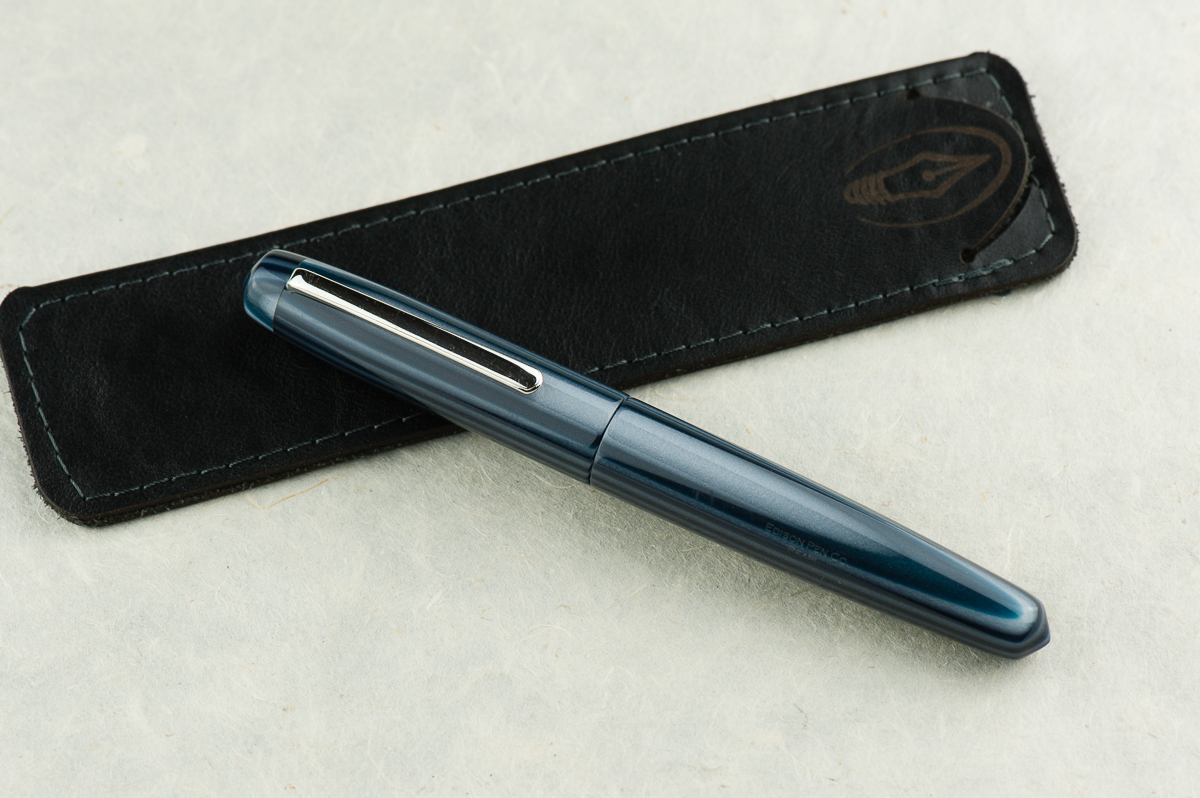
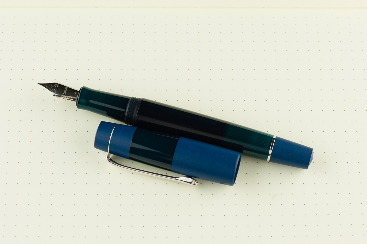
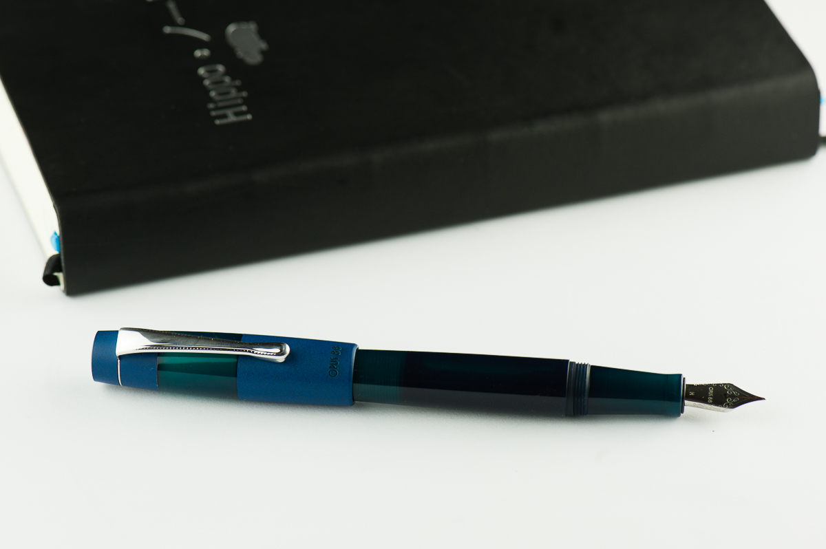
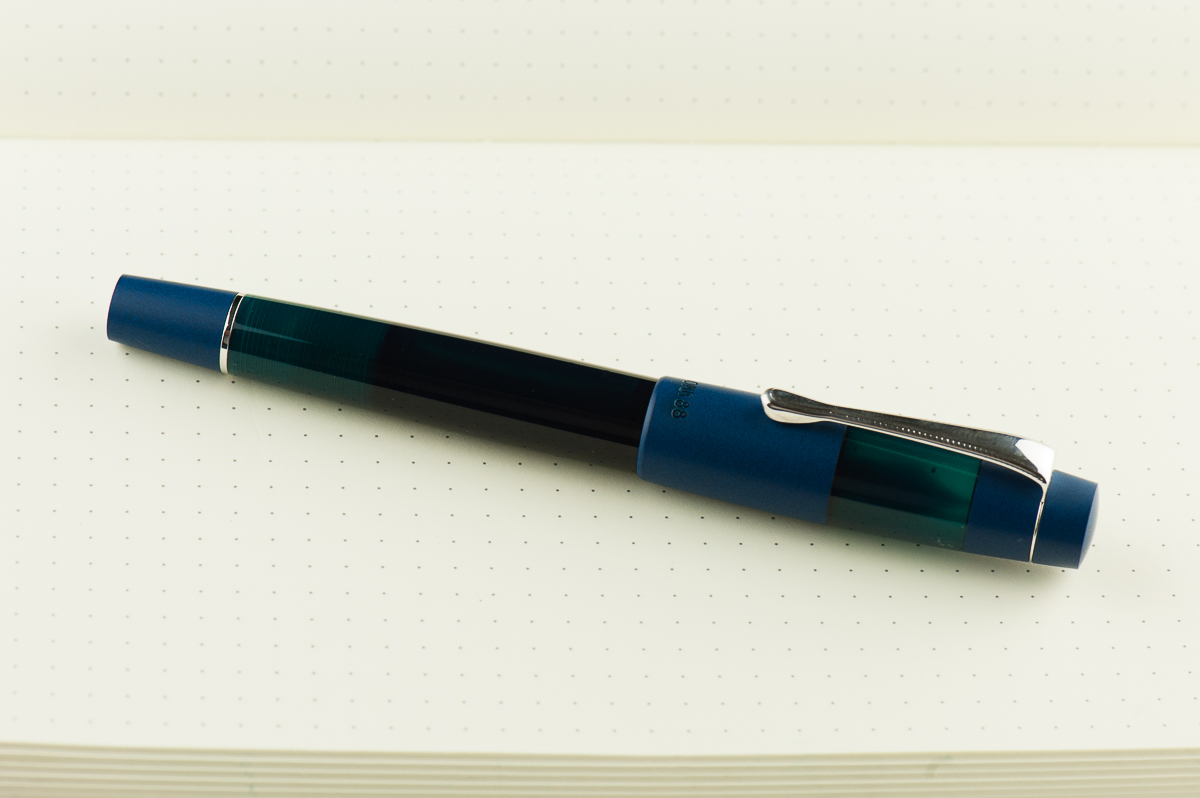
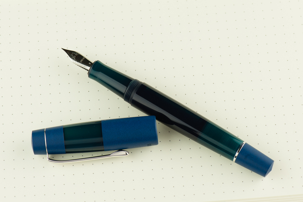
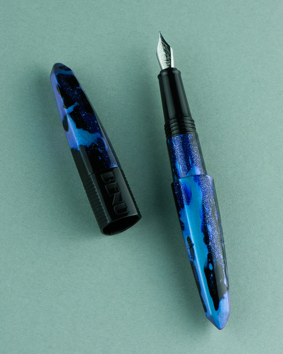
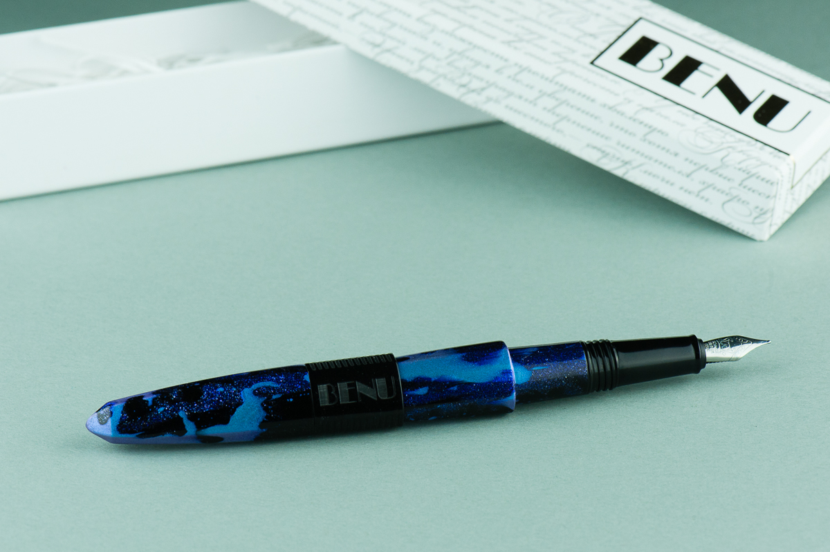
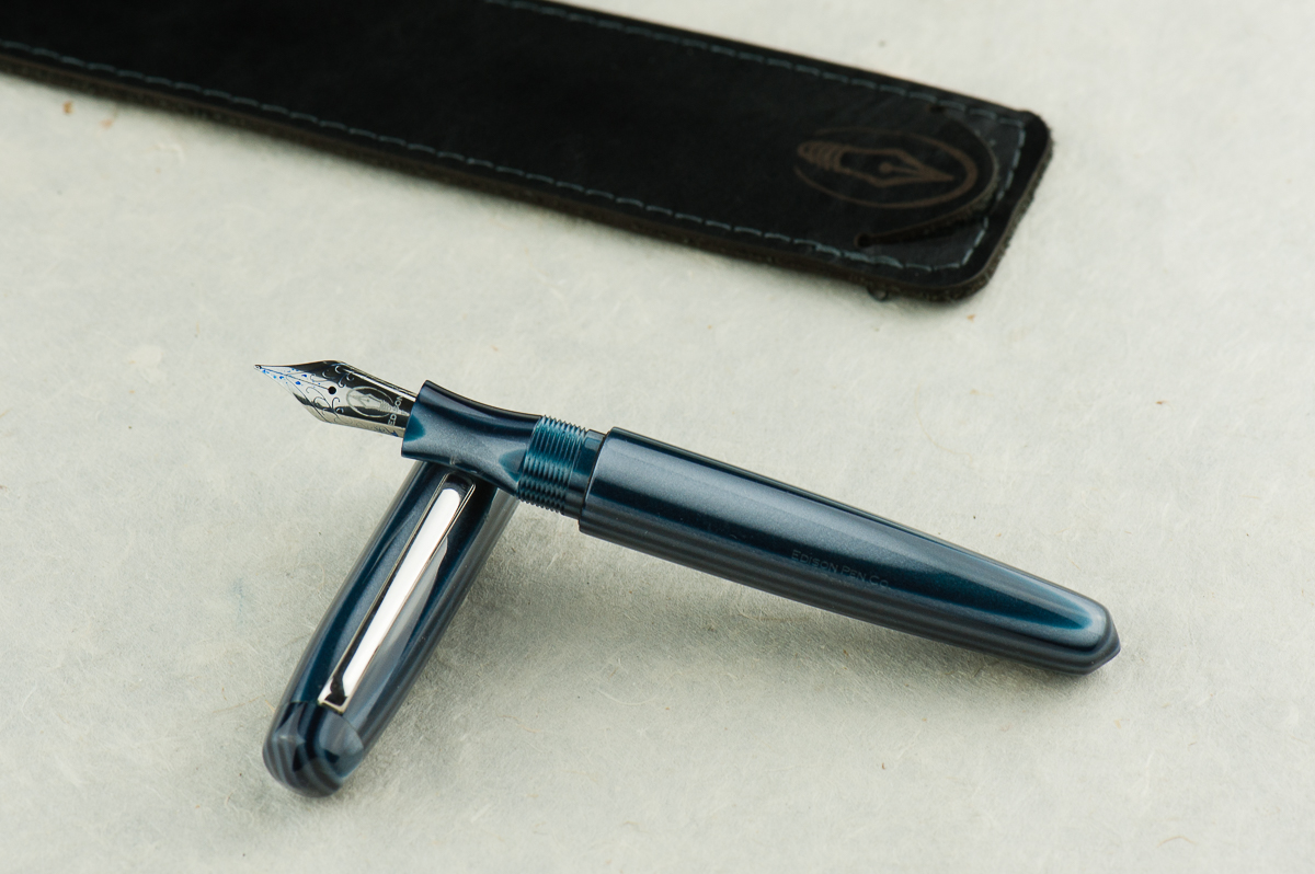
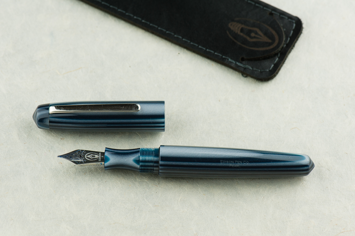
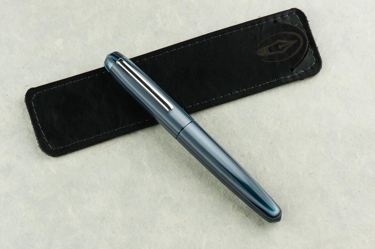
Katherine: Oooh stripes! And blue! And a hint of sparkle. And pointy ends! All the things I love in a pen. The shape is heavily reminiscent of the Nakaya Piccolo, and as with that pen, I love the clean lines and the small touches on this pen, like the gentle taper and conical ends. Franz’s example is particularly close to my heart because it’s both blue and striped, but I’m sure it comes in a variety of materials depending on one’s taste.
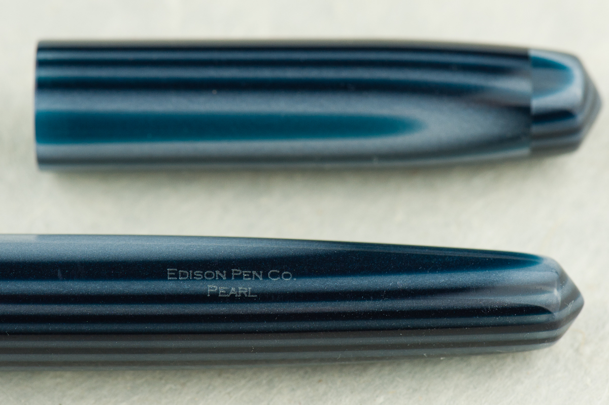
Pam: The Edison Pearl is a great flagship pen and a great example of their work. They take pride in their craftsmanship from nib to pen material. They were one of the first companies that I was made aware of as a newbie fountain pen addict that broke the mold using beautiful and unique acrylics. This particular material that Franz selected is absolutely stunning. The blue and gray stripes is a great compliment to this simple shape.
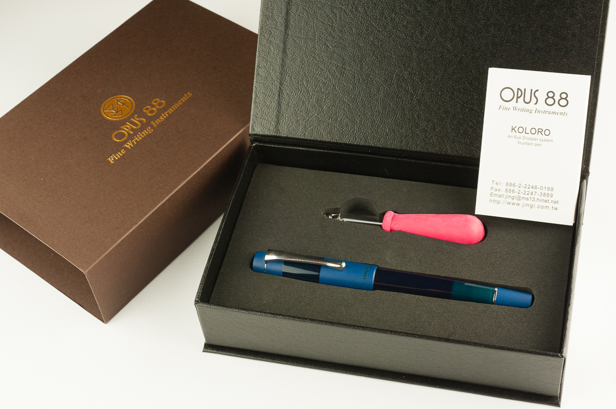
Franz: Fountain Pen Day 2013. Yep. That’s what I call this pen because I got this from Edison Pen Co.‘s current inventory offering on FPD. I never held an Edison Pearl before but c’mon! With the shape and the blue… I mean, the material, how can one go wrong? =) The Edison Pearl is part of Brian and Andrea Gray’s Signature Line of pens and you purchase one either by checking out their Current Inventory, or emailing them and ordering a custom one for yourself.
The Business End
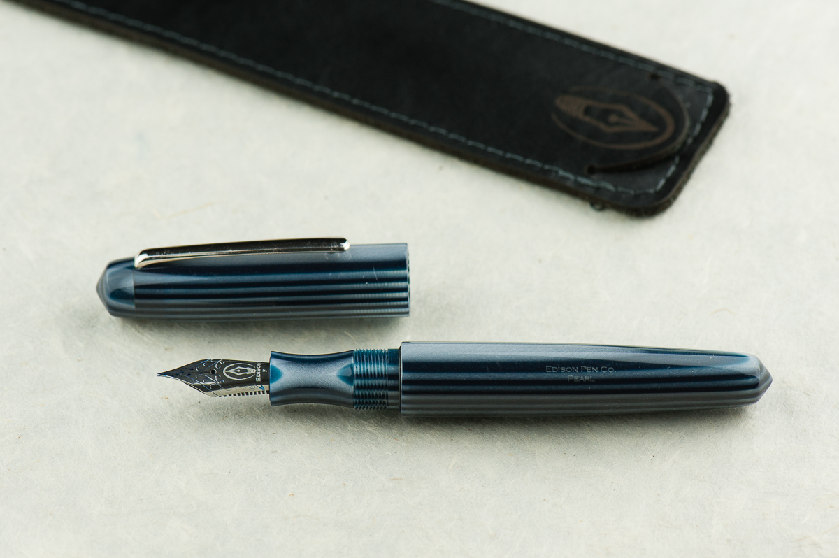
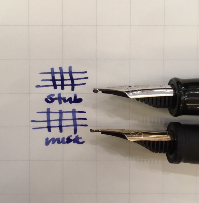
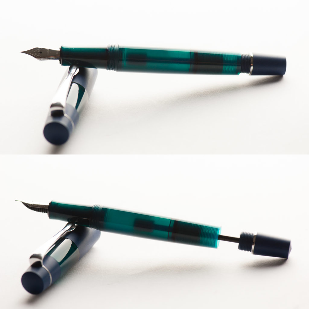
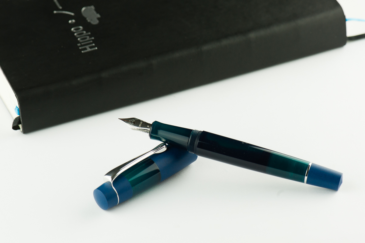
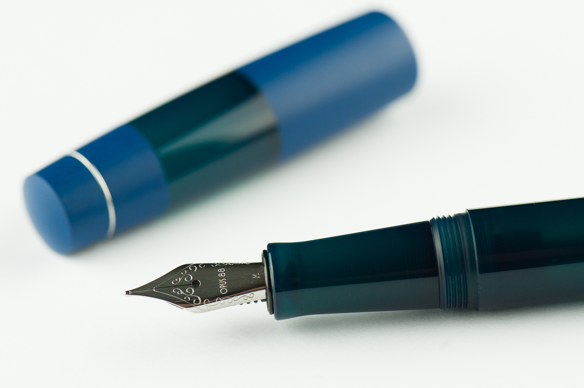
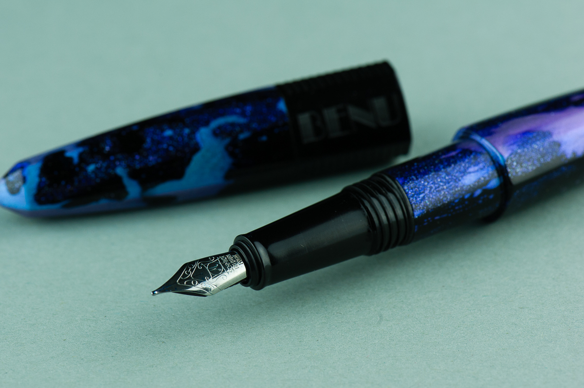
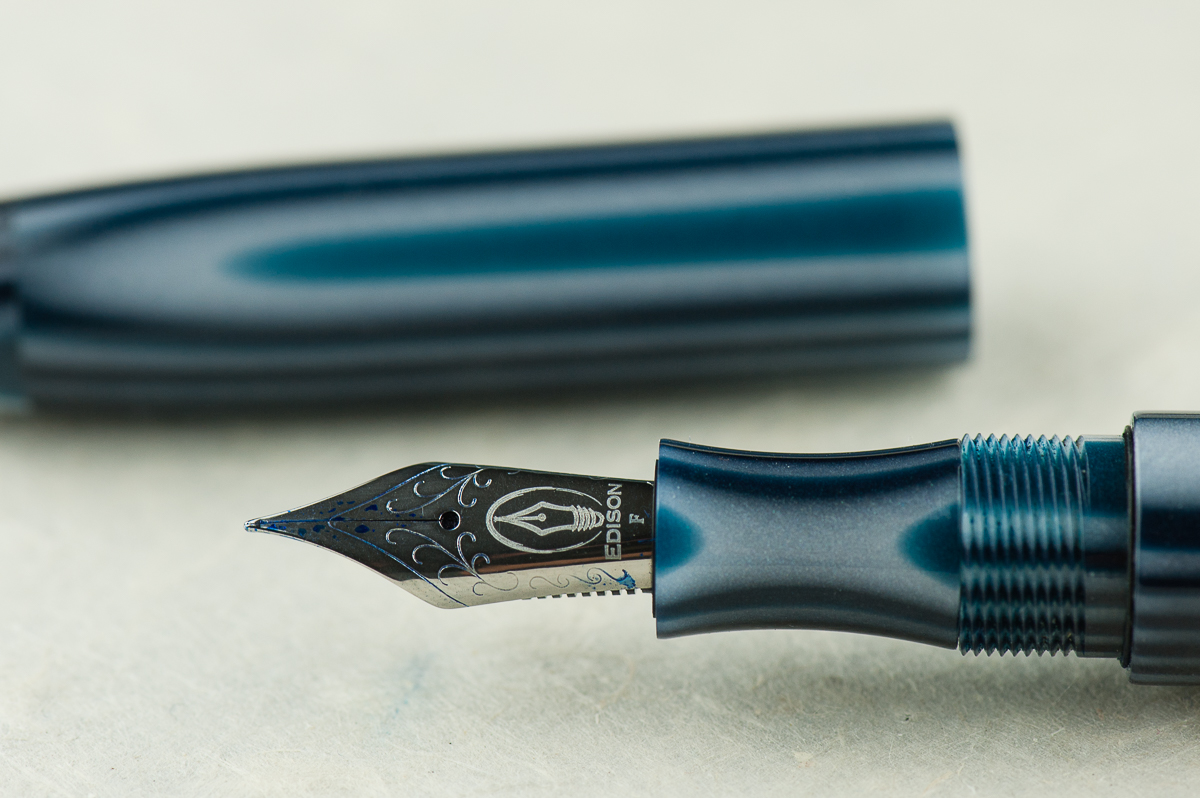
Katherine: It’s a Jowo holder, but Brian Gray tunes the nibs quite nicely. Franz has this one paired with a smooth wet Fine nib, but think of all the other fun nibs it could house!
Pam: The fine nib is very smooth for its size and I find it touch glossy. A great compliment to Brian Gray’s tuning work. This is a great pen for those who would want to swap nibs.
Franz: Originally, this pen came with a medium 0.9mm cursive italic customized by Mr. Brian Gray and I love that nib. For this review, I just swapped it with a fine nib from another Edison Pen of mine. As with any well tuned nib, this fine is quite fine to write with. And I love how the nib (logo) within a nib looks!
Write It Up
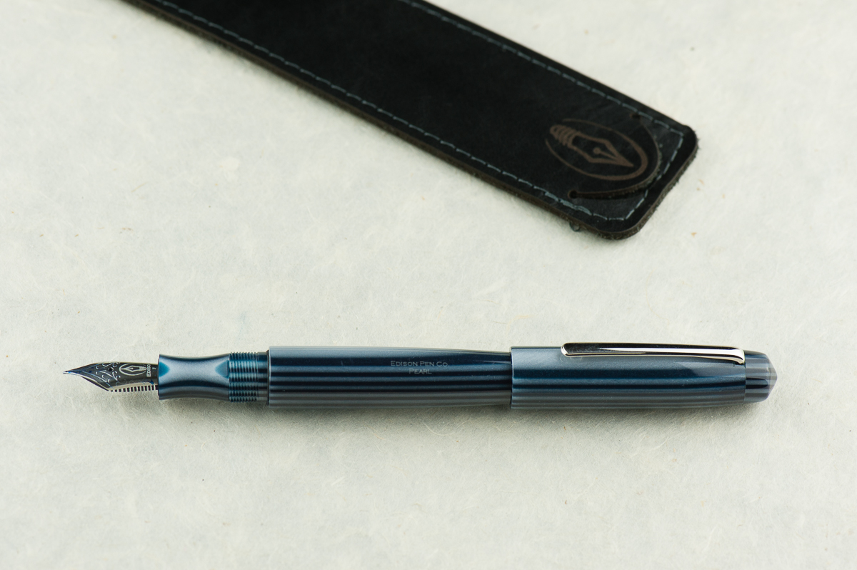
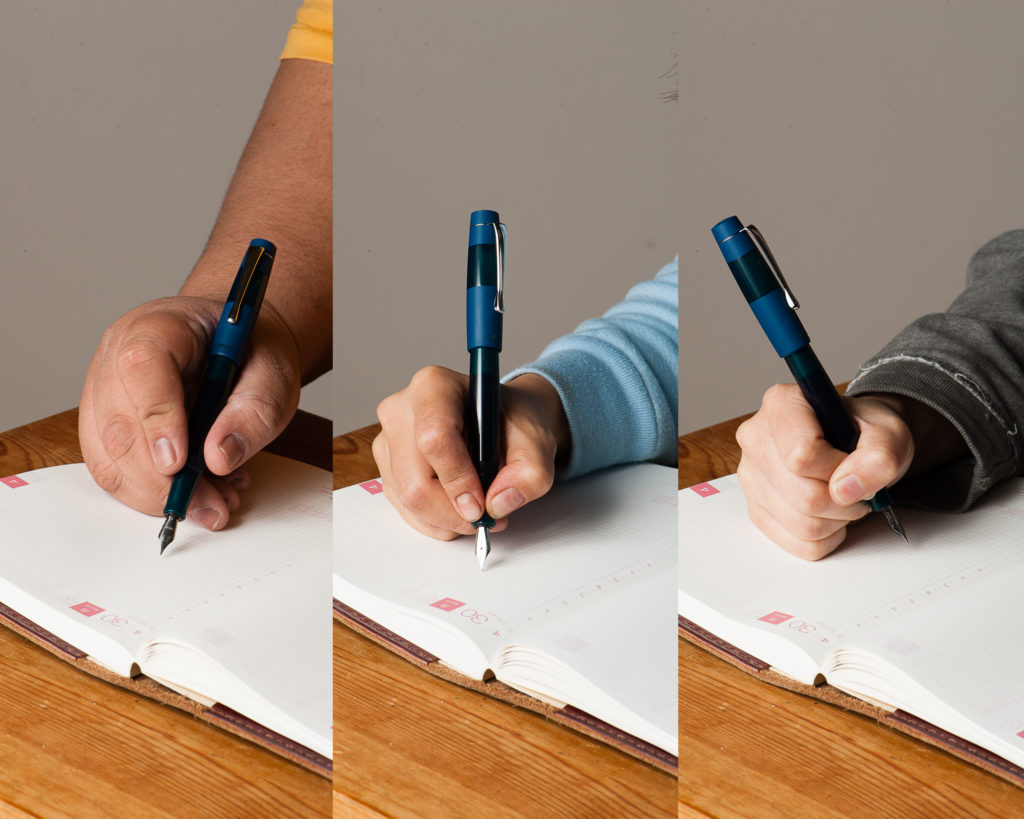
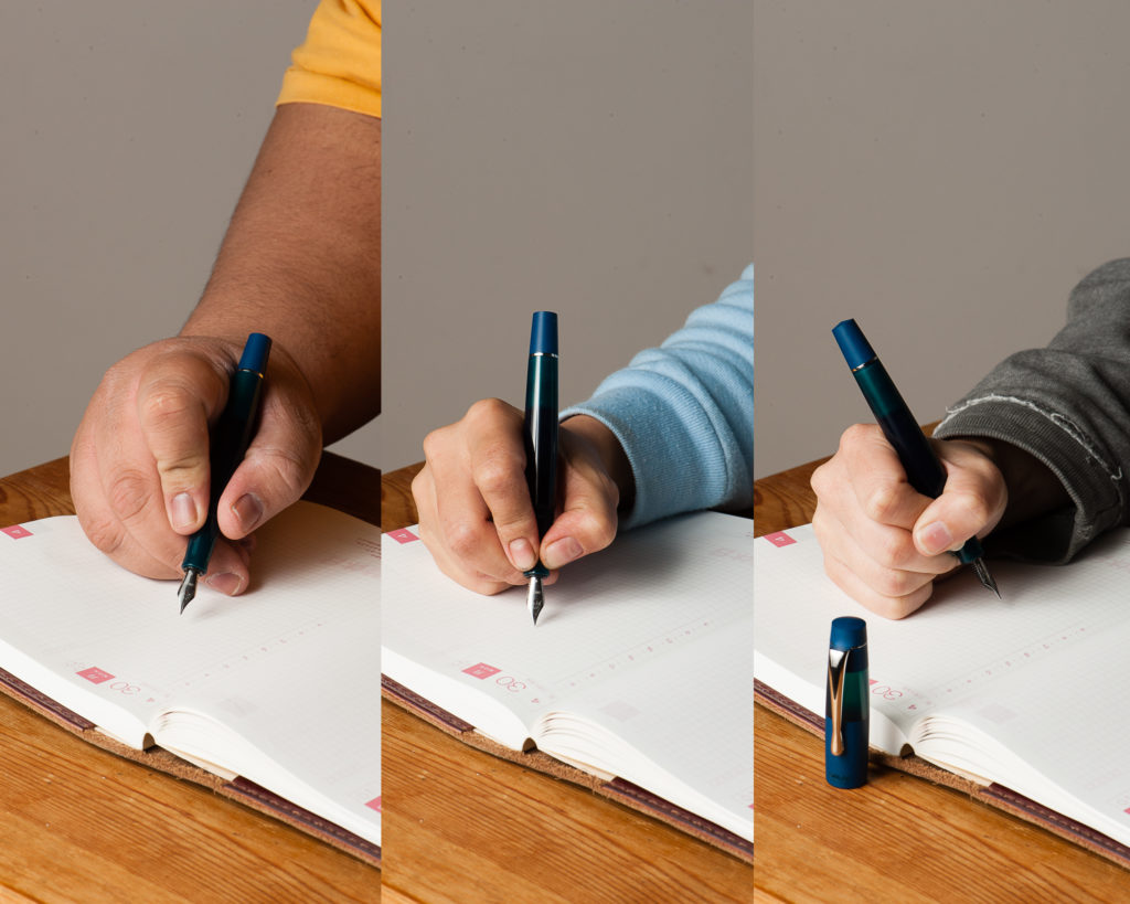
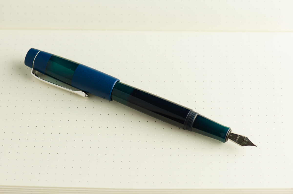
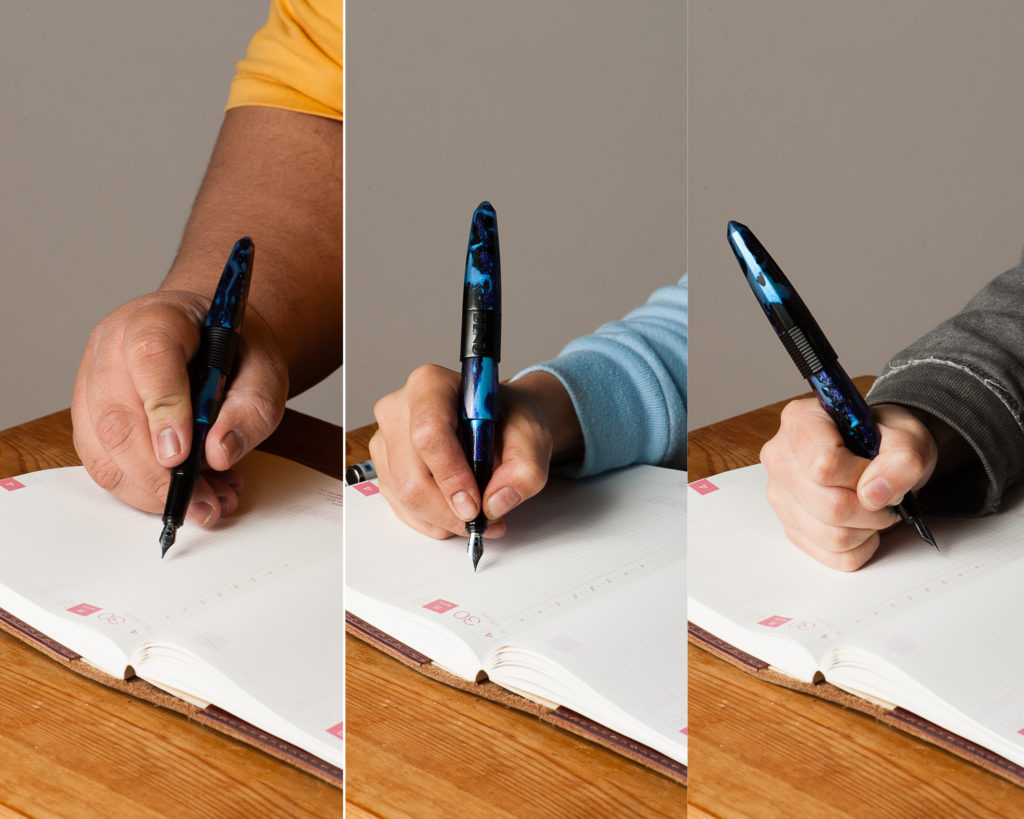
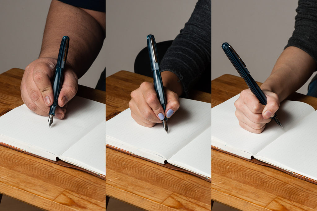
Katherine: The Pearl is comfortable, but the “waist” on the section is a little deeper than I’d prefer. With narrower sections like this, my thumb tends to creep “forward” as I write, and eventually I end up in a Pam-like coma-grip (probably still not a vise-like).
Pam: I find the width of the Pearl to be quite comfortable. Alas, the threads fall right at where I would grip. The threads are not too sharp, but I am reminded that they are there if I grip too hard. I don’t have too much contact with the waist of the section, and the section does widen to the width similar to the pen body.
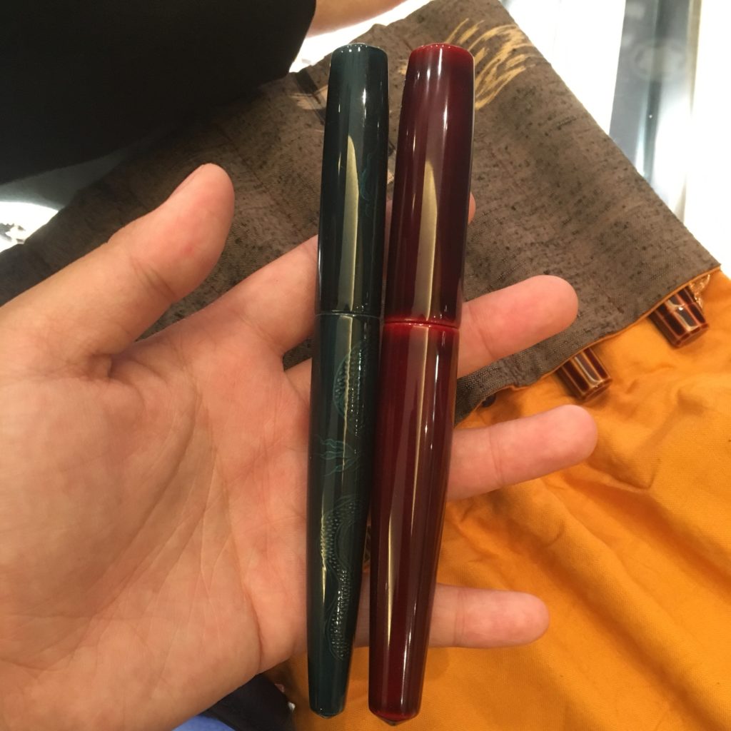
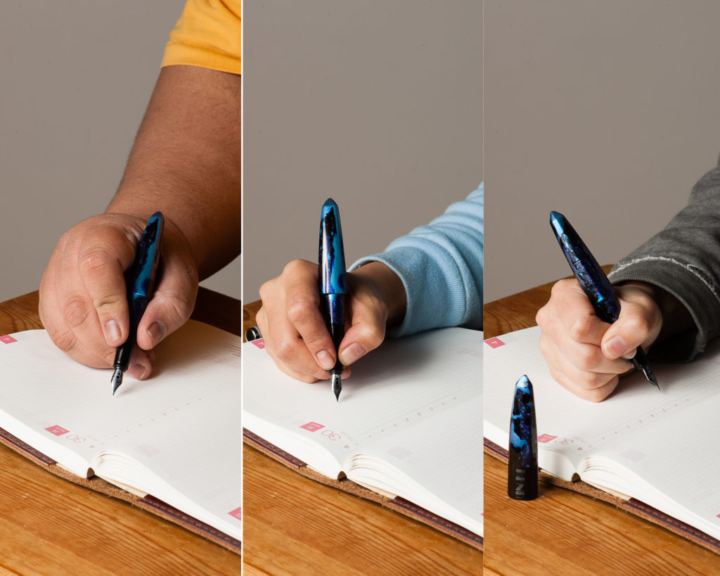
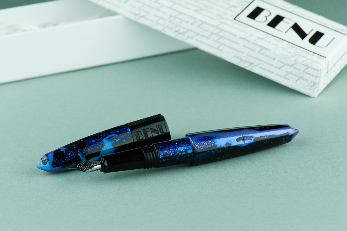
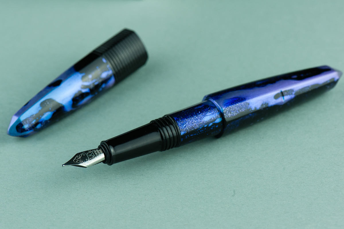
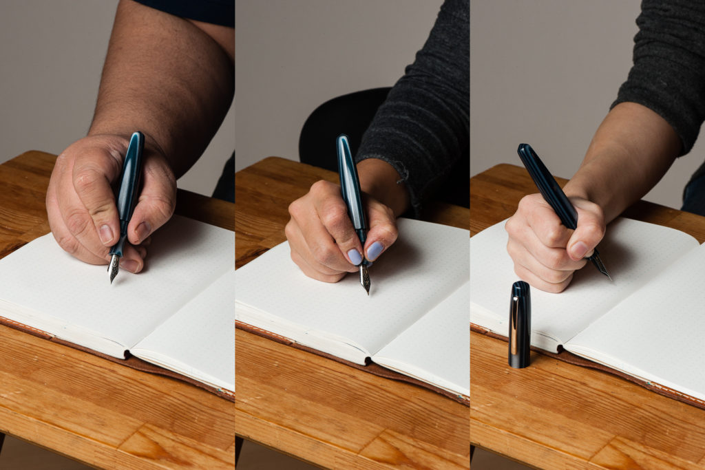
Franz: Like Katherine, I found the section’s concave design a little too thin so I always gripped it by the threads. The Pearl may have a girthy barrel but the length is a little short when the cap is unposted. Unfortunately, the cap does not post securely and it makes it a bit too long. You can definitely see that in our hand comparisons above.
But nevertheless, using the Pearl unposted, I’ve written a couple of letters and lots of pages in my journal. The shorter length definitely gives me some fatigue but it’s fairly adequate for my bear paw.
EDC-ness
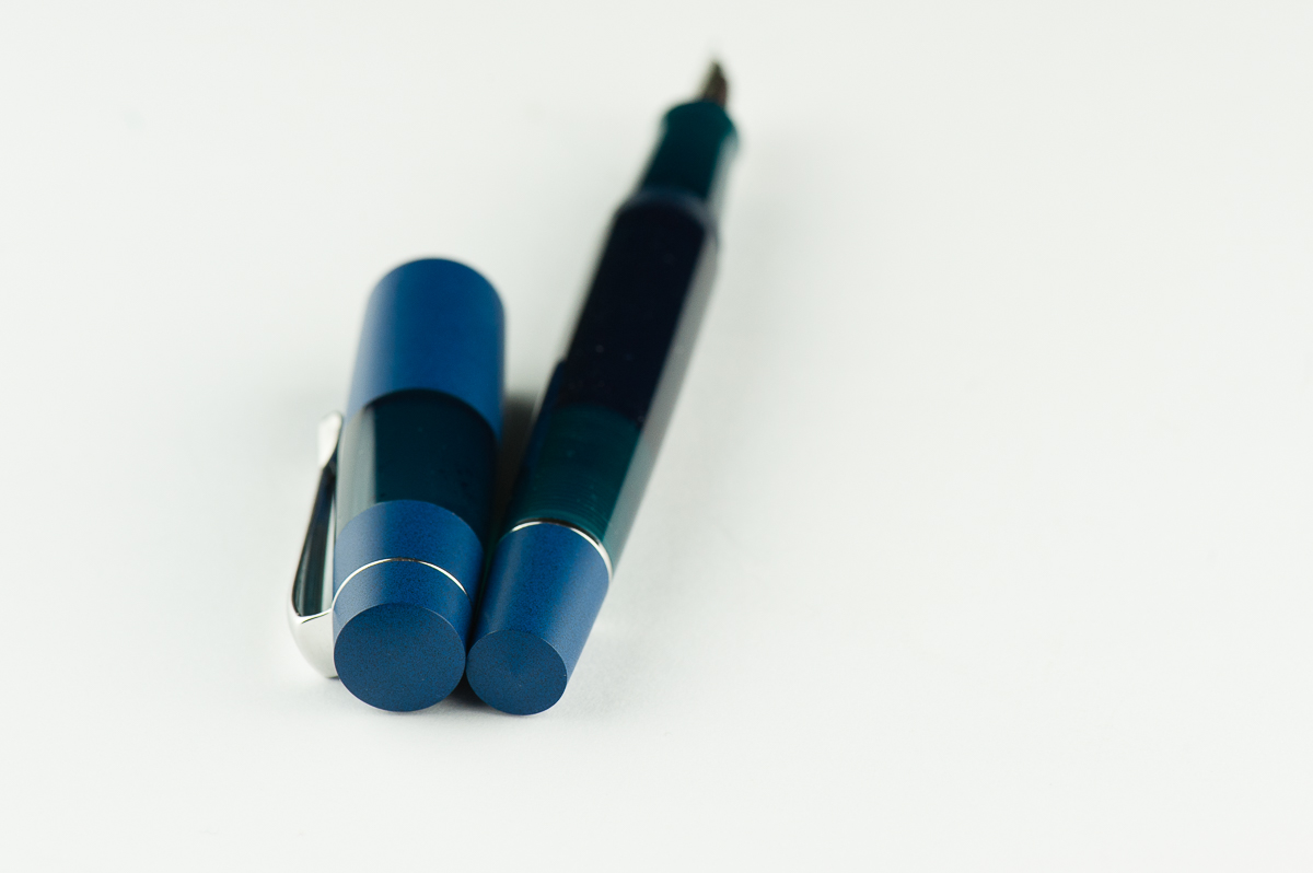
Katherine: The Pearl takes one and three fourths turns to uncap, and has a solid clip. Overall, no complaints from me on carrying this pen daily.
Pam: This pen is a great pen to for regular carry with a small number of rotations to uncap and a professional looking clip. I think this would be a very adventurous pen in the office!
Franz: I’ve used the Pearl for journaling, as well as in the office setting. The original 0.9mm cursive italic and the fine nib currently installed writes nicely on cheaper copier paper. My personal every day paper is Tomoe River and I enjoy the fine line for practicing some tiny writing.
Final Grip-ping Impressions
Katherine: Section aside, this pen is reminds me a lot of a Nakaya Piccolo, except in a much wider range of fun materials and lots of nib choices. Additionally, since the Pearl is part of Edison’s Signature line, it’s customizable — so you could get one at a Piccolo length, or a longer one if you have oversize hands. As with any customizable pen, it all comes down to your preferences — but as a base, the Pearl has great (to me!) shape and is very well made and immaculately finished.
Pam: I love custom pen makers. In a world where we obsess over the perfect shade of ink, the feel of nib and line widths; a customizable pen is ideal. I would recommend this pen for those discerning individuals who enjoy building their own pen from a great maker.
Franz: The Edison Pearl is a fantastic example of Edison Pen’s quality of pen making. I’ve had this pen for five years now and even though it’s not a pen always inked up, I keep it in mind when rotating pens.
After the Pearl, I discovered and liked the longer pens that the Edison Pen Co. creates. The Huron and the Glenmont are pens that I currently favor more due to the length. Both have flat end designs. The Pearl seems to have a more unique shape among their line and perhaps I’d want one customized to be a little longer. Ahem…maybe next year? =)

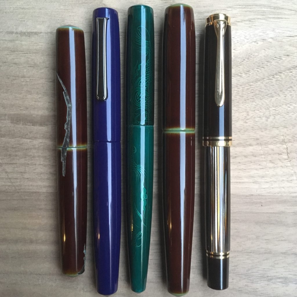
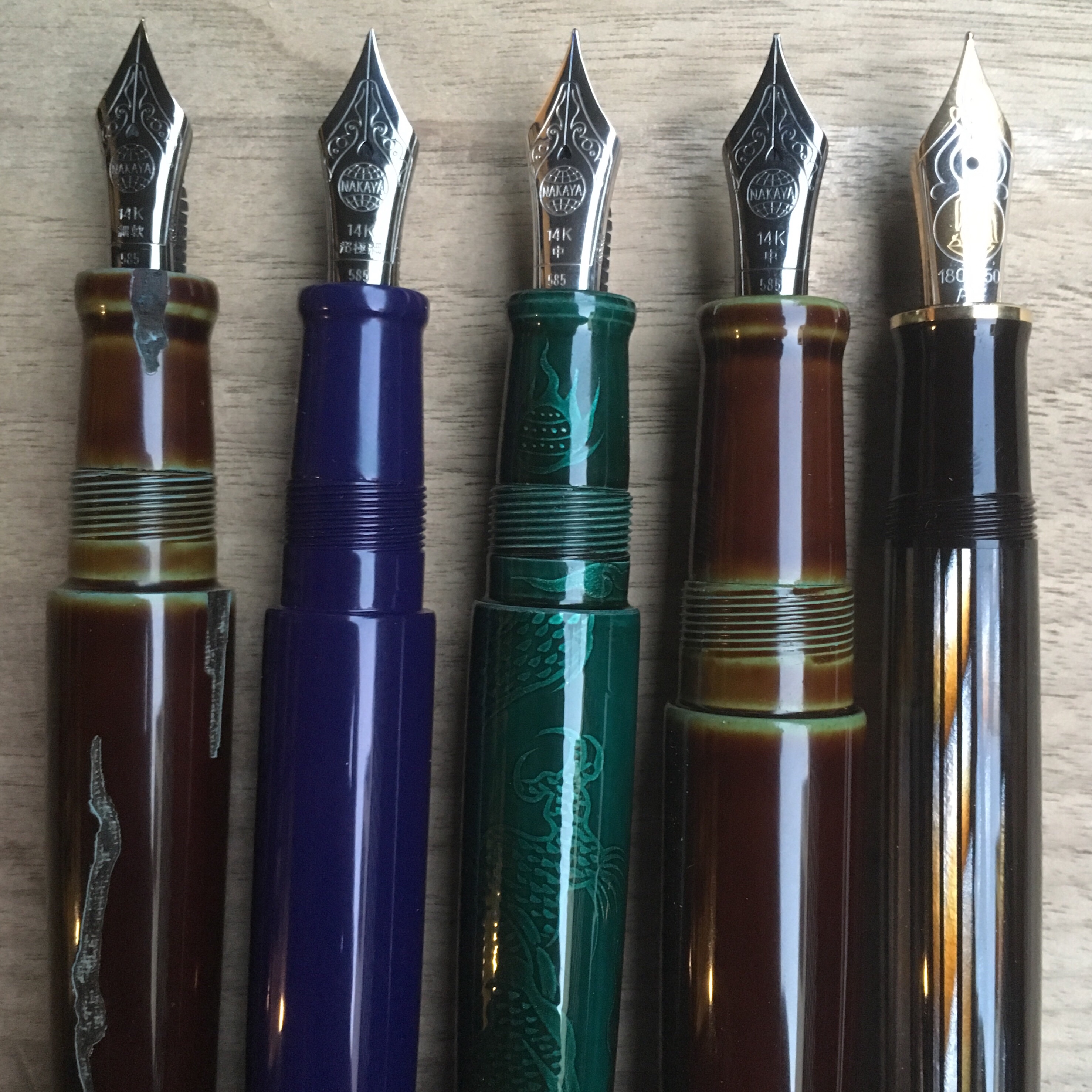
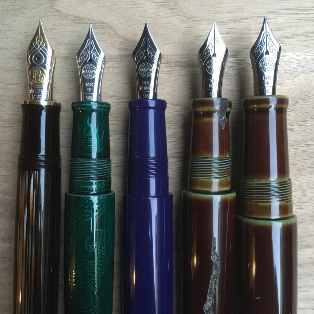
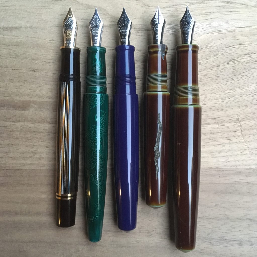
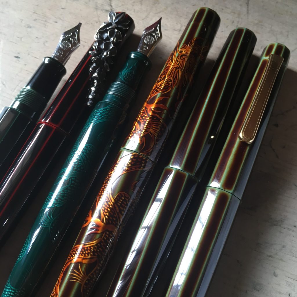
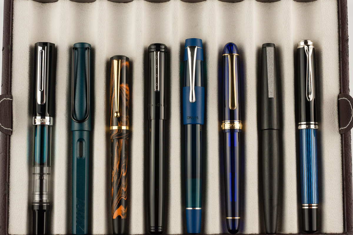
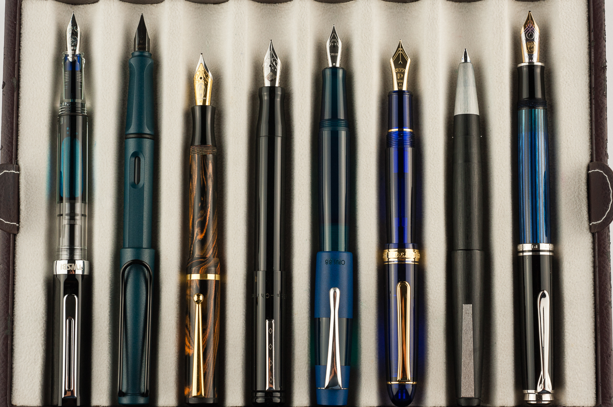
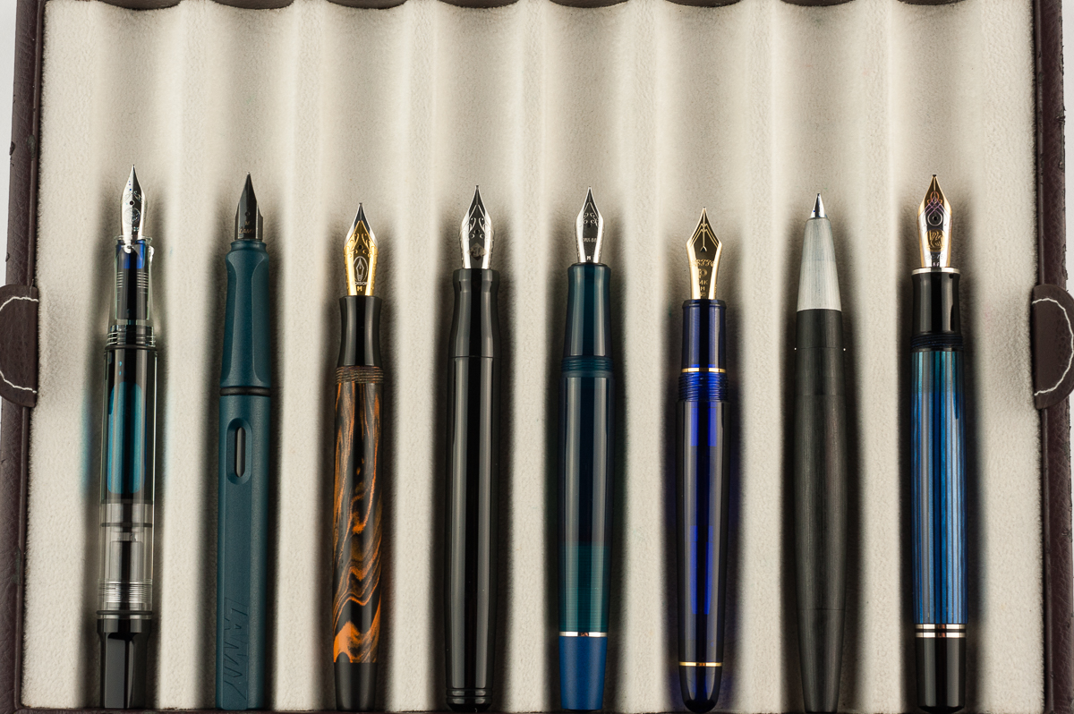
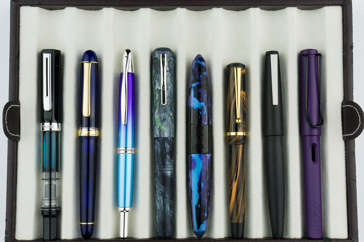
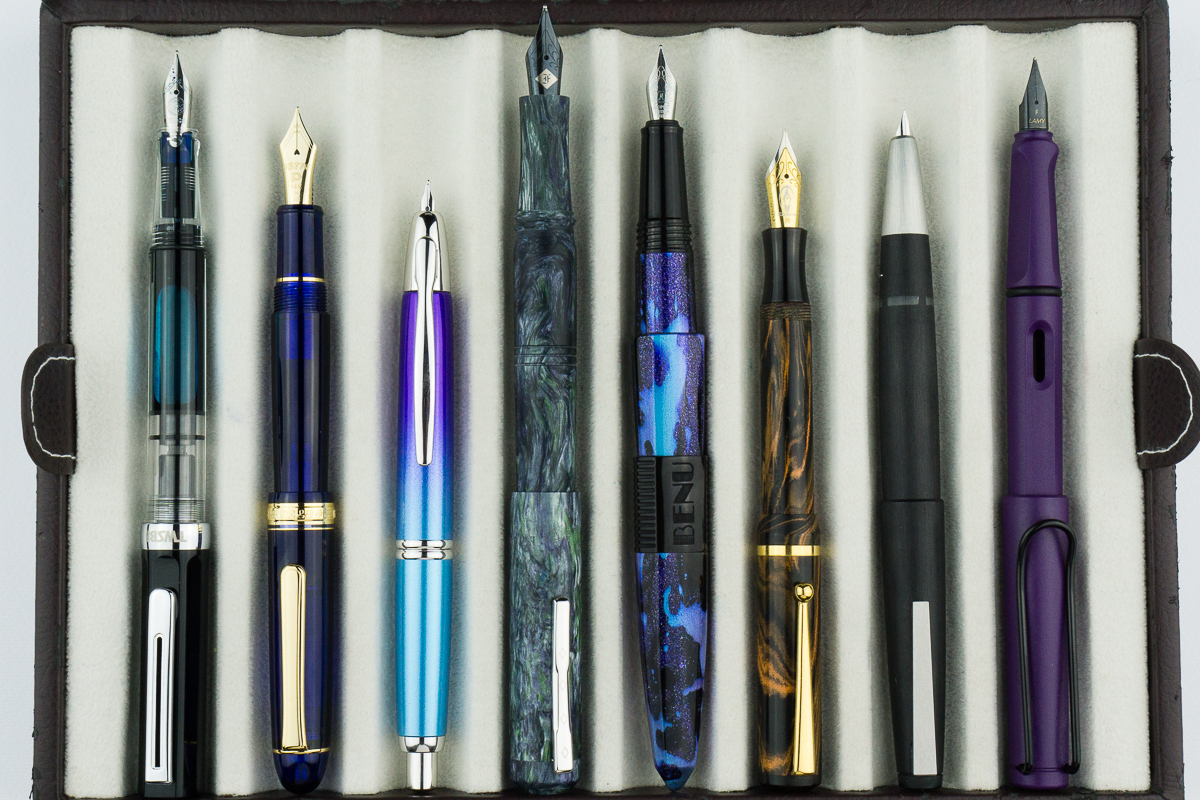
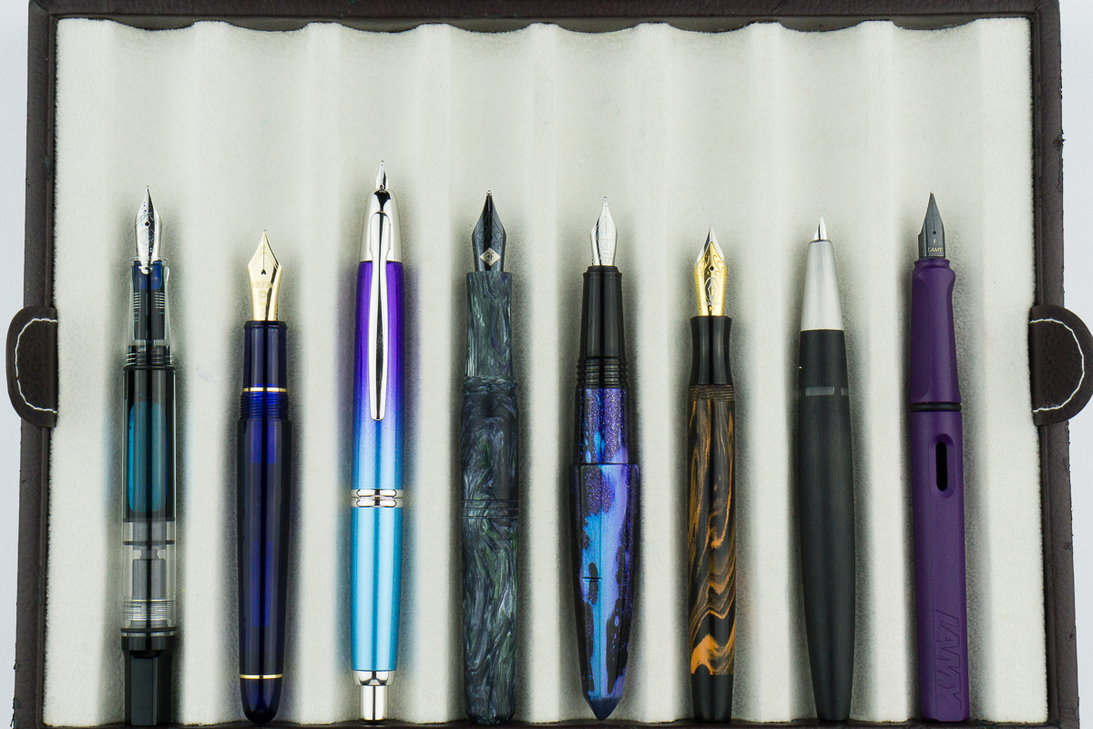
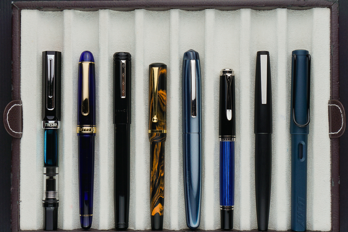
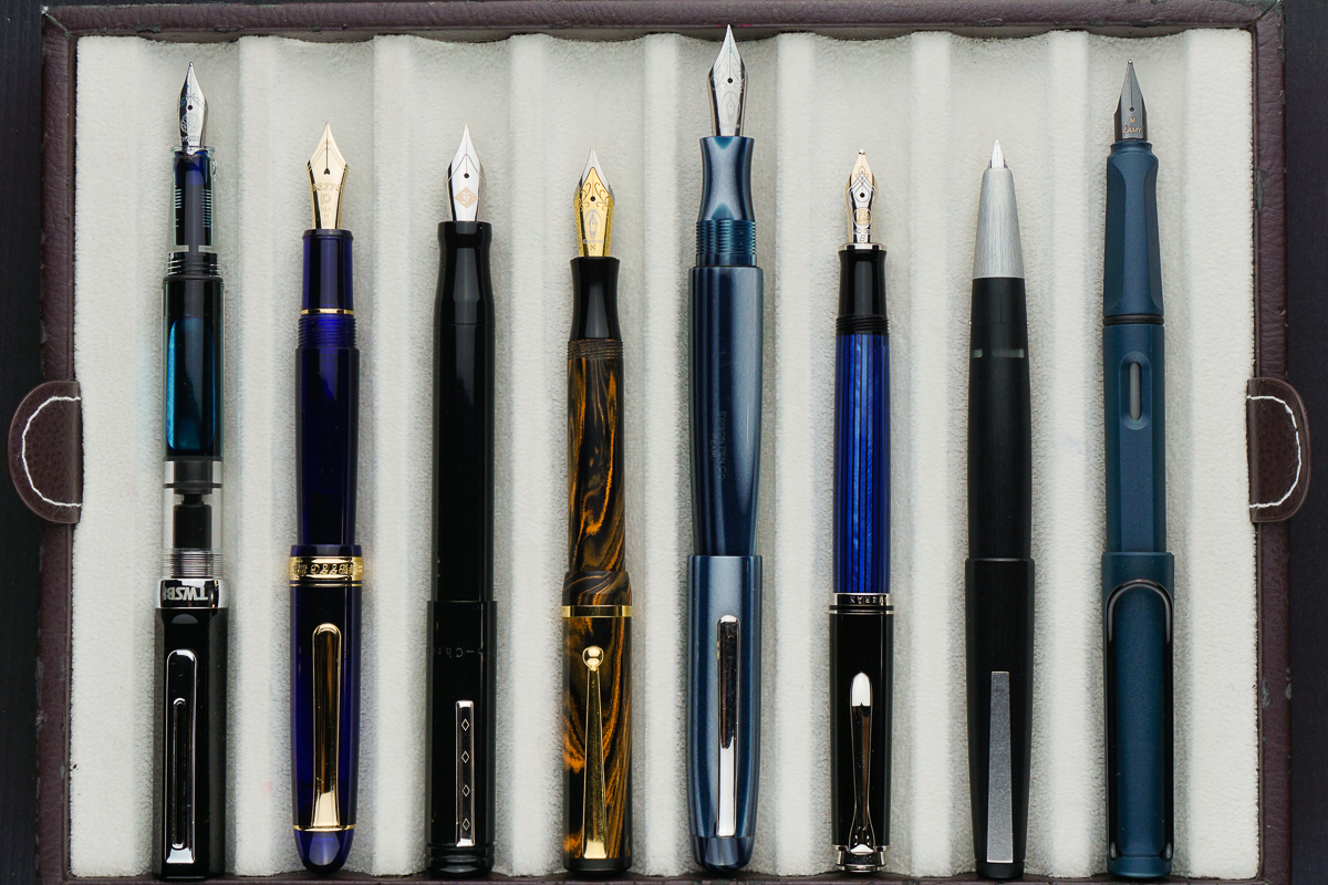
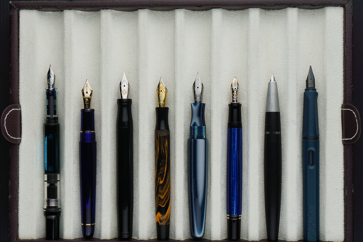
Pen Comparisons
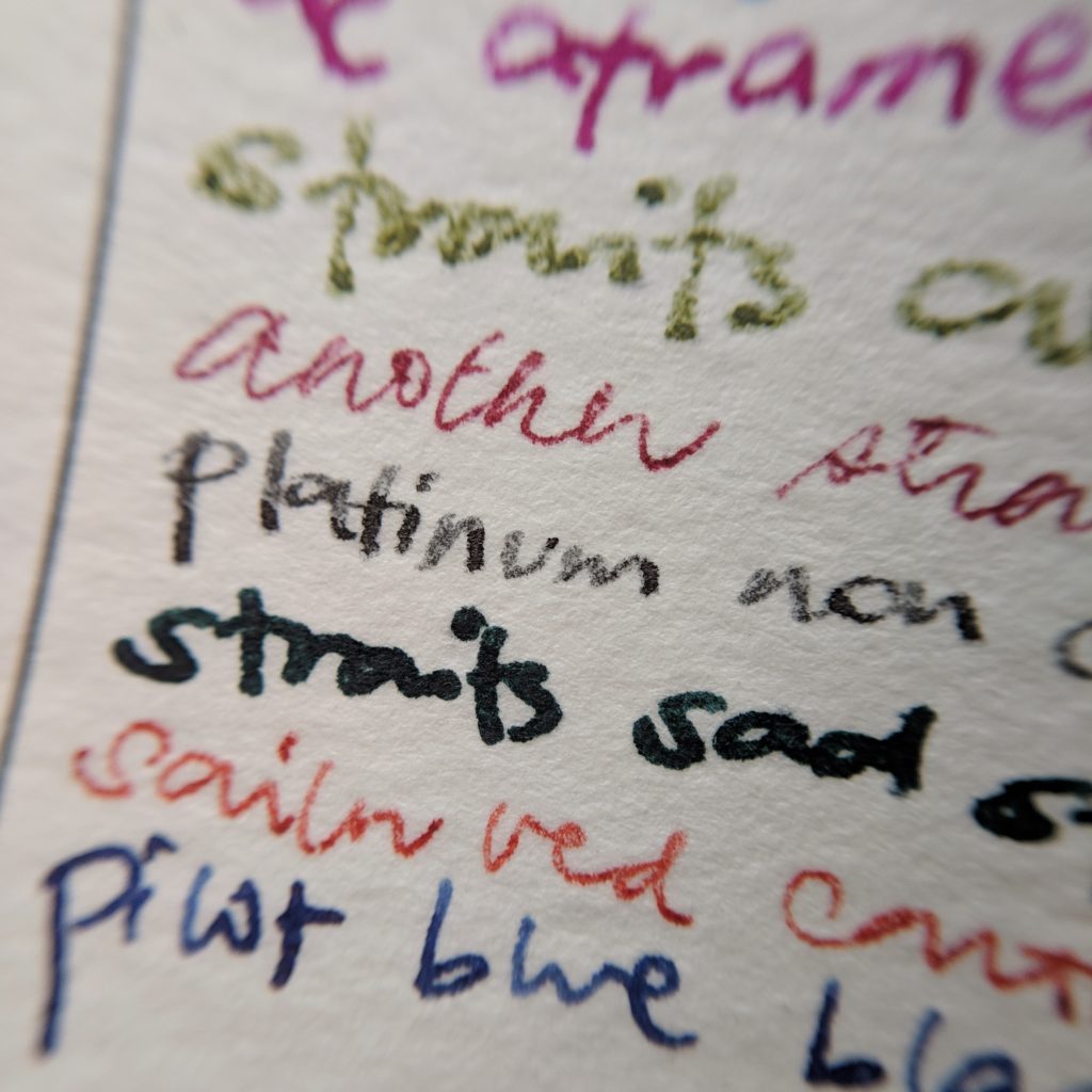
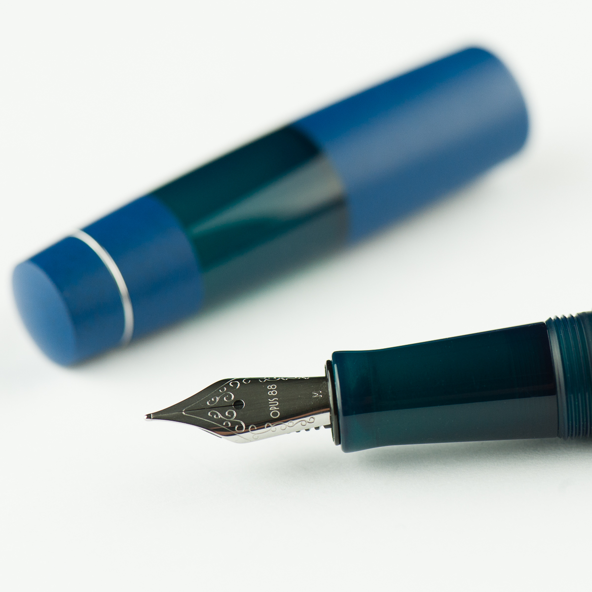
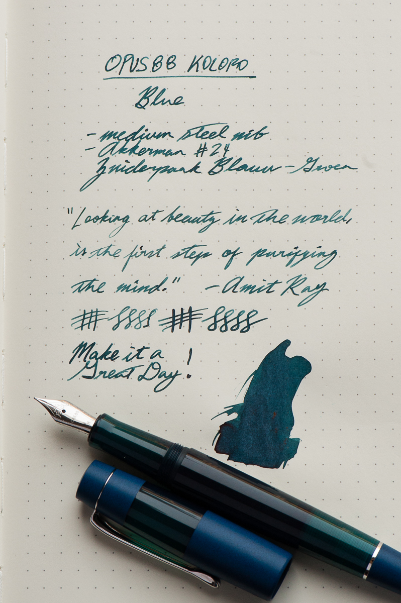
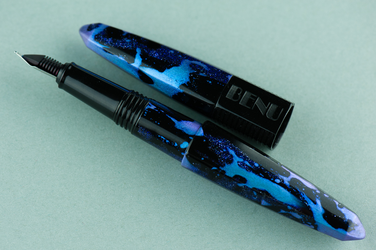
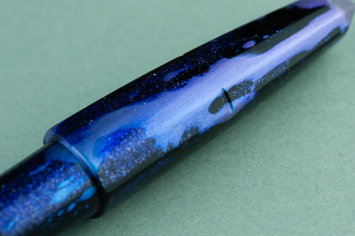
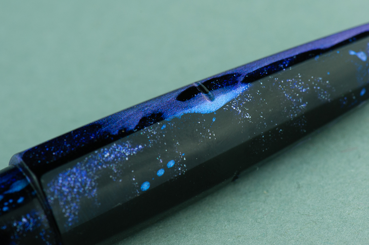
Pen Photos (click to enlarge)