Hand Over That Pen, please!
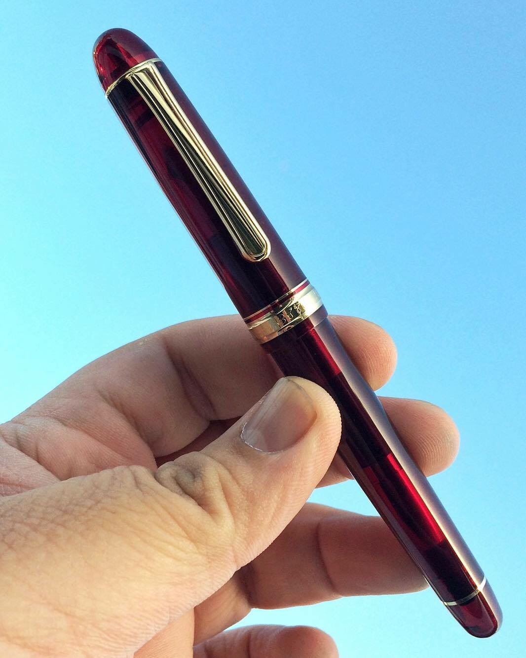
Katherine: The pen is made of some sort of dark red translucent plastic with gold trim, and I really like it. It’s translucent enough to have depth, but solid enough to have some mystery. Overall I’m not a big fan of gold trim, but the trim makes the red look really rich and warm. I’m a fan!
Franz: I have always admired the Platinum 3776 Century Bourgogne, and Chartres Blue’s translucent material. With the right lighting, the pen just seems to glow. The cigar shape is quite nice and gives it a balanced look that I find very pleasing.
Pamela: I was unimpressed when I saw the picture of this pen on the internet since the color and the shape of the pen doesn’t appeal to me. However, upon handling the pen, the material feels substantial. Although I am not a fan of the yellow gold, the red is deep and rich in color. As Katherine says, the yellow gold is the best compliment to the red.
The cigar shape and the gold trim provides the pen a classic and traditional aesthetic, which is not my cup of tea, but is worthy of consideration for anyone who enjoys the aesthetic.
Hands-On
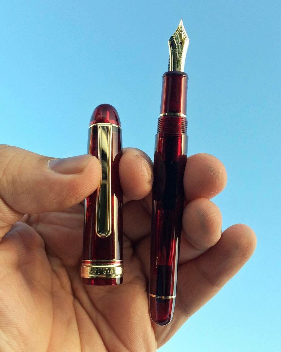
Katherine: I’ve seen a couple reviews of this pen saying it’s a little small unposted — I think it’s perfect. I prefer it unposted, but do post it when I’m worried about losing the cap. It’s a solid and well-balanced pen.
Franz: Sorry Katherine, but in my hand, this pen needs to be posted to be comfortable for I grip it far back near the threads. The pen is still usable when unposted but I need to place my fingers closer to the nib and I have to be conscious in doing so.
The resin material is well made and sturdy. It’s probably just me, but the pen warms up in my hand almost like how an ebonite pen feels. I believe it takes one and a quarter turn to cap/uncap the pen. As you cap the pen, the final quarter turn gives a secure feeling as the inner cap actuates the Slip and Seal mechanism.
Pamela: I prefer my pens to be posted when I write with them. Unposted, the length is perfect and is noticeably lighter. However, given my preference, the cap provides slightly additional heft to the pen that I typically prefer in the hand feel. Please note, I am also the type of person who enjoys the heftier VP over the slimmer and lighter Decimo model.

The Business End
Katherine: I love this nib. It writes with a touch of feedback and quite a bit of springiness (since this is a Soft Fine). Writing with this pen makes me feel alive. However, if I want to keep writing with visible line variation, this pen isn’t by any means semi-flex and it can get pretty tiring.
Franz: Yep, the nib on this pen means business. It just… writes. For a Japanese Fine nib, it is smooth but lets me know that it is writing. I generally prefer to write with western medium/broad nibs but with this nib, I don’t mind it at all. As Katherine mentioned, there is just a little bit of spring to the nib and it feels nice.
And let’s not forget the nib’s awesome heart-shaped breather hole!
Pamela: This nib is out of this world and seems to defy the law of physics. I can’t believe that this is a “stock nib” from Platinum. It provides some bite when writing, particularly with my heavy hand, but nib still provides an acceptable fine line with regular writing. If desired, the “softness” of the nib can be used to add a flourish with the added line variation. The softness is best used with moderation since it actually takes quite a bit of concerted effort make a large line variation.
How did Platinum make a gold nib that is stiff enough to produce a wonderfully fine line yet perfectly springy enough to provide a great line variation? Some nibs just have it all.

Write It Up
(20-minute writing experience)
Katherine: This pen is comfortable and I have no qualms writing with it for long periods of time. (I quite enjoy it, actually!)
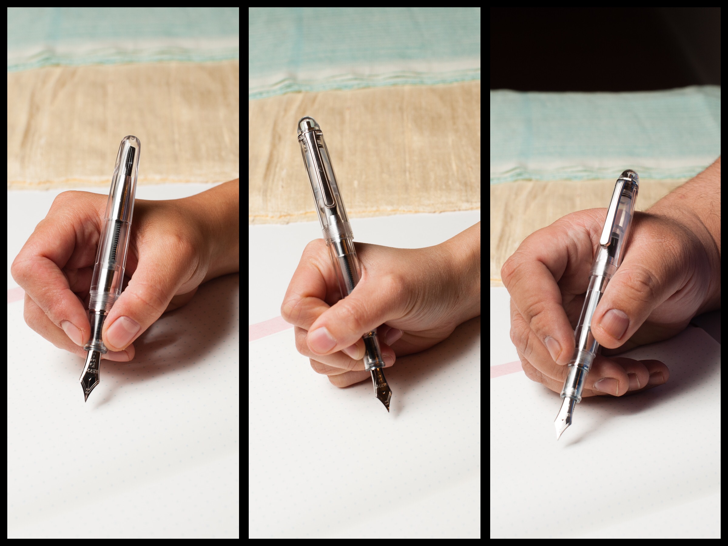
Franz: For the first fifteen minutes of writing I posted the 3776 and it was fantastic! The pen seemed to meld into my hand and made my journaling an enjoyable experience. I was gripping the pen high up and the threads were resting on my middle finger. It did not bother me at all.
For the last five minutes of my journaling, I wrote with it unposted. My fingers slid down closer to the lip of the section. I felt a tighter grip and gave me a tense feeling. A total 180-degree experience from earlier. So, I will only use the pen unposted when I need to write a word or two.
Pamela: Writing with this pen is a joy. I find that the small amount of “bite” to be so satisfying because you can feel the words be put into the paper whether it is from a strong punctuation at the end of a sentence or the smooth sweep of cursive. If I am not mindful, I can start gripping the pen on the threads and tight enough to feel the step down bite into my hand. Otherwise, I have little complaints to size of the pen.
EDC-ness
Katherine: I jot down a lot of notes at work — unscrewing the cap every time is okay, but not optimal. Additionally, this pen seems to like spitting ink into its cap while it’s in my backpack. The nib is huge and pretty — but almost always has a glob or two of ink on it. Not my favorite bring-to-work-pen.
Franz: I found this pen to be acceptable for use at my work setting. For signatures and quick notes, the screw cap did not bother me at all. I signed my name about 14 times in one day and I liked it (posted, of course!). Fortunately, I have not experienced any nib/feed issues unlike both of my colleagues.
Pamela: Ditto on all of Katherine’s points. As much as I enjoy the nib, I didn’t find it particularly work friendly with the screw on cap. I, too, noticed spurts of ink after this pen was in my backpack. And at one point, the flow of the ink seemed to be pretty inconsistent. The pen would start writing just fine for about 3-5 words then it would appear that the feed was running out of ink despite an almost full converter.
Grip-ping Impressions
Katherine: I think this is one of my favorite pens for the value ($83 dollars?! That’s a steal!)– I love the way it writes and it doesn’t look bad. Actually, I like this pen so much I have two, the other being a limited edition Sai with a Fine nib. I really love the way it writes and it’s a very comfortable size unposted.
Franz: The Platinum 3776 Century is a great pen to have and I would recommend it for anyone looking for a medium sized pen. I most probably will own a Chartres Blue with rhodium trim in the near future. (Thanks Katherine!)
Pamela: Due to the aesthetics of the pen, I wouldn’t buy it for the listed price. However, I am willing to pay for this pen just for the nib alone. Luckily, Nakaya uses Platinum nibs. If (or when) I am fortunate enough to be able to afford my own Nakaya, I will definitely be choosing the soft fine nib. It’s a unique and wonderful nib, worthy of a dream/grail pen.
