Our apologies dear friends. We skipped our August pen and ink pairing post for we all have been swamped for the past couple of months. We did not want to skip September as well no matter how late it may be. Thank you for reading and your kind words!
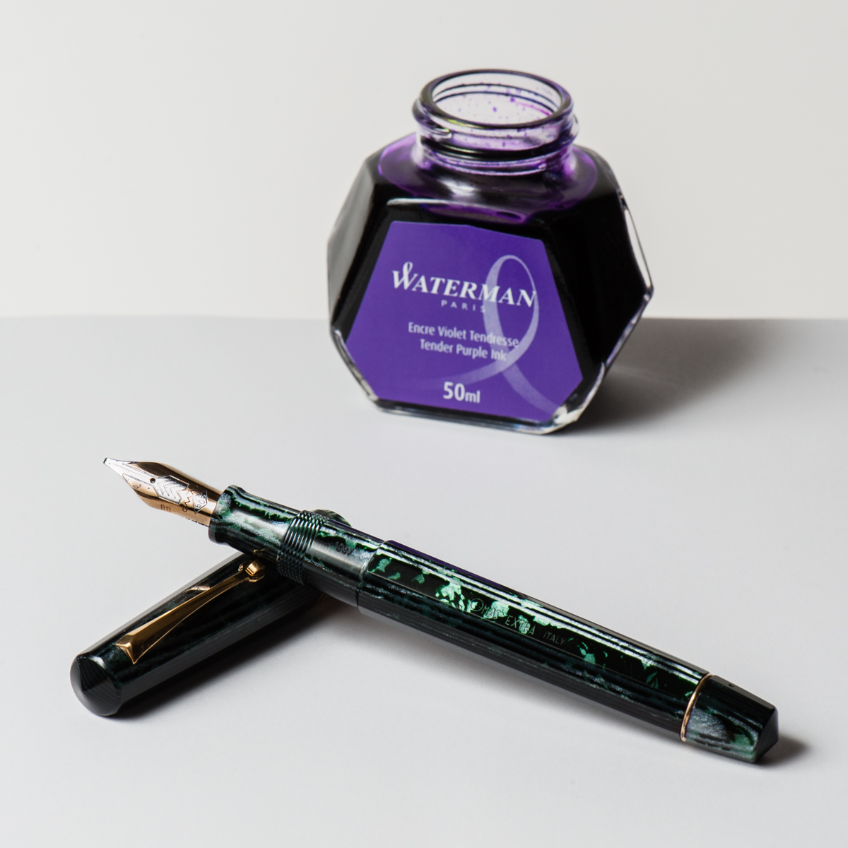
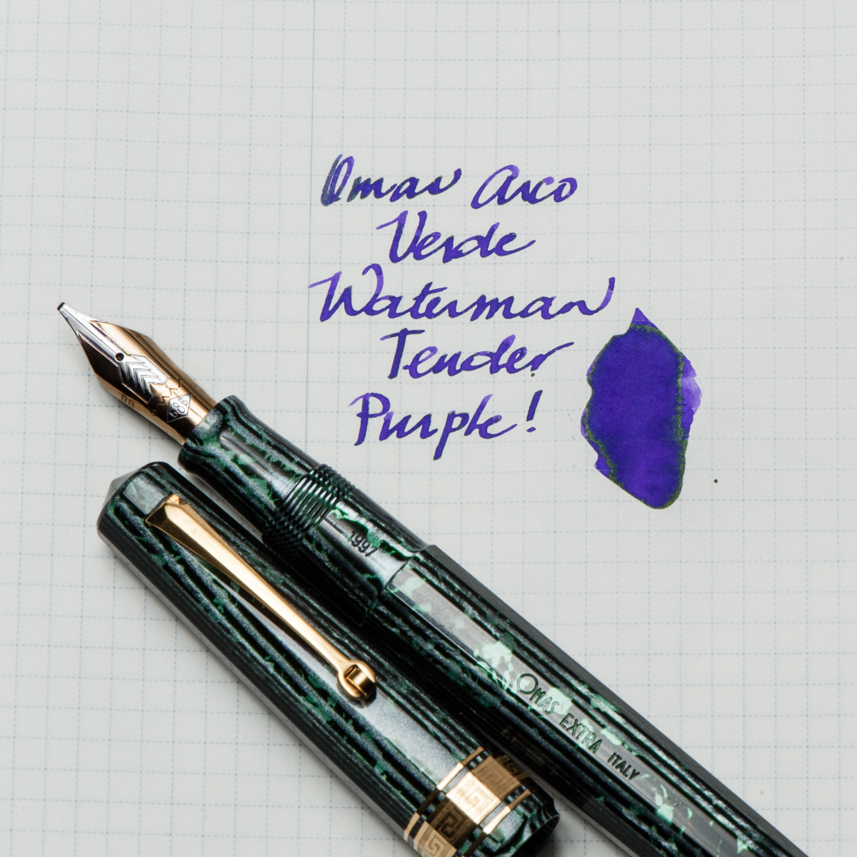
Katherine: This pen was the star of my SF Pen Show 2017 Haul — an “old size” Omas Paragon in Arco Verde. It has a smooth, relatively wet (but not puddle-y!) B CI. The nib is marked BB, but I think it was narrowed a little bit, but is realistically somewhere between a B and a BB, it’s wider than my other Omas B by a hair. I paired it with Waterman Tender Purple for both contrast and how easy to clean it is. The pairing has been very fun for me — a smooth broad CI putting down vivid stokes of purple, with a hint of sheen in the wetter spots. This might end up as a “one true pairing” for me, since I suspect this will be an annoying to clean pen. 🙂
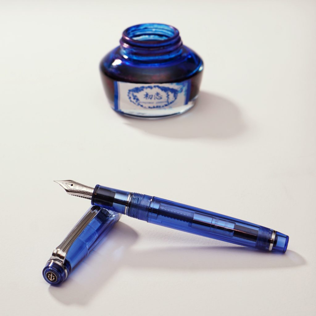
Pam: As a great fan of alliteration, it would only seem appropriate that September would herald in the Sailor Sky with Sapphire ink. The Sailor Sky was my second Sailor Pro Gear Slim. The rest is how we should say, his-ssstory. This pairing is also one my first first “ink will match the pen” type of pairings. (I am working on being more adventurous!) It’s one of my most sustaining pairings!
Sailor Sky is a special edition color, although I don’t think it’s limited. It’s a special edition like the 4 Seasons. (I think.) The barrel color reminds me of a summer sky. I originally paired this pen with Bungbox Omaezaki Sea. However, what really stuck was Bungbox First Love Sapphire, an ink that Franz has introduced me to. To say the least, it was love at first write. I absolutely love the sheen on this ink! It’s a very distinct blue ink with a red sheen that comes through beautifully with the F nib of the Sailor Sky. Some people have compared it to Akkerman’s Shocking Blue. More than anything, I highly recommend trying First Love Sapphire, you might fall for it too.
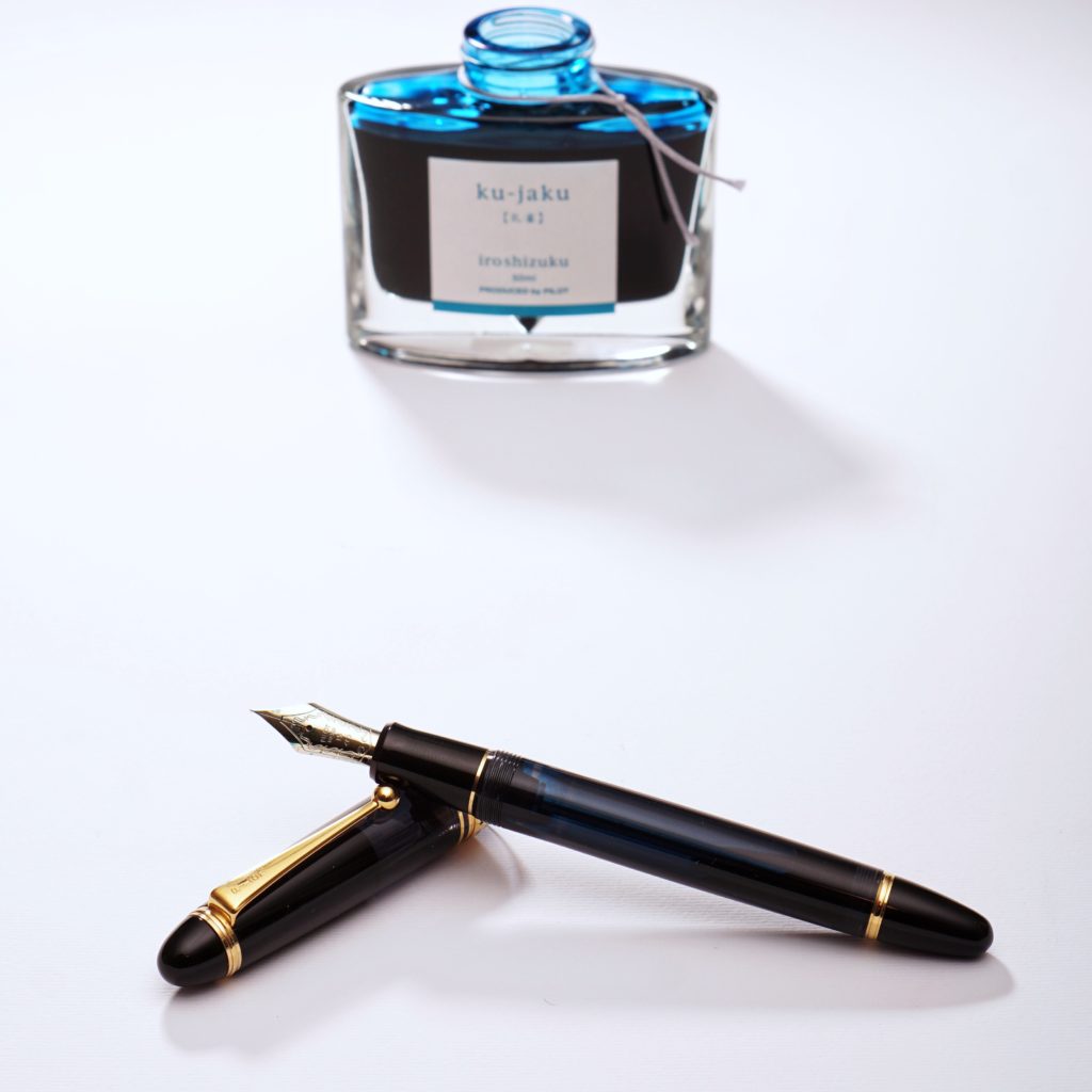
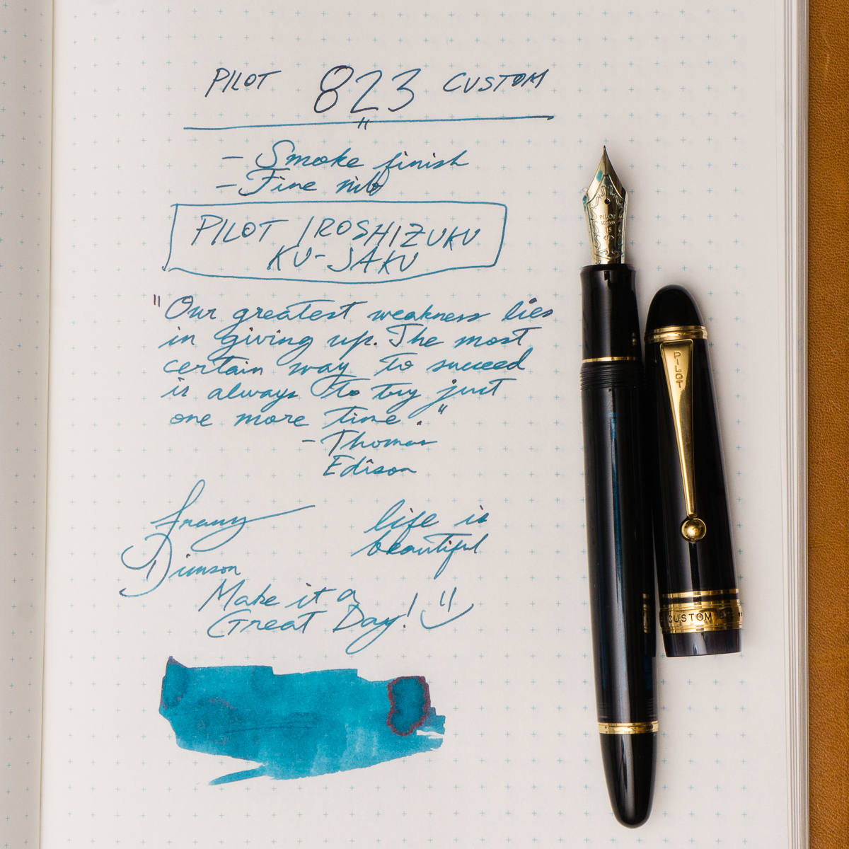
Franz: So for the month of September, my pairing is the Pilot Custom 823 in Smoke or Black Transparent finish and Pilot Iroshizuku Ku-Jaku ink. Ku-Jaku/Peacock is a deep turquoise blue and is such a nice ink color for both work and personal use. The 823 is the first pen I’ve ever inked up with Ku-Jaku. Even though the nib on the 823 is a stock fine, I still appreciate the color it lays down on paper especially on Tomoe River paper in my Nanami Cross Field journal.
The Smoke finish definitely conceals the ink color inside the barrel but you can definitely see the ink level as you write. During meetings in a professional setting, this pen doesn’t call attention to itself but I still enjoy the subtlety of its transparency and places a smile on my face. Now on to trying to remember what that meeting was about.
The San Francisco Pen Show took place from August 25-27. This is the second in a series of recaps. Check out one from my dog’s POV here.
It’s a little funny to go back and see what I thought I wanted to buy as of last, last week… Allegedly an Aurora Novum, but I saw zero of those at the show. Oh well!
All in all though, the show was a huge success for my pen collection, and a moderate injury for my wallet. I stayed under budget, but not by much. To cut to the chase (a little more on workshops and such below), here’s my haul:
SF Show Haul!
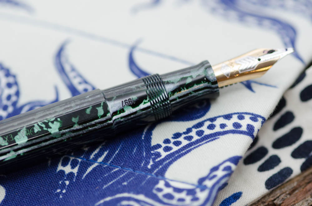
Omas old style Paragon (date stamp ’97) in Arco Verde
Pilot Capless in Black Stripe
E Faber Permapoint in a cool brown striated material w/ yellow trim*
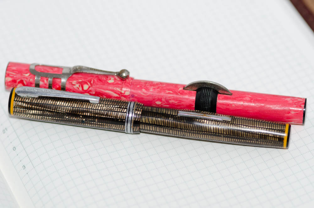
Spors glass nibbed pen in marbled pink
Brute Force Designs small (don’t remember model name) acrylic pen in a marbled brown
Vintage Sailor from the collection of Susan Wirth
Written in Rice octopus 7-pen wrap
Four bottles of Chinese ink: Pen BBS 226 June Pearl, Pen BBS 178 Rose Quartz, Starry Silent Corderite, Students Ink 25 (yellow, no sparkle) [swabs here]
Five grinds: (one each) Masuyama needlepoint, Masuyama formal italic, Dan Smith CI & two Dan Smith sharp-ish stubs
The Omas Arco materials have long been on my wishlist — last year at the show I asked around, but ultimately everything was out of my budget. This year, I found this one at Peyton Street Pens within the first hour or two of the show at a competitive price (and for reference, my budget for an Arco pen wasn’t significantly higher this year than last!). Teri was kind enough to hold it for me while I agonized over the price and dragged various friends back to her table to see it. In the end, I decided I’d regret not jumping on it… and I’m glad I didn’t, it’s a joy to use and to look at.
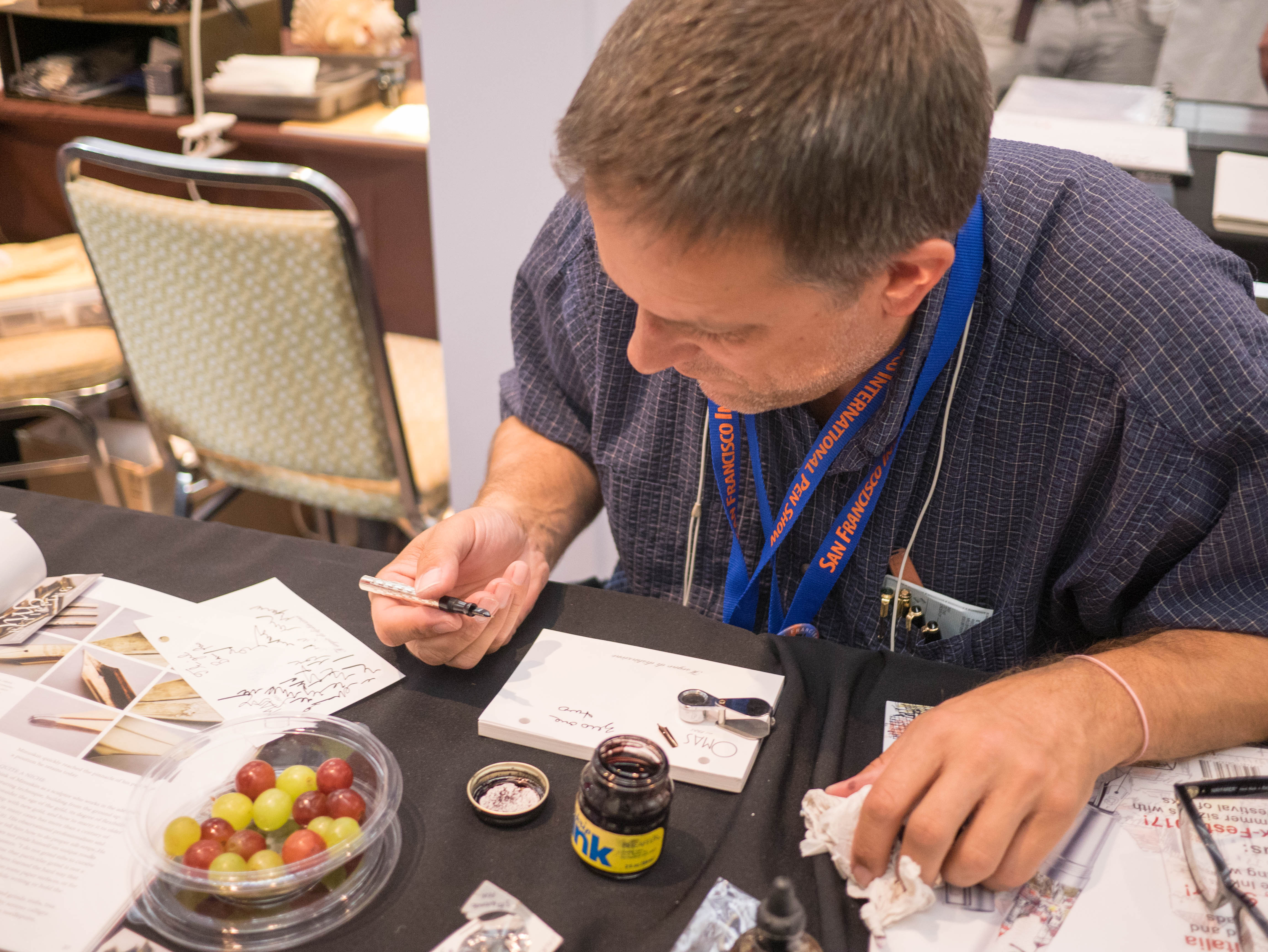
Above are another two pens I picked up on Friday, both from friends. The back pen is from Leigh Reyes, a glass-nibbed Spors pen from wartime Japan. Yep, that crazy material is vintage. The front pen is a E Faber “Permapoint”, from a fellow SF Pen Posse member and SF Show dealer, Gary Naka. It’s a pen I’ve been eyeing for months, and he finally restored it and was willing to part with it — yay! I love the unique finishes on both pens, vintage pens are so cool. I also had the brown pen ground to a fine CI by Dan Smith, so in addition to being cool looking, it’s quite fun to write with.
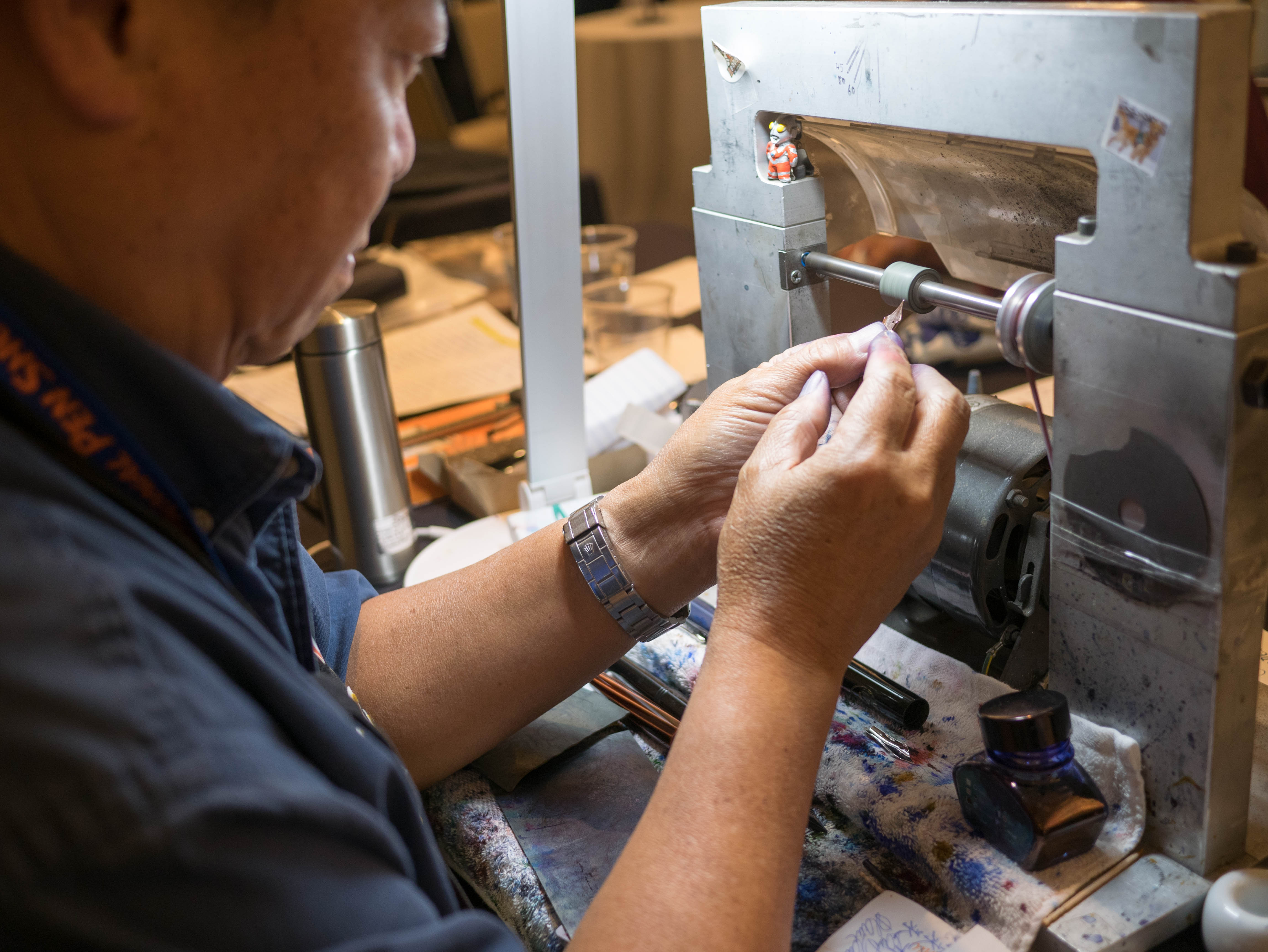
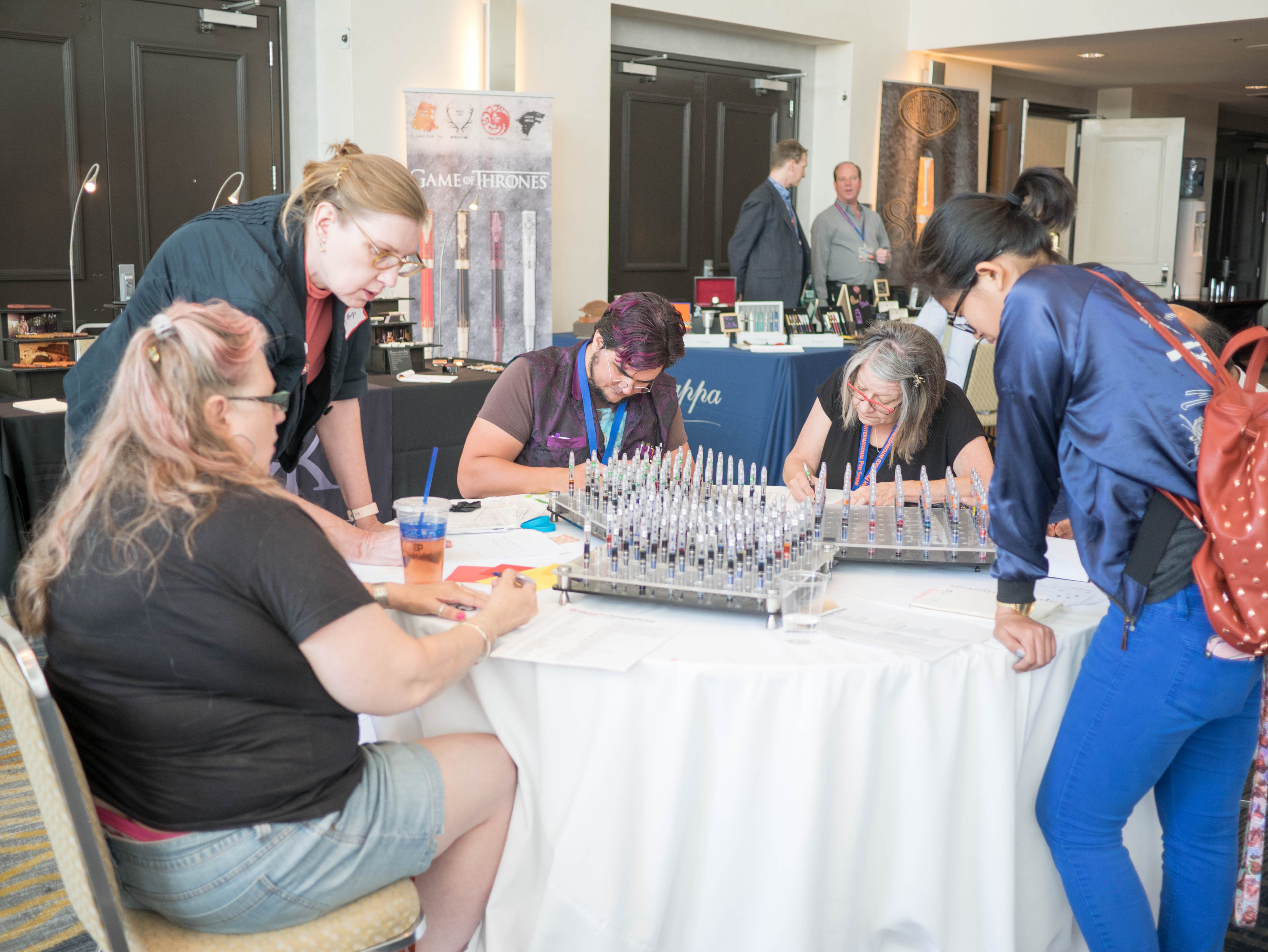
This show was also the first time I worked one-on-one with a nibmeister, and I was lucky enough to work with both Dan Smith (above) and Mike Masuyama (below). They have very different styles of working (see their different set ups), but both produced great nibs for me!
The grind I was most nervous about and most excited about was a formal italic on my Nakaya Decapod Twist, medium nib. I tried a friend’s formal italic several months ago and loved it — but they are notoriously sharp, and most people were surprised I wanted one, including Masuyama himself. I’ve had a few days with the nib now, and I really enjoy writing with it. Yes, it’s sharp — but I haven’t caught paper with it and writing with it feels… like it will keep me awake? I don’t know how to describe it, but it’s fantastic.
This year the show featured some new inks in the ink testing stations, and even a new model of ink testing stations for shimmer inks (though I failed to capture a picture). I didn’t spend much time with the ink testing stations this year, but they were consistently quite popular!
Loot and new shiny pens aside, the show has always been a place for friends new and old to connect and discuss a shared passion. This year I met many people I’d talked to online for the first time, which is always a little strange for me (I’m kind of awkward :P) but was overall a great experience. I also like to think I did a good job of introducing folks to each other — in the picture above, Todd (one of the show organizers, a local Pen Posse regular, also known as farmboy on FPN) helps a friend replace a broken nib, on the spot, no tools needed other than a shred of paper towel. He’s super cool like that.
No show would be complete without classes, seminars and meet ups! This year Pam and I hosted a repeat of the Planner Meet-up, which I thought went very well — we met ladies (why are there no men who show up?) from around California and shared washi tape, planner layouts and took a look at different brands and designs. I also attended Leigh’s workshop on Creative Uses of Fountain Pen Ink (picture above) where she shared some of her tips and techniques for “making a mess” and getting artistic with materials one already has… not that I really needed more help making a giant mess. And lastly, I attended the Hanko Making class lead by Rui Saito, who wrote part of my Chinese name for me in her beautiful calligraphy.
There will be many more pictures to come of the pens and inks I picked up, and maybe a little bit of house cleaning to help my wallet recover… But in the meantime, thank you so much to everyone who came to the show and said hi! And to those who I haven’t met, I hope to meet you at a future show! Sometimes I loathe to admit it, but this hobby is great because of the social aspect — sharing a love of shiny objects (and journaling, plannering and making ink blobs) while spending uncomfortable gobs of money. What else could a girl ask for?
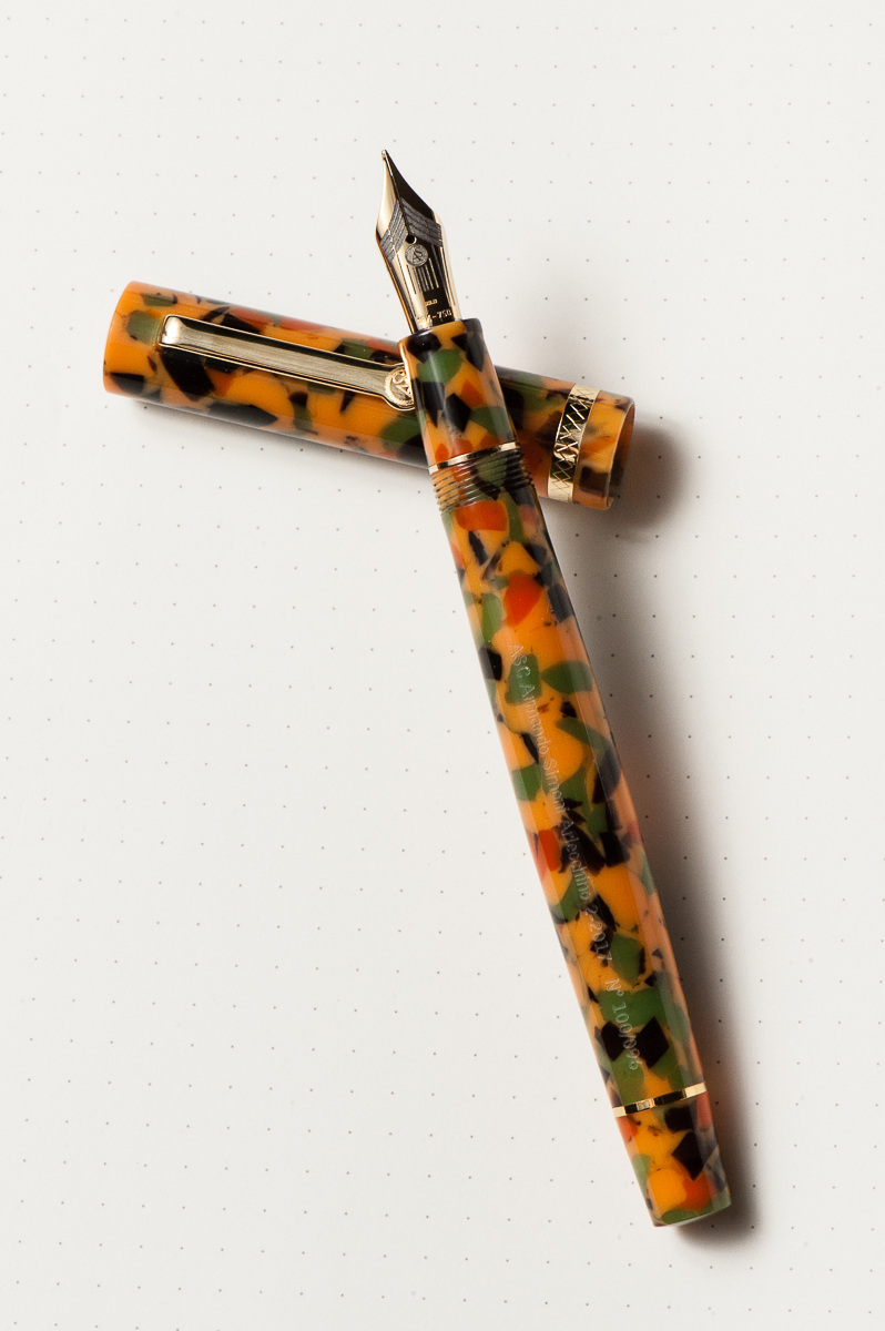
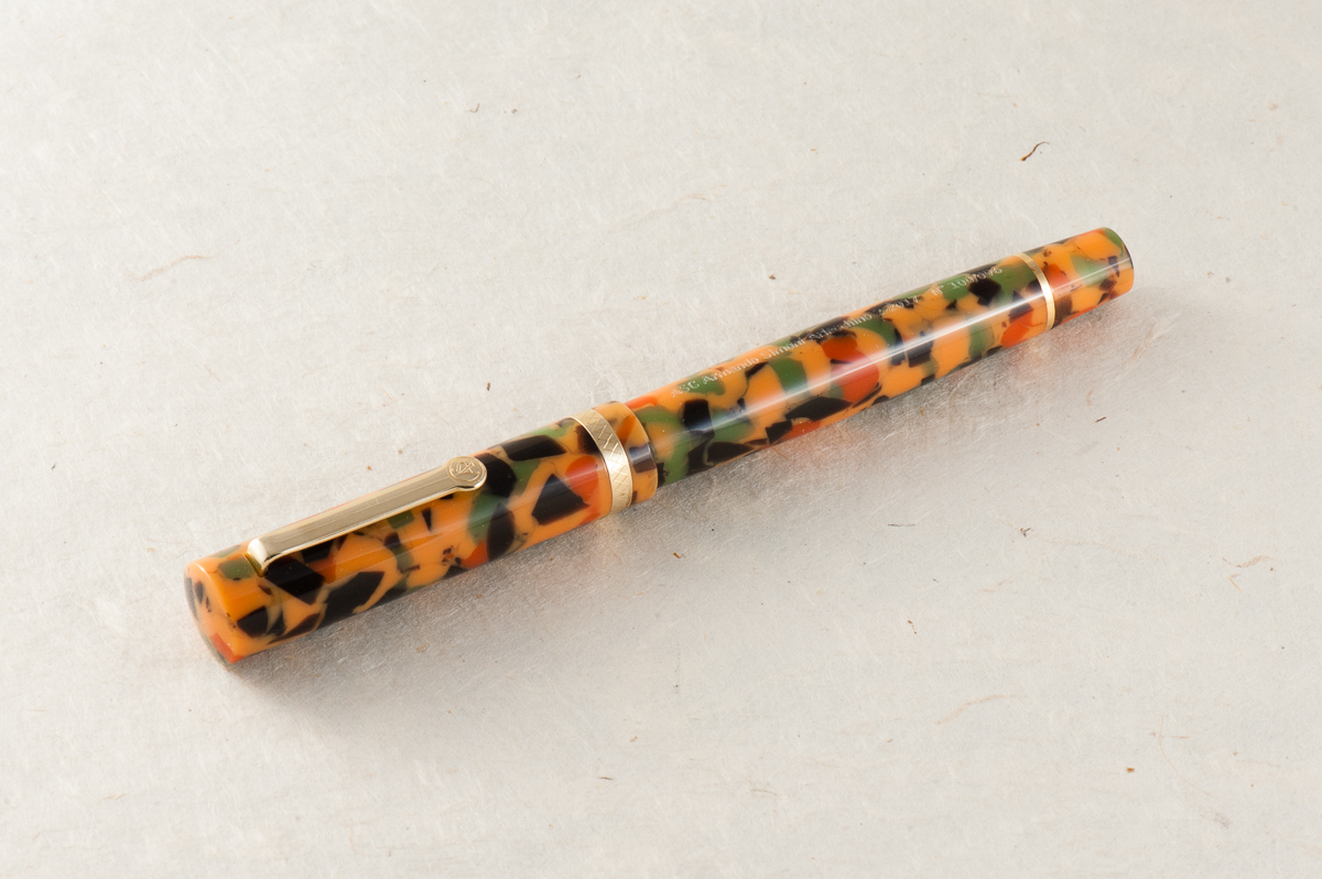
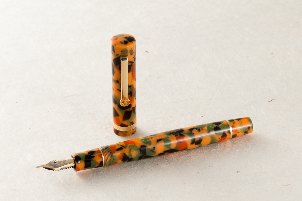
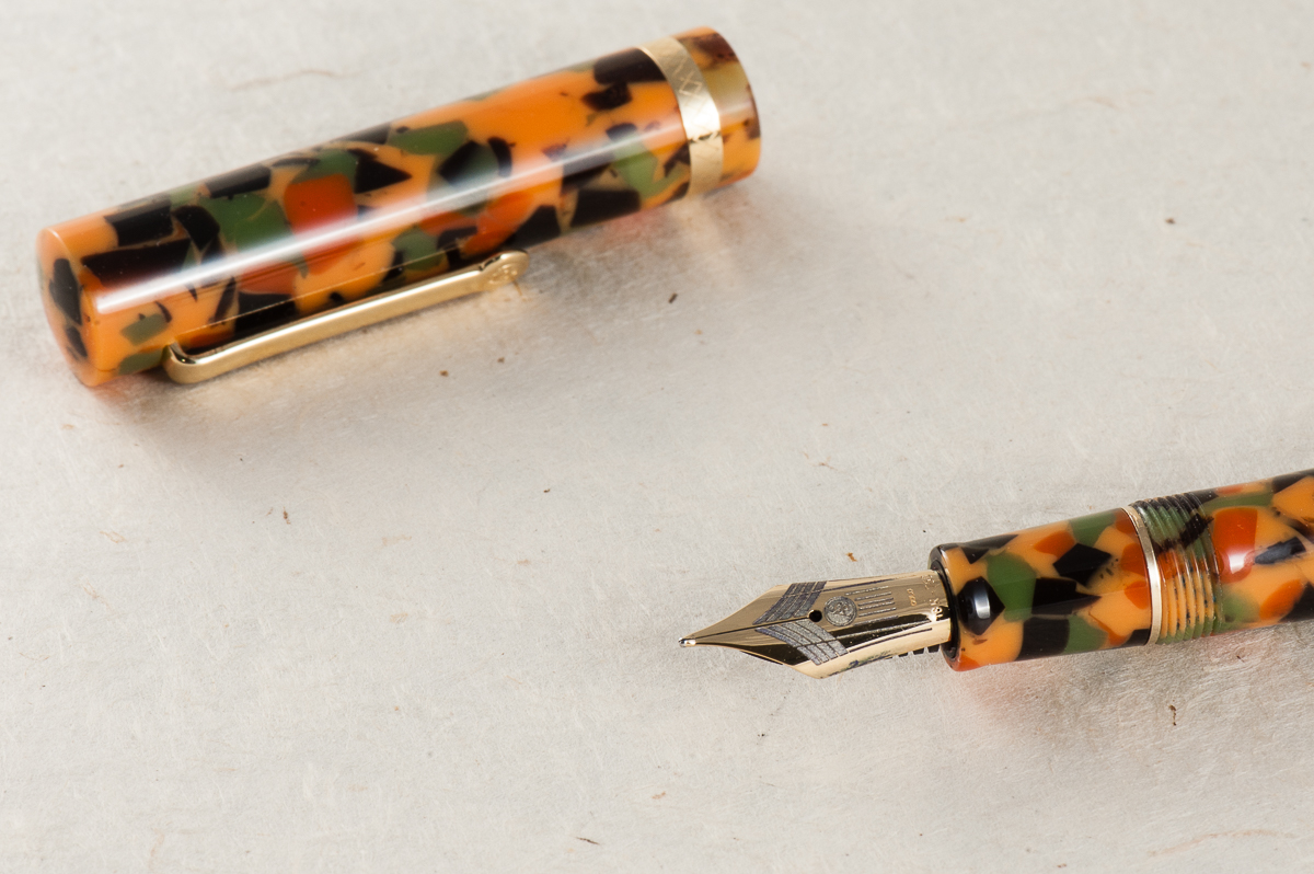
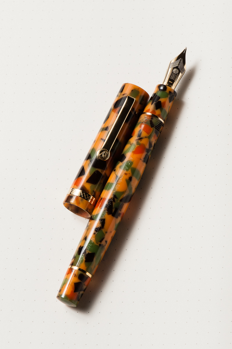
Once again, we’d like to thank Mr. Detlef Bittner of Bittner Pens for lending us this ASC Pens Arlecchino 2 fountain pen for review. His family pen store is located in the beautiful town of Carmel, California, and is well known in the pen shows in the United States.
The opinions here are our own and we were not compensated (monetarily, or otherwise) for this review.
Hand Over That Pen, please!
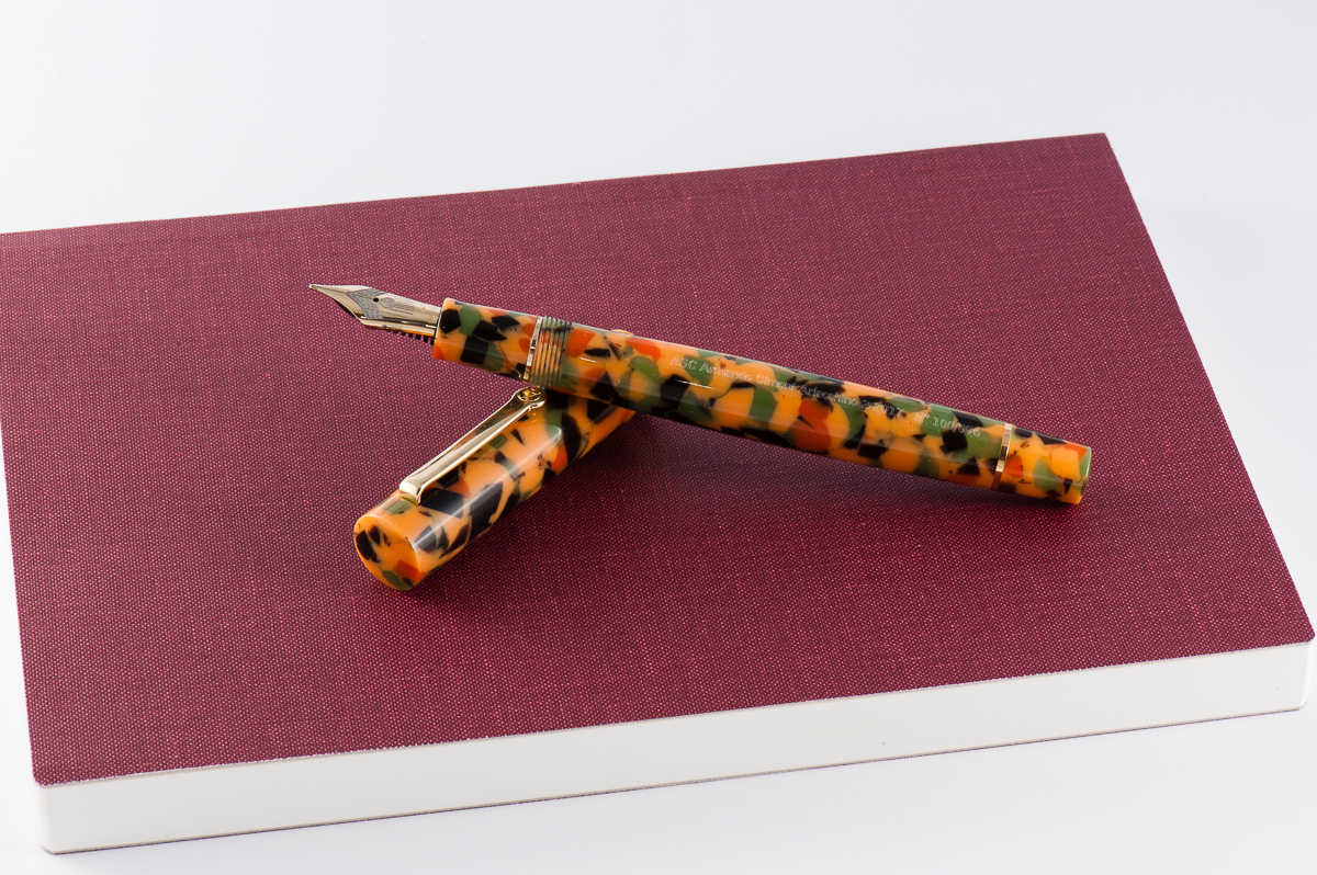
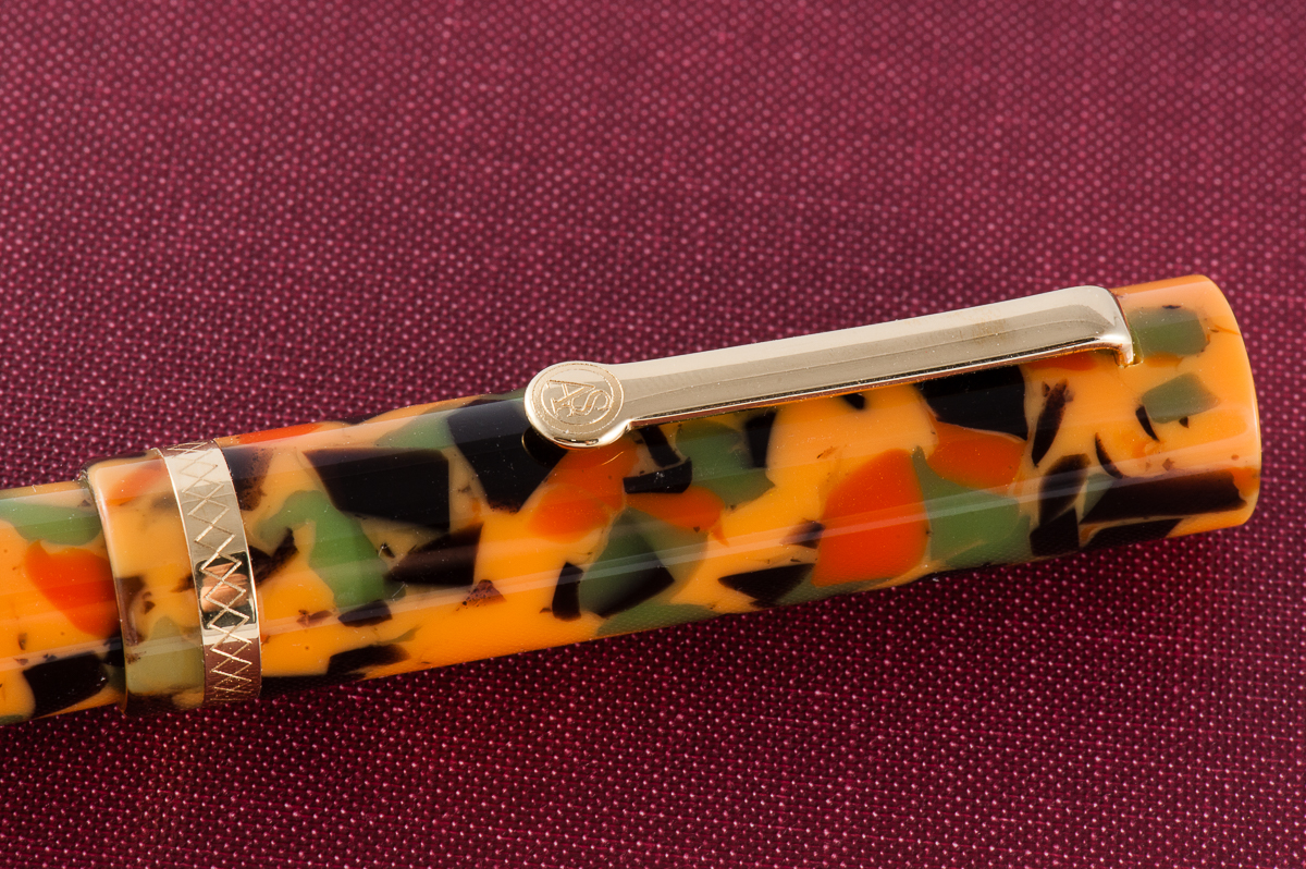
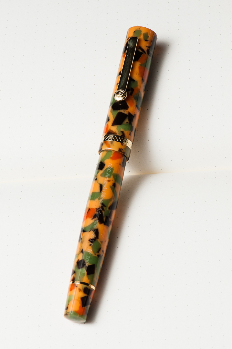
Pam: The pen is a pretty and appealing shape. The material however is quite busy. For someone who really enjoys a lot of monochromatic pens, this is a bit of a shock to the system. The material is unique, and unorthodox in a pen. In summary, the shape and silhouette of the pen is wonderful, but the material is an acquired taste.
Katherine: I think the star of this pen is the Omas Arlecchino material. However, it’s just not my thing. It reminds me of pumpkin soup. Or the Filipino dessert commonly called “cathedral windows“. Or fall leaves that are turning. Anyway, reminds me a lot of things, mostly makes me hungry… but just isn’t my thing on a pen.
Claire: I really fell hard for this pen in the short time I had to write with it. I was quite surprised since this isn’t the sort of pen I would normally even bother to try. The barrel is a lot longer than what I normally find comfortable. I do find the material to be a bit busy for my taste but other than that I like the shape of this pen.
Franz: I first saw the ASC Arlecchino 2 pen at the 2017 LA Pen Show when a friend from the San Francisco Bay Pen Posse bought one and I was immediately intrigued with the unique finish of the pen. Actually, I’m loving the design of the pen and the celluloid material.
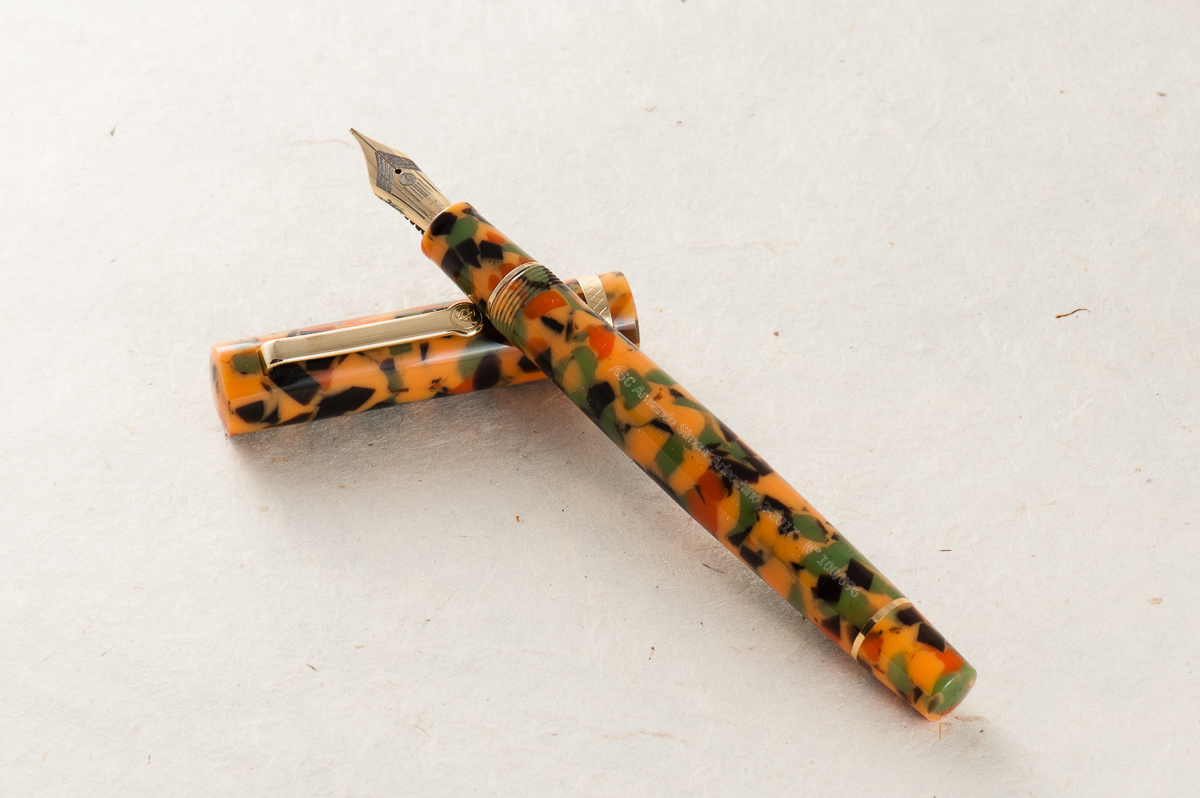
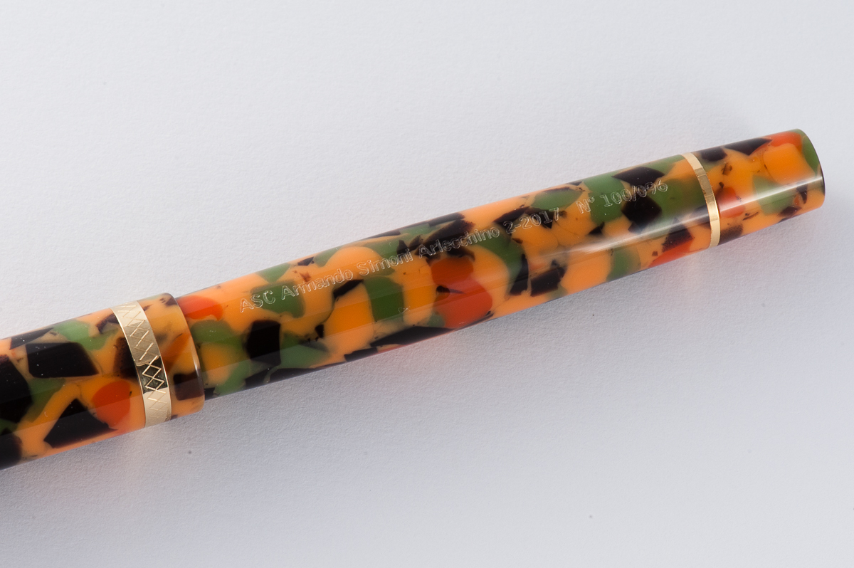
This material was part of the Omas stock bought by ASC Pens when the Omas Pen Company sadly shut down in 2016. According to ASC pens, they acquired just enough of this rod stock to create a limited edition of 100 pens to pay homage to the original pen called, the Arlecchino (Italian for harlequin).
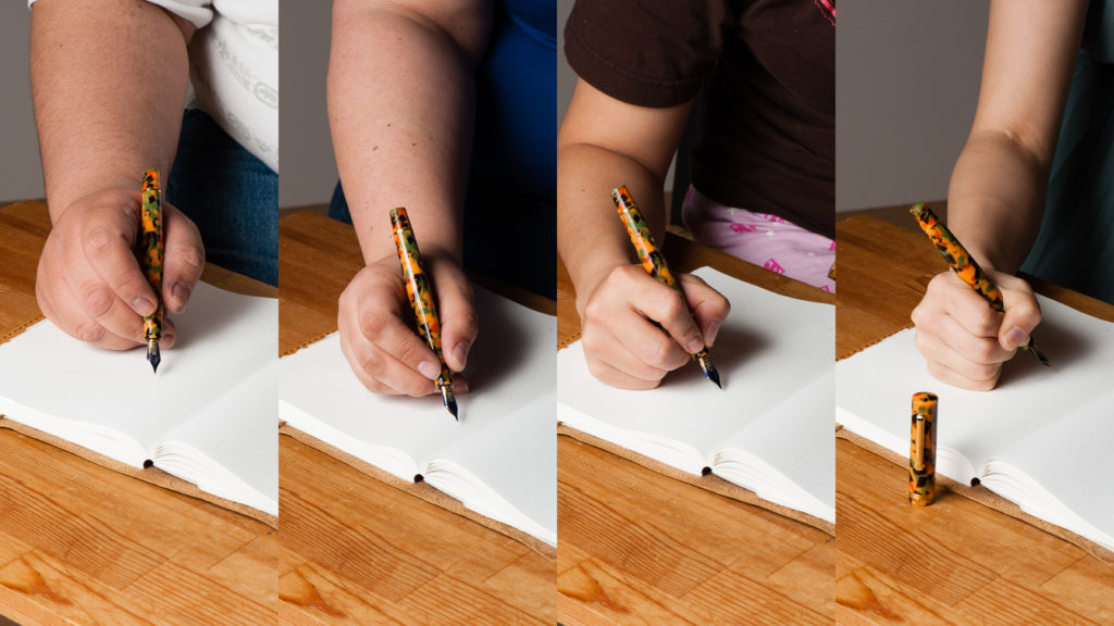
In the Hand: ASC Arlecchino 2 (posted) — from left to right: Franz, Claire, Katherine, and PamIn the Hand: ASC Arlecchino 2 (unposted) — from left to right: Franz, Claire, Katherine, and Pam
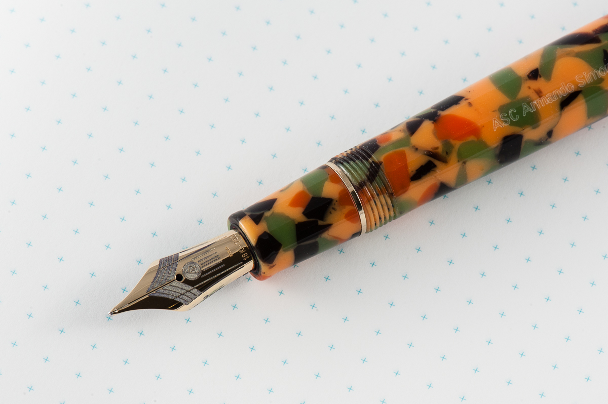
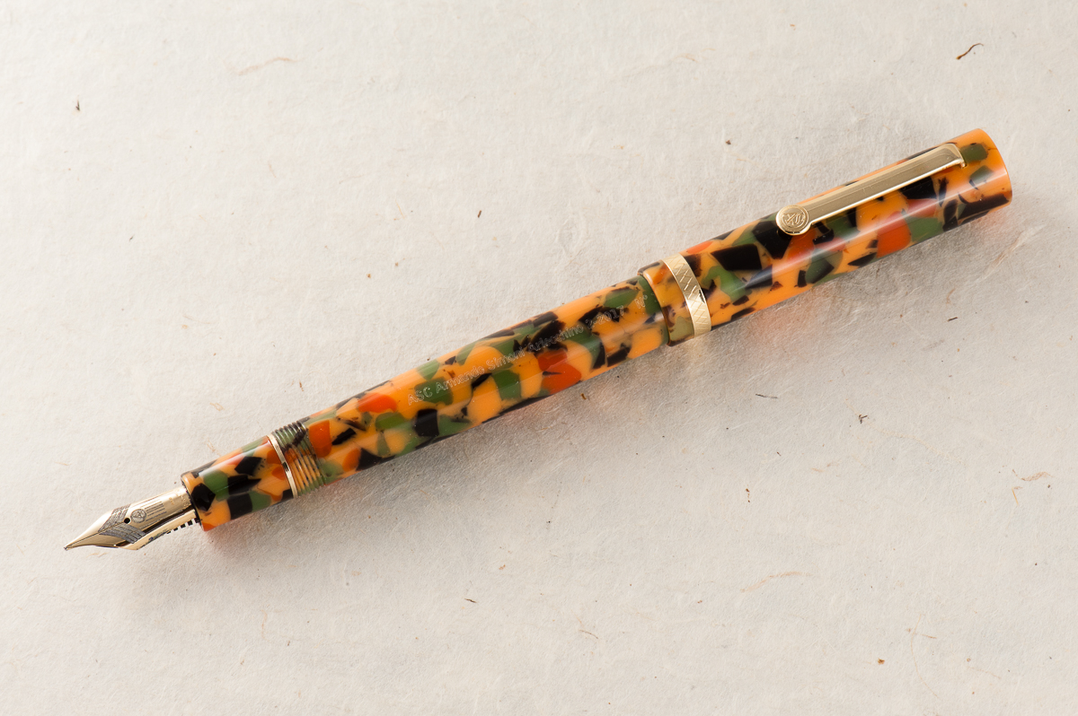
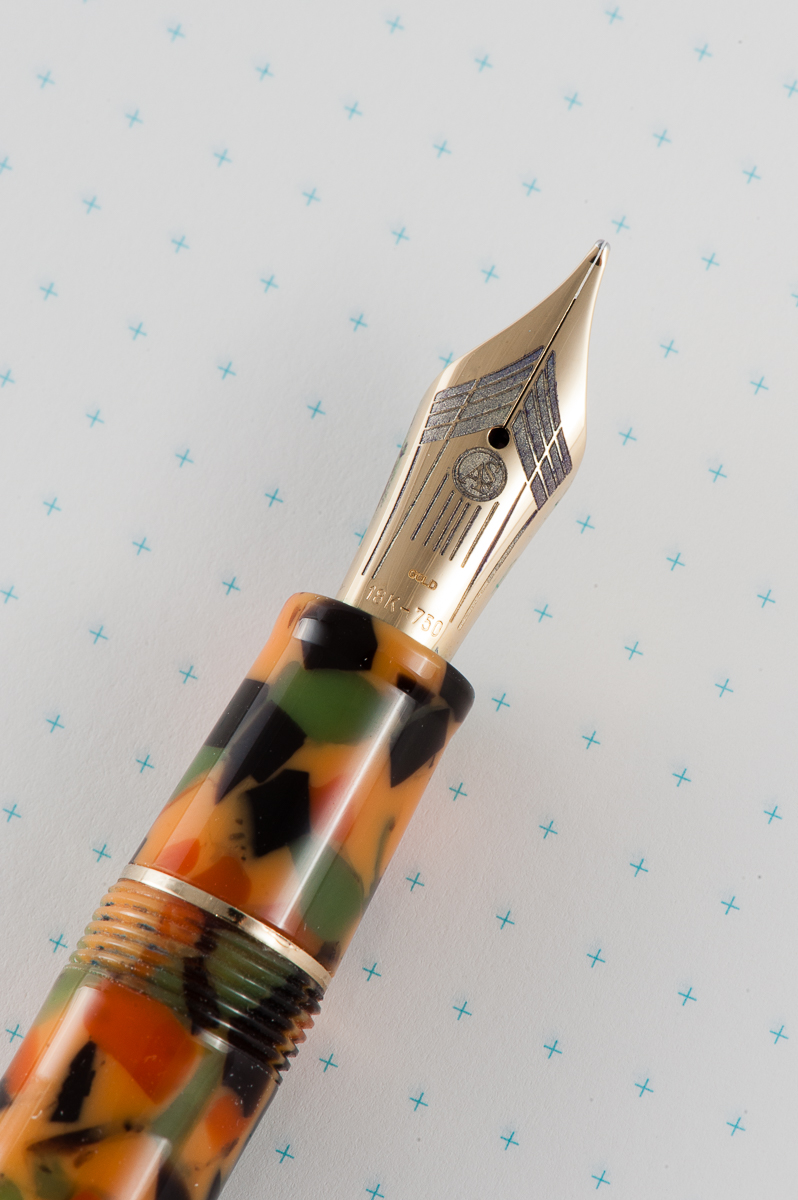
The Business End
Pam: The nib itself is a great writer and performs well, as expected. The nib was very enjoyable as a writing experience. I did find the nib to be springy in the perfect Goldilocks kind of way.
Katherine: The nib on this pen is… okay. It’s a perfectly comfortable and usable writer, but it didn’t feel unique in any way, nor did it have much character to me. But, if you told me this was the only nib I could use for the rest of my life, I’d be a little annoyed, but I’d be okay with it. It’s inoffensive. (A glowing review, I know.)
Claire: I loved the feel of the nib and the overall writing experience of the pen was pleasant. The nib has a bit of bounce without being so soft or mushy. It’s not what I would reach for as a workhorse nib, but it’s great for a little extra pizzazz.
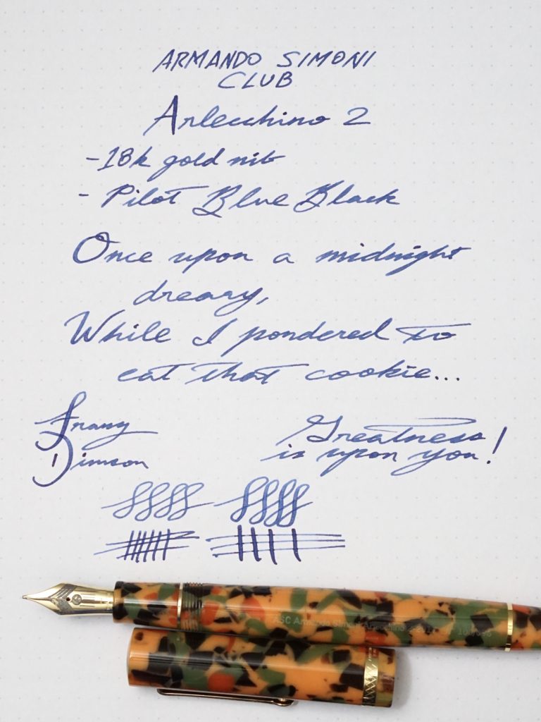
Franz: The Magic Flex nib is such a smooth writer and is quite springy which gives my writing some flair! The black ebonite feed kept up with my writing even when I flexed it a little.
Franz’ writing sample on Rhodia Dot Grid paper
Write It Up
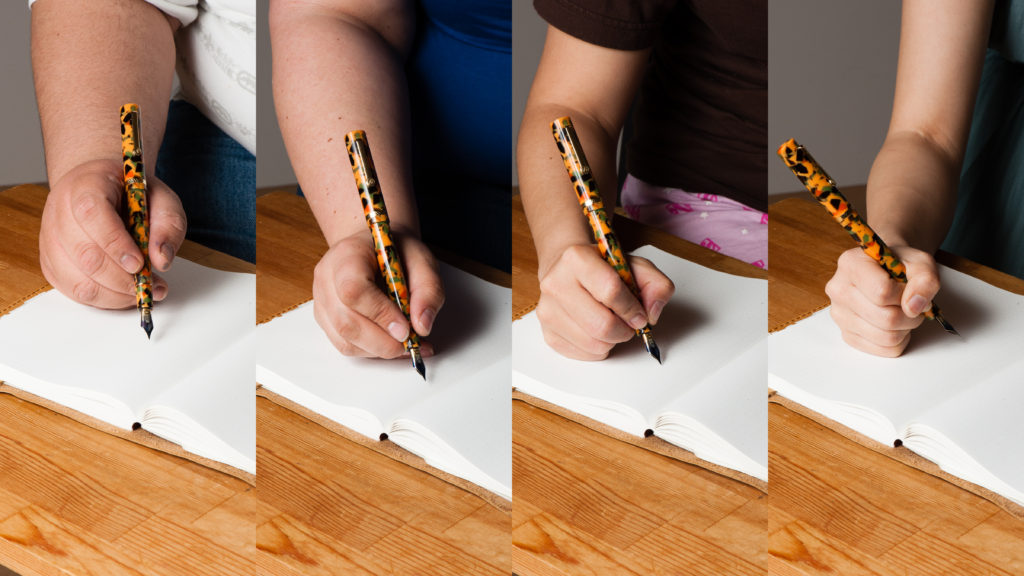
Pam: The shape and size of the pen lends to great comfort for extended writing. Honestly, maybe it was the nib, or the light weight of the pen, but the pen didn’t leave an impression for me. It was a comfortable, well balanced pen, but no more, no less for me.
Katherine: This pen was pretty comfortable in the hand for a long period of time. The gentle taper of the body makes it a little more interesting than what I envision a “generic” pen to look like. This also (I think) makes it a better balanced pen.
Claire: I had trouble putting this pen down when writing with this pen. I was more than a little disappointed when I had to let Pam, Katherine and Franz have a chance to give it a spin. This pen is not like any of the pens in my collection and really was a lot of fun to write with. I had no trouble writing with this pen for pages on end. There was no trace of hand fatigue or pain even after a few pages.
Franz: I really enjoyed writing with the Arlecchino 2 as it is light and well balanced when unposted. Writing with the cap posted made it a little too lengthy and I found it unbalanced. (Yes. Shocking, I know!) My only small wish is for the section/barrel to be just a hair thicker to be perfect for my bear paw. But that’s just me.
Arlecchino 2 on top of a Seven Seas Crossfield A5 journal notebook
EDC-ness
Pam: This pen would be quite a show stopper in any pocket or as a notebook companion with the colorful material and sweet nib. The clip seems sturdy enough to be kept in shirt pockets.
Katherine: This was another loan from Bittner Pens — so once again, no real EDC usage. But, it seemed well made, and could hold up to every day use. It’s a solid pen that is a comfortable size both to use and to tuck into a pocket or notebook. And the clip feels solid enough to keep it firmly attached to a shirt pocket, if I had shirt pockets.
Claire: I didn’t have a chance to carry this pen with me for a few day, but I can see this being a daily writer in my arsenal. The diameter of the pen is just about perfect for long writing sessions which is ideal for me.
Franz: I was not able to fill this pen with ink and use at my workplace so no real world EDC report. But it’s important to note that it is piston-filled for a nice ink capacity, and the Arlecchino 2 is ready to write with just one twist of the cap.
And I believe my co-workers will see the colorful material and say, “What kinda pen is that?!”.
Final Grip-ping Impressions
Pam: I very much appreciate the beauty of the pen and reliable writing experience. That said, I can’t recommend this pen due to the price tag. Particularly for a pen that didn’t actually leave an impression with me. I prefer the writing experience of a Pelikan (ahem, Franz-fluence). The material is the only compelling reason to buy the pen for me. Luckily for my wallet, the material isn’t my style.
Katherine: This pen was perfectly usable — decent nib, good size, and comfortable in hand. However, it didn’t shine in any way for me. It was an okay, inoffensive pen, body material aside. In another material, it’s a pen I wouldn’t mind owning, but isn’t high on my list of must-acquire pens. In the Arlecchino material… I’d rather have a bowl of pumpkin soup. Maybe with some chives and a pinch of paprika to round out the colors.
Claire: Overall, I really like this pen. the only gripe I have with this pen is that the inside of the cap was not polished. For a pen at this price range, it seems a little bit sloppy to me. Other than this pen is lovely, though I wouldn’t feel comfortable paying MSRP on this pen. This brand has access to some of the hottest materials, and they are charging for those materials.
Franz: I love this pen! I love its shape, its material finish, its springy nib, and the history that it represents. However, I just can’t love its price tag. Yes. I know that it’s a limited edition of 100 pens, it’s celluloid, it’s a “flexy” nib, etc. Believe me, I understand why it costs the way it costs and also please know the fact that I “want” it. But my heart and mind says, “Hold on, not yet.” Perhaps it’s because I have a few other pens that I also want that has a lower price tag? I know that someday I’ll own the Arlecchino 2, but not yet.
If you want this LE pen and have no qualms about the price, grab it while it’s available. Reach out to Detlef of Bittner Pens.
Thank you for letting us review the Arlecchino 2 Detlef!
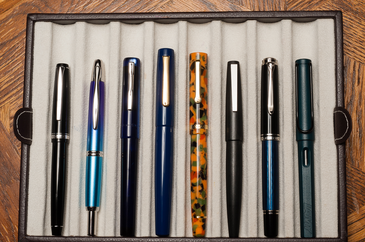
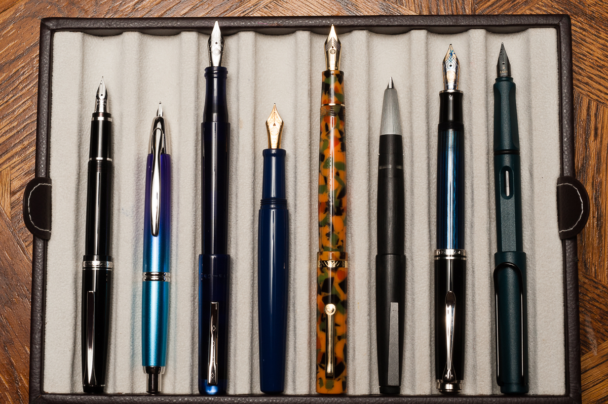
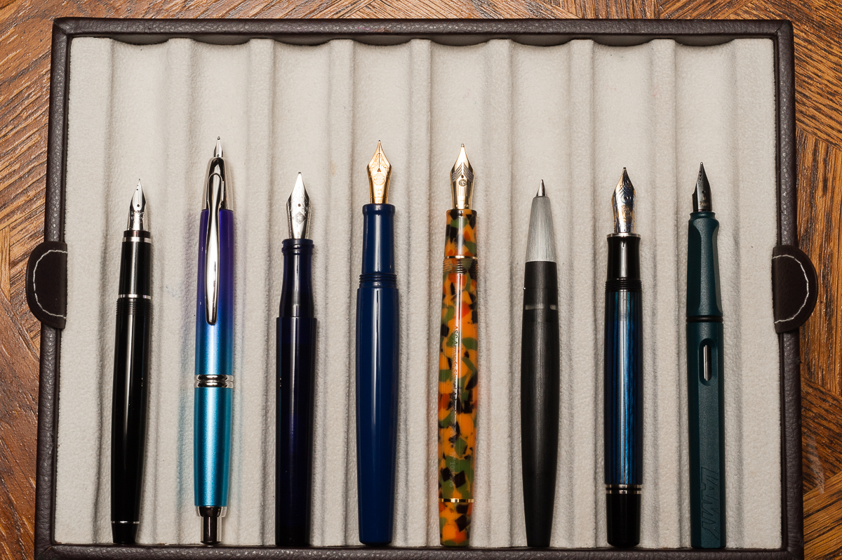
Pen Comparisons
Closed pens from left to right: Pilot Falcon, Pilot Vanishing Point, Franklin-Christoph Model 03, Nakaya Neo Standard, *ASC Arlecchino 2*, Lamy 2000, Pelikan M805, and Lamy SafariPosted pens from left to right: Pilot Falcon, Pilot Vanishing Point, Franklin-Christoph Model 03, Nakaya Neo Standard, *ASC Arlecchino 2*, Lamy 2000, Pelikan M805, and Lamy SafariUnposted pens from left to right: Pilot Falcon, Pilot Vanishing Point, Franklin-Christoph Model 03, Nakaya Neo Standard, *ASC Arlecchino 2*, Lamy 2000, Pelikan M805, and Lamy Safari