We thank Lisa and Mike Vanness of Vanness Incorporated for lending us this Benu Pen Essence fountain pen for review. The Vanness family has had a pen shop in Little Rock, Arkansas since 1938 and is celebrating 80 years of being in business. Check their store out if you can or they could also be attending a pen show near you.
The opinions in this review are always our own and we were not compensated (monetarily or otherwise) for this review.
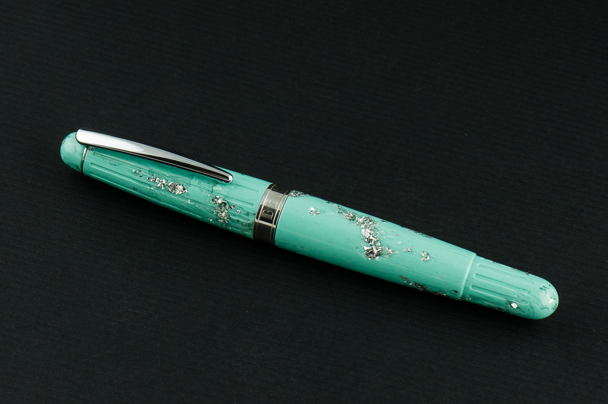
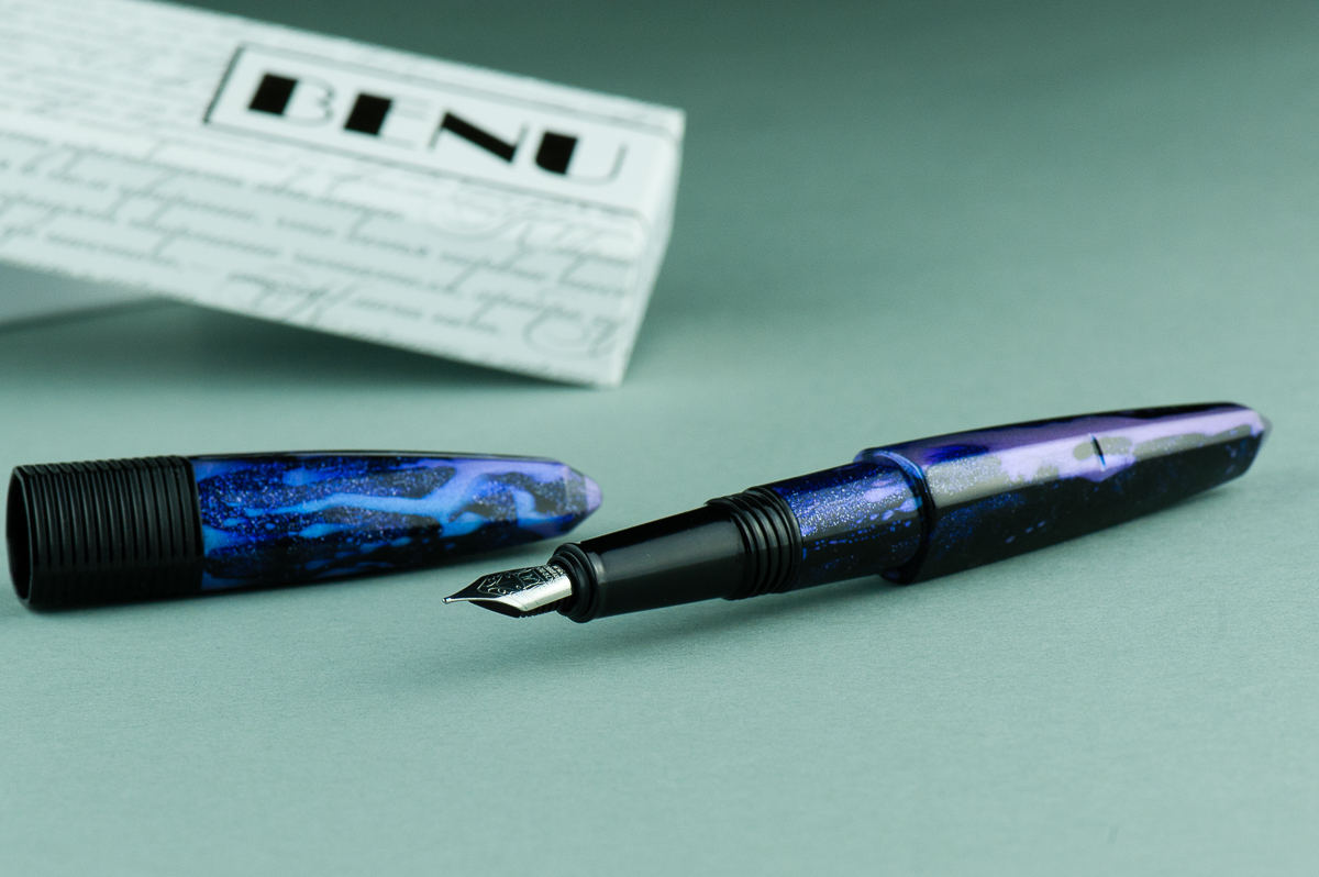
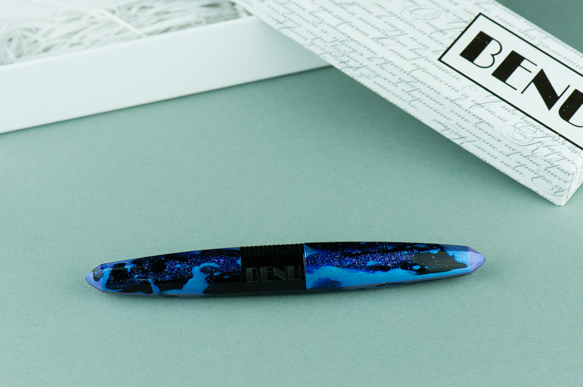
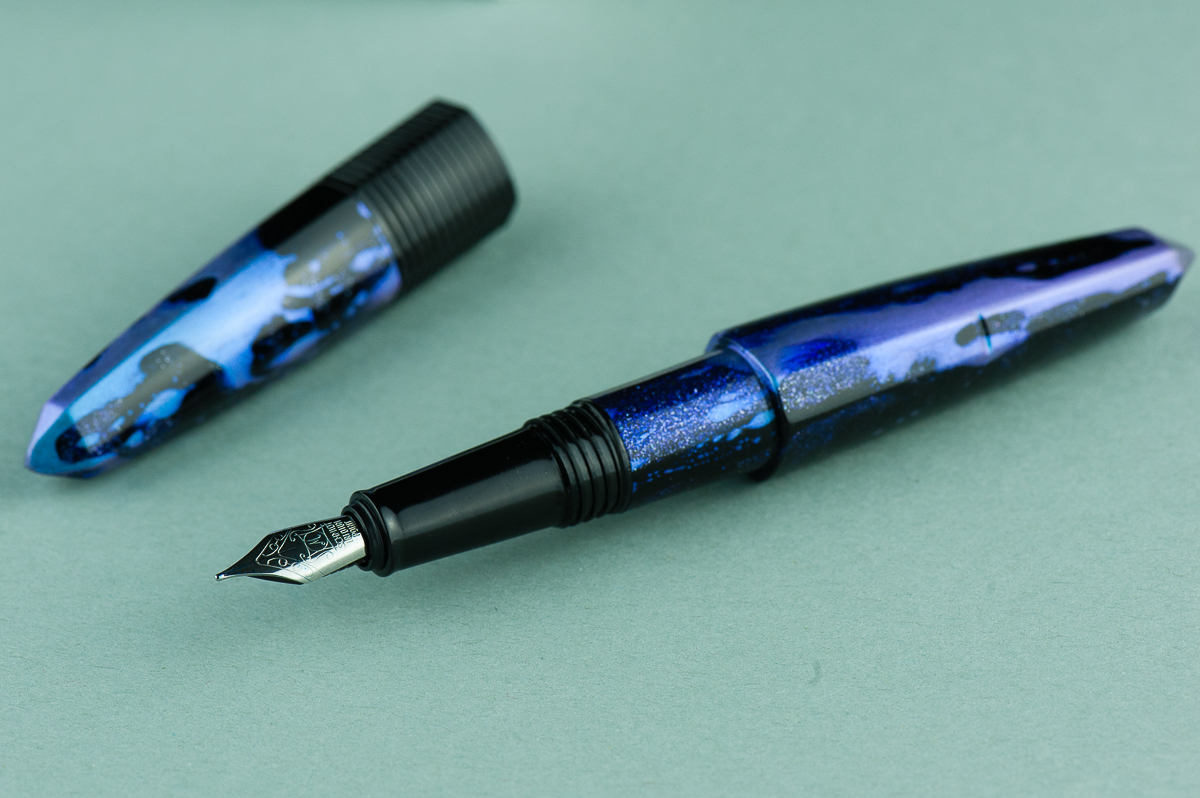
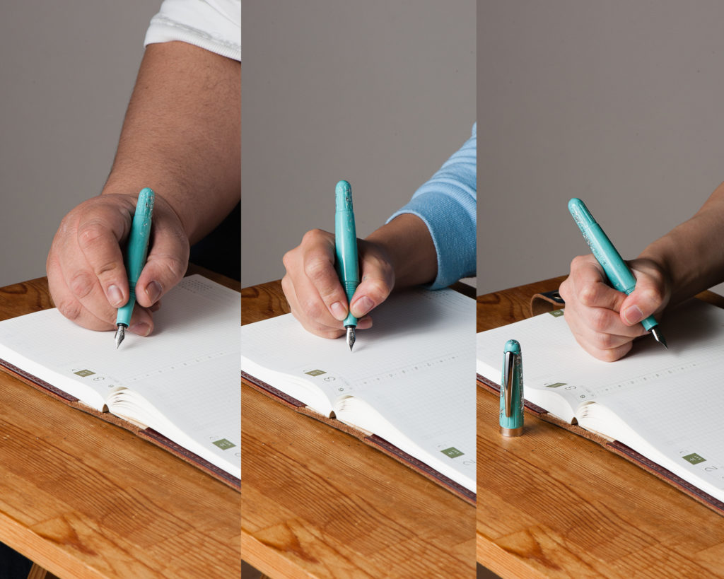
Hand Over That Pen, please!
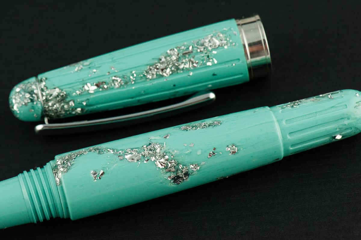
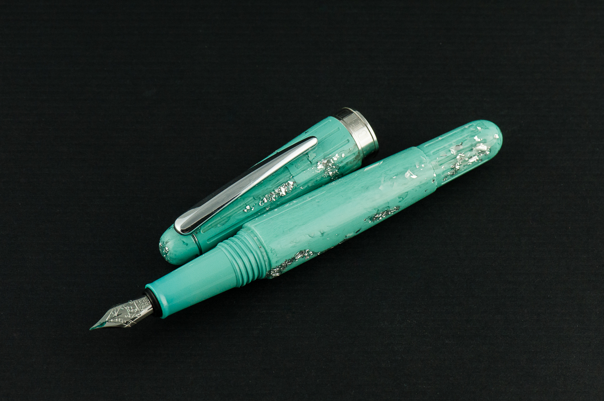
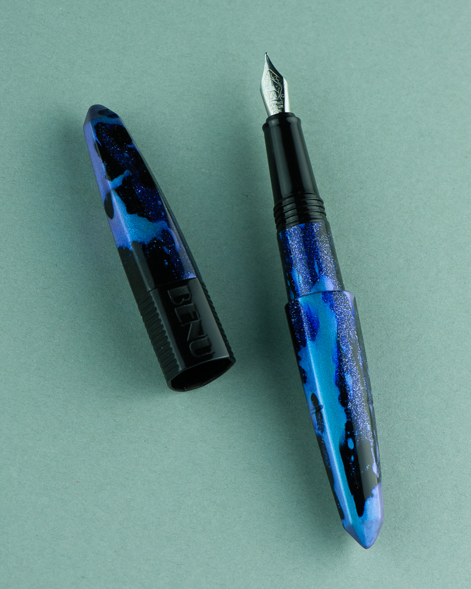
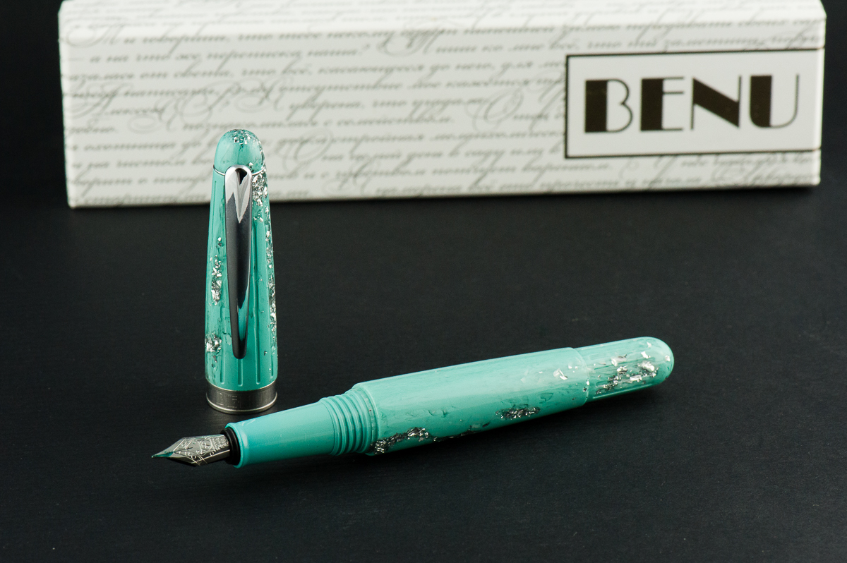
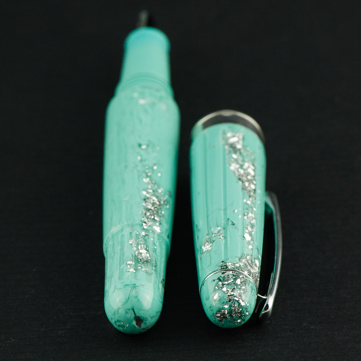
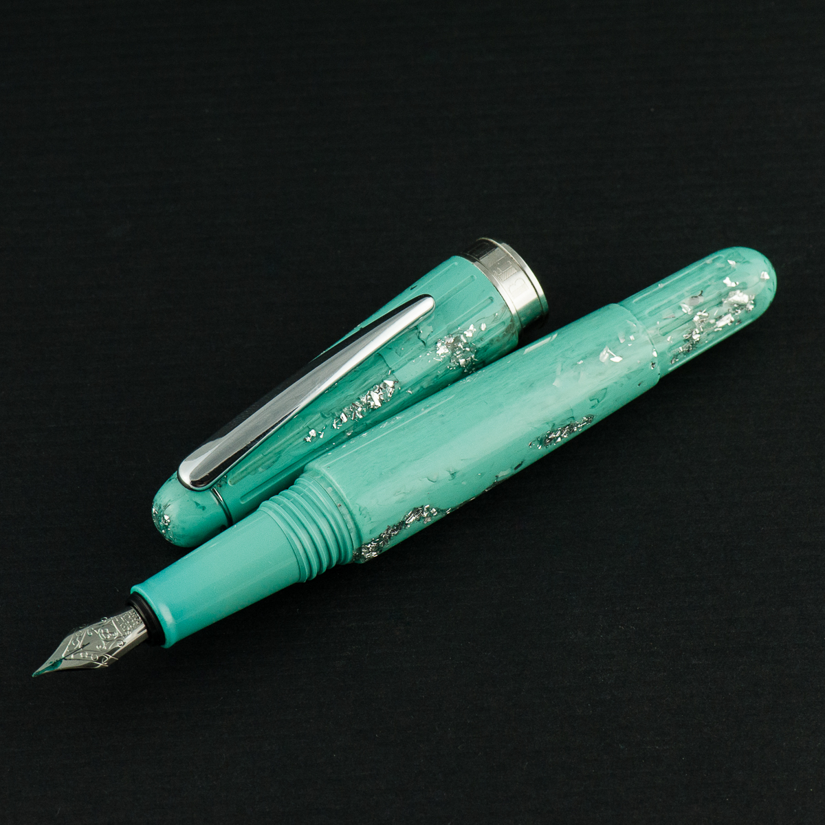
Katherine: Aesthetically, this pen is not my jam… but I do know some people who love it. So, to each their own. But, robin’s egg blue and glitter aside — it’s a well finished pen that feels sturdy in hand.
Pam: This pen is “rich” in decor and chunks of glitter which borders on obscene in my more minimalist preferences/opinions. However, to those who find this aesthetic pleasing, it is definitely an eye catching and bold pen.
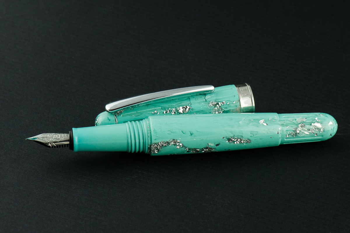
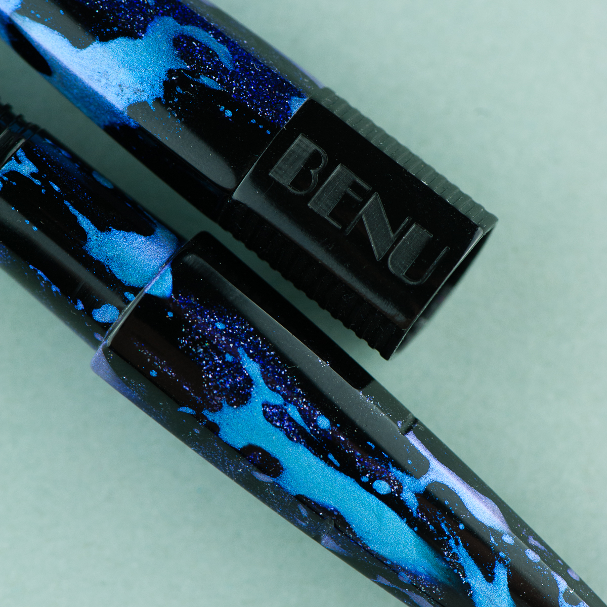
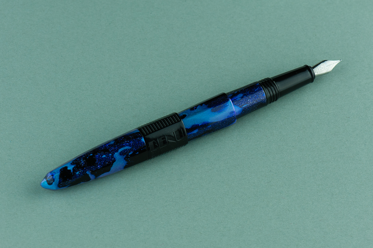
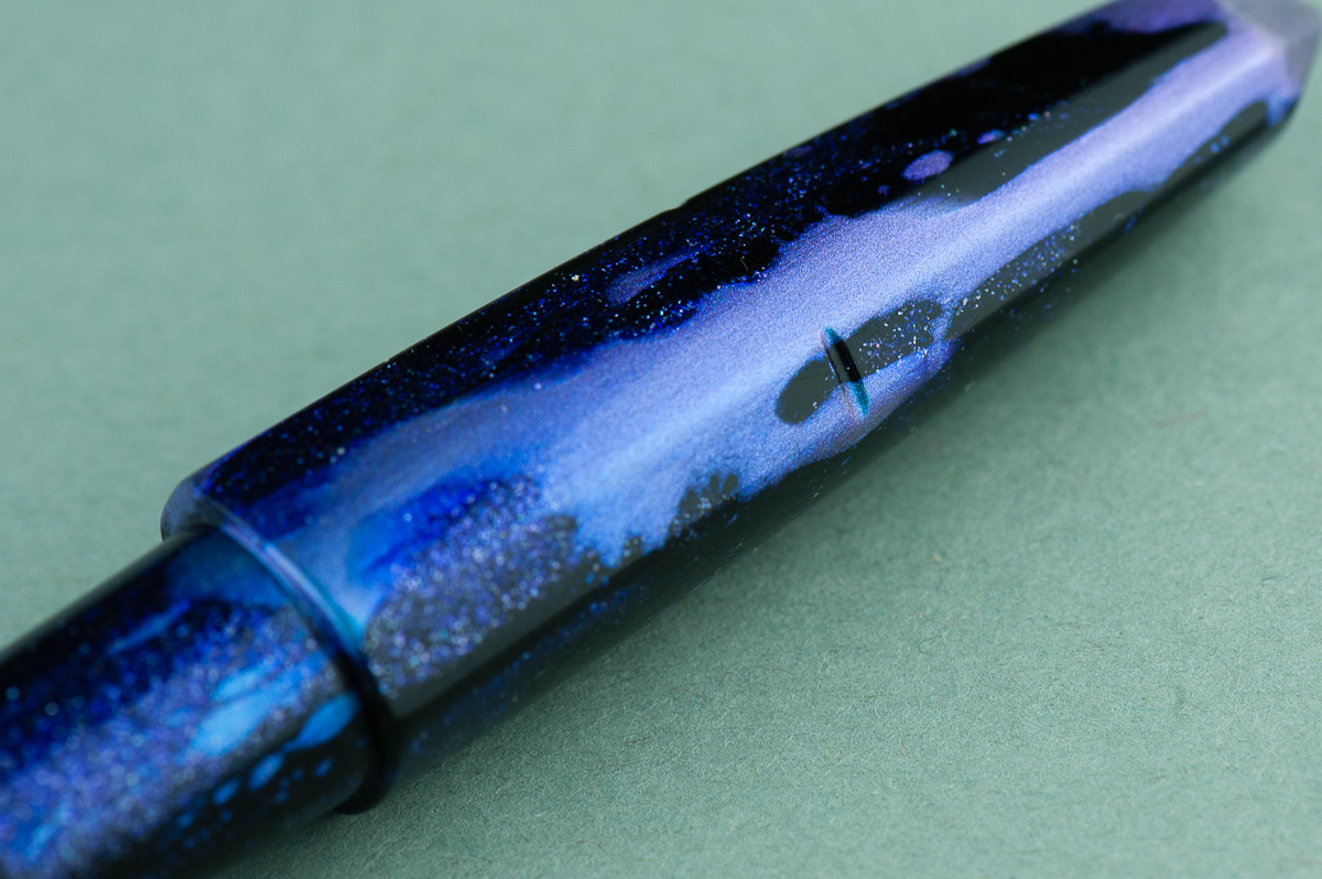
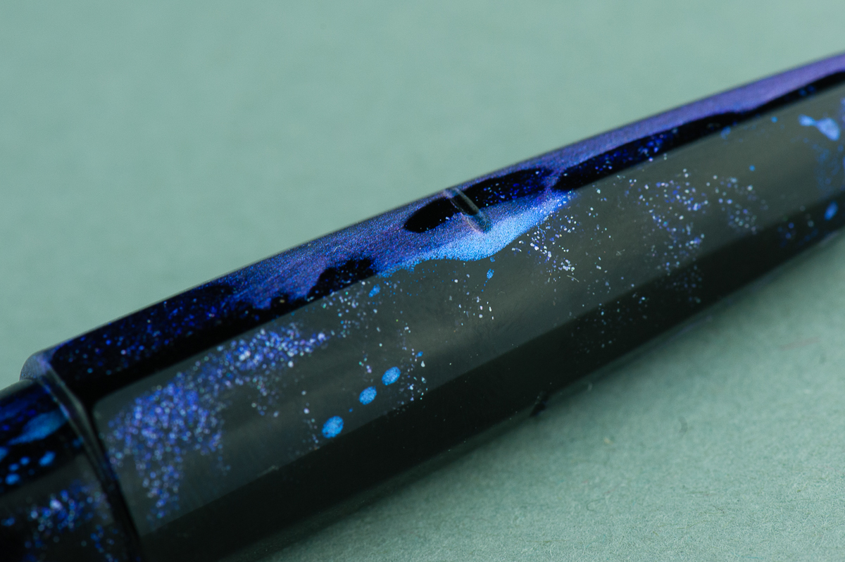
Franz: The Benu Essence is surely tugging on my color palette for I love the minty, turquoisey tone! Sans the glitter/ice part though for it makes it a bit garish. I really like the swirly bits of color in the acrylic. The Essence’s torpedo shape is plain which balances the material’s garishness.
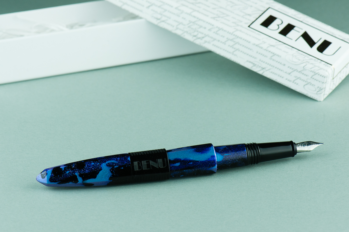
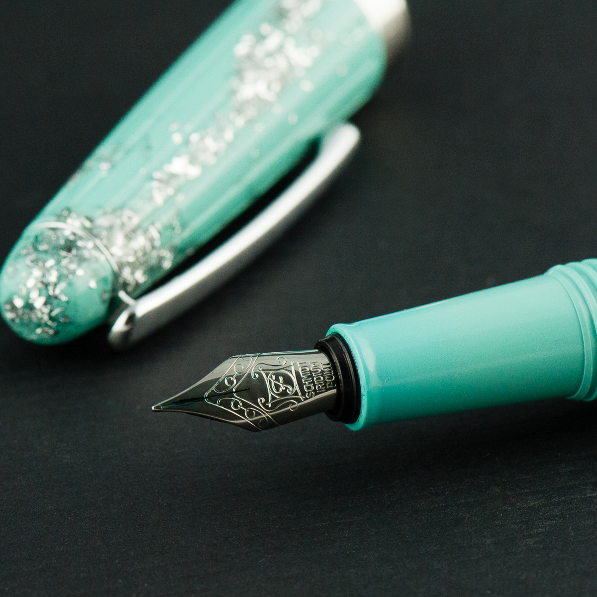
The Business End
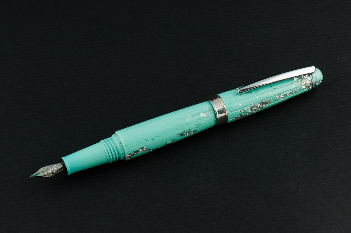
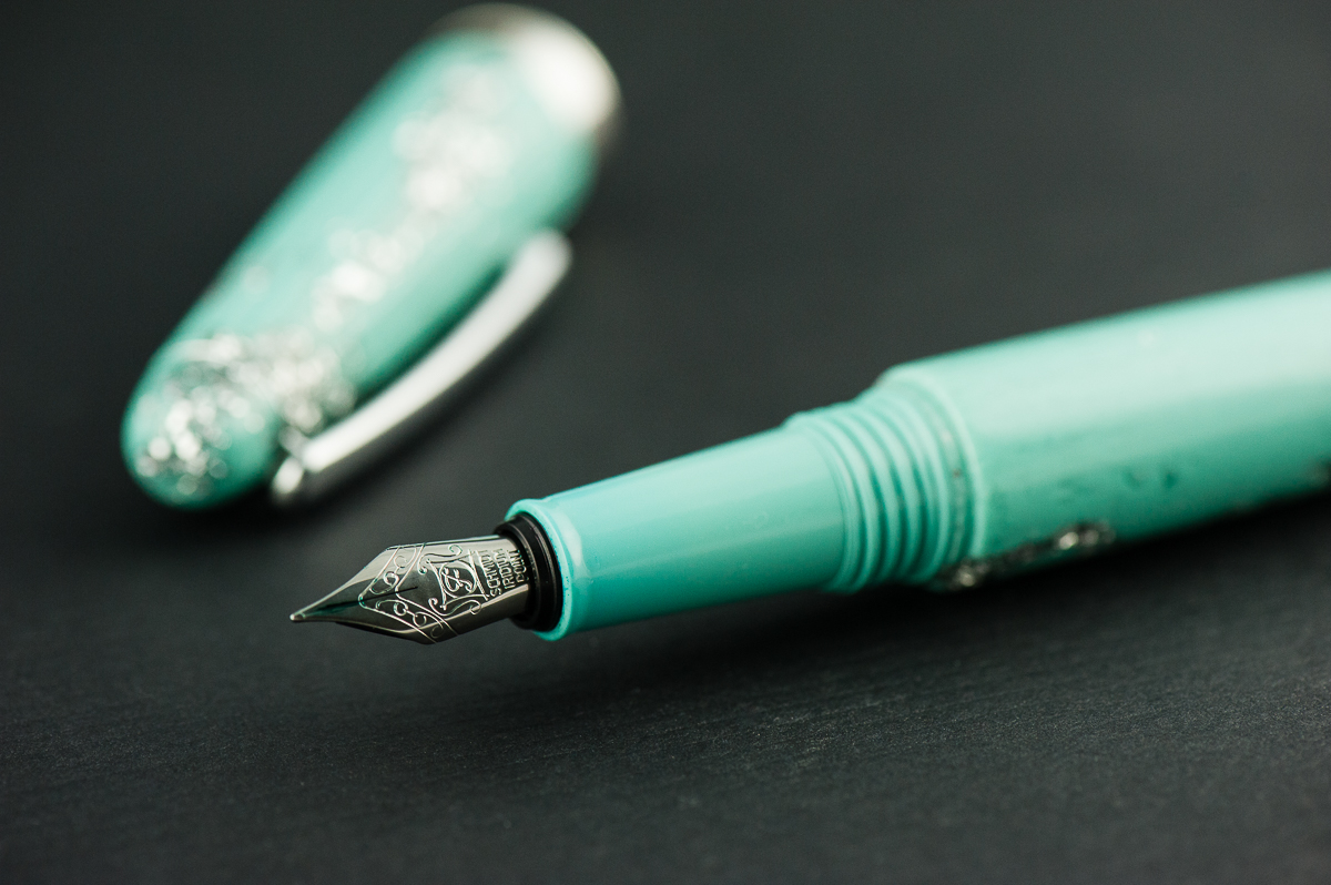
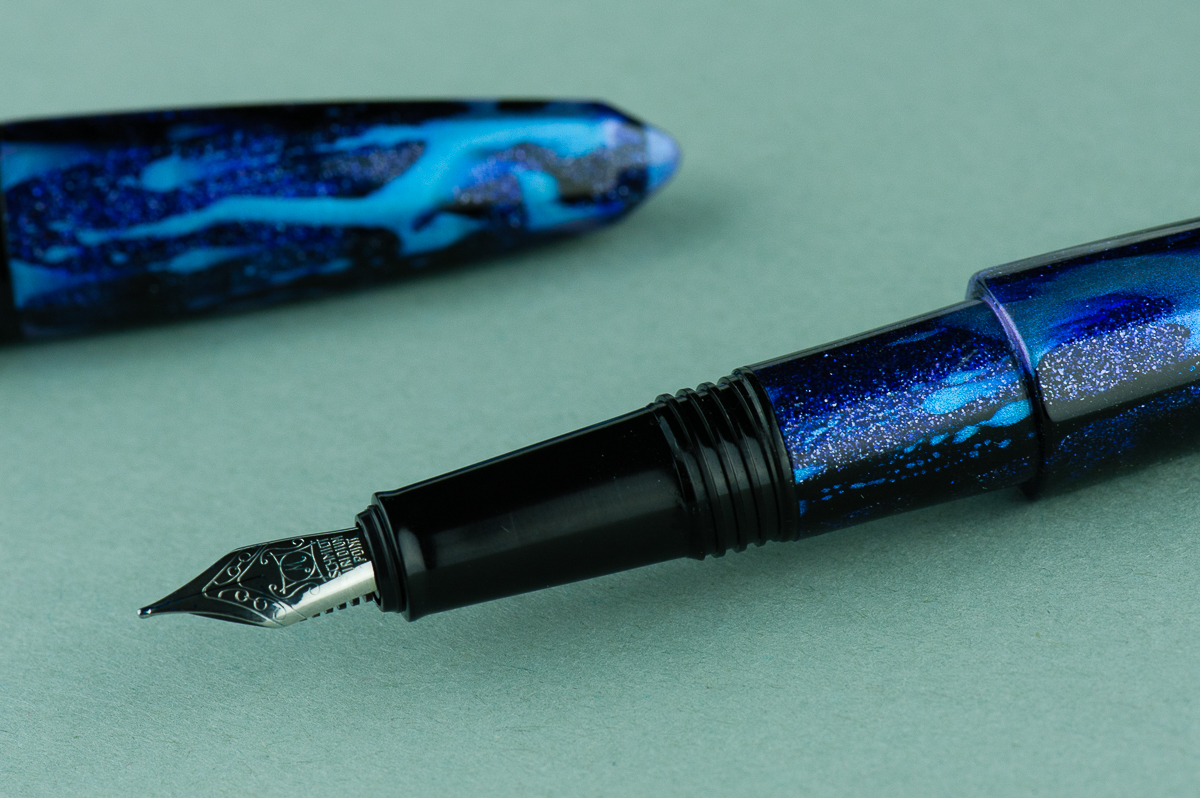
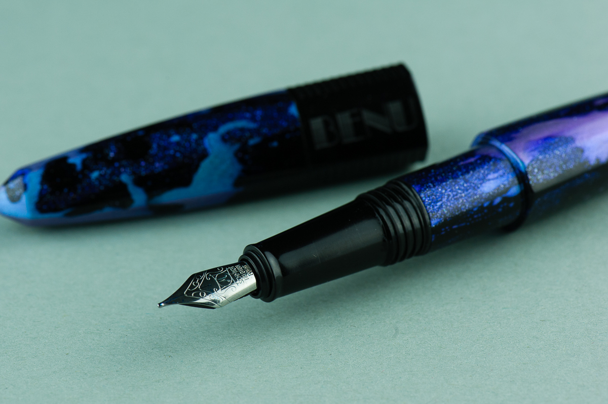
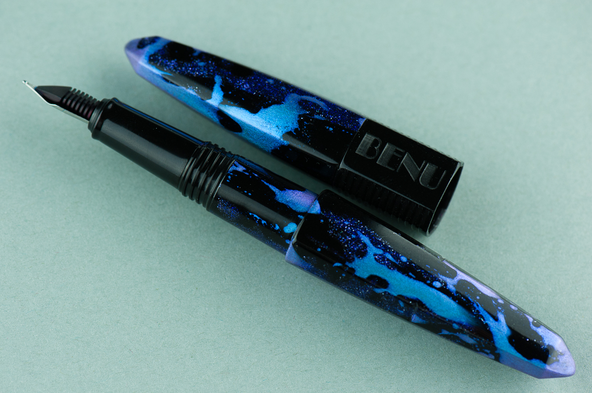
Katherine: Like the other Benu pens, this one sports a Schmidt nib. It’s a well behaved nib that puts ink to paper just fine, but doesn’t have a lot of character. It would be a great candidate for a grind or a swap with something more interesting (like the Benu Chameleon, this one is also a loaner, so no experimental nib swaps for me…).
Pam: I really have no complaints or major compliments about the Schmidt nib. It’s a fully functional, works well out of the box, and not very memorable nib. Aesthetically, the nib to be a bit small relative to the rest of the pen. Currently, it’s a #5 sized nib, which makes me wonder if a #6 nib would be more balanced.
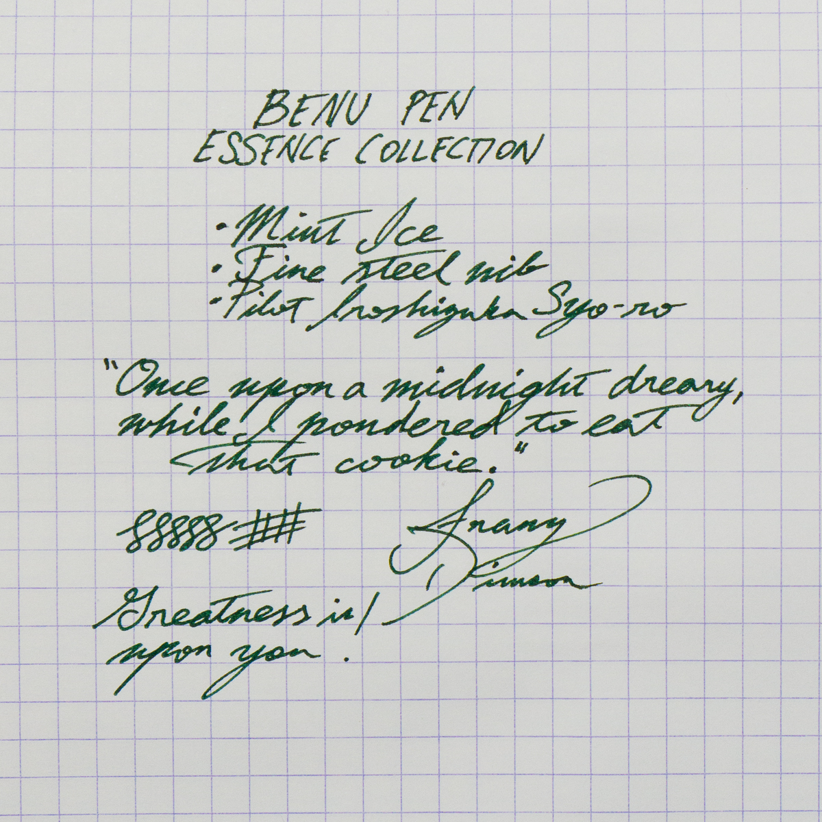
Franz: The Benu’s fine nib wrote well out of the box and I enjoyed using it for my daily writing. It was pretty smooth and with Pilot Iroshizuku Syo-ro, the flow was moderate to generous.
Contrary to Pam’s thoughts, I feel that the current nib complements the shape of the pen and tapers with the section. I placed a #6 Schmidt nib beside the Essence and it became somewhat too small. However, I do wish that Benu could stamp their name/logo onto their nibs. I know it’s an aesthetic thing but I always prefer the nib branding to match my pen.
Write It Up
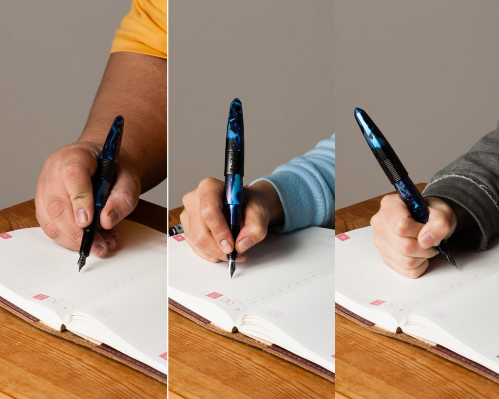
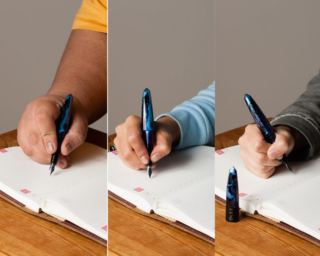
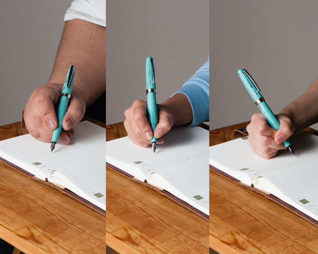
Katherine: I found the pen comfortable in hand for long periods of time — the section is a smidge small for me, but still perfectly usable. I had no issues with this pen for either journaling or writing quick notes.
Pam: The section and the step are right at the “sweet” spot of the tender bit between thumb and pointer finger. The step wasn’t particularly sharp, but it wasn’t comfortable if I tightened my grip like I inevitably do during a long writing session. The pen was balanced closer to the nib end and comfortable for a longer writing session. I appreciate the added girth of the pen, so it might be pretty comfortable for someone with larger hands (if it wasn’t for the length.)
Franz: The length of the Essence was quite comfortable for me even unposted. I feel that the balance is better when the cap is posted so I wrote with this pen posted for a while. The cap is definitely secure and the grooves on the back of the pen helps it so. When the cap was not aligned to the grooves, it still posted but it wasn’t as stable.
EDC-ness
Katherine: It’s a small-ish pen that fits easily in a pocket. Additionally the clip felt strong and I didn’t hesitate to clip it to my skirt pocket for the day. My one hesitation is that it’s so glittery that I didn’t think customers might take me seriously if I used it in a meeting… but that’s true of a lot of pens, even my beloved raden and maki-e pens. So, coworkers’ raised eyebrows aside, I’d give this a thumbs up as an EDC.
Pam: Due to this pen being a loaner pen, I didn’t have it in my lab coat pocket. And like Katherine, looking young with a blingy pen only adds to an image akin to Doogie Howser sans medical degree.
The clip was strong and was snug within my pen case.
Franz: The Essence was a great pen to use on the daily. I used it at work and the clip secured the pen in my shirt pocket. I appreciate that I don’t need to post the cap to be use it comfortably for a longer period.
Final Grip-ping Impressions
Katherine: To buy or not to buy? In the end it comes down to the aesthetic. Like the Benu Chameleon we reviewed a few months ago, it’s a solid pen, it all comes down to aesthetics, if you love it, you won’t be disappointed.
Pam: The pen is a serviceable pen for those who appreciate the aesthetic. My reception of the pen is lukewarm, but I see those who appreciate the over the top decor of the pen to enjoy this writing instrument.
Franz: The Benu pen company create pens that stand out from others. The acrylic designs catch your attention and then their different pen shapes will intrigue you. The Essence collection is probably one of the more conservatively shaped pens in their lineup and is great to use.
In the beginning, I was apprehensive when I saw the taper of the Essence’s section. I was worried that it may be too small for my larger hand, but I ended up really liking the pen. The pen has a good medium to large size to it that I appreciate very much.
Once again, thanks to the Vanness Incorporated team especially to Lisa Vanness for lending us this Benu pen. We really appreciate your support!
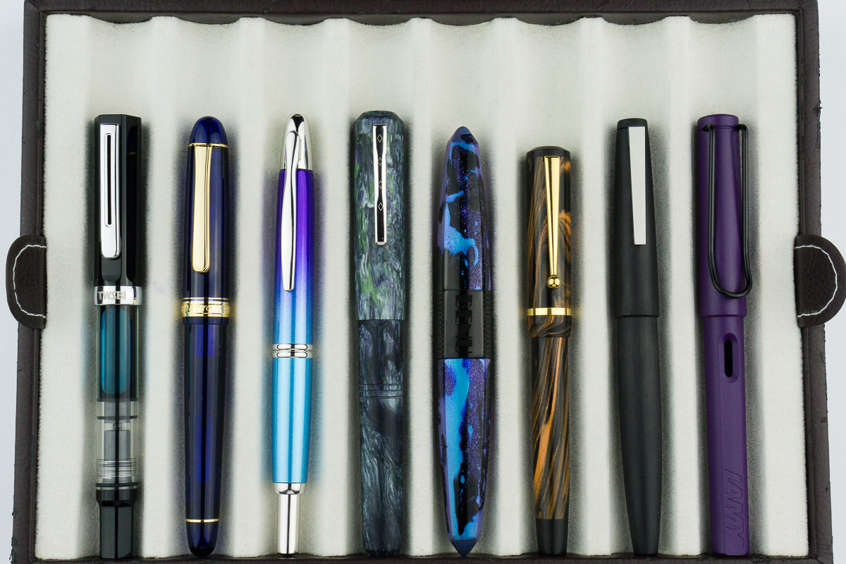
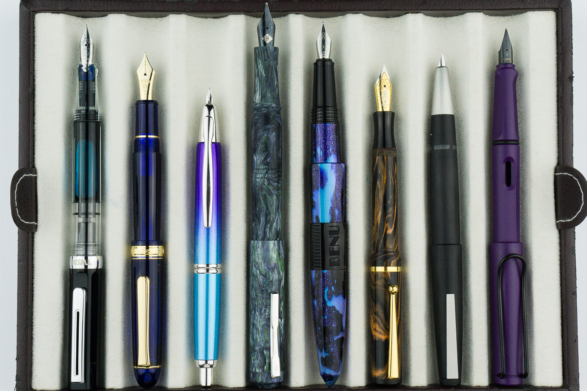
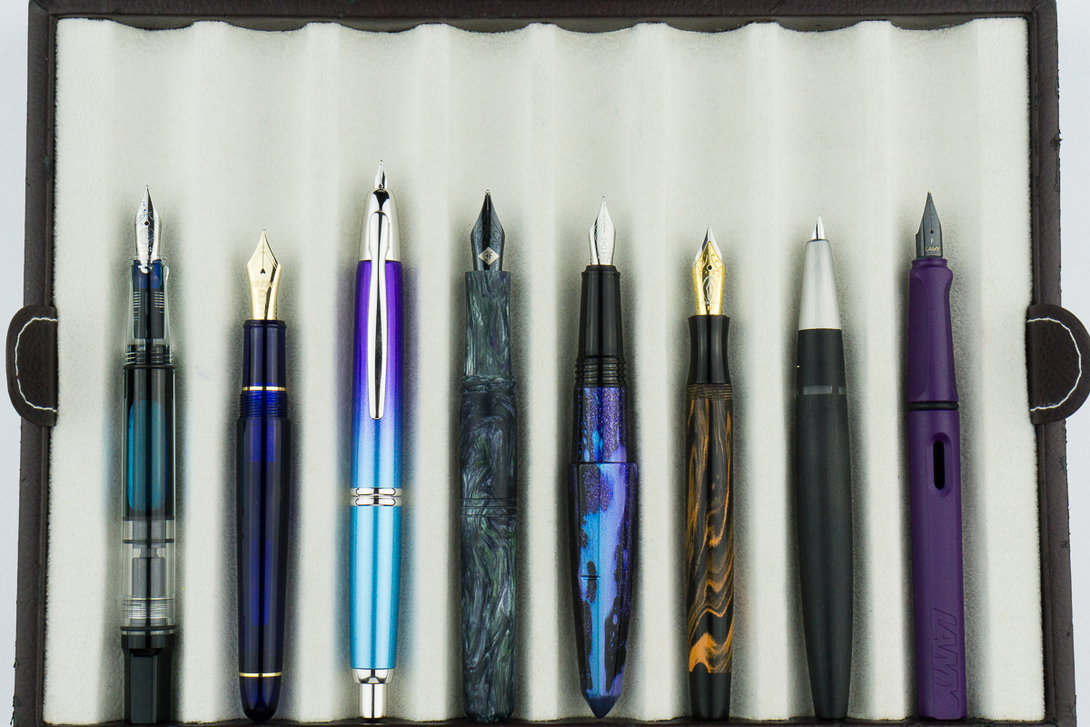
Pen Comparisons
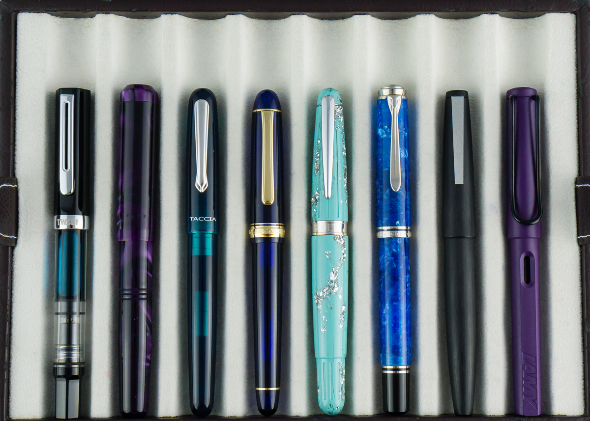
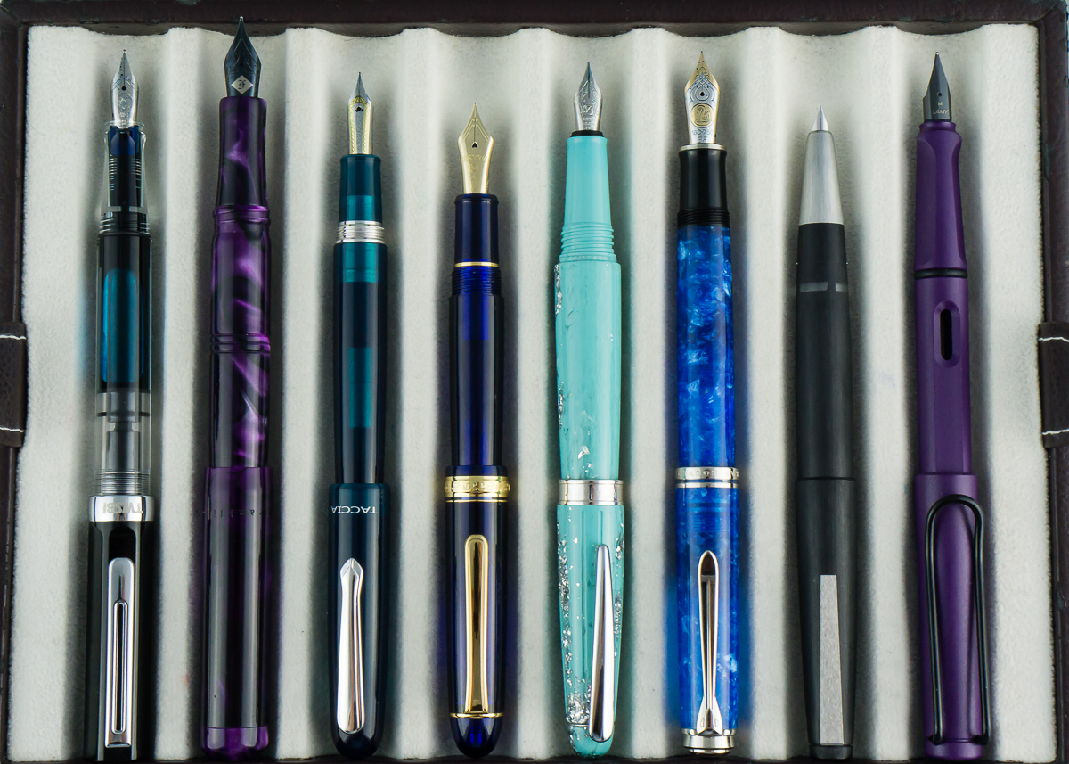
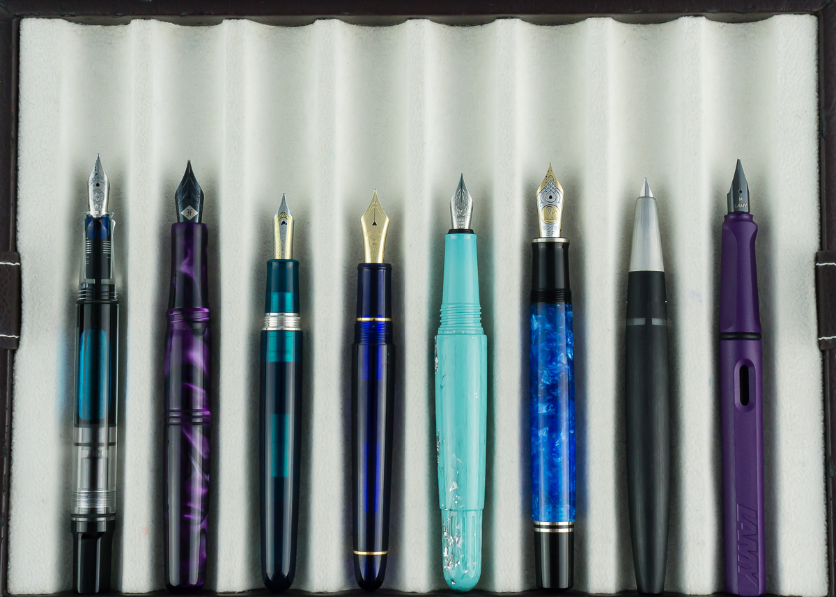
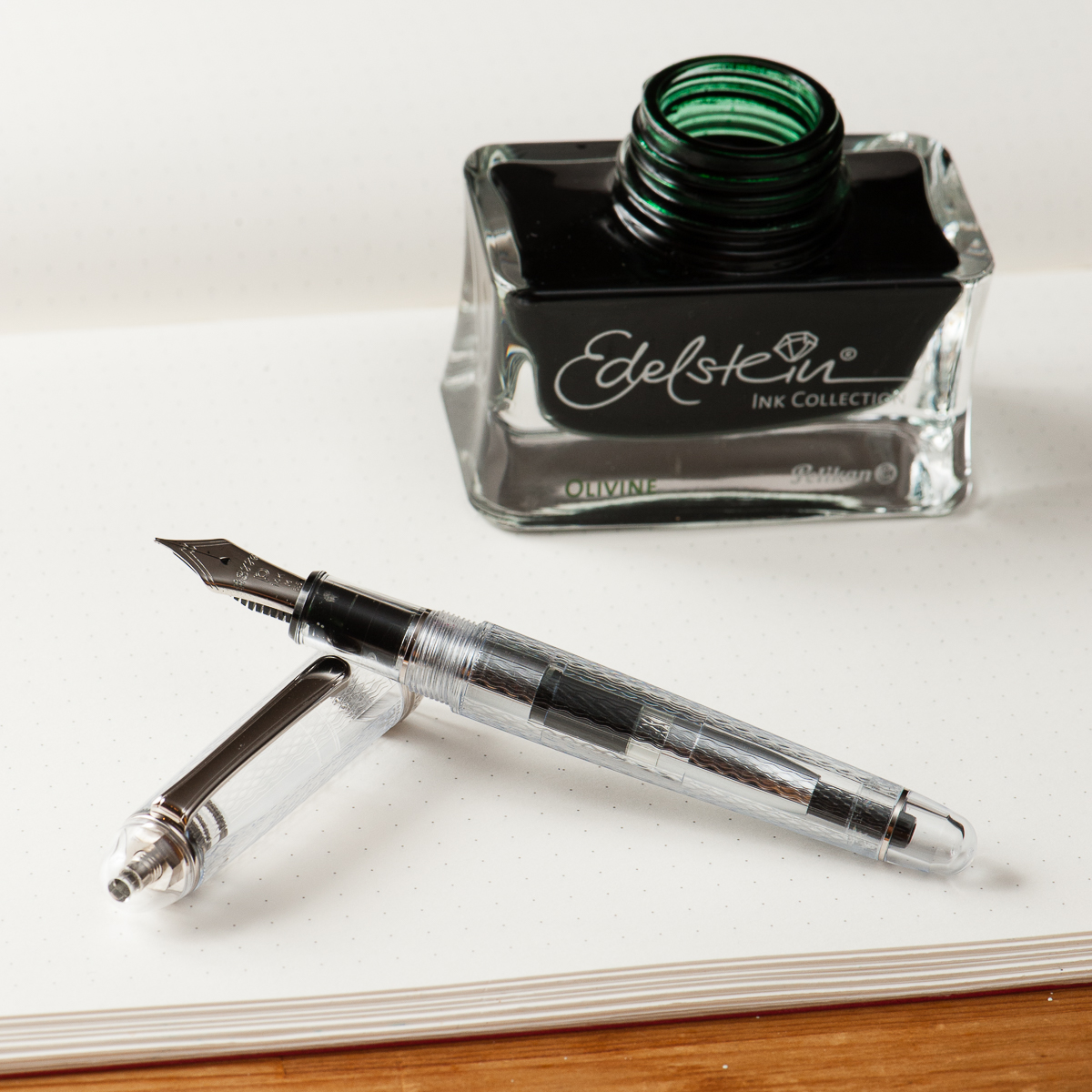
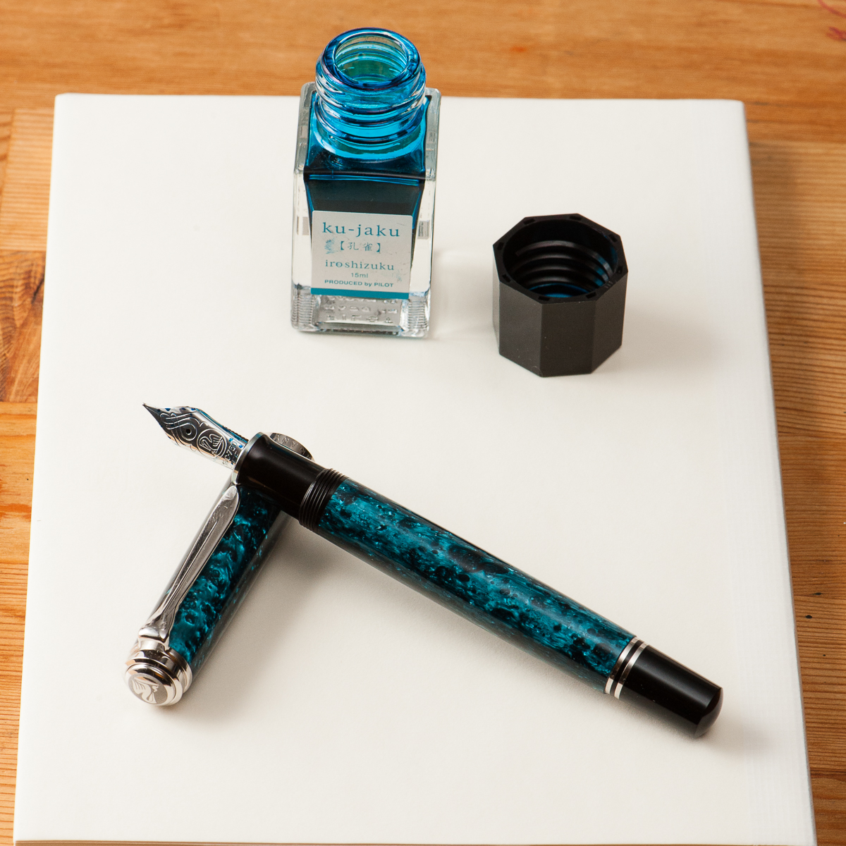
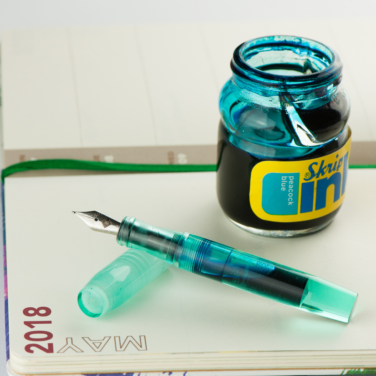
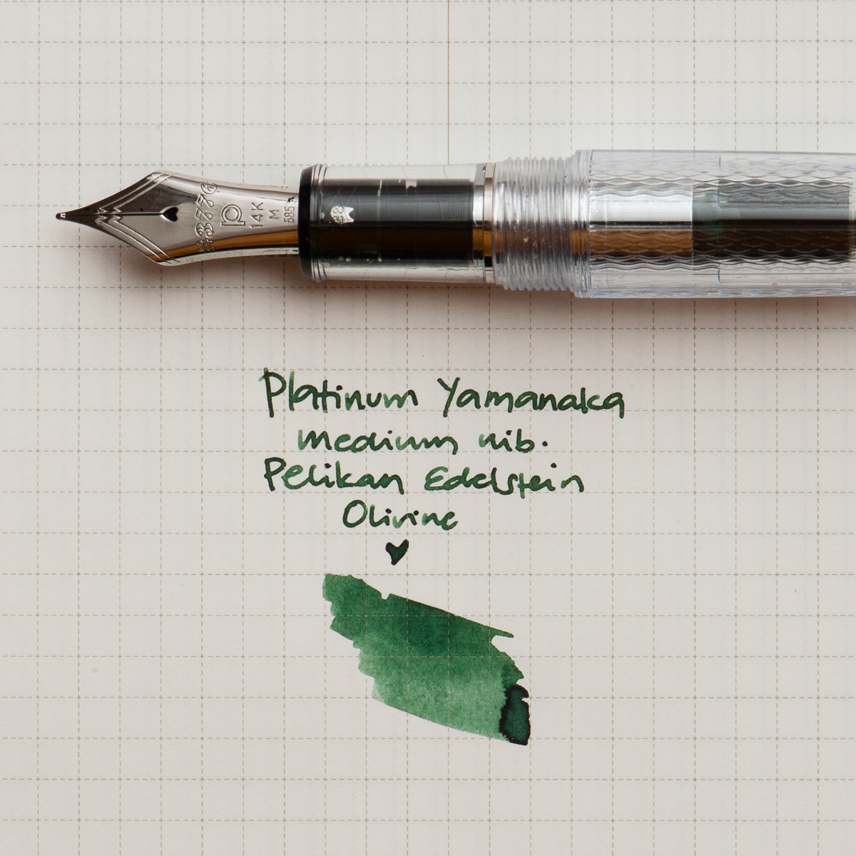
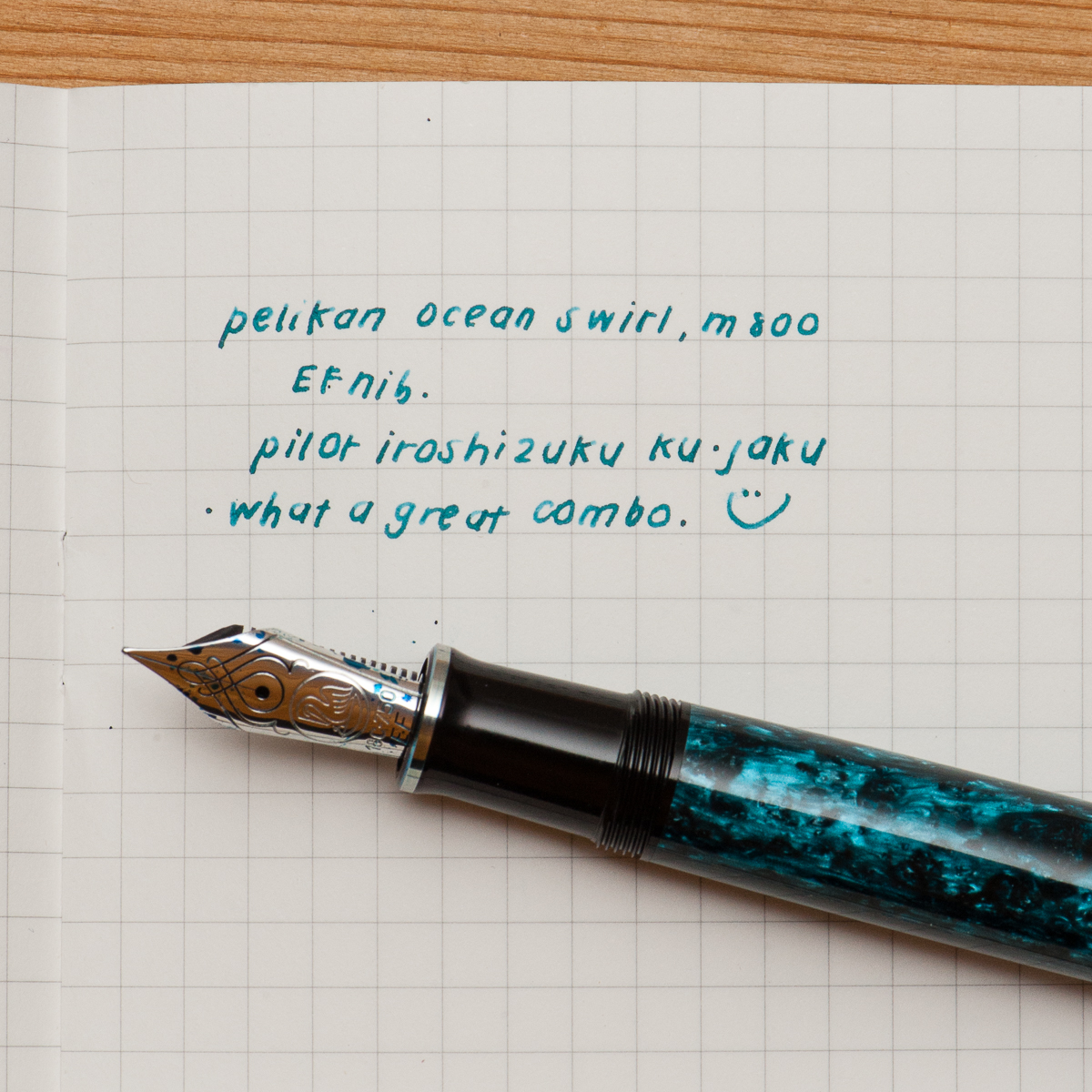
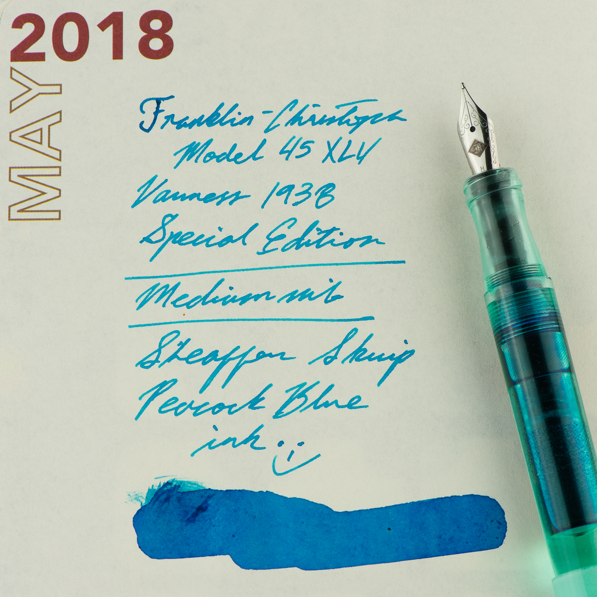
Pen Photos (click to enlarge)