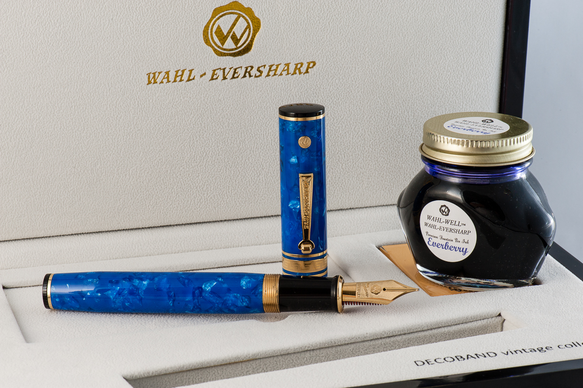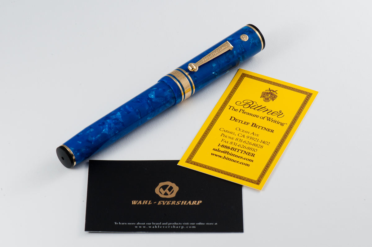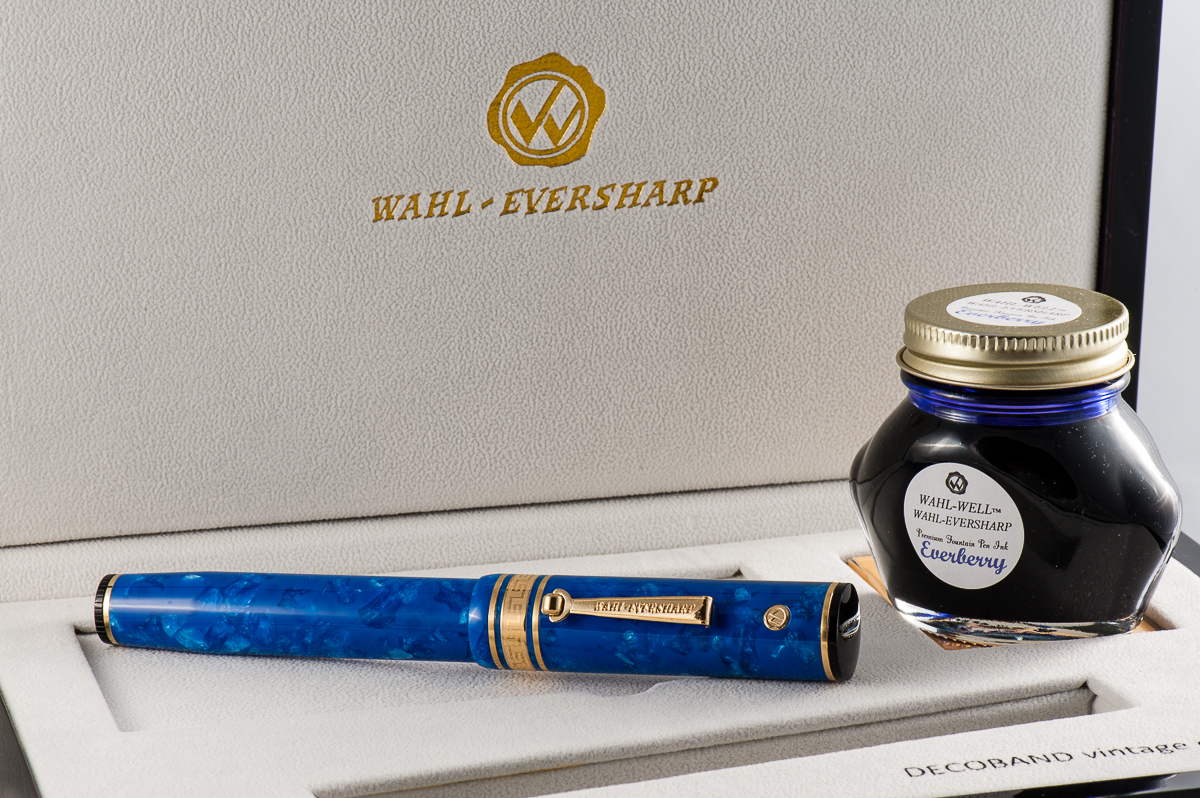
Once again, we’d like to thank Mr. Detlef Bittner of Bittner Pens for lending us this ASC Pens Arlecchino 2 fountain pen for review. His family pen store is located in the beautiful town of Carmel, California, and is well known in the pen shows in the United States.
The opinions here are our own and we were not compensated (monetarily, or otherwise) for this review.
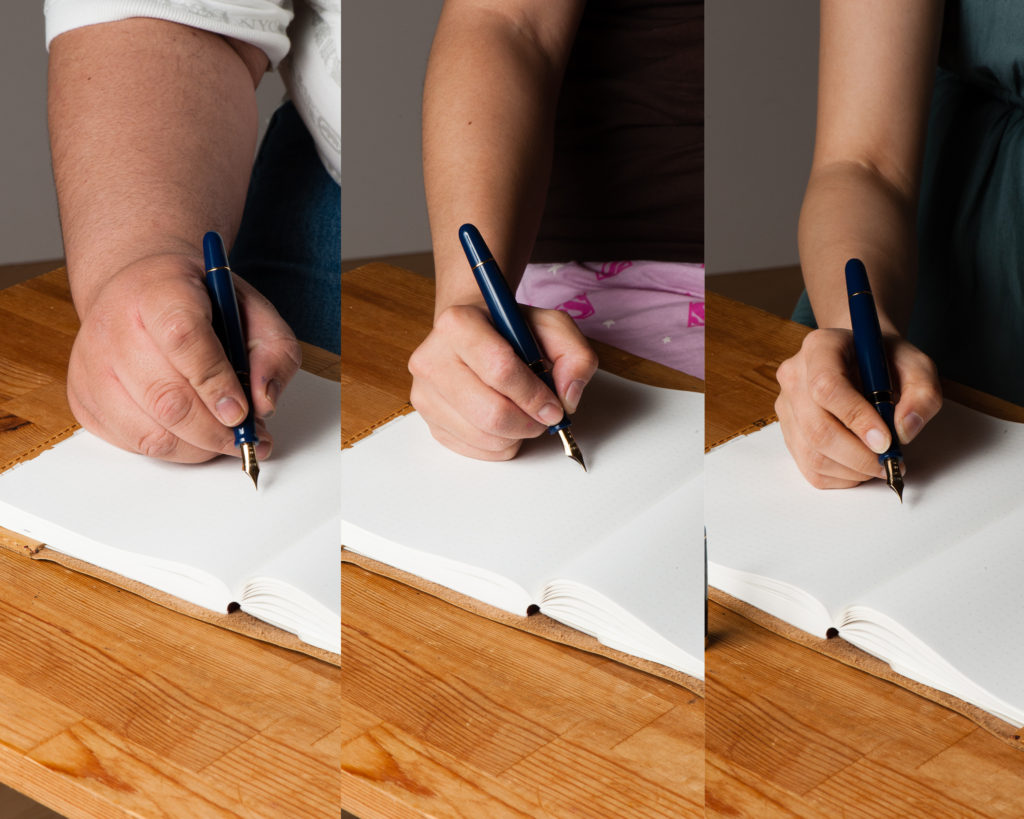
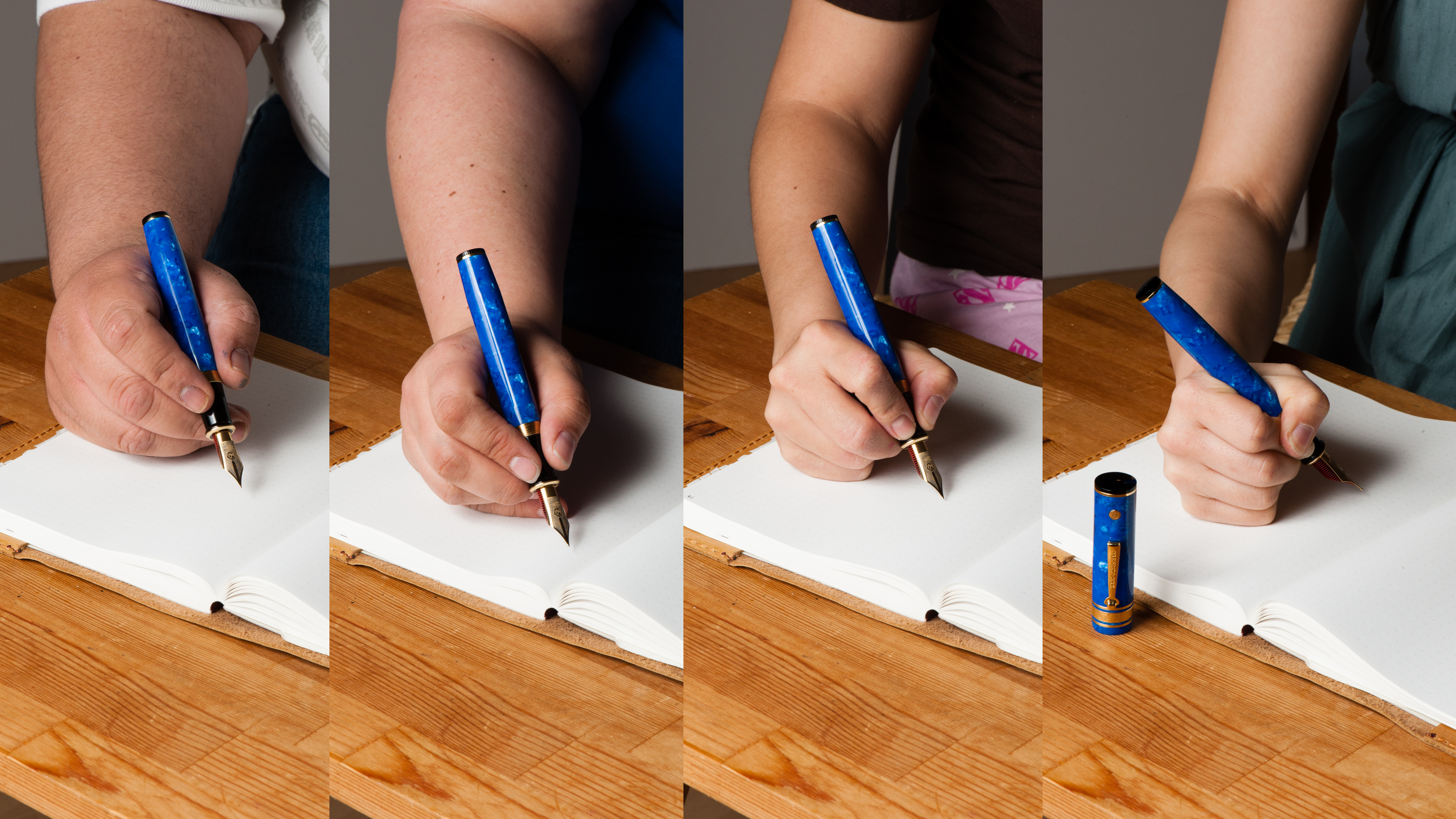
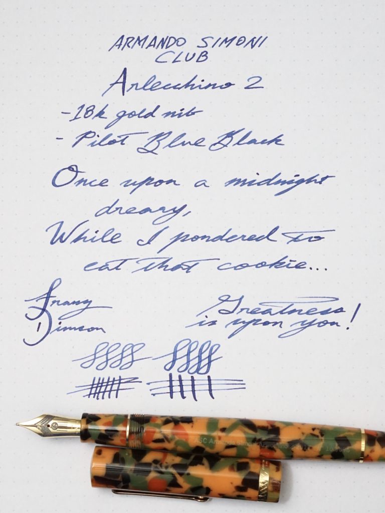
Hand Over That Pen, please!
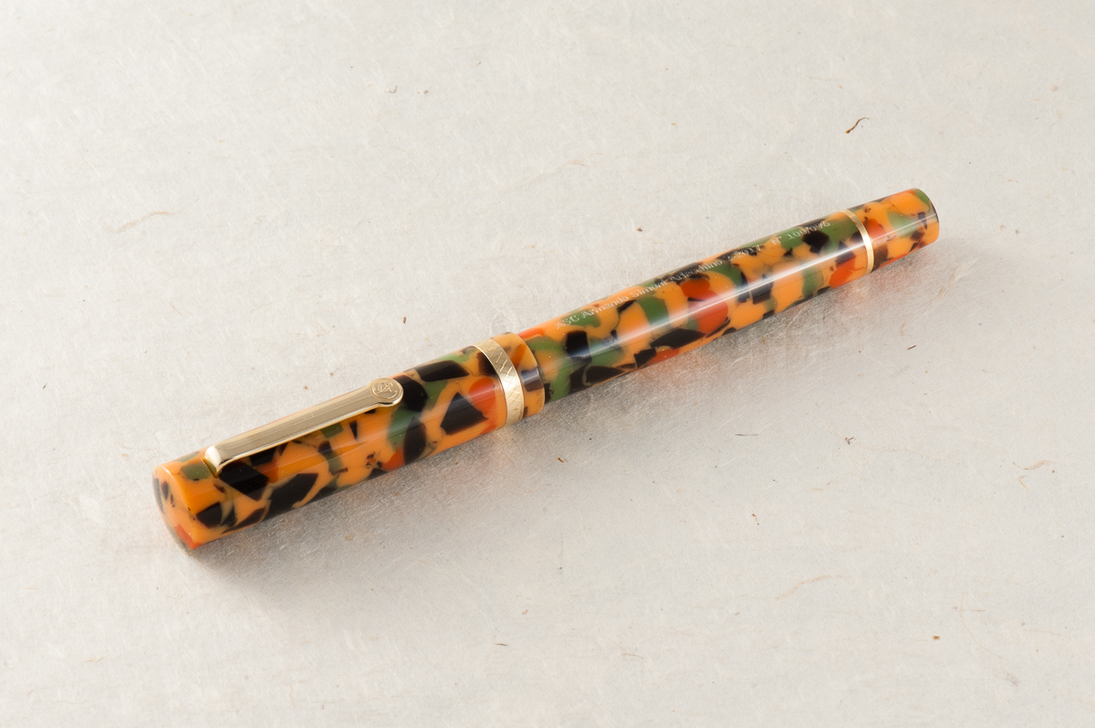
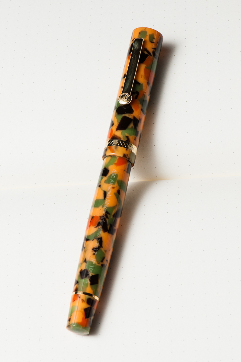
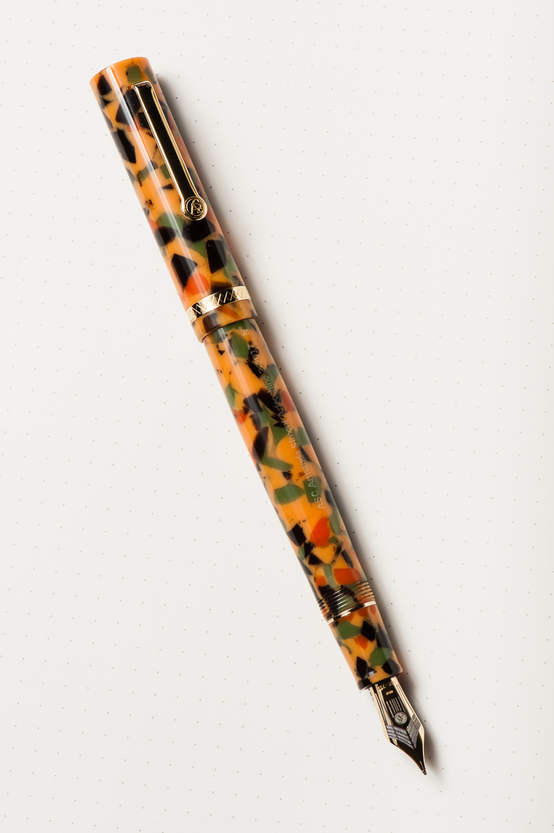
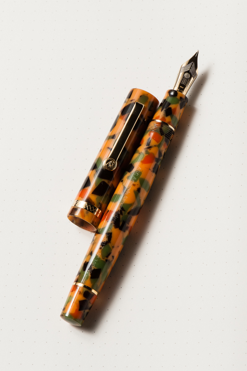
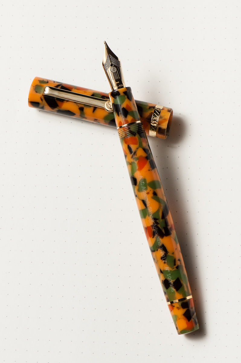
Pam: The pen is a pretty and appealing shape. The material however is quite busy. For someone who really enjoys a lot of monochromatic pens, this is a bit of a shock to the system. The material is unique, and unorthodox in a pen. In summary, the shape and silhouette of the pen is wonderful, but the material is an acquired taste.
Katherine: I think the star of this pen is the Omas Arlecchino material. However, it’s just not my thing. It reminds me of pumpkin soup. Or the Filipino dessert commonly called “cathedral windows“. Or fall leaves that are turning. Anyway, reminds me a lot of things, mostly makes me hungry… but just isn’t my thing on a pen.
Claire: I really fell hard for this pen in the short time I had to write with it. I was quite surprised since this isn’t the sort of pen I would normally even bother to try. The barrel is a lot longer than what I normally find comfortable. I do find the material to be a bit busy for my taste but other than that I like the shape of this pen.
Franz: I first saw the ASC Arlecchino 2 pen at the 2017 LA Pen Show when a friend from the San Francisco Bay Pen Posse bought one and I was immediately intrigued with the unique finish of the pen. Actually, I’m loving the design of the pen and the celluloid material.
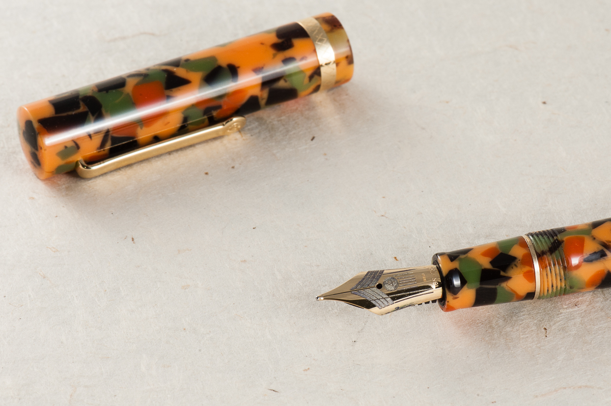
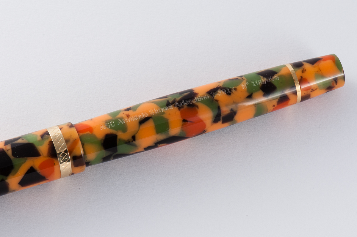
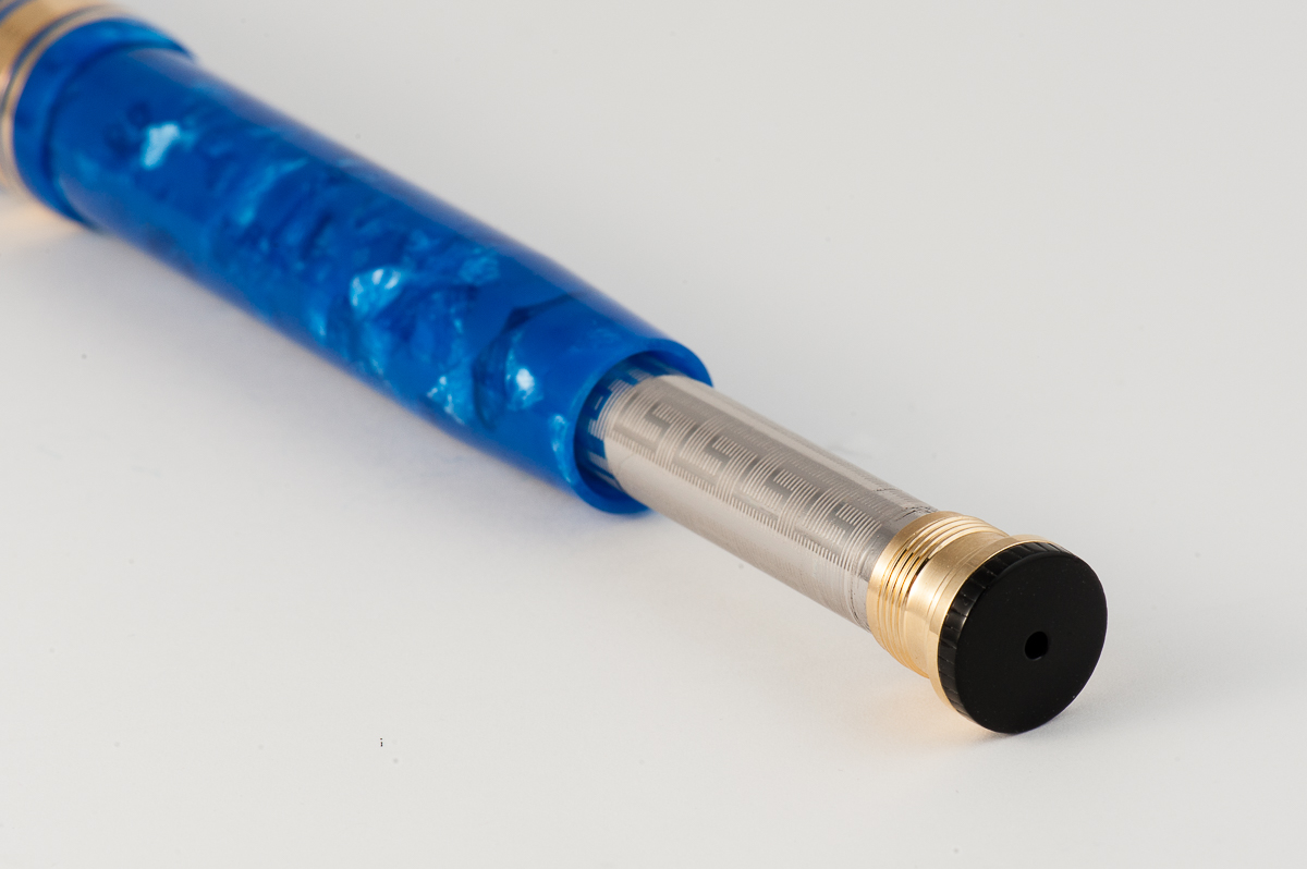
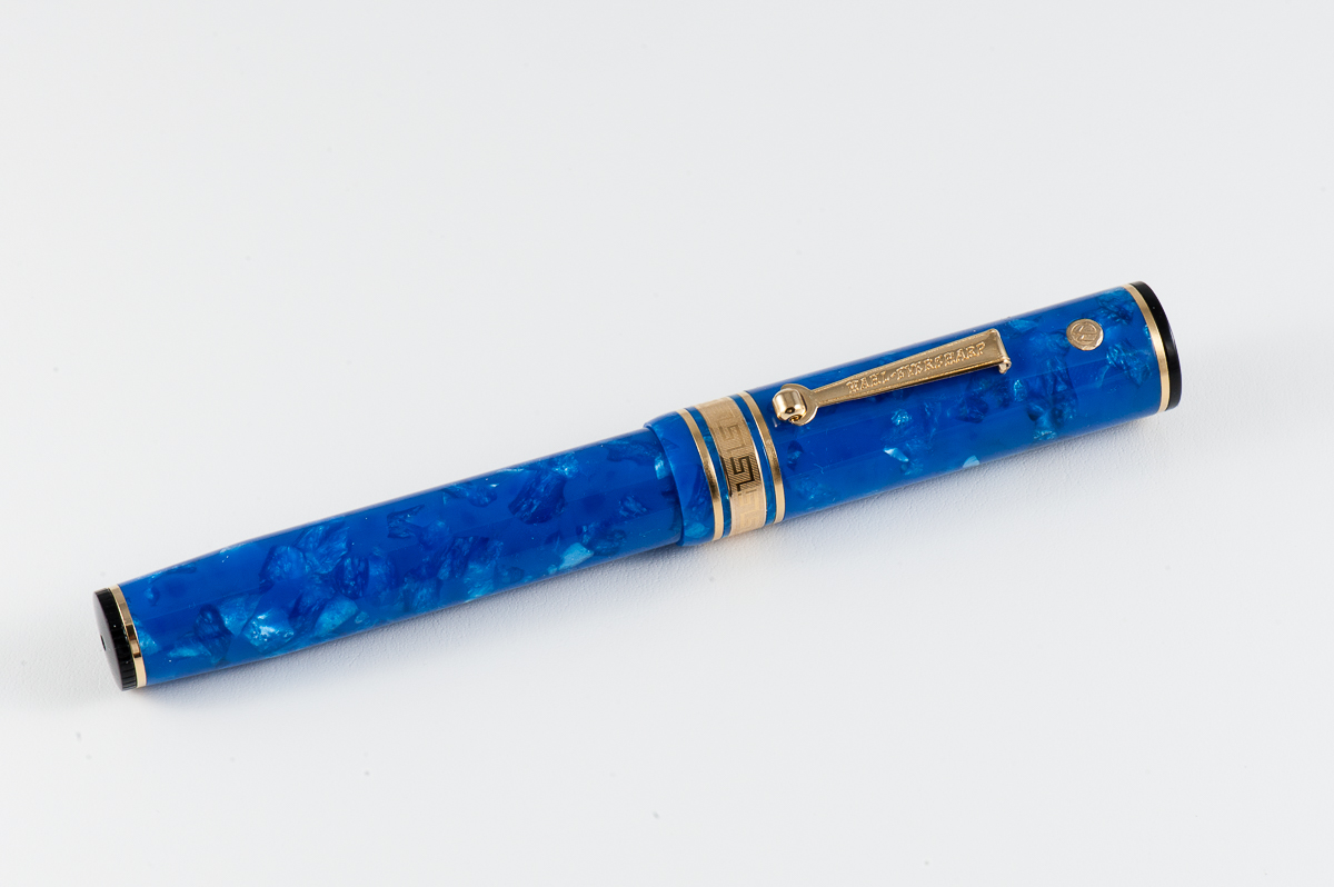
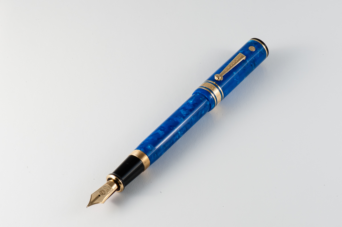
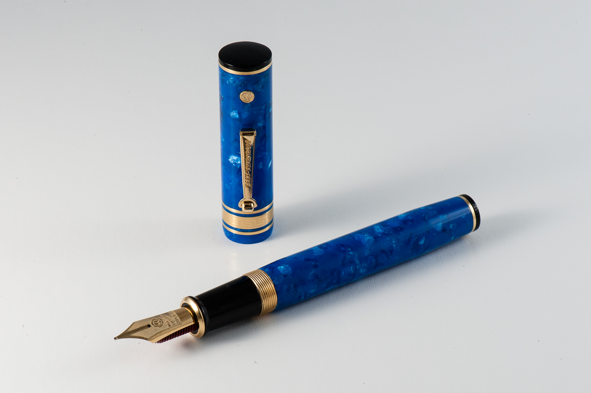
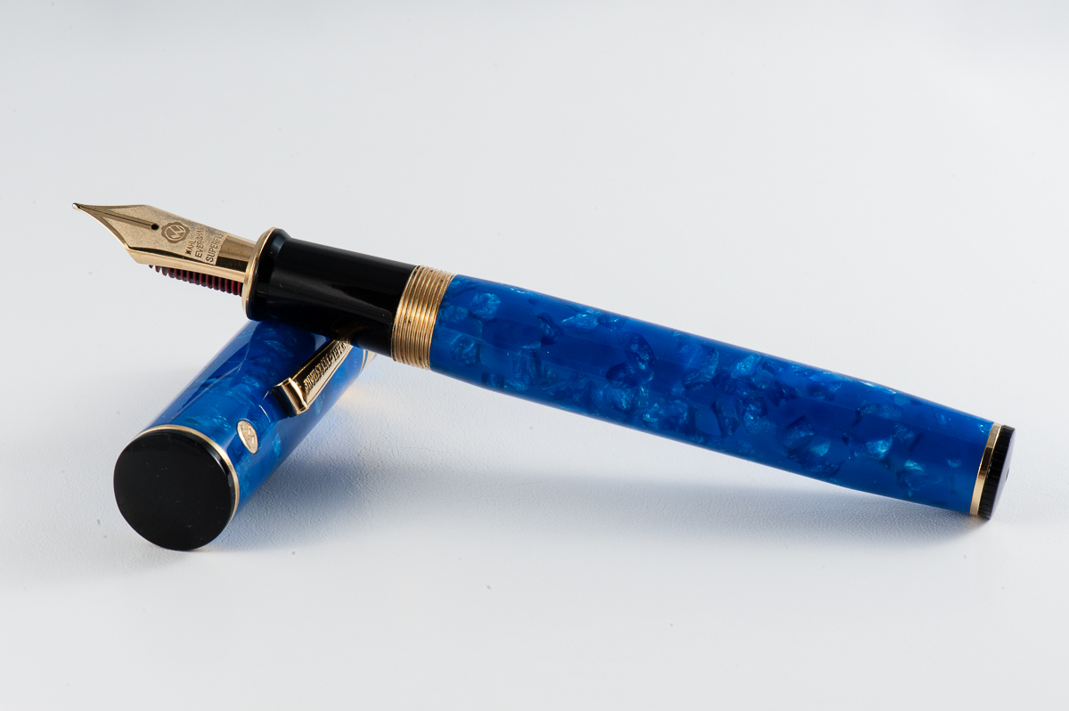
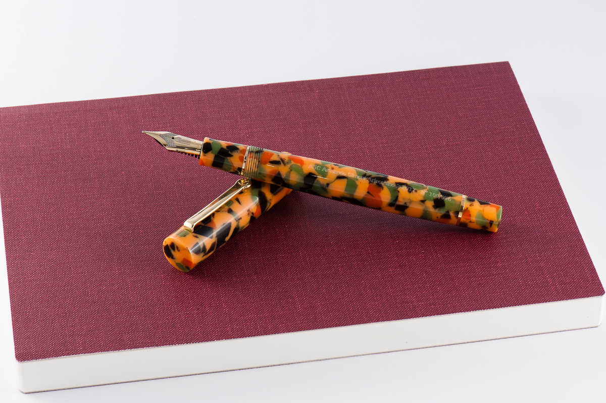
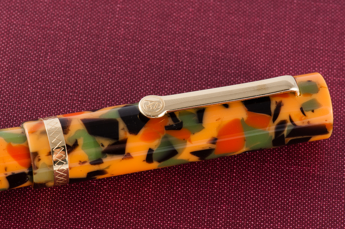
This material was part of the Omas stock bought by ASC Pens when the Omas Pen Company sadly shut down in 2016. According to ASC pens, they acquired just enough of this rod stock to create a limited edition of 100 pens to pay homage to the original pen called, the Arlecchino (Italian for harlequin).
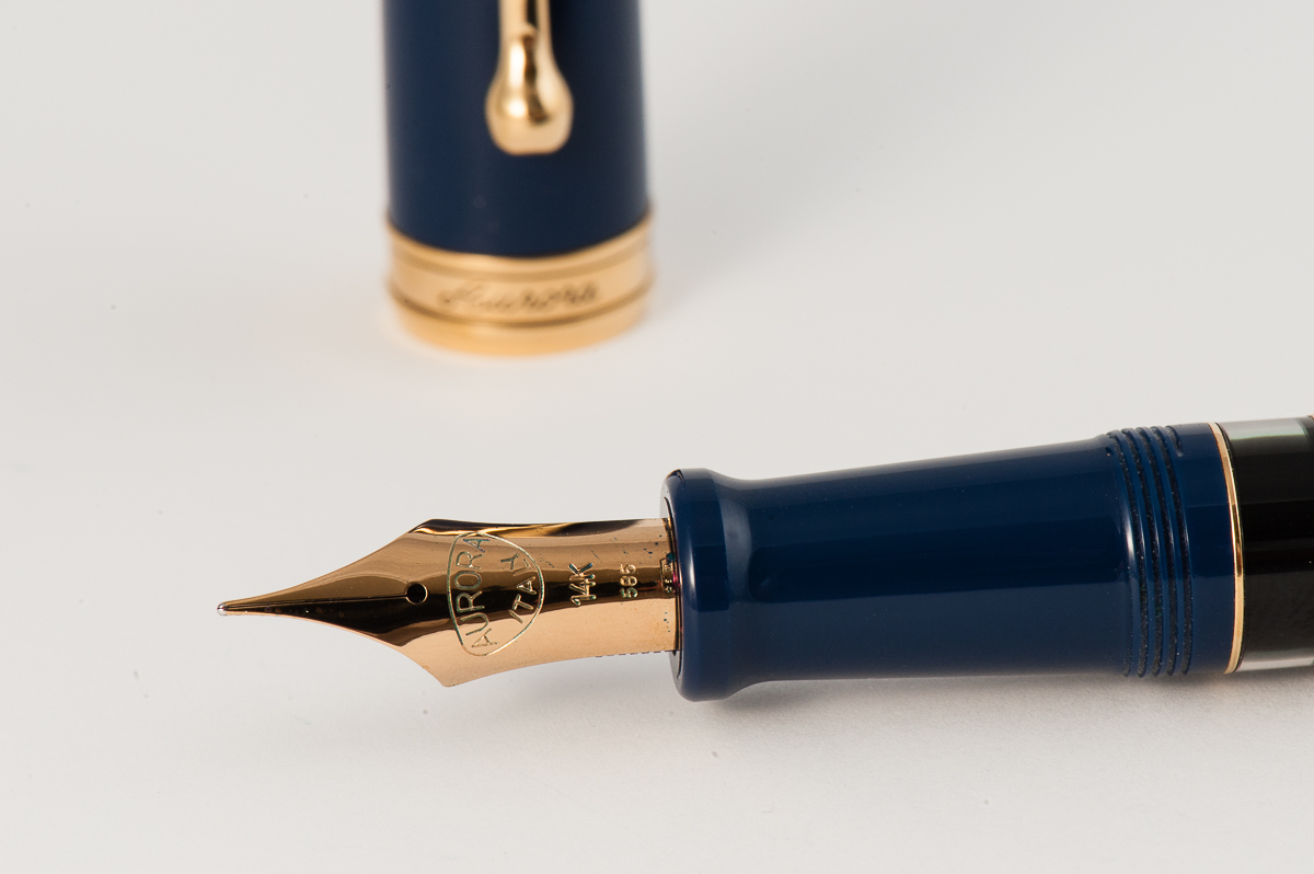
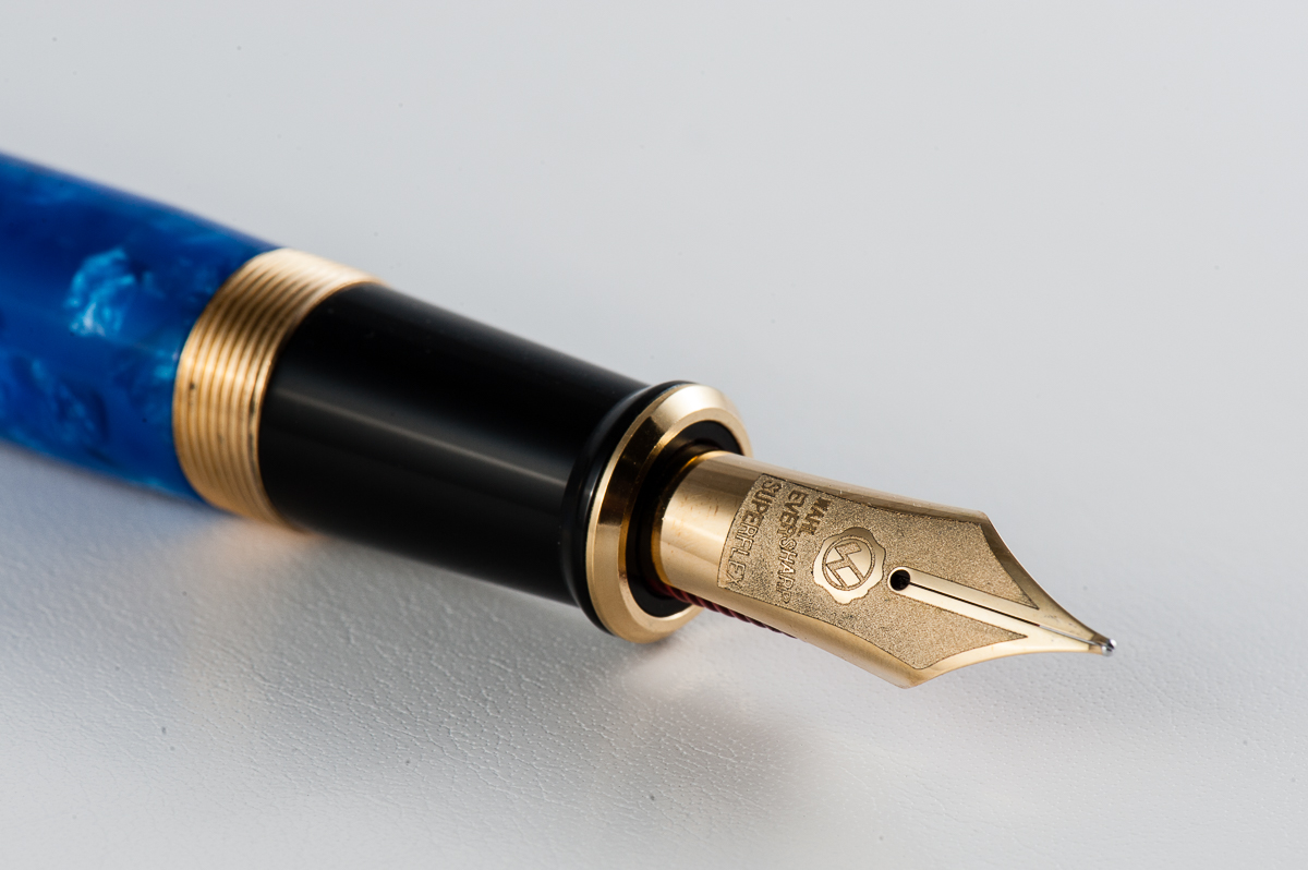
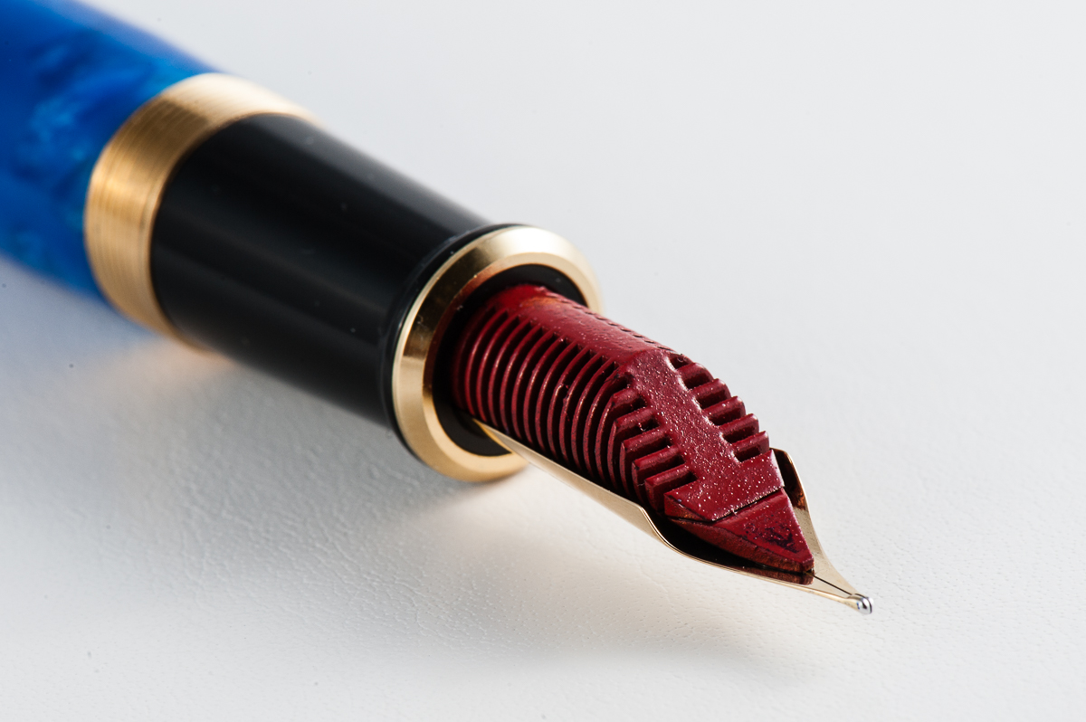
The Business End
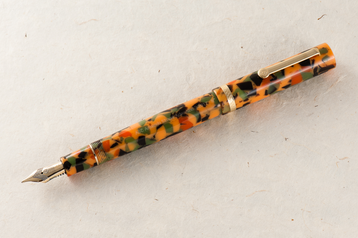
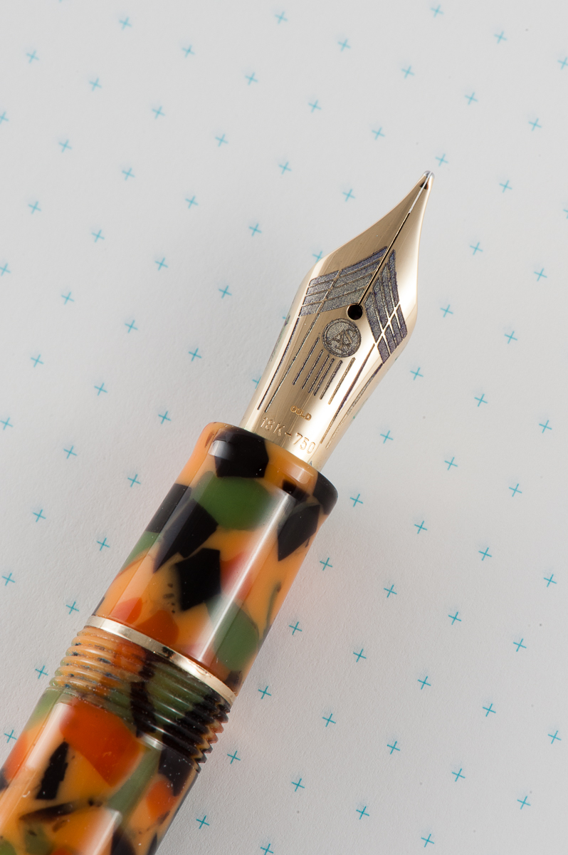
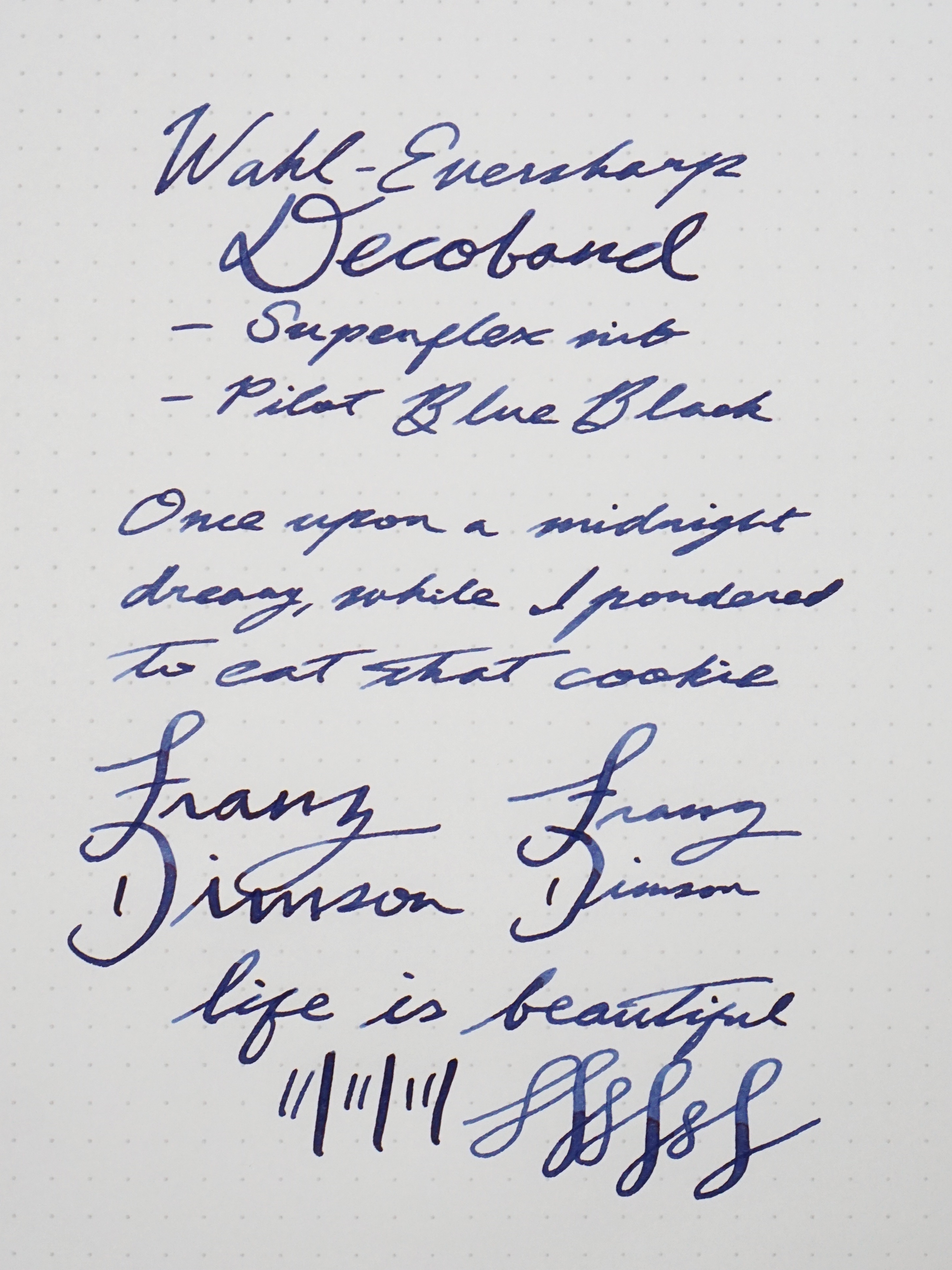
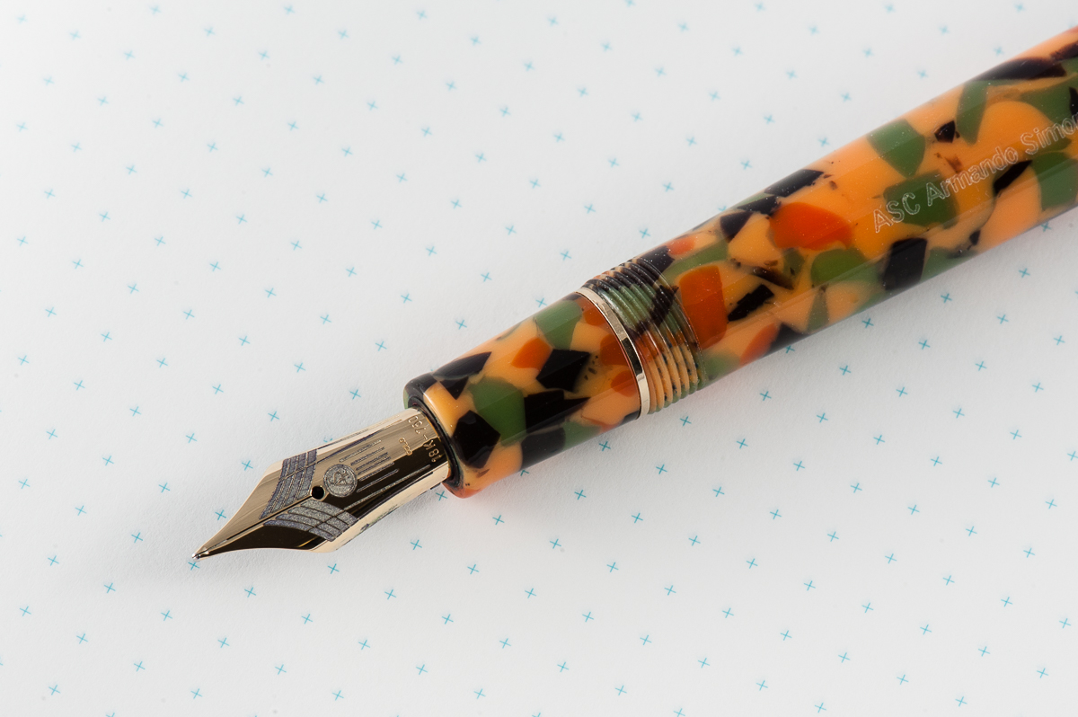
Pam: The nib itself is a great writer and performs well, as expected. The nib was very enjoyable as a writing experience. I did find the nib to be springy in the perfect Goldilocks kind of way.
Katherine: The nib on this pen is… okay. It’s a perfectly comfortable and usable writer, but it didn’t feel unique in any way, nor did it have much character to me. But, if you told me this was the only nib I could use for the rest of my life, I’d be a little annoyed, but I’d be okay with it. It’s inoffensive. (A glowing review, I know.)
Claire: I loved the feel of the nib and the overall writing experience of the pen was pleasant. The nib has a bit of bounce without being so soft or mushy. It’s not what I would reach for as a workhorse nib, but it’s great for a little extra pizzazz.
Franz: The Magic Flex nib is such a smooth writer and is quite springy which gives my writing some flair! The black ebonite feed kept up with my writing even when I flexed it a little.
Write It Up
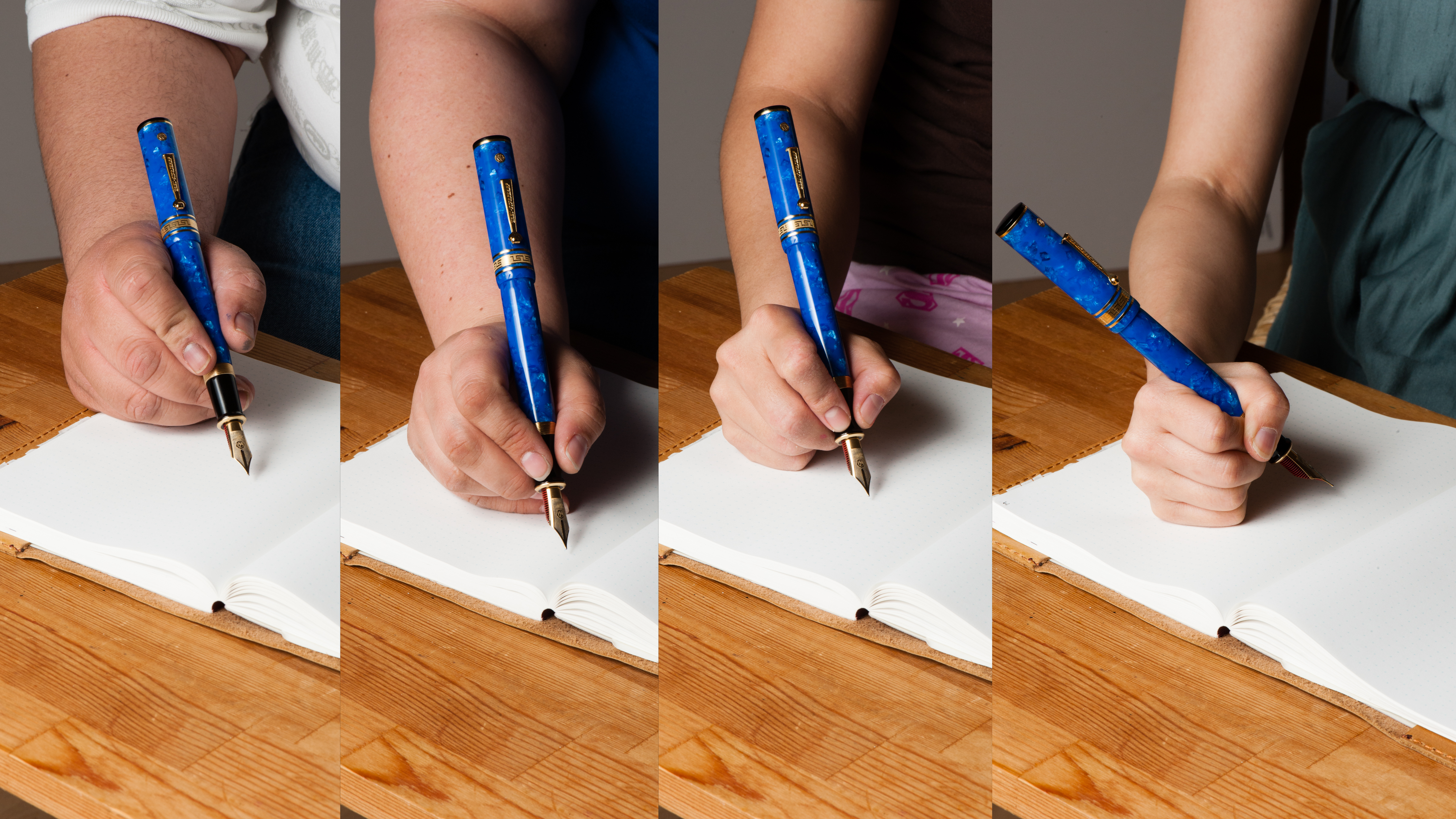
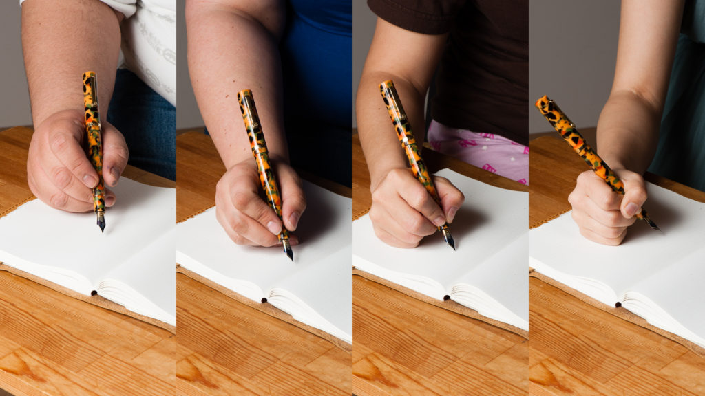
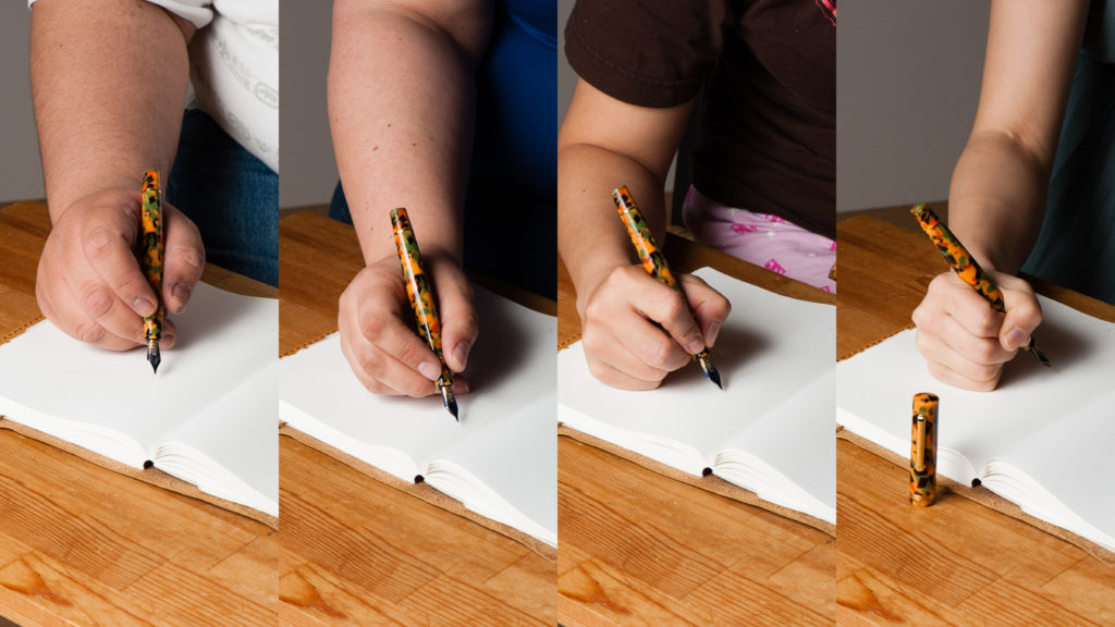
Pam: The shape and size of the pen lends to great comfort for extended writing. Honestly, maybe it was the nib, or the light weight of the pen, but the pen didn’t leave an impression for me. It was a comfortable, well balanced pen, but no more, no less for me.
Katherine: This pen was pretty comfortable in the hand for a long period of time. The gentle taper of the body makes it a little more interesting than what I envision a “generic” pen to look like. This also (I think) makes it a better balanced pen.
Claire: I had trouble putting this pen down when writing with this pen. I was more than a little disappointed when I had to let Pam, Katherine and Franz have a chance to give it a spin. This pen is not like any of the pens in my collection and really was a lot of fun to write with. I had no trouble writing with this pen for pages on end. There was no trace of hand fatigue or pain even after a few pages.
Franz: I really enjoyed writing with the Arlecchino 2 as it is light and well balanced when unposted. Writing with the cap posted made it a little too lengthy and I found it unbalanced. (Yes. Shocking, I know!) My only small wish is for the section/barrel to be just a hair thicker to be perfect for my bear paw. But that’s just me.
EDC-ness
Pam: This pen would be quite a show stopper in any pocket or as a notebook companion with the colorful material and sweet nib. The clip seems sturdy enough to be kept in shirt pockets.
Katherine: This was another loan from Bittner Pens — so once again, no real EDC usage. But, it seemed well made, and could hold up to every day use. It’s a solid pen that is a comfortable size both to use and to tuck into a pocket or notebook. And the clip feels solid enough to keep it firmly attached to a shirt pocket, if I had shirt pockets.
Claire: I didn’t have a chance to carry this pen with me for a few day, but I can see this being a daily writer in my arsenal. The diameter of the pen is just about perfect for long writing sessions which is ideal for me.
Franz: I was not able to fill this pen with ink and use at my workplace so no real world EDC report. But it’s important to note that it is piston-filled for a nice ink capacity, and the Arlecchino 2 is ready to write with just one twist of the cap.
And I believe my co-workers will see the colorful material and say, “What kinda pen is that?!”.
Final Grip-ping Impressions
Pam: I very much appreciate the beauty of the pen and reliable writing experience. That said, I can’t recommend this pen due to the price tag. Particularly for a pen that didn’t actually leave an impression with me. I prefer the writing experience of a Pelikan (ahem, Franz-fluence). The material is the only compelling reason to buy the pen for me. Luckily for my wallet, the material isn’t my style.
Katherine: This pen was perfectly usable — decent nib, good size, and comfortable in hand. However, it didn’t shine in any way for me. It was an okay, inoffensive pen, body material aside. In another material, it’s a pen I wouldn’t mind owning, but isn’t high on my list of must-acquire pens. In the Arlecchino material… I’d rather have a bowl of pumpkin soup. Maybe with some chives and a pinch of paprika to round out the colors.
Claire: Overall, I really like this pen. the only gripe I have with this pen is that the inside of the cap was not polished. For a pen at this price range, it seems a little bit sloppy to me. Other than this pen is lovely, though I wouldn’t feel comfortable paying MSRP on this pen. This brand has access to some of the hottest materials, and they are charging for those materials.
Franz: I love this pen! I love its shape, its material finish, its springy nib, and the history that it represents. However, I just can’t love its price tag. Yes. I know that it’s a limited edition of 100 pens, it’s celluloid, it’s a “flexy” nib, etc. Believe me, I understand why it costs the way it costs and also please know the fact that I “want” it. But my heart and mind says, “Hold on, not yet.” Perhaps it’s because I have a few other pens that I also want that has a lower price tag? I know that someday I’ll own the Arlecchino 2, but not yet.
If you want this LE pen and have no qualms about the price, grab it while it’s available. Reach out to Detlef of Bittner Pens.
Thank you for letting us review the Arlecchino 2 Detlef!
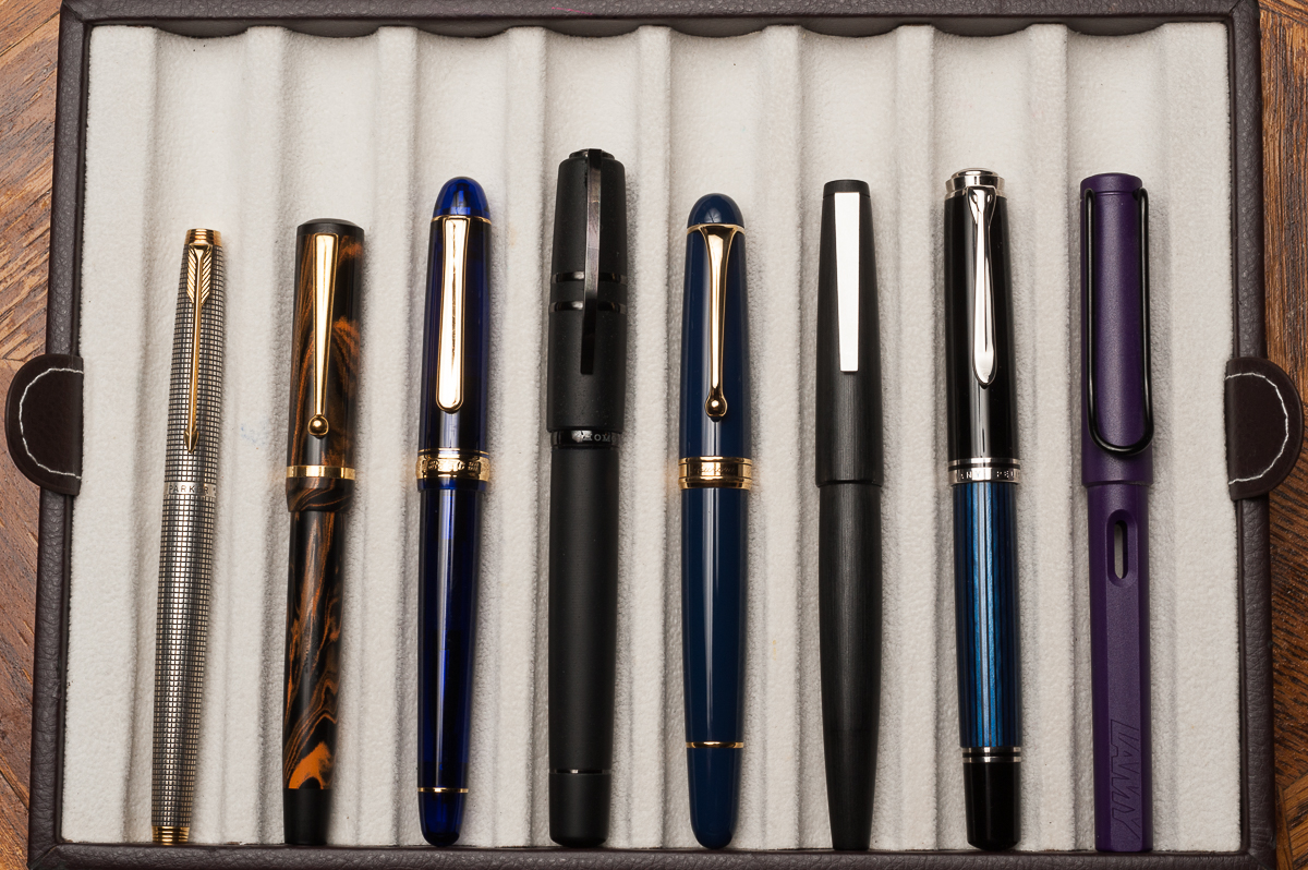
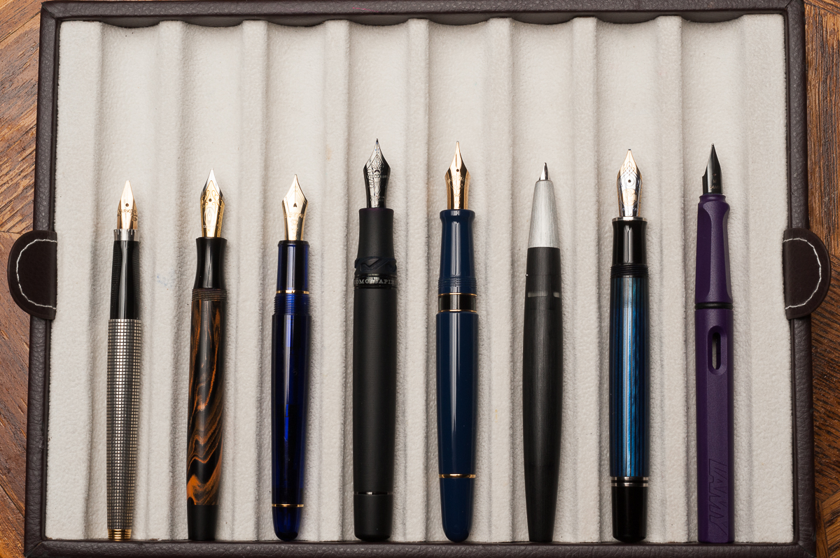
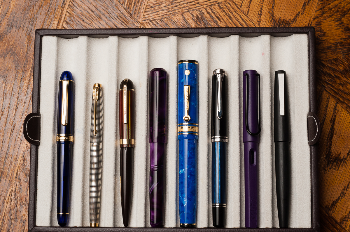
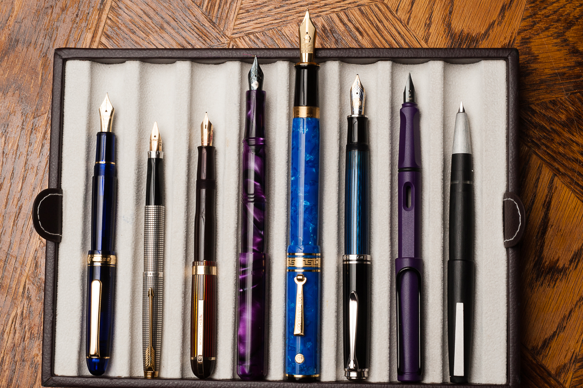
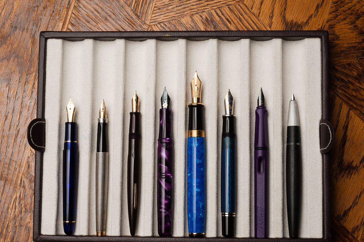
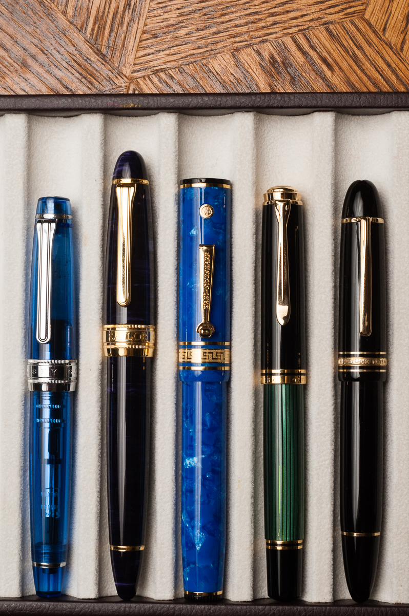
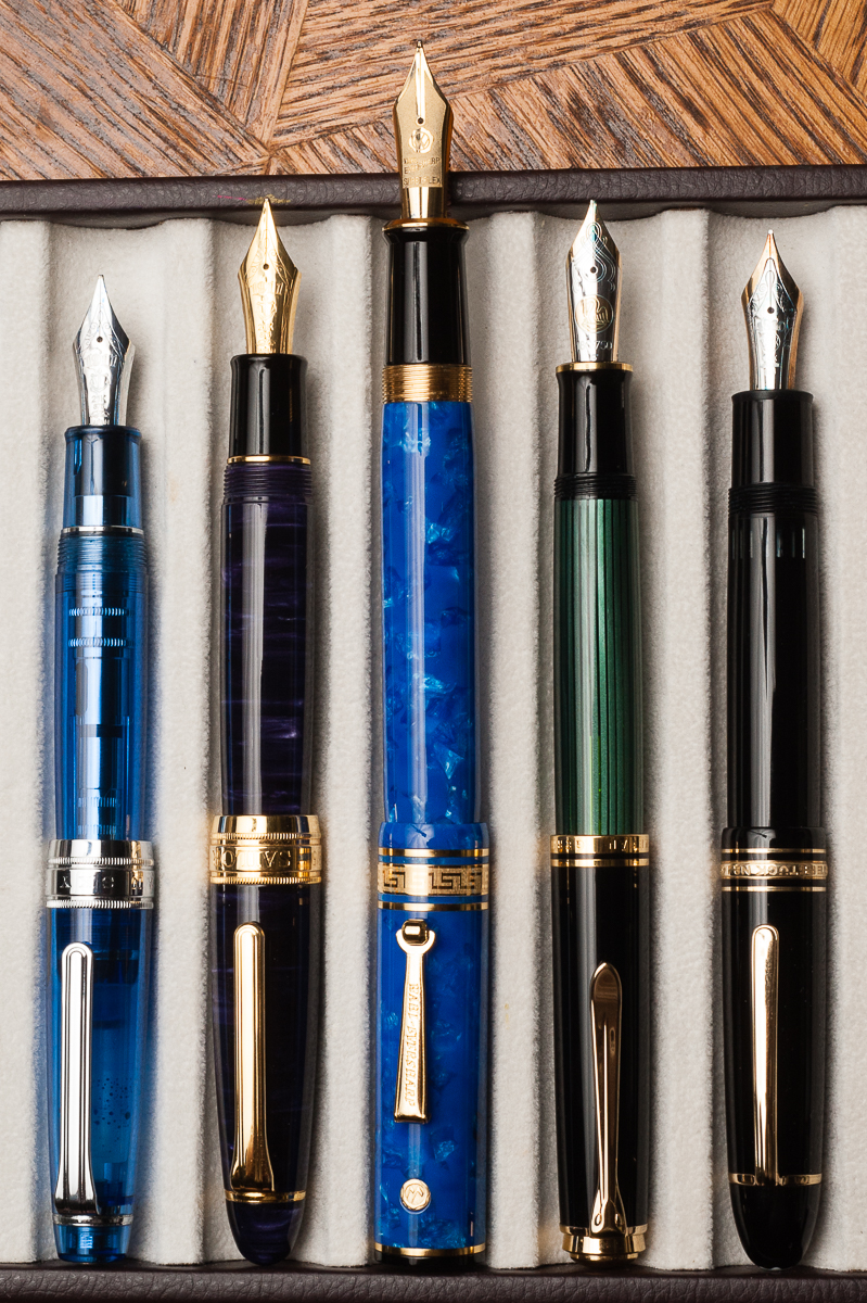
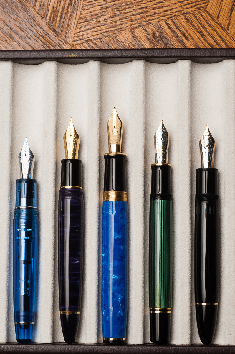
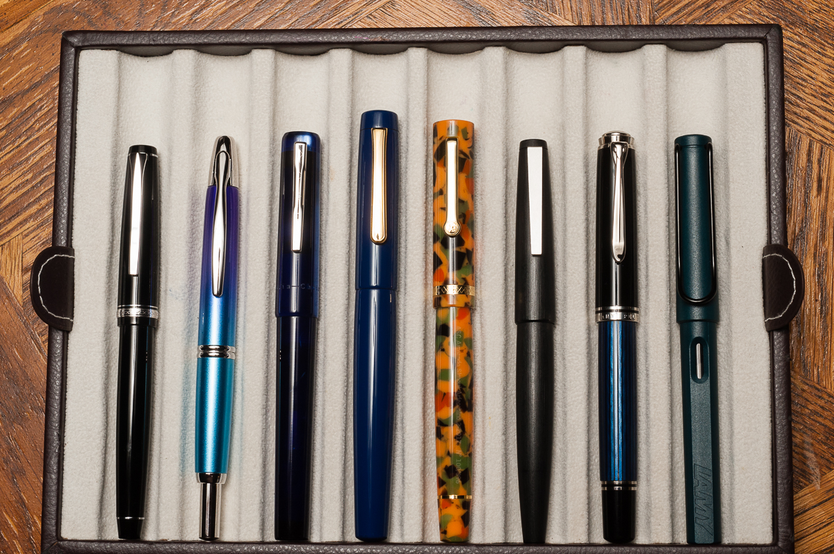
Pen Comparisons
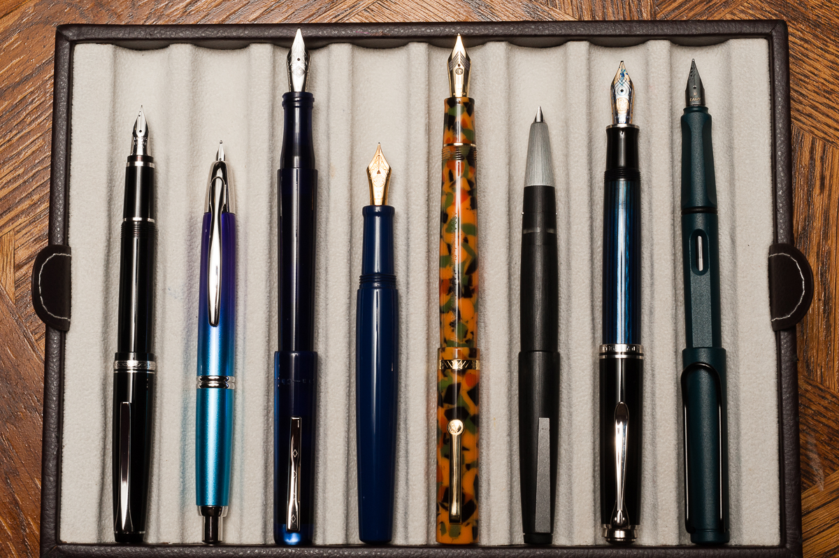
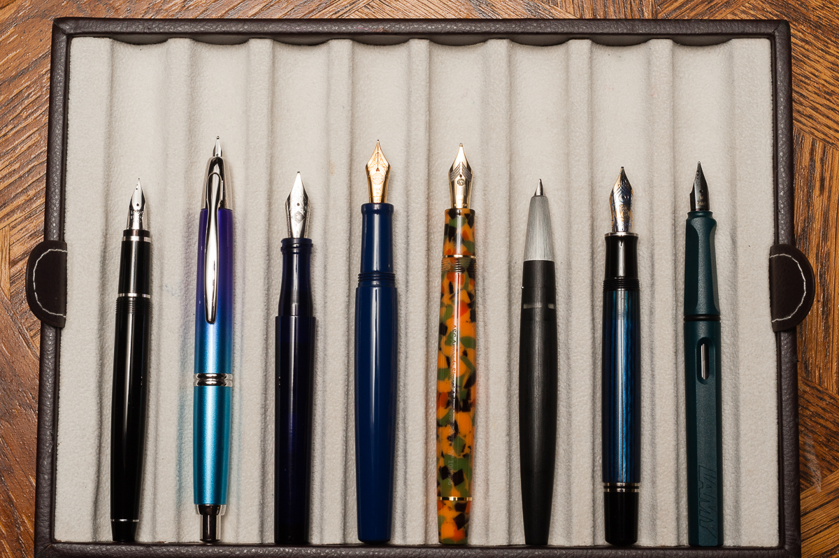
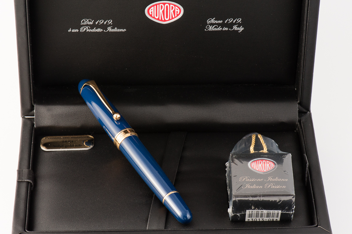
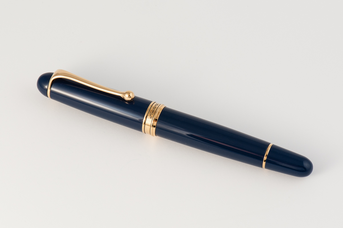
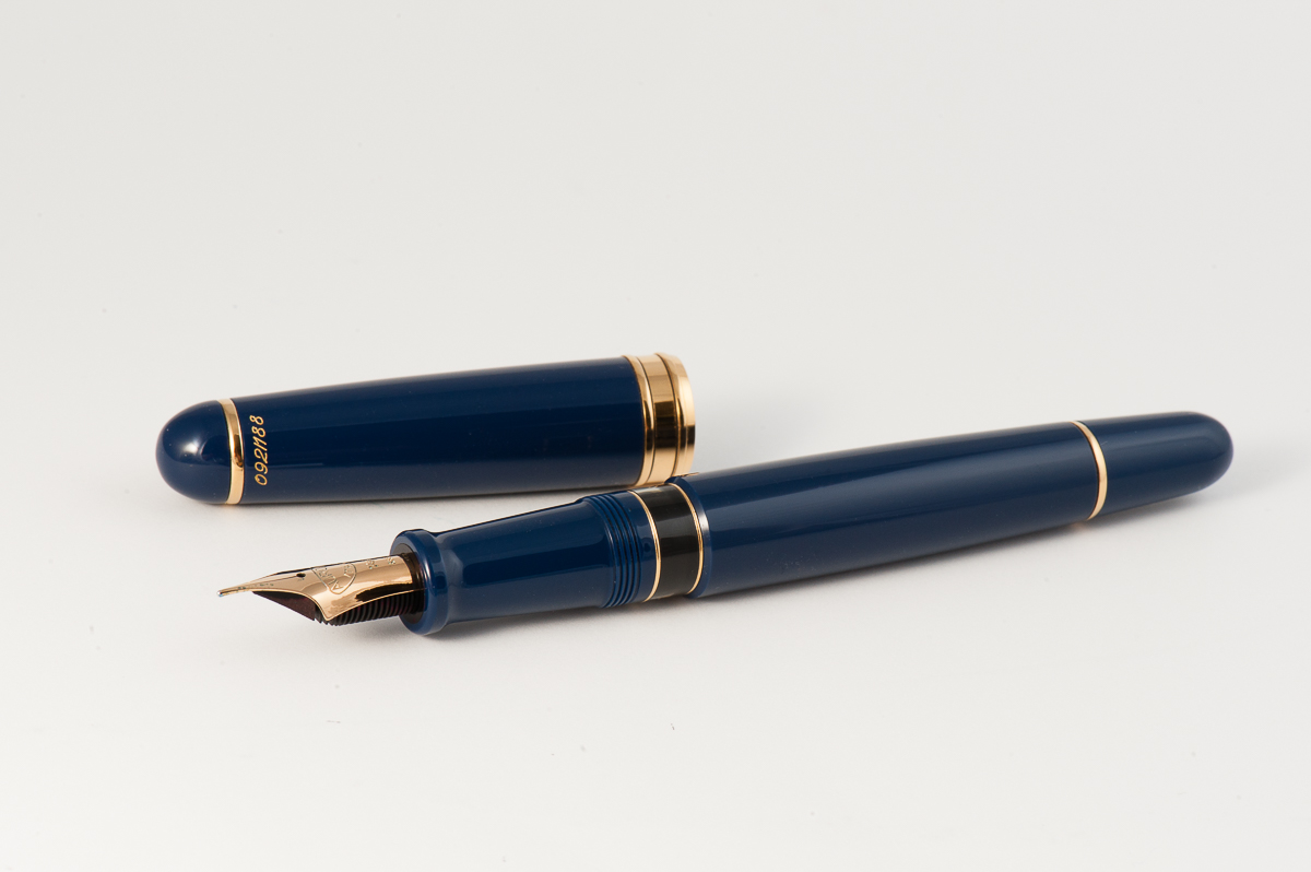
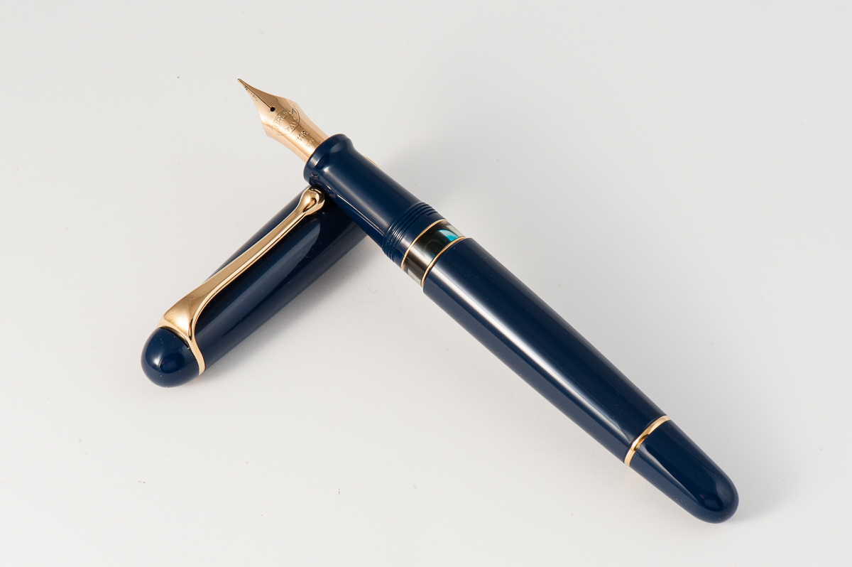
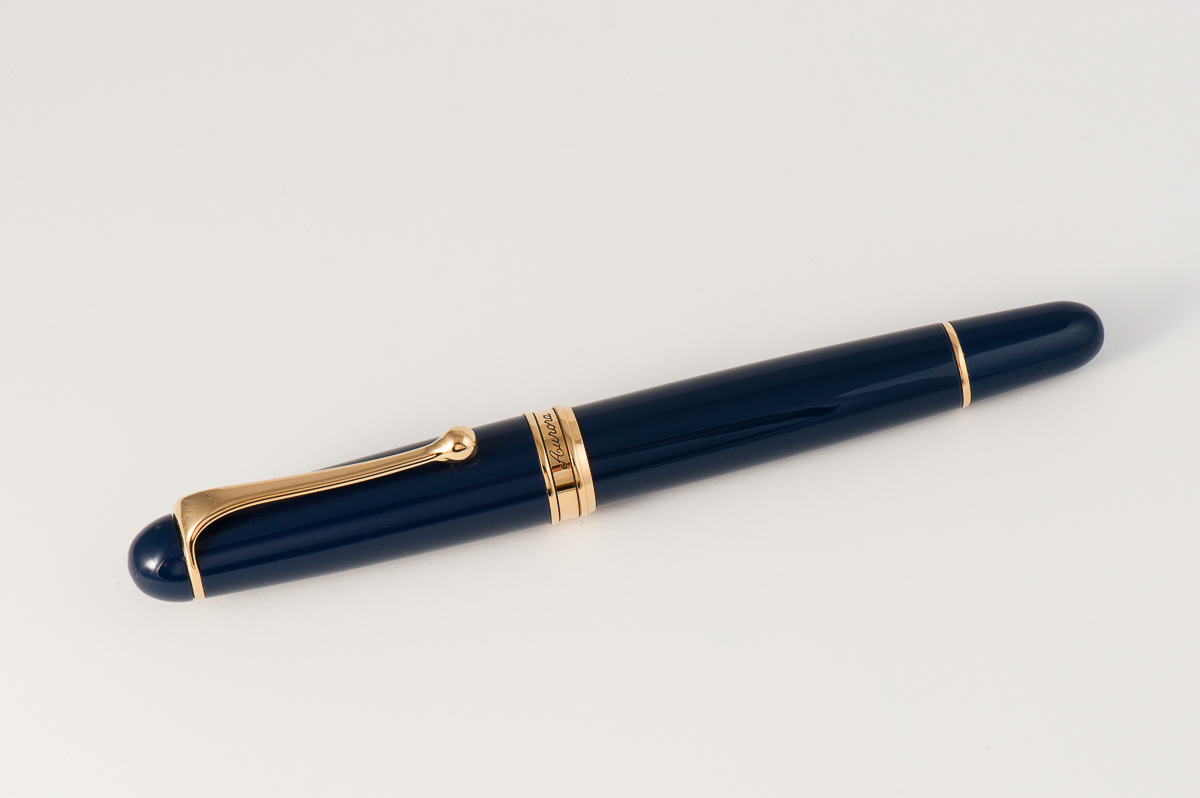
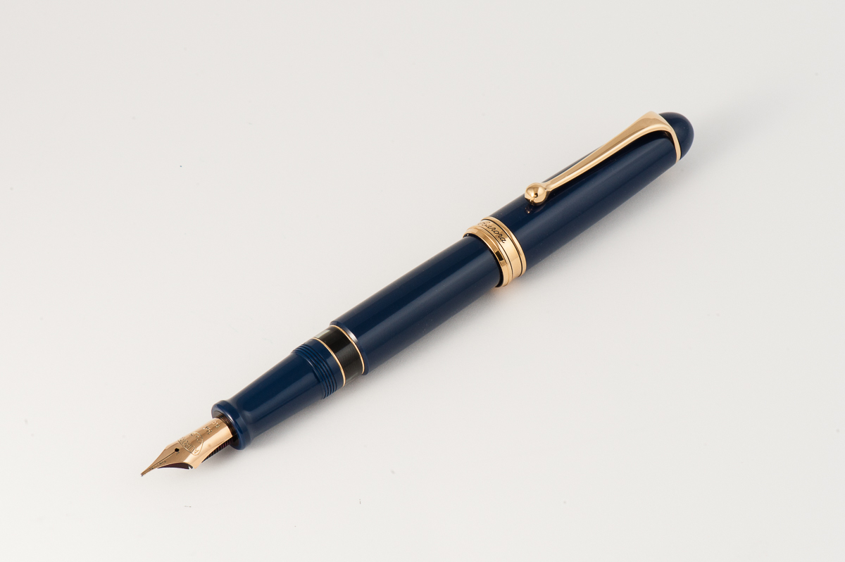
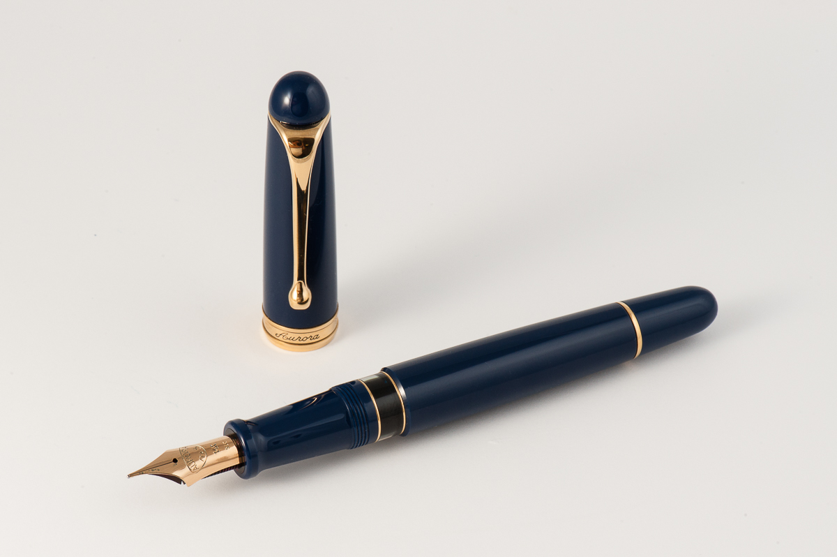
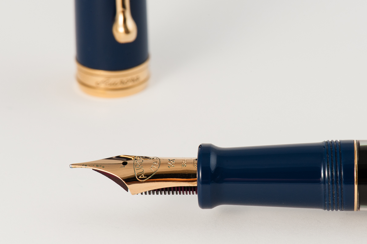
Pen Photos (click to enlarge)