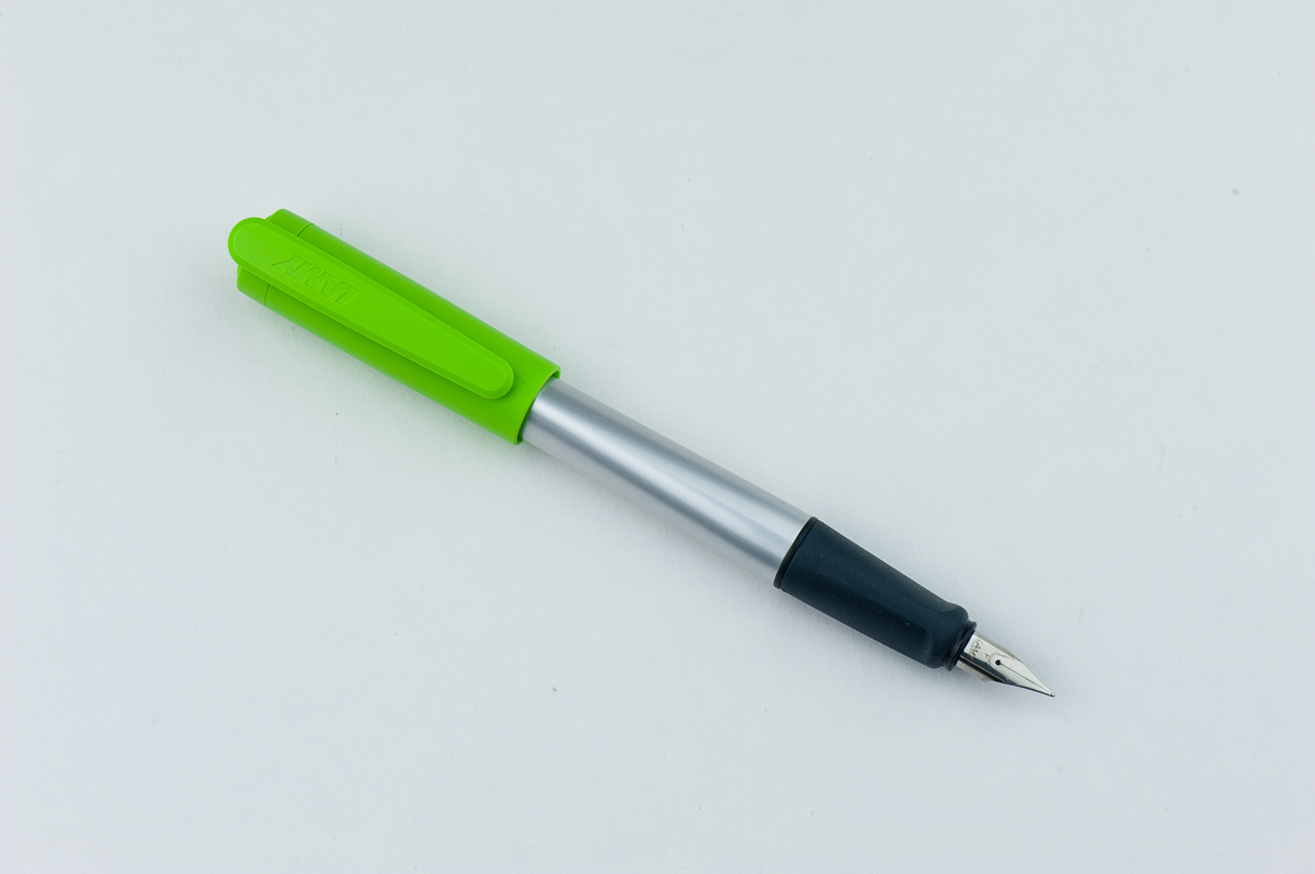
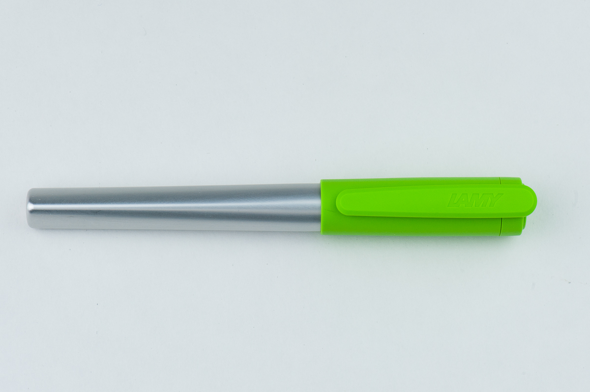
Review: Lamy Nexx (Lime, Fine Nib)

Disclaimer: Katherine has published a partial review — but not all of Franz’s reviews are complete. If you have small hands, we hope this review will be helpful anyway & Franz will catch up when he has time! (But life comes first, sorry!)

Hand Over That Pen, please!

Katherine: The Lamy Nexx ain’t my thing. It looks like a cheap disposable pen to me… and while it’s relatively cheap for this “hobby”, I think most of the “uninitiated” would still think $10+ (depending on the source) is pretty steep for the pen. But… I guess if you think of it as a cute school pen, maaaaaybe?

Pam: The Lamy Nexx holds a special place in my heart.  It was one of the first pens I owned and the first German nib I used at the start of my journey down the pen rabbit hole.  I was drawn to the price, quality of the nib that you hear so much about as a newbie, and the bright color of the design.  I found the design to be relatively “cute” by Lamy standards.  It’s eye catching and a reliable writer.  Not a bad combination for a newbie’s pen.

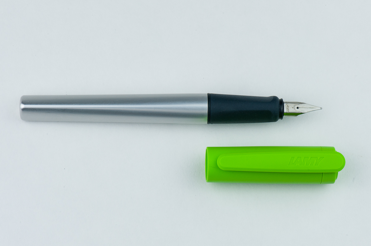
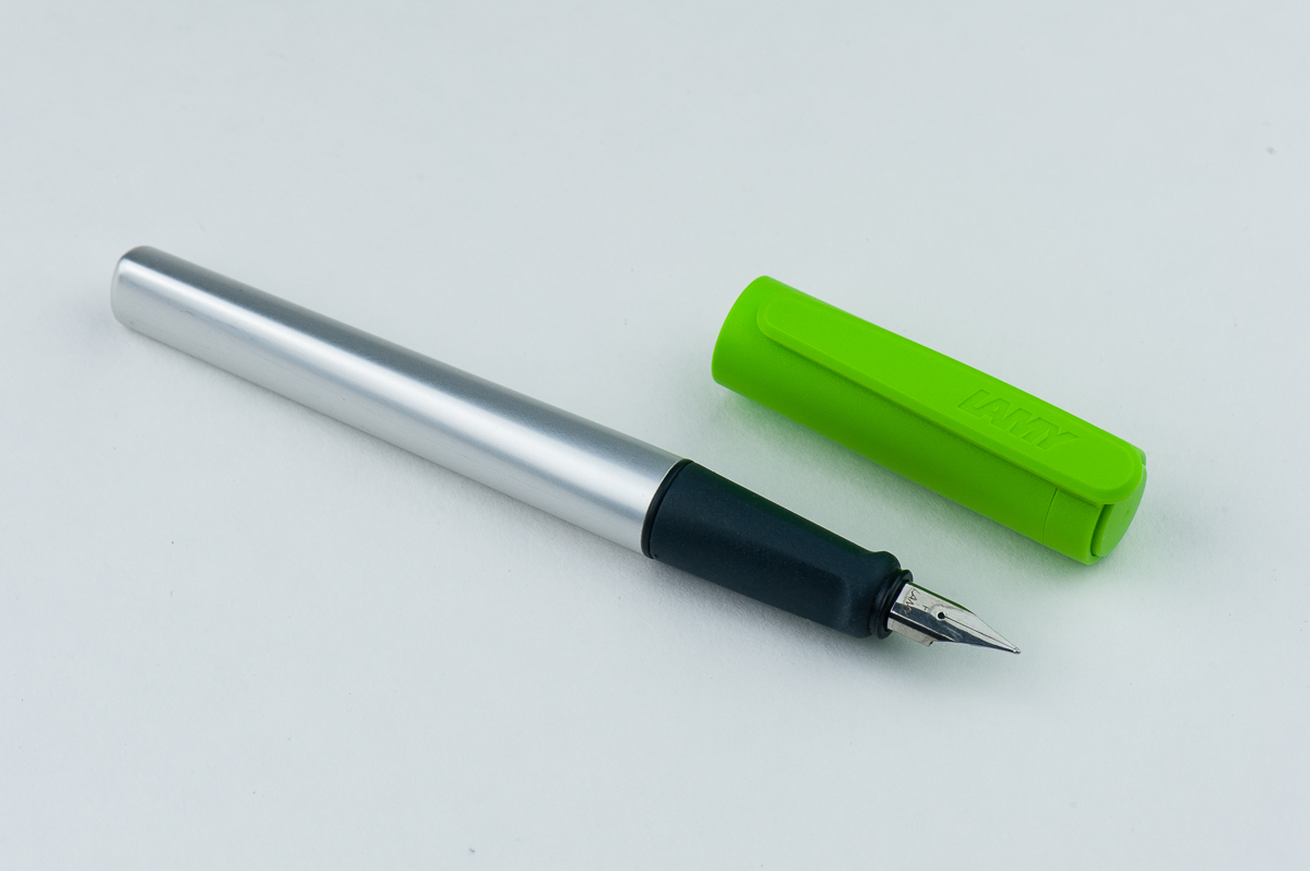
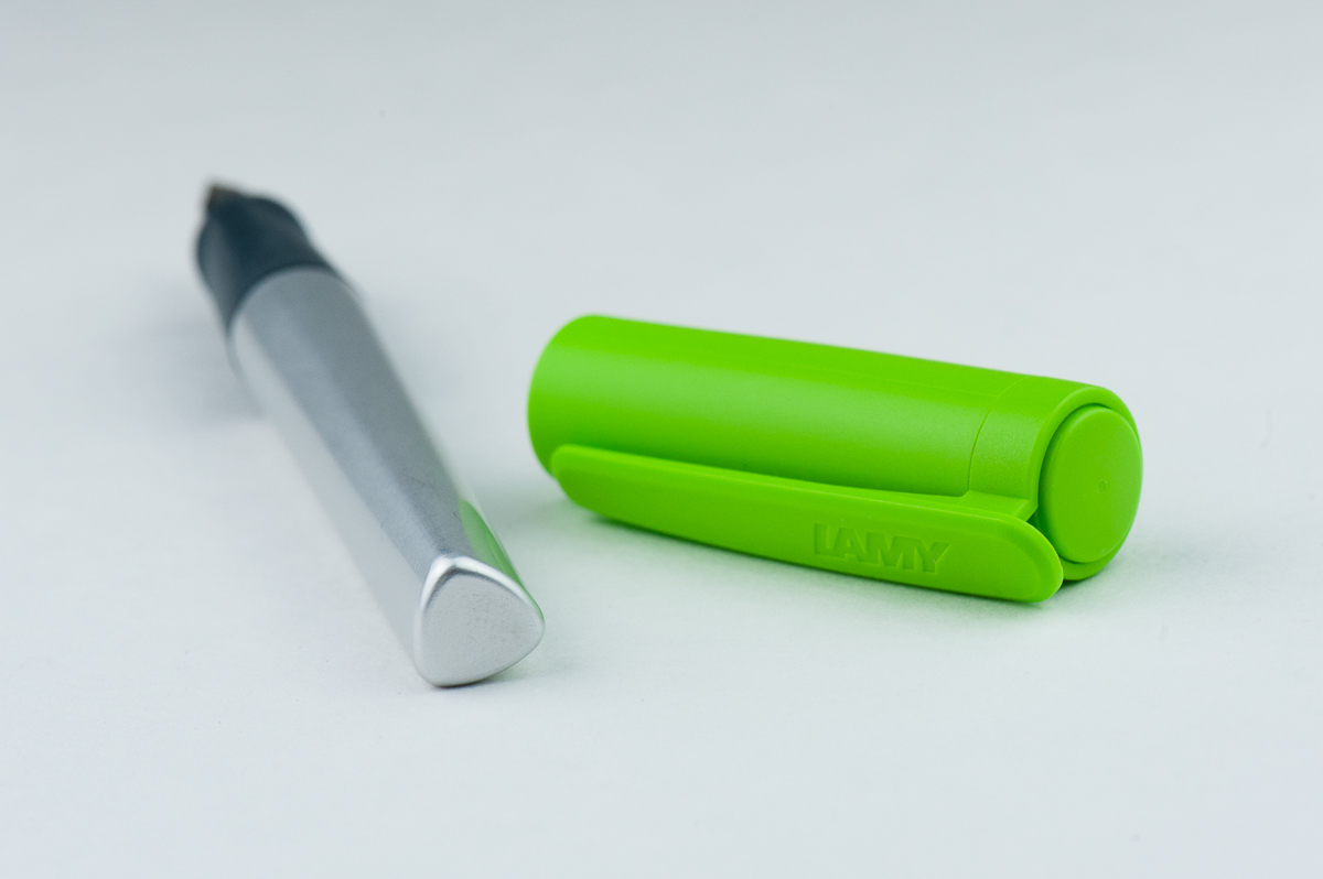
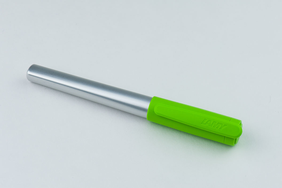
Franz: This pen has an interesting shape and silhouette! I like how the Nexx tapers from the cap to the barrel. And that bright green cap just pops.

Roz: At first glance, the Lamy Nexx looks so different compared to the Aion and 2000! The shape and colors are cute and fun; the pen itself is also very light compared to its more serious looking siblings. I am, however, a little nervous about the Nexx’s triangular body and grip.
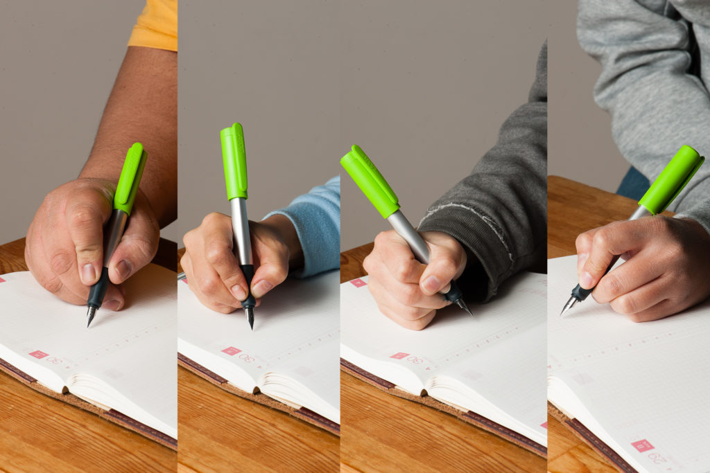
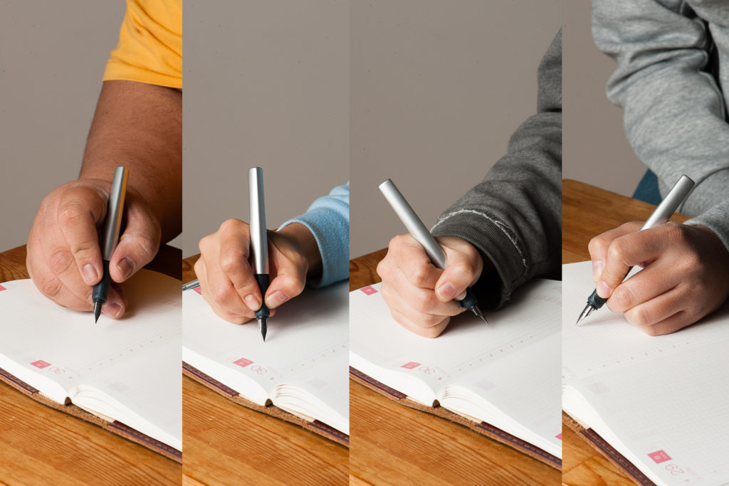
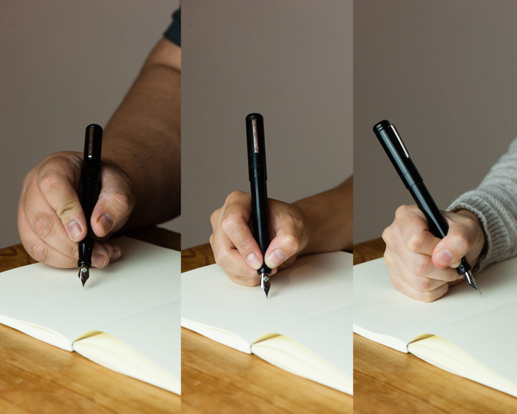
In the Hand: Lamy Nexx (posted) — from left to right: Franz, Katherine, Pam, and Roz
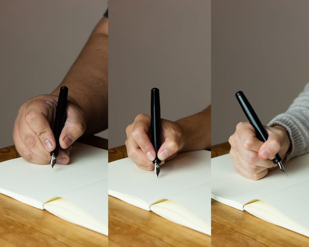
In the Hand: Lamy Nexx (unposted) — from left to right: Franz, Katherine, Pam, and Roz

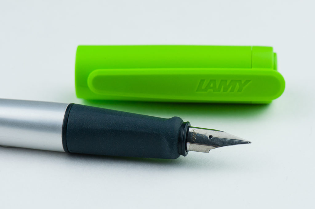
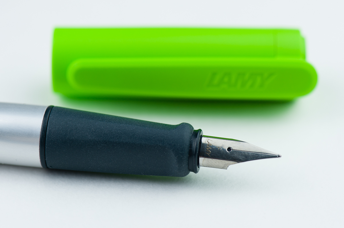
The Business End

Katherine: I found the Lamy Nexx a little too smooth, as I tend to do with Lamys. If smooth and wet is your thing, this pen may be a fit — but I prefer a bit more tooth and character to my nibs.

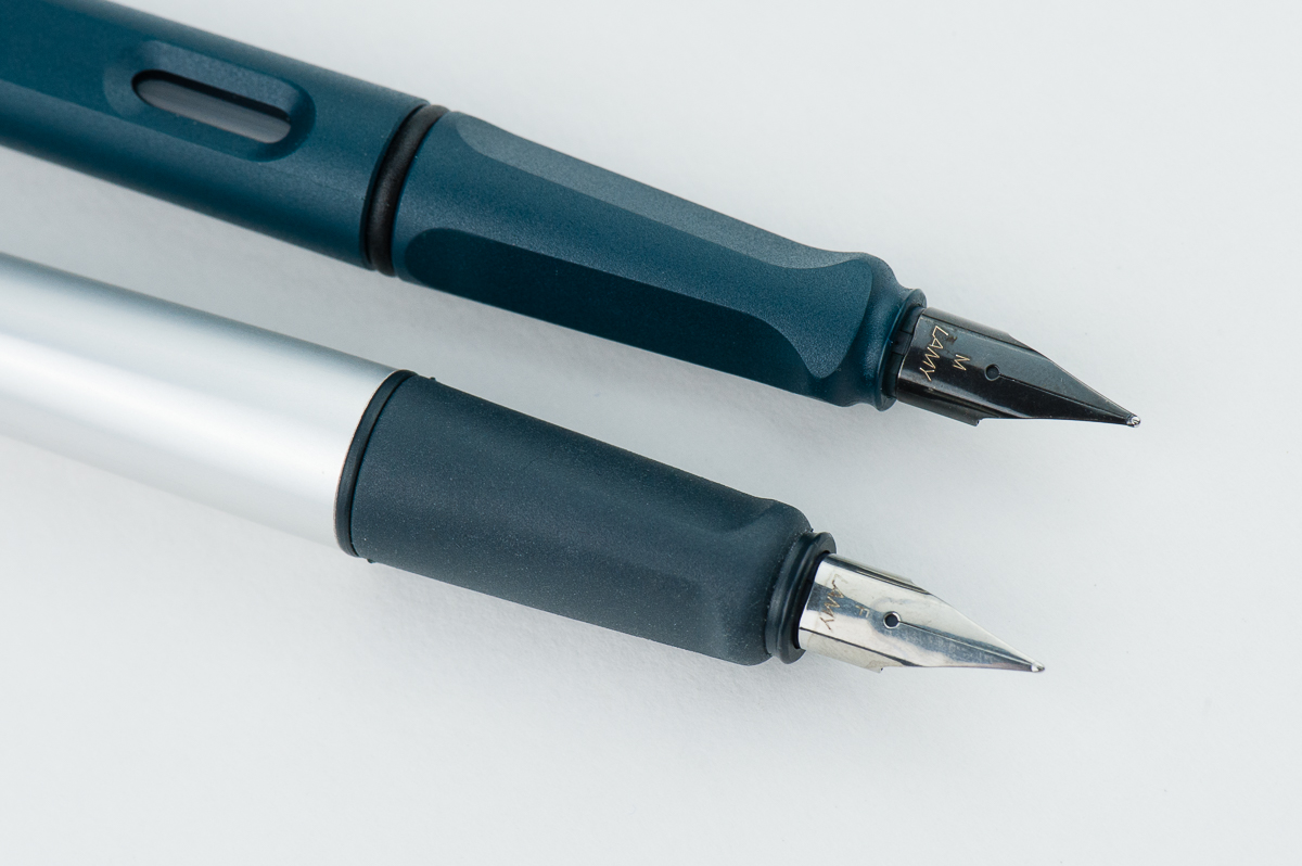
Pam:  I do enjoy the Lamy Nexx has the same nib as the Lamy Safari.  I find the “larger” nib sizes like the M and B are super smooth.  The EF can provide minimal feedback but not typically.  The Lamy ink can seem to run a bit dry and boring, particularly the blue or blue-black from my recollection which does make a marked difference in writing experience with cheaper office paper.  The EF nib doesn’t seem to glide as well with drier inks whereas the M nib is effortless.

Franz: The nib on the Nexx is

Roz: As always, I’m starting to notice, Lamy’s nibs are amazing. I was concerned the triangular grip would dictate too much the angle I wrote at, and impact the ink flow as a result – but I was worried for nothing! It doesn’t matter at what angle I wrote, the ink is always consistent and there is little to no scratchiness.
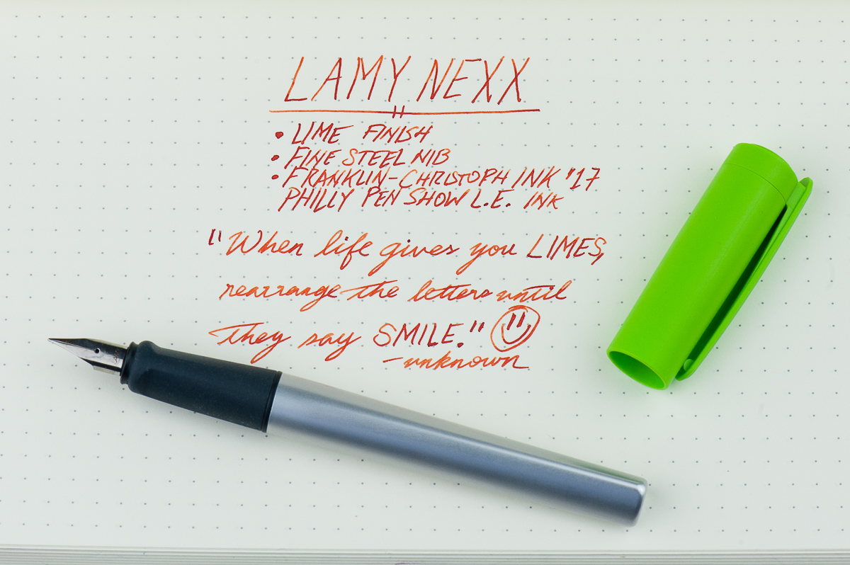
Writing sample on a 68 gsm cream Tomoe River paper (Hippo Noto)

Write It Up

Katherine: Overall, it’s a pretty comfy pen. The rubberized triangular grip fit my hand well, and I had no issues writing with it for long stretches.

Pam:  I have no issues with triangular grip and found it be comfortable for long writing session.  It was a pleasurable experience and the bright color was a bit of a welcome distraction for me.  I preferred to write with this pen capped, like the good ol’ days.  I liked the extra weight as little as it was.  It was an overall light pen.  That being said, the plastic isn’t very impressive to write home about.  I felt the other plastic pen from Lamy, the Safari has a much better feel for the body.

Franz:

Roz: This is where I expected the triangular grip to really impact my writing experience. But the grip – combined with how light the Nexx is – was not as intrusive as I thought it would be. Posted or unposted, the Nexx was comfortable to work with and left almost no impression – even after long writing sessions.
EDC-ness

Katherine: It’s a great EDC pen if you don’t mind your coworkers thinking you’re using a kid’s pen. It’s cheap, seems very durable (I didn’t throw it at anything, but it looks like it would hold up) and it’s easy to spot in a crowded backpack.

Pam:  I really enjoyed using it at work because the snap cap was so convenient to use.  The older version of the pen had a loop on the cap that allowed for it be tied into a lanyard for fast deployment. This iteration doesn’t have that feature which isn’t much of a loss given the lack of practicality.  I prefer the clip which seems a bit flimsy.

Franz:

Roz:  I kept the Nexx with my planner mostly and it did very well in my Hobonichi’s pen loops. I carry my planner with me every day and I’m not gentle on it either! I throw it in to my backpack, rummage around for it when I have a moment to brain dump or work on it whenever I have time at the office or on the train – so it really mattered to have a pen paired with my planner that could keep up with all that which the Nexx did with flying colors.
Final Grip-ping Impressions

Katherine: It’s a solid writer, and if the cap wasn’t so bulbous I’d consider giving these as gifts to friends and family who are new to the world of fountain pens. However, instead I worry that they’ll think I got them a disposable pen and I’ll stick to an Eco, Metro or maybe even a Safari (my least favorite of the three).

Pam:  I really like the Lamy Nexx for nostalgic reasons.  However, there are better priced options for starter pens.  If you are looking for brightly colored, almost cute pen, with a well functioning Safari nib for the youth in you or in your life, the Lamy Nexx isn’t a bad choice.  Alternatively, if you want a finer line and something comparable, I would choose the Pilot Kakuno instead.

Franz:

Roz:  I think it’s safe to say I am solidly a Lamy fan girl. Between the Lamy 2000, Aion, and now the Nexx, I have truly enjoyed being able to try them all. The Nexx seems to have found a great role to fill within the Lamy line; it’s light and fun, and even at the end of this review the Nexx is sitting in my line of sight and I still want to pick it up and write with it!
Pen Comparisons
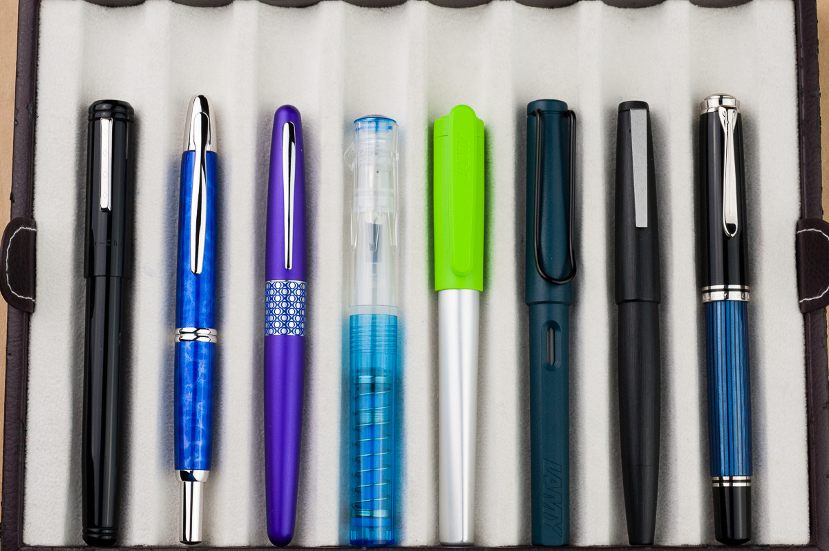
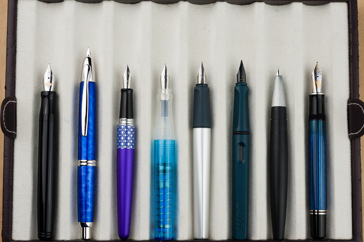
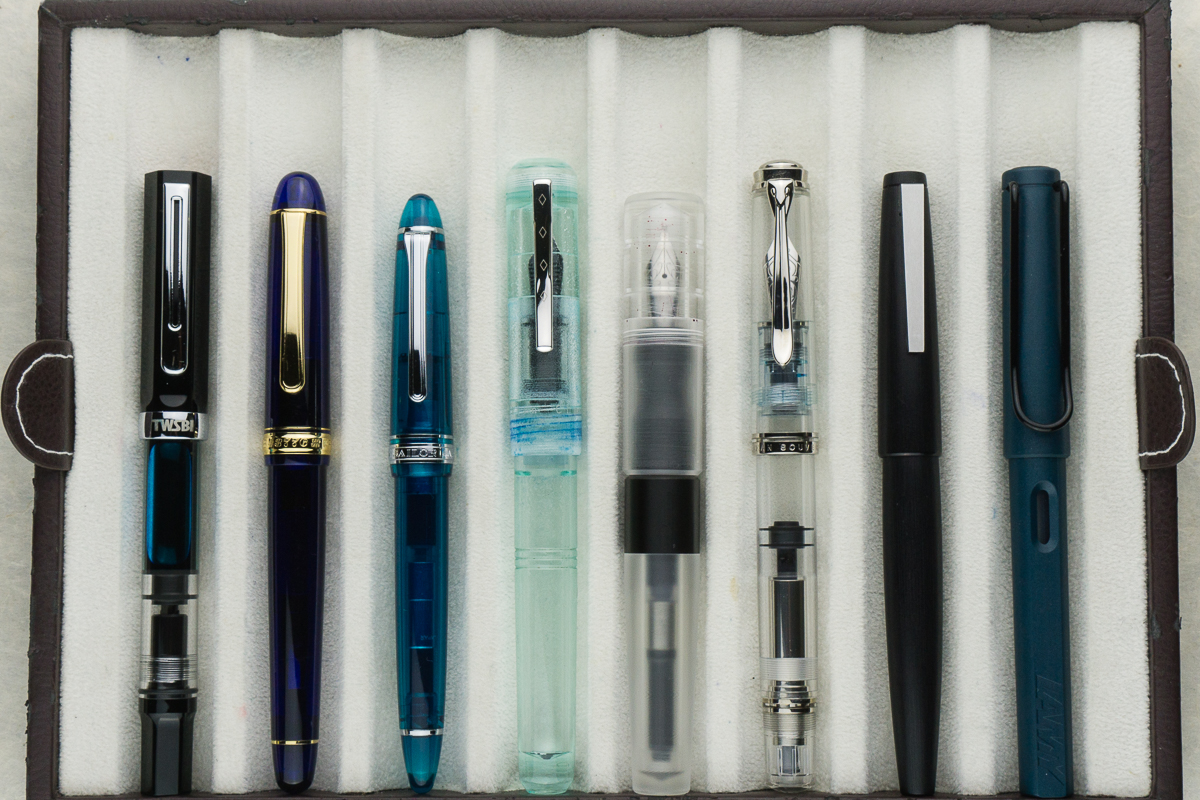
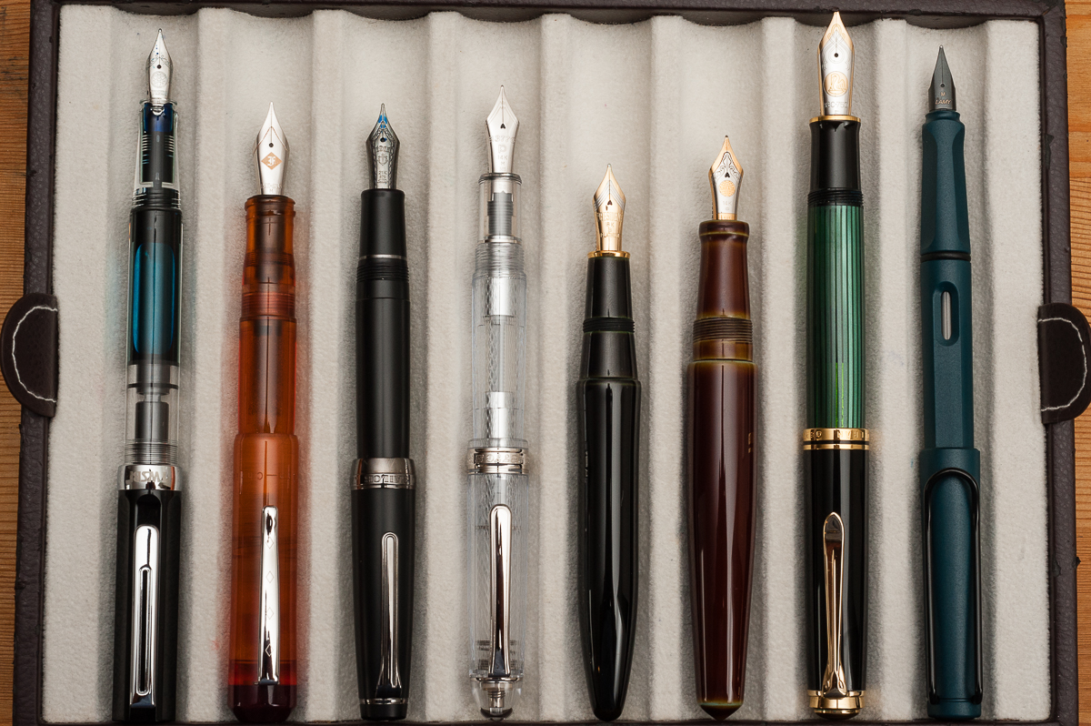
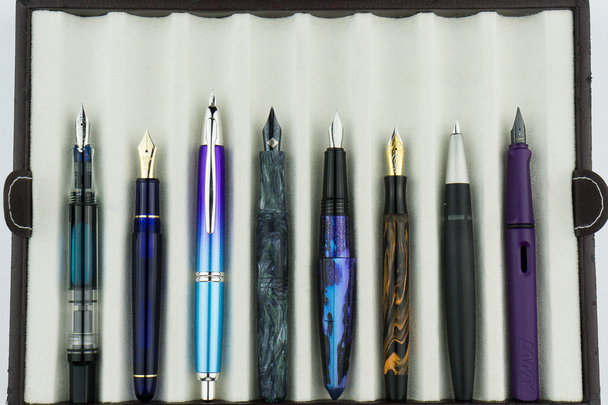
Closed pens from left to right: Franklin-Christoph Model 20, Pilot Vanishing Point, Pilot Metropolitan, TWSBI Go, *Lamy Nexx*, Lamy Safari, Lamy 2000, and Pelikan M805
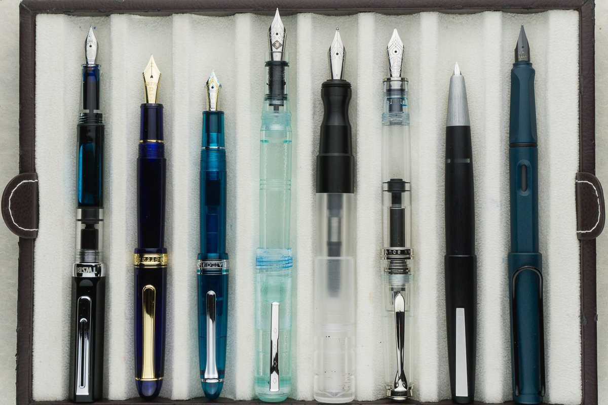
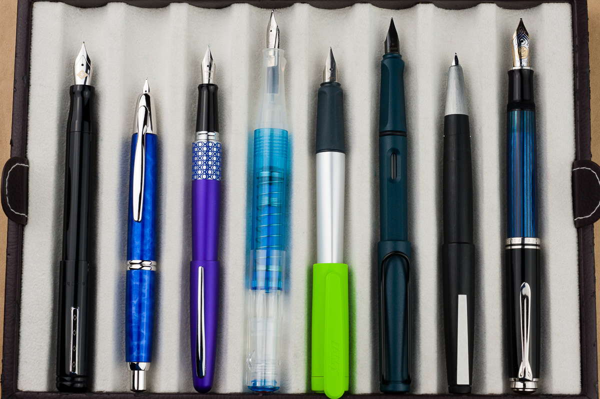
Posted pens from left to right: Franklin-Christoph Model 20, Pilot Vanishing Point, Pilot Metropolitan, TWSBI Go, *Lamy Nexx*, Lamy Safari, Lamy 2000, and Pelikan M805
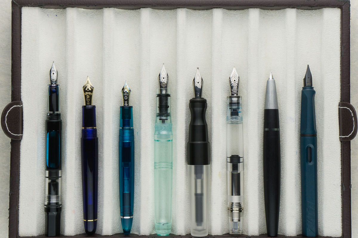
Unposted pens from left to right: Franklin-Christoph Model 20, Pilot Vanishing Point, Pilot Metropolitan, TWSBI Go, *Lamy Nexx*, Lamy Safari, Lamy 2000, and Pelikan M805

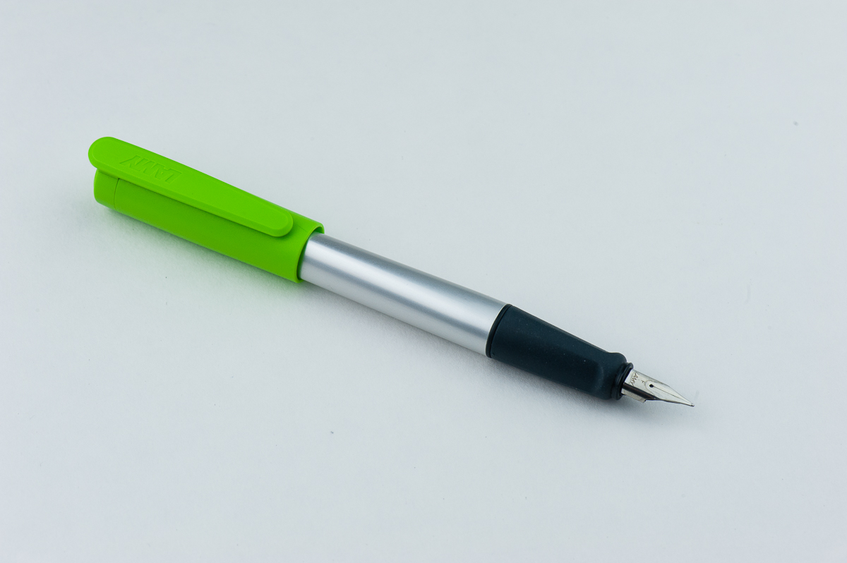
Pen Photos (click to enlarge)

We received this pen free of charge for the purposes of this review. We were not compensated monetarily for our review. Everything you’ve read here is our own opinions.
1 Comment

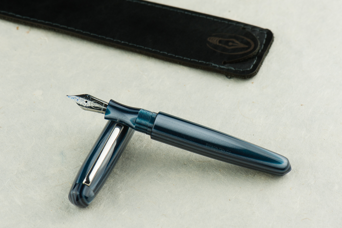
Review: Edison Pearl (Striated Navy Stripe, Fine Nib)


Hand Over That Pen, please!

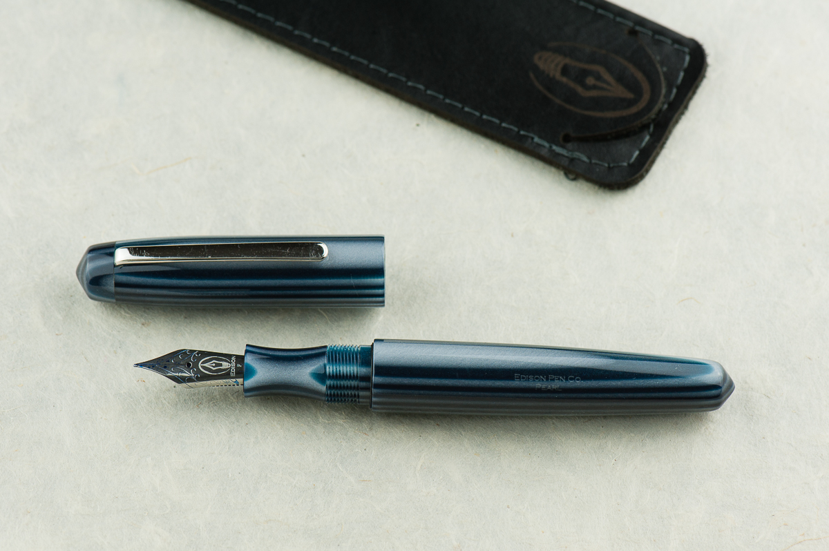
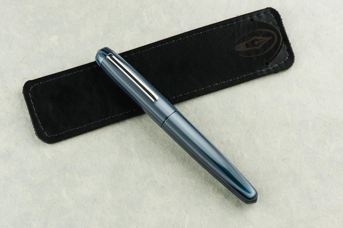
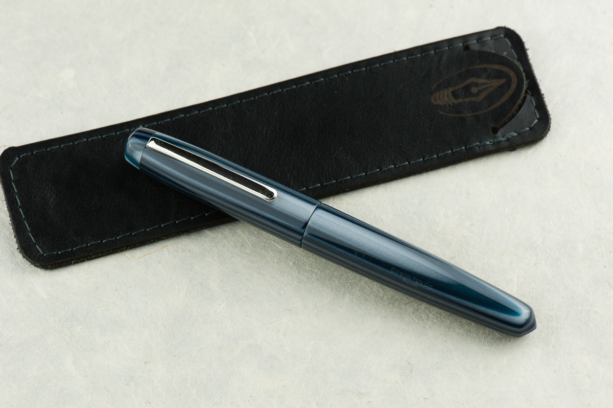
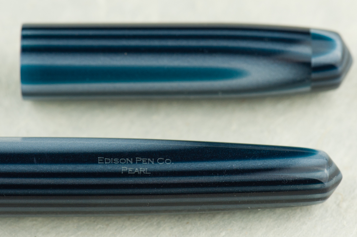
Katherine: Oooh stripes! And blue! And a hint of sparkle. And pointy ends! All the things I love in a pen. The shape is heavily reminiscent of the Nakaya Piccolo, and as with that pen, I love the clean lines and the small touches on this pen, like the gentle taper and conical ends. Franz’s example is particularly close to my heart because it’s both blue and striped, but I’m sure it comes in a variety of materials depending on one’s taste.

Pam:  The Edison Pearl is a great flagship pen and a great example of their work.  They take pride in their craftsmanship from nib to pen material.  They were one of the first companies that I was made aware of as a newbie fountain pen addict that broke the mold using beautiful and unique acrylics.  This particular material that Franz selected is absolutely stunning.  The blue and gray stripes is a great compliment to this simple shape.

Franz: Fountain Pen Day 2013. Yep. That’s what I call this pen because I got this from Edison Pen Co.‘s current inventory offering on FPD. I never held an Edison Pearl before but c’mon! With the shape and the blue… I mean, the material, how can one go wrong? =) The Edison Pearl is part of Brian and Andrea Gray’s Signature Line of pens and you purchase one either by checking out their Current Inventory, or emailing them and ordering a custom one for yourself.

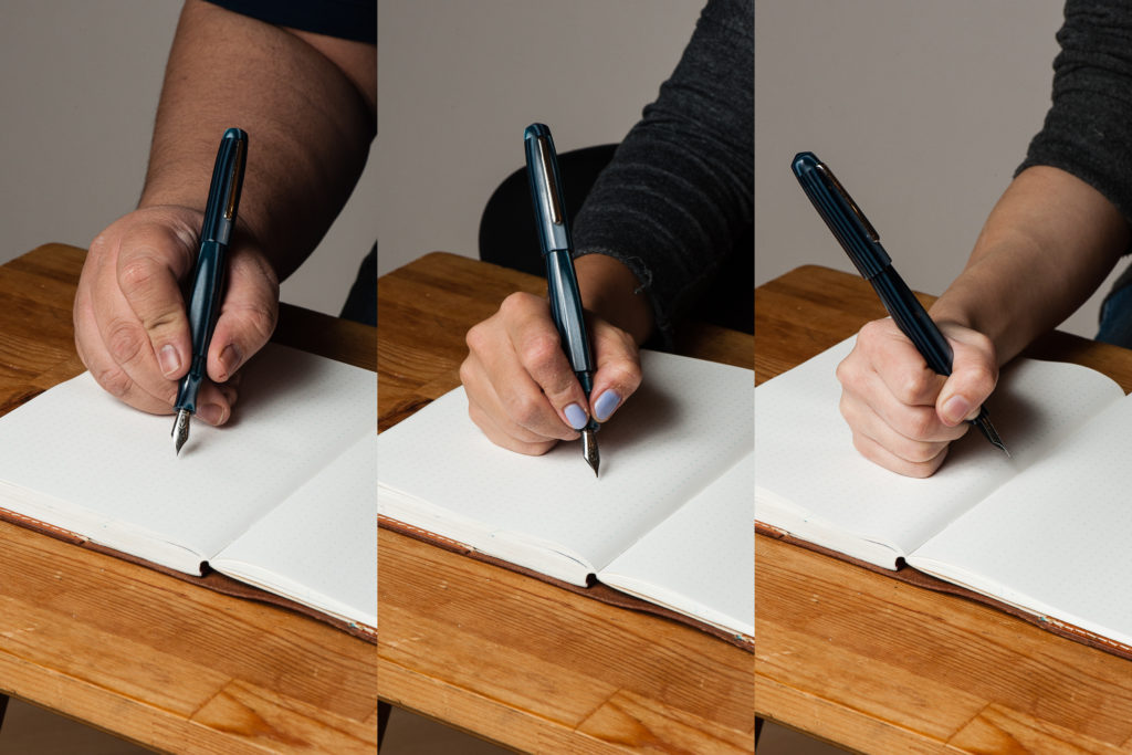
In the Hand: Edison Pearl (posted) — from left to right: Franz, Katherine, and Pam
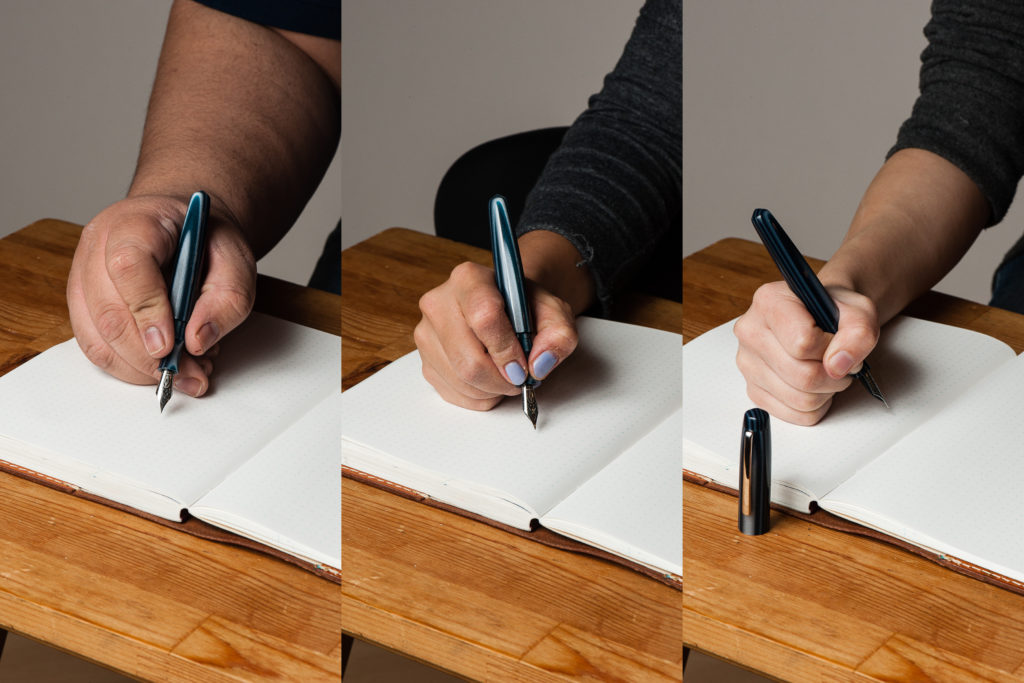
In the Hand: Edison Pearl (unposted) — from left to right: Franz, Katherine, and Pam


The Business End

Katherine: It’s a Jowo holder, but Brian Gray tunes the nibs quite nicely. Franz has this one paired with a smooth wet Fine nib, but think of all the other fun nibs it could house!

Pam: The fine nib is very smooth for its size and I find it touch glossy.  A great compliment to Brian Gray’s tuning work.  This is a great pen for those who would want to swap nibs.

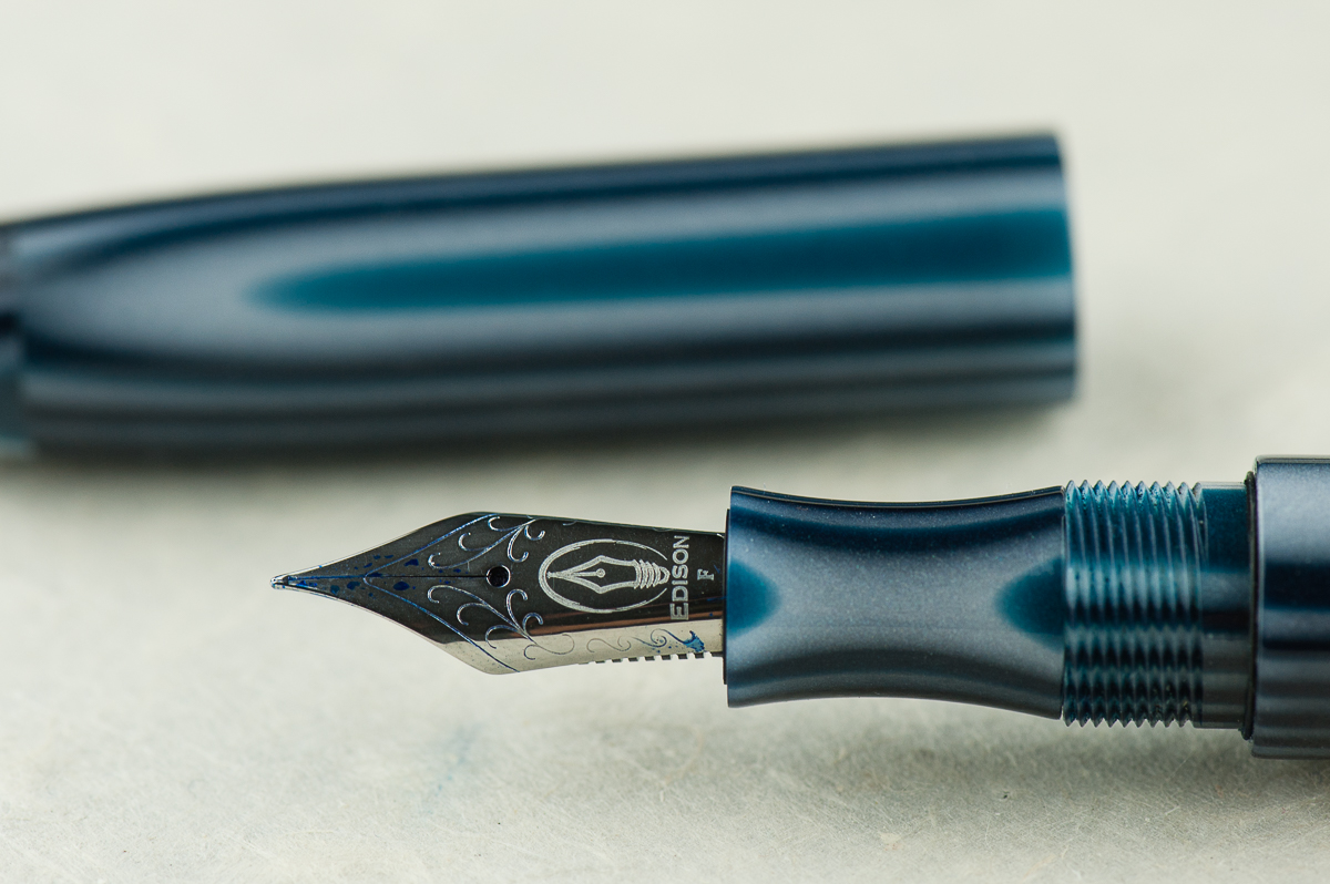
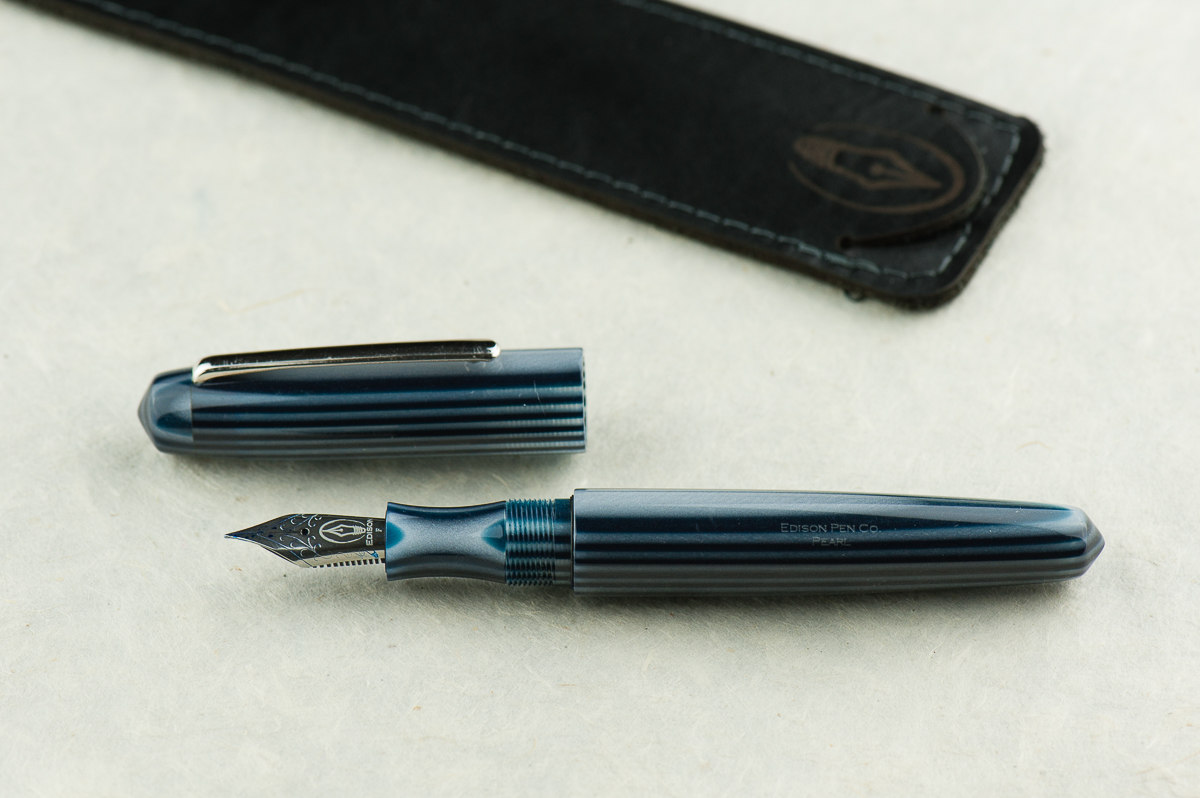
Franz: Originally, this pen came with a medium 0.9mm cursive italic customized by Mr. Brian Gray and I love that nib. For this review, I just swapped it with a fine nib from another Edison Pen of mine. As with any well tuned nib, this fine is quite fine to write with. And I love how the nib (logo) within a nib looks!


Write It Up

Katherine: The Pearl is comfortable, but the “waist” on the section is a little deeper than I’d prefer. With narrower sections like this, my thumb tends to creep “forward” as I write, and eventually I end up in a Pam-like coma-grip (probably still not a vise-like).

Pam:  I find the width of the Pearl to be quite comfortable.  Alas, the threads fall right at where I would grip.  The threads are not too sharp, but I am reminded that they are there if I grip too hard. I don’t have too much contact with the waist of the section, and the section does widen to the width similar to the pen body.

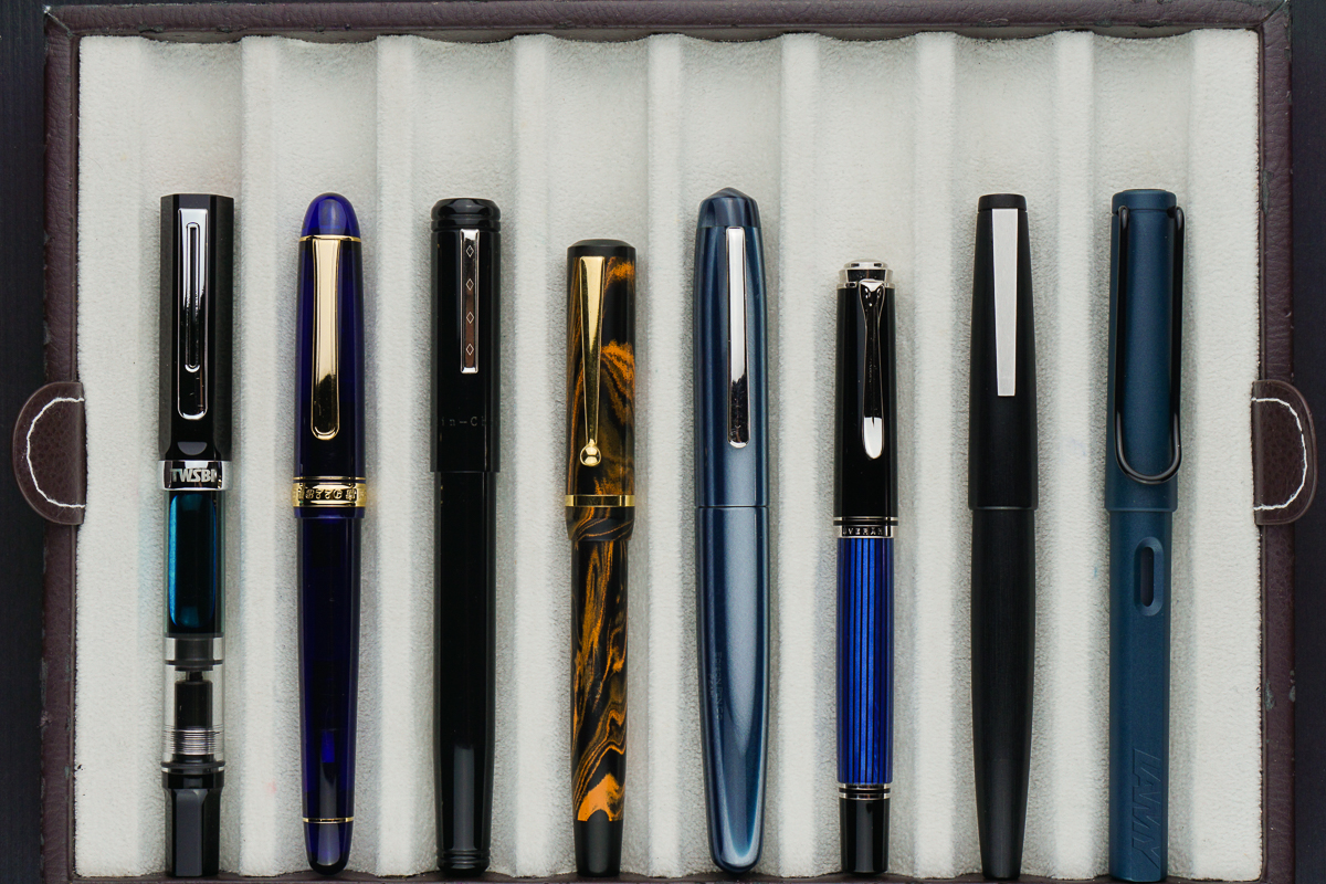
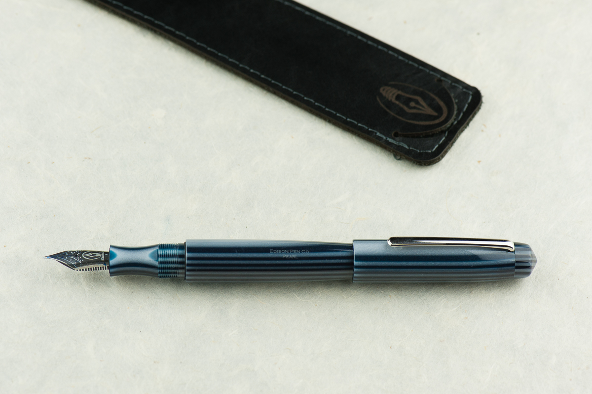
Franz: Like Katherine, I found the section’s concave design a little too thin so I always gripped it by the threads. The Pearl may have a girthy barrel but the length is a little short when the cap is unposted. Unfortunately, the cap does not post securely and it makes it a bit too long. You can definitely see that in our hand comparisons above.

But nevertheless, using the Pearl unposted, I’ve written a couple of letters and lots of pages in my journal. The shorter length definitely gives me some fatigue but it’s fairly adequate for my bear paw.


EDC-ness

Katherine: The Pearl takes one and three fourths turns to uncap, and has a solid clip. Overall, no complaints from me on carrying this pen daily.

Pam:  This pen is a great pen to for regular carry with a small number of rotations to uncap and a professional looking clip.  I think this would be a very adventurous pen in the office!

Franz: I’ve used the Pearl for journaling, as well as in the office setting. The original 0.9mm cursive italic and the fine nib currently installed writes nicely on cheaper copier paper. My personal every day paper is Tomoe River and I enjoy the fine line for practicing some tiny writing.


Final Grip-ping Impressions

Katherine: Section aside, this pen is reminds me a lot of a Nakaya Piccolo, except in a much wider range of fun materials and lots of nib choices. Additionally, since the Pearl is part of Edison’s Signature line, it’s customizable — so you could get one at a Piccolo length, or a longer one if you have oversize hands. As with any customizable pen, it all comes down to your preferences — but as a base, the Pearl has great (to me!) shape and is very well made and immaculately finished.

Pam:  I love custom pen makers.  In a world where we obsess over the perfect shade of ink, the feel of nib and line widths; a customizable pen is ideal.  I would recommend this pen for those discerning individuals who enjoy building their own pen from a great maker.

Franz: The Edison Pearl is a fantastic example of Edison Pen’s quality of pen making. I’ve had this pen for five years now and even though it’s not a pen always inked up, I keep it in mind when rotating pens.

After the Pearl, I discovered and liked the longer pens that the Edison Pen Co. creates. The Huron and the Glenmont are pens that I currently favor more due to the length. Both have flat end designs. The Pearl seems to have a more unique shape among their line and perhaps I’d want one customized to be a little longer. Ahem…maybe next year? =)


Pen Comparisons

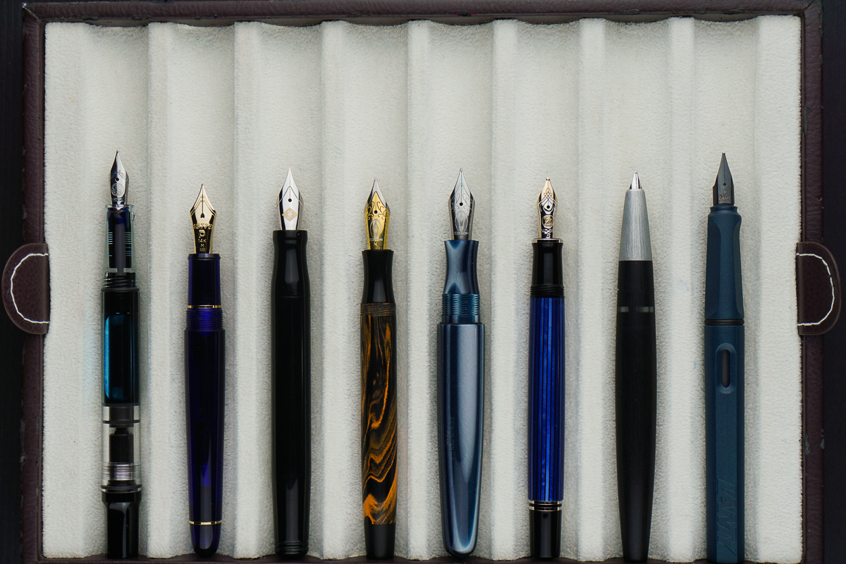
Closed pens from left to right: TWSBI Eco, Platinum 3776, Franklin-Christoph Model 20, Edison Beaumont, *Edison Pearl*, Pelikan M405, Lamy 2000, and Lamy Safari
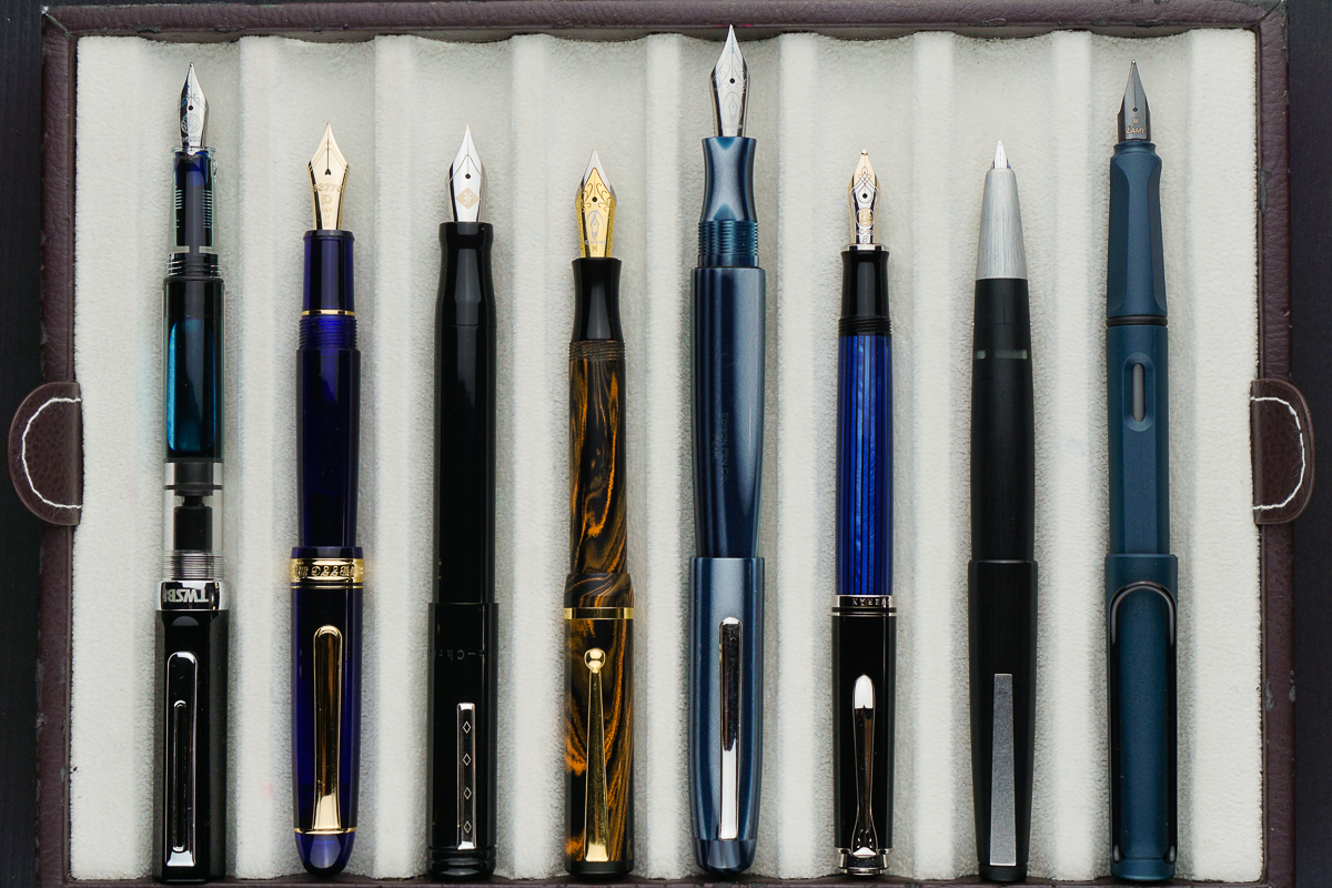
Posted pens from left to right: TWSBI Eco, Platinum 3776, Franklin-Christoph Model 20, Edison Beaumont, *Edison Pearl*, Pelikan M405, Lamy 2000, and Lamy Safari
Unposted pens from left to right: TWSBI Eco, Platinum 3776, Franklin-Christoph Model 20, Edison Beaumont, *Edison Pearl*, Pelikan M405, Lamy 2000, and Lamy Safari


Pen Photos (click to enlarge)

No Comments

Review: Kasama Una


Hand Over That Pen, please!

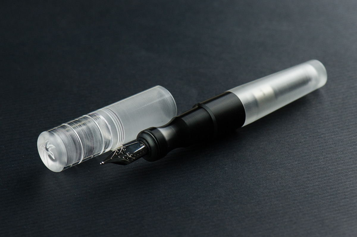
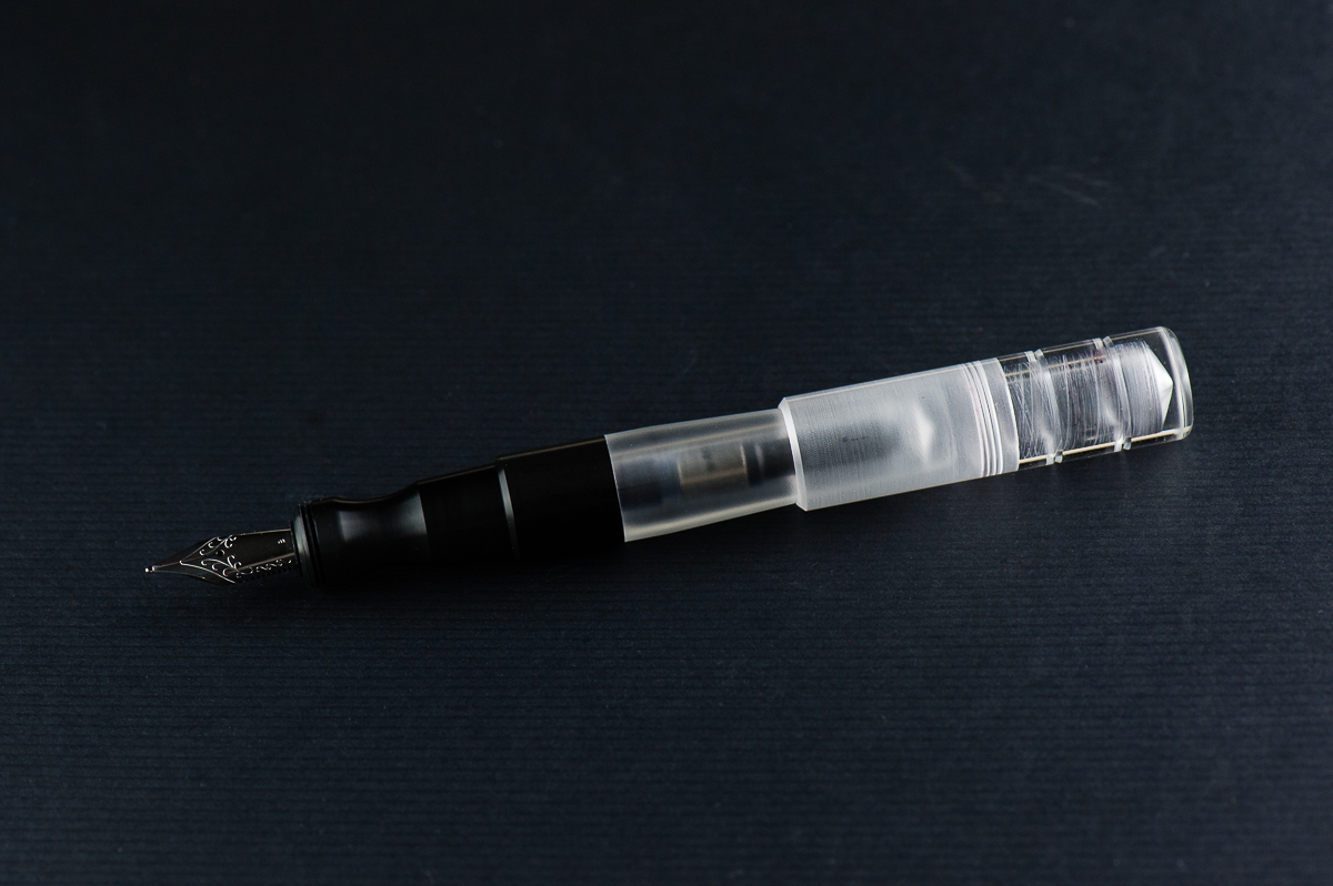
Katherine: I love short and chubby pens — so the Kasama Una is right down my alley. I also love demonstrators, despite not owning too many, so that’s another check mark. When Kasama first started selling the Unas, I was a little disappointed that they had delrin sections, instead of being entirely translucent, but now that I’ve spent some time with it, it’s grown on me a lot!

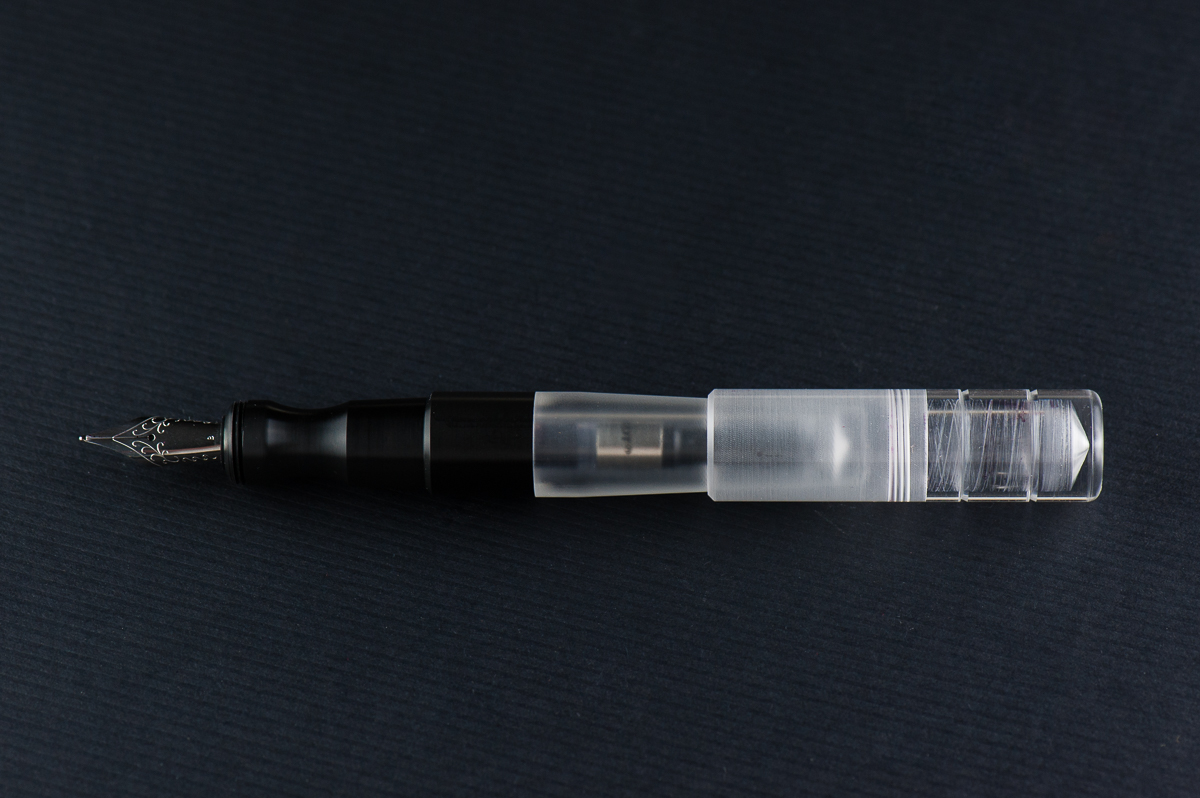
Pam:  I am so glad that Franz and Katherine are my gateways to the awesome pen and stationary community in the Phillipines.  The Kasama Una is a very modern pen with the translucent and black material.  The acrylic feels good to the hand, and the section is Delrin which feels fantastic.  It feels warmer than the acrylic in my opinion.  The shape of the pen seems disproportional to me at first glance, however, after picking it up, it makes a lot of sense.  The cap adds to the oversized nature of the pen, however, the pen body itself is proportional in your hand.

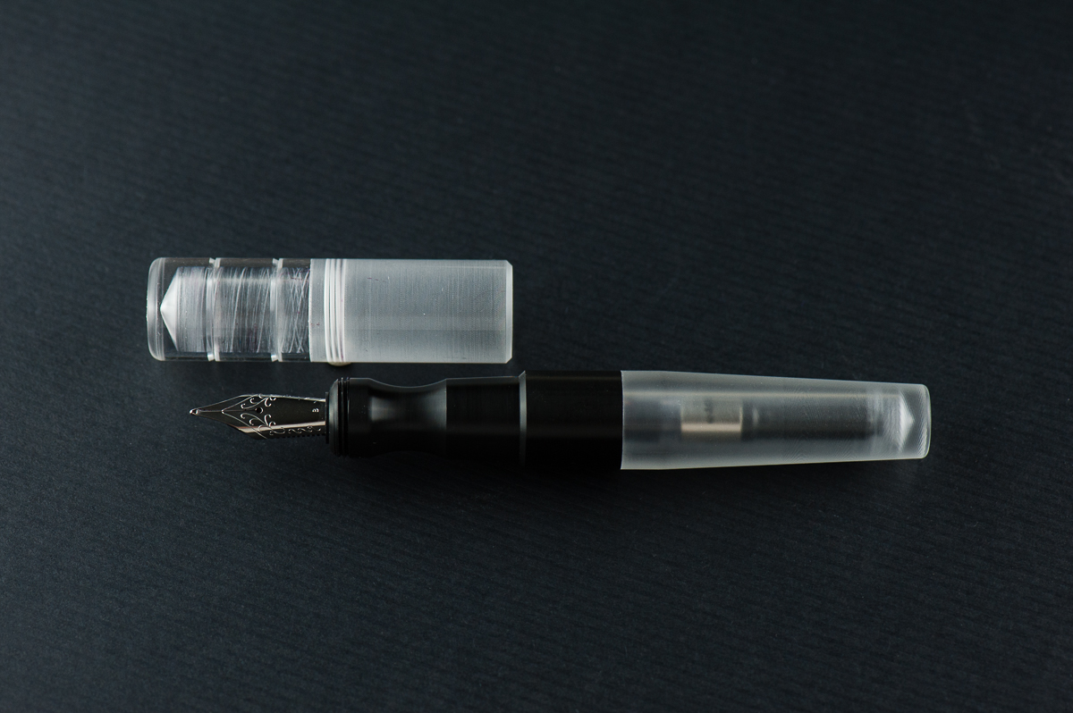
Franz: One of the things I love about this pen hobby is being able to check out cool things either in terms of design or materials. And this Kasama Una fountain pen definitely piques my interest in both of those aspects. Honestly, what drew my attention to this pen is its section. It’s oddly shaped, weirdly ergonomic, and that delrin material is prrretty cool! Actually, it seems that the Kasama folks created the pen around the features of the section (see their post on Instagram).

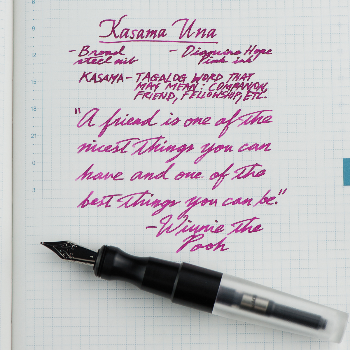
As Pam mentioned, Kasama is a new pen company from the Philippines and they create these Una pens in the Philippines as well. Kasama is a Filipino/Tagalog word that can mean a multitude of things depending on its usage and context. Some of which are: companion, fellow, friend, being included, or being in one’s company, etc. Una in tagalog means first which is befitting since this is Kasama’s first fountain pen.


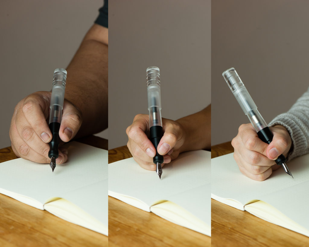
In the Hand: Kasama Una (posted) — from left to right: Franz, Katherine, and Pam
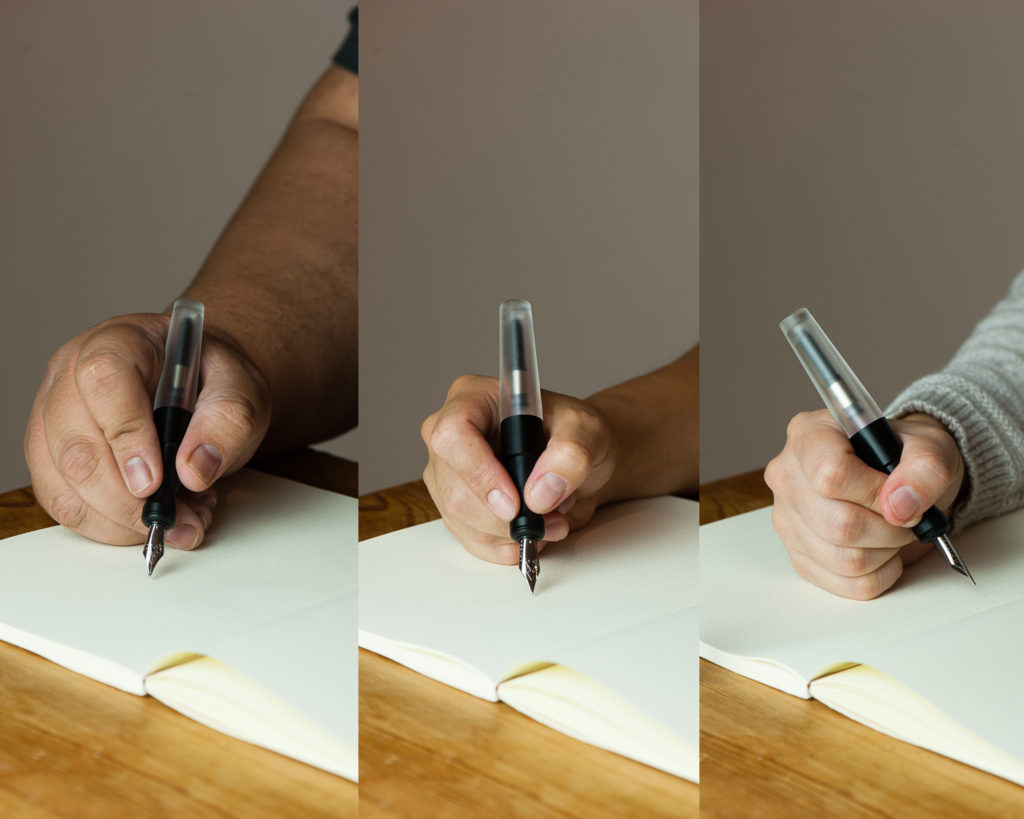
In the Hand: Kasama Una (unposted) — from left to right: Franz, Katherine, and Pam


Detail Shots

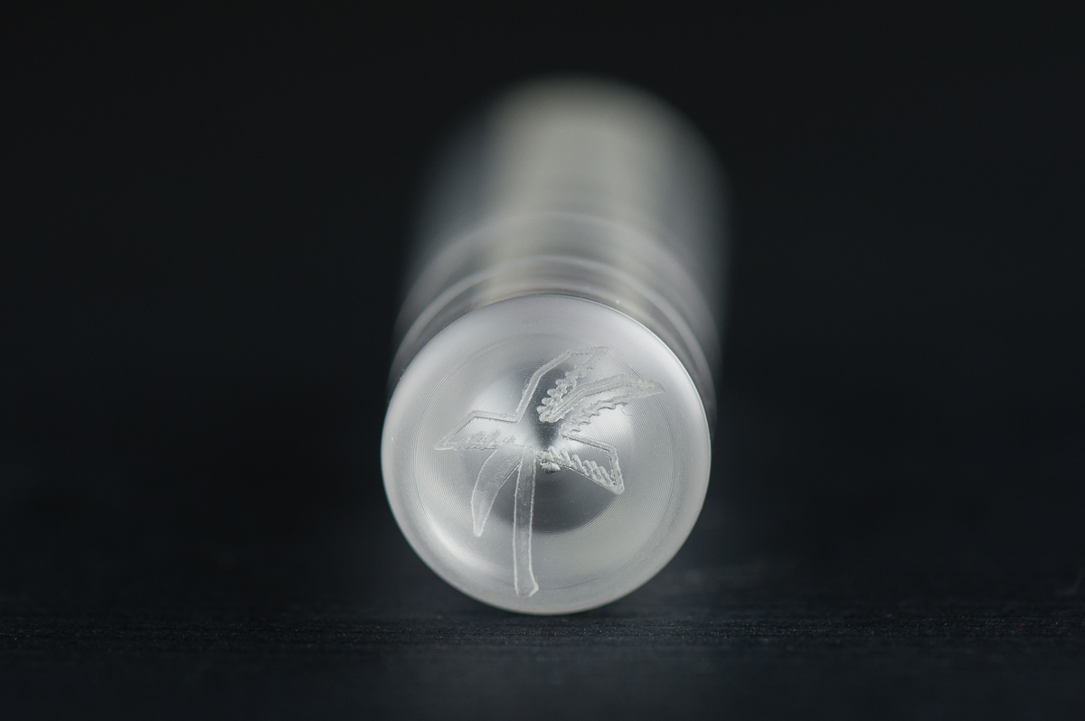
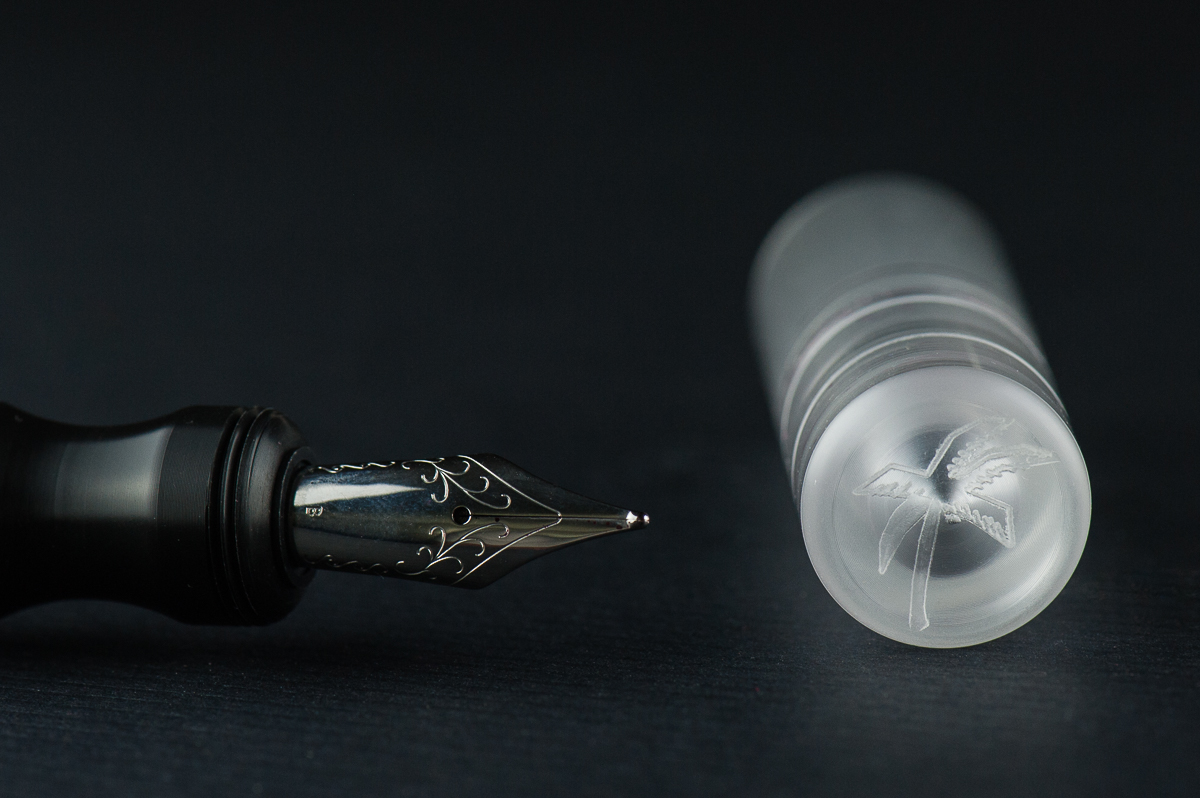
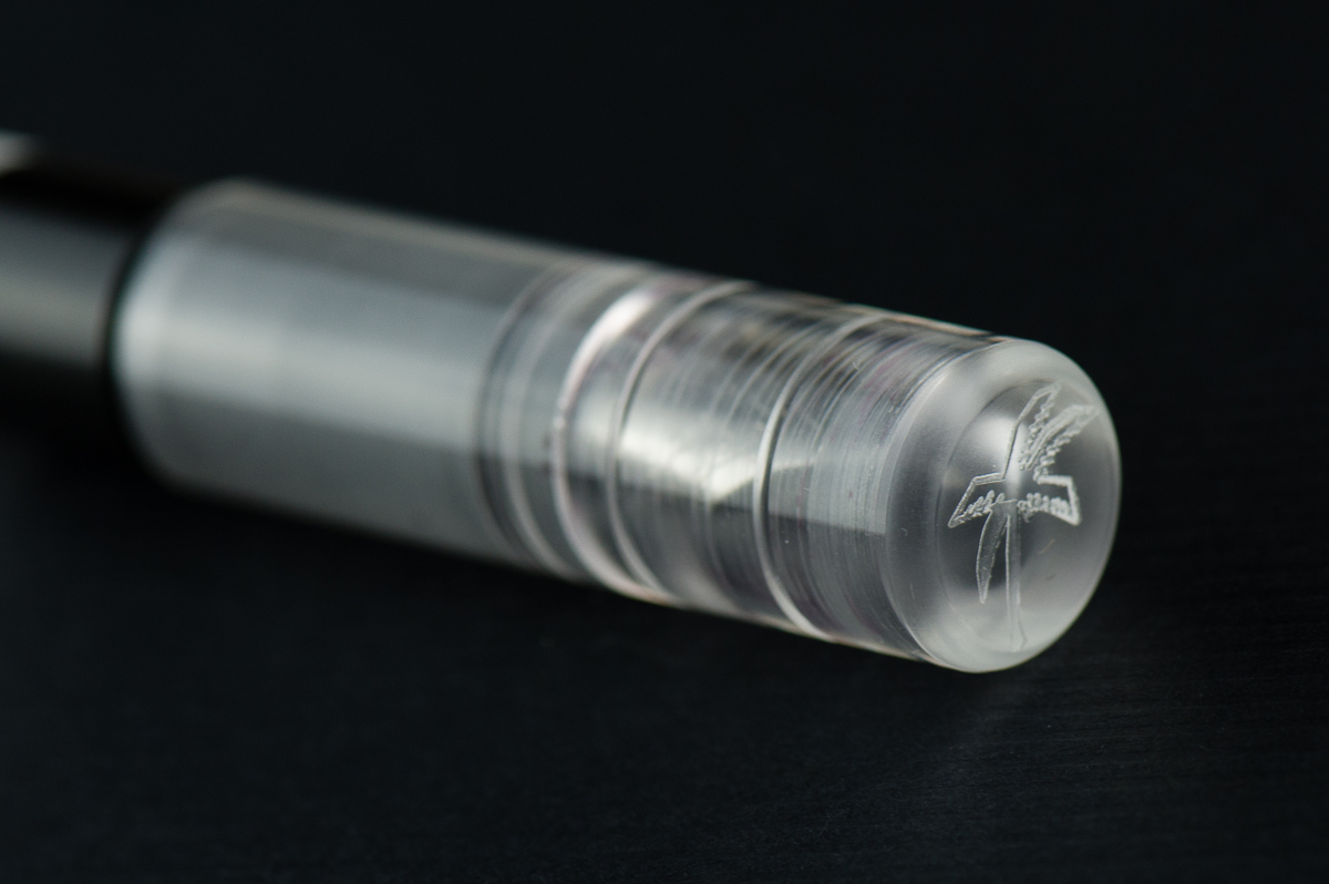
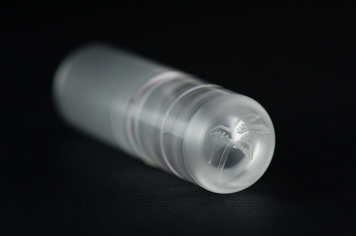
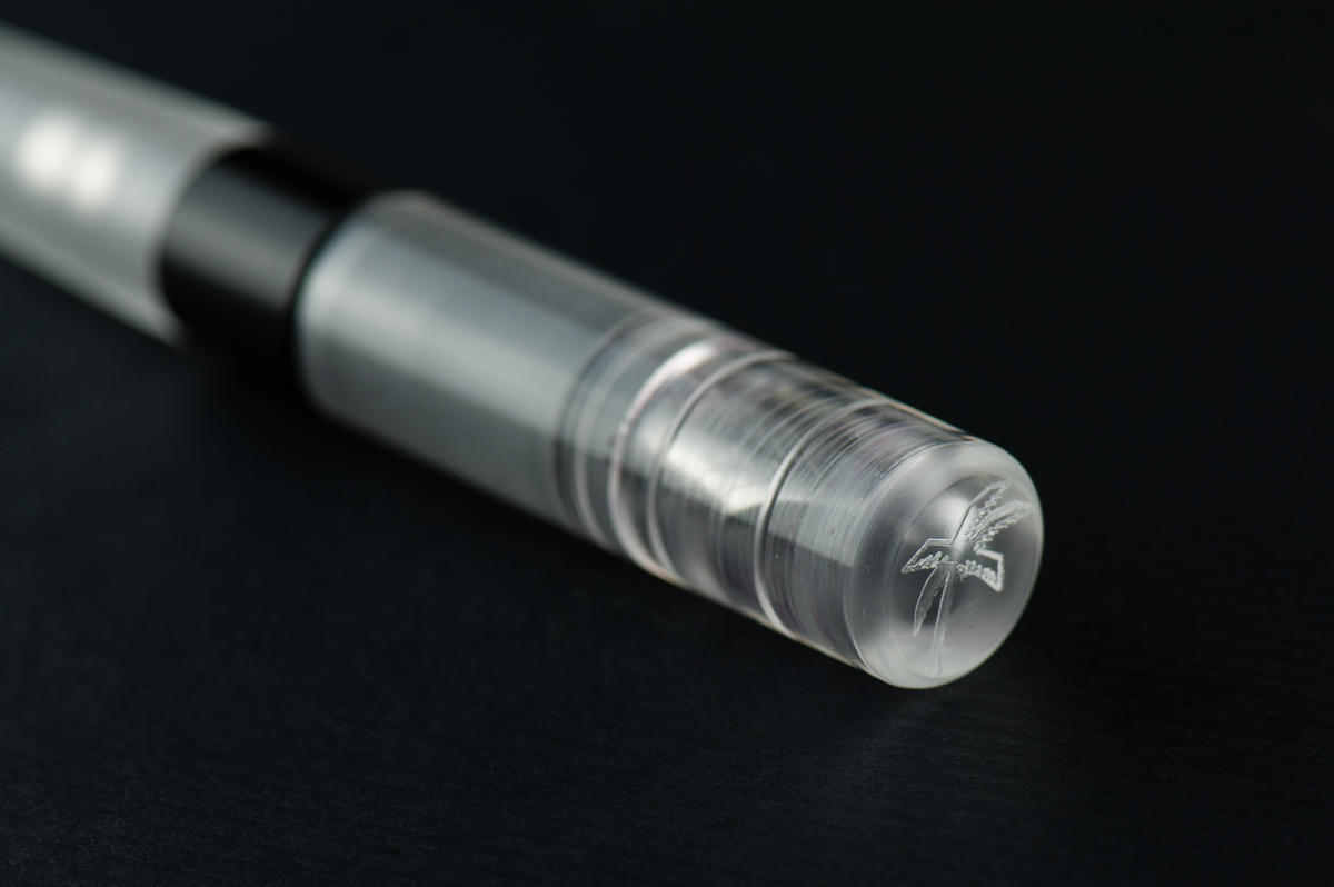
Kasama logo on the Una’s finial
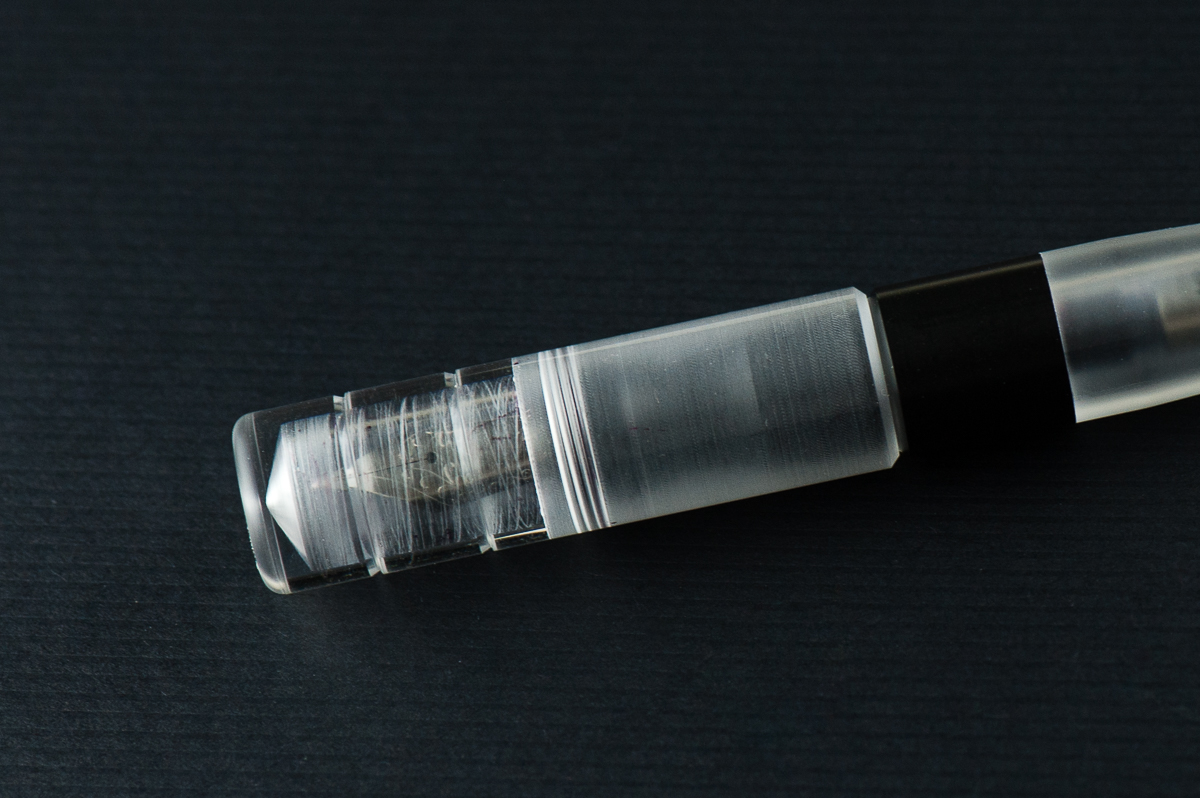
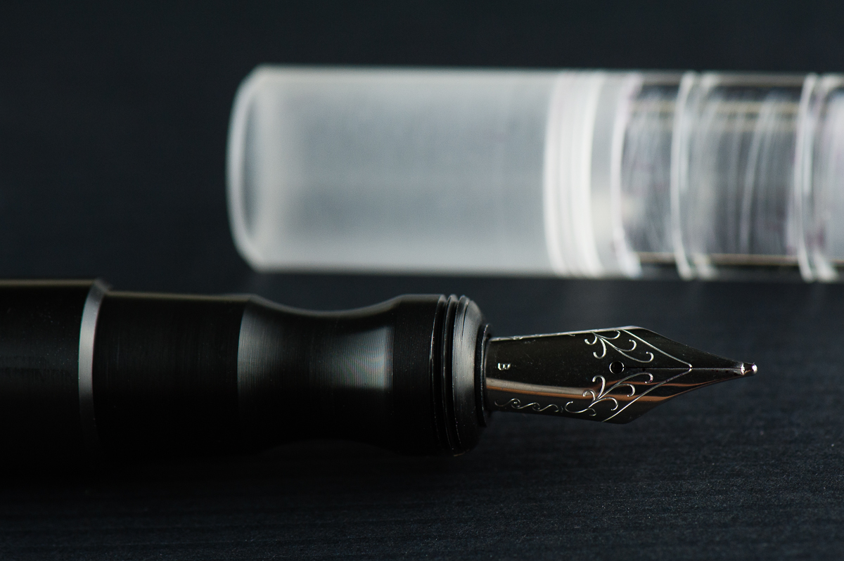
The semi-translucent cap reveals its interior shape, cap threads, and the nib
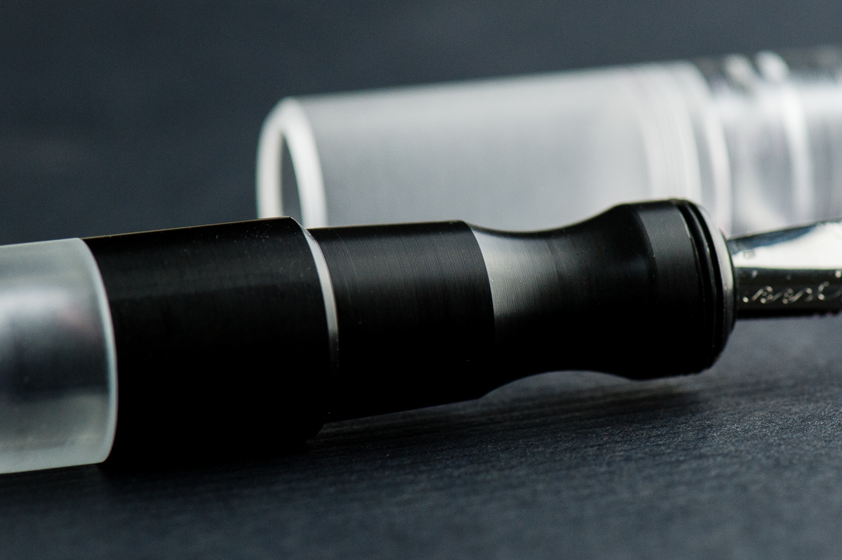
The Delrin section shows very fine lines however they are smooth to hold.


The Business End

Katherine: It’s a Jowo broad that’s super smooth (I’m not sure if they did any tuning work, but I know they do grinds on some nibs). Not my favorite width, but Jowo threads are standard, so I’m excited to swap it out after this review is done.

Pam:  The nib is a stock Jowo broad nib that is glass smooth.  It performed well and provided a well saturated line.  Not much variation from the standard quality of the Jowo nibs in terms of stiffness or performance.  This nib is just smoother than usual so I am not sure if it was tuned or not.

Franz: Perfectly tuned broad and juicy nib. And I love me some broad nibs! =) And yep, being a Jowo nib you can swap it with other similarly sized ones.


Franz’ writing sample on a Hobonichi Cousin journal


Write It Up

Katherine: I suspect the Kasama Una’s shape will be pretty polarizing. It has a very deep waist where you hold the pen, so this either works for you or it doesn’t. Personally, it works great for me and is very comfortable, but I’m not surprised it doesn’t work for Pam. It does force me to hold my pen at a reasonable distance from the nib though, versus my natural tendency to hold pens further forward.

Pam:  I had a really hard time wrapping my hands around this pen, literally.  The Kasama Una has a cap that encapsulates the section as well.  It leads to the step being higher up on a pen than most pens.  The step is very smooth so it doesn’t bite into the flesh between thumb and pointer finger, but it is noticeable and can be annoying.  The section has a pretty deep groove that is super comfortable for the tripod grip but gets wonky for me in my tiger fist grip. Adding to the comfort of the tripod grip is the extra width to the pen.

Franz: Writing with the Una is quite enjoyable since it is on the larger side of the pen scale. What won me over is how comfortable the pen’s section is even if my grip lands on the pinched area. Either when the cap was posted or not, I wrote effortlessly for a long period of time.

A thing to note, the cap posts deeply however sometimes if it’s not secure it becomes lopsided or may even come off while writing. This could be user error in my part because I also didn’t want to use force since it wasn’t my pen.

EDC-ness

Katherine: Totally EDC-able, though I don’t remember offhand how many rotations it takes to get the cap off — I think two? Ish? Either way, it’s an easy to carry pen that has a rugged aesthetic that suggests durability. One of the later editions of this pen was made from ultem, a super durable plastic — I have one on the way, drop test here we come!

Pam:  This pen won’t be lost in your pocket, clip or no clip.  There wasn’t a drop test but the acrylic body does appear to be of high quality.  Scratches may be more evident on the material and finish.  It only takes about 2 turns to uncap the pen so it’s a great pen for pick notes if you can spare two hands. My only gripe is that the body section can also unscrew as you attempt to unscrew the cap depending on the force applied.  It’s because the threads for the body and the cap are cut in the same direction. It doesn’t happen often and surely something that can be improved upon in later iterations of this pen.

Franz: First (Una ;-P) to answer the number of turns, it took one and 3 quarter turns to cap or uncap the Una. Not bad for a daily use pen! This pen stayed in my shirt pocket fairly secured even without a clip. And because it is a larger pen, I didn’t have to fish it out to use it. Of course with the cheap copier paper and the broad nib, I definitely didn’t use it very often at work. But if fitted with a finer nib, this pen will be great to use.

A feature I’d like to highlight is the Delrin section’s fine machined lines. It’s smooth to the touch but you can feel a hint of texture. =)

The Una is a cartridge/converter filler and they include a standard international converter with it. I imagine that you can eyedropper this one as well but since it was Katherine’s pen, I didn’t attempt to do so.


Final Grip-ping Impressions

Katherine: I’m excited to see more makers in the pen scene, and especially excited to see that Kasama went for a more unique design, not another standard-ish girth stick or rounded stick CNC pen. The pen itself is well made (though there was a sharp point on the end of the barrel, I sanded it down, but that would have been easy to do in shop) and solidly made. My only real gripe with this pen is that the section<>barrel and section<>cap threads turn in the same direction — so if you don’t tighten the section<>barrel well, unscrewing the cap can unscrew the barrel instead. This hasn’t been an issue for me, but it’s a small design change that could go a long way.

Pam:  This is a solid pen and well worth a try, especially for those who prefer a wider pen.  It has the potential to be made with a variety of acrylics and delrin and very comfortable for longer writing session.  Other than the section, which is a deal breaker for the pixie fist grip that I have, I would recommend this pen.  Good thing Katherine has one I can play with occasionally!

Franz: To sum up, I really love the Una fountain pen. I’d largely attribute that to the design: interestingly shaped Delrin section, machined lines on the cap, translucent cap that shows the nib underneath, and a couple more things.

Katherine and Pam pointed out probably the biggest issue with this pen though. The Una’s thread design can be a little frustrating if you’re in a rush to write but then you find that you unscrewed the barrel instead. Annoying? Sure. But I’d be getting one anyway. Because… penvy (pen envy). Darn you Katherine for making me spend money!

My chosen quote from the writing sample above fits my gratitude of being friends with Katherine and Pam in this fun little project we call HOTP. They are my “kasama” in this blog. Thanks ladies! And thank you all for your readership. =)

“A friend is one of the nicest things you can have and one of the best things you can be.”  — Winnie The Pooh


Pen Comparisons

Closed pens from left to right: TWSBI Eco, Platinum 3776, Sailor 1911S, Franklin-Christoph Model 31, *Kasama Una*, Pelikan M805, Lamy 2000, and Lamy Safari
Posted pens from left to right: TWSBI Eco, Platinum 3776, Sailor 1911S, Franklin-Christoph Model 31, *Kasama Una*, Pelikan M805, Lamy 2000, and Lamy Safari
Unposted pens from left to right: TWSBI Eco, Platinum 3776, Sailor 1911S, Franklin-Christoph Model 31, *Kasama Una*, Pelikan M805, Lamy 2000, and Lamy Safari

Pen Photos (click to enlarge)

4 Comments

Review: Franklin-Christoph Model 20 Marietta


Hand Over That Pen, please!

Katherine: I love the shape of this pen — it’s so clean and well proportioned. My one gripe, as with the Pocket 20, is I don’t love the lines on the cap and at the end of the barrel. I’ve owned two Model 20s, but over time I’ve sold both. I love the frosted finishes, but the barrel is too large for me to want to eyedropper the pen (because I’ll never be able to write it dry) and they don’t look quite as nice with converters.

Pam:  Franklin-Christoph never disappoints.  I am happy to review their classic Model 20.  I was initially turned off by the shape of the pen when it saw it in the Ice and Antique Glass finish.  In the black finish, it’s actually quite subtle and doesn’t bother me at all.  One of my favorite features of this pen is the snap cap.  It’s so practical for my specific use case.

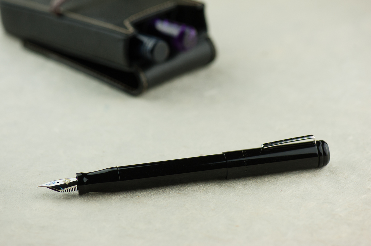
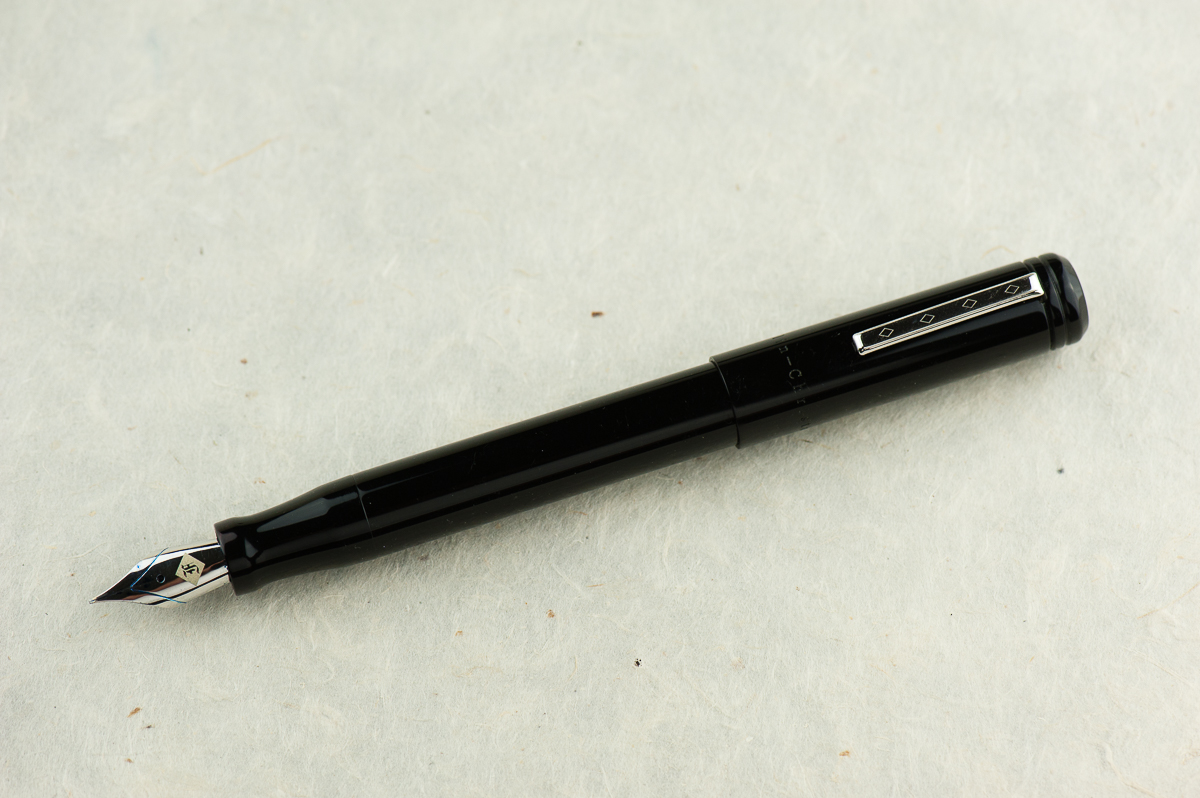
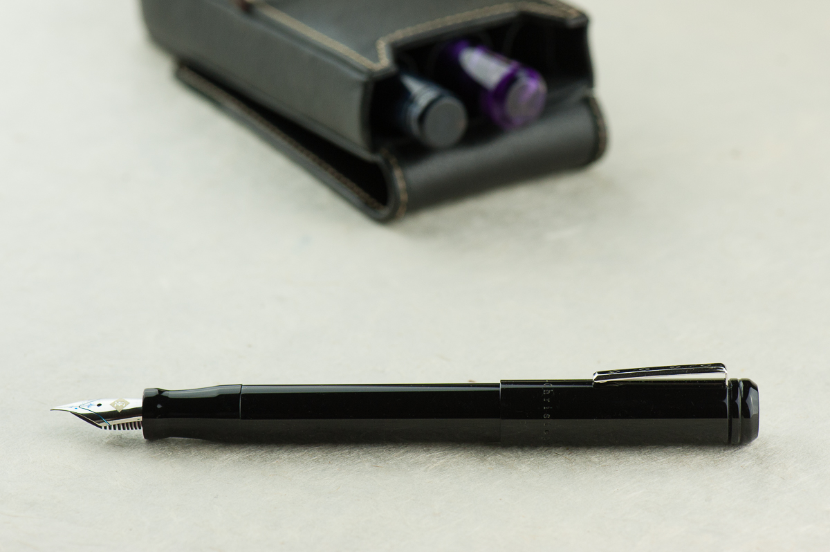
Franz: The Model 20 looks so simple and sleek! The beveled flat ends, and the very slight taper of the barrel give the pen a lovely silhouette. Actually, the barrel’s slight taper is there for both function and form. I’ll expand more on that later on. For now, I’m just saying that the Model 20 Marietta looks oh so good! =)


In the Hand: Franklin-Christoph Model 20 (posted) — from left to right: Franz, Katherine, and Pam
In the Hand: Franklin-Christoph Model 20 (unposted) — from left to right: Franz, Katherine, and Pam


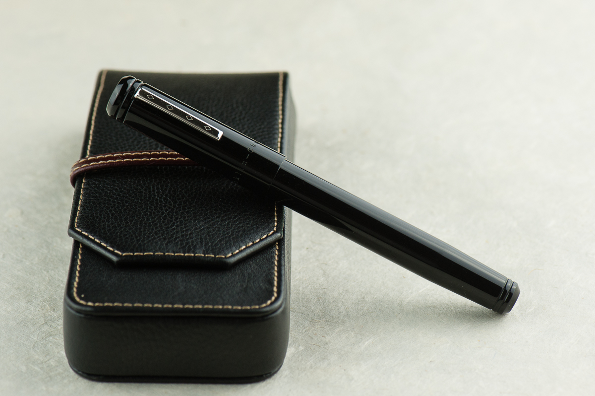
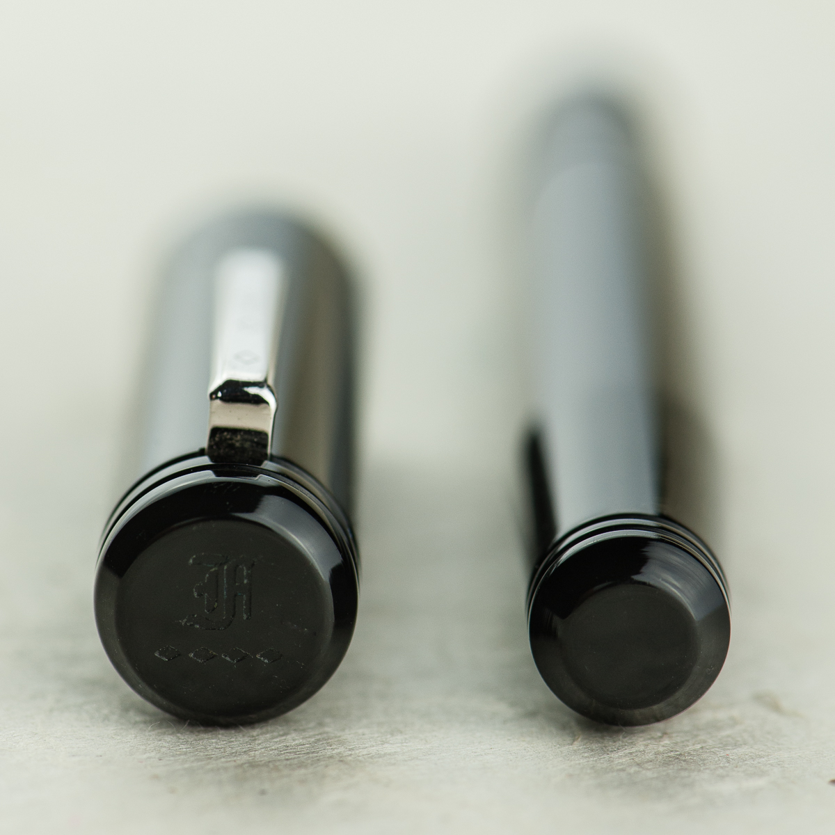
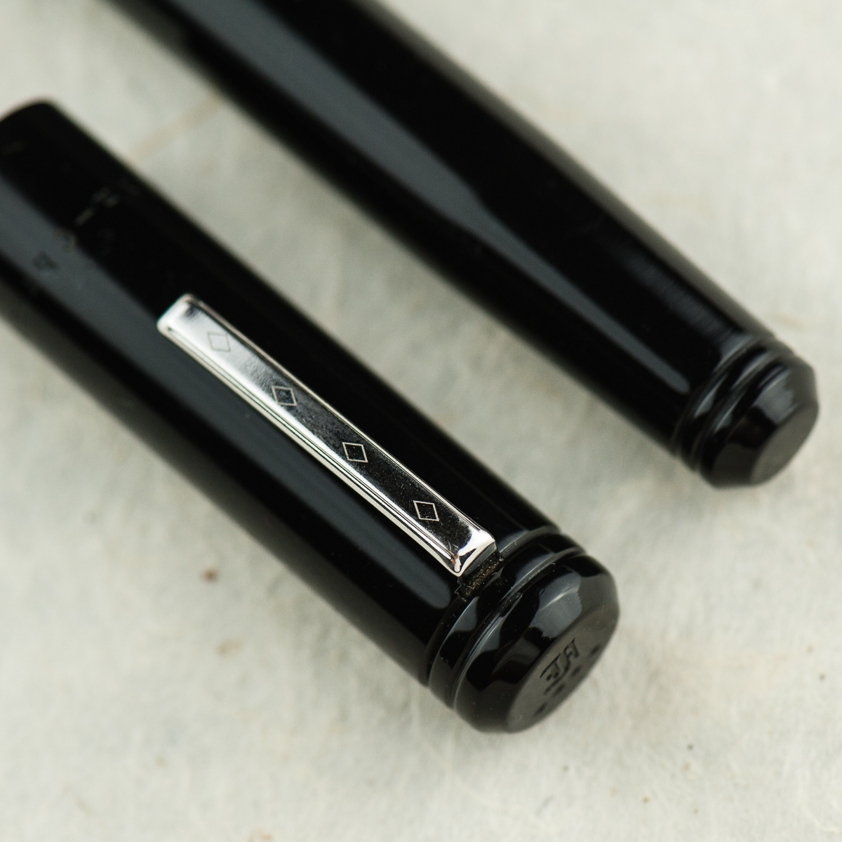
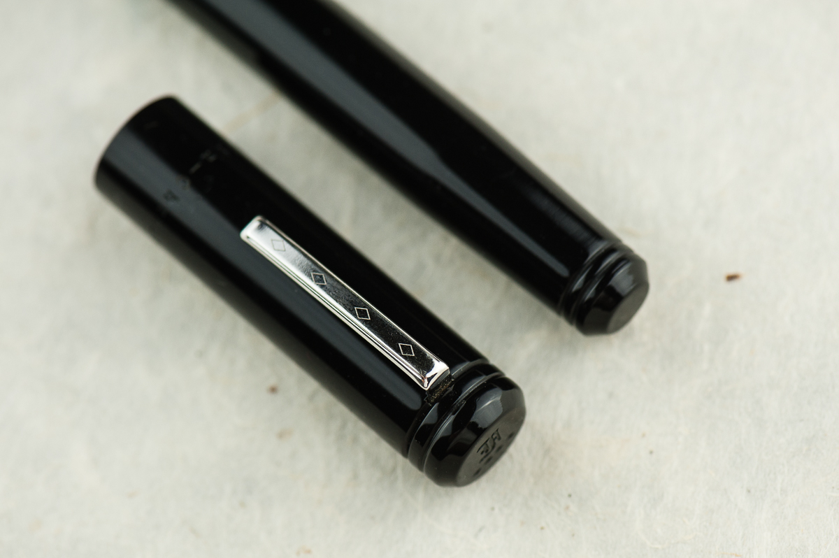
Details: Franklin-Christoph’s logo engraved on the cap’s finial, and the flat end of the barrel.
Details: Beveled ends of the cap and barrel, Franklin-Christoph’s Diamond design on the clip, and the rings designed on each end.


The Business End

Katherine: Yay Masuyama cursive italics! I prefer the Fine, but the Medium is similarly smooth while still be nice and crisp.

Pam: The nib is a Masuyama M cursive italic that was tuned by Jim Rouse at time of purchase.  The cursive italic has a small amount of bite, but nothing bothersome.  It’s also the nature of a cursive italic grind to be less smooth than a typical stub grind.  Like always, it’s a joy to write with and the bit of a bite is pleasant feedback.

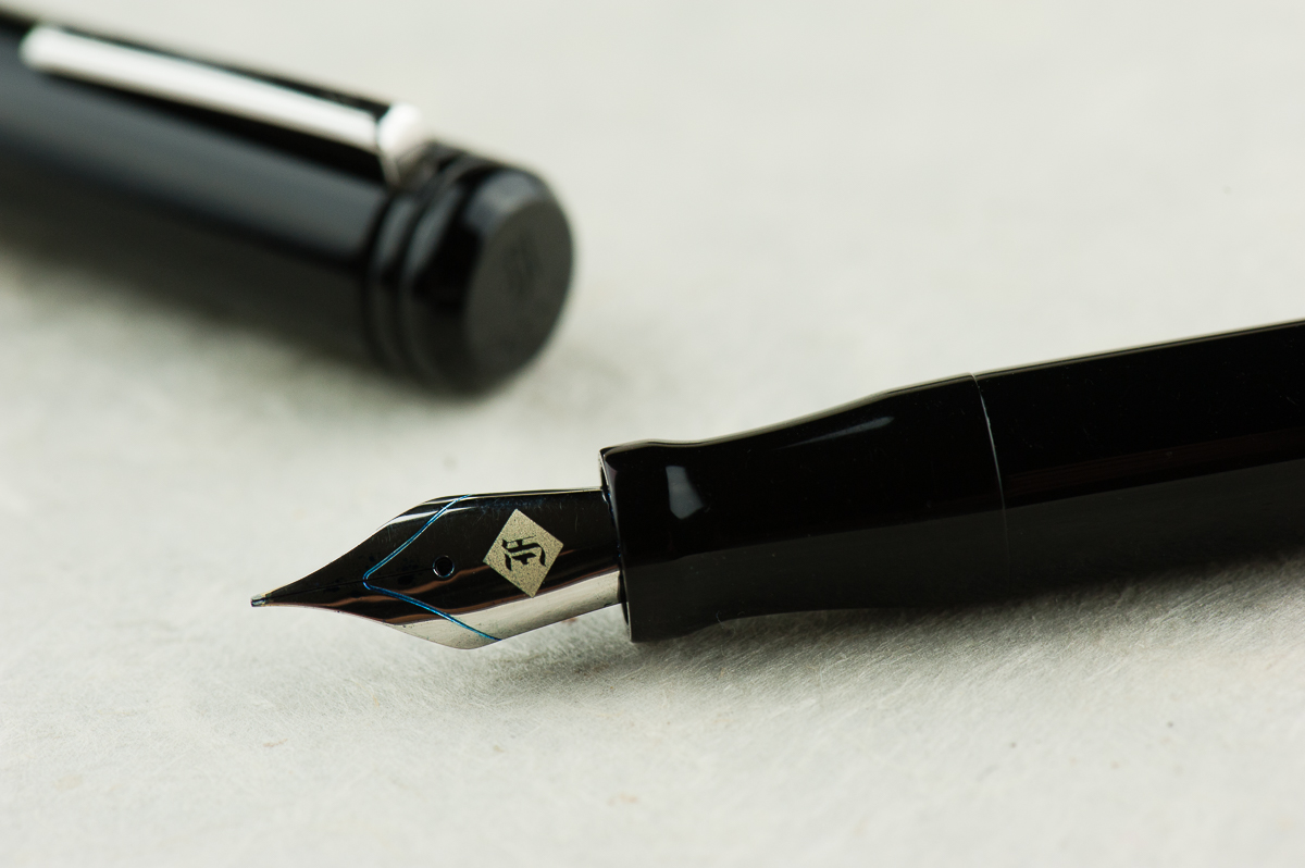
Franz: As far as I know, when Franklin-Christoph introduced the Model 20 in early 2015, it was the first recessed nib fountain pen they had. And that design alone attracted me to the Marietta at the 2015 LA Pen Show. It wasn’t sold back then but I knew I had to have one!

The Model 20 is fitted with a #6 size Jowo nib like most of their larger pens. This nib in particular was pre-ground to a cursive italic by Mr. Mike Masuyama and then as with all F-C pens sold, it was finally adjusted by Mr. Jim Rouse to my liking. It provides a crisp line and also quite forgiving.


Write It Up

Katherine: This pen is definitely comfortable — it’s light and the section is a good size! I’ve definitely written page upon page with this pen, it’s unobtrusive and, paired with a nice grind, lots of fun.

Pam: Due to the lack of threads, my typical writing grip is REALLY comfortable.  Yay for no threads or steps!  The section is a good fit for me in the tripod grip.  The little flare is quite helpful in keeping my fingers in check. However, due to the lack of a step and the seamless transition from section to body makes it so the section can accommodate larger fingers and grips.  #bearpawsallpaws

I highly recommend using the pen unposted for those of the smaller hand persuasion.  It’s a bit top heavy when posted.  Without the cap the pen is nice and light.

Franz: Just like Pam, I definitely enjoyed the lack of threads on the barrel so that the pen can be held at any spot you’re comfortable with. As for myself, I was comfortable gripping either on the pinched section or the barrel itself. Also, both writing modes (posted and unposted) were very comfortable for my large paw. As a preference though, I prefer the cap posted for it gives more weight and a better balance for me. With the cap unposted, the pen seemed to be a little too light.


EDC-ness

Katherine: I’m not generally good at tightening my caps or well… remembering to close things all the way. Except the fridge. And the Model 20 is no different, but the slip cap is even more dangerous. As a desk pen, or one sandwiched in a notebook, it’s generally fine — but if I relied on the clip, I had several close calls with the body sliiiiiding away toward the floor. Yikes. It’s super convenient, but because it’s a slip, not snap cap, I have a pretty hard time telling when I’ve closed it “enough”.

Pam:  As mentioned previously, this pen is one of the best EDCs for me.  The snap cap makes this pen really easy to deploy and use for quick notes and comfortable enough for longer writing sessions.  It’s a great all rounder pen for me.  The clip was secure and the capping was easy.  The only thing missing from the capping action is a satisfying snap like the Pilot Prera.  (Insert total bias disclaimer here.) It’s hard for me to determine when the cap is securely capped but it is a snug fit and I haven’t had issues with the pen falling out into my pocket.

Franz: Another top reason why I was attracted to the Model 20 is its slip cap feature which makes it a perfect candidate for an every day carry pen. The two ladies’ comments about the pen not having a positive snap is very valid and was one of my issues when I first got the Marietta. However, after watching Scott Franklin’s introduction video of the Model 20, I learned a lot about how the pen was engineered. So with just a liiiiitle push, the cap secures very well. And this works in both closing the pen, and posting the cap. The lip end of the section and the tapered end of the barrel was designed to attach firmly deep inside the cap. To detach the cap, it’s easier to just use one hand. If you’d like to watch the video, link is here Model 20 Marietta Introduction.

The Model 20 can be inked either via a cartridge/converter filler, or eye-droppered. I prefer using the supplied converter and it is a standard international one.

One thing to note, the clip on this Model 20 is the older version and it doesn’t clip to clothing easily. I’d need to lift the clip with my fingers and slip it in my dress shirt. Franklin-Christoph changed the clip to a better functioning one so that issue is solved.


Final Grip-ping Impressions

Katherine: This is a pen I thought I loved, but with use found that while I certainly enjoy it, it wasn’t true love. Even then, it’s more one of those “it’s not you, it’s me” things — it’s a very solid pen that’s fairly unique in the industry, but it’s got a couple quirks that just don’t work for me (the generally super convenient slip cap and the lines on the cap and barrel). But every time I see one for sale second hand… I’m tempted, maybe the third time’s the charm?

Pam:  I know that I have mentioned that the Sailor Progear Slim is an “upgrade” to the Pilot Prera starter pen.  I think the pocket Model 20 and Model 20 is the Western “upgrade” to the Pilot Prera.  They both are snap caps and Franklin-Christoph boasts one of the largest variety of steel and golden #6 nibs on the market for their pens.  If you want a great EDC pen with a variety of different nibs that can be swapped out, the Model 20 is close to perfect.

Franz: What else is there to say except to say that the Model 20 is one of my favorite pens to ink up! In the pen comparison photos below, it is very similar to a Pelikan M805 and that’s about the perfect pen size for my larger hands. The Model 20’s features check pretty much all the boxes for me. Simple aesthetic, larger size (length and girth), slip cap for quick deploy, lightweight, and a fantastic nib performance!

Like a lot of their pens, Franklin-Christoph offers the Model 20 in a few different colors on their site, and they also offer more color prototypes at pen shows. I definitely recommend this model for your daily use or even just part of your rotation. See if it’s a comfortable pen for your paws. =)


Pen Comparisons

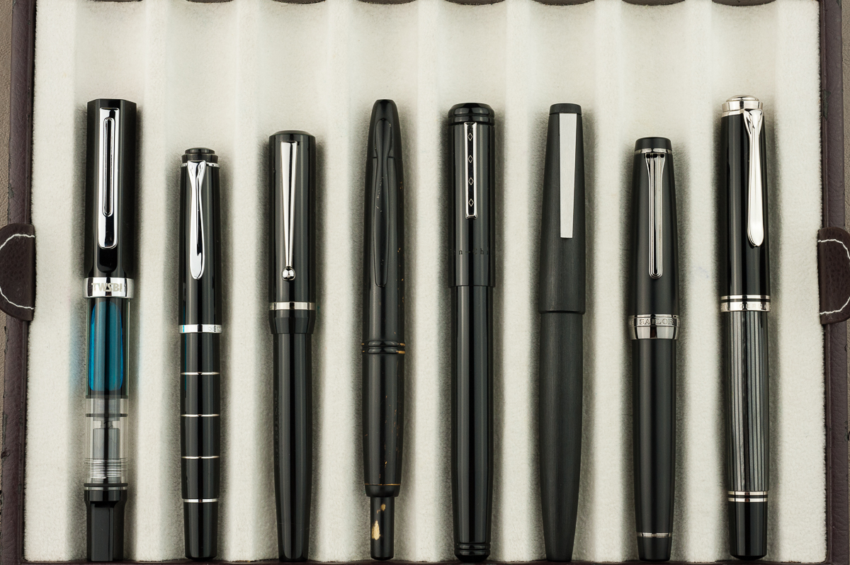
Closed pens from left to right: TWSBI Eco, Pelikan M215, Edison Beaumont, Pilot Vanishing Point, *Franklin-Christoph Model 20*, Lamy 2000, Sailor Professional Gear, and Pelikan M805
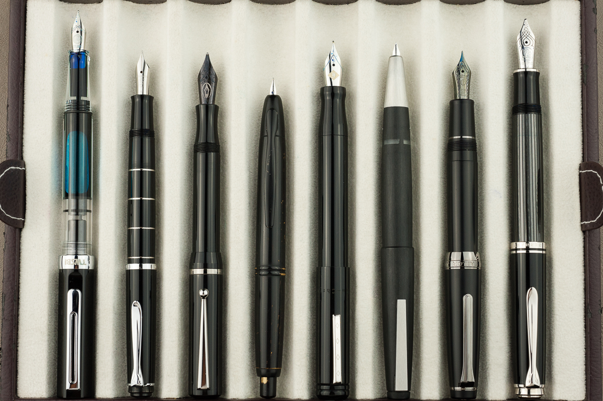
Posted pens from left to right: TWSBI Eco, Pelikan M215, Edison Beaumont, Pilot Vanishing Point, *Franklin-Christoph Model 20*, Lamy 2000, Sailor Professional Gear, and Pelikan M805
Unposted pens from left to right: TWSBI Eco, Pelikan M215, Edison Beaumont, Pilot Vanishing Point, *Franklin-Christoph Model 20*, Lamy 2000, Sailor Professional Gear, and Pelikan M805


Pen Photos (click to enlarge)

2 Comments

Review: Platinum Izumo (Soratame, Broad Nib)

We would like to thank Pen Chalet for lending us this Platinum Izumo fountain pen for review. Pen Chalet is based in Mesa, Arizona and has been a company that sells pens and stationery items at competitive prices. They also frequently run promos for specially priced items as well as provide discount coupons. Check them out if you haven’t yet.

That being said, the opinions below are our own and we were not compensated (monetarily, or otherwise) for this review.


Hand Over That Pen, please!

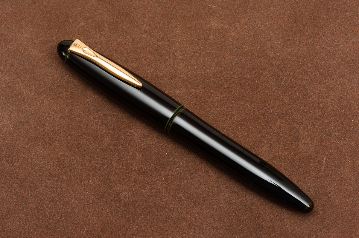
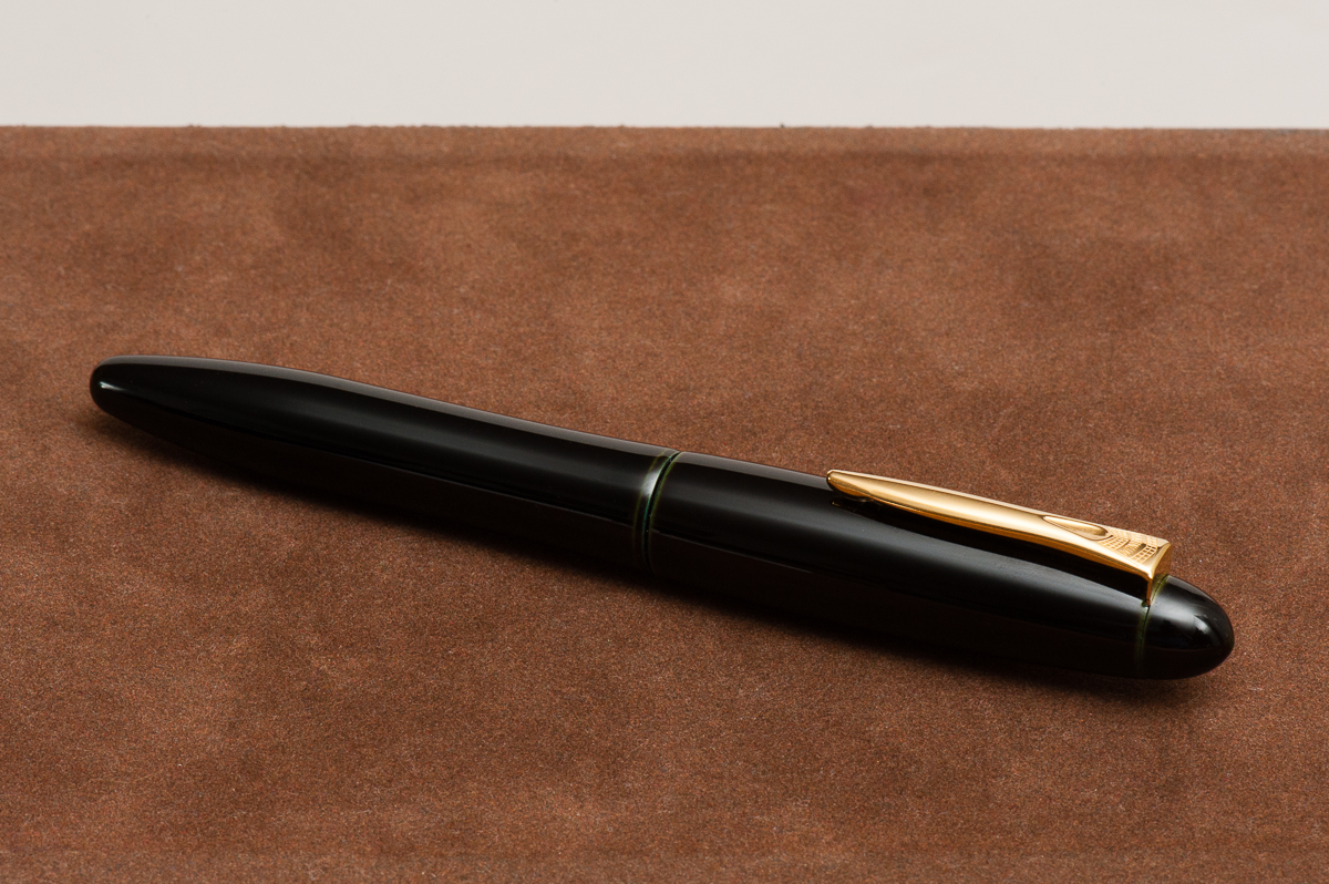
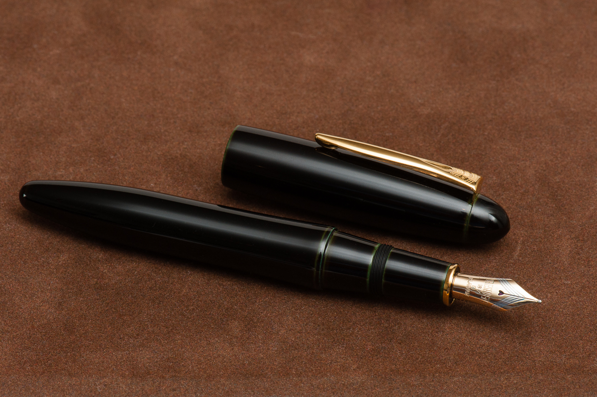
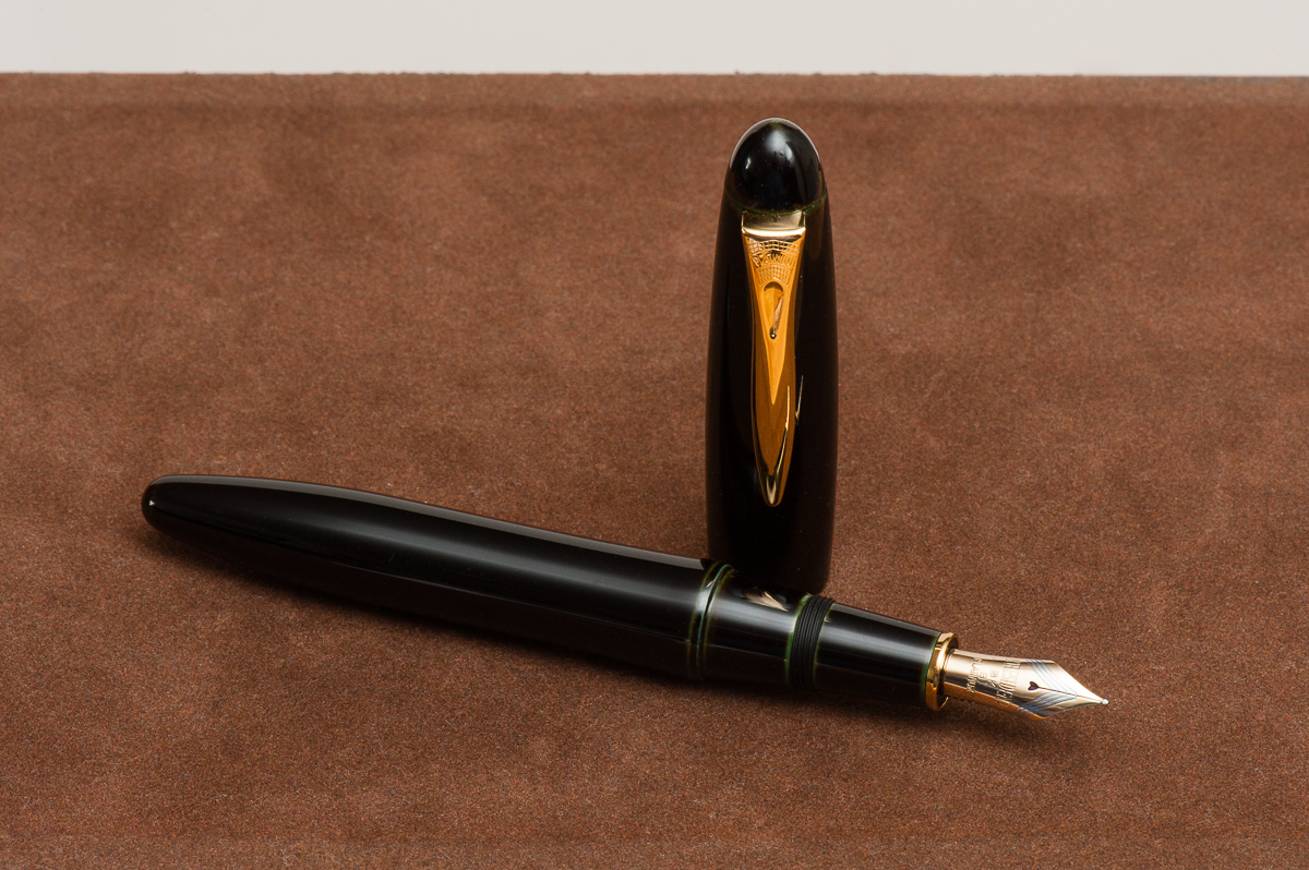
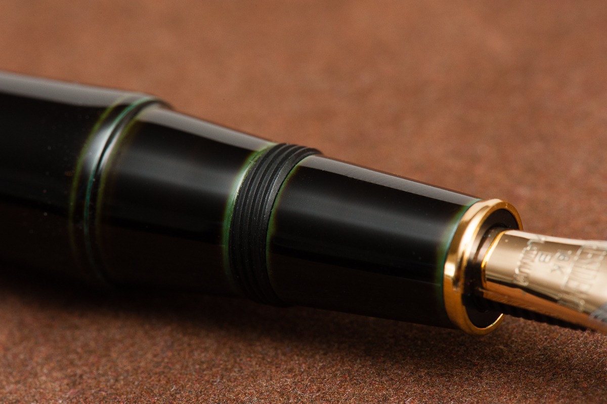
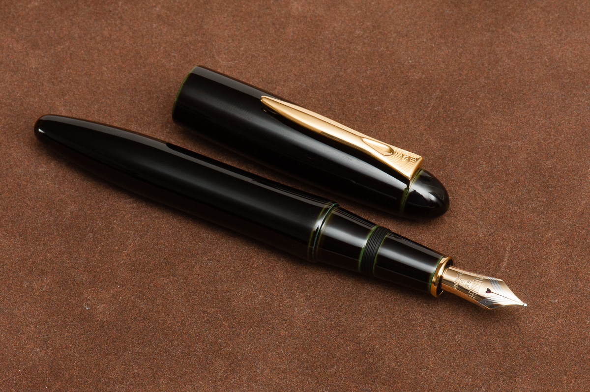
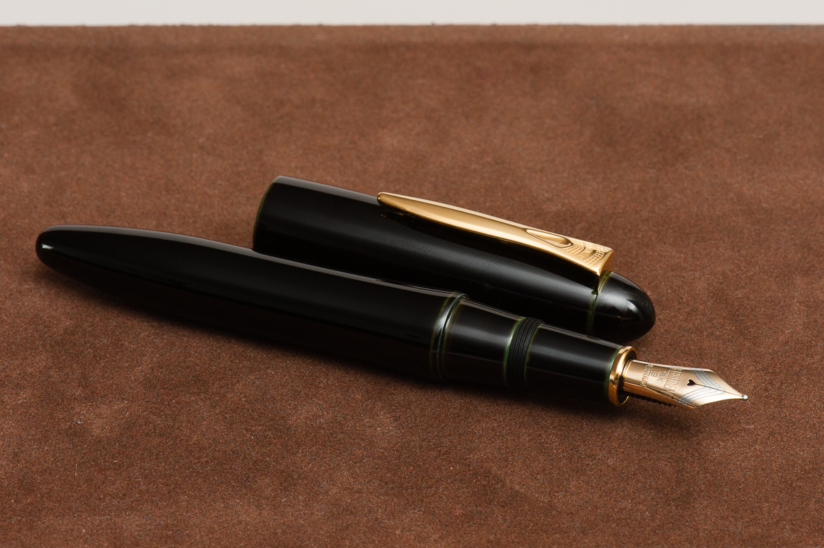
Katherine: The shape of the Izumo isn’t my jam… but I have a general bias against bulbous caps. Tapered? Maybe that’s a less graphic word. Anyway, general shape aside, the Izumo comes in many beautiful finishes (ugh I really wish I liked their base shape more!) this one is soratame, a green and black tamenuri, pretty subtle, but quite nice when you look closely. The pen also comes in a variety of other finishes, some of which are really quite breathtaking.

Pam:  Whoa!  This is a big pen!  The urushi finish is flawless on a classic cigar shaped pen.  At first glance, pen is really intimidating based on it’s size and finish. It’s not my aesthetic.  To my untrained eye, I wouldn’t know that this pen had urushi on it because it’s just a boring black cigar shaped pen.  The nib is a very business like nib.  The design is either really retro or modern.

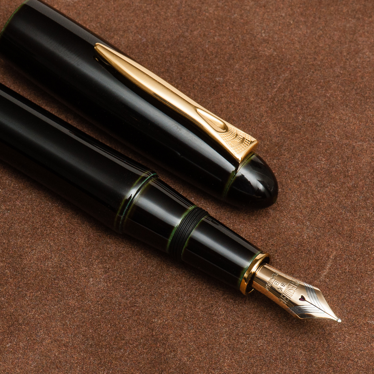
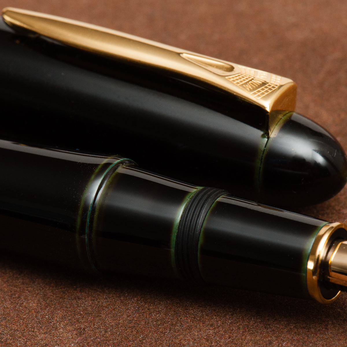
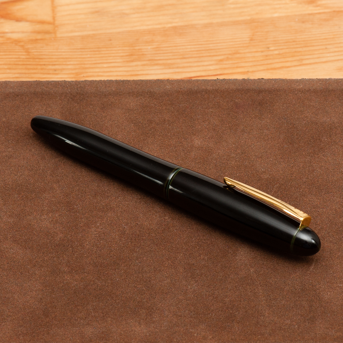
Franz: The Platinum Izumo is quite large, curvy and seems to create a grand stature. It’s like the pen says, “Hey look at me!” whilst flexing its muscles. I believe in the closed position, the pen is just a little over 6 inches. I’m one to appreciate urushi lacquered pens and this Soratame is beautiful and simple. I love the hints of color in the seams of the pen.

A close up of the Soratame finish


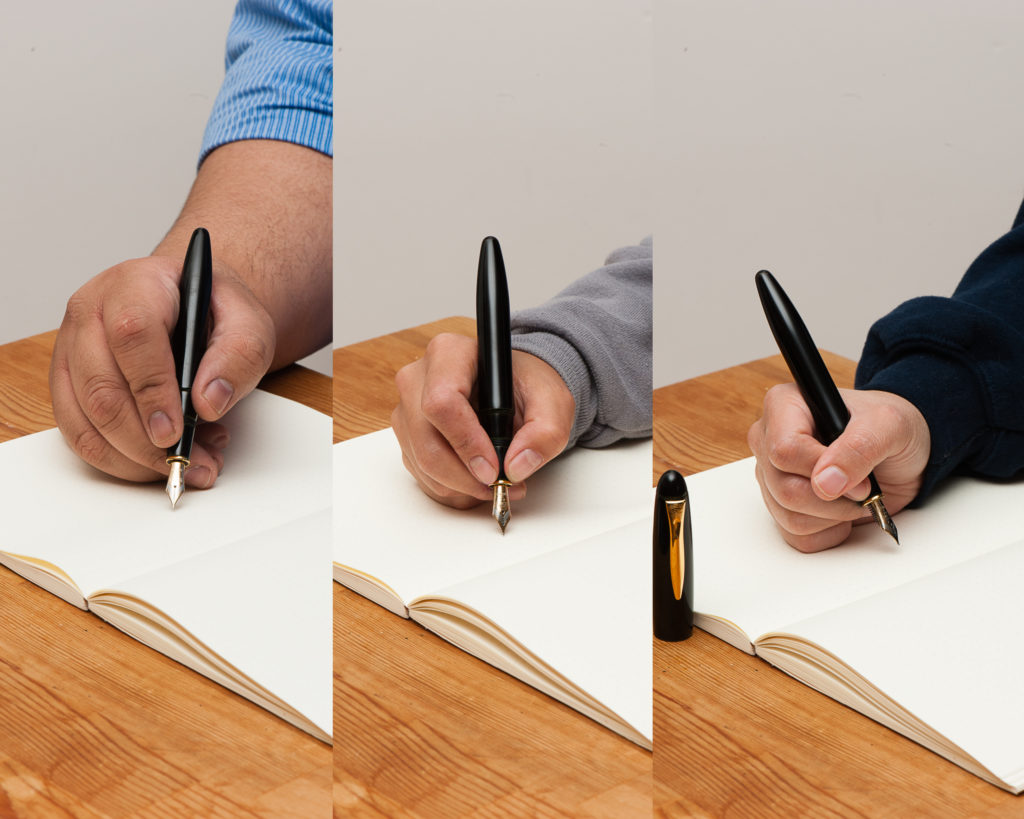
In the Hand: Platinum Izumo — from left to right: Franz, Katherine, and Pam


The Business End

Katherine: The Izumo nib feels much more “western” to me than the 3776 nib, but that’s a sample size of one. It’s smooth, wet and stiff — a great nib to get things done with, but not one I’m excited to write with.

Pam: I am going to enter a “expectations management” disclaimer. Given that this is a Platinum nib and my only experience with Platinum is through the 3776 nibs so my expectations included a characteristic and unique Platinum nib.  I am biased.  That being said, the Izumo nib is… serviceable.  It’s just not memorable and lacks any characteristic that makes me want to pick it up again.  It’s really really smooth which is fantastic for those looking that kind of writing experience.  However, that’s not what I was expecting.

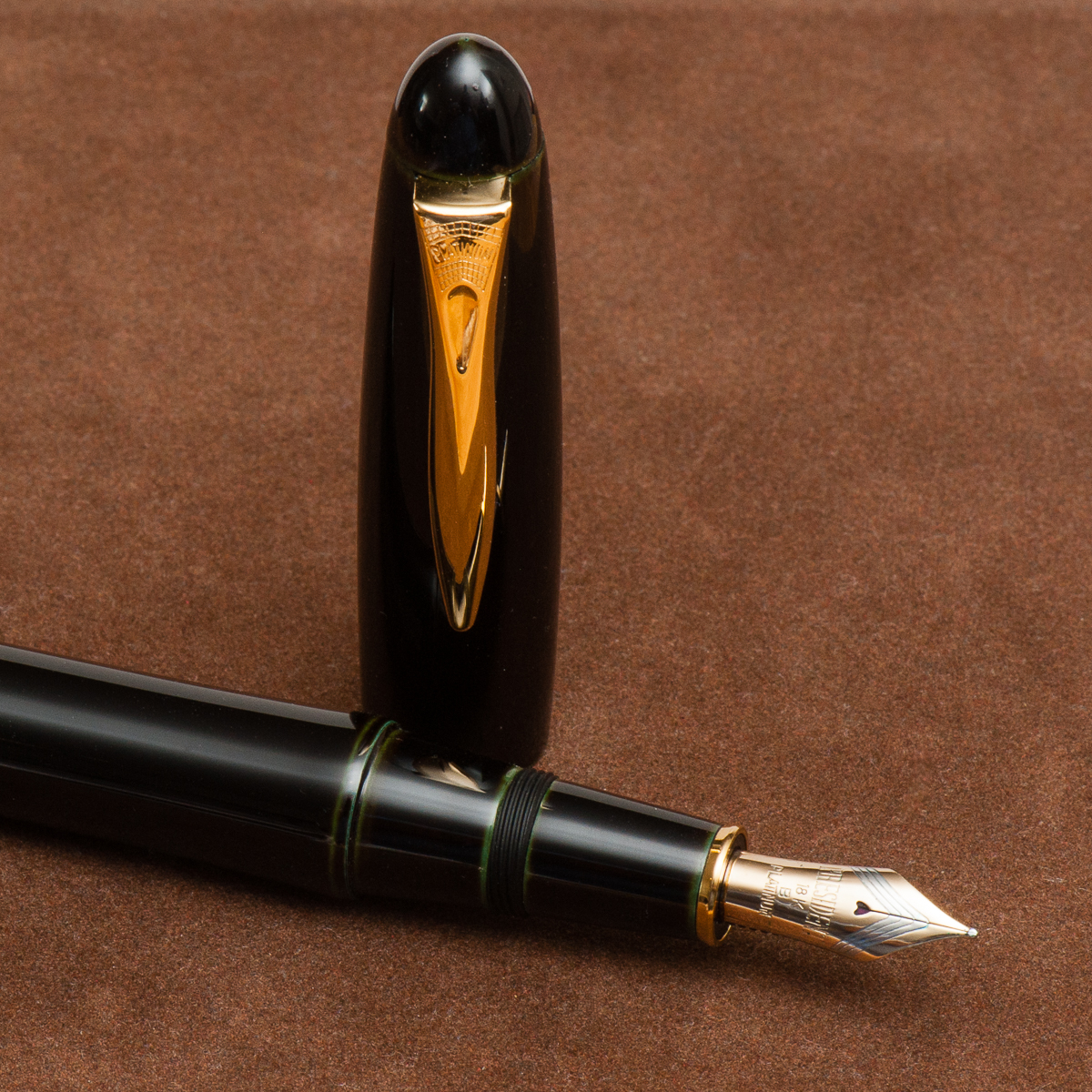
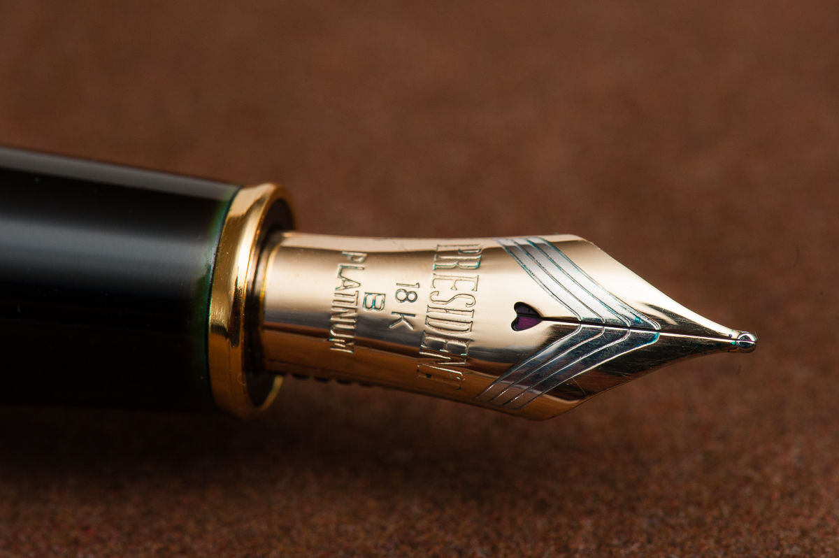
Franz: It was my first time to write with a President nib from Platinum and I echo the ladies’ comments above. It wrote smoothly, a good flow, and did not skip like any good nib should. I always love the heart-shaped breather holes of Platinum nibs.

The Platinum President nib


Write It Up

Katherine: The section of the Izumo is very comfortable (though that gold ring at the very front bugs me, especially on the dark and subtle soratame finish) — though it doesn’t have the “flare” at the very end that I prefer. It’s a heavier pen than I expected (a little heavier than the m800?) but very manageable, I’m just used to urushi pens being super light. All in all a comfortable and usable pen, but not outstandingly so.

Pam:  The nib is fantastically smooth.  Almost too smooth.  There is no feedback and it lays down a nice saturated line without being overly wet.

Franz: Being an ebonite pen, the Izumo was very pleasant to write with and was balanced. The cap is “post-able” however we did not attempt to do that since it is a loaner and posting generally mars the urushi finish. One thing though, my index finger naturally lands on the threads in the middle of the section and they’re kinda sharp. It doesn’t hurt at all but you can definitely feel them. But I’ll live with it because the urushi’s green underlayer shows very nicely. Needless to say, I did not experience any fatigue while writing in my journal.


EDC-ness

Katherine: Super fast uncap (1 turn) and a strong clip — it’s a little big for me, but definitely EDC-able if you like the size.

Pam:  Given the size of the pen and the finish, I didn’t take this pen to work.  The clip works well and keeps it secure in a case.

Franz: The Izumo was a very lovely pen to use at work for jotting down notes as well as for signatures. The pen just stayed on my desk for most of the the day, but I did clip it onto my shirt pocket for safekeeping as well.

Like other Platinum pens, the Izumo is cartridge/converter filled and the supplied Platinum converter was very sufficient. If I were to use this pen every day at work, I’d probably refill it with ink every 3 days or so.

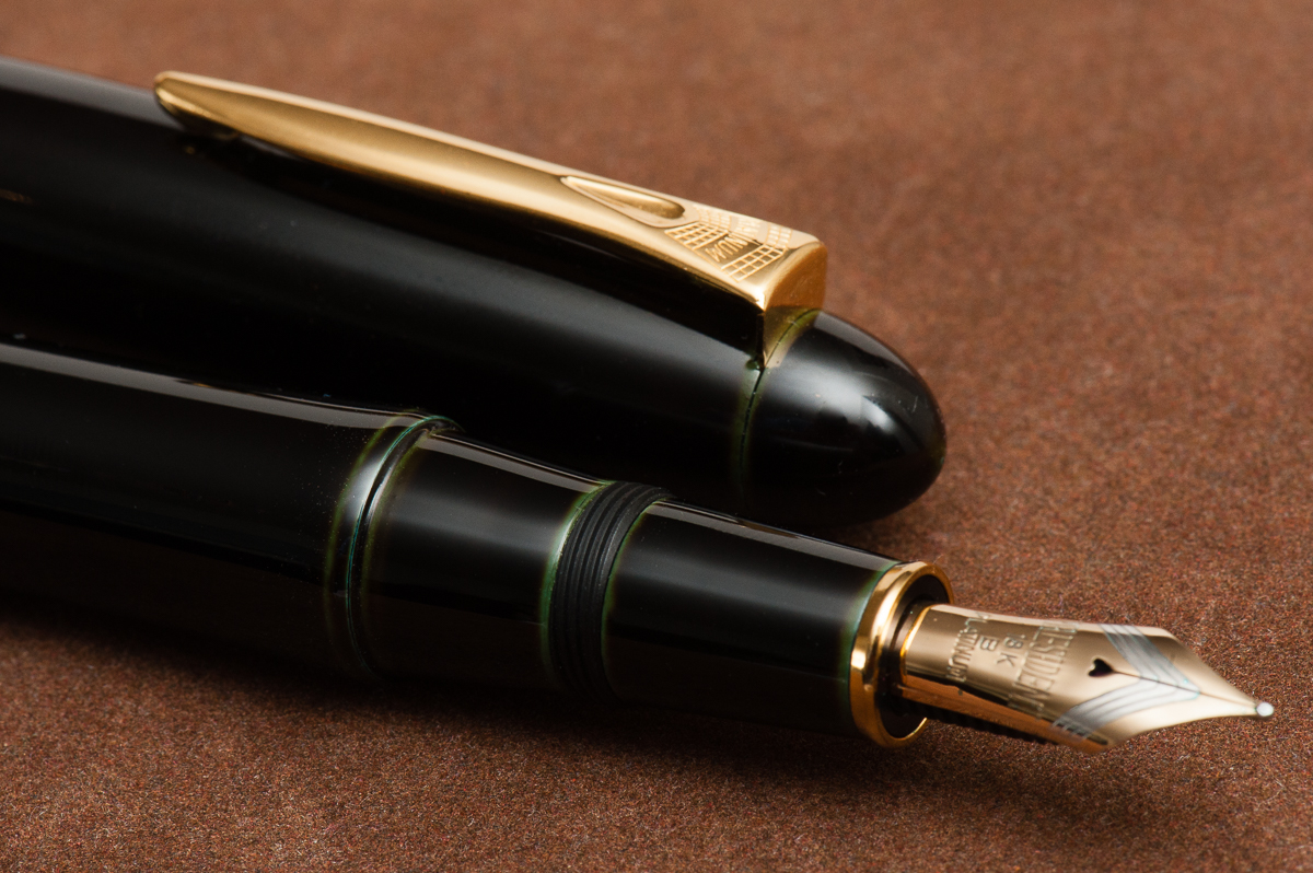
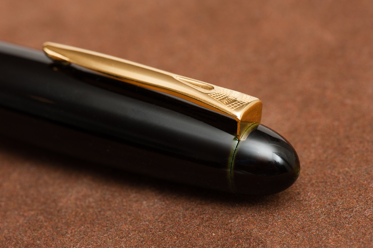
The cap and clip have interesting curves in them.


Final Grip-ping Impressions

Katherine: The Izumo has all the pieces — a beautiful finish, a solid nib and solidly built. At the end of it all though, half of this hobby is about the aesthetics and the Izumo just ain’t my thing. If you love the aesthetic, it won’t disappoint!

Pam:  This a great pen for those who can appreciate the classic look, the nuances of the urushi and a very smooth writing experience.  That being said, this is not the urushi pen for me.  Perhaps I have been ruined by Nakaya, just maybe.

Franz: Overall, the Izumo is a great pen to use. Ebonite pens have always been a favorite of mine and this seems to be one of them. I do love the stealthy tamenuri finish of the Soratame. As I said in the beginning of this review, the Izumo’s size and shape makes a statement. And something that’s true with every pen one holds, does that pen speak to you?


Pen Comparisons

Closed pens from left to right: TWSBI Eco, Franklin-Christoph Model 02, Sailor Professional Gear, Platinum 3776, *Platinum Izumo*, Nakaya Dorsal Fin, Pelikan M1000, and Lamy Safari
Posted pens from left to right: TWSBI Eco, Franklin-Christoph Model 02, Sailor Professional Gear, Platinum 3776, *Platinum Izumo* (unposted), Nakaya Dorsal Fin (unposted), Pelikan M1000, and Lamy Safari
Unposted pens from left to right: TWSBI Eco, Franklin-Christoph Model 02, Sailor Professional Gear, Platinum 3776, *Platinum Izumo*, Nakaya Dorsal Fin, Pelikan M1000, and Lamy Safari

Pen Photos (click to enlarge)

2 Comments

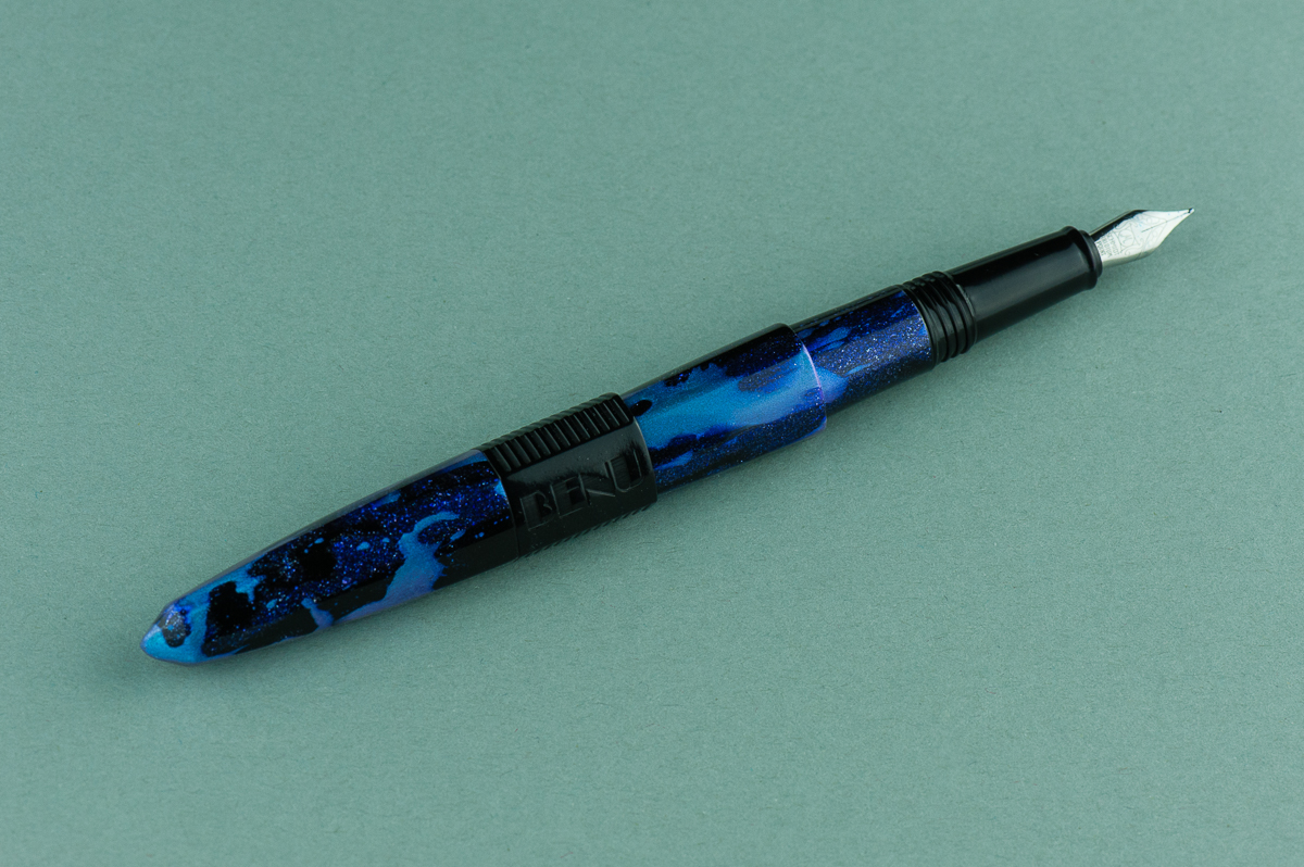
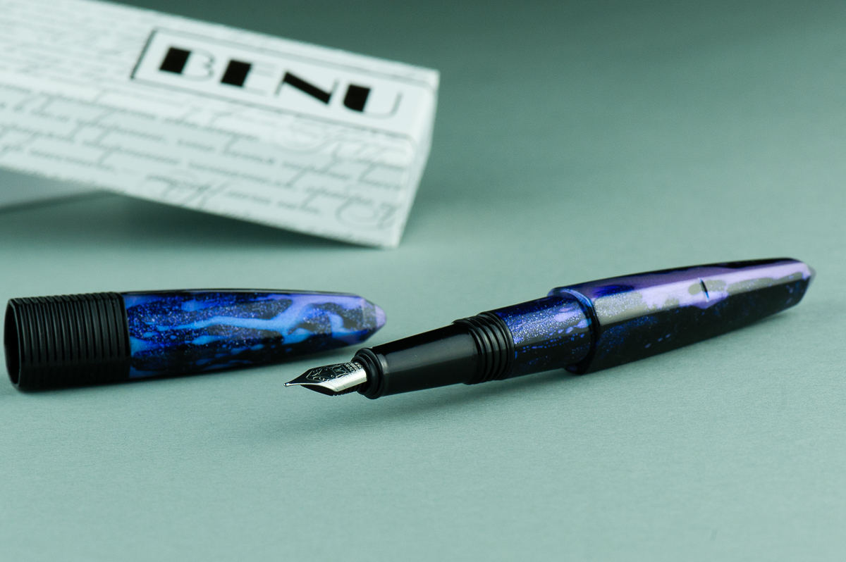
Review: Benu Essence (Mint Ice, Fine Nib)

We thank Lisa and Mike Vanness of Vanness Incorporated for lending us this Benu Pen Essence fountain pen for review. The Vanness family has had a pen shop in Little Rock, Arkansas since 1938 and is celebrating 80 years of being in business. Check their store out if you can or they could also be attending a pen show near you.

The opinions in this review are always our own and we were not compensated (monetarily or otherwise) for this review.


Hand Over That Pen, please!

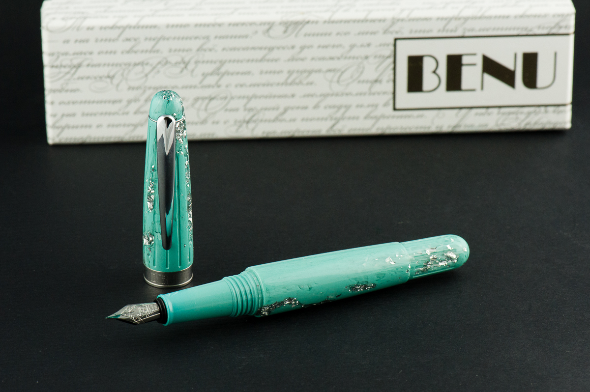
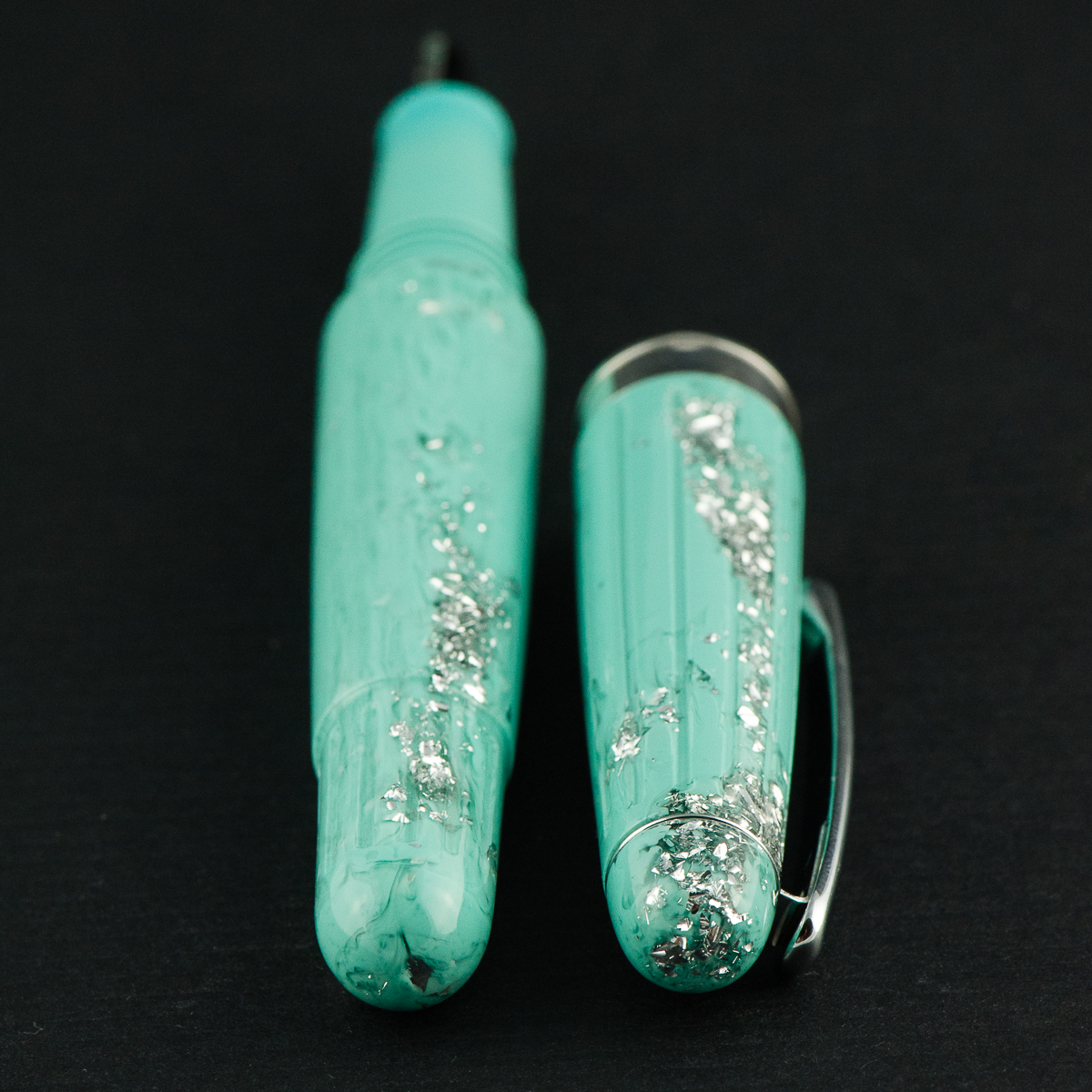
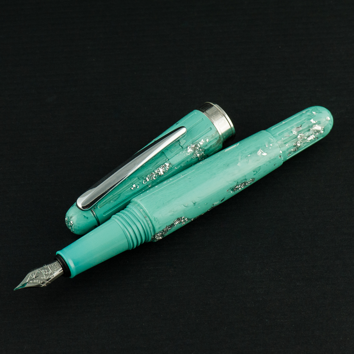
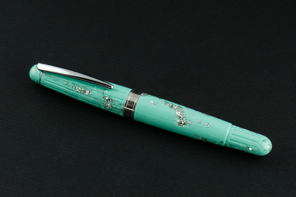
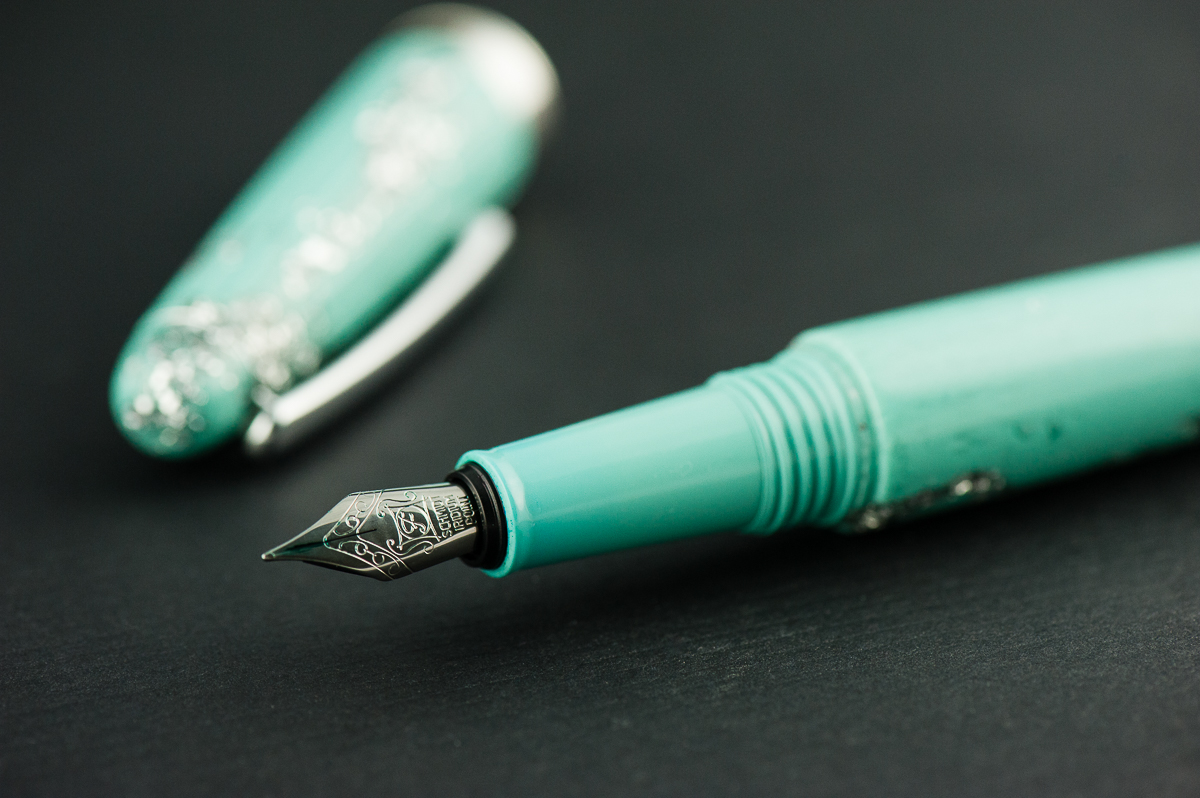
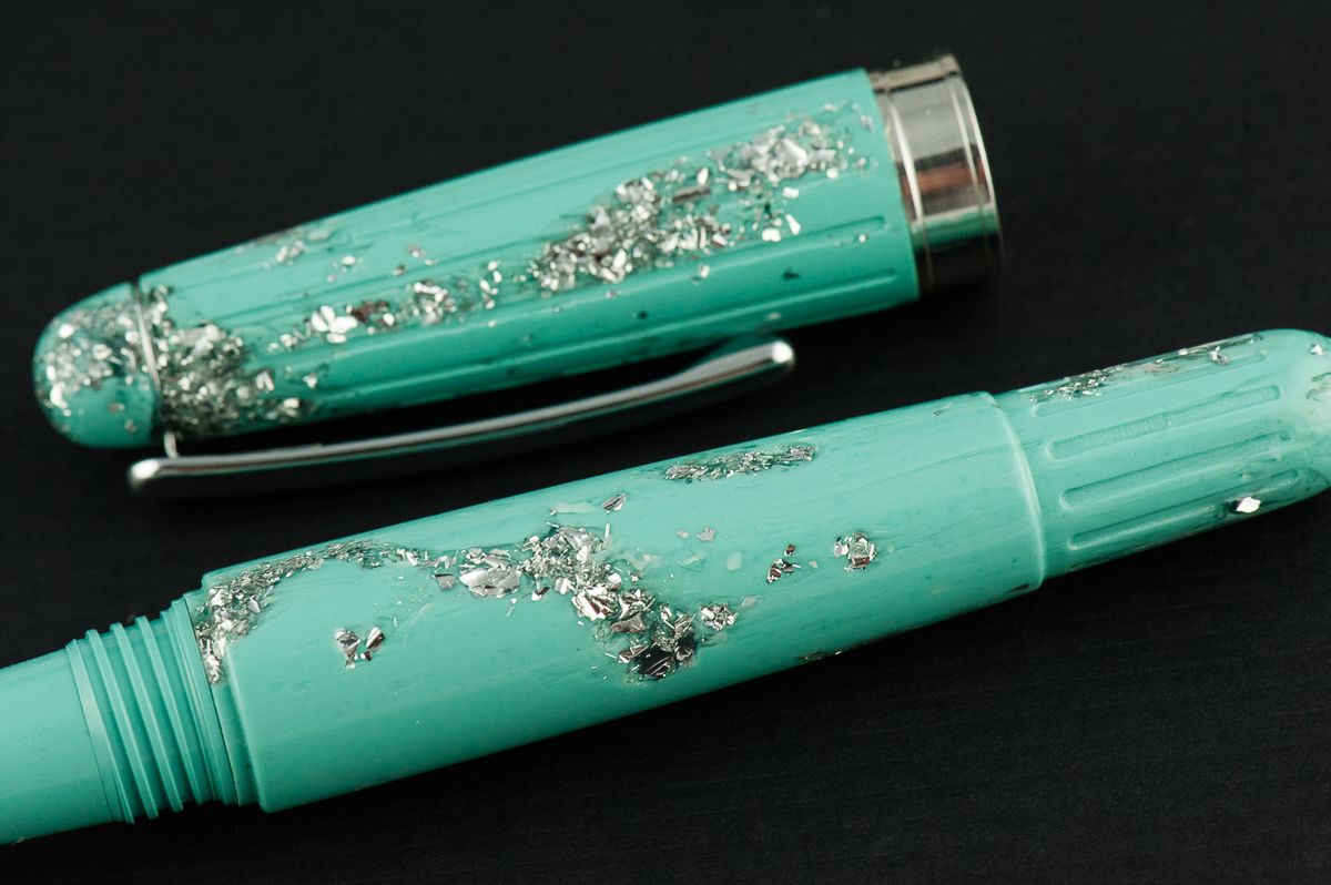
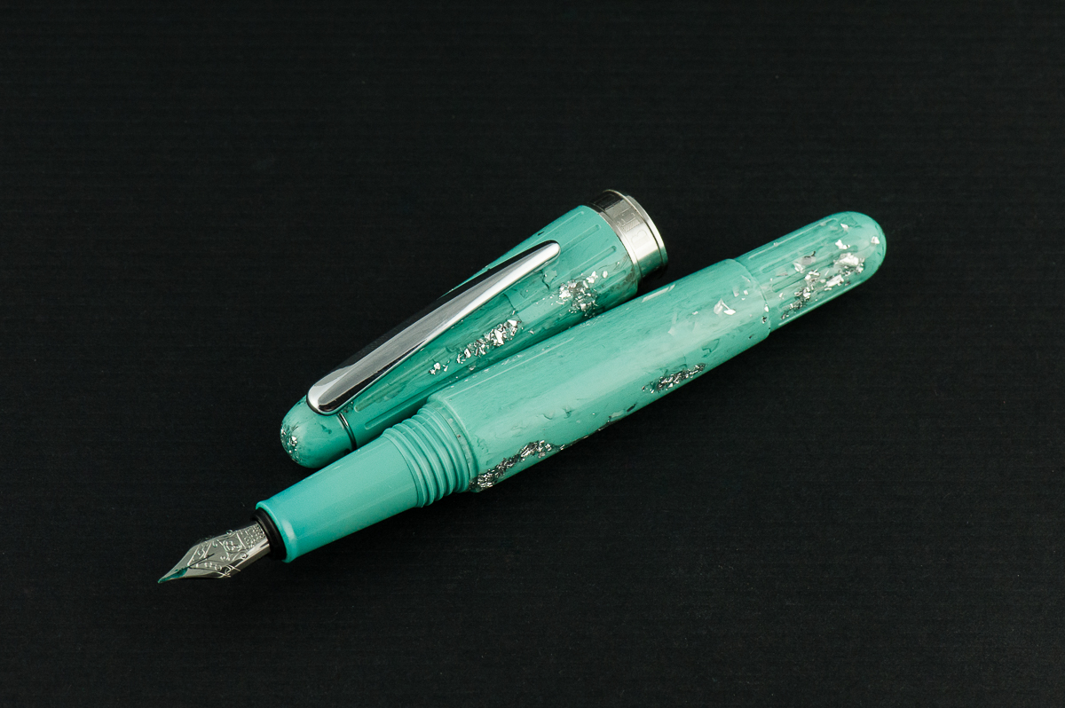
Katherine: Aesthetically, this pen is not my jam… but I do know some people who love it. So, to each their own. But, robin’s egg blue and glitter aside — it’s a well finished pen that feels sturdy in hand.

Pam:  This pen is “rich” in decor and chunks of glitter which borders on obscene in my more minimalist preferences/opinions. However, to those who find this aesthetic pleasing, it is definitely an eye catching and bold pen.

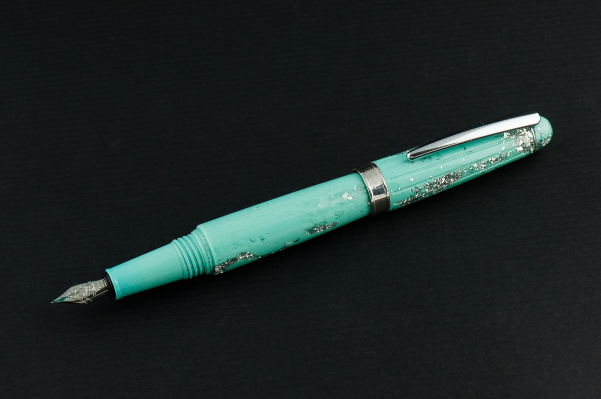
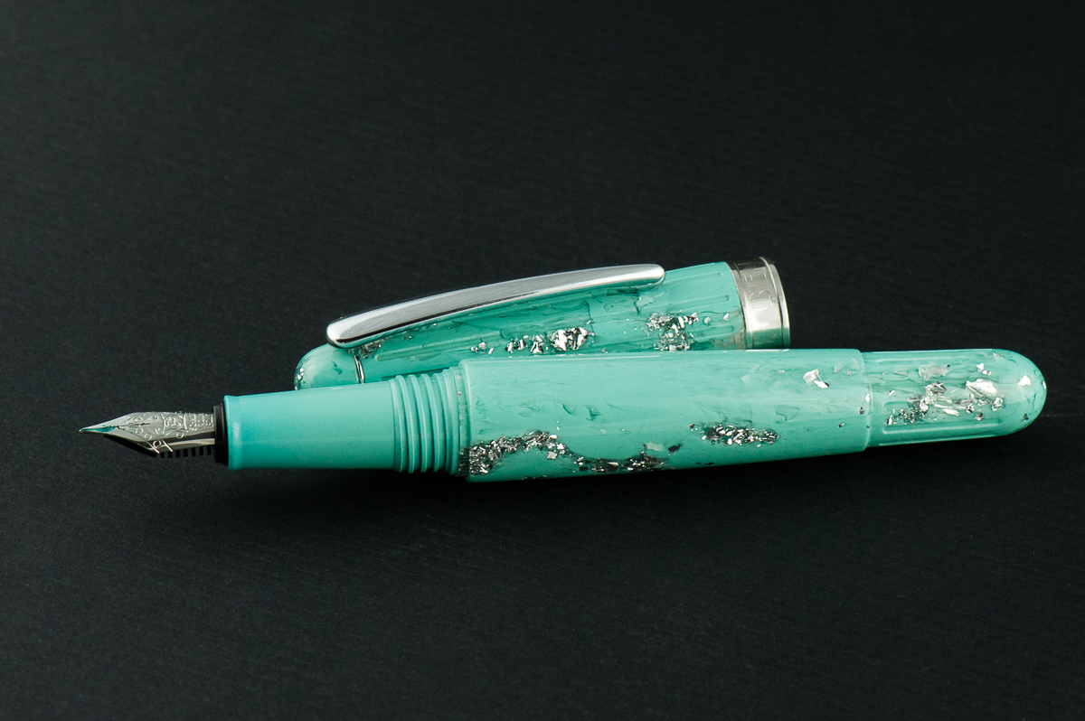
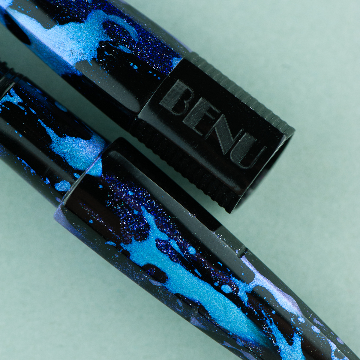
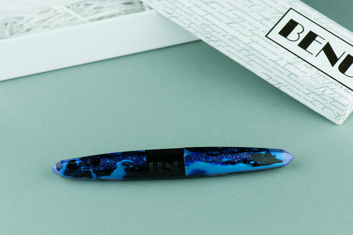
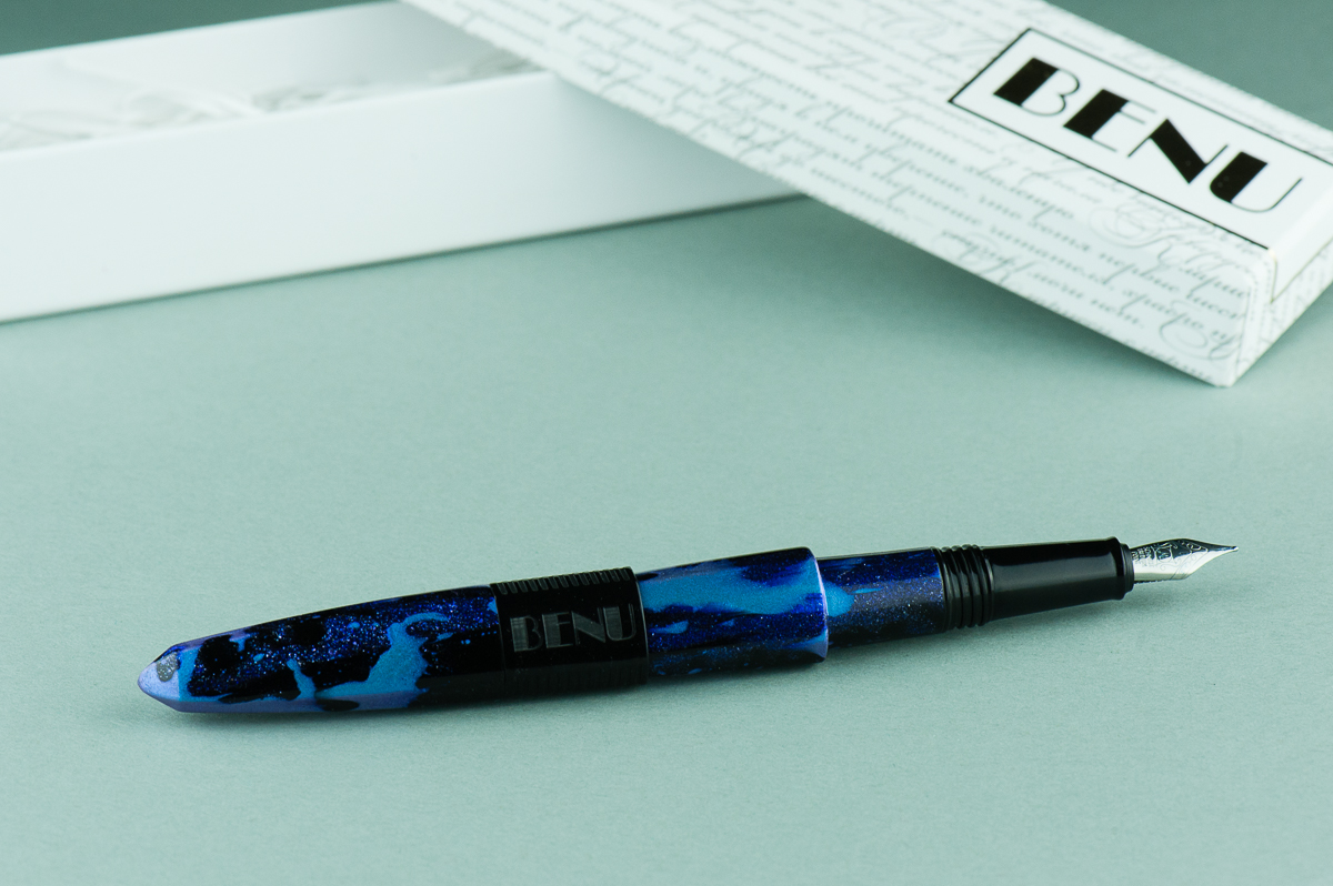
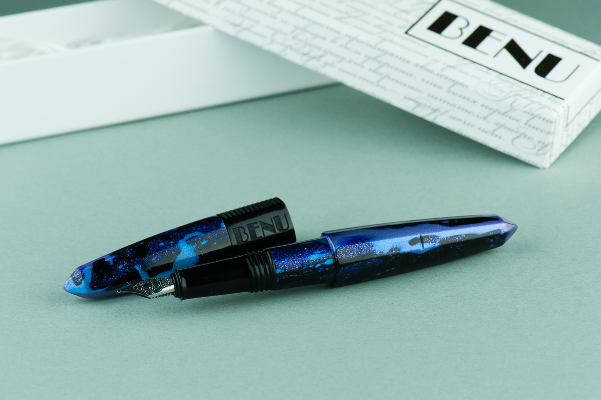
Franz: The Benu Essence is surely tugging on my color palette for I love the minty, turquoisey tone! Sans the glitter/ice part though for it makes it a bit garish. I really like the swirly bits of color in the acrylic. The Essence’s torpedo shape is plain which balances the material’s garishness.


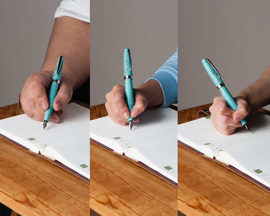
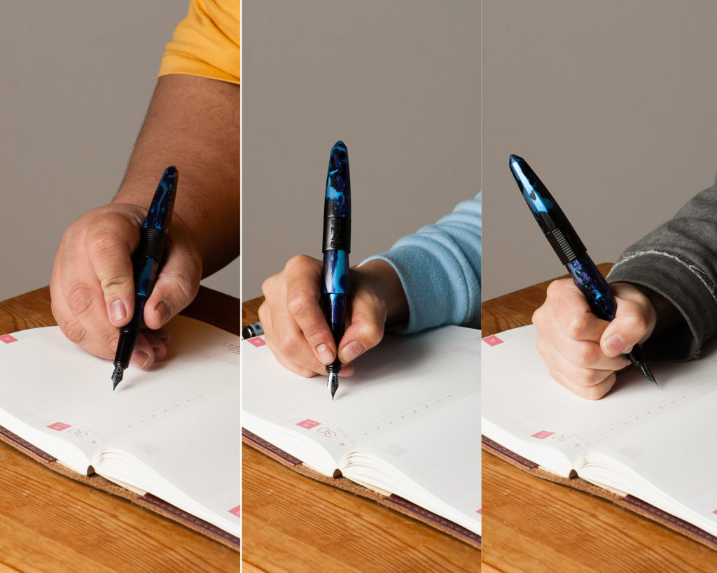
In the Hand: Benu Essence (posted) — from left to right: Franz, Katherine, and Pam
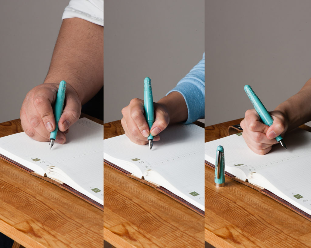
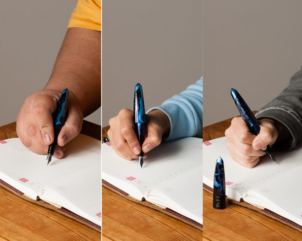
In the Hand: Benu Essence (unposted) — from left to right: Franz, Katherine, and Pam


The Business End

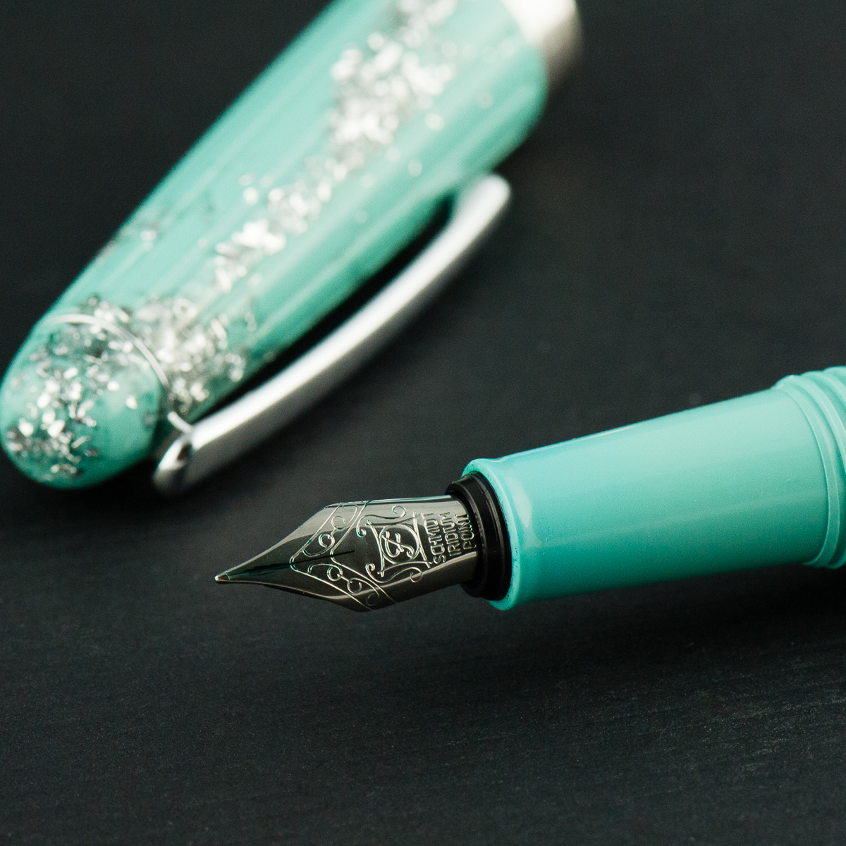
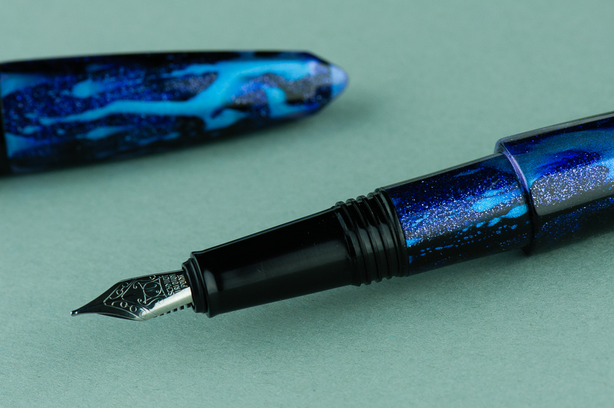
Katherine: Like the other Benu pens, this one sports a Schmidt nib. It’s a well behaved nib that puts ink to paper just fine, but doesn’t have a lot of character. It would be a great candidate for a grind or a swap with something more interesting (like the Benu Chameleon, this one is also a loaner, so no experimental nib swaps for me…).

Pam:  I really have no complaints or major compliments about the Schmidt nib.  It’s a fully functional, works well out of the box, and not very memorable nib. Aesthetically, the nib to be a bit small relative to the rest of the pen.  Currently, it’s a #5 sized nib, which makes me wonder if a #6 nib would be more balanced.

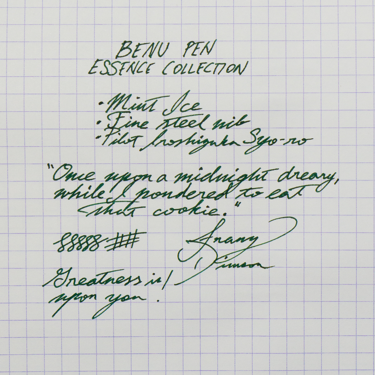
Franz: The Benu’s fine nib wrote well out of the box and I enjoyed using it for my daily writing. It was pretty smooth and with Pilot Iroshizuku Syo-ro, the flow was moderate to generous.

Contrary to Pam’s thoughts, I feel that the current nib complements the shape of the pen and tapers with the section. I placed a #6 Schmidt nib beside the Essence and it became somewhat too small. However, I do wish that Benu could stamp their name/logo onto their nibs. I know it’s an aesthetic thing but I always prefer the nib branding to match my pen.

Franz’s writing sample on a 80 gsm Rhodia grid paper


Write It Up

Katherine: I found the pen comfortable in hand for long periods of time — the section is a smidge small for me, but still perfectly usable. I had no issues with this pen for either journaling or writing quick notes.

Pam:  The section and the step are right at the “sweet” spot of the tender bit between thumb and pointer finger.  The step wasn’t particularly sharp, but it wasn’t comfortable if I tightened my grip like I inevitably do during a long writing session.  The pen was balanced closer to the nib end and comfortable for a longer writing session.  I appreciate the added girth of the pen, so it might be pretty comfortable for someone with larger hands (if it wasn’t for the length.)

Franz: The length of the Essence was quite comfortable for me even unposted. I feel that the balance is better when the cap is posted so I wrote with this pen posted for a while. The cap is definitely secure and the grooves on the back of the pen helps it so. When the cap was not aligned to the grooves, it still posted but it wasn’t as stable.


EDC-ness

Katherine: It’s a small-ish pen that fits easily in a pocket. Additionally the clip felt strong and I didn’t hesitate to clip it to my skirt pocket for the day. My one hesitation is that it’s so glittery that I didn’t think customers might take me seriously if I used it in a meeting… but that’s true of a lot of pens, even my beloved raden and maki-e pens. So, coworkers’ raised eyebrows aside, I’d give this a thumbs up as an EDC.

Pam:  Due to this pen being a loaner pen, I didn’t have it in my lab coat pocket.  And like Katherine, looking young with a blingy pen only adds to an image akin to Doogie Howser sans medical degree.

The clip was strong and was snug within my pen case.

Franz: The Essence was a great pen to use on the daily. I used it at work and the clip secured the pen in my shirt pocket. I appreciate that I don’t need to post the cap to be use it comfortably for a longer period.


Final Grip-ping Impressions

Katherine: To buy or not to buy? In the end it comes down to the aesthetic. Like the Benu Chameleon we reviewed a few months ago, it’s a solid pen, it all comes down to aesthetics, if you love it, you won’t be disappointed.

Pam:  The pen is a serviceable pen for those who appreciate the aesthetic.  My reception of the pen is lukewarm, but I see those who appreciate the over the top decor of the pen to enjoy this writing instrument.

Franz: The Benu pen company create pens that stand out from others. The acrylic designs catch your attention and then their different pen shapes will intrigue you. The Essence collection is probably one of the more conservatively shaped pens in their lineup and is great to use.

In the beginning, I was apprehensive when I saw the taper of the Essence’s section. I was worried that it may be too small for my larger hand, but I ended up really liking the pen. The pen has a good medium to large size to it that I appreciate very much.

Once again, thanks to the Vanness Incorporated team especially to Lisa Vanness for lending us this Benu pen. We really appreciate your support!


Pen Comparisons

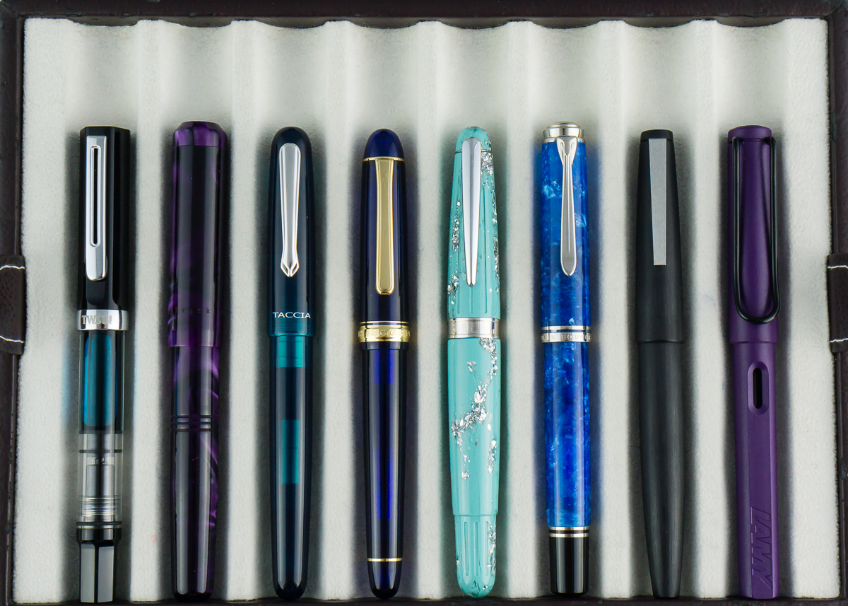
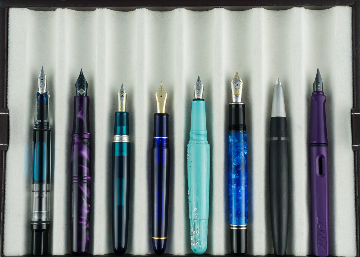
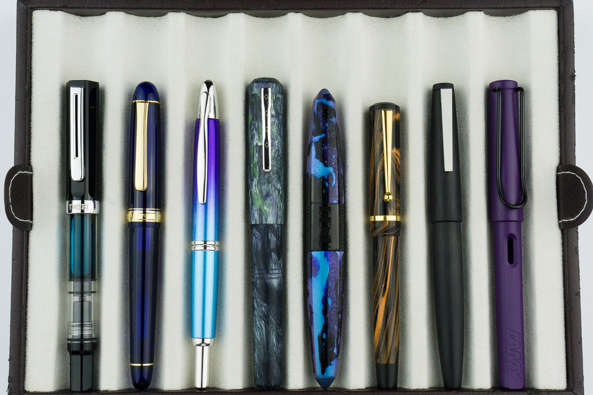
Closed pens from left to right: TWSBI Eco, Franklin-Christoph Model 31, Taccia Spectrum, Platinum 3776, *Benu Essence*, Pelikan M805, Lamy 2000, and Lamy Safari
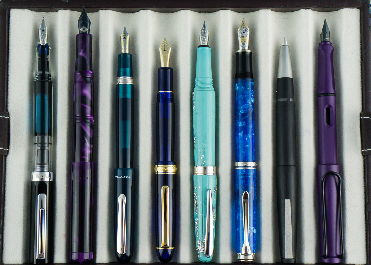
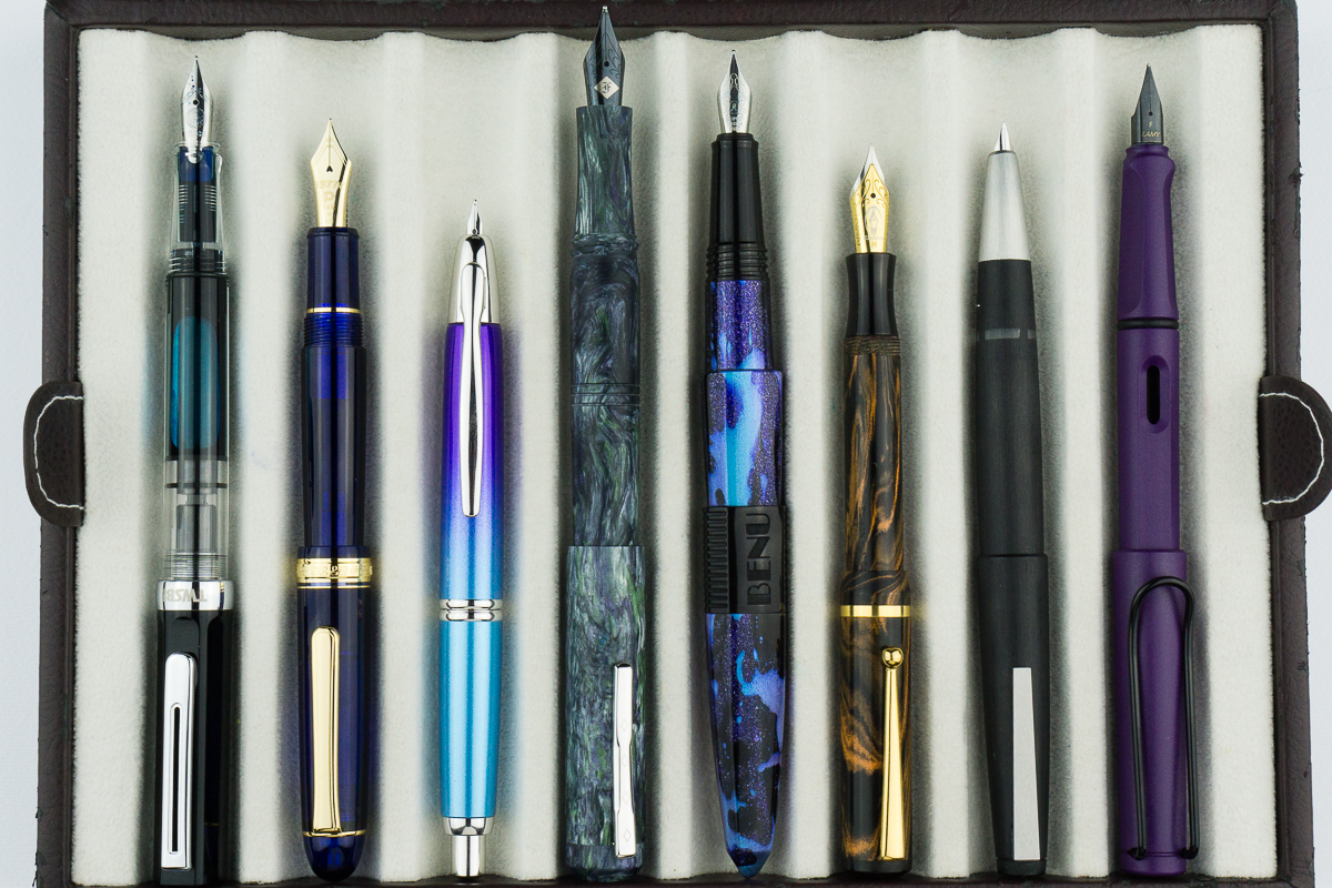
Posted pens from left to right: TWSBI Eco, Franklin-Christoph Model 31, Taccia Spectrum, Platinum 3776, *Benu Essence*, Pelikan M805, Lamy 2000, and Lamy Safari
Unposted pens from left to right: TWSBI Eco, Franklin-Christoph Model 31, Taccia Spectrum, Platinum 3776, *Benu Essence*, Pelikan M805, Lamy 2000, and Lamy Safari

Pen Photos (click to enlarge)

No Comments

Pen Review: Faber-Castell Ondoro (Orange, F Nib)


In this review, we are once again joined by our friend, Roz. She’s volunteered to be our left-handed reviewer and we love having her back. Especially when she brings us cupcakes. Thanks again Roz!

Hand Over That Pen, please!

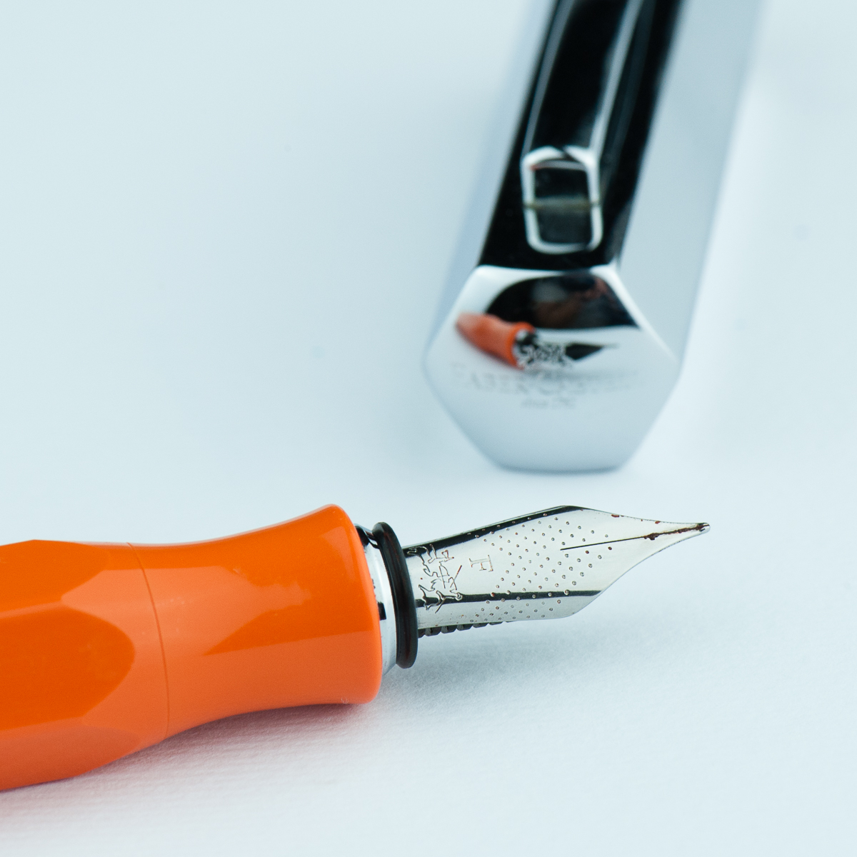
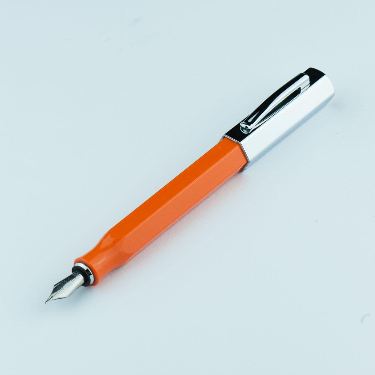
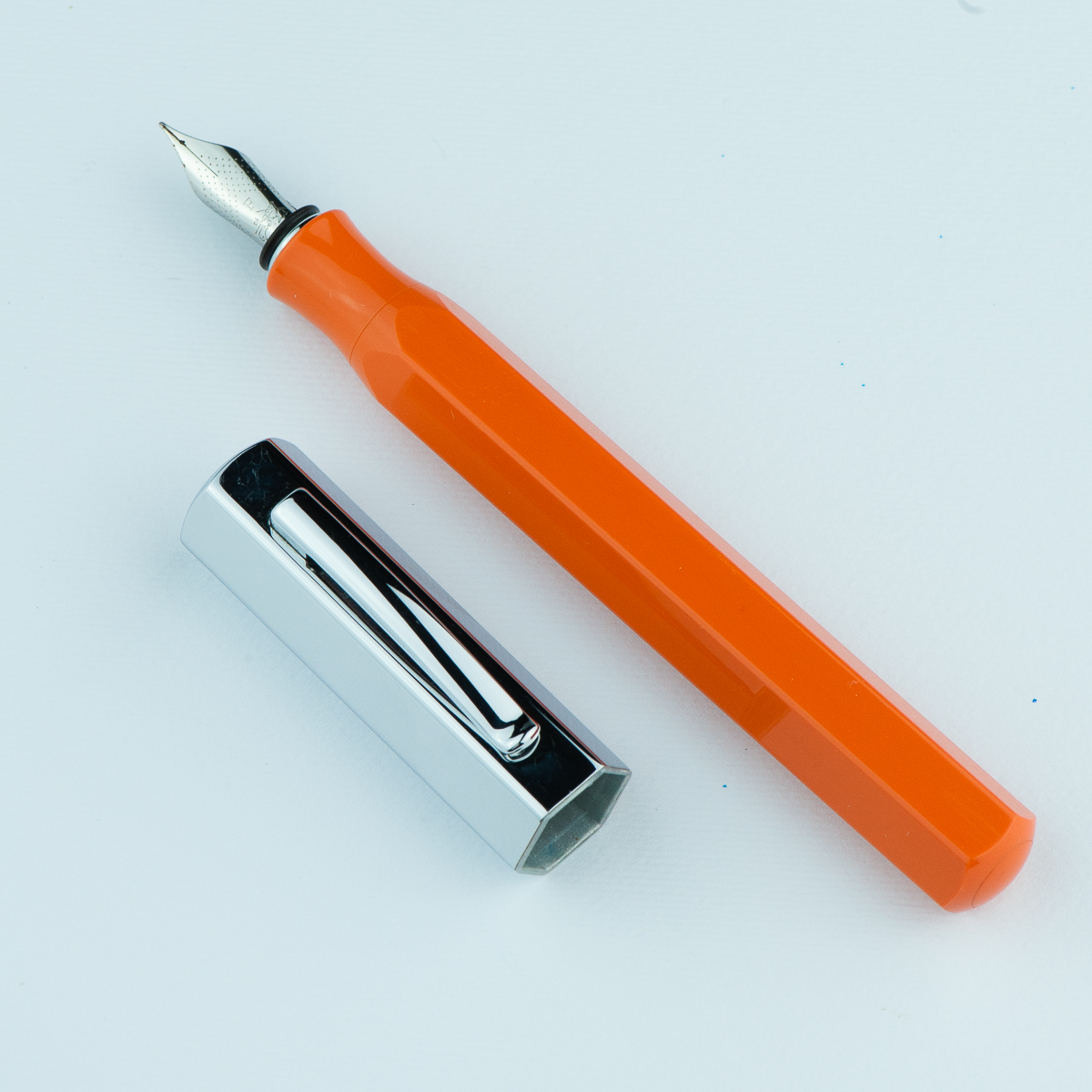
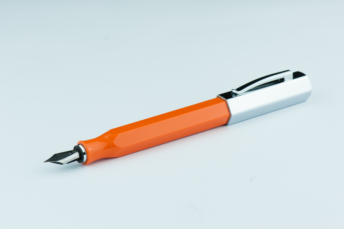
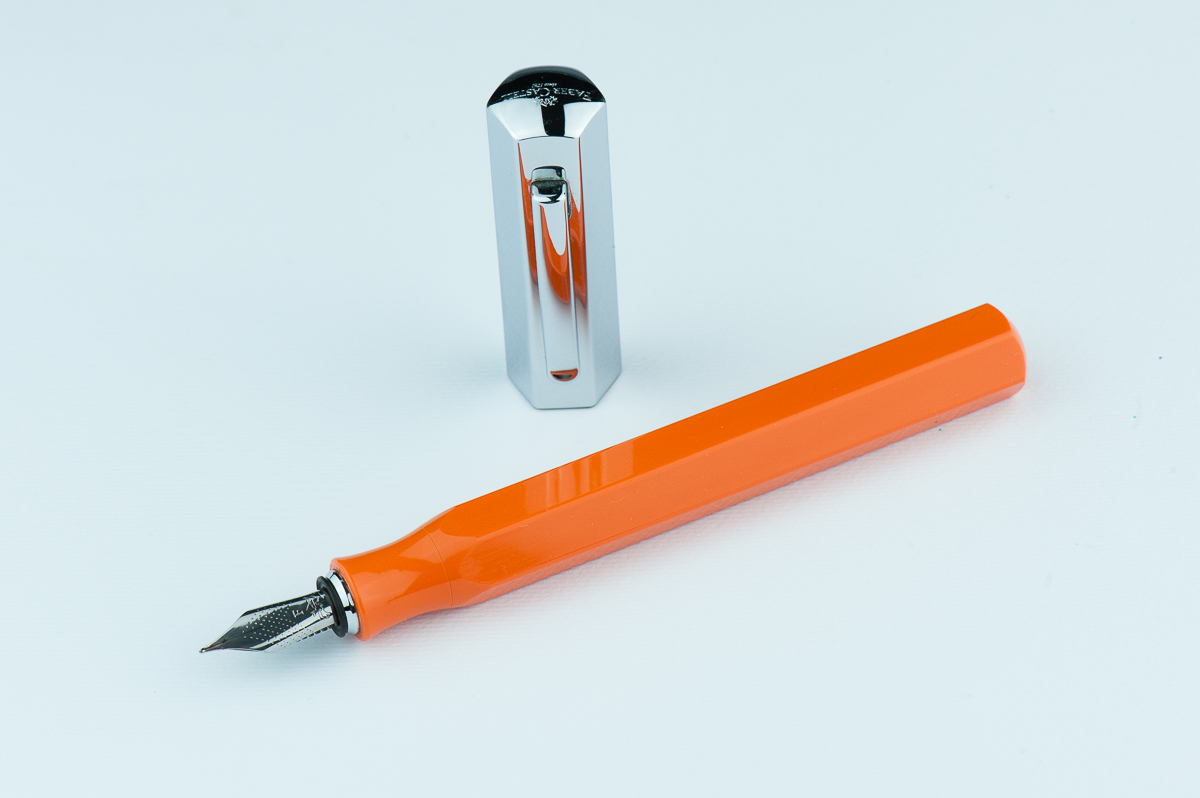
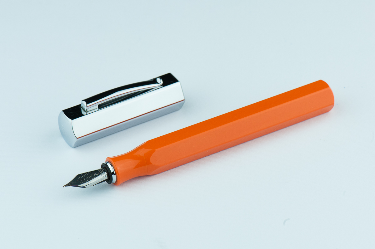
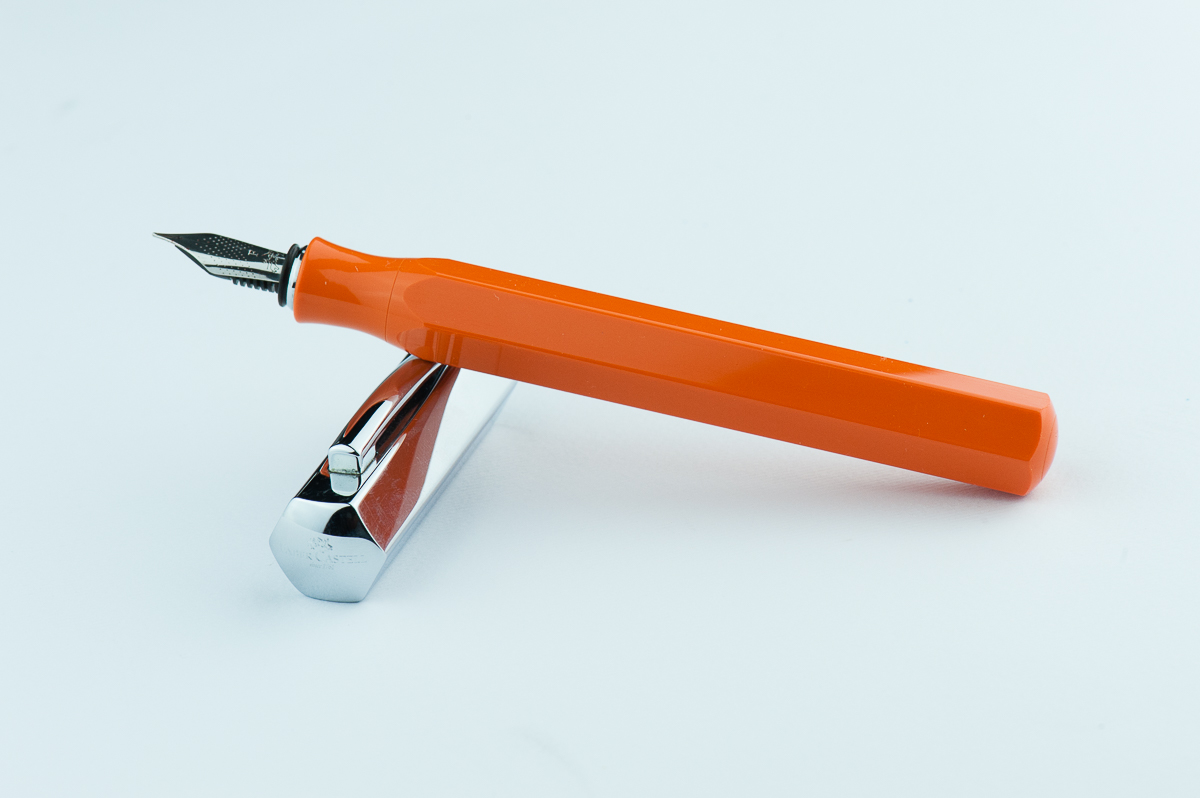
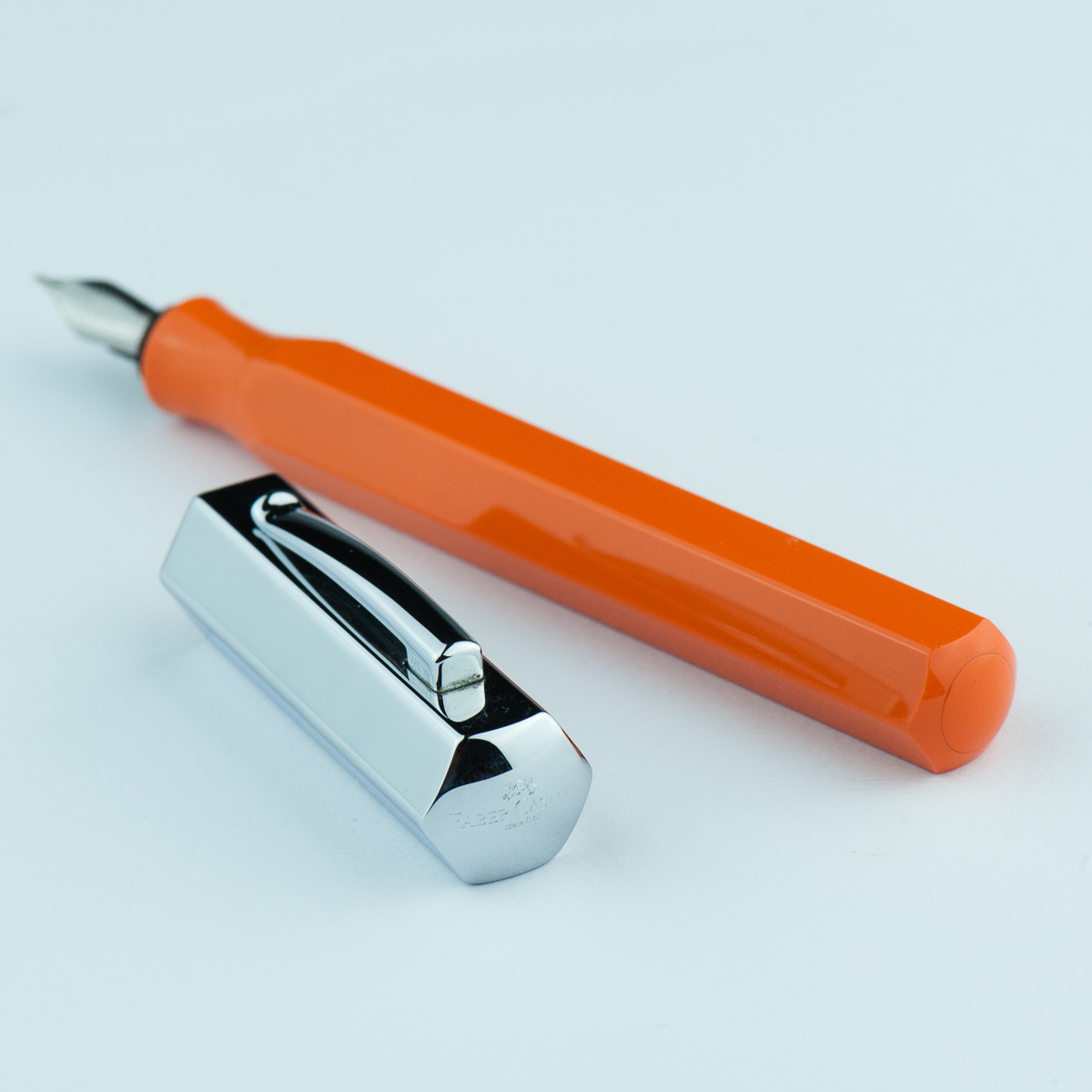
Katherine: I have a thing for faceted pens, and this is no exception. I love the chunky, stubby look of the Ondoro paired with clean faceted lines. I really want a white Ondoro… but they appear to be discontinued, so for now I have an orange one. I like the bright playful orange and the contrast with the chrome cap. The bright orange paired with the chunky look reminds me of those big grip pencils that little kids get.

Pam:  The Ondoro’s unique design and eye catching color did make me curious to pick one up.  I am glad that Katherine ultimately decided to get one.  The shape of the barrel reminds me of an oversized pencil.  I mean, a fountain pen is an adulting pencil right?  The chrome barrel is a great cherry on top to this design in my opinion.

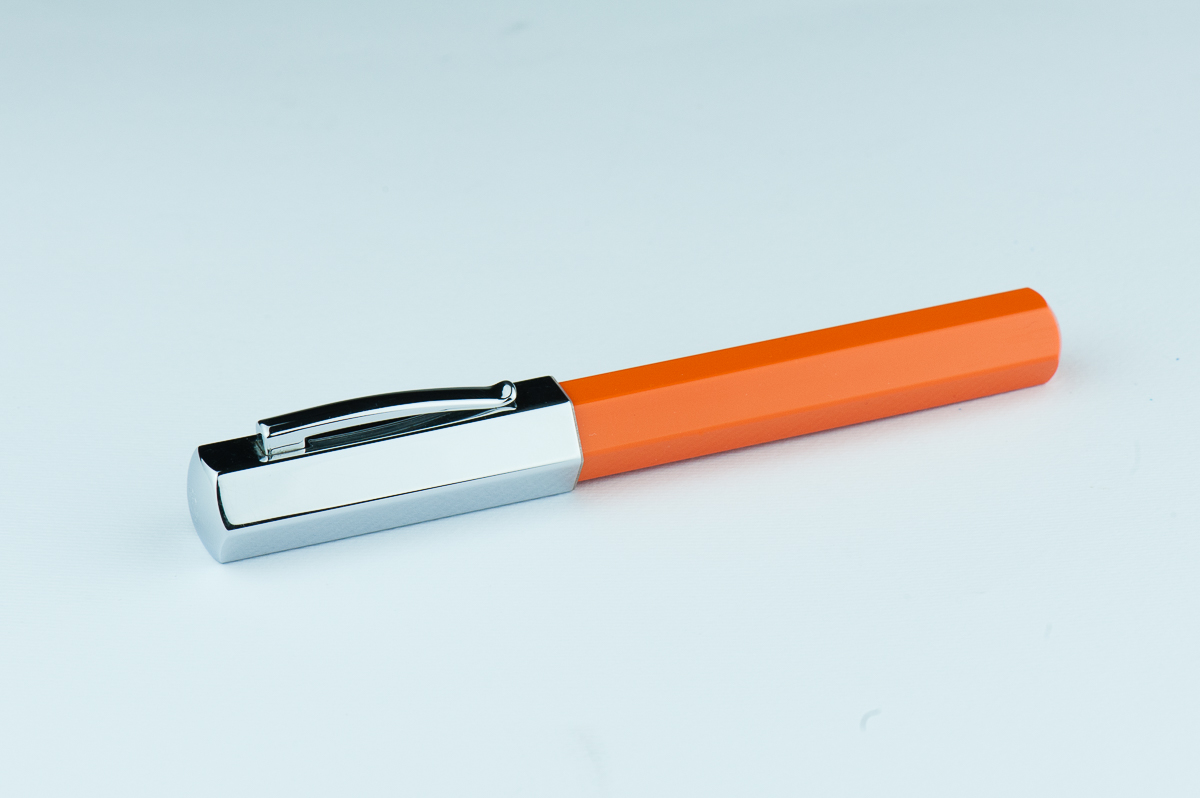
Franz: Stout! That’s one word I’d describe the Ondoro. Its shortness in length is balanced by the girth of the barrel and cap though. The hexagonal facets make this pen interesting and different from others. The shiny cap is cool looking but is a fingerprint magnet for sure.

Roz: Wow, my eyes! The Ondoro is definitely an attention getter. The bright orange with shiny silver cap, I’m awake and excited to experience this pen. I’m still not sure about my opinions on facets – but I feel like a pen of this size benefits from the facets breaking up the amount of solid colors there would be otherwise.

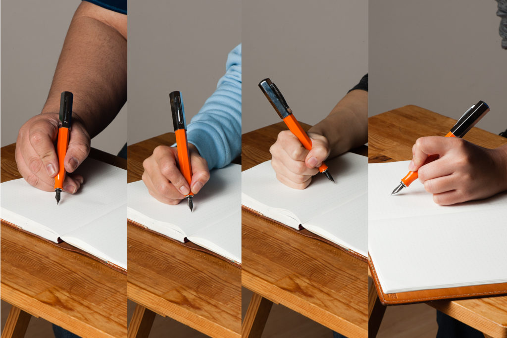
In the Hand: Faber-Castell Ondoro (posted) — from left to right: Franz, Katherine, Pam, and Roz
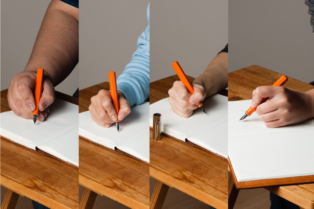
In the Hand: Faber-Castell Ondoro (unposted) — from left to right: Franz, Katherine, Pam, and Roz
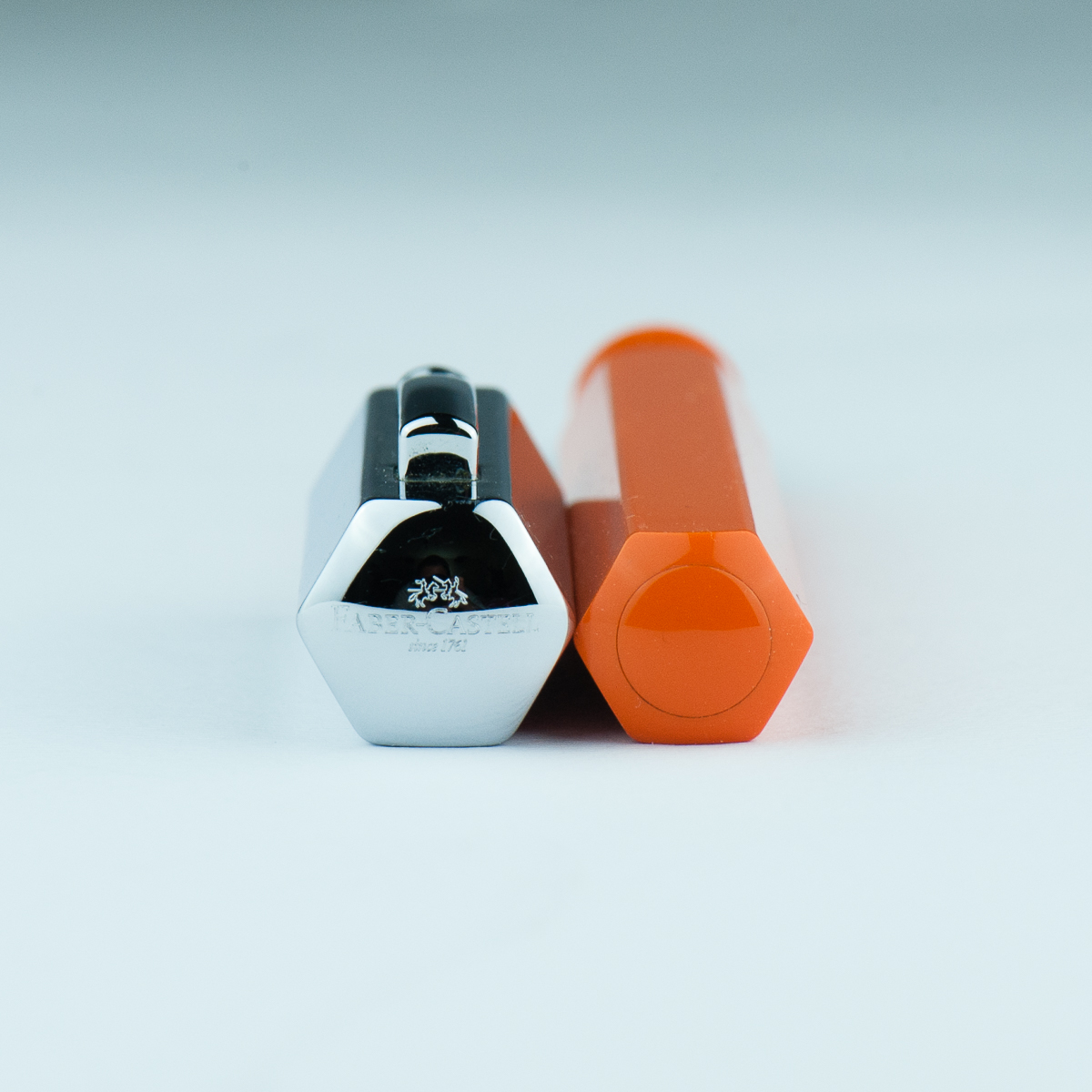
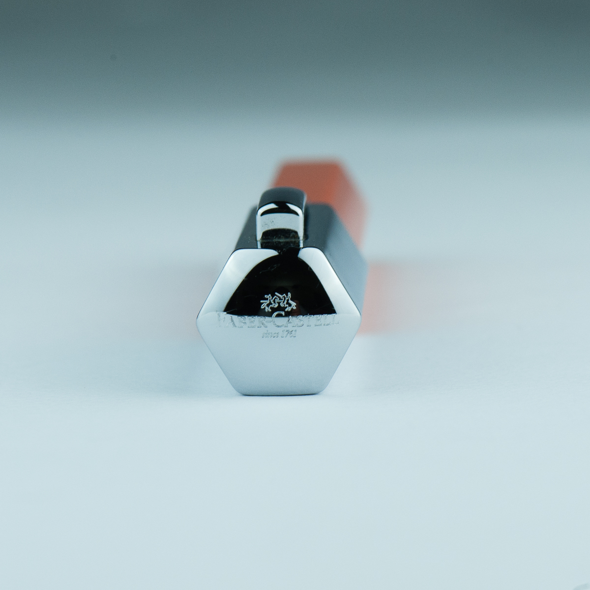
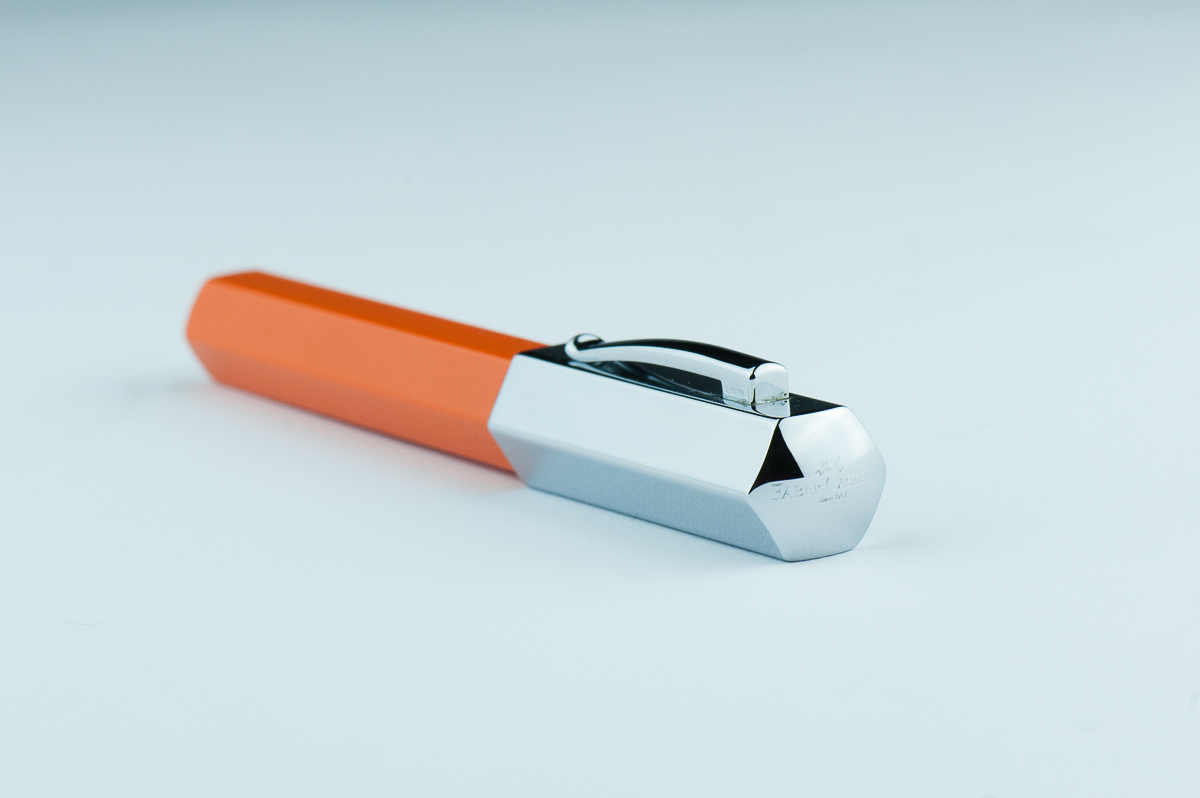
Cap and Barrel ends.


The Business End

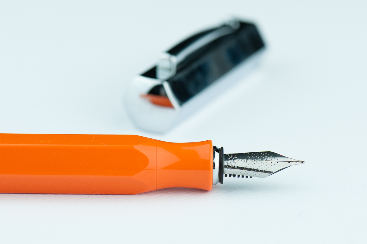
Katherine: This was my first experience with a Faber Castell nib. I like the nib and it’s pleasant to write with, but nothing particularly notable. It’s a western fine with a nice balance in wetness — wet enough to be comfortable for writing, but dry enough to see lots of shading with the right inks. The feedback on the nib is a smidge feedbacky — which I really like. Hurray for nibs that aren’t super smooth and “buttery”.

Pam:  I do really enjoy the Faber Castell nib.  It’s a pleasant nib to write with and does somewhat remind me of a pencil in terms of feedback.  It’s not super smooth, but the feedback isn’t distracting either. The nib performed well and had more feedback on Midori paper than Tomoe River paper in my opinion.  The nib is a good balance between dry and wet.  It’s dry enough for a decent consistent line, however, you also get to enjoy the ink color you have put into the Ondoro.  I would prefer a more saturated ink in this instance given that I shading inks make my handwriting look messier, especially if it’s beyond a couple of sentences.

Franz: Aesthetically, the smaller nib size (#5?) looks good on this pen. I also love the design of dots with chevron shape. As for nib performance, the fine nib has a bit more feedbacl tha I refer. But I am the medium/broad nib kinda guy so not a biggie for me. It did write with a consistent ink flow though.

Roz: The nib was a bit scratchy for me at first, it took me a while to find a good angle – but I did find it! Once I got my angle down, the nib was pretty easy to write with. Additionally, the nib made a sound while writing that I really liked.


Write It Up

Katherine: I was initially hesitant about this pen (why I never bought a white one) because of the narrowed section. However, it’s surprisingly comfortable, but does force me to hold my pen slightly further back than I usually do (probably more like a normal person). I use the pen unposted and it’s well balanced and pleasant to write with for extended periods.

Pam:  The short section was a bit of a concern for my dinky iron grip initially, however, I had no reasons to worry.  The smooth transition from body to section meant that the entire pen is one big grip for me!  The angles on the pen is soft enough that no corner actually bites into my hand and the section being tapered doesn’t detract from my capacity to grip the pen.  I do get sweaty hands so there are times that I have to reposition a bit.  Surprisingly, slippage was relatively minimal.  That’s more my hand sweat problem and less about that pen.

Franz: Okay… writing with the Ondoro for 20 minutes, I’ve come up with some issues. Probably it’s just specific to me but I didn’t find the Ondoro comfortable to write with either posted or unposted. Posted, the cap definitely makes it unbalanced and top heavy. I seemed to have to exert some force to counterweight the cap to put the nib to paper. Unposted, the length is barely enough for my usual higher grip. With the Ondoro’s pinched/concave section, I needed to grip it higher because of the smaller diameter of the section.

Now here comes the probably just specific to me part and you as a reader shouldn’t worry too much about. Gripping the Ondoro higher above the section wasn’t comfortable for me either because my usual writing angle causes my fingers to land on the edges and not on the flat side of the facets. This bothered me a bit and when I adjust my grip to the flat sides of the facet, either the writing angle felt weird to me, or one of the nib’s tines was not hitting the paper optimally and caused me to feel scratchiness or more feedback. Again, this is possibly just me.

Roz: My grip tends to move around a lot when I write; so having to keep to a narrower range of angles, I really expected my hand to tire quickly. But I didn’t! The girth of the pen kept my hand from cramping up and the grip dipped in such a way that it really helped with my writing fatigue. Writing with the Ondoro unposted was a bit unbalanced for me. While I preferred to write posted, the cap does add a good amount of weight to be wielded.


EDC-ness

Katherine: It’s a snap cap! Hurray! My only complaint with this pen as an EDC is that the snap isn’t satisfying — it doesn’t have that clean click that makes me think “now my pen is capped”. I’m not sure if all Ondoros are like this, or if it’s because this one came to me used. That being said, I’ve never had it uncap itself, so it seems pretty secure and my gripes about an unsatisfying snap are purely aesthetic. (Does the word “aesthetic” still apply to how satisfying something is to hear and feel?)

Pam: I love a good snap cap!  I makes me so happy that it’s so quick and easy to deploy at work.  The snap does leave a bit to be desired in terms of “aesthetics”, but on the flip side, it’s a quiet snap cap action so it’s not going to announce to the world that your capping and uncapping your pen.   The clip worked pretty well in my white coat pocket, nothing crazy notable in terms of tightness or looseness when it came down to it snagging on the fabric.

Franz: Echoing the ladies here, snap cap FTW. =) It definitely is a good pen for on-the-go, quick notes kind of writing. And the fine nib performed very well with copier paper found in our office.

Roz: I kept the Ondoro snugly in my Nock case during transport. I don’t get to write a ton during my work day, so it was really fun to bust this pen out for random thoughts, meeting notes, and quick breakdowns.


Final Grip-ping Impressions

Katherine: I like this pen! At $150 MSRP, I think it’s a little steep for a steel nib, but it has a unique look and often shows up slightly discounted. It’s a solid pen with a solid nib that makes a great sturdy EDC.

Pam: I honestly really like the Faber Castell Ondoro.  It’s a great pen for those who enjoy faceted pens, an industrial aesthetic, and a snap cap.  The nib is a great bonus. With the different colors available, it’s a great statement pen for those looking for a good pizazz in their pockets.

Franz: Here’s another plus one for liking the Ondoro’s aesthetics and its faceted disposition. I love the nib’s looks and performance, and that orange is very pleasing. I have stated (with some length) how I feel about writing with the pen for a longer period of time and I’m thankful that I got to try it without buying one. I’ve concluded that because of my larger paw, and kinda picky writing angle, this pen isn’t really for me. And that means I won’t steal… er… borrow the pen for a long time from Katherine. =)

Roz: Overall, the Faber Castell Ondoro was an interesting one for me to try out. Without a doubt the Ondoro is a pen that makes a statement, but in the end I think it was too much pen for me. And I’m still not sure about my opinion on facets!


Pen Comparisons

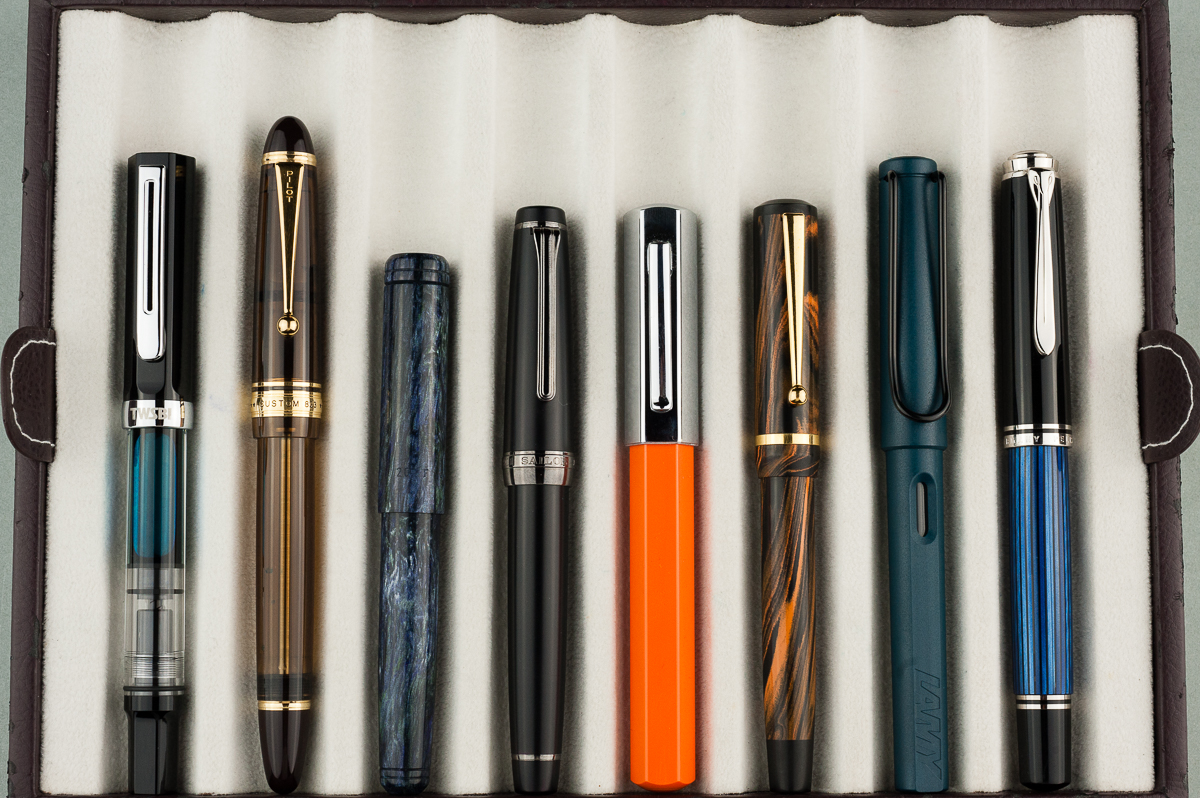
Closed pens from left to right: TWSBI Eco, Pilot Custom 823, Franklin-Christoph Pocket 20, Sailor Pro Gear Classic, *Faber Castell Ondoro*, Edison Beaumont, Lamy Safari, and Pelikan M805
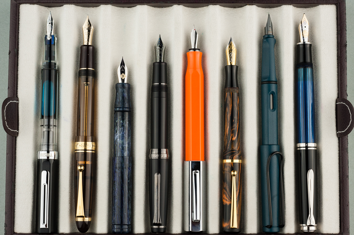
Posted pens from left to right: TWSBI Eco, Pilot Custom 823, Franklin-Christoph Pocket 20, Sailor Pro Gear Classic, *Faber Castell Ondoro*, Edison Beaumont, Lamy Safari, and Pelikan M805
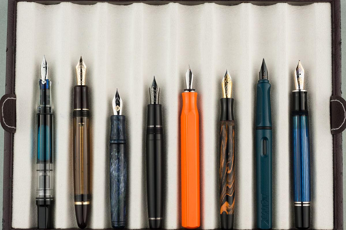
Unposted pens from left to right: TWSBI Eco, Pilot Custom 823, Franklin-Christoph Pocket 20, Sailor Pro Gear Classic, *Faber Castell Ondoro*, Edison Beaumont, Lamy Safari, and Pelikan M805

Pen Photos (click to enlarge)

5 Comments

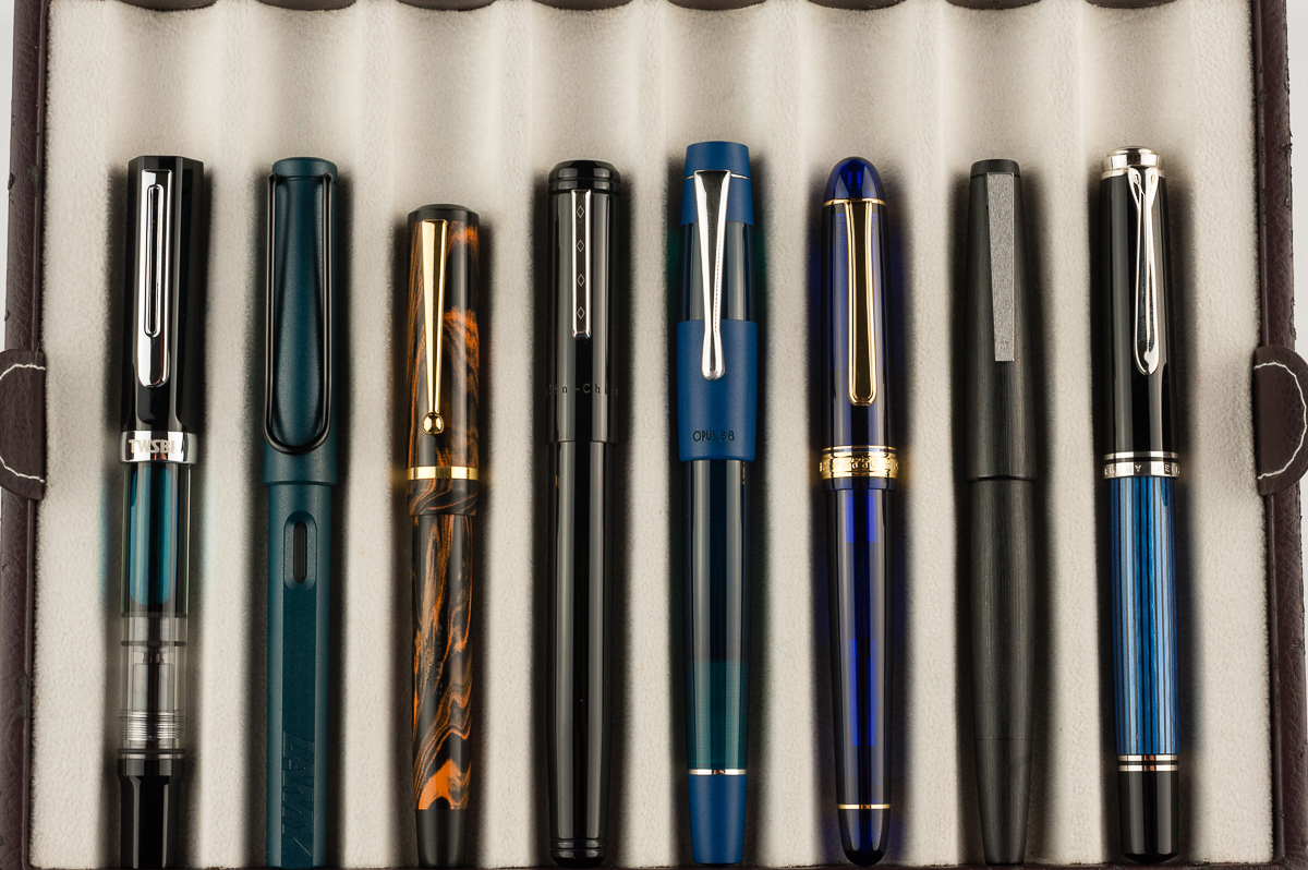
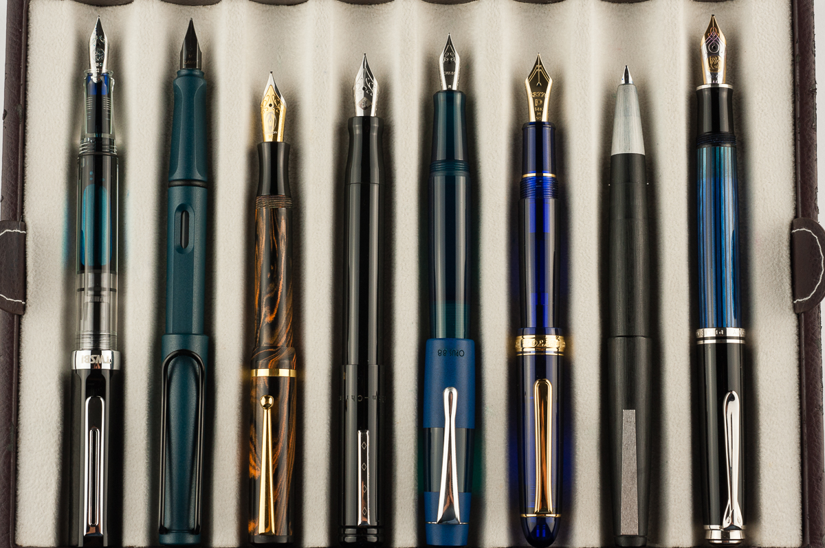
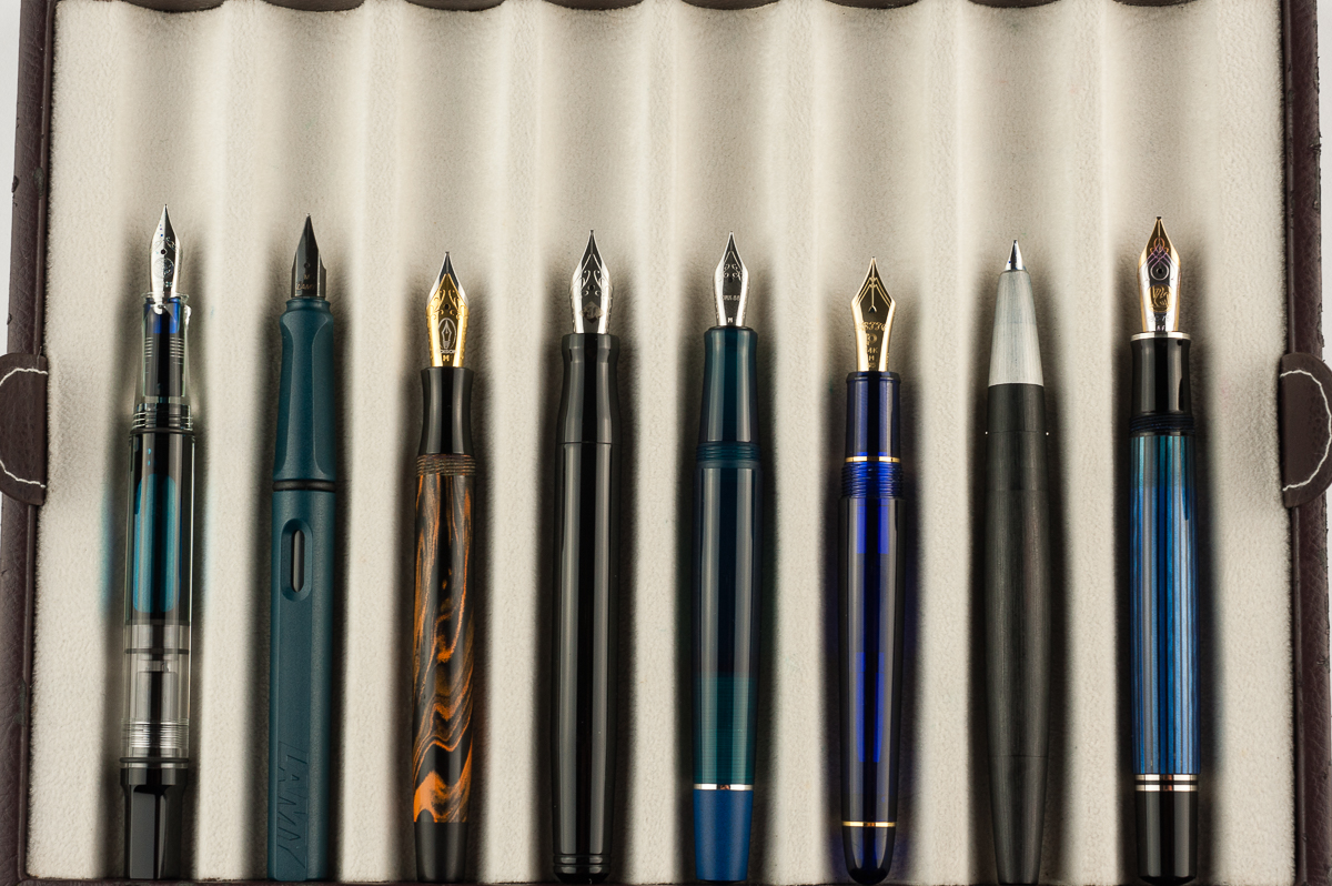
Opus 88 Koloro (Blue, Medium Nib)

Before anything else, a big shout out of appreciation to Goldspot Pens, and Tom for providing this Opus 88 Koloro fountain pen for review. Goldspot Pens is an online shop for pens, and stationery goods and they are an authorized retailer for diverse brands that we love!

Hand Over That Pen, please!

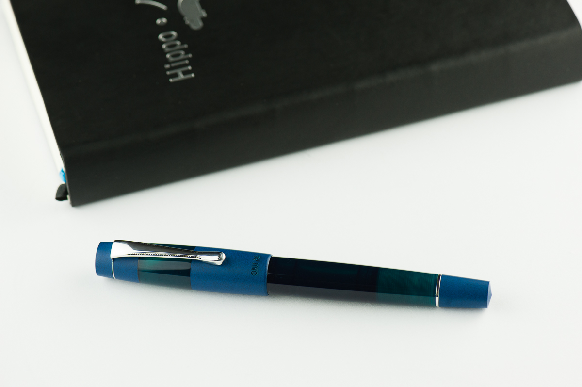
Katherine: Like many, this pen ain’t my thing aesthetically. I’m not a big fan of the solid matte blue paired with the shinier blue green — the two colors are too close for me (I also can’t stand denim on denim… or blue shirts with blue denim, but that’s besides the point). The demonstrator version looks neat though — but once again… this is all personal preference. 🙂

Pam:  The demonstrator version is very striking, however, I am relieved to see different colors for the Koloro.  All I see on Instagram is the demonstrator version! The slight translucency of the blue makes the material more interesting than a matte plastic.  That said, why not just maintain the same material throughout, like the demonstrator?  Lastly, the demonstrator version of the pen is pretty modern, and I wish the clip would reflect that.  But then again, I am heavily influenced by the Lamy 2000 clip.

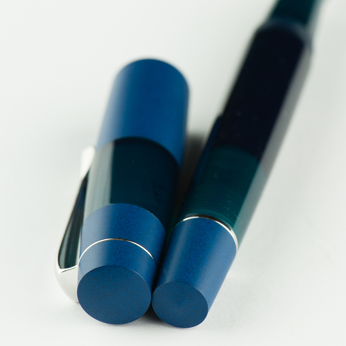
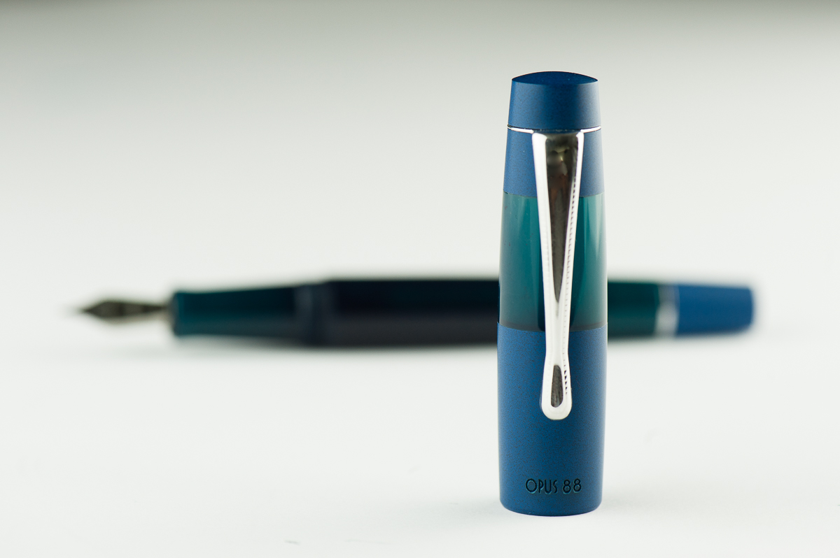
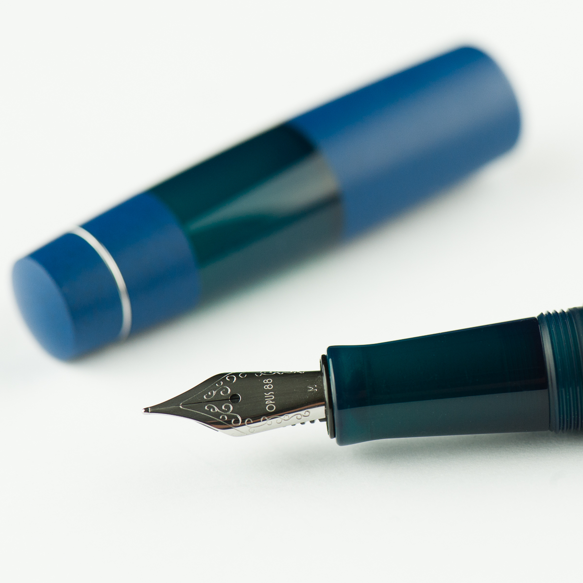
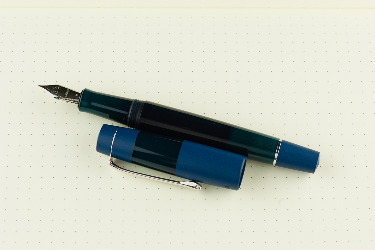
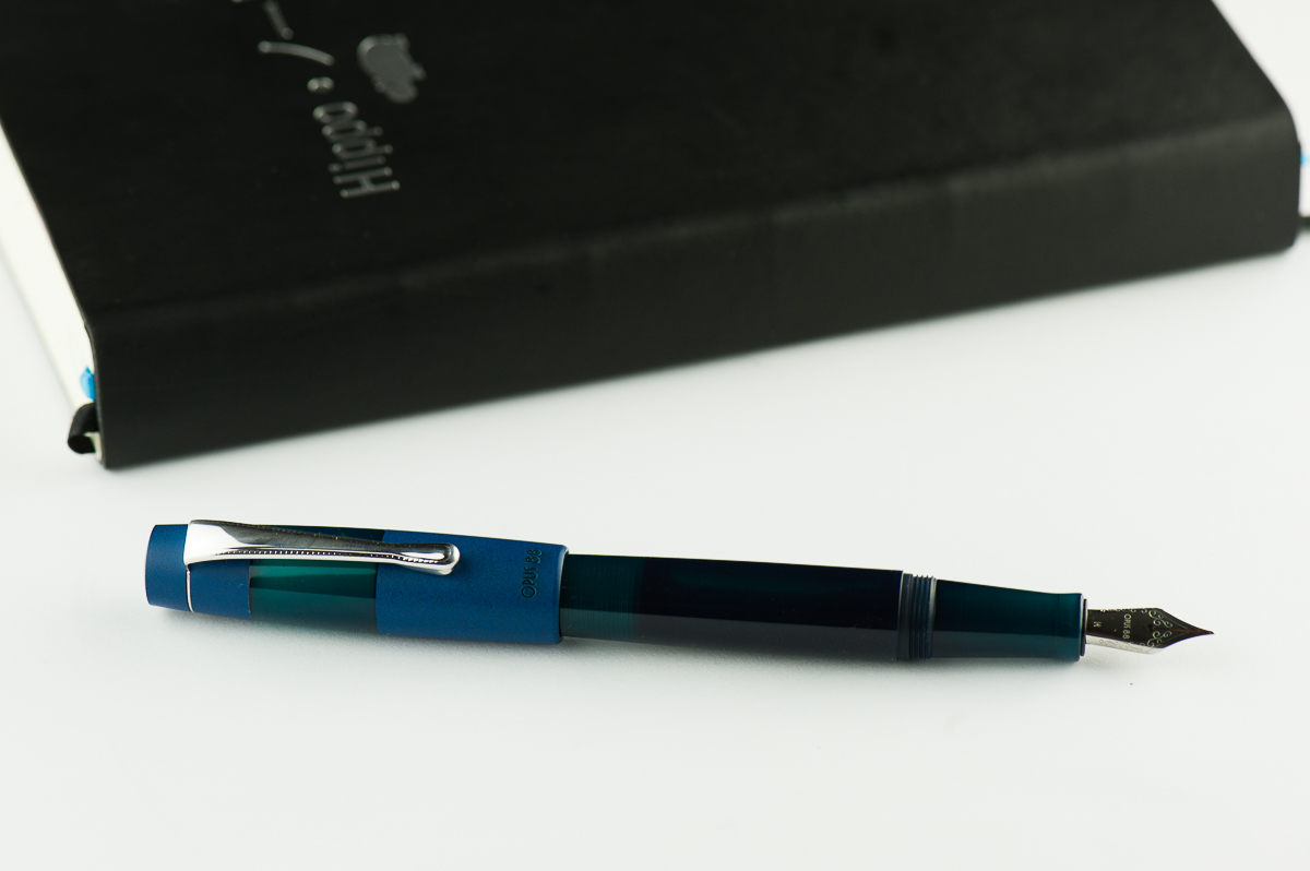
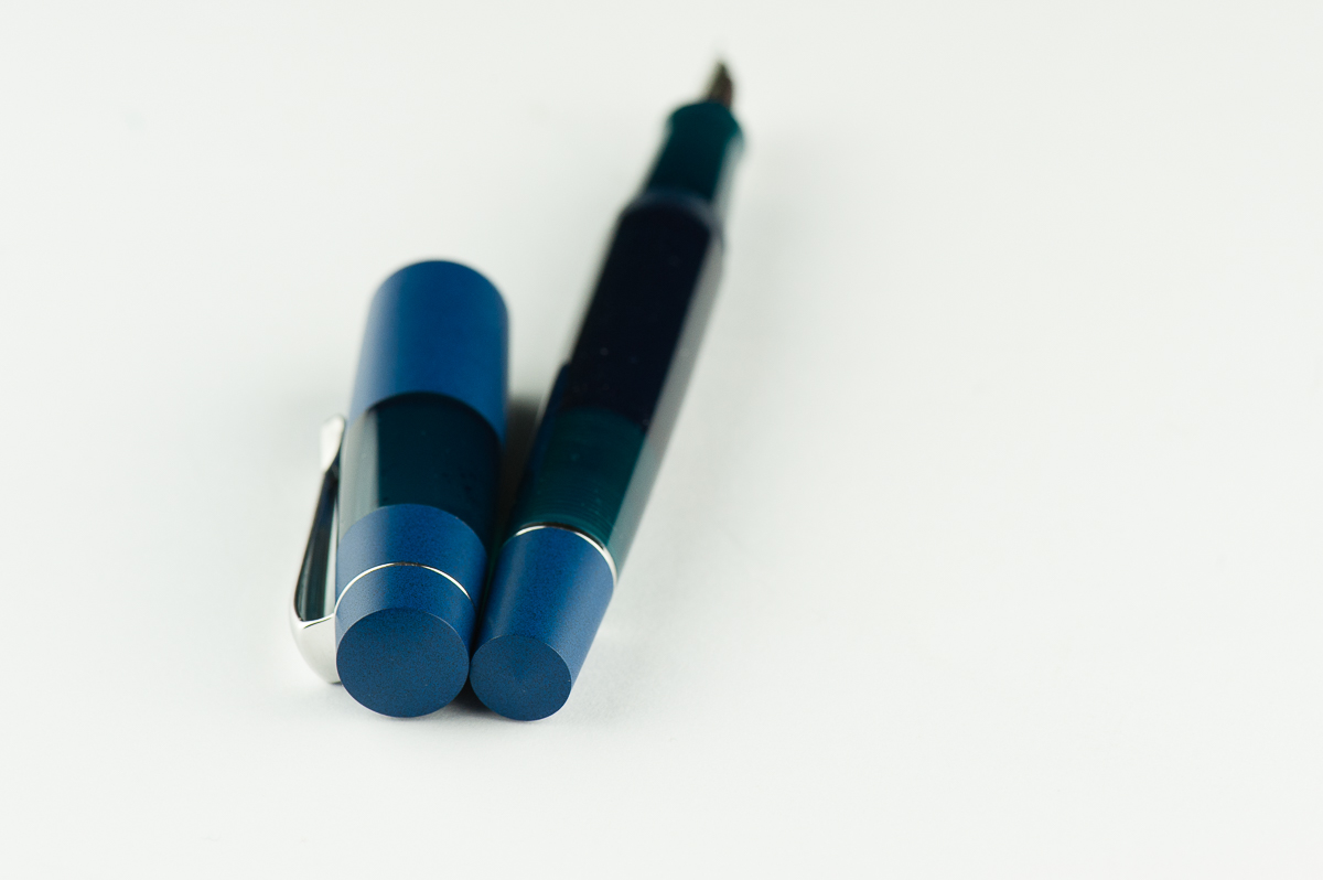
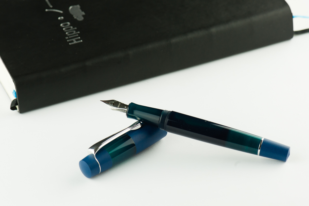
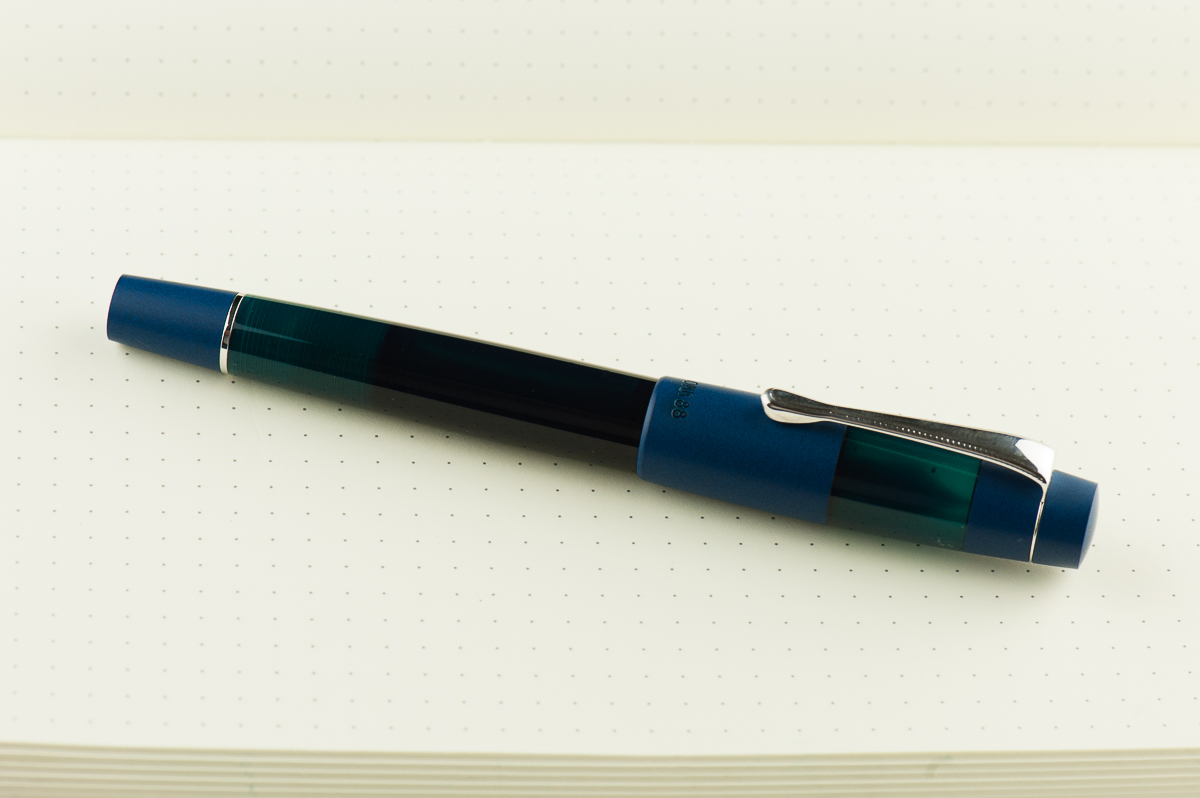
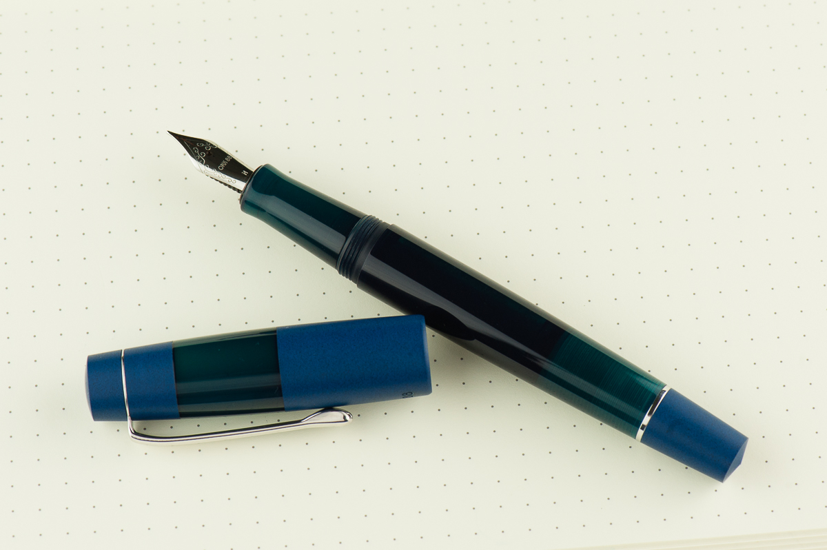
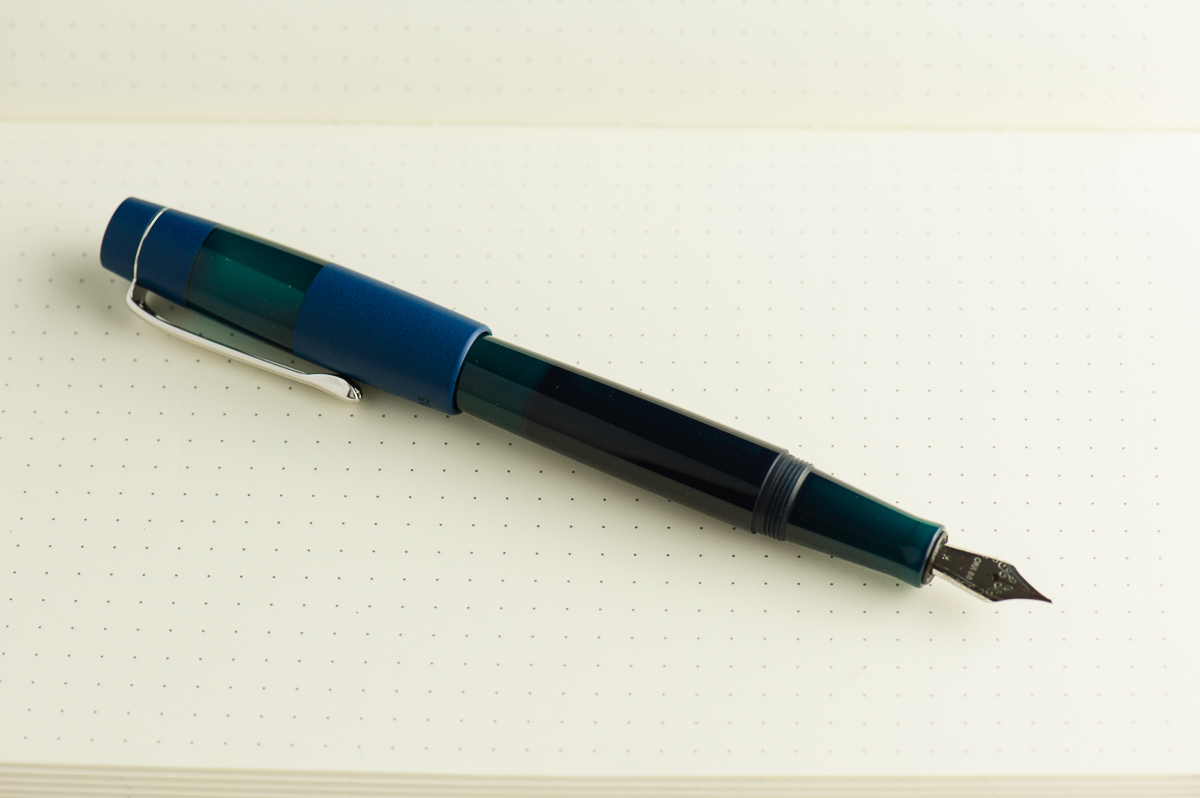
Franz: The Koloro is an interesting looking pen. The acrylic parts of the barrel and cap has a cloudy transparency and allows me to see inside with a bit of light behind. The dark blue ebonite is quite spectacular to look at and hold (and smell). When you look closely, you’ll notice that there are black bits in the ebonite and gives it a sandblasted effect. And finally, the dome shape of the cap’s finial makes me smile for some reason. =)

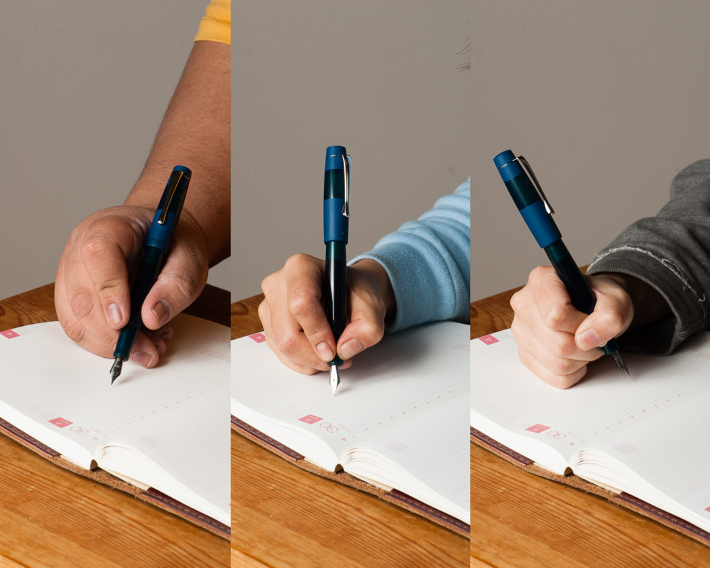
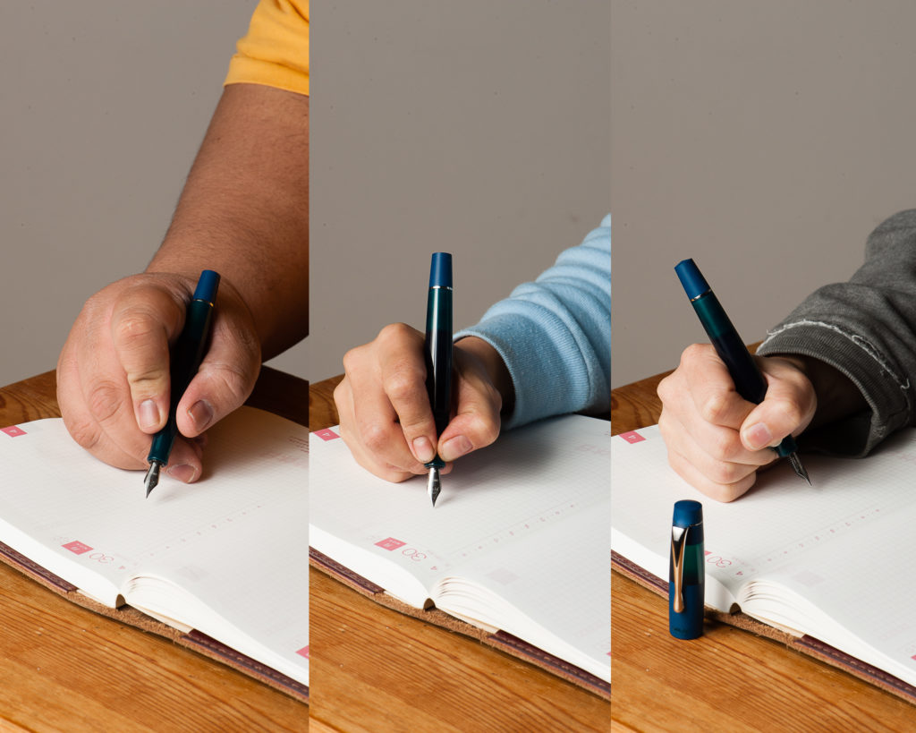
In the Hand: Opus 88 Koloro (posted) — from left to right: Franz, Katherine, and Pam
In the Hand: Opus 88 Koloro (unposted) — from left to right: Franz, Katherine, and Pam


Pen Details

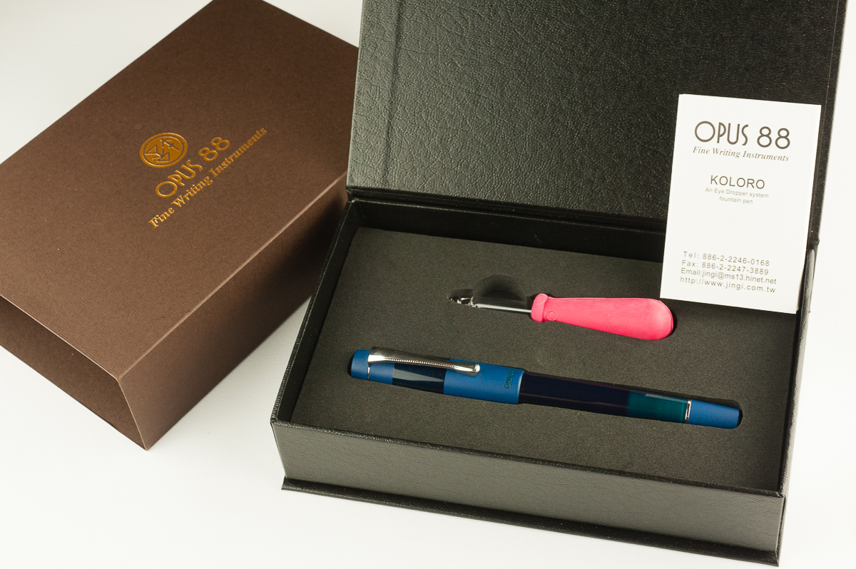
In the box: The Koloro is shipped in a box with foam cutouts. An eyedropper is supplied along with the needed instructions for filling and using the pen. The presentation is very nice.
The Koloro is mostly an acrylic pen with blue ebonite accents on the cap. and blind cap on the barrel.
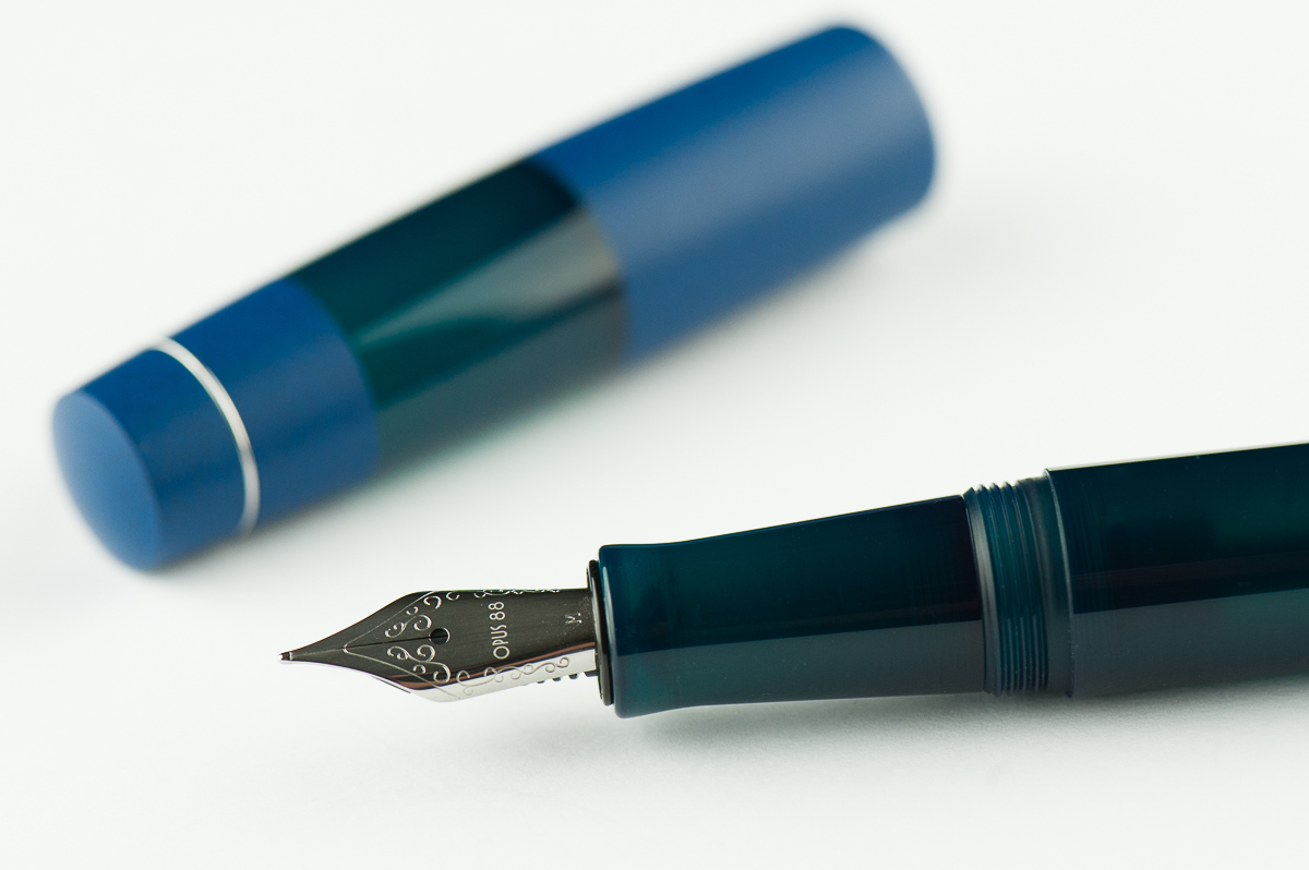
A close up of the blue ebonite on the cap. The blue-green acrylic in the middle is translucent.


The Business End

Katherine: The pen takes a #5 Jowo nib, which is nice. The one that came with this pen is smooth and well adjusted out of the box. I love that this takes a #5 though, since it seems like it would be a good candidate for frankenpenning with a vintage flex nib and nibs that fit aren’t hard to find.

Pam:  At first, the nib felt really dry and was unpleasant to write with.  However, a special feature of the pen is the shut off valve.  After we opened up the valve and saturated the feed, it was a much more pleasant writer.  (Thank you Katherine & Franz!) The #5 Jowo nib performed consistently and as expected.

Franz: There is a taper to the section that makes the #5 nib size suitable however, a part of me wishes it came with a #6. That’s just me though. As for the writing experience, it was smooth as can be and wrote nicely.

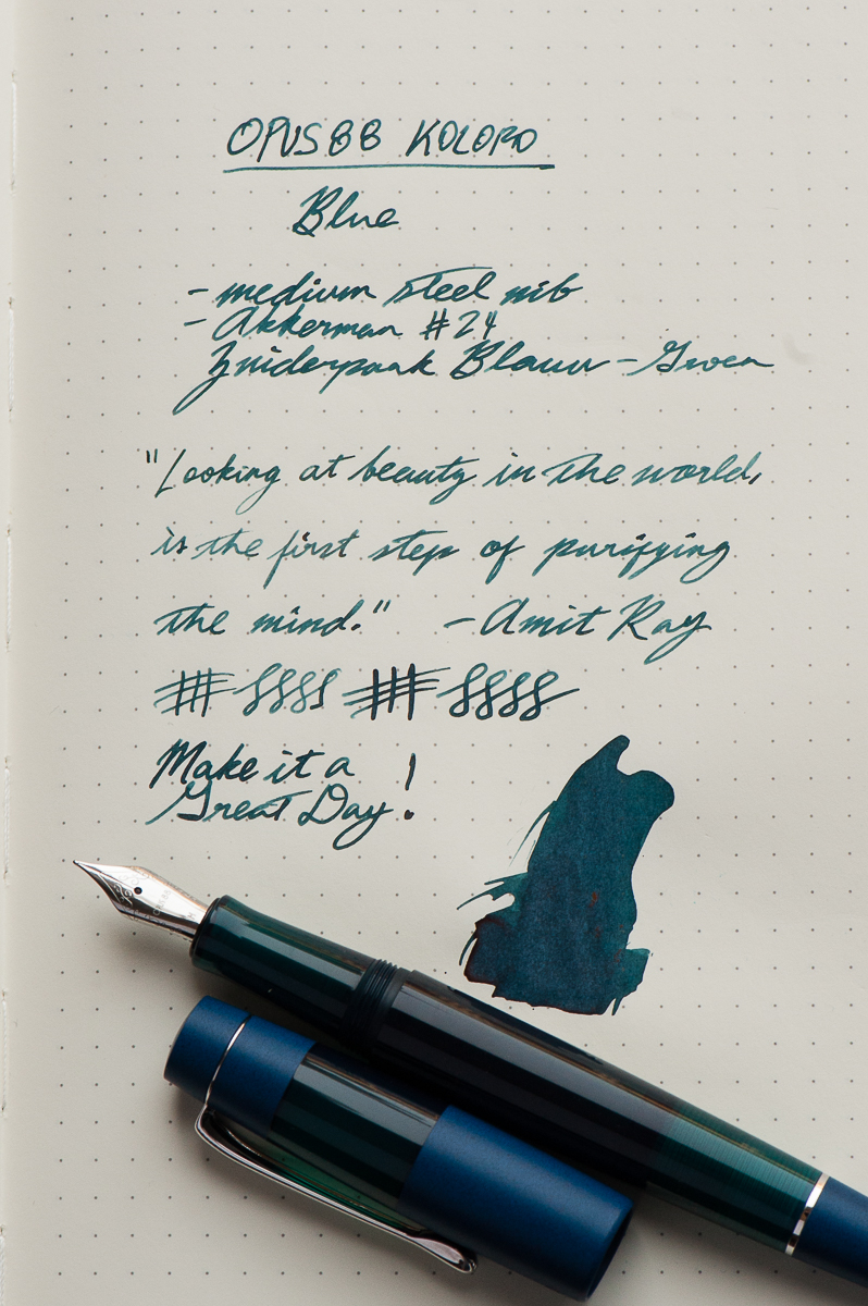
I noticed that the medium nib on the Koloro seems finer than my usual medium Jowo nibs. So I took a loupe and compared it to my other medium #5 Jowo nib. The tipping was slightly smaller/finer than on my Franklin-Christoph Model 45. Of course, this is only from one Opus 88 nib unit but I can’t help but think that since these are Taiwanese pens, could it be that their nib line widths are more towards the Japanese size?

Franz’s writing sample on a Hippo Noto Pocket A5 notebook with 68 gsm Tomoe River cream paper.


Write It Up

Katherine: The section is maybe a smidge slimmer than perfect, but overall it’s a comfortable pen that’s well balanced in my hand (unposted). I found it comfortable for long writing sessions, but my one gripe is that once the feed runs dry (because I forgot to open the knob and wrote for a while) it takes a while for the ink to make its way down. When loosened, it’s great… when I forget, it can be a little annoying, though the pen does keep writing, just more dry.

Pam:  I had no problem with the width of the pen.  I found it to be pretty comfortable actually.  The threads and the mild step was a bit sharp for me and had some bite in the tender area where thumb meets palm. It wasn’t painful, but it was very noticable.  I had to loosen my grip and readjust multiple times during the prolonged writing session.

Franz: I wrote in my journal with the Koloro for a good chunk of time and I did not experience any fatigue. I do prefer writing with the cap posted but it’s perfectly usable even when unposted due to the length of the section. It was my first time to use a Japanese-style eyedropper and as long as the blind cap was unscrewed, the ink flows as it should.


EDC-ness

Katherine: Sorry, three cap turns is just too many. I take a lot of stop and go notes… and this just doesn’t work. Otherwise, the clip feels strong and is maybe a smidge tight, but seems secure and comfortable.

Pam:  I couldn’t use this pen at work since it took far too many turns to uncap to be a good EDC at work.  It is definitely a 2 hand operation.  If that’s not a hinderance for you, the clip did keep the pen secure in my pen case.

Franz: Like the ladies above, uncapping the Koloro took a while and with a work setting of having the need to constantly cap and uncap, definitely was an irritation. As long as one doesn’t have the need for quick deploy, the Koloro is a great pen to use on the daily. I actually liked using this pen while taking notes on a conference call. The build of the pen seems sturdy and can withstand being jostled around in a pocket or a bag. The eyedropper filling system allows the pen to have a little over 2 milliliters of ink for a lot of writing.

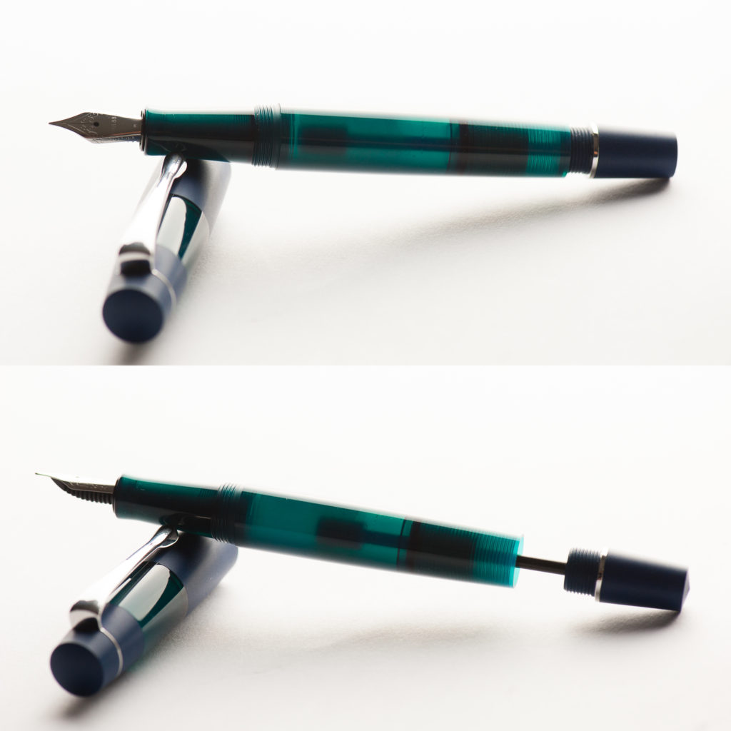
The photo below shows the Koloro’s ink chamber and eyedropper’s plunger rod slightly pulled back. The section does have an O-ring which prevents ink from leaking out.


Final Grip-ping Impressions

Katherine: I’m really excited that a modern maker has chosen to build a pen with the Japanese Eyedropper mechanism! This pen doesn’t do it for me aesthetically, but it’s solidly made and writes well — I can’t wait to see what else Opus 88 comes up with!

Pam:  The price is fair for what you get in this pen.  If you like the aesthetic, want a relatively novel eyedropper with shut off valve, and a reliable nib, you will be hard pressed to find a better alternative.  This pen is not for me mostly due to personal preferences, however, as an introduction to Opus 88, it’s a solid opening volley.  Bring it on Opus 88!

Franz: One thing I would say that’s a negative (for me) is because the Koloro’s barrel is acrylic, I don’t get the warm ebonite feel while writing. I only have a few ebonite pens but the warm feel is something that I’ve come to expect. That’s just my personal thing though.

The Koloro is a fantastic pen to use as it has a lot going for it (fairly large size, Japanese eyedropper filling system, different color choices) and as Pam mentioned, it’s at a fair price. It is a pen I find myself using a lot for my journal time whenever I do get the time.


Once again, thank you to Goldspot Pens for providing this pen for review. If you’re interested in the Koloro, check out the other options on their site, here.


Pen Comparisons

Closed pens from left to right: TWSBI Eco, Lamy Safari, Edison Beaumont, Franklin-Christoph Model 20, *Opus 88 Koloro*, Platinum 3776, Lamy 2000, and Pelikan M805
Posted pens from left to right: TWSBI Eco, Lamy Safari, Edison Beaumont, Franklin-Christoph Model 20, *Opus 88 Koloro*, Platinum 3776, Lamy 2000, and Pelikan M805
Unposted pens from left to right: TWSBI Eco, Lamy Safari, Edison Beaumont, Franklin-Christoph Model 20, *Opus 88 Koloro*, Platinum 3776, Lamy 2000, and Pelikan M805


Pen Photos (click to enlarge)

We received this pen free of charge for the purposes of this review. We were not compensated monetarily for our review. Everything you’ve read here is our own opinions.
1 Comment

June 2018 Pen & Ink Pairing

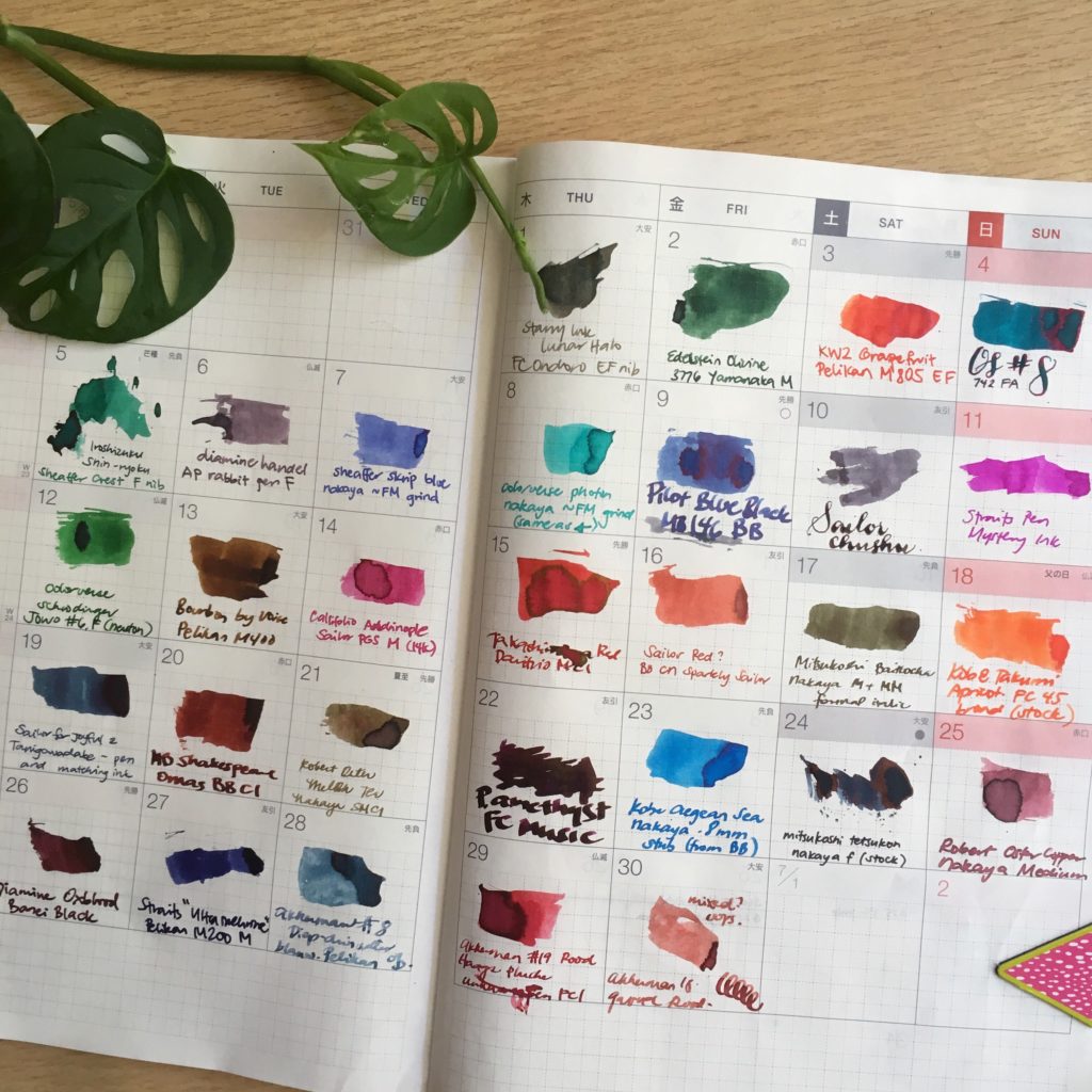
Katherine: I didn’t have a pen and ink pairing for June — I had 30! I kept up with the #30inks30days challenge on Instagram and had quite a lot of fun.I repurposed the (empty) June page from my 2017 Hobonichi to track my progress. I own more ink samples than I’d care to admit, and I had a lot of fun trying new ones and revisiting old favorites. I also own more pens than I can use regularly, and this gave me a chance to get some of them inked up and writing!


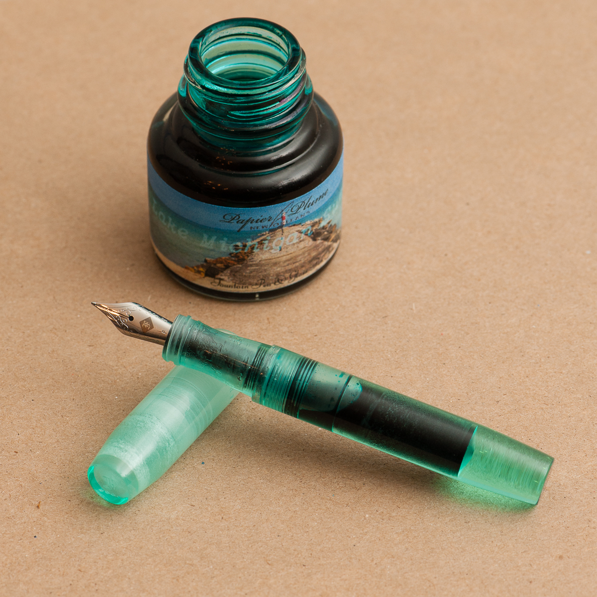
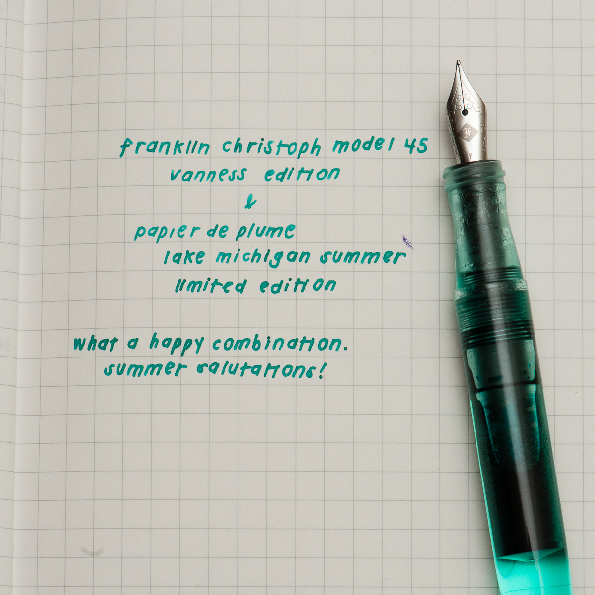
Pam: As luck would have it, ’tis the season to reveal an ink in my stash that I have been hoarding.  It has patiently waited for a pen-mate.  Thankfully, my minty dreams have come true with the Vanness edition of the Franklin Christoph Model 45 which is the perfect color match to Papier de Plume’s Lake Michigan Summer. The minty color sings of happy summer days as well as the soothing waters of a lake shore in both ink and pen.

I have typically avoided minty inks due to the a possible brightness that detracts from the readability of an ink.  I don’t have any problem with this ink.  It’s dark and well saturated to make reading a breeze. The comfort of the model 45 rivals that of my Pilot Prera which is practically a daily carry at work.  Not only is the ink and pen pairing a dream come true for me; I can’t imagine a better color than the minty Vanness edition Model 45.


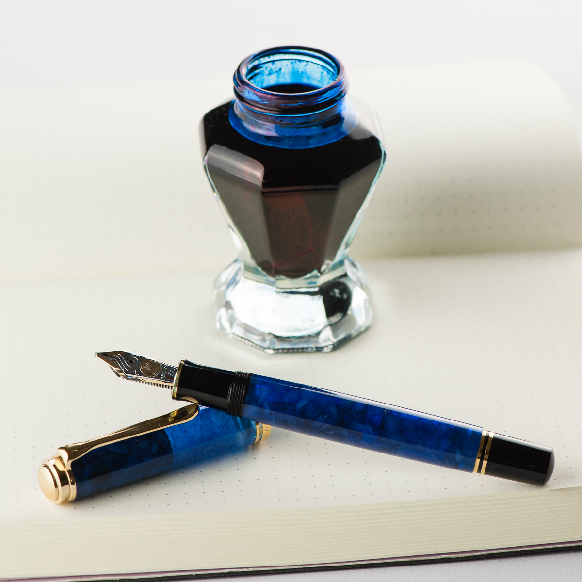
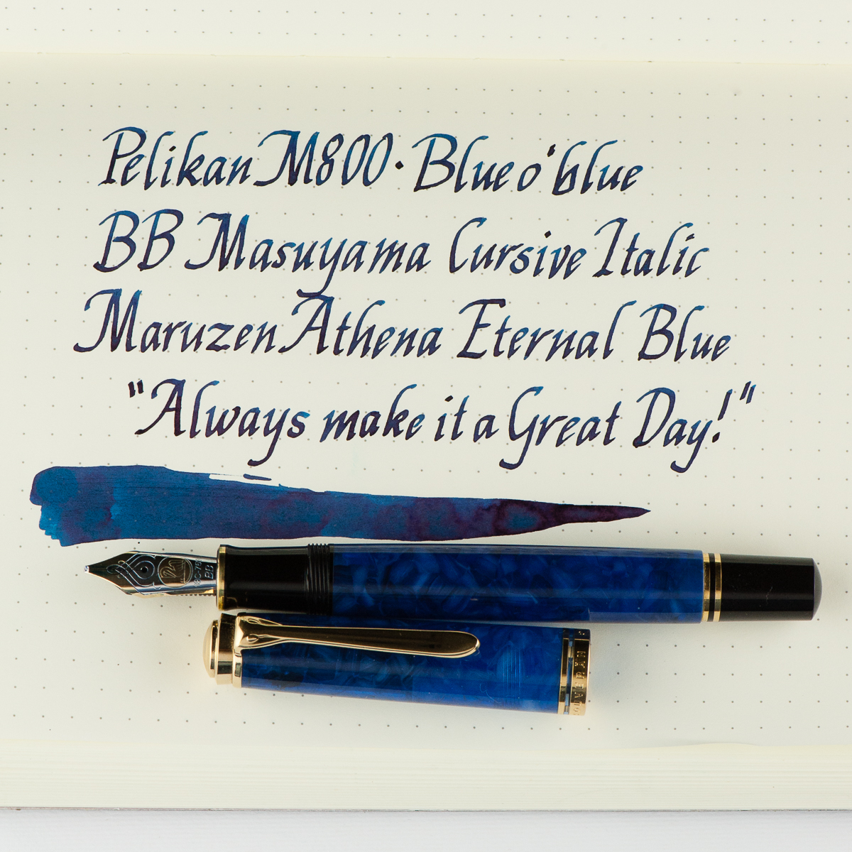
Franz: Hellooo BLUE-tiful! I have had this M800 Blue o’ blue for a while now and figured to ink it up just for practicing and improving my novice italic calligraphy skills. The Blue o’ blue (Blue over blue) was a Special Edition pen by Pelikan in 2010 and I was fortunate to have gotten this pen early in my collecting days. The translucency of this material never ceases to amaze me. #ilovebluepens

I also inked up the M800 Blue o’ blue to match with the Maruzen Athena Eternal Blue ink that I have been growing to like. The Eternal Blue ink has shading that mimics the Blue o’ blue’s material. The double broad italic nib is a fitting nib for this ink because it helps bring out the shading even more.


Pam’s writing sample
Franz’s writing sample
2 Comments

Benu Chameleon (Charming Chameleon, Medium Nib)

We want to thank Lisa and Mike Vanness of Vanness Incorporated for lending us this Benu Pen Chameleon fountain pen for review. And sorry it has taken a while Lisa! The Vanness family has had a pen shop in Little Rock, Arkansas since 1938 and is celebrating 80 years of being in business. Check their store out if you can. They also travel to pen shows in the United States and one of the shows that we will see them at is the upcoming San Francisco Pen Show in August.

The opinions in this review are always our own and we were not compensated (monetarily or otherwise) for this review.


Hand Over That Pen, please!

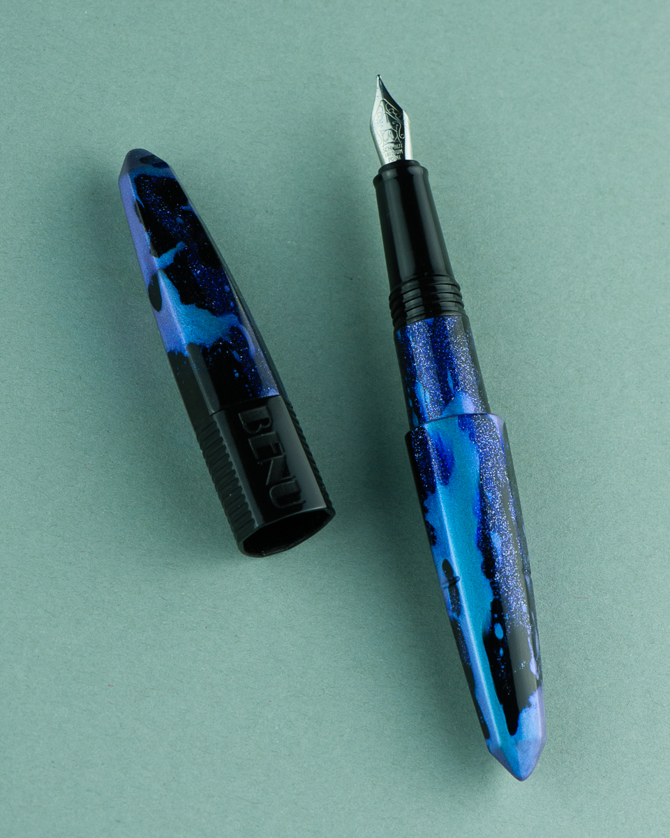
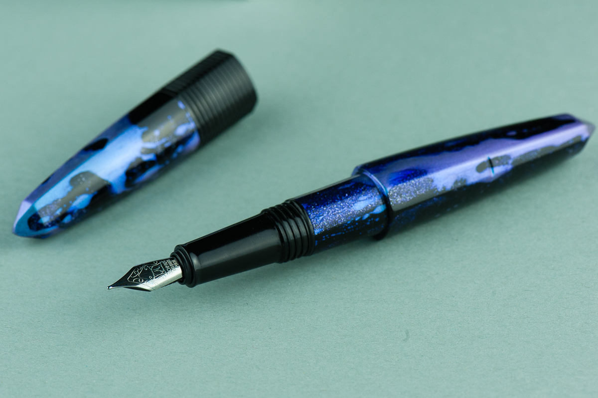
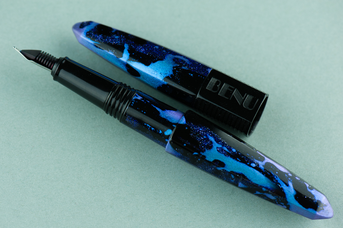
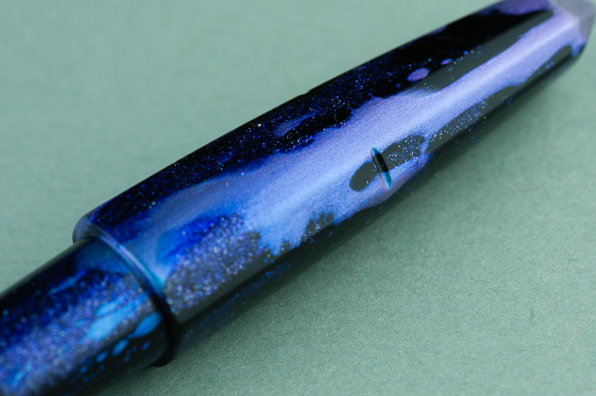
Katherine: This pen is… very purple. The unique shape of many of the Benu pens has intrigued me since I started to see them on Instagram. Many thanks to Vanness for lending us one so I could finally try one! And such a cool purple material too. Off the bat, I suspect the looks of this pen will be very polarizing — you either love it or you don’t. Personally, I like the galaxy-ish purple material and the unique shape. However, I couldn’t get the triangular sides to line up, which bugged me (I could also just be incompetent EDIT: Franz confirmed — I’m incompetent and it lines up for him).

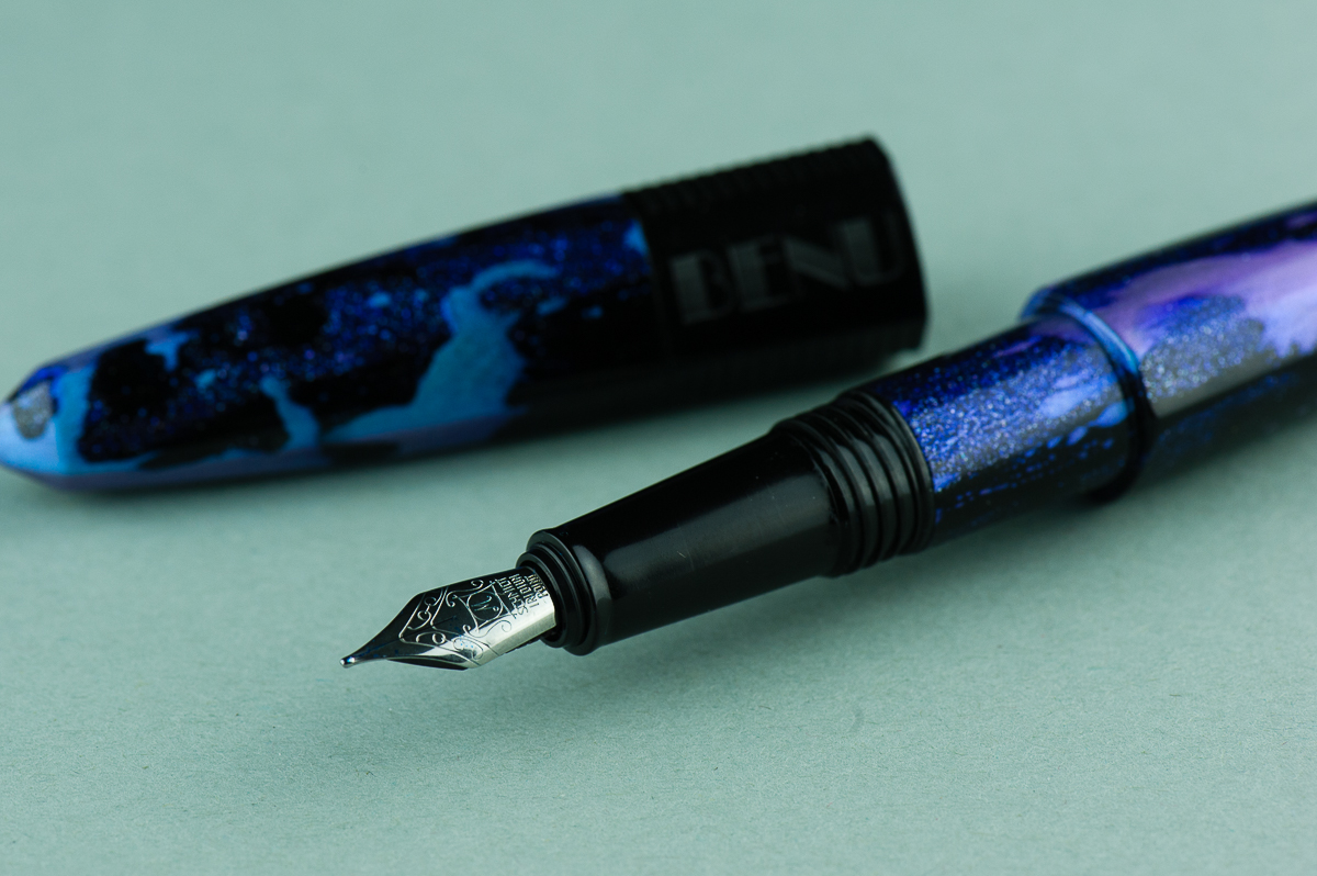
Pam:  It’s a very unique pen in terms of aesthetics.  The material is “loud” to me but the shape is intriguing.  It’s not often that we get to see a triangular shape in the world of fountain pens.  I will admit that I am not particularly fond of the material as I find it very distracting and detracts from the cool shape of the pen.
Franz: Yep, this Benu Chameleon pen definitely has a distinctive design. It reminds me of the crystal that Superman used to create his Fortress of Solitude except that it’s blue and purple (blurple) and not a glowing green. Hmm… I hope that wasn’t too geeky of a reference. Hehehe… =P


In the Hand: Benu Chameleon (posted) — from left to right: Franz, Katherine, and Pam
In the Hand: Benu Chameleon (unposted) — from left to right: Franz, Katherine, and Pam


Details

Benu’s packaging is pretty nice and simple. The white box seems perfect for the colorful pens they make. An instruction booklet also comes with the package.
A close up of the Charming Chameleon’s finish.


The Business End

Katherine: It contains a Schmidt nib, which is perfectly usable, but not particularly memorable. It’s on the smaller side though — so I bet you might be able to swap a vintage nib into it (though I didn’t try, so proceed at your own risk!).

Pam:  I do find the Schmidt nib to be small relative to the rest of the pen.  It’s not ideal for my angle of writing with this particular set up.  It puts my hand closer to the paper than I would like it.  The Schmidt nib is a reliable nib, writing smoothly and well right out of the box.

Franz: This Chameleon has a medium steel nib and is smooth out of the box. The smaller #5 nib complements the taper of the barrel and section nicely. This nib wrote nicely as it should and I liked it. I believe Benu pens currently have F, M, and B as nib size choices.
As Katherine alluded to, you can “gently” pull out the nib and feed to swap a similarly sized nib. Please remember that any modification you make to any pen may void any warranty there may be.
 

Write It Up 

Katherine: When I uncapped it, I was initially worried about the size of the step from section to barrel, but the section is long enough and I hold my pen far enough forward that it wasn’t an issue at all. The section is on the narrower side, and the pen is on the heavier side, which generally isn’t a combination I love. This pen was no different — usable, but not a pen that feels perfect in hand.

Pam:  The triangular shape surprisingly doesn’t detract from the comfort during the writing experience, however, the step does for me.  It’s not very sharp, but that does depend on how heavily you grip the pen.  I was left with some indentations on my hands based on my typical grip.  I do think Benu created this pen for those with a traditional grip in mind.

The cap does post rather deeply and the material is light enough that it doesn’t add too significant of a weight to the back end of the pen.  Posting the pen may be beneficial for those with the larger hands.  I found it did upset my balance, especially since the nib is relatively small and it threw off my typical writing angle slightly.

Franz: I comfortably wrote with this pen unposted for a long time and it’s due to the longer than usual section. My grip ends up on the threads and they are not sharp at all. Posted, the Chameleon definitely becomes longer. And I really love the notches on the barrel to keep the cap in place. I surprisingly prefer writing with the Chameleon unposted.

Unposted, one can see the notch on the barrel for the cap to latch on to. The longer section allows for the step to be further back.
Posted, the cap covers about an inch of the barrel and is very secure.


EDC-ness

Katherine: Upside: it doesn’t roll. Downside: it doesn’t have a clip. It takes two turns to uncap, but they’re two wonderfully smooth turns.
Pam:  The pen did well in my Nock Sinclair case for EDC-ness, however, it wasn’t user friendly for me at work being clipless.  On the flip side, it was quick to uncap and the nib performed admirably well on crappy office paper. The cap does post relatively securely for those quick notes.  My biggest hesitation with this being my EDC is that the material is also quite loud which made me hesitate bringing it out in the hospital setting.
Franz: In the workplace, I used the Chameleon either on the go stored in my shirt pocket or on my desk. I found that this pen is the sit-down-and-write kind due to the number of cap turns (2 and a quarter), as well as the facets that made sure the pen did not roll away. The medium nib wrote nicely on the copier paper and was all around nice.

This pen is also fun-ny because my coworkers thought I was holding a mascara tube or something. Technically, it applies color to a surface, right? ;-P

Chameleon sitting on one of its facets ready to pounce… er… write!


Final Grip-ping Impressions

Katherine: The unique shapes and materials are the big draw with this pen. If it’s not your thing, this isn’t the pen for you. But, if you’re like me and you’ve been curious about them for a while, it’s a bit of a relief to find out that while it isn’t the most comfortable and perfect pen for my hand, it’s definitely a usable and reliable writer. My one peeve is that the facets/sides don’t line up.

Pam:  Benu is willing to break tradition with unique materials and shapes.  This pen is best suited for those with a traditional tripod grip.  So if you are looking for a pen with a unique aesthetic and reliable nib, this might be the pen for you.  Based on the material and how it works out with my grip, this pen just isn’t for me.

Franz: Hey Katherine!!! The cap and barrel’s facets do line up. You just gotta give it a gentle twist. 😉 Overall, the Chameleon pen is a good size pen and the shape definitely stands out against other pen designs. What also captivates me is the “Charming” finish on this pen. Blue and purple are my two favorite colors and this is a great example of a blurple pen. I do like this pen a lot and if it is up your aesthetical alley, try it out!

Another shout out of appreciation to Lisa and Mike Vanness for the opportunity to review this Benu pen! The Chameleon pen in this finish and others can be found over at their site, www.vanness1938.com.


Pen Comparisons

Closed pens from left to right: TWSBI Eco, Platinum 3776, Pilot Vanishing Point, Franklin-Christoph Model 31, *Benu Chameleon*, Edison Beaumont, Lamy 2000, and Lamy Safari
Posted pens from left to right: TWSBI Eco, Platinum 3776, Pilot Vanishing Point, Franklin-Christoph Model 31, *Benu Chameleon*, Edison Beaumont, Lamy 2000, and Lamy Safari
Unposted pens from left to right: TWSBI Eco, Platinum 3776, Pilot Vanishing Point, Franklin-Christoph Model 31, *Benu Chameleon*, Edison Beaumont, Lamy 2000, and Lamy Safari


Pen Photos (click to enlarge)

2 Comments
1 2 3 8