Pen & Ink Pairing: April 2018

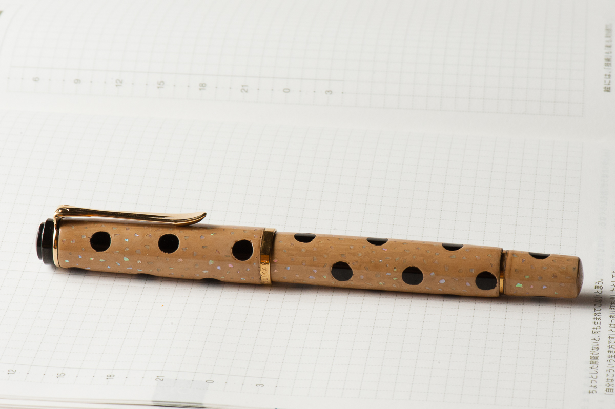
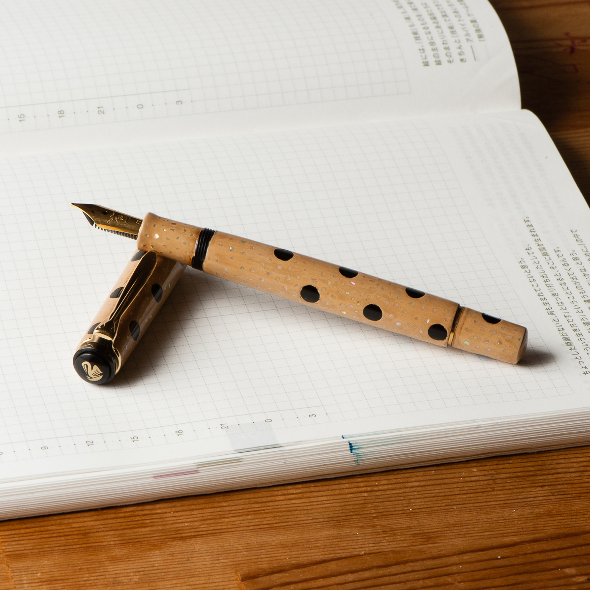
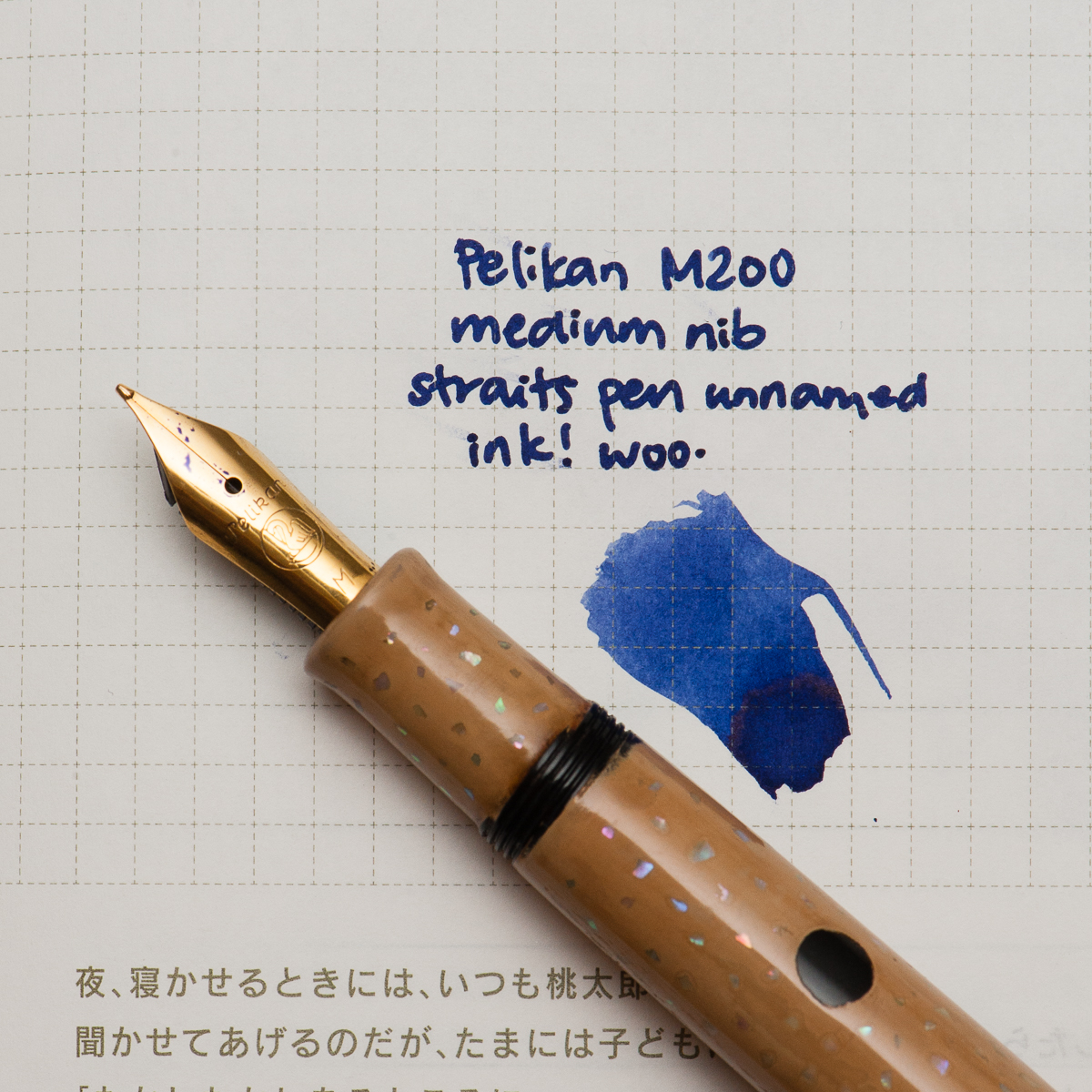
Katherine: It’s late in the month and I’m looking back thinking “What have I written with the most this month?” and the winner, hands down, is this funky combination of a Pelikan with a custom urushi finish by Bokumondoh and a Straits Pen custom ink. Honestly, the Pelikan (originally a M200) holds so much ink that I’m getting a little sick of this purple-ish blue. It’s a lovely color… but after staring at it week after week, I’m ready for something new (good thing May is just around the corner!).

Before we hop into my birthday month, here are some quick thoughts on April’s pen and ink —

First, the pen. I sent this M200 to Bokumondoh despite her warnings that this particular finish ends up pretty thick. I love the beige and black polka dots, and the sparkle of the raden. It came back about a month later, and the finish is, as promised, quite thick — but the serendipitous thing is that now I can use my M200 as a slip cap. Game changer! I can still thread the cap if I need to, but the barrel is now thick enough that I use it as a slip cap 90% of the time.

Second, the ink. This is a custom ink that the folks over at Straits Pen cooked up — it’s a wonderful shade of purple-blue that flows well and dries reasonably quickly. I hope to see it in production soon. Perhaps at the SF Pen Show?
Katherine’s Writing Sample


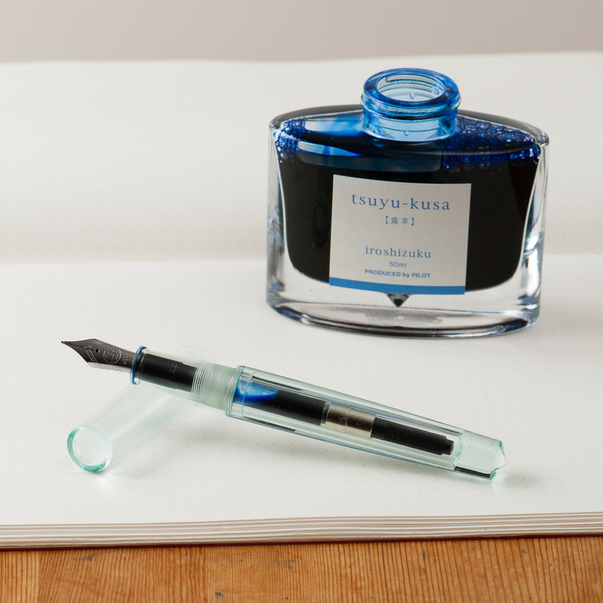
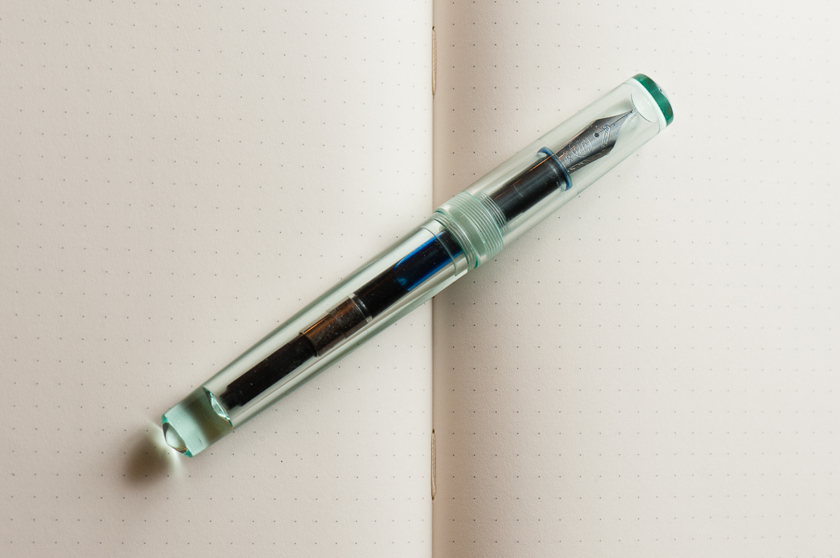
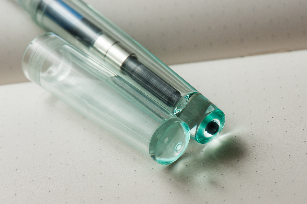
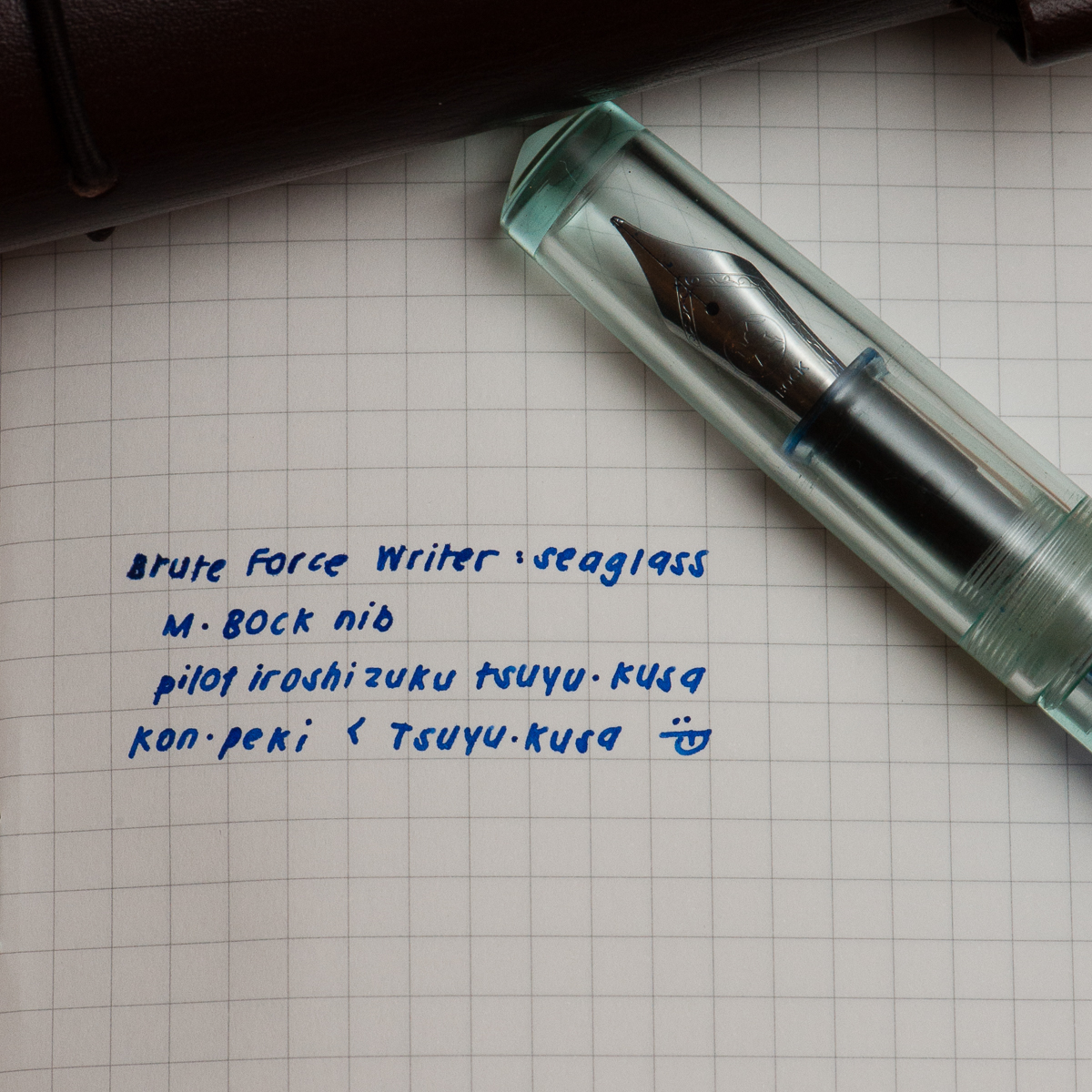
Pam: Thank you Anderson Pens for your ink match up giveaway.  I was a lucky winner of the Pilot Iroshizuku Tsuya-Kusa, a new blue (for me.)  I will admit that I have been lax in my admiration of the Pilot Iroshizuku inks as of late, however I plan on rectifying that.  Starting with pairing this beautiful cornflower blue ink with the Brute Force Design Writer in Sea Glass.  The beautiful and deep blue of Tsuya-kusa is deeper and more nuanced than a turquoise or sky blue.  (That’s right, I said it.  I like it better than Iroshizuku Kon-Peki.)  It’s also a warmer blue with more red tones based on my amateur comparison.

Creator in Chief behind Brute Force Design, Troy, is a wonderful artist in pairing metals and woods in his signature pen designs.  I chose a lighter version of the Writer model due to the beautiful transparency and seafoam green tint of the material. The nib of choice for Brute Force is a Bock nib.  The one I have here is really wet and very well displays the color and depth of Tsuya-kusu to the fullest extent.

Bring on the spring/summer, world!  My inked pens, allergy meds and I are ready for you.
Pam’s Writing Sample


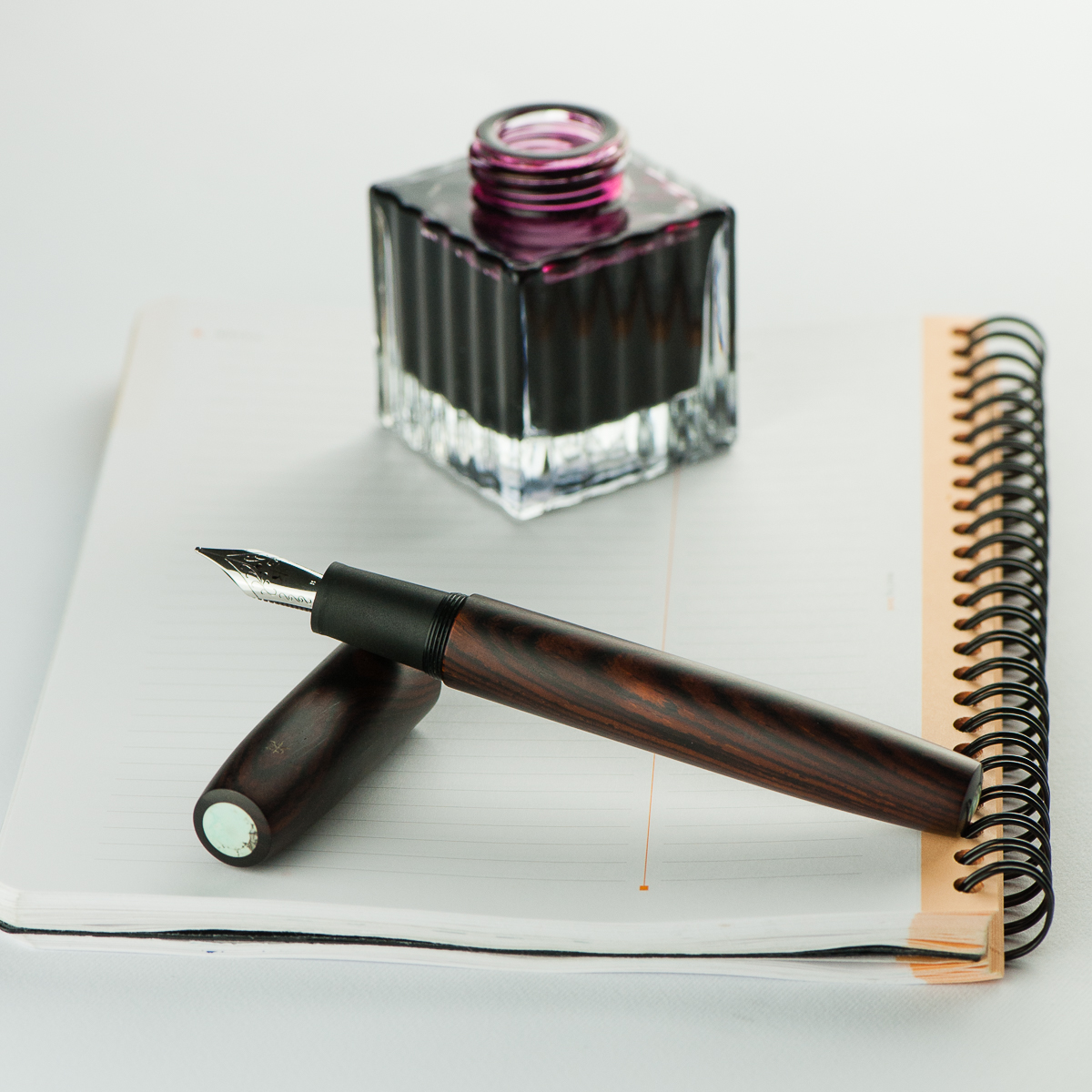
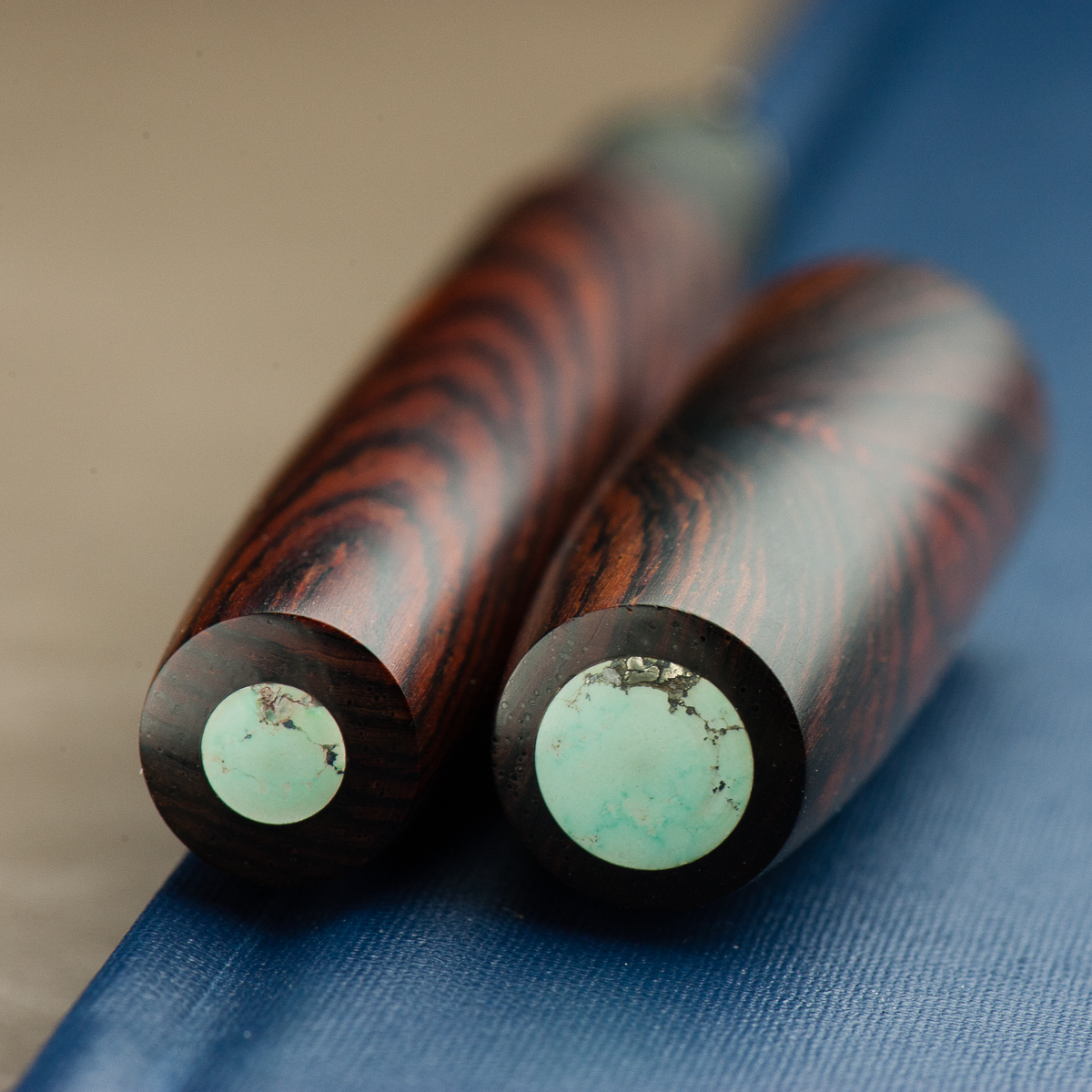
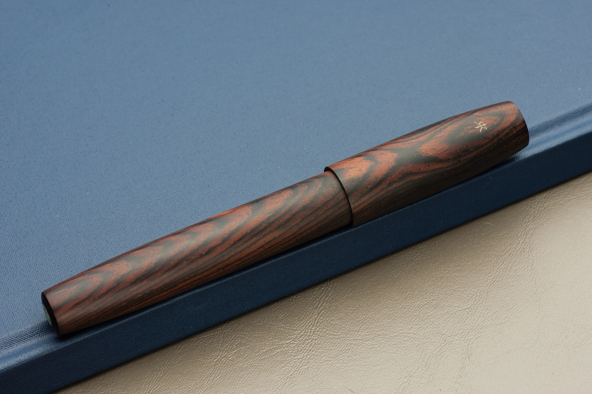
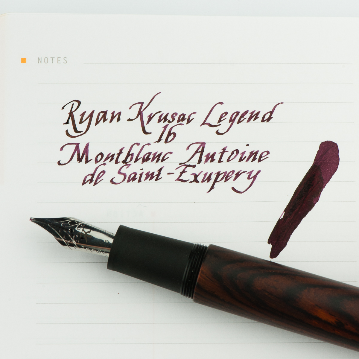
Franz: For the month of April, I thought of inking up my Ryan Krusac Legend L-16 with the limited edition Montlbanc Antoine de Saint-Exupéry ink. I haven’t used the L-16 ever since our review of the pen and I also inked it for two main reasons. First reason is to mark the pen’s first year anniversary with me since I got it at the Atlanta Pen Show in April 2017. Second, the broad cursive italic is very nice to practice my italic calligraphy writing. I’ve been using this pen to write some quotes and post them on instagram. If you’re interested, you may check out #FTDquotes tag on Instagram. =)

As for the MB Saint-Exupéry ink, this was my first time inking a pen with it and the burgundy color is quite rich and has purplish tones. I don’t have many burgundy inks and I find this ink to possess some beautiful shading, and the broad nib brings out the saturation very well. There is no sheen that I can see in the writing which is fine and the flow is very wet. Even if the ink does not match the cocobolo finish of the pen, the ink color complements it well.

What pens and inks have you written with lately this month?
Franz’ Writing Sample


Pen Closeups (click to enlarge)
No Comments

Pen and Ink Pairing: March 2018 (Vintage Edition)

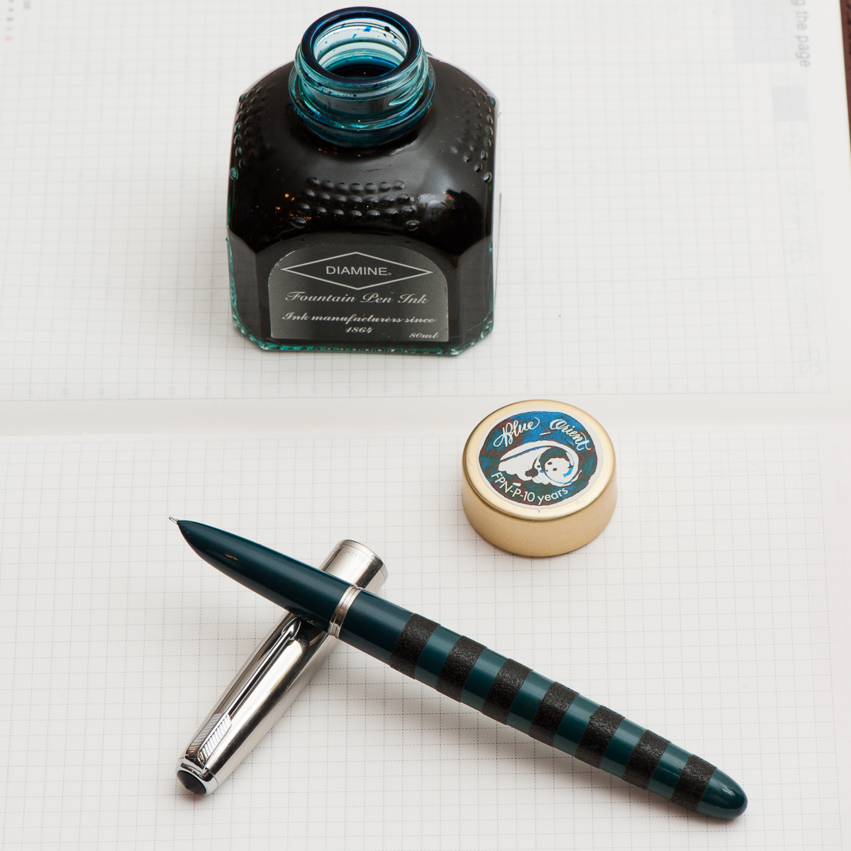
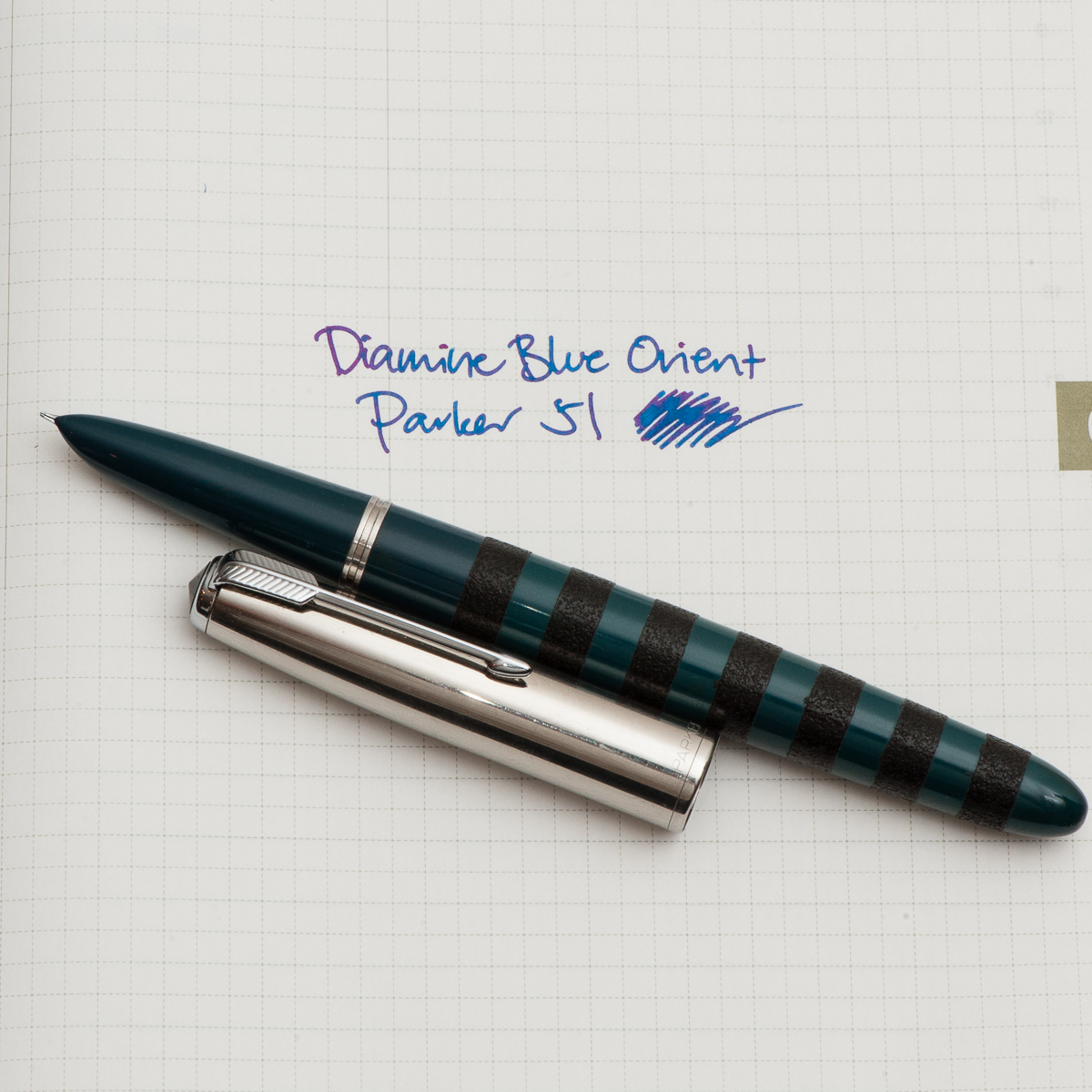
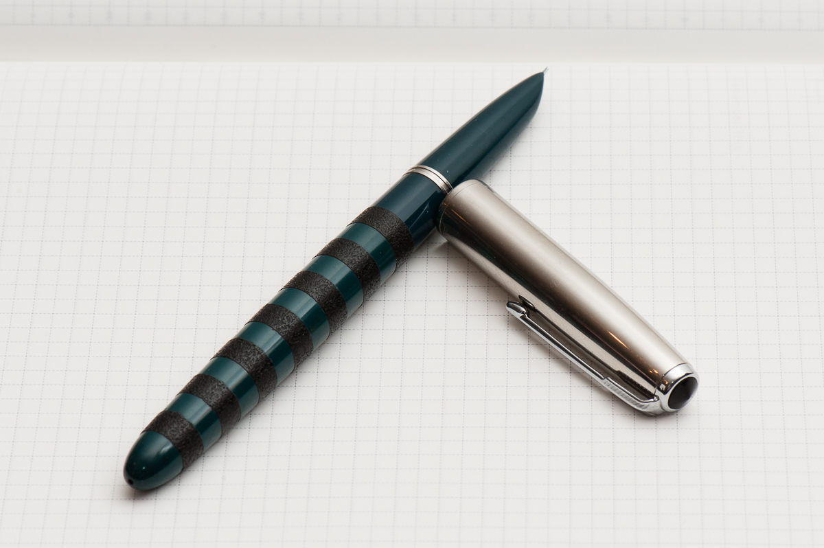
Katherine: It’s been a busy month, and I haven’t spent as much time playing with pens as I would have hoped. I’ve found that for the last couple weeks, my constant companion has been a Parker 51 Special filled with Diamine Blue Orient. The Parker 51 (review to come!) sports black ishime stripes, courtesy of Bokumondoh. I love the feel of the ishime and the visual variance that it gives an otherwise kind of boring looking pen (sorry!). Diamine Blue Orient is a limited edition ink created for FPN Philippine’s 10 year anniversary — I assume it’s honoring the beautiful oceans surrounding the islands.


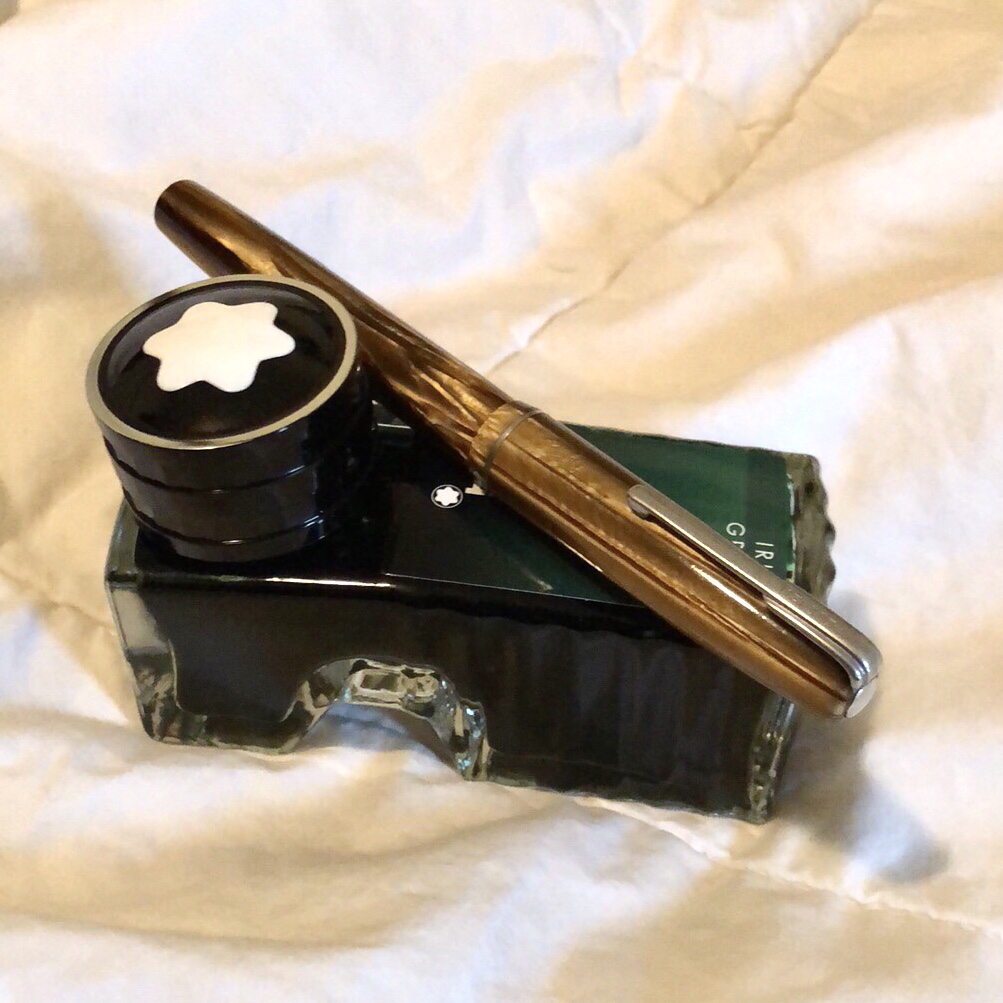
Pam:  I have been on a bit of a vintage bender recently.  Nik Pang introduced me to this understated brown Waterman that is a lever filler last month.  I have also been finding out in my ink-splorations what brands of ink I prefer as I keep getting through all the samples.  I inked up the Waterman with my favorite green, Montblanc Irish Green.  The nib is akin to a Japanese F and writes beautifully.  I chose a drier ink to highlight how fine the nib is.

On a side note, has any noticed inconsistent flows in heavily saturated inks?  Or is that just me?


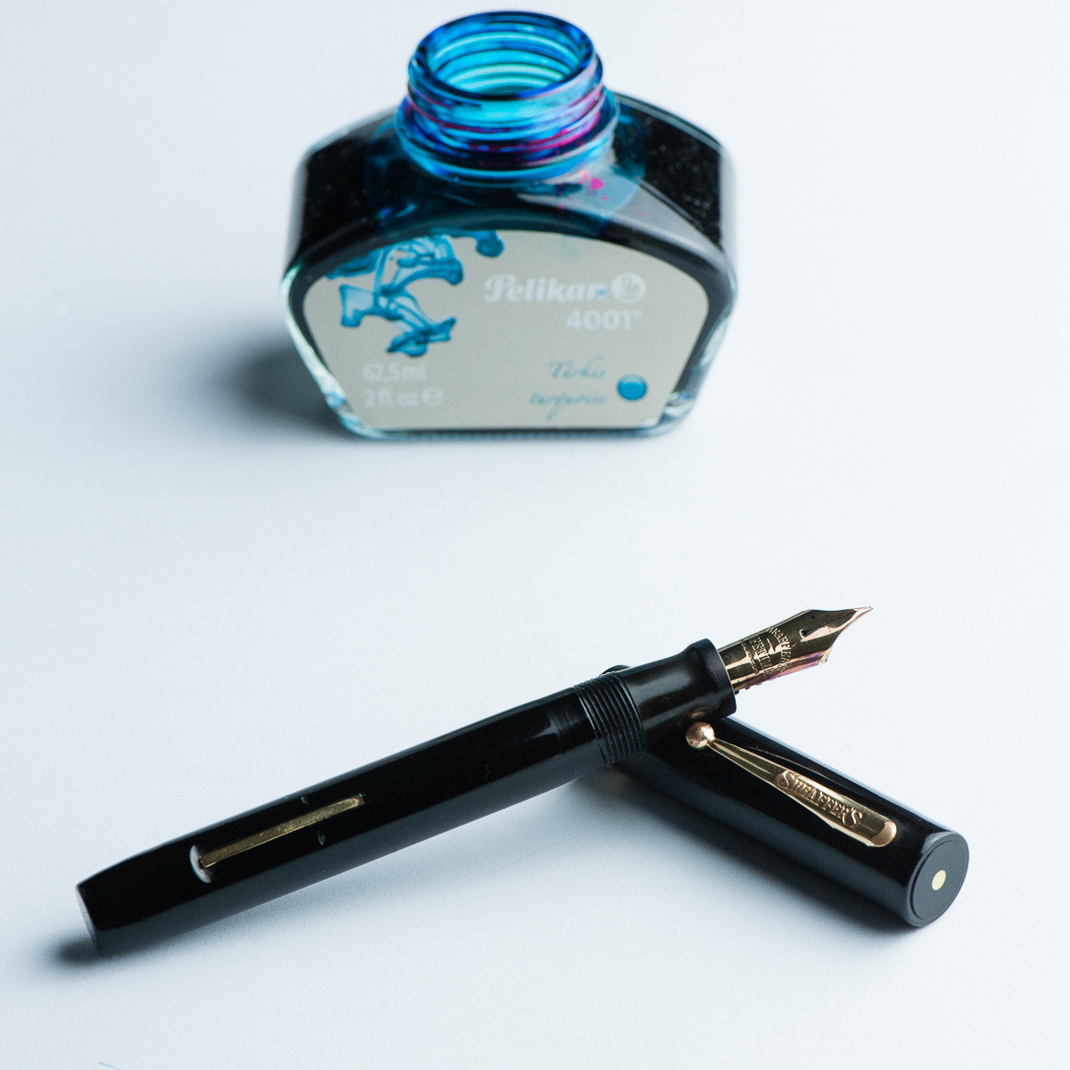
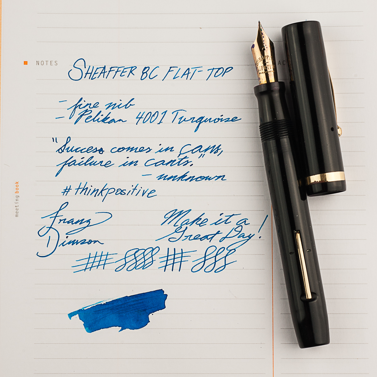
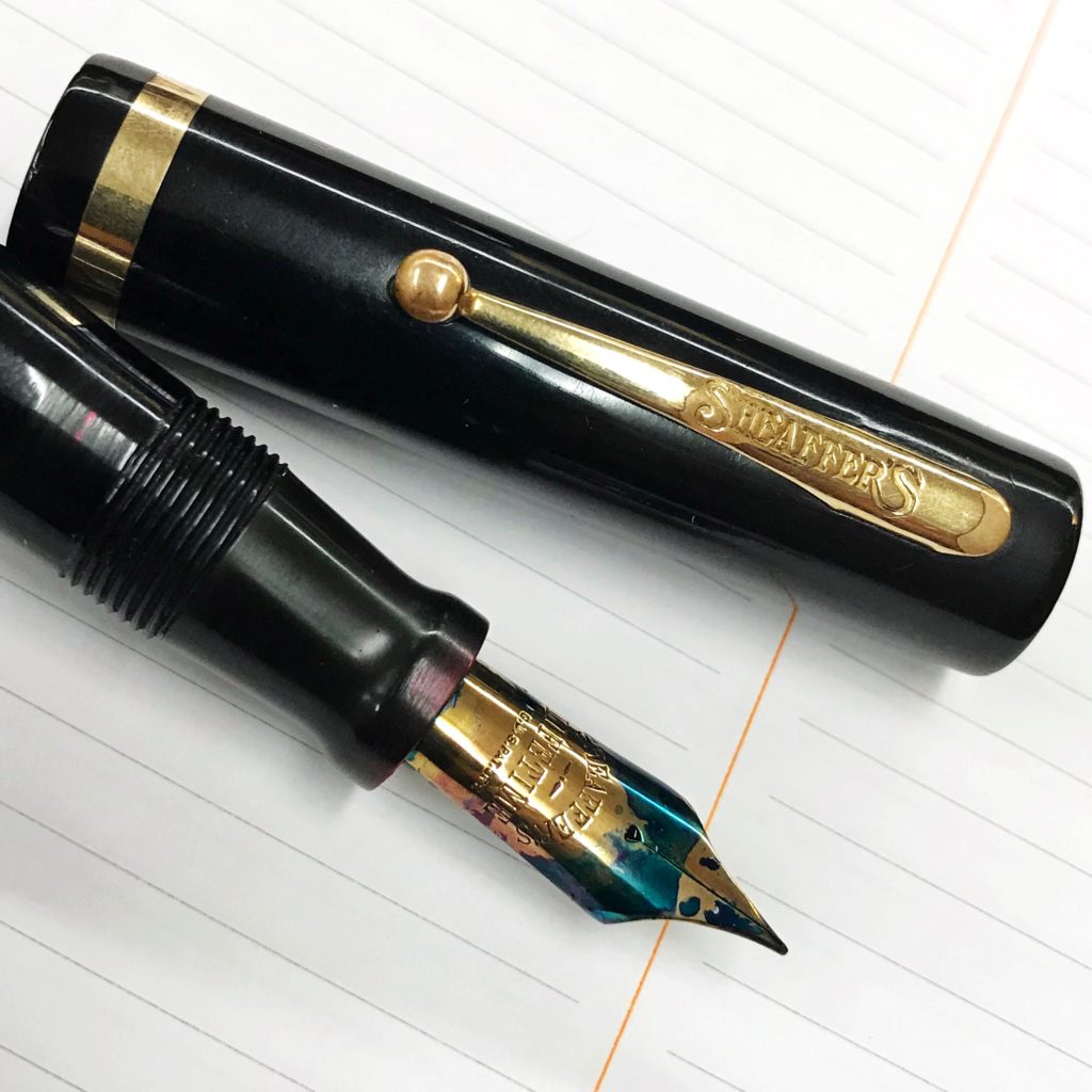
Franz: My pen for the month of March may be a vintage pen but it was a new acquisition from the LA pen show in February. My friend Jon S. knew about my apprehension about Sheaffer pens because most of the ones I come across are short and thin pens. So he showed me the Sheaffer 8C flat top pen which was from the 1920’s. And man, I loved it! He restored the pen himself and it’s in great condition as well. I’ve been using this pen at work almost everyday ever since I got it. The 8C fills my hand very well even when unposted so the bear paw is happy. =)

And of course I had to pair it with my favorite ink, the Pelikan 4001 Turquoise. Even if the nib is a fine width, it shows the ink color very very well. In some parts of the writing, some sheen comes through as well. There’s just something about turquoise inks that floats my boat.


Seems like the three of us have been writing with vintage pens lately. What pens have you been writing with?


Writing Samples and Detail Photos

No Comments

Pen & Ink Pairing: Feb ’18

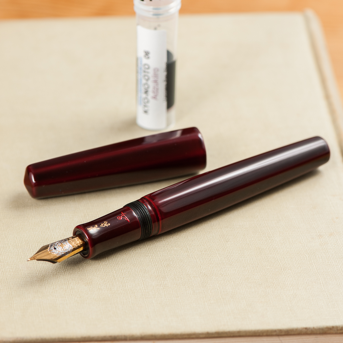
Katherine: My pairing for this month is a Danitrio Hakkaku in some sort of red urushi (I’m guessing it’s aka-tamenuri, but I don’t know what Danitrio actually calls it) and Kyo-no-oto (06) Adzuki-iro. Clearly red because Valentines day and Chinese New Years! Not because I got a new ink and put it in a pen that matches…

I’ve had this Hakkaku for a little bit now, but I never found it a perfect ink pairing, but now I have and I’m really enjoying it. The Adzuki-iro is a wonderful dark red without too much orange or purple and it pairs wonderfully with the deep red Hakkaku’s urushi. I’m not Pam, so I don’t think I can declare this a “one true pairing,” but we’ll see if I keep these two together over time. (Maybe I’ll report back next year when red is the thematically appropriate color of the season again…)


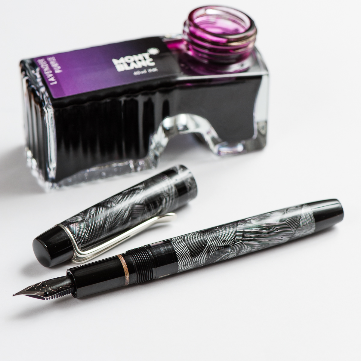
Pam:  I am not a fan of Valentines Day, but February does have alot to do with love and a great reminder to appreciate those that you love.  Therefore, it would seem fitting that I show an appreciation for one of my favorite literary figures, Sherlock Holmes.  I obtained the lined vintage celluloid pen from John Albert of Romulus pens and named it Sherlock in the process of designing the pen with him.  The black and gray lines reminded me of the now infamous Belstaff coat that is donned by the most recent reincarnation of Sherlock, Benedict Cumberbatch in the BBC series.  I searched for a while before I found my perfect pairing of ink.  Montblanc Lavender Purple is very reminiscent of the purple scarf Cumberbatch-Sherlock is fond of wearing.  As I told my fellow pen bloggers, I heart Cumberbatch-Sherlock as much as Katherine loves faceted pens. What better time of year to express my love in pen form than this month? Thanks John for such  an amazing pen!


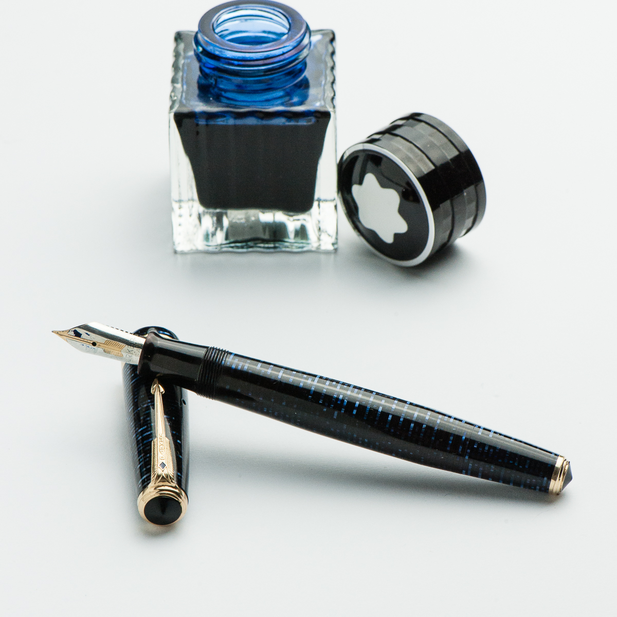
Franz: It’s a blue pen… shocking! =) It has been said before that February is the month of love and well, #iLoveBluePens! So for this month, I chose to ink up and feature this Parker Vacumatic Maxima in Azure Blue Pearl. According to the date code, this Vacumatic was made in the last quarter of 1941. I’ve seriously been getting deeper into the vintage pen realm and loving it. Honestly, any fountain pen lover must own at least one Parker Vacumatic. I’m sure you’ll enjoy the feel of it as well as the coolness of the vacuum pump filler. For about 15 years, Parker produced the Vacumatic in a handful of different sizes for almost every hand size. Having the bear-paw among the 3 of us, the Maxima (the largest) size fits my hand well even with the cap unposted.

Paired with this beautiful blue pen is the limited edition Montblanc Meisterstück Blue Hour/Twilight Blue ink. I love how the pen matches the blue color of the ink when you lay it down on paper and then as it dries, it changes to a blue-green color. I learned about this ink about 3 years ago from reading Azizah’s review on her site: Gourmet Pens-Montblanc Blue Hour.

So a cool blue pen, paired up with a cool blue ink. What else can I ask for? Oh, wait… more blue pens! ;-P

3 Comments

Review: Montblanc Diplomat 149 (Medium Cursive Italic)

Hand Over That Pen, please!

Katherine: The 149, like its little brother the 146, is a very classic style. As I mentioned in our review of the 146, I find the design inoffensive but a little boring.

Pamela: I am not a huge fan of cigar shaped pens.  Despite my appreciation of the 146 proportion and finish, I found the 149 to be “too much.”  It’s a BIG pen! It’s has a great classic, vintage feel, just not my cup of tea.

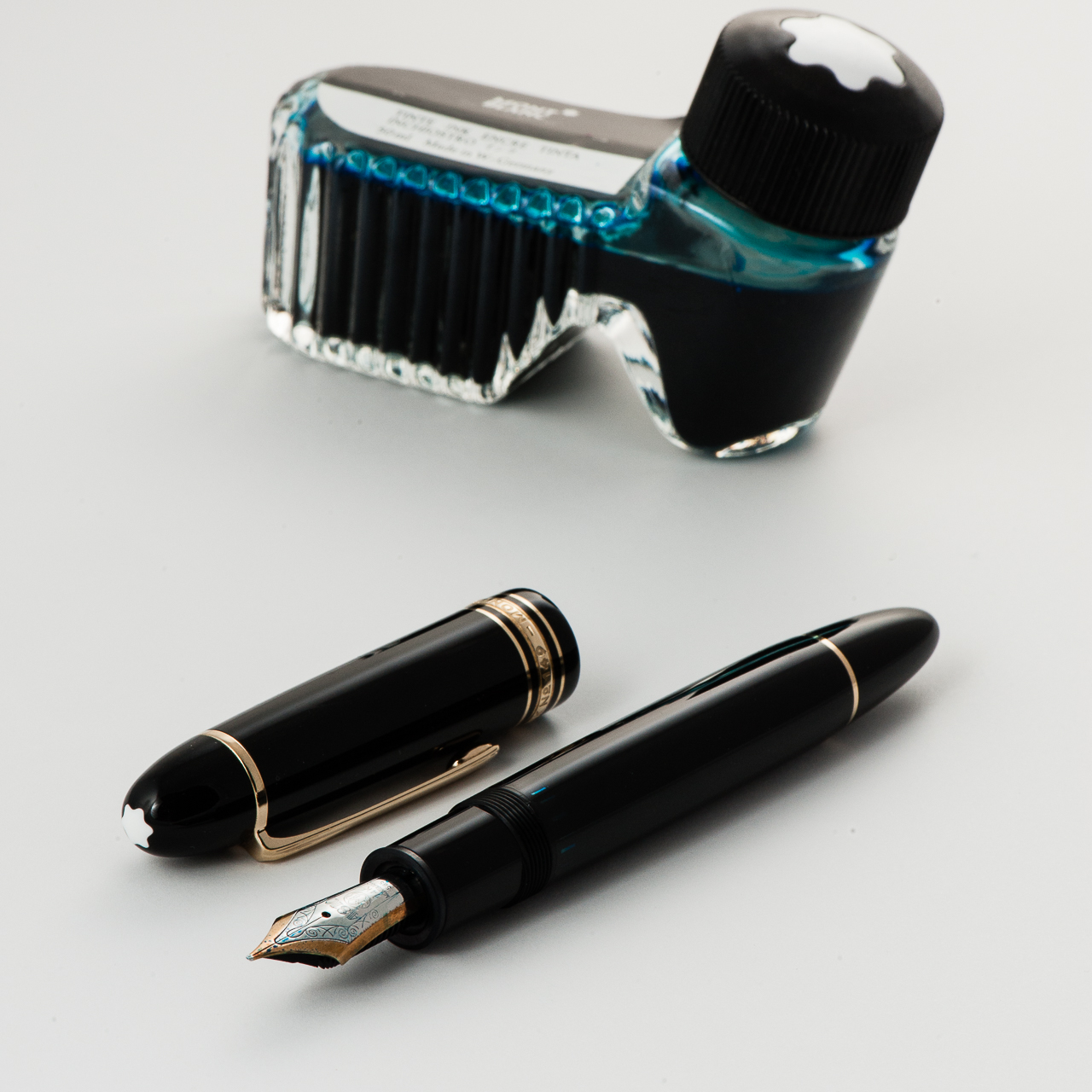
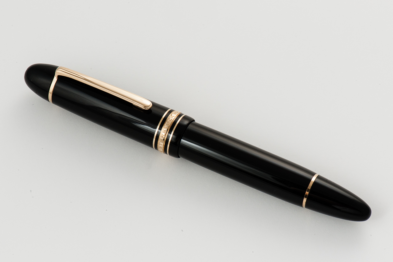
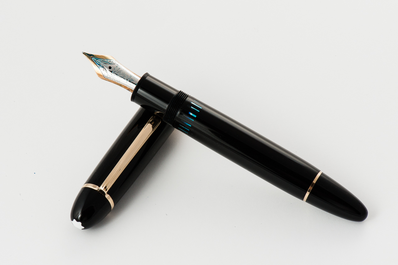
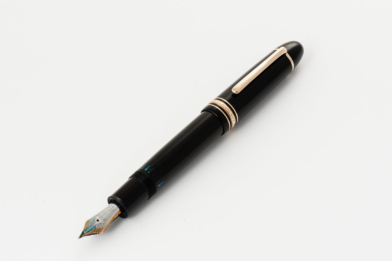
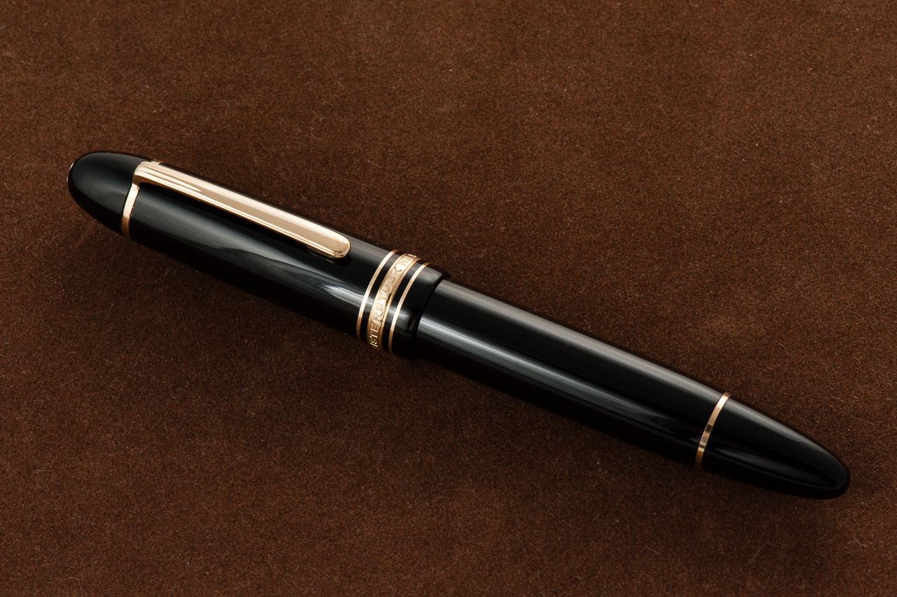
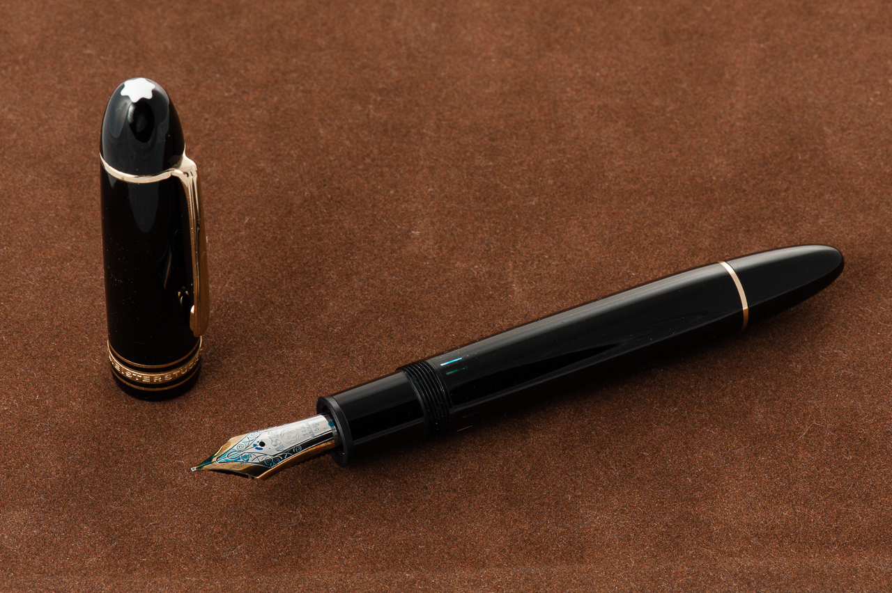
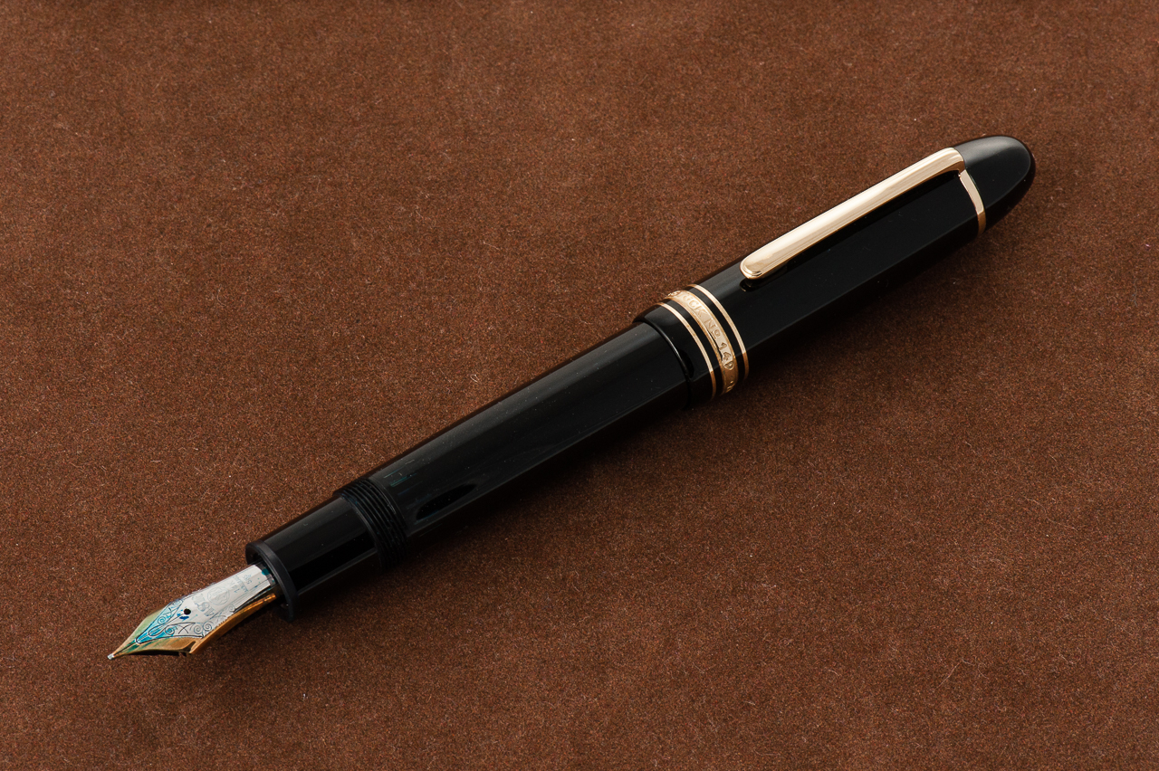
Franz: Oversize pen alert! Here’s a big one. The Montblanc Diplomat 149 is a simple black pen and is quite pleasant to hold. The resin is smooth, and scratch resistant. Its iconic torpedo shape speaks to me. I’ve been aware of this pen ever since I started using fountain pens but I’ve only seen and held one in person two years into the hobby. I had to have it!

Carrying over from our review of the Montblanc 146, the Montblanc Diplomat 149 is part of the Meisterstück line (Masterpiece) and was first introduced in 1952. It is a piston-filled pen which contains a large ink capacity. The number of the pen meant that: 1 – Meisterstück Line, 4 – Piston-filler system, and 9 – nib size.

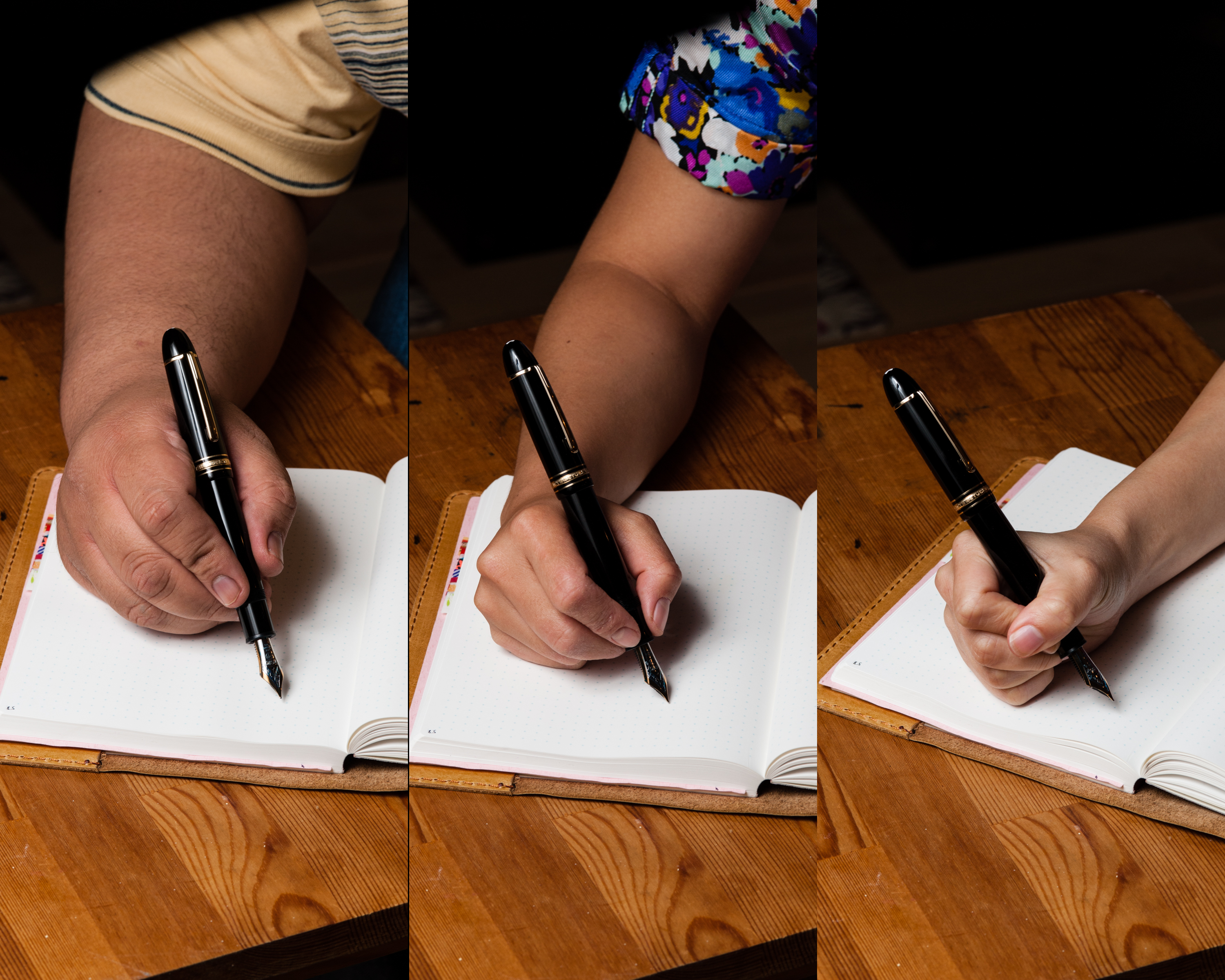
In the Hand: Montblanc 149 (posted) — from left to right: Franz, Katherine, and Pam
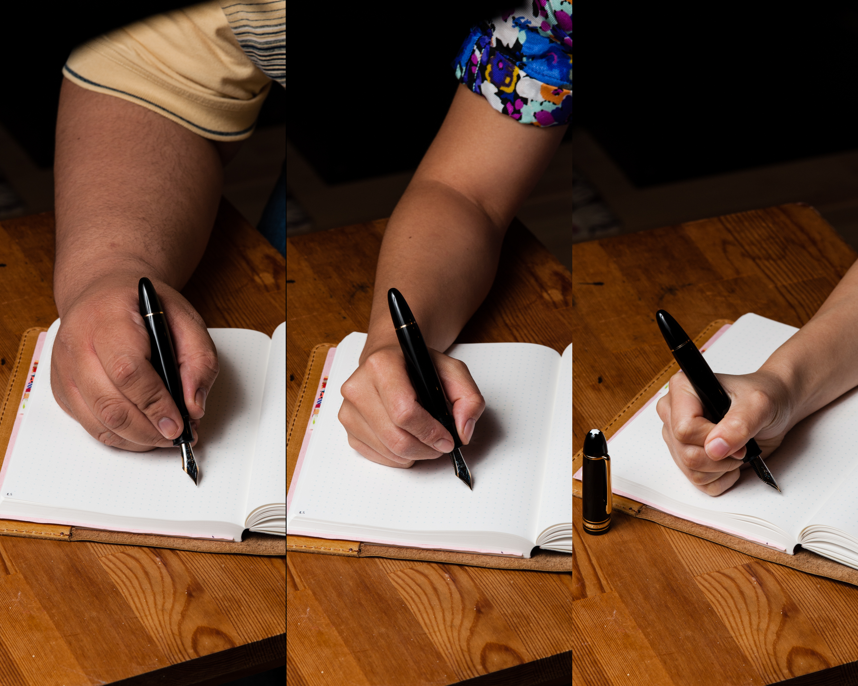
In the Hand: Montblanc 149 (unposted) — from left to right: Franz, Katherine, and Pam

The Business End

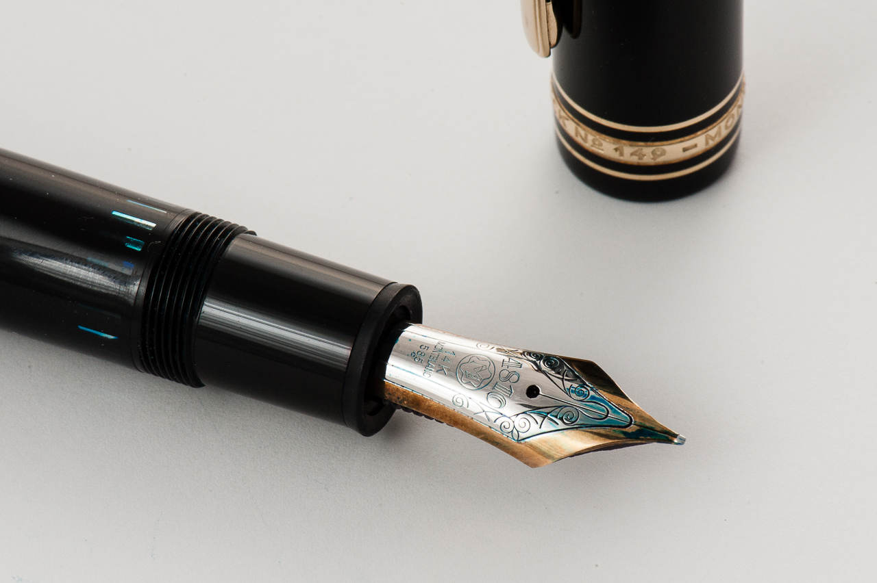
Katherine: The nib on Franz’s specimen, like the other Montblanc nibs I’ve tried, is fantastic. It gets the job done smoothly and flawlessly. The pen is smooth without being glassy, with just enough character not to be boring. I suppose having a grind by Masuyama-san doesn’t hurt either. 🙂

Pamela:  Montblanc and Masuyama?  Yes please!  The nib is a joy to write with and as always, smooth.

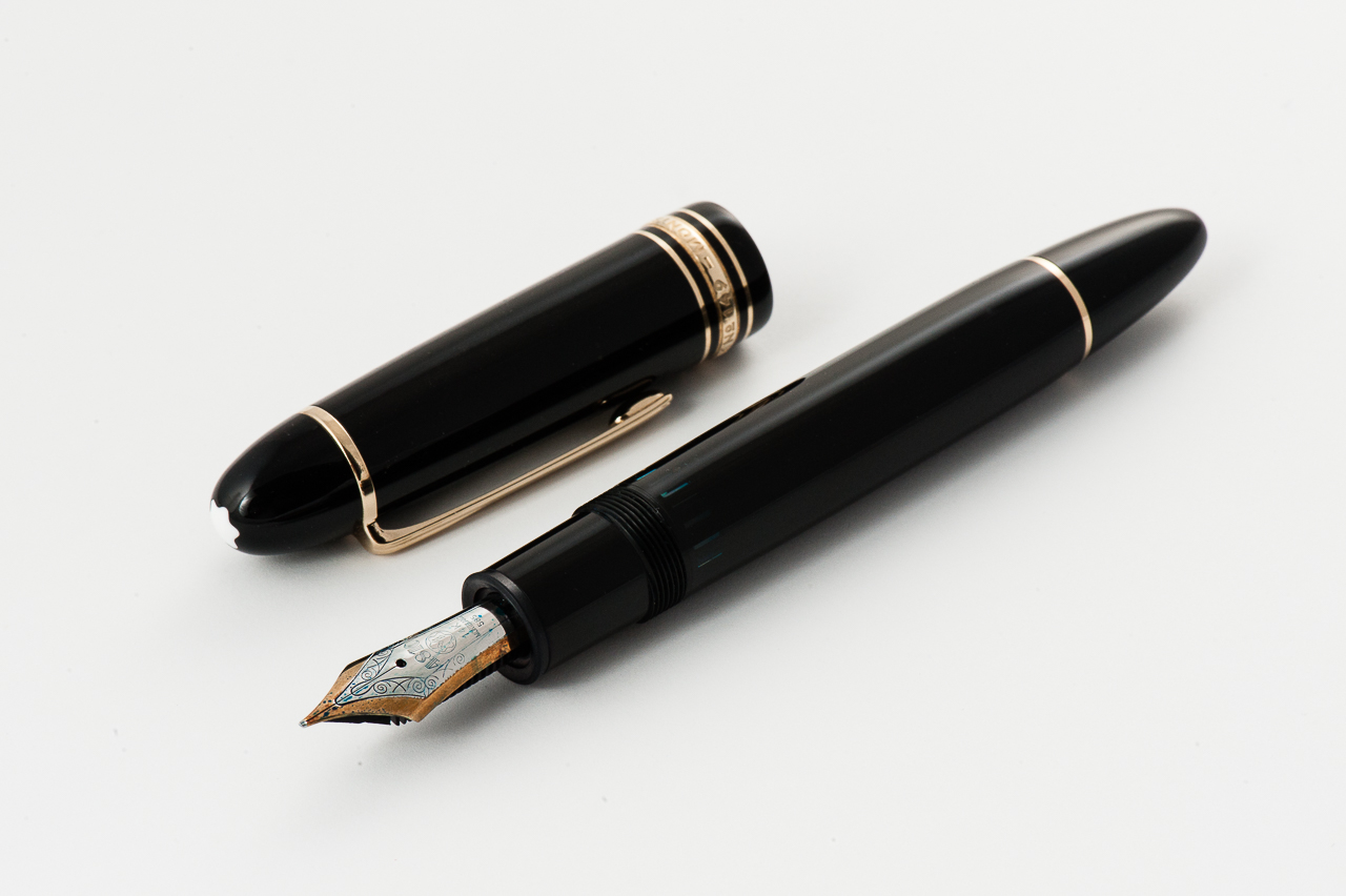
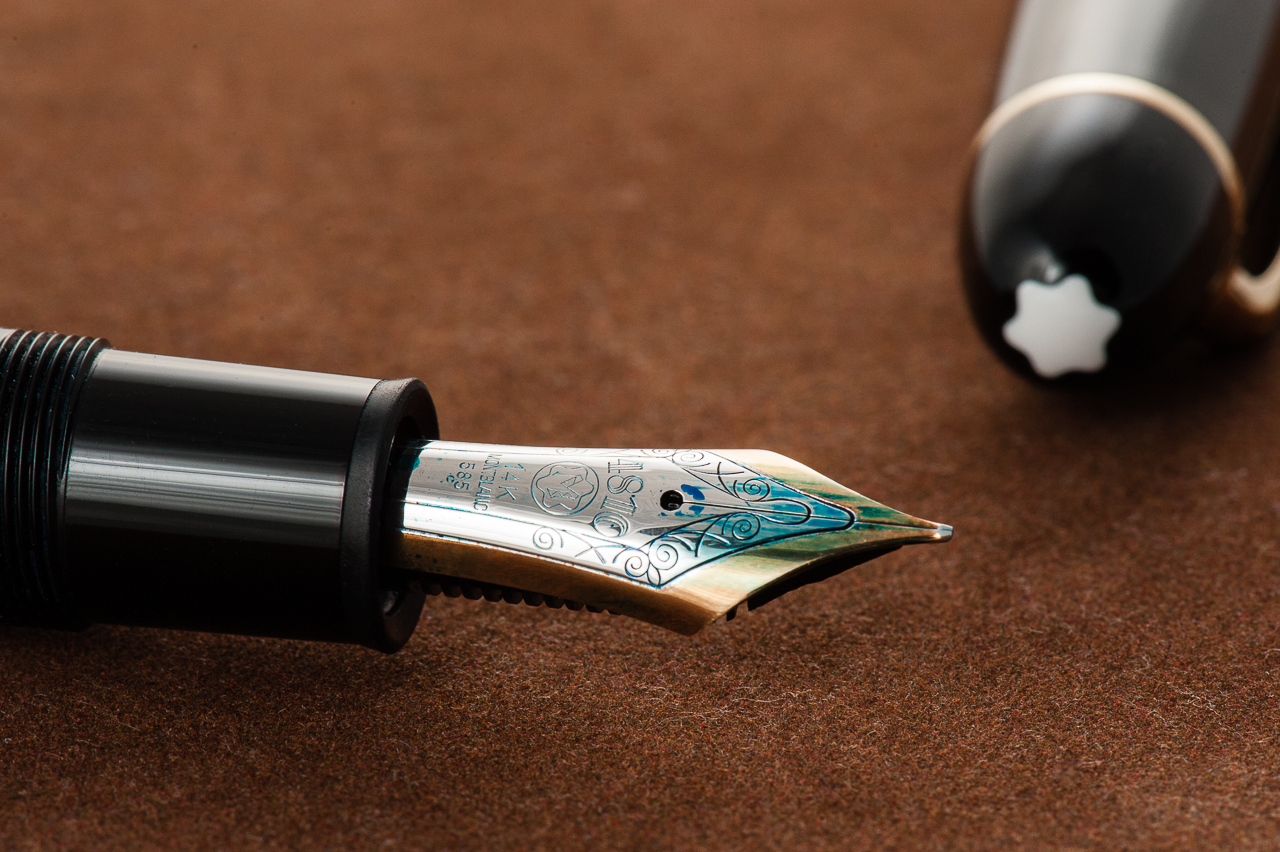
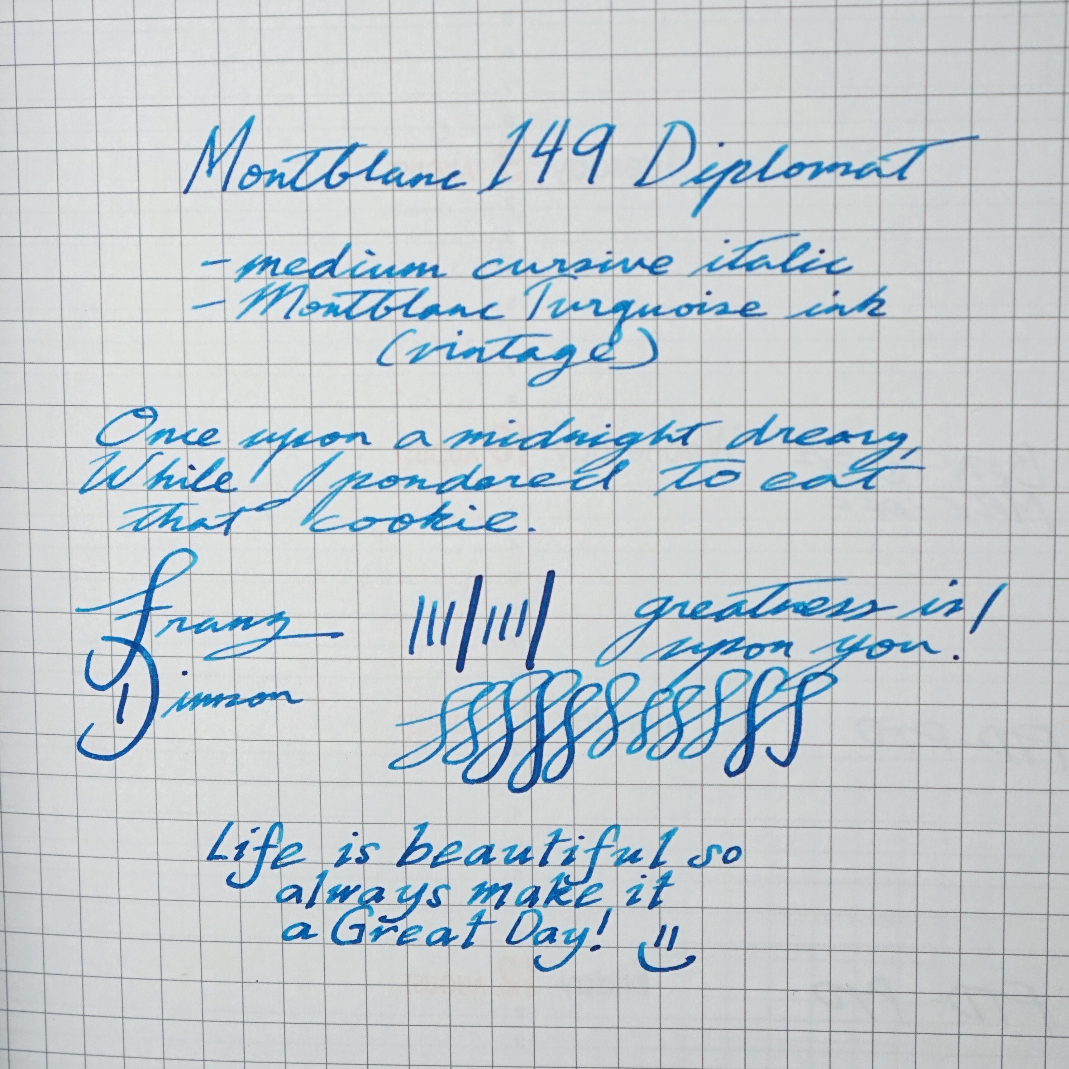
Franz: The medium 14K nib of this 149 was a very smooth and juicy when I bought it in January 2015. This was the third Montblanc nib I have written with and so far Montblanc is 3 for 3 in terms of nib quality. I loved the nib’s springiness which gives the writing some character. At the 2015 LA Pen Show, I had Mr. Masuyama turn this nib into a cursive italic and it has been one of my favorite nibs ever since.

Franz’s writing sample on a Rhodia Weekly Planner

Write It Up

Katherine: While the nib on this pen poses no problems… the size of the pen does. This pen is quite the monster for me. It’s a little too long and a little too girthy to be comfortable. Small hands, huge pen… just ain’t a fit. 146, please!

Pamela:  The pen is really unbalanced for me due to my grip and the length of the pen.  I felt that my hand fatigued more easily using the larger 149.  This pen gave me hand muscle quite the work out.

Franz: During my journaling, the 149 was comfortable for me for the first ten minutes. As I wrote longer with it, my hand felt a bit fatigued. The grip section is about 13 millimeters and it’s one of my wider pens. Lengthwise, I prefer to write with the cap posted but it’s not as secure as I want it to. There was a moment when the cap came loose.

EDC-ness

(Daily use at work/home, at least a day or two)

Katherine: Honestly, I didn’t even try. I borrowed Franz’s pen for a week, but found that it never left my desk. It’s just barely comfortable for me to use, but certainly isn’t a size that I’m comfortable putting in my pocket. Not to mention, it doesn’t fit any of my pen cases. Womp.

Pamela:  The pen is not a shy one.  It’s also far too large for me to carry around without being stopped for brandishing a weapon.  This pen stayed in my backpack as I transported it around, however, it was bit too heavy and large to be an EDC for me.

Franz: I’ve used the 149 in rotation at work for quite a while now, and it’s great for quick notes and perfect for signatures. I appreciate the quick uncapping with just one rotation of the cap, as well as the medium cursive italic nib that writes well on the office copy paper.

Final Grip-ping Impressions

Katherine: This feels like a pretty short review for me. Take everything I loved about the 146… and resize it to be too big for my hands. Sadness. The 146 is a perfect size and weight for me, versus the 149 feels like I’m out to club someone. Maybe some baby seal stationary. (That’s gotta exist, right?)

Pamela:  I agree with Katherine that my review of the 149 is shorter than usual.  The 149 is a great pen for those who love GREAT (big) pens, enjoys the quality of Montblanc nibs and has the “paws” proportional enough to use larger pens comfortably.

Franz: Talk about iconic! Yep, the Montblanc 149 is one of the most recognizable fountain pens. As evidenced from both ladies above, this pen isn’t for everyone. But one should at least write with it for a period of time and decide for themselves. The 149 fits right at home in my bear paw. Even though it can get tiring for my journaling/letter writing, I love it for quick notes during meetings, and perfect for signatures.

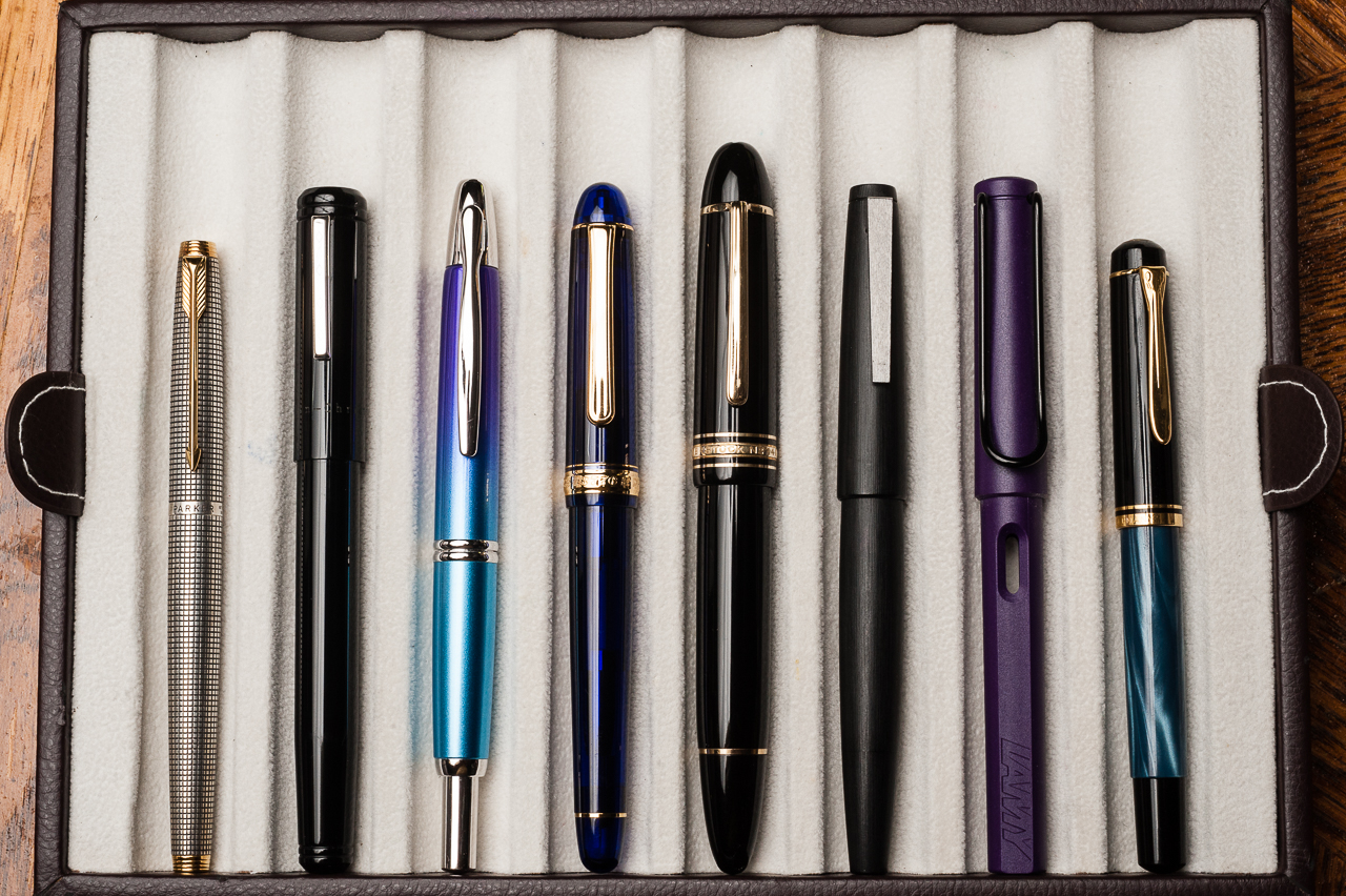
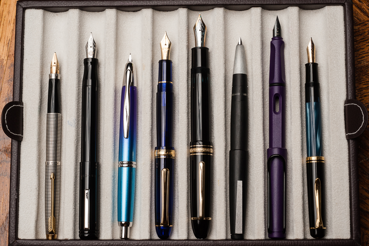
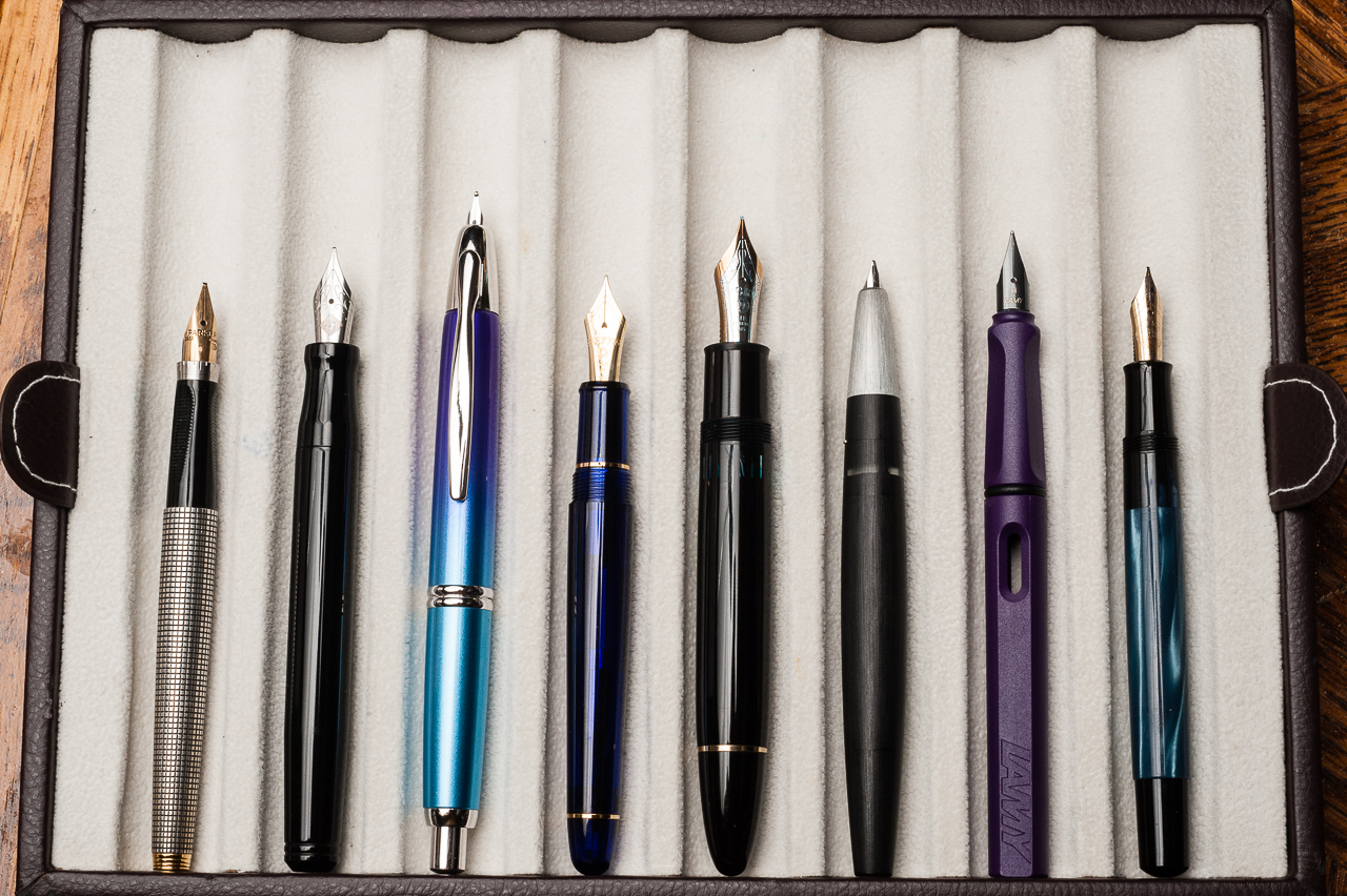
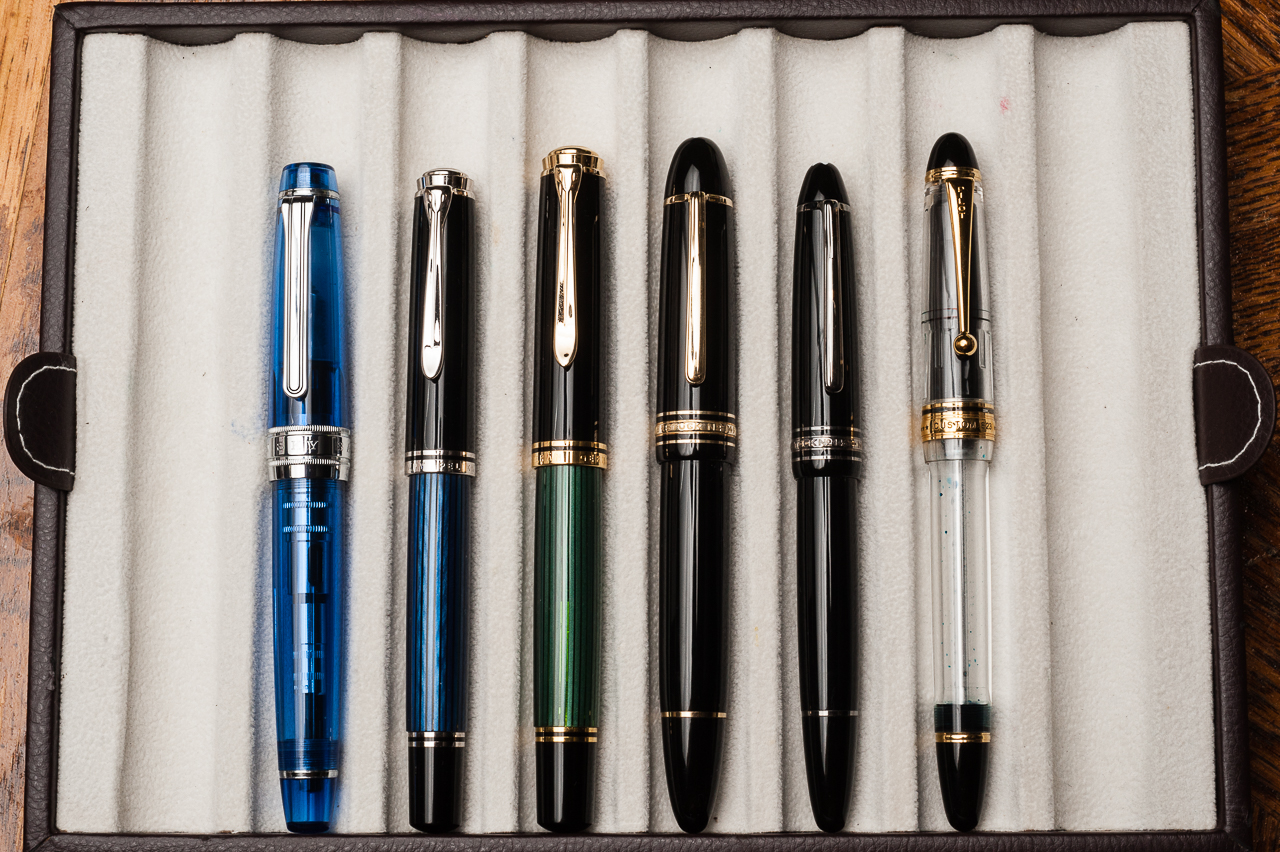
There are quite a few oversize pens comparable to the Montblanc 149. Photos were taken below for comparison. I honestly prefer the size of a Pelikan M805 as it’s almost the same length uncapped, but a little bit thinner and allows me to grip the pen better.


Pen Comparisons

Closed pens from left to right: Parker 75, Franklin-Christoph Model 20, Pilot Vanishing Point, Platinum 3776, *Montblanc 149*, Lamy 2000, Lamy Safari, and Pelikan M200
Posted pens from left to right: Parker 75, Franklin-Christoph Model 20, Pilot Vanishing Point, Platinum 3776, *Montblanc 149*, Lamy 2000, Lamy Safari, and Pelikan M200
Unposted pens from left to right: Parker 75, Franklin-Christoph Model 20, Pilot Vanishing Point, Platinum 3776, *Montblanc 149*, Lamy 2000, Lamy Safari, and Pelikan M200

Oversize Pen Comparisons

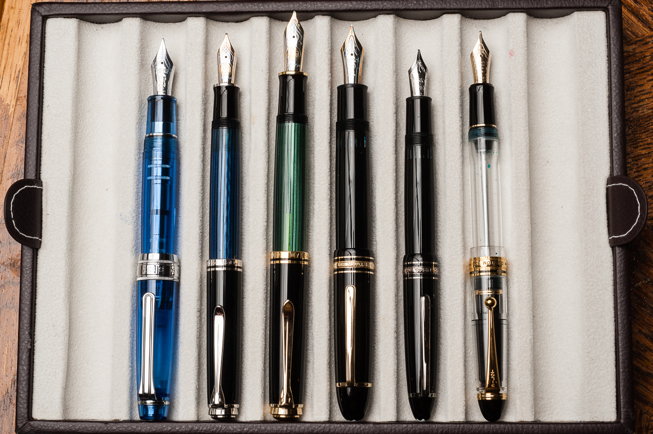
Oversize closed pens from left to right: Sailor King of Pen Pro Gear, Pelikan M805, Pelikan M1000, *Montblanc 149*, Montblanc 146, and Pilot Custom 823
Oversize posted pens from left to right: Sailor King of Pen Pro Gear, Pelikan M805, Pelikan M1000, *Montblanc 149*, Montblanc 146, and Pilot Custom 823
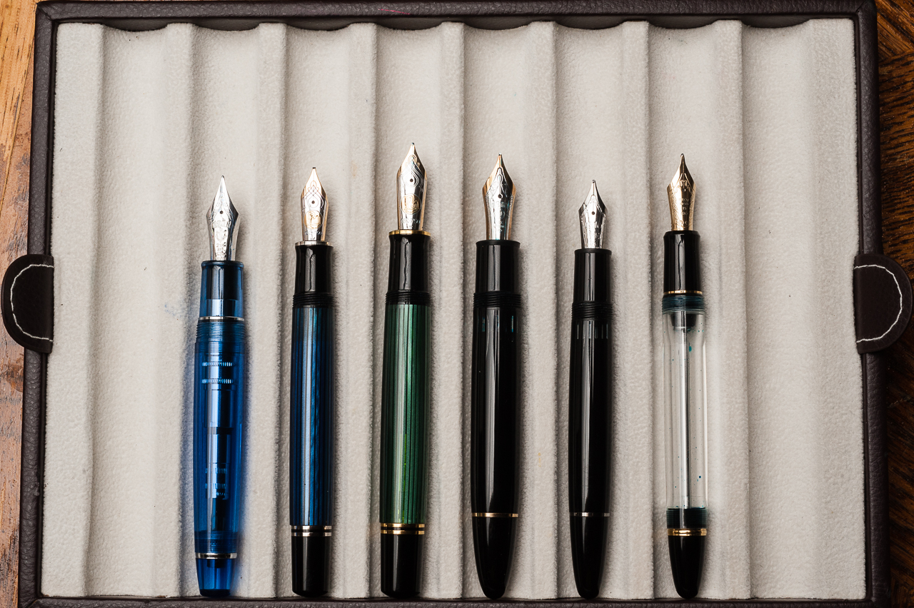
Oversize unposted pens from left to right: Sailor King of Pen Pro Gear, Pelikan M805, Pelikan M1000, *Montblanc 149*, Montblanc 146, and Pilot Custom 823

Pen Photos (click to enlarge)
2 Comments