We would like to thank Pen Chalet for lending us this Platinum Izumo fountain pen for review. Pen Chalet is based in Mesa, Arizona and has been a company that sells pens and stationery items at competitive prices. They also frequently run promos for specially priced items as well as provide discount coupons. Check them out if you haven’t yet.
That being said, the opinions below are our own and we were not compensated (monetarily, or otherwise) for this review.
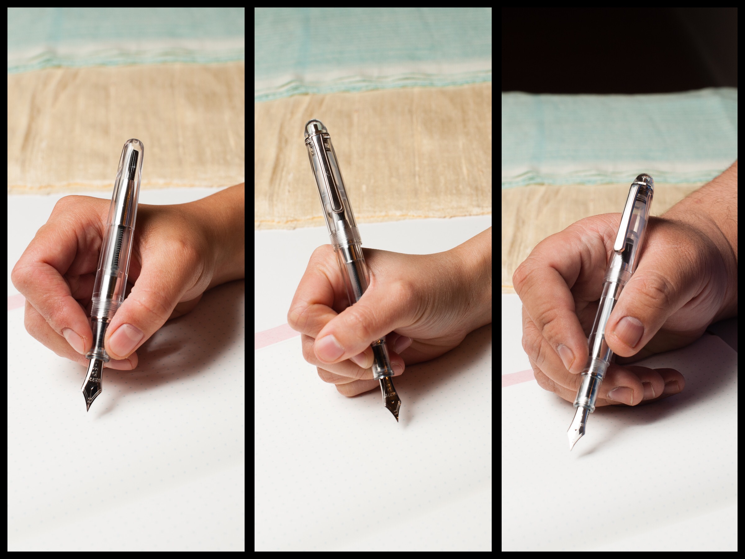
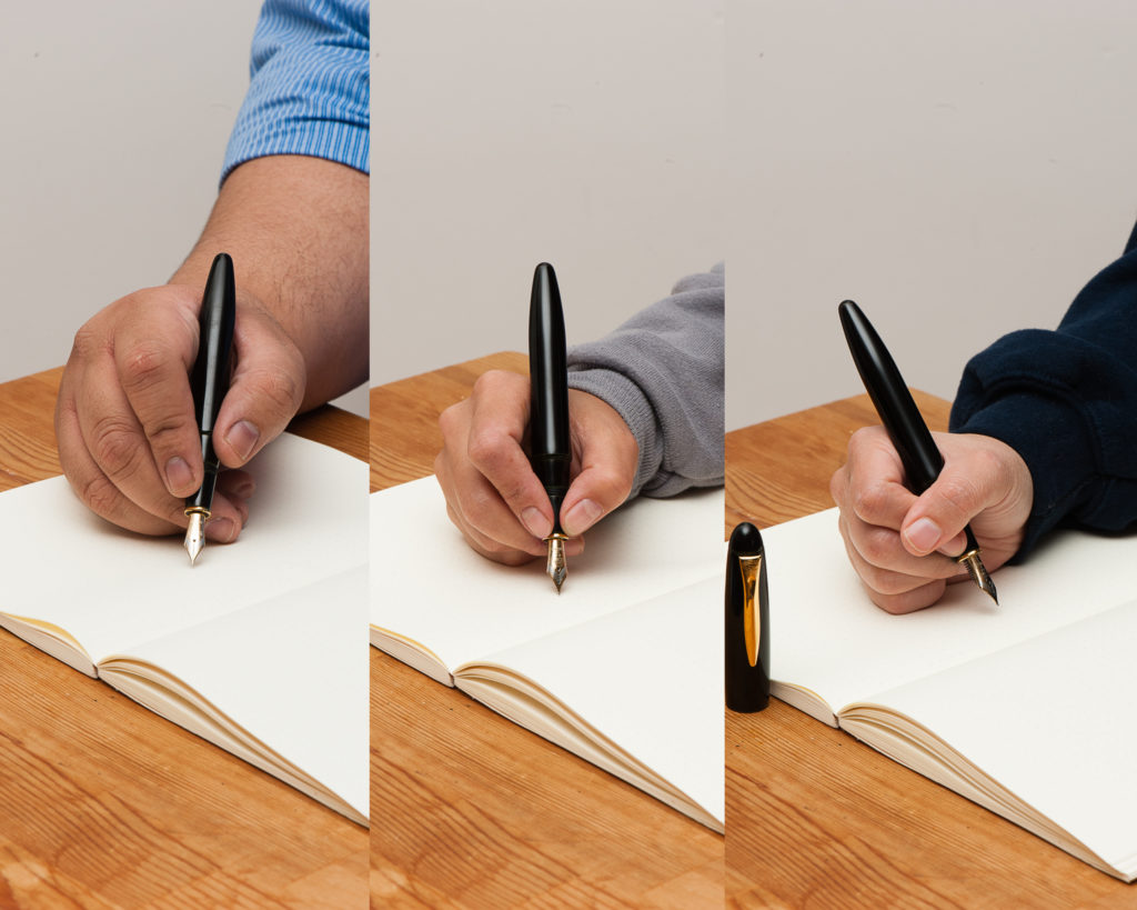
Hand Over That Pen, please!
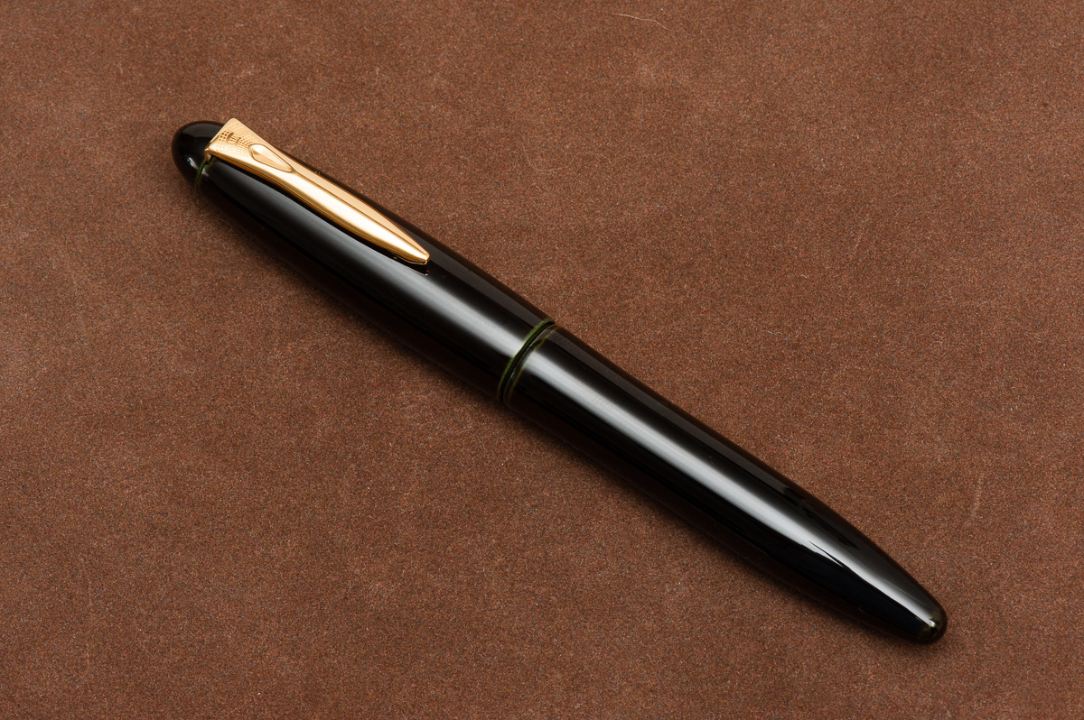
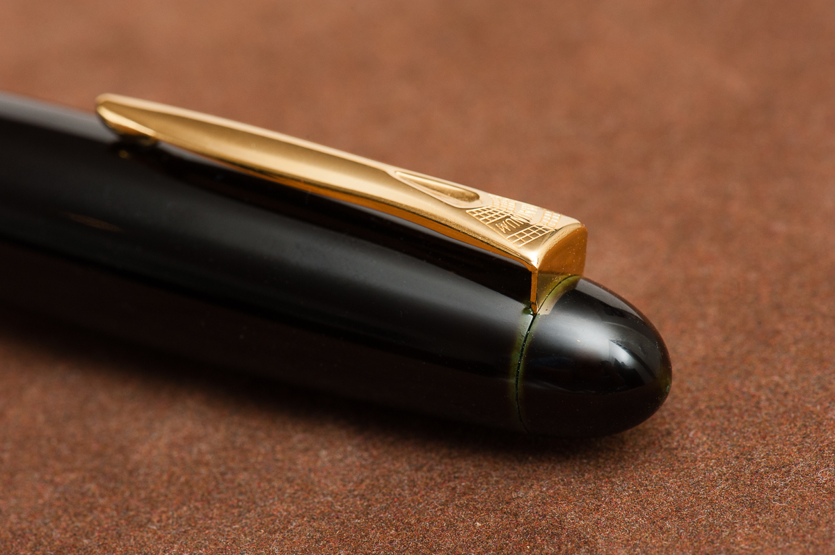
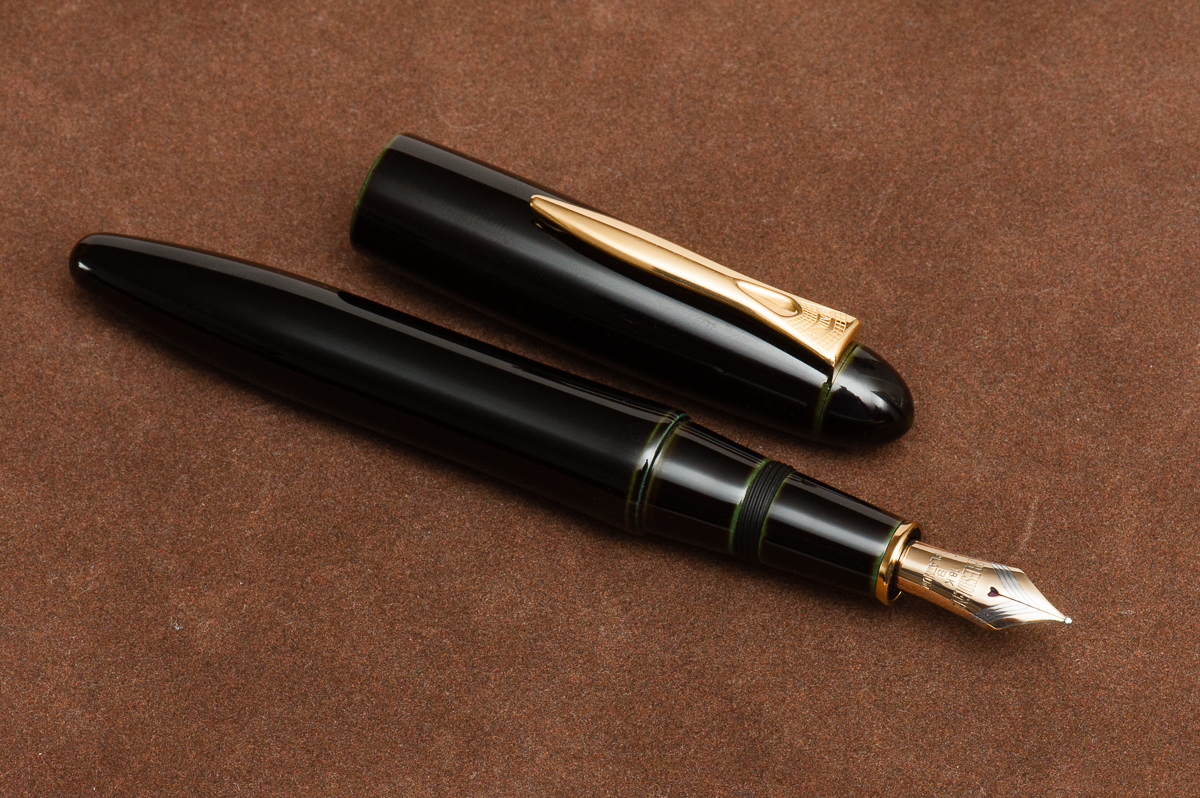
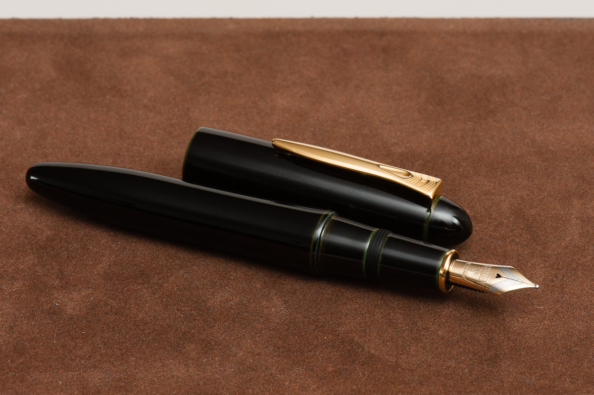
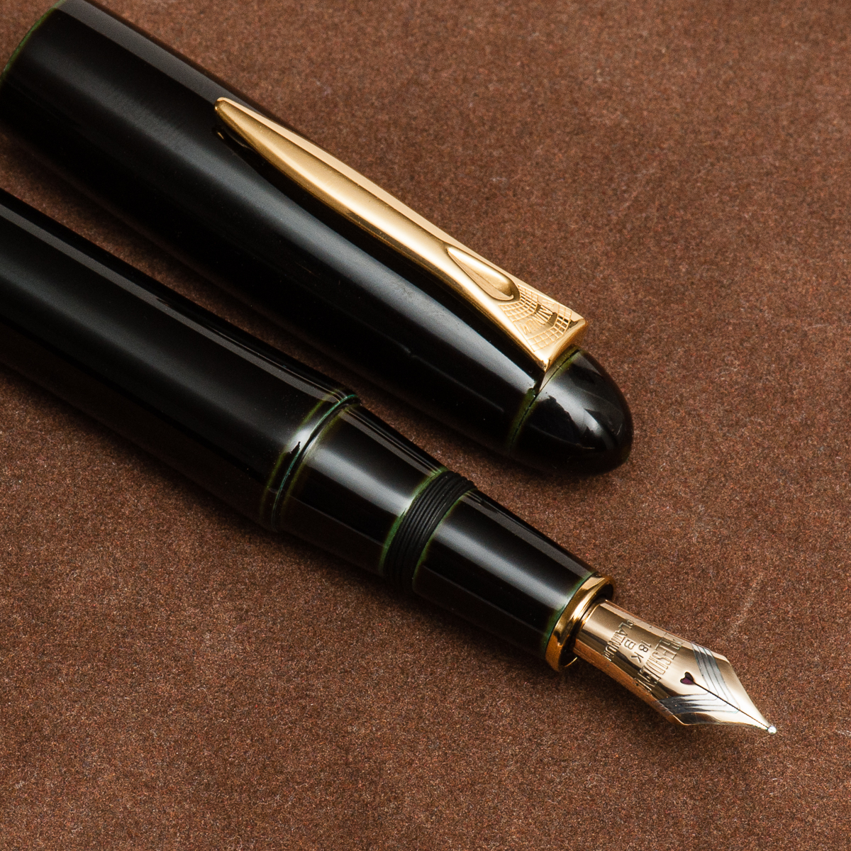
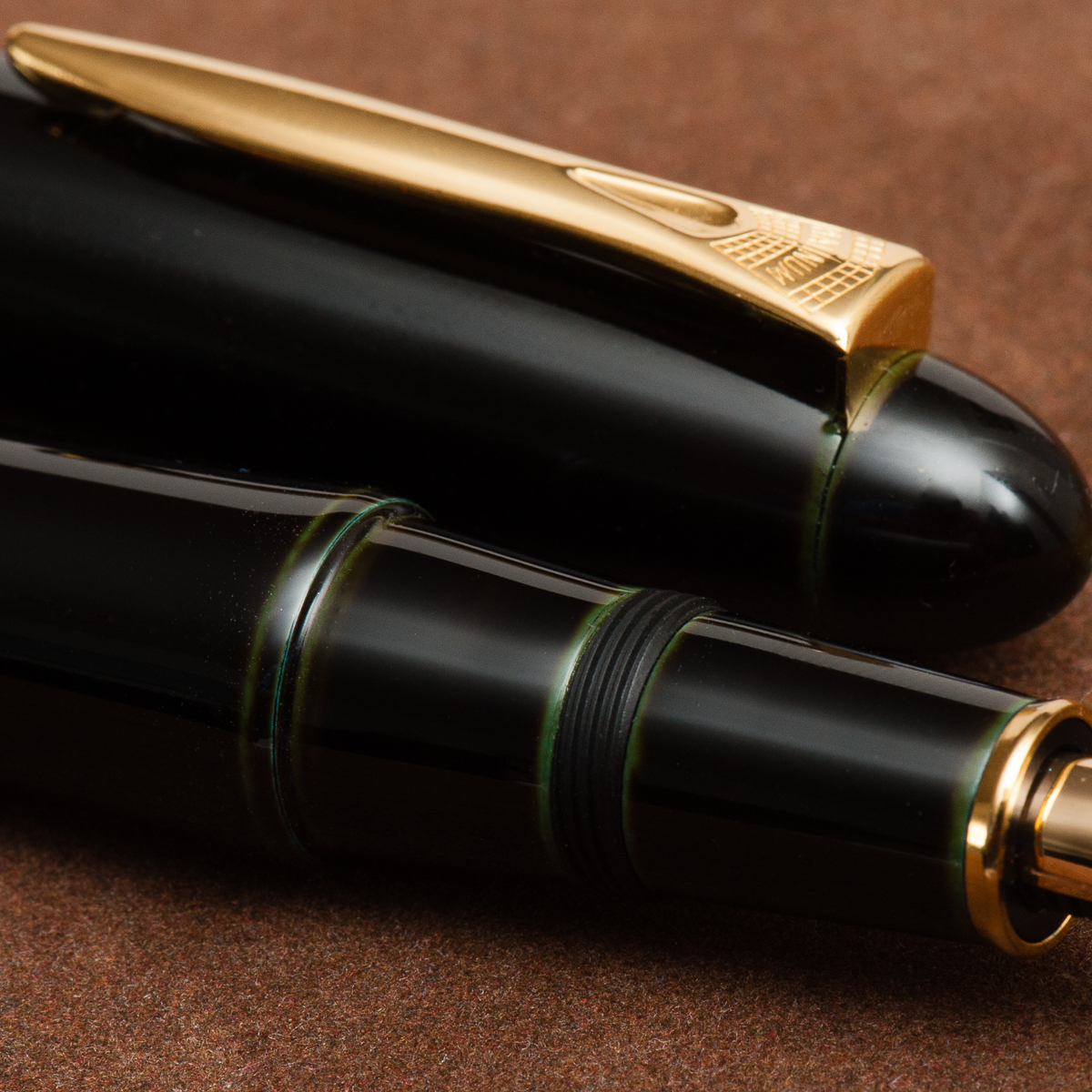
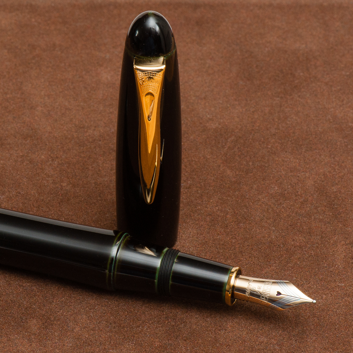
Katherine: The shape of the Izumo isn’t my jam… but I have a general bias against bulbous caps. Tapered? Maybe that’s a less graphic word. Anyway, general shape aside, the Izumo comes in many beautiful finishes (ugh I really wish I liked their base shape more!) this one is soratame, a green and black tamenuri, pretty subtle, but quite nice when you look closely. The pen also comes in a variety of other finishes, some of which are really quite breathtaking.
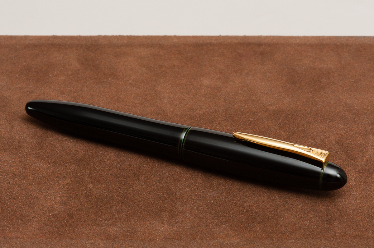
Pam: Whoa! This is a big pen! The urushi finish is flawless on a classic cigar shaped pen. At first glance, pen is really intimidating based on it’s size and finish. It’s not my aesthetic. To my untrained eye, I wouldn’t know that this pen had urushi on it because it’s just a boring black cigar shaped pen. The nib is a very business like nib. The design is either really retro or modern.
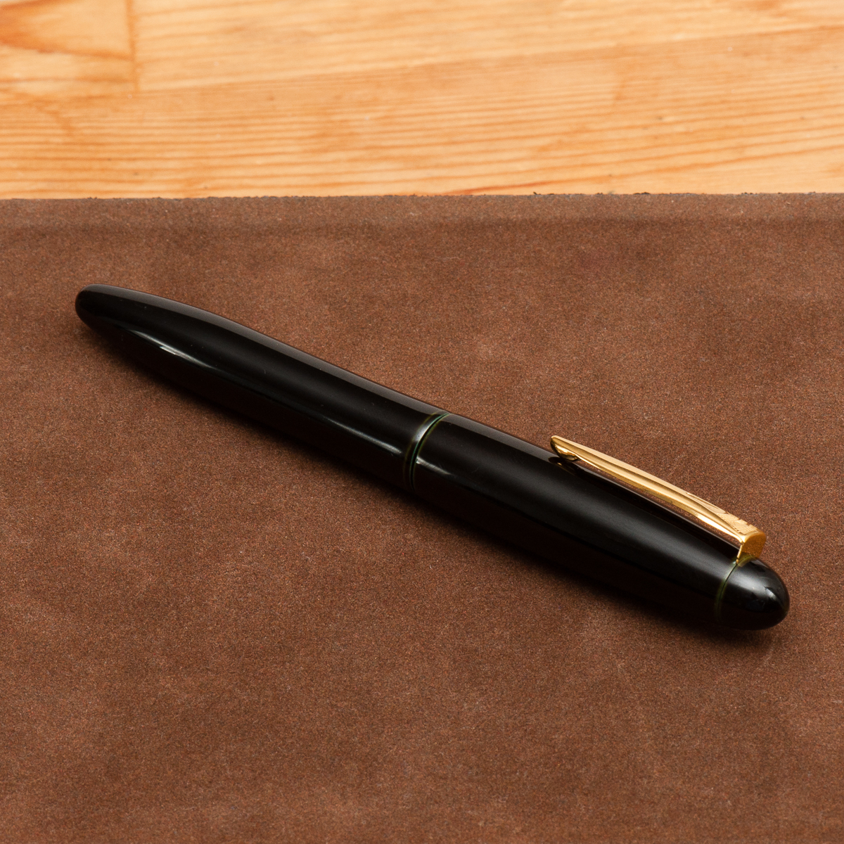
Franz: The Platinum Izumo is quite large, curvy and seems to create a grand stature. It’s like the pen says, “Hey look at me!” whilst flexing its muscles. I believe in the closed position, the pen is just a little over 6 inches. I’m one to appreciate urushi lacquered pens and this Soratame is beautiful and simple. I love the hints of color in the seams of the pen.
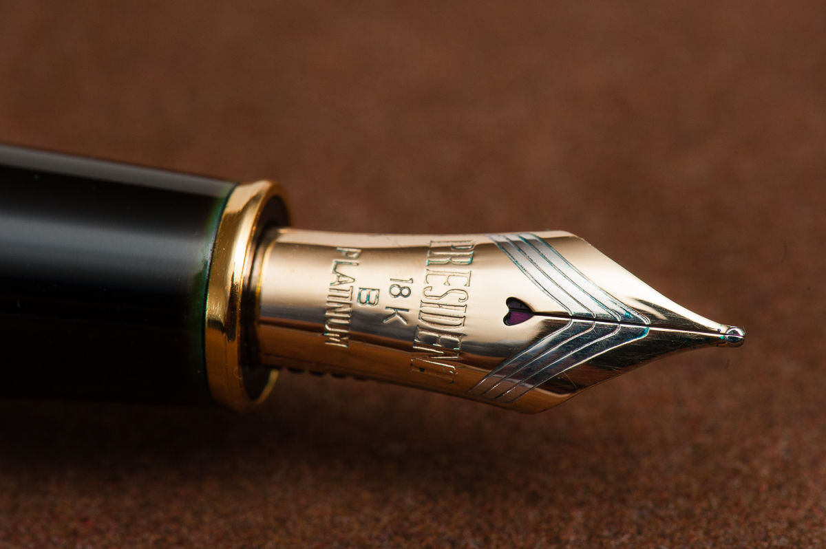
The Business End
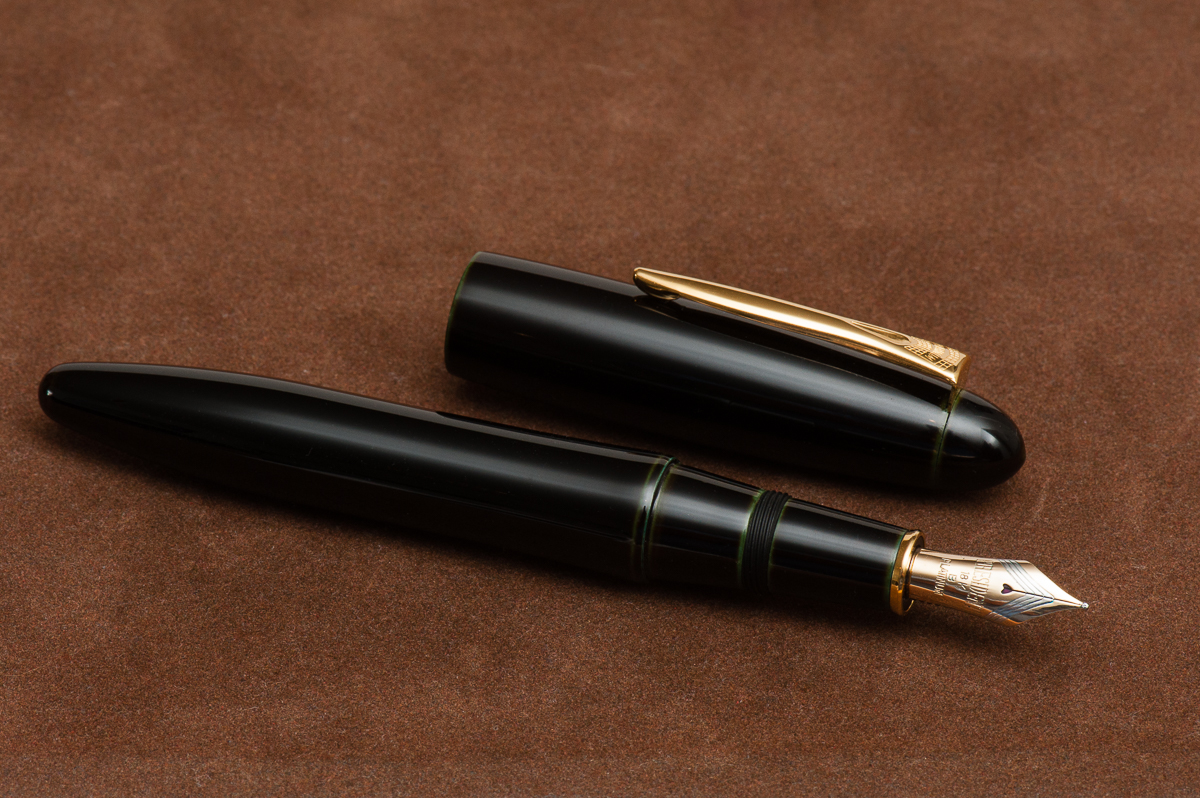
Katherine: The Izumo nib feels much more “western” to me than the 3776 nib, but that’s a sample size of one. It’s smooth, wet and stiff — a great nib to get things done with, but not one I’m excited to write with.
Pam: I am going to enter a “expectations management” disclaimer. Given that this is a Platinum nib and my only experience with Platinum is through the 3776 nibs so my expectations included a characteristic and unique Platinum nib. I am biased. That being said, the Izumo nib is… serviceable. It’s just not memorable and lacks any characteristic that makes me want to pick it up again. It’s really really smooth which is fantastic for those looking that kind of writing experience. However, that’s not what I was expecting.
Franz: It was my first time to write with a President nib from Platinum and I echo the ladies’ comments above. It wrote smoothly, a good flow, and did not skip like any good nib should. I always love the heart-shaped breather holes of Platinum nibs.

Write It Up
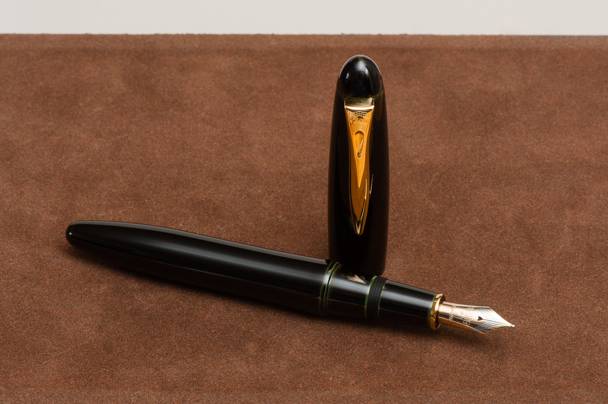
Katherine: The section of the Izumo is very comfortable (though that gold ring at the very front bugs me, especially on the dark and subtle soratame finish) — though it doesn’t have the “flare” at the very end that I prefer. It’s a heavier pen than I expected (a little heavier than the m800?) but very manageable, I’m just used to urushi pens being super light. All in all a comfortable and usable pen, but not outstandingly so.
Pam: The nib is fantastically smooth. Almost too smooth. There is no feedback and it lays down a nice saturated line without being overly wet.
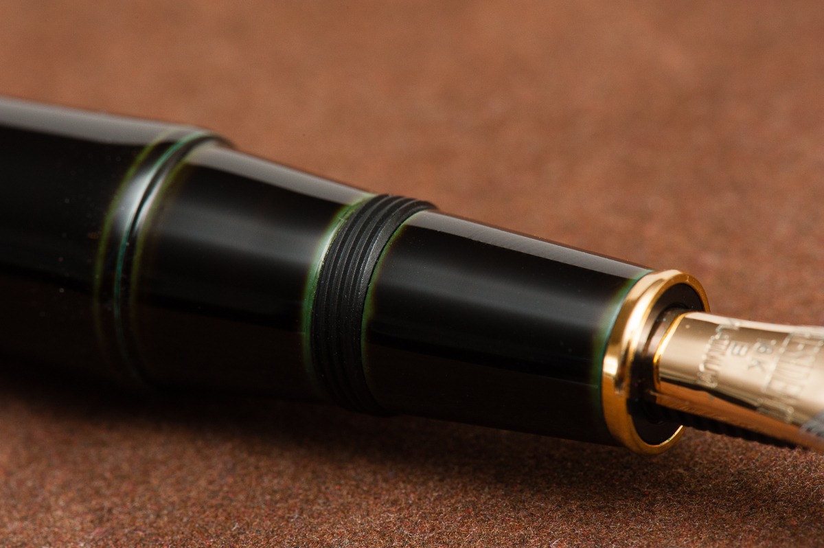
Franz: Being an ebonite pen, the Izumo was very pleasant to write with and was balanced. The cap is “post-able” however we did not attempt to do that since it is a loaner and posting generally mars the urushi finish. One thing though, my index finger naturally lands on the threads in the middle of the section and they’re kinda sharp. It doesn’t hurt at all but you can definitely feel them. But I’ll live with it because the urushi’s green underlayer shows very nicely. Needless to say, I did not experience any fatigue while writing in my journal.
EDC-ness
Katherine: Super fast uncap (1 turn) and a strong clip — it’s a little big for me, but definitely EDC-able if you like the size.
Pam: Given the size of the pen and the finish, I didn’t take this pen to work. The clip works well and keeps it secure in a case.
Franz: The Izumo was a very lovely pen to use at work for jotting down notes as well as for signatures. The pen just stayed on my desk for most of the the day, but I did clip it onto my shirt pocket for safekeeping as well.
Like other Platinum pens, the Izumo is cartridge/converter filled and the supplied Platinum converter was very sufficient. If I were to use this pen every day at work, I’d probably refill it with ink every 3 days or so.

Final Grip-ping Impressions
Katherine: The Izumo has all the pieces — a beautiful finish, a solid nib and solidly built. At the end of it all though, half of this hobby is about the aesthetics and the Izumo just ain’t my thing. If you love the aesthetic, it won’t disappoint!
Pam: This a great pen for those who can appreciate the classic look, the nuances of the urushi and a very smooth writing experience. That being said, this is not the urushi pen for me. Perhaps I have been ruined by Nakaya, just maybe.
Franz: Overall, the Izumo is a great pen to use. Ebonite pens have always been a favorite of mine and this seems to be one of them. I do love the stealthy tamenuri finish of the Soratame. As I said in the beginning of this review, the Izumo’s size and shape makes a statement. And something that’s true with every pen one holds, does that pen speak to you?
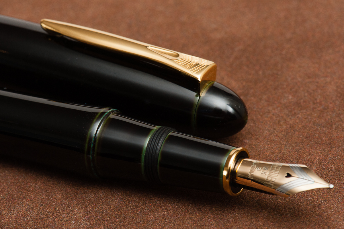
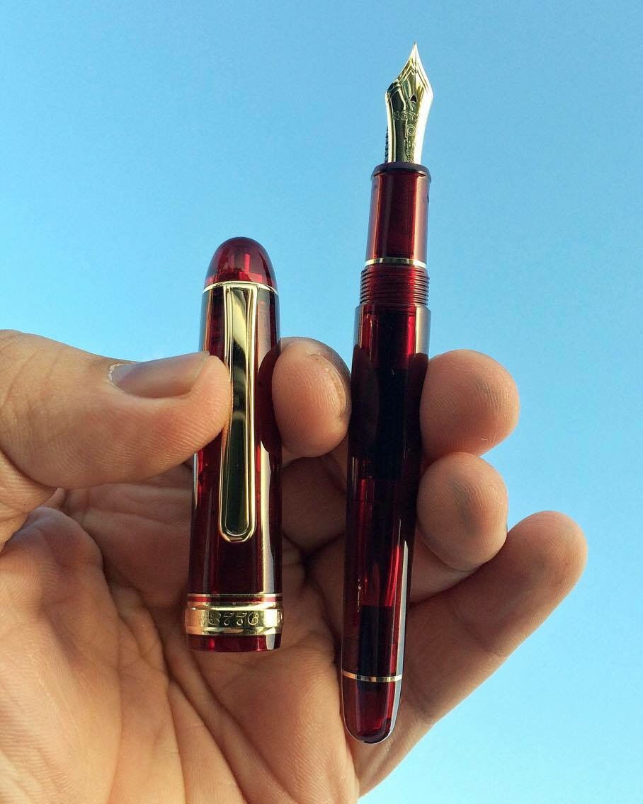
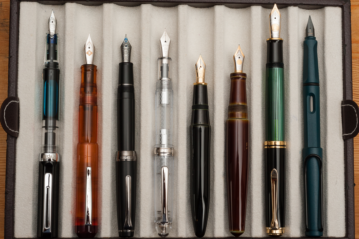
Pen Comparisons


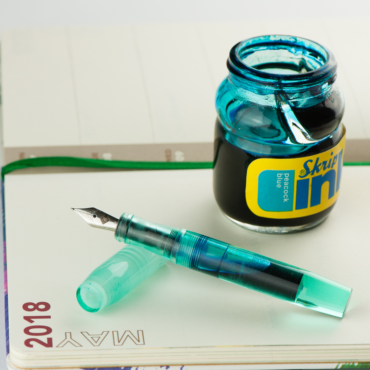
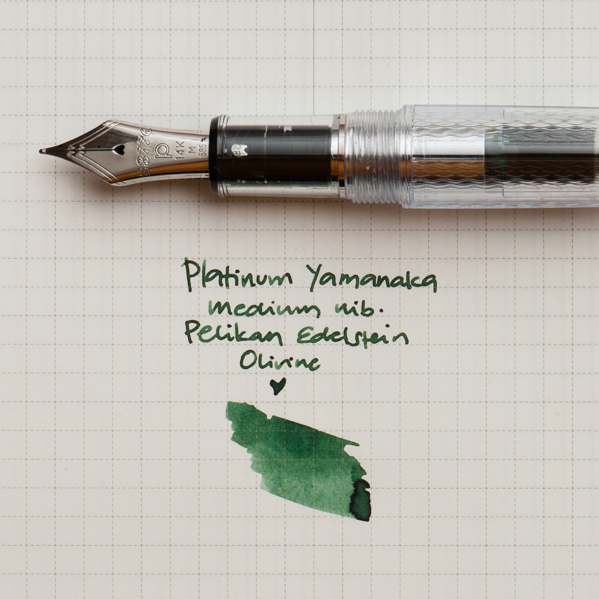
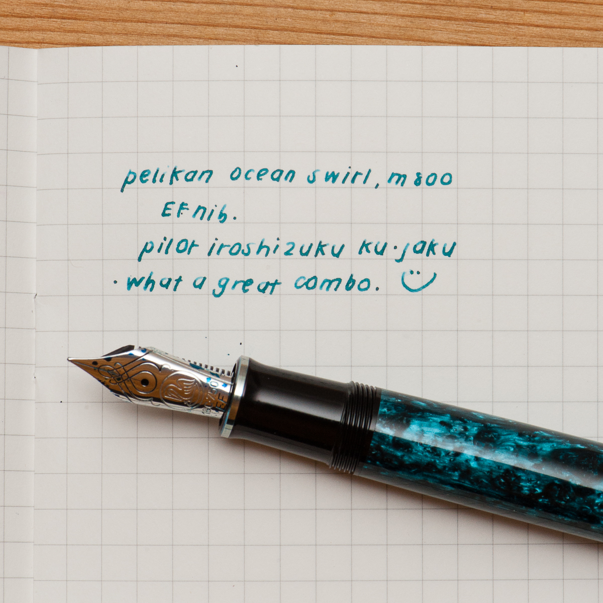
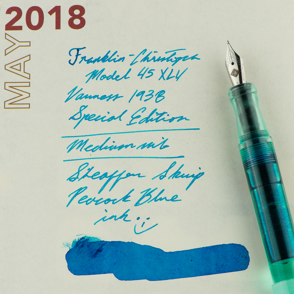
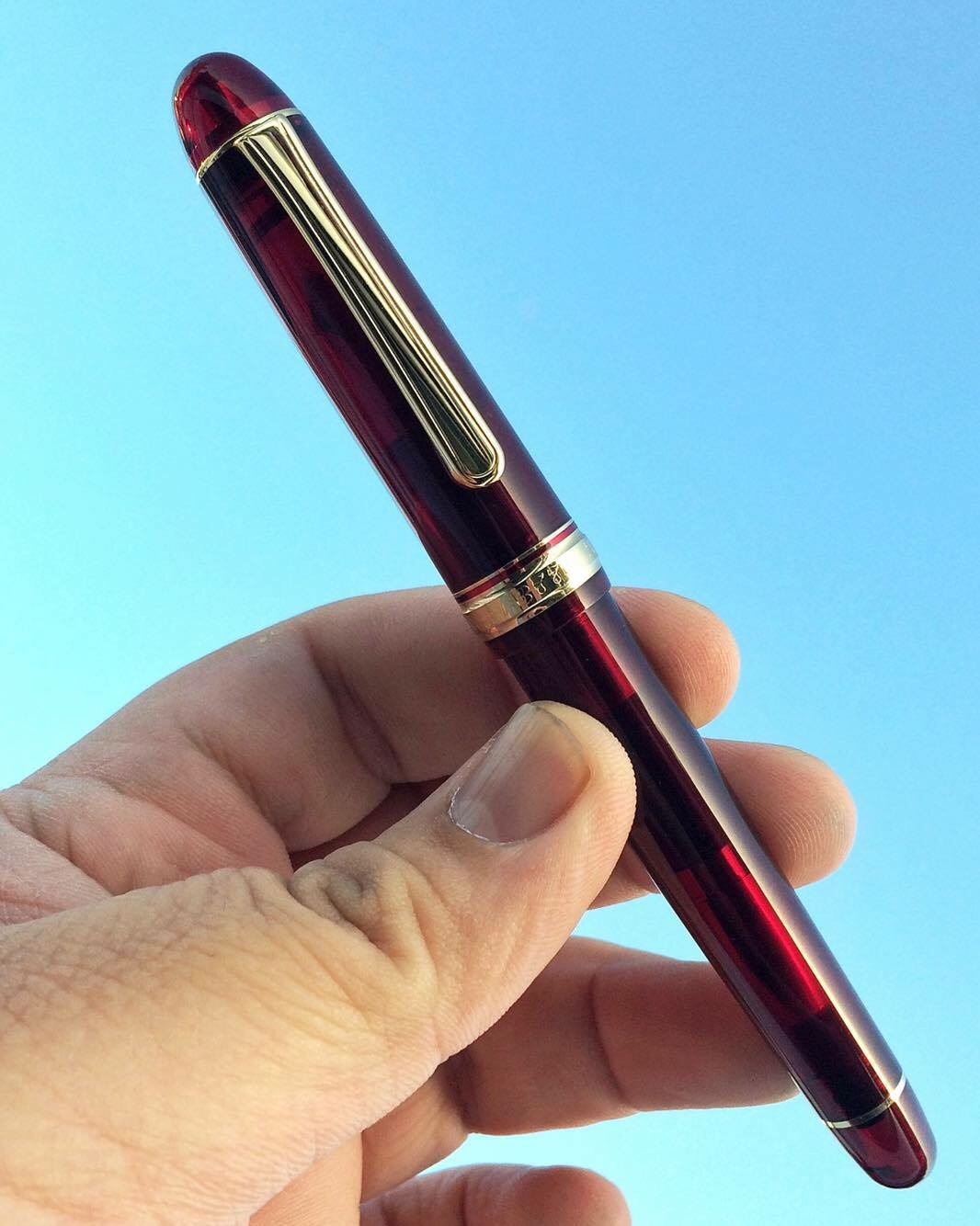
Pen Photos (click to enlarge)