2018 LA Pen Show Report: Franz

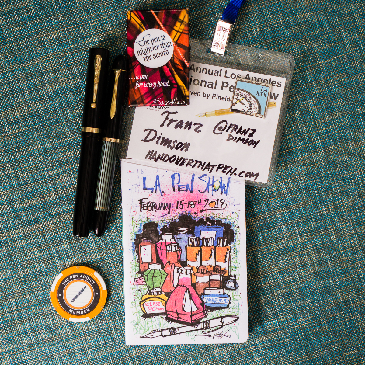
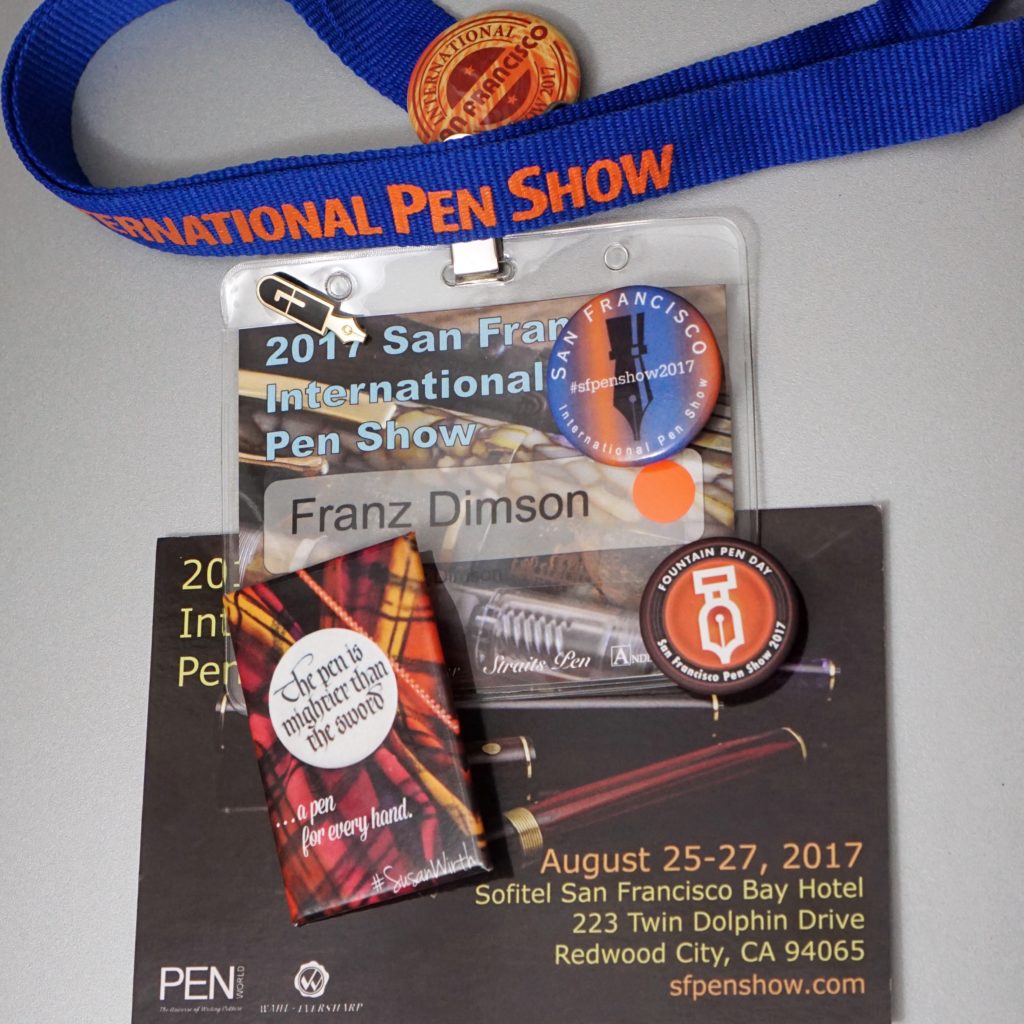
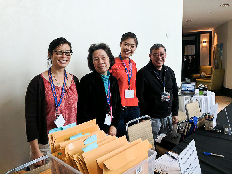
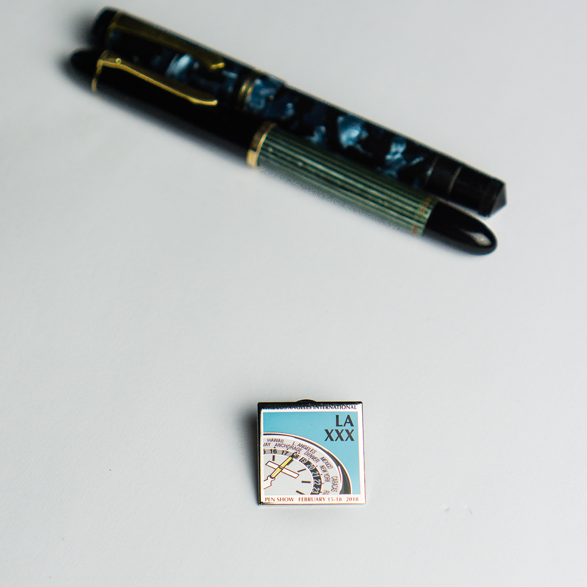
Hello Friends! I was fortunate enough to be able to attend the 2018 Los Angeles International Pen Show that was held on February 15 thru 18. I actually try to make it to the LA pen show every year as kind of like a vacation for myself. Things I look forward to at a pen show: hanging out with pen-minded people, perusing thousands upon thousands of different pens, possibly buying a pen (or two) that I can’t go home without, seeing and visiting with old friends, creating new friends, and just having a fun time!


Thursday, February 15, 2018

Sunset sky at the Manhattan Beach Marriott Hotel. I have arrived!

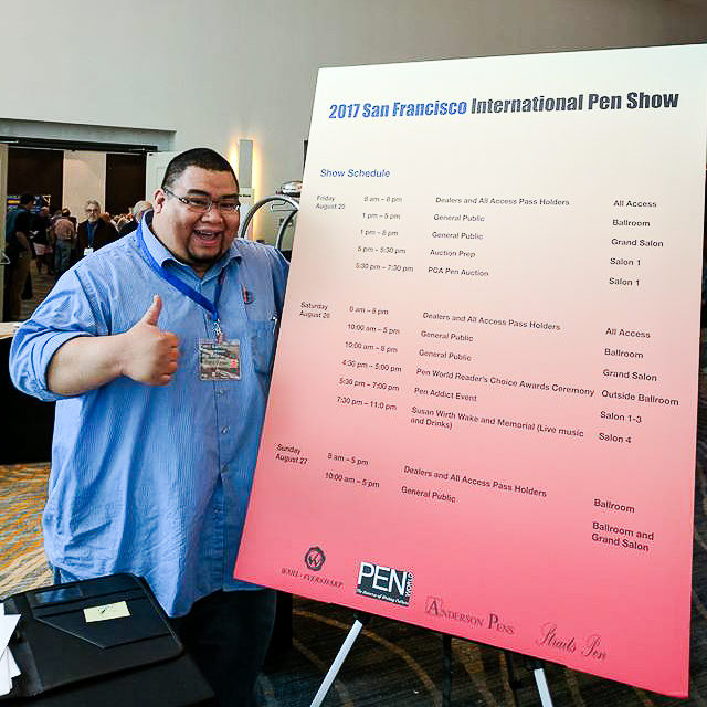
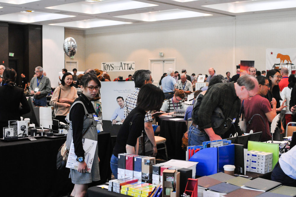
Each year, the LA pen show is held at the Manhattan Beach Marriott Hotel in Manhattan Beach, California. This year, they’re in a transition period and changing their name to Westdrift but is still under the Marriott brand. The hotel was still undergoing construction during the pen show. There’s more to be said about that part but I’d rather just focus on the show which was all fun for me!

I arrived on Thursday afternoon just in time as the first day was wrapping up. I immediately checked in and went downstairs to the ballroom.

Pens were found!
Ebonite pens at the Peyton Street Pens table

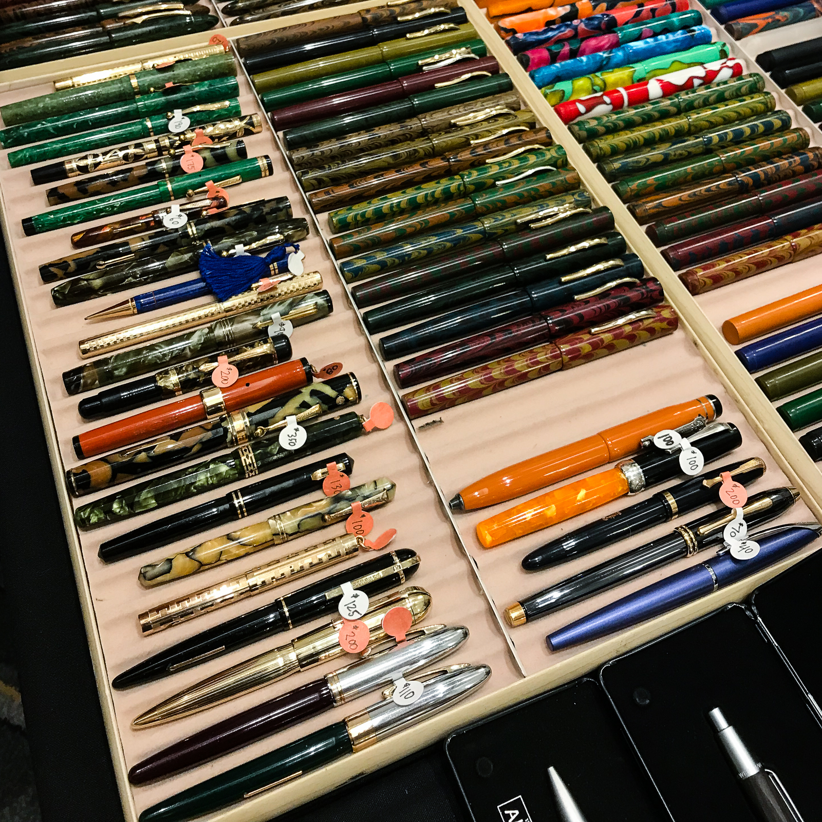
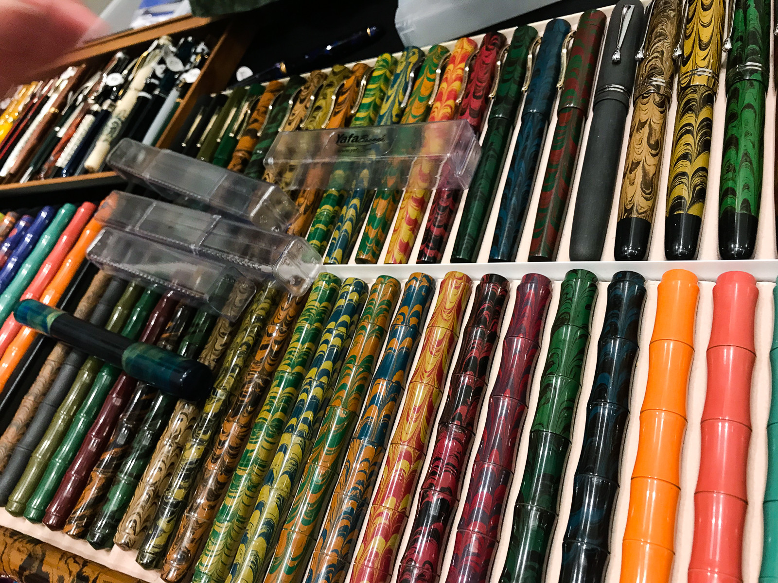
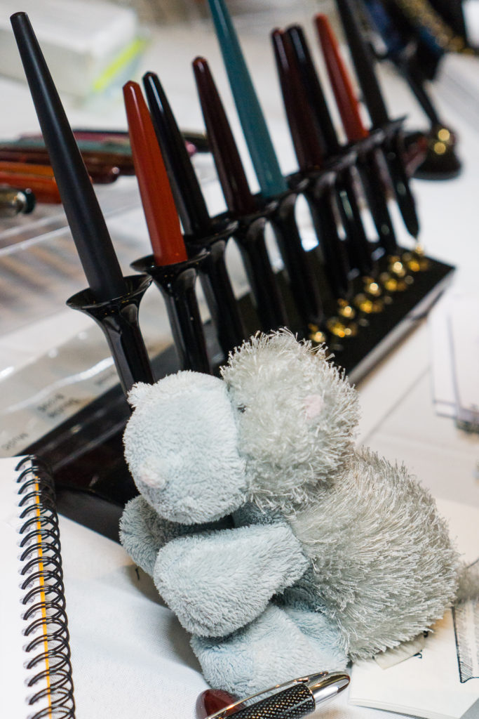
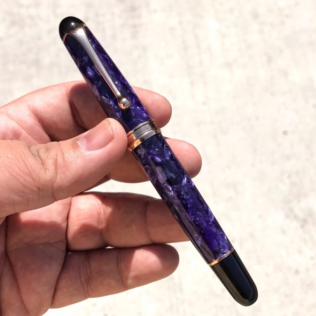
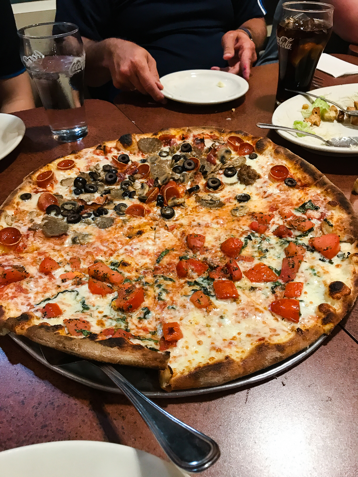
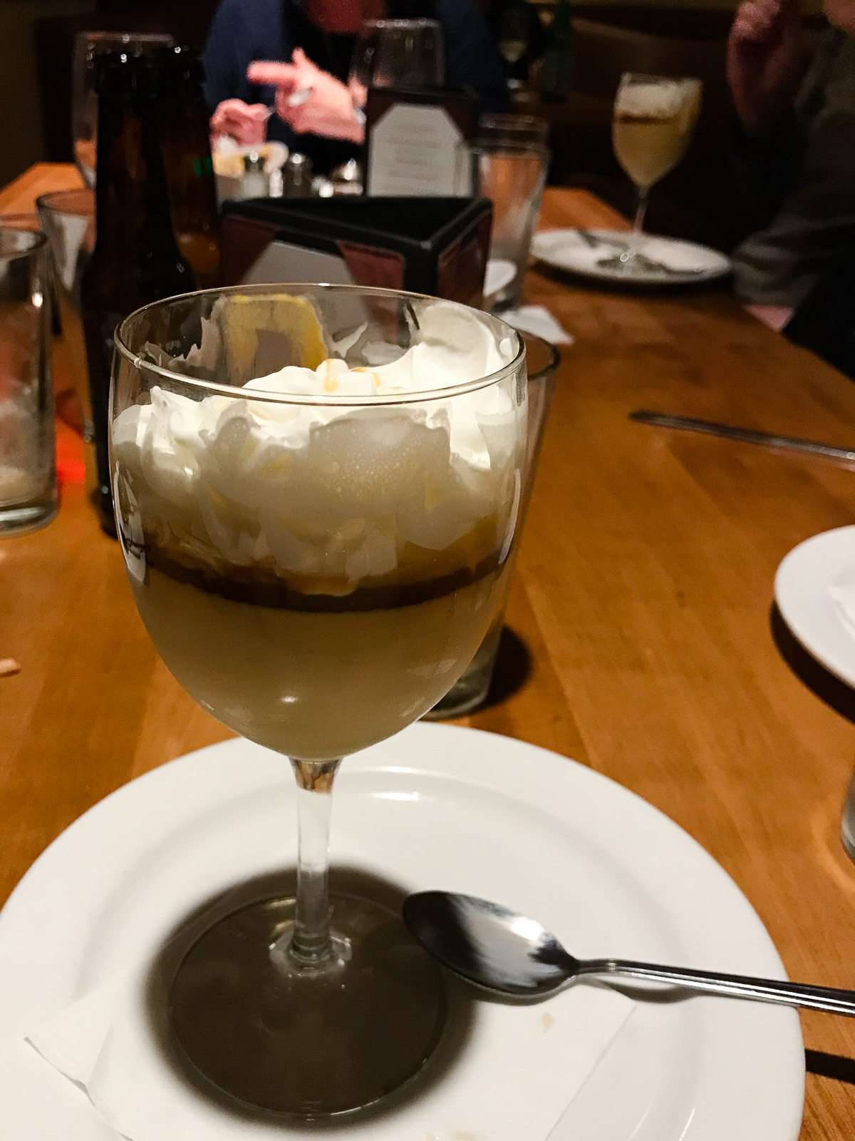
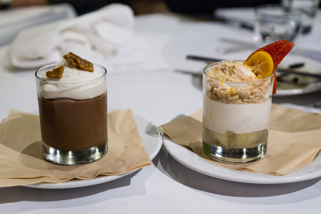
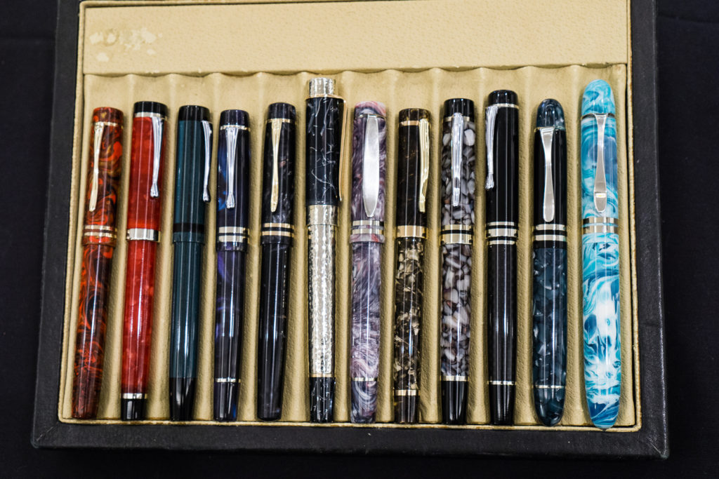
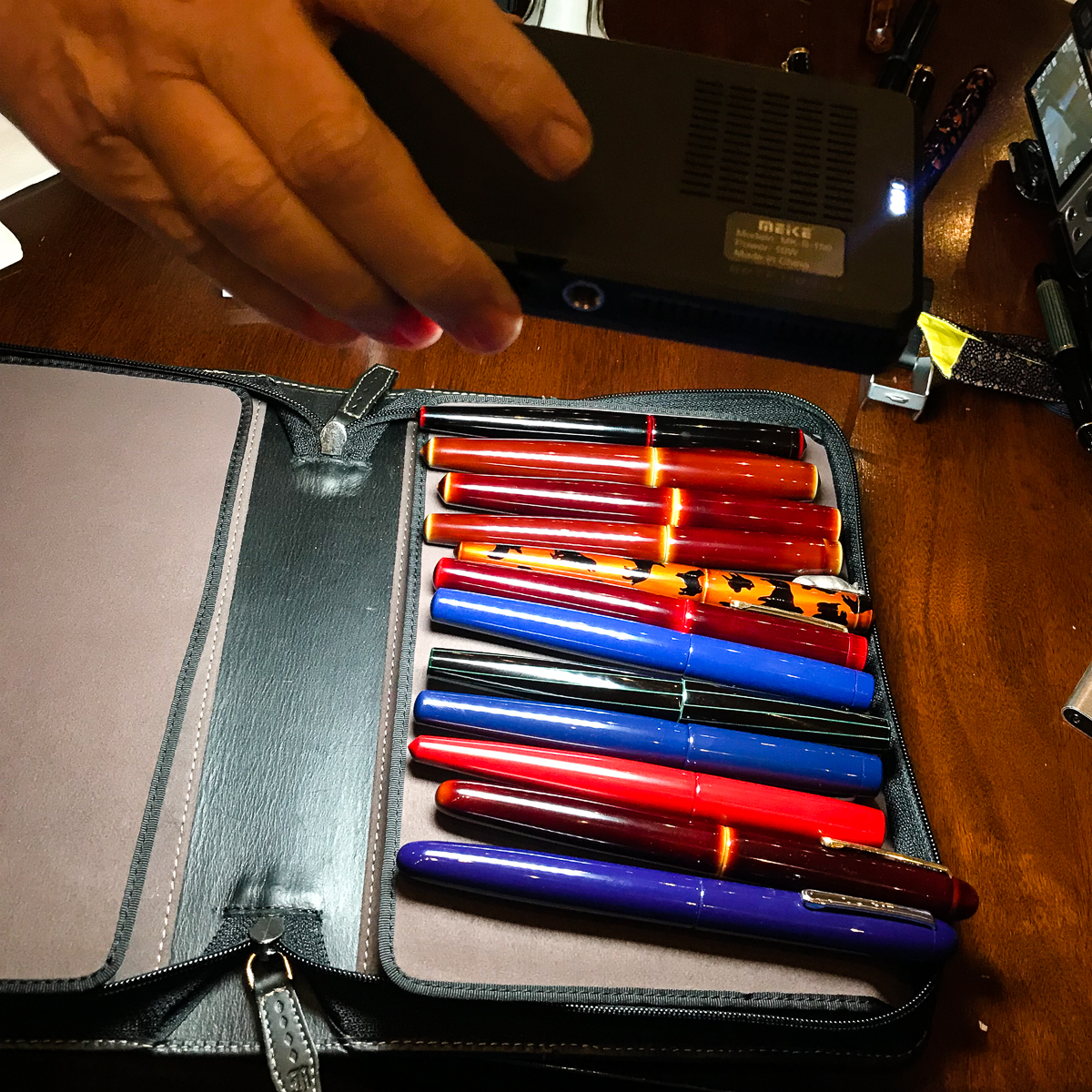
Walking around, I found a “few” pens that want to be bought! But since it was the first day and the first hour I was at the show, I decided to just take it easy and mull it over until the next day. Basically, if the pen isn’t sold yet then it’s mine. So I didn’t buy anything for myself for Thursday. We left the hotel for dinner with Pen Posse peeps as well as pen dealers from Italy, and Japan. We had great food from Sammy’s Woodfired Pizza and Grill. We shared tapas, and pizzas but what we really went there for was the dessert. Salted Caramel Pudding. ‘Nuff said. =)

Salted Caramel Pudding

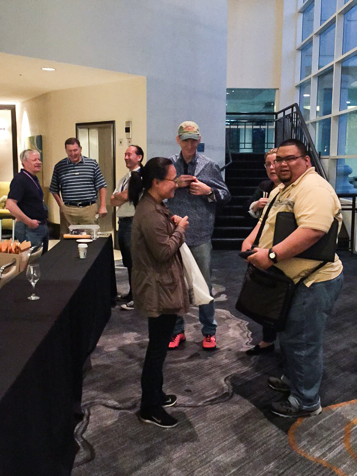
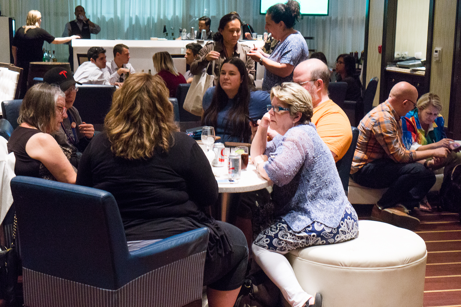
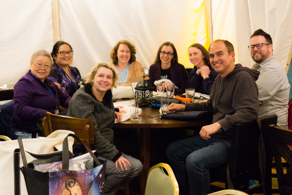
Back at the hotel, we all congregated to the hotel’s outdoor bar aptly called, “The Tent”. This is the time where pen people sit, relax, talk, and show off their pens.

At the bar: A Pilot Hira Maki-e pen in Ume pattern in the foreground while being photobombed by Kimberly.
At the bar: An Aurora Optima 365 Azzurra pen. Playing with pens is sweet especially when you have dessert on hand.

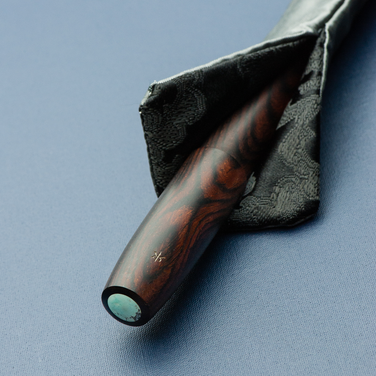
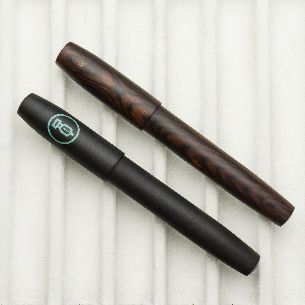
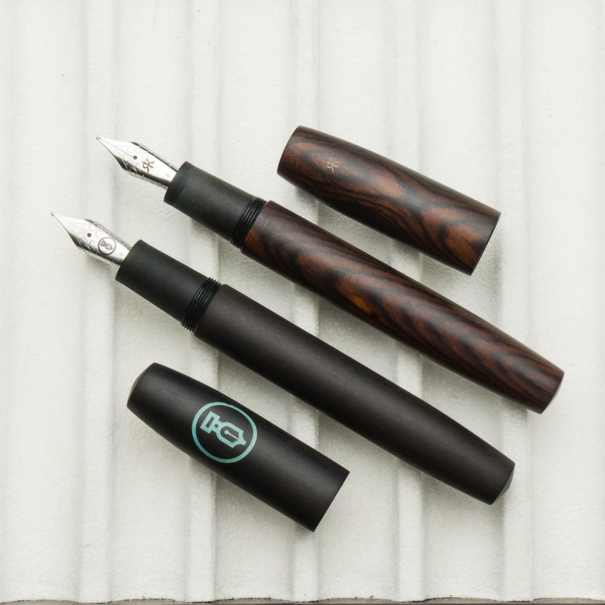
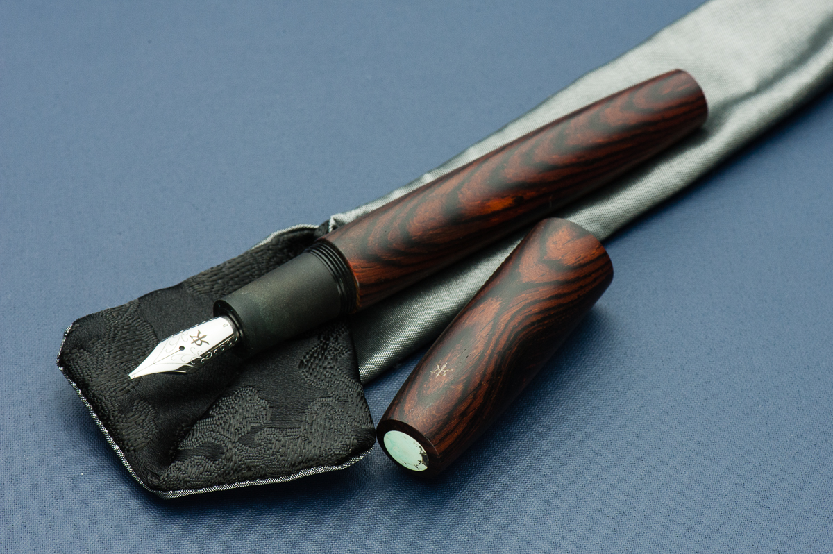
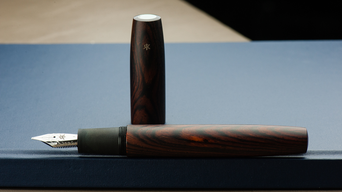
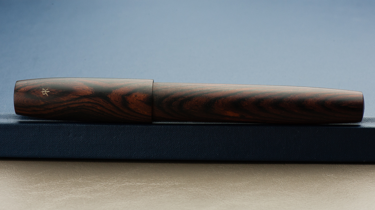
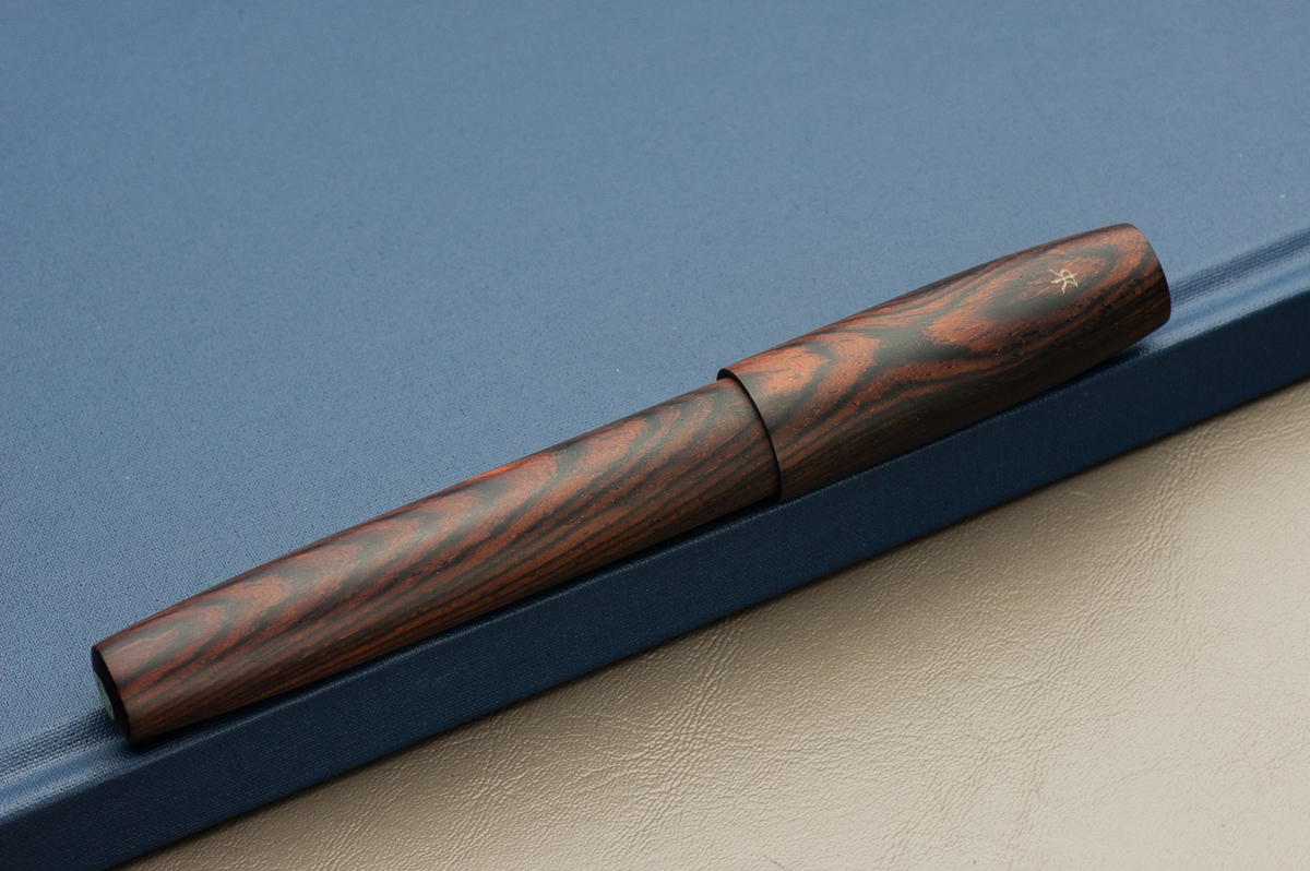
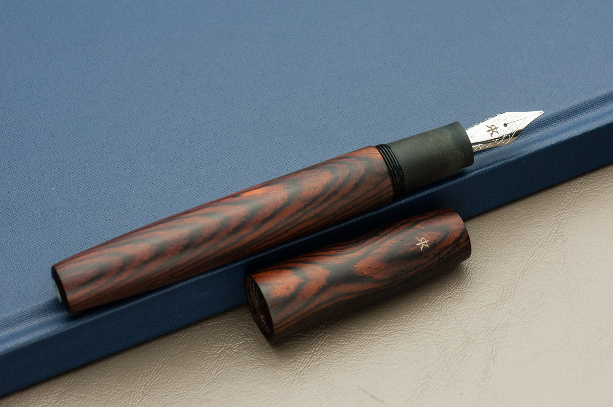
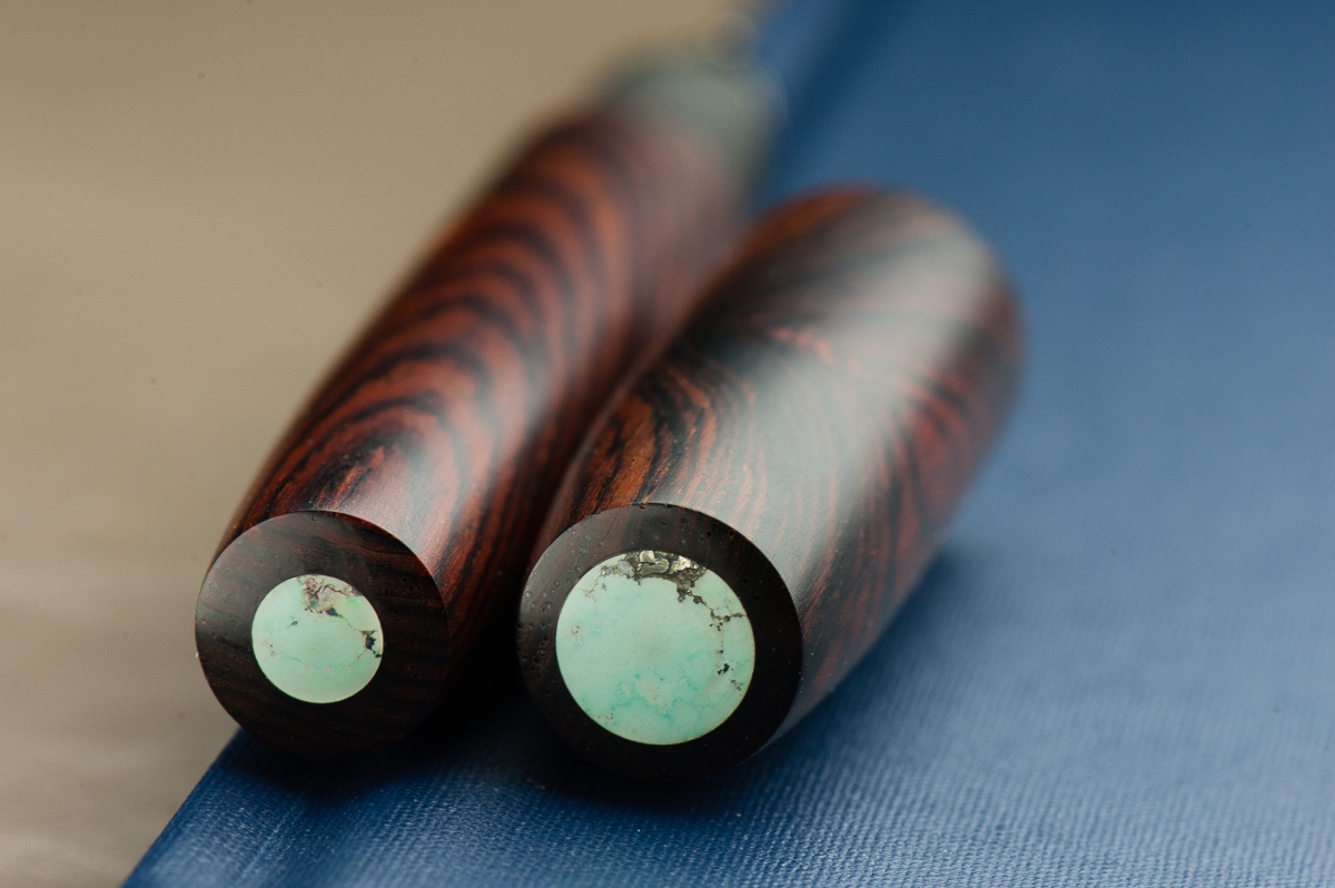
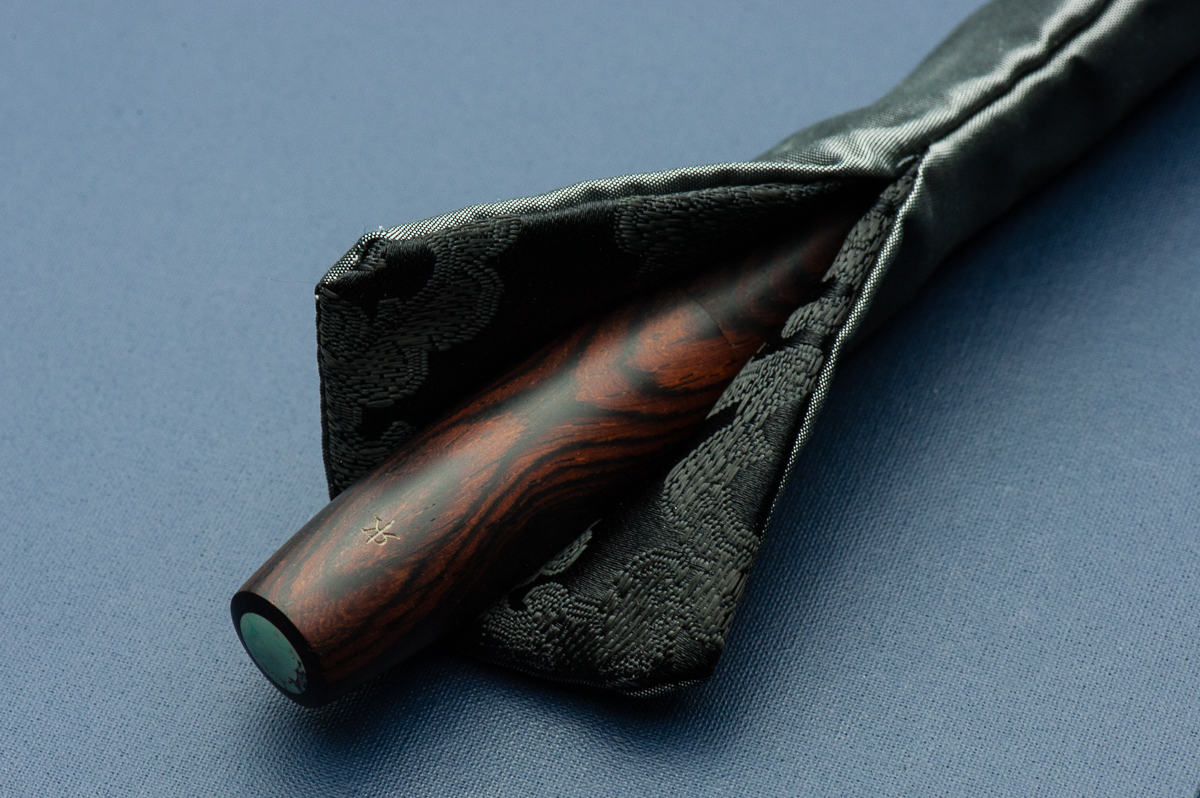
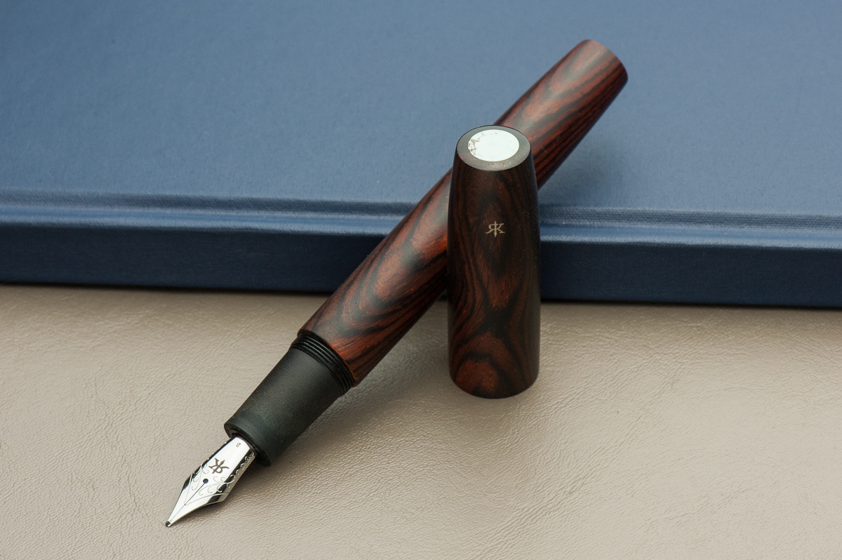
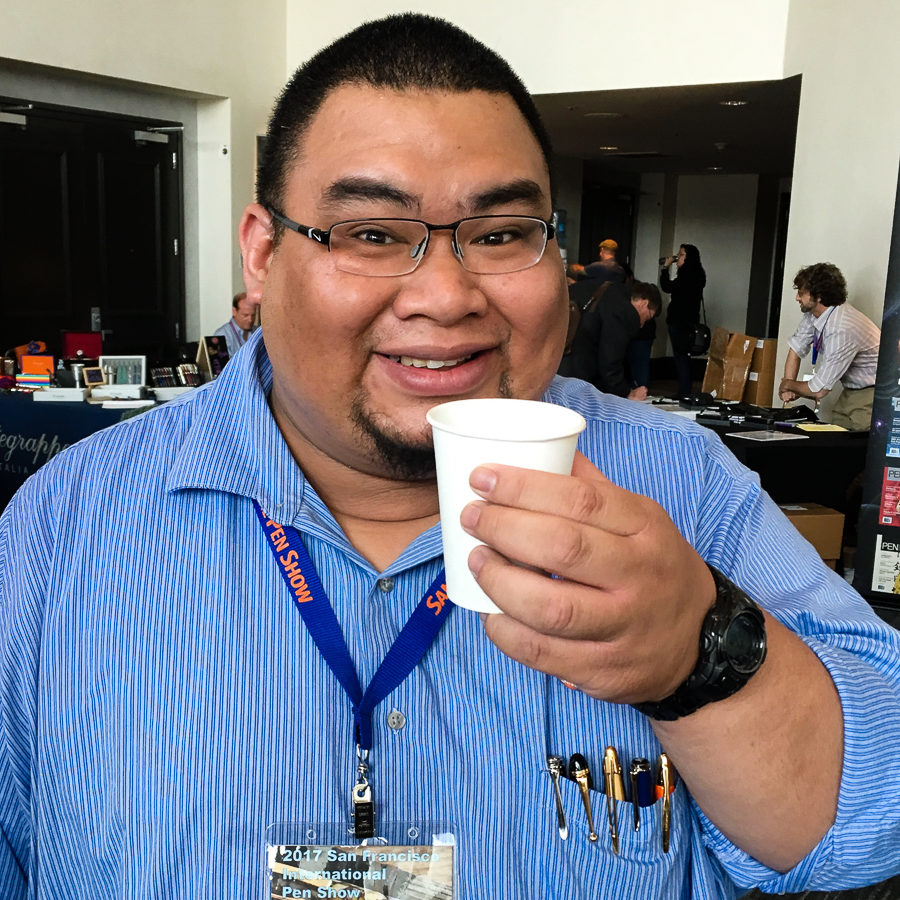
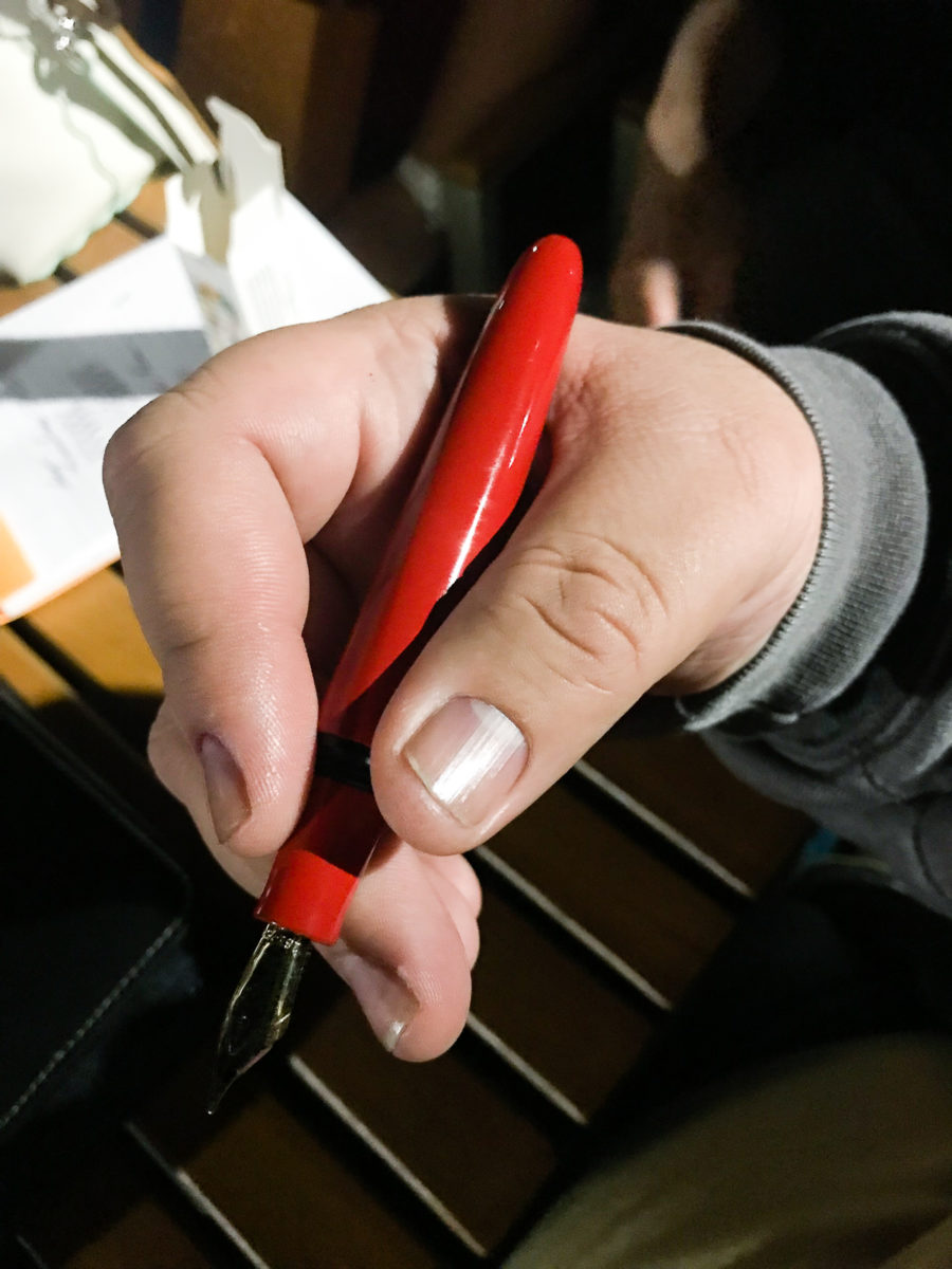
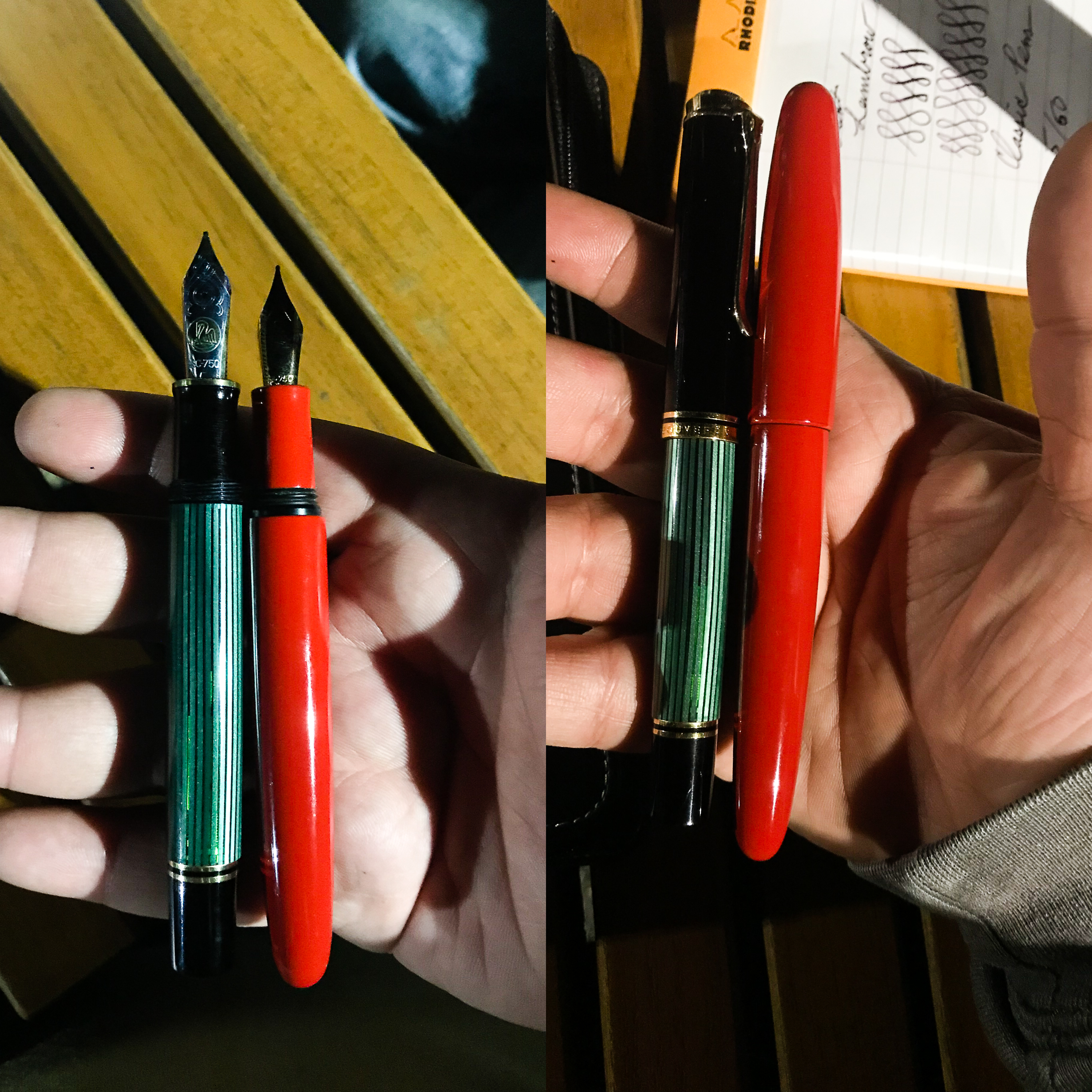
One of the pen bloggers (code name: Pink Hair) arrived at The Tent and generously let everyone try out the new Wancher Dream Pen. I must say that it is a substantial pen that filled my paws well. I then did a quick comparison in size with a Pelikan M1000. Thank you Agent Pink Hair!

At the bar: Wancher Dream Pen capped
At the bar: Wancher Dream Pen unposted
Side-by-side: Pelikan M1000 and Wancher Dream Pen


Friday, August 16, 2018

Good morning Los Angeles! It’s a beautiful day for a pen show! I woke up early-ish and got ready for the day. I went down around 8:30am and found that the show was already ongoing. Paid for my Trader Pass and I was on my way. Walked around and visited to say hello to friends (vendors and attendees).

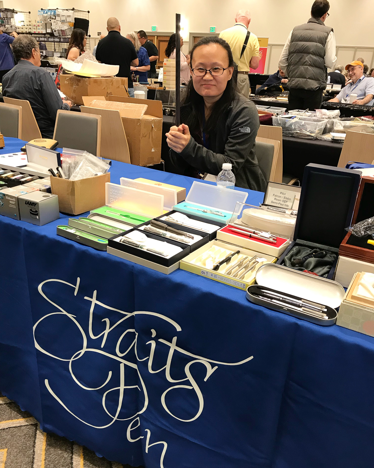
I found the Straits Pen table with some Pelikan pens as well their table’s security detail.

Pelikan M400, M600, and M800
Pelikan M101 Originals of their Time 1935 in Lapis Blue
Pen Posse Yuan armed with an ebonite rod for those people with sticky fingers!

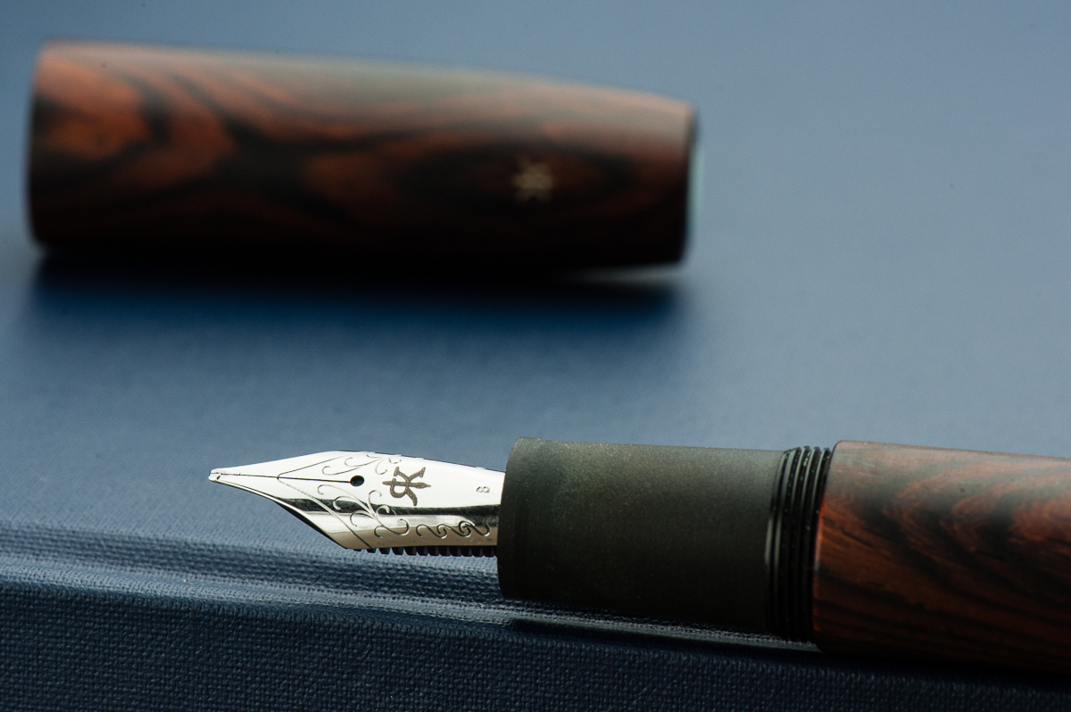
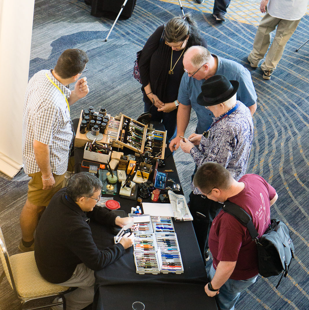
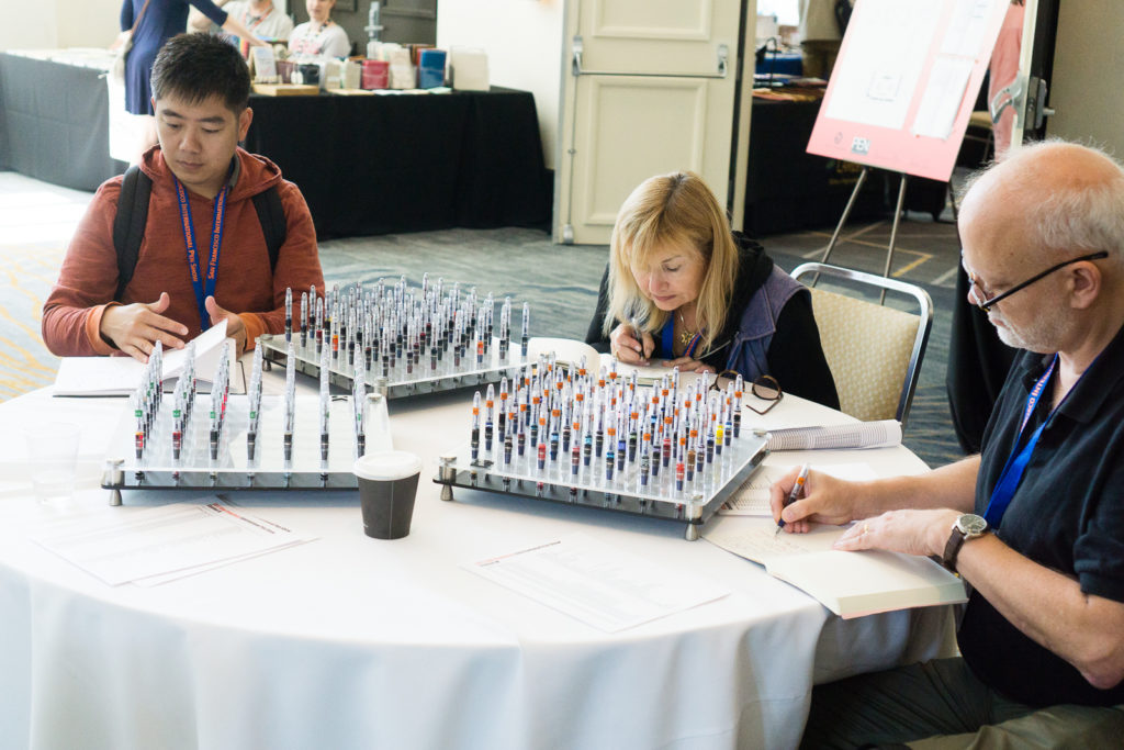
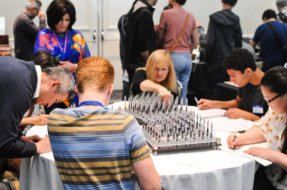
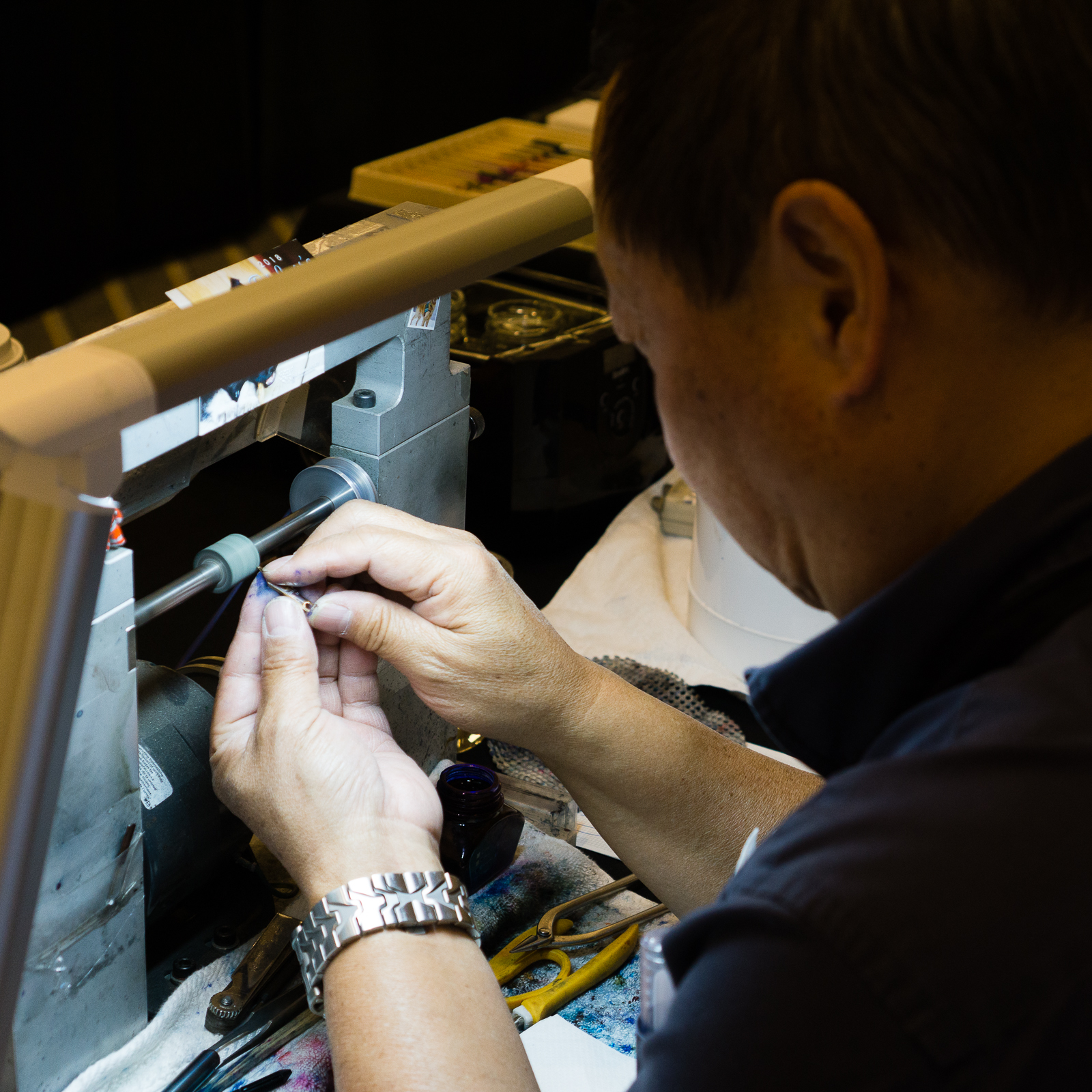
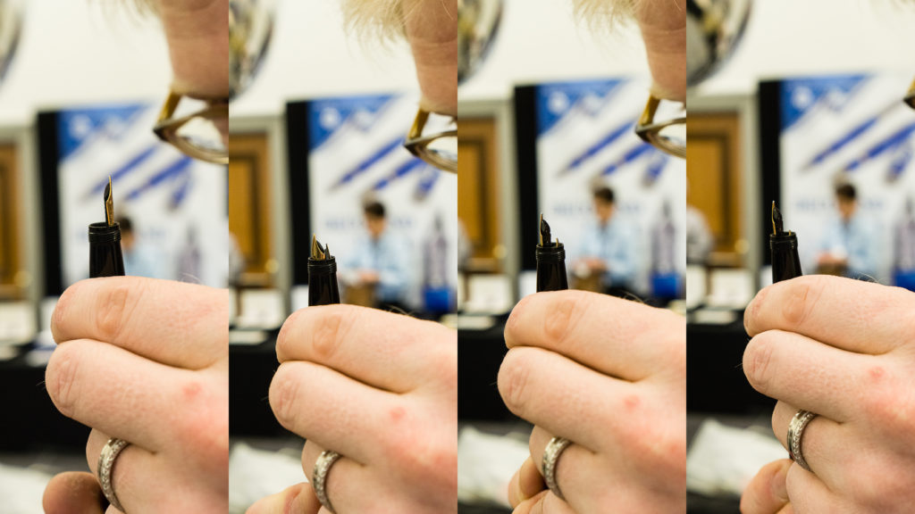
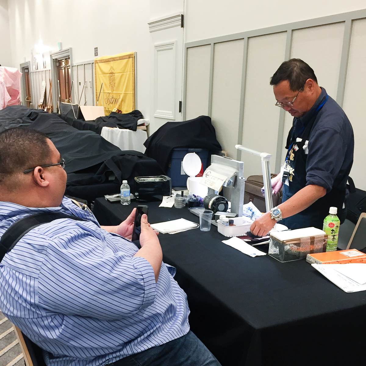
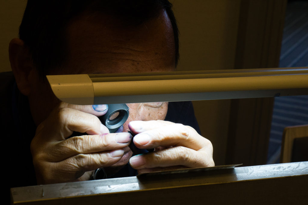
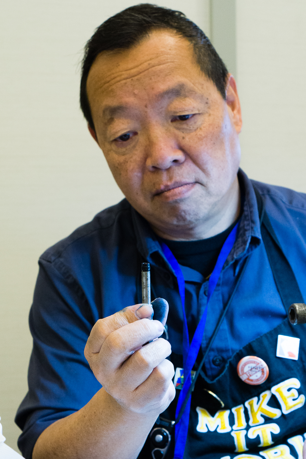
Walked around more and saw the Professional Nib Expert, Mike Masuyama at his table working early. I signed up to get some nibwork done as well. Because of how late I signed up (9:00am), I wasn’t sure if I’ll make the cut for the end of the day. That’s how in demand this gentleman is.

Mike Masuyama’s first customer was ready and raring to get her nibs ground!
Mike Masuyama’s work station wherein he pretty much sits behind the whole pen show. This is THE place where he wields his magic and skills to make you happy to write with your pens.
Masuyamasan grinding a nib to a cursive italic

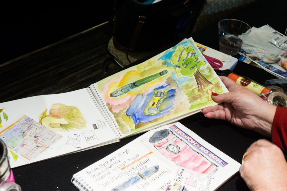
Since Friday morning wasn’t too busy yet, I got the chance to do a Live Instagram video and got to show some of the pen show’s light action on Friday morning. I then uploaded to YouTube for others to watch. I was reading and answering live comments (that you don’t see anymore) so pardon my incoherency at times. Enjoy!


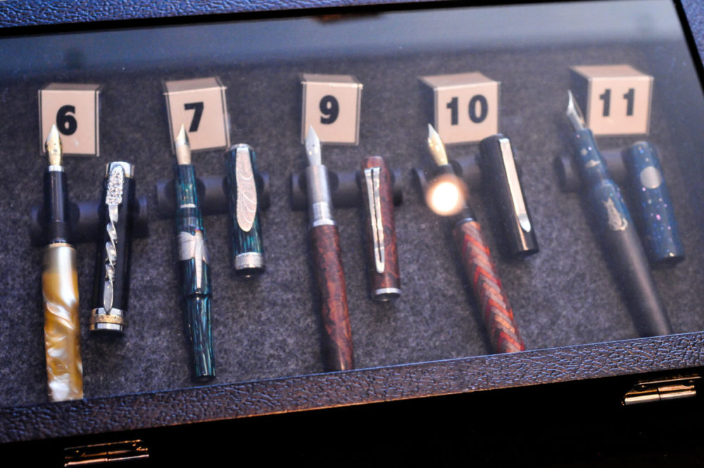
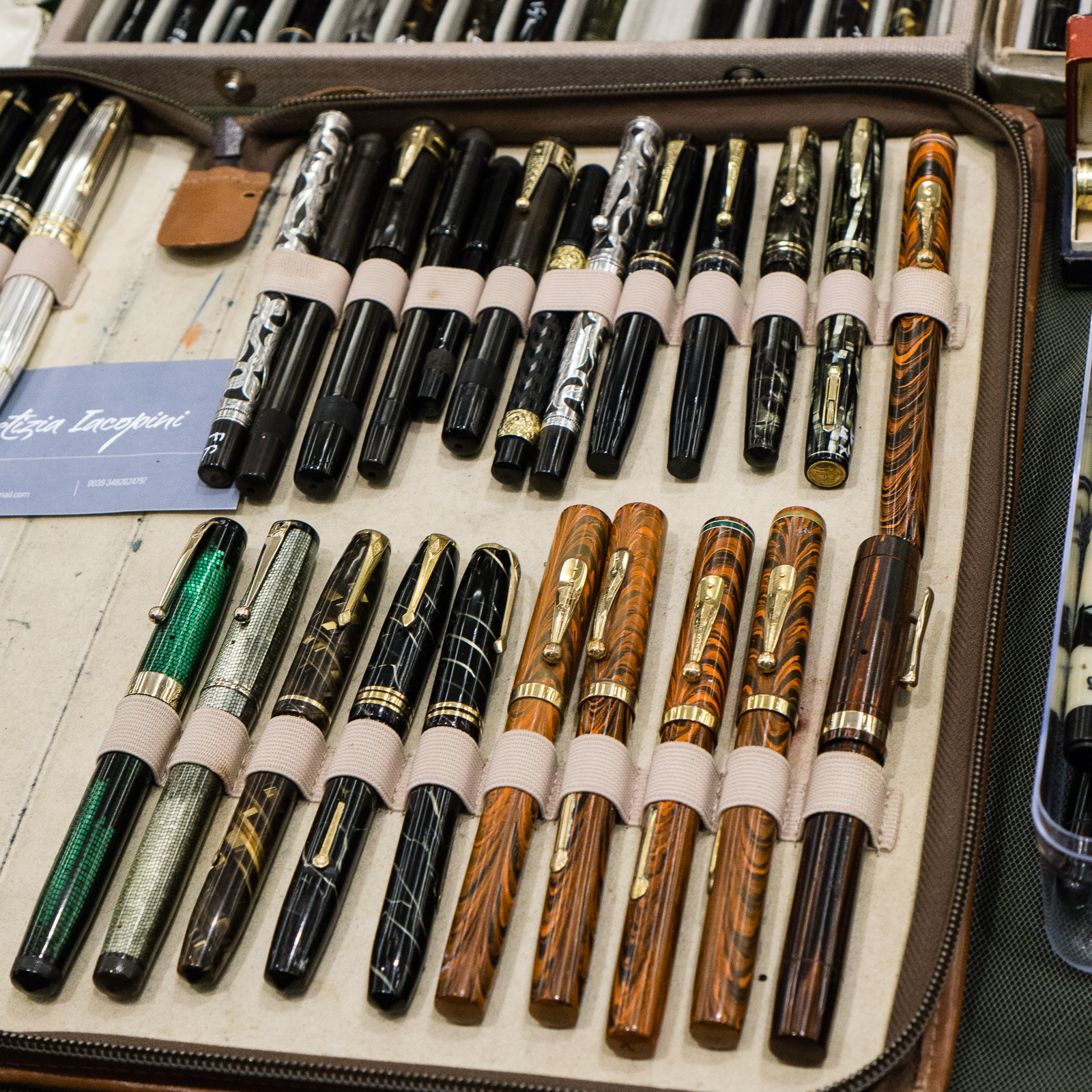
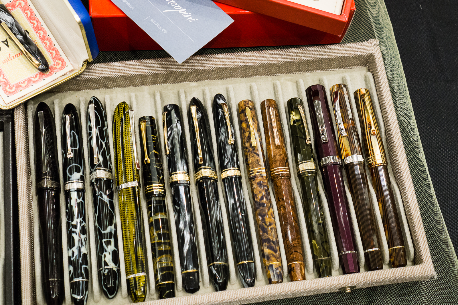
One of the pen dealers who I just met this year at the show was Letizia Iacopini from Italy. I have always heard of her name in the community and how she is an expert of Italian and other pens.  She is also an author of several fountain pen books. Her most recent book was, “Parker in Italia: 1900-1960”. Her table at the show had exquisite pens from the vintage and modern era. Majority of her pens were Italian.

Vintage Omas pens

Modern Omas pens
Own a Ferrari? Why not get a Ferrari Omas pen as well?
One of my favorites in Letizia’s table. A Parker 45 with Italian solid 18k gold basket weave overlay. I mean, WOW.

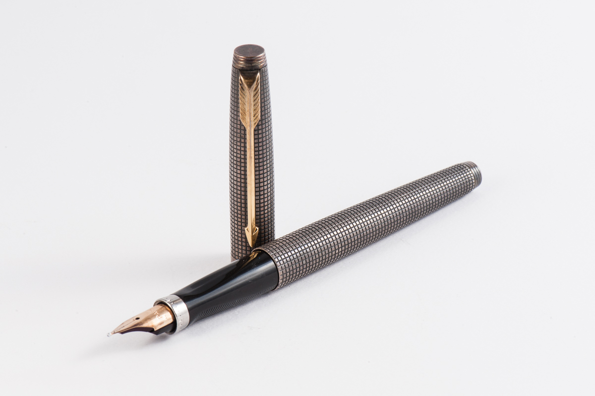
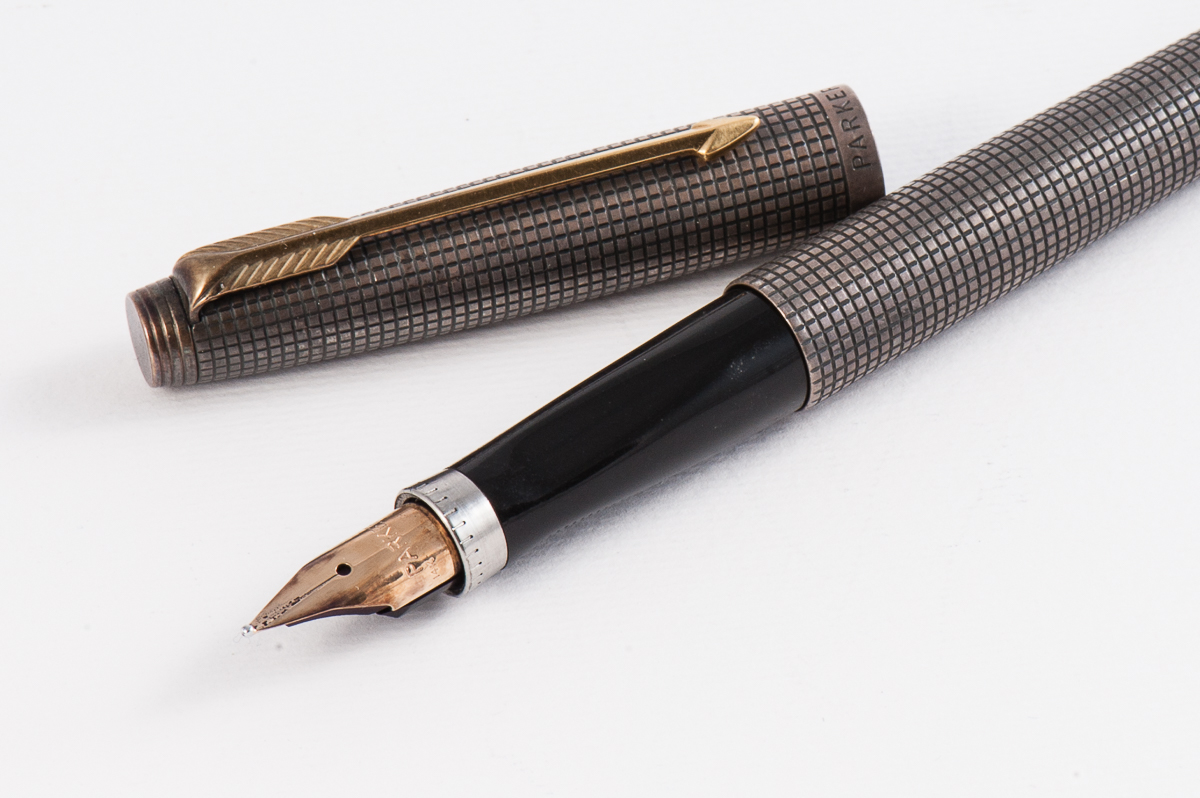
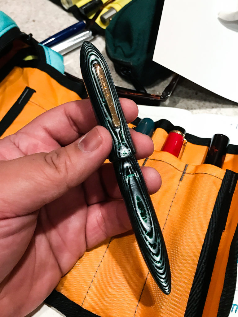
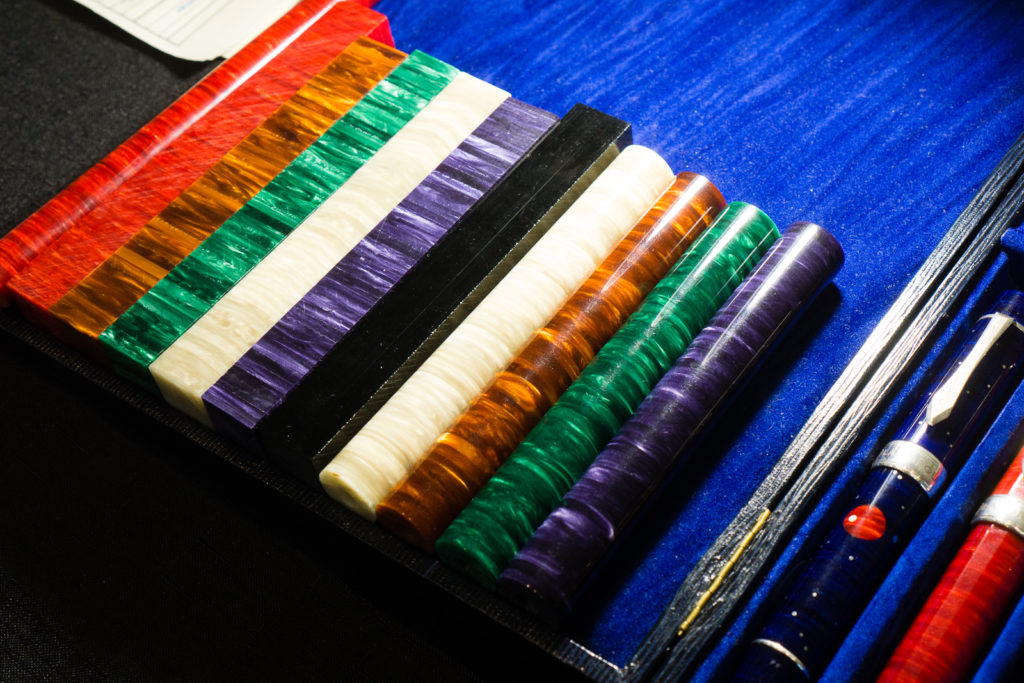
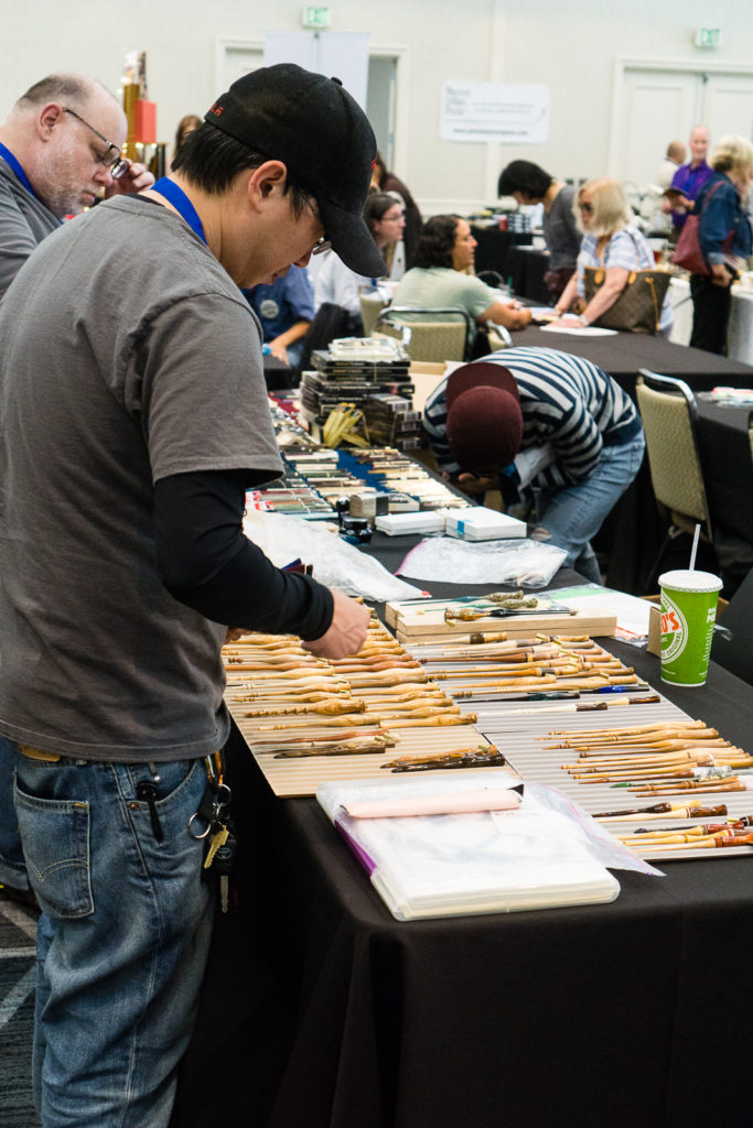
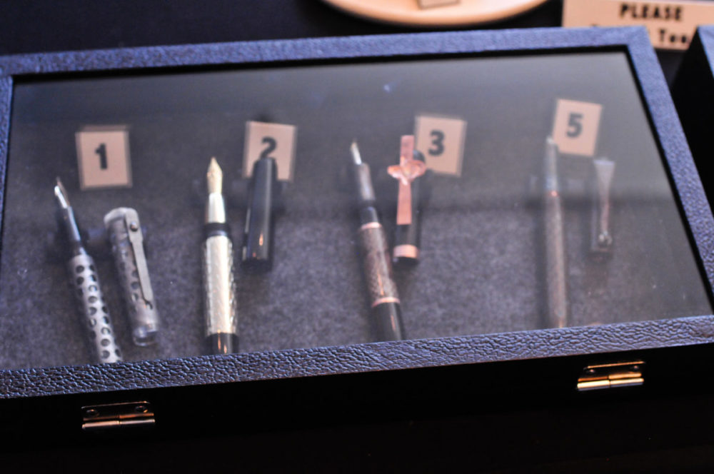
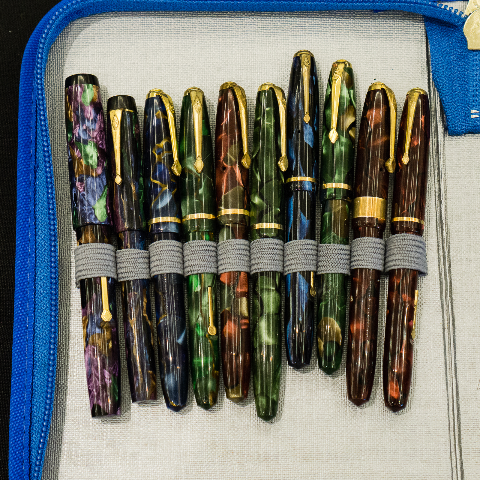
Then I turn around and walk 3 steps towards the table of Dayne Nix. He always brings in great vintage pens from different regions. As a side note, I met Dayne at the 2012 SF Pen Show and it was from him that I bought my first flex pen, a Parker Televisor and I still have it. Anyway, Dayne’s table display is fascinating especially his array of Conway Stewart Dinkie pens as well as his  demonstration of how a rare Zerollo Dunhill Two Pen worked.

Conway Stewart Dinkie, part 1
Conway Stewart Dinkie, part 2
Conway Stewart Dinkie, part 3
I placed a Pelikan 400 to contrast against the size of these Conway Stewart Dinkie pens

Perhaps one of the most curious pens I’ve seen from Dayne is this Zerollo/Dunhill Two Pen from the 1930s with a matchstick filler. Thank you for showing us this awesome pen Dayne! #onlyatpenshows

Brian and I were fascinated with the Zerollo/Dunhill Two Pen. I took a few action shots and these four showed the pen’s action very well.

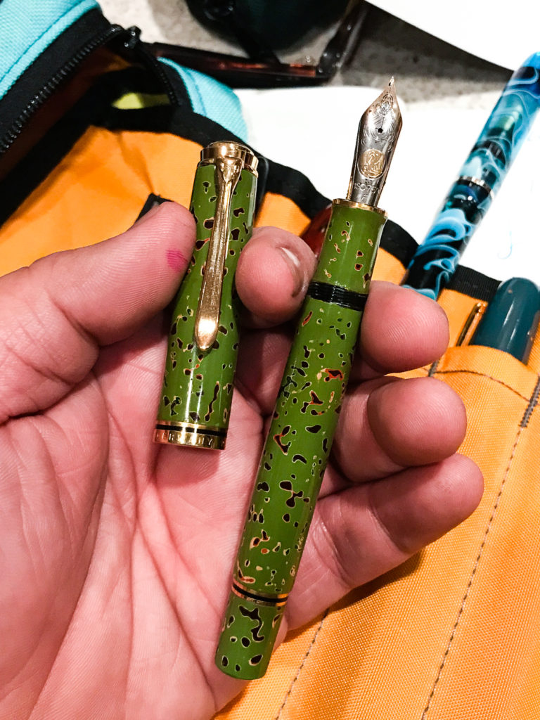
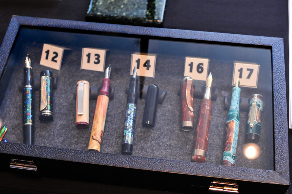
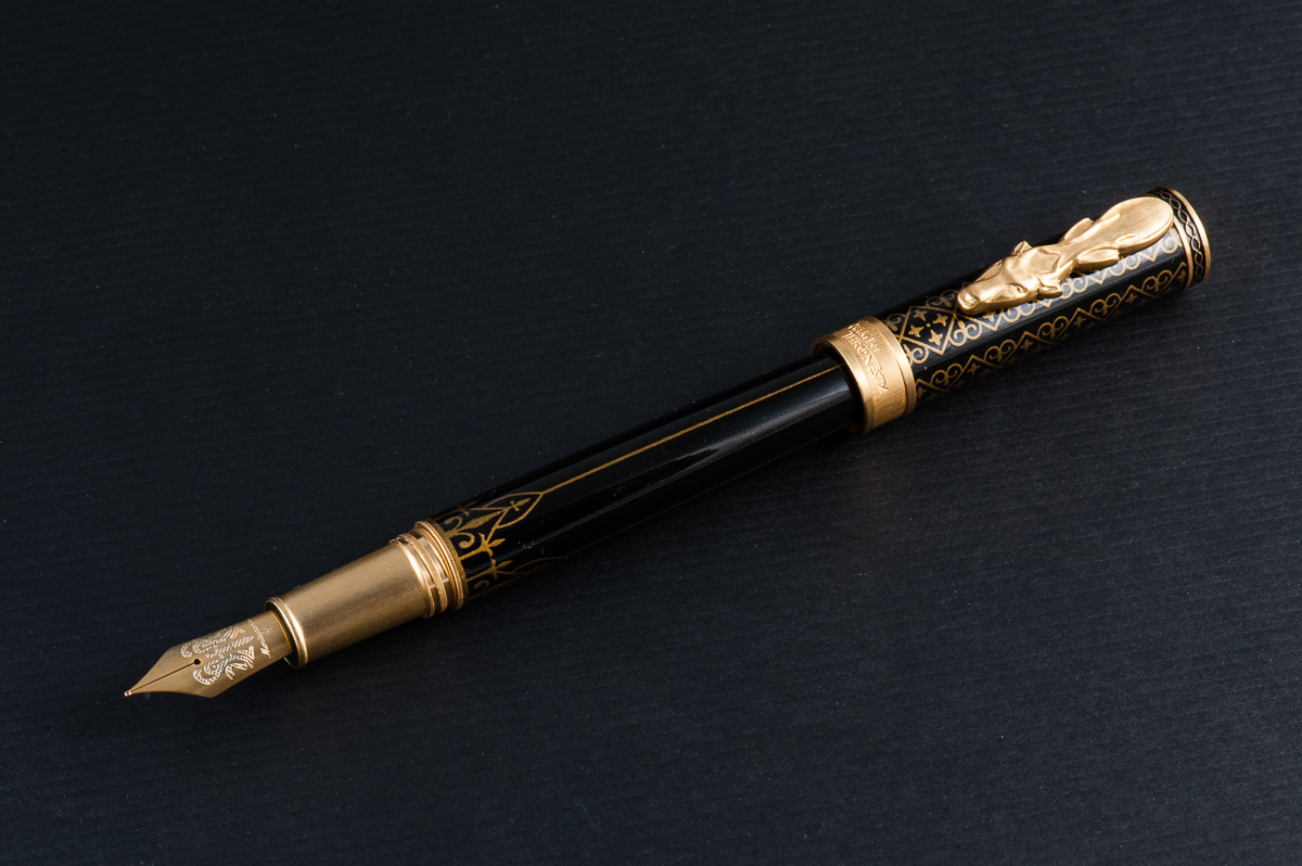
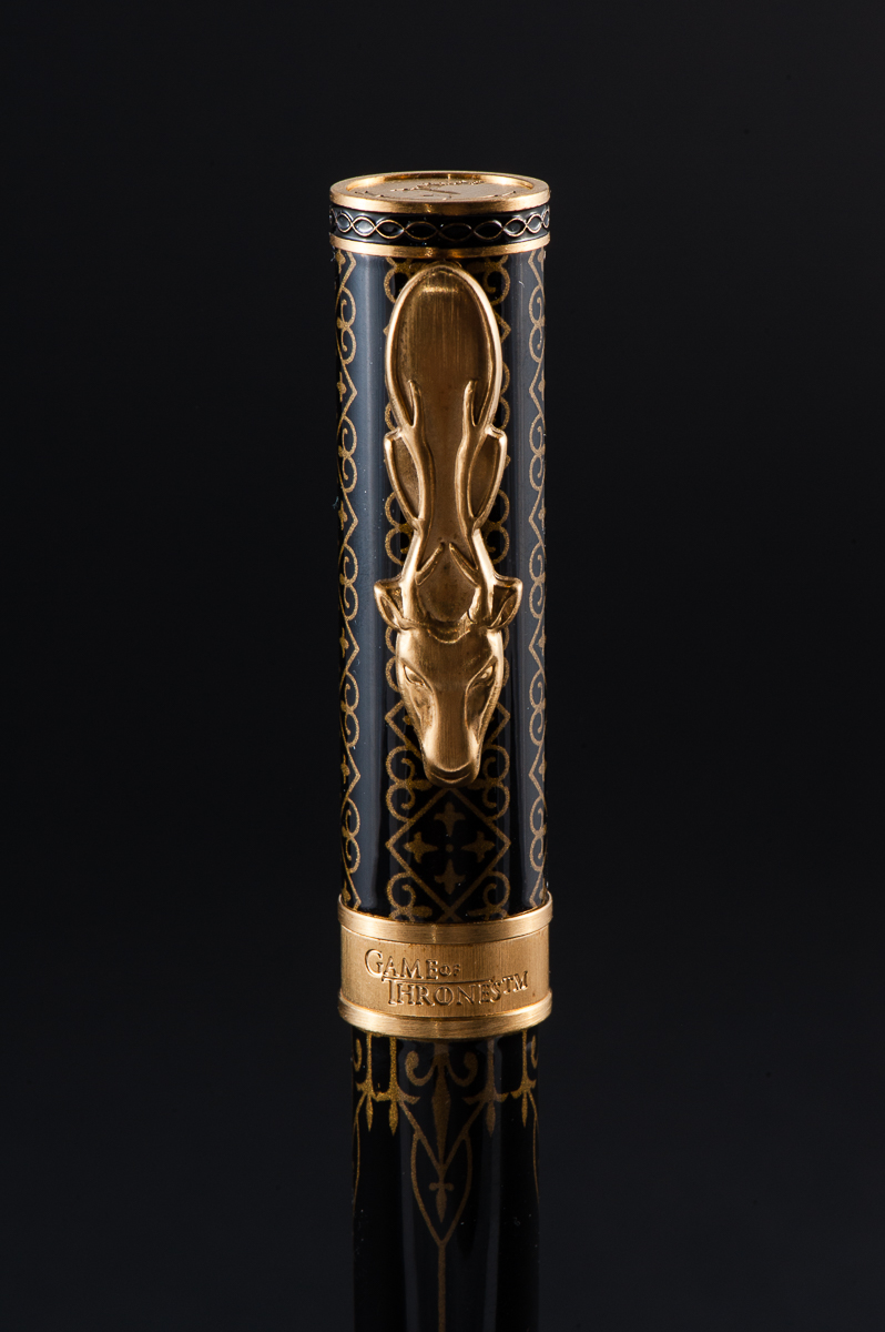
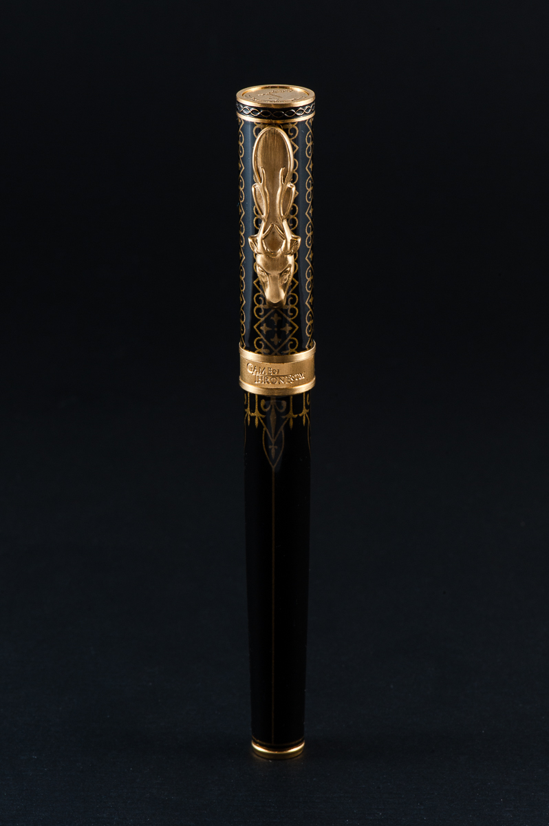
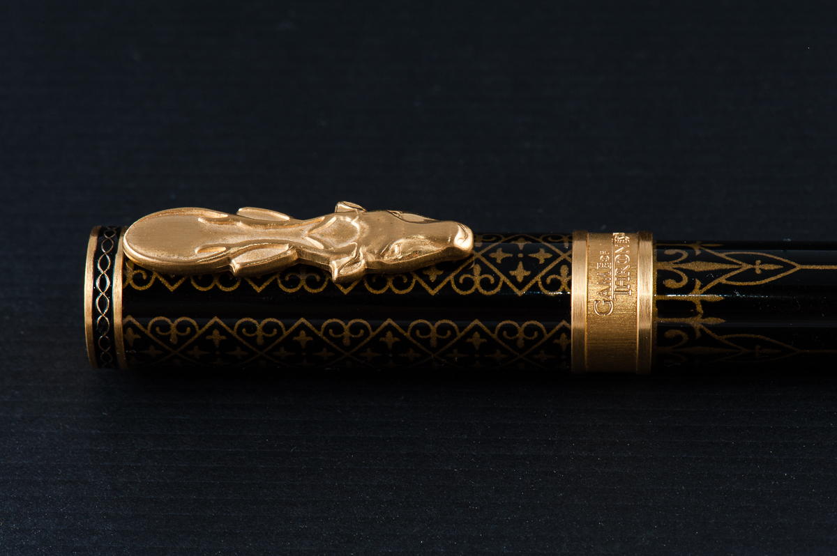
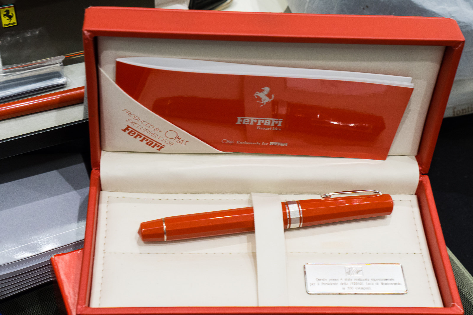
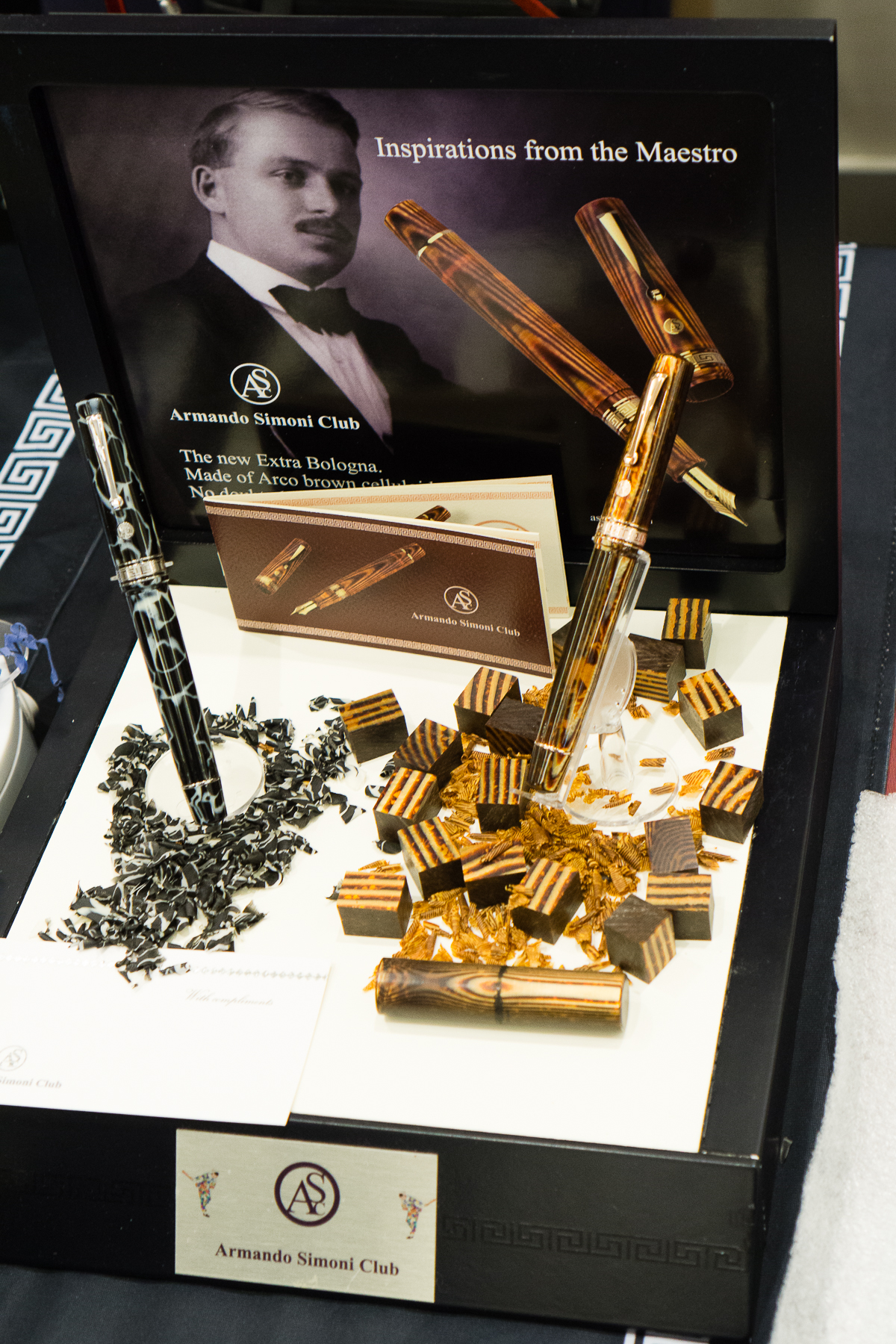
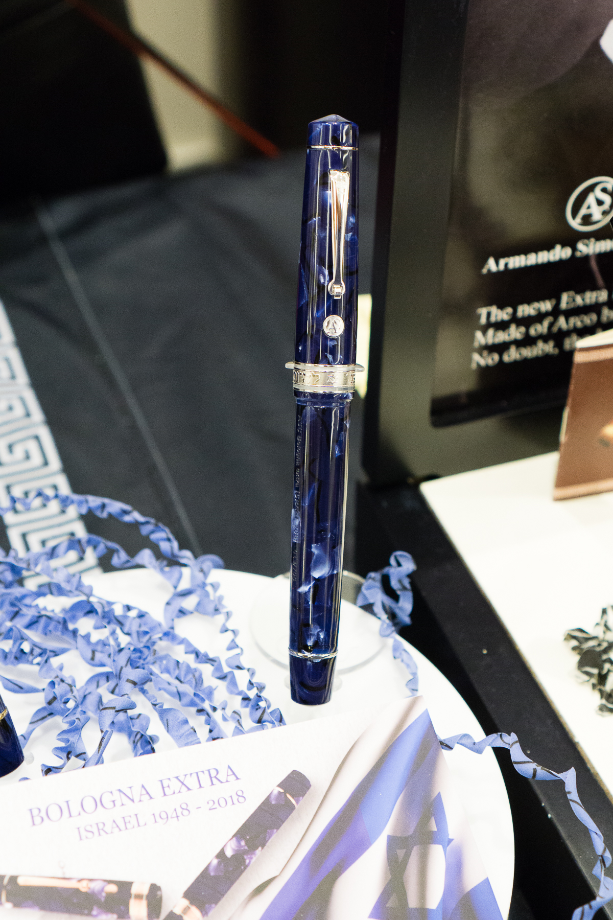
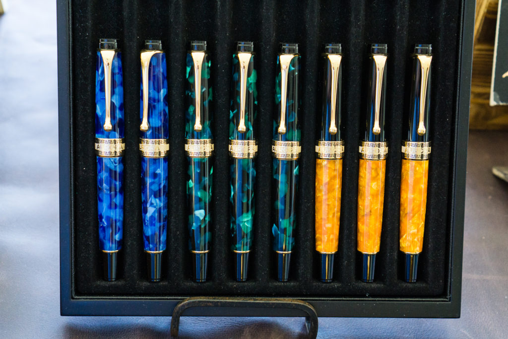
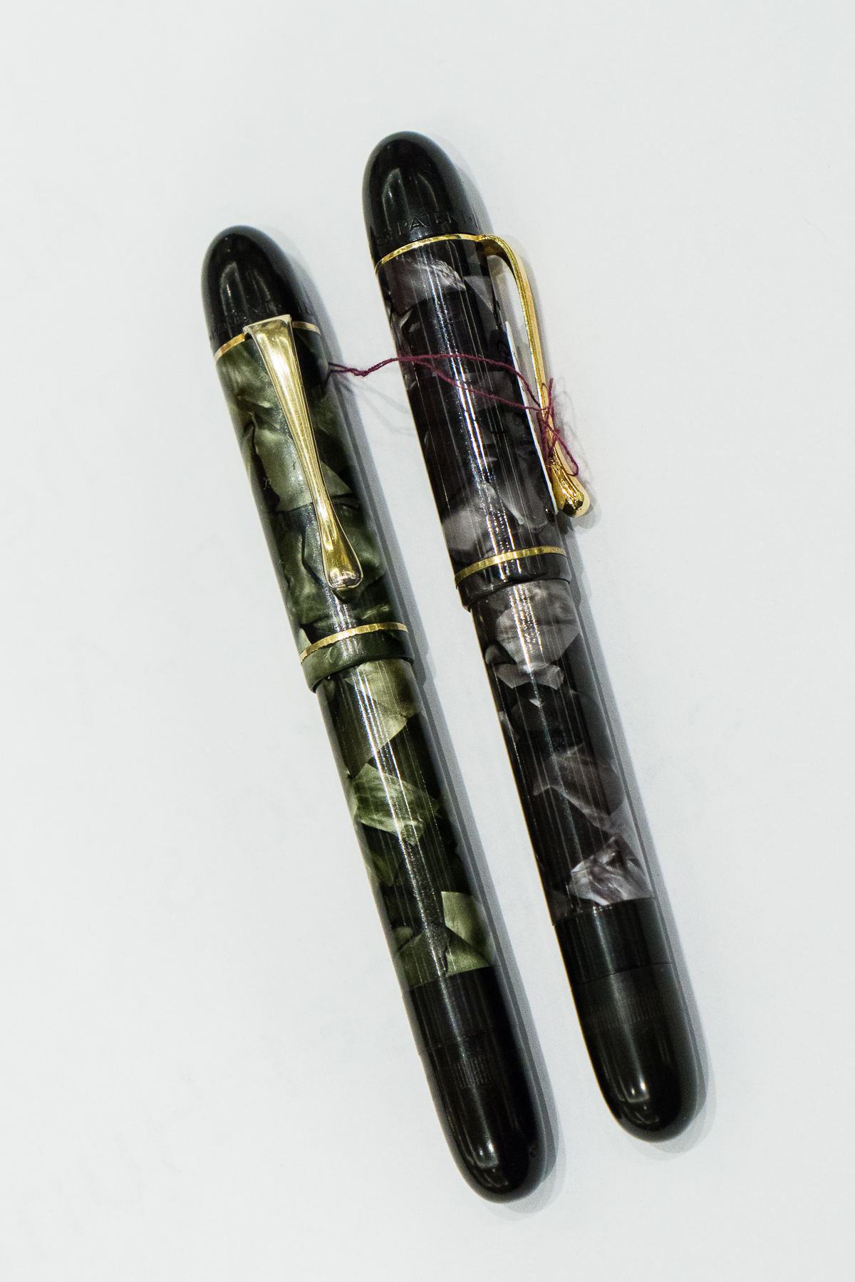
At the Armando Simoni Club (ASC) table, a couple large pens caught my eye.

ASC Bologna Wild Dark Side, and Arco Brown
ASC Bologna Extra Israel

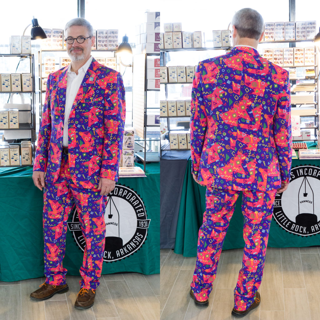
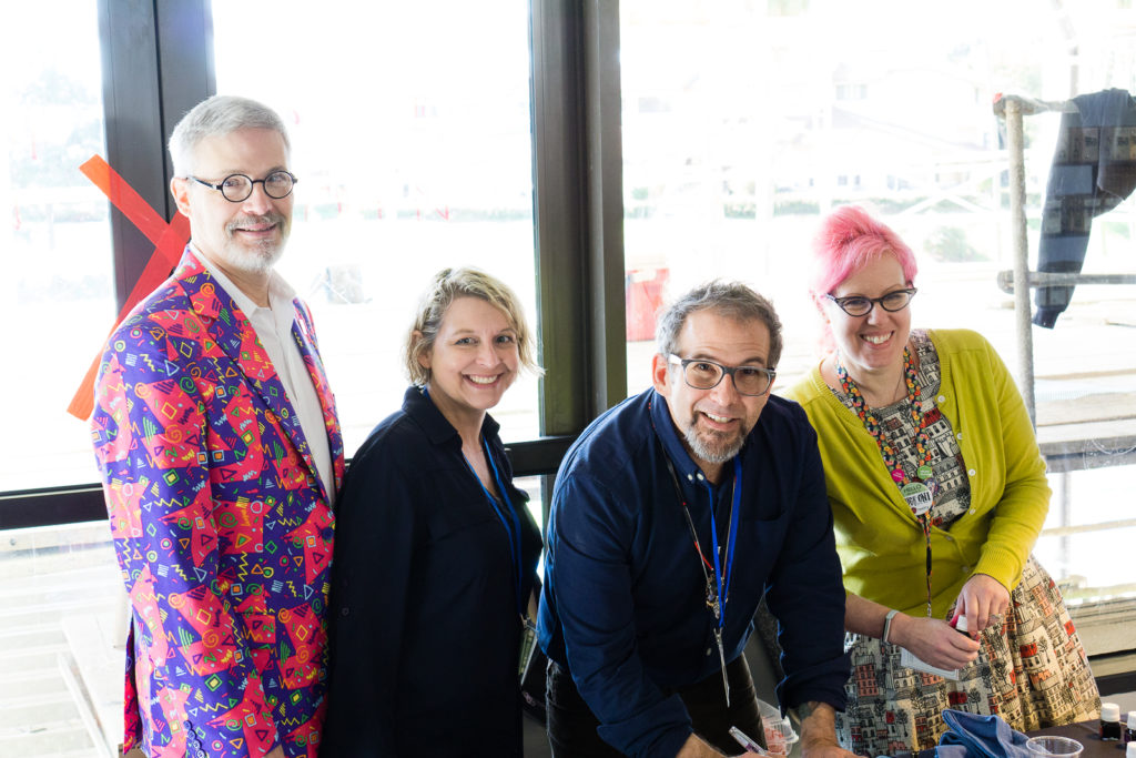
I then walked out of the ballroom to check out the Vanness Pens team in the hallway and look at who I found! Mike Vanness and his awesome suit! He always wears colorful clothing.

Mike Vanness

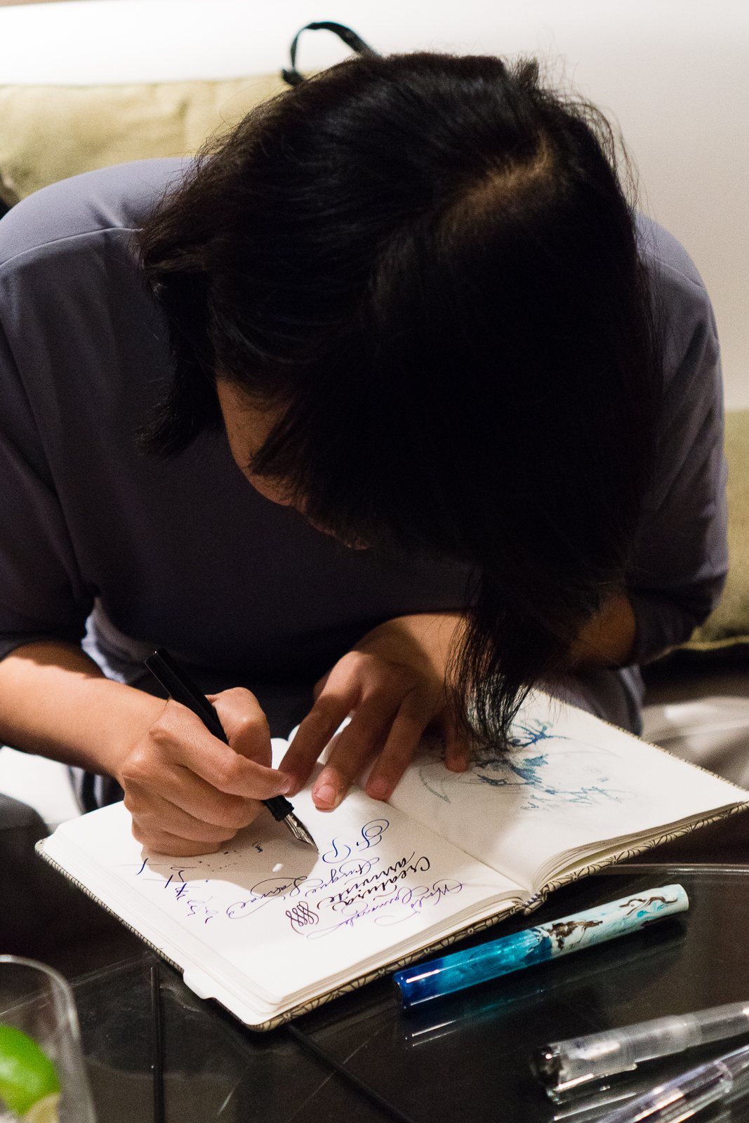
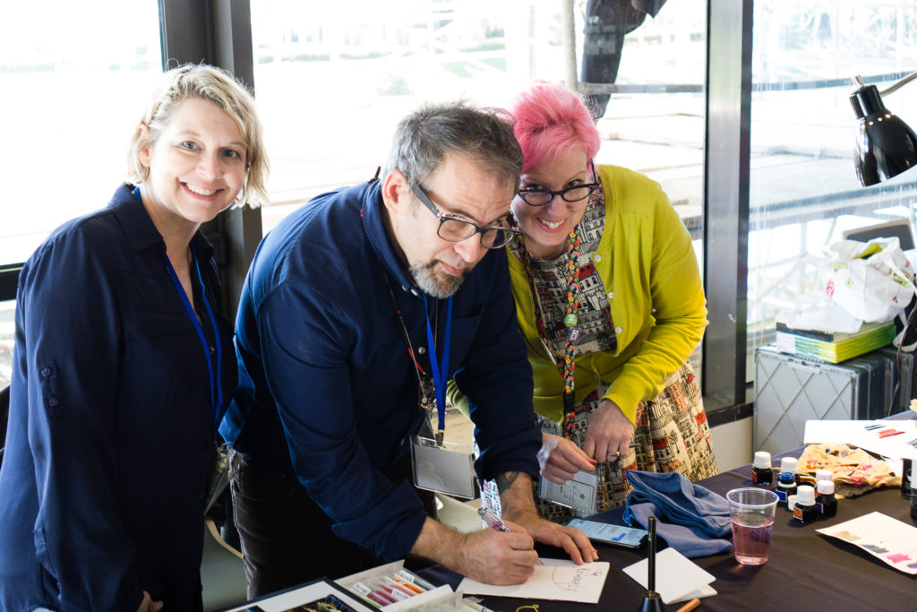
In the corner were Lisa Vanness, Joey Feldman, and Ana Reinert. Joey was creating artwork for people who bought journals at the show.

Lisa, Joey, and Ana
Mike joined in for the Vanness team photo sans Brad who was still traveling.
Vanness always brings in tons of paper, pens, and lots of ink! Akkerman, Lamy, Colorverse, etc.
Vibrant Pink Special Edition Lamy Al-Stars


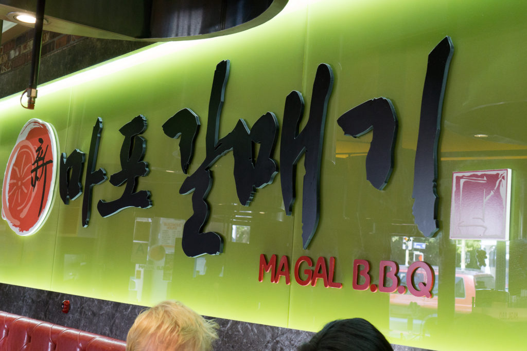
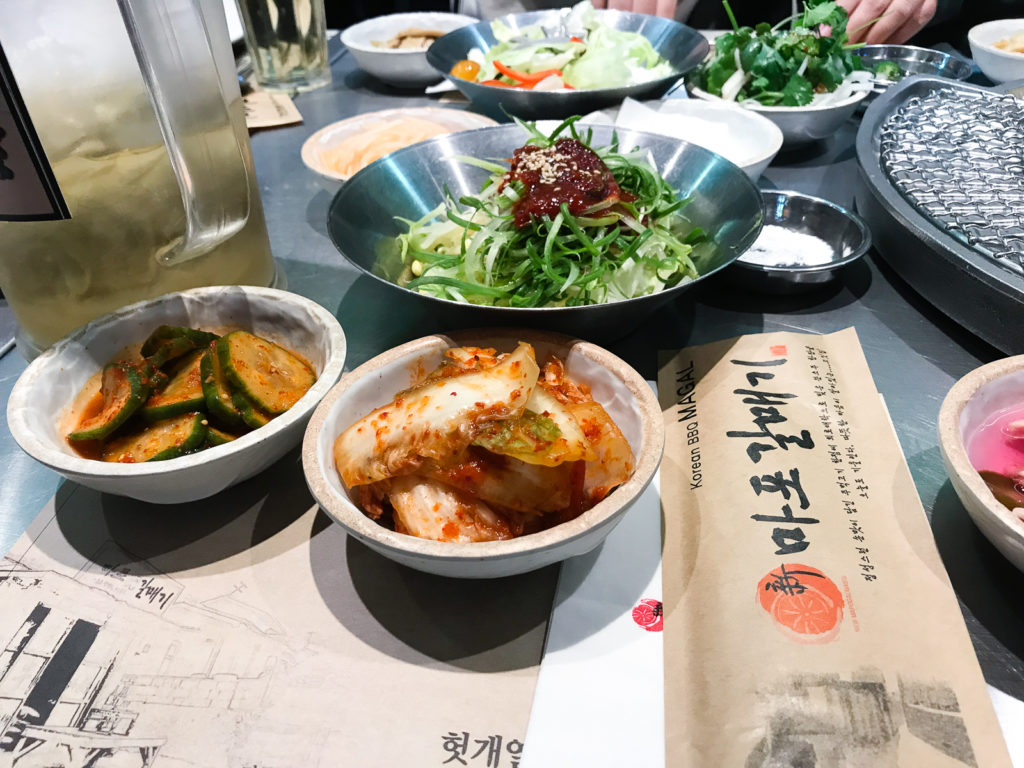
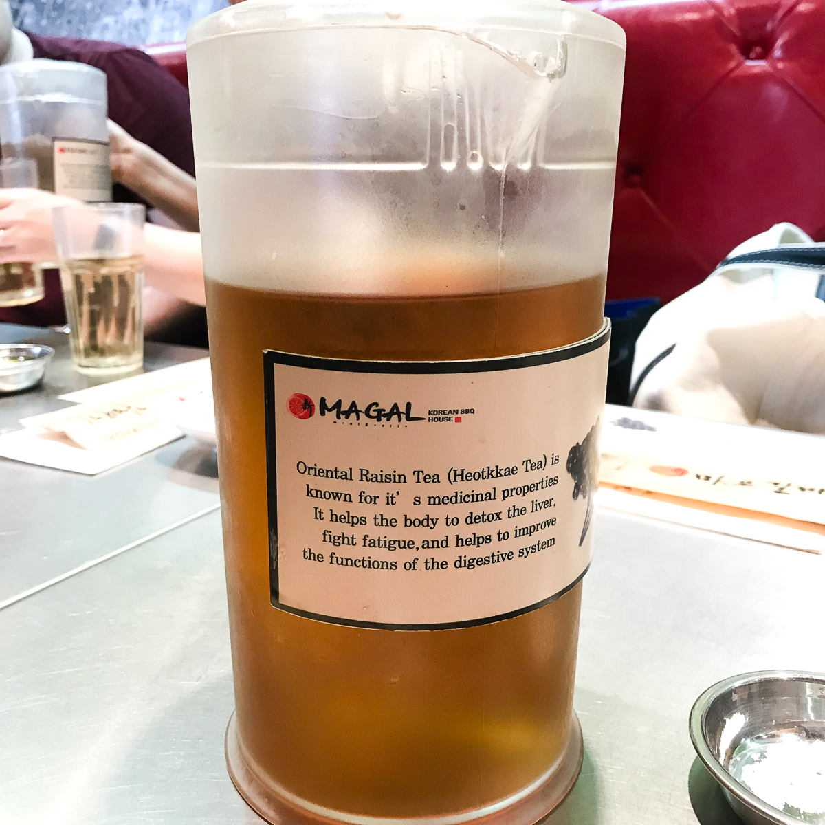
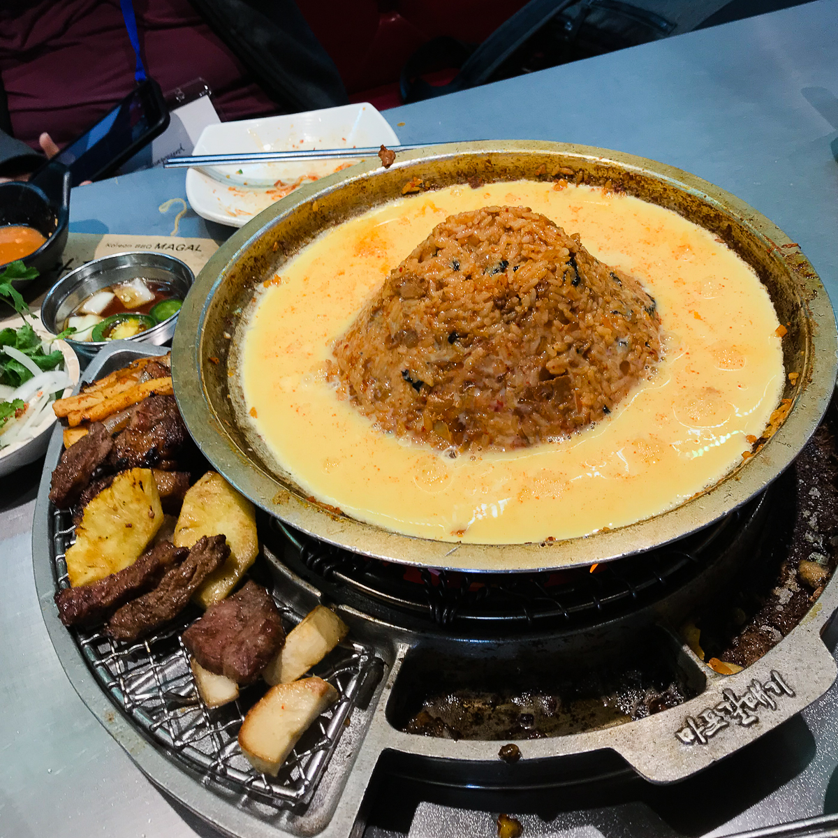
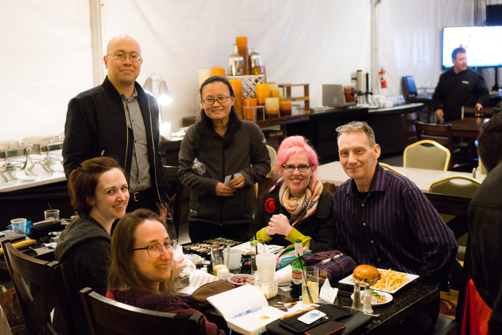
FOOD TRIP: It was almost 11:00am and a few of the pen posse peeps congregated to go out for lunch. A quick-ish drive to Korea town for Magal B.B.Q.! It’s become a tradition for us mainly because of the magic tea they serve.

Kimchi, etc.
Magic Tea
Volcano Fried Rice

After lunch, we went back to the hotel for more pen show! It was actually energizing to step out of the show for a relaxed lunch. I need to do that more often.

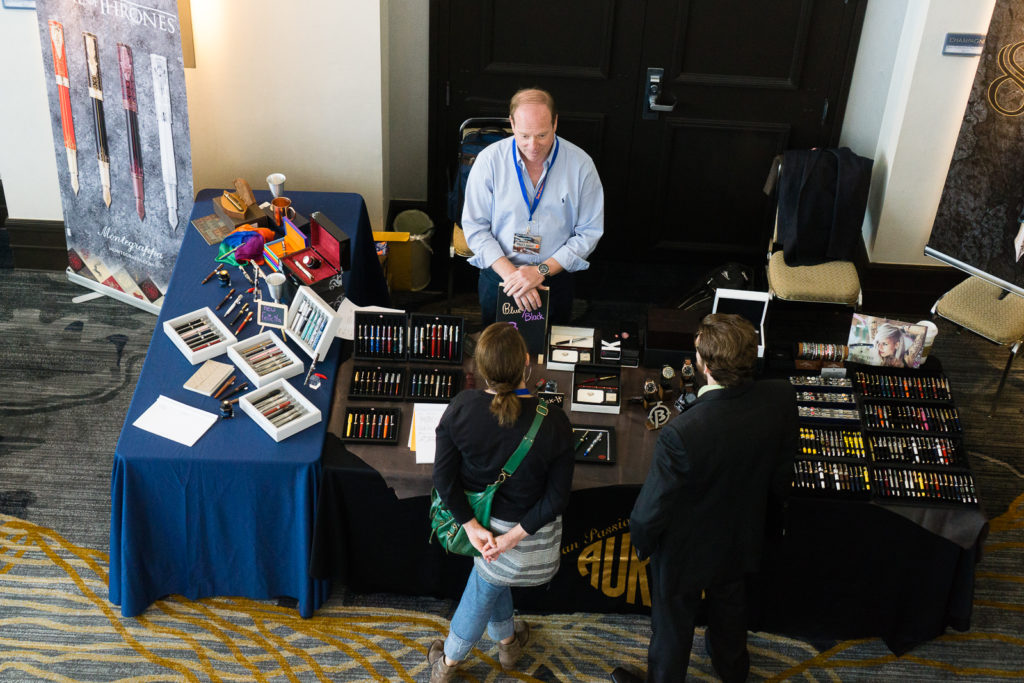
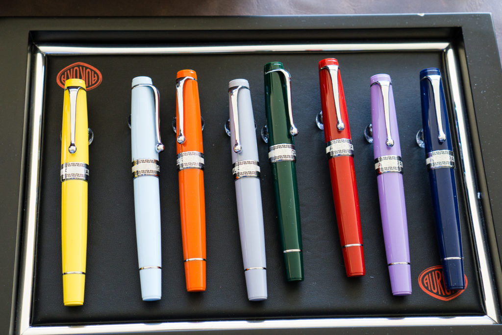
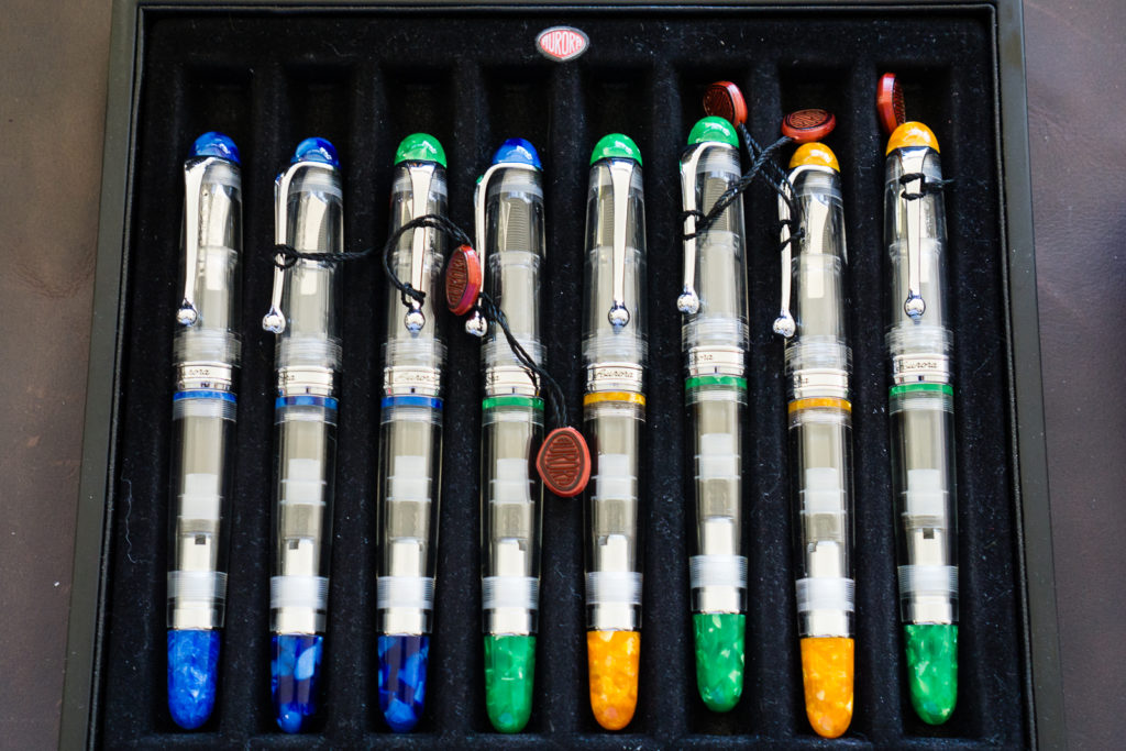
I stumbled upon the Kenro table with all the Aurora pens on display.

The new lineup for Aurora Optima Flex limited edition pens. This time they have rhodium trim instead of the gold ones on the 88 lineup last year.
Aurora Optima pens. Blue Auroloide, Green Auroloide. And dio mio! Look at that Sole Mio!
Someone’s been playing with the caps of those Aurora 88 Demonstrators
The Aurora 88 Marte is showing off its beauty as it basks in the Sun.

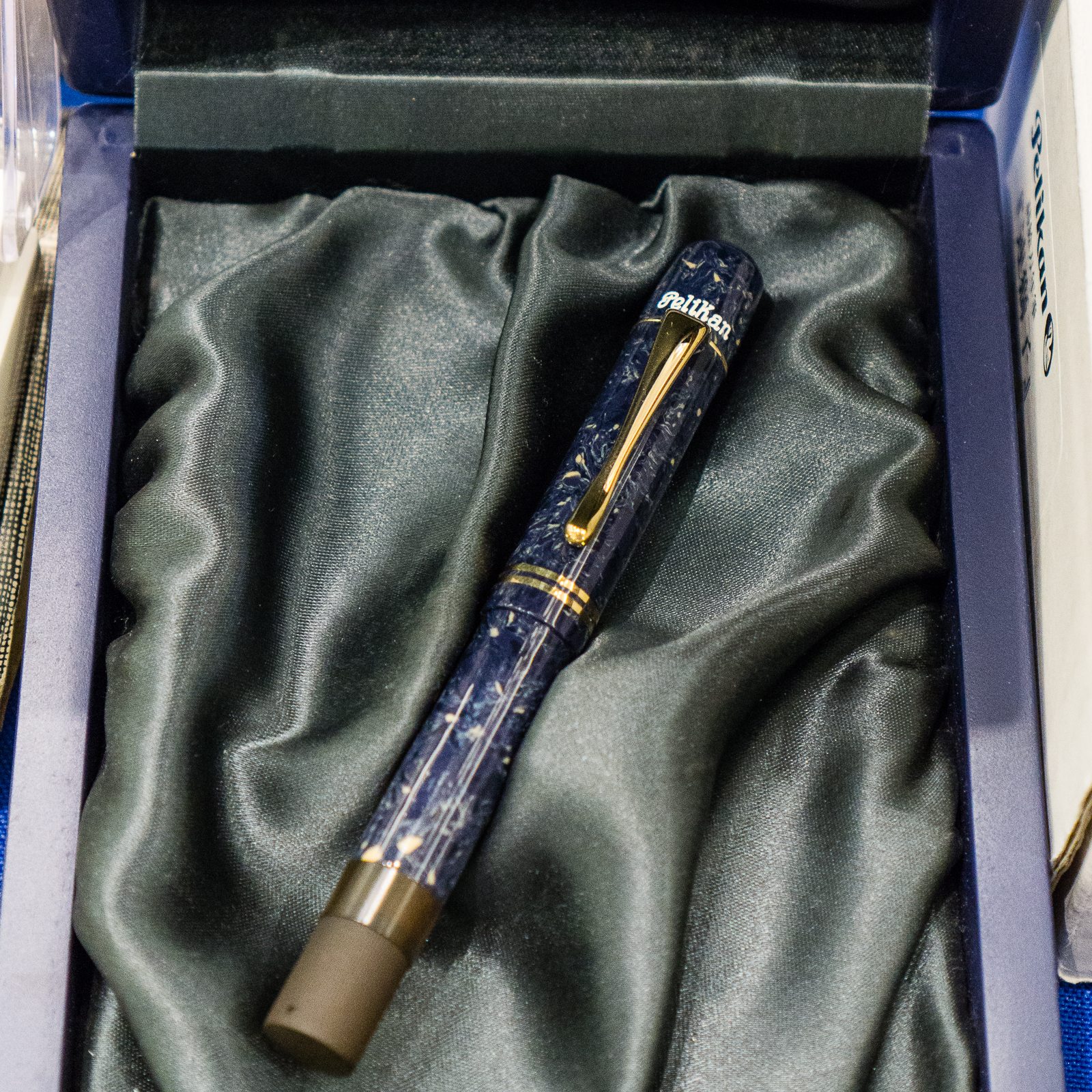
Here’s a Pelikan basking in the sun as well.

That Bright Red M101N is enjoying the sunshine by the Dromgoole’s table


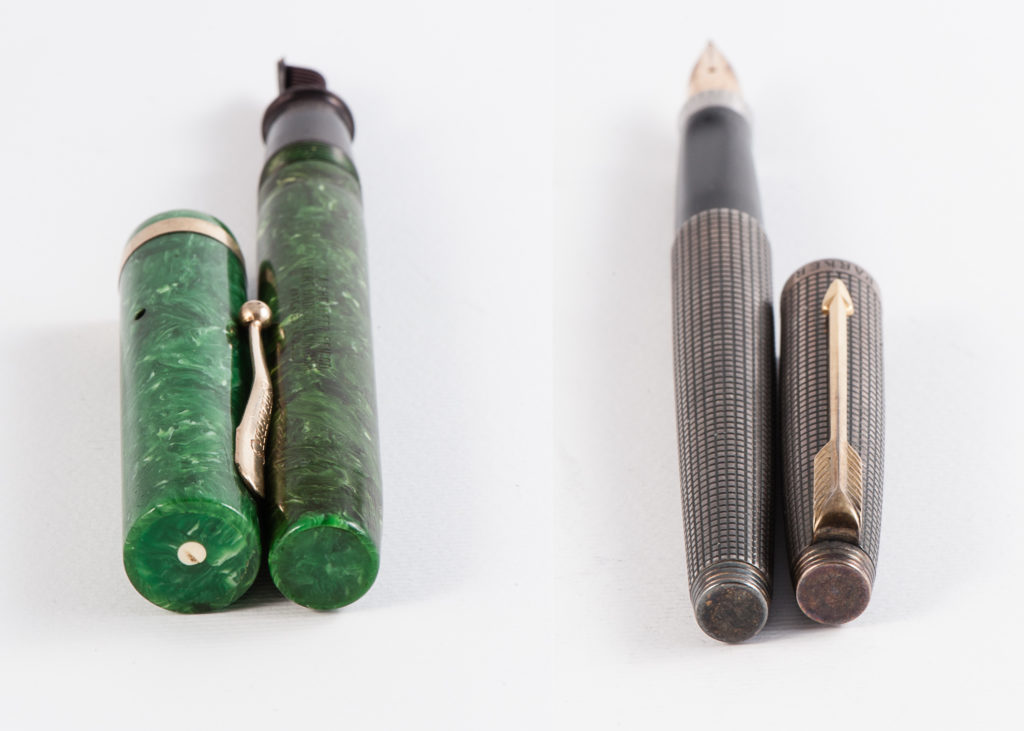
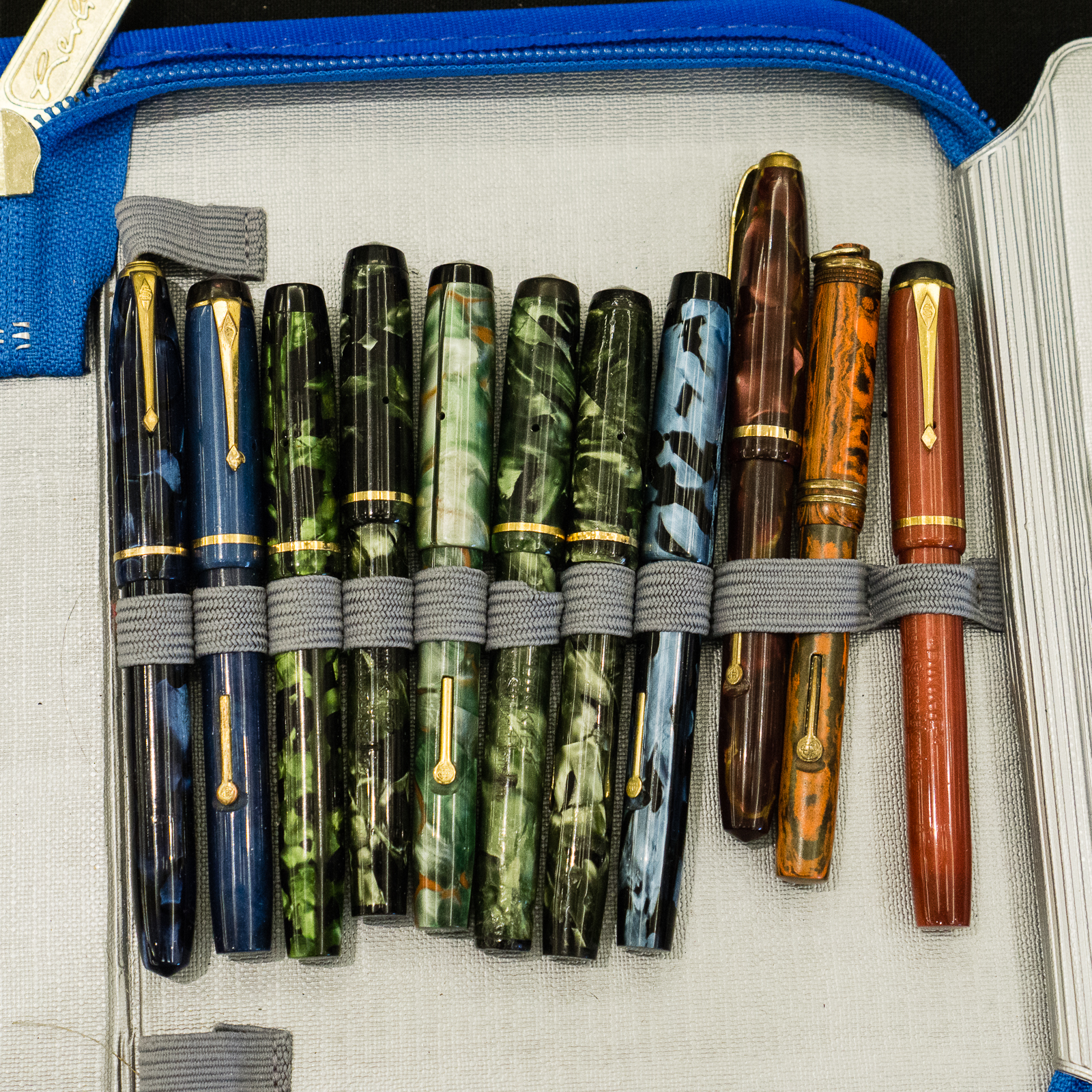
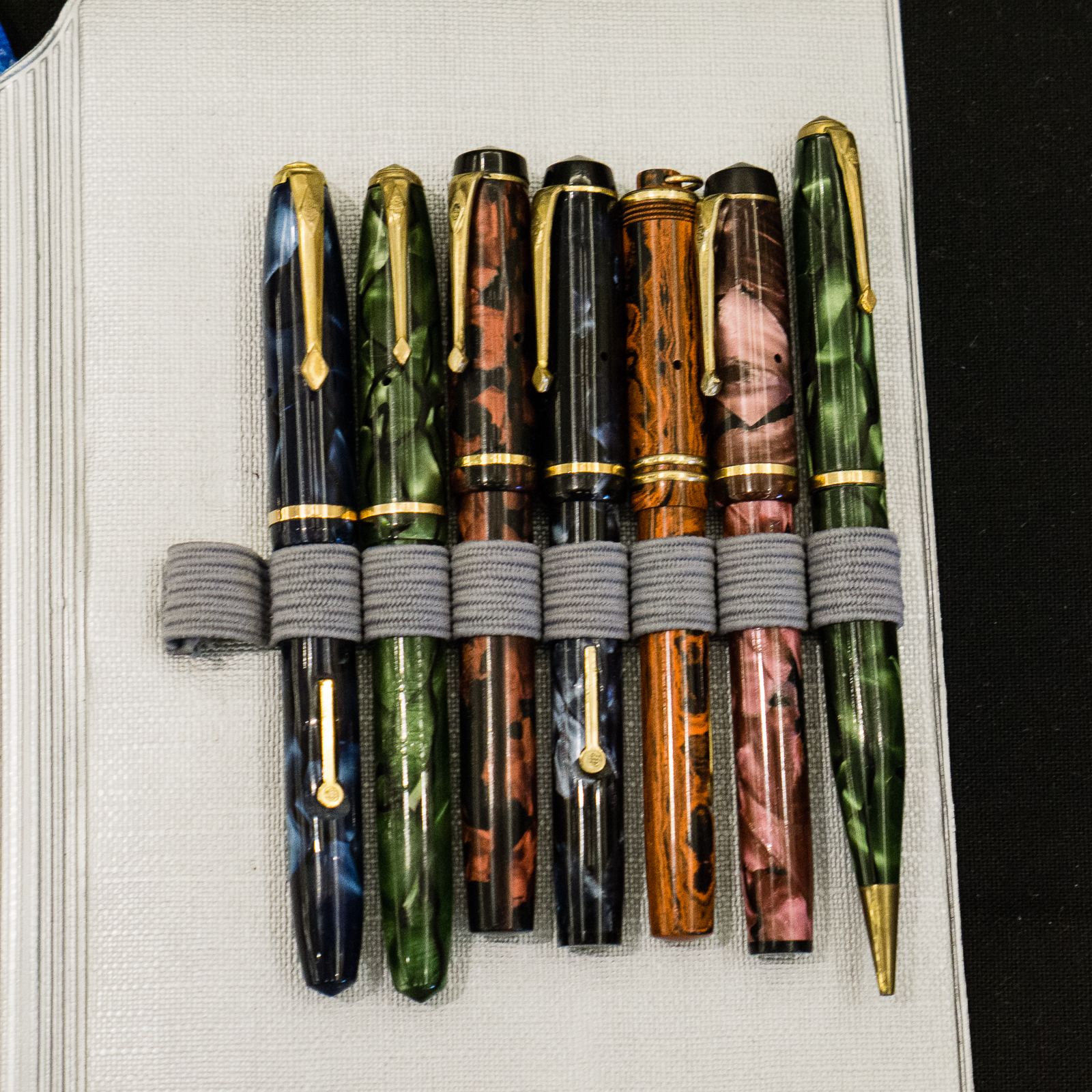
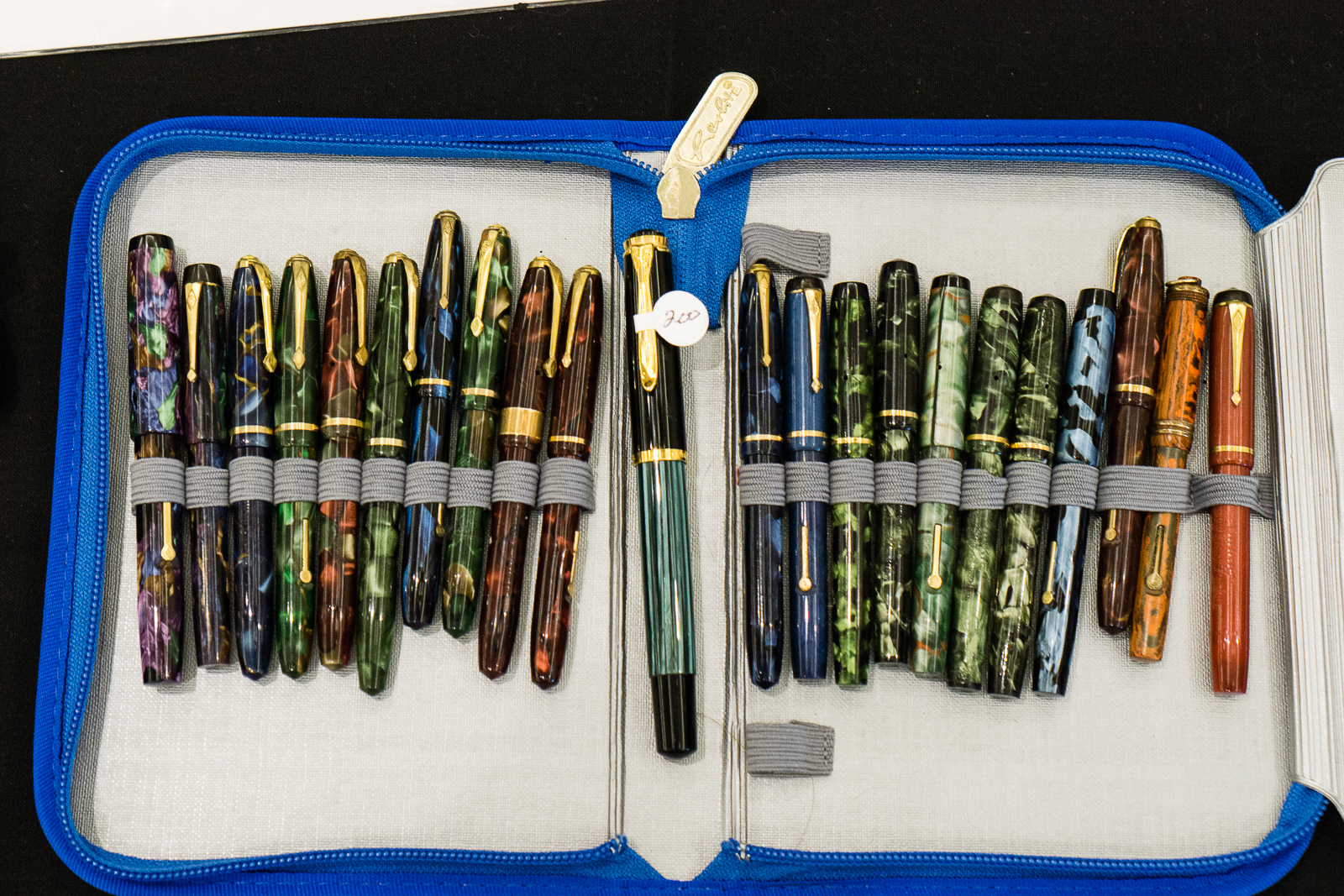
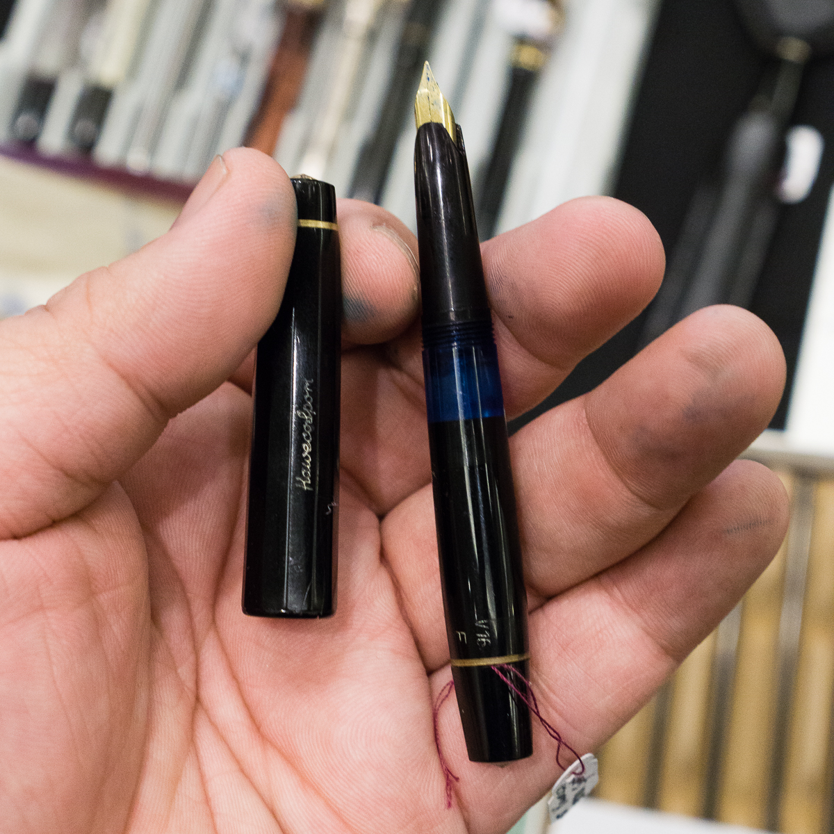
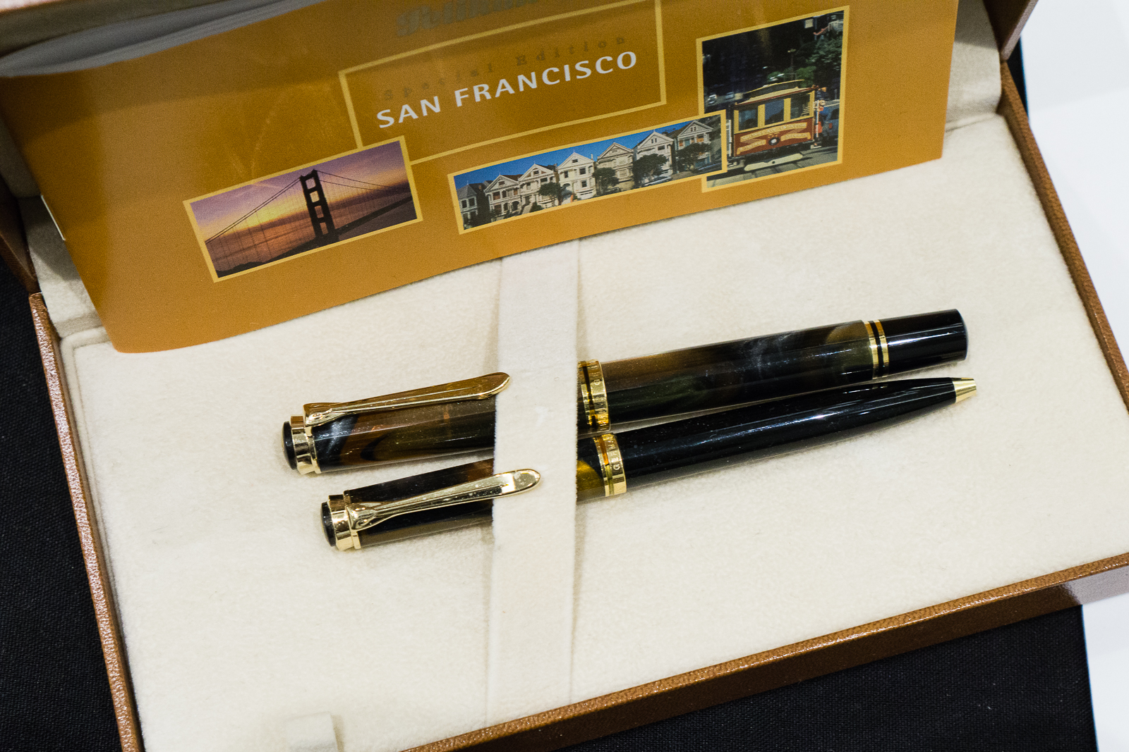
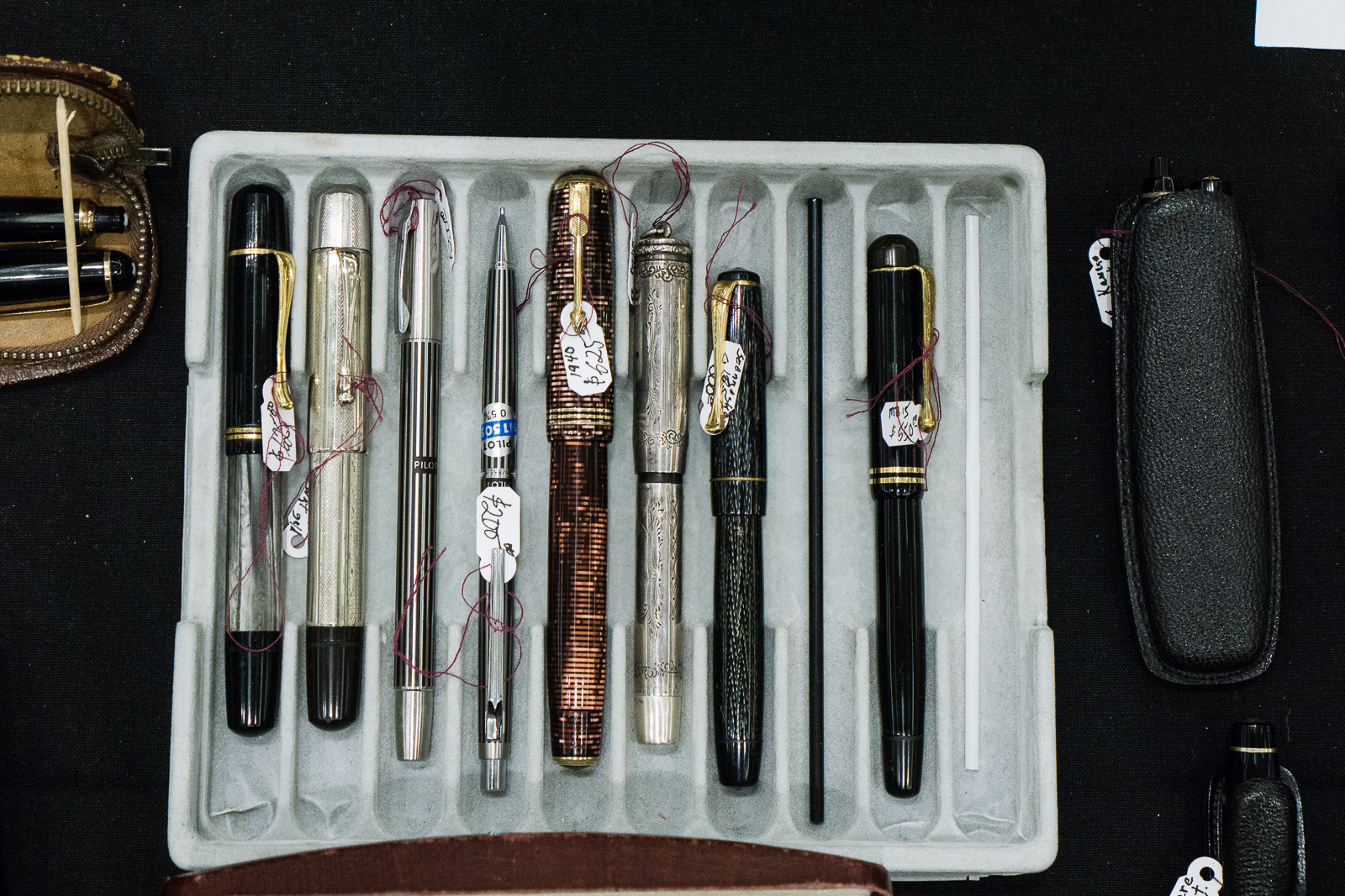
Vintage Corner: My friend Janet showed me a Pelikan IBIS in Grey Marbled that Rick Propas was selling and also showed me her Green Marbled one. The Pelikan IBIS was a pen produced from the mid-1930s thru the early 1940s. You don’t see the IBIS often and this was actually my first time to see the marble colored ones. #onlyatpenshows

Pelikan IBIS: Green Marbled, and Grey Marbled

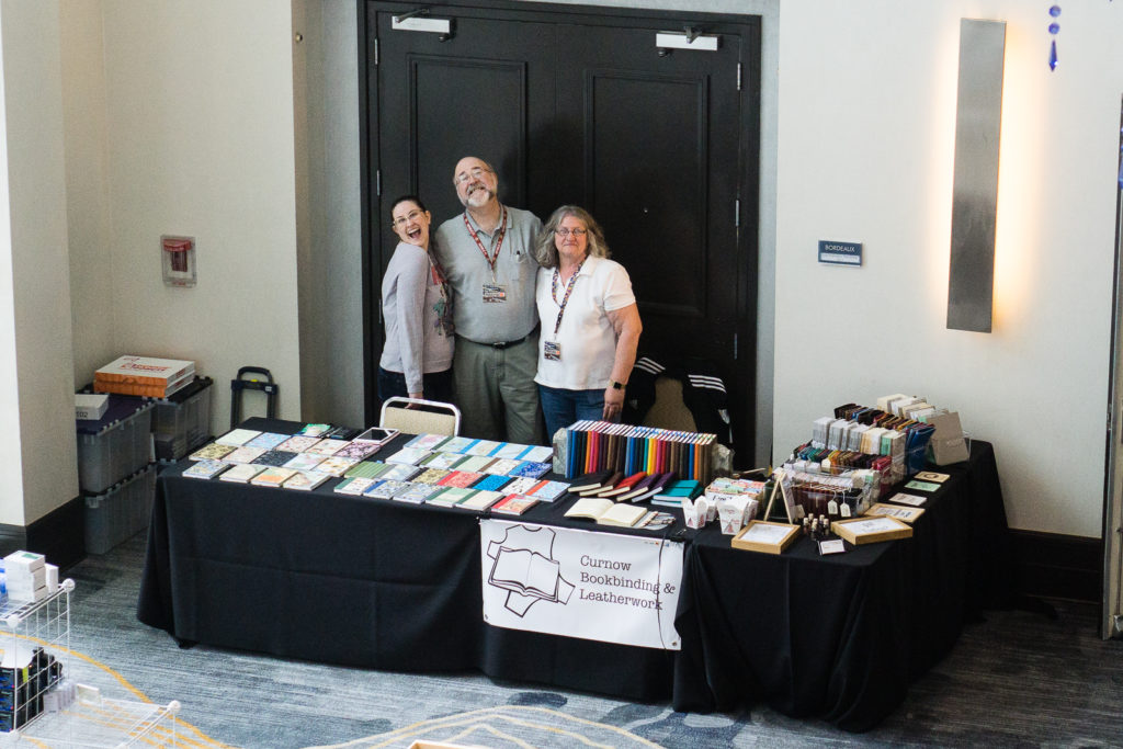
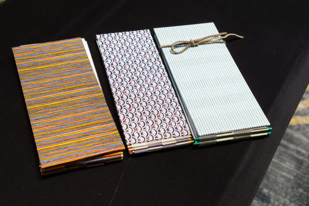
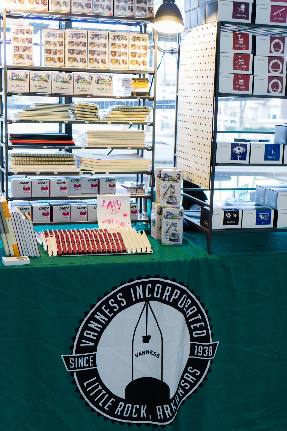
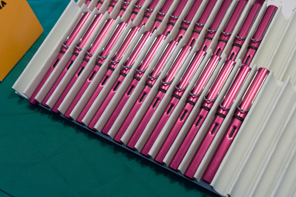
I then went back to the Vanness Pens table to buy some of their special edition LA Pen Show journals by Curnow Bookbinding with artwork by Joey Feldman. Joey was still there and he drew my Pen Show Persona on the back of the A5 journal I bought. This guy is phenomenal and do you notice what he named my sneakers as? Pelikan M800 FTW! Thanks Joey!

Afterwards, I went up to my room to unload my purchases and rest for a while.

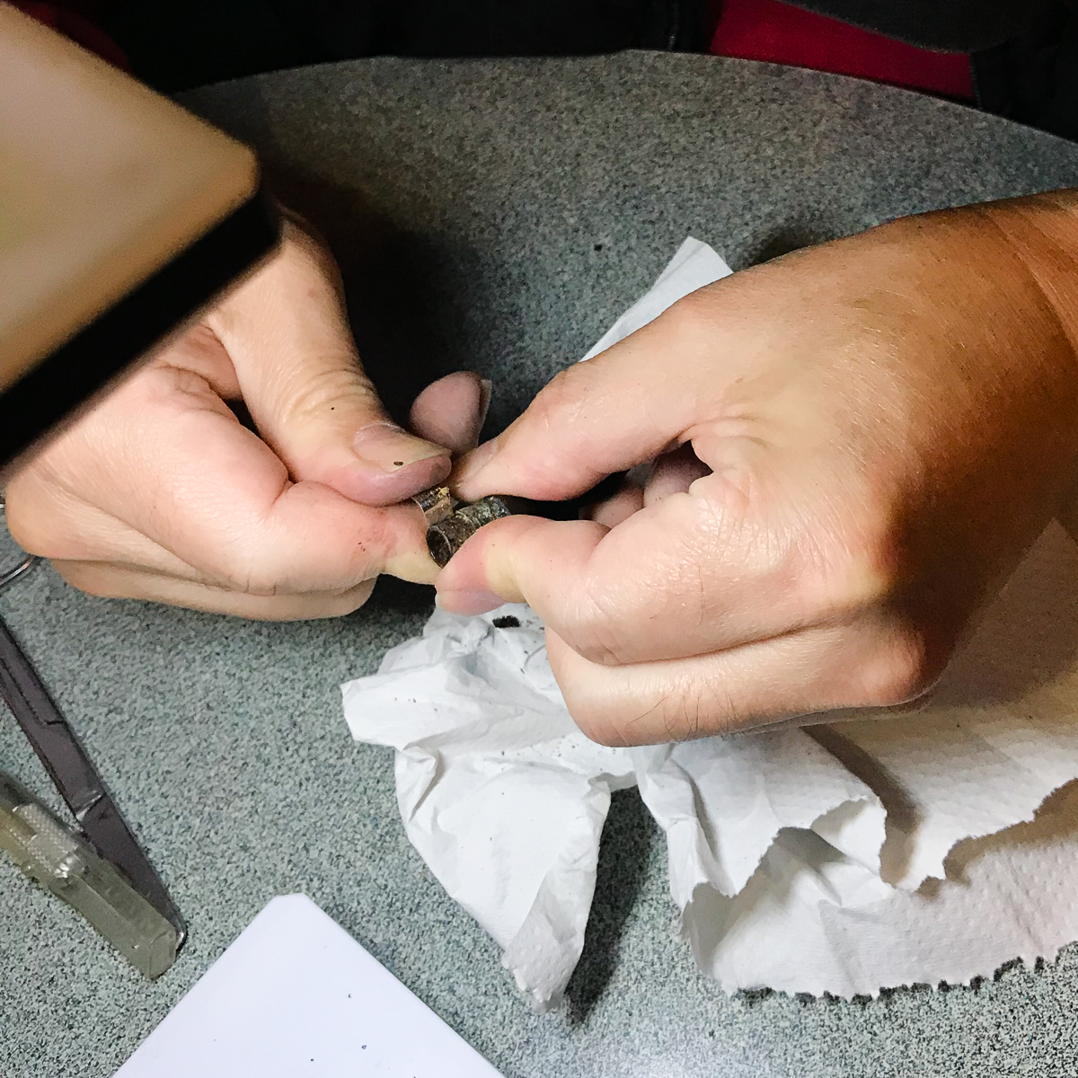
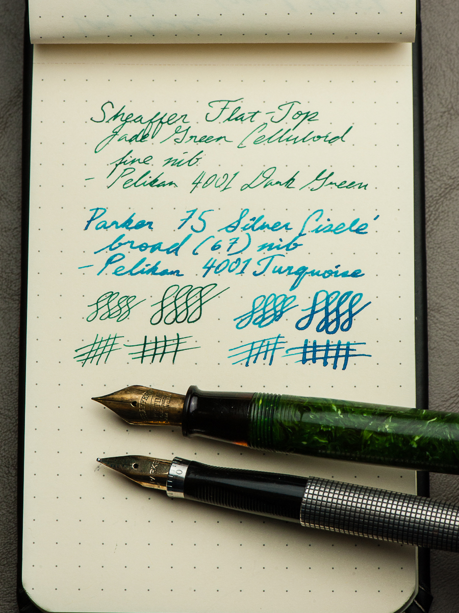
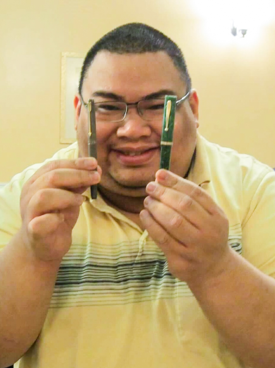
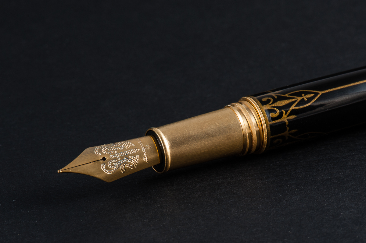
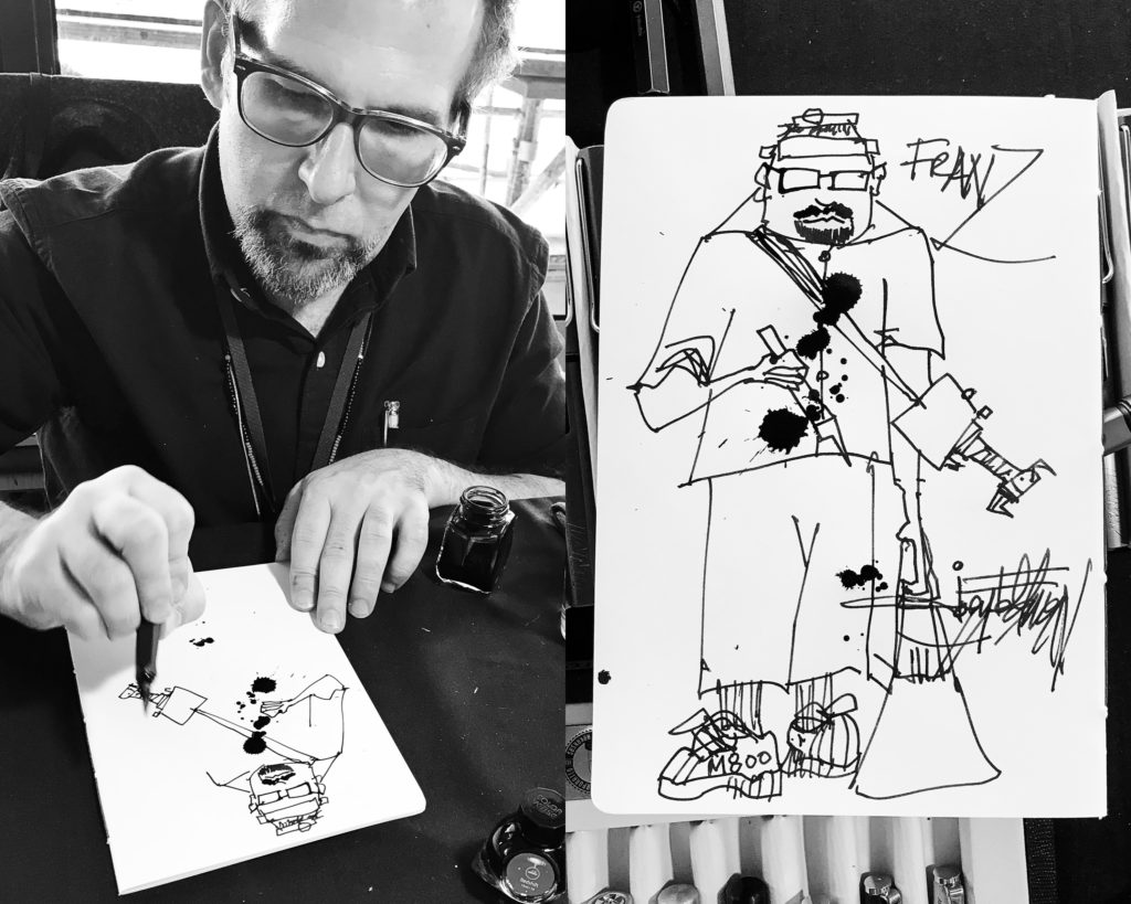
As I went back down, I checked on the progress at Mike Masuyama’s table. As it happens, the “last” person Mike was gonna help was a vendor and did not have the pen with him at the moment and I was the lucky person next on the list. Ricky got to take a picture of me as Masuyamasan was tuning my M800 nib. Thanks Ricky!

Masuyamasan’s last customer on Friday

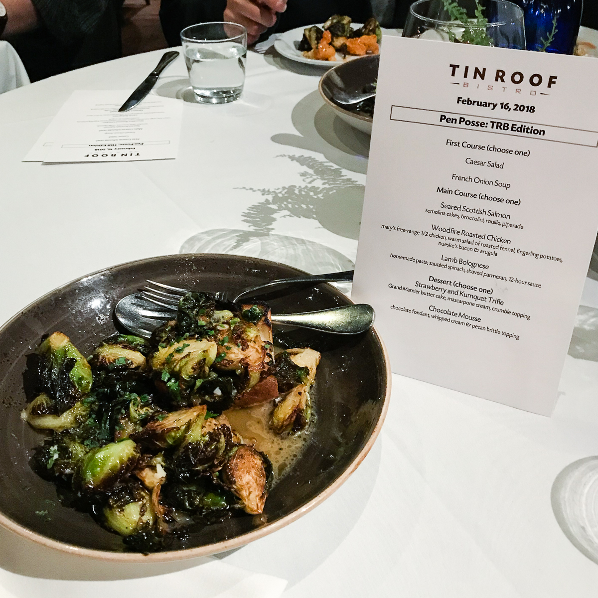
Post Show Dinner: Every year, the SF Bay Pen Posse as well as friends from the SoCal contingent hold a dinner at the Tin Roof Bistro and Joi E. graciously organizes this with the restaurant. As seen on the menu, we call it, “Pen Posse: TRB Edition”. Thank you very much once again Joi!

For this meal, it’s all about the Brussel Sprouts! If you’ve had them at Tin Roof Bistro, you know this to be true.

Brussel Sprouts!!
Dessert: Chocolate Mousse, and Straberry Kunquat Trifle
coffee… coffee… coffee… pen…

Back at the hotel, it’s Pen Shows After Dark time!

At the bar: Cary’s Wahl-Eversharp Decoband in Gatsby Pensbury Etched finish
At the bar: Cary’s limited edition Pelikan M1000 Sunrise
At the bar: Yuan brought delicious Port wine


Saturday, February 17, 2018

Pen Show Persona: Thanks to Sharon for taking this pic and thanks to Mike P. for the head gear!

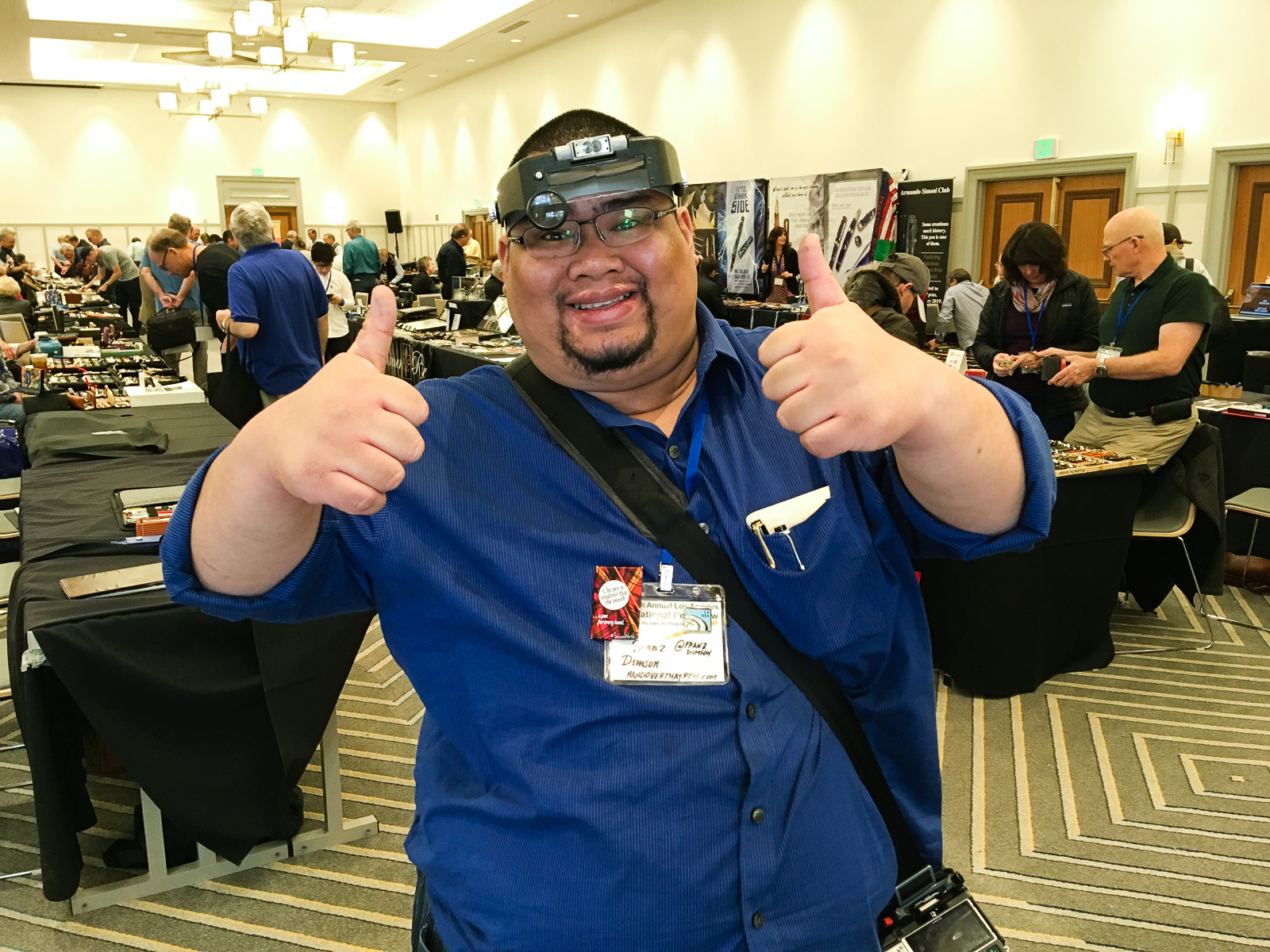
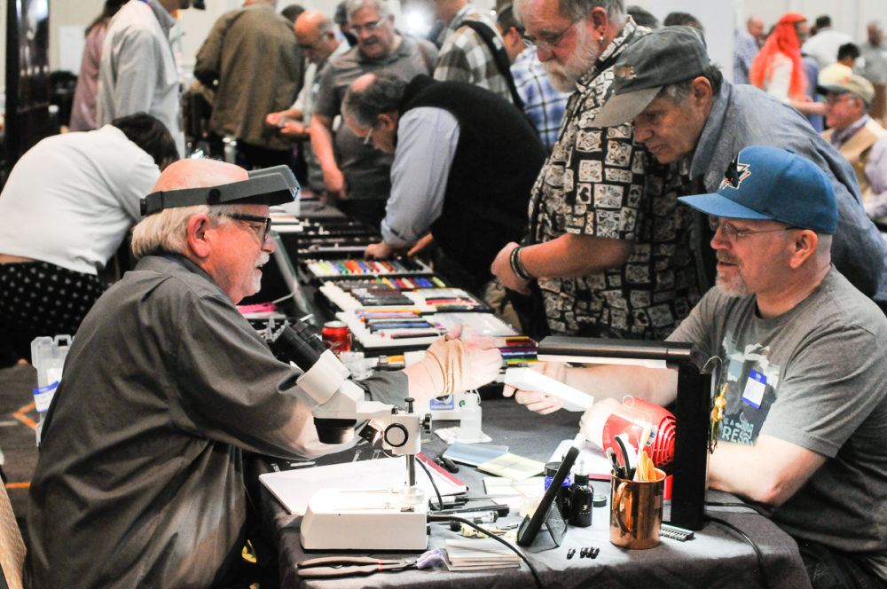
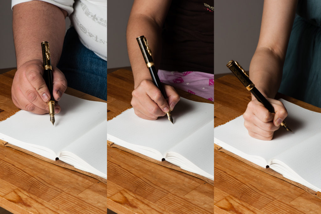
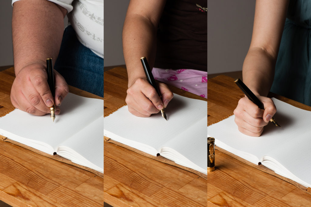
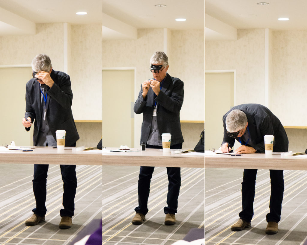
Woke up early once again to get ready for the show. I think I got to the ballroom at 7:50am (so early) and it was once again busy with activity. A quick side note, a week prior at a Pen Posse meetup, I joked that I wanted to walk around the show wearing a magnifier head gear to look like a legit pen guy. Friday morning, my friend Mike got me one of these and I committed to what I said. Interestingly enough, what started out as a funny gesture became a very useful tool while I was perusing pens. Sometimes you just can’t see the small print on nibs and barrels. So if you’re going to a pen show, I recommend having a lighted magnifier like a loupe, or this head gear. #pro-tip

After signing up again at Mike Masuyama’s table, I did my walk around and found myself at Paul Erano’s table. Paul is the Grand Poobah of the secret-not-so-secret Black Pen Society.

Paul Erano: Parker 65, Cross Verve, vintage Parker Duofold pens, and a modern Parker Duofold International in between them.
Paul Erano: An array of more pens.

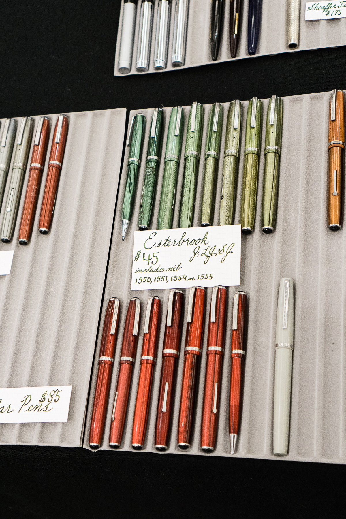
This year, I was fortunate to meet Jesi Coles at the show. She is one of the hosts of the B.Y.O.B. Pen Club Podcast and she also sells pens at shows or on her website. She is known for being a proprietor of vintage Esterbrook pens.

Jesi brought a nib tester display so people can try out the different nib types and sizes that Esterbrook had. This was pretty cool!
Esterbrook J, LJ, and SJ
Esterbrook Pastel pens

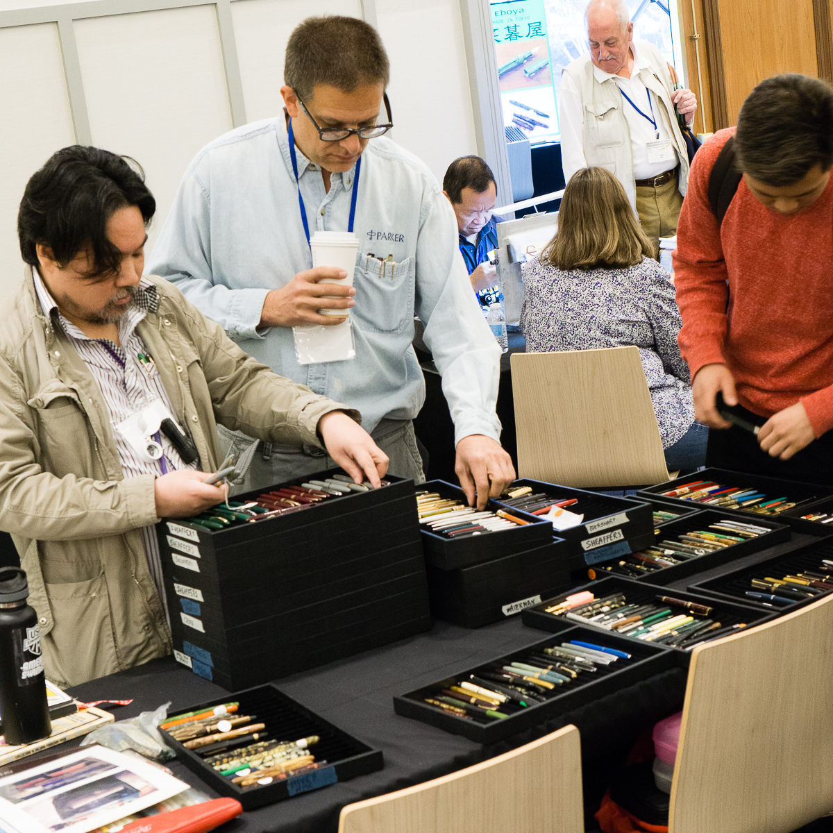
Suddenly, I saw 2 to 3 people doing a beeline from one side of the ballroom to the other. Apparently, a seller just brought out their trays of pens and a few pen buyers saw it from afar. #onlyatpenshows

Vintage Pen Trays

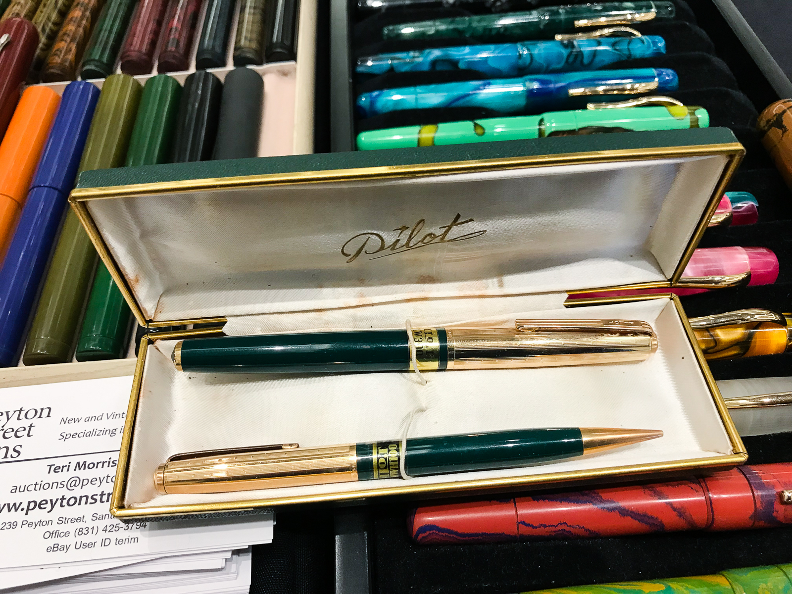
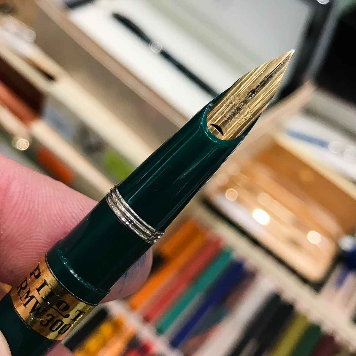
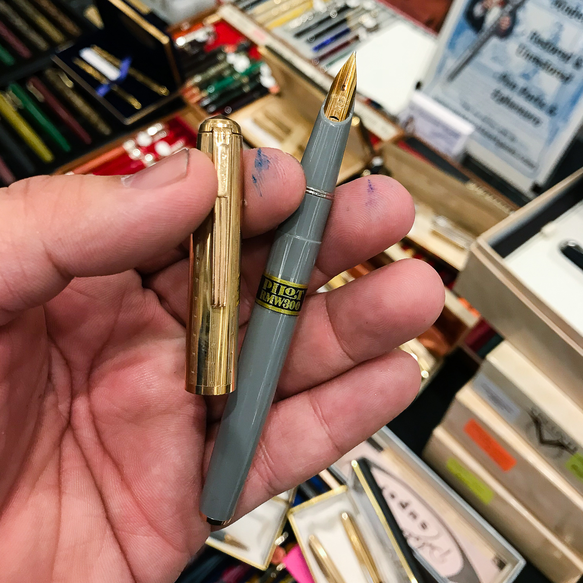
Visited the Peyton Street Pens table and found some vintage Pilot Pens from the 1950s. Sent my friend photos and a message if interested, and boom! Pen show muling… done. OPM points!

Green Pilot RMW300 set
Nib close up of the Pilot RMW300
The Pilot RMW300 also had gray and black color choices

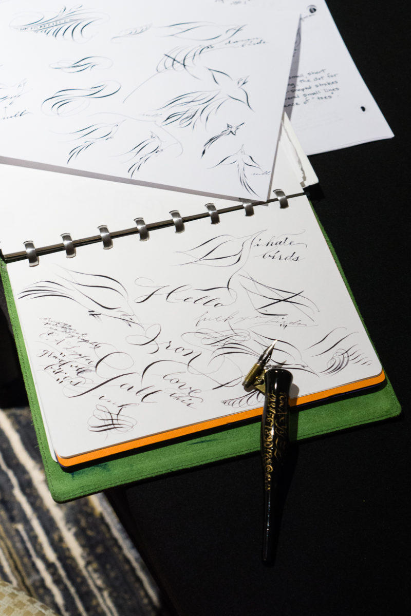
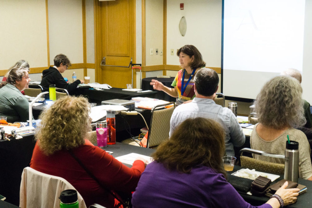
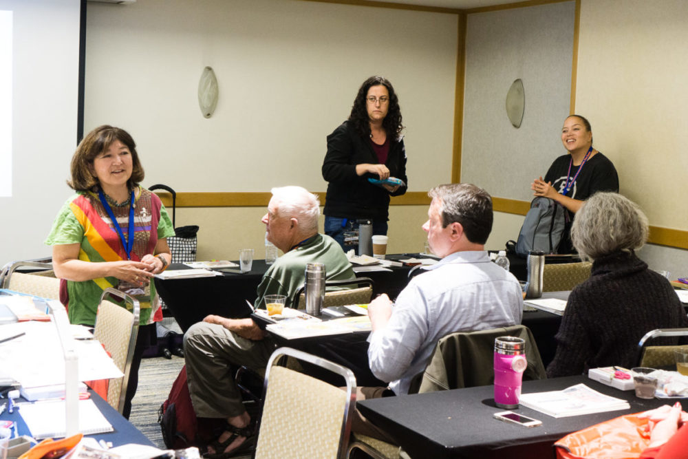
Afterwards, I went up to the hotel’s mezzanine level to attend two seminars. This was my first time to sit in a seminar in LA. The first seminar was about writing books on pens by Mr. Andreas Lambrou. He described his process when he was starting to write his Fountain Pens of Japan book as well as the Fountain Pens of the World. I was so into his topic that I forgot to take a photo. The second seminar was about fantastic nibs by Mr. John Mottishaw. He was demonstrating how to tweak nibs to make it write a little better. He asked people to bring up pens that didn’t write quite right and showed them simple tricks to make it better.

John Mottishaw tweaking nibs

After the seminars, we stepped out for brunch at the Shake Shack across the street from the hotel. First time to have their food and it was good!

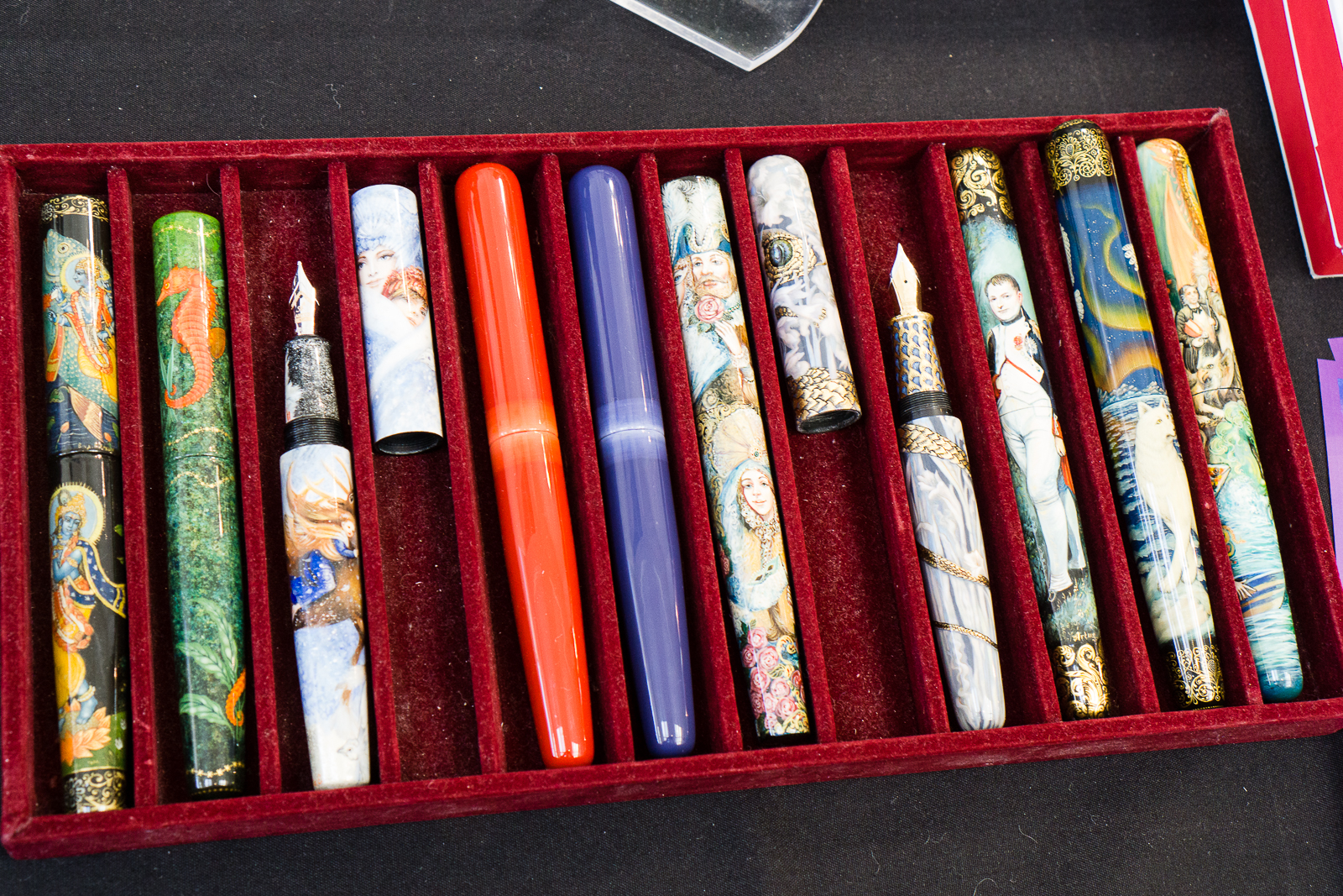
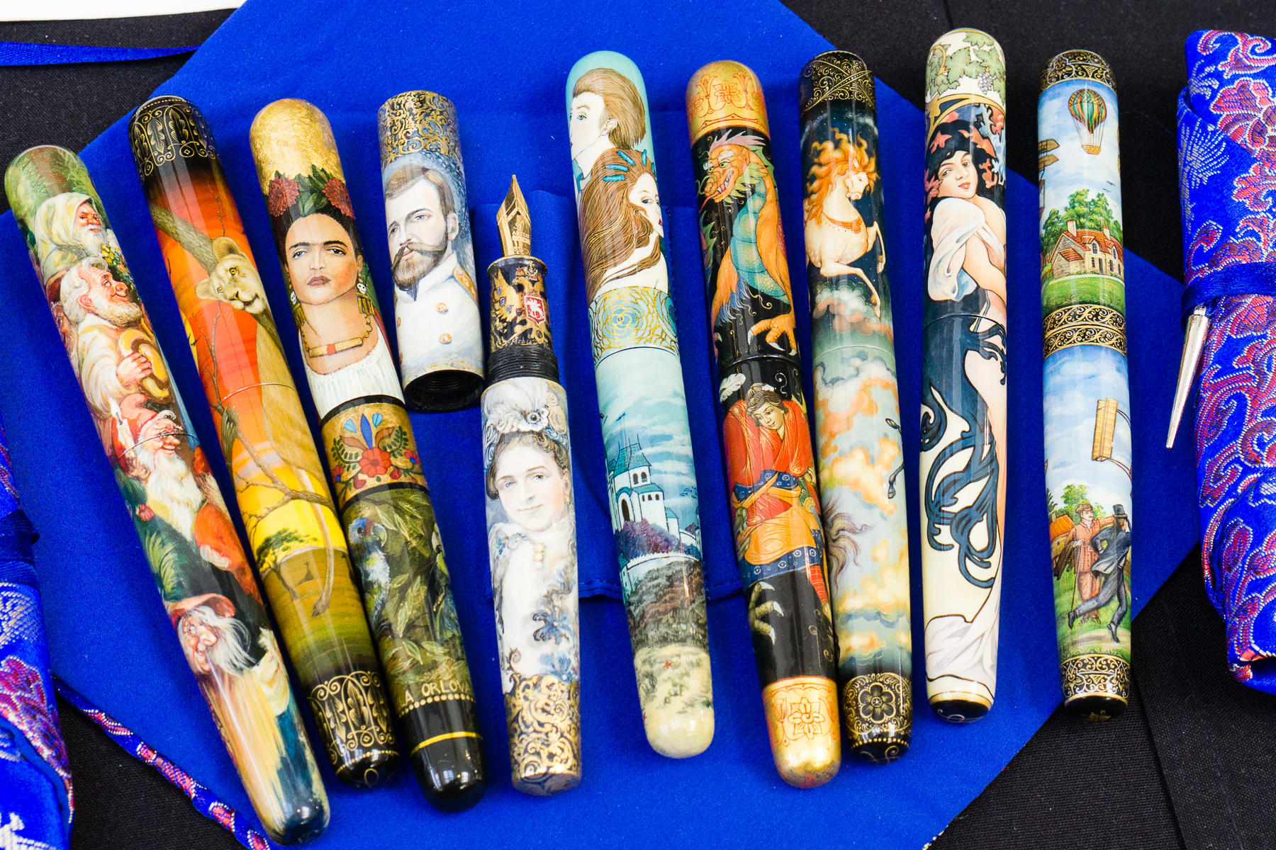
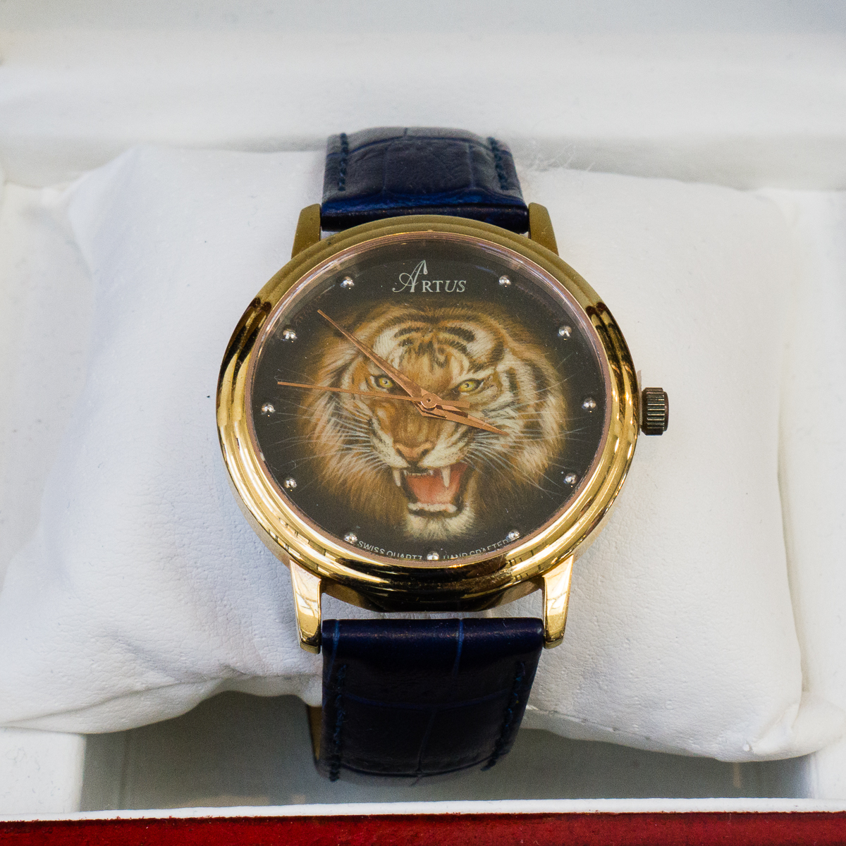
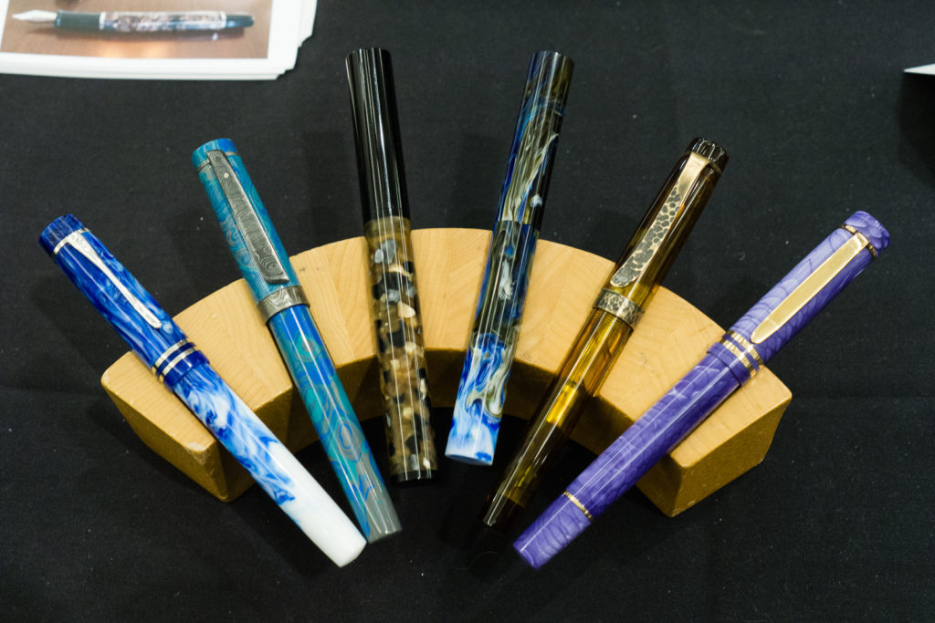
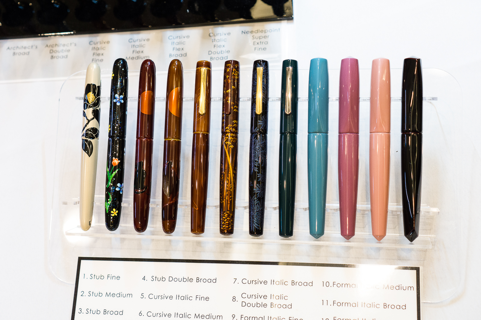
After brunch, it’s back to the show and I got to stop at the Artus Pens table and chat with Maxim. Artus Pen always has beautiful art pens painted by Russian artists. Their lacquer work is phenomenal and the artwork is just stunning.

Artus Pens
Artus Pens
Beautiful tiger lacquer on a watch. First time to see this at Artus Pen


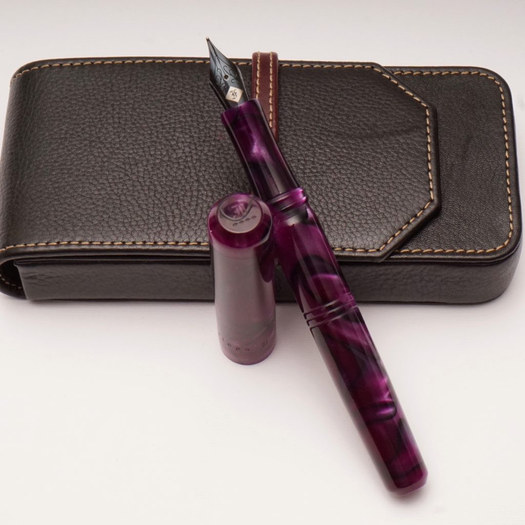
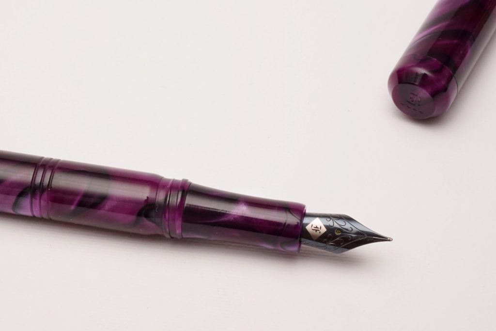
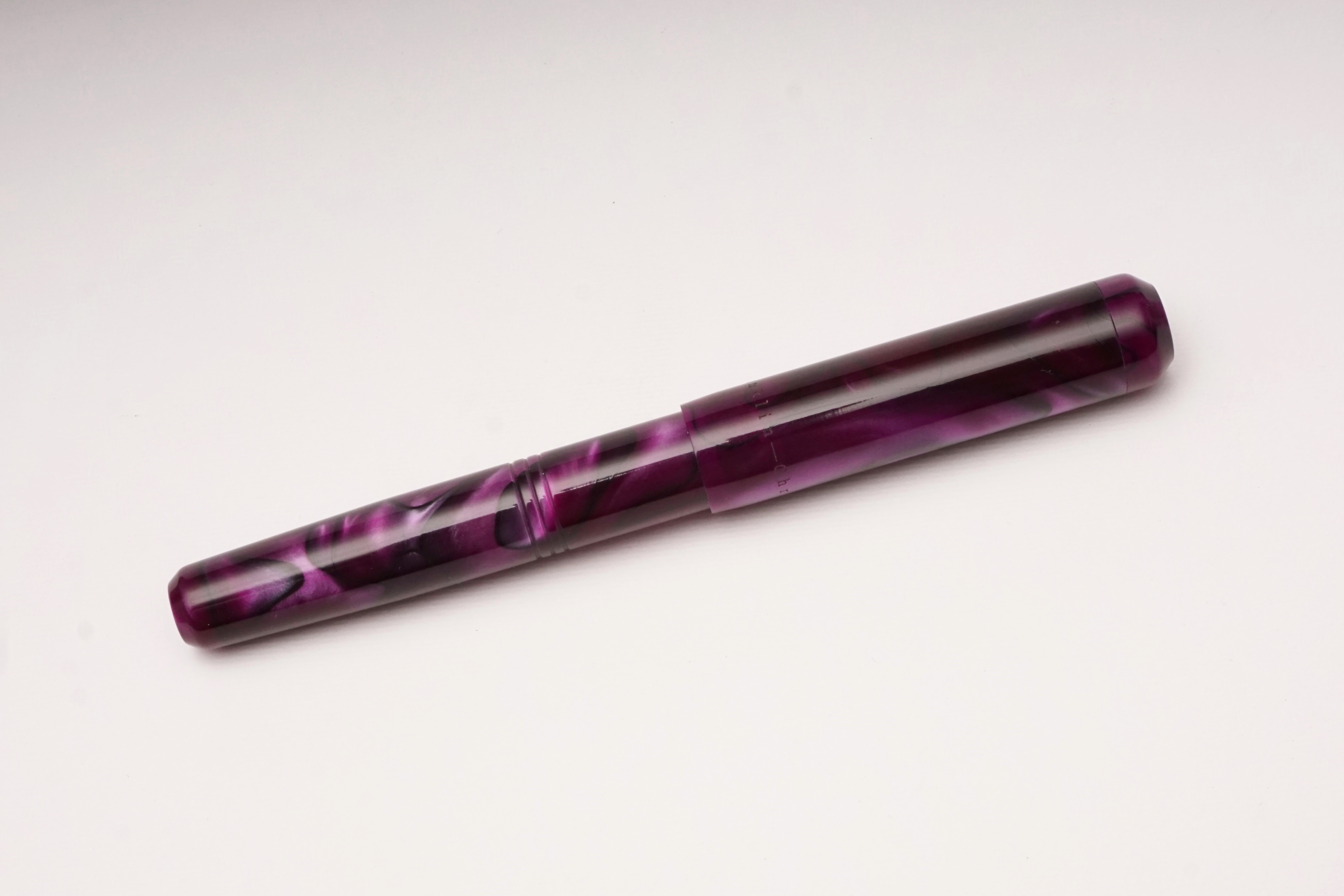
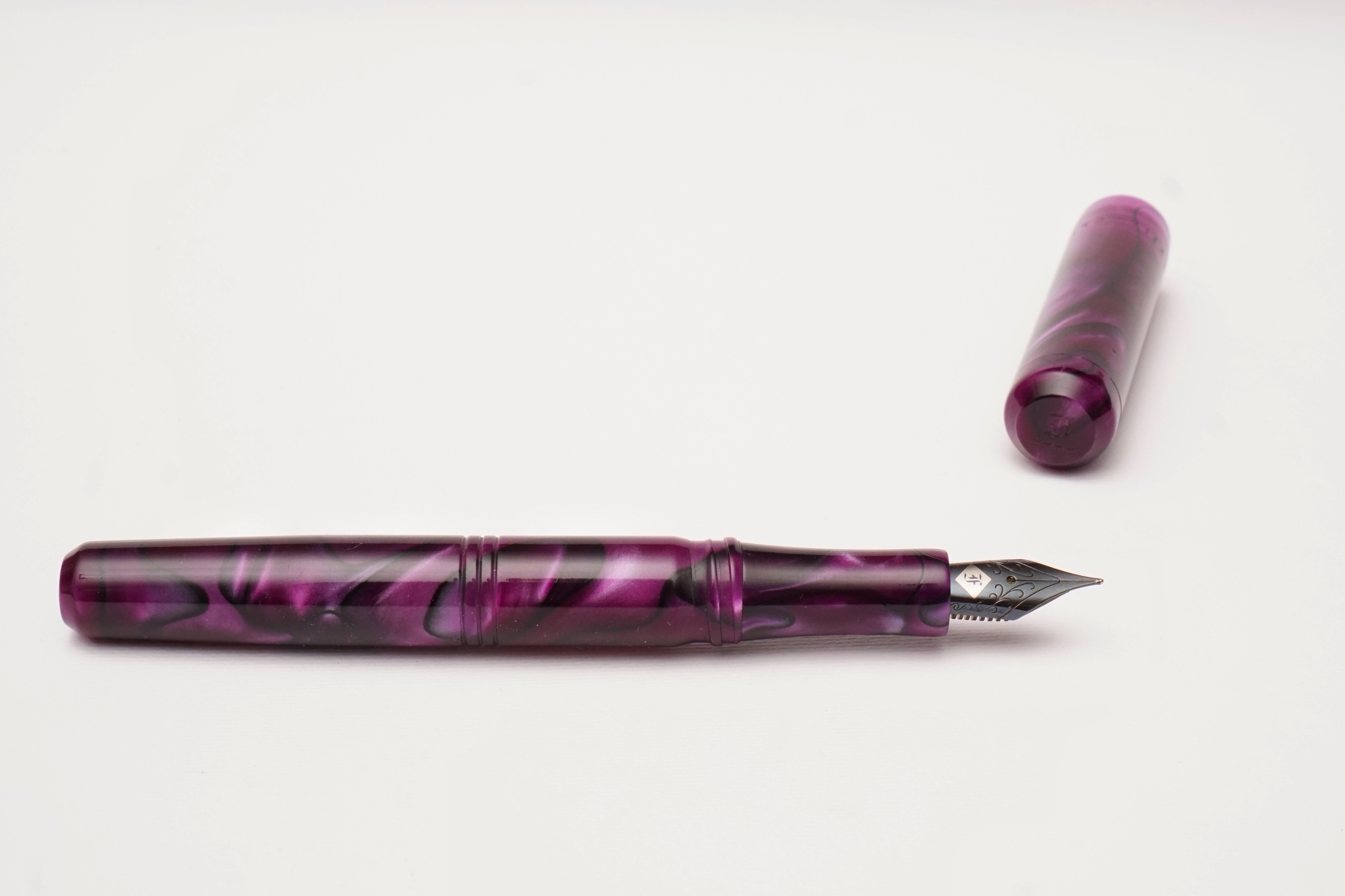
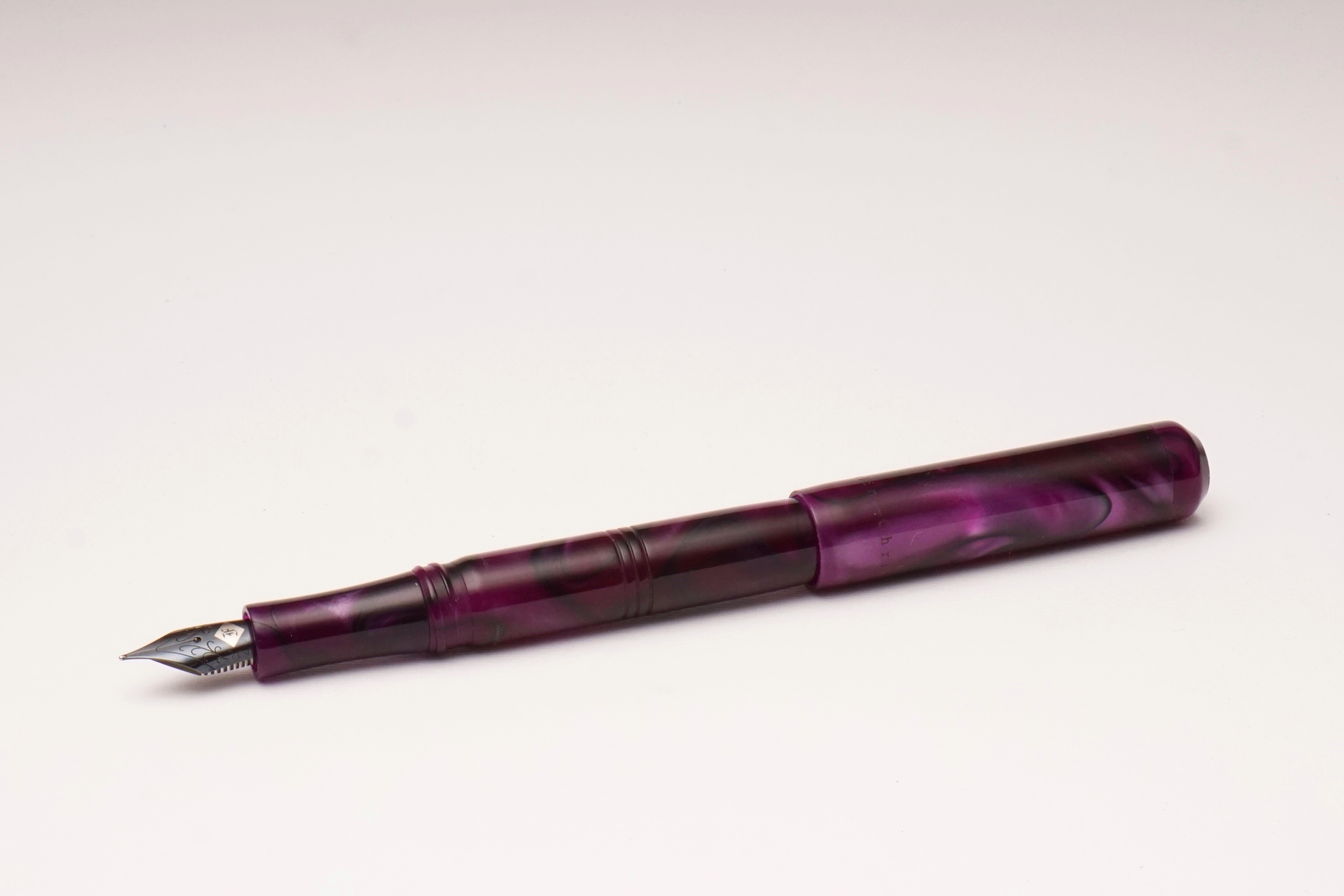
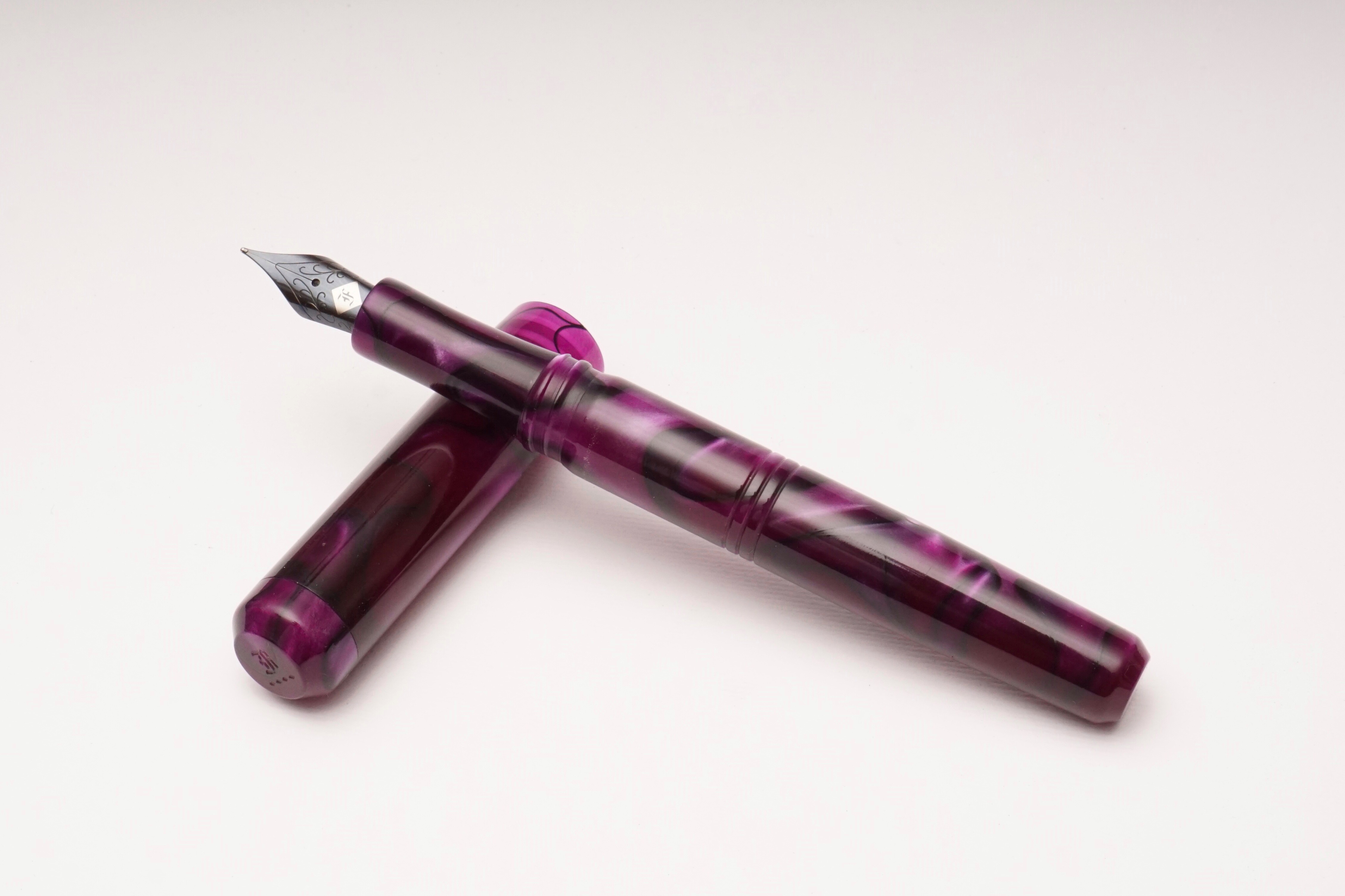
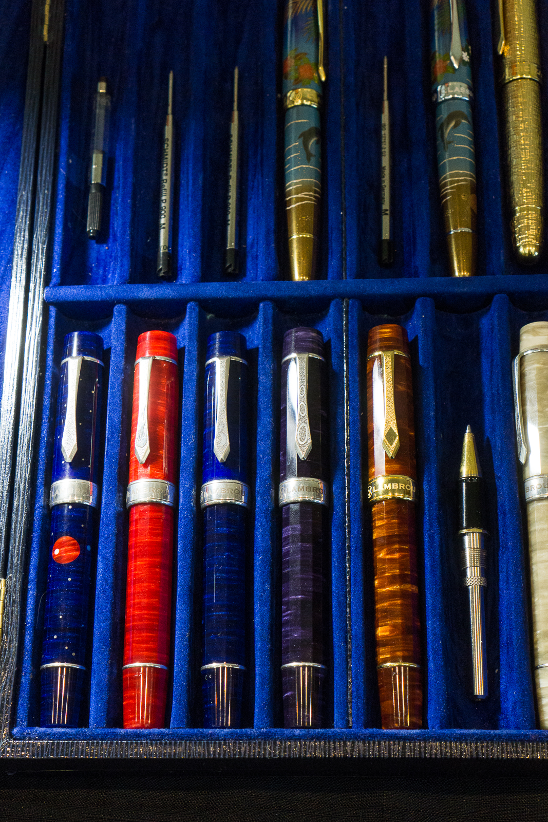
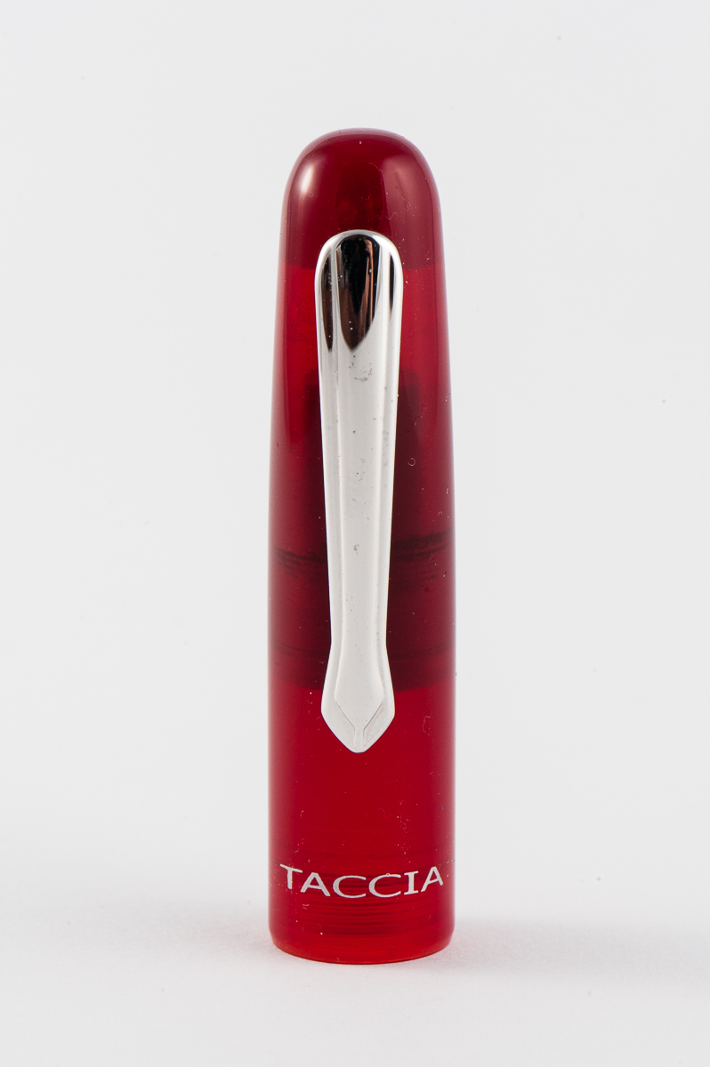
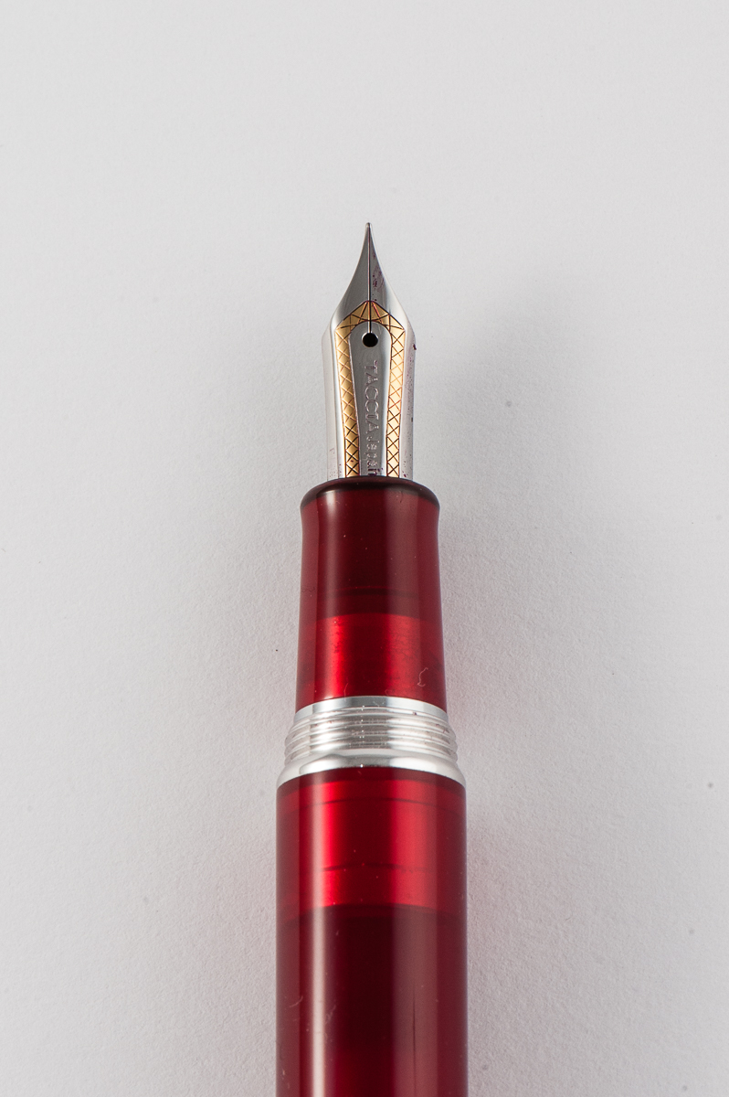
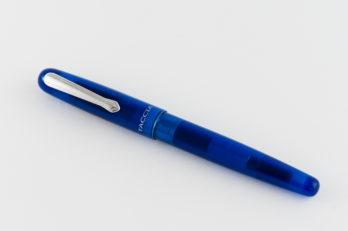
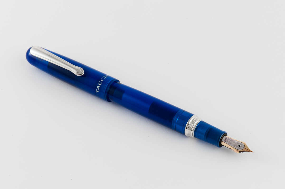
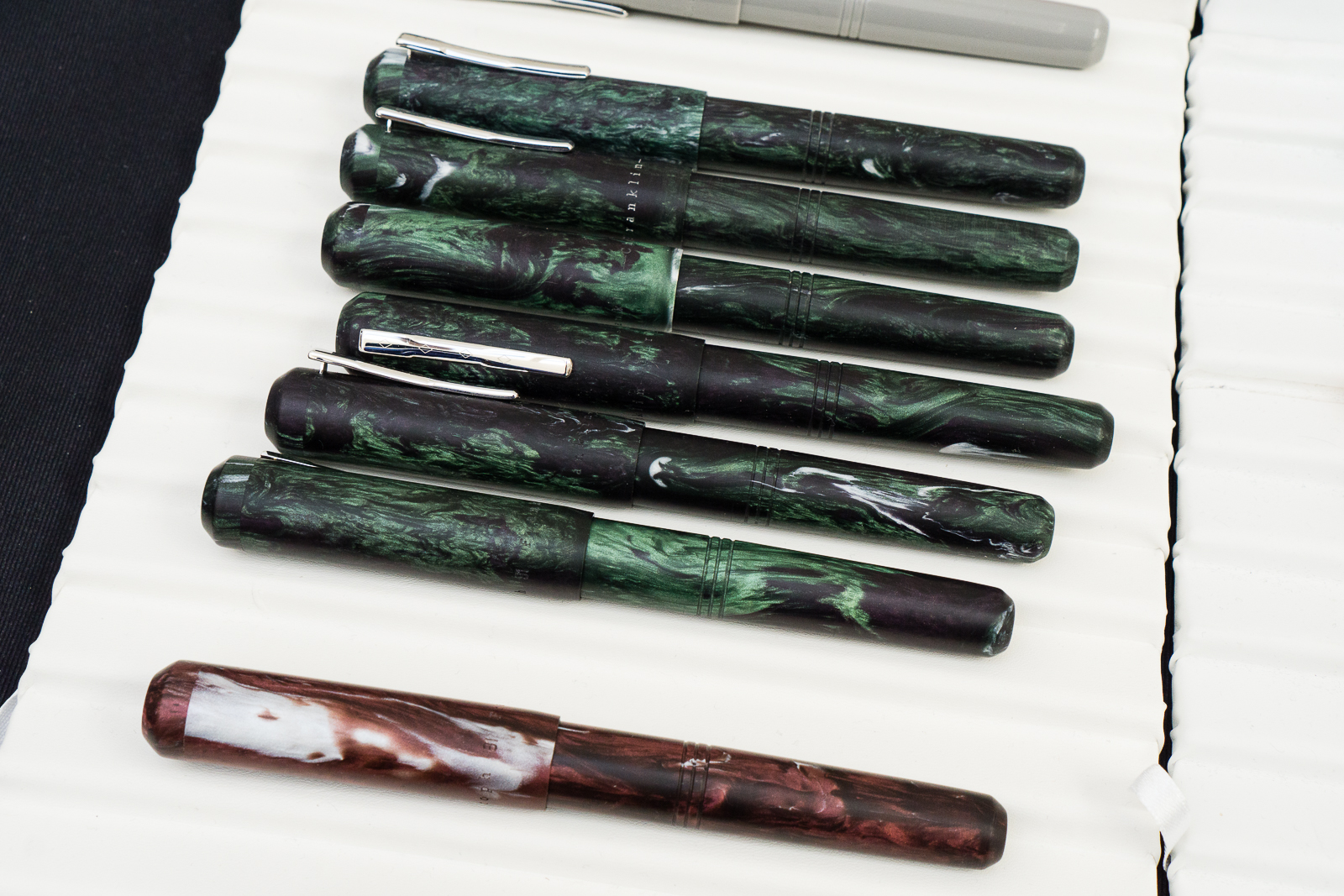
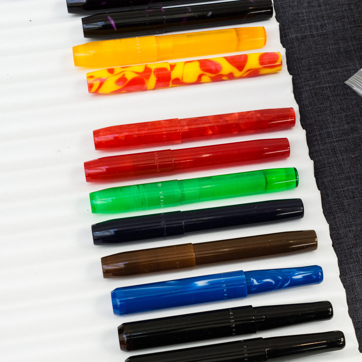
One of the usually busy tables at a pen show is the Franklin-Christoph team. I barely got to see them yesterday because of people being at their table so I took advantage of a slower moment on Saturday. I got to peruse their show prototype pens and saw a “few” that I liked.

F-C Model 31 prototypes with the fantastic Jonathon Brooks material
F-C Model 45 and a couple Pocket 40 protoypes

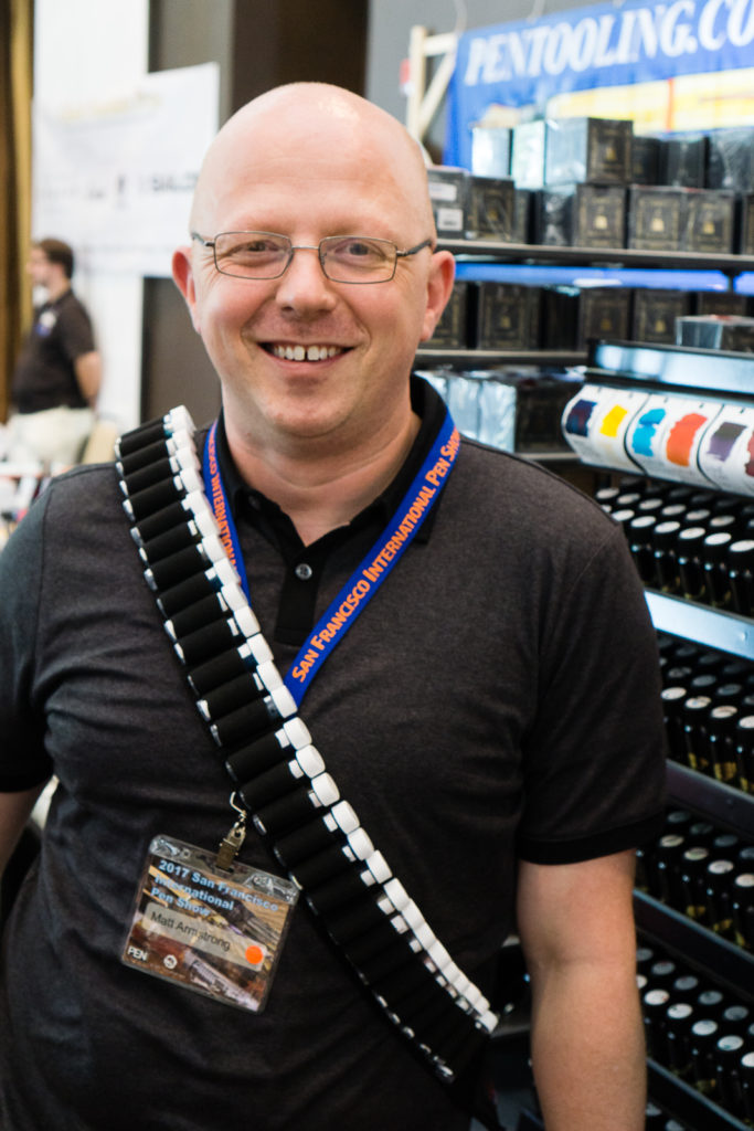
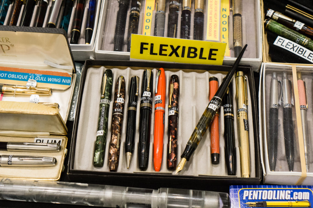
Pens from Dale Beebe’s table. Pentooling.com
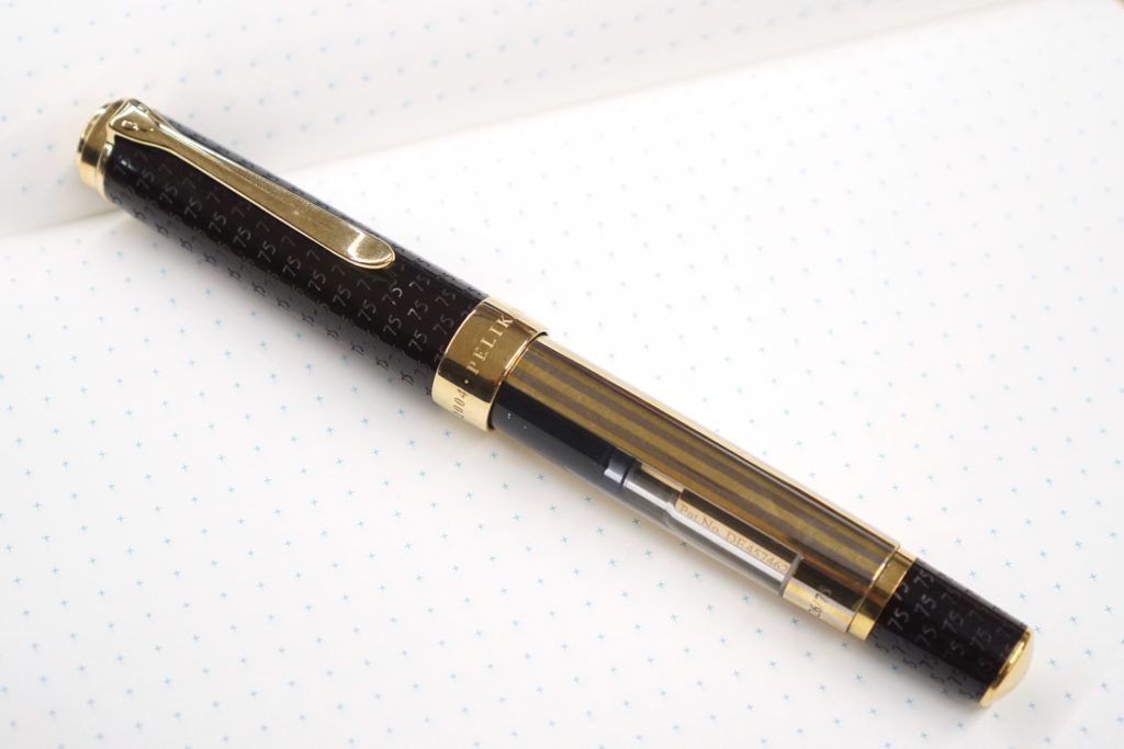
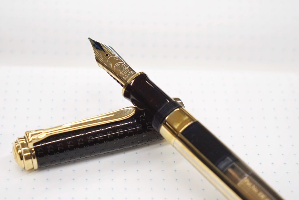
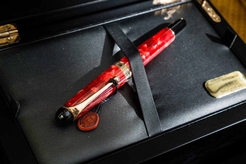
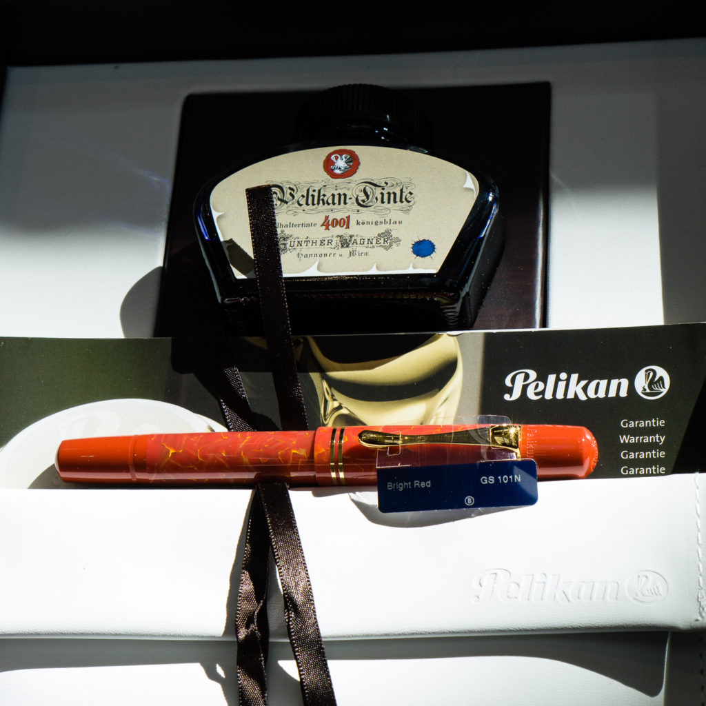
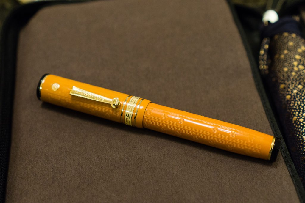
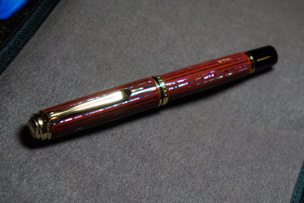
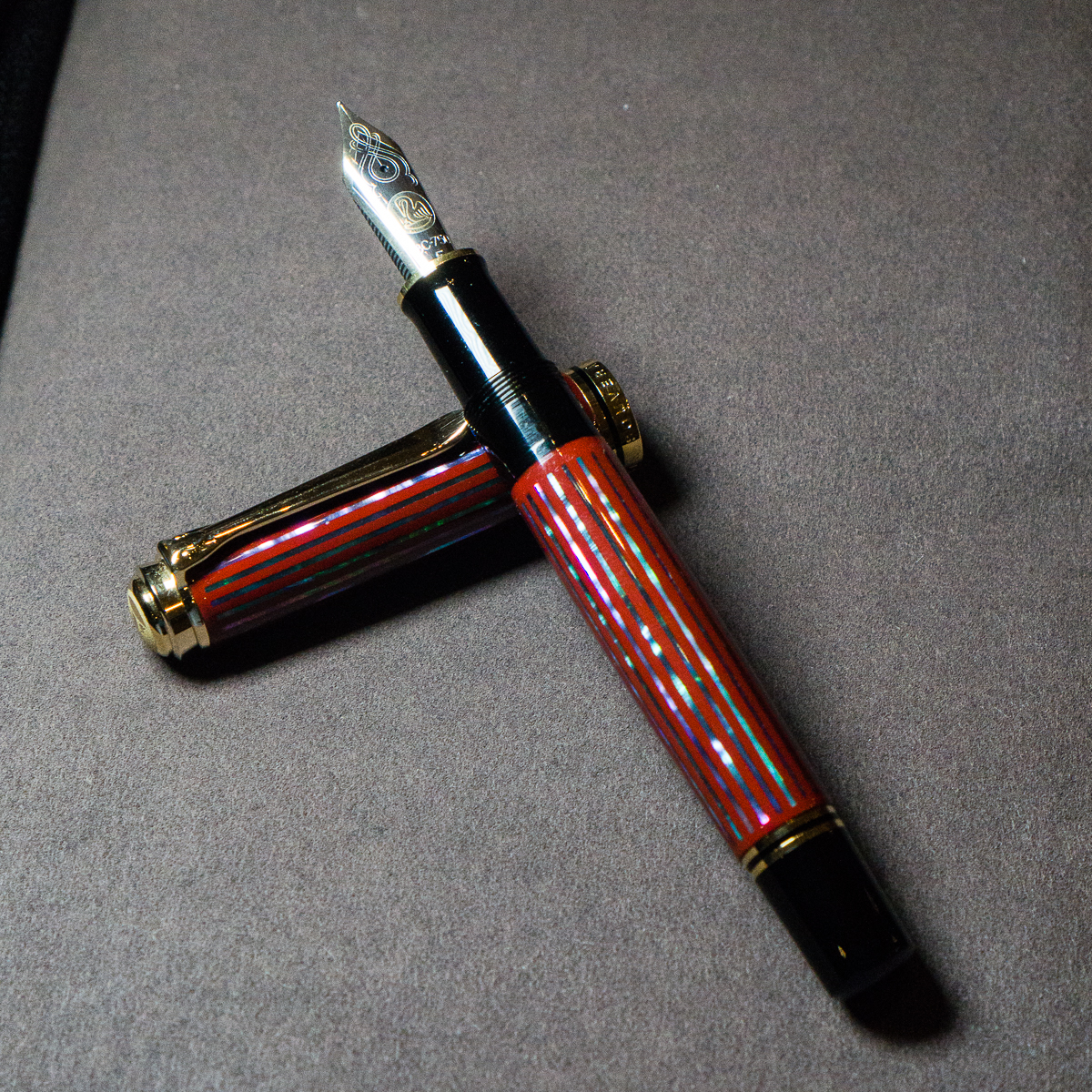
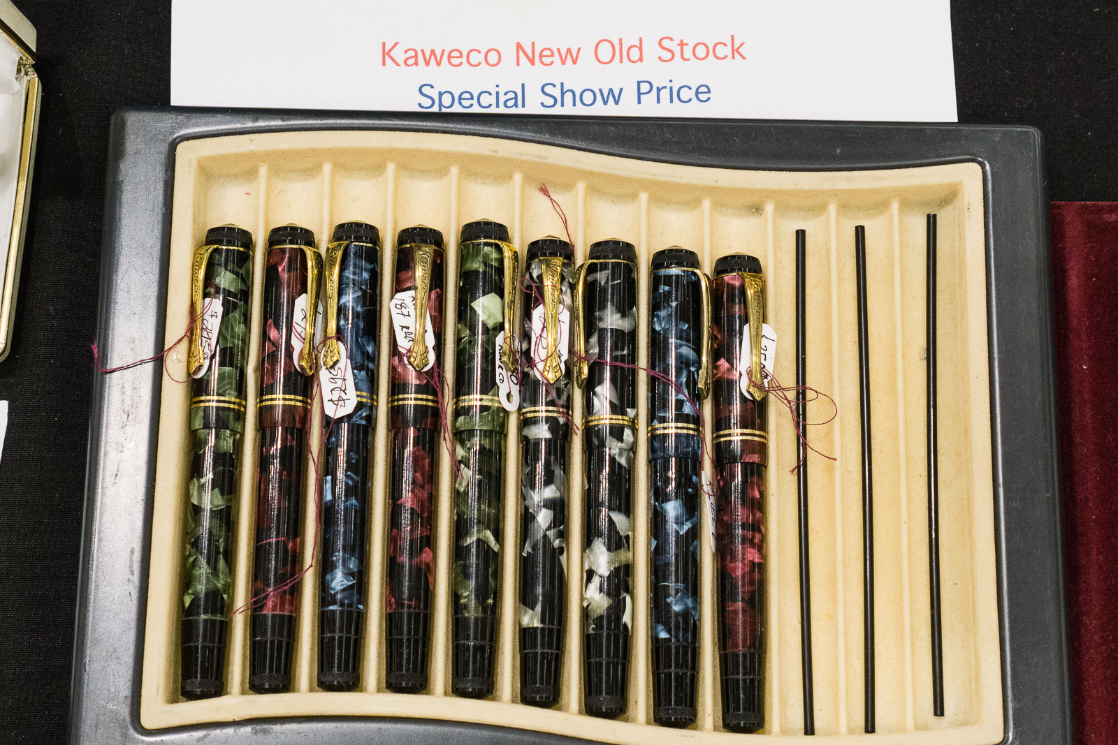
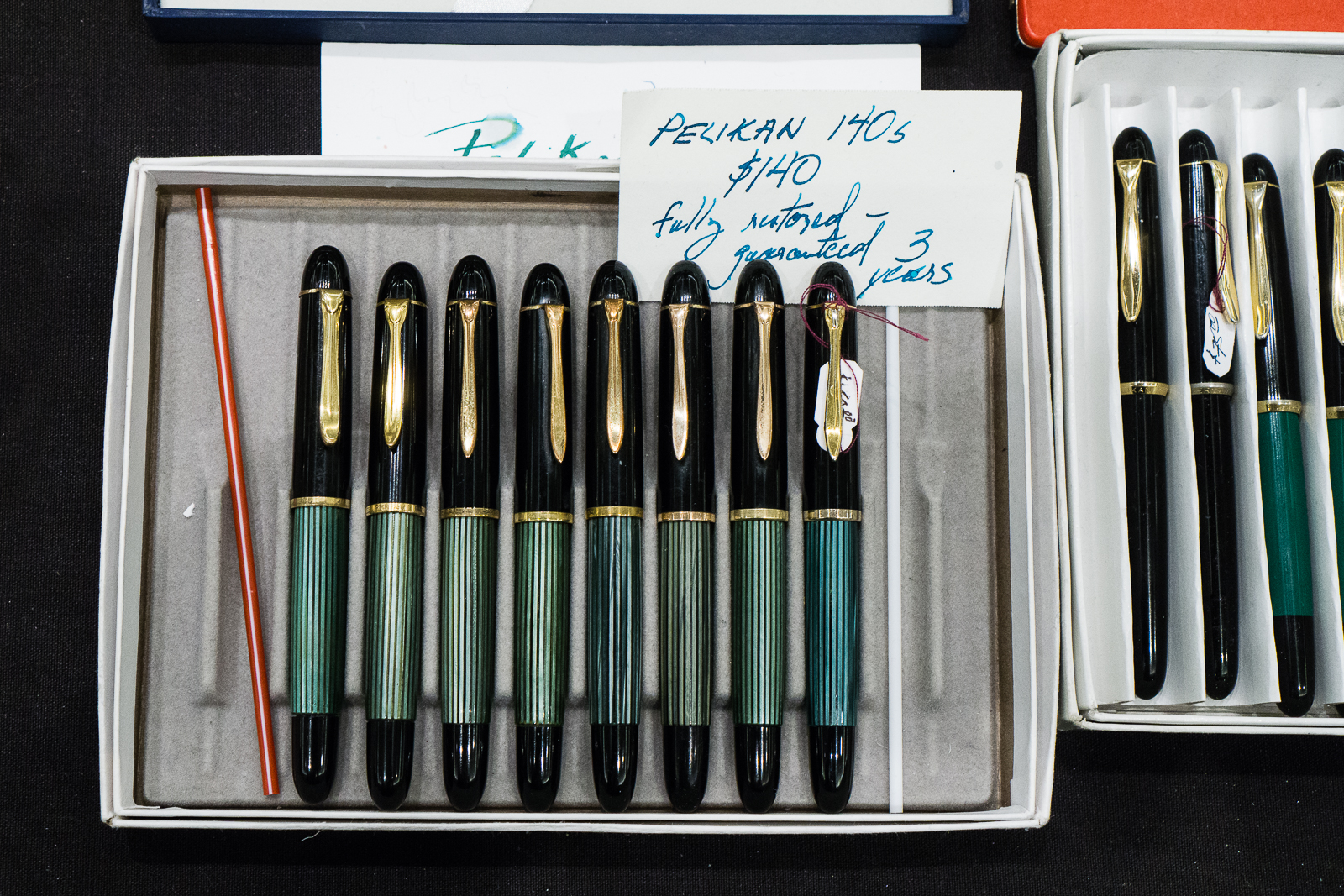
flexible nib pens
desk sets

More Pelikan pens…

Vintage Pelikan 100, 100N, etc.

I saw Eric Sands of Atelier Lusso who was also at last year’s SF Pen Show. He is a pen maker and he does great work as well. The clips on most of his pens were fashioned by Eric himself.

Atelier Lusso Pens
Atelier Lusso Pens

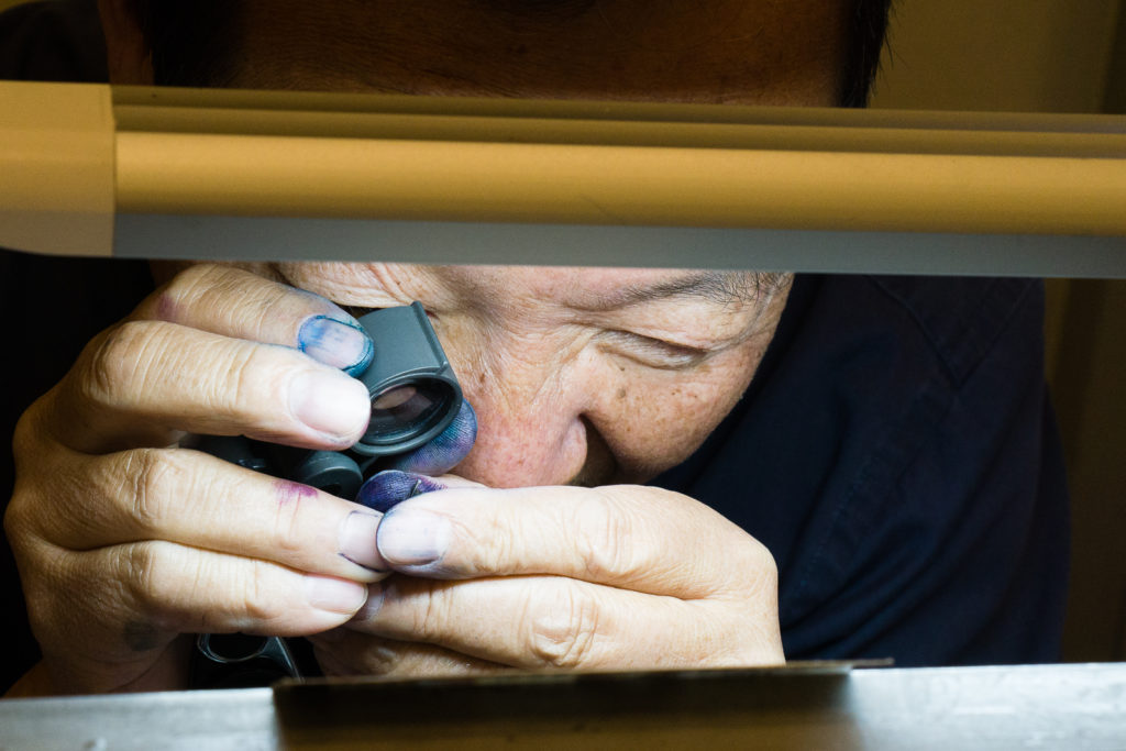
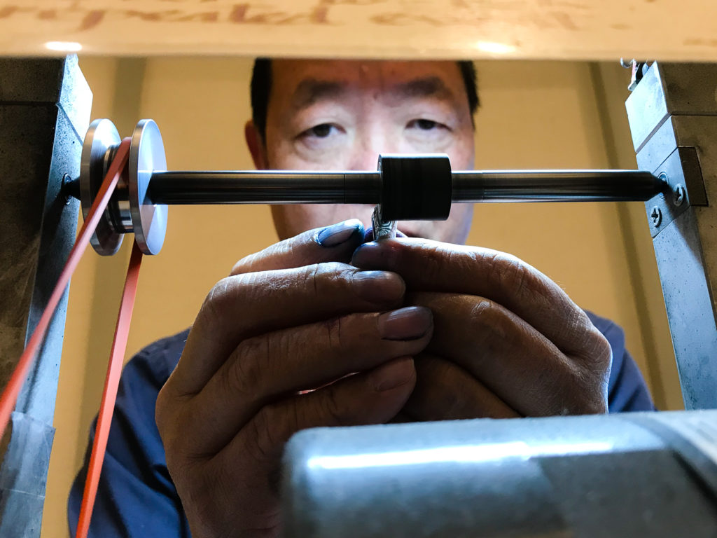
Back at Mike Masuyama’s table, Mike called me over and I had him do an italic grind on one nib as well as tune a vintage Pilot pen. A friend of mine was listed before my turn but had to leave the show so he entrusted me with 2 of his pens for Mike to work on. I spent a little over an hour sitting and chatting with Mike and other pen friends who walk by. This is one of the best ways to spend a Saturday afternoon at the pen show.

Mike checking out the nib with his loupe
Still taking a closer “loupe” at the nib
Mike applying his skills and grinding the magic on to my M800 nib


Sometimes, a vintage pen is stubborn and takes a little more time. Mike seems to be casting a spell on it or something. =P

After sitting with Mike, I walked around once again and just enjoyed the rest of the afternoon. We went to  dinner just outside the hotel and came back to “The Tent” for more hanging out.

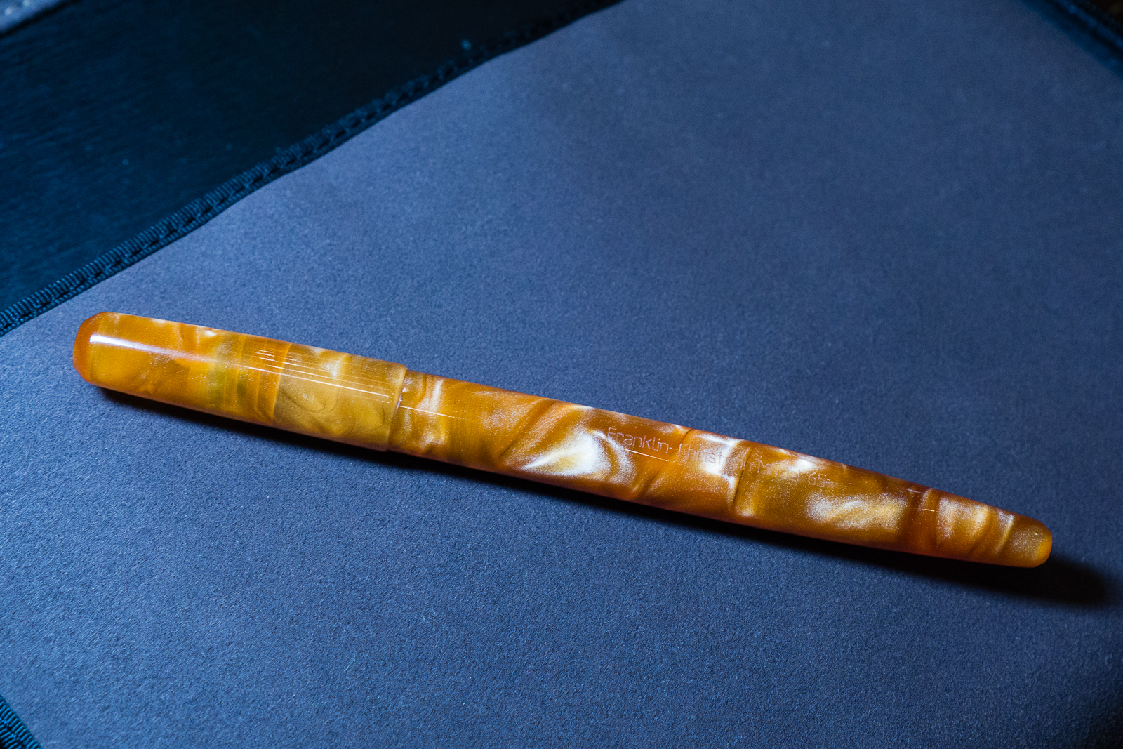
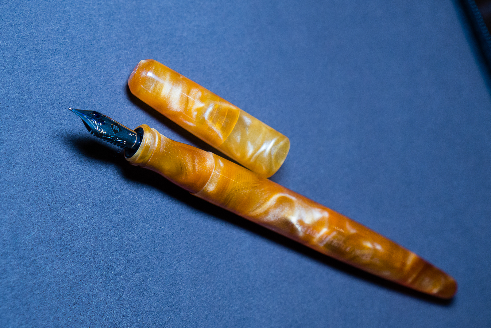
A friend of mine showed me her newly purchased Franklin-Christoph Model 65.

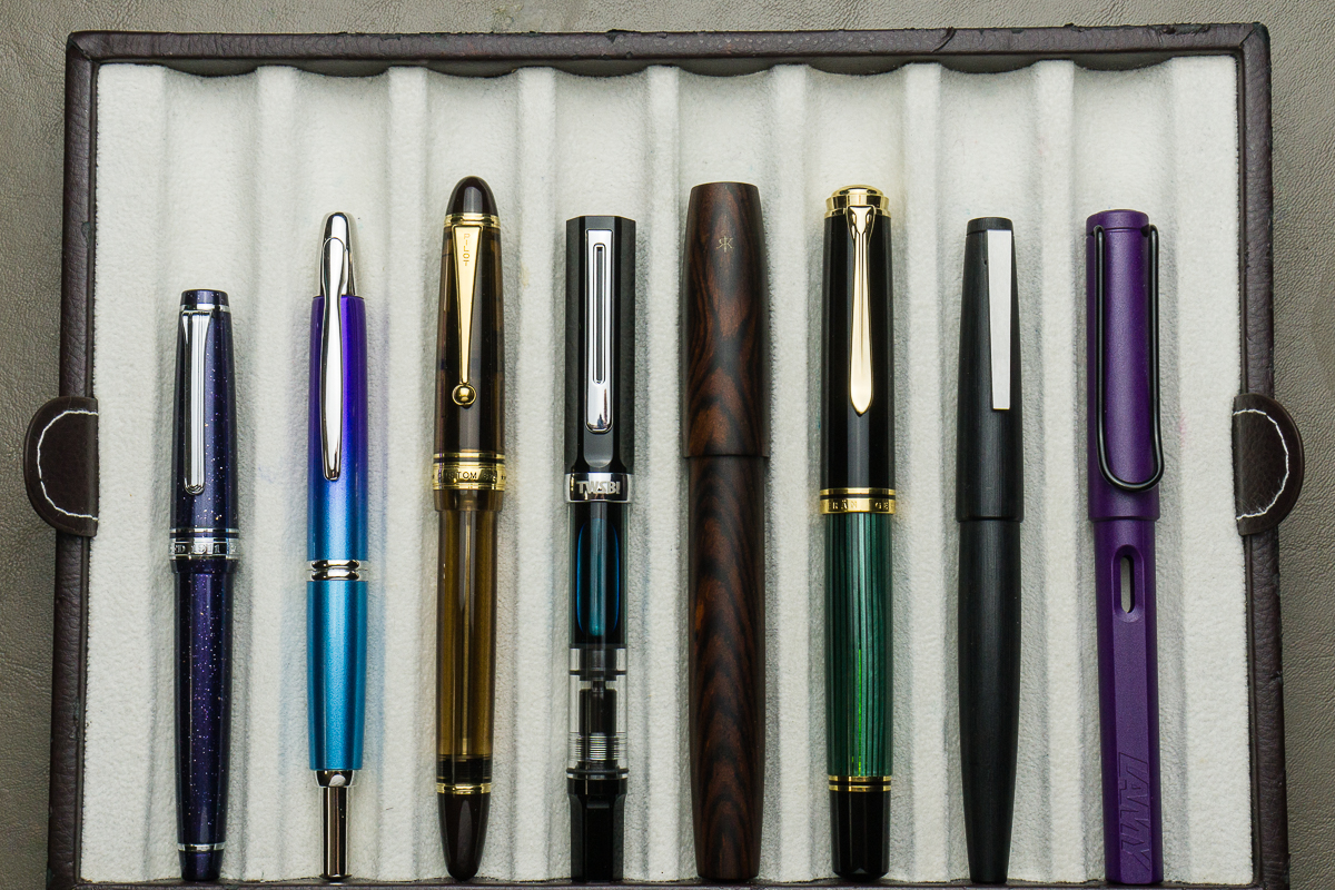
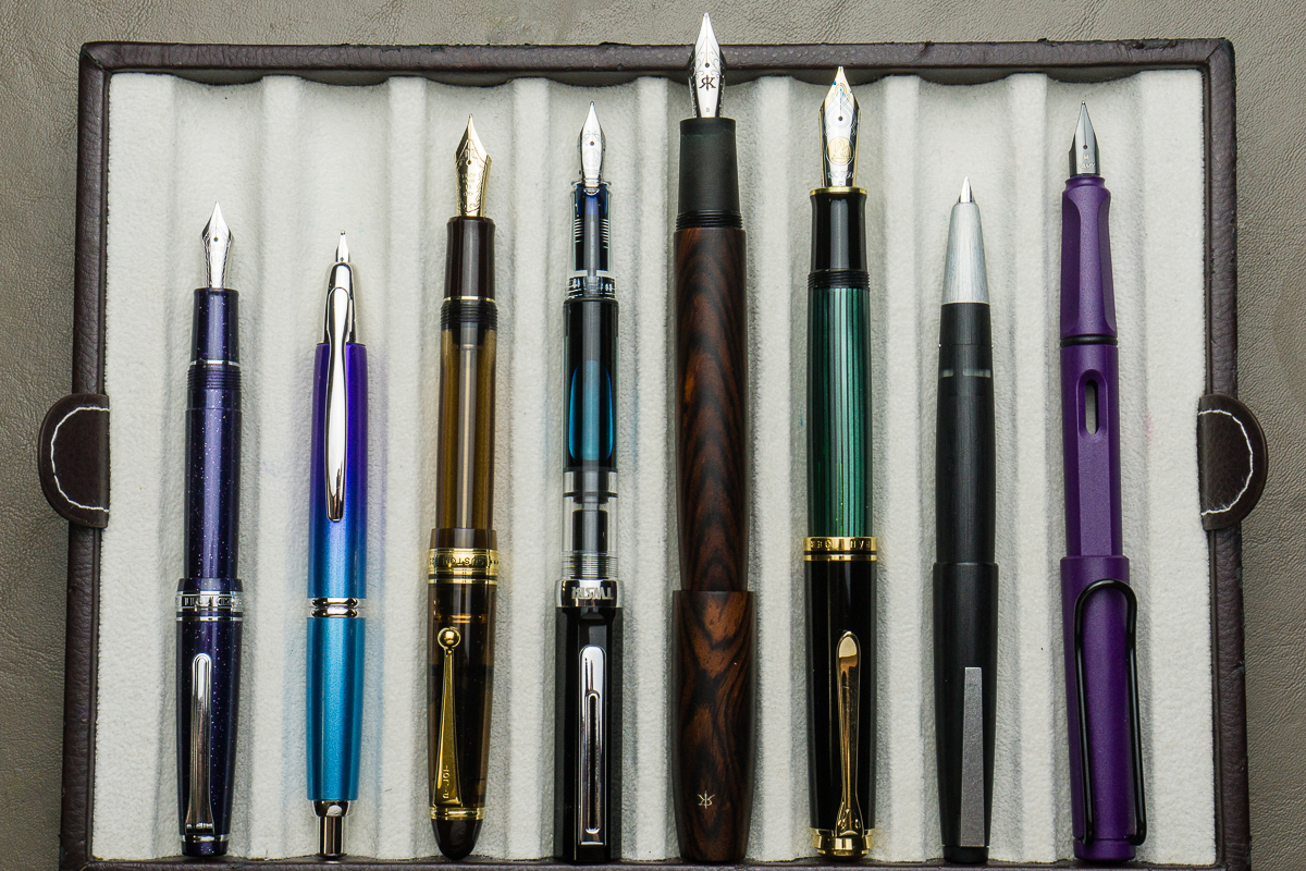
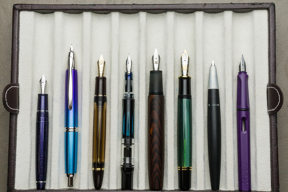
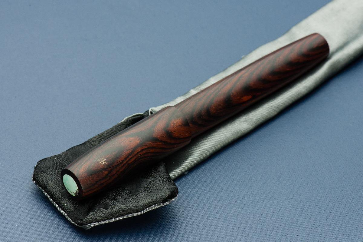
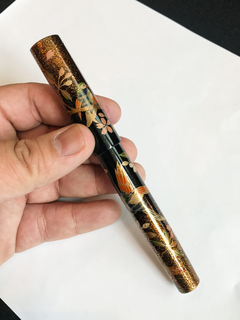
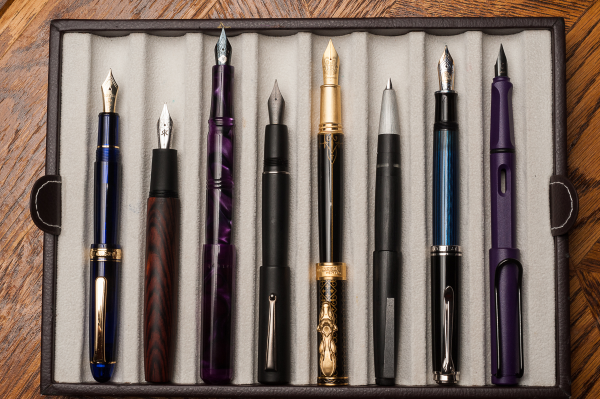
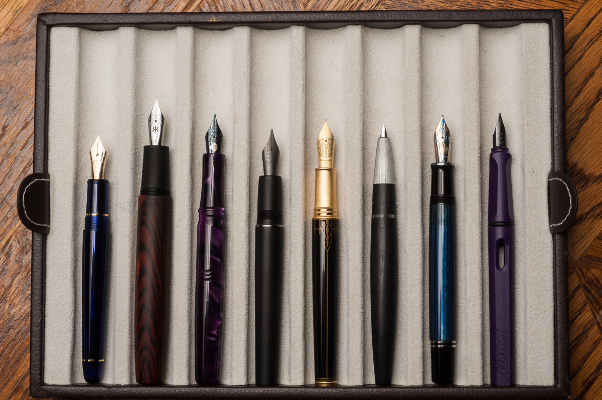
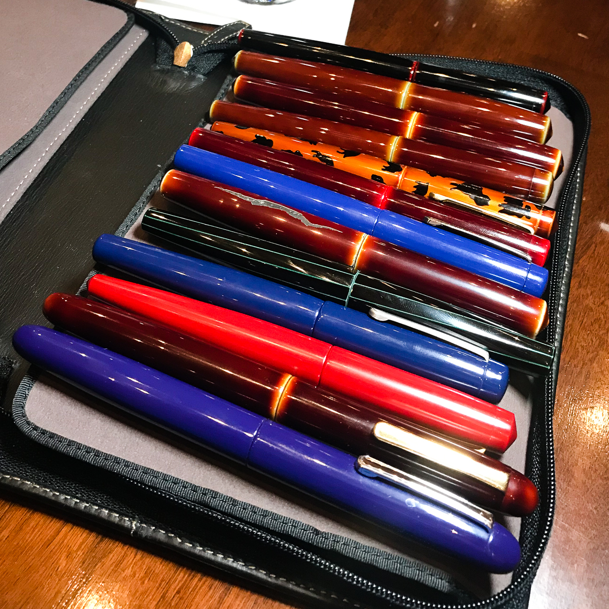
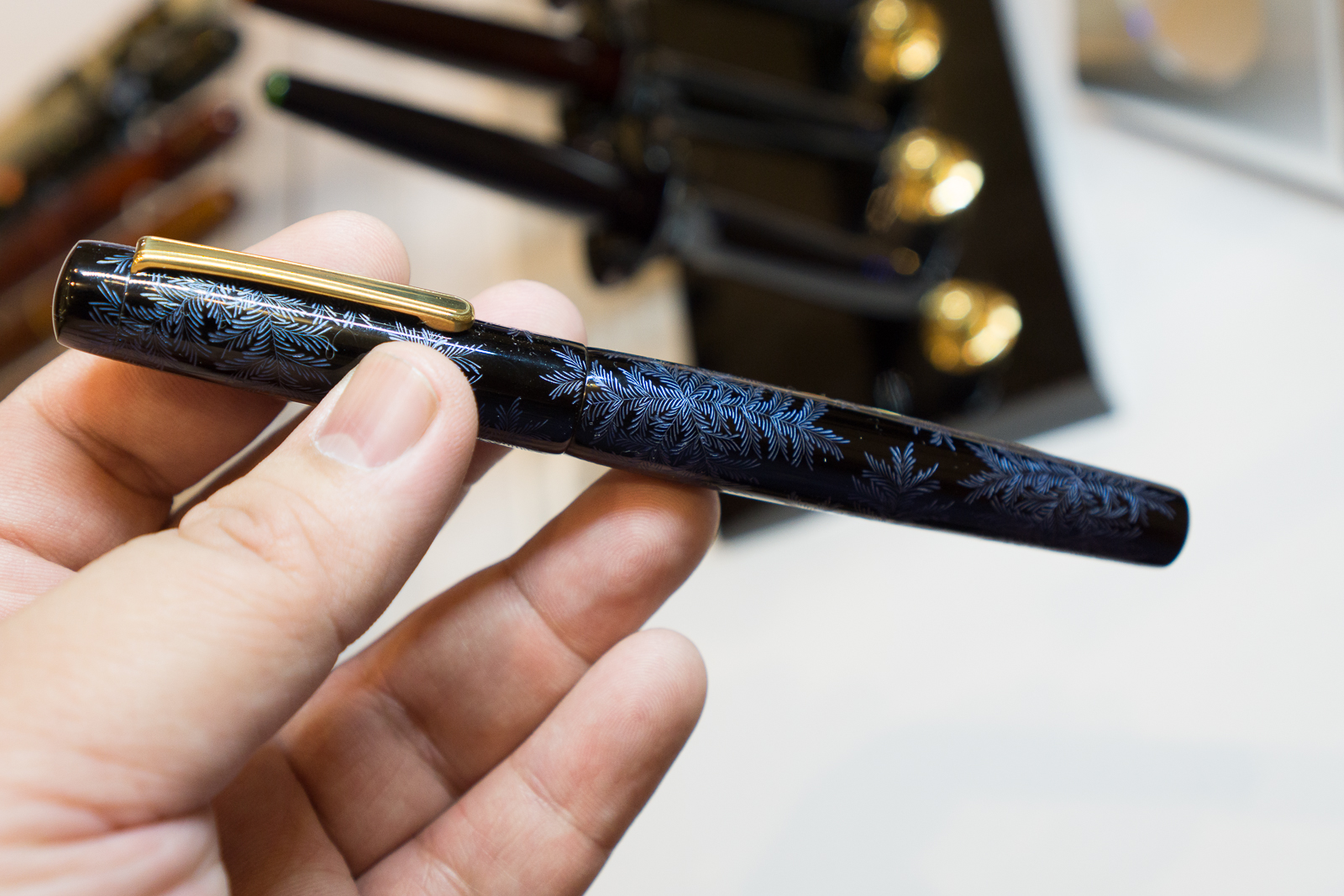
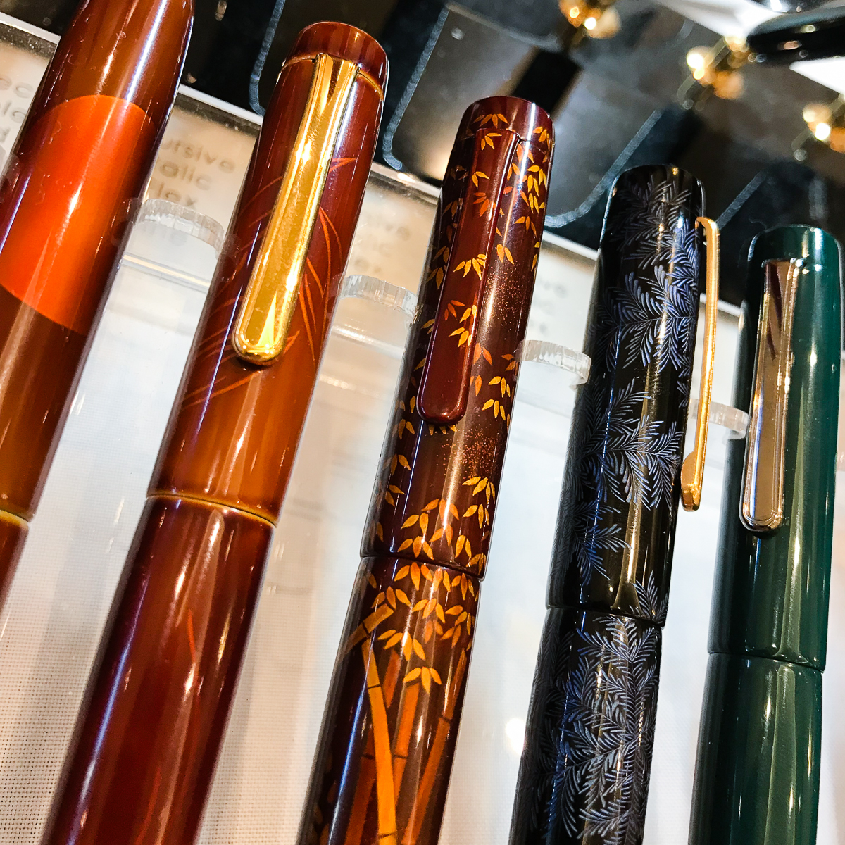
We were admiring different pens with my LED light panel then something happened. A certain brand of urushi lacquered pens kept on appearing under the light and we decided to take a family photo.

A Nakaya family photo from different pen owners
BTS Photo: A photo LED light panel makes a difference when you’re in a dark area
Kikyo (Blue) Urushi on 2 Neo-Standards and a Long. We were discussing how the kikyo finish was different among the 3 pens. Pretty interesting!

Called it a night and went to bed. Sunday is the busiest day and I am helping out at a table so I had to get some rest.


Sunday, February 18, 2018

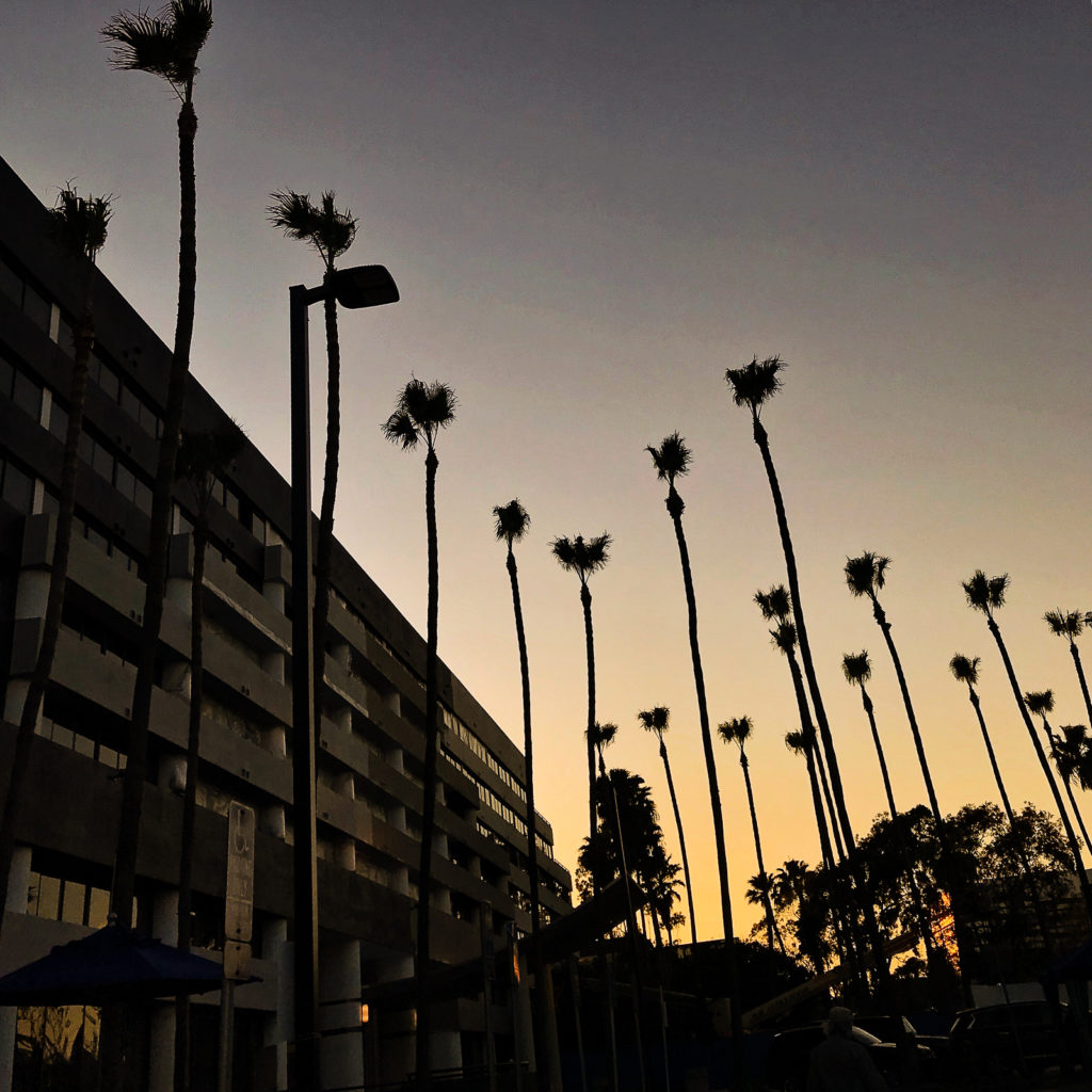
Last day of the pen show! Woke up around 6:30 to catch the sunrise. I swear, pen shows are the only time I sleep late, and wake up earlier than when I have to go to work. Pen Show Time Zone! =)

The show opens to the general public by 10:00am so the Trader Pass holders had 2 hours of last minute shopping before the crowd gets in. I took advantage to take a few photos before I had to work at a table so here are some photos as I walked around.

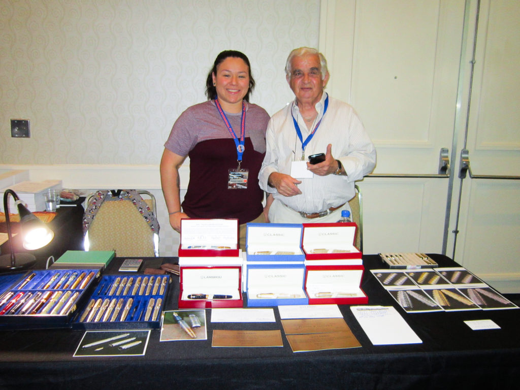
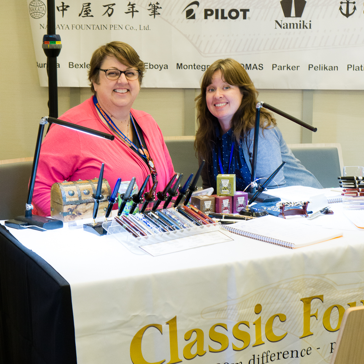
The Classic Fountain Pens table.

Nakaya nib testers
Neo Standard in Shinobu Blue
Urushi goodness
These ladies took care of all the customers over the weekend. They answered questions about the pens as well as nib grinds. Thank you!
Last but not the least, CFP’s security detail, Pony Boy. #adventuresofponyboy

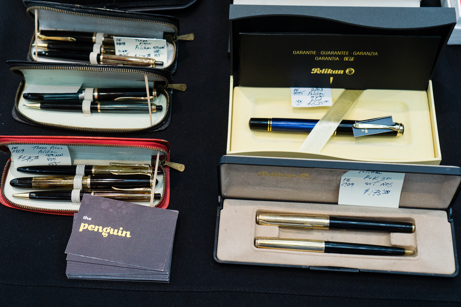
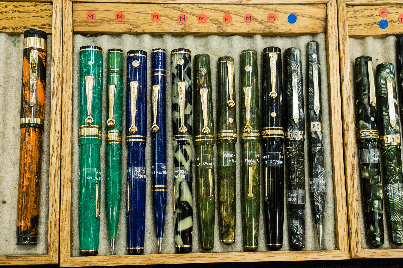
The PENguin Rick Propas‘ table had a lot of pens for sale and these were a few pens that caught my fancy. He is also a “fountain” of knowledge about pens and is always willing to share it.

Vintage Kaweco Sport pens
Uncapped vintage Kaweco Sport has a nice shaped nib and a blue ink window
These were Kaweco 187 and 189 vintage pens
Vintage Pelikan 140 for $140. These are perfect starter pens for people who want to go vintage and experience a Pelkan pen with vintage gold nibs. The box on the right were the 120 pens that usually sport a steel nib.
A Pelikan 400NN Tortoiseshell set in its original leather case
One of the more sought-after Pelikan pens is this M620 San Francisco from the City Series.
A different perspective to show the different cap finials of vintage Montblanc pens. #whitestarpen
Rick also had a lot of vintage Parker pens for sale. I wish I had funds to just buy all of these.
A nice gold-filled Eversharp Ventura set.
This is one of the premium pen trays =)
Pen shows have knives too!

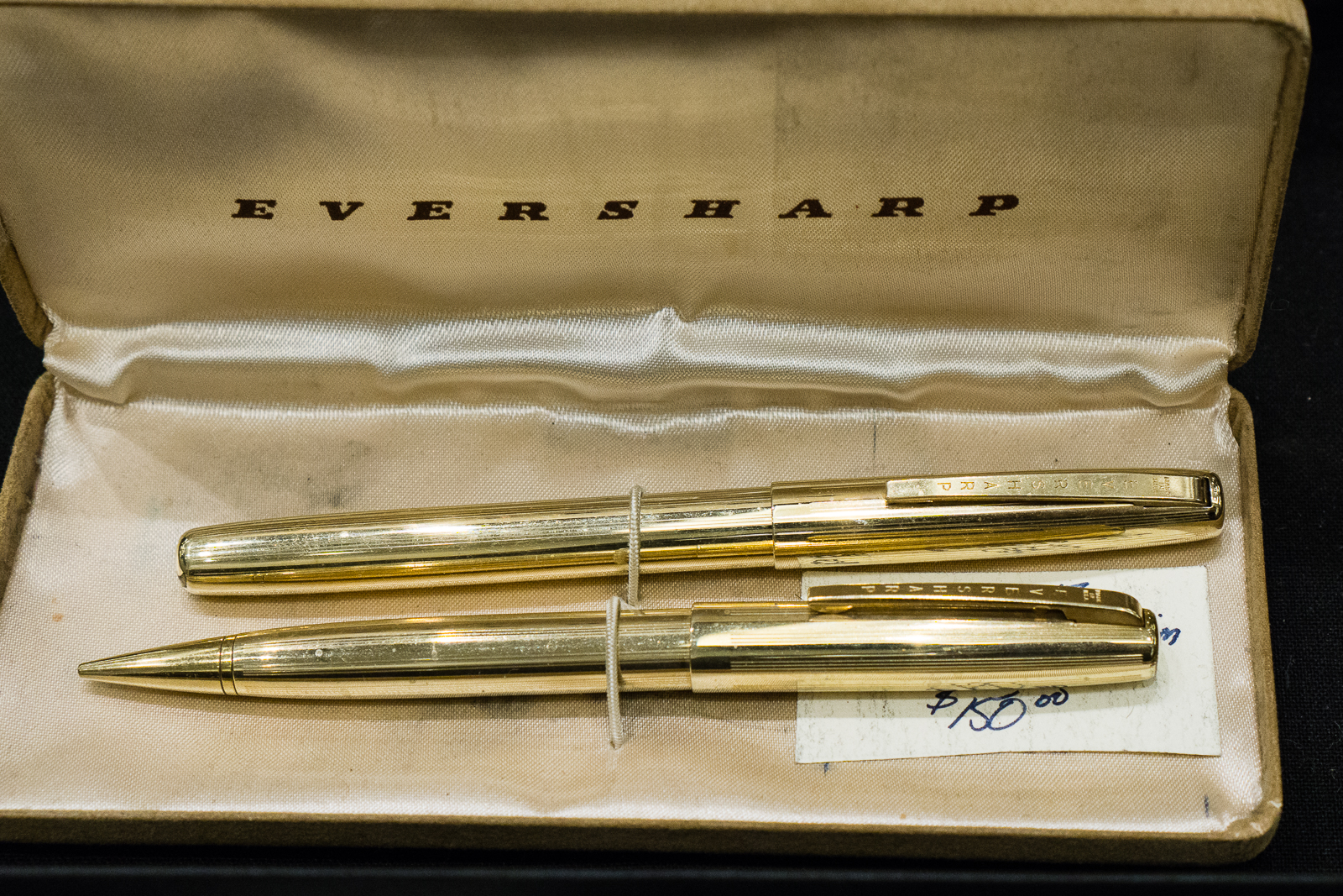
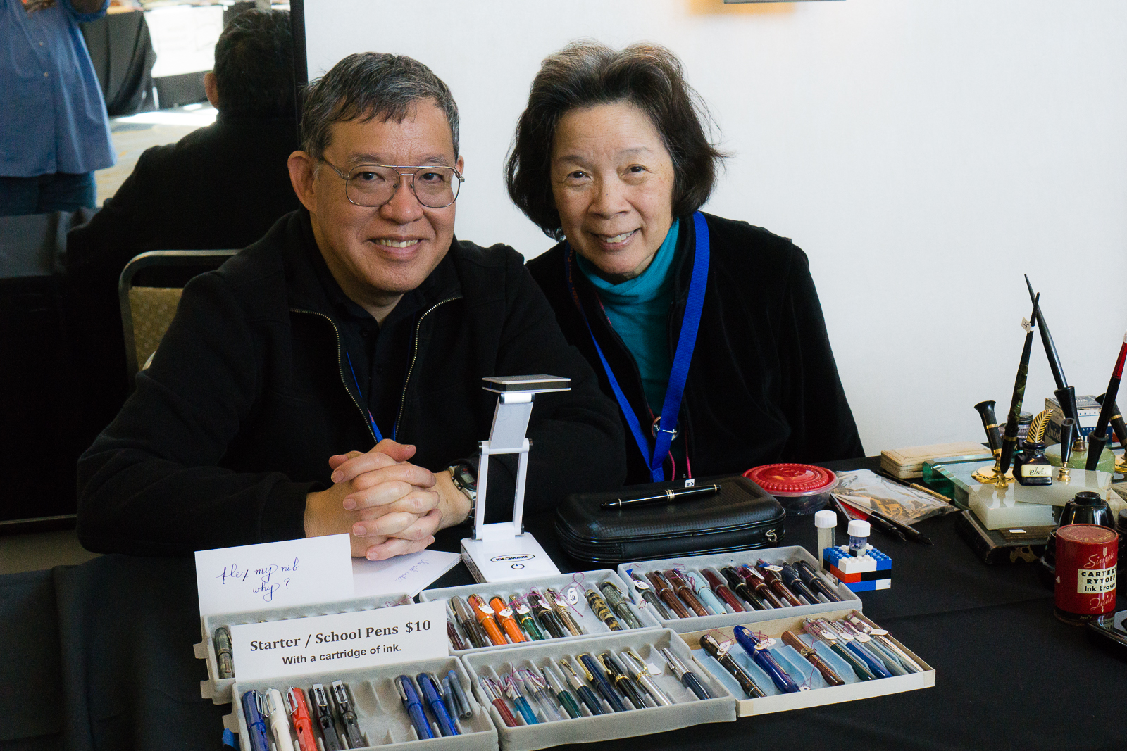
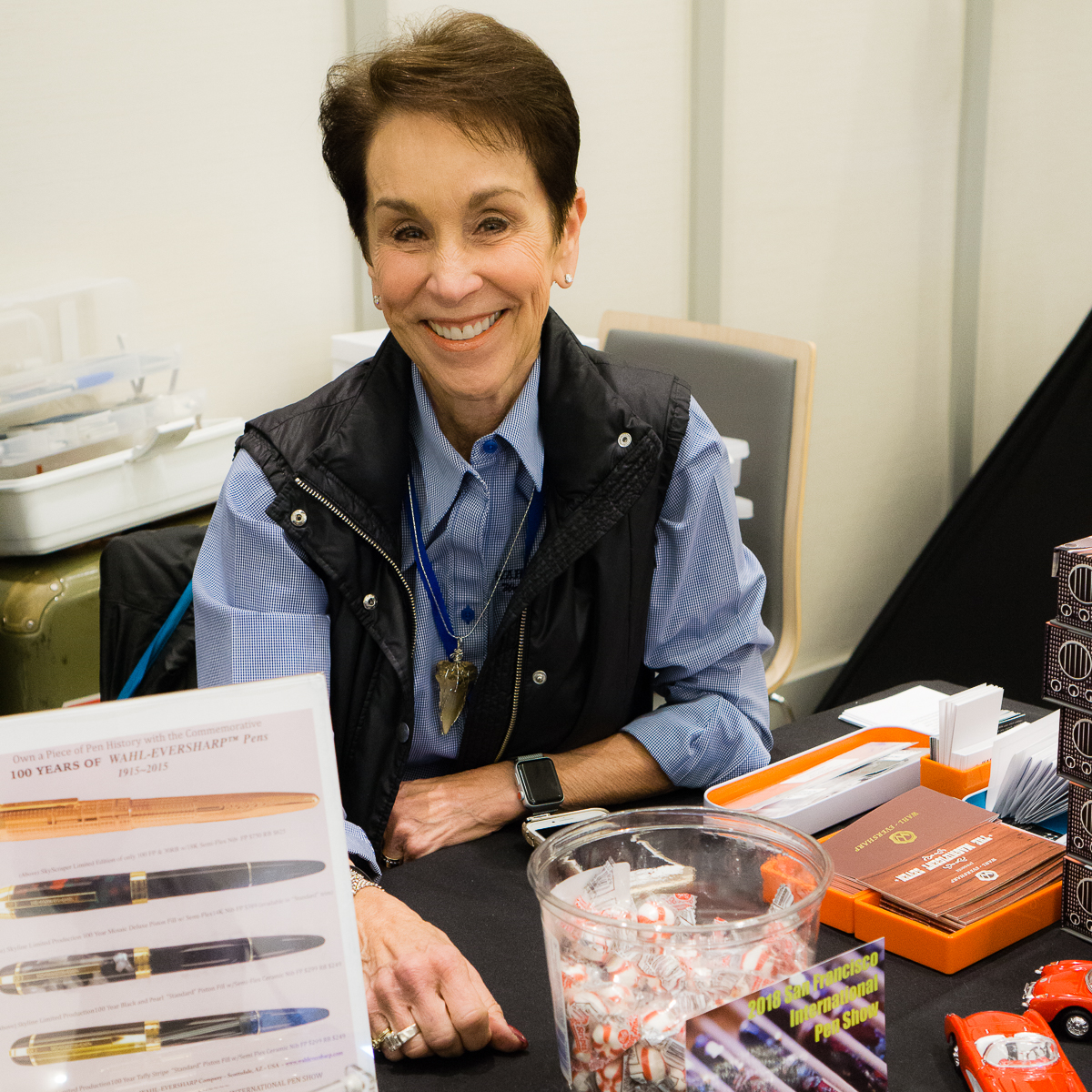
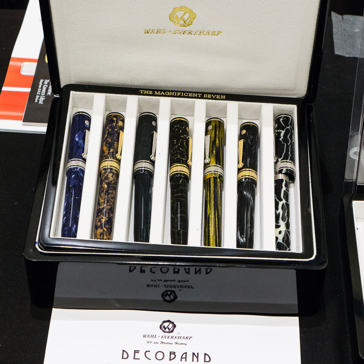
The Wahl-Eversharp table was manned by Syd and Judi Saperstein

Judi was ready with her sweet smile and to give away sweet candies!
Wahl-Eversharp Decoband Israel. That blue material is fantastic!
The Magnificent Seven Decoband set

Pendemonium’s Sam and Frank were ready for the Sunday crowd

Frank and Sam Fiorella. Two of my most favorite people.
I seem to always catch Sam while taking photos
Typewriters can also be found at a pen show

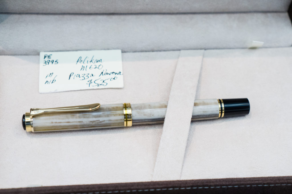
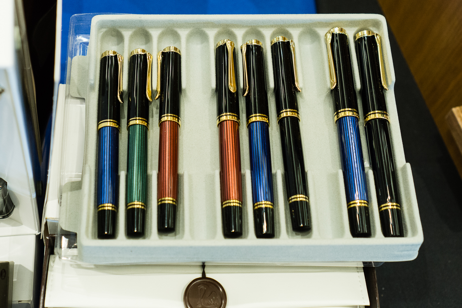
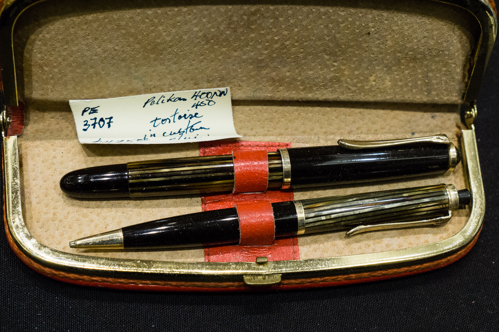
Bill Weakley’s table had beautiful discontinued Pelikan pens for sale.

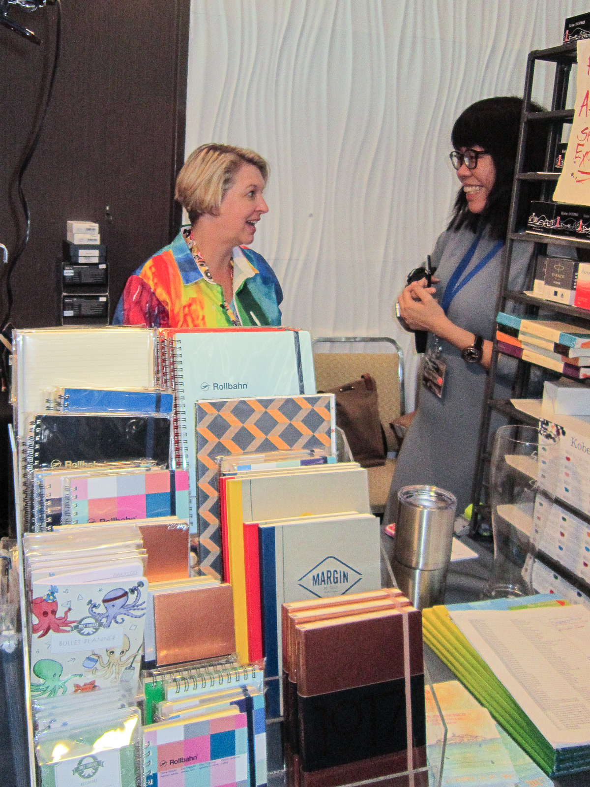
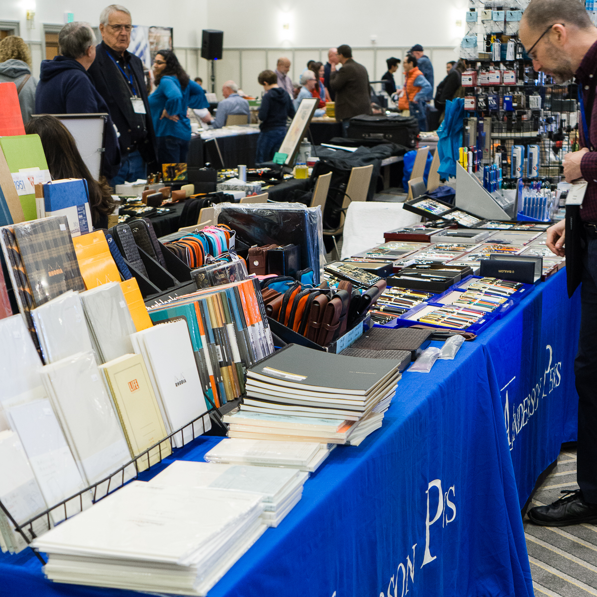
The Andersons always brings paper, pen cases, pens, and inks to the shows.

Anderson Pens

Vintage Wahl-Eversharp pens found at table of The Write Shoppe

Wahl-Eversharp pens

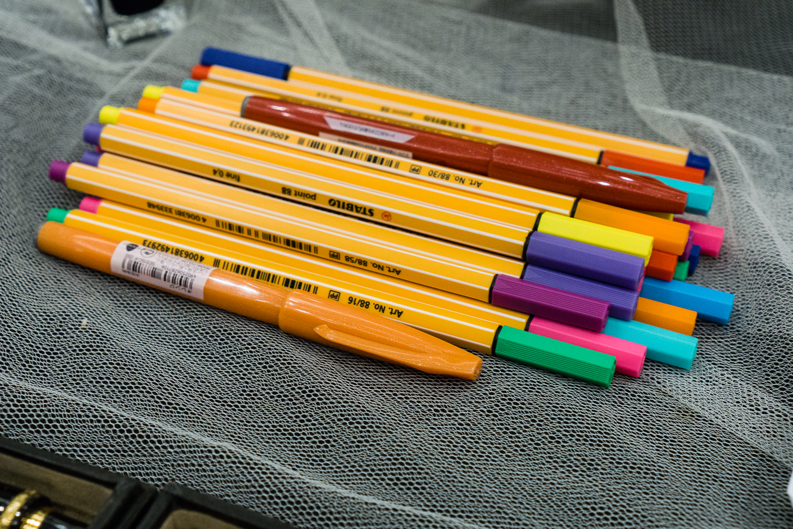
Not just fountain pens… Stabilo markers found at Carla M.’s table for kids attending the show.

Coloful Stabilo markers

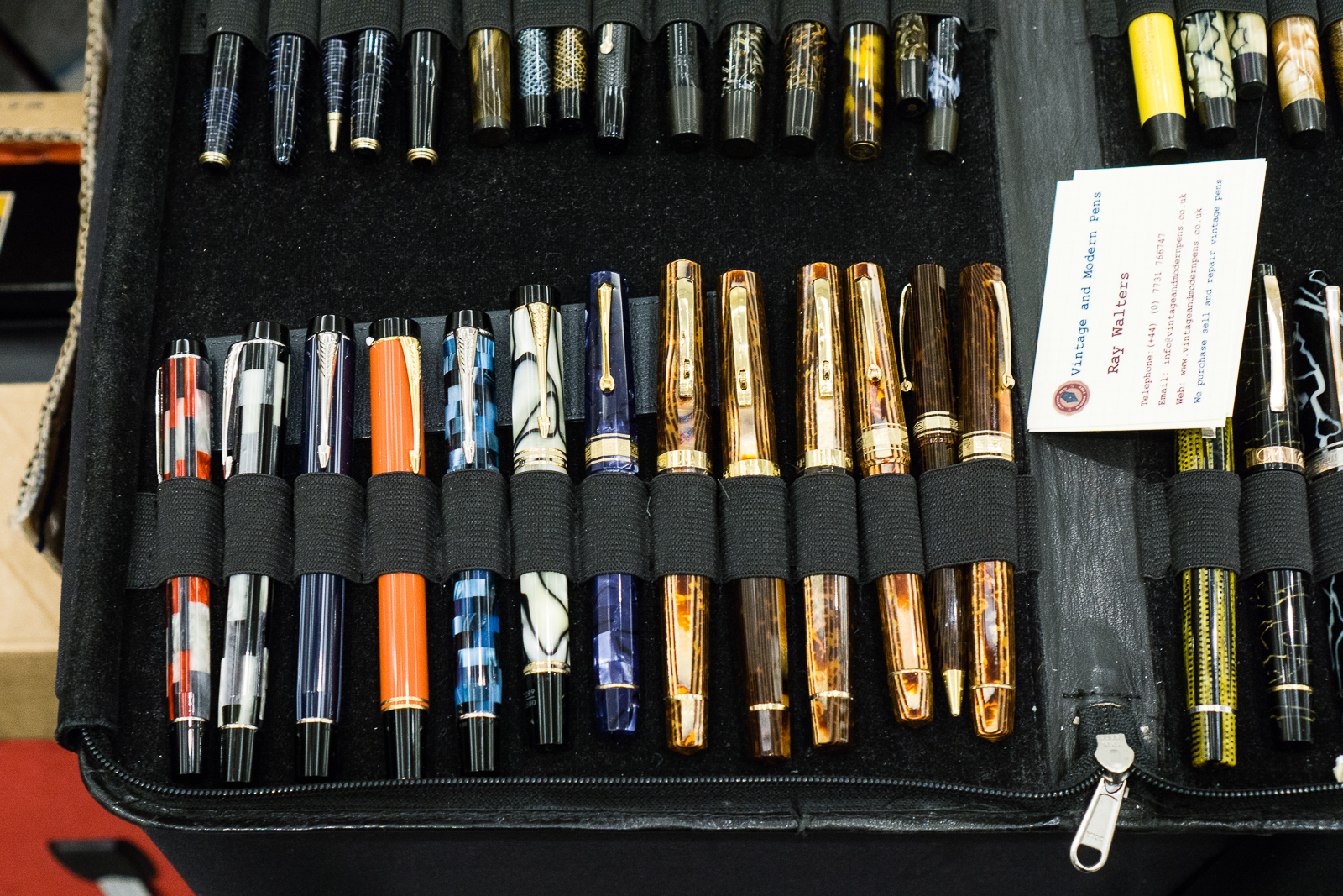
Ray Walters from the United Kingdom was at the show as well.

Parker Duofold pens, Omas pens

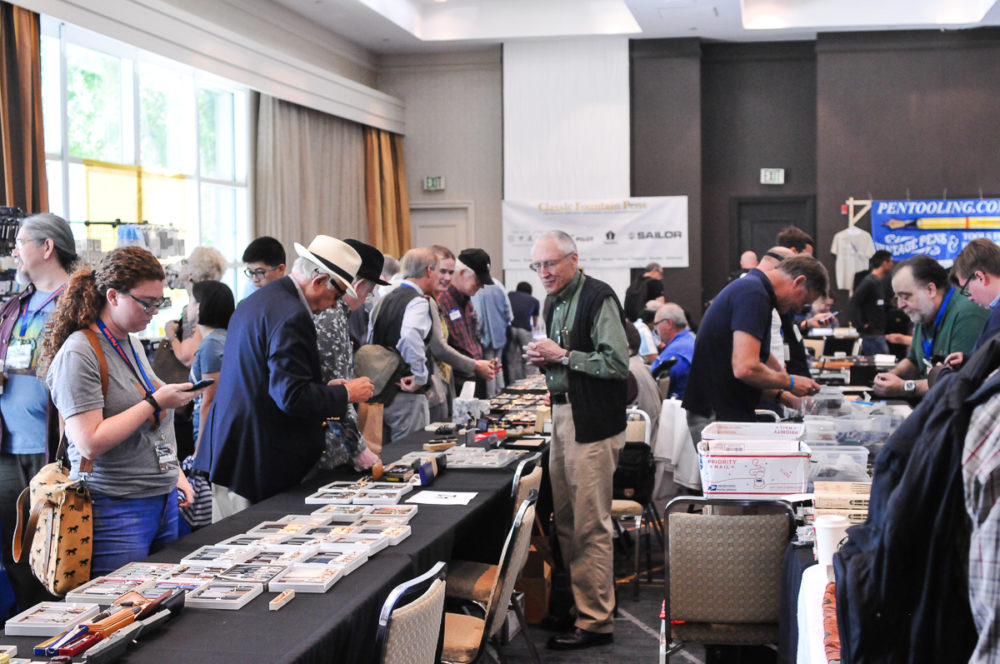
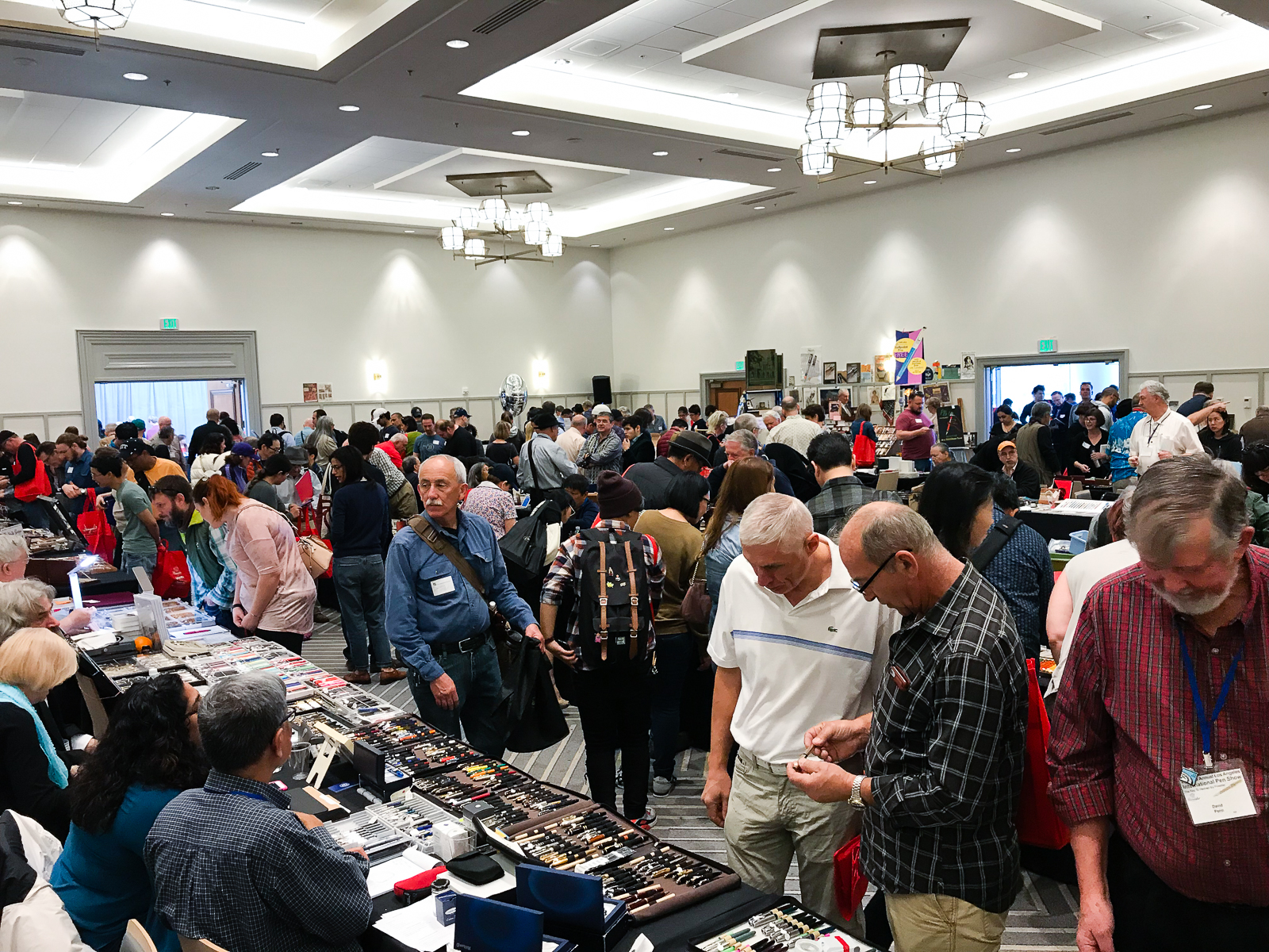
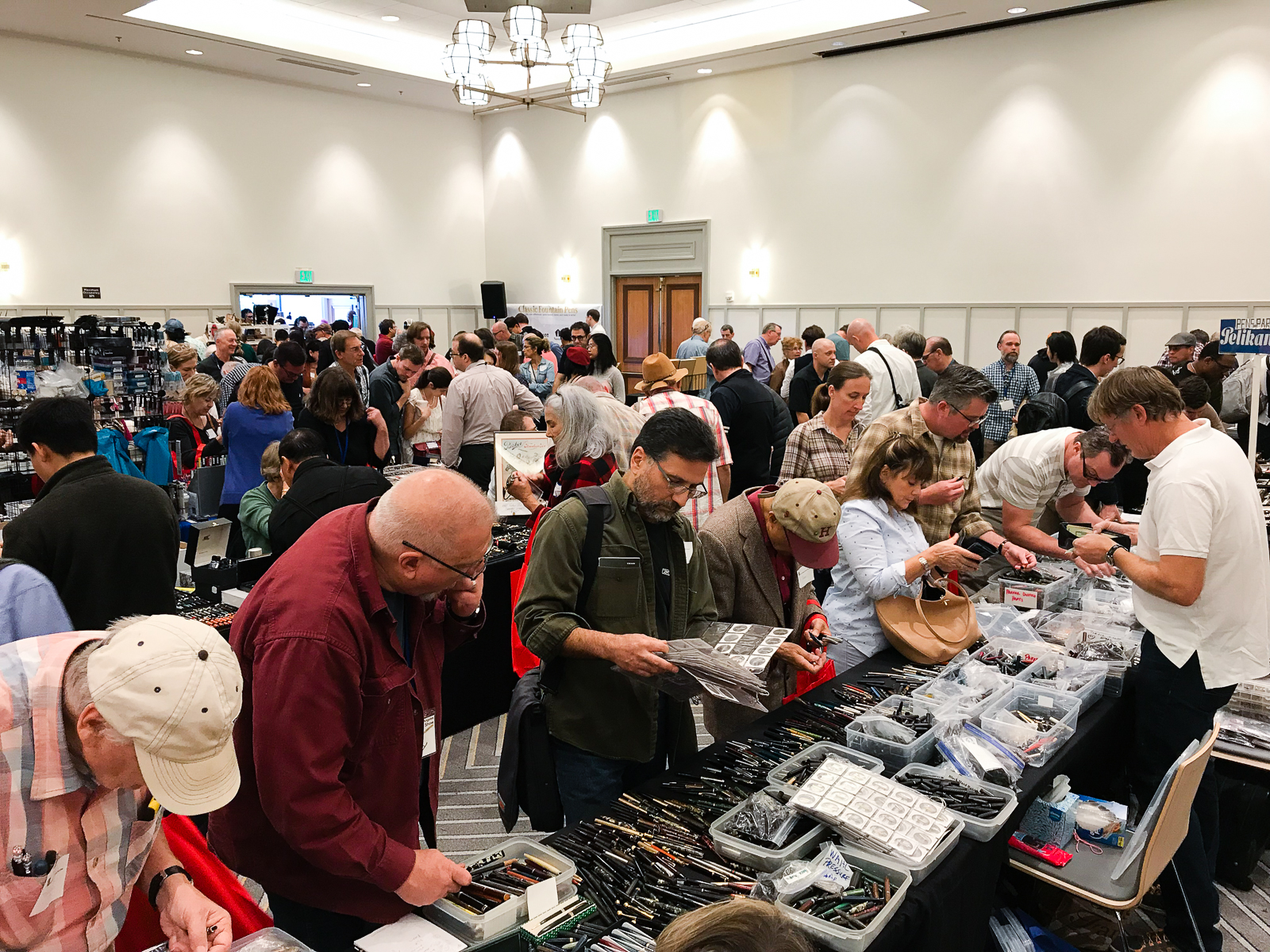
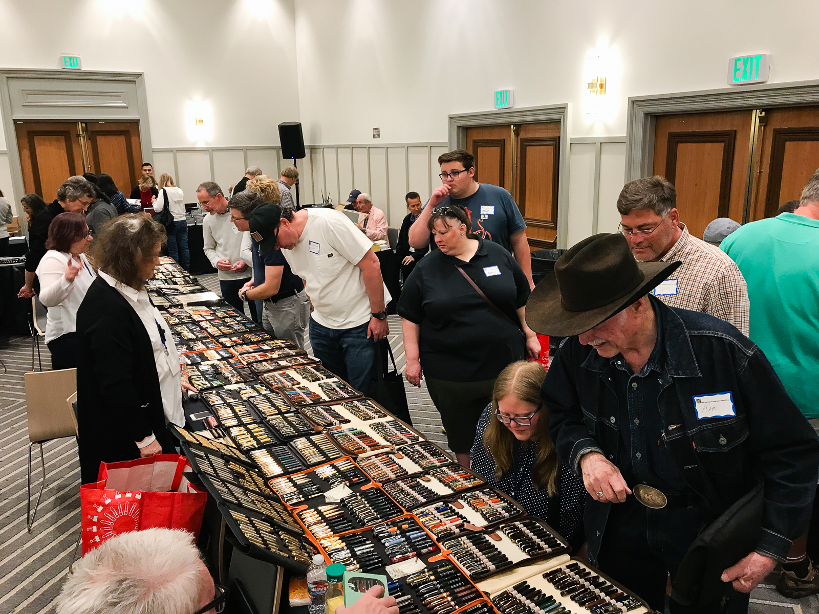
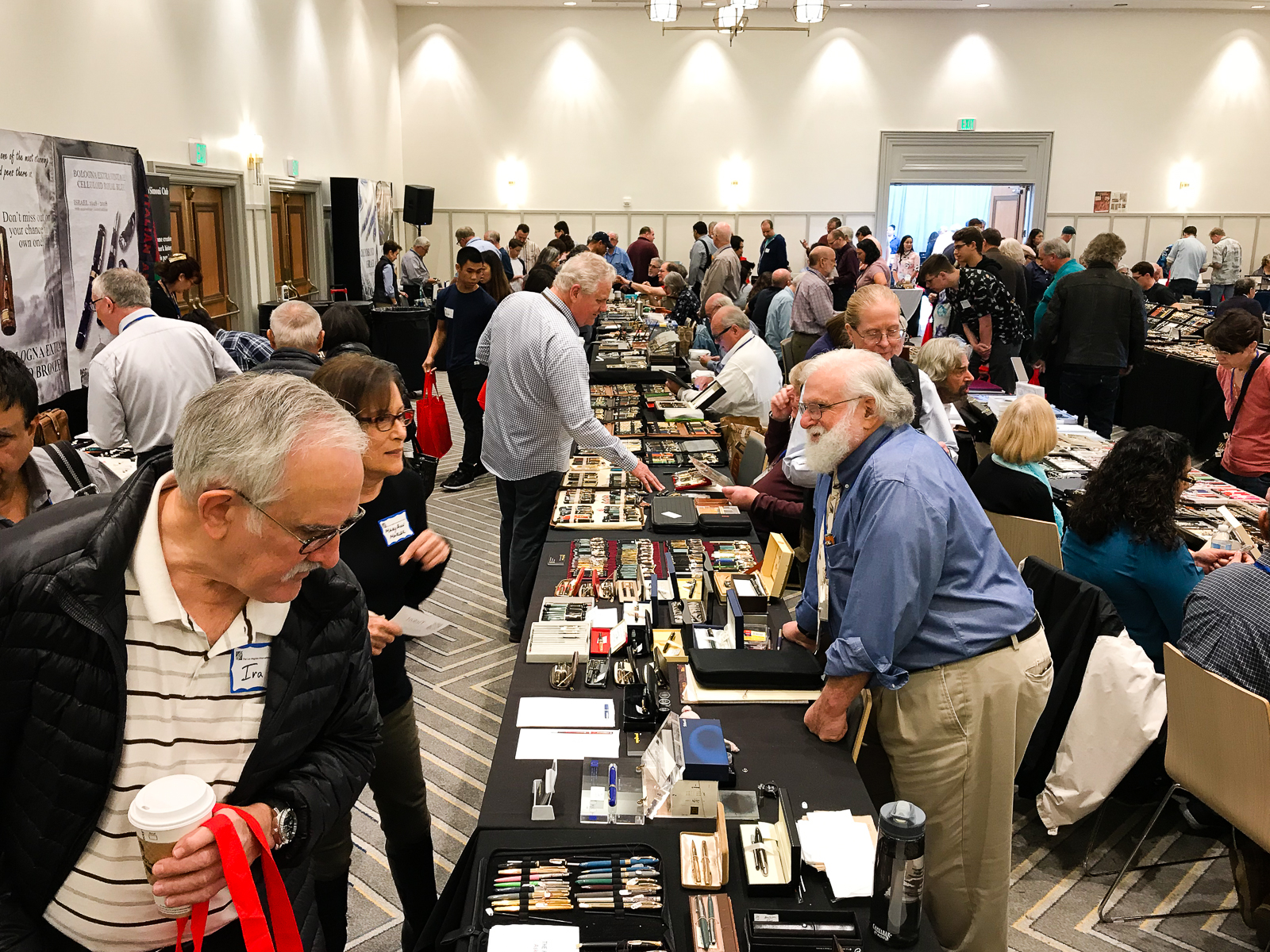
Alright, 10:00am arrives and the crowd is let in. I didn’t get to take photos of the line this year but it was pretty long as usual. Having one public day at a pen show honestly causes the big rush. Sometimes people wish that public was allowed to get in on Saturday as well. Will that change? Maybe. Not sure. I hope so. Anyway, here are my shots of the ballroom while I was helping out at a table around 10:30 so the full force of people haven’t really cleared the line yet.

Around 1:00pm, the crowd let up a bit and I got a chance to walk around and do a live Instagram video once again. Enjoy!

And with that, 5:00pm arrived and the 2018 LA Pen Show was over. Helped a couple vendors pack up, and went to dinner to end a tiring but fun weekend.


Final Thoughts

Pen shows are definitely a fun event to attend. Being in the pen community forges friendships and pen shows are way for you to see your friends. It can never be said enough, if you are near a pen show or can afford to attend one, do it. You find out how a certain pen feels in your hand, you learn about different pens, you find pens you didn’t know existed, but more importantly, you meet people who are as enthusiastic as you are with stationery and pens. To these people, these aren’t just sticks that hold ink. =P

As I’ve said before, pen shows for me have evolved into a social event and honestly is what I treasure more than what pens I bought. To all my friends, it was great to see you as always and to all the new people I’ve met, Instagram people I’ve finally met in real life, hope to see you all more often as well. Until next year!

Thank you for your time in reading my report!


“Pen shows are about the people and the stories between each other. The pens start the story and the people get closer.”

Part of my pen show haul: Sheaffer Flat-top, Pelikan 300, and LA Pen Show journal from Vanness Pens. I also got my Pen Addict “MemberChip” given by Brad Dowdy. Gotta represent Susie Wirth too!
13 Comments

Review: Ryan Krusac Studios Legend L-16 (Cocobolo, Broad Cursive Italic)


Hand Over That Pen, please!

Katherine: I love the materials and finish of this pen. The warm, rich wood paired with a turquoise finial is a beautifully organic pairing! However, I think the pens proportions are a weeee bit off? The barrel looks a little too long to me. But, I do tend to prefer stubbier pens.

Pam: This is one big pen.  Even for someone who loves the Pelikan M800 and the Sailor King of Pen.  The craftsmanship on this pen is obvious. From the warm and super smooth finish of the wood, the subtly engraved Ryan Krusac logo, and the turquoise inset, you can see the care that has been put into this pen. It’s a work of art.

Franz: The Legend L-16 is quite impressive in the hand as it is the largest in Ryan Krusac’s Legend pen line. The L-16 denotes that the barrel’s diameter is 16mm and then another size is the L-14 which is 14mm. Ryan had also announced the L-15 size (15mm) but that is still unavailable at the time of this review. The Legend pen can either be ordered from his website or at any pen show that he attends. I happen to have snagged this Legend in Cocobolo from Ryan at the 2017 Atlanta Pen Show. The dark Cocobolo finish is complemented by the turquoise inlays on the cap and barrel.

Being a wood pen, the Legend gets warmer while writing as well as the ebonite section. I must mention that Ryan pays attention to details with each pen he creates. When you are writing with the Legend, the best looking grain of the wood faces you as you write and also, the cap and barrel aligns perfectly each time. Smart move to make it a single thread!

In the Hand: RKS Legend L-16 (posted) – from left to right: Franz, Katherine, and Pam
In the Hand: RKS Legend L-16 (unposted) – from left to right: Franz, Katherine, and Pam
Detail: Turquoise inlays on the cap and barrel


The Business End

Katherine: The pen fits a Jowo #6 nib. The nib on this one had a nice BCI, unlike many of Franz’s other BCIs, this one had a little bit of tooth. It’s unlike most of the Masuyama grinds I’ve used, but it was a perfectly usable nib with some character. Would borrow (from Franz) again!

Pam: It’s a great CI.  I find the nib to be crisp and wet. It is pretty toothy, but I greatly appreciate the feedback.  It makes for a unique writing experience.  It did show off the sheen of Pelikan Turquoise fantastically.

Franz: When you buy a pen from Ryan, you have a choice of steel nibs or 18-karat gold nibs. I opted for a broad steel nib with the intention of having it ground by Mr. Mike Masuyama at the same pen show. Needless to say, the juicy broad nib was transformed into a crisp, juicy cursive italic. The broad nib can go through ink quite fast but the included standard international cartridge/converter does its job as it should. Also, I really love Ryan’s logo on the nib as it makes a “generic” Jowo nib match the pen.

Franz’ writing sample on a Rhodia 6.5 x 8.25 Meeting Book


Write It Up

Katherine: This pen is quite long for me… but surprisingly light. As a result, it’s a very comfortable pen for me to write with despite its size.

Pam: I am surprised how comfortable I found this pen.  The length and width/girth of the pen is similar to the Sailor King of Pen.  The Krusac is lighter for me. Due to the width of the pen, it’s quite comfortable to hold in the tripod grip.  However, for those with the iron fist grip, the step and the threads are right below where I would place my thumb.  No thread imprints for the win.

Franz: The Legend fits my hand very well and my journaling of about 15 minutes was very enjoyable. We may have taken a hand comparison photo of the pen with the cap posted but neither of us wrote in that mode. Reason being? I don’t believe this pen was made to be posted as the cap threads can mar the wood finish. Also, the cap only touches less than half an inch of the barrel which makes for a very long unwieldy pen, and the cap is unsecured and can wiggle off while writing. Unposted, this pen is plenty long even for my bear paw.


EDC-ness

Katherine: The lack of a clip or rollstop makes this one a bit of a danger to EDC… I imagine it doesn’t do well when hitting the ground. (Don’t worry Franz, I didn’t test that!) Additionally, it takes a full three turns to uncap — so I found this pen was a suboptimal EDC. But a lovely home desk-living pen!

Pam:  Honestly, it didn’t occur to me to try out the EDC-ness of this pen other than have it live in the Nock Sinclair.  My hesitation was that it didn’t have a clip and I can’t imagine dropping this pen out of my coat pocket, especially since it’s not mine to drop.  This is a “savor the journaling moment” pen where one would enjoy the finer things and slower moments in life.  Keep it at the desk or in a case is my recommendation.

Franz: I do echo the ladies above that the Legend pen being clipless is a risk for ROFY. (Rolling-On-Floor-Yikes!) So I’m a bit more conscious when I am using this pen at work and avoid walking around with it. I do enjoy writing with it while I’m at my desk during a call or something else that doesn’t require me to move around.

And because the pen is single-threaded to maintain the cap and barrel alignment, the trade-off is taking 3 full turns to uncap for use. Not really the best for on-the-go purposes.


Final Grip-ping Impressions

Katherine: If the proportions of this pen were a little bit different, I think this would be love. But, thankfully for my wallet, they’re not, and while it’s a nice pen, it’s not aesthetically balanced to me. Despite that though, it’s very usable even for my small hands — light and comfortable!

Pam:  If you appreciate the craftsmanship and the beauty of natural materials like wood, I would highly recommend this pen to you. For many, it’s a worthy grail pen to covet.  If this pen is too big for you, the good news is that Ryan Krusac has other sizes available!  Be sure to check Ryan Krusac out at your nearest pen show to see what works best for you.

Franz: As I started my review above, the Legend L-16 is an impressive pen — size-wise as well as aesthetics-wise. Anyone who is interested in this pen must try it out and see if it’s for you. Ryan is currently based in Georgia so he will always be at the Atlanta pen show but he travels to several U.S. pen shows including the Los Angeles pen show, and the San Francisco pen show.

One of the best parts of buying a pen from Ryan is that you get a handmade pen sleeve by his two daughters, Zoe and Sylvia. They even have their own handmade brand, zoia.co. The grey and black pen sleeve pictured above was included when I got the Legend in Atlanta.

What else can I say about the Legend L-16? I like it… a lot! So much that when Cary (Fountain Pen Day), and Ryan collaborated on a pen to raise funds for Shawn Newton, I jumped on the opportunity to get the FPD Legend pen in the L-16 size as well. The limited edition pen is made with Gaboon Ebony wood (pictures below).


Pen Comparisons

Closed pens from left to right: Sailor Pro Gear Slim, Pilot Vanishing Point, Pilot Custom 823, TWSBI Eco, *RKS Legend L-16*, Pelikan M1000, Lamy 2000. Lamy Safari
Posted pens from left to right: Sailor Pro Gear Slim, Pilot Vanishing Point, Pilot Custom 823, TWSBI Eco, *RKS Legend L-16*, Pelikan M1000, Lamy 2000. Lamy Safari
Unposted pens from left to right: Sailor Pro Gear Slim, Pilot Vanishing Point, Pilot Custom 823, TWSBI Eco, *RKS Legend L-16*, Pelikan M1000, Lamy 2000. Lamy Safari


Pen Photos (click to enlarge)

7 Comments

An Anecdote Of Two Pens


Hello! Franz here and I wanted to share a story about the two vintage pens above. From top to bottom they are: Parker 75 in Sterling Cicelé, and a Sheaffer Flat-Top in Jade Green celluloid.

December 9, 2017

On a Saturday while I was at work, a very good customer looked for me and astonished me. Let’s call him Dr. M, Jr. since he is a dentist. He said that he knew I liked fountain pens and showed me his father’s pens that he found at home. He asked me about them and I shared my little knowledge of vintage pens and told him that the silver one was a Parker 75 likely from the mid-’60s and the green one was a Sheaffer flat-top pen probably from the ’20s or ’30s. I told him that the Sheaffer’s cap and barrel were in beautiful condition and just needs a restoration of the internals. As for the Parker, the internals would just need cleaning from dried up ink and it would write like new.

Dr. M, Jr. shared that his father was a veterinarian and he always saw him with either of these pens clipped onto his shirt pocket just like I do when he sees me. He then said that he would be happy to give these pens to me. At first, I declined and said that these were his father’s pens and he should keep it. But Dr M, Jr. insisted that I be the one to keep them since I am more likely to use Dr. M Sr.’s pens. So I accepted his gift with a very wide smile on my face, and with a promise that these pens will be restored and be put to good use.

After Dr. M, Jr. left, I was so ecstatic and I immediately shared the story on the Facebook group of the San Francisco Bay Pen Posse. Below was my post and a lot of people responded with kind and heartwarming words.

Pen Condition and Characteristics

After doing some light research and examining the two pens , I found that the Sheaffer was probably made around 1938-1940 by looking at the imprint on the barrel and nib as well as the comb underside of the feed. The cap’s condition is almost pristine and the barrel is just a little darker. I think this darkening was caused by the rubber sac’s off-gassing thru the years but I could be wrong on that.

As for the Parker 75, even though I could not find a date code on the barrel, it was made around 1966-1968 due to the “flat tassies”, and the zero engraving on the section. The patina developed on the sterling silver is just uniform and beautiful. I would not dare polish the patina off the pen and keep its aged and used look.

Both pens have flat cap and barrel finials


December 10, 2017

So the next day, I attended the Pen Posse meetup and brought the two pens. As I walked in, Farmboy aka Todd, immediately told me that he won’t restore the Sheaffer and effectively no other pen posse member will restore it as well. He said that since the pen was given to me, no one else should restore the pen but me. That definitely makes sense since it will be a more meaningful repair. BUT… I was petrified because in my 5 years of being into fountain pens, I’ve never restored a pen before. I’ve never even seen one done nor even read a repair book. I was afraid that I might mess it up and break the section, or barrel, or whatever. Well, I accepted the challenge and told them I shall restore the Sheaffer next week under their supervision.

I immediately searched “sheaffer pen resaccing” on YouTube. Learned a few things but I knew the hardest part was getting the section off the barrel without breaking it. So all I really did during the week was soak the section in water to clear out the dried ink as much as possible.

Sheaffer section soaking in a shot glass

December 17, 2017

Resaccing the Sheaffer

Fast forward a whole week and the day has come for me to face my fears. Gary, a pen posse member, guided me along the whole process and he actually brought most of his pen restoration tools. I first had to heat the section so that I can gently pull it off the barrel. This probably took the longest time and it’s the one part of the process that requires patience. Basically, enough heat will expand the barrel so you can slowly take out the section. Emphasis on “slowly” because you risk breaking the barrel due to excessive force if you rush it.

While heating the section, rotating ensures uniform heating of the barrel. Like a rotisserie!

After some coaxing, the section finally came off and I had to clean out the old dried up sac from the section, and the barrel. There were bits of the sac that was onto the inside of the barrel that needed some encouragement with different scraping tools but it eventually cleaned off. The photo on the left below still shows the shellacked part of the sac still on the section and the photo on the right shows the cleaning of the section.

Bits and pieces of the dried up sac

After cleaning both section and barrel, a new sac was measured and cut to fit. I’ve learned from Gary that it’s easier to have different sizes of rubber sacs and trial fit them into the barrel rather than looking for a specific size for each pen. Most of the process here was not documented though, so my apologies. After cutting the sac, I applied shellac on the section and slowly placed the sac. I applied more shellac over the seam to ensure there were no gaps and let it dry. After about 30 minutes, I applied some pure talc on the sac for lubrication, and inserted the section in the pen barrel with a snug fit. Et voila! The Sheaffer has been restored! I waited 24 hours before inking it up though.


Reconditioning the Parker 75

The Parker 75 was a straight-forward restoration in which I’ve done before. I just soaked the section and nib overnight in water to loosen up the dried up ink. Afterwards, I took the nib out from section and flushed water to continue clearing out the ink. The section of a Parker 75 seems to hold A LOT of ink but with just a little patience it eventually cleared out. The converter’s rubber sac had holes and needed to be replaced so my friend Nik P. graciously swapped a “newer” converter for the old one. The sacs on these vintage Parker converters are replaceable.

And that’s about it for the Parker 75!


Conclusion

Well, thank you for letting me share my proud pen story. It feels great when you restore your own pens but restoring gifted pens with a history definitely holds more meaning and gives the pen a more personal (to me) story. Thanks to Farmboy and the Pen Posse for the encouragement, Nik for the help, and special thanks to Gary for the guidance from start to finish!

I’ve been using these two pens since December and love them! I haven’t seen Dr. M, Jr. since I restored the pens but when I do, it will certainly be a proud moment.

Take care and keep on writing friends!

– Franz

Writing Sample
Photo by Gary

Pen Photos (click to enlarge)

8 Comments

Pen & Ink Pairing: Sept ’17

Shall we say, #LATEPOST? Ha!

Our apologies dear friends. We skipped our August pen and ink pairing post for we all have been swamped for the past couple of months. We did not want to skip September as well no matter how late it may be. Thank you for reading and your kind words!


Katherine: This pen was the star of my SF Pen Show 2017 Haul — an “old size” Omas Paragon in Arco Verde. It has a smooth, relatively wet (but not puddle-y!) B CI. The nib is marked BB, but I think it was narrowed a little bit, but is realistically somewhere between a B and a BB, it’s wider than my other Omas B by a hair. I paired it with Waterman Tender Purple for both contrast and how easy to clean it is. The pairing has been very fun for me — a smooth broad CI putting down vivid stokes of purple, with a hint of sheen in the wetter spots. This might end up as a “one true pairing” for me, since I suspect this will be an annoying to clean pen. 🙂


Pam:  As a great fan of alliteration, it would only seem appropriate that September would herald in the Sailor Sky with Sapphire ink.  The Sailor Sky was my second Sailor Pro Gear Slim.  The rest is how we should say, his-ssstory.  This pairing is also one my first first “ink will match the pen” type of pairings.  (I am working on being more adventurous!) It’s one of my most sustaining pairings!

Sailor Sky is a special edition color, although I don’t think it’s limited.  It’s a special edition like the 4 Seasons. (I think.) The barrel color reminds me of a summer sky.  I originally paired this pen with Bungbox Omaezaki Sea.  However, what really stuck was Bungbox First Love Sapphire, an ink that Franz has introduced me to.  To say the least, it was love at first write. I absolutely love the sheen on this ink!  It’s a very distinct blue ink with a red sheen that comes through beautifully with the F nib of the Sailor Sky.  Some people have compared it to Akkerman’s Shocking Blue.  More than anything, I highly recommend trying First Love Sapphire, you might fall for it too.

Franz: So for the month of September, my pairing is the Pilot Custom 823 in Smoke or Black Transparent finish and Pilot Iroshizuku Ku-Jaku ink. Ku-Jaku/Peacock is a deep turquoise blue and is such a nice ink color for both work and personal use. The 823 is the first pen I’ve ever inked up with Ku-Jaku. Even though the nib on the 823 is a stock fine, I still appreciate the color it lays down on paper especially on Tomoe River paper in my Nanami Cross Field journal.

The Smoke finish definitely conceals the ink color inside the barrel but you can definitely see the ink level as you write. During meetings in a professional setting, this pen doesn’t call attention to itself but I still enjoy the subtlety of its transparency and places a smile on my face. Now on to trying to remember what that meeting was about.


Writing Samples (click to enlarge)


No Comments

Review: Franklin-Christoph Model 31 Omnis (Purpurae, Medium Nib)

Hand Over That Pen, please!

Katherine: I really like the material of this pen. It’s so pretty! The design of the pen isn’t my favorite though, but in the grand scheme of things, it’s not bad. It’s probably worth noting that I’m not a big fan of what I think of as FC’s “chunkier” designs, or the indented rings they like putting on pens. I love their models with clean lines — the 45, the p66, 66 and (a little bit less) the 20, but the 31 just isn’t as clean.  But, personal preference.

Pam: I was blown away by the size and material of this pen.  The material of the pen is stunning with alot of iridescence and depth.  I really like the shape of the pen, but the size of the pen is a bit much for me. I have mixed feelings about the indentations on the body and the placement of the nib.  It adds texture to the body and interest in the eye, but also breaks up the lines of the pen shape.  The nib is semi-hooded which baffles me a little bit.  I didn’t notice this before on other FC pens and I can’t decide if I like it or not.  Overall, I think the model 31 is a great add to the line up for those with larger hands or prefer larger pens.

Franz: “Holy swirly purple pen Batman!” Yep, that was my reaction when I saw this at the LA pen show in February 2017. This was the first Model 31 I ever saw and it was (at that time) the only prototype in the purpurae material. When I saw this pen, I knew I had to have it. Anyway, going back to the pen model, this is a fairly large pen size in the Franklin-Christoph line up. Their model 19 is still the largest of the group but I think the model 31 is just a level below that.

Now for the details that my co-bloggers have mentioned, I love the indented rings on the barrel as it’s quite distinctive. While I’m at a pen show hovering at a Franklin-Christoph table, I can immediately identify a model 31 from their display because of these rings. The nib is recessed just like their model 20 and provides a smooth transition from the section to the nib which I’m liking very much.

In the Hand: Franklin-Christoph Model 31 (posted) — from left to right: Franz, Katherine, and Pam
In the Hand: Franklin-Christoph Model 31 (unposted) — from left to right: Franz, Katherine, and Pam


The Business End

Katherine: Like all FC nibs, this one was a comfortable and unproblematic writer. Franz had a steel medium in it and it was smooth, wet without being soggy, and an all around undramatic but very reliable writer. No complaints!

Pam:  Like all FC nibs that I have tried, it wrote well.  Smooth, saturated lines without getting too heavy.  The black anodized nib is amazing.   I particularly like how the logo stands out on such a sleek nib.

Franz: Surprisingly, I asked for a stock medium nib when I got this pen and Mr. Jim Rouse actually chose the Shadow (black) finish of the nib to match the pen. As with all Franklin-Christoph pens bought at a pen show, the nib is tuned by Jim to your writing preferences. So this medium nib is one of the smoothest, and perfect flow writers I have.

Thanks very much ROUSE! 🙂


Write It Up

Katherine: This pen was a wee bit top heavy when posted (the cap doesn’t post super deeply, so the pen ends up kinda long), but when unposted, is very comfortable. The threads are on the section, so I don’t even have to worry about gripping them when I hold my pen further forward. I could write for pages with this pen.

Pam: I preferred writing with this pen unposted.  In my pixie handed fist grip I found it to be top heavy when posted.  I had no issues writing with this pen as I found it relatively light (for it’s size) and well balanced.  The width of the pen is quite comfortable for either the fisty grip or the tripod grip.  For a larger pen, it is quite comfortable in petite hands.

Franz: As seen from the “In the Hand” photos above, the Model 31 is perfect for my hand with both the cap posted, or unposted. The elongated section is great because my grip comfortably lands right before the threads start when unposted. If I post the cap, it does get a bit long but it’s not unwieldy at all. The light cap doesn’t make it top heavy for me especially when I move my grip a little further back. #BearPaw

I wrote with the 31 unposted, and posted equally within twenty minutes and it was a very pleasant journaling session.


EDC-ness

Katherine: This made a solid EDC carry. It feels solidly made, uncaps fairly quickly and has a reliable clip. I wouldn’t hesitate to keep this pen in my pocket, or even throw it in my jacket pocket with my keys (don’t worry Franz, I didn’t!).

Pam: Like all FC pens,I have no qualms using this pen as an EDC. It’s well built and should there be a clip, a great add on to any shirt pocket!

Franz: I have used the Model 31 at my workplace quite a few times already and it works nicely as an Every Day Carry type of pen. The medium nib writes nicely on the cheap copier paper and the cap twists off very quickly for fast writing requirements. The only issue of this specific pen is that it’s clip-less and at times I worried that It might roll away when I set it down. Thankfully it hasn’t happened yet.

Let me just add that when I bought this pen, Jim said that I can request to have a clip installed if I wanted to. So far I like it as it is but if I change my mind, I’m sure Franklin-Christoph will take care of it because their great customer service is legendary.

A couple months ago, I featured this pen paired with Pelikan Edelstein Amethyst ink. It just matches!


Final Grip-ping Impressions

Katherine: All in all, I think (like most of FC’s pens) this is a very solid, well made pen. However, the aesthetics just don’t jive with me. I love the material, but ultimately found the pen a little too chunky and a little too busy for my tastes. But, if the look appeals to you (and now that I’m looking at their website… perhaps that yellow and black?) it’d be an easy buy for me.

Pam: Franklin-Christoph has a pen to suit every taste, hand size and aesthetic.  The model 31 is a bit big for me and the material is not exactly my cup of tea. Although this pen doesn’t particularly scream “buy me,” I have been a fan of FC for a while. The pocket 20, model 45 and model p66 are totally up my alley. FC materials are also always amazing, so you really can’t lose!  The model 31 is a great add for any collection really.  You should really check out their table at your nearest pen show.

Franz: Dude… it only took me a couple years but I think I can finally say that I found a Franklin-Christoph pen that fits my hand very nicely.

If that last statement isn’t enough, let me just establish that I am very smitten by the Model 31. Before the 31 came out, I was leaning more towards their Model 03 and/or Model 02 but couldn’t decide which one I liked better. But I am thankful that I met this pen at the LA pen show and it has not been un-inked since I got it. I’m afraid that I might inadvertently start a Model 31 prototype collection if I’m not careful. (Channeling @murberdraws from Instagram)

As contrasted by the experiences of the two ladies above, I would recommend the Model 31 for people with medium to larger hands. If you think the model 03 is kinda small, and the model 19 is too big, try out a model 31. You never know.

“Twilight fell: The sky turned to a light, dusky purple littered with tiny silver stars.”

– J.K. Rowling

Pen Comparisons

Closed pens from left to right: Pelikan M200, Pilot Vanishing Point, Sailor Pro Gear Classic, Edison Beaumont, *Franklin-Christoph Model 31*, Lamy 2000, Pelikan M805, and Lamy Safari
Posted pens from left to right: Pelikan M200, Pilot Vanishing Point, Sailor Pro Gear Classic, Edison Beaumont, *Franklin-Christoph Model 31*, Lamy 2000, Pelikan M805, and Lamy Safari
Unposted pens from left to right: Pelikan M200, Pilot Vanishing Point, Sailor Pro Gear Classic, Edison Beaumont, *Franklin-Christoph Model 31*, Lamy 2000, Pelikan M805, and Lamy Safari

Pen Photos (click to enlarge)

3 Comments

2017 Pelikan Hub Palo Alto, California Report: Franz


On Friday September 22, 2017, the Pelikan Hub for Palo Alto was held at the Lathrop Library in Stanford University. The Hub was organized by co-Hubmasters Lawrence C. and Glenn T. and it was definitely well organized. Thank you very much for a terrific event gentlemen!

Hubmaster Lawrence speaking at the beginning. The person to his left was Hubmaster Glenn.

Our group had a mixture of members of the San Francisco Bay Pen Posse, and also members of the Stanford Pen Club. It was a nice gathering and I was happy to meet new people interested in the hobby. As we introduced ourselves around the room, I found that there were people into pens for about a month and up to about 40 years so it was an eclectic group and a lot of people shared their experiences and knowledge.

Speaking of knowledge, we were very lucky to have Pelikan pen expert, Rick Propas aka The PENguin, a part of our hub. He had talked about the history of the Pelikan pen company, the first model Pelikan 100, and the evolution of the Pelikan pen models. He showed a few rare, or one-off pens that are in his collection.

Rick Propas attends a few pen shows in the United States. He sells pens at pen shows, and also via his website: www.thePENguinpen.com

Rick Propas starting his talk about Pelikan history
Rick Propas and his Pelikan collection brought to the hub

I broadcasted an Instagram Live video and also uploaded to my YouTube account. Rick imparted a lot of information and I am very thankful he had taken the time to do so.


Rick showed his grail pen, the Pelikan 75th Anniversary. I got a chance to photograph this fabulous pen that evening.

Show and Tell: Pelikan 75th Anniversary. Those yellow stripes are very different and distinct.
Show and Tell: The nib of the Pelikan 75th Anniversary is very unique. The “75” engraving was fantastic as well.


Lawrence and Glenn were given Edelstein ink bottles by Pelikan and they made it available for participants to take ink sample vials of. Here’s some of the bottles emptied out.


A big thank you to Pelikan for once again hosting the Pelikan Hubs around the world and providing an avenue for people to meet and learn about fountain pens and Pelikan pens! Also, we appreciate the generous gift of the Pelikan Edelstein Smoky Quartz ink bottle for each registered participant. I love this ink!

I have been attending the Pelikan Hubs since it started in 2014 and hope that this annual event continues to occur successfully. See you next year!

A flock of Pelikan pens that came out for the Pelikan Hub


2 Comments

2017 SF Pen Show Report: Franz (Part 1)


Wait, wha?! The 2017 San Francisco Pen Show is over?! I guess time flies when you are having fun!

Time for another pen show report! This will be another long read just like my 2016 SF Pen Show report so I dare not call it a “recap”. This year, I have become much busier working the show as the volun-told Class Registrar, assisting at the Registration Desk, and also being behind my registered table hosting the Pay-It-Forward table. So being busier means less time walking around the show and less photos taken by me. I’ve asked a few friends if I may use their show photos and they have obliged oh so kindly. Thank you!

Oh wait, for those who only want the short version? Okay, well, it lives up to their tag line, “THE FUN PEN SHOW”. And the post is done. j/k!

So go ahead and grab a snack to hold you over if you wish. This may be the lengthiest pen show report you’ve ever read. Quite lengthy that I had to divide it into two parts. I tried to be thorough and provide you the unique multiple perspective that I experience at this pen show. I hope you enjoy it!


Thursday, August 24 – The Day Before the Show

The Pen Show doesn’t really start until Friday but Thursday is typically the day when vendors, and attendees who travel from out of town arrive at the hotel. Thursday afternoon is a time for vendors to claim their badges, paperwork, AND table assignments. Some vendors with multiple tables and large displays start setting up so there would be less work to do on Friday morning. The show organizers also host food and drinks in the evening for the vendors. Just like last year, they served burger sliders as well as grilled cheese with tomato soup. Yum!

I arrived around 7:00pm to take care of some class logistics for the next day, as well as meet up with pen friends from all over. Some Pen Posse friends decided to have a late dinner and we trekked to the city of Millbrae for our favorite place, Peter’s Cafe. I think this may become a yearly tradition for Thursday night.

Hanging out by the lobby on a Thursday night. Photo by Ricky Chau

Afterwards, I hung out at the bar with a couple friends and got to check out some cool pens from different people. I also finally got to meet Leigh Reyes who arrived the same day all the way from the Philippines. A couple months ago when I knew Leigh was planning to attend the show, I reached out to her and “made” her do a free seminar which was on Sunday.

Show and Tell: A friend’s Oldwin in the Arco Verde material. That is nice!
Show and Tell: A friend’s Pelikan M1000 with an urushi lacquer by Bokumondoh that he got in Japan.
At the Bar: Leigh Reyes doodling with a pen fitted with a Shiro nib


Friday, August 25 –  Show Time!

On the first day, the ballroom opens to vendors to setup at 7:00am, and the All-Access Pass Holders are let in at 8:00am. The General Public was admitted at 1:00pm later that day.

Okay. This is no big secret but it still needs to be said. What’s one of the SF Pen Show’s secret weapon for success? The SF Bay Pen Posse. And I am very grateful to be part of this group. There were a number of volunteers months before, during, and even after the show. The people at the registration desk that greets and helps show attendees are ALL volunteers.  No one gets compensated monetarily, but an attendee’s smile while being at the show would be enough for them. So friends, I’d like to take this opportunity and thank you all for your help! Also for the whole weekend, Desk Boss Margaret kept us in line so special thanks goes to her as well! =)

The Early Morning Registration Desk Team is ready to go! Thank you to everyone who volunteered the whole weeekend. Photo courtesy of Sam Fiorella from Pendemonium
I was caught cheesin’ it at the Registration Desk. The pen show weekend was filled with so much fun! Photo courtesy of Sam Fiorella from Pendemonium. Thank you Sam! =)
Right before 8:00am, people are waiting. Photo courtesy of Ricky Chau.

I arrived 7:00am (too early…) at the hotel to make sure I get to assist the people who pre-registered for the classes and also help out at the registration desk. Friday paid classes were:

While at the registration desk, I get to see what people bought. This Pen Posse member came up to me and showed me his “First Blood” purchase from Stylo-Art.

Show and Tell: A very nice urushi and maki-e done by Stylo-Art

Around 11:00am, I finally got to walk around a little bit at the show, took a few photographs, and visited with friends. 

Steve Curnow and his family are back at their usual spot at the SF Pen Show. They have quality paper goods and a very good spread as you can see.

Pen Posse: The Curnow Family: Curnow Bookbinding & Leatherwork

The show’s registration desk from above.

Pen Posse: Rachel and Mike

As you walk past the registration desk, Greg Weddig is back at the show and selling vintage pens as well as his Valley Oak Iron Gall Dip Pen ink. Sharing the table with Greg is Gary Naka who was also selling restored vintage pens.

Pen Posse: Greg Weddig and Gary Naka’s table view from the mezzanine

Kenro Industries is back as well. This year they were represented by Neil L., and Cary Y. (Fountain Pen Day). Kenro is the US distributor for Montegrappa, and Aurora pens. They showcased the Montegrappa Game of Thrones pens, the Aurora 88 Flex pens, and a lot more.

Kenro Industries: Neil talking to show attendees

While I was at the mezzanine level, I yelled down to Ricky to pose for a photo and this is what I got. I asked for captions from the SF Bay Pen Posse group and I’ll share the top three (IMHO). Which one would be your pick? ;-P

  • “Where the F— did the Mont Blanc carpet go?!”
  • “WHAT?!?! Do you think I’m in charge or something?”
  • “Trust me! Drop your Namiki Emperor, I’ll catch it”
Pen Posse: Ricky Chau

Still within the foyer, our very own Katherine split a table with other pen posse peeps and was selling her hand carved stamps of pens, and ink bottles. She also created a Hand Over That Pen 2017 SF Pen Show stamp for friends to mark on their journals.

To complete the table, here’s Lawrence and Yuan who were selling pens, inks, washi tapes, etc.

Pen Posse: Lawrence and Yuan

Right beside was Claire R. (@writteninrice) who occasionally is a guest reviewer on our blog. She sells great quality pen wraps and she loves prime numbers. Her current wrap design holds 7 pens very securely. Her fabric combinations are just so cool!

Written In Rice Pen Wraps


Ink Testing Stations

A very unique feature of the San Francisco Pen Show are the Ink Testing Stations (ITS) set up for show attendees to enjoy. This year, round tables were scattered around the show for attendees to sit down and test the different ink brands, and colors. The pens used for the ITS were Dollar 717i. For 2017, there was a total of 783 inks available for testing. The ink lists for the past 3 years can be found on the SF Pen Show Ink Testing section of the show website.

Months before the show, the Pen Posse with the direction of Ink Boss Christina, all 783 pens were cleaned, labeled, organized, and inked up for the show.

We had different companies donate inks for the Ink Testing Stations. Luxury Brands donated their inks, Franklin-Christoph gave us their inks as well, Robert Oster donated 60 bottles of their inks, and Vanness Pens donated Organics Studio inks. Thank you very much for your generosity!


Right before the ballroom was an Ink Testing Station table. This table always had people sitting down. To my knowledge, one person successfully wrote and tested all 783 inks during the weekend!

Ink Testing Stations, Foyer Location


At the show, Patrick represented the Robert Oster company from Australia. Here’s Patrick speaking with Brian and Christina of the Pen Posse.

Brian, Patrick (Robert Oster), and Christina (the Ink Boss). Photo courtesy of Gary Naka

Walking into the ballroom, you will find Andy Lambrou of Lambrou Pens (formerly Classic Pens) and his associate, Monica, to your left. He has been attending the San Francisco pen show since 2014 and brings exquisite pens. This year, he brought a case full of Classic Pens CP-8, Lambrou Pens LB-6, and a few of the LB4 Tahiti pens.

Andreas Lambrou, and Monica. Photo courtesy of Gary Naka


Rod stocks of diffusion bonded acrylics exclusive to Lambrou Pens
Upper row: LB4 Tahiti pens, and a CP-8. Bottom Row (left-right): LR-8 Jupiter, LB-6 Passion, LB-6 Celestial, LB-6 Integrity, LB-6 Essence, and LB-6 Humanity

Walking over to the left was Itoya’s table. Itoya is the US Distributor of Sailor pens as well as Taccia pens. It was Itoya’s first time at the SF pen show and they brought a nice display of their Pro Gear pens inked up with their different inks.

Sailor pen and ink tester display
The Fresca Blue, and Anchor Gray 1911 pens were on display at the Itoya table

A little further in to the ballroom was The PENguin’s table. That’s Mr. Rick Propas who is a very well-known expert of German pens especially Pelikan pens. I always try my best to visit with him and say hello. Also, to take a look at his pens for sale.

Rick Propas always has arrays of vintage pens at his table. Majority of the pens pictured are the Pelikan 100 in different finishes.
One of the special edition Pelikan City Series pens, the M620 Piazza Navona. These are sought after by Pelikan collectors.
A few vintage Pelikan 400NN sets on the left, a Pelikan M800 Blue Striated, and a Pelikan P&K 30 set on the right.

Classic Fountain Pens aka nibs.com came back to the SF Pen Show this year and had several Nakaya pens on display. There were testers with their different nib sizes inked up for people to try out. Jonella set the table up on Friday and was there to answer questions, and take in orders of their pens all weekend. I’ve known her since my 2014 LA Pen Show experience (Pen Posse OPM).

Nakaya pen models: Portable Writer, Portable Cigar, Neo Standard Writer, Long Cigar, and Dorsal Fin Version 2
Nakaya pen tester set-up

Also at the Classic Fountain Pens table was Pony Boy. He was guarding the Nakaya pens! Pony Boy does quite a lot of traveling too. Check out #adventuresofponyboy on Instagram

Pony Boy #adventuresofponyboy
I tried to sneak around but I couldn’t evade Pony Boy =) #adventuresofponyboy

Here’s Matt Armstrong of The Pen Habit blog came back to the show! And once again, he helped the Vanness Pens team at their table.

Matt and his bandolier of ink samples! He’s ready for either an ink battle or a barrage of ink questions at Vanness Pens.

Lisa Vanness and Leigh Reyes during a light moment behind the Vanness Pens table. Photo by Gary Naka.

Lisa and Leigh

Kick A$$ Calligrapher Nik Pang was at the show as well. He was selling nib holders and was writing people’s names.

Pen Posse: It’s @possibly_nikp!

As I walked out of the ballroom to do more pen show duties, I saw more people testing out the Ink Stations.

A few more show attendees ink testing. This was inside the Grand Salon room.

One of the SF Pen Show’s sponsors is Straits Pen represented by Sunny Koh. He brings in a lot of pens and inks from Asia. I caught him having a snack by the registration desk with a friend.

Pen Posse: Sunny Koh and Don (Sorry Don!) getting ready to snack on a hard boiled egg.

I had a registered table at the show and that was gonna be the Pay-it-Forward table. But I decided that I would set it up on Saturday and Sunday afternoon. So I had my friend, Mark C. sit at my table and sell his freshly roasted Monsooned Malabar coffee beans. He also, by request, brewed some coffee for people to try out what he was selling. I was very thankful he did that. And that’s my cup that he has the pour over dripper on. =)

Monsooned Malabar coffee beans for sale
My coffee… mine! =)
Caught by my friend Kelly taking a coffee break. I told you that coffee was mine. =)
Got a quick picture of Desk Boss before she told me to go back to work. haha! j/k! ;-P


Back at the registration desk, I met this nice fellow named Ralph and he got me beat with having two shirt pockets filled with pens. Cross pens at that! There were a couple Parker pens too. He showed me a Cross Townsend in Lapis Lazuli that I almost drooled on but I didn’t get to take a photo of it though. =(

Ralph, the Cross man!

I noticed these Kisses chocolates left out on a table. Let’s just say I got some much needed sugar boost! =)

Dark Chocolate Kisses

Friday’s show went on, met more awesome friends during the day. The show ballroom closes down at 5:00pm and the Pen Collectors of America (PCA) held a pen auction at 5:30pm. I registered and got paddle 27 but I eventually didn’t go and just hung out with people. I gave my paddle to a pen posse friend and apparently paddle 27 was very active. Haha!

One of the reasons why I did not go to the auction was that I realized that I missed my reserved time with The Nib Smith, Dan Smith. So I waited to be the last person he’d help for the day and I picked up the only pen on my pen show list. The Fabulosa! I mean, the Aurora 88 Nebulosa.

Show and Tell: I rarely share my haul at pen shows but that Nebulosa is yummy!


After a fun first day, a large group of us went to the Pen Posse favorite, Amici’s East Coast Pizzeria for dinner. It was a quick 5 minute drive from the hotel.

I only got to take this one picture of the pizza before we devoured… ate it.

FOOD!

After dinner comes my favorite part of pen shows. Back at the hotel bar, it’s hanging out with the people you saw at the show. Sharing the items bought, and telling the stories of the day. As Eleanor said before, it’s Pen Shows After Dark!

At the Bar: Different groups of pen folk
At the Bar: Pen Play!
At the Bar: Someone bought an inkwell. Neat!
At the Bar: Leigh Reyes doodling =)
At the Bar: Nik Pang wrote Holly’s name down as the group was talking.


Saturday, August 26 – Second Day

On Saturday, the ballroom once again opens to vendors to setup at 7:00am, and the All-Access Pass Holders are let in at 8:00am. The General Public was admitted at 10:00am in the morning.

After a late night of pen-joyment, I sleepily got ready for another fun day. Pen shows are the only events that I would look forward to going to bed in the wee hours of the morning and then wake up WAY earlier than when I have to go to work. It’s what I call Pen Show Time Zone (PSTZ) and I love it.

Typically, Saturday is the busiest day for the pen show and is the day when the most number of people attend. This year was no exception and with all the events jam-packed, it definitely was a busy show day.

I arrived around 7:00am once again for the registration desk and for the classes and seminars being held on Saturday. When I arrived, there were already a few people in line for Mr. Mike Masuyama’s sign up sheet. Masuyama-san did something different this year in that he asked the registration desk to do the sign up for him instead of it being at his table. So the sheet was brought out at 8:00am for people to write their names and phone numbers. The photo below was around 7:45am and good thing I got to take it.

The Saturday Masuamaya-san line. A few of these people were in line for all 3 days.

For Saturday, there were a combination of 2 paid classes and 3 free seminars.

  • Guide to Italic Handwriting by Sherrie Lovler
  • Special Design Bookmaking by Virginia Woodruff
  • Basic Handwriting by Gary Naka (free seminar)
  • Pens 101: Pen Basics by Loren Smith (free seminar)
  • Pens 102: Vintage Pens by Ricky Chau (free seminar)

Here are examples of the special edition books that Virginia designed for the pen show. You can add or remove pages as you go.


Calligraphy Demononstrations

Something new for the pen show this year was that there were volunteers each day to do calligraphy demonstrations. The volunteers came from The Pacific Scribes Guild, and Friends of Calligraphy Guild. Their tables were located at the foyer across the registration desk so I got to check them out and two ladies wrote my name.


Pen Artisan Guild Annual Contest

Another new event for the pen show this year was that the Pen Artisan Guild held their first annual contest for guild members and created one of a kind pens for the contest.

Show attendees had the chance to vote for the pen they like. And The People’s Choice Award went to pen number 11, by Jonathon Brooks of the Carolina Pen Company. Photos of the guild pens are courtesy of Ricky Chau.


At 10:00am. the General Public was let in to the show and it definitely got busier. Here are Ricky Chau’s photos of the ballroom around that time.

Getting crowded. John Strother assisting a customer at his table.
Sailor’s table was selling their inks. The Montblanc table was marked by Wolverine, errr Hugh Jackman’s photo.
Dale Beebe and John Martinson in the foreground, Vanness Pens table is busy in the back left. Do you see Matt’s colorful fishing vest?
Amidst the busy ballroom, some calm was found by people at the ink testing station table.
Jim Rouse setting up nibs for a customer at at the ever popular Franklin-Christoph table.
Lisa Anderson helping out a customer at the Anderson Alley.


PAY-IT-FORWARD Table

What is the Pay-It-Forward table you ask? Well, it is a table at a pen show fully motivated by kindness, happiness, and a great love for writing instruments. The PIF table was originated by Oscar, The PENthusiast, and a smattering of other generous pen folk at the 2017 DC Pen Show. If I am not mistaken, this idea was inspired as well by Rachel Goulet of The Goulet Pen Company. The PIF mission at pen shows is twofold. First is to create and give out Fountain Pen Starter kits to newbies young and old. Second is to provide an avenue for experienced pen people to donate items that are no longer loved, and to give these items a second chance to be loved by another home. Items encouraged to be donated are pens, ink bottles, notebooks, and other stationery related things. Monetary donations are also welcome either at the pen show or the PENthusiast’s website.

Right before the 2017 D.C. Pen Show, I reached out to Oscar to come to SF with the PIF table. But due to schedule issues he couldn’t make it. He did send a box full of PIF supplies for us to host at the show. We then put a call out on a blog post, and at the SF Bay Pen Posse group to ask for donations at the show. Let me tell you, a lot of people have come up to me and donated new pens, used pens, mostly full ink bottles, notebooks, and other items. Since Thursday night I’ve had items given to me for the table and I am floored with the generosity of the pen community. I decided to have the PIF table up by noon on Saturday and Sunday at the show. The table was located right before the ballroom so a lot of people stopped by, asked questions, and eventually left happy.

Because of all the pens and inks given at the table, we didn’t really use all of the supplies that Oscar sent. Which is great because the next planned pen show appearance of the PIF table will be at the Colorado Pen show in October.

I did make a big blunder that I should be burned at the stakes for. Out of all the excitement and busy-ness, I did not write down the names of the people who donated items during the show. I do remember and know a lot of the people who donated but at the risk of forgetting anyone, I shall just say a big…  THANK YOU FOR YOUR GENEROSITY! You all know who you are and your kindness is deeply appreciated.

Initial supply for the Pay-It-Forward table

During both days, a lot of people asked about the Give A Pen, Take A Pen racks. I explained that it doesn’t have to be exactly give and then take. If there was a pen (or two) that they would like to have, they may just take it. Now if they have a pen that they don’t love anymore, they may just leave (give) it on the rack for someone else to possibly love it as well!

Here’s a quick story. There was a young lady who wanted a fountain pen from the rack but instead of just taking it, she felt it necessary to give a pen so she left a ballpoint. #onelessballpoint ;-P

Another one. An awesome person was looking at the Give A Pen, Take A Pen and placed this beautiful pen on the rack. He made the pen himself and wanted to donate it. I’m glad I got to take a photo of it because someone had taken the pen not even five minutes after. To the awesome gentleman who left this pen and if you are reading this, please let me know your name for I missed it during the show.

Awesome handmade pen donated to the PIF table! #killwinterwithorange

On Sunday morning, Lisa and Mike Vanness came up to me and asked where the Pay-It-Forward table was. They had a crate full of empty ink bottles that they’d like to donate. I told them it’s not set up yet but we can definitely place them at the table for people to take. Et voila! Thank you!

Bottle organization, and Signage courtesy of Christina. Thank you!

In the photo below, the gentleman on my right is Mr. Ron L. and the lady behind him is his daughter. They helped sort out the donated pens and placed them in the starter kits with ink samples as well. Their efforts truly helped us out at the PIF table and made it possible to provide more kits to people on Saturday and Sunday. Thank you Ron! You are a gem for the pen posse, the pen world, and to myself.

Photo courtesy of Christina L.

I also would like to give special thanks to another person who helped out at the PIF table. None other than my mother, Edna or as she placed on her name badge, “Franz’s Mom”. She helped me out at the table on both Saturday, and Sunday. She was such a pro talking to the newbies at the show. Here she was on Sunday checking out at a nib with her loupe.

Thank you Mother! Big Kisses! =)

Edna getting “loupe-y” for a newbie at the PIF table. She was rockin her purple SF Pen Show shirt from last year as well!

This Pay-It-Forward initiative by Oscar and company was such a great idea and I am glad to provide help as well. The PIF table was such a success at the show and we are planning on how to make it a much better experience for show attendees next year at the SF Pen Show.

Thumbs up for Paying It Forward! Thumbs up for Penvangelism! Photo courtesy of Kyo Suayan


With that, thank you for reading this far and I hope you are enjoying it! The report for the rest of Saturday, and Sunday pen show will be published on Friday, September 15, 2017 and will be found on SF Pen Show Report Part 2.

Cheers!

10 Comments

Prospective Look at the 2017 San Francisco International Pen Show

The San Francisco Pen show is just around the corner for the HOTP crew! Here is a sneak peek of some of the things that will be at the pen show and what we are each looking forward to for 2017!


Pam:  It’s odd to think that I met Franz at the registration desk of the SF pen show in 2015, 2 years ago! That said, my first full experience of the SF Pen Show was last year. With the knowledge from last year, I can say that I am really looking forward to:

  • Starting bright eyed and bushy tailed on Saturday morning! To start, I will be at the registration desk to greet you and very likely at the HOTP table soon after. Stop by to check out the amazing show exclusive stamps that Katherine has made! And the “Pay-It-Forward” loot!
  • I will also likely be making a majority of my pen purchases that day. I am most excited to get a “sea glass” pen from Troy at Brute Force Designs!! I hope to get the great Mike Masuyama to work on some of my pens.
  • Don’t forget the planner meet up! We will be meeting at 1pm on Saturday in Salon 4. The Pen Addict meet up is a must for me. It’s very surreal to see a face to go with the voice for me each time I meet THE Brad Dowdy (Downy). And finally, I will be ending the night by attending Susan Wirth’s Memorial.
  • Sunday is class day! I will be attending Nik Pang’s Copperplate class, the Hanko (Japanese seals) class by Rui Saito and a mystery class by the amazing Leigh Reyes. Oh, yes, Leigh Reyes will be at the SF Pen Show. May the fangirling commence. ::squeal!::

Itinerary aside, I am just really excited to meet pen friends, new and old, near and far. The pen show is a great time and place for me to nerd out with all things pens and stationary with nerds just like me. And at the end of the day/weekend, it’s just what it’s all about. See you all at the FUN pen show by the Bay!


Katherine: I’m mostly on the hunt for unusual pens and have been excited to hear that there will be a couple of European vendors that are new to the show AND Stylo Art will be there! My wallet quakes in fear. I’d love to pick up an Aurora Novum, but we’ll see if I can find one that fits in my budget. -____-

I’m also sharing a table with a couple friends from Pen Posse, where I’ll be selling washi tape and hand carved stamps. Keep an eye out for me in the lobby! 🙂


Franz: Whoa! It’s been a year already since the 2016 SF Pen Show and now I can hardly wait for next week! Year over year, the SF pen show seems to become much bigger and busier. I try my best to help out at the show with assisting at the registration desk. Pen Posse members try to take shifts in manning the desk to make sure that we help people get in the show, or direct them to classes and seminars. Being at the desk lets me see old friends when they arrive and make new friends as well.

This year, the pen show has more vendors attending that weren’t present in 2016. Some vendors off the top of my head: Shawn Newton (Newton Pens), Hugh and Karol (Kanilea Pen Co.), John Mottishaw (Classic Fountain Pens), Motoshi Kuzuno and wife, Shuko (Stylo Art Karuizawa), Claire Rice (WrittenInRice), Miroslav Tischler (Penkala Pens), and A LOT more!

Events that I’m looking forward for the weekend:

  • I will attend an actual live pen auction sponsored by the Pen Collectors of America (PCA) on Friday. I just don’t know if I can control myself from over-bidding on a few lots.
  • As Pam said, there’s a planner meetup on Saturday. I’m not a planner kinda person but I do use my Hobonichi Planner as a daily quotes, and gratitude journal. I’m curious to see what other people do.
  • Saturday afternoon, Pen World Magazine will hold a ceremony to announce this year’s Readers Choice award winners.
  • Of course after the show on Saturday, the Pen Addict Meetup is a thing to attend. I love getting to sit down and talk pens with the attendees and dealers. There are door prizes too! Last year, Pam won an ink bottle from Vanness Pens that is so awesome and I’m still secretly planning to steal…oops… ssshhh!
  • And yes, a memorial to the Queen of Ink Susan Wirth at 7:30pm Saturday.
  • On Sunday, I’m hoping to attend Leigh Reyes’ seminar in the morning and then John Mottishaw’s in the afternoon.

The San Francisco Pen Show for me has evolved into primarily a social gathering. I love seeing the different vintage and modern pens offered for sale and I may buy a pen, or two, or three! ;-P But what really floats my boat is seeing old friends, visiting with the pen show vendors, meeting Instagram friends in real life.


Pay-It-Forward


This year, we will have the Hand Over That Pen table to host the Pay-It-Forward initiative. The Penthusiast Oscar Rodriguez along with a lot of awesome pen people started this fantastic PIF table to provide beginners, and children who are attending the show with pen starter kits. It was a great success at the D.C. Pen Show a few weeks ago. There will also be a “Give a pen. Take a pen.” part wherein people can donate pens they no longer use and just want to donate instead of selling. People can also take a pen that they would want to own. This will be a little bit smaller than what they did at the recently held D.C. Pen Show but we believe it’s important to keep the ball rolling.

To learn more about the PIF table, it’s all documented on Oscar’s site: https://www.thepenthusiast.com/dc-pen-show-pay-it-forward-table. If you would like to donate money, pens, notebooks, etc. please let us know via the comments or direct message Franz on Instagram: @franzdimson


Hope to see you at the #SFPenShow2017! 🙂

8 Comments

Review: Montegrappa Game of Thrones Baratheon

We would like to thank Mr. Detlef Bittner of Bittner Pens for letting us review this Montegrappa Game of Thrones Baratheon fountain pen. His family pen store is located in the beautiful town of Carmel, California, and is well known in the pen shows in the United States.

And as always, the opinions here are our own and we were not compensated (monetarily, or otherwise) for this review.

Hand Over That Pen, please!

Katherine: It’s a cool looking pen — though I was a littttle disappointed that there wasn’t more texture to the barrel, which makes it feel more mass produced and gimmicky to me. But really, I’m not sure what I expected, I think my standards may just be unreasonable here. Out of all the GoT pens, I like this one the most, which is a litttle disappointing, since the Baratheons aren’t a terribly interesting house to me.

Pam:  Fan disclaimer:  I am only on book 2 of the series so I have been holding out on watching the series in its entirety.  Therefore, I have to say, this is a really good representation of the houses from the awesome fantasy series.  My biggest gripe about the set of 4 is that I believe that they could have made a set of 5 to include the Tyrells because who doesn’t love an experienced, witty woman throwing some shade?  (Think of an edgier Dowager Violet Crawley from Downton Abbey for those not familiar with the glorious shad-ability of Olenna Tyrell.)

House Baratheon is one of my least favorite, but I think of all the pens, the Baratheon pen is the best made and unique of the bunch.  The clip is perfect representing the Baratheon stag.  I find the other clips, Lannister’s Lion, Stark’s Wolf, and Targaryen’s Dragon, to be too triangular and similar in shape and less pleasing to the eye. The stag is the most unique and well done of all the clips in my opinion. There was so much potential for the dragon on the Targaryen’s pen for it to be more serpentine in shape or maybe even wings!  The rest of the decor are similar among all the pens, with the exception of the colors to represent each house.

Thank you again Bittner Pens for allowing us to borrow this beauty!

Franz: So… let me just say it. I have not watched a single episode, segment, nor even a second of Game of Thrones. *cringe*.  Nothing against the show but I just haven’t given it a chance yet. So my approach with this pen review is just all about the design, performance, and of course the Hand-le-ability of the Montegrappa GoT Baratheon. I think I will let the person who has the most knowledge of the pen’s theme handle the rest of what the pen represents. Right Pam? ;-P

Just by handling the pen, I loved its overall looks and the heavier weight is more what I prefer. The brushed cap finial, cap band, and section ties up the design of the pen as well. And that clip design. Wow. Love the clip!

In the Hand: Montegrappa GoT Baratheon (posted) — from left to right: Franz, Katherine, and Pam
In the Hand: Montegrappa GoT Baratheon (unposted) — from left to right: Franz, Katherine, and Pam

The Business End

Katherine: I enjoyed this nib — it was smooth, wet (and least when dipped, but I’m pretty sure I wrote enough to get over the initial super wetness of a dip) and prettily matching. However, I wouldn’t buy this pen for the nib, it was solid, but not unique. No surprise there.

Pam:  Montegrappa did not skimp on the nib and did a wonderful job making it fit in with the Game of Thrones theme.  I am pretty sure that all the nibs are the same design, with a sword in the center, but a different color to match the clip colorjng.  Montegrappa did a great job with that detail.

I found the nib to write wonderfully.  I can’t particularly comment on flow or saturation since we dipped the pens.  The nib was smooth with little feedback and was very pleasant to write with.

Franz:  Oh yeah, the Baratheon’s steel nib also has brushed background for the engraved sword. Such a pretty thing to look at. As for its writing performance, it wrote smoothly and didn’t skip at all. It was a well tuned nib out of the box.

Write It Up

Katherine: Overall this pen was well balanced and comfortable for me… BUT, I did notice the threads. They weren’t terrible, but I did notice they were there and was a little annoyed. Nothing major, but worth mentioning because I typically don’t notice sharp threads because I hold my pens pretty far forward. Despite my grip, I still noticed the threads on this pen.

Pam:  I didn’t end up writing with this pen for the 20 minute time span because it just plain hurt to do so.  The step is pretty sharp on this pen and pretty unforgiving with my iron fist grip.  I ended up with indentations of the step along the skin between my pointer finger and thumb.  Yes, I understand that I could just loosen my grip and that would ease some misery, but the step is sharp enough that I wouldn’t recommend this pen for those with “fisty grips,” particularly if it’s around the step.

Franz: The length and girth of the Baratheon was comforable for me either when it was posted or unposted. The only issue I had was that the brushed steel section made my fingers slip closer to the nib as I wrote with it. So writing with the cap posted afforded me to grip the pen higher above the threads and my fingers did not slip anymore.

EDC-ness

Katherine: I didn’t carry this — but it seems very solidly made. The clip is solid and I’d be comfortable clipping the pen to a shirt pocket — but not springy enough for me to clip it to jeans.

Pam:  Since the pen was borrowed, it stayed in the case until we were ready to write with it.  The clip seems solid and able to clip onto fabrics well.  The weight of the pen is considerable for this pen and I can see where it might drag down a shirt pocket.  I don’t know if the clip will prevent it from slipping out.  Also, given the pristine finish of the pen, I wouldn’t recommend it being thrown in a jeans pocket with your keys either.  This pen would be great in a pen case on the go.  Like a sword, this pen deserves a proper sheath.  😛

Franz: Since it is a pen on loan, we did not fill it up with ink and we didn’t get to use the pen at a work setting. However, as Katherine said, the clip works very nicely and clips on to my shirt pocket. The Baratheon has a cartridge/converter filling system so a full fill will last me a good 2-3 days if I would use it at work. Now something I love about the pen for its EDC-ness? The acme threads allow the cap to be unscrewed with just one turn. Love that quick deploy!

Final Grip-ping Impressions

Katherine: Ehhhh. I’m not big on franchise merchandise, and this pen was no exception. BUT, if you’re a GoT fan and you enjoy themed stuff, this pen could be perfect for you. It’s a well made, solid writer and seems like it can withstand the rigors of daily life (and hopefully your life is less stressful than any of the characters…).

Pam:  I genuinely enjoyed this pen, not only due to the theme and the details involved in making these four into reality. The set of pens is a great collectors item for both fountain pen and Game of Thrones enthusiasts alike.  Notably, these pens would be more of a “collectors” item for me than practical due to the price.  At around $300 per pen, it’s a bit of an investment for one pen, let alone all four.  That being said, the details and construction of the pen are fantastic and deserve to be rewarded.  If you are in the perfect cross section of GoT and fountain pen fandoms (and your favorite house is represented with these four options), this is a great pen for you! You will get a quality writing instrument and wave your house banner high at the same time!

Franz: I truly appreciate the design of the Montegrappa GoT Baratheon pen sans the Game of Thrones knowledge. The Baratheon actually inspired me to take more pen photos than usual so please enjoy them below. The pen is comfortable for my use in terms of its dimensions, and nib performance. I just wish that metal sections did not make my fingers slip.

With an MSRP of $350, this might be a justifiable buy when you are a great fan of the show. For me, the price is just a little too high even if I do love the design and build of the pen. A pen’s value (or any other item), is both all relative, and subjective.

Once again, big thanks to Detlef Bittner of Bittner Pens for lending us this Montegrappa GoT Baratheon pen!

Pen Comparisons

Closed pens from left to right: Platinum 3776, Ryan Krusac Legend L-16, Franklin-Christoph Model 31, Delta Unica, *Montegrappa GoT Baratheon*, Lamy 2000, Pelikan M805, and Lamy Safari
Posted pens from left to right: Platinum 3776, Ryan Krusac Legend L-16 (did not post), Franklin-Christoph Model 31, Delta Unica, *Montegrappa GoT Baratheon*, Lamy 2000, Pelikan M805, and Lamy Safari
Unposted pens from left to right: Platinum 3776, Ryan Krusac Legend L-16, Franklin-Christoph Model 31, Delta Unica, *Montegrappa GoT Baratheon*, Lamy 2000, Pelikan M805, and Lamy Safari

Pen Photos (click to enlarge)

No Comments

Review: Taccia Spectrum


The Taccia pen company was very generous in letting us review their Spectrum pen line. Multiple units were provided so we were able to try out their steel and gold nibs. We very much appreciate this opportunity! And special thanks goes to Ron L. for connecting us with Ms. Shu-Jen.

As always, the opinions here are our own and we were not compensated (monetarily, or otherwise) for this review.


Hand Over That Pen, please!

Katherine: I’m not a big fan of the aesthetics of this pen. I think the colors are pretty, but the semi-opaqueness (you can see the converter, but it’s not really clear enough to be a demonstrator) just isn’t my thing. I think it looks messy. But, that’s the super, super subjective part of this review. On we go!

Pam:  The Spectrum is a very modern feeling pen with both the shape and material.  The material with the odd balance of translucence and opacity gives the pen a “space age” feel for me.  I do really enjoy the different colors.  Each of them are rich and very pleasant. My favorite is the teal, it reminds me of one of my favorite inks, Yama-dori.

Franz: Taccia has been a pen brand that I’ve seen around especially at pen shows I’ve attended but I haven’t had the chance to try their pens out until now. The colors of the Spectrum are quite pleasing to the eye and its translucency is striking for me. The shape of the pen kind of resembles a Parker 51 or a vintage Conway Stewart. And I second Pam’s opinion of the green pen matching Sailor Yama-Dori ink

In the Hand: Taccia Spectrum (posted) — from left to right: Franz, Katherine, and Pam
In the Hand: Taccia Spectrum (unposted) — from left to right: Franz, Katherine, and Pam


The Business End

Katherine: The Taccia nibs are apparently made by Sailor. Interestingly, they look like Sailor nibs, but seem to be tuned differently (and it’s not necessarily a bad thing). The steel nibs are wetter than the comparable Sailor nib widths (though we were comparing against gold Sailor nibs) and have less of the signature Sailor feedback. It feels like a nib smack in the middle of Sailor feedback and fineness, and a western nib that’s a little smoother and wetter. Nice, but not the same as a Sailor nib, which is what I initially expected after being told they’re made by the same person. The gold nibs (Thank you for sending us the range, Taccia!) were even more western feeling, smoother and broader than the equivalent Taccia steel nib and Sailor gold nibs. What a difference tuning makes!

Pam: The non-Sailor Sailor nibs did not perform how I expected.  I was expecting it to perform like the Sailor nibs that I love and adore.  Instead, I felt that the steel nibs from Taccia was a big improvement of the Sailor steel nibs.  I find the Sailor steel nibs to be really dry.  The Taccia gold nibs provide slightly more feedback for me and also provide a wider line width.  I prefer the Taccia steel nibs and the Sailor gold nibs for my writing style/purposes. Comparisons of the nibs and how they perform on Rhodia paper in the picture below.

Franz: Taccia sent us 8 pens to try out and compare their steel and gold nibs. This ranged from fine to their music nib size. They sent us their “Spectrum” of nibs! And yes, these nibs are made by Sailor for Taccia. We really appreciate being able to write with the different nibs. Aesthetically, I like the engraving on the steel nib as it gives a nice border to the Taccia brand.

I had the same experience as the ladies above in that the steel nibs seem to be much smoother and less feedback-y and I liked that. As for their line widths, they seem to be the same to me but the 14k gold nibs do offer a little more bounce so the line width can be thicker. Also, the music nibs are so fun to play with and I got to write on a letter with it!

Nib comparisons written by Pam on Rhodia (she has the most consistent writing among us)
steel fine nib
14k gold broad nib


Write It Up

Katherine: I journaled quite a bit with this pen. Overall, I found it comfortable, but a tad bit heavy, perhaps because of the metal section. I did notice that after extended writing sessions, my hand got tired feeling — but took quite a bit to reach this point, so I don’t think it’s an issue.

Pam:  I really enjoy writing with the pen.  I prefer to write with it unposted due to length. It’s a bit front weighted and it can tire the hand.  I found the width of the pen to be quite comfortable.  Overall, it does well and I have no real complaints about the pen during a lengthy writing session.

Franz: Let me tell you right now, I did not journal with the Spectrum unposted as it is too small lengthwise and the section is quite thin. And the lip where the cap meets the pen dug into my finger. So posted it is! And posted, I found this pen quite comfy as I grip it on the barrel above the threads. The cap gave the pen balance for me and I did not feel any hand cramps after almost twenty minutes of writing.

EDC-ness

Katherine: The Taccia feels very well made and sturdy. It carried for a couple days at work and it was a champ — the clip is solid, no spitting into the cap & it’s solid enough that I’m not worried about the occasional fall. (Dear Taccia people who lent me this pen — I promise I didn’t drop it!)

Pam:  I kept the pen in my Nock Sinclair for several days and it did wonderfully! It gave me no trouble whatsoever.

Franz: As I used the Spectrum at work with its medium steel nib, I found it wrote nicely on copier paper. For quick notes, I can write with the pen unposted so it was a nice experience. And my co-workers loved the color of the Forest Green too!

My one nit is that it takes two and 3/4 turns before it uncaps. Kinda too long for my constant need to use at work. It’s a good pen to just stay on my desk during the day and write when I get to sit down.

Final Grip-ping Impressions

Katherine: At about $150 for the steel nibs, the Spectrum feels expensive. That’s just a little cheaper than it’s gold nibbed Sailor cousins, or the Platinum 3776 at US MSRP (but 2x the 3776 at Japanese prices). The price is my biggest gripe about the pen. Other than that, I don’t love the aesthetic, but know many people who do, but the pen is a comfortable writer with interesting nibs. If you see one on sale and like the way they look, I wouldn’t hesitate to pick one up!

Pam:  I really enjoyed playing with this pen.  I don’t know if I love the pen for the price.  For the $150 for the steel nib, I would consider getting a Sailor Pro Gear Slim and those come with a gold nib.  That being said, I really like the performance of the Taccia steel nib and the aesthetics of the pen.  If you are up for a modern aesthetic with a great steel nib and a splash of amazing color, this pen is for you.

Franz: The Spectrum is a fun, solidly built pen with stunning colors which for me brings value against the offered price. And then their steel nibs are fantastic writers out of the box.

The Taccia Spectrum is an awesome pen even if it is a bit small for my bear paw, I probably would get one for myself. I just need to decide between the Forest Green (which is a crowd favorite), or the Ocean Blue (because… blue!).

Thanks again to Taccia for lending (entrusting) us these pens and to our pen posse friend, Ron L. for being our liaison to Taccia.

Pen Comparisons


Closed pens from left to right: Pelikan M205, Sailor Pro Gear Slim, Lamy 2000, Platinum 3776, *Taccia Spectrum*, Franklin-Christoph Model 03, Pelikan M805, and Lamy Safari
Posted pens from left to right: Pelikan M205, Sailor Pro Gear Slim, Lamy 2000, Platinum 3776, *Taccia Spectrum*, Franklin-Christoph Model 03, Pelikan M805, and Lamy Safari
Unposted pens from left to right: Pelikan M205, Sailor Pro Gear Slim, Lamy 2000, Platinum 3776, *Taccia Spectrum*, Franklin-Christoph Model 03, Pelikan M805, and Lamy Safari


Pen Photos (click to enlarge)


Forest Green


Merlot Red


Ocean Blue

1 Comment