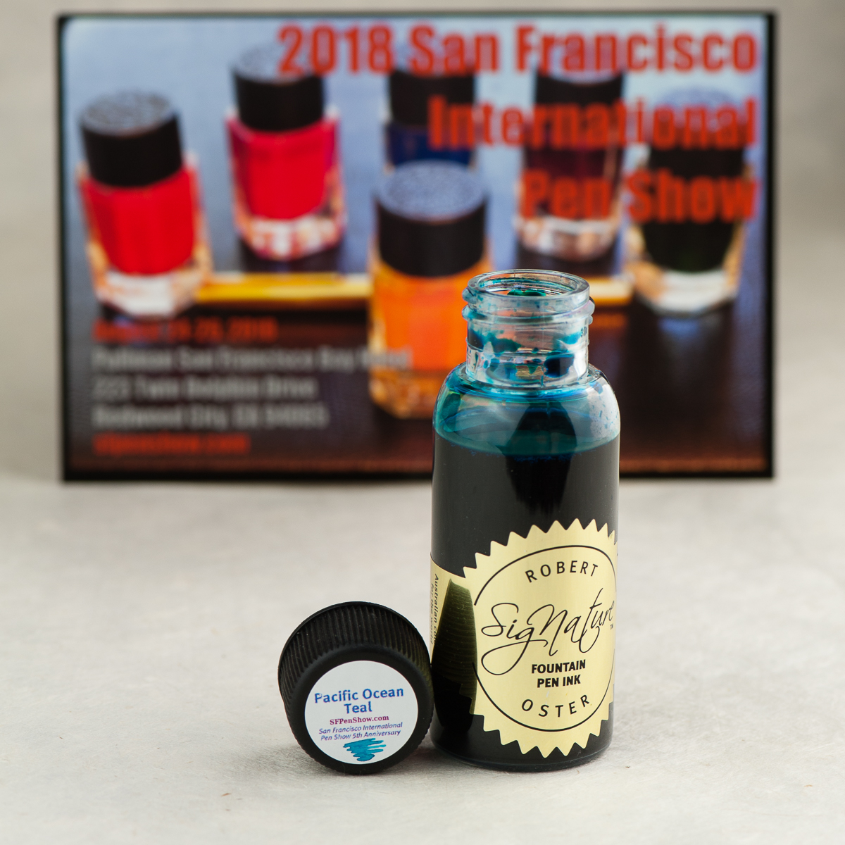
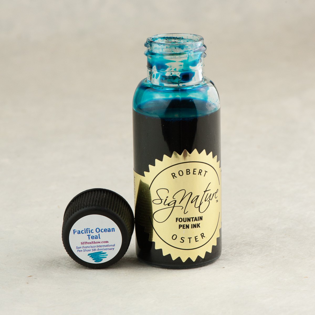
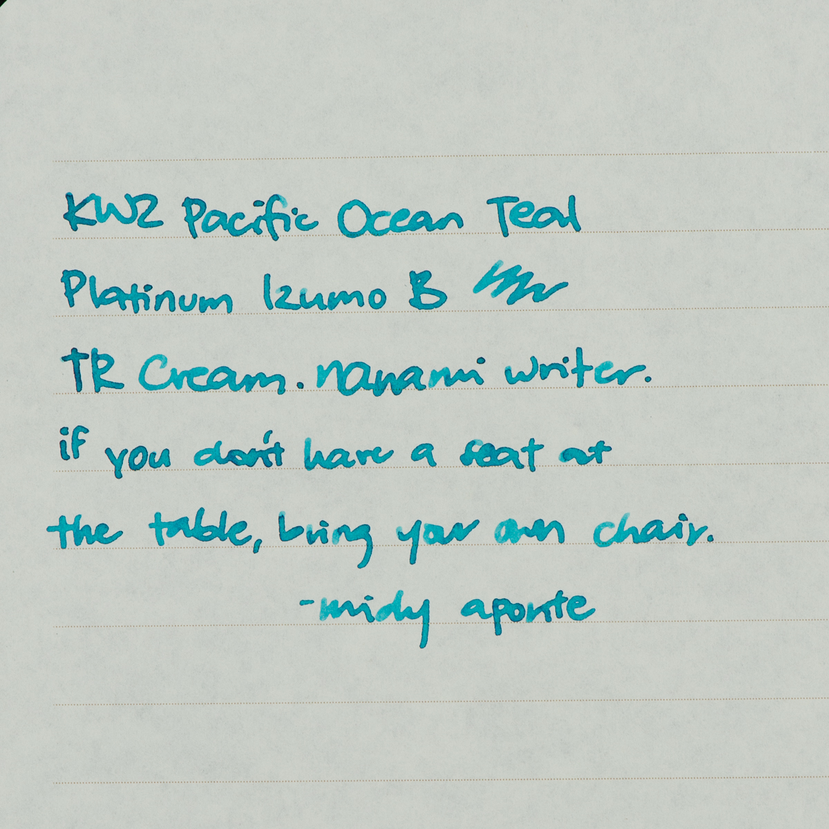
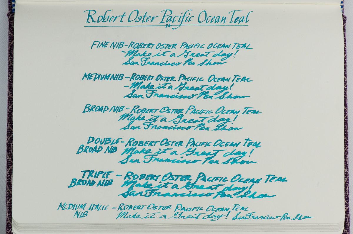
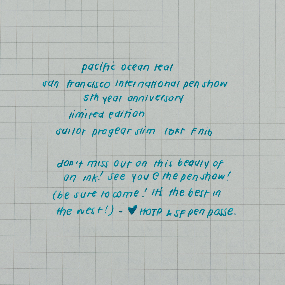
We are very thankful to have received a bottle of this Pacific Ocean Teal ink from the San Francisco Pen Show group for review. They have commissioned Robert Oster Signature Inks in Australia to create an exclusive ink for the 2018 San Francisco International Pen Show to commemorate their Fifth Anniversary. They wanted a nice teal that shades and Robert Oster delivered!
The Pacific Ocean Teal ink bottles will be on sale at the pen show happening this weekend, Friday August 24 until Sunday August 26. We are told that supplies are limited so act fast! They will be sold near the show’s registration desk in the foyer area of the Pullman SF Bay Hotel in Redwood City, California.
For more information and details of the San Francisco Pen Show, check their website at: www.sfpenshow.com.
Paper: Tomoe River, 52 gsmPaper: Tomoe River Dot Grid, 68 gsm (Hippo Noto Notebook)
Inky Dispositions
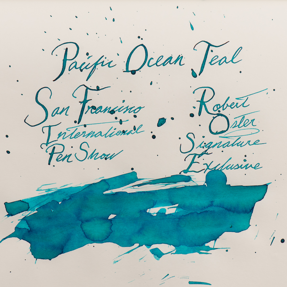
Katherine: It’s pretty! 😀 I prefer it in drier nibs (as pictured below) where it’s lighter and shows more shading. In wet nibs it just looks black. Overall it seems well behaved, and maybe a touch on the wet side. And oddly hard to photograph!
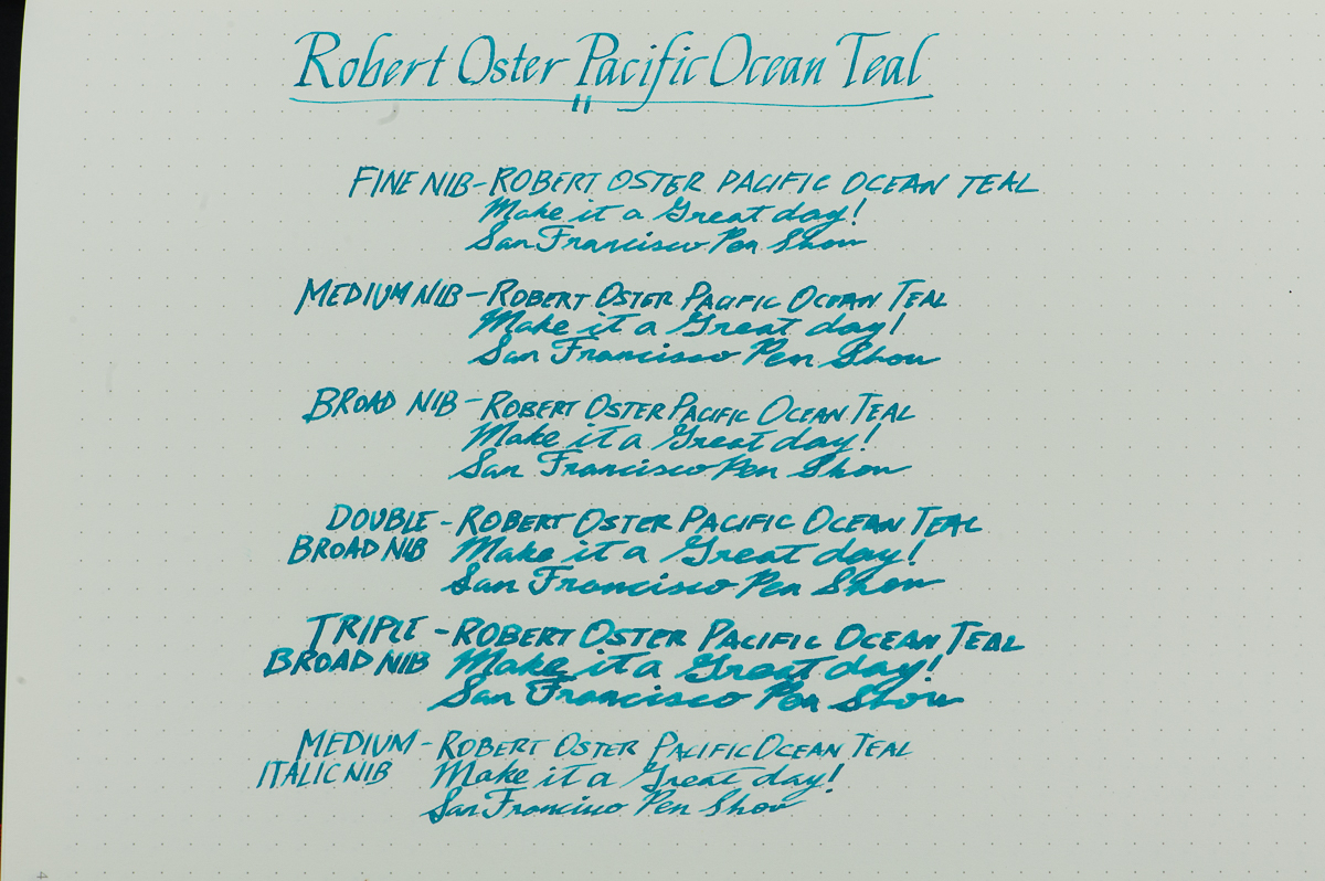
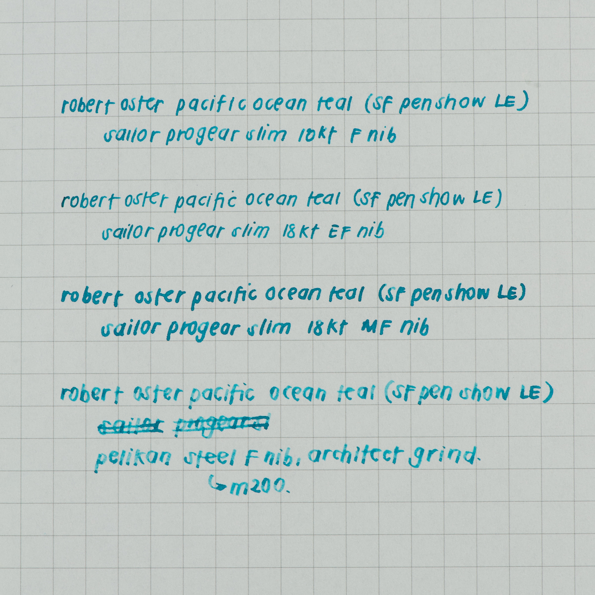
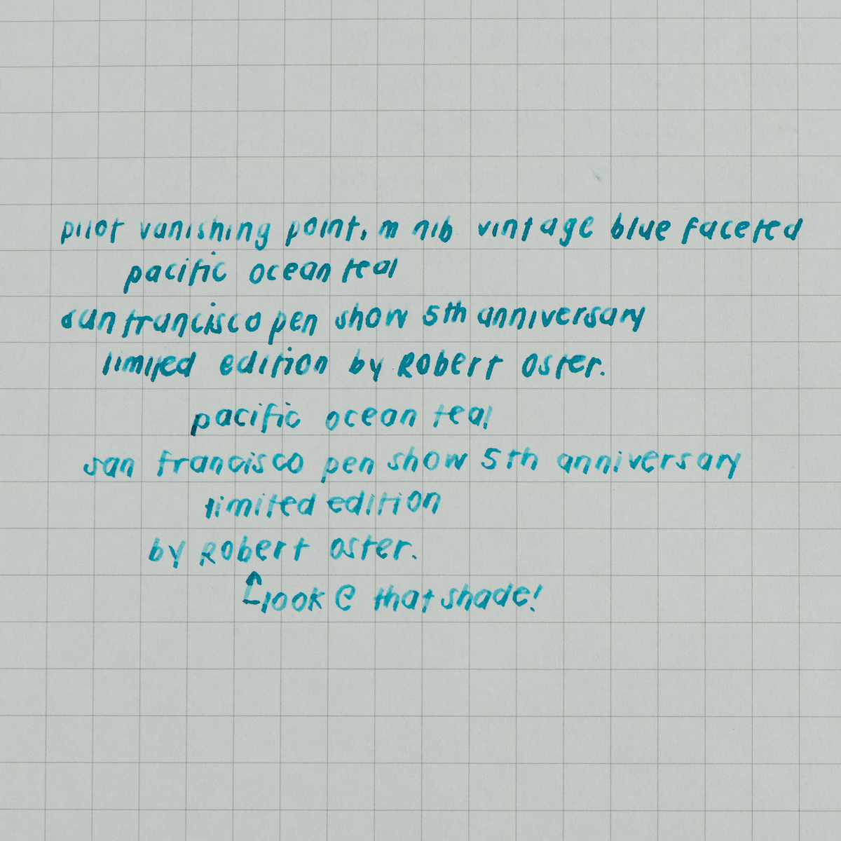
Franz: Teal, this color is in the realm of my favorite color which is blue. I say that like nobody knows it. hehe.. Anyway, inks made by Robert Oster are always well-behaved and are a treat to write with. This Pacific Ocean Teal is no exception. I’ve used the ink in different pens and they all wrote well consistently. My writing samples shown below were made via a Pelikan M800 because of the full range of nibs but I actually used a medium nibbed Vanishing Point at work with this ink and it was great as well.
The color of this ink is very close to what you find when you do an internet search for teal and that’s pretty cool. This ink may be at the medium to high in wetness for me but the dry-time isn’t too long. Some folks look for sheen and it’s there but not too much. It does show up in broad nibs or in flex writing if people really want that. But what I really like with this ink? It’s the shading for sure. You can use an extra fine nib up to even a triple broad nib and the shading is there!
Overall, I really love this ink! I don’t have many teal inks because my taste in ink color seems to lean more towards the blue side but this color is a fantastic one. I hope to get a bottle (or two) for myself at the show.
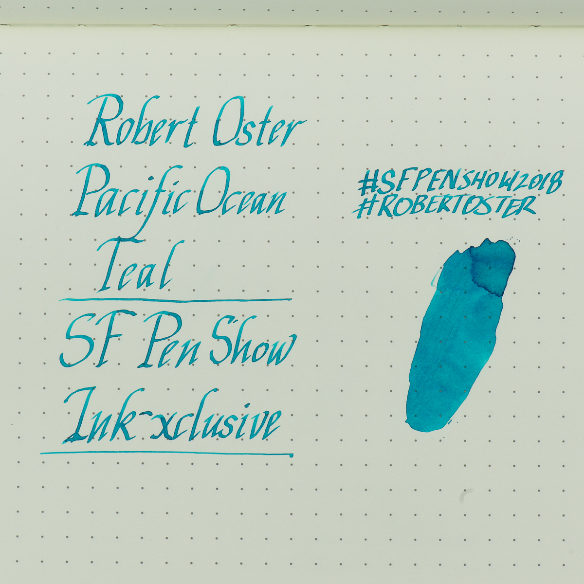
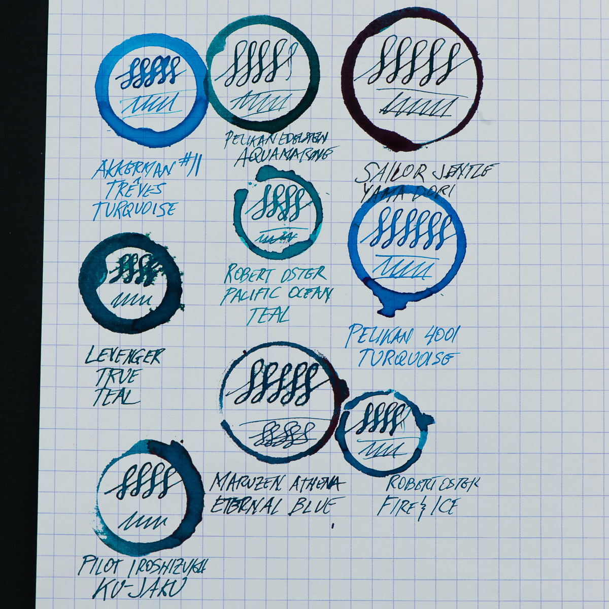
Pam: I had my reservations when I heard that the SF anniversary ink would be “teal.” Not another blue ink! However, I was pleasantly surprised. It’s. definitely within the blue family. It has the warmth and clarity of color that I loved about Iroshizuku Tsuya-kusa. The color reminds of Pelikan Turquoise. Albeit, it’s lighter than Turquoise and capable of some shading. I didn’t detect sheen when I have been using it.
The ink is well behaved in my book, producing lines that are as expected. It may lean wet, but only by a smidge. It runs really well through EF and F nibs, which is greatly appreciated. I don’t see a loss in color or saturation unless I am using in a really dry nib like my architect.
Overall, I would recommend this ink. It’s a beautiful color, reminiscent of the ocean blue waters surround our Golden Gate. I can see it being very dynamic for a calligrapher or any that experiment with a dip nib. The shading would be pretty great with this ink. Yet, it’s still readable, pleasing to the eye and can be used on a regular basis for your flair of “blue” in the office.
In this review, we are once again joined by our friend, Roz. She’s volunteered to be our left-handed reviewer and we love having her back. Especially when she brings us cupcakes. Thanks again Roz!
Hand Over That Pen, please!
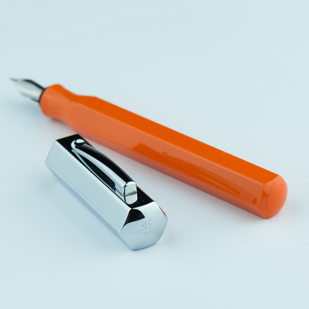
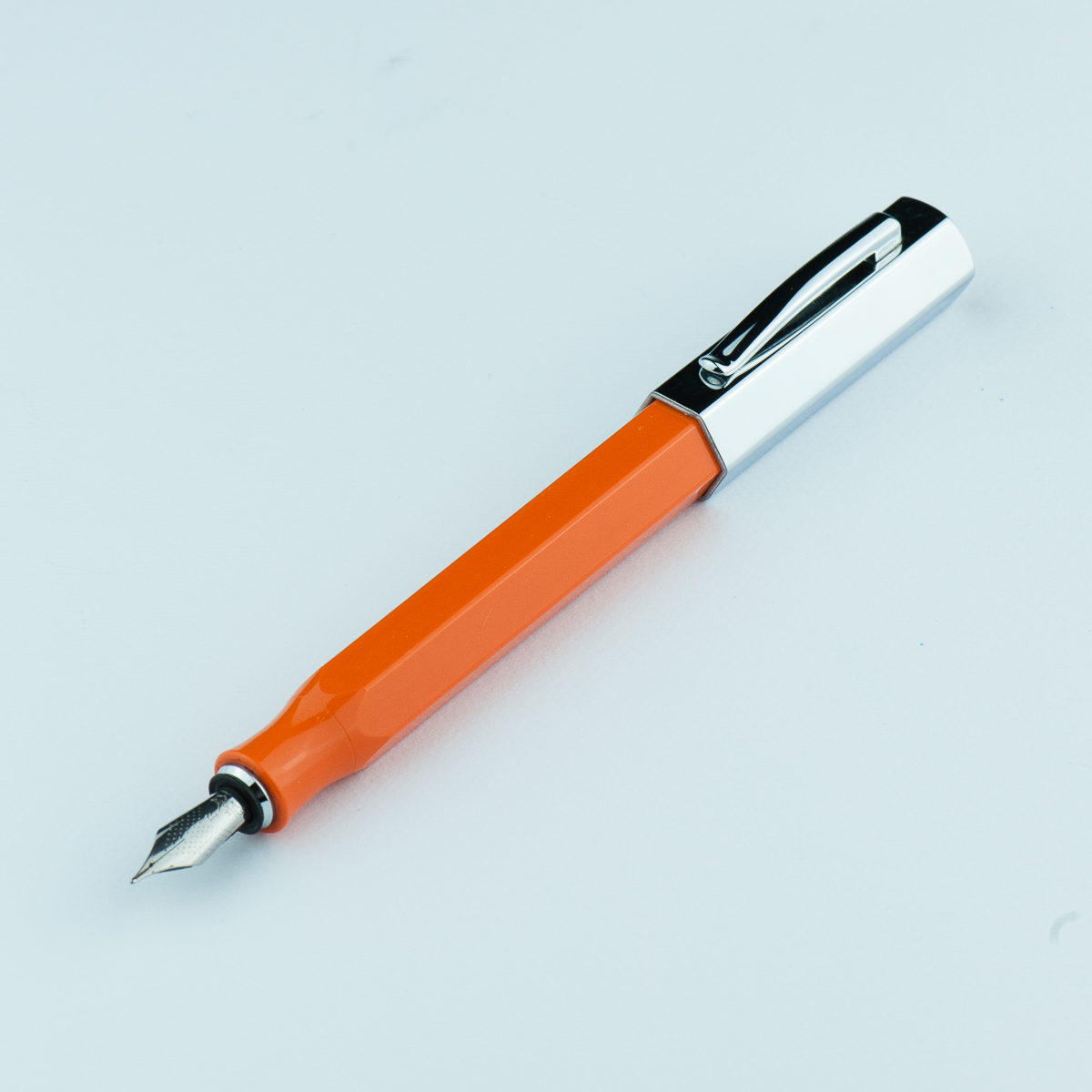
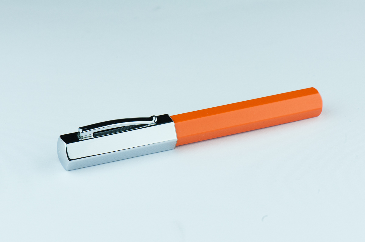
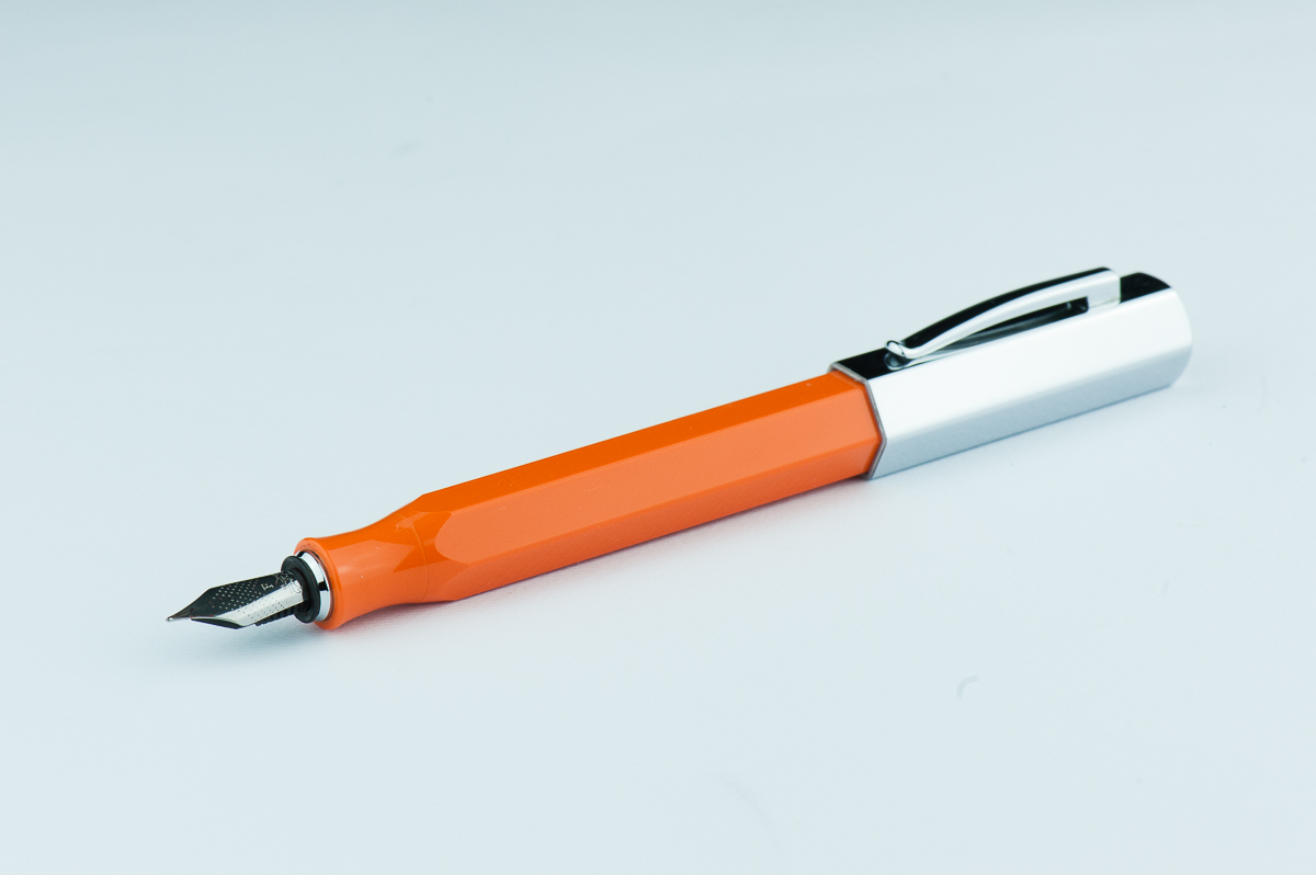
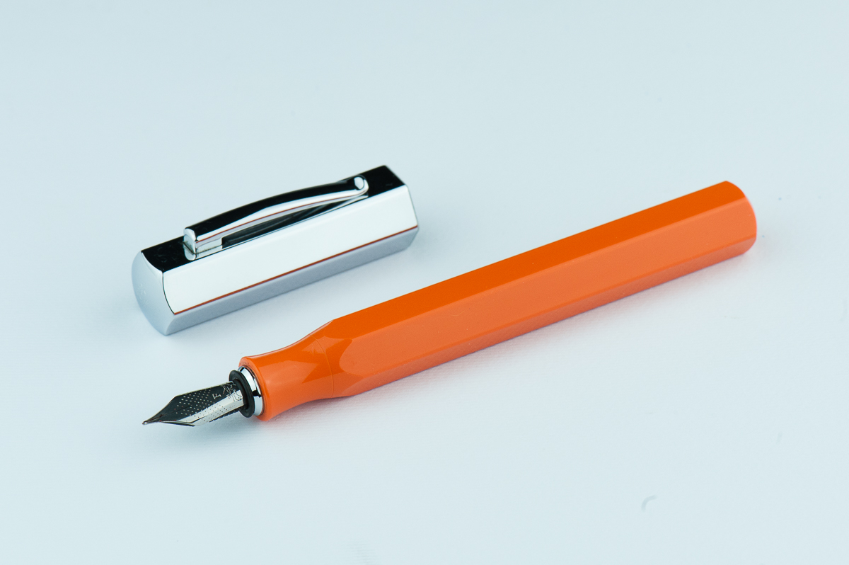
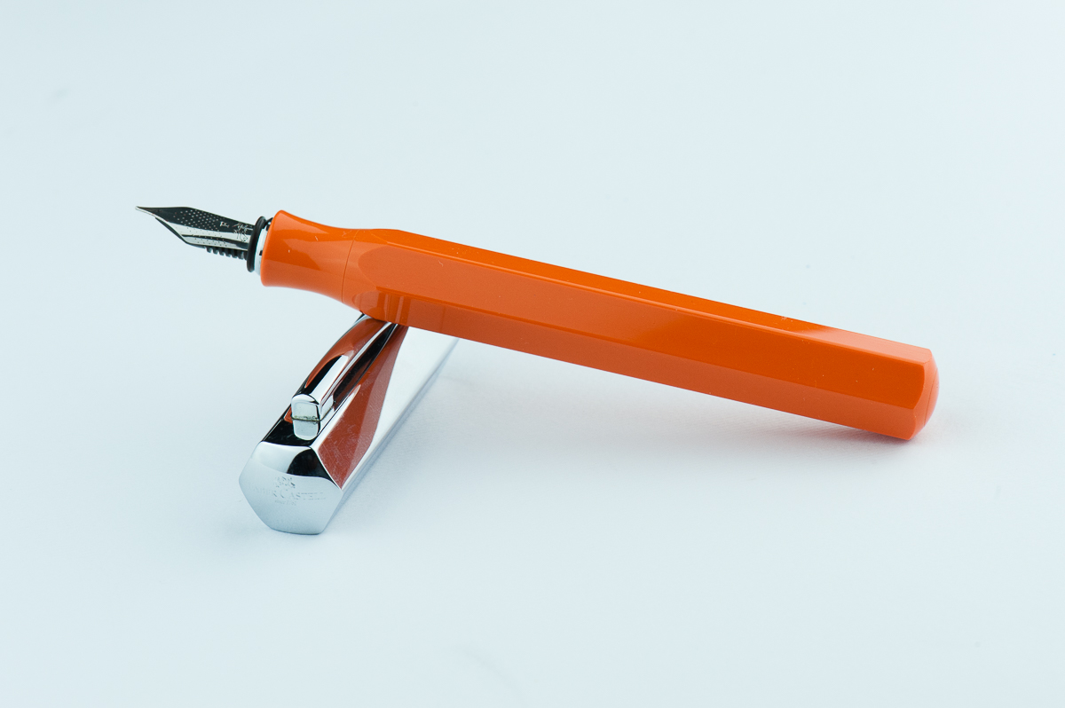
Katherine: I have a thing for faceted pens, and this is no exception. I love the chunky, stubby look of the Ondoro paired with clean faceted lines. I really want a white Ondoro… but they appear to be discontinued, so for now I have an orange one. I like the bright playful orange and the contrast with the chrome cap. The bright orange paired with the chunky look reminds me of those big grip pencils that little kids get.
Pam: The Ondoro’s unique design and eye catching color did make me curious to pick one up. I am glad that Katherine ultimately decided to get one. The shape of the barrel reminds me of an oversized pencil. I mean, a fountain pen is an adulting pencil right? The chrome barrel is a great cherry on top to this design in my opinion.
Franz: Stout! That’s one word I’d describe the Ondoro. Its shortness in length is balanced by the girth of the barrel and cap though. The hexagonal facets make this pen interesting and different from others. The shiny cap is cool looking but is a fingerprint magnet for sure.
Roz: Wow, my eyes! The Ondoro is definitely an attention getter. The bright orange with shiny silver cap, I’m awake and excited to experience this pen. I’m still not sure about my opinions on facets – but I feel like a pen of this size benefits from the facets breaking up the amount of solid colors there would be otherwise.
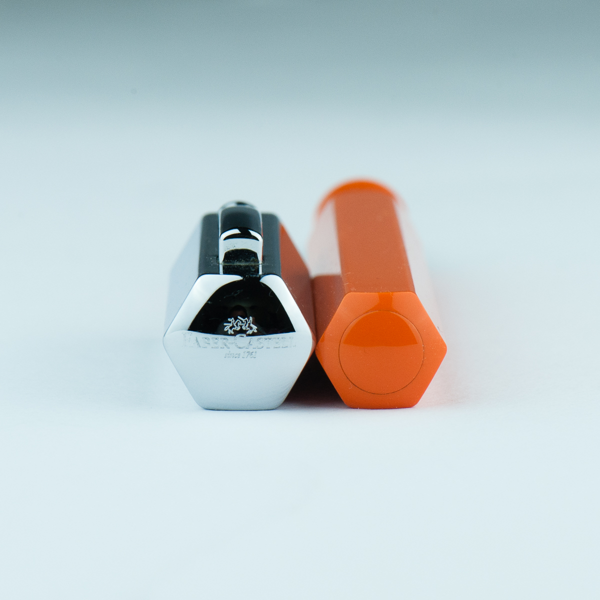
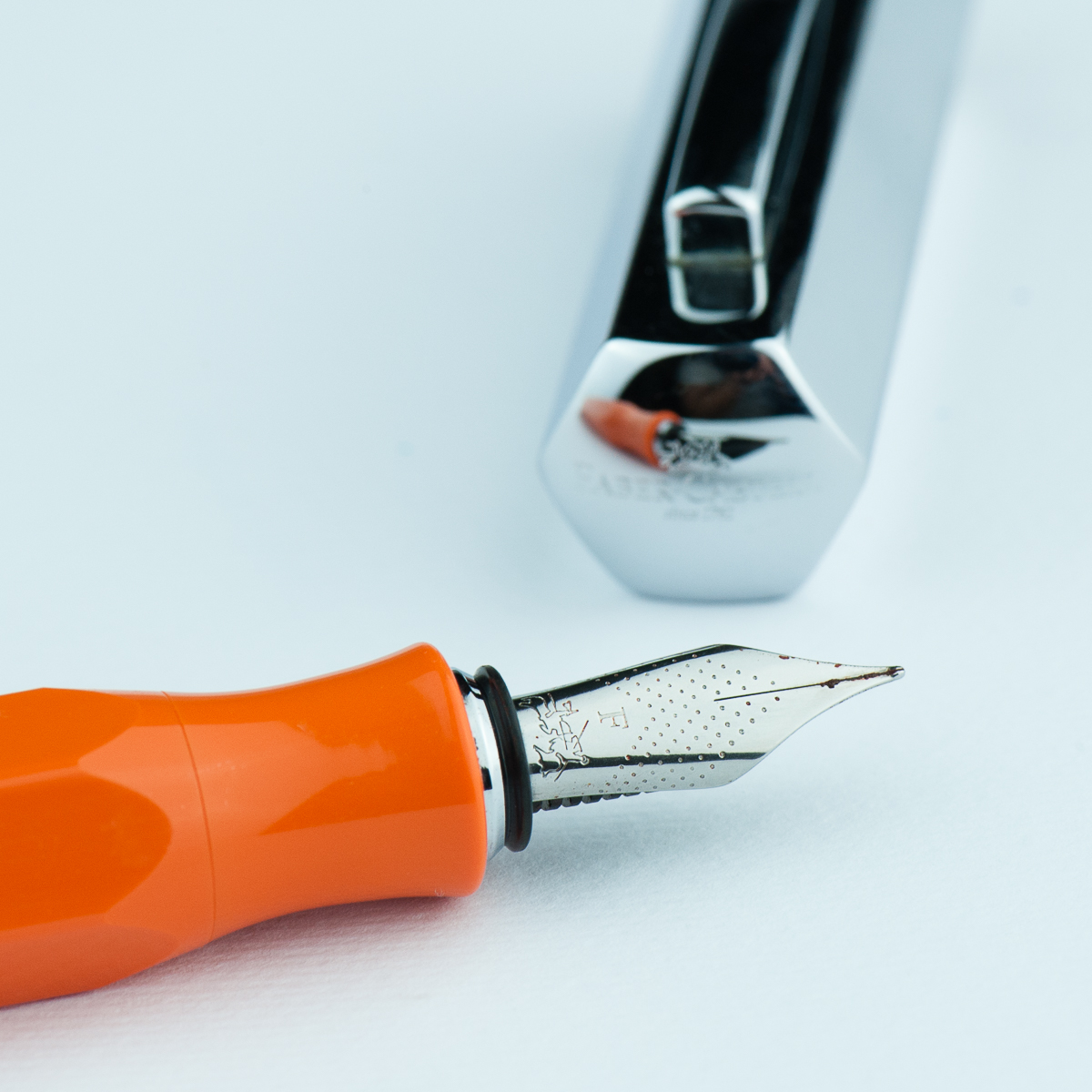
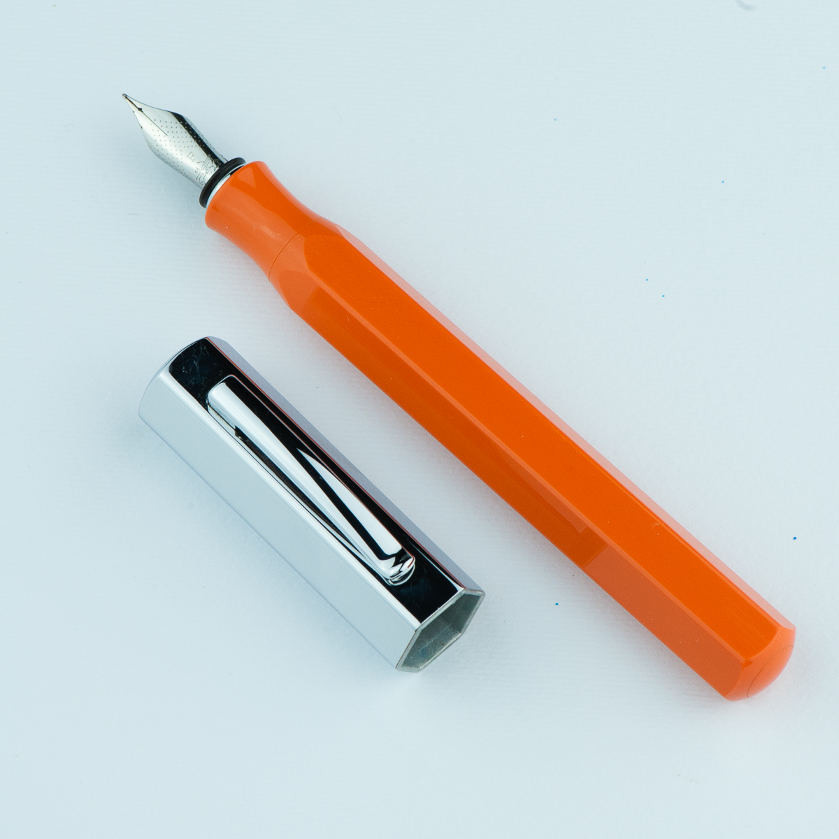
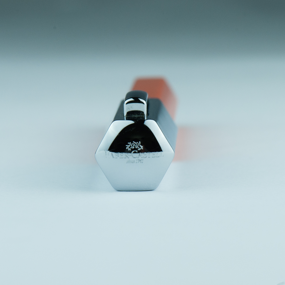
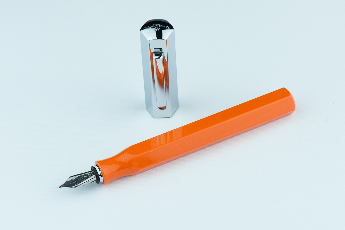
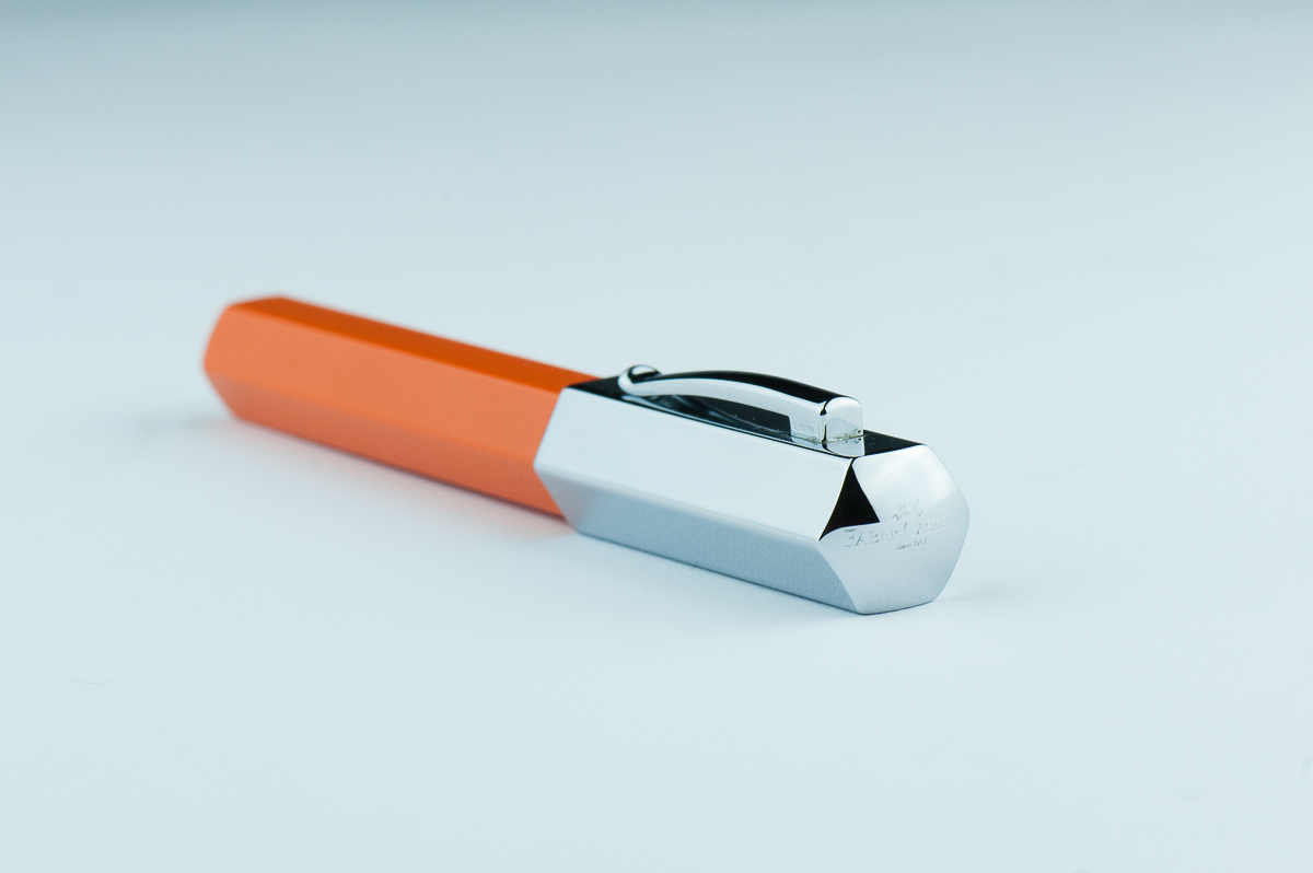
In the Hand: Faber-Castell Ondoro (posted) — from left to right: Franz, Katherine, Pam, and RozIn the Hand: Faber-Castell Ondoro (unposted) — from left to right: Franz, Katherine, Pam, and RozCap and Barrel ends.
The Business End
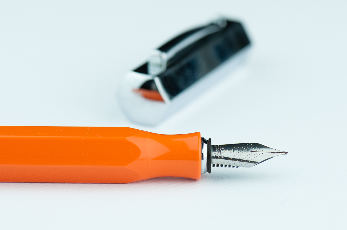
Katherine: This was my first experience with a Faber Castell nib. I like the nib and it’s pleasant to write with, but nothing particularly notable. It’s a western fine with a nice balance in wetness — wet enough to be comfortable for writing, but dry enough to see lots of shading with the right inks. The feedback on the nib is a smidge feedbacky — which I really like. Hurray for nibs that aren’t super smooth and “buttery”.
Pam: I do really enjoy the Faber Castell nib. It’s a pleasant nib to write with and does somewhat remind me of a pencil in terms of feedback. It’s not super smooth, but the feedback isn’t distracting either. The nib performed well and had more feedback on Midori paper than Tomoe River paper in my opinion. The nib is a good balance between dry and wet. It’s dry enough for a decent consistent line, however, you also get to enjoy the ink color you have put into the Ondoro. I would prefer a more saturated ink in this instance given that I shading inks make my handwriting look messier, especially if it’s beyond a couple of sentences.
Franz: Aesthetically, the smaller nib size (#5?) looks good on this pen. I also love the design of dots with chevron shape. As for nib performance, the fine nib has a bit more feedbacl tha I refer. But I am the medium/broad nib kinda guy so not a biggie for me. It did write with a consistent ink flow though.
Roz: The nib was a bit scratchy for me at first, it took me a while to find a good angle – but I did find it! Once I got my angle down, the nib was pretty easy to write with. Additionally, the nib made a sound while writing that I really liked.
Write It Up
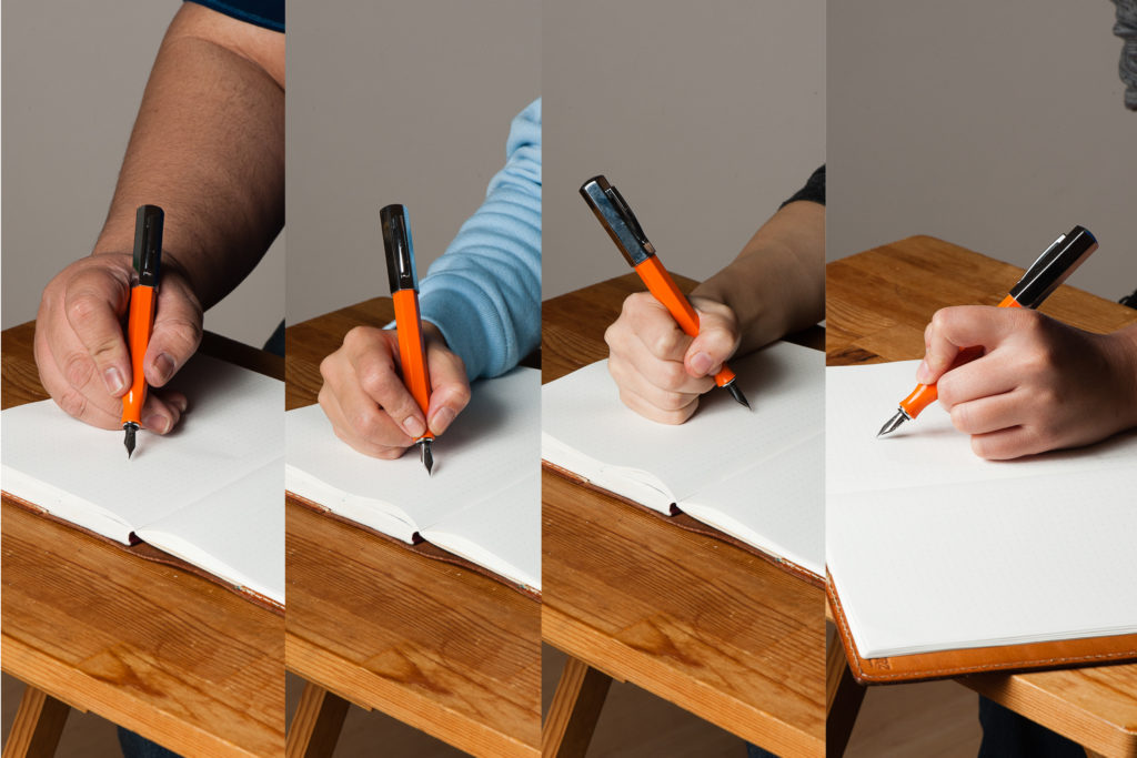
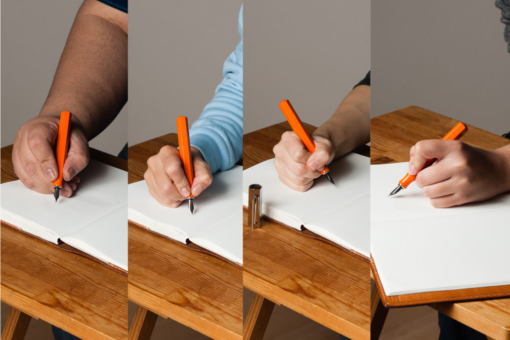
Katherine: I was initially hesitant about this pen (why I never bought a white one) because of the narrowed section. However, it’s surprisingly comfortable, but does force me to hold my pen slightly further back than I usually do (probably more like a normal person). I use the pen unposted and it’s well balanced and pleasant to write with for extended periods.
Pam: The short section was a bit of a concern for my dinky iron grip initially, however, I had no reasons to worry. The smooth transition from body to section meant that the entire pen is one big grip for me! The angles on the pen is soft enough that no corner actually bites into my hand and the section being tapered doesn’t detract from my capacity to grip the pen. I do get sweaty hands so there are times that I have to reposition a bit. Surprisingly, slippage was relatively minimal. That’s more my hand sweat problem and less about that pen.
Franz: Okay… writing with the Ondoro for 20 minutes, I’ve come up with some issues. Probably it’s just specific to me but I didn’t find the Ondoro comfortable to write with either posted or unposted. Posted, the cap definitely makes it unbalanced and top heavy. I seemed to have to exert some force to counterweight the cap to put the nib to paper. Unposted, the length is barely enough for my usual higher grip. With the Ondoro’s pinched/concave section, I needed to grip it higher because of the smaller diameter of the section.
Now here comes the probably just specific to me part and you as a reader shouldn’t worry too much about. Gripping the Ondoro higher above the section wasn’t comfortable for me either because my usual writing angle causes my fingers to land on the edges and not on the flat side of the facets. This bothered me a bit and when I adjust my grip to the flat sides of the facet, either the writing angle felt weird to me, or one of the nib’s tines was not hitting the paper optimally and caused me to feel scratchiness or more feedback. Again, this is possibly just me.
Roz: My grip tends to move around a lot when I write; so having to keep to a narrower range of angles, I really expected my hand to tire quickly. But I didn’t! The girth of the pen kept my hand from cramping up and the grip dipped in such a way that it really helped with my writing fatigue. Writing with the Ondoro unposted was a bit unbalanced for me. While I preferred to write posted, the cap does add a good amount of weight to be wielded.
EDC-ness
Katherine: It’s a snap cap! Hurray! My only complaint with this pen as an EDC is that the snap isn’t satisfying — it doesn’t have that clean click that makes me think “now my pen is capped”. I’m not sure if all Ondoros are like this, or if it’s because this one came to me used. That being said, I’ve never had it uncap itself, so it seems pretty secure and my gripes about an unsatisfying snap are purely aesthetic. (Does the word “aesthetic” still apply to how satisfying something is to hear and feel?)
Pam: I love a good snap cap! I makes me so happy that it’s so quick and easy to deploy at work. The snap does leave a bit to be desired in terms of “aesthetics”, but on the flip side, it’s a quiet snap cap action so it’s not going to announce to the world that your capping and uncapping your pen. The clip worked pretty well in my white coat pocket, nothing crazy notable in terms of tightness or looseness when it came down to it snagging on the fabric.
Franz: Echoing the ladies here, snap cap FTW. =) It definitely is a good pen for on-the-go, quick notes kind of writing. And the fine nib performed very well with copier paper found in our office.
Roz: I kept the Ondoro snugly in my Nock case during transport. I don’t get to write a ton during my work day, so it was really fun to bust this pen out for random thoughts, meeting notes, and quick breakdowns.
Final Grip-ping Impressions
Katherine: I like this pen! At $150 MSRP, I think it’s a little steep for a steel nib, but it has a unique look and often shows up slightly discounted. It’s a solid pen with a solid nib that makes a great sturdy EDC.
Pam: I honestly really like the Faber Castell Ondoro. It’s a great pen for those who enjoy faceted pens, an industrial aesthetic, and a snap cap. The nib is a great bonus. With the different colors available, it’s a great statement pen for those looking for a good pizazz in their pockets.
Franz: Here’s another plus one for liking the Ondoro’s aesthetics and its faceted disposition. I love the nib’s looks and performance, and that orange is very pleasing. I have stated (with some length) how I feel about writing with the pen for a longer period of time and I’m thankful that I got to try it without buying one. I’ve concluded that because of my larger paw, and kinda picky writing angle, this pen isn’t really for me. And that means I won’t steal… er… borrow the pen for a long time from Katherine. =)
Roz: Overall, the Faber Castell Ondoro was an interesting one for me to try out. Without a doubt the Ondoro is a pen that makes a statement, but in the end I think it was too much pen for me. And I’m still not sure about my opinion on facets!
Pen Comparisons
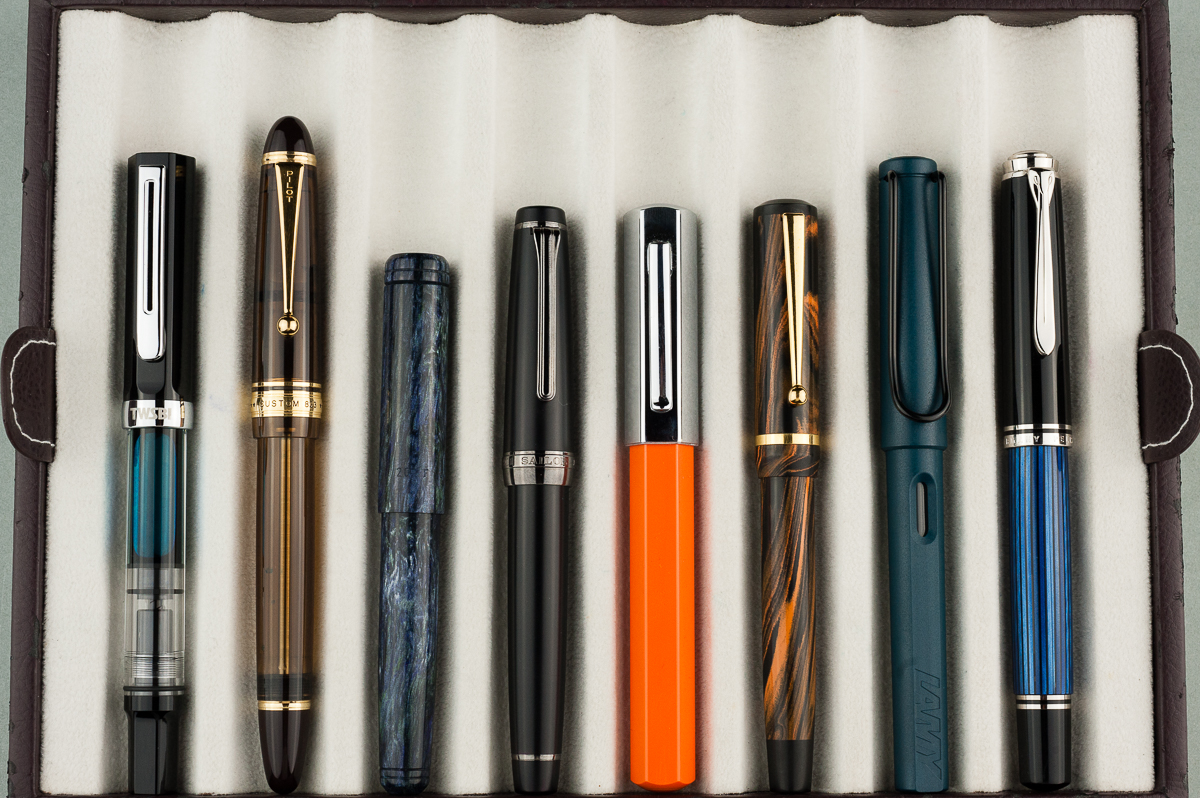
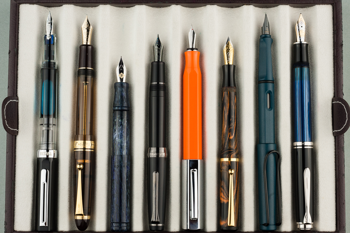
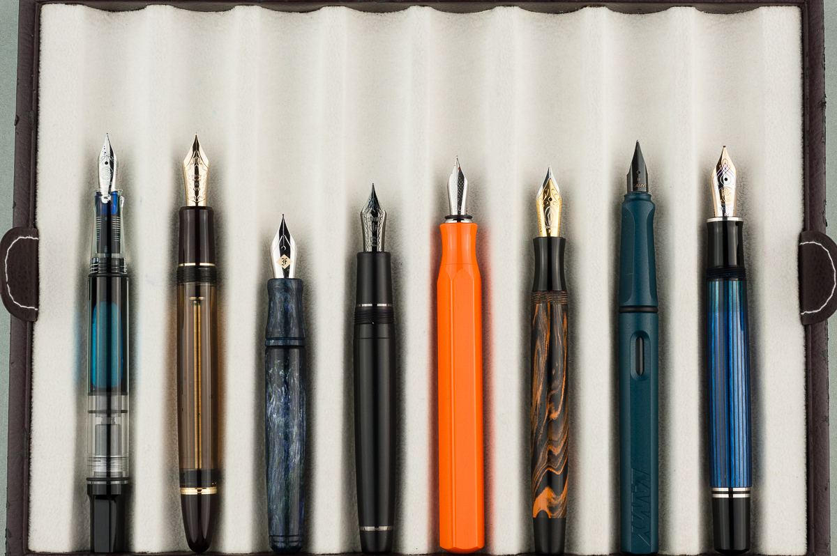
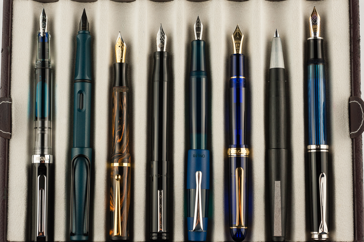
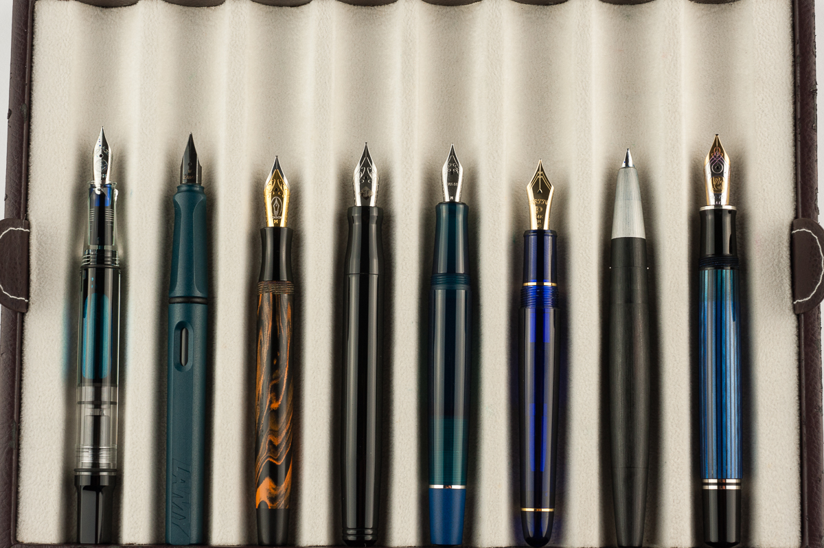
Closed pens from left to right: TWSBI Eco, Pilot Custom 823, Franklin-Christoph Pocket 20, Sailor Pro Gear Classic, *Faber Castell Ondoro*, Edison Beaumont, Lamy Safari, and Pelikan M805Posted pens from left to right: TWSBI Eco, Pilot Custom 823, Franklin-Christoph Pocket 20, Sailor Pro Gear Classic, *Faber Castell Ondoro*, Edison Beaumont, Lamy Safari, and Pelikan M805Unposted pens from left to right: TWSBI Eco, Pilot Custom 823, Franklin-Christoph Pocket 20, Sailor Pro Gear Classic, *Faber Castell Ondoro*, Edison Beaumont, Lamy Safari, and Pelikan M805
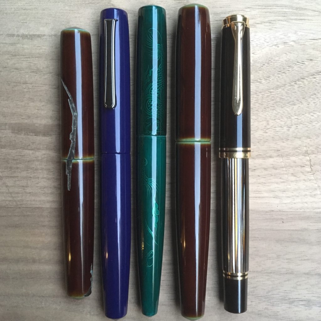
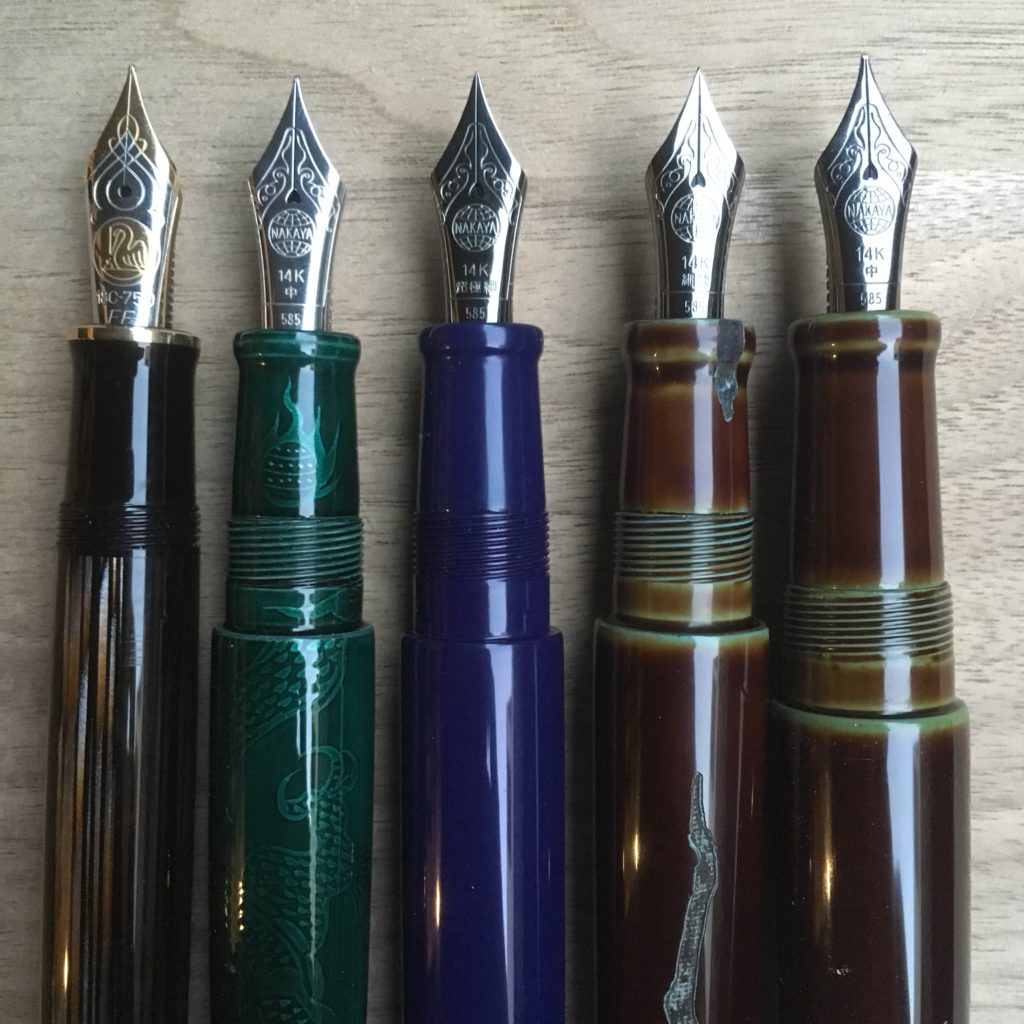
The Nakaya Clinic at Aesthetic Bay brought us a new shape — the finless dorsal fin (ryogiri, thanks for the name Dan!). Thomas of Penucopia was was kind enough to lend us his for some photos.
Left to right: Piccolo, Long Piccolo, Naka-ai, Finless Dorsal Fin, Pelikan M800
The Long Piccolo is exclusive to Aesthetic Bay, and the Naka-Ai is exclusive to nibs.com
Left to right: Pelikan M800, Naka-ai, Long Piccolo, Piccolo, finless Dorsal Fin
The Pelikan was added in in case you have no other Nakaya to compare against. It’s what I had on hand, sorry.
Left to right: Pelikan M800, Naka-ai, Long Piccolo, Piccolo, finless Dorsal Fin
Unfortunately I don’t have a Dorsal Fin version 1 or 2 to compare against in photos. However, I was able to compare the two in person and it’s the same section on both. The big difference is the fins.
Sorry for the mediocre phone photo quality. The borrowed pens are on their way to their new home and it didn’t feel right to delay them for better photos.
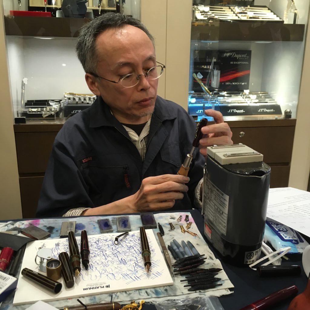
I got to Aesthetic Bay at 10am, in preparation for an 11am appointment. The slots, predictability, ran late. Yoshida-san got to my pens at about 2:30. But, it was more than worth the wait. (Also waiting with fellow Nakaya fans is a lot of fun)
While waiting, I met several other Nakaya enthusiasts, oggled their collections, egged people on into buying their own Nakaya, talked about notebooks… etc etc. It turns out that I don’t get hungry as fast when standing around with a bunch of other rabid pen folks. Pen clinic adrenaline?
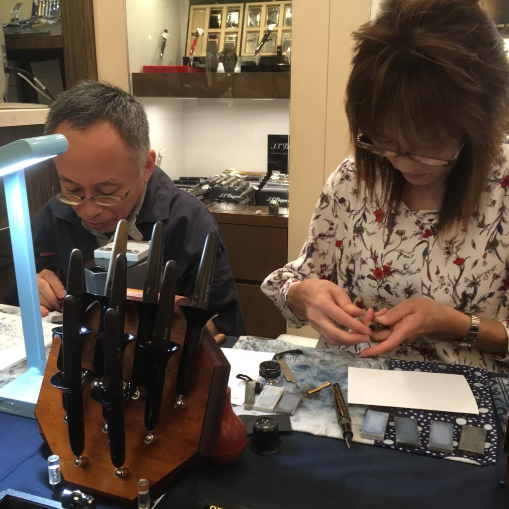
At the clinic, Yoshida-san and his assistant (I think her name is Sanae-san, but I’m not 100% sure) will tune or adjust any Nakaya or Platinum pen. However, they will not grind Platinum pens, only Nakaya. And some grinds take a while, so they don’t do them at the clinic, they need to be brought back to Japan and will be shipped back to their owner (someone asked for an Architect and that was the response, I’m not sure which other grinds fall into that category).
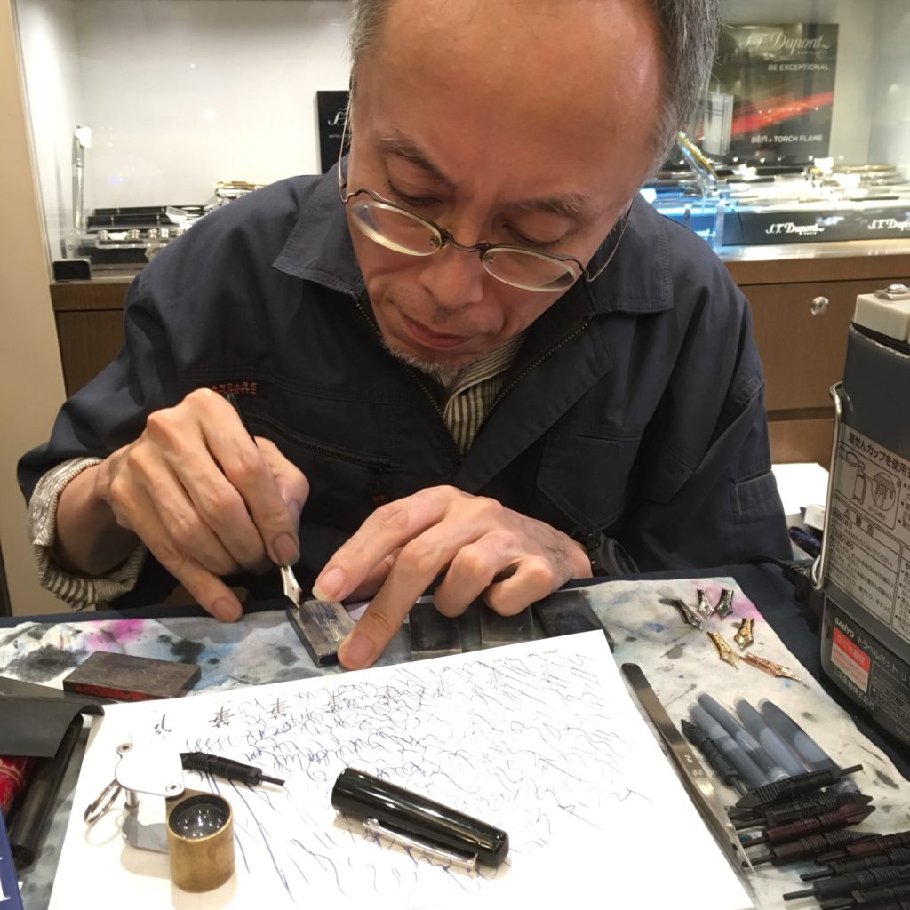
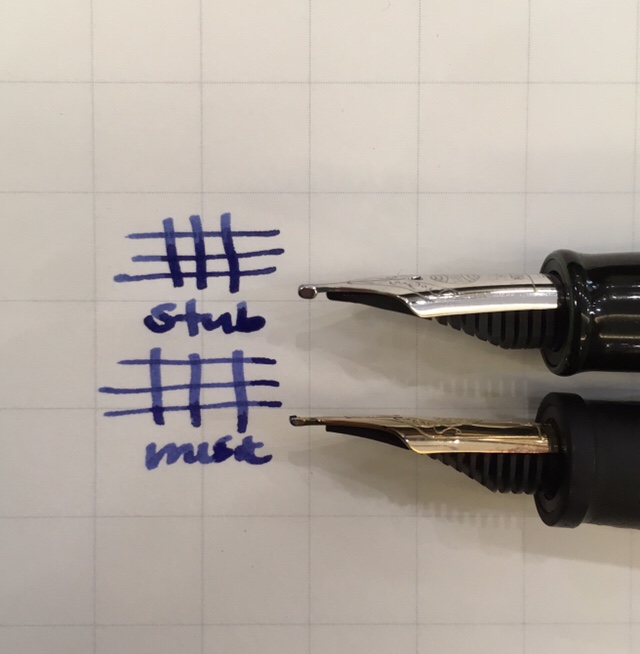
My first request was a stub on a BB nib. It’s a joy to watch Yoshida-san work, he uses no power tools — only traditional whetstones and some elbow grease. Additionally he has made a lot of his own tools — special feeds for grinding, a steamer with silicon blocks for warming feeds and a bunch of other things that we didn’t see in action.
My pen (the stub) compared with the music nib from their nib testing set. The two nibs put down similar-ish lines, but feel very different when writing. The BB stub is extremely smooth on both sides, possibly even smoother when used upside down. Sorcery.
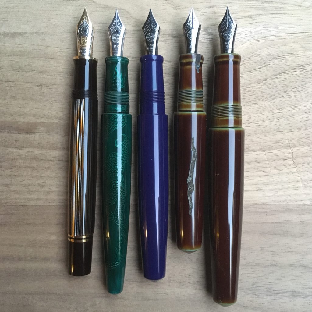
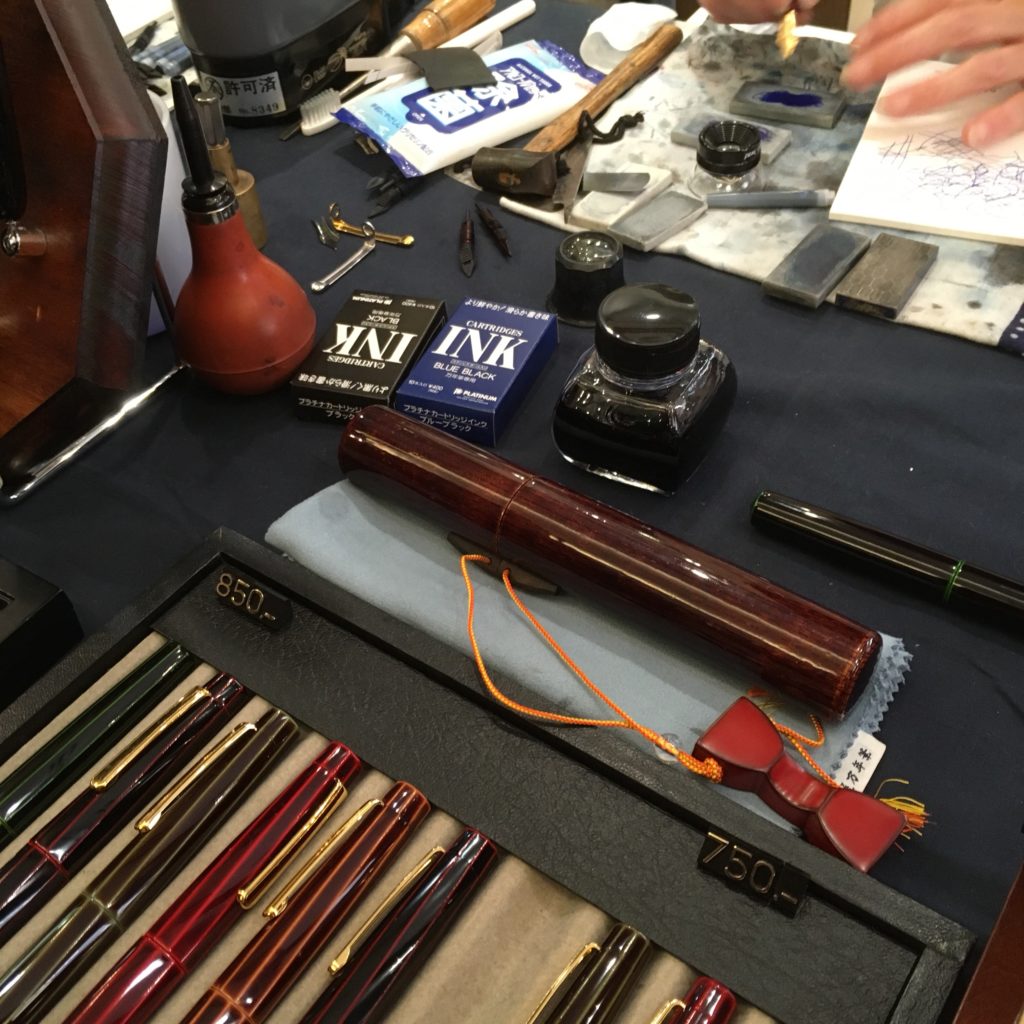
After this Yoshida-san tuned and tweaked a couple nibs for me, and installed a wisteria roll stop on a kuro-tamenuri Decapod Mini for me. The first picture in this post is all the pens he worked on for me. (I guess people like me are why all the slots ran late…)
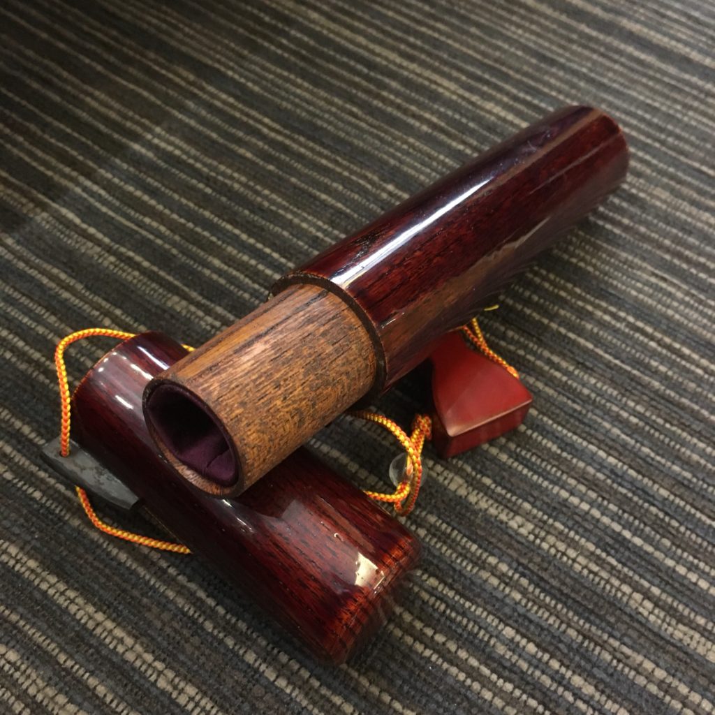
Nakaya also brought out this super cool yatate in the morning, a wooden single pen holder. It’s made of wood, with fabric cushioning on the inside and finished with urushi.
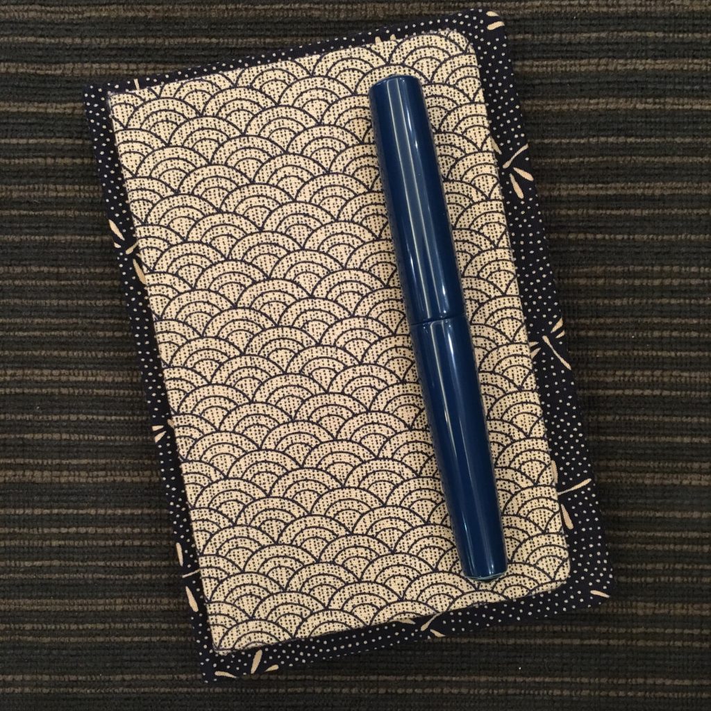
Unfortunately it also costs more than many entry level Nakaya… so I’m sticking to my Musubi two pen case (which is also far more practical). Speaking of Musubi,
I had a chance to oggle the new Musubi sizes — here they are compared against a Nakaya Piccolo. So cute!
Here’s a last photo of Yoshida-san, installing my rollstop, but more importantly, you can see his customized kettle for warming feeds. Steam comes up between the white silicon blocks and warms the feed, while the nibs never get scratched.
I don’t know when the next pen clinic will be, but if you love Nakaya as much as I do, I highly recommend going. Many thanks to Aesthetic Bay for putting this together and hosting!
Hello again, it’s Katherine and I’ve gone rogue with the mediocre iPhone pictures. (Sorry)
I’m at the Nakaya Clinic hosted by Aesthetic Bay in Singapore. It’s a three day event where the Nakaya team (Yoshida-san, his assistant, and a translator) brings pens and offers time to get your Nakaya and Platinum nibs tuned and adjusted (by appointment). They are willing to do some grinds, but generally grinds take a lot of time so not all grinds are available. Additionally, each slot is 15 minutes long — so there isn’t a lot of time for multiple grinds, the focus is really on getting pens tuned.
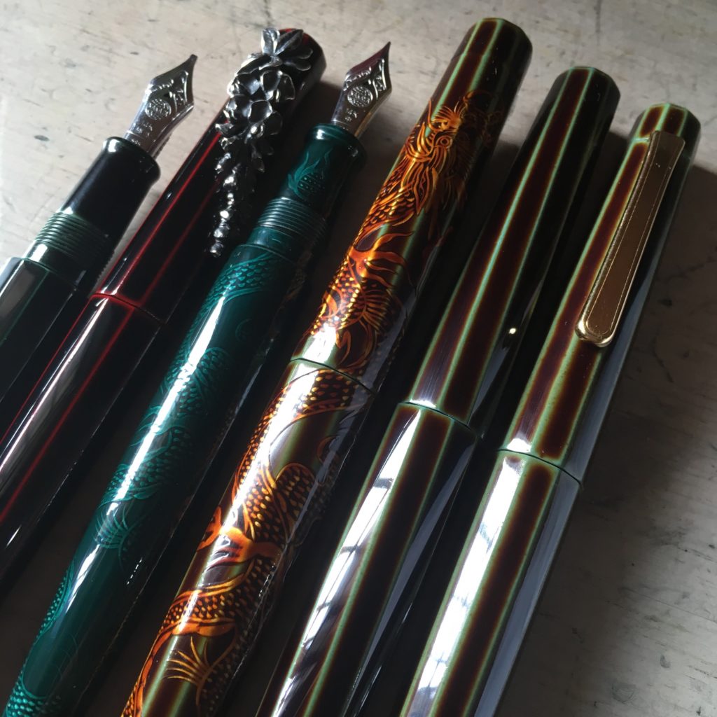
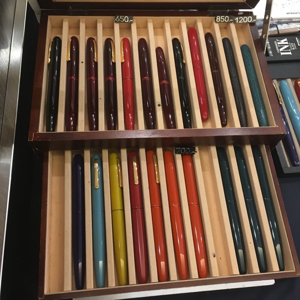
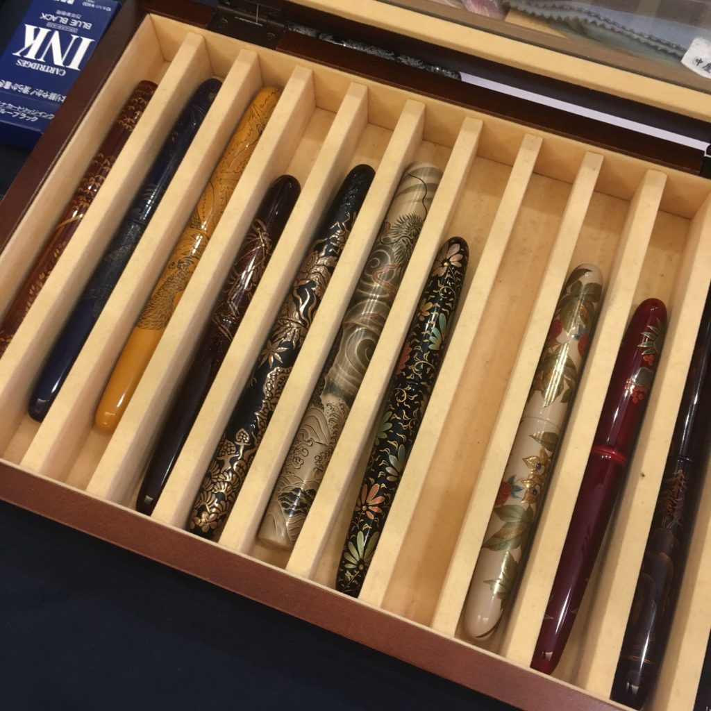
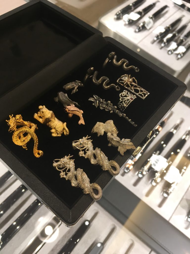
Above is the tray of “fancier” pens — there are some really interesting urushi techniques in that case, how many can you identify?
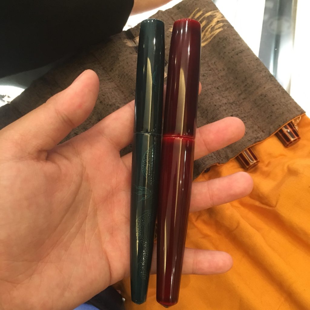
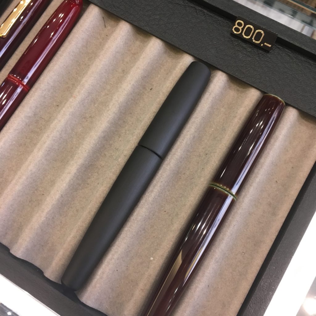
New to this clinic is a new shape — a Dorsal Fin without the fin (on the right. The left pen is a Naka-ai for comparison). These are list at $800 USD for the tamenuris, and $900 for a variation of hairline.
They sold pretty quickly. (As Nakaya tend to do…)
And a selection of stoppers and nibs. They can be added to existing pens, or newly purchased ones! (For a fee, obviously)
When you buy a pen, they’ll tune and adjust it for you. The stand on the front left are their nib testers — each stock Nakaya nib is represented and available to try. Now I really want a music nib. Yikes.
My appointment is tomorrow still, so I’ll be back with updates on getting my pen(s) tuned and adjusted.
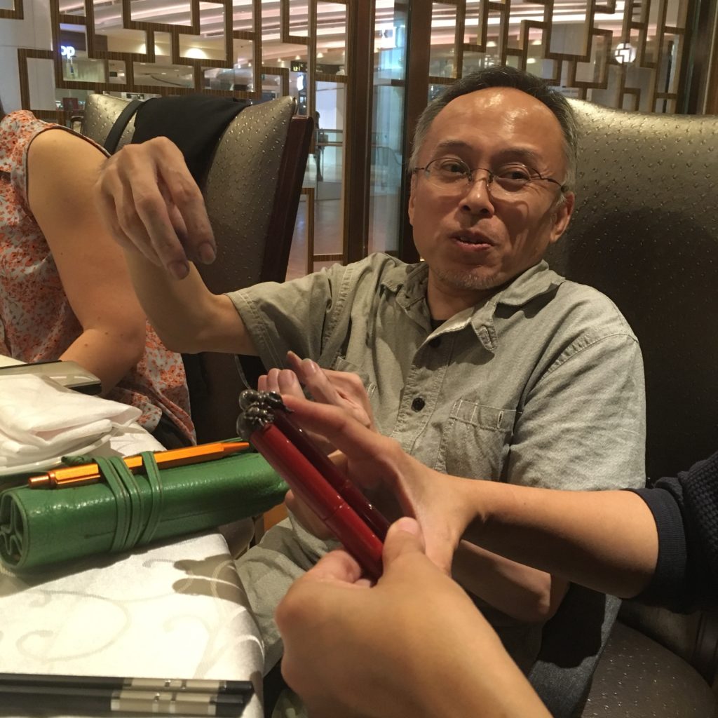
Lastly, I finished off the day with dinner with some of the Aesthetic Bay team and the Nakaya team (and a handful of other Nakaya fans!). Yoshida-san showed us some of his personal Nakaya pens… and my wish list just grew a whole lot longer.
Before anything else, a big shout out of appreciation to Pen Chalet, for sending us inks to review! Pen Chalet was generous and sent us the inks at no charge, but we promise the review below is unbiased and our own uninfluenced* opinions.
* Except maybe by the food coma that followed our dinner gathering
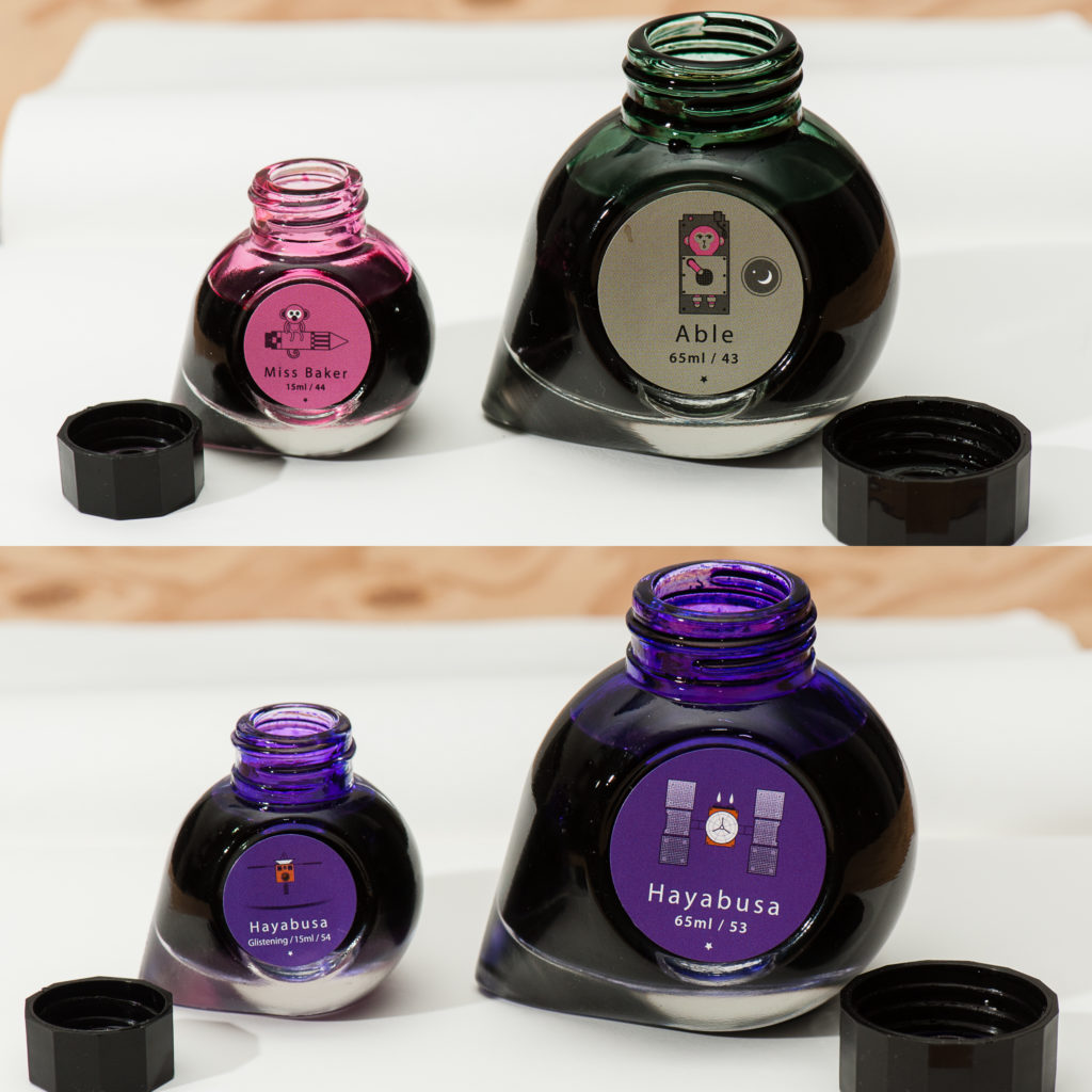
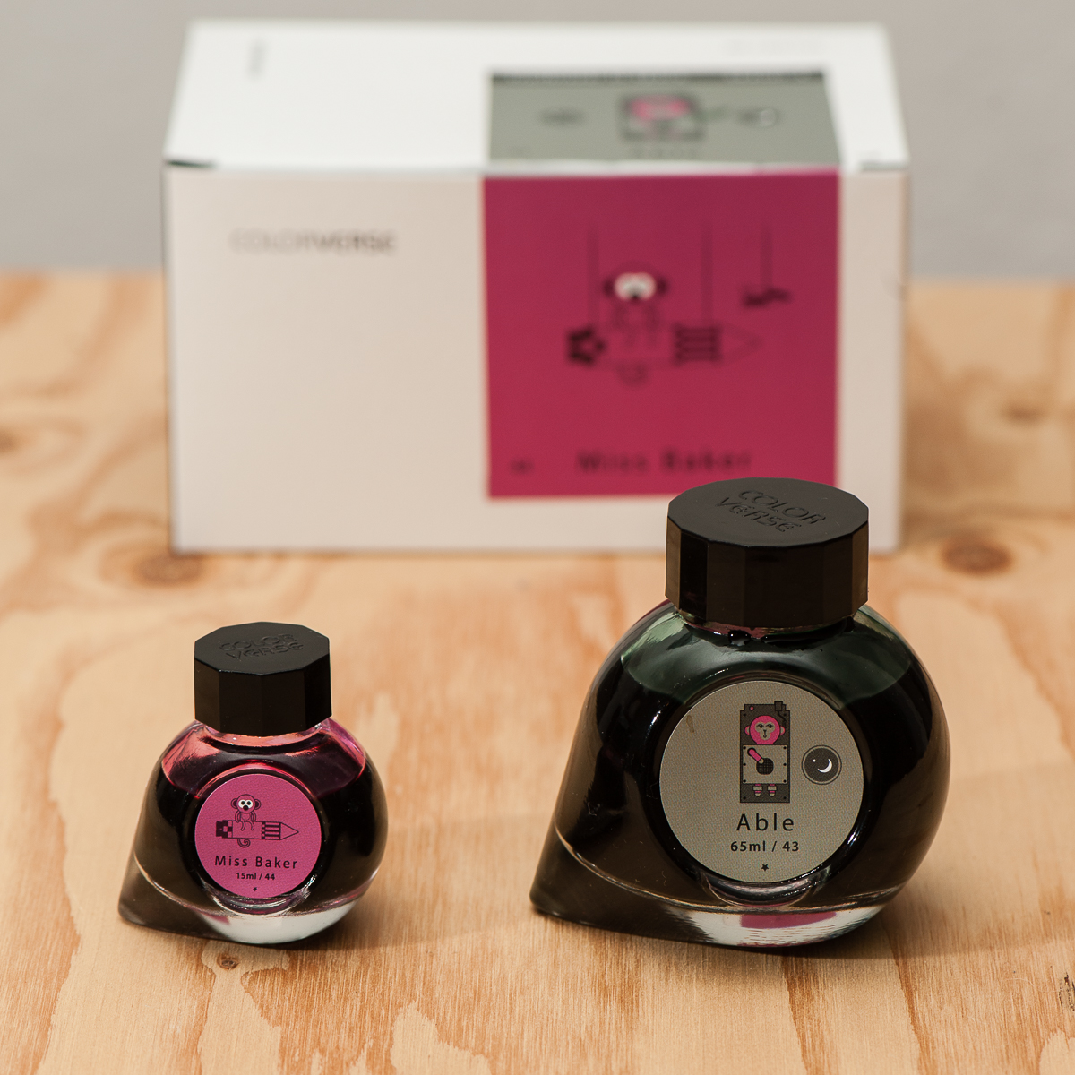
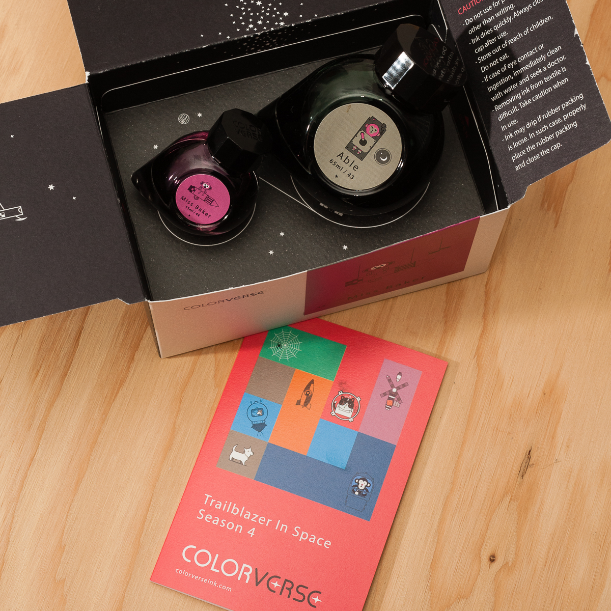
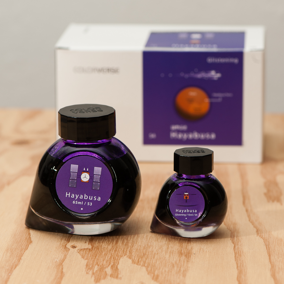
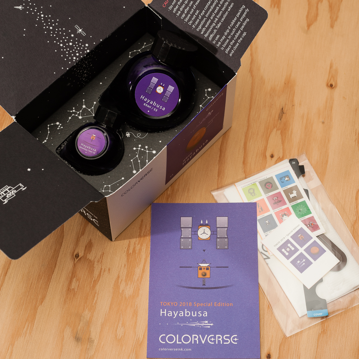
For those unfamiliar with the Colorverse brand, each set contains two bottles, a big one (65ml)and a small (15ml) one. For this review we’re taking a look at two sets: Able + Miss Baker, and Hayabusa + Hayabusa Glistening. Able + Miss Baker is part of Colorverse’s Season 4 offering, Trailblazer in Space. Hayabusa is a Tokyo 2018 Special Edition.
Packaging
Inky Dispositions
Franz: Here goes our first ink review! =) For a period of time now, I’ve been intrigued with the ink bottles of Colorverse. Their bottle shape is very unique as well as their decision to ship two different size bottles and different ink colors. I also really love their outer space themes.
In this review, I only got to test the Able and the Hayabusa (non Glistening). Oh by the way, I kept referring to it as Habuyasa. Good thing I spelled it right in my sample below. Anyway, back to the ink review please.
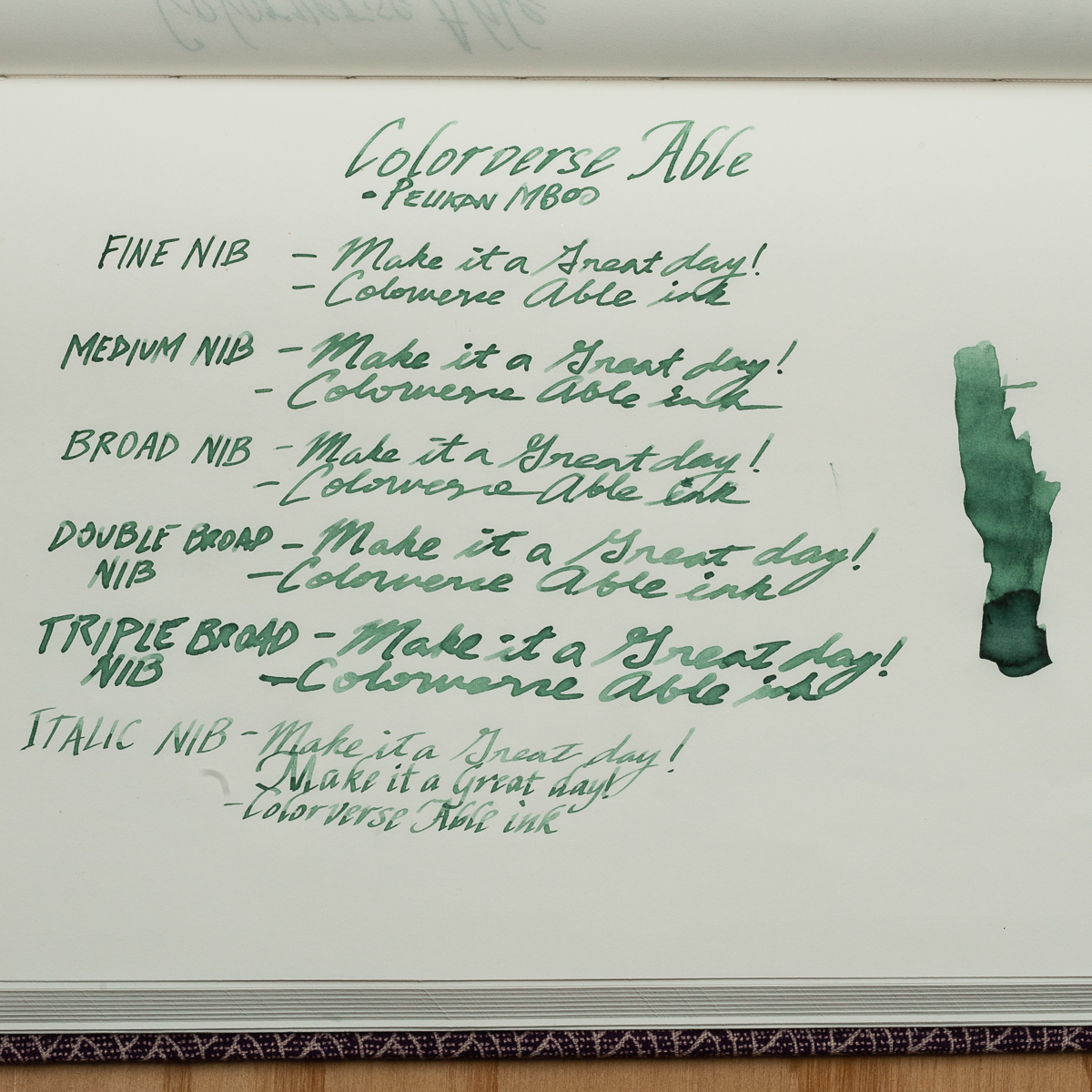
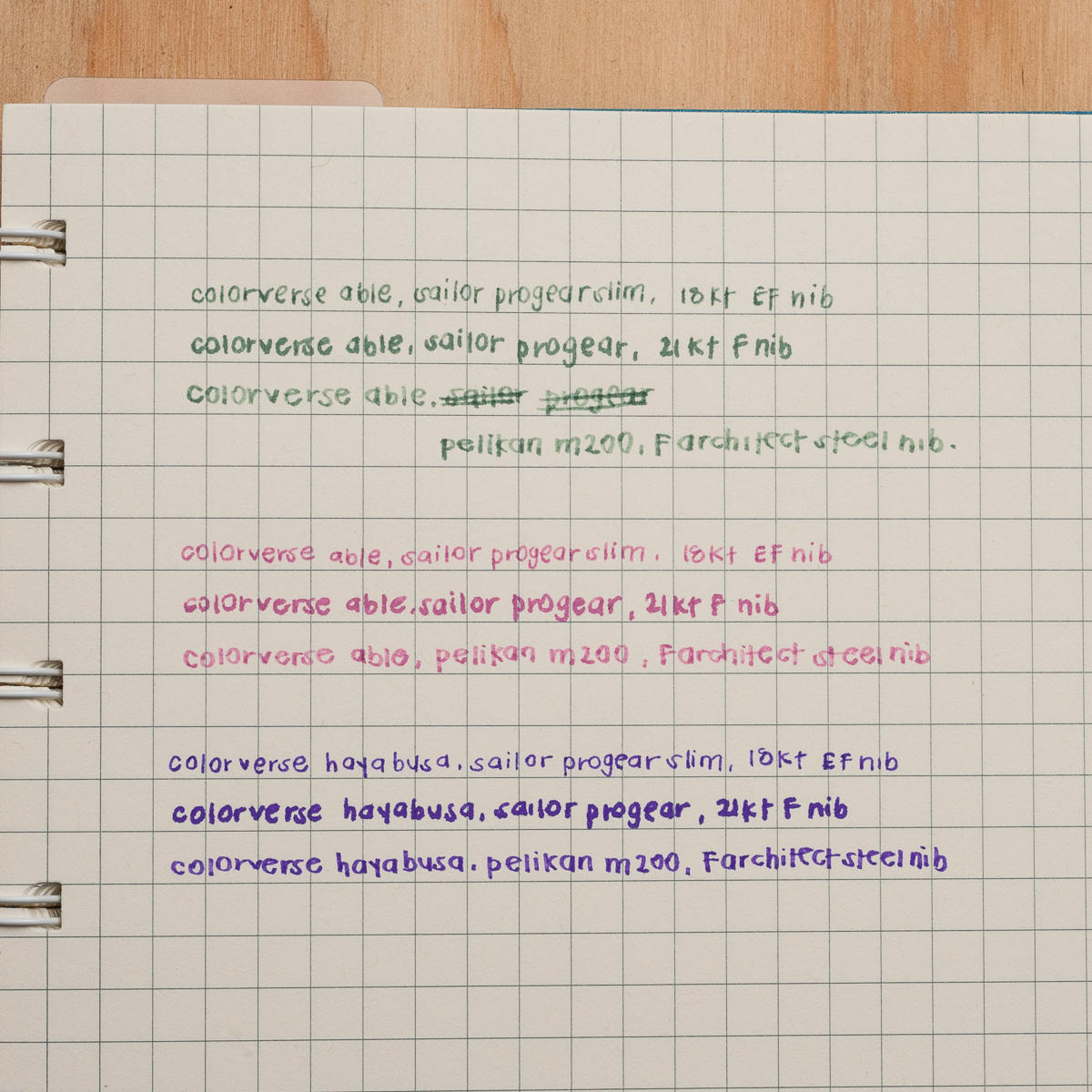
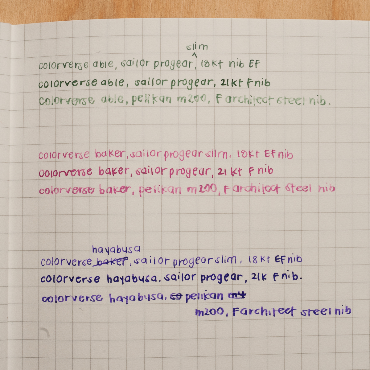
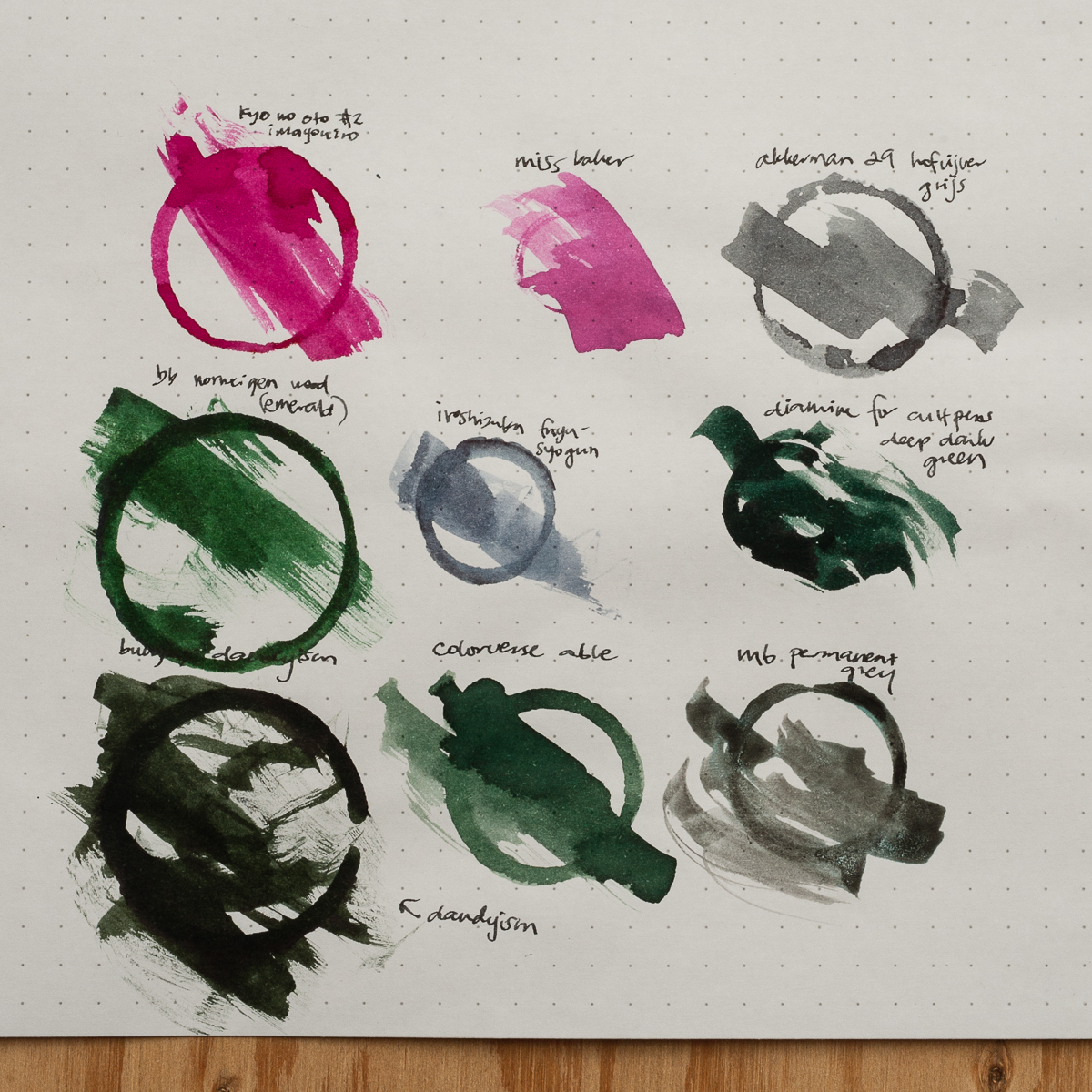
Able: Color- mossy green; Saturation- low; Shading- high; Wetness- dry; Dry time- fast; Overall thoughts- The green color is very nice to look at however it is too light. The italic writing is from a wet, medium size Pelikan M800 nib but it doesn’t look like it below.
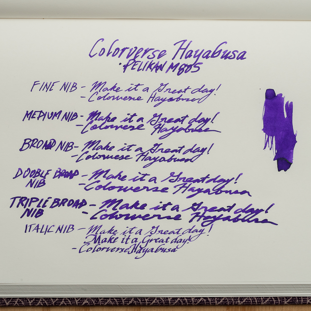
Hayabusa: Color- violet (more of in between violet and purple); Saturation- high; Shading- low; Wetness- medium to high; Dry time- medium; Overall thoughts- I’m loving this color! I don’t have too many purple inks but this definitely hits it for me. The difference in Hayabusa’s lubrication is noticeably different against the Able.
Ms. Baker: As I stated earlier, I was not able to test this ink but I was able to compare ink swatches and the two ladies’ writing samples. I would describe the color a light hot pink. I only own 3 pink inks (Monteverde Kindness Pink, Pilot Iroshizuku Tsutsuji, and Kosumosu) but they don’t match Ms. Baker at all.
I’m happy to have been able to try out inks from the Colorverse brand. I will look into getting more samples of their growing ink line up.
Colorverse Able on 52gsm Tomoe River paper in a Musubi diary notebookColorverse Hayabusa on 52gsm Tomoe River paper in a Musubi diary notebook
Katherine: First off, I think the Colorverse bottles and packaging are adorable. There are even little stickers! But, that Able label is misleading. It looks solidly grey, but as you can see in our swatches, is solidly green. Perhaps a muddy green, but definitely green.
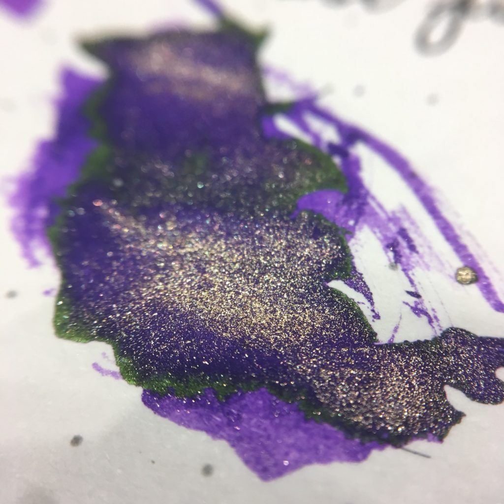
Packaging aside, the inks are well behaved — flow well and wash out easily (I did splatter Able and Miss Baker on some clothing and my face before dinner over the weekend. It washed off easily and no one looked at me funny as I ate my fancy multicourse meal). My one gripe is that Able is really, really light in most nibs — even wetter ones like Pelikan nibs. The highlight of trying the three for me is that Hayabusa Glistening both sheens and shimmers — a purple ink with green sheen and gold shimmer, so much fun!
Overall, I really like Hayabusa (I’m a sucker for purple ink) and Miss Baker. I like the overall color of Able, but found it too light except when in a narrow wet nib (the FCI in my writing samples).
Paper: 52gsm Tomoe River in a Seven Seas Crossfield journal notebook
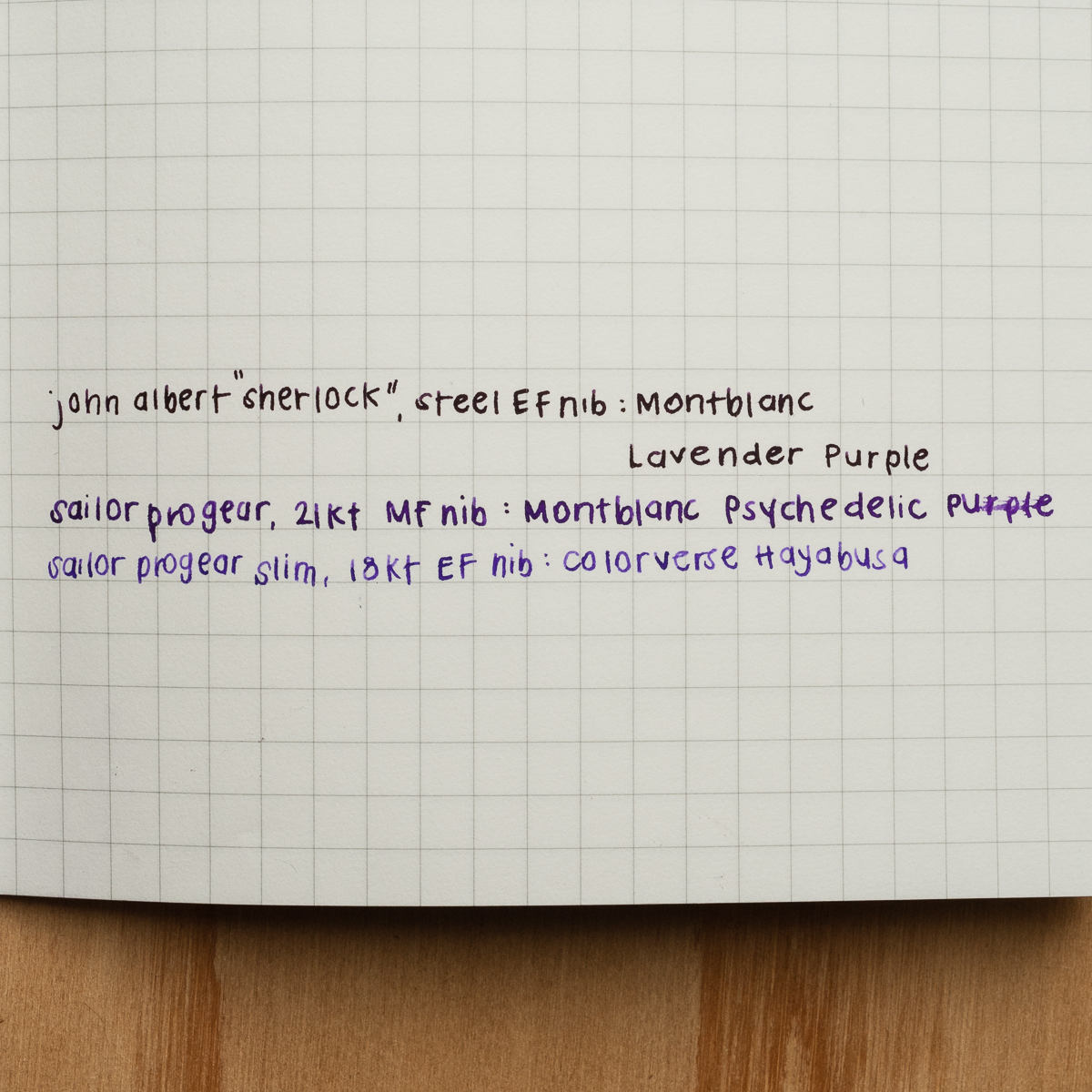
Pam: My favorite color of the three is Colorverse Hayabusa. It’s a fantastic purple color. It reminds me of the Montblanc Psychedelic Purple. There are subtle differences between the two; Hayabusa is a cooler purple (more blue undertones) where as Psychedelic Purple is a warmer purple (with more red undertones.) Both have a subtle gold sheen, although, the sheen on Hayabusa can appear more green in certain lights. I find Hayabusa to be a great purple ink that has great readability that behaves very well in pens. Hayabusa was easily the most saturated of the inks and performed extremely well in F and EF nibs. My architect nib is particularly dry so this saturated ink has more shading without losing it’s vibrancy.
Miss Baker was a pleasant surprise for me. As someone who passed on Sailor Peche and sakura-inspired pink hues for ink, Miss Baker was surprisingly pleasant to behold. I particularly liked it with the Sailor 21k F nib, which is the wettest of my three nibs. My bias towards saturation is obvious, but I can’t deny that Miss Baker is capable of some great shading. Unfortunately, I don’t see myself using Miss Baker often due to the softness of the color. I am not sure if I would find a page of Miss Baker to be highly readable, or if it’s a color that would capture my attention in the margins in a sea of black print.
I will admit that I was expecting Able to be a gray ink, so my disappointment on this particular color may overshadow any positive qualities that this ink may have. Able is NOT gray. It’s a dull green-gray (more green). It lacks vibrancy of a green like Montblanc Irish Green or even Bungubox Norwegian Wood or the interest of a green-variant like Ku-jaku or Bungbox Dandyism. Able is just a blah-green. If there is any gray in the ink, it just took away the vibrancy and readability of the ink. It’s the least saturated ink of the three and is a pale ghost of it’s already zombied-green self in my EF and dry architect nibs. If anything, I feel mislead by the packaging and disappointed by the color.
Overall, I found all the Colorverse inks to be wet in flow and really easy to clean out. I will definitely be adding some Colorverse inks to my collection in the near future. Thank you again Pen Chalet! My order will be in your queue soon!
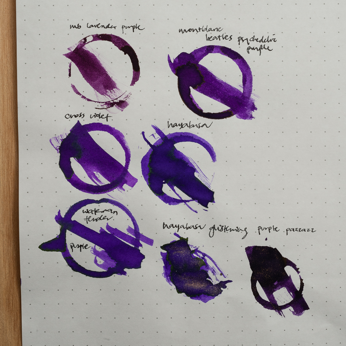
Paper: Filofax notebook.Paper: (insert here, wait for Pam)Paper: (insert here). A comparison of different purples side by side. Lavender Purple is much redder.
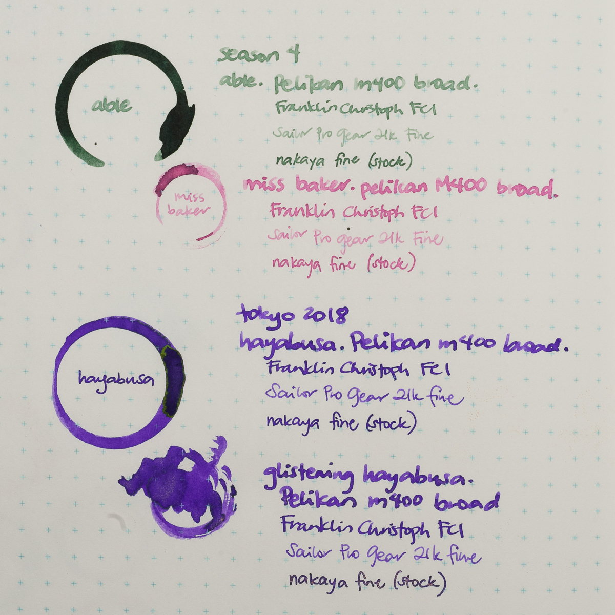
Ink Circles and Comparisons
Paper: Rhodia 80g Dot Pad. Able is definitely not grey, but is a pretty unique light muddy green. Able is a bright pink, but not similar to anything we had on hand. Katherine suspects it might be close to J Herbin’s Bouquet D’ Antan.
Paper: Rhodia 80g Dot Pad. Hayabusa’s closest match is Waterman Tender Purple, they even have the same greenish sheen.
And for the shimmer fiends, here’s a close up of Hayabusa Glistening. Unfortunately I couldn’t get the sheen and shimmer to show in any writing samples.
We received these inks free of charge for the purposes of this review. We were not compensated monetarily for our review. Everything you’ve read here is our own opinions.
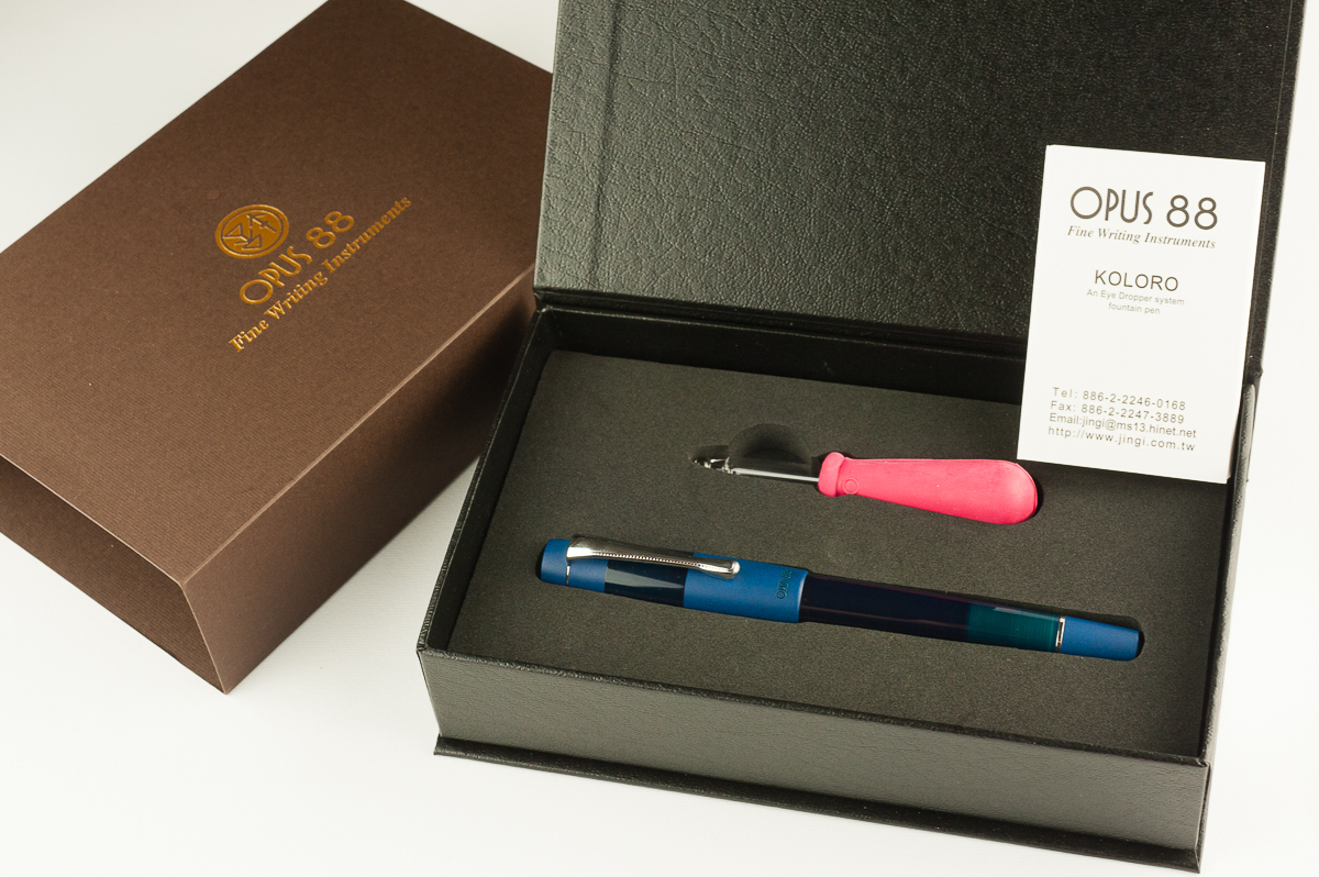
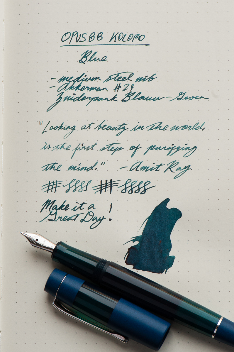
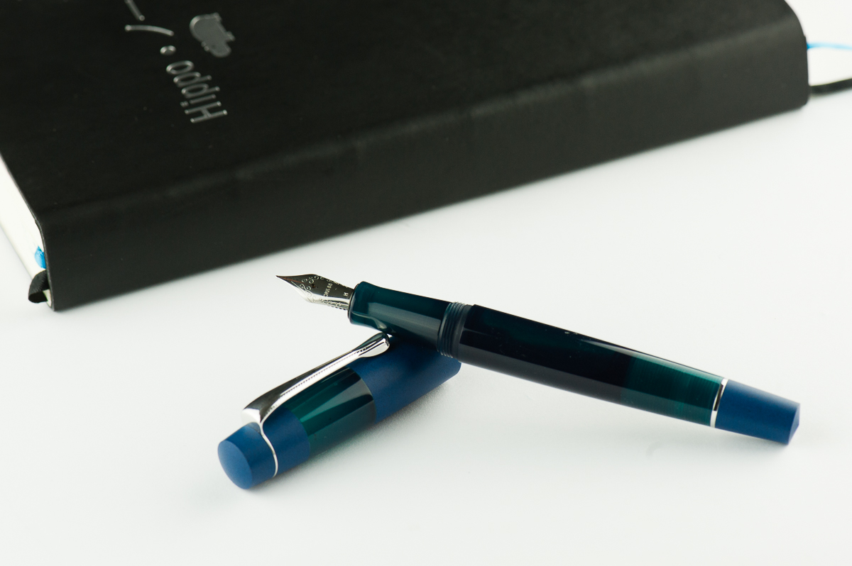
Before anything else, a big shout out of appreciation to Goldspot Pens, and Tom for providing this Opus 88 Koloro fountain pen for review. Goldspot Pens is an online shop for pens, and stationery goods and they are an authorized retailer for diverse brands that we love!
Hand Over That Pen, please!
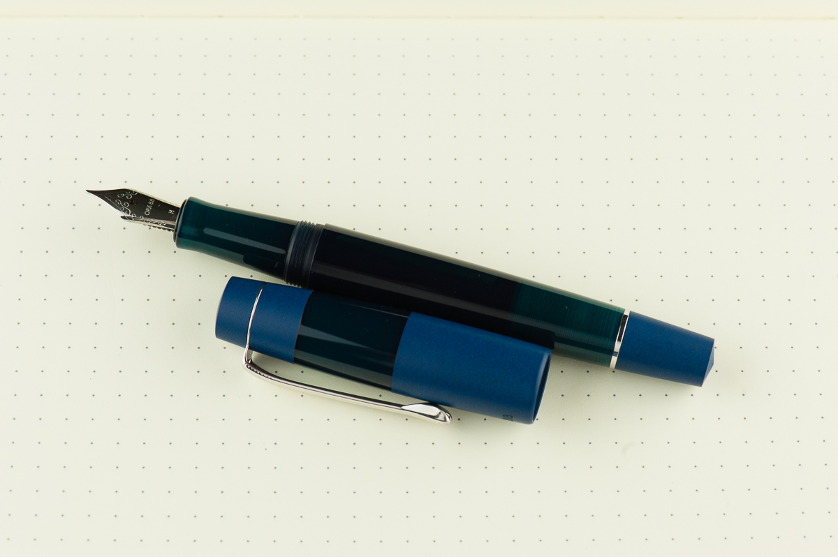
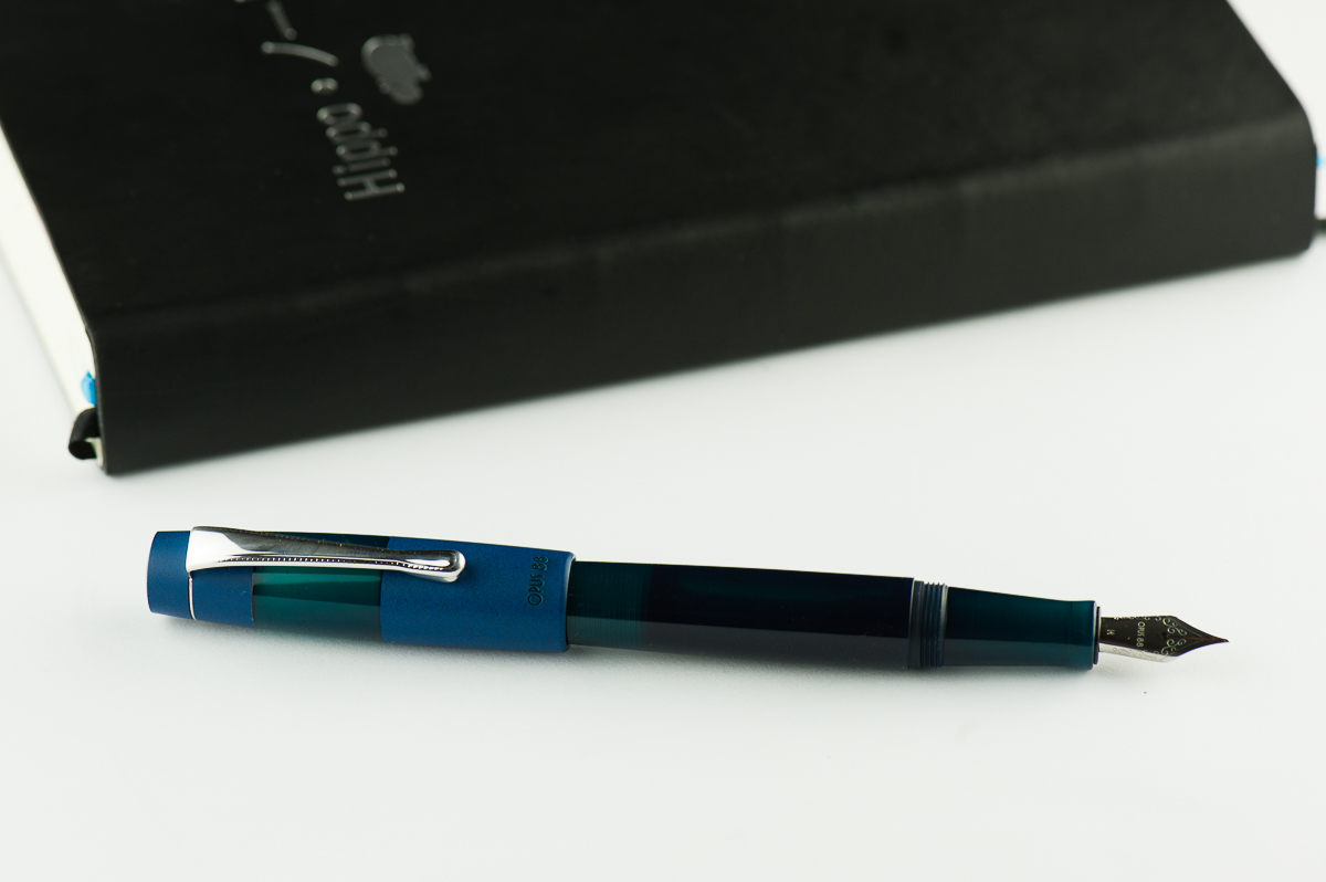
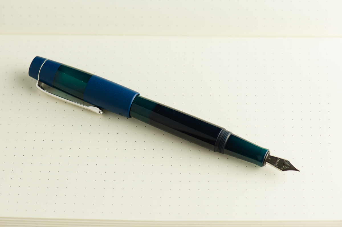
Katherine: Like many, this pen ain’t my thing aesthetically. I’m not a big fan of the solid matte blue paired with the shinier blue green — the two colors are too close for me (I also can’t stand denim on denim… or blue shirts with blue denim, but that’s besides the point). The demonstrator version looks neat though — but once again… this is all personal preference. 🙂
Pam: The demonstrator version is very striking, however, I am relieved to see different colors for the Koloro. All I see on Instagram is the demonstrator version! The slight translucency of the blue makes the material more interesting than a matte plastic. That said, why not just maintain the same material throughout, like the demonstrator? Lastly, the demonstrator version of the pen is pretty modern, and I wish the clip would reflect that. But then again, I am heavily influenced by the Lamy 2000 clip.
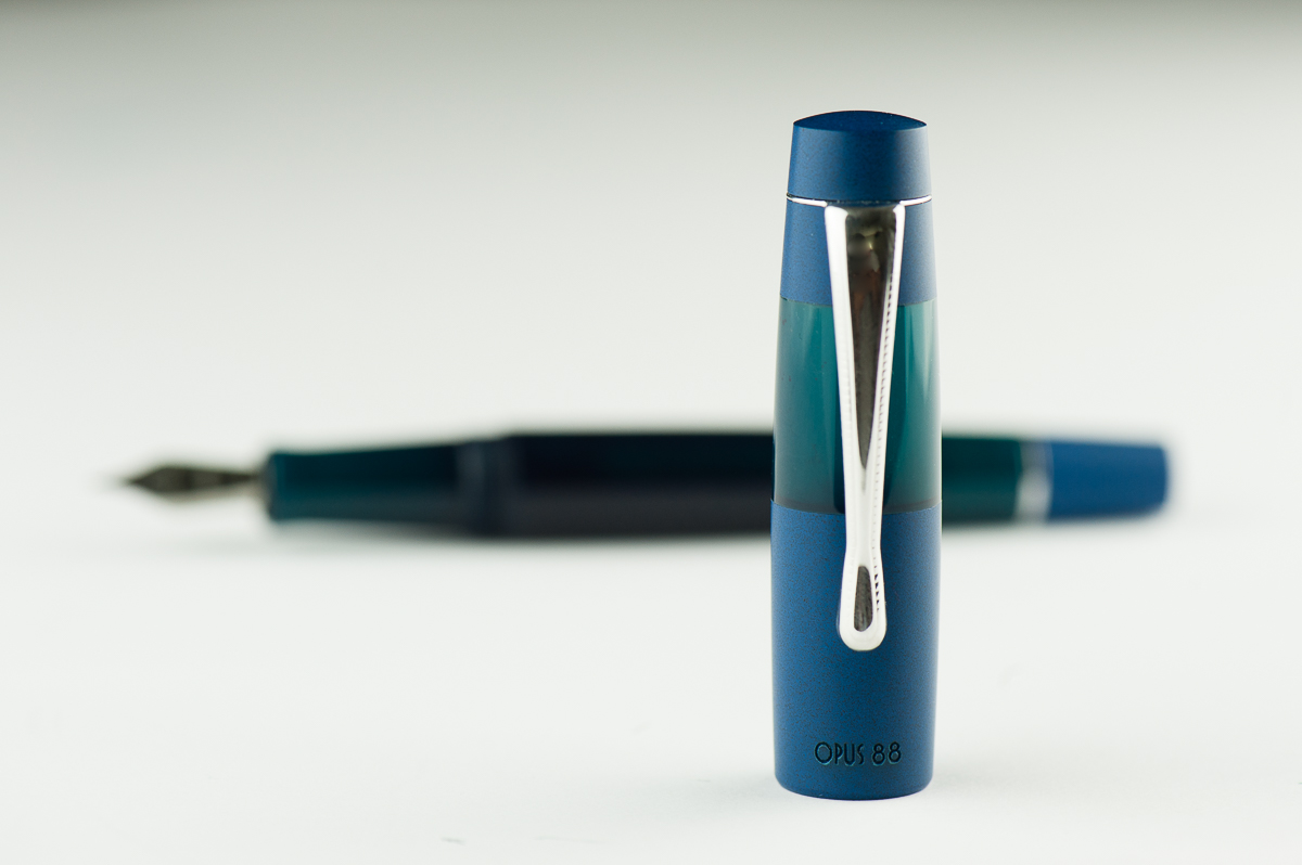
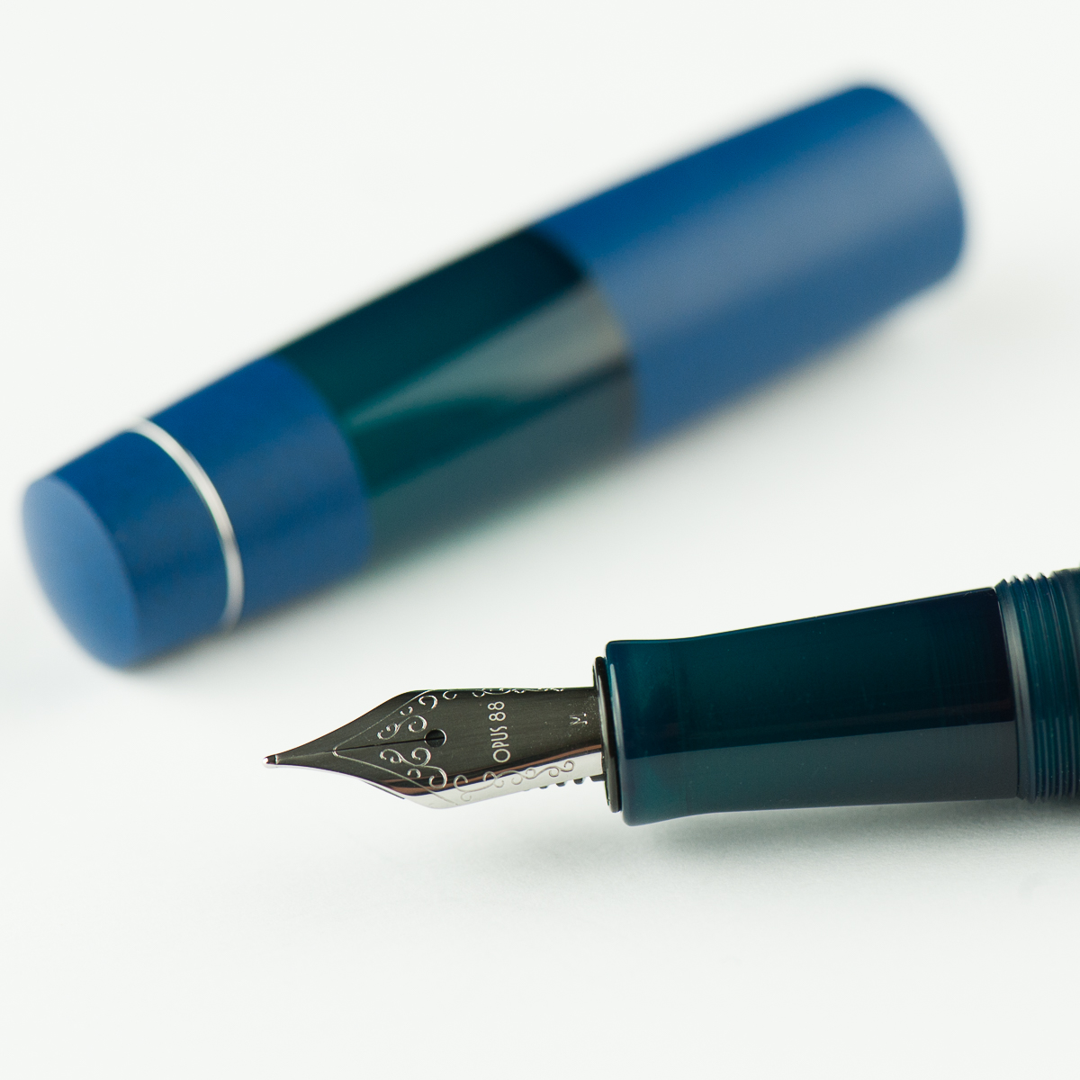
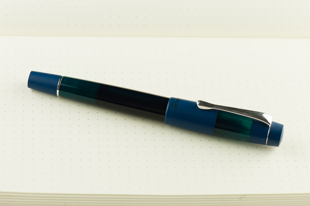
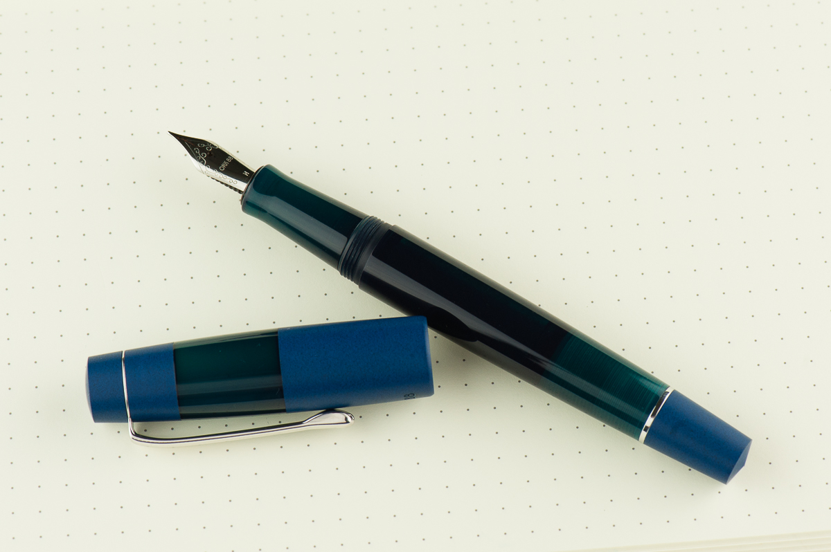
Franz: The Koloro is an interesting looking pen. The acrylic parts of the barrel and cap has a cloudy transparency and allows me to see inside with a bit of light behind. The dark blue ebonite is quite spectacular to look at and hold (and smell). When you look closely, you’ll notice that there are black bits in the ebonite and gives it a sandblasted effect. And finally, the dome shape of the cap’s finial makes me smile for some reason. =)
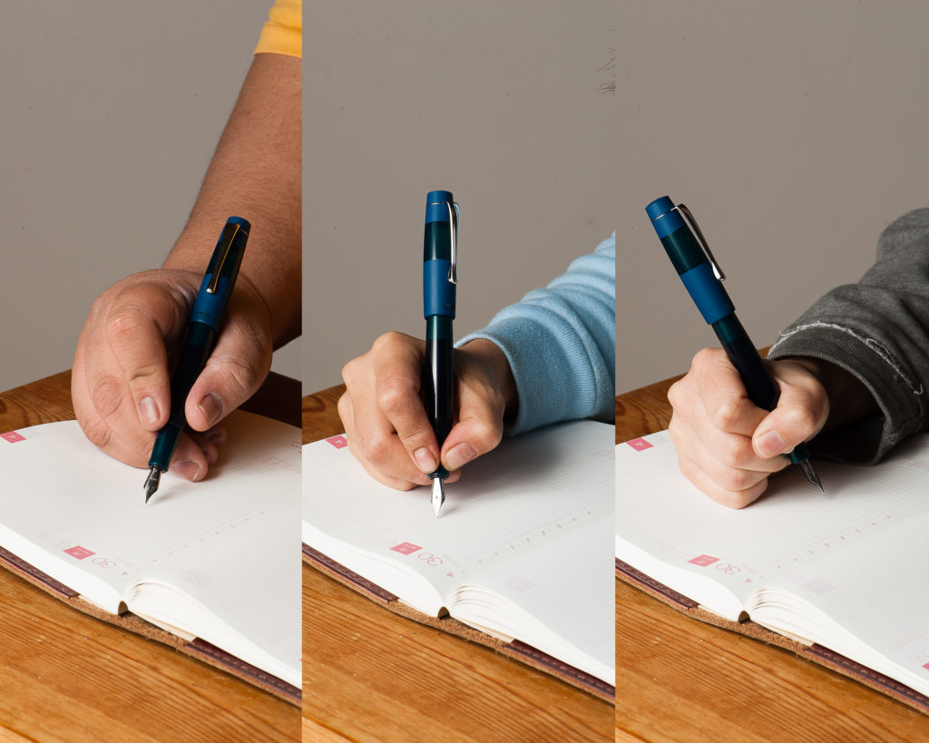
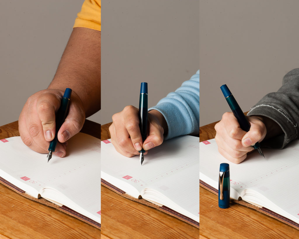
In the Hand: Opus 88 Koloro (posted) — from left to right: Franz, Katherine, and PamIn the Hand: Opus 88 Koloro (unposted) — from left to right: Franz, Katherine, and Pam
Pen Details
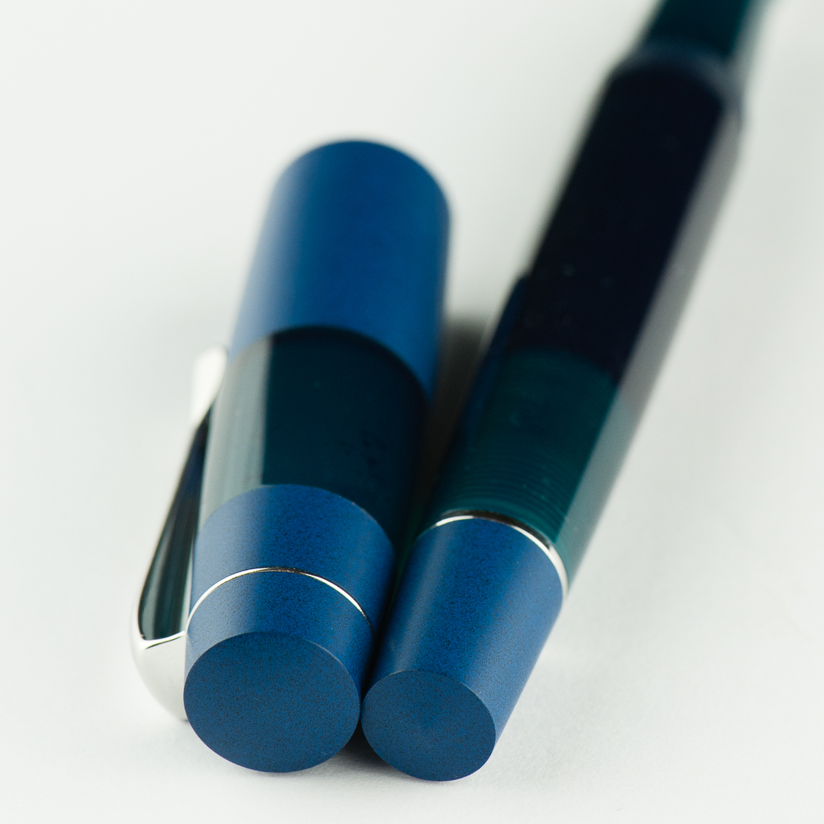
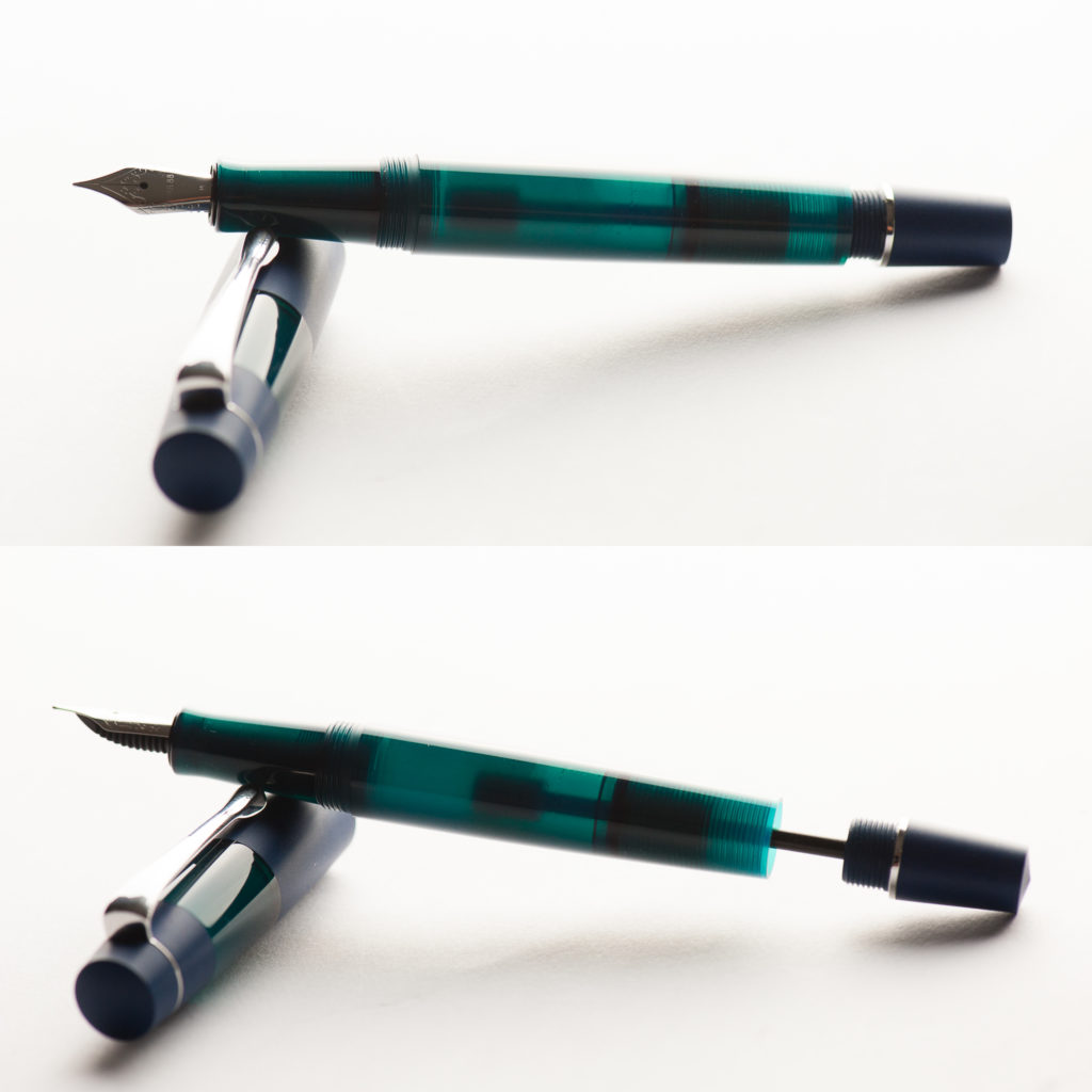
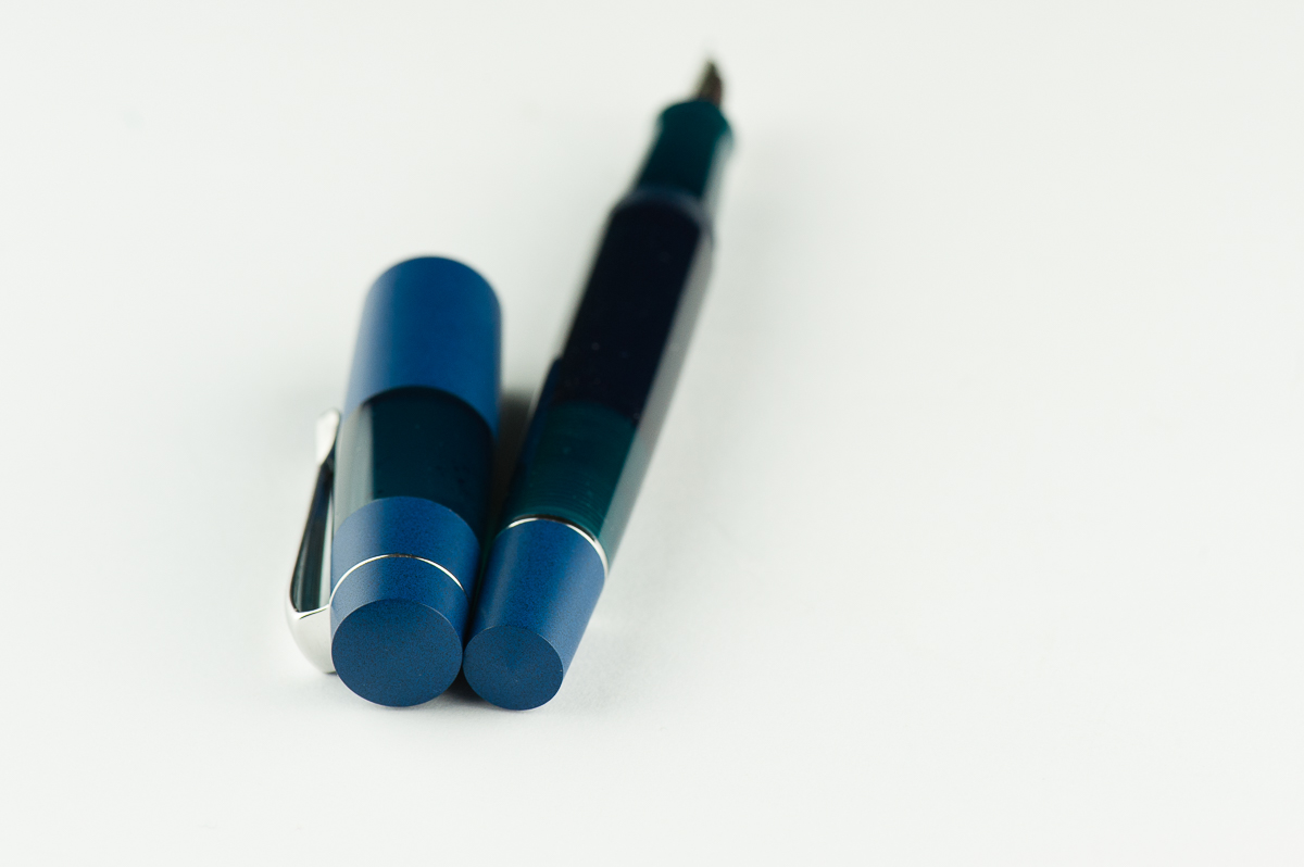
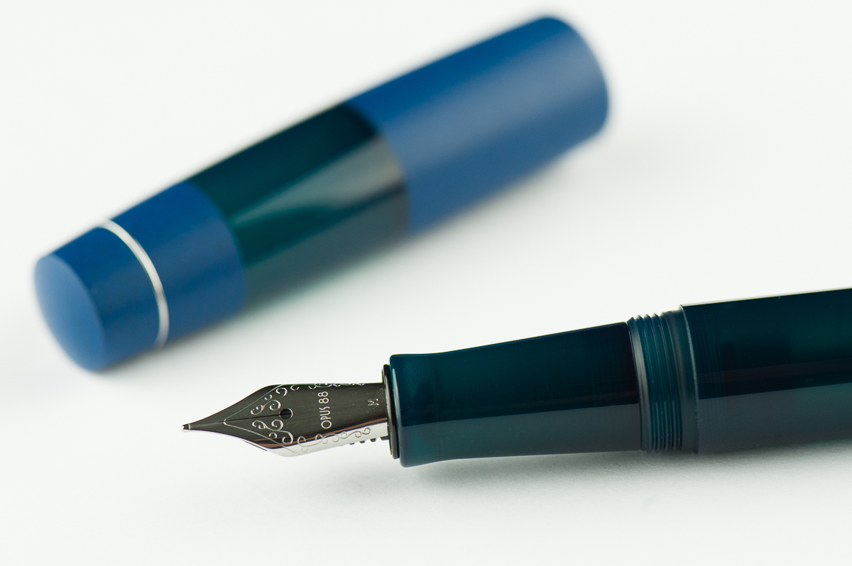
In the box: The Koloro is shipped in a box with foam cutouts. An eyedropper is supplied along with the needed instructions for filling and using the pen. The presentation is very nice.The Koloro is mostly an acrylic pen with blue ebonite accents on the cap. and blind cap on the barrel.A close up of the blue ebonite on the cap. The blue-green acrylic in the middle is translucent.
The Business End
Katherine: The pen takes a #5 Jowo nib, which is nice. The one that came with this pen is smooth and well adjusted out of the box. I love that this takes a #5 though, since it seems like it would be a good candidate for frankenpenning with a vintage flex nib and nibs that fit aren’t hard to find.
Pam: At first, the nib felt really dry and was unpleasant to write with. However, a special feature of the pen is the shut off valve. After we opened up the valve and saturated the feed, it was a much more pleasant writer. (Thank you Katherine & Franz!) The #5 Jowo nib performed consistently and as expected.
Franz: There is a taper to the section that makes the #5 nib size suitable however, a part of me wishes it came with a #6. That’s just me though. As for the writing experience, it was smooth as can be and wrote nicely.
I noticed that the medium nib on the Koloro seems finer than my usual medium Jowo nibs. So I took a loupe and compared it to my other medium #5 Jowo nib. The tipping was slightly smaller/finer than on my Franklin-Christoph Model 45. Of course, this is only from one Opus 88 nib unit but I can’t help but think that since these are Taiwanese pens, could it be that their nib line widths are more towards the Japanese size?
Franz’s writing sample on a Hippo Noto Pocket A5 notebook with 68 gsm Tomoe River cream paper.
Write It Up
Katherine: The section is maybe a smidge slimmer than perfect, but overall it’s a comfortable pen that’s well balanced in my hand (unposted). I found it comfortable for long writing sessions, but my one gripe is that once the feed runs dry (because I forgot to open the knob and wrote for a while) it takes a while for the ink to make its way down. When loosened, it’s great… when I forget, it can be a little annoying, though the pen does keep writing, just more dry.
Pam: I had no problem with the width of the pen. I found it to be pretty comfortable actually. The threads and the mild step was a bit sharp for me and had some bite in the tender area where thumb meets palm. It wasn’t painful, but it was very noticable. I had to loosen my grip and readjust multiple times during the prolonged writing session.
Franz: I wrote in my journal with the Koloro for a good chunk of time and I did not experience any fatigue. I do prefer writing with the cap posted but it’s perfectly usable even when unposted due to the length of the section. It was my first time to use a Japanese-style eyedropper and as long as the blind cap was unscrewed, the ink flows as it should.
EDC-ness
Katherine: Sorry, three cap turns is just too many. I take a lot of stop and go notes… and this just doesn’t work. Otherwise, the clip feels strong and is maybe a smidge tight, but seems secure and comfortable.
Pam: I couldn’t use this pen at work since it took far too many turns to uncap to be a good EDC at work. It is definitely a 2 hand operation. If that’s not a hinderance for you, the clip did keep the pen secure in my pen case.
Franz: Like the ladies above, uncapping the Koloro took a while and with a work setting of having the need to constantly cap and uncap, definitely was an irritation. As long as one doesn’t have the need for quick deploy, the Koloro is a great pen to use on the daily. I actually liked using this pen while taking notes on a conference call. The build of the pen seems sturdy and can withstand being jostled around in a pocket or a bag. The eyedropper filling system allows the pen to have a little over 2 milliliters of ink for a lot of writing.
The photo below shows the Koloro’s ink chamber and eyedropper’s plunger rod slightly pulled back. The section does have an O-ring which prevents ink from leaking out.
Final Grip-ping Impressions
Katherine: I’m really excited that a modern maker has chosen to build a pen with the Japanese Eyedropper mechanism! This pen doesn’t do it for me aesthetically, but it’s solidly made and writes well — I can’t wait to see what else Opus 88 comes up with!
Pam: The price is fair for what you get in this pen. If you like the aesthetic, want a relatively novel eyedropper with shut off valve, and a reliable nib, you will be hard pressed to find a better alternative. This pen is not for me mostly due to personal preferences, however, as an introduction to Opus 88, it’s a solid opening volley. Bring it on Opus 88!
Franz: One thing I would say that’s a negative (for me) is because the Koloro’s barrel is acrylic, I don’t get the warm ebonite feel while writing. I only have a few ebonite pens but the warm feel is something that I’ve come to expect. That’s just my personal thing though.
The Koloro is a fantastic pen to use as it has a lot going for it (fairly large size, Japanese eyedropper filling system, different color choices) and as Pam mentioned, it’s at a fair price. It is a pen I find myself using a lot for my journal time whenever I do get the time.
Once again, thank you to Goldspot Pens for providing this pen for review. If you’re interested in the Koloro, check out the other options on their site, here.
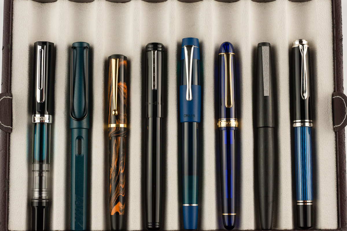
Pen Comparisons
Closed pens from left to right: TWSBI Eco, Lamy Safari, Edison Beaumont, Franklin-Christoph Model 20, *Opus 88 Koloro*, Platinum 3776, Lamy 2000, and Pelikan M805Posted pens from left to right: TWSBI Eco, Lamy Safari, Edison Beaumont, Franklin-Christoph Model 20, *Opus 88 Koloro*, Platinum 3776, Lamy 2000, and Pelikan M805Unposted pens from left to right: TWSBI Eco, Lamy Safari, Edison Beaumont, Franklin-Christoph Model 20, *Opus 88 Koloro*, Platinum 3776, Lamy 2000, and Pelikan M805
Pen Photos (click to enlarge)
We received this pen free of charge for the purposes of this review. We were not compensated monetarily for our review. Everything you’ve read here is our own opinions.
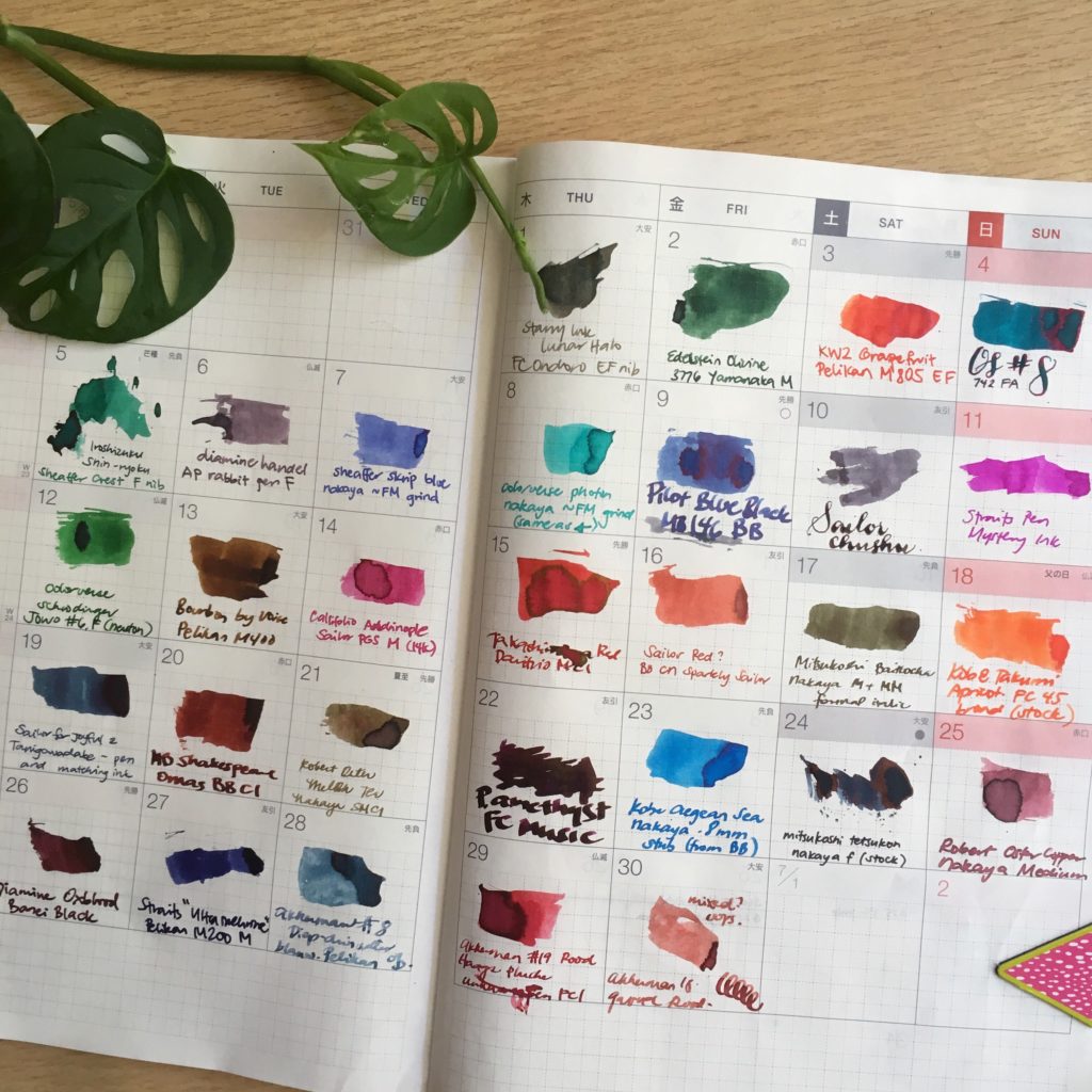
Katherine: I didn’t have a pen and ink pairing for June — I had 30! I kept up with the #30inks30days challenge on Instagram and had quite a lot of fun.I repurposed the (empty) June page from my 2017 Hobonichi to track my progress. I own more ink samples than I’d care to admit, and I had a lot of fun trying new ones and revisiting old favorites. I also own more pens than I can use regularly, and this gave me a chance to get some of them inked up and writing!
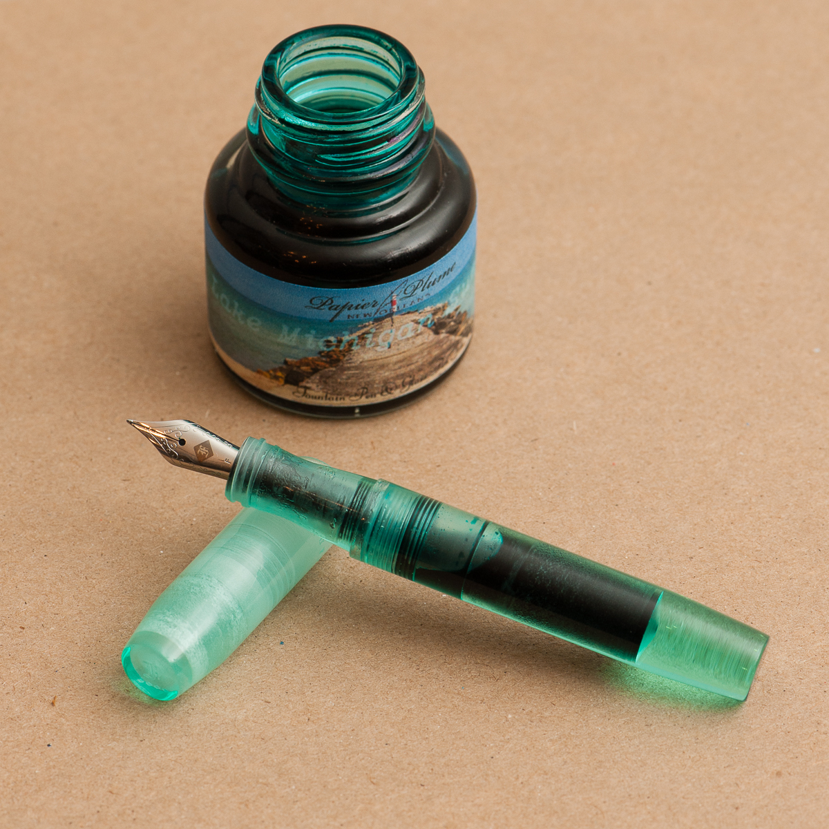
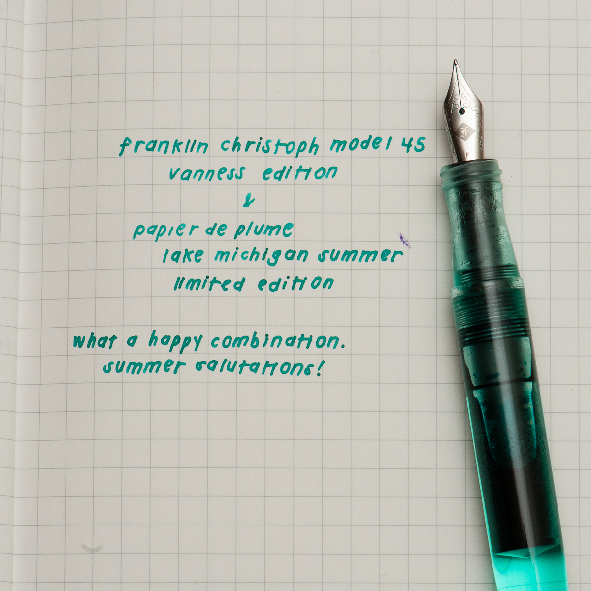
Pam: As luck would have it, ’tis the season to reveal an ink in my stash that I have been hoarding. It has patiently waited for a pen-mate. Thankfully, my minty dreams have come true with the Vanness edition of the Franklin Christoph Model 45 which is the perfect color match to Papier de Plume’s Lake Michigan Summer. The minty color sings of happy summer days as well as the soothing waters of a lake shore in both ink and pen.
I have typically avoided minty inks due to the a possible brightness that detracts from the readability of an ink. I don’t have any problem with this ink. It’s dark and well saturated to make reading a breeze. The comfort of the model 45 rivals that of my Pilot Prera which is practically a daily carry at work. Not only is the ink and pen pairing a dream come true for me; I can’t imagine a better color than the minty Vanness edition Model 45.
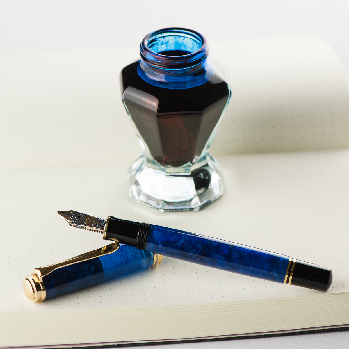
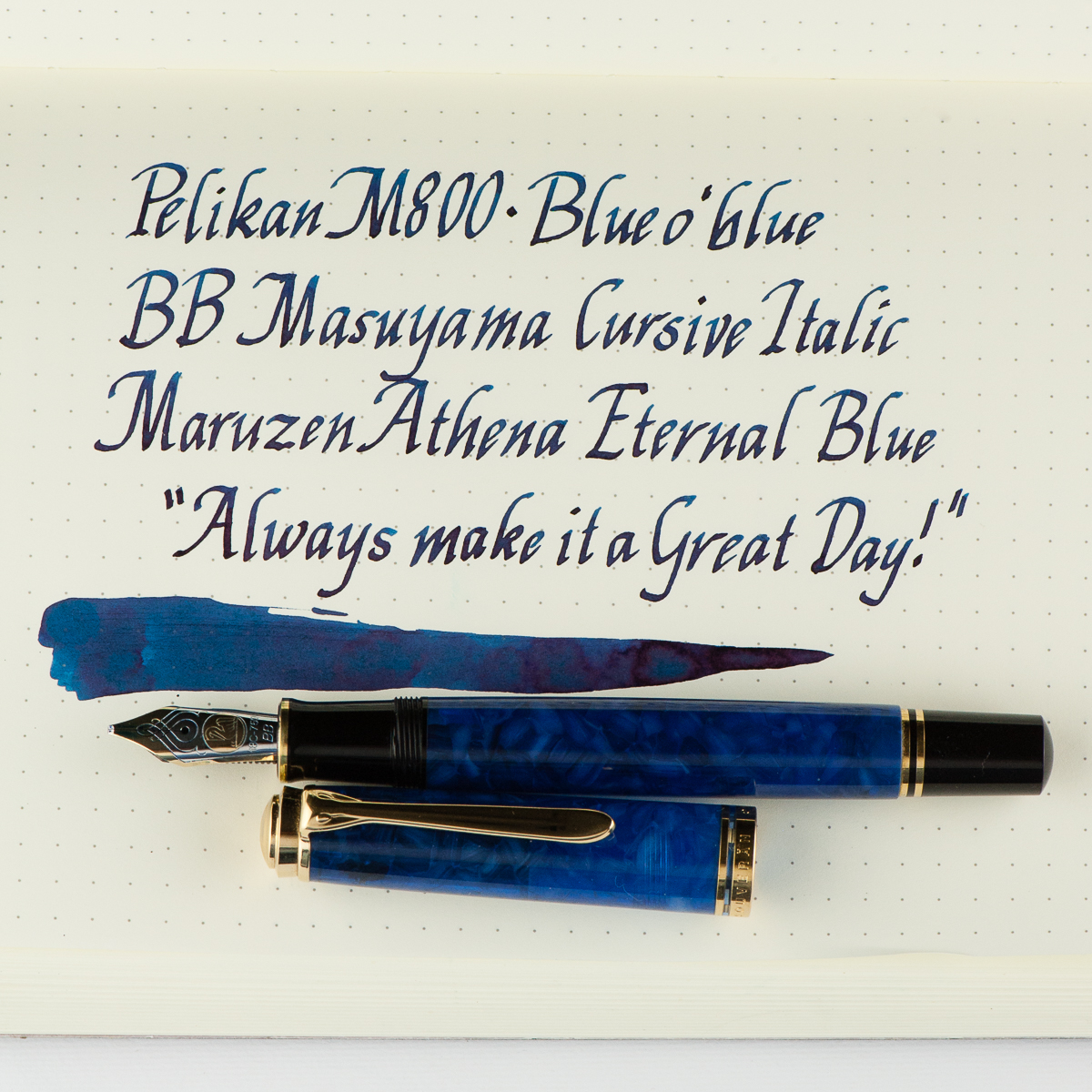
Franz: Hellooo BLUE-tiful! I have had this M800 Blue o’ blue for a while now and figured to ink it up just for practicing and improving my novice italic calligraphy skills. The Blue o’ blue (Blue over blue) was a Special Edition pen by Pelikan in 2010 and I was fortunate to have gotten this pen early in my collecting days. The translucency of this material never ceases to amaze me. #ilovebluepens
I also inked up the M800 Blue o’ blue to match with the Maruzen Athena Eternal Blue ink that I have been growing to like. The Eternal Blue ink has shading that mimics the Blue o’ blue’s material. The double broad italic nib is a fitting nib for this ink because it helps bring out the shading even more.
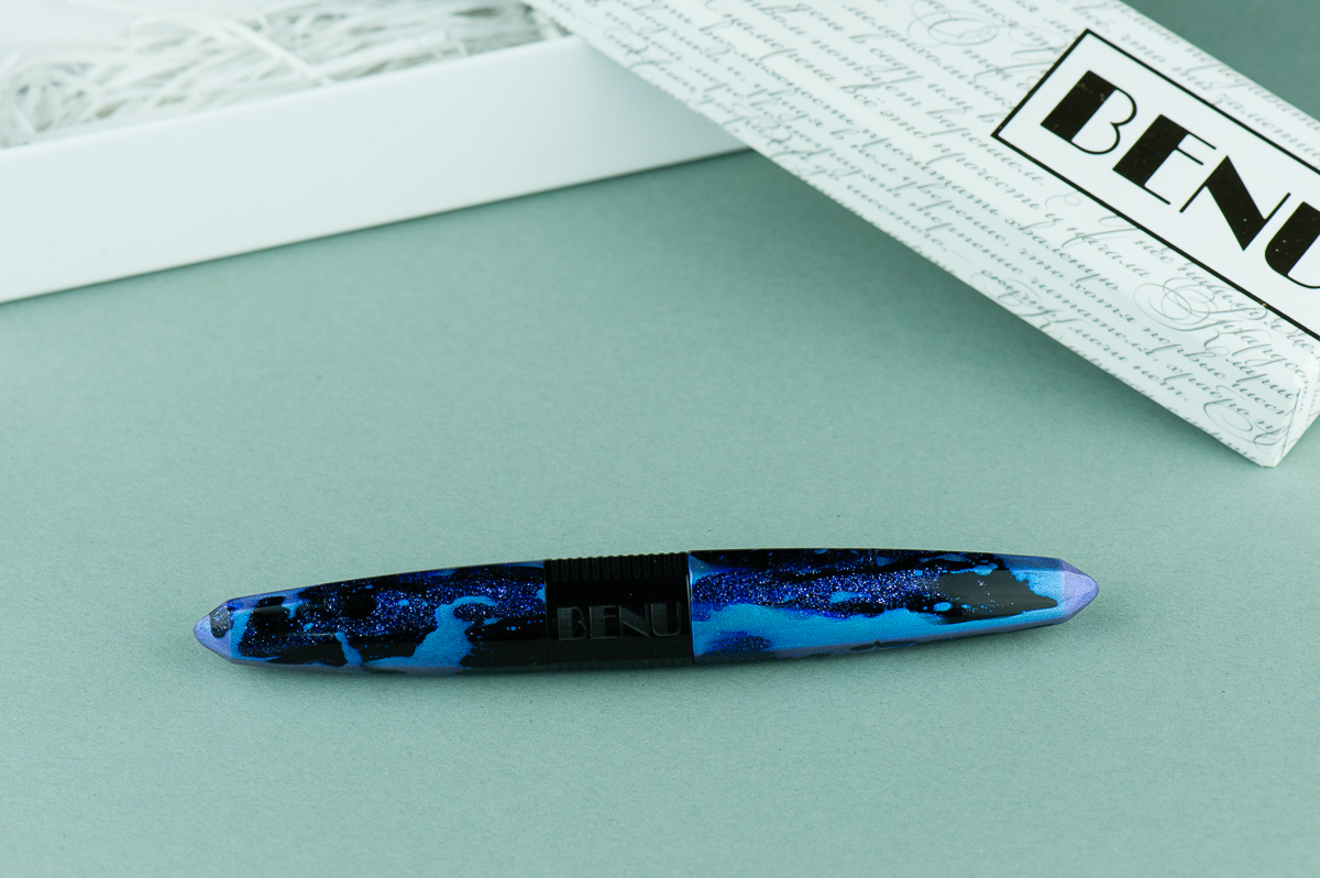
We want to thank Lisa and Mike Vanness of Vanness Incorporated for lending us this Benu Pen Chameleon fountain pen for review. And sorry it has taken a while Lisa! The Vanness family has had a pen shop in Little Rock, Arkansas since 1938 and is celebrating 80 years of being in business. Check their store out if you can. They also travel to pen shows in the United States and one of the shows that we will see them at is the upcoming San Francisco Pen Show in August.
The opinions in this review are always our own and we were not compensated (monetarily or otherwise) for this review.
Hand Over That Pen, please!
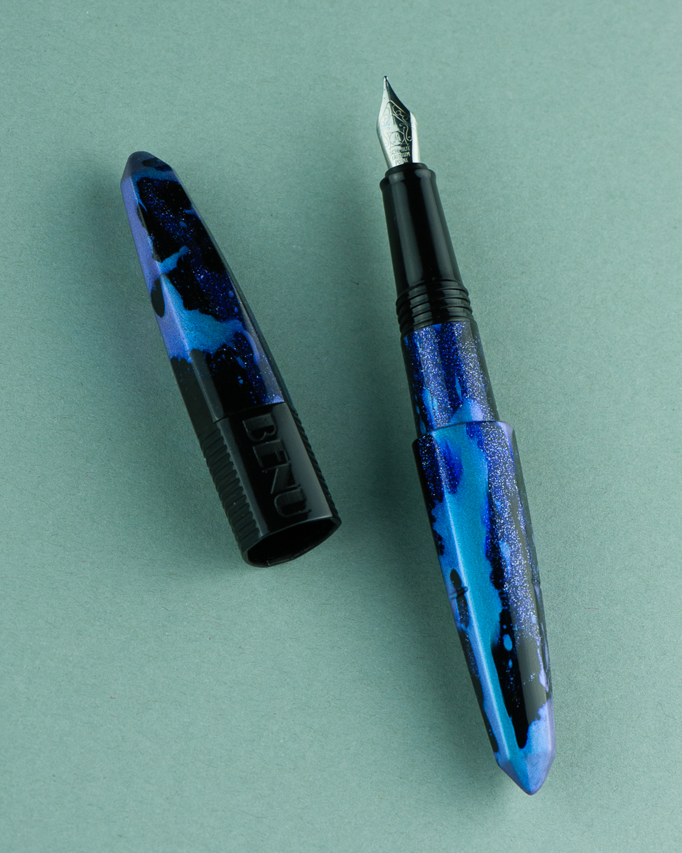
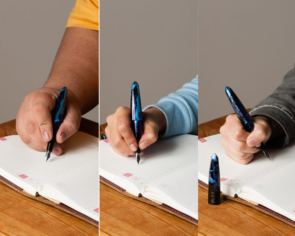
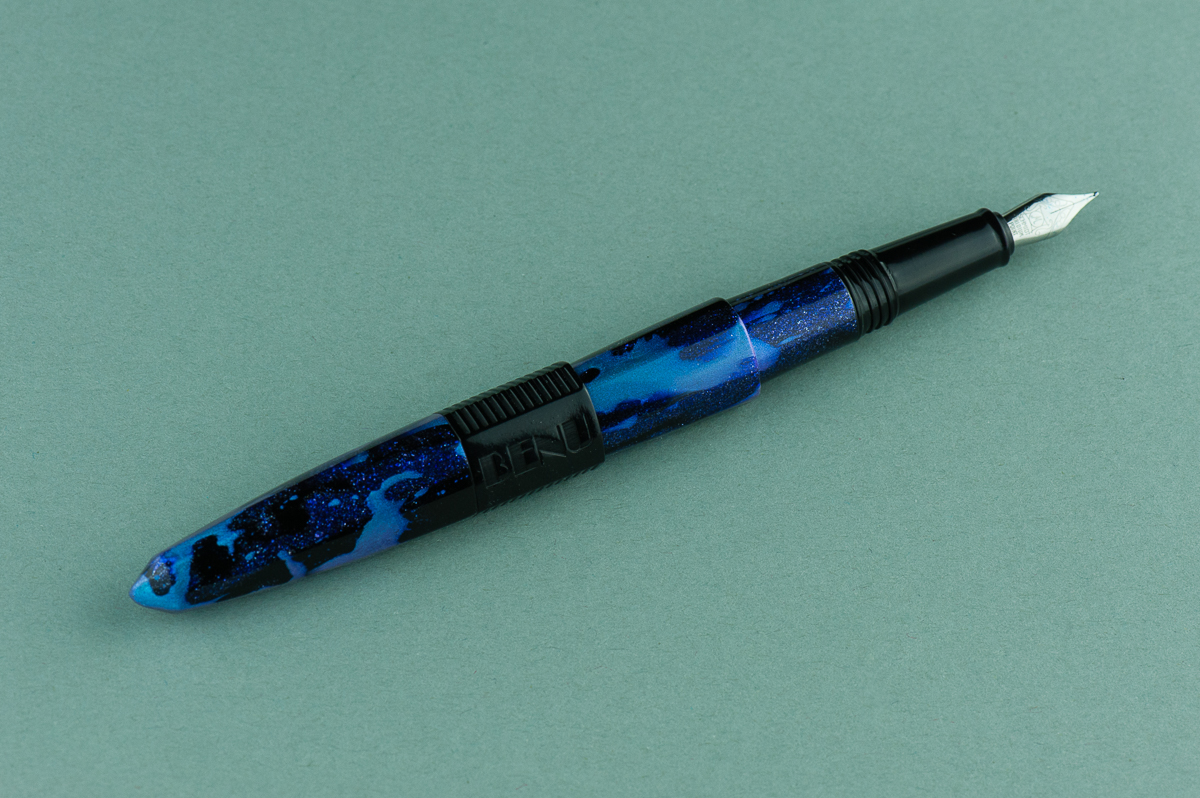
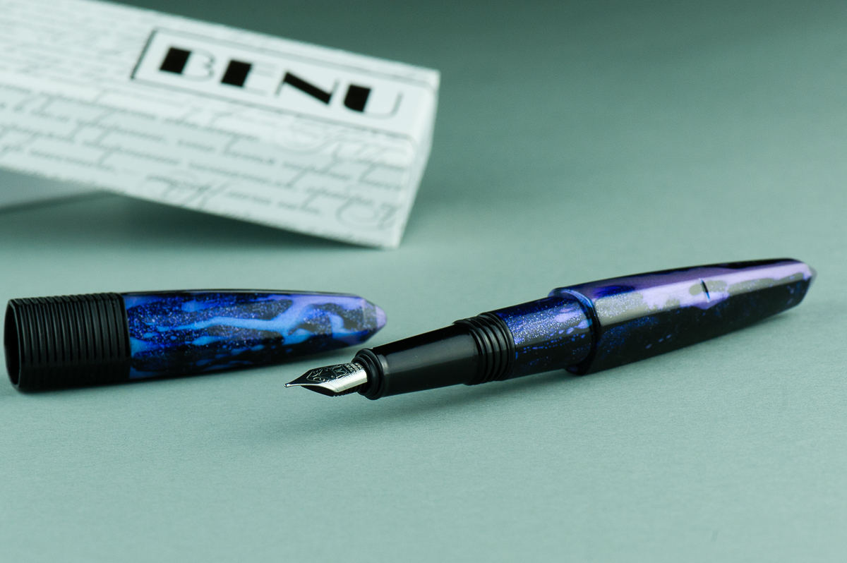
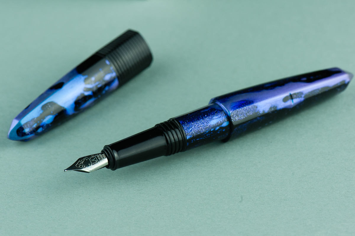
Katherine: This pen is… very purple. The unique shape of many of the Benu pens has intrigued me since I started to see them on Instagram. Many thanks to Vanness for lending us one so I could finally try one! And such a cool purple material too. Off the bat, I suspect the looks of this pen will be very polarizing — you either love it or you don’t. Personally, I like the galaxy-ish purple material and the unique shape. However, I couldn’t get the triangular sides to line up, which bugged me (I could also just be incompetent EDIT: Franz confirmed — I’m incompetent and it lines up for him).
Pam: It’s a very unique pen in terms of aesthetics. The material is “loud” to me but the shape is intriguing. It’s not often that we get to see a triangular shape in the world of fountain pens. I will admit that I am not particularly fond of the material as I find it very distracting and detracts from the cool shape of the pen.
Franz: Yep, this Benu Chameleon pen definitely has a distinctive design. It reminds me of the crystal that Superman used to create his Fortress of Solitude except that it’s blue and purple (blurple) and not a glowing green. Hmm… I hope that wasn’t too geeky of a reference. Hehehe… =P
In the Hand: Benu Chameleon (posted) — from left to right: Franz, Katherine, and PamIn the Hand: Benu Chameleon (unposted) — from left to right: Franz, Katherine, and Pam
Details
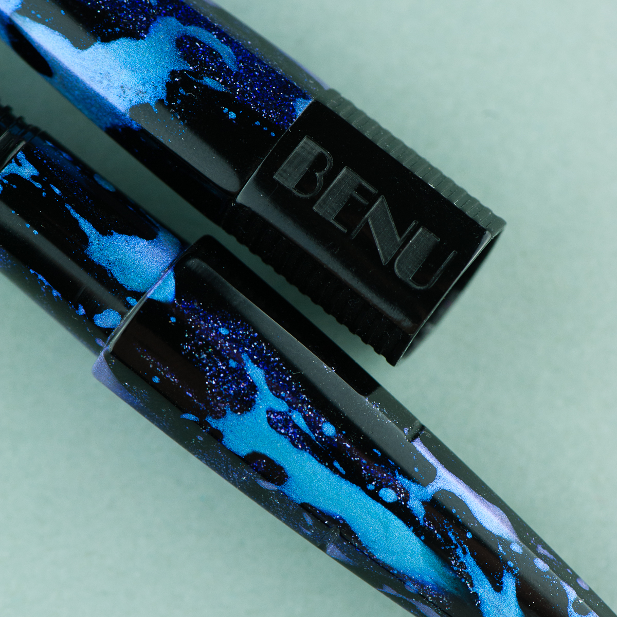
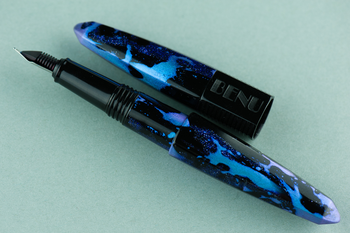
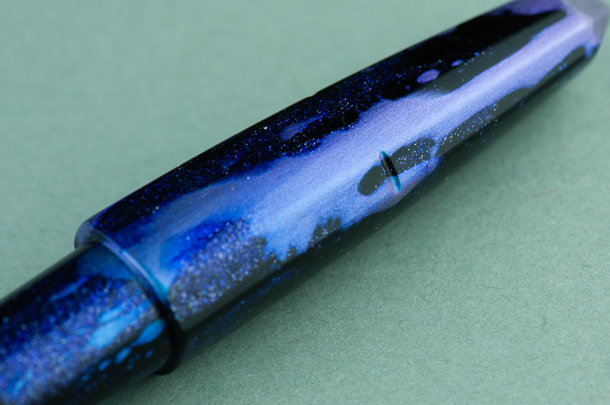
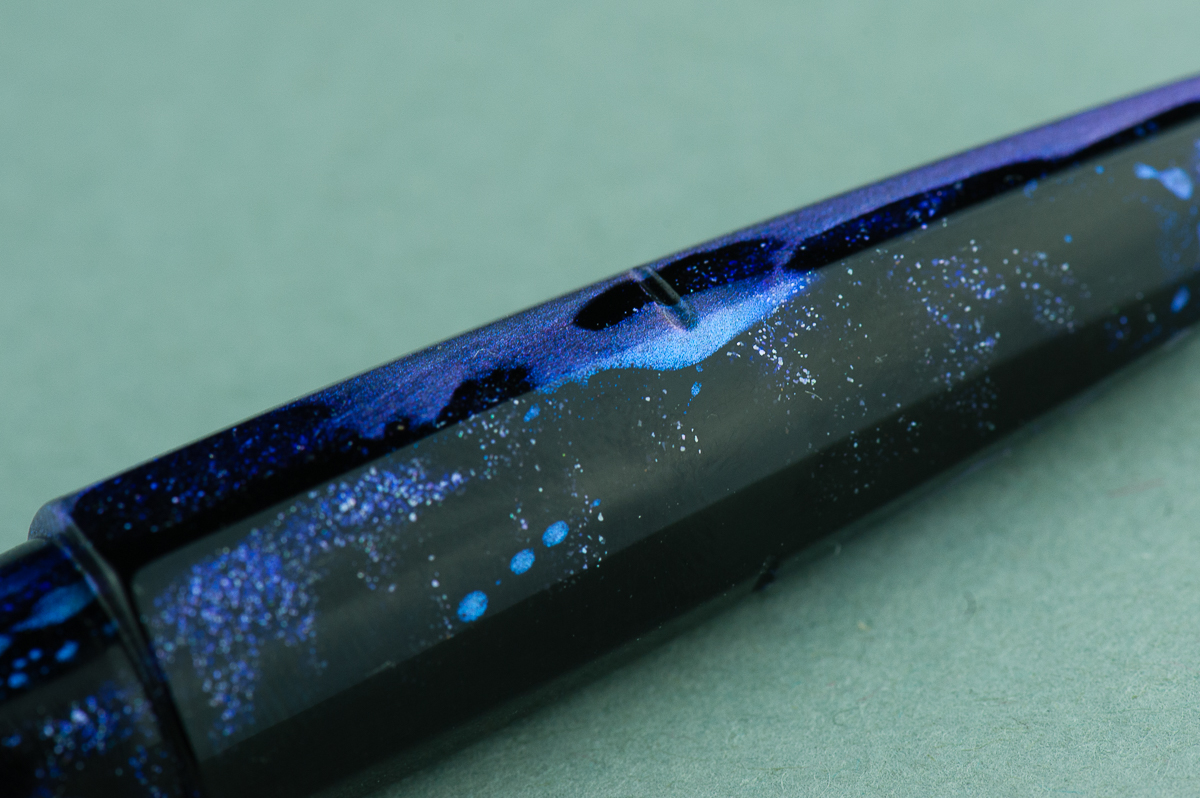
Benu’s packaging is pretty nice and simple. The white box seems perfect for the colorful pens they make. An instruction booklet also comes with the package.A close up of the Charming Chameleon’s finish.
The Business End
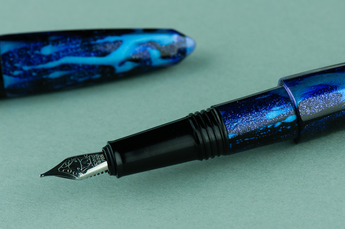
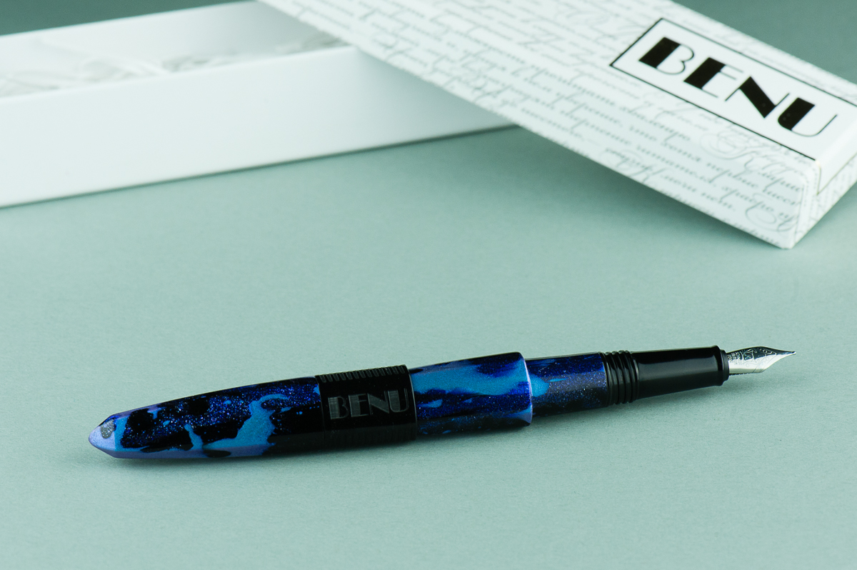
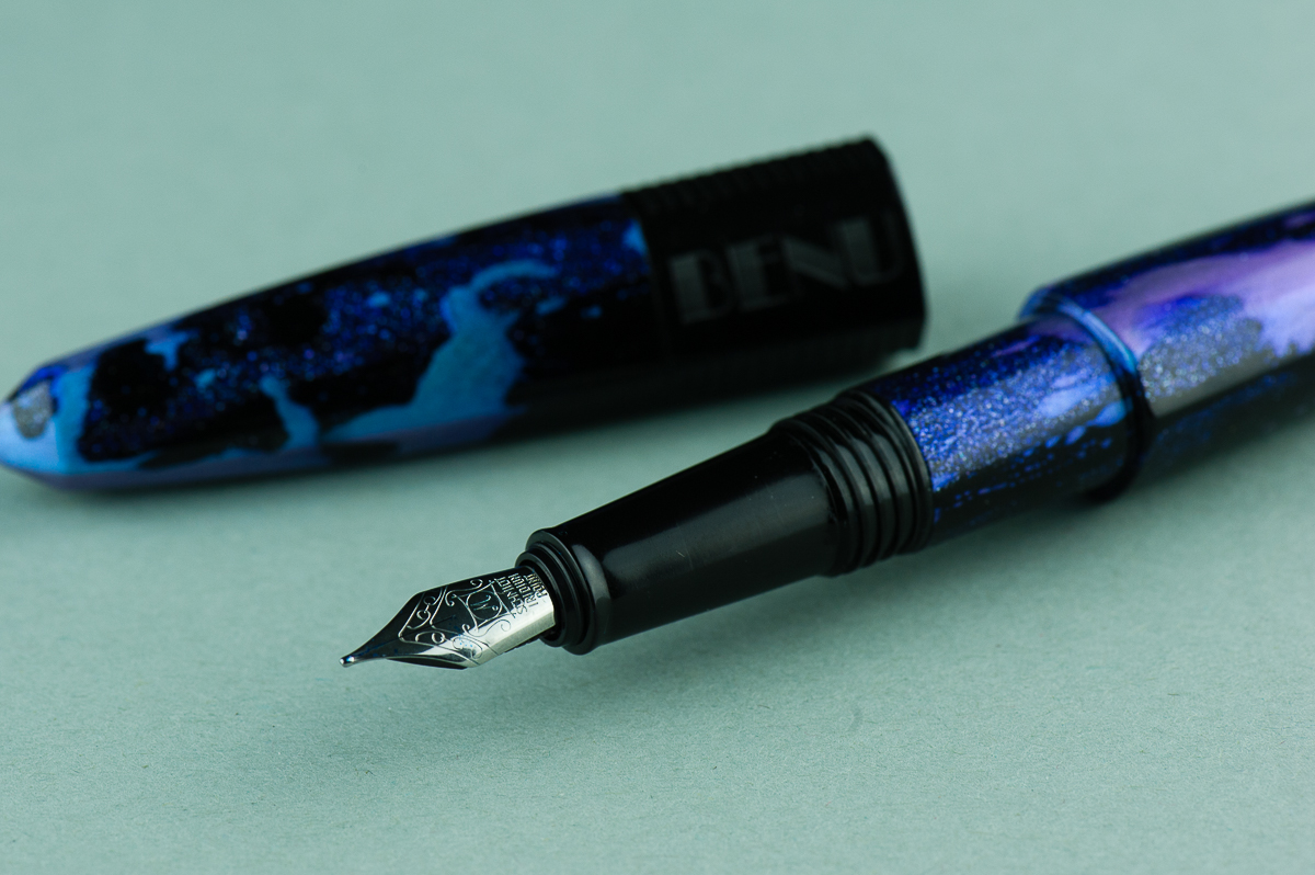
Katherine: It contains a Schmidt nib, which is perfectly usable, but not particularly memorable. It’s on the smaller side though — so I bet you might be able to swap a vintage nib into it (though I didn’t try, so proceed at your own risk!).
Pam: I do find the Schmidt nib to be small relative to the rest of the pen. It’s not ideal for my angle of writing with this particular set up. It puts my hand closer to the paper than I would like it. The Schmidt nib is a reliable nib, writing smoothly and well right out of the box.
Franz: This Chameleon has a medium steel nib and is smooth out of the box. The smaller #5 nib complements the taper of the barrel and section nicely. This nib wrote nicely as it should and I liked it. I believe Benu pens currently have F, M, and B as nib size choices.
As Katherine alluded to, you can “gently” pull out the nib and feed to swap a similarly sized nib. Please remember that any modification you make to any pen may void any warranty there may be.
Write It Up
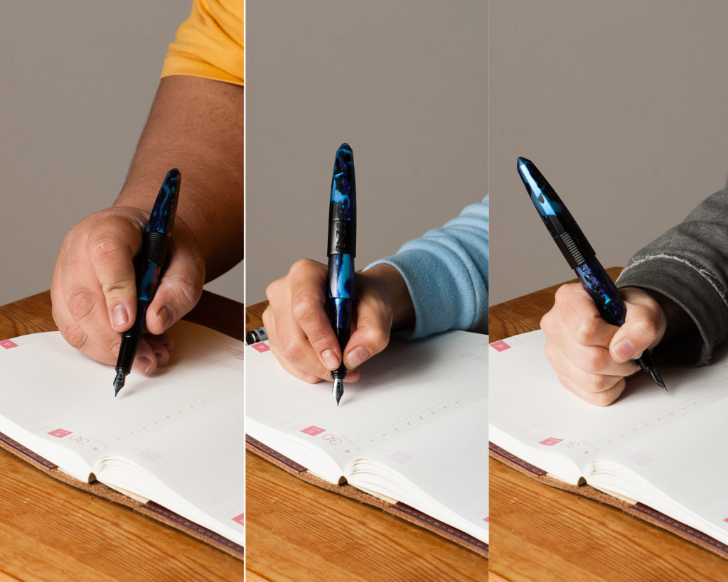
Katherine: When I uncapped it, I was initially worried about the size of the step from section to barrel, but the section is long enough and I hold my pen far enough forward that it wasn’t an issue at all. The section is on the narrower side, and the pen is on the heavier side, which generally isn’t a combination I love. This pen was no different — usable, but not a pen that feels perfect in hand.
Pam: The triangular shape surprisingly doesn’t detract from the comfort during the writing experience, however, the step does for me. It’s not very sharp, but that does depend on how heavily you grip the pen. I was left with some indentations on my hands based on my typical grip. I do think Benu created this pen for those with a traditional grip in mind.
The cap does post rather deeply and the material is light enough that it doesn’t add too significant of a weight to the back end of the pen. Posting the pen may be beneficial for those with the larger hands. I found it did upset my balance, especially since the nib is relatively small and it threw off my typical writing angle slightly.
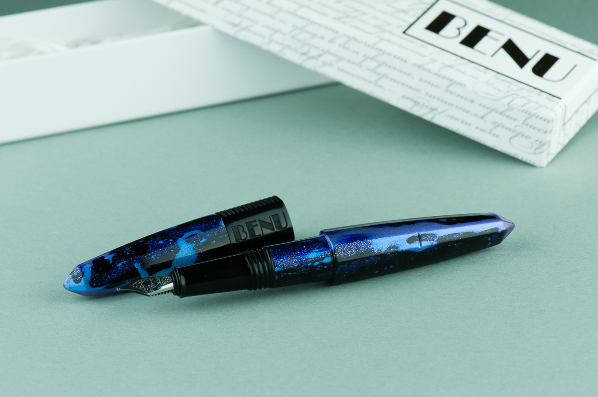
Franz: I comfortably wrote with this pen unposted for a long time and it’s due to the longer than usual section. My grip ends up on the threads and they are not sharp at all. Posted, the Chameleon definitely becomes longer. And I really love the notches on the barrel to keep the cap in place. I surprisingly prefer writing with the Chameleon unposted.
Unposted, one can see the notch on the barrel for the cap to latch on to. The longer section allows for the step to be further back.Posted, the cap covers about an inch of the barrel and is very secure.
EDC-ness
Katherine: Upside: it doesn’t roll. Downside: it doesn’t have a clip. It takes two turns to uncap, but they’re two wonderfully smooth turns.
Pam: The pen did well in my Nock Sinclair case for EDC-ness, however, it wasn’t user friendly for me at work being clipless. On the flip side, it was quick to uncap and the nib performed admirably well on crappy office paper. The cap does post relatively securely for those quick notes. My biggest hesitation with this being my EDC is that the material is also quite loud which made me hesitate bringing it out in the hospital setting.
Franz: In the workplace, I used the Chameleon either on the go stored in my shirt pocket or on my desk. I found that this pen is the sit-down-and-write kind due to the number of cap turns (2 and a quarter), as well as the facets that made sure the pen did not roll away. The medium nib wrote nicely on the copier paper and was all around nice.
This pen is also fun-ny because my coworkers thought I was holding a mascara tube or something. Technically, it applies color to a surface, right? ;-P
Chameleon sitting on one of its facets ready to pounce… er… write!
Final Grip-ping Impressions
Katherine: The unique shapes and materials are the big draw with this pen. If it’s not your thing, this isn’t the pen for you. But, if you’re like me and you’ve been curious about them for a while, it’s a bit of a relief to find out that while it isn’t the most comfortable and perfect pen for my hand, it’s definitely a usable and reliable writer. My one peeve is that the facets/sides don’t line up.
Pam: Benu is willing to break tradition with unique materials and shapes. This pen is best suited for those with a traditional tripod grip. So if you are looking for a pen with a unique aesthetic and reliable nib, this might be the pen for you. Based on the material and how it works out with my grip, this pen just isn’t for me.
Franz: Hey Katherine!!! The cap and barrel’s facets do line up. You just gotta give it a gentle twist. 😉 Overall, the Chameleon pen is a good size pen and the shape definitely stands out against other pen designs. What also captivates me is the “Charming” finish on this pen. Blue and purple are my two favorite colors and this is a great example of a blurple pen. I do like this pen a lot and if it is up your aesthetical alley, try it out!
Another shout out of appreciation to Lisa and Mike Vanness for the opportunity to review this Benu pen! The Chameleon pen in this finish and others can be found over at their site, www.vanness1938.com.
Pen Comparisons
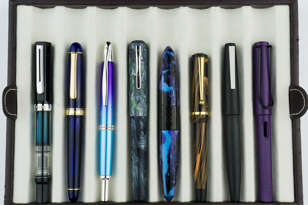
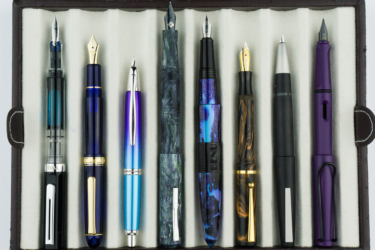
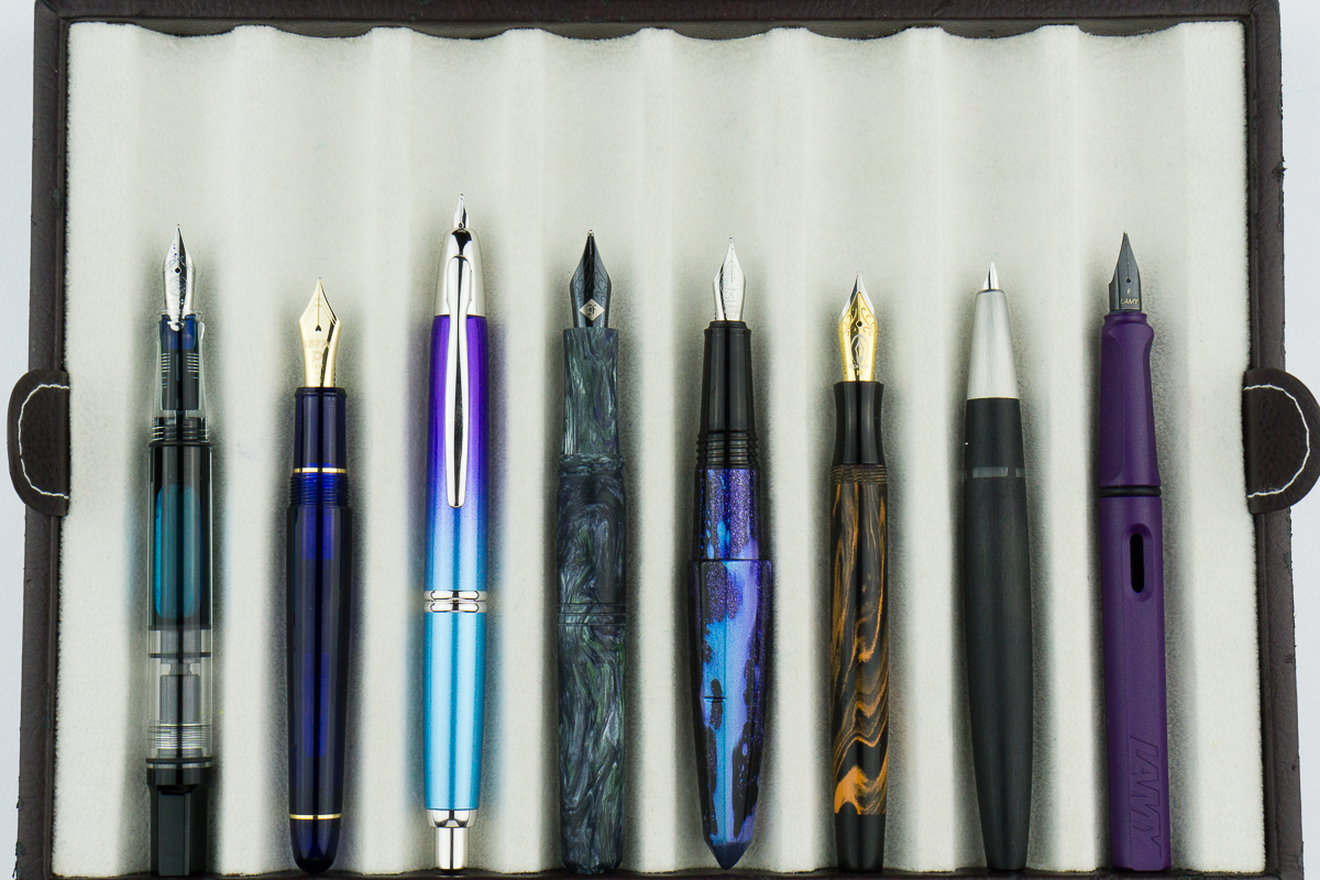
Closed pens from left to right: TWSBI Eco, Platinum 3776, Pilot Vanishing Point, Franklin-Christoph Model 31, *Benu Chameleon*, Edison Beaumont, Lamy 2000, and Lamy SafariPosted pens from left to right: TWSBI Eco, Platinum 3776, Pilot Vanishing Point, Franklin-Christoph Model 31, *Benu Chameleon*, Edison Beaumont, Lamy 2000, and Lamy SafariUnposted pens from left to right: TWSBI Eco, Platinum 3776, Pilot Vanishing Point, Franklin-Christoph Model 31, *Benu Chameleon*, Edison Beaumont, Lamy 2000, and Lamy Safari
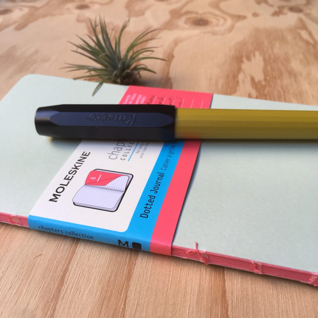
It’s Mini Review time! As usual, it’s Katherine writing about another bit of fountain peripheral stuff, this time the Moleskine Chapters notebook. I was gifted one because they’ve dropped to being pretty cheap on Amazon, so I thought I’d give it a whirl. (Also it seems a little inconsiderate to not try something you’re gifted… no matter how bad the reputation of Moleskine paper)
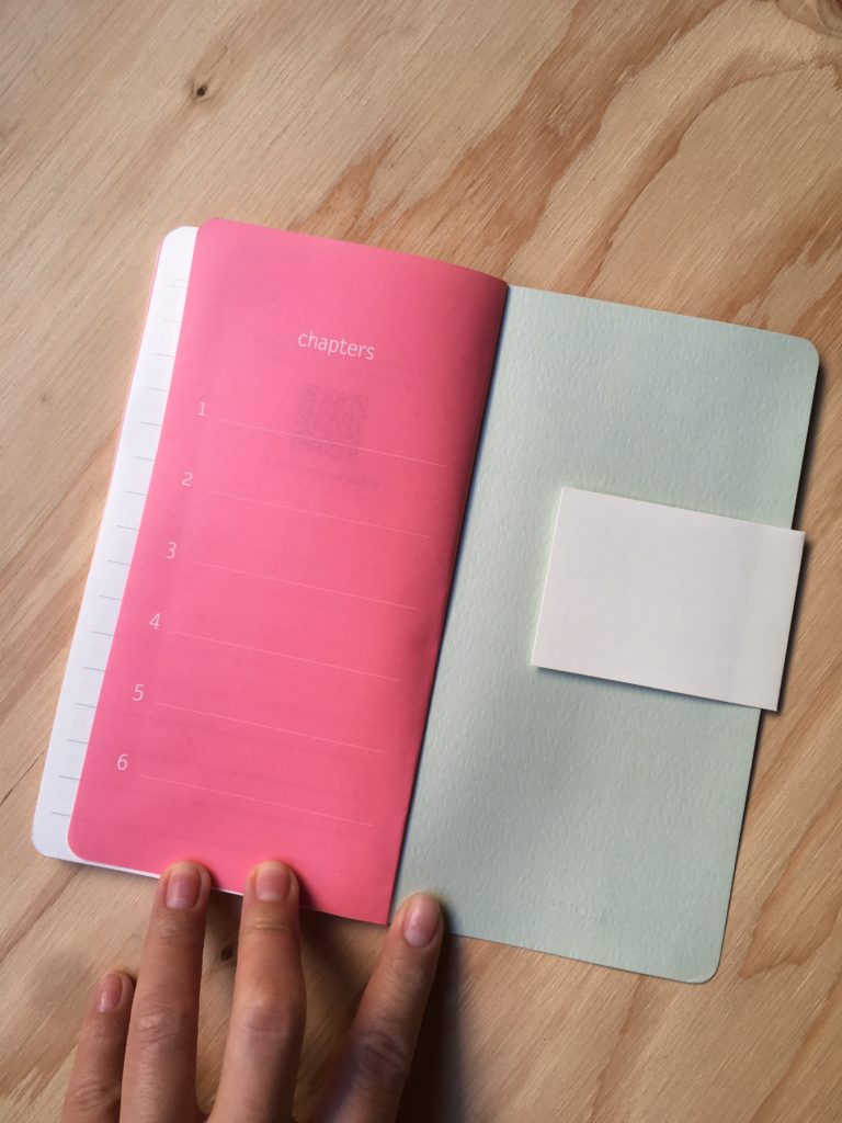
It’s a notebook with six sections plus a set of lists (space for 13) at the very back. Each section has a title spread, and the last section and the lists are perforated. Neat in theory, but I’m not yet sure what I’ll use this for — if you have six things going on in your life, this could be great. For me, I’m not sure.
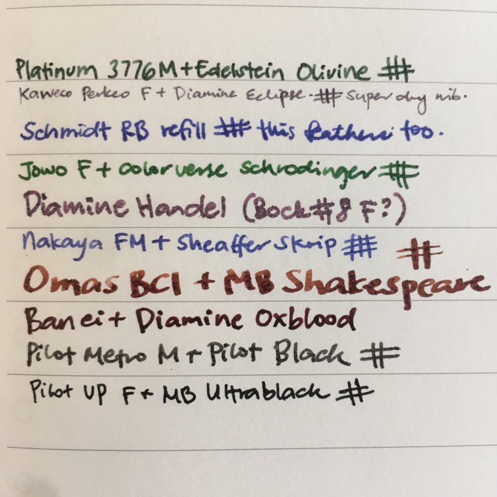
I know all you really care about is the paper, so here it goes — it’s the typical (I think?) Moleskine paper which is kinda fountain pen tolerant, but not quite friendly. If you prefer drier and narrower nibs, it’s totally fine, with wetter and broader nibs, less so. What surprised me was that even my rollerball showed through — what are you supposed to use? Pencils? Just the driest fountain pens? (Notice the Perkeo barely shows through)
And, there’s a fair amount of show through… which isn’t great. Moleskine products are so cute, I wish they did better with fountain pens! Alas, they aren’t, but this layout could be perfect for something, I’m just not sure what yet…