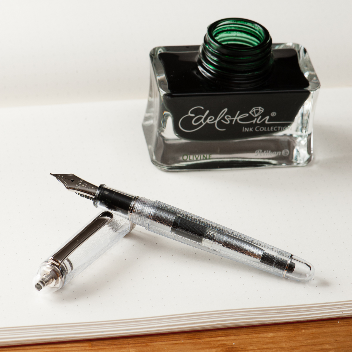
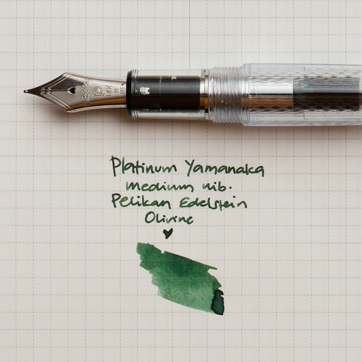
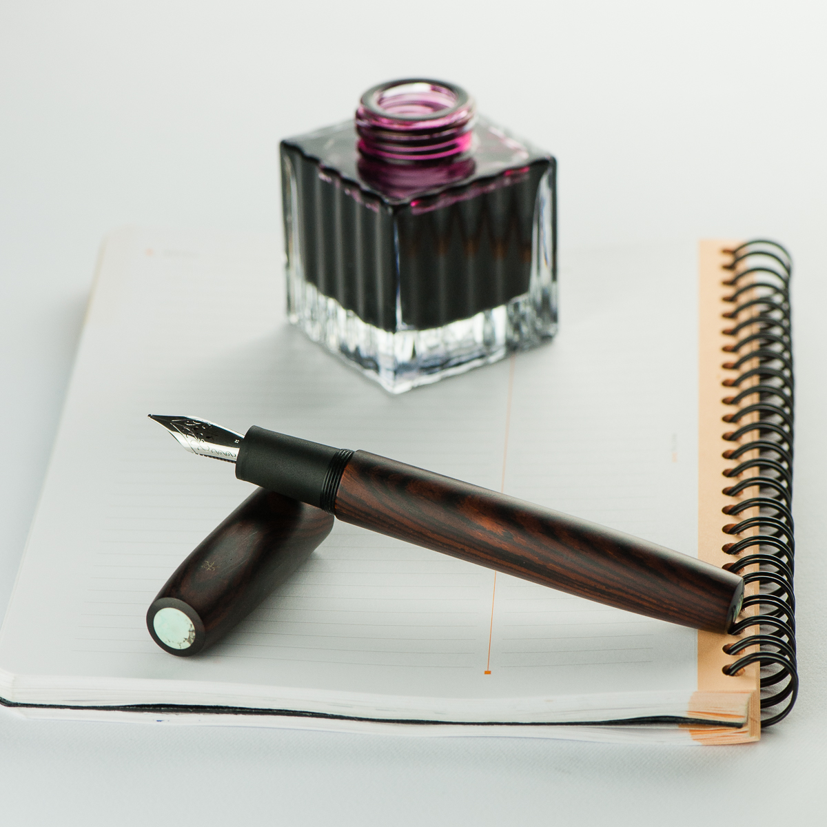
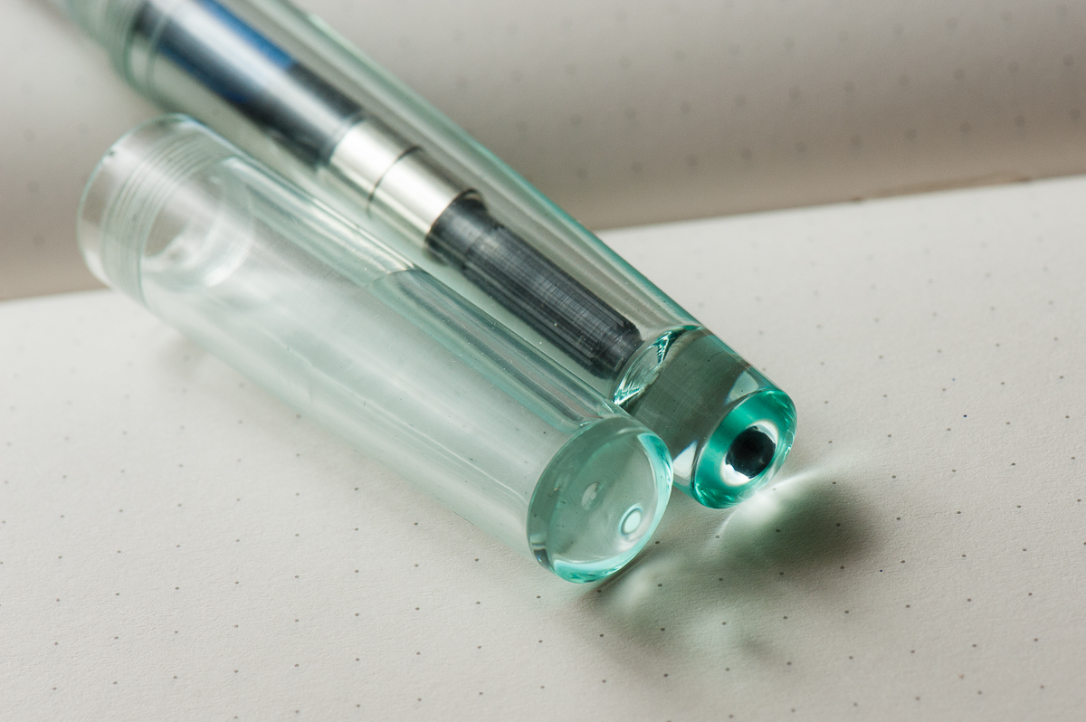
Katherine: I’m another year older and (supposedly) another year wiser this year… so I’ve chosen to celebrate with a Platinum 3776 Yamanaka, paired with Edelstein Olivine. I’ve loved the texture on the Yamanaka for a while, and was finally lucky enough to pick one up last month. It sat uninked for a couple weeks while I wanted to find it a wonderful partner (pretty uncommon for me, I usually ink things up immediately!). Franz brought over a bottle of Olivine and it seemed like a perfect match. The deep green reminds me of plants, and the textured transparent body of a terrarium — a perfect pairing for the middle of spring.
Here’s to another year of friendship, adventure and pens. (And maybe a few more plants)
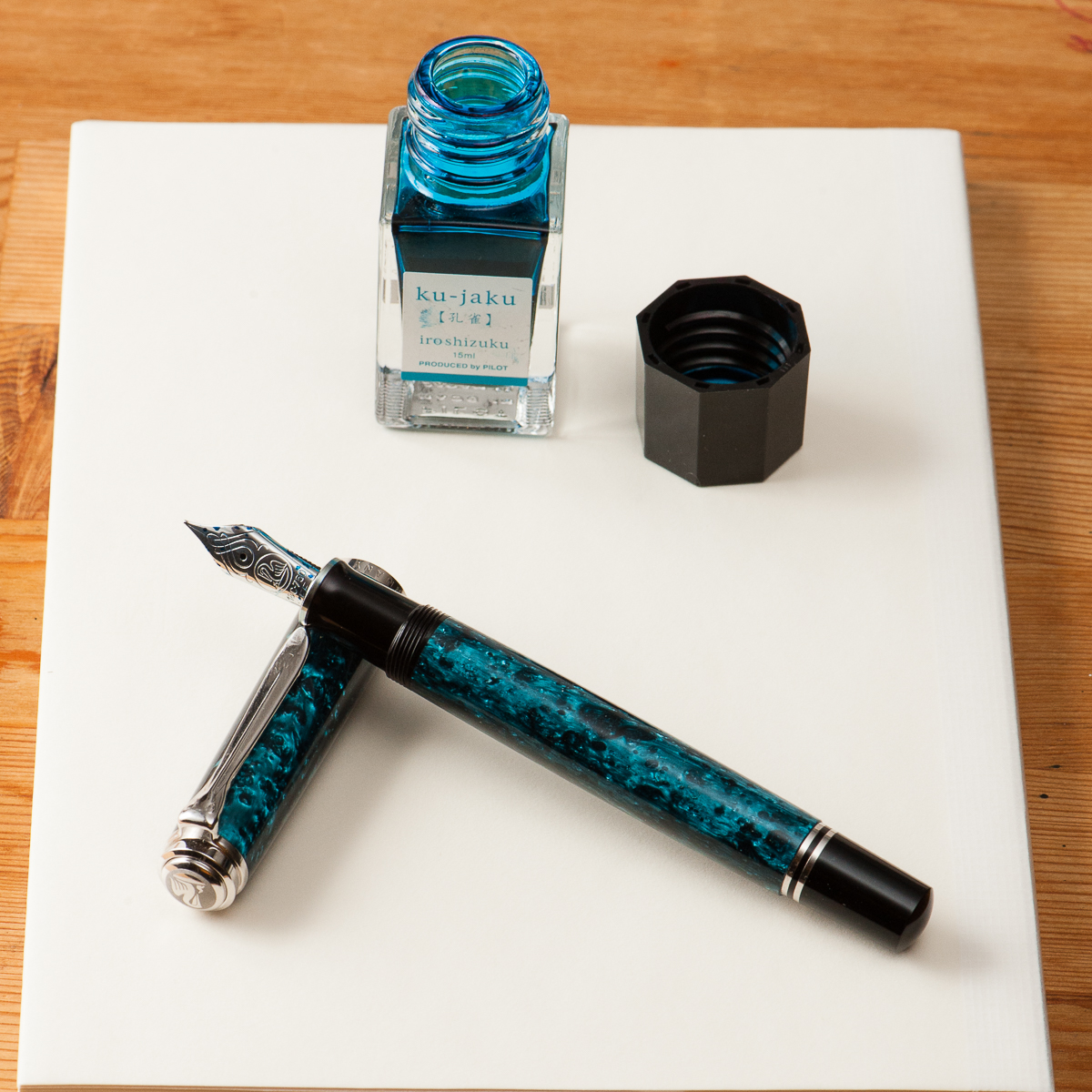
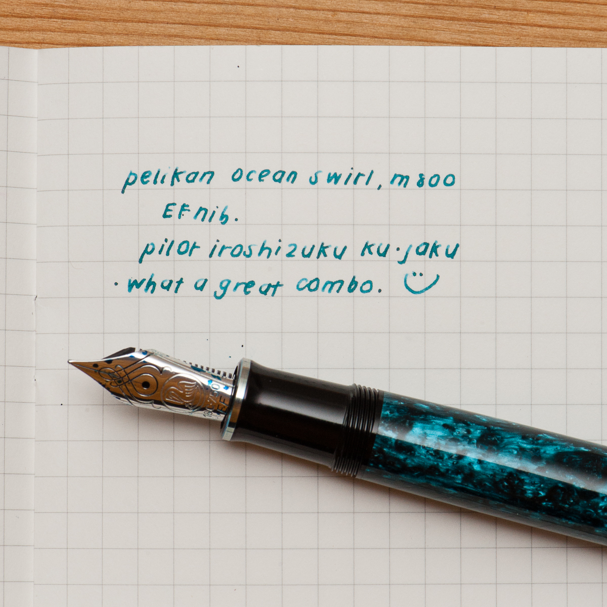
Pam: I had struggled to find the perfect ink color for Pelikan’s Ocean Swirl. The teals were either too blue or too green. I originally attempted Organic Studio’s Walden but found the flow of the Ink to be too wet for an already broad EF.
My last attempt with Pilot Iroshizuku Ku-Jaku was a serendipitous hit. The Pelikan nib is wet enough that the ink color shines though and the line width is within the expected range of an EF. Also, like all well behaved inks, it is much faster drying with little concern for smearing in my Midori’s travelers notebook.
I am glad to return to my first inky loves in the last couple of months. Can’t wait to try more of the “oldies but goodies.” Are there any new ink brands that are comparable to the staples like Pilot and Sailor?
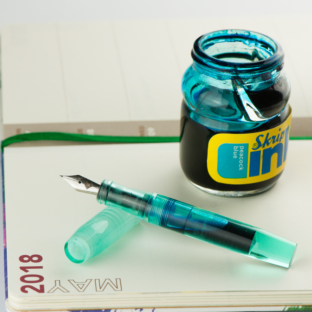
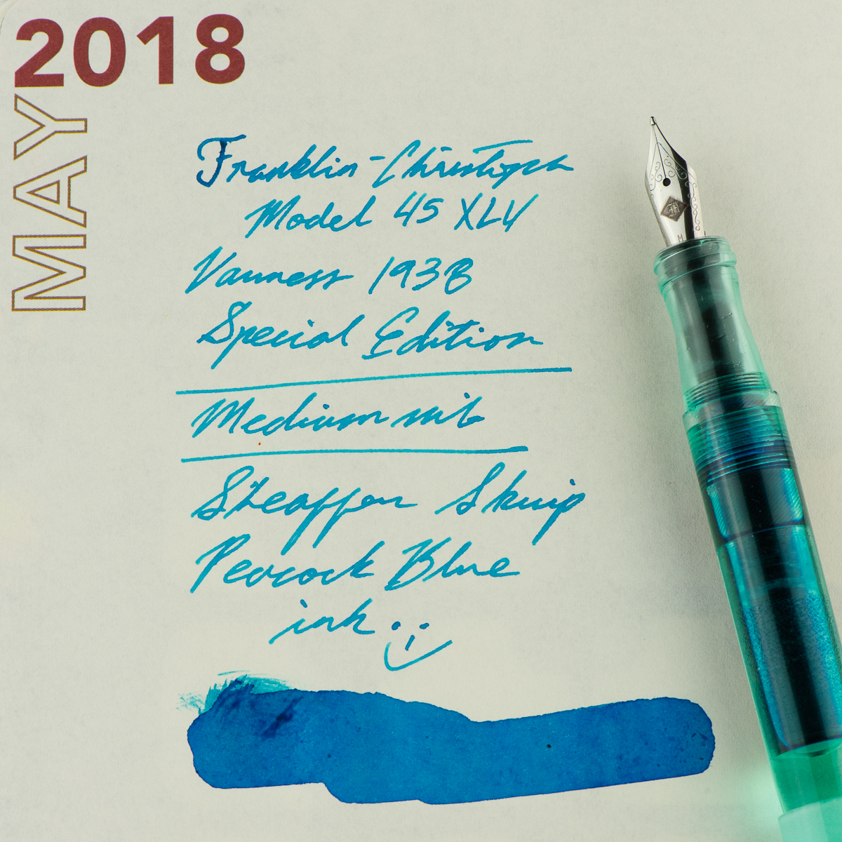
Franz: This month, I finally inked up my Franklin-Christoph Model 45 XLV Vanness Exclusive pen. The mint color of this pen really just appeals to me even if I know that it’s a small pen for my hand. But for the past couple of weeks, I’ve used the pen in conjunction with my Starbucks Philippines Weekly Planner and so far it’s a nice complement to it. I’m “trying” to be a bit more organized in scheduling tasks and events and by using this combo, it’s been enjoyable for me.
Since this is a Vanness Exclusive pen, I figured to ink with one of Lisa Vanness’ favorite colors, turquoise. The Sheaffer Skrip Peacock Blue is a nice vintage ink to complement this pen. I know for a fact that there are inks out there that would match the color of the pen however, this is a more personal ink to me for various personal reasons. Let’s just say that this ink is a homage to a couple people. One of those people used to say, “An italic gives you traction…”. And come on, who doesn’t like turquoise ink? Hmm? Hmm? ;-P
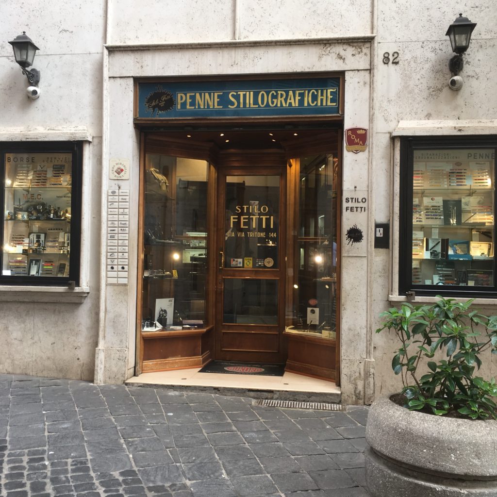
Following up on my Naples Store Recap, here are my photos and notes from my time pen shopping in Rome.
To start with — almost everything (both touristy and pen related) seem to be clustered in the same area. I’m not sure if that’s actually the case, or if the things I could find were biased because I’m searching in English. But, here are the stores I visited —
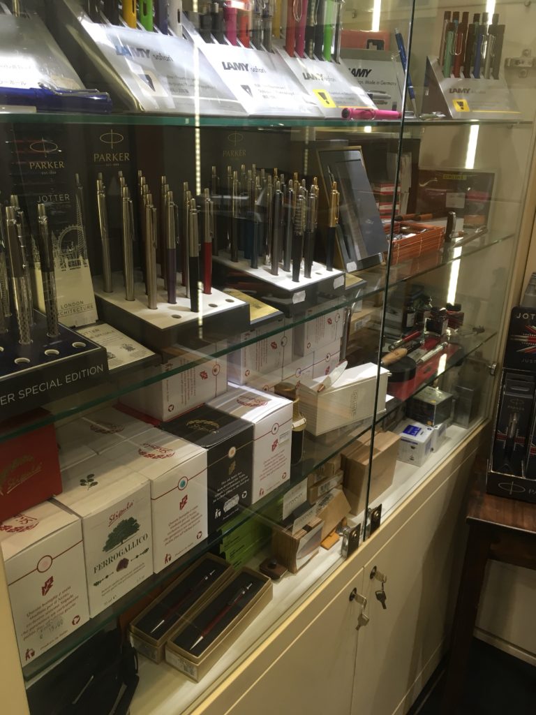
First up, Stilo Fetti! This store is super close to the Pantheon (about a block away) and very much in the center of the main tourist area.
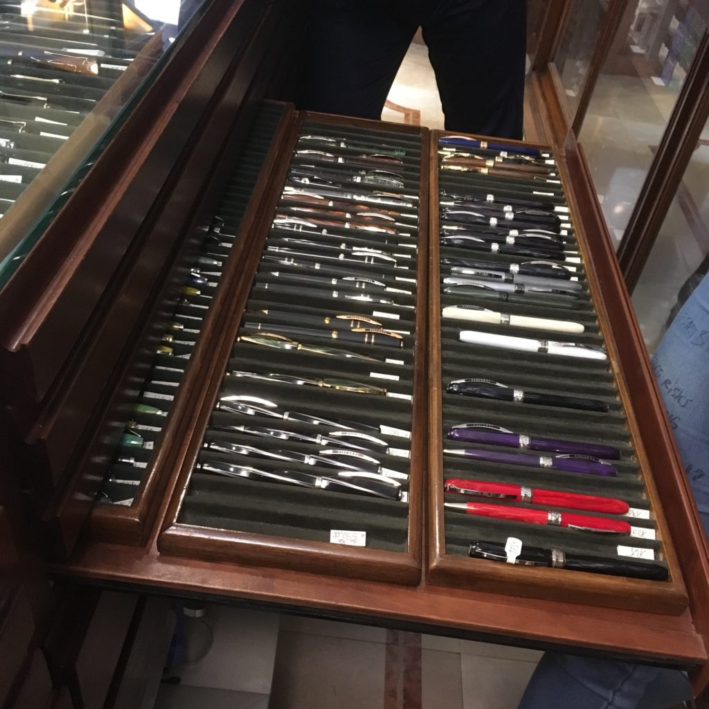
They had quite the selection of pens — including drawers upon drawers that you had to ask to see. A huge selection, but prices were on the higher end of the spectrum for new pens.
And a small selection of Omas celluloids. The larger ones are all rollerballs, but the smaller ones were fountain pens. They had a handful of new celluloid Omas pens, but none of them came cheap (though I also don’t think the prices were necessarily absurd, Omas celluloid just isn’t cheap these days).
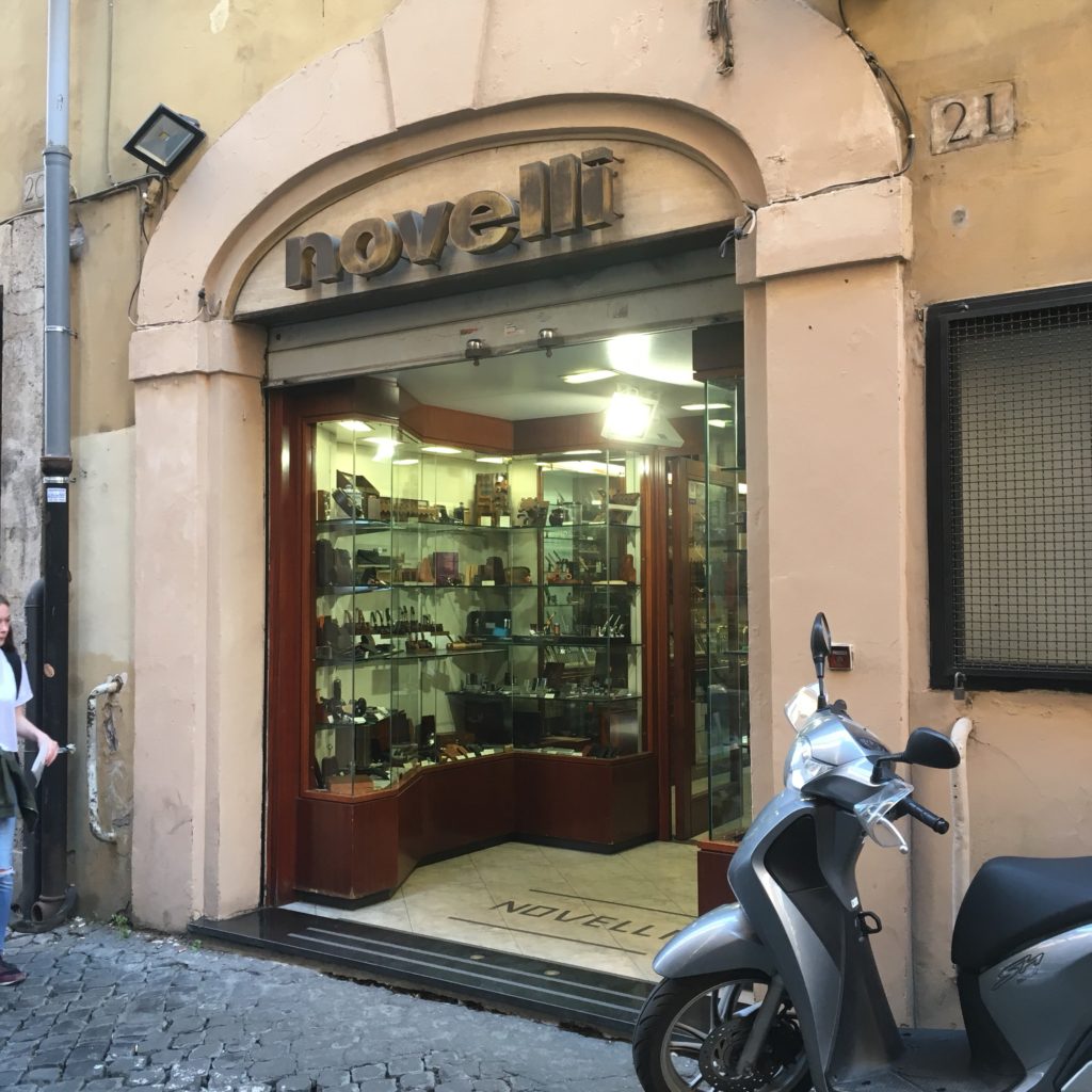
Second, Novelli. This is a pen and pipe store, featuring a smaller selection than Stilo Fetti, but still worth a visit.
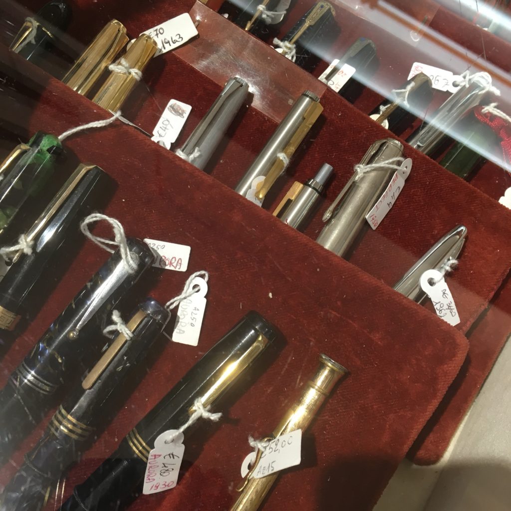
A selection of vintage pens under a glass case — Derek was more than happy to show them to me and answer any questions I had. The third Aurora on the bottom was plenty tempting. Derek also tipped me off on the fact that I could get my tax refund in the city, in cash! Nifty. You end up getting 11% of your purchase price back via the VAT refund (the provider eats the rest of it as profit). All the stores on this list will do a tax refund for purchases over €150 (or maybe 155?).
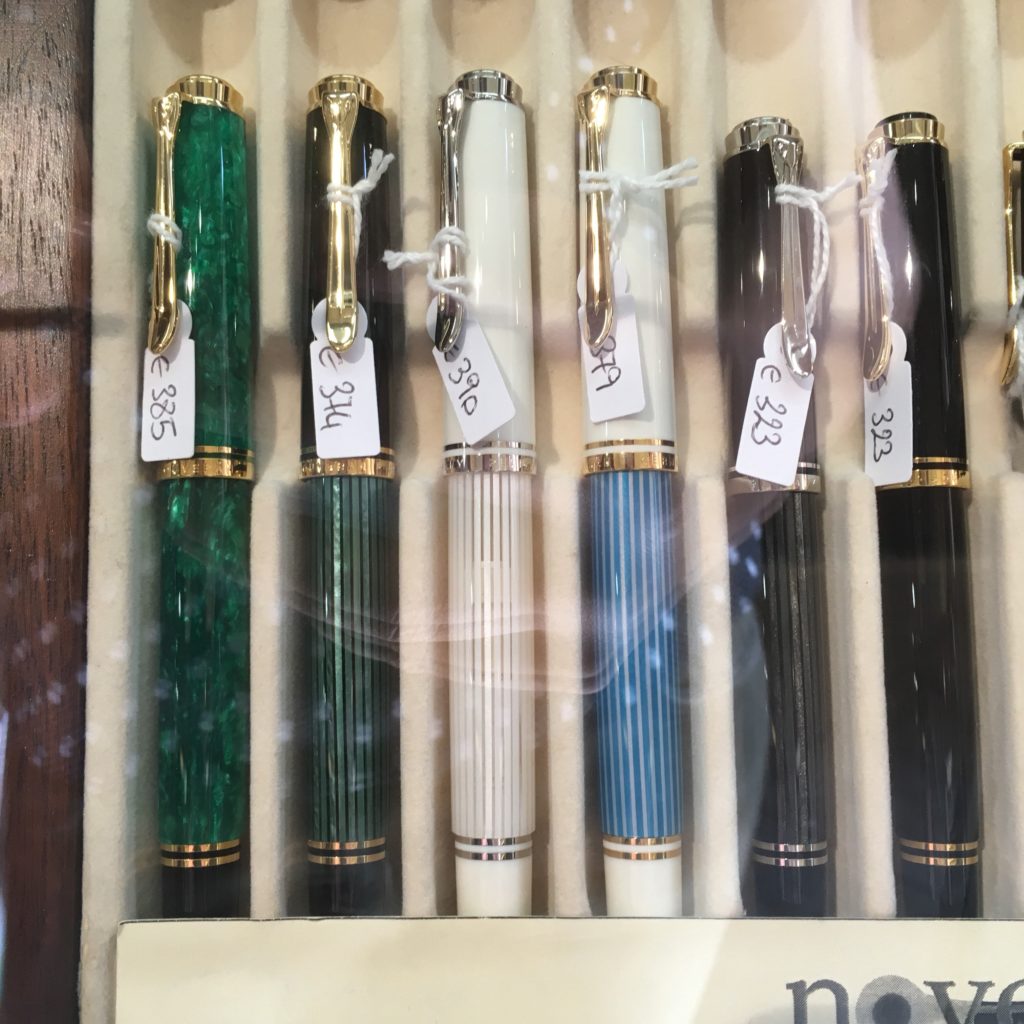
In addition to vintage they also stock quite a few modern pens at reasonable prices. On new pens, the prices seemed a smidge lower than Stilo Fetti (though I didn’t compare extensively across brands). Here’s a selection of M600s and M400s.
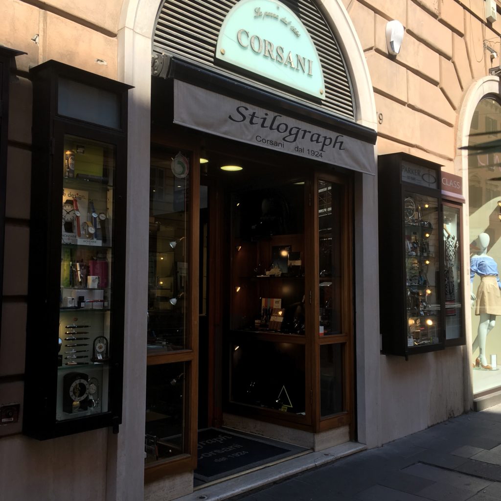
Corsani was our third stop — though it’s further out from all the other stores on this list. But if you visit the Vatican (or St Peter’s Basilica) then Corsani is only a short walk away.
I think Corsani is one of the most famous Roman shops, or at least the one I’d read about most before visiting. It’s also a more modern feeling shop than Stilo Fetti or Novelli and carries a wide range of pens across price points — from cheap to high end.
I don’t know much about these, but I saw them in the window and they looked interesting. The staff here were very friendly and happy to test nibs and let you dip pens. My brother ended up buying a Visconti here and they were more than happy to let him pick a nib and (hopefully) avoid the inconsistent QA Visconti is known for.
Fourth, C’Art, which isn’t really a pen store but does sell pens. It was on sale when we visited and the selection wasn’t particularly interesting, but it is there if you’re looking for a pen, any pen. Waterman, Parker, at ST Dupont all had quite a few pens on display.
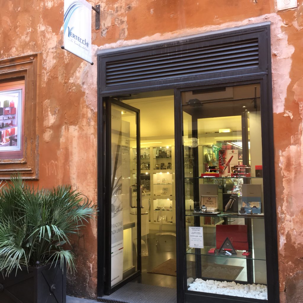
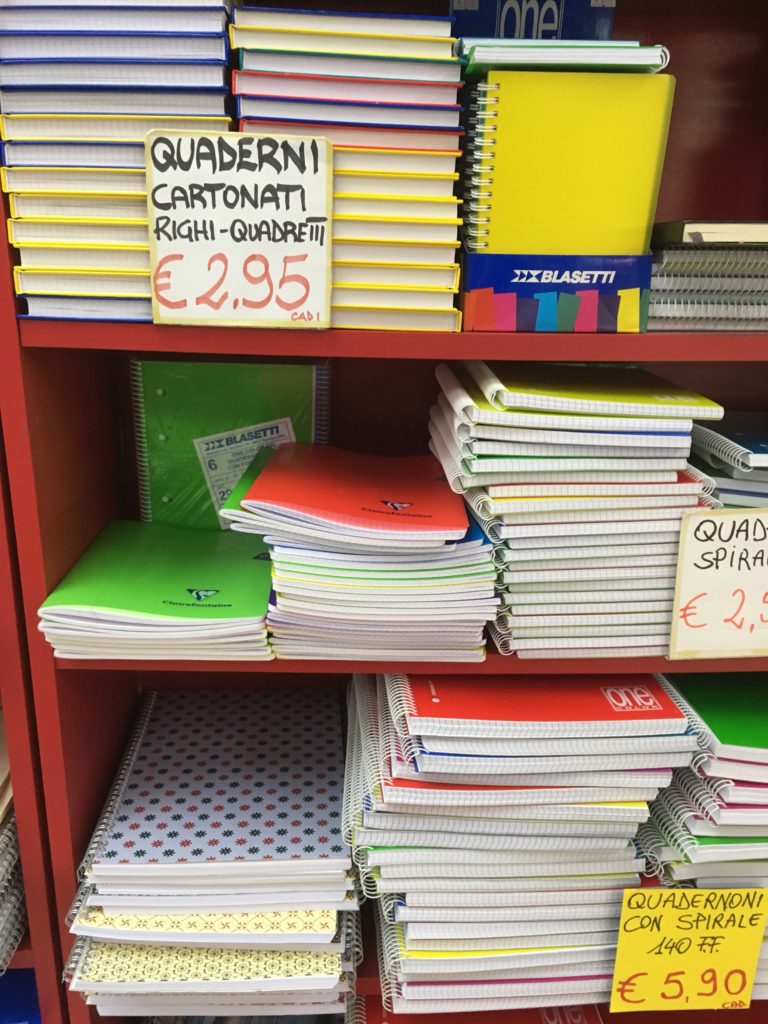
Fifth was Vertecchi. They sell an assortment of school-supply-ish stuff, cute pouches, backpacks, calligraphy supplies, notebooks and have a dedicated room for fountain pens!
Some of their calligraphy supplies. I was on the lookout for a glass dip pen, but I’ve realized I don’t like the brightly colored swirly ones. They also had glass cases for pens, all the usual suspects, but also Pilot! (though Pilot was pretty expensive). Price wise, higher than Corsani or Novelli, probably on part with Stilo Fetti for the items they both sell. The selection is pretty boring, entirely modern fairly easy to find stuff, but I did almost buy a bunch of cute boxes/pouches/pencil case things.
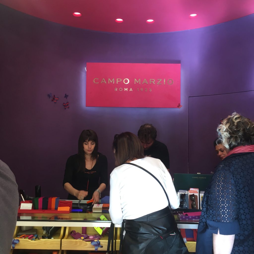
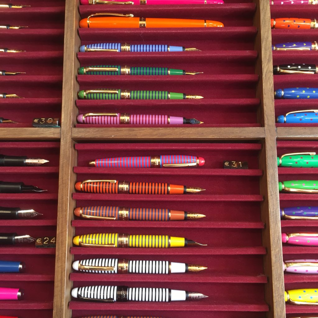
Lastly, Campo Marzio, which is the name of both a street (where one of it’s branches is) and a store is a “fashion accessories” (read: synthetic leather) brand. But, they also carry a bunch of cheap colorful pens.
The bulk of their pens are rebranded Chinese pens, but the small striped pens and the faceted pens below were both new to me (though definitely both Chinese made). The pens above are €24 for a fountain pen, €17 for the rollerball. Ignore the price tag. The faceted pens below, I forgot to double check if the price tag was right.
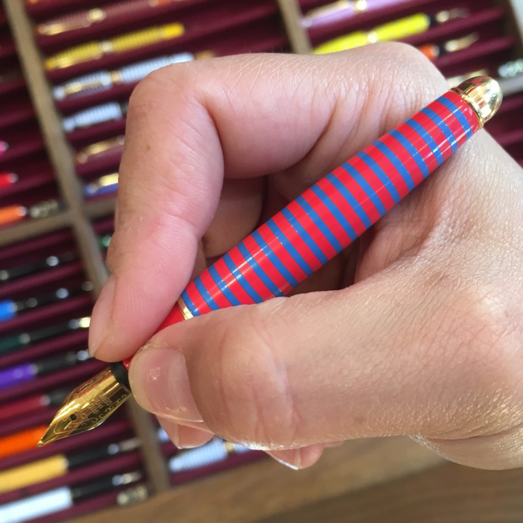
True to the theme of this blog, here’s Katherine’s hand with the small pen unposted. They’re very small!
And the last note, the Vatican museum gift shops carry this Delta pen (and a black RB counterpart). The Vatican definitely isn’t a pen store, but I thought I’d note this for those looking for a souvenir pen.
All in all, Rome has quite a few pen stores all within walking distance. Prices here aren’t a steal compared to buying online or in the US (not sure about other locations) even for Italian brands. However, some stores (Corsani!) have brands I don’t typically see, and many of the stores (Fetti, Corsani, Novelli) have quite a selection of pens that you may not find in store — Omas, lots of Delta, vintage, etc. And, because the pens stores are all clumped together, you can eat gelato or other delicious things while walking from one to the next (I had a delicious burrata and anchovy “stuffed pizza” after Corsani, on my way back to Stilo Fetti).
All in all, my Rome (and Italy overall) pen haul was one fountain pen, one rollerball and two bottles of Omas ink. I didn’t call out the store where I bought them because I bought the last two. The only other store where I saw Omas bottles was Novelli, but I think they were part of the display. Corsani had lots of Omas cartridges.
Hi there! It’s that time again, another recap of pen shopping by Katherine. Previous ones include Tokyo, Kyoto and Osaka.
I spent a couple days in Naples and on the Amalfi Coast last week, and had a chance to do a little bit of pen shopping — but not much buying. (A post about Rome, where my wallet bled, will follow)
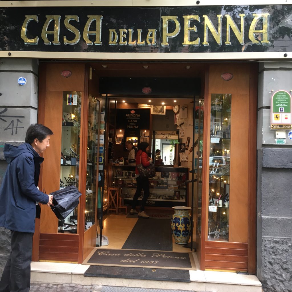
First stop: Casa Della Penna, really the only store that shows up when you search for pen stores in Naples.
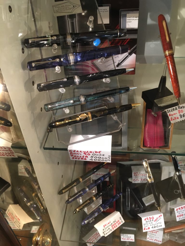
They have a pretty good selection of several brands — mostly mid and higher end ones. Montblanc, Aurora, Omas, Pelikan, pretty standard fare.
They still have Omas in stock — but their prices seem to be pretty standard retail prices, so no deals here. I wouldn’t go out of my way to visit, but if you’re in the area (or live in Naples) it’s a pretty neat store to have near by. Beats anything we have locally in San Francisco!
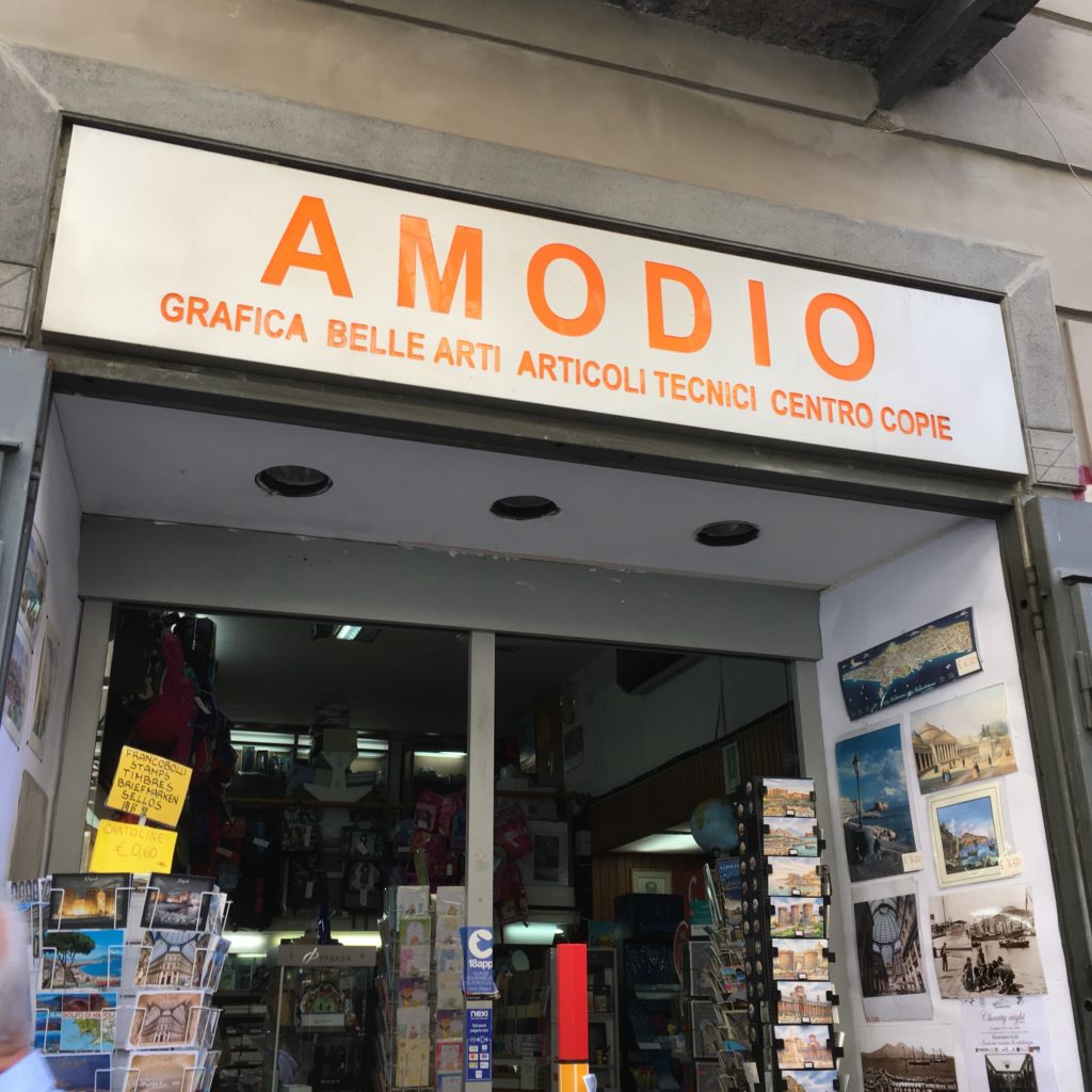
Second stop: Amodio, I found this one by accident, I was walking around the “old” part of Naples being a tourist (and eating some fried seafood out of a paper cone) and the pens in the window caught my eye —
This is much more of a general office supply store than a pen store, but they do carry a selection of Pelikan, Delta and Lamy pens.
Here’s the lovely M205 in the window display. They also had quite a few other M200-ish Pelikans. I don’t think they carry any pens over €200.
But lots of notebooks and paper! Including quite a few fountain pen friendly brands.
Third stop: stores in Amalfi. There were a couple of these stores in the town of Amalfi (I suspect they exist in other towns along the Amalfi coast, but I didn’t run into them) — stationary stores that sell primarily dip pens and Italian paper. The pen selection isn’t particularly interesting, as they mostly look like cheap souvenirs — though a few had interesting glass dip pens, but those were easily €30-5o.
EDIT on August 24, 2020: Tabula, Amalfi Handmade has requested that we remove pictures of their store. (Well, now I know the name of the store at least!) If you’re heading to this part of the world and are making plans, send Katherine a note on IG and she can send you some pictures.
But the paper selection was gorgeous! Beautiful patterns, and available in every usage — postcards, notebook, sheets (embossed with the Amatruda logo!), envelopes and cards… etc.
EDIT on August 24, 2020: Second photo here was also removed.
All in all, it’s always fun to shop for pens, but don’t go out of your way, there’s more to life than buying pens. While in Naples, eat lots of pizza, sfogliatella, cuppo (fried food in a paper cone). And in Amalfi, drink limoncello (or buy some so you can drink it after you spend all your money in Rome…) and enjoy the view!
In this review, we are once again joined by our friend, Roz. Thank you for sharing your thoughts on this pen Roz!
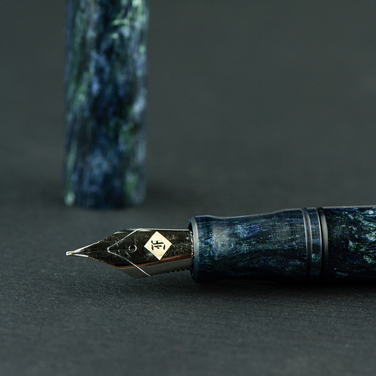
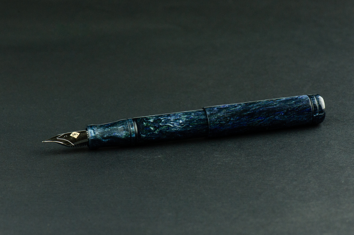
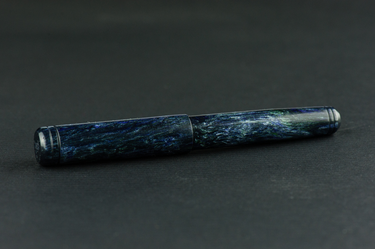
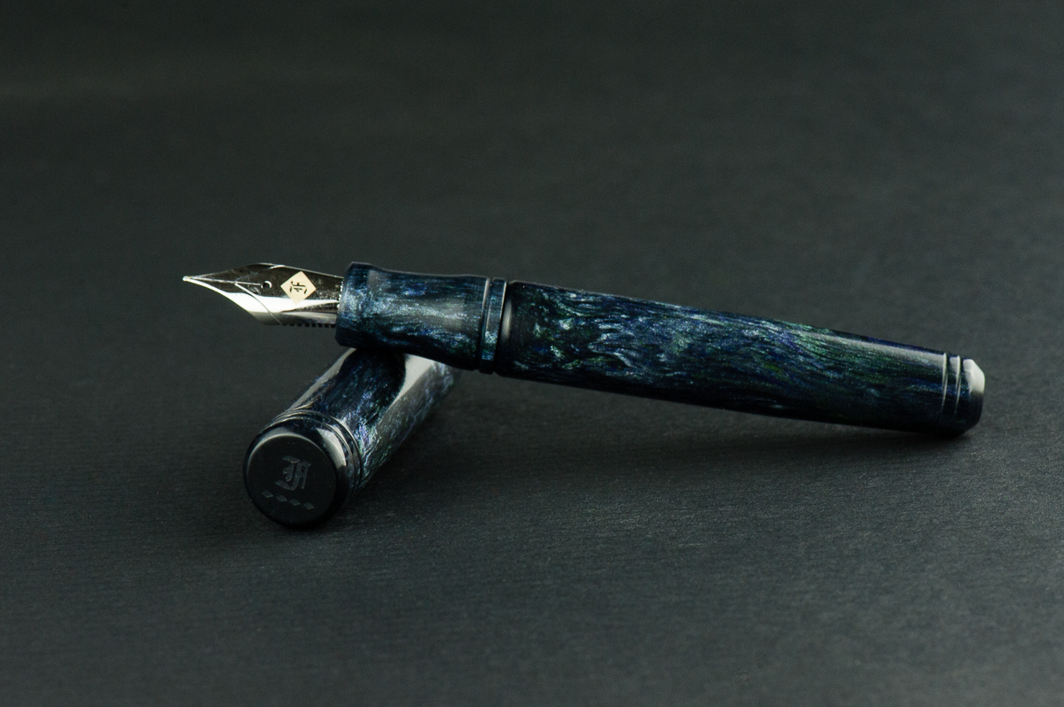
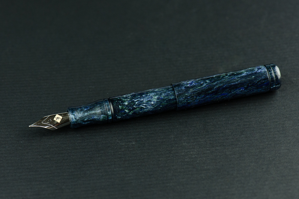
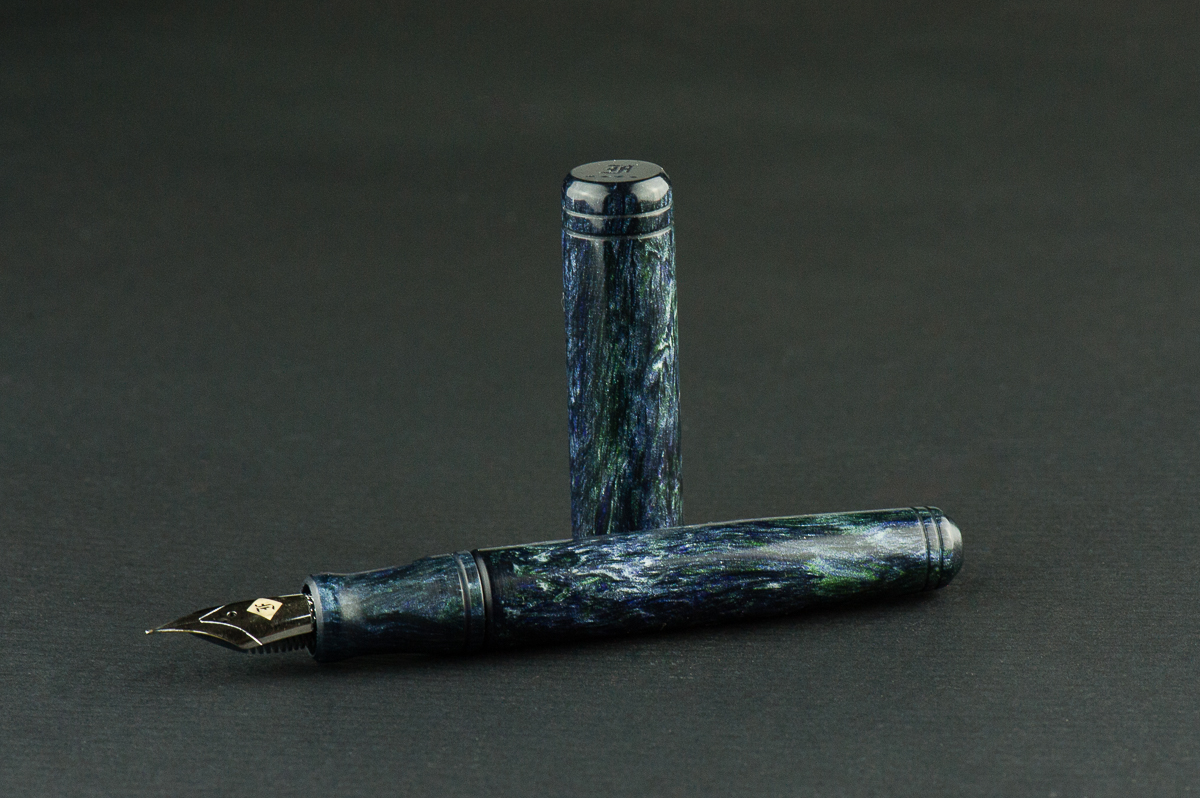
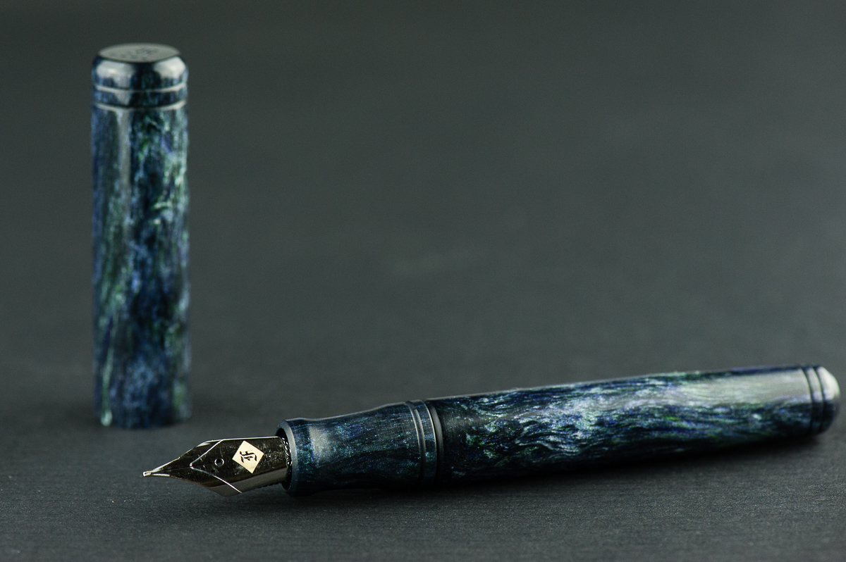
For this post, we are reviewing a color prototype finish of Franklin-Christoph’s Pocket 20 model. This pen was acquired at the 2016 San Francisco Pen Show and seems to be one of the first pens they made with the EPW (Emerald, Purple, White) acrylic created by Mr. Jonathon Brooks. These EPW and other Brooks acrylics are seemingly used by Franklin-Christoph to produce different models in a small batch fashion and is usually only sold at pen shows when available.
As mentioned before, we primarily produce reviews to reflect our different hand sized perspectives. We thank you for your continued readership!
Hand Over That Pen, please!
Katherine: The Pocket 20 is so cute! And this material is gorgeous. Overall, I prefer the look of its longer sibling, the Model 20, but the P20, especially in a nifty material like this is quite nice too. My one gripe, as with the Model 20 is that the engraved lines are a little weird to me — I’d prefer this pen if it didn’t have those and was just a smooth cylinder. But, the busier material on this pen does a good job of hiding them.
Pam: The material on this pen is outstanding. It has a lot of color, depth and patterning. I believe that the material is from the now famed Jonathon Brooks. His “blanks” are breathtaking. The shape doesn’t take away from the material and really let you see it in all it’s glory. I really enjoy the Pocket 20 for its unique shape and portability.
Franz: That Pocket 20 is small! It definitely is a “pocket” pen. I honestly love F-C’s bevel designs on their cap and barrel and the Pocket 20’s silhouette shows them very well. The carved rings leading to the beveled edges are just so cool.
As for the pen’s EPW acrylic finish? What else can I say that the ladies haven’t mentioned yet? A fabulous shimmery nebula? I have to admit, I frequently caught myself admiring the beautiful finish and at times distracted me from my writing time. Hehehe… =)
Roz: I have to say, as someone who shies away from the shiny and glittery, the Franklin-Christoph Pocket 20 does a pretty good job balancing a subtle glimmer while still having distinct flecks of shine in its pen. It’s more a galaxy sparkle versus a disco ball.
In the Hand: Franklin-Christoph Pocket 20 (posted) — from left to right: Franz, Katherine, Pam, and RozIn the Hand: Franklin-Christoph Pocket 20 (unposted) — from left to right: Franz, Katherine, Pam, and Roz
The Business End
Katherine: I love the F-C Masuyama FCIs. And this one was no different. A wonderful balance between smoothness and line variation — this is the nib that first got me thinking about line variation and how much fun it could be. Everyone should try this nib at least once.
Pam: I am really partial to cursive italics for their crisp line variation. The fine cursive italic is a well tuned nib with the right amount of ink on paper. I agree with Katherine that this nib is worth trying for yourself, particularly with a gold nib. I am a firm believer in steel nibs (particularly in my newly dubbed “tiger grip”) however, this is an example in which having a “springier” material is beneficial to the line created and the writing experience.
Franz: I must mention that recessed nib/section designs float my boat. The Pocket 20 and its bigger brother, Model 20 Marietta, have the same design and fits a #6 nib size. This fine cursive italic was tuned perfectly with beautiful line variation. I definitely enjoyed writing with it.
Roz: The nib on the Pocket 20 took me a while to get used to. Even though I find it maybe too scratchy for me to write comfortably, the lines are very sharp and crisp.
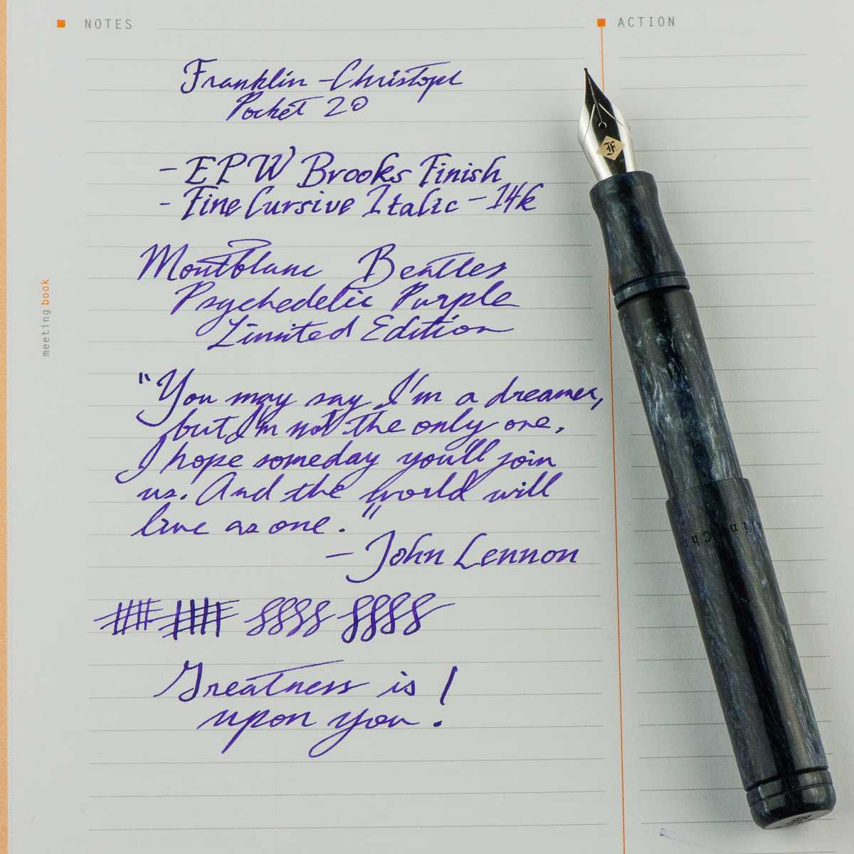
Franz’ writing sample on a Rhodia Meeting Notebook
Write It Up
Katherine: I find the Model 20 quite comfortable, and the Pocket 20 is no different. It’s shorter, but because the Model 20 is so light, the Pocket 20 feels very similar. The big upside is I can imagine eyedropper filling a P20, but not a Model 20 (I’d just NEVER write it dry) — and eyedroppering could give it a little more heft, if that’s what you’re looking for. Personally though, I enjoy the way it feels like a light extension of my hand.
Pam: I prefer both the look and the feel of the Pocket 20 compared to the original model 20. Due to the slip cap, I find the pen to be really comfortable. Even more comfortable than the pocket 66 due to the lack of a step and threads. I think the only other F-C pen that I find comparably comfortable is the model 45. So if you like the model 45, the Pocket 20 is a winner.
Franz: I wrote with the Pocket 20 posted for about 15 minutes and I love that it posts deeply and provides a balanced weight. It weighs almost next to nothing and I did not feel fatigued at all. There’s pretty much no step between the section and the barrel and I gripped the pen comfortably. Unposted mode for the bear paw? It’s a short pen for comfort and I’ll just take another half a second to post the cap for longer writing sessions.
Roz: Super light! The Pocket 20 was so light I almost lost track of how long I would be writing. I did need some adjustment time getting used to the engraved rings near the start of the pen’s grip, but it wasn’t any deal breaker – just something my thumb had to get used to.
EDC-ness
Katherine: No clip! This pen loves running away… but it does do great tucked into my zip hobonichi case or dropped into a pocket. The slip cap is super convenient for notes on the go — but I did notice that there were a few instances where I didn’t cap the pen tightly enough and almost put an inky disaster into my pocket. After a couple scares, I got much better at capping it tightly — but it’s still something I worry about.
Pam: It’s difficult to justify adding a clip to the pen because the material and lines of the pen already is a complete package visually. However, on a utilitarian point of view, a clip would greatly enhance the EDC-ness of the pen. I kept losing the pen to the bottom of my white coat pocket and always feared getting ink all over the section and nib from all the jostling. Definitely kept the pen in a case after half a shift.
Franz: In my workplace, the Pocket 20 is a decent Every Day Carry pen. No twisting of the cap needed so it was quick to open and sign my name, or take a phone number down. The fine cursive italic wrote nicely on the copier paper we use and gave line variation to differentiate from my co-workers’ gel pen writing. As for carry-ability, just like Pam I found the pen always lying down in the bottom of my pocket and had to fish it out often because of the lack of a clip. Franklin-Christoph does provide the option of purchasing the pen with or without a clip so no biggie.
Filling system options? Unfortunately, the short length of the pen does not allow a converter to fit so you are limited to either inserting a short international cartridge, or eyedropper filled for more ink options as long as you apply silicon grease on the appropriate areas. Although, you can do what I did and empty out a cartridge and syringe fill it with any of your favorite fountain pen inks. =)
Roz: I’m not confident enough to carry a pen with no clip in anything but my lovely Nock case, but I really enjoyed using this pen throughout the work day. I spend a lot of time stuck on a keyboard, so it’s nice to take a break from typing position and pick up a light pen and go to town!
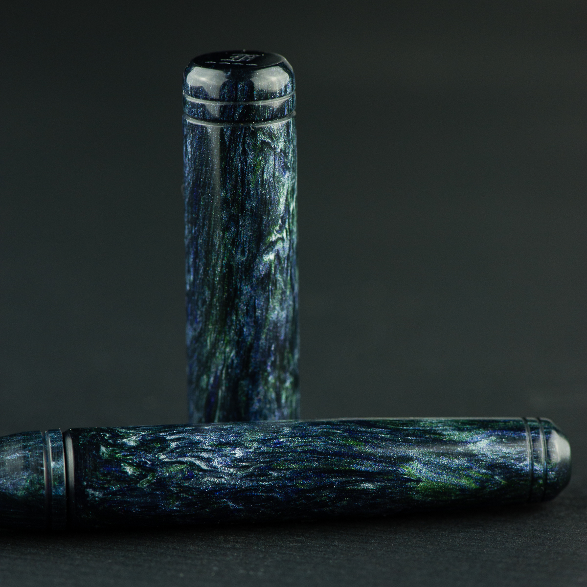
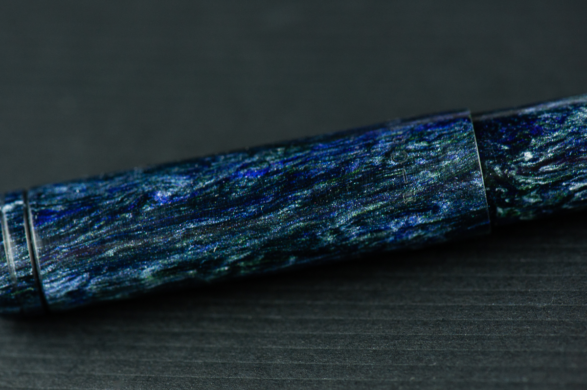
EPW material close up of the cap and barrel
Final Grip-ping Impressions
Katherine: If this was my only pen, would I use it and love doing so? Yeah. Do I own one? Nope. Where’s the disconnect? Welllll — It’s a perfectly solid and reasonable pen, but the aesthetic doesn’t stand out to me. It’s a pen that gets the job done and I enjoy writing with (I do own two FC+MM FCIs) but given all the pen choices out there (even just from Franklin-Christoph!) I like other pens more.
Pam: I really miss the beautiful utilitarian-ness of the Pocket 20. Honestly, the slip cap and clip (should there be one), makes this pen a great pen for quick and easy deployment. It’s not as great for “rough” play like a Kaweco Sport due to the lack of threads to cap the pen, but it’s the perfect pen for my specific use case at work. If you are in the market for a beautiful pen that is really convenient to use for quick note taking without rough and tumbles throughout the day, this pen is for you. Bonus, there are enough materials this pen is made in to match any person or setting.
Franz: The Pocket 20 is a neat pen to have and if pocket pens are your jam, you gotta have one of these. For my pen habit, this wouldn’t be a pen I’d always have in my pocket due to the smaller size however, I would keep it inked up and kept in my daily bag for portability and emergency use.
Roz: I admit I started off unsure about the look, the nib, and the grip of the Pocket 20. However, at the end of my time with the Franklin-Christoph, I must say this pen really grew on me. It was a pleasant pen to write with and I enjoyed having a chance to really try the Pocket 20 out!
Small/Pocket Pen Comparisons
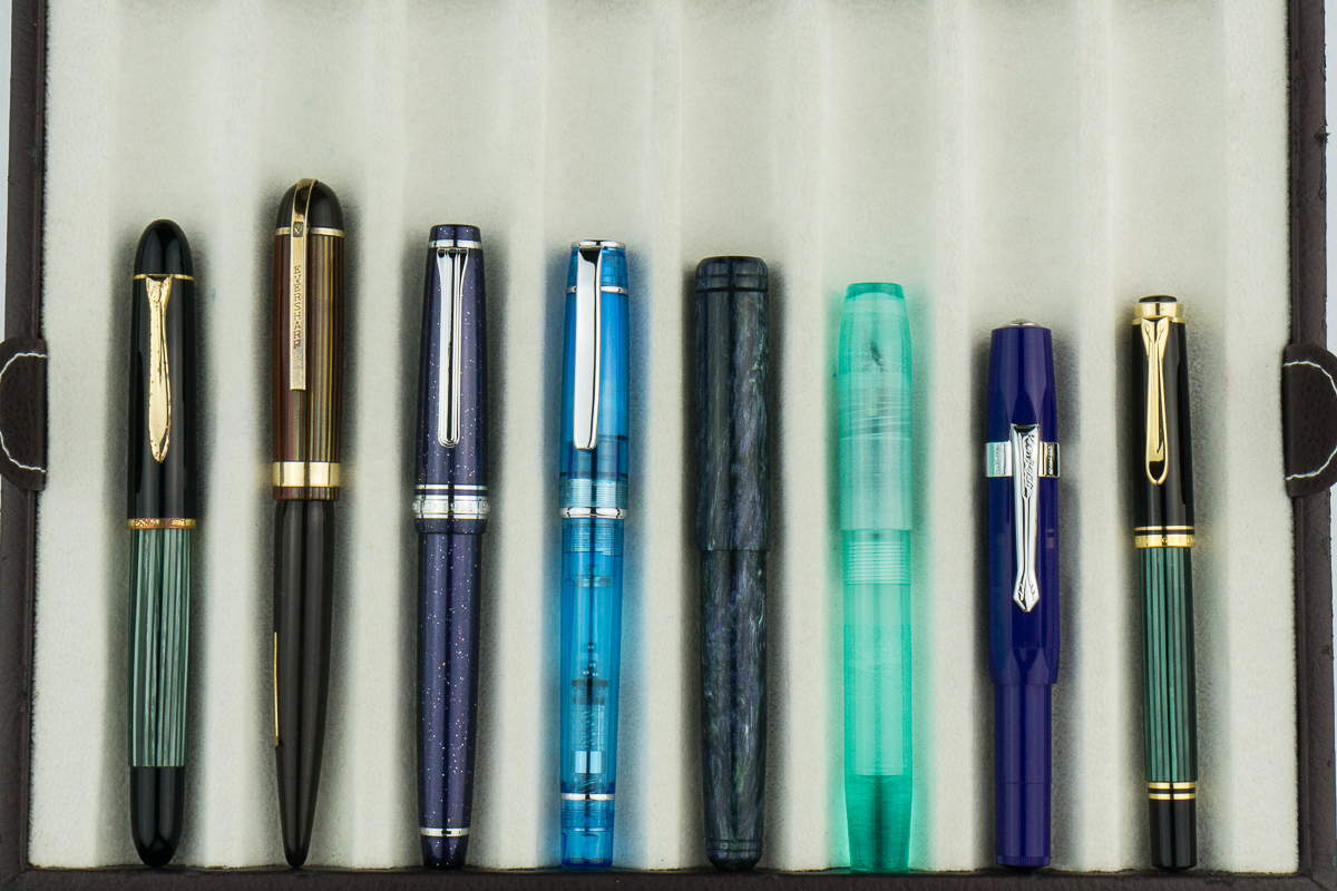
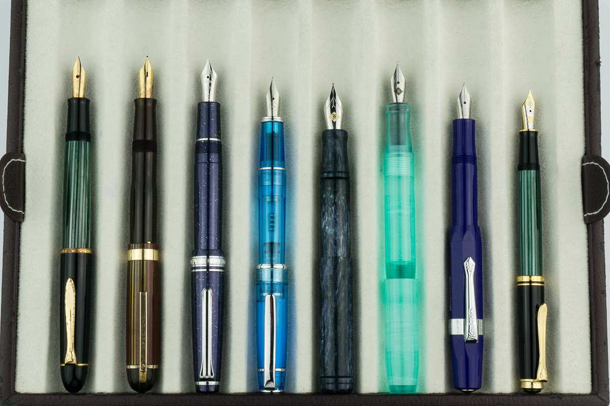
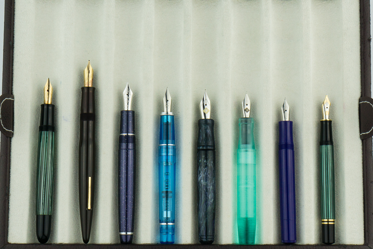
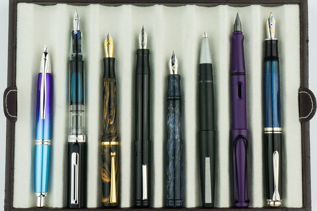
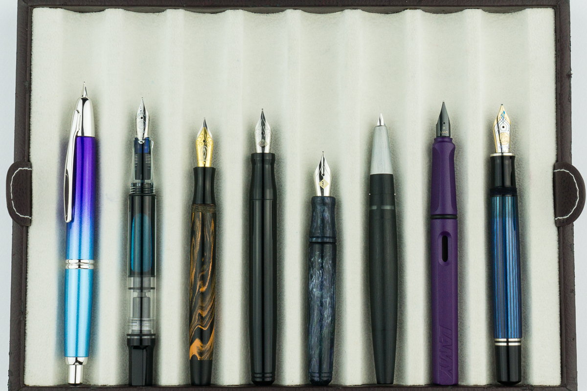
Closed pens from left to right: Peilkan 140, Wahl-Evershap Skyline, Sailor Pro Gear Slim, Pilot Prera, *Franklin-Christoph Pocket 20*, Franklin-Christoph Model 45, Kaweco Sport, and Pelikan M300Posted pens from left to right: Peilkan 140, Wahl-Evershap Skyline, Sailor Pro Gear Slim, Pilot Prera, *Franklin-Christoph Pocket 20*, Franklin-Christoph Model 45, Kaweco Sport, and Pelikan M300Unposted pens from left to right: Peilkan 140, Wahl-Evershap Skyline, Sailor Pro Gear Slim, Pilot Prera, *Franklin-Christoph Pocket 20*, Franklin-Christoph Model 45, Kaweco Sport, and Pelikan M300
Pen Comparisons
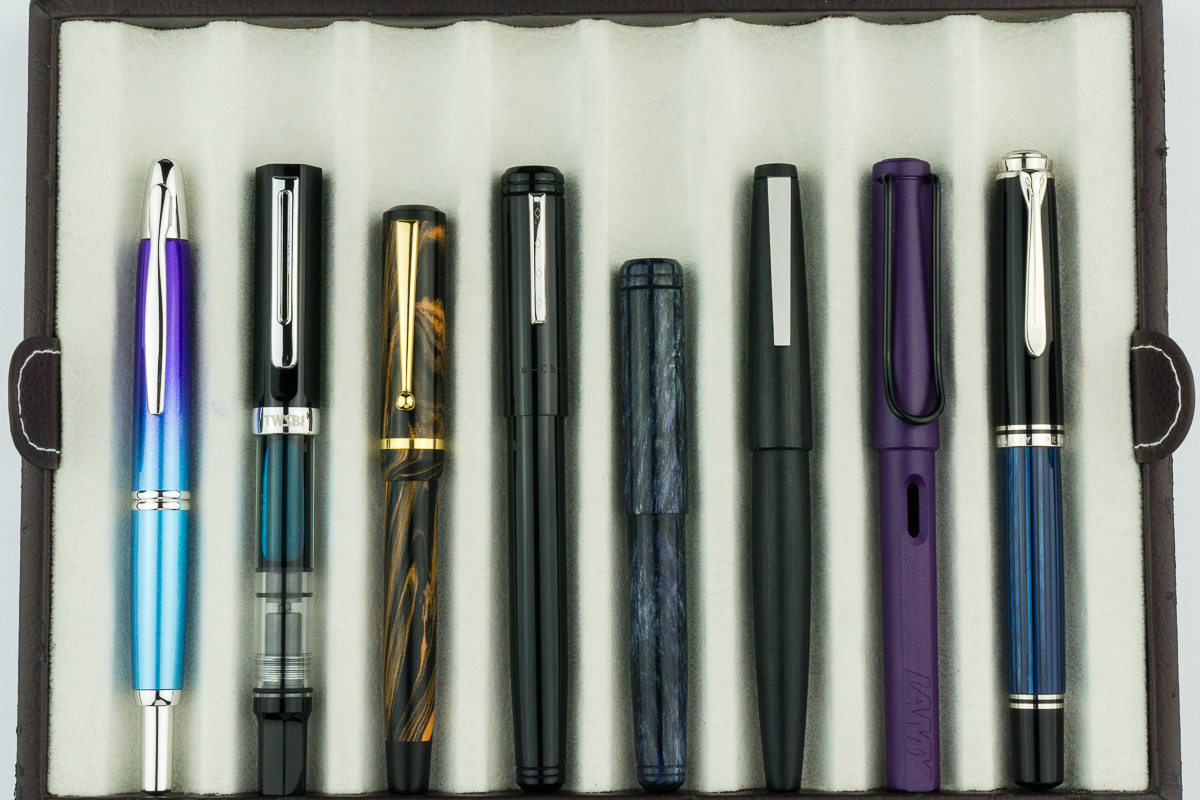
Closed pens from left to right: Pilot Vanishing Point, TWSBI Eco, Edison Beaumont, Franklin-Christoph Model 20, *Franklin-Christoph Pocket 20*, Lamy 2000, Lamy Safari, Pelikan M805Posted pens from left to right: Pilot Vanishing Point, TWSBI Eco, Edison Beaumont, Franklin-Christoph Model 20, *Franklin-Christoph Pocket 20*, Lamy 2000, Lamy Safari, Pelikan M805Unposted pens from left to right: Pilot Vanishing Point, TWSBI Eco, Edison Beaumont, Franklin-Christoph Model 20, *Franklin-Christoph Pocket 20*, Lamy 2000, Lamy Safari, Pelikan M805
Edit 2 (July 29, 2018): The Musubi divider is here! It’s an easy removable strip in fabric that matches the case and slides in for the length of your pen. No more touching! New pictures to come.
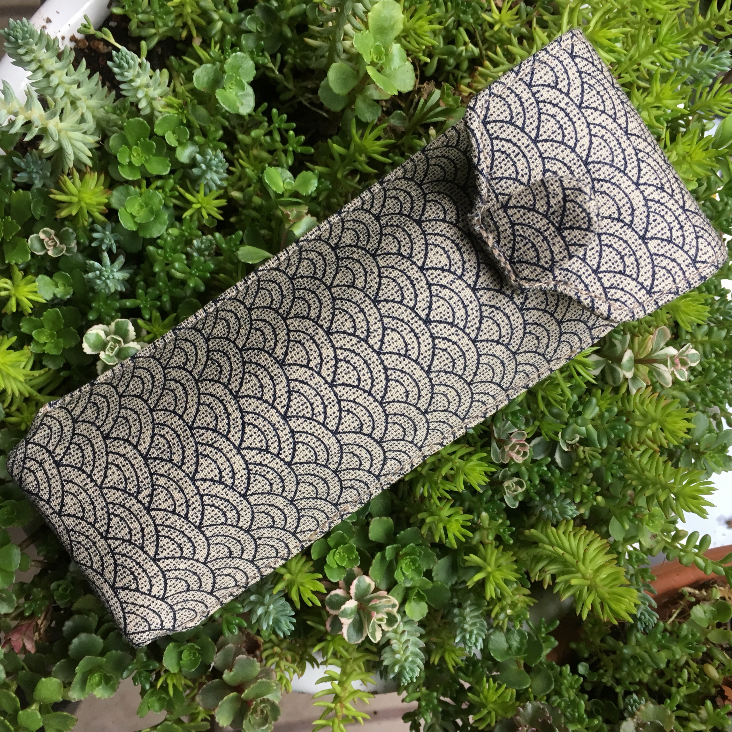
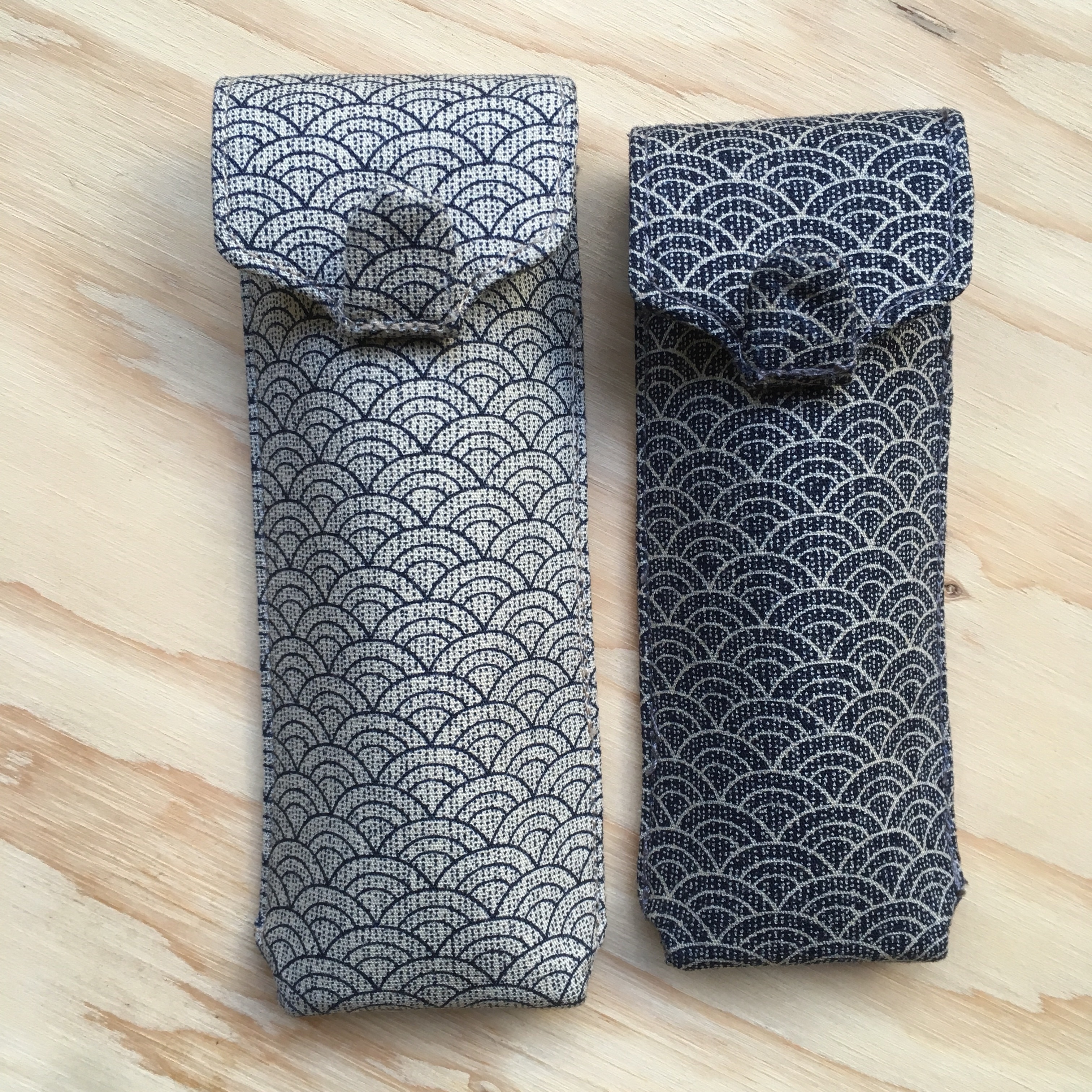
Atelier Musubi is known for their handmade Tomoe River diaries. They recently released these two pen cases in two sizes, a large and a small. I bought a large for myself, and a smaller one for my mom for mother’s day (ssssh — good thing I know she doesn’t read any blogs!).
True to the Musubi description, the small one is a great size for short pens. The long, perfect for longer pens. The long comfortably fits Nakaya Decapods, a Newton Shinobi, an old style Paragon and my Montblanc 146. I’ve only had this for a couple days, so I haven’t tried too many pens!
I haven’t tried too many pens in either case yet, but most of my pens fit in the shorter size, but some, like the Montblanc 146, fit but make the flap slightly harder to close. The 3776 fits perfectly in the short case though!
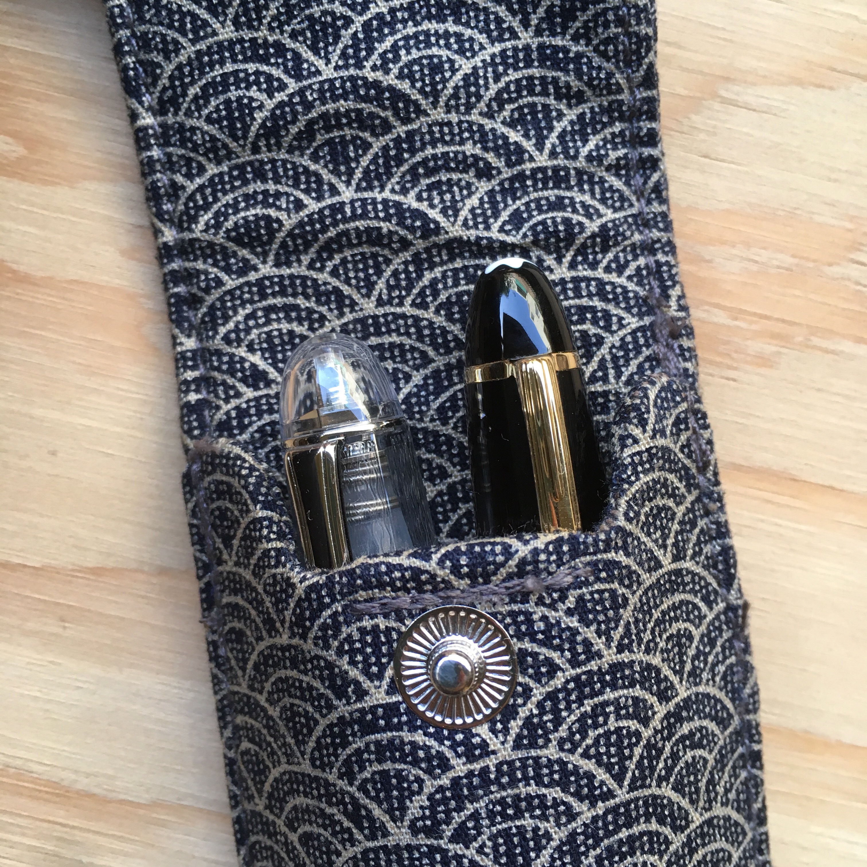
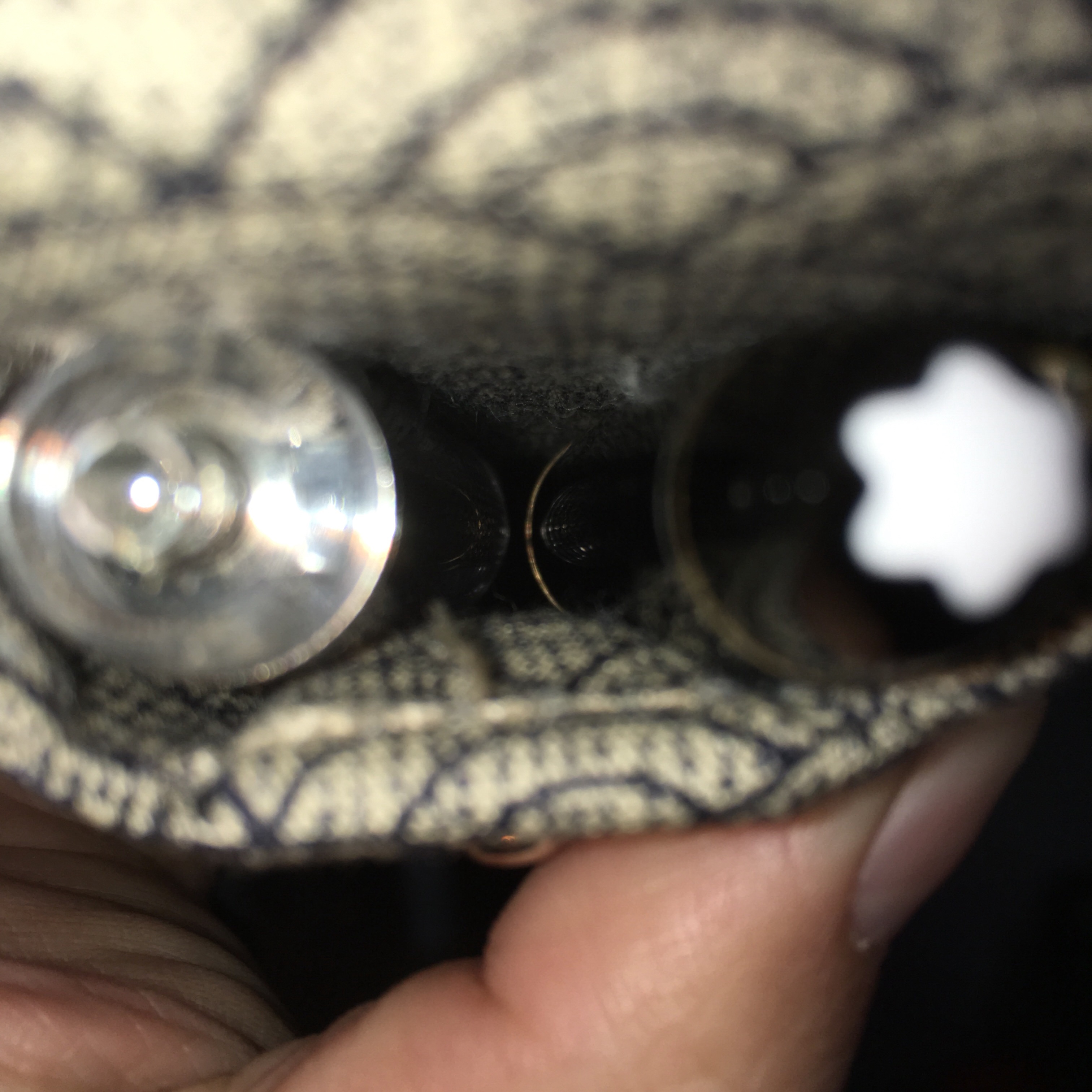
Overall, I really like the case, it’s very well made and seems very sturdy. My one complaint is that the pens do touch each other in the case (no longer an issue, see my edit at the top of the review). The tab at the top keeps the two pens from touching at the top. In the small size, fatter pens (including Piccolos and the caps of the 3776 and MB 146) they do rub as you slide pens in and out. In the larger case, the above pens don’t rub, but do clatter against each other if you shake the case. I stuffed a small piece of cotton at the bottom of the long case with a bump in the middle, and it seems to hold the pens apart at the bottom too. (They might still rub a little, but at least they don’t clatter against each other when I shake the case)
It’s hard to photograph, but that’s a 3776 and Montblanc 146 in a large case… probably touching. (So use the supplied divider if you care!)
TLDR: Great cases, but not for you if you want a healthy space between all your pens at all times.
Edit: Musubi is rethinking their design to add a separator between pens. Keep an eye out on their social media for updates!
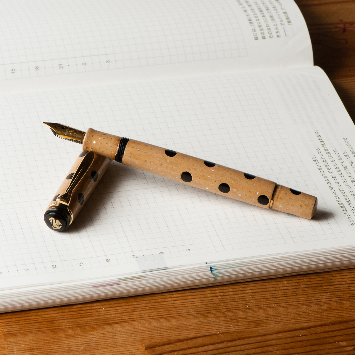
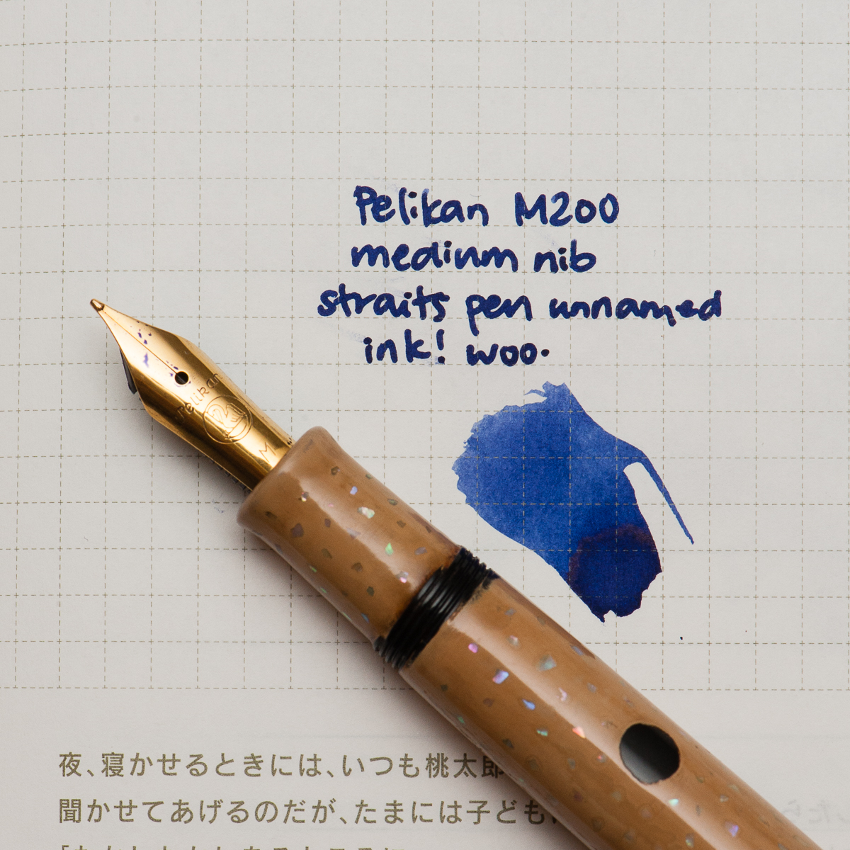
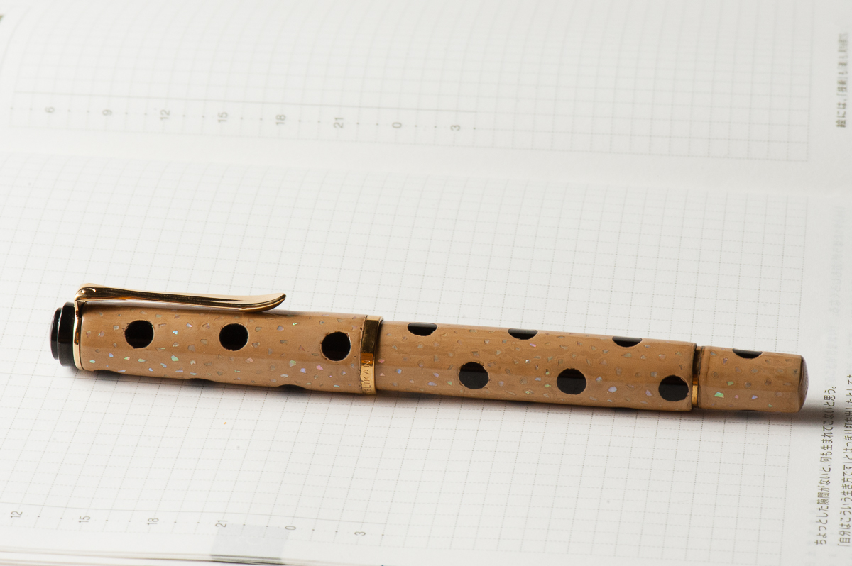
Katherine: It’s late in the month and I’m looking back thinking “What have I written with the most this month?” and the winner, hands down, is this funky combination of a Pelikan with a custom urushi finish by Bokumondoh and a Straits Pen custom ink. Honestly, the Pelikan (originally a M200) holds so much ink that I’m getting a little sick of this purple-ish blue. It’s a lovely color… but after staring at it week after week, I’m ready for something new (good thing May is just around the corner!).
Before we hop into my birthday month, here are some quick thoughts on April’s pen and ink —
First, the pen. I sent this M200 to Bokumondoh despite her warnings that this particular finish ends up pretty thick. I love the beige and black polka dots, and the sparkle of the raden. It came back about a month later, and the finish is, as promised, quite thick — but the serendipitous thing is that now I can use my M200 as a slip cap. Game changer! I can still thread the cap if I need to, but the barrel is now thick enough that I use it as a slip cap 90% of the time.
Second, the ink. This is a custom ink that the folks over at Straits Pen cooked up — it’s a wonderful shade of purple-blue that flows well and dries reasonably quickly. I hope to see it in production soon. Perhaps at the SF Pen Show?
Katherine’s Writing Sample
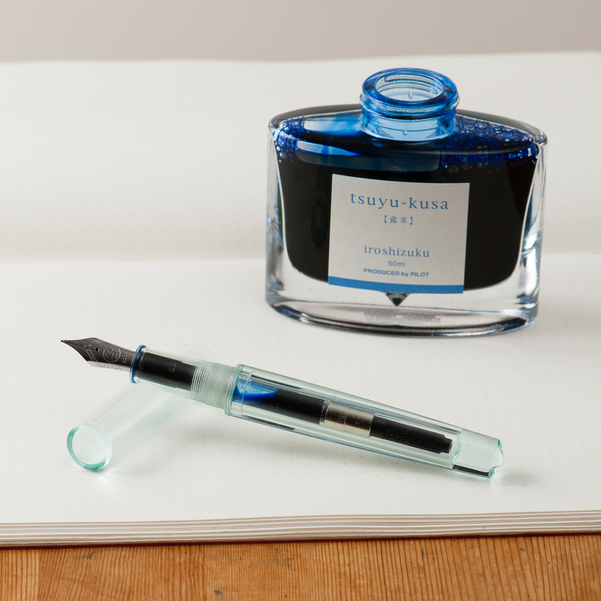
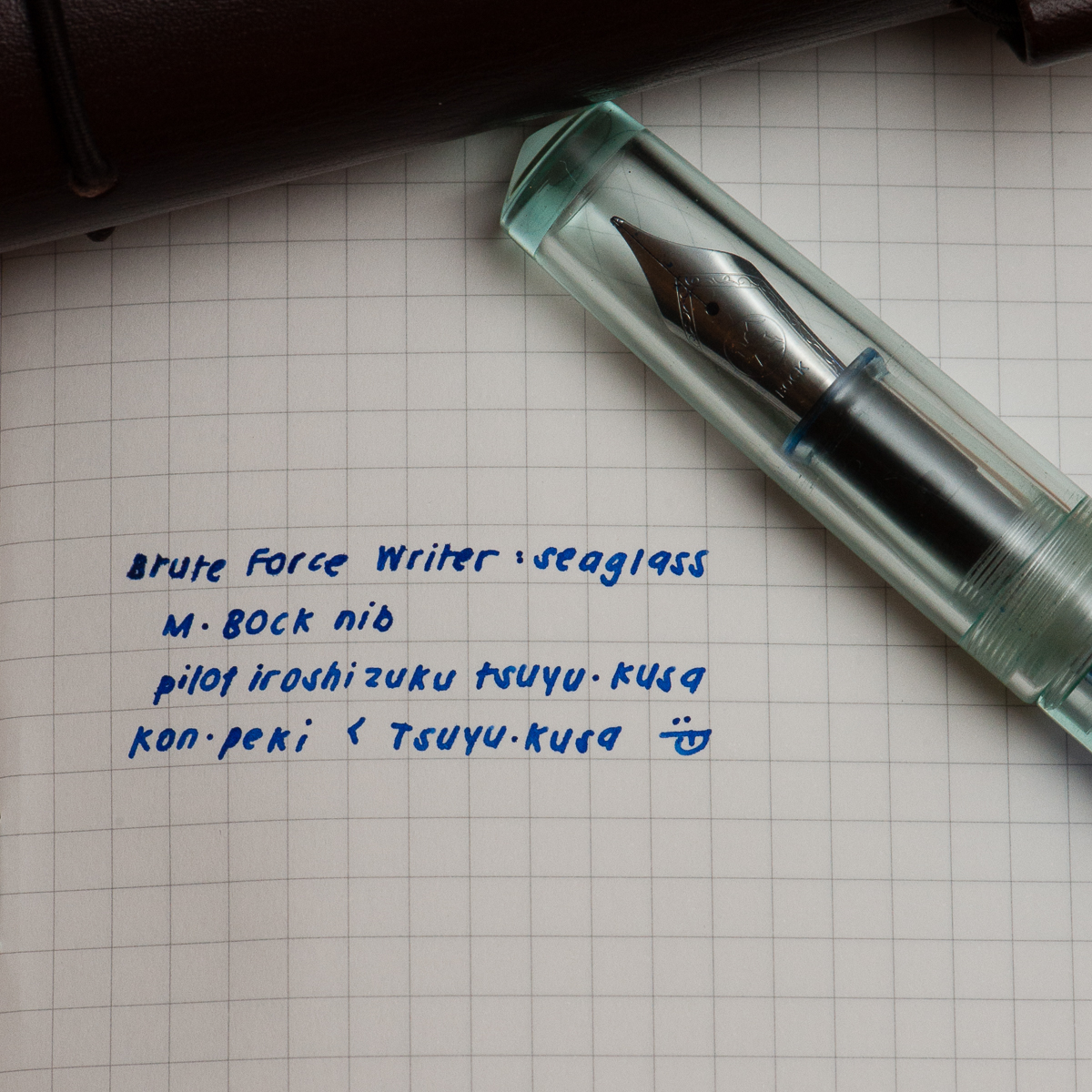
Pam: Thank you Anderson Pens for your ink match up giveaway. I was a lucky winner of the Pilot Iroshizuku Tsuya-Kusa, a new blue (for me.) I will admit that I have been lax in my admiration of the Pilot Iroshizuku inks as of late, however I plan on rectifying that. Starting with pairing this beautiful cornflower blue ink with the Brute Force Design Writer in Sea Glass. The beautiful and deep blue of Tsuya-kusa is deeper and more nuanced than a turquoise or sky blue. (That’s right, I said it. I like it better than Iroshizuku Kon-Peki.) It’s also a warmer blue with more red tones based on my amateur comparison.
Creator in Chief behind Brute Force Design, Troy, is a wonderful artist in pairing metals and woods in his signature pen designs. I chose a lighter version of the Writer model due to the beautiful transparency and seafoam green tint of the material. The nib of choice for Brute Force is a Bock nib. The one I have here is really wet and very well displays the color and depth of Tsuya-kusu to the fullest extent.
Bring on the spring/summer, world! My inked pens, allergy meds and I are ready for you.
Pam’s Writing Sample
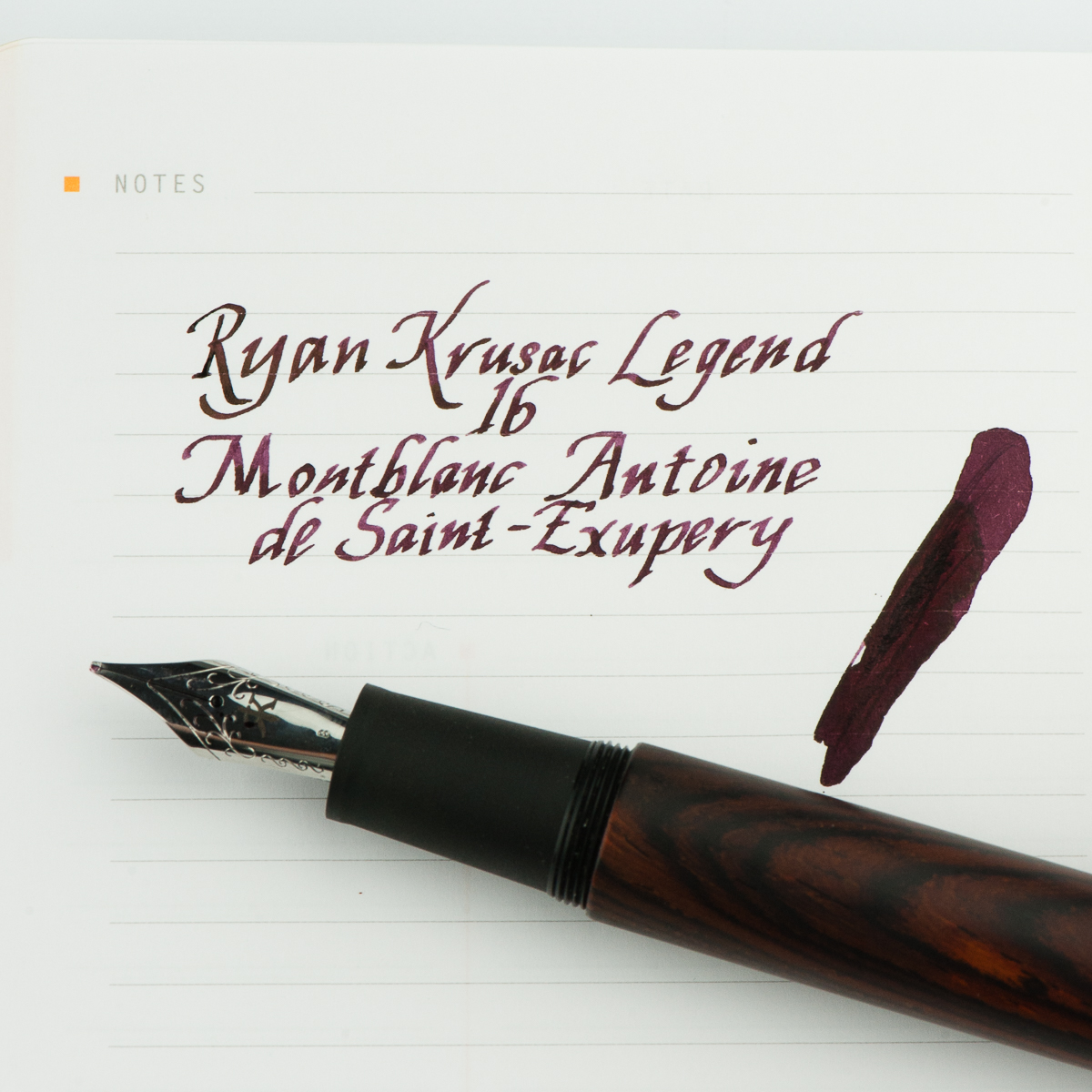
Franz: For the month of April, I thought of inking up my Ryan Krusac Legend L-16 with the limited edition Montlbanc Antoine de Saint-Exupéry ink. I haven’t used the L-16 ever since our review of the pen and I also inked it for two main reasons. First reason is to mark the pen’s first year anniversary with me since I got it at the Atlanta Pen Show in April 2017. Second, the broad cursive italic is very nice to practice my italic calligraphy writing. I’ve been using this pen to write some quotes and post them on instagram. If you’re interested, you may check out #FTDquotes tag on Instagram. =)
As for the MB Saint-Exupéry ink, this was my first time inking a pen with it and the burgundy color is quite rich and has purplish tones. I don’t have many burgundy inks and I find this ink to possess some beautiful shading, and the broad nib brings out the saturation very well. There is no sheen that I can see in the writing which is fine and the flow is very wet. Even if the ink does not match the cocobolo finish of the pen, the ink color complements it well.
What pens and inks have you written with lately this month?
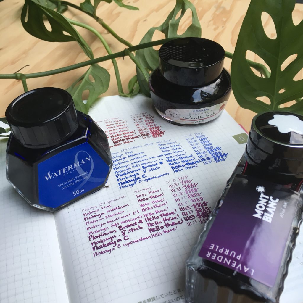
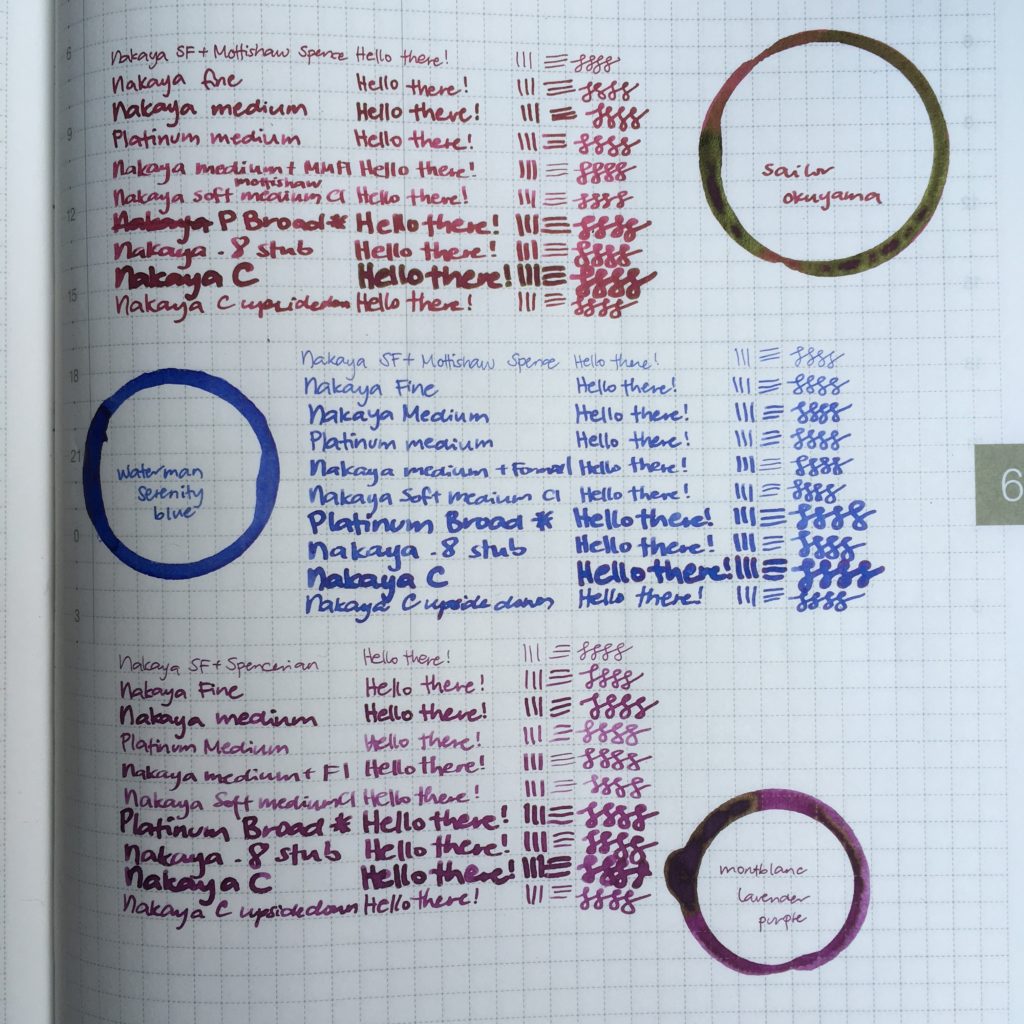
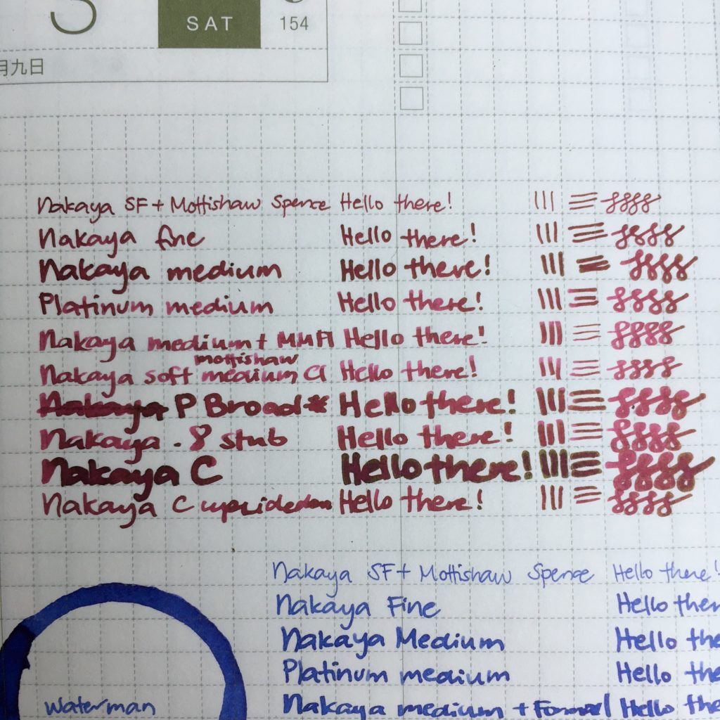
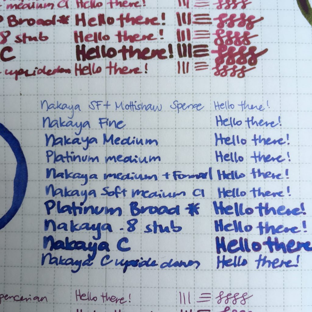
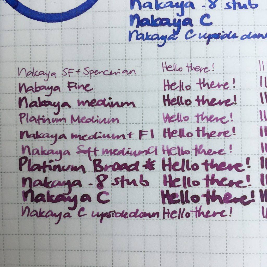
Hello again, it’s me, Katherine, going rogue on one of these mini reviews (complete with unadjusted iPhone photos — sorry). This time I sat down and did writing samples with every Nakaya and Platinum 3776 nib I had on hand.
The method: I chose three inks — Sailor Okuyama, Waterman Serenity Blue and Montblanc Lavender Purple. For each pen and ink combo, I dipped the nib, up to the breather hole, kept it there for ten seconds, then wrote a line and a half in my notebook so the feed wouldn’t be too saturated — then did the writing sample. This is all done in a Hobonichi, with 3.8mm grid.
About the nibs: (from top to bottom, here are some notes)
Nakaya SF + Mottishaw’s Spencerian Grind – very fine, has quite a bit of softness. I think this is fairly close to the stock UEF in line width… But I don’t have one of those, so i can’t do a side by side.
Nakaya Fine – stock nib.
Nakaya Medium – stock nib.
Platinum Medium – stock nib. Overly dry to start, but after adjusting, writes much like the Nakaya stock medium. I’ve had a few Platinum 3776s show up with overly dry nibs out of the box. Nakaya doesn’t have this problem since each is tuned.
Nakaya Medium + Masuyama Formal Italic – A sharp well-defined italic. Great for me because I use very little pressure, but can be scratchy and paper-tearing if the angle doesn’t suit you or you use a lot of pressure.
Nakaya Soft Medium + Mottishaw Cursive Italic – A more forgiving grind than the formal italic, but still not an easy nib — the CI is relatively sharp, but the softness means that it’s extra easy to catch paper edges. This nib works well for my hand, but some people (like Franz) just can’t get it to cooperate. Additionally, it’s tuned on the dry side so you don’t get the forgiveness and slickness of a lubricating ink.
Platinum Broad * – This is very close to a stock Broad, but I’ve ground it down to be a little stubby since I have a hard time writing with round Broads.
Nakaya BB + Mottishaw Stub, taken to .8mm – a nice smooth stub, nice line variation but very easy to write with.
Nakaya BB (also known as C) – stock nib
Nakaya BB (C) – written with upside down
My favorites: My favorite width is the medium — wide enough to show off an ink, narrow enough to suit my small hand writing and doodling. My favorite stock nib is probably a Soft Medium, but I don’t own an unmodified one — time to change that? My favorite nib out of the bunch above is the Soft Medium with the CI grind — I love the way it writes and it demands just enough attention of me to keep me awake. Fun.
There’s not much of a conclusion here — everyone has different nib preferences. Are there any other writing samples or comparisons that would be helpful? Feel free to suggest things! I’m sure Pam and Franz will let me pillage their collections for pens to compare against! 🙂
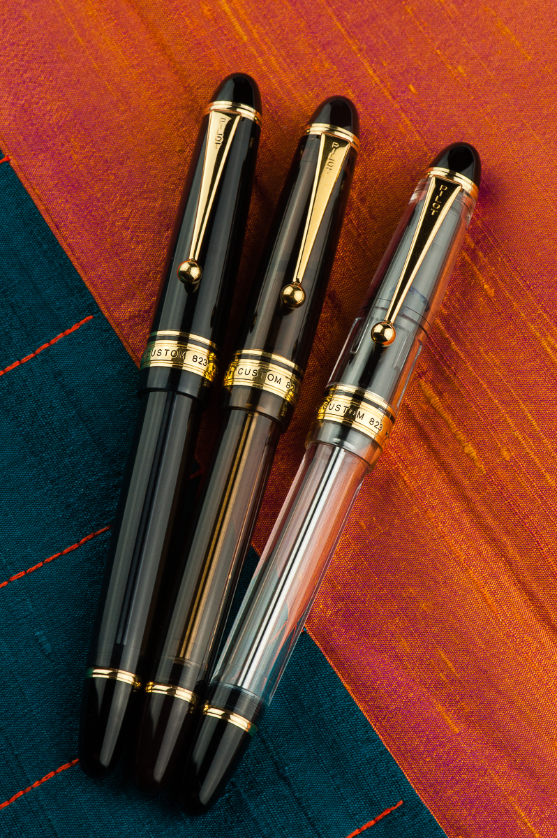
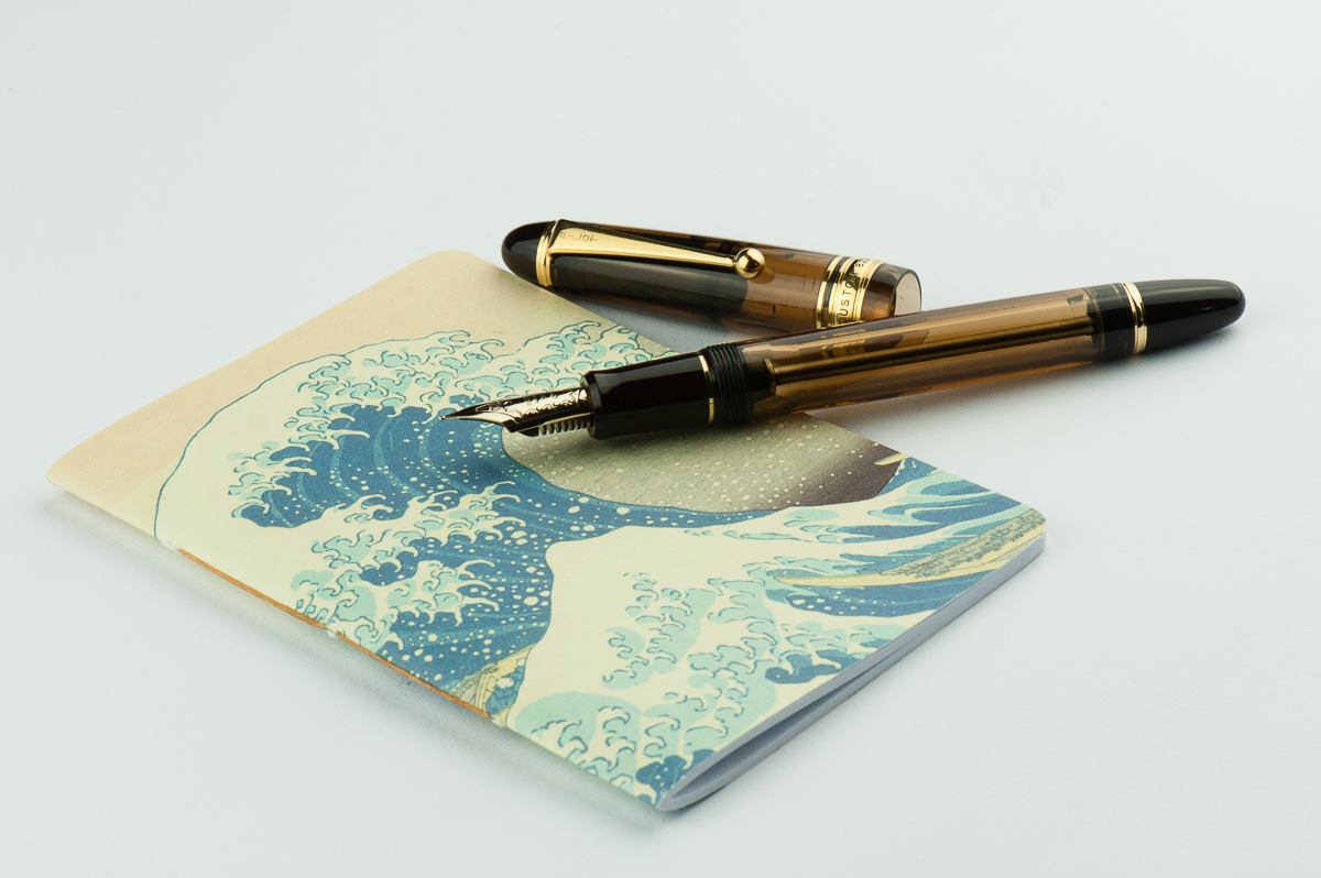
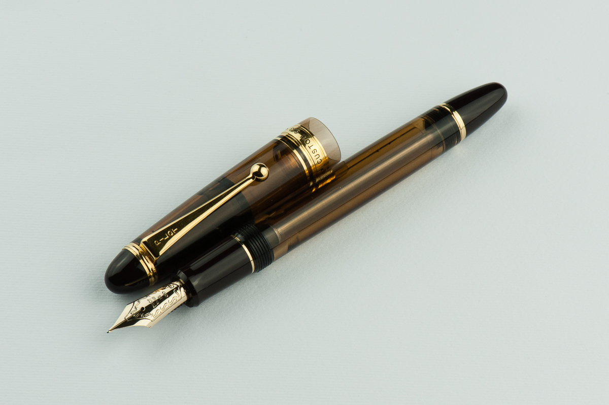
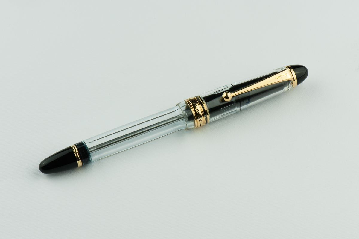
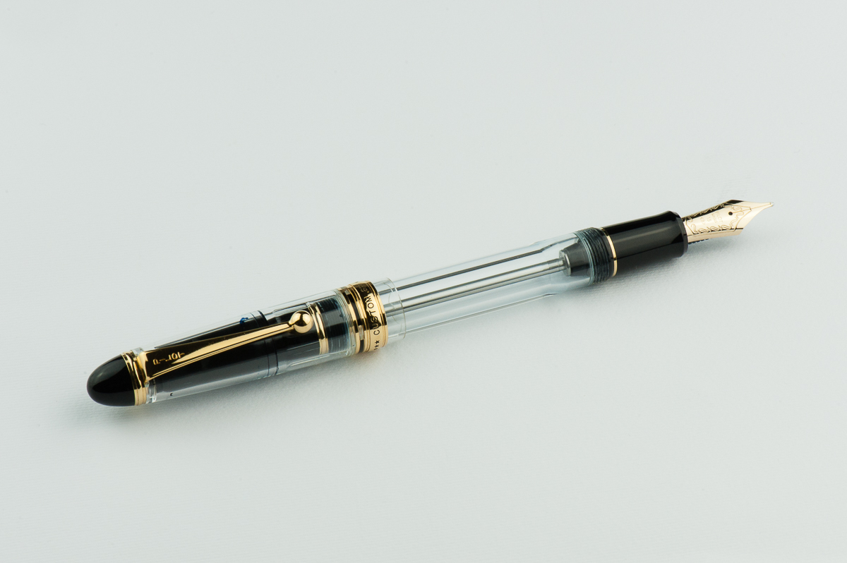
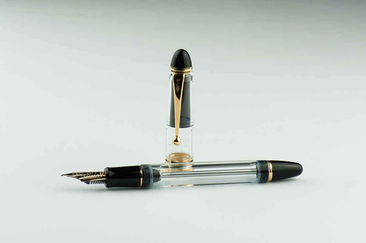
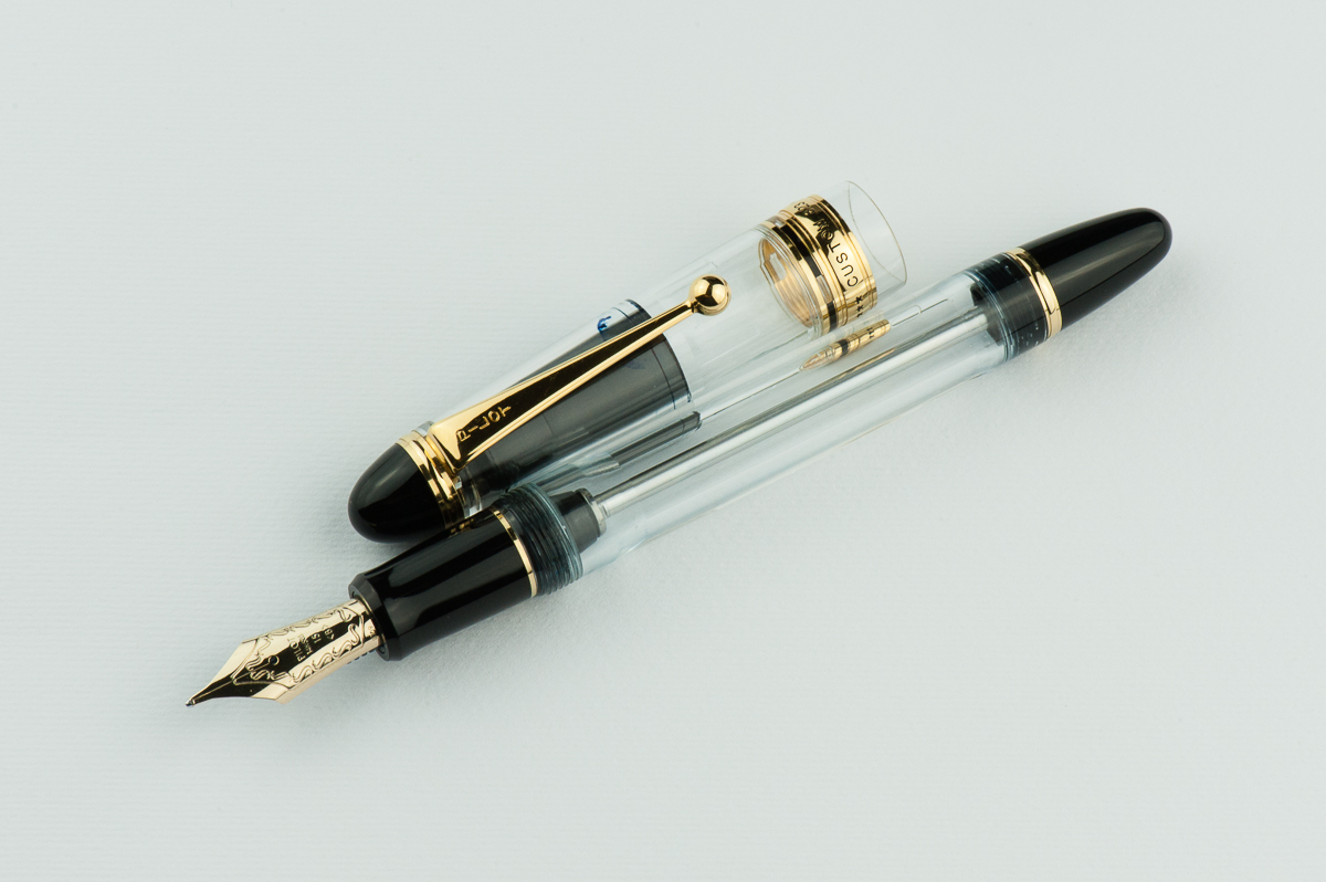
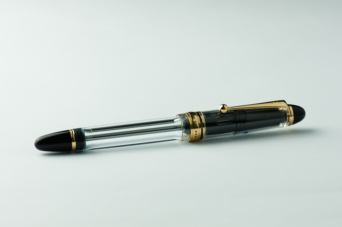
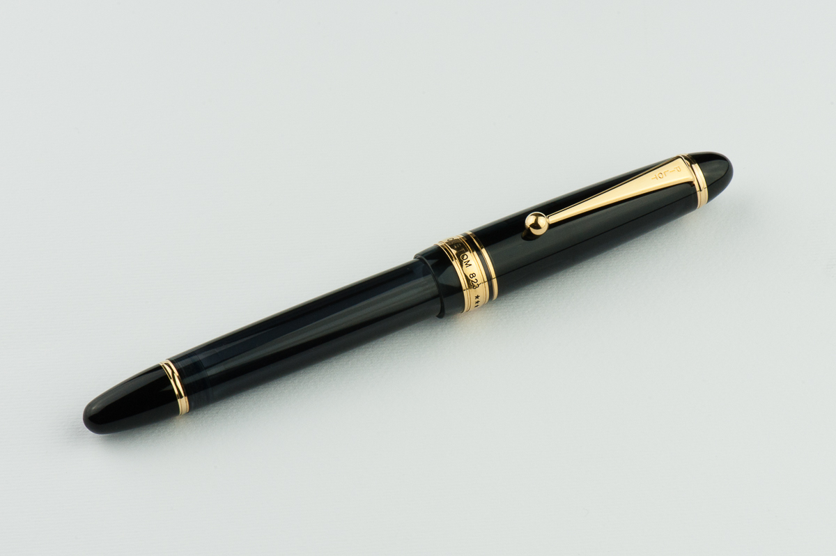
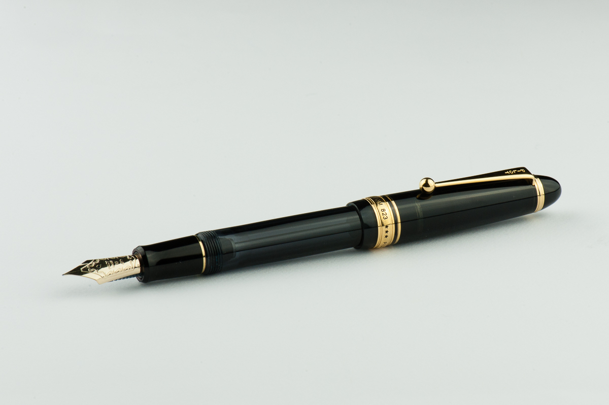
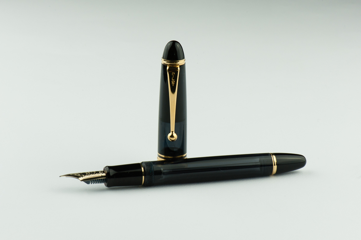
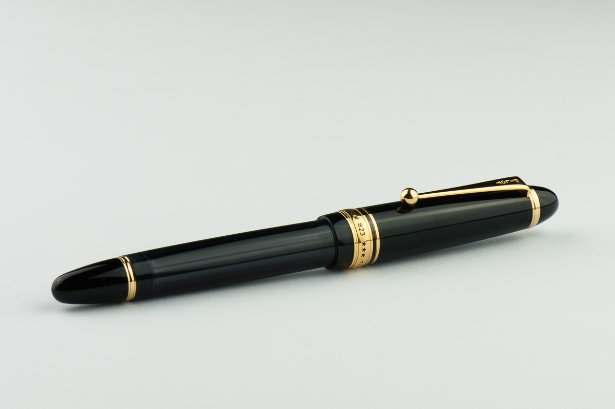
Katherine: This is a serious looking pen. But not too serious. All three finishes (amber, smoke and clear) are demonstrators, but the amber and smoke aren’t obviously so. As usual, the cigar shape isn’t my favorite, but I like the way the translucent amber and smoke materials look with ink sloshing around. My long time gripe with the clear one was that the cap liner (on all three, but most obvious on the black) is black… and very obvious. BUT, I’ve recently discovered that it’s not hard to remove the cap liner — a fat eraser (like one of the ones on those easy grip chubby kids pencils) can easily pull it out. Then it looks oh-so-much cleaner! If this pen came in the 912’s styling (flat ends, rhodium trim), it would be a must-own for me, instead I very much enjoy it, but I’m not in love with the way it looks.
Pam: Le sigh. It’s another cigar shape pen. Its saving grace is due to the demonstrator quality of them. The clip is… not aesthetically pleasing to me. I really enjoy the black and transparent material. Per usual, I am more fond of rhodium trim, however I don’t think that trim is available in the 823 model. Oh, what I would give for a ruthenium trim on the clear/transparent model. I will admit that the vanity in me prevent me picking up this pen. (Spoiler alert: I regret not picking up this pen sooner.)
Franz: Now I feel out of place. I love cigar shaped pens but the Pilot Custom 823 is more torpedo shaped, no? Hihihi… Either way, I love the 823’s shape and for some reason, that smoke finish is a winner for me! The 823’s size is substantial in the hand but at the same time it’s not too big, if that makes sense.
Just like what we learned in our review of the Pilot Custom 912, Pilot assigned a lot of their pen model names according to the company’s year when they were introduced. Namiki/Pilot was founded in 1918 and they are celebrating their 100th anniversary this year as well. So for the Pilot Custom 823, the first two digits (82) mean that the pen was released in Pilot’s 82nd year, 2000. The third digit represents the manufacturer suggested retail price in 10,000 Japanese Yen, ¥30,000.
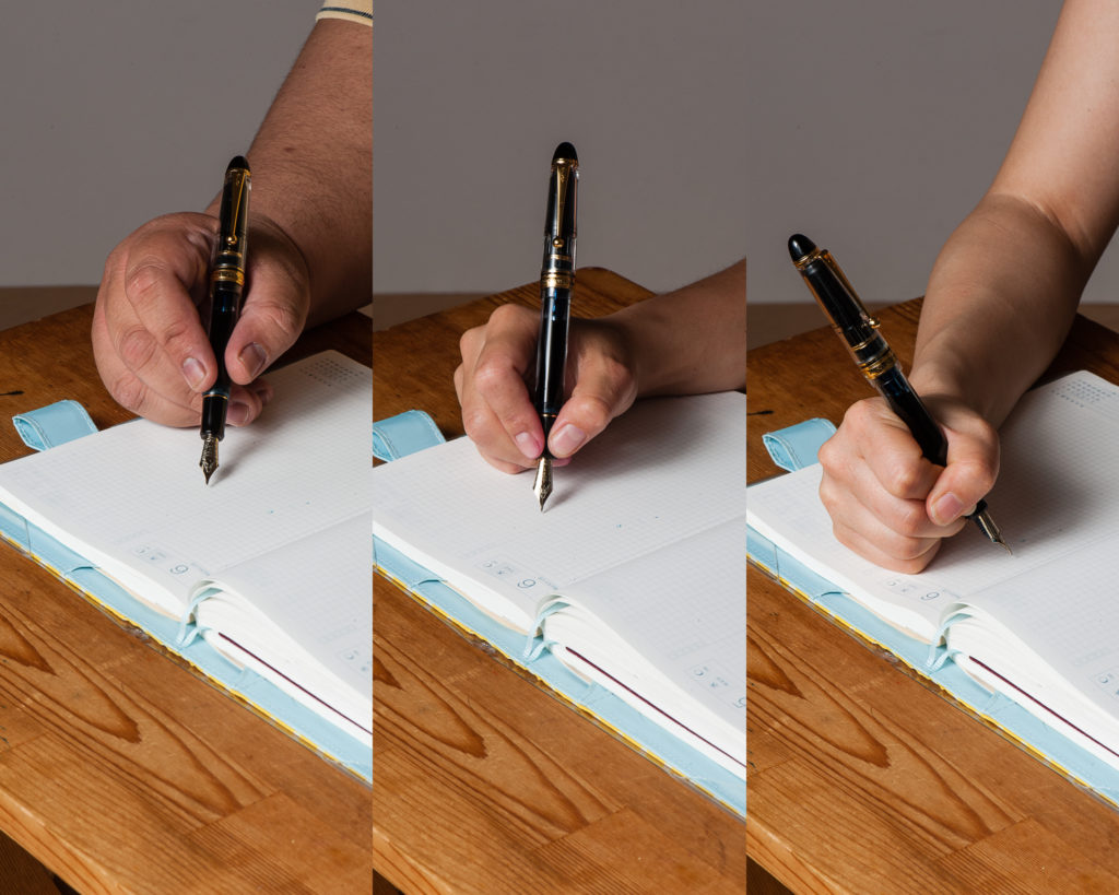
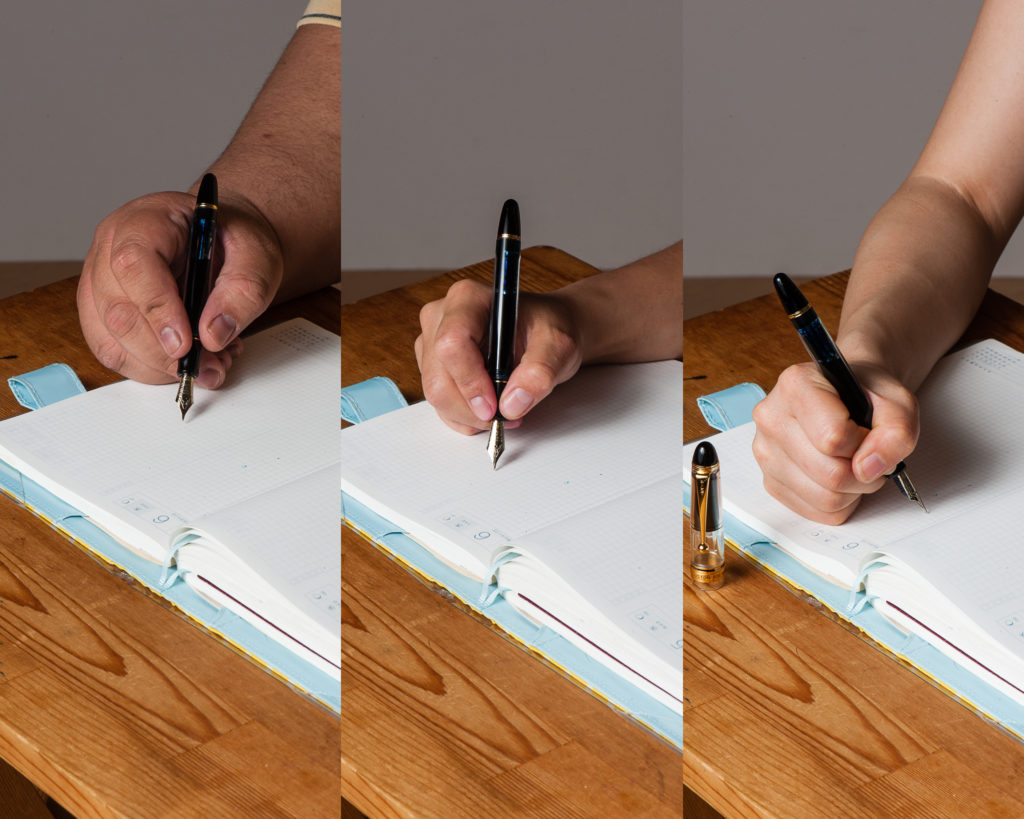
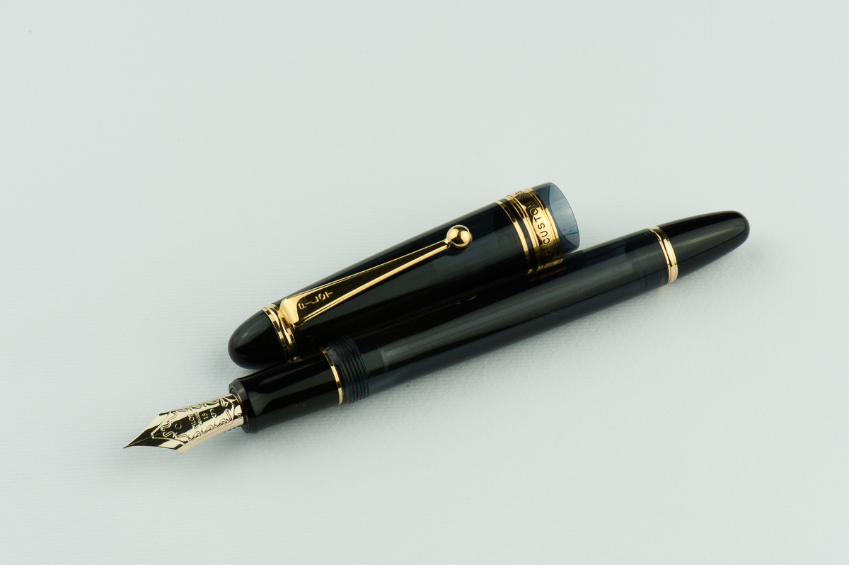
In the Hand: Pilot Custom 823 (posted) — from left to right: Franz, Katherine, and PamIn the Hand: Pilot Custom 823 (unposted) — from left to right: Franz, Katherine, and Pam
The Business End
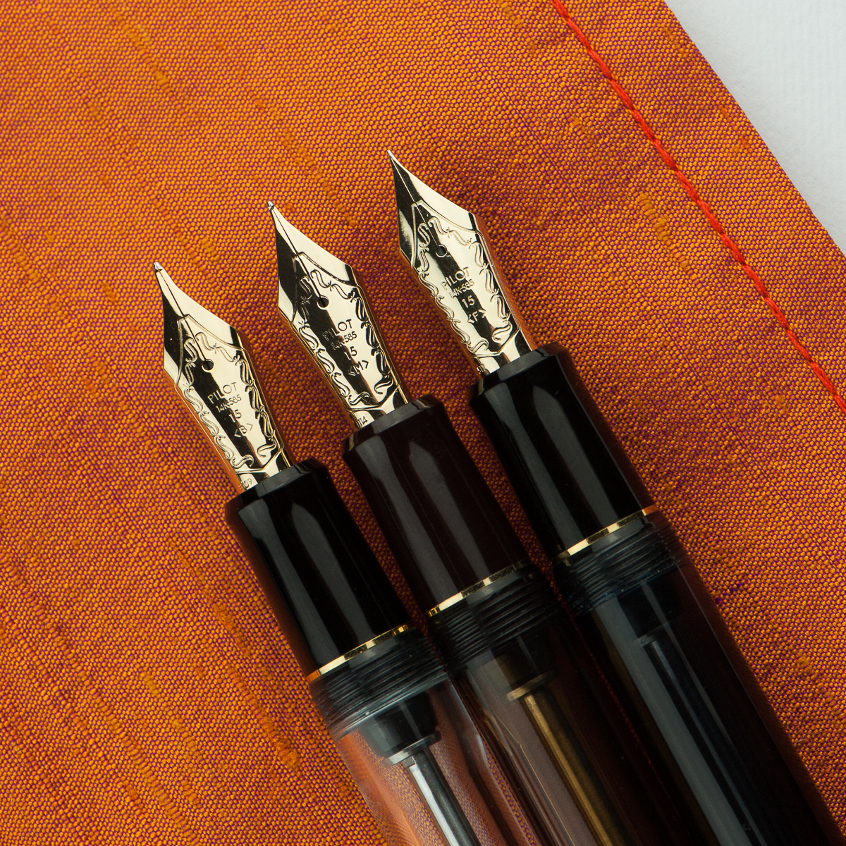
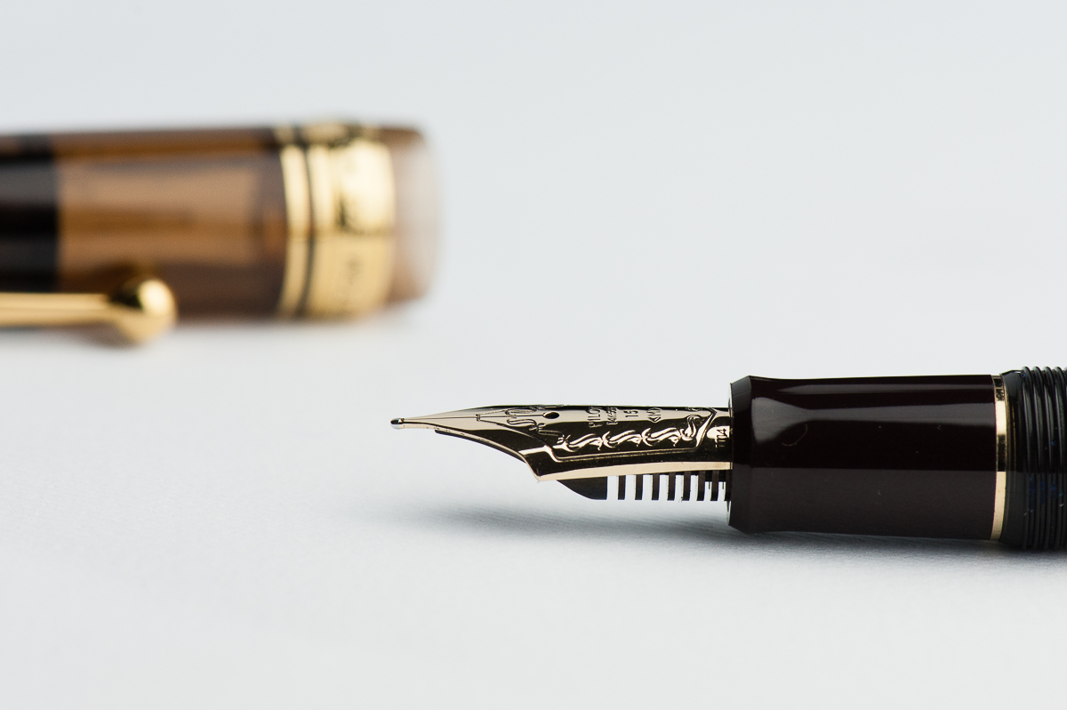
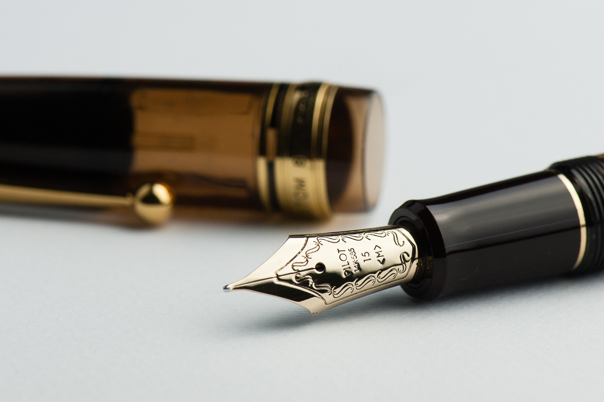
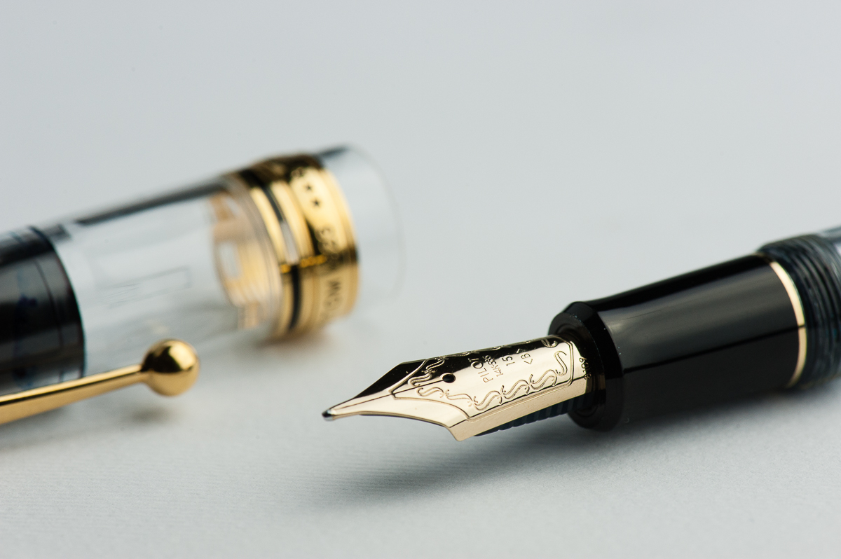
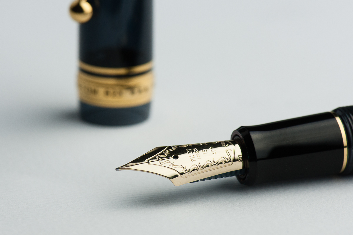
Katherine: Yay for Pilot #15 nibs! I really enjoy them. The medium on this pen was no different — a wonderful balance of smooth and wet, but not overly so in either direction. I’ve also had the pleasure of using a handful of other nib sizes on 823s and have been quite happy with all of them. Personally, I own a #15 FA, and love the bounce (the #10 I own is softer/flexier) and smooth writing it gives me.
Pam: Franz was kind enough to allow me to borrow a 823 with a fine nib. What a nib!!! It’s honestly everything one could love about a Pilot nib. Granted, my experience with Pilot is limited to a few select pens (Elite, Myu, m90, Murex, Volex) and I typically use the Pilot Prera and Vanishing Point at work. What was quite different about this particular nib is the size; it’s so big!! It’s also a great “upgrade” in both size, material and performance.
Franz: The 823’s nibs are very pleasant to write with. No adjustments were necessary to provide a great writing experience. However, among the three, the broad nib was modified by Mr. Dan Smith into a juicy stub. The medium and fine nibs had a good flow as well. The 823 nibs definitely have the bounce to give that flair in your writing.
Writing sample on Nanami Cross Field A5 Journal
Write It Up
Katherine: I thought the 823 was overhyped until I borrowed one from Franz for this review. As I wrote with it (and stared at it, trying to settle my feelings on its aesthetic) I realized why it’s such a popular pen… It’s a solid workhorse of a pen that writes wonderfully and feels solid and comfortable in the hand. It’s not too big, not too small, not too smooth, not too feedbacky… Somehow it’s a fantastic balance on so many axes (plural of axis, not that I’m balancing pens on wood chopping implements). I guess it’s implied, but I had a great time writing with it — though I did forget to loosen the knob the first time and was momentarily vexed as I wrote the feed dry.
Pam: I didn’t just write with this pen for an extended period of time. I “borrowed” this pen from Franz for an extended period of time. It’s has just enough stiffness and give from the material and size to make the writing experience tactically enjoyable for me. I found the pen to be very well balanced unposted. It’s a bit tall for me posted. The ink in the chamber is a bit mesmerizing.
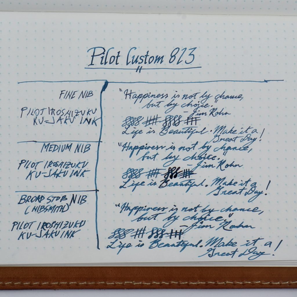
The nib was Pilot smooth with little/no feedback. The nib performed surprisingly better than I expected on cheap office paper. It didn’t feather as much as usual. Ink used was Pilot Iroshizuku Ku-Jaku. The pen and ink combo shined in both my Midori insert and Hobonichi (Tomoe River paper).
The writing experience of this nib is quite unique to this nib/pen. I am a bit addicted to the particular writing experience that this pen provides. I would highly recommend trying this pen out yourself. Just remember, the first taste is free. ;P
Franz: The biggest thing that I love about the Pilot 823 is that there isn’t a step between the barrel and section and that the threads aren’t sharp. When the cap is posted it is plenty long for my large hand but like Pam, I prefer to write with the pen unposted because the weight is more balanced. So with fingers on the threads, the unposted length is very comfy for me.
EDC-ness
Katherine: Solid clip, 1.75 turns to uncap and an ink capacity that lasts pages and pages and pages. And it low-key looks so your boss doesn’t wonder why you’re writing with a glitter stick. But some oooh and aah when your teammates notice the ink sloshing around inside.
Pam: I loved this pen at work. It was less than two turns to get you writing and as previously stated, the F nib does a pretty good job on office paper. The clip was just enough to easily slip in and out of a my white coat pocket with little issues. The ink capacity of this pen is fantastic and by far exceeds my other EDCs for work. For quick note taking, the VP is the height of convenience. However, for end of the day wrapping up “thought gathering” and where you have an extended note-taking session, I kept reaching for the 823. I may be adding another Pilot to my pocket for work at the rate we are going.
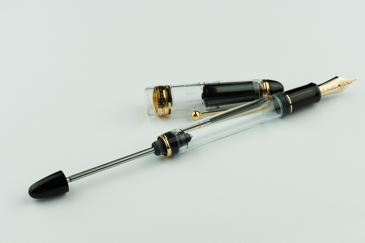
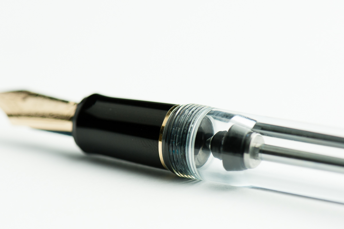
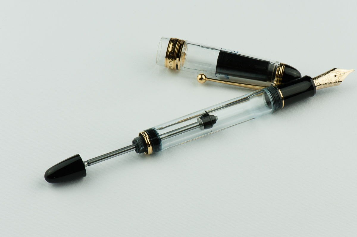
Franz: The 823 is a great companion for use at work and when I’m out and about. The fine and/or medium nib was great for the copier paper in the office and it just wrote well. The ball clip is sturdy and fits onto my shirt pocket as well as my jeans pocket. The biggest advantage of the 823 is its ink capacity. When you operate the vacuum filler (pictured below), the pen gets about 75% filled up. There is a maneuver you can do to fill the pen 100% of ink which is about 2.5ml. Dan Smith shows this in his video review of the Pilot Custom 823 here.
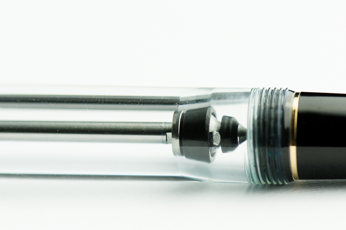
As Katherine described earlier, the 823 does have a shut-off valve (second picture below) and you need to unscrew the knob to make sure the ink flows freely onto the reservoir and feed. Gotta make sure that it is unscrewed or else you’ll find the nib writing dry after a page or two of journaling (trust me, I know). The shut-off valve helps contain the ink when you are flying, or if you are shipping the pen filled with ink. I received my 823 filled with ink in the mail from my friend and aside from ink spots in the cap, no other ink was wasted.
Vacuum plunger knob pulled all the way back ready for inkingThe plunger knob is unscrewed and the shut-off valve is open for ink to flow onto the reservoir/feed
Final Grip-ping Impressions
Katherine: The 823 is a solid pen. It’s not my favorite aesthetically, but I’m more than willing to forgive it that for how well balanced of a pen and nib it is. However, at $250-300 new, it’s not a pen I’m in a hurry to acquire (well, also because I arguably have more than enough pens…) but I do one day want to own one with an FA nib. I’m sure this will upset someone, but the 823 reminds me a lot of another pen I love, the Pelikan M800 — solid workhorse pens with an ink capacity for days and a clean professional vibe (assuming you aren’t sporting a maki-e M800 or something). If you like cigar shaped pens and gold trim, I don’t think you can go wrong with the 823.
Pam: #PenAddictProTip I agree with Brad. As in you should try the 823 for yourself. I believe that this pen is in the “everyone should try it or own it” category, like the Lamy 2000. You may not like it, but it’s a pen that is so easily and quickly reference for what it brings to the table: a LARGE gold nib, piston filler, a classic shape with a modern twist and a fantastic writing experience. It is well deserving of the “pens you should know” pantheon. The price maybe a sticking point, but I have had such a great writing experience with this pen that if you enjoy it as much as I did, it may well justify the price for you.
Franz: Well, if you haven’t noticed yet, the Pilot Custom 823 is a definite win among the three of us. It is a decently sized pen with great balance and is a great fit for small to large handed writers. Currently in the United States, only the Amber finish is available. I really wish that the Smoke and the Clear finishes would be made available in the market. You may purchase the two finishes from Japan sources if you are patient and knowledgeable enough to do so. I was lucky enough to secure my Pilot Custom 823 in Smoke from the secondary market.
You can call it a cigar-shaped, or a torpedo-shaped pen, it doesn’t matter as long as you try one. It’s a fantastic pen for me and I’m happy I own one.
Pen Comparisons
Closed pens from left to right: Parker 75, TWSBI Eco, Pilot Vanishing Point, Sailor 1911 Large, *Pilot Custom 823*, Pelikan M805, Lamy 2000, and Lamy SafariPosted pens from left to right: Parker 75, TWSBI Eco, Pilot Vanishing Point, Sailor 1911 Large, *Pilot Custom 823*, Pelikan M805, Lamy 2000, and Lamy SafariUnposted pens from left to right: Parker 75, TWSBI Eco, Pilot Vanishing Point, Sailor 1911 Large, *Pilot Custom 823*, Pelikan M805, Lamy 2000, and Lamy Safari
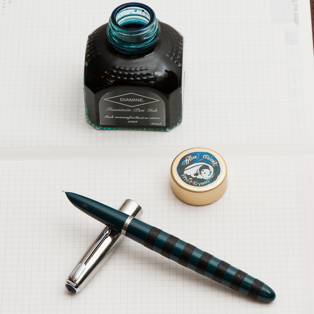
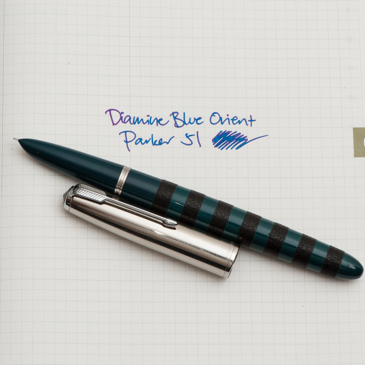
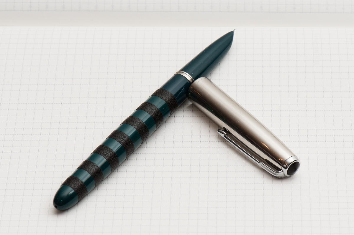
Katherine: It’s been a busy month, and I haven’t spent as much time playing with pens as I would have hoped. I’ve found that for the last couple weeks, my constant companion has been a Parker 51 Special filled with Diamine Blue Orient. The Parker 51 (review to come!) sports black ishime stripes, courtesy of Bokumondoh. I love the feel of the ishime and the visual variance that it gives an otherwise kind of boring looking pen (sorry!). Diamine Blue Orient is a limited edition ink created for FPN Philippine’s 10 year anniversary — I assume it’s honoring the beautiful oceans surrounding the islands.
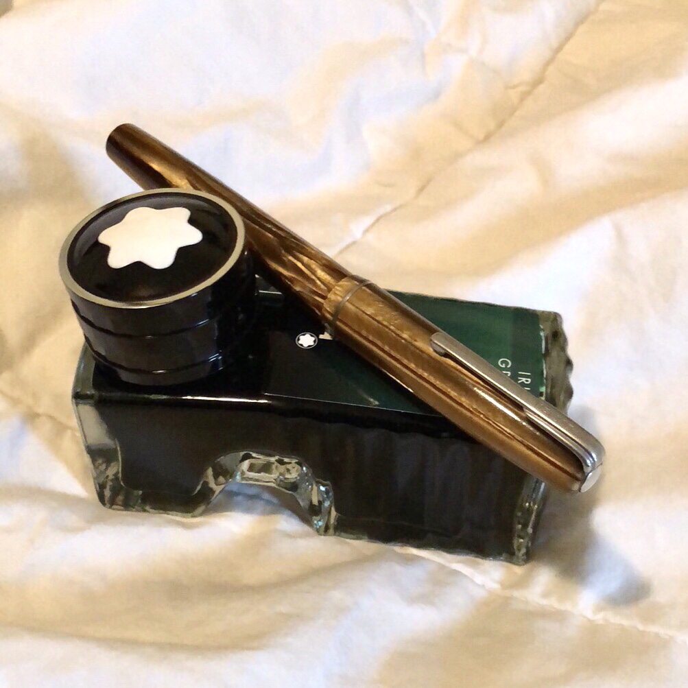
Pam: I have been on a bit of a vintage bender recently. Nik Pang introduced me to this understated brown Waterman that is a lever filler last month. I have also been finding out in my ink-splorations what brands of ink I prefer as I keep getting through all the samples. I inked up the Waterman with my favorite green, Montblanc Irish Green. The nib is akin to a Japanese F and writes beautifully. I chose a drier ink to highlight how fine the nib is.
On a side note, has any noticed inconsistent flows in heavily saturated inks? Or is that just me?
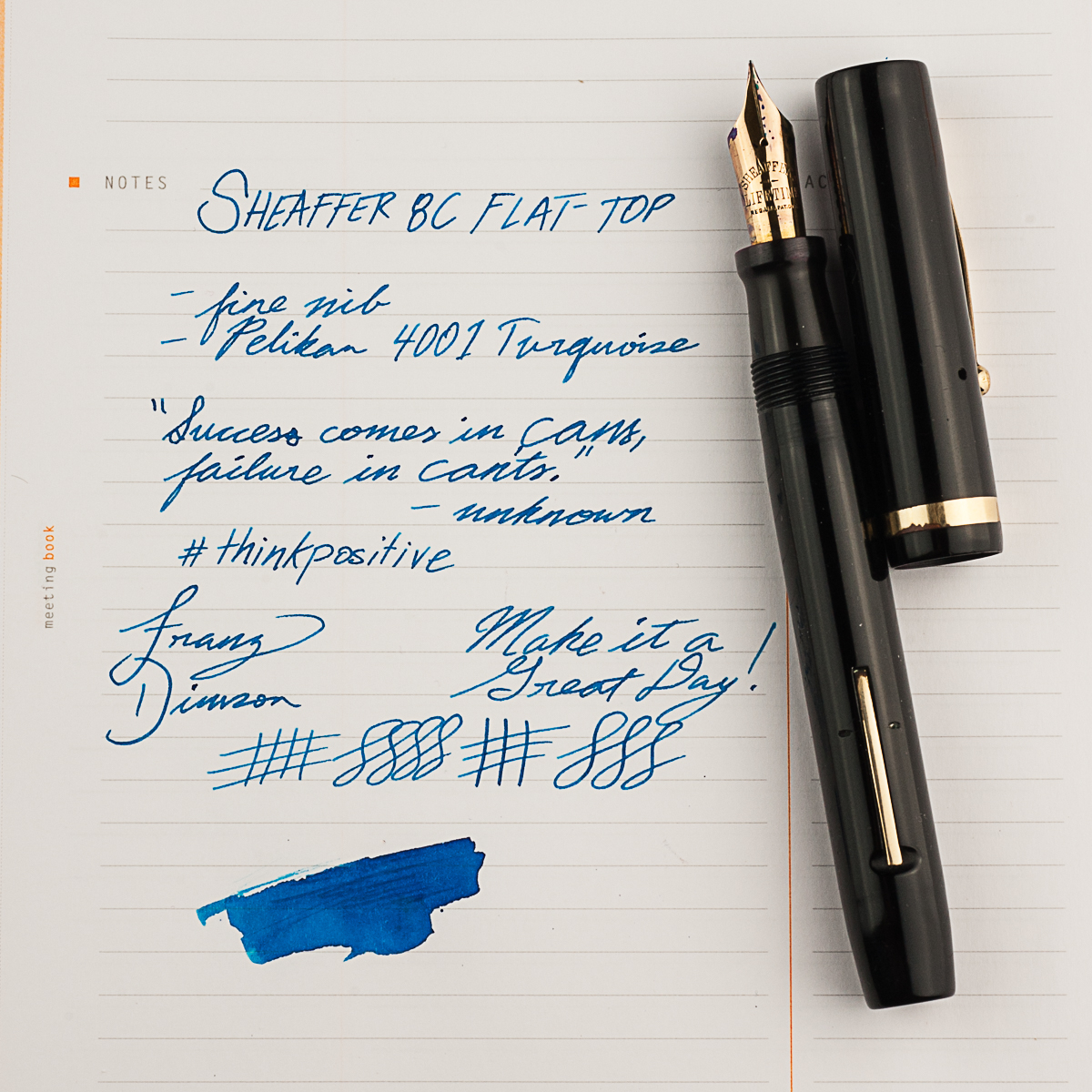
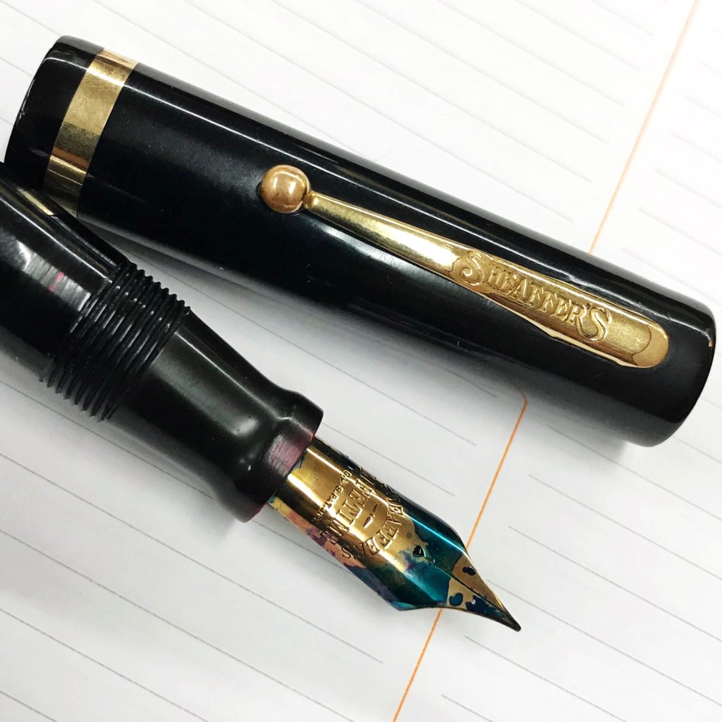
Franz: My pen for the month of March may be a vintage pen but it was a new acquisition from the LA pen show in February. My friend Jon S. knew about my apprehension about Sheaffer pens because most of the ones I come across are short and thin pens. So he showed me the Sheaffer 8C flat top pen which was from the 1920’s. And man, I loved it! He restored the pen himself and it’s in great condition as well. I’ve been using this pen at work almost everyday ever since I got it. The 8C fills my hand very well even when unposted so the bear paw is happy. =)
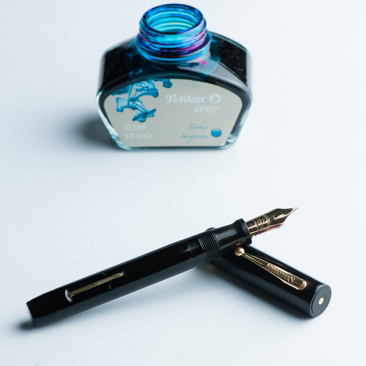
And of course I had to pair it with my favorite ink, the Pelikan 4001 Turquoise. Even if the nib is a fine width, it shows the ink color very very well. In some parts of the writing, some sheen comes through as well. There’s just something about turquoise inks that floats my boat.
Seems like the three of us have been writing with vintage pens lately. What pens have you been writing with?
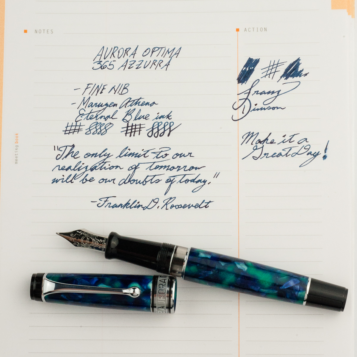
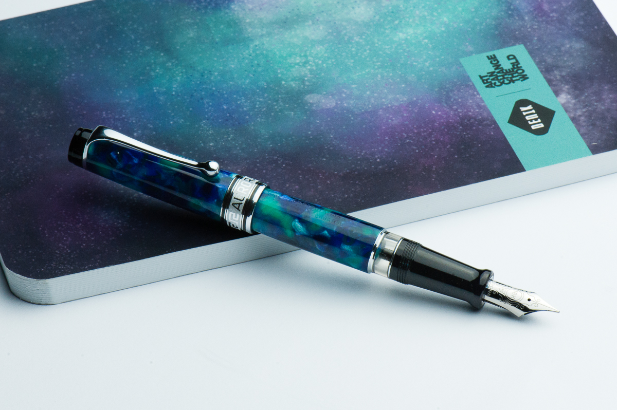
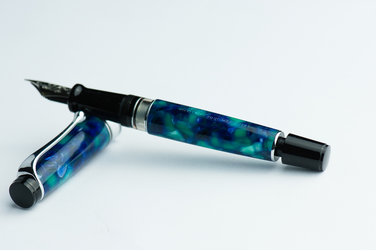
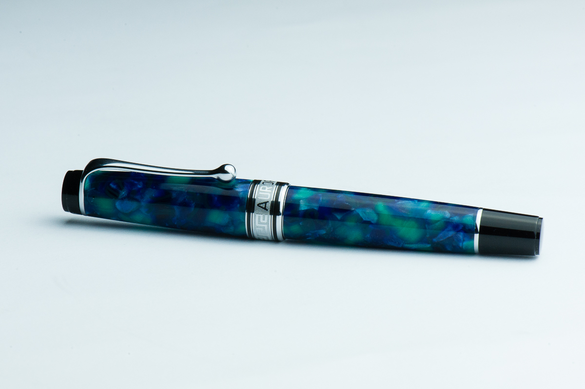
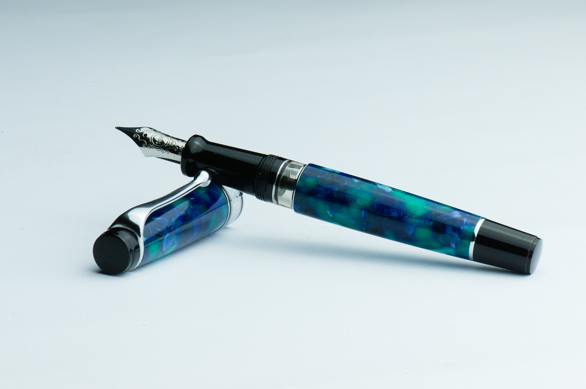
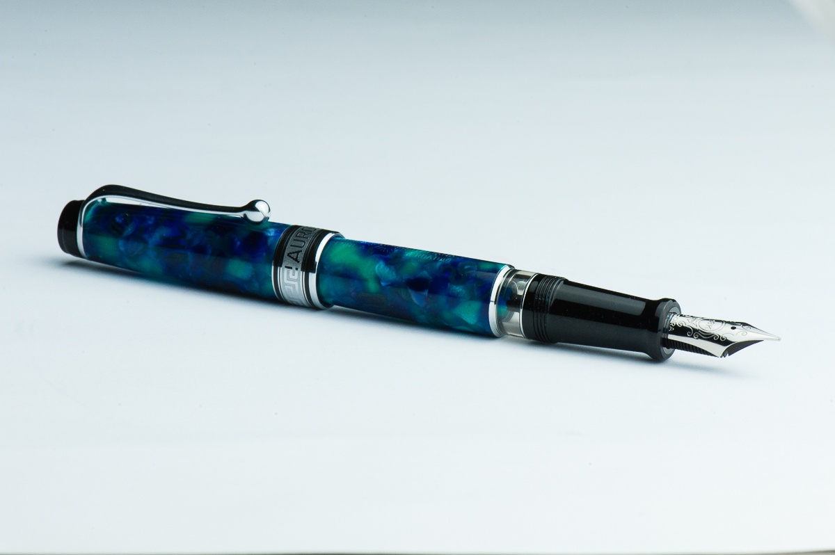
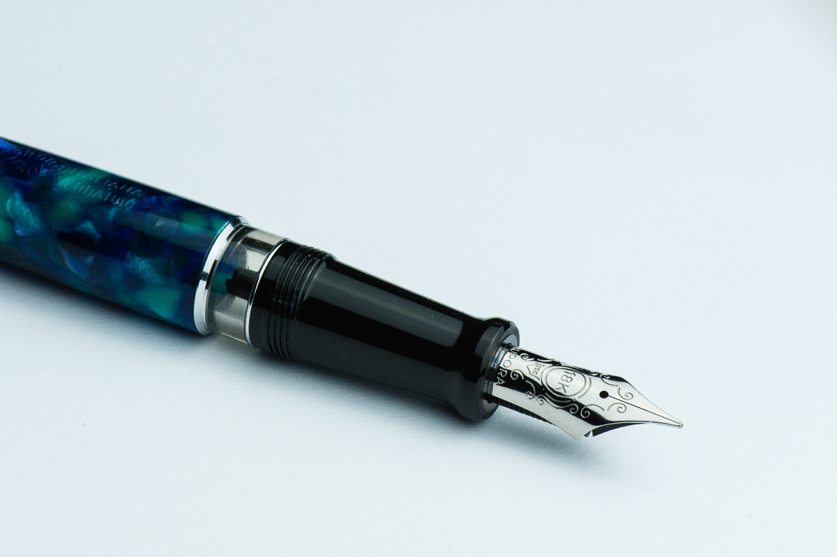
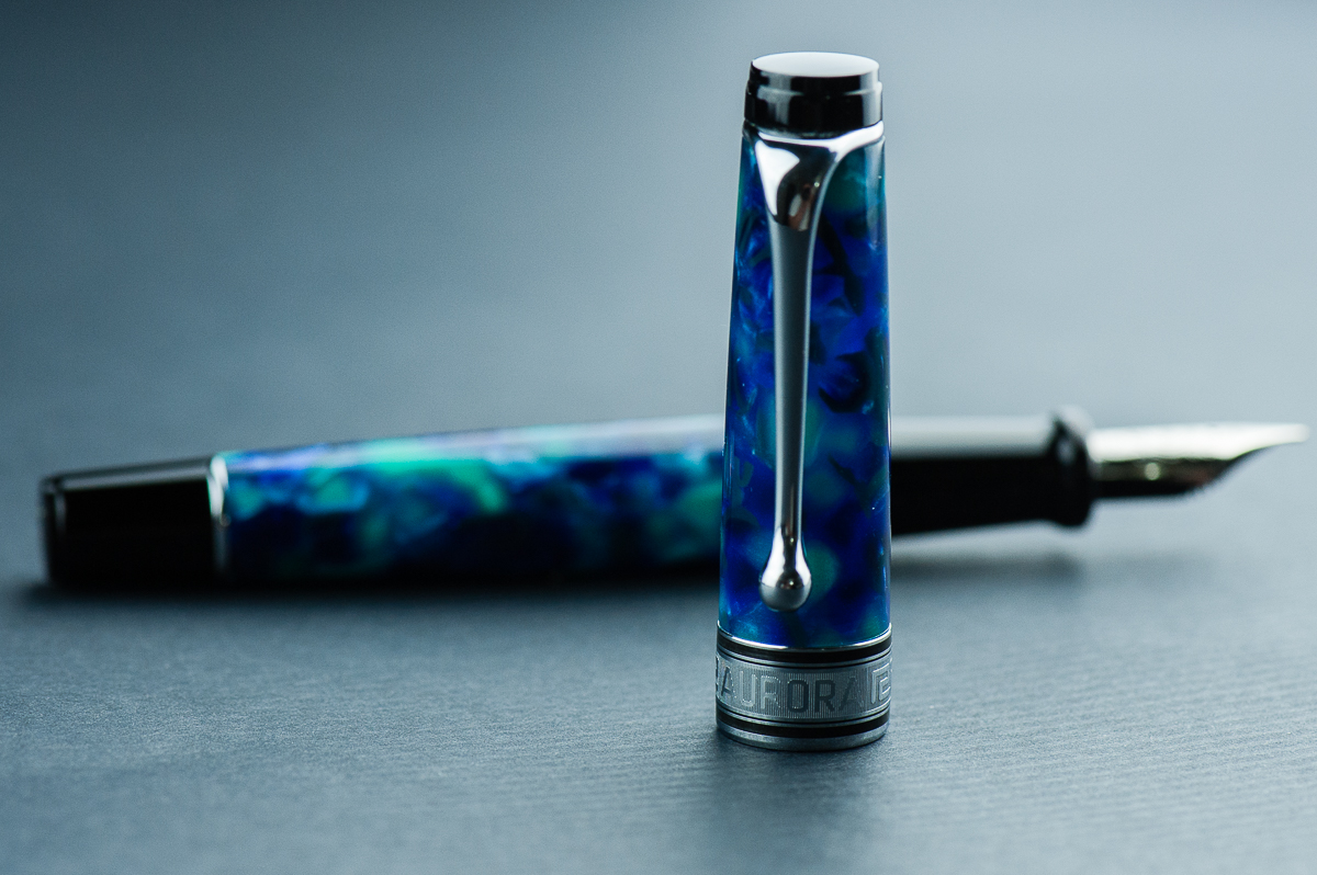
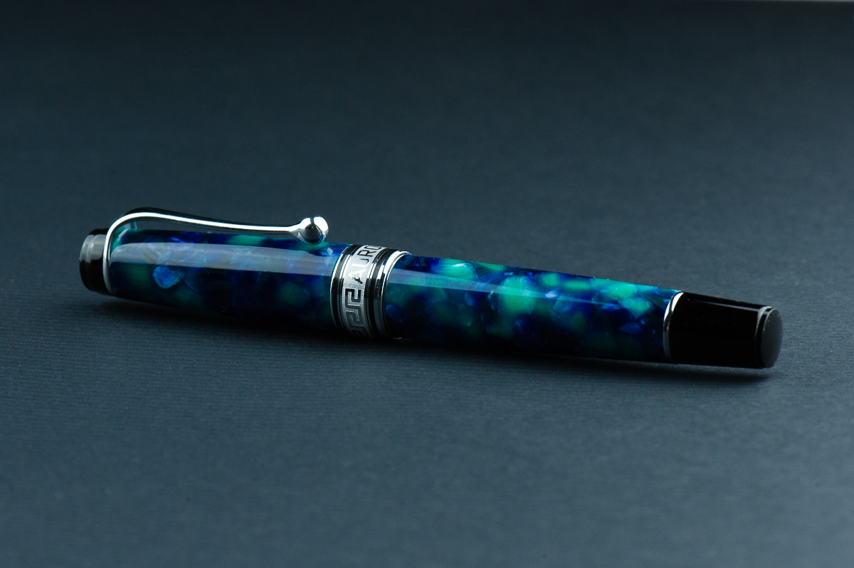
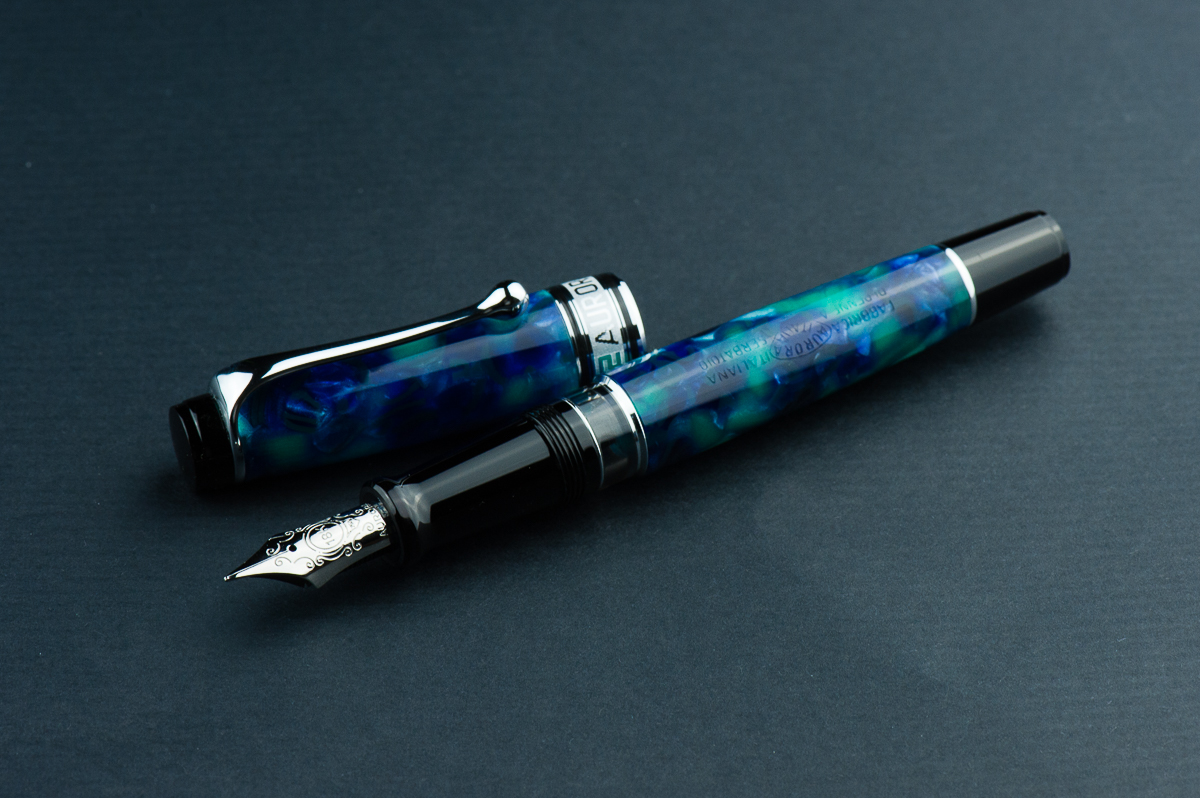
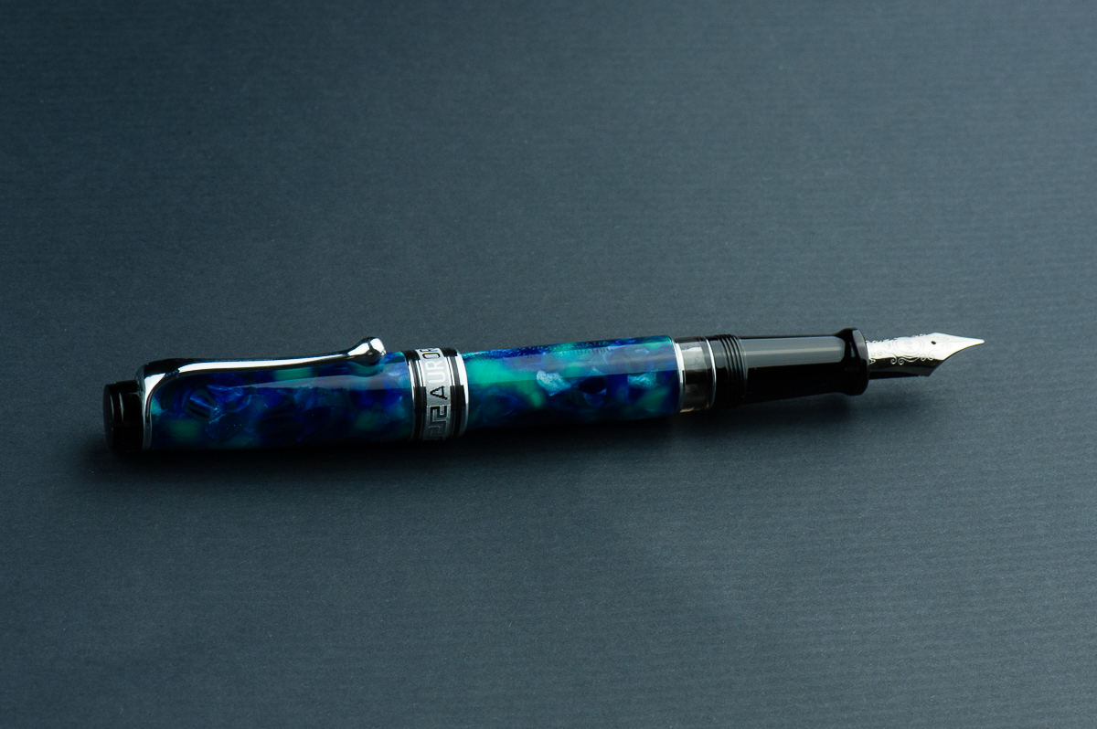
Katherine: I love the Optima’s aesthetic. I love the flat ends, a taper, but overall it’s short and kind of stubby. And I love stubby pens. Additionally, Aurora makes it in a range of gorgeous materials — including the limited edition pictured here. I’m partial to the gold and green, but have yet to find one at a price I’m comfortable with.
Pam: I really love the Optima’s shape and size. Why you ask? Because, to me, the Aurora Optima 365 is a gaudier Sailor Progear with the use of a wider, more ostentatious cap band. I have hesitated in purchasing an Optima mostly due to the stock material used for the pen body and cap. This limited edition material for the Optima made me eat my words. It’s sooo pretty. The blues, teal and flecks of silver-white is pretty unique and fantastic.
Franz: Wow! That Azzurra is fantastic! Pam’s observation is correct that the Optima is similarly styled as the Sailor Pro Gear. However in the hand, the Optima is definitely larger and the section is longer. That Greek key cap band is quite nice to look at as well. I’ve observed that a lot of Italian pens use this design which is pretty cool especially on the vintage ones.
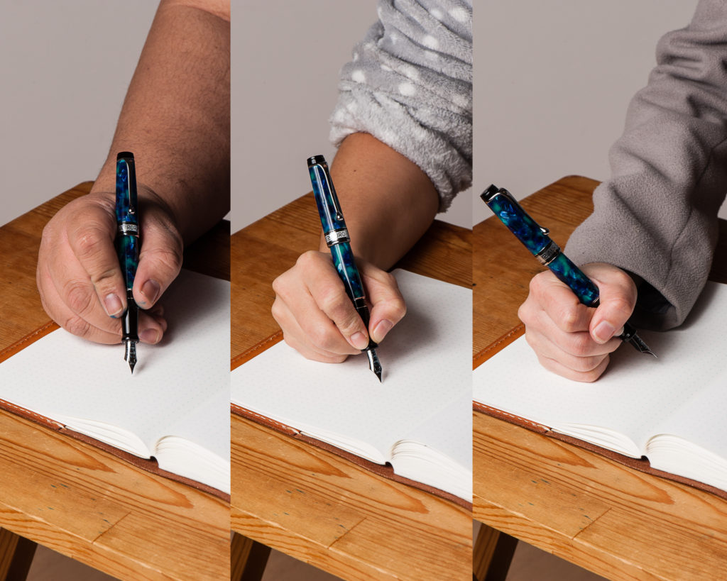
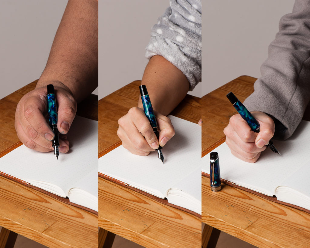
In the Hand: Aurora Optima (posted) – from left to right: Franz, Katherine, and PamIn the Hand: Aurora Optima (unposted) – from left to right: Franz, Katherine, and Pam
A Bit of History
The Aurora pen company was established in 1919 in Turin, Italy. Pretty cool to know that they are nearing their 100th year anniversary!
Just like what we learned about the 88 model in our review, the Aurora Optima model has been a part of their model lineup since the 1930’s. The vintage model had the same flat ends kind of style and the greek key cap band as well. The vintage Optima however had the same celluloid material for the whole pen unlike the modern one which has black cap finials, section, and piston knob. Also, the vintage Optima had a vacuum-filler instead of the piston-filler in the modern one.
The Optima that we know nowadays was redesigned in 1992. The Optima is offered in different colors, materials, and limited edition options. As long as you like the shape and style of the pen, there’s gonna be an Optima pen just for you. The Azzurra 365 is a limited edition of 365 units and Franz snagged one when it came out in 2017 from Dan Smith, the Nibsmith. As of March 2018, Dan still has a couple of these in his inventory.
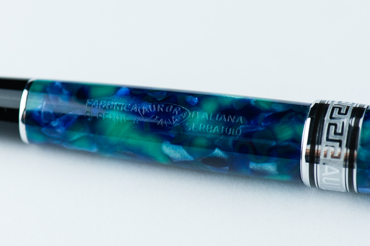
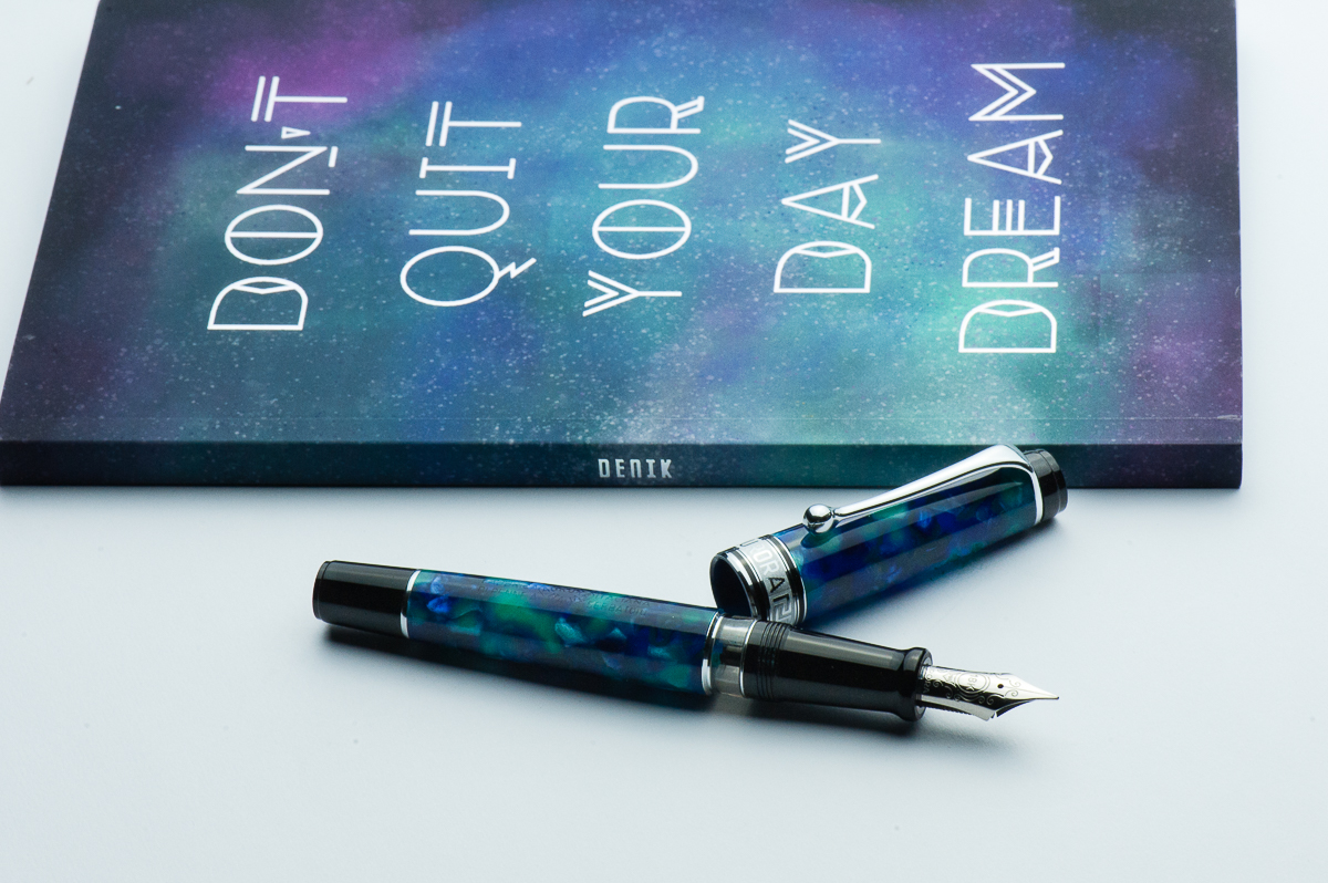
Beautiful Azzurra celluloid engraved with Aurora’s full company name: Fabbrica Italiana di Penne a Serbatoio – Aurora
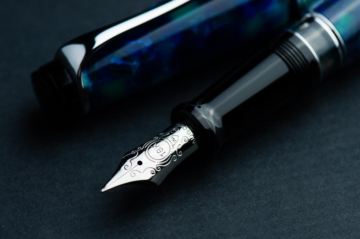
The Business End
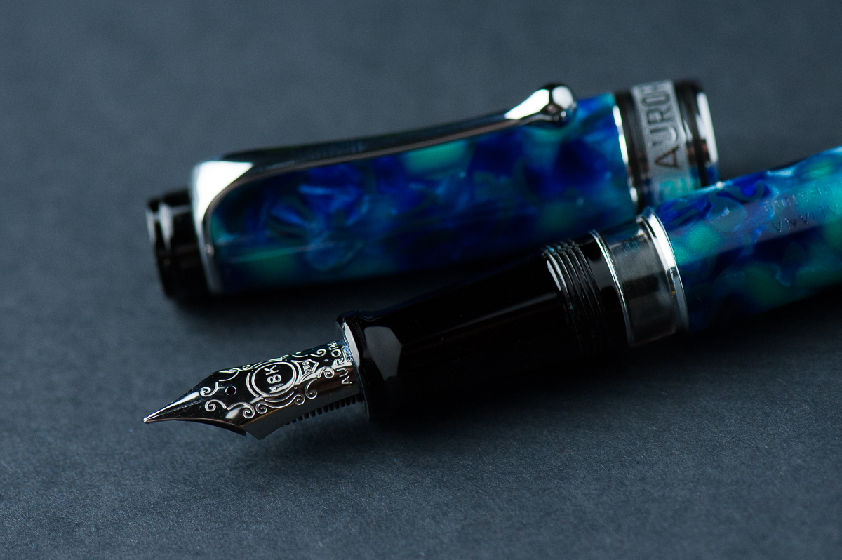
Katherine: I’ve been surprised by the Optima nibs I’ve tried — they’re somewhere between a Japanese and a Western nib. Plus they have a wonderful smidge of feedback, reminiscent to me of Sailor nibs. Now that I’ve typed this all out… the Optima nibs feel like a middle ground between a Sailor nib and a typical Western nib in terms of both line width and feedback vs smoothness.
Pam: I have been able to try both an Aurora Optima’s EF and F nib. I have found Aurora’s nibs to be very consistent in line width and feel. The EF is more similar to a Japanese EF. The F nib is more consistent with a Western EF. The nib is quite wet but then again, the ink itself is also quite wet. I really enjoyed the super smooth writing experience. Sheeny inks would really shine with this nib.
Franz: I really love the nib design of the Aurora Optima and the shape is a traditional fountain pen nib. Surprisingly, I didn’t ask for a medium/broad nib from Dan but a fine instead. I’m glad I did because the fine nib is definitely lovely to write with. As Katherine said, there is a pleasant feedback while writing that I like especially on smooth paper like my Rhodia meeting notebook. The 18-karat nib isn’t really flexy nor is it marketed as a flexible nib but with just a little pressure, it does give my signature a little flair.
Franz’ writing sample on a Rhodia Meeting Notebook
Write It Up
Katherine: I haven’t measured, but this pen feels like a heavier Pro Gear. Maybe a little bigger? But if it is, not by much. I found it comfortable (and quite enjoyable) to write with for long periods of time.
Pam: It’s a comfortable size pen for a variety of hand sizes. For smaller hands, it would be worth it to post the pen. For smaller sized hands, unposted is slightly better balanced and comfortable. My thumb wraps around the step and threads of the pen, but I hardly notice them. The step and threads aren’t sharp and the step is minimal making for a wonderful “no imprints” writing experience in my iron fist grip.
Franz: Let me just say that writing in my journal with the Optima was such a joy. The Optima is quite light compared to my usual Pelikan M800 and I have not experienced any fatigue at all. Both modes posted and unposted were very comfortable for me. The cap posts deeply onto the barrel and doesn’t affect the balance at all. I’ve already mentioned this but what I really love about the Optima is the lengthy section since I do grip pens farther back than others as seen in the hand comparison photos above.
EDC-ness
Katherine: A solid pen that works quite well as an EDC. And the cap takes 1.3 turns to uncap, which is pretty darn fast. I holds up quite comfortably to a life of being used to jot down quick meetings.
Pam: The pen is a great size capped. It should fit into a decent number of pockets. The clip is strong and tight. It should have no problem slipping in and out of shirt pockets. It took a bit more finagling for my white coat pockets with the thicker material. I kept it in my Sinclair case for a majority of my time with it.
Franz: I’ve been using the Optima at my workplace for a couple weeks now and it’s such a nice everyday carry pen. The ball clip fastens to my shirt pocket very securely and uncapping is fairly quick with less than one and a half turn. The fine nib was nice to use on the copier paper in the office too.
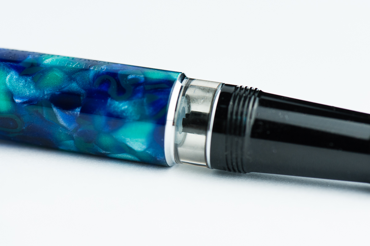
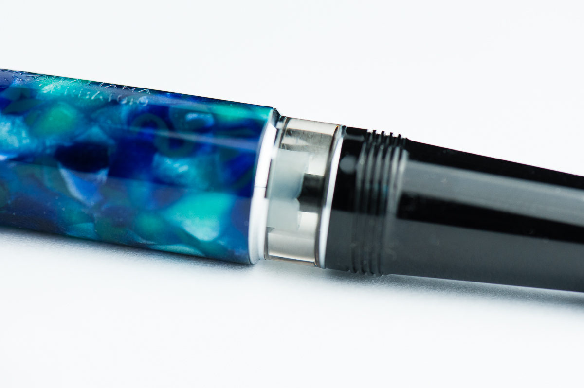
Something pretty cool with Aurora’s piston filled pens like the 88 and the Optima is their hidden ink reservoir. If you are running out of ink, just fully extend the piston down and a little bit more ink will be available to use hopefully until you get back home to refill your pen.
The black stem behind the feed is where ink is fed through. The piston has a hole that will fit around the black stem.Piston midway onto Stem: When the piston goes over the black stem, a couple drops of ink underneath will be displaced and fed up to the stem.When the piston knob is extended, it is a reminder for you to refill the pen.
Final Grip-ping Impressions
Katherine: All in all, I really like the Optima. I like the shape, the nibs are fantastic and they are made in beautiful materials. But, I find the MSRP quite high for the pen so I’ve been quite conflicted about purchasing one. As Pam mentioned earlier in the review, also remind me a lot the Pro Gears, though I don’t think the aesthetic is better or worse — just very different.
Pam: I really enjoyed my time with the pen. I enjoyed the nib more. This particular material is exceptional. I know the price of the Aurora Optima reflect the celluloid material used for the pen but that alone isn’t enough for me. That being said, if you can enjoy a beautiful modern celluloid pen with a fantastic nib, I would highly recommend the Aurora Optima.
Franz: I don’t have a lot of Italian pens in my collection but so far, Aurora has been winning my heart over. The Aurora Optima has been a pen model I’ve liked a lot and the 365 Azzurra pushed me to get one. For large-sized hands, I can definitely recommend the Optima and as mentioned earlier, there are lots of finishes that one can choose from. I think with the experience of the two ladies above, the Optima is also a good pen for small and medium sized hands as well. Plus, it’s a piston-filler which holds a lot of ink perfect for daily use.
A little food for thought to end this review, Optima is derived from the word optimus which stands for “Best”. Hmmm… is it the best pen ever? For me, the Optima has jumped into my Top 5 since I got it late last year. Not necessarily my Number One pen (Pelikan still FTW) but it’s up there. Now of course, best pens are very subjective! =)
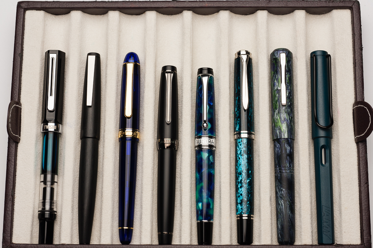
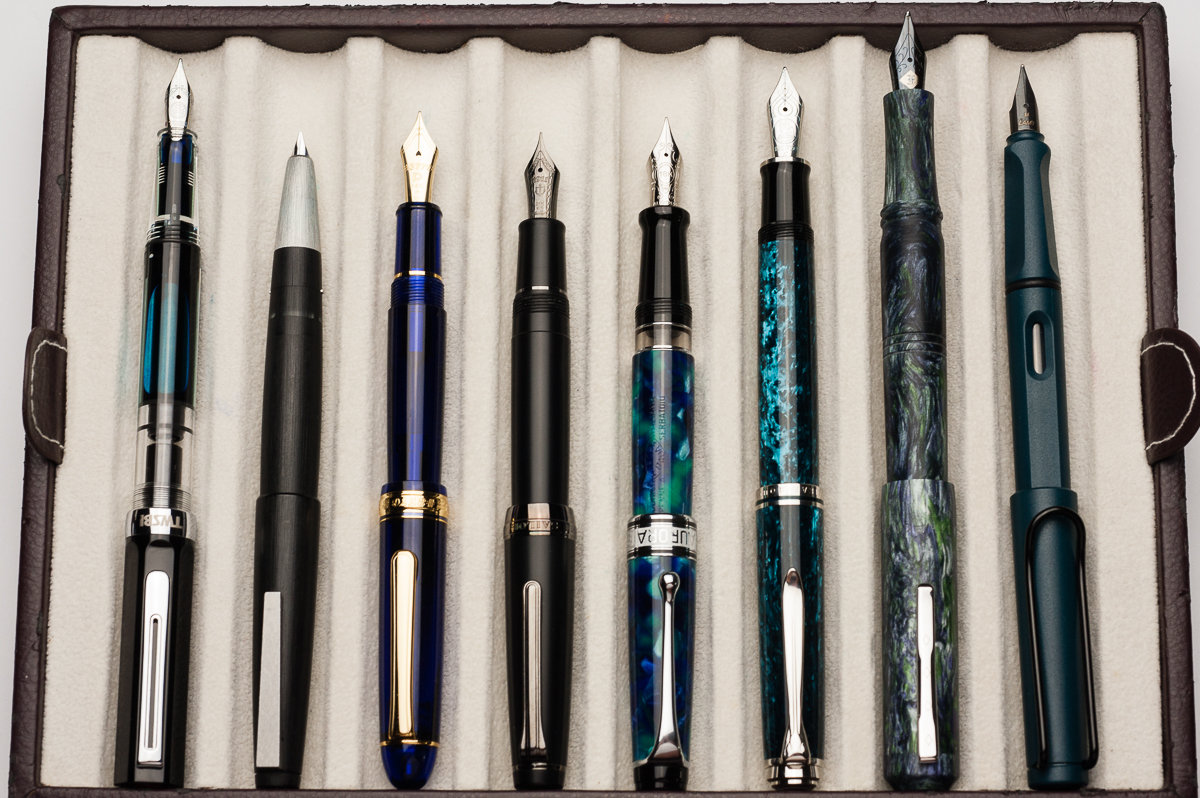
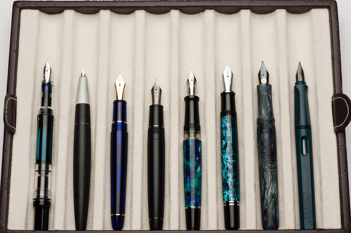
Pen Comparisons
Closed pens from left to right: TWSBI Eco, Lamy 2000, Platinum 3776, Sailor Pro Gear Classic, *Aurora Optima*, Pelikan M805, Franklin-Christoph Model 31, and Lamy SafariPosted pens from left to right: TWSBI Eco, Lamy 2000, Platinum 3776, Sailor Pro Gear Classic, *Aurora Optima*, Pelikan M805, Franklin-Christoph Model 31, and Lamy SafariUnposted pens from left to right: TWSBI Eco, Lamy 2000, Platinum 3776, Sailor Pro Gear Classic, *Aurora Optima*, Pelikan M805, Franklin-Christoph Model 31, and Lamy Safari