While taking a shower and considering which pens would make the cut for my “Top 5” for 2018, I realized that I’ve gone pretty deep on a couple new (to me) makers/brands this year. It’s about time I branched out! It’s well known in the addict enthusiast community that I’m a bit Nakaya obsessed (see our 2017 Wrap-up for proof) so I’m excited to be diversifying.
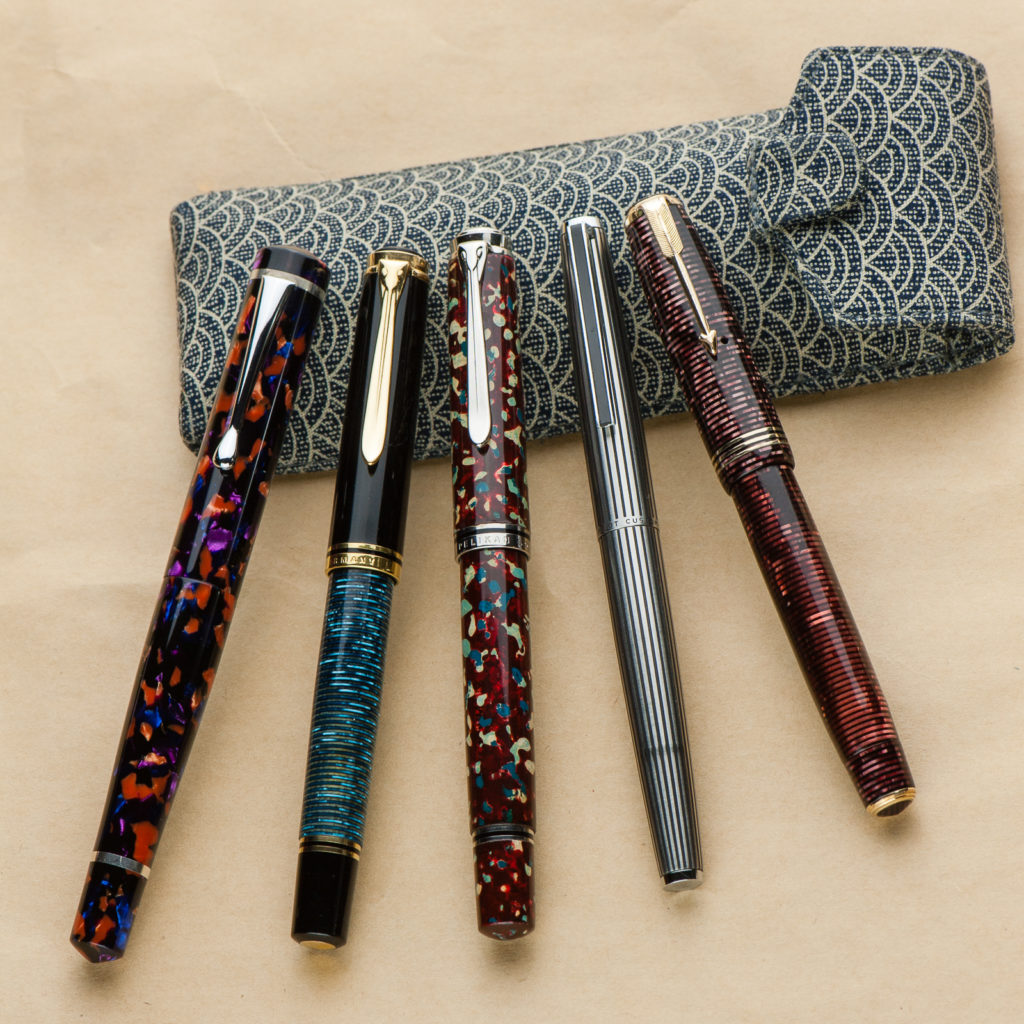
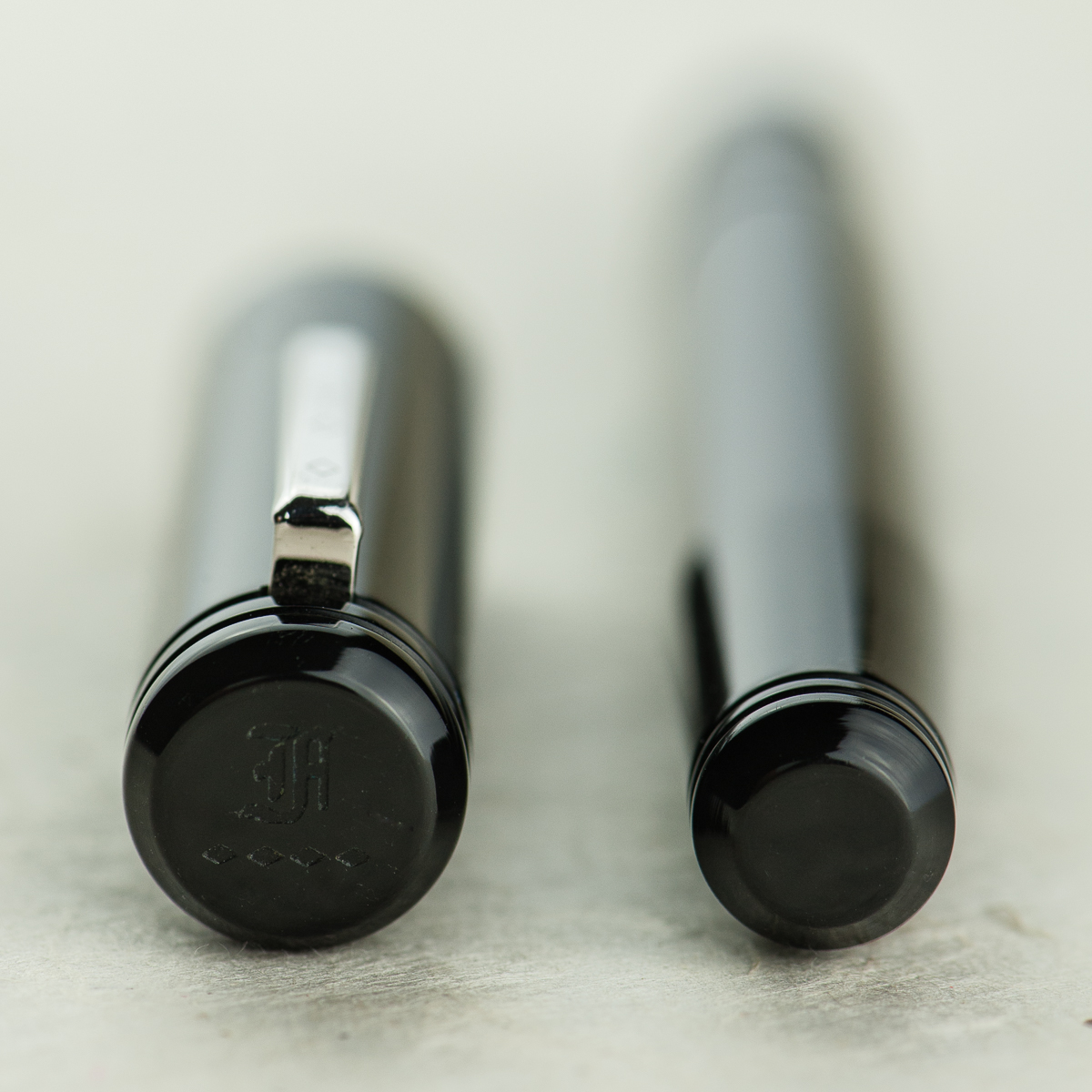
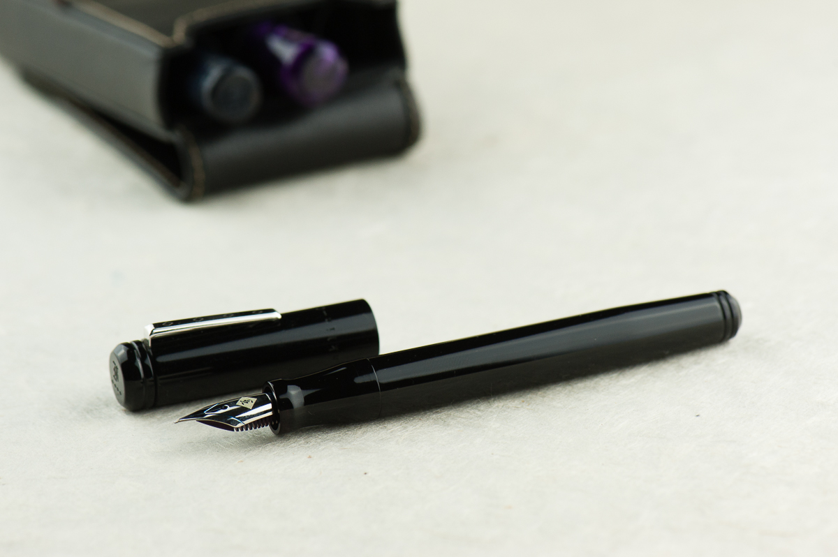
Run by a husband & wife team, Stylo Art is well known for their beautiful wood, urushi and wood & urushi pens. Kazuno-san (Mr. Stylo Art, I guess?) turns the pens himself out of ebonite or interesting woods, including some less common Japanese species. The pens are then fitted with Pilot nibs (and often sections). I’ve admired their pens from a distance for a couple years, but this year I went from zero… to three. (And I have my eye on a fourth, but that’s for 2019)
Top to bottom: Tanabata (raden and urushi), Taki-Sansui (maki-e), purple saiun-nuri
The three I have are all in the “Asama” shape, the only one available for most of the urushi finishes. All three are fitted with Pilot #15 nibs, an FA, WA and PO from top to bottom. The Pilot nibs (and Kazuno-san’s tuning) make them all fantastic writers. Paired with unique and gorgeous finishes, what more could an urushi fangirl like me ask for?
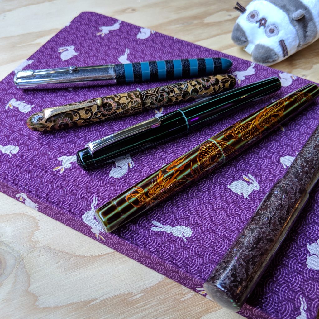
Like the Stylos, I’d admired the Kasama pens before I owned one, but… also before Kasama became a brand. I’d seen a handful of prototypes during a FPN-Ph mini meet and loved the chunky, short shape and the interesting materials. Several months later, Kasama was born and my brother gifted me my first one for my birthday.
Left to right: Ultem, Micarta, FPN-PH exclusive in acrylic, acrylic and delin (my first one!)
I tend to prefer the look of short pens, and the Kasama Una (the shape of all their pens so far) is short, but not narrow. To make matters worse, they’ve continued to experiment with models and color combinations… so I constantly find myself fighting the urge to collect them like Pokemon. (I’m not sure I’m winning) And, of course, it doesn’t hurt that they’re made in the Philippines — I love the idea of putting my thoughts to paper with an implement that is hopefully the start of a new niche, craft and tradition in my (kind of) home country.
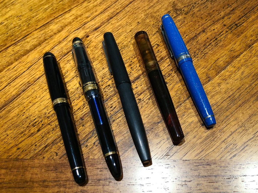
Urushi Studio Bokumondoh is made up of a single artist, Hiroko. She’s not a pen person herself, but she’s more than happy to do custom urushi work on pens you send her (the one caveat is that she can’t get under a clip, so either send pens with removable clips, or pick a design that leave the clip area plain). For my first order, I sent her one pen, for my second, I sent four.
Batch 2 of pens with Bokumondoh urushi finishes
I’ve had a fantastic time working with her on my pens — I had specific for some, and for others I asked her to do what she thought would be interesting. The results have been great all around. I’m currently thinking about sending her a third round, but I haven’t decided what should be in it. Perhaps a pen from Kasama? (She did do a couple pens with Stylo Art that were sold at the SF show this year)
What did you discover in 2018? What are you excited to carry forward into the New Year?
Franz: Another fantastic year has come and gone and 2018 has been an interesting year for me in terms of refining my pen focus. I believe I can categorize this year as both the Custom/One-Off Exploration, and the Vintage Search/Education type. I’ve actually bought less pens this year against any other year however it has been more deliberate and selective. This may be an influence from Katherine. Haha!
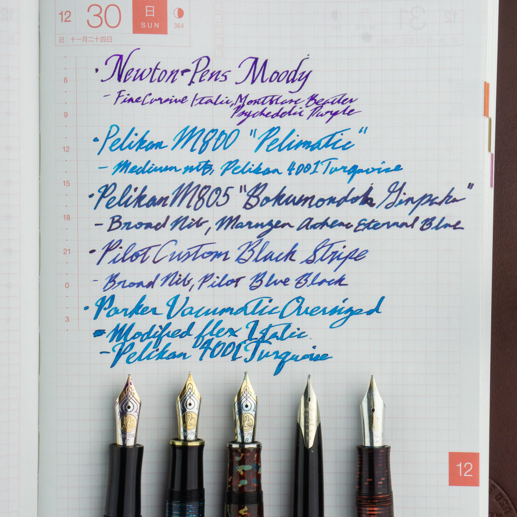
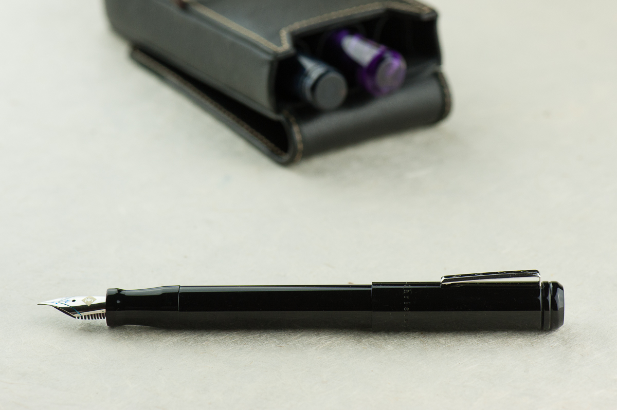
And here are my Top 5 Pens for 2018. This isn’t my greatest pens of all time however these are the pens that have been acquired within the year and has been inked up ever since I got it. Also a quick note, one of my invaluable stationery finds for the year is the Musubi pen case (pictured above). This has been a daily carry case for me at work and it secures my pens well.
Newton Pens Moody (Fine M800 Cursive Italic Nib) – I got the chance to be on Shawn’s wait list and it took me a while to figure out what I wanted. I supplied the M800 nib to Shawn, I asked him for a longer section, and also found this fantastic material. I got this early on in the year and it’s been a favorite ever since.
Pelikan M800 (Medium Nib) – I got this from the LA Pen Show from one of the trusted vendors. He said that this was a one-off and it took a long time for him to decide on selling this pen. He dubbed it “Pelimatic” even if the material in the binde used was from a Visconti Wall Street celluloid. I found it on Thursday night but I did not buy it until Friday afternoon. So I know that this pen was for me.
Pelikan M805 (Broad Nib) – This is sort of a cheat. This pen was a Black M805 and has been with me since 2014. However this year, the pen took a trip to Japan around September and came back in November with new clothes! =) The entire barrel and cap was customized with urushi lacquer by Hiroko of Bokumondoh. The technique/finish is called Ginpaku (silver leaf). I love everything about it!
Pilot Custom (Broad Nib) – Here’s a vintage pen that’s always been on my list. I love the Pilot MYU Black Stripe but I found that posting and unposting wasn’t the best for work. Now this Custom Black Stripe is pretty much a perfect Every Day Carry pen for me. A snap-cap, smooth juicy nib, and a simple aesthetic.
Parker Vacumatic Oversize – Hello Parker! =) Parker Vacumatics have always been a pen model that I love. I started getting into Vacumatics even way before I got into Pelikan. But I’ve always had the Major/Demi models which are quite small for my hand. I then decided on just getting the Maxima/Oversize models. This Burgundy Oversize model was an unexpected find while helping out with Mr. Rick Propas’ new website photos. I couldn’t stop ogling and fondling… er… admiring the pen while photographing it. So… this pen eventually found its way to my hands during a pen posse meetup. Aside from the pen itself, the nib is so good as well. Nib was customized to an italic and was provided to have some flex to it. #lovethispen
However, the biggest find for me in 2018 are my Pen Friends! I was lucky enough to be able to once again attend both the San Francisco and Los Angeles pen shows and was able to meet new people either just from the show or via online. The San Francisco Bay Pen Posse pen group has also grown and I’ve met great people whom I see at least once a month. I really love that there is an active pen group that is local to me as it lets me talk to like-minded people in this hobby. So here’s to 2019 for more pen adventures, more learnings, and more fun! Thank you for your readership dear friends!
Katherine: It’s been a crazy year for me — both personally and in terms of pens. In 2018 I discovered a couple new brands and makers (a post about this to follow!) and hoarded acquired more pens than was probably responsible. Whoops.
For my top 5 I’ve chosen a mix of both interesting and super-functional pens: Nakaya ao-tamenuri decapod mini, Japanese vintage (kamakura-bori), Nakaya heki-tamenuri dragon thingy, Parker 51 with ishime by Bokumondoh & Stylo Art Saiun-nuri.
All of them are reliable and solid writers, but honestly some are more practical than others. The Saiun-nuri sports a fantastic PO nib that’s great for my small handwriting and all sorts of paper. On the other end of the spectrum, the carved floral pen is a lever filler, a decent writer but not a pen I’d choose to EDC any time soon. (Though some of that is due to how uncommon it is, I’ve never seen another one like it… nor has anyone I know)
They’re also from a variety of sources, which adds to the fun. The Dragon Nakaya was from my July trip to Singapore for the Aesthetic Bay Nakaya fair. The floral kamakura-bori was muled from LA by a friend who sent me a picture of a dealer’s case, which I zoomed in on and fell in love, and Paypaled them the money… all while brushing my teeth. The funniest story is the Ao Decapod Mini’s — it had been a grail pen of mine for a while, and one day I woke up to a message “This is really silly, but I think I’ve had your grail pen in a drawer all this time, do you want it?” (Clearly, the answer was YES OMG HOW MUCH DO YOU WANT FOR IT… then I ran around my parents house squeeing for a while while my brother’s corgi chased me. Yep, that’s my life.)
I’m excited to see what 2019 brings, and how my hoard evolves! And, I think it goes without saying, if you happen to find a decapod mini in your drawer and want to send it to a new home, you know how to reach me! ♥
Pam: 2018 was a year of big changes for me, which included in less acquisitions (darn adulting!) and exploring what was already in my collection. At least, that’s what my top 5 pens are reflecting to me as we wrap up 2018.
Pilot Custom 823, F nib. I haven’t explored Pilots more expensive pens despite my love of the Pilot Prera. I have become a bit addicted to using this pen when it comes to a writing experience. It’s such a comfortable and smooth writer. It’s also my first vac! Now, if only I could find it’s one true ink pairing…
Lamy 2000, needlepoint grind by Mottishaw. An oldie but a goodie. You know you love a pen when you part with it only to buy it again. I parted with my original Lamy 2000 with the EF nib to a friend who loved it more than I did, only to miss it. I was fortunate enough to find someone at the SF pen show who was willing to part with the needlepoint Lamy 2000 that I coveted since the 2017 SF pen show. It was fated! Yes, I absolutely inked it with Sailor Yama-dori.
Sailor Blue Cosmos, MF nib is a bit of a surprise to me in terms of how much I enjoyed writing with the pen despite it’s broader, relatively speaking, nib size. It is currently paired with my new blue obsession, Iroshizuku Tsuya-Kusa. I can’t get enough of this warm blue which reminds me of bright summer skies. The MF nib shows off the color beautifully. This is my favorite pen and ink pairing in 2018.
Platinum 3776, UEF nib was a gift by the infamous Thomas Hall who is also known for his tiny “hantwriting.” From one tiny handwriting person to another, I am so grateful for this pen. It has been inked with Pilot Blue Black, my ode to Thomas Hall himself. Platinum is a brand that I was introduced to through Katherine who has a bit of a Nakaya obsession and now, I definitely understand why so many love the Platinum nibs as much as they do. I greatly appreciate how different the nibs of the big 3 Japanese brands feel and how they distinguish themselves. I find that to be particularly true in the super fine and extra fine sized nibs. The difference may appear to be minute, but when nib hits the paper, it’s a whole new world.
Brute Force Pequeno with Montblanc 144 nib became one of my favorite SF pen show memories this year and resulted in one of my favorite pens of 2018. I loved the body of the Pequeno but found the standard nib to be lackluster. I really wanted to write with the Montblanc 144 nib more, but hated the skinny body. Claire came to my rescue by notifying me that the 144 nib would fit a Jowo housing if I could acquire one. The hunt was on at the SF pen show! It resulted in trips down memory lane for both Troy and me as I showed him the new improved Pequeno. I paired with with Sailor Rikyu-cha because the broader, wetter Montblanc nib showed off the green-brown color so well. I am still intrigued and mesmerized with this ink color.
2018 was the year of me getting over the Sailor limited edition FOMO. It was a tough year for resisting temptation! It also is making me reconsider parts of my collection that I don’t use out of fear of losing or damaging the pen, particularly when it comes to the vintage fountain pens. In 2019, we are going to fix that! I am going to start rotating in my vintage collection and continue to fine tune my collection. To more inky and pen adventures in the upcoming year!
Franz’ Top 5 Pen Writing Samples on a Hobonichi Planner
Katherine: Oooh stripes! And blue! And a hint of sparkle. And pointy ends! All the things I love in a pen. The shape is heavily reminiscent of the Nakaya Piccolo, and as with that pen, I love the clean lines and the small touches on this pen, like the gentle taper and conical ends. Franz’s example is particularly close to my heart because it’s both blue and striped, but I’m sure it comes in a variety of materials depending on one’s taste.
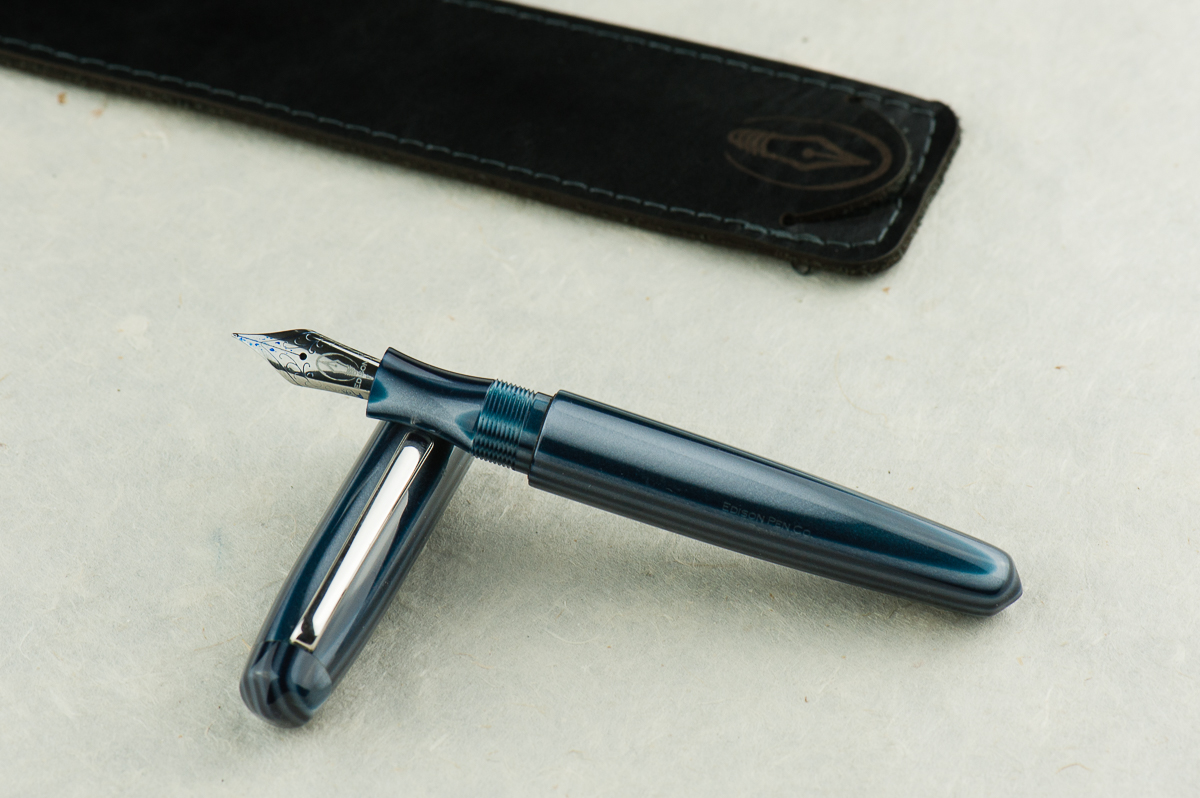
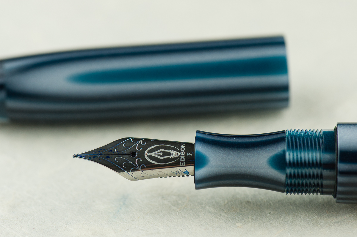
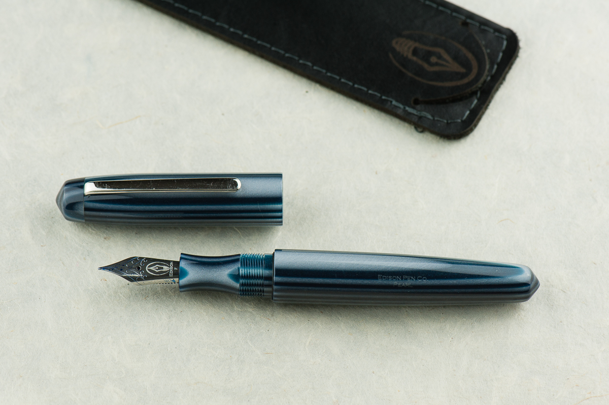
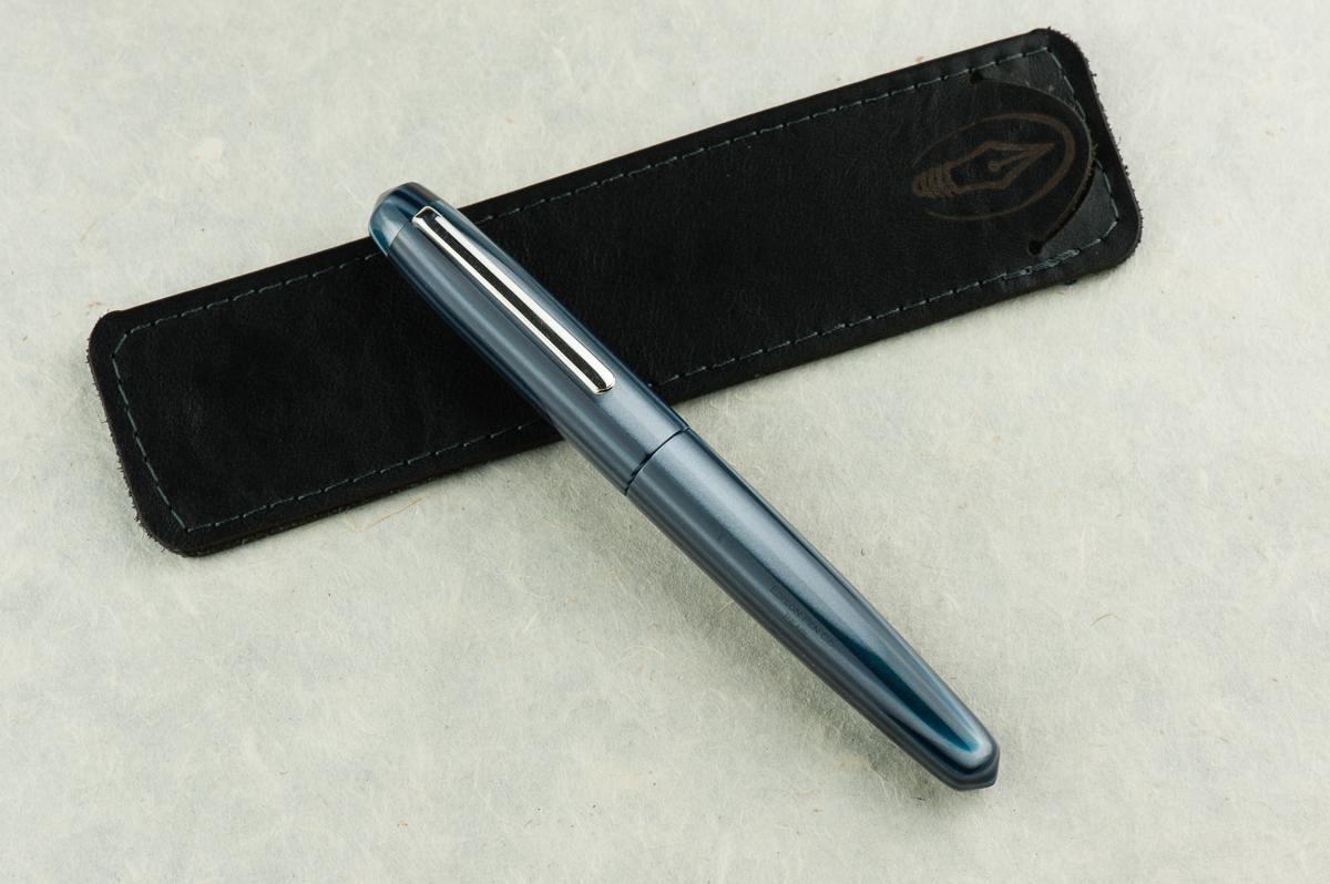
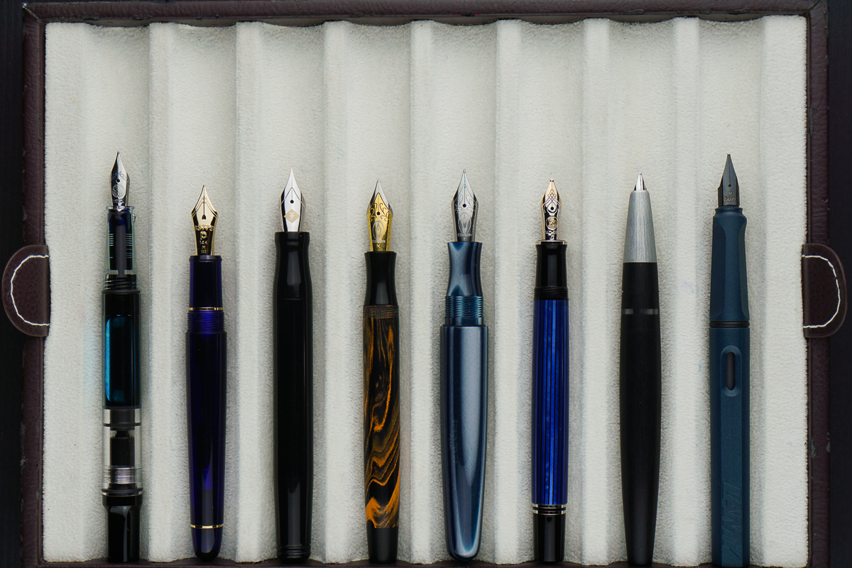
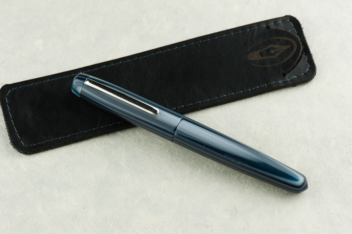
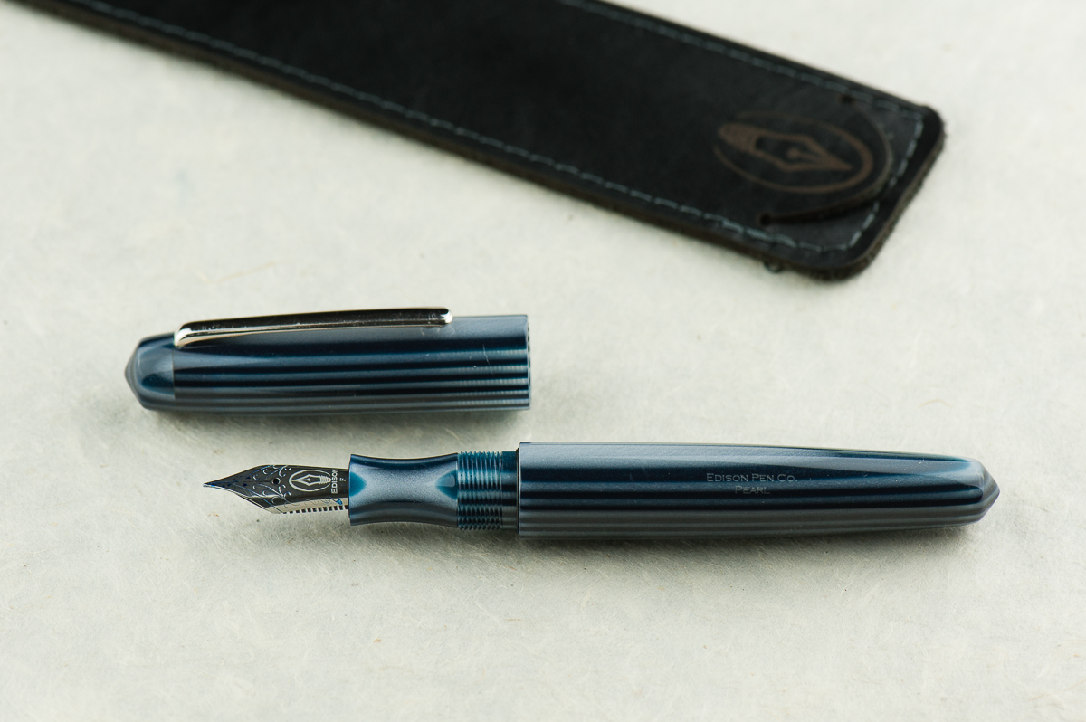
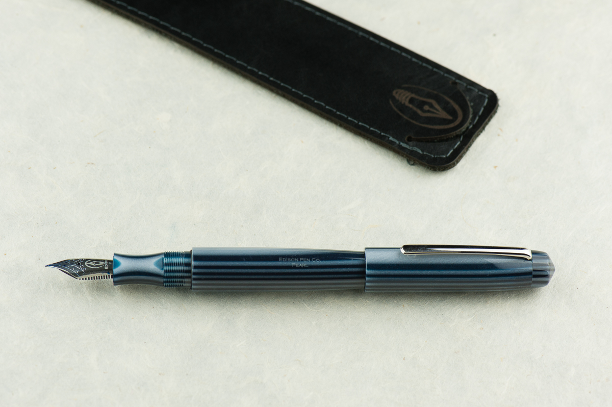
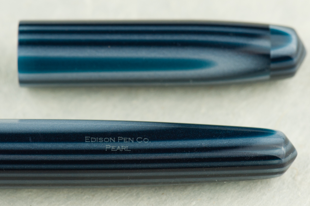
Pam: The Edison Pearl is a great flagship pen and a great example of their work. They take pride in their craftsmanship from nib to pen material. They were one of the first companies that I was made aware of as a newbie fountain pen addict that broke the mold using beautiful and unique acrylics. This particular material that Franz selected is absolutely stunning. The blue and gray stripes is a great compliment to this simple shape.
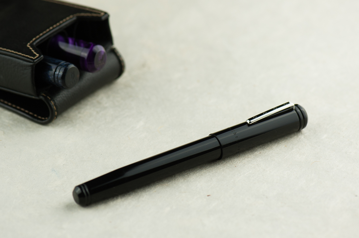
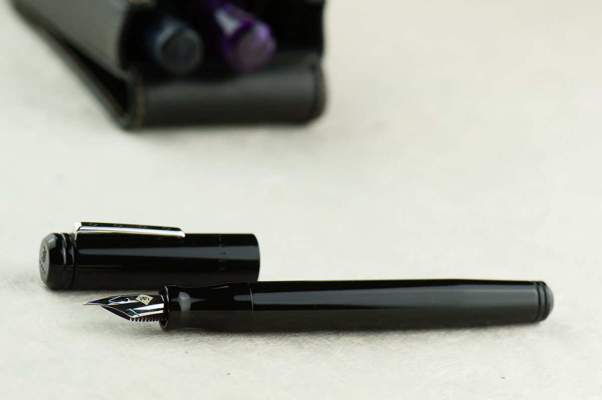
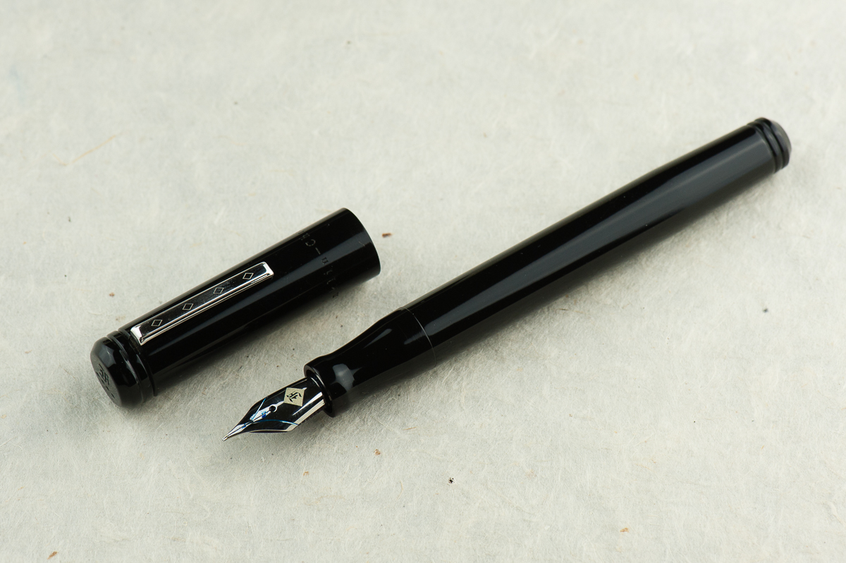
Franz: Fountain Pen Day 2013. Yep. That’s what I call this pen because I got this from Edison Pen Co.‘s current inventory offering on FPD. I never held an Edison Pearl before but c’mon! With the shape and the blue… I mean, the material, how can one go wrong? =) The Edison Pearl is part of Brian and Andrea Gray’s Signature Line of pens and you purchase one either by checking out their Current Inventory, or emailing them and ordering a custom one for yourself.
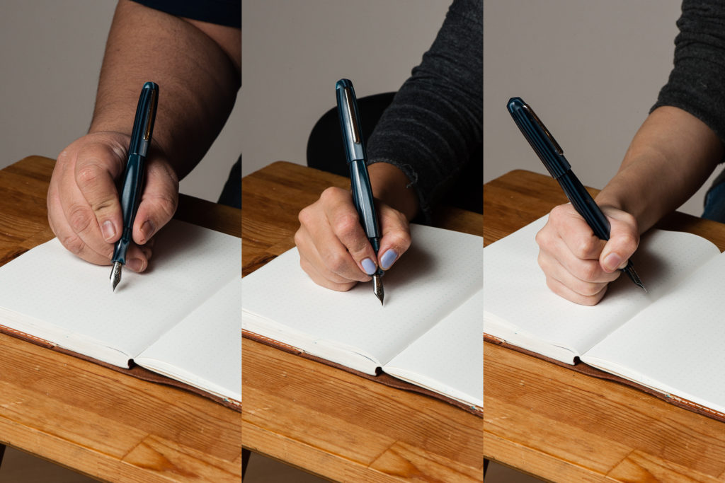
In the Hand: Edison Pearl (posted) — from left to right: Franz, Katherine, and Pam
In the Hand: Edison Pearl (unposted) — from left to right: Franz, Katherine, and Pam
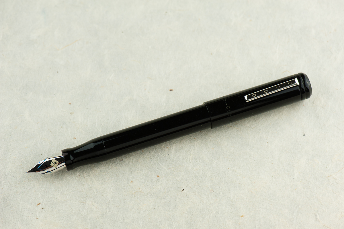
The Business End
Katherine: It’s a Jowo holder, but Brian Gray tunes the nibs quite nicely. Franz has this one paired with a smooth wet Fine nib, but think of all the other fun nibs it could house!
Pam: The fine nib is very smooth for its size and I find it touch glossy. A great compliment to Brian Gray’s tuning work. This is a great pen for those who would want to swap nibs.
Franz: Originally, this pen came with a medium 0.9mm cursive italic customized by Mr. Brian Gray and I love that nib. For this review, I just swapped it with a fine nib from another Edison Pen of mine. As with any well tuned nib, this fine is quite fine to write with. And I love how the nib (logo) within a nib looks!
Write It Up
Katherine: The Pearl is comfortable, but the “waist” on the section is a little deeper than I’d prefer. With narrower sections like this, my thumb tends to creep “forward” as I write, and eventually I end up in a Pam-like coma-grip (probably still not a vise-like).
Pam: I find the width of the Pearl to be quite comfortable. Alas, the threads fall right at where I would grip. The threads are not too sharp, but I am reminded that they are there if I grip too hard. I don’t have too much contact with the waist of the section, and the section does widen to the width similar to the pen body.
Franz: Like Katherine, I found the section’s concave design a little too thin so I always gripped it by the threads. The Pearl may have a girthy barrel but the length is a little short when the cap is unposted. Unfortunately, the cap does not post securely and it makes it a bit too long. You can definitely see that in our hand comparisons above.
But nevertheless, using the Pearl unposted, I’ve written a couple of letters and lots of pages in my journal. The shorter length definitely gives me some fatigue but it’s fairly adequate for my bear paw.
EDC-ness
Katherine: The Pearl takes one and three fourths turns to uncap, and has a solid clip. Overall, no complaints from me on carrying this pen daily.
Pam: This pen is a great pen to for regular carry with a small number of rotations to uncap and a professional looking clip. I think this would be a very adventurous pen in the office!
Franz: I’ve used the Pearl for journaling, as well as in the office setting. The original 0.9mm cursive italic and the fine nib currently installed writes nicely on cheaper copier paper. My personal every day paper is Tomoe River and I enjoy the fine line for practicing some tiny writing.
Final Grip-ping Impressions
Katherine: Section aside, this pen is reminds me a lot of a Nakaya Piccolo, except in a much wider range of fun materials and lots of nib choices. Additionally, since the Pearl is part of Edison’s Signature line, it’s customizable — so you could get one at a Piccolo length, or a longer one if you have oversize hands. As with any customizable pen, it all comes down to your preferences — but as a base, the Pearl has great (to me!) shape and is very well made and immaculately finished.
Pam: I love custom pen makers. In a world where we obsess over the perfect shade of ink, the feel of nib and line widths; a customizable pen is ideal. I would recommend this pen for those discerning individuals who enjoy building their own pen from a great maker.
Franz: The Edison Pearl is a fantastic example of Edison Pen’s quality of pen making. I’ve had this pen for five years now and even though it’s not a pen always inked up, I keep it in mind when rotating pens.
After the Pearl, I discovered and liked the longer pens that the Edison Pen Co. creates. The Huron and the Glenmont are pens that I currently favor more due to the length. Both have flat end designs. The Pearl seems to have a more unique shape among their line and perhaps I’d want one customized to be a little longer. Ahem…maybe next year? =)
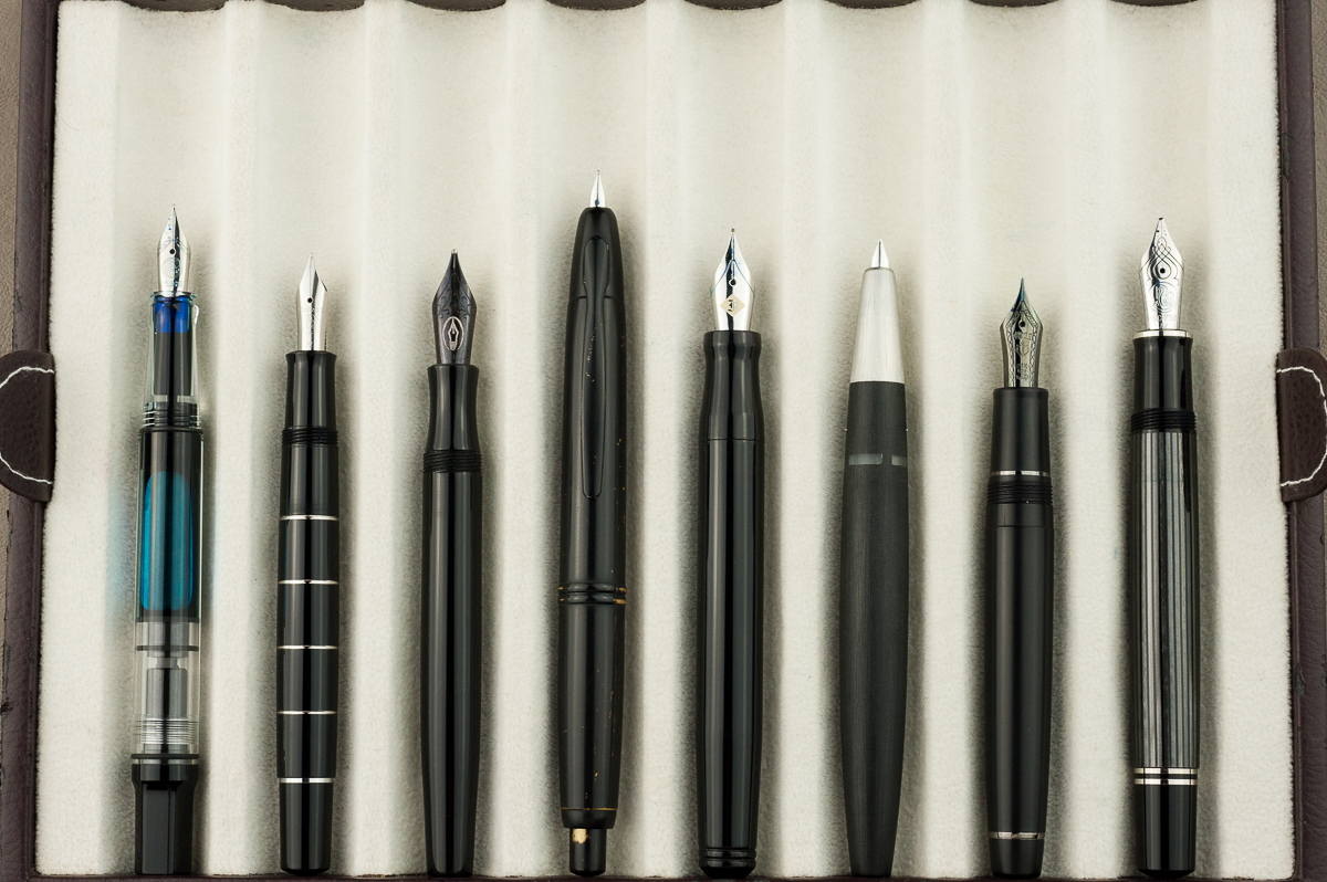
Pen Comparisons
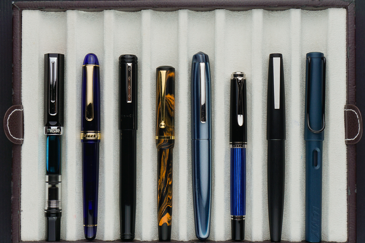
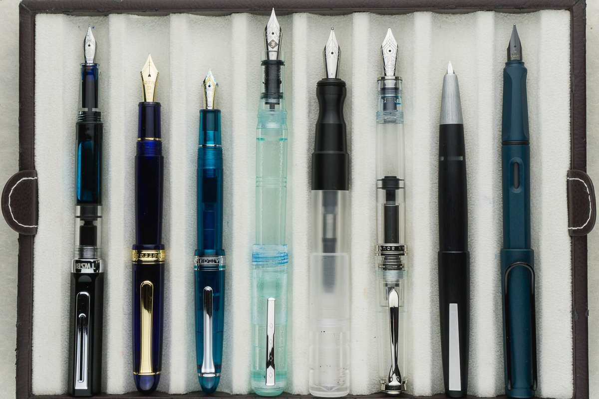
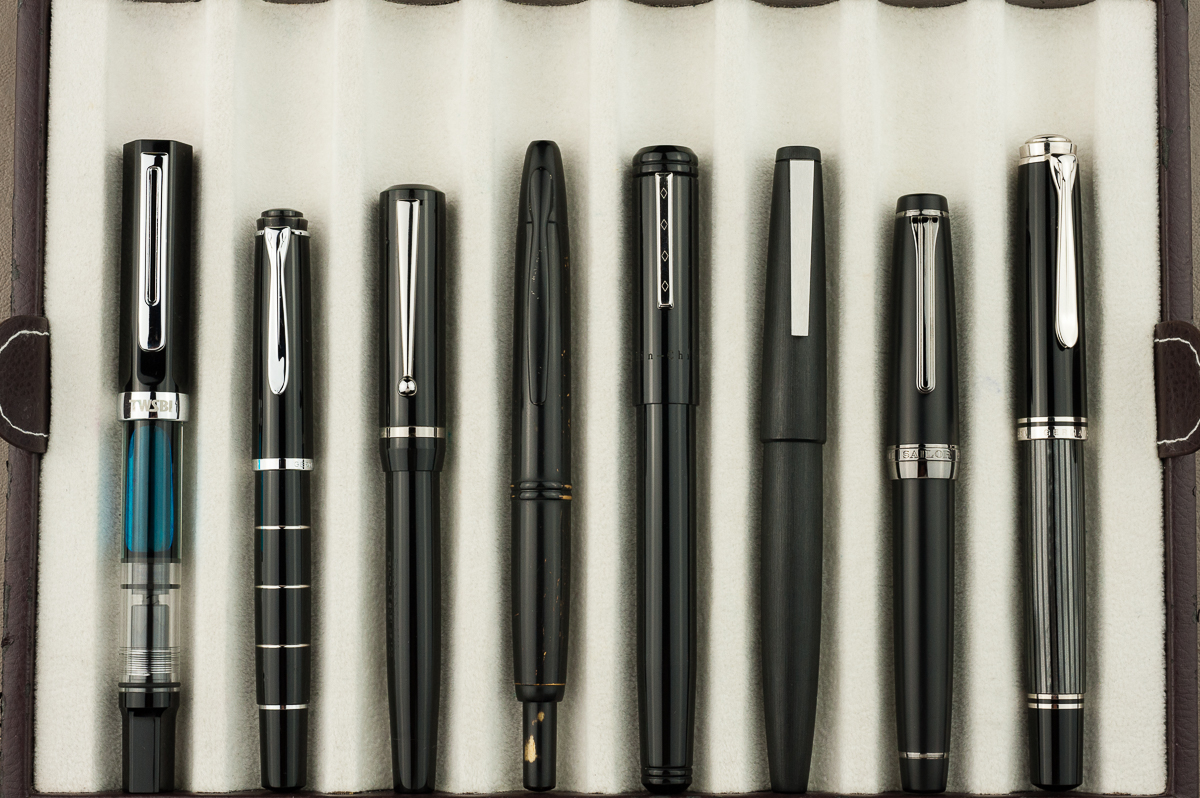
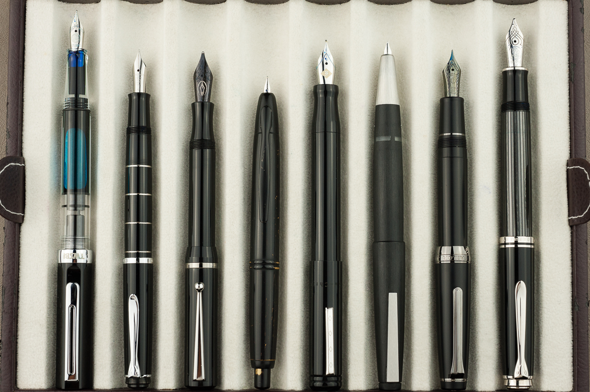
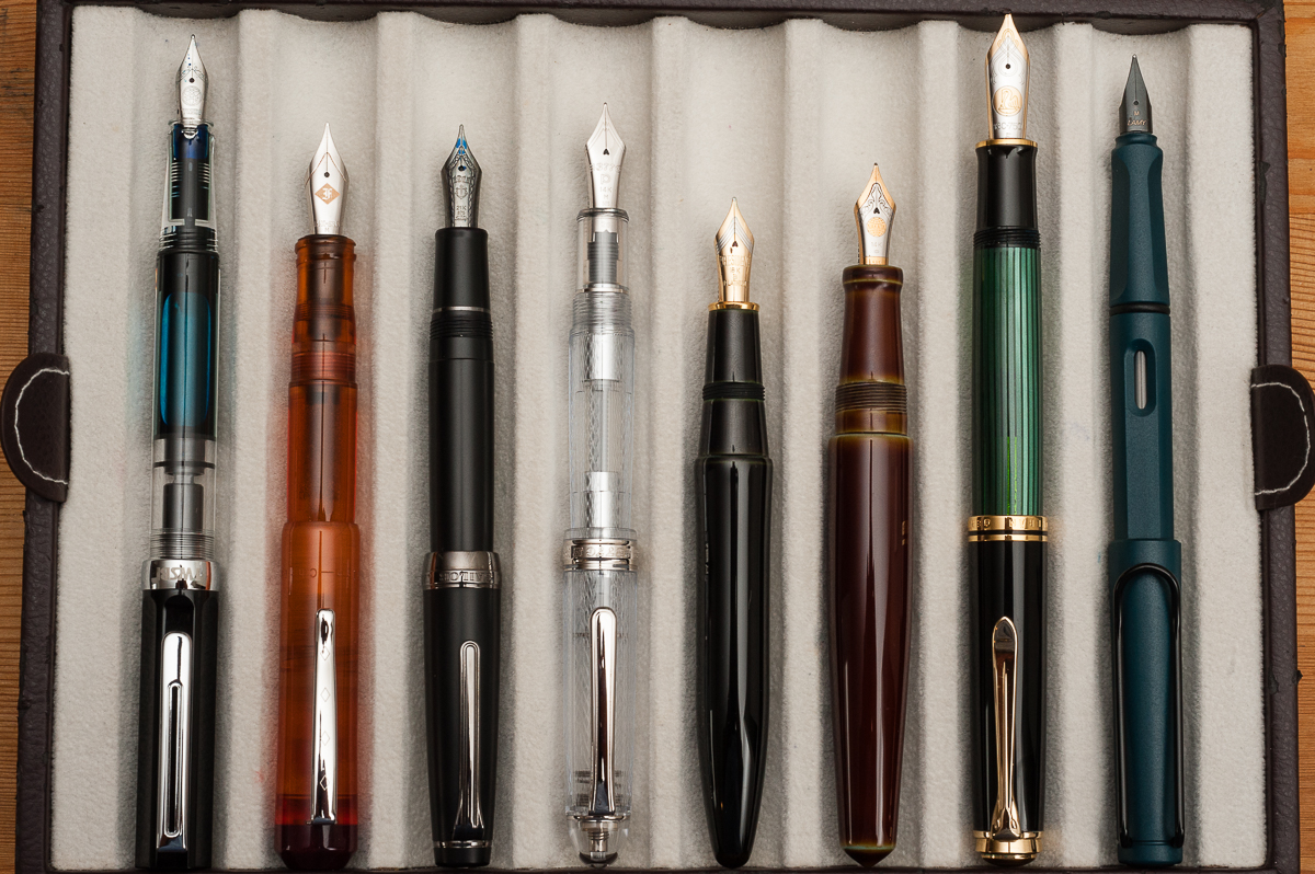
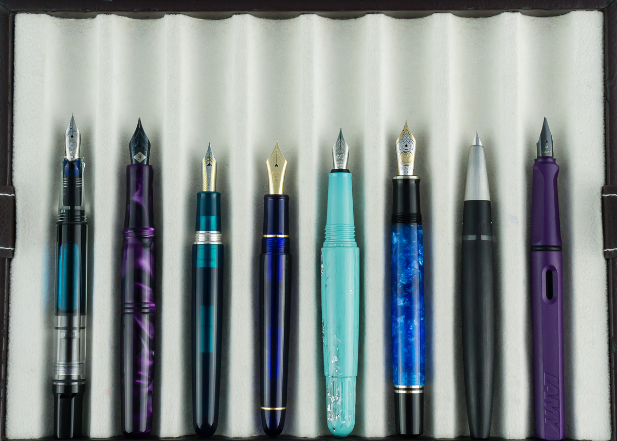
Closed pens from left to right: TWSBI Eco, Platinum 3776, Franklin-Christoph Model 20, Edison Beaumont, *Edison Pearl*, Pelikan M405, Lamy 2000, and Lamy Safari
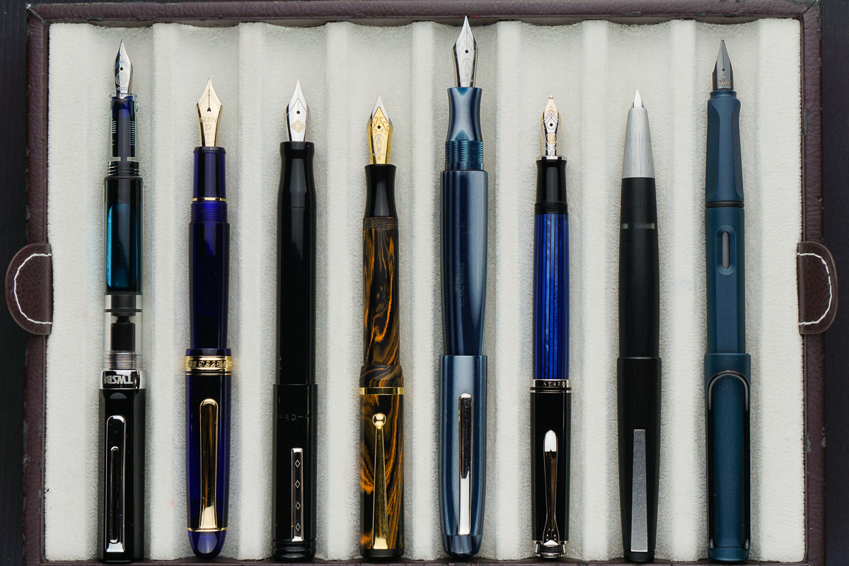
Posted pens from left to right: TWSBI Eco, Platinum 3776, Franklin-Christoph Model 20, Edison Beaumont, *Edison Pearl*, Pelikan M405, Lamy 2000, and Lamy Safari
Unposted pens from left to right: TWSBI Eco, Platinum 3776, Franklin-Christoph Model 20, Edison Beaumont, *Edison Pearl*, Pelikan M405, Lamy 2000, and Lamy Safari
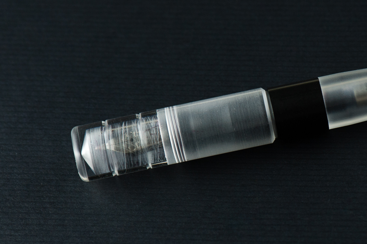
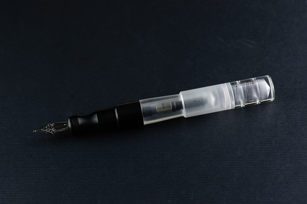
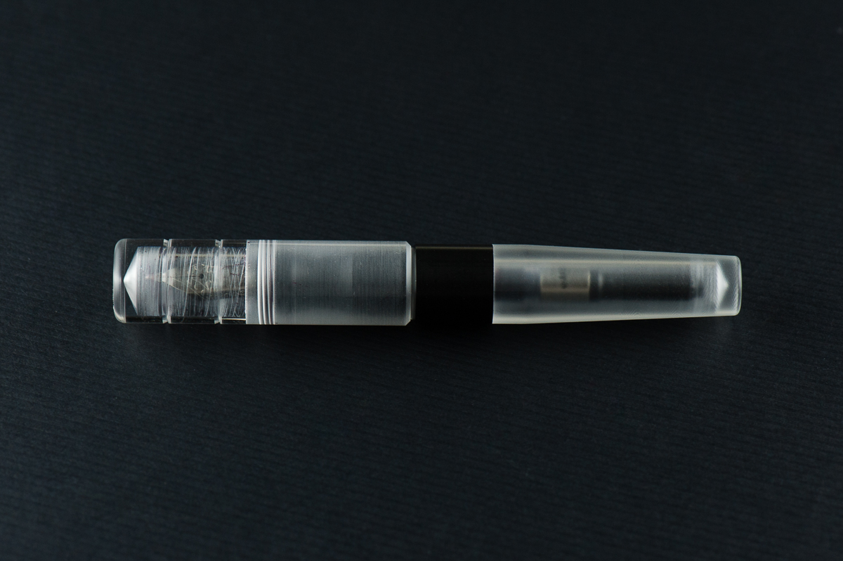
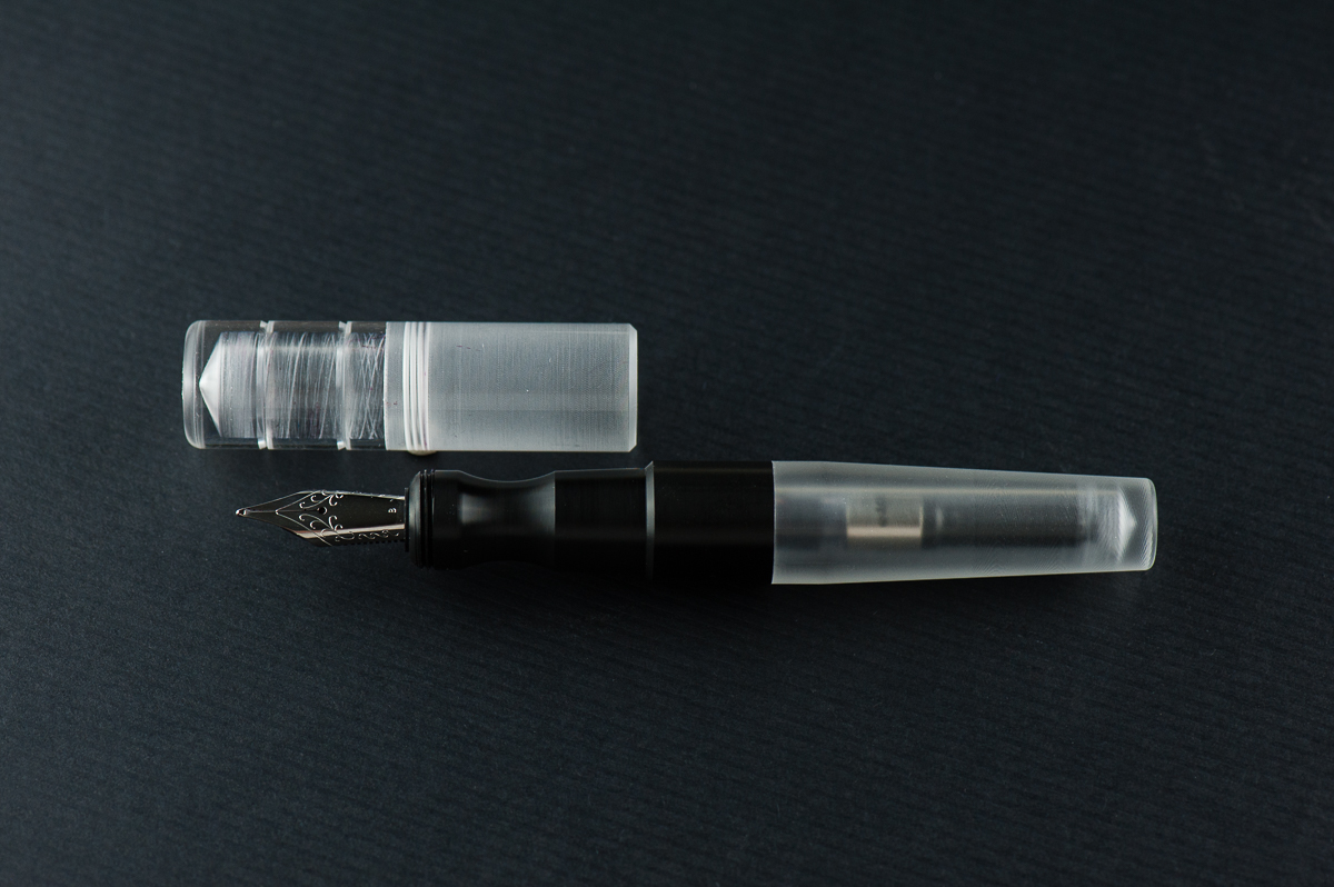
Katherine: I love short and chubby pens — so the Kasama Una is right down my alley. I also love demonstrators, despite not owning too many, so that’s another check mark. When Kasama first started selling the Unas, I was a little disappointed that they had delrin sections, instead of being entirely translucent, but now that I’ve spent some time with it, it’s grown on me a lot!
Pam: I am so glad that Franz and Katherine are my gateways to the awesome pen and stationary community in the Phillipines. The Kasama Una is a very modern pen with the translucent and black material. The acrylic feels good to the hand, and the section is Delrin which feels fantastic. It feels warmer than the acrylic in my opinion. The shape of the pen seems disproportional to me at first glance, however, after picking it up, it makes a lot of sense. The cap adds to the oversized nature of the pen, however, the pen body itself is proportional in your hand.
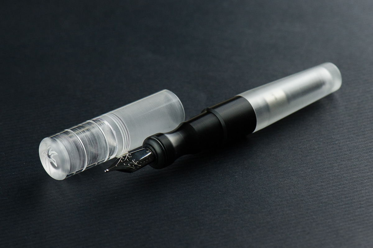
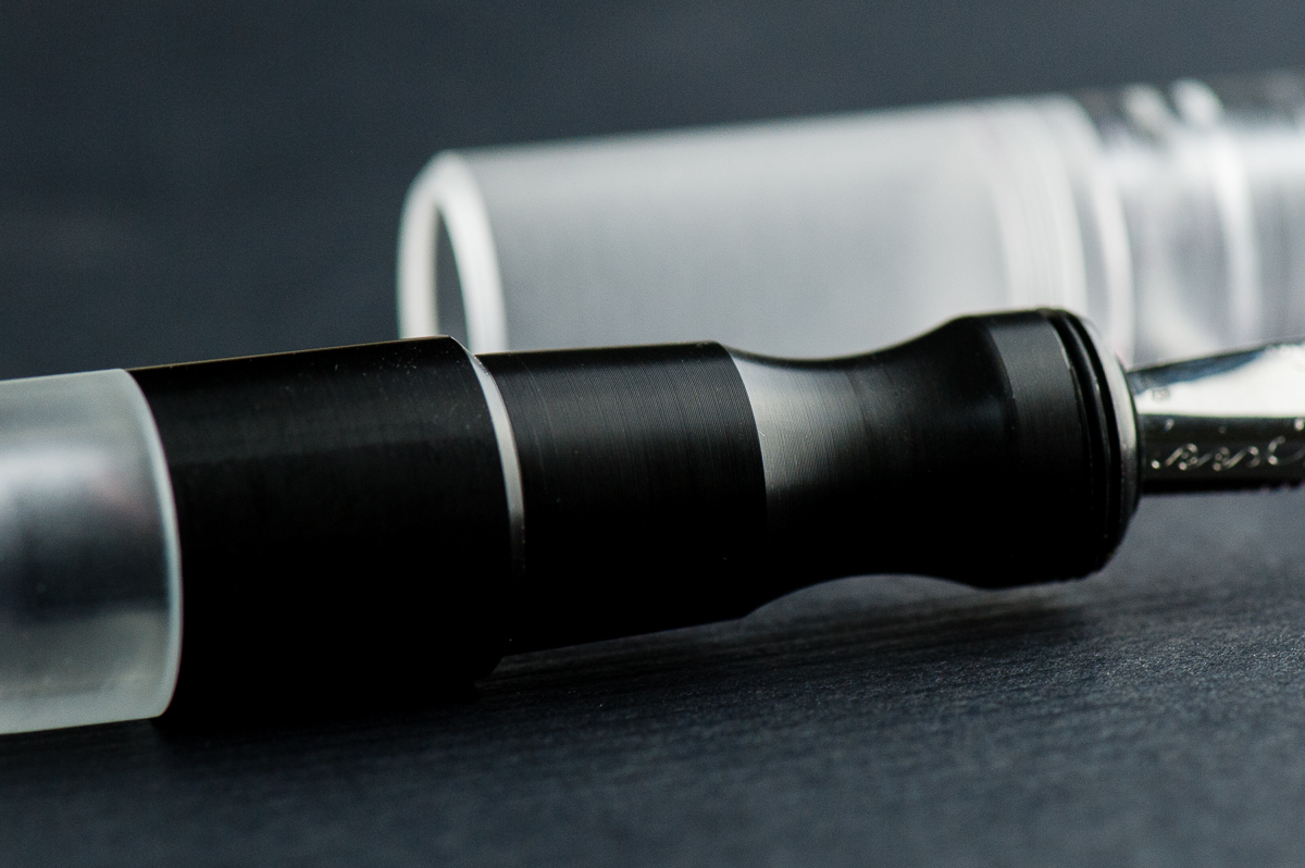
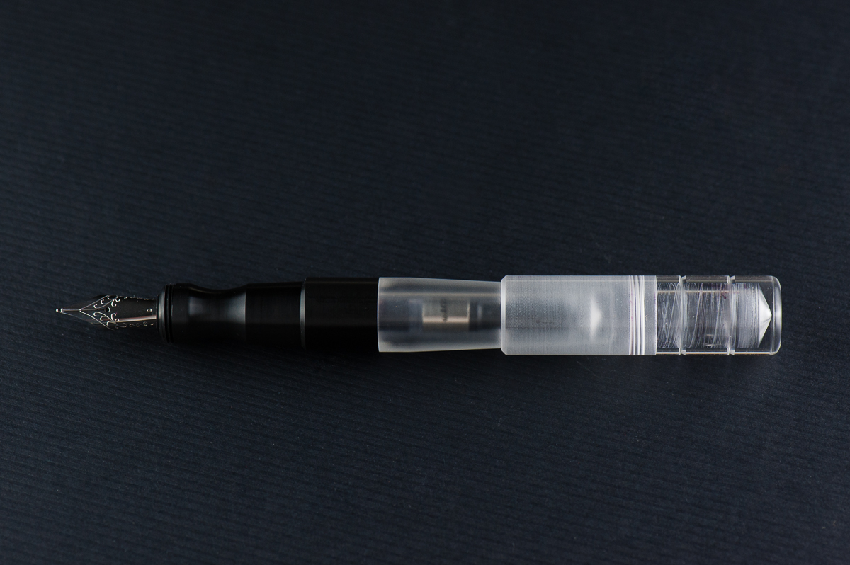
Franz: One of the things I love about this pen hobby is being able to check out cool things either in terms of design or materials. And this Kasama Una fountain pen definitely piques my interest in both of those aspects. Honestly, what drew my attention to this pen is its section. It’s oddly shaped, weirdly ergonomic, and that delrin material is prrretty cool! Actually, it seems that the Kasama folks created the pen around the features of the section (see their post on Instagram).
As Pam mentioned, Kasama is a new pen company from the Philippines and they create these Una pens in the Philippines as well. Kasama is a Filipino/Tagalog word that can mean a multitude of things depending on its usage and context. Some of which are: companion, fellow, friend, being included, or being in one’s company, etc. Una in tagalog means first which is befitting since this is Kasama’s first fountain pen.
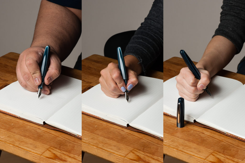
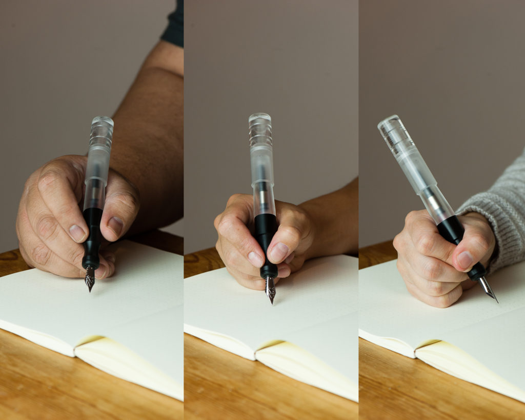
In the Hand: Kasama Una (posted) — from left to right: Franz, Katherine, and Pam
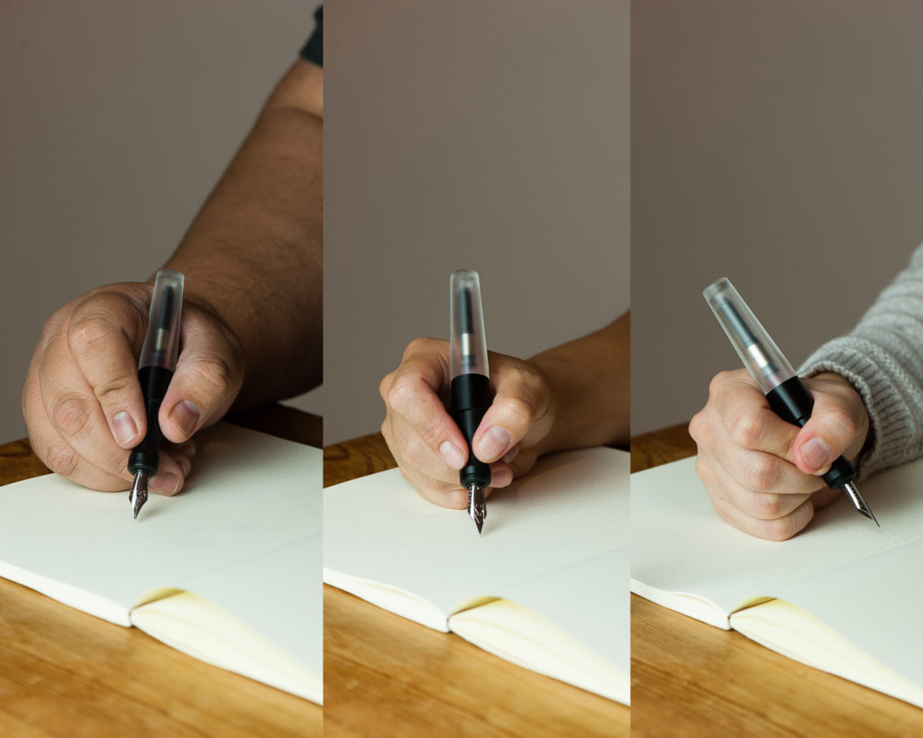
In the Hand: Kasama Una (unposted) — from left to right: Franz, Katherine, and Pam
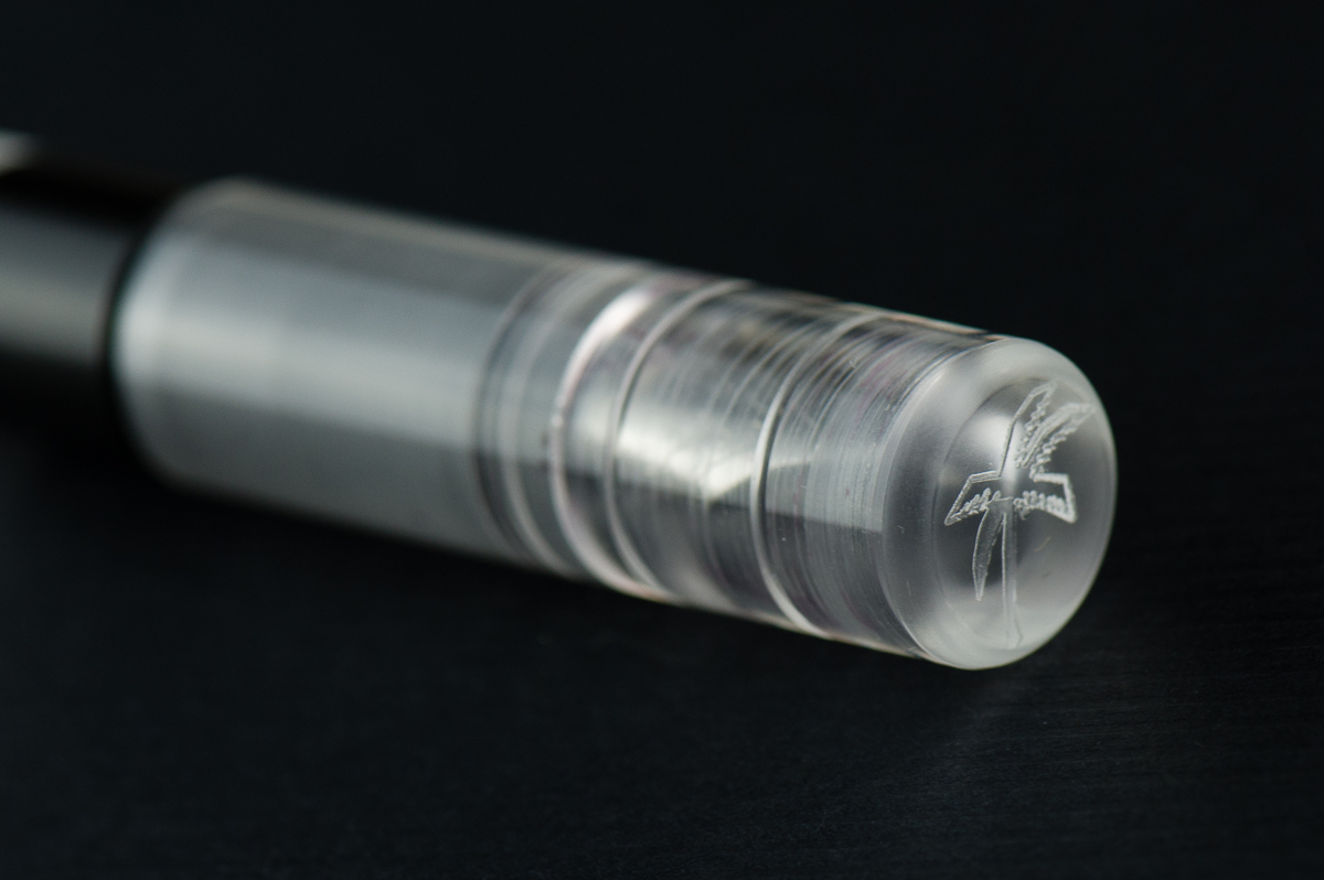
Detail Shots
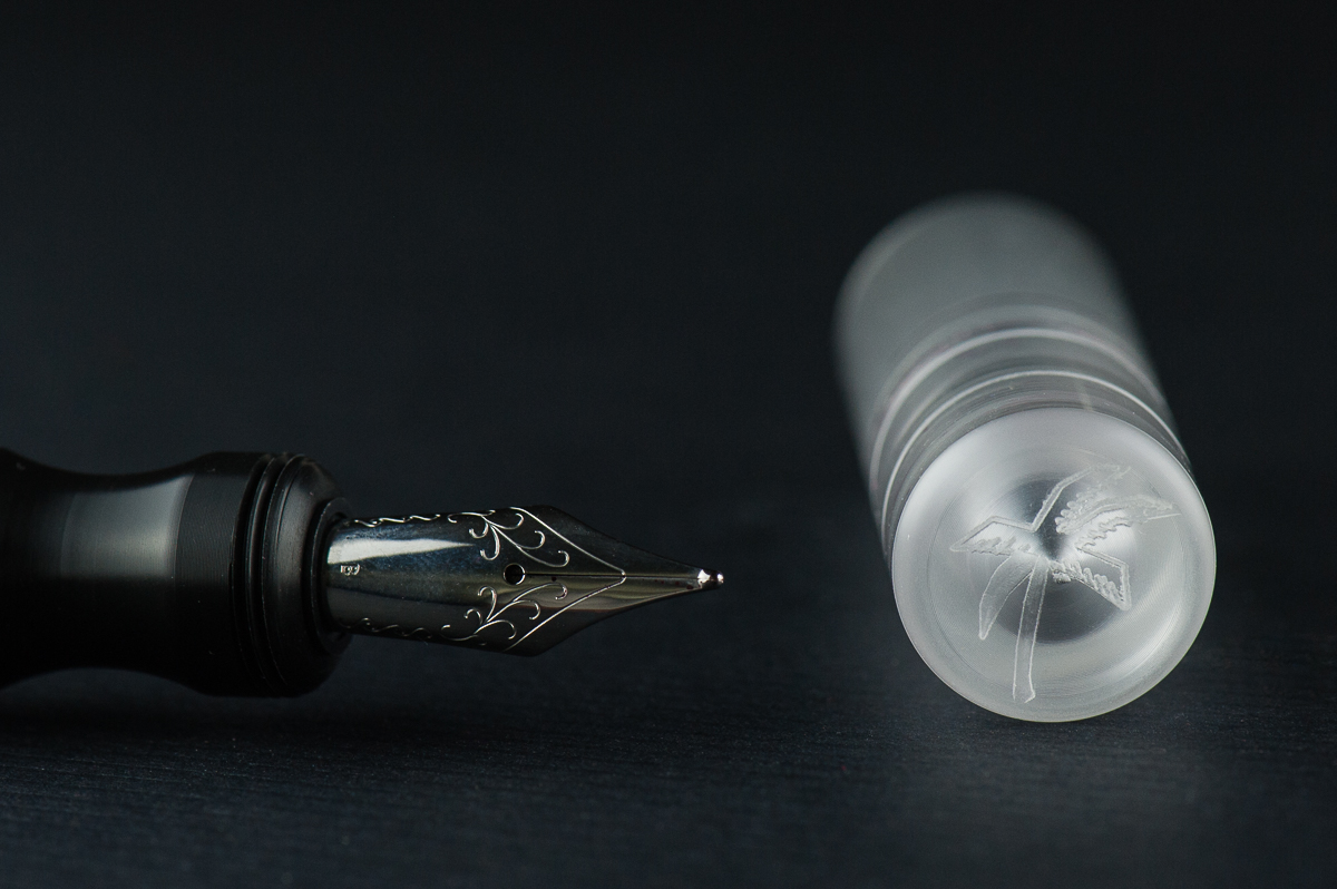
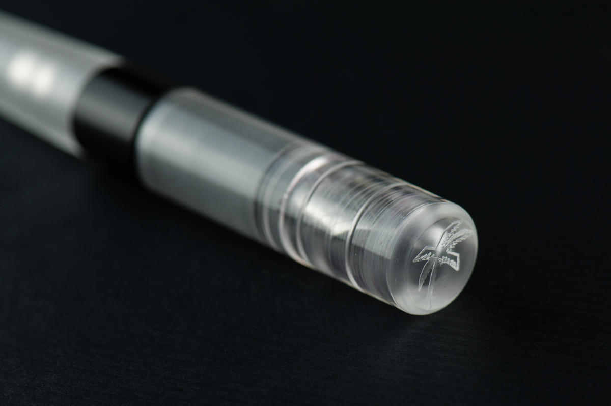
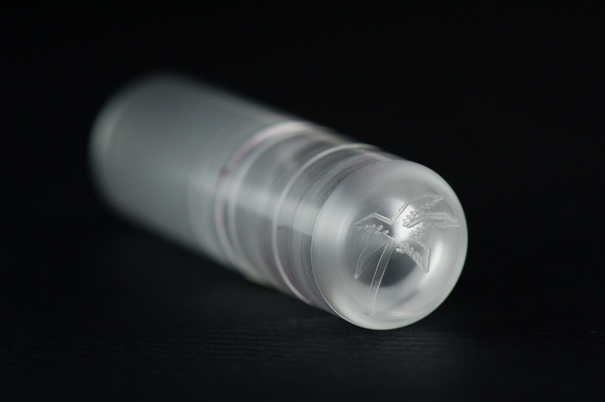
Kasama logo on the Una’s finial
The semi-translucent cap reveals its interior shape, cap threads, and the nib
The Delrin section shows very fine lines however they are smooth to hold.
The Business End
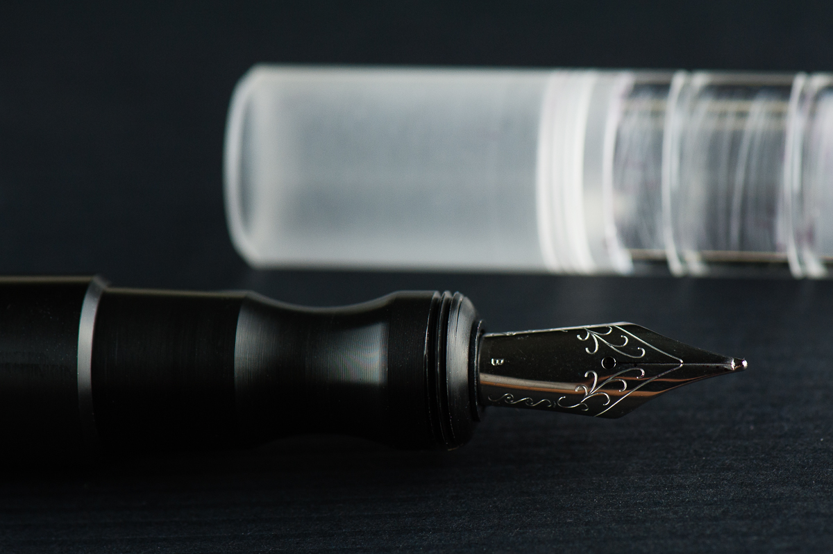
Katherine: It’s a Jowo broad that’s super smooth (I’m not sure if they did any tuning work, but I know they do grinds on some nibs). Not my favorite width, but Jowo threads are standard, so I’m excited to swap it out after this review is done.
Pam: The nib is a stock Jowo broad nib that is glass smooth. It performed well and provided a well saturated line. Not much variation from the standard quality of the Jowo nibs in terms of stiffness or performance. This nib is just smoother than usual so I am not sure if it was tuned or not.
Franz: Perfectly tuned broad and juicy nib. And I love me some broad nibs! =) And yep, being a Jowo nib you can swap it with other similarly sized ones.
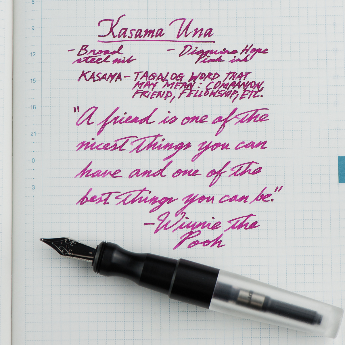
Franz’ writing sample on a Hobonichi Cousin journal
Write It Up
Katherine: I suspect the Kasama Una’s shape will be pretty polarizing. It has a very deep waist where you hold the pen, so this either works for you or it doesn’t. Personally, it works great for me and is very comfortable, but I’m not surprised it doesn’t work for Pam. It does force me to hold my pen at a reasonable distance from the nib though, versus my natural tendency to hold pens further forward.
Pam: I had a really hard time wrapping my hands around this pen, literally. The Kasama Una has a cap that encapsulates the section as well. It leads to the step being higher up on a pen than most pens. The step is very smooth so it doesn’t bite into the flesh between thumb and pointer finger, but it is noticeable and can be annoying. The section has a pretty deep groove that is super comfortable for the tripod grip but gets wonky for me in my tiger fist grip. Adding to the comfort of the tripod grip is the extra width to the pen.
Franz: Writing with the Una is quite enjoyable since it is on the larger side of the pen scale. What won me over is how comfortable the pen’s section is even if my grip lands on the pinched area. Either when the cap was posted or not, I wrote effortlessly for a long period of time.
A thing to note, the cap posts deeply however sometimes if it’s not secure it becomes lopsided or may even come off while writing. This could be user error in my part because I also didn’t want to use force since it wasn’t my pen.
EDC-ness
Katherine: Totally EDC-able, though I don’t remember offhand how many rotations it takes to get the cap off — I think two? Ish? Either way, it’s an easy to carry pen that has a rugged aesthetic that suggests durability. One of the later editions of this pen was made from ultem, a super durable plastic — I have one on the way, drop test here we come!
Pam: This pen won’t be lost in your pocket, clip or no clip. There wasn’t a drop test but the acrylic body does appear to be of high quality. Scratches may be more evident on the material and finish. It only takes about 2 turns to uncap the pen so it’s a great pen for pick notes if you can spare two hands. My only gripe is that the body section can also unscrew as you attempt to unscrew the cap depending on the force applied. It’s because the threads for the body and the cap are cut in the same direction. It doesn’t happen often and surely something that can be improved upon in later iterations of this pen.
Franz: First (Una ;-P) to answer the number of turns, it took one and 3 quarter turns to cap or uncap the Una. Not bad for a daily use pen! This pen stayed in my shirt pocket fairly secured even without a clip. And because it is a larger pen, I didn’t have to fish it out to use it. Of course with the cheap copier paper and the broad nib, I definitely didn’t use it very often at work. But if fitted with a finer nib, this pen will be great to use.
A feature I’d like to highlight is the Delrin section’s fine machined lines. It’s smooth to the touch but you can feel a hint of texture. =)
The Una is a cartridge/converter filler and they include a standard international converter with it. I imagine that you can eyedropper this one as well but since it was Katherine’s pen, I didn’t attempt to do so.
Final Grip-ping Impressions
Katherine: I’m excited to see more makers in the pen scene, and especially excited to see that Kasama went for a more unique design, not another standard-ish girth stick or rounded stick CNC pen. The pen itself is well made (though there was a sharp point on the end of the barrel, I sanded it down, but that would have been easy to do in shop) and solidly made. My only real gripe with this pen is that the section<>barrel and section<>cap threads turn in the same direction — so if you don’t tighten the section<>barrel well, unscrewing the cap can unscrew the barrel instead. This hasn’t been an issue for me, but it’s a small design change that could go a long way.
Pam: This is a solid pen and well worth a try, especially for those who prefer a wider pen. It has the potential to be made with a variety of acrylics and delrin and very comfortable for longer writing session. Other than the section, which is a deal breaker for the pixie fist grip that I have, I would recommend this pen. Good thing Katherine has one I can play with occasionally!
Franz: To sum up, I really love the Una fountain pen. I’d largely attribute that to the design: interestingly shaped Delrin section, machined lines on the cap, translucent cap that shows the nib underneath, and a couple more things.
Katherine and Pam pointed out probably the biggest issue with this pen though. The Una’s thread design can be a little frustrating if you’re in a rush to write but then you find that you unscrewed the barrel instead. Annoying? Sure. But I’d be getting one anyway. Because… penvy (pen envy). Darn you Katherine for making me spend money!
My chosen quote from the writing sample above fits my gratitude of being friends with Katherine and Pam in this fun little project we call HOTP. They are my “kasama” in this blog. Thanks ladies! And thank you all for your readership. =)
“A friend is one of the nicest things you can have and one of the best things you can be.” — Winnie The Pooh
Pen Comparisons
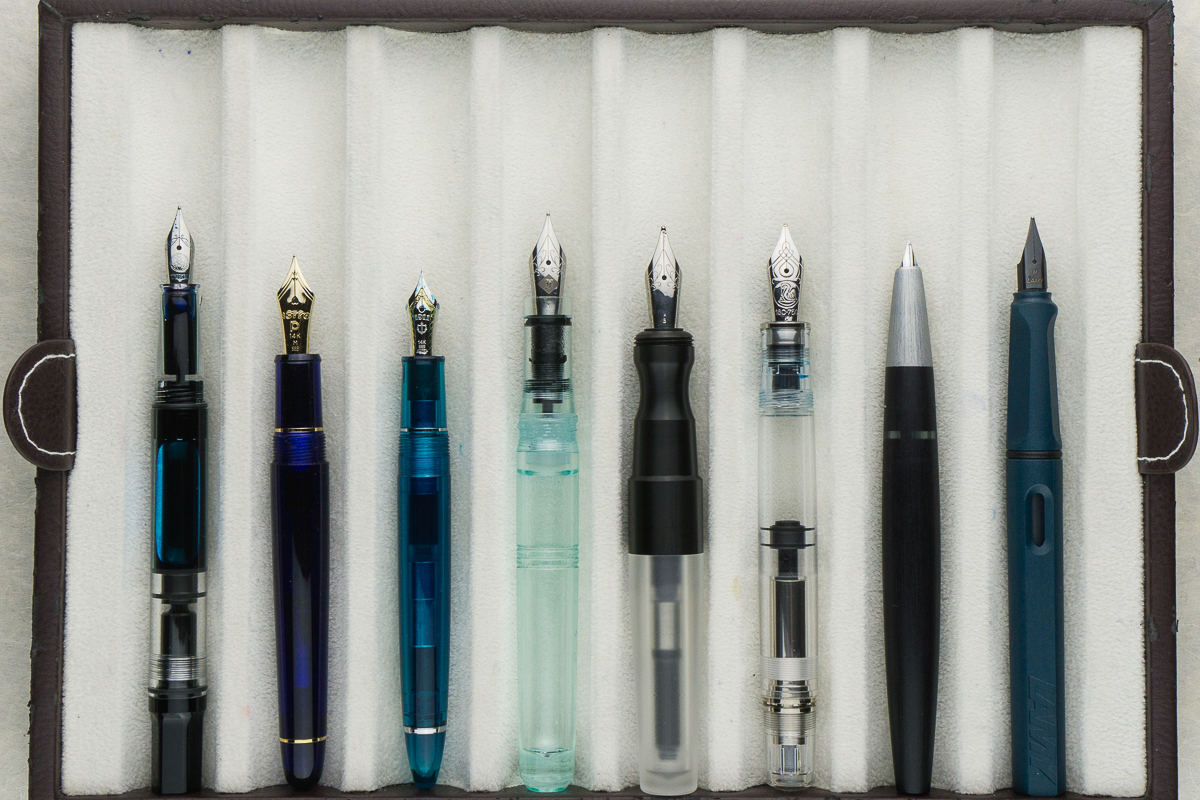
Closed pens from left to right: TWSBI Eco, Platinum 3776, Sailor 1911S, Franklin-Christoph Model 31, *Kasama Una*, Pelikan M805, Lamy 2000, and Lamy Safari
Posted pens from left to right: TWSBI Eco, Platinum 3776, Sailor 1911S, Franklin-Christoph Model 31, *Kasama Una*, Pelikan M805, Lamy 2000, and Lamy Safari
Unposted pens from left to right: TWSBI Eco, Platinum 3776, Sailor 1911S, Franklin-Christoph Model 31, *Kasama Una*, Pelikan M805, Lamy 2000, and Lamy Safari
It’s that time of the year again — holiday cards! I ordered this year’s batch of cards from Minted, so I thought I’d share a quick writing sample incase other folks were interested —
The paper seems to be coated, so many inks seem to sit on top of it, the exceptions are Pilot Blue Black (but feathered quite a bit when wet), Platinum Carbon Black (a little feathering, but much less) and Sailor inks, other than Sei-Boku.
Wetter pens seem to saturate the paper enough to get through the coating, but some do feather.
A tiny bit of feathering with PCB when it’s really wet, but it’s overall easily readable, and I wouldn’t hesitate about putting it in the mail when it’s wet and rainy. (I ordered post cards)
All in all, these aren’t fountain-pen friendly, but are tolerant if you’re willing to do a little experimentation and find a nib and ink that work for you. If you want to play it safe, Platinum Carbon Black delivers.
Have you ordered from another online card printer? Want to do a guest post, let us know!
Katherine: I love the shape of this pen — it’s so clean and well proportioned. My one gripe, as with the Pocket 20, is I don’t love the lines on the cap and at the end of the barrel. I’ve owned two Model 20s, but over time I’ve sold both. I love the frosted finishes, but the barrel is too large for me to want to eyedropper the pen (because I’ll never be able to write it dry) and they don’t look quite as nice with converters.
Pam: Franklin-Christoph never disappoints. I am happy to review their classic Model 20. I was initially turned off by the shape of the pen when it saw it in the Ice and Antique Glass finish. In the black finish, it’s actually quite subtle and doesn’t bother me at all. One of my favorite features of this pen is the snap cap. It’s so practical for my specific use case.
Franz: The Model 20 looks so simple and sleek! The beveled flat ends, and the very slight taper of the barrel give the pen a lovely silhouette. Actually, the barrel’s slight taper is there for both function and form. I’ll expand more on that later on. For now, I’m just saying that the Model 20 Marietta looks oh so good! =)
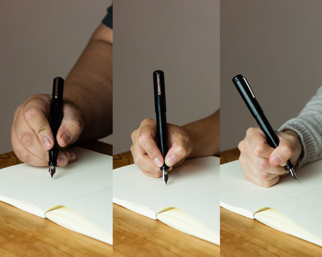
In the Hand: Franklin-Christoph Model 20 (posted) — from left to right: Franz, Katherine, and Pam
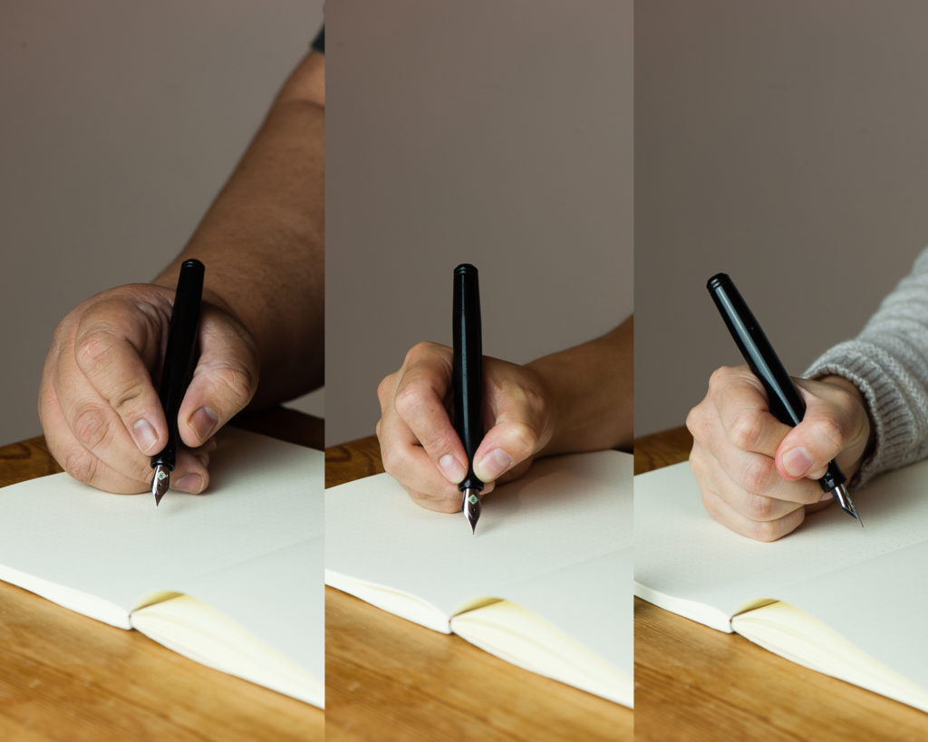
In the Hand: Franklin-Christoph Model 20 (unposted) — from left to right: Franz, Katherine, and Pam
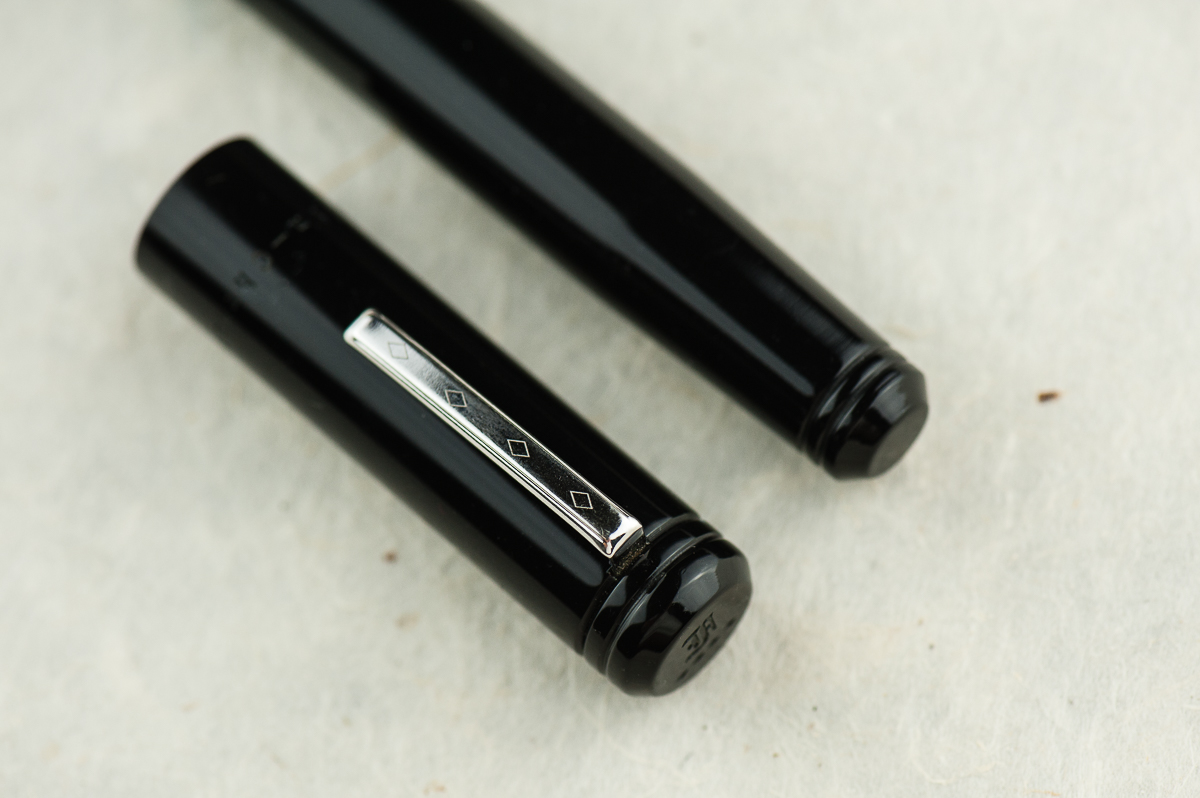
Details: Franklin-Christoph’s logo engraved on the cap’s finial, and the flat end of the barrel.
Details: Beveled ends of the cap and barrel, Franklin-Christoph’s Diamond design on the clip, and the rings designed on each end.
The Business End
Katherine: Yay Masuyama cursive italics! I prefer the Fine, but the Medium is similarly smooth while still be nice and crisp.
Pam: The nib is a Masuyama M cursive italic that was tuned by Jim Rouse at time of purchase. The cursive italic has a small amount of bite, but nothing bothersome. It’s also the nature of a cursive italic grind to be less smooth than a typical stub grind. Like always, it’s a joy to write with and the bit of a bite is pleasant feedback.
Franz: As far as I know, when Franklin-Christoph introduced the Model 20 in early 2015, it was the first recessed nib fountain pen they had. And that design alone attracted me to the Marietta at the 2015 LA Pen Show. It wasn’t sold back then but I knew I had to have one!
The Model 20 is fitted with a #6 size Jowo nib like most of their larger pens. This nib in particular was pre-ground to a cursive italic by Mr. Mike Masuyama and then as with all F-C pens sold, it was finally adjusted by Mr. Jim Rouse to my liking. It provides a crisp line and also quite forgiving.
Write It Up
Katherine: This pen is definitely comfortable — it’s light and the section is a good size! I’ve definitely written page upon page with this pen, it’s unobtrusive and, paired with a nice grind, lots of fun.
Pam: Due to the lack of threads, my typical writing grip is REALLY comfortable. Yay for no threads or steps! The section is a good fit for me in the tripod grip. The little flare is quite helpful in keeping my fingers in check. However, due to the lack of a step and the seamless transition from section to body makes it so the section can accommodate larger fingers and grips. #bearpawsallpaws
I highly recommend using the pen unposted for those of the smaller hand persuasion. It’s a bit top heavy when posted. Without the cap the pen is nice and light.
Franz: Just like Pam, I definitely enjoyed the lack of threads on the barrel so that the pen can be held at any spot you’re comfortable with. As for myself, I was comfortable gripping either on the pinched section or the barrel itself. Also, both writing modes (posted and unposted) were very comfortable for my large paw. As a preference though, I prefer the cap posted for it gives more weight and a better balance for me. With the cap unposted, the pen seemed to be a little too light.
EDC-ness
Katherine: I’m not generally good at tightening my caps or well… remembering to close things all the way. Except the fridge. And the Model 20 is no different, but the slip cap is even more dangerous. As a desk pen, or one sandwiched in a notebook, it’s generally fine — but if I relied on the clip, I had several close calls with the body sliiiiiding away toward the floor. Yikes. It’s super convenient, but because it’s a slip, not snap cap, I have a pretty hard time telling when I’ve closed it “enough”.
Pam: As mentioned previously, this pen is one of the best EDCs for me. The snap cap makes this pen really easy to deploy and use for quick notes and comfortable enough for longer writing sessions. It’s a great all rounder pen for me. The clip was secure and the capping was easy. The only thing missing from the capping action is a satisfying snap like the Pilot Prera. (Insert total bias disclaimer here.) It’s hard for me to determine when the cap is securely capped but it is a snug fit and I haven’t had issues with the pen falling out into my pocket.
Franz: Another top reason why I was attracted to the Model 20 is its slip cap feature which makes it a perfect candidate for an every day carry pen. The two ladies’ comments about the pen not having a positive snap is very valid and was one of my issues when I first got the Marietta. However, after watching Scott Franklin’s introduction video of the Model 20, I learned a lot about how the pen was engineered. So with just a liiiiitle push, the cap secures very well. And this works in both closing the pen, and posting the cap. The lip end of the section and the tapered end of the barrel was designed to attach firmly deep inside the cap. To detach the cap, it’s easier to just use one hand. If you’d like to watch the video, link is here Model 20 Marietta Introduction.
The Model 20 can be inked either via a cartridge/converter filler, or eye-droppered. I prefer using the supplied converter and it is a standard international one.
One thing to note, the clip on this Model 20 is the older version and it doesn’t clip to clothing easily. I’d need to lift the clip with my fingers and slip it in my dress shirt. Franklin-Christoph changed the clip to a better functioning one so that issue is solved.
Final Grip-ping Impressions
Katherine: This is a pen I thought I loved, but with use found that while I certainly enjoy it, it wasn’t true love. Even then, it’s more one of those “it’s not you, it’s me” things — it’s a very solid pen that’s fairly unique in the industry, but it’s got a couple quirks that just don’t work for me (the generally super convenient slip cap and the lines on the cap and barrel). But every time I see one for sale second hand… I’m tempted, maybe the third time’s the charm?
Pam: I know that I have mentioned that the Sailor Progear Slim is an “upgrade” to the Pilot Prera starter pen. I think the pocket Model 20 and Model 20 is the Western “upgrade” to the Pilot Prera. They both are snap caps and Franklin-Christoph boasts one of the largest variety of steel and golden #6 nibs on the market for their pens. If you want a great EDC pen with a variety of different nibs that can be swapped out, the Model 20 is close to perfect.
Franz: What else is there to say except to say that the Model 20 is one of my favorite pens to ink up! In the pen comparison photos below, it is very similar to a Pelikan M805 and that’s about the perfect pen size for my larger hands. The Model 20’s features check pretty much all the boxes for me. Simple aesthetic, larger size (length and girth), slip cap for quick deploy, lightweight, and a fantastic nib performance!
Like a lot of their pens, Franklin-Christoph offers the Model 20 in a few different colors on their site, and they also offer more color prototypes at pen shows. I definitely recommend this model for your daily use or even just part of your rotation. See if it’s a comfortable pen for your paws. =)
Pen Comparisons
Closed pens from left to right: TWSBI Eco, Pelikan M215, Edison Beaumont, Pilot Vanishing Point, *Franklin-Christoph Model 20*, Lamy 2000, Sailor Professional Gear, and Pelikan M805
Posted pens from left to right: TWSBI Eco, Pelikan M215, Edison Beaumont, Pilot Vanishing Point, *Franklin-Christoph Model 20*, Lamy 2000, Sailor Professional Gear, and Pelikan M805
Unposted pens from left to right: TWSBI Eco, Pelikan M215, Edison Beaumont, Pilot Vanishing Point, *Franklin-Christoph Model 20*, Lamy 2000, Sailor Professional Gear, and Pelikan M805
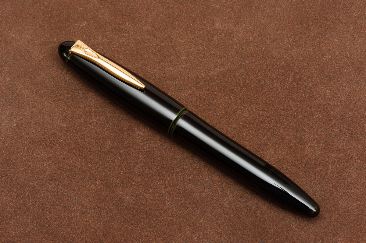
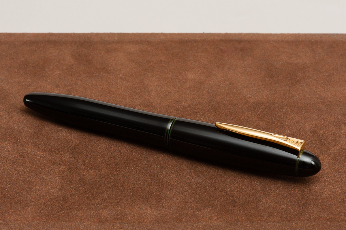
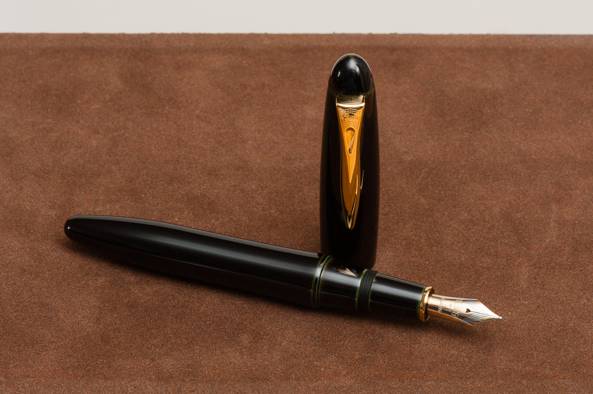
We would like to thank Pen Chalet for lending us this Platinum Izumo fountain pen for review. Pen Chalet is based in Mesa, Arizona and has been a company that sells pens and stationery items at competitive prices. They also frequently run promos for specially priced items as well as provide discount coupons. Check them out if you haven’t yet.
That being said, the opinions below are our own and we were not compensated (monetarily, or otherwise) for this review.
Hand Over That Pen, please!
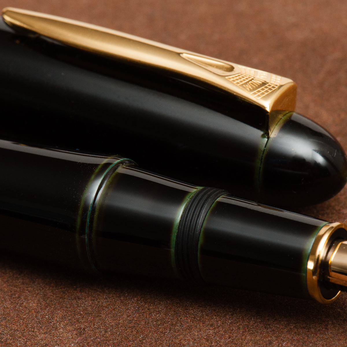
Katherine: The shape of the Izumo isn’t my jam… but I have a general bias against bulbous caps. Tapered? Maybe that’s a less graphic word. Anyway, general shape aside, the Izumo comes in many beautiful finishes (ugh I really wish I liked their base shape more!) this one is soratame, a green and black tamenuri, pretty subtle, but quite nice when you look closely. The pen also comes in a variety of other finishes, some of which are really quite breathtaking.
Pam: Whoa! This is a big pen! The urushi finish is flawless on a classic cigar shaped pen. At first glance, pen is really intimidating based on it’s size and finish. It’s not my aesthetic. To my untrained eye, I wouldn’t know that this pen had urushi on it because it’s just a boring black cigar shaped pen. The nib is a very business like nib. The design is either really retro or modern.
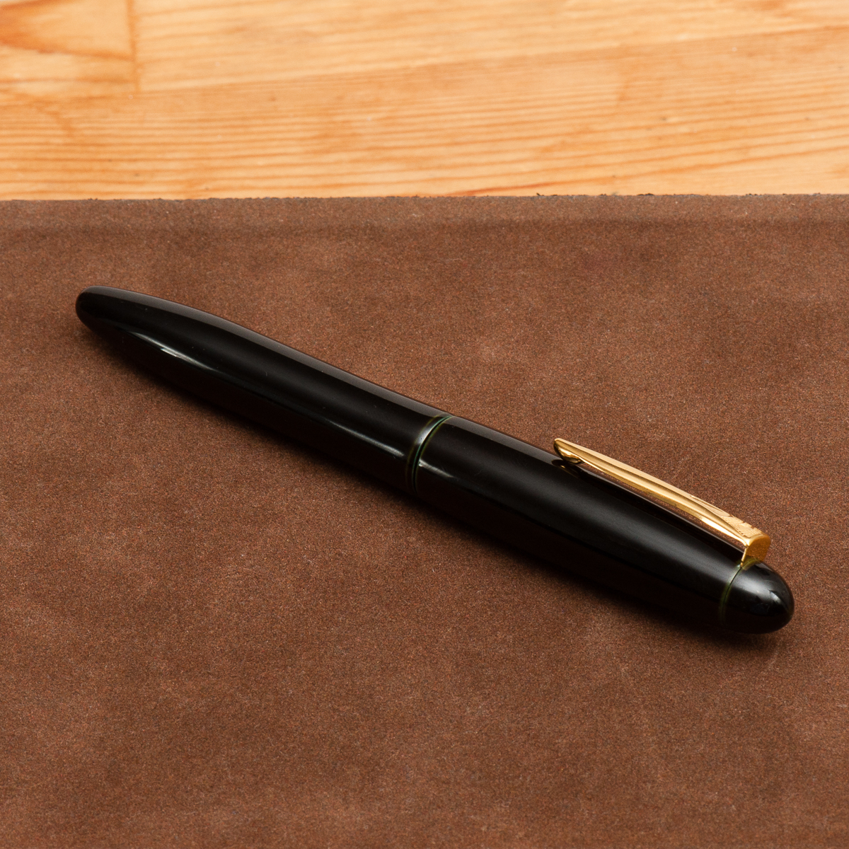
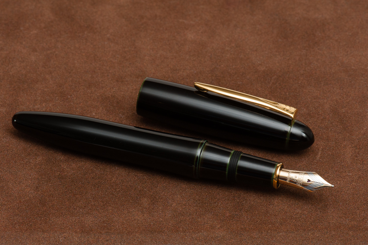
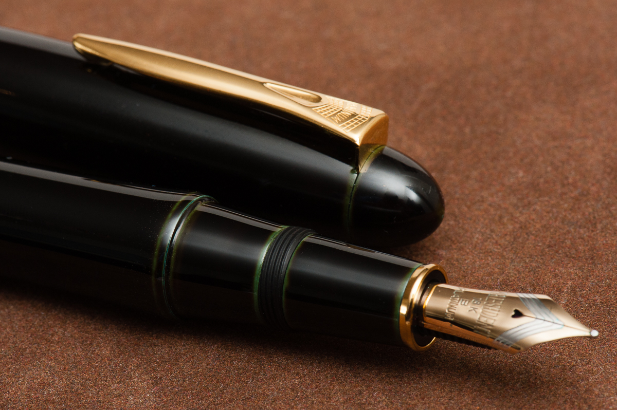
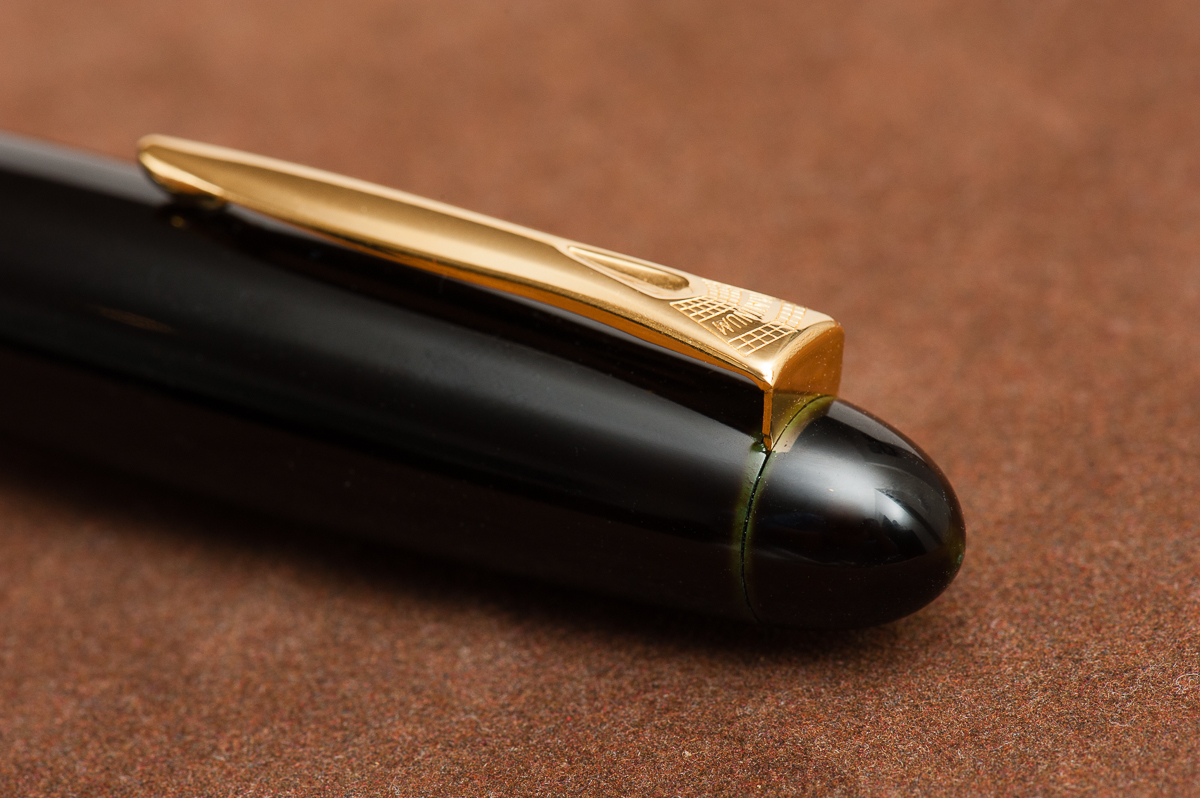
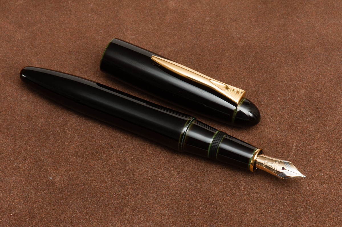
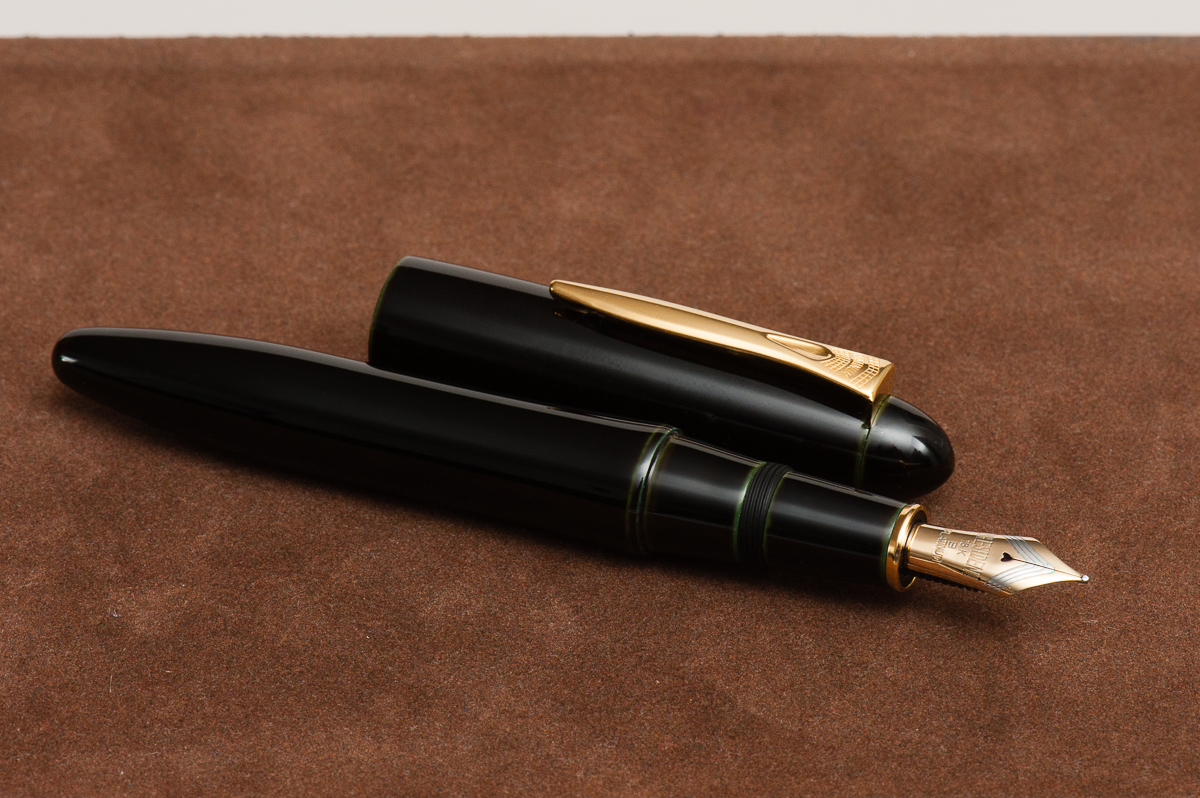
Franz: The Platinum Izumo is quite large, curvy and seems to create a grand stature. It’s like the pen says, “Hey look at me!” whilst flexing its muscles. I believe in the closed position, the pen is just a little over 6 inches. I’m one to appreciate urushi lacquered pens and this Soratame is beautiful and simple. I love the hints of color in the seams of the pen.
A close up of the Soratame finish
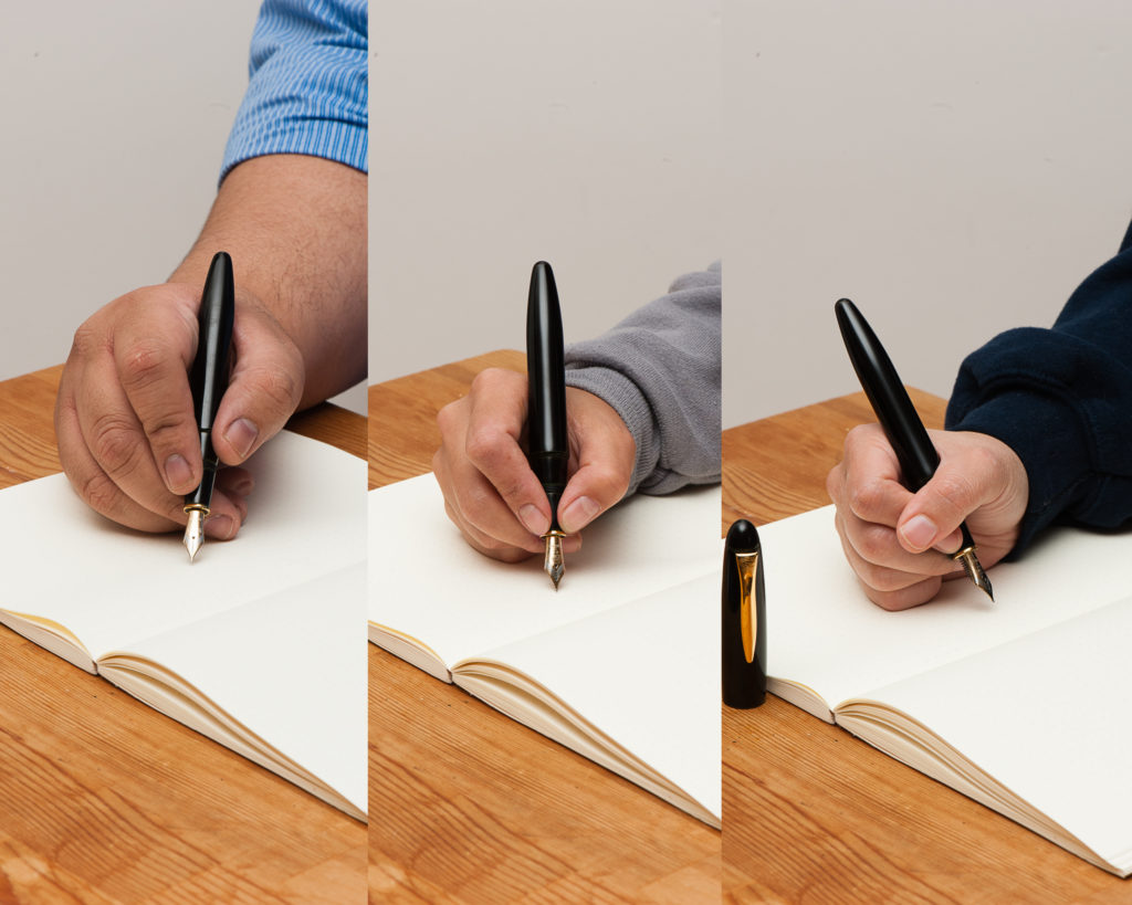
In the Hand: Platinum Izumo — from left to right: Franz, Katherine, and Pam
The Business End
Katherine: The Izumo nib feels much more “western” to me than the 3776 nib, but that’s a sample size of one. It’s smooth, wet and stiff — a great nib to get things done with, but not one I’m excited to write with.
Pam: I am going to enter a “expectations management” disclaimer. Given that this is a Platinum nib and my only experience with Platinum is through the 3776 nibs so my expectations included a characteristic and unique Platinum nib. I am biased. That being said, the Izumo nib is… serviceable. It’s just not memorable and lacks any characteristic that makes me want to pick it up again. It’s really really smooth which is fantastic for those looking that kind of writing experience. However, that’s not what I was expecting.
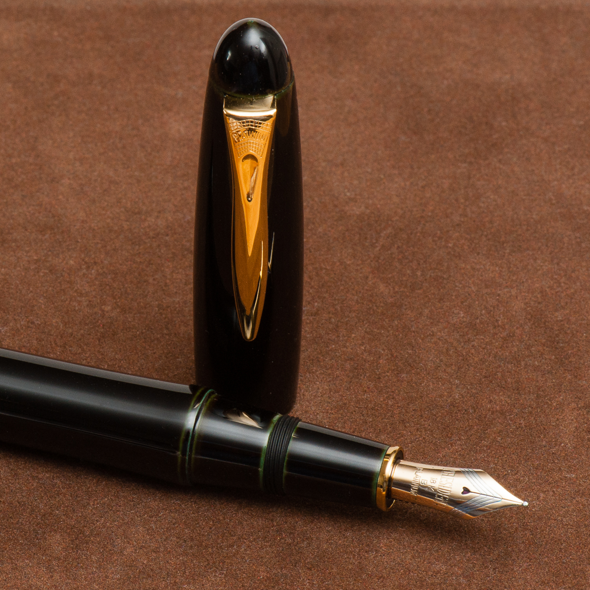
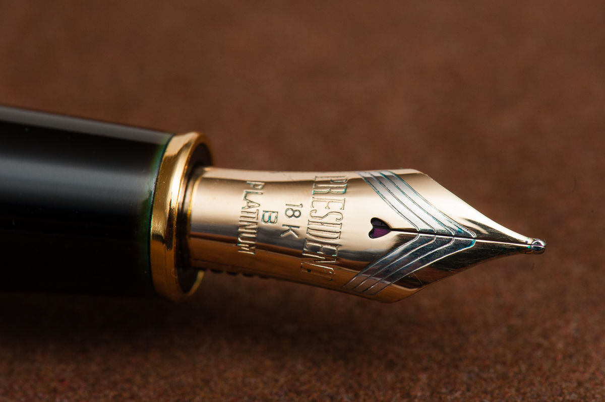
Franz: It was my first time to write with a President nib from Platinum and I echo the ladies’ comments above. It wrote smoothly, a good flow, and did not skip like any good nib should. I always love the heart-shaped breather holes of Platinum nibs.
The Platinum President nib
Write It Up
Katherine: The section of the Izumo is very comfortable (though that gold ring at the very front bugs me, especially on the dark and subtle soratame finish) — though it doesn’t have the “flare” at the very end that I prefer. It’s a heavier pen than I expected (a little heavier than the m800?) but very manageable, I’m just used to urushi pens being super light. All in all a comfortable and usable pen, but not outstandingly so.
Pam: The nib is fantastically smooth. Almost too smooth. There is no feedback and it lays down a nice saturated line without being overly wet.
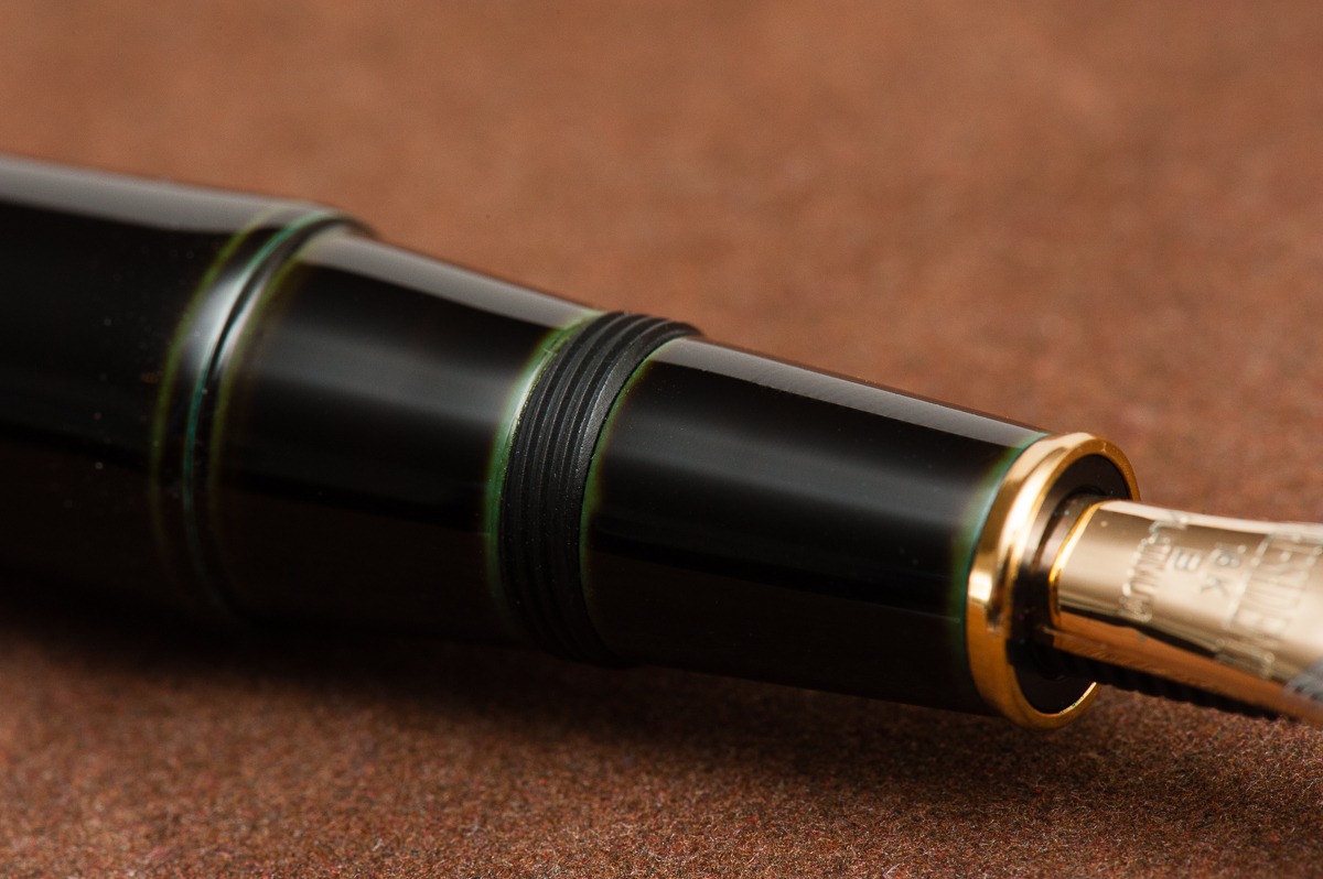
Franz: Being an ebonite pen, the Izumo was very pleasant to write with and was balanced. The cap is “post-able” however we did not attempt to do that since it is a loaner and posting generally mars the urushi finish. One thing though, my index finger naturally lands on the threads in the middle of the section and they’re kinda sharp. It doesn’t hurt at all but you can definitely feel them. But I’ll live with it because the urushi’s green underlayer shows very nicely. Needless to say, I did not experience any fatigue while writing in my journal.
EDC-ness
Katherine: Super fast uncap (1 turn) and a strong clip — it’s a little big for me, but definitely EDC-able if you like the size.
Pam: Given the size of the pen and the finish, I didn’t take this pen to work. The clip works well and keeps it secure in a case.
Franz: The Izumo was a very lovely pen to use at work for jotting down notes as well as for signatures. The pen just stayed on my desk for most of the the day, but I did clip it onto my shirt pocket for safekeeping as well.
Like other Platinum pens, the Izumo is cartridge/converter filled and the supplied Platinum converter was very sufficient. If I were to use this pen every day at work, I’d probably refill it with ink every 3 days or so.
The cap and clip have interesting curves in them.
Final Grip-ping Impressions
Katherine: The Izumo has all the pieces — a beautiful finish, a solid nib and solidly built. At the end of it all though, half of this hobby is about the aesthetics and the Izumo just ain’t my thing. If you love the aesthetic, it won’t disappoint!
Pam: This a great pen for those who can appreciate the classic look, the nuances of the urushi and a very smooth writing experience. That being said, this is not the urushi pen for me. Perhaps I have been ruined by Nakaya, just maybe.
Franz: Overall, the Izumo is a great pen to use. Ebonite pens have always been a favorite of mine and this seems to be one of them. I do love the stealthy tamenuri finish of the Soratame. As I said in the beginning of this review, the Izumo’s size and shape makes a statement. And something that’s true with every pen one holds, does that pen speak to you?
Pen Comparisons
Closed pens from left to right: TWSBI Eco, Franklin-Christoph Model 02, Sailor Professional Gear, Platinum 3776, *Platinum Izumo*, Nakaya Dorsal Fin, Pelikan M1000, and Lamy Safari
Posted pens from left to right: TWSBI Eco, Franklin-Christoph Model 02, Sailor Professional Gear, Platinum 3776, *Platinum Izumo* (unposted), Nakaya Dorsal Fin (unposted), Pelikan M1000, and Lamy Safari
Unposted pens from left to right: TWSBI Eco, Franklin-Christoph Model 02, Sailor Professional Gear, Platinum 3776, *Platinum Izumo*, Nakaya Dorsal Fin, Pelikan M1000, and Lamy Safari
We thank Lisa and Mike Vanness of Vanness Incorporated for lending us this Benu Pen Essence fountain pen for review. The Vanness family has had a pen shop in Little Rock, Arkansas since 1938 and is celebrating 80 years of being in business. Check their store out if you can or they could also be attending a pen show near you.
The opinions in this review are always our own and we were not compensated (monetarily or otherwise) for this review.
Hand Over That Pen, please!
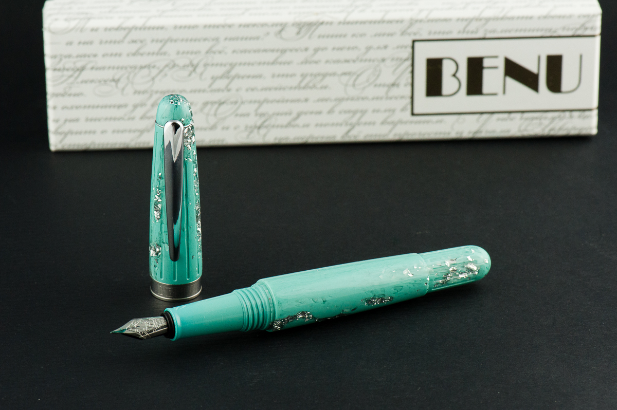
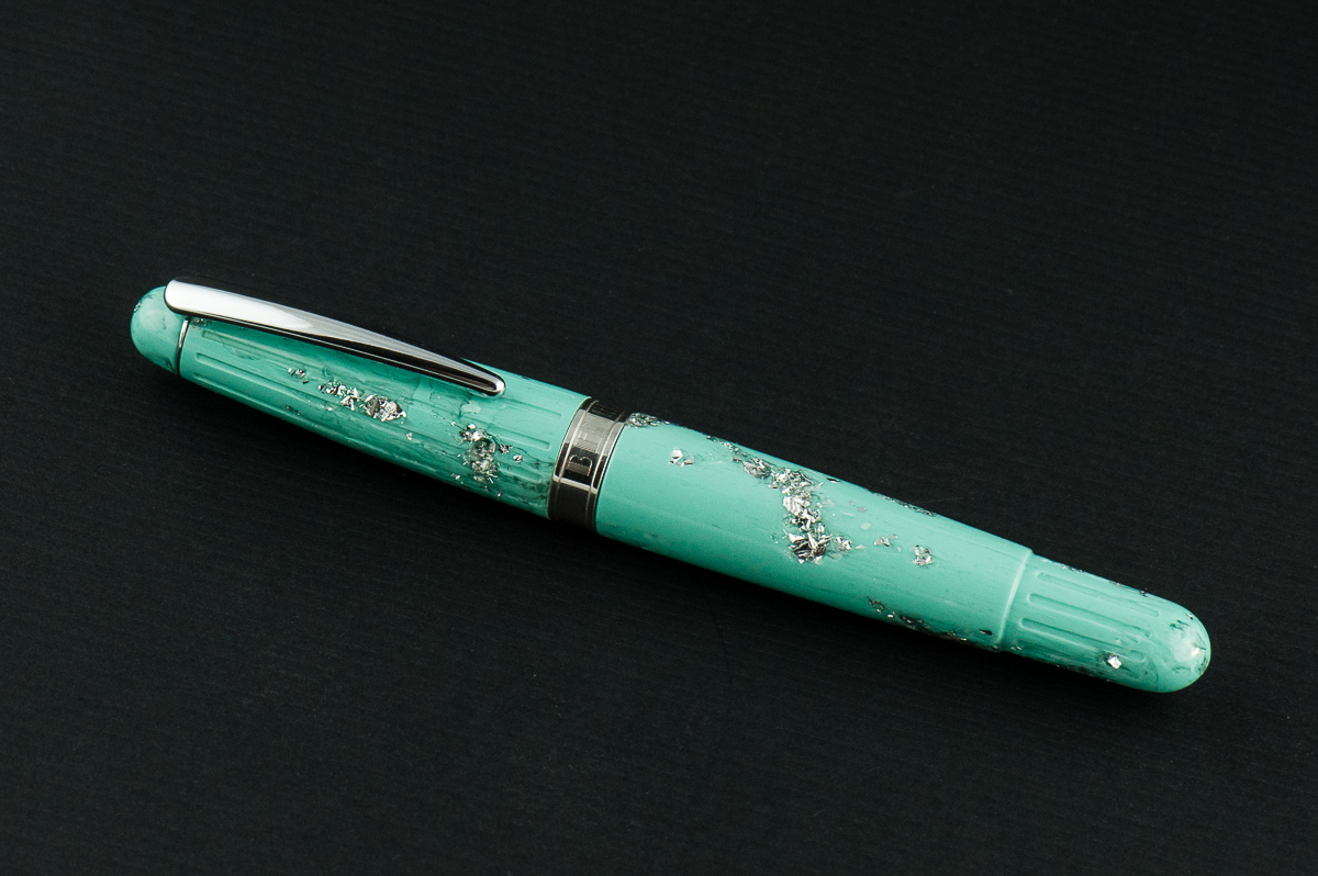
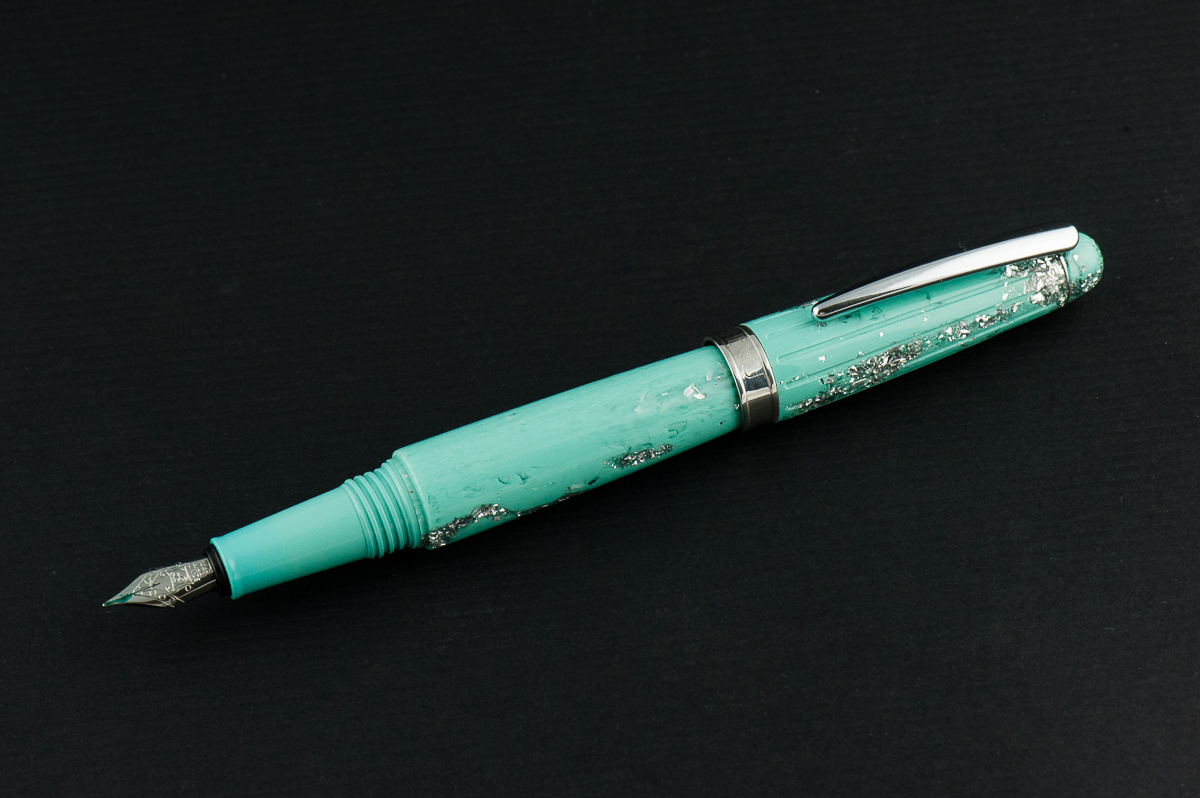
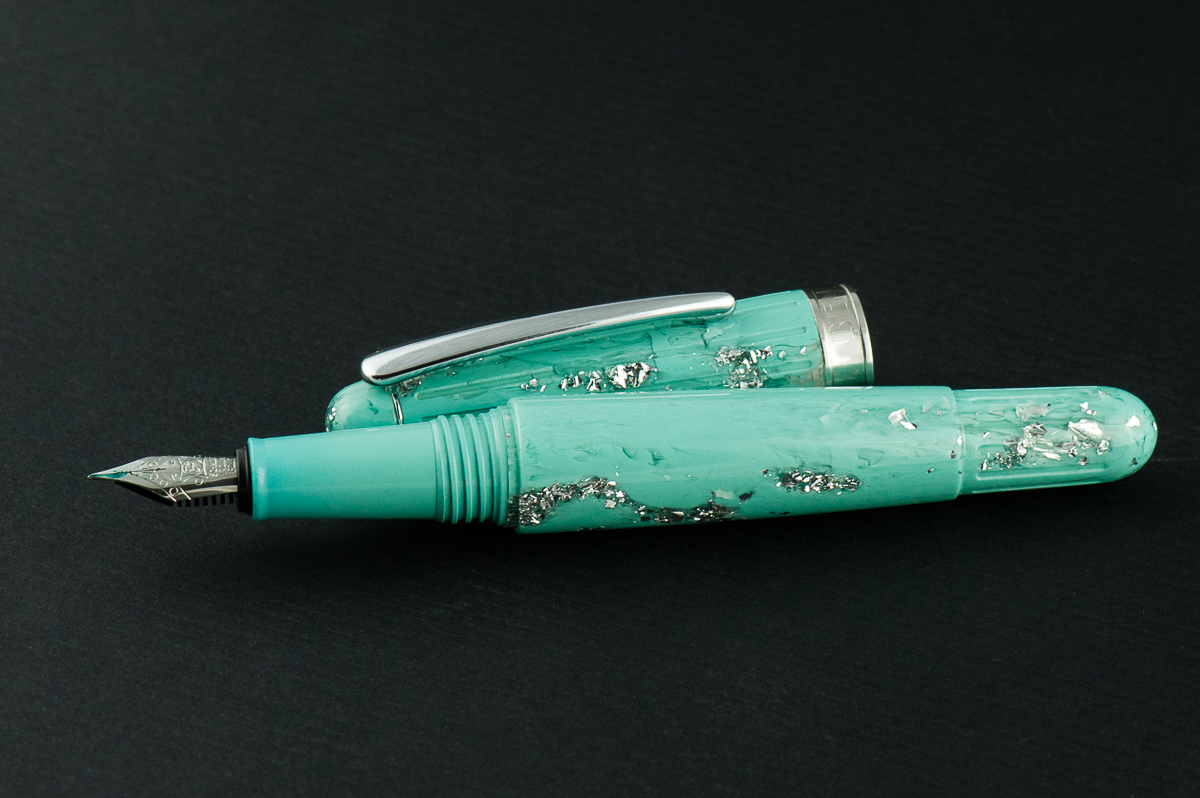
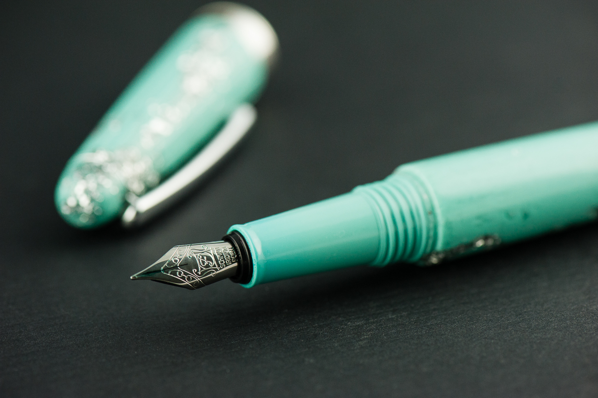
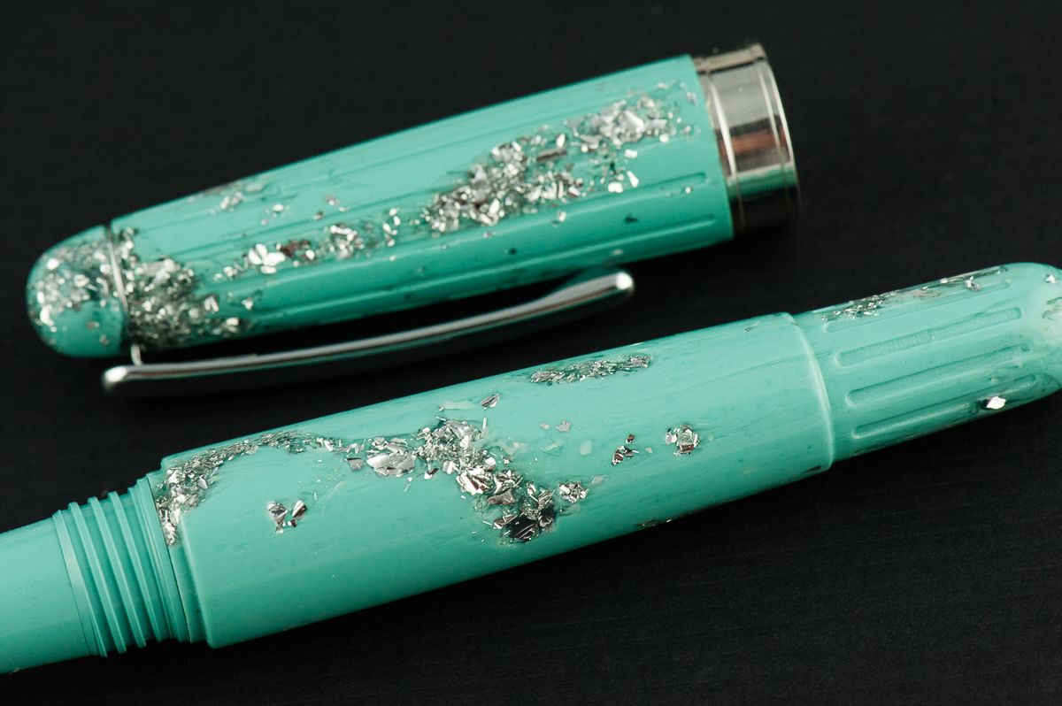
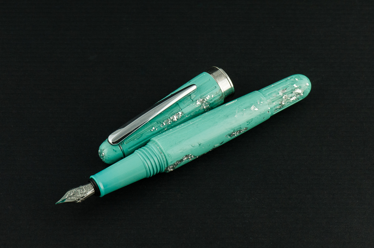
Katherine: Aesthetically, this pen is not my jam… but I do know some people who love it. So, to each their own. But, robin’s egg blue and glitter aside — it’s a well finished pen that feels sturdy in hand.
Pam: This pen is “rich” in decor and chunks of glitter which borders on obscene in my more minimalist preferences/opinions. However, to those who find this aesthetic pleasing, it is definitely an eye catching and bold pen.
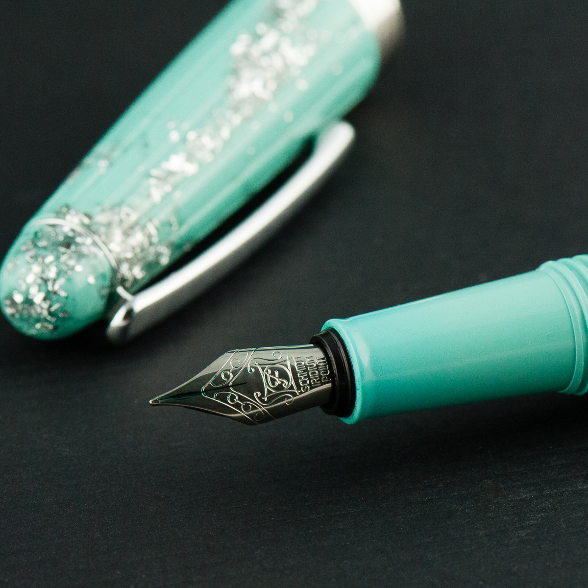
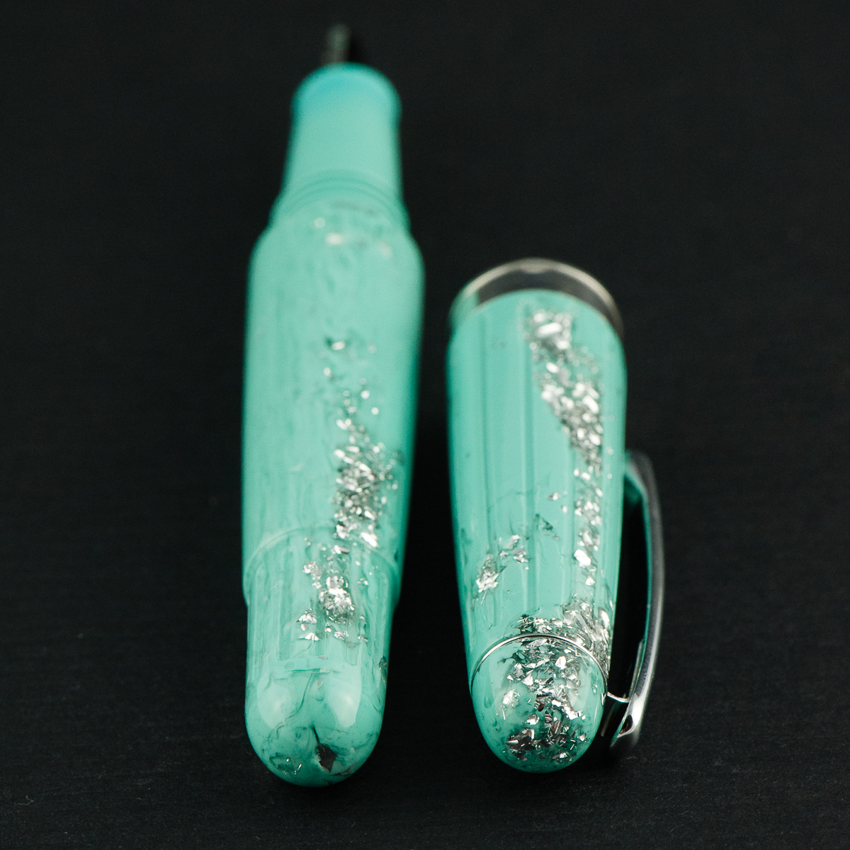
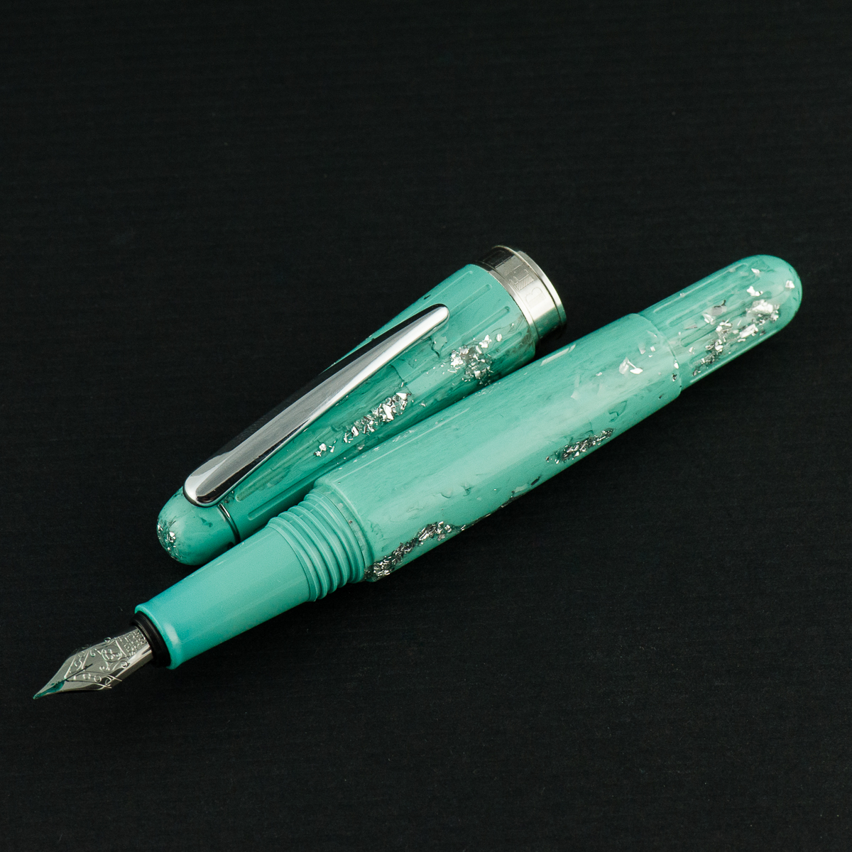
Franz: The Benu Essence is surely tugging on my color palette for I love the minty, turquoisey tone! Sans the glitter/ice part though for it makes it a bit garish. I really like the swirly bits of color in the acrylic. The Essence’s torpedo shape is plain which balances the material’s garishness.
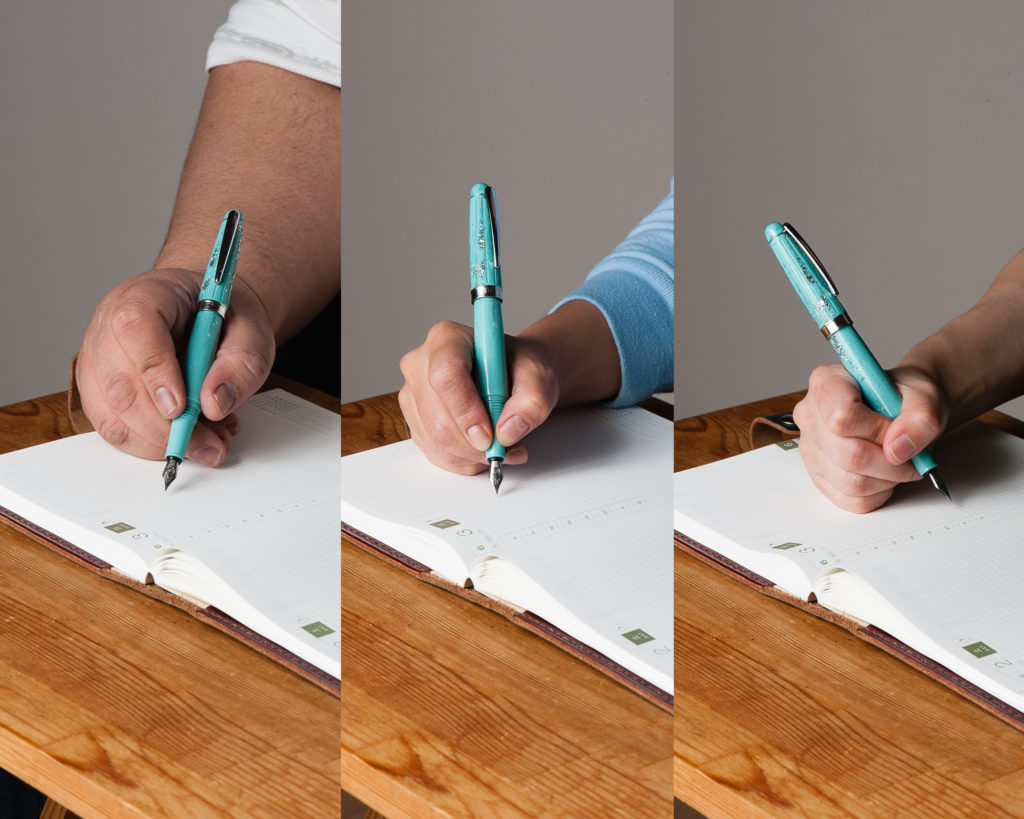
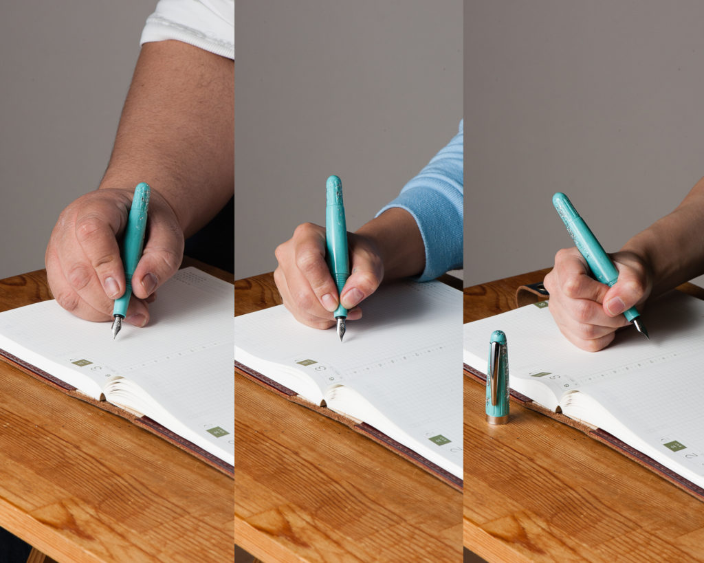
In the Hand: Benu Essence (posted) — from left to right: Franz, Katherine, and Pam
In the Hand: Benu Essence (unposted) — from left to right: Franz, Katherine, and Pam
The Business End
Katherine: Like the other Benu pens, this one sports a Schmidt nib. It’s a well behaved nib that puts ink to paper just fine, but doesn’t have a lot of character. It would be a great candidate for a grind or a swap with something more interesting (like the Benu Chameleon, this one is also a loaner, so no experimental nib swaps for me…).
Pam: I really have no complaints or major compliments about the Schmidt nib. It’s a fully functional, works well out of the box, and not very memorable nib. Aesthetically, the nib to be a bit small relative to the rest of the pen. Currently, it’s a #5 sized nib, which makes me wonder if a #6 nib would be more balanced.
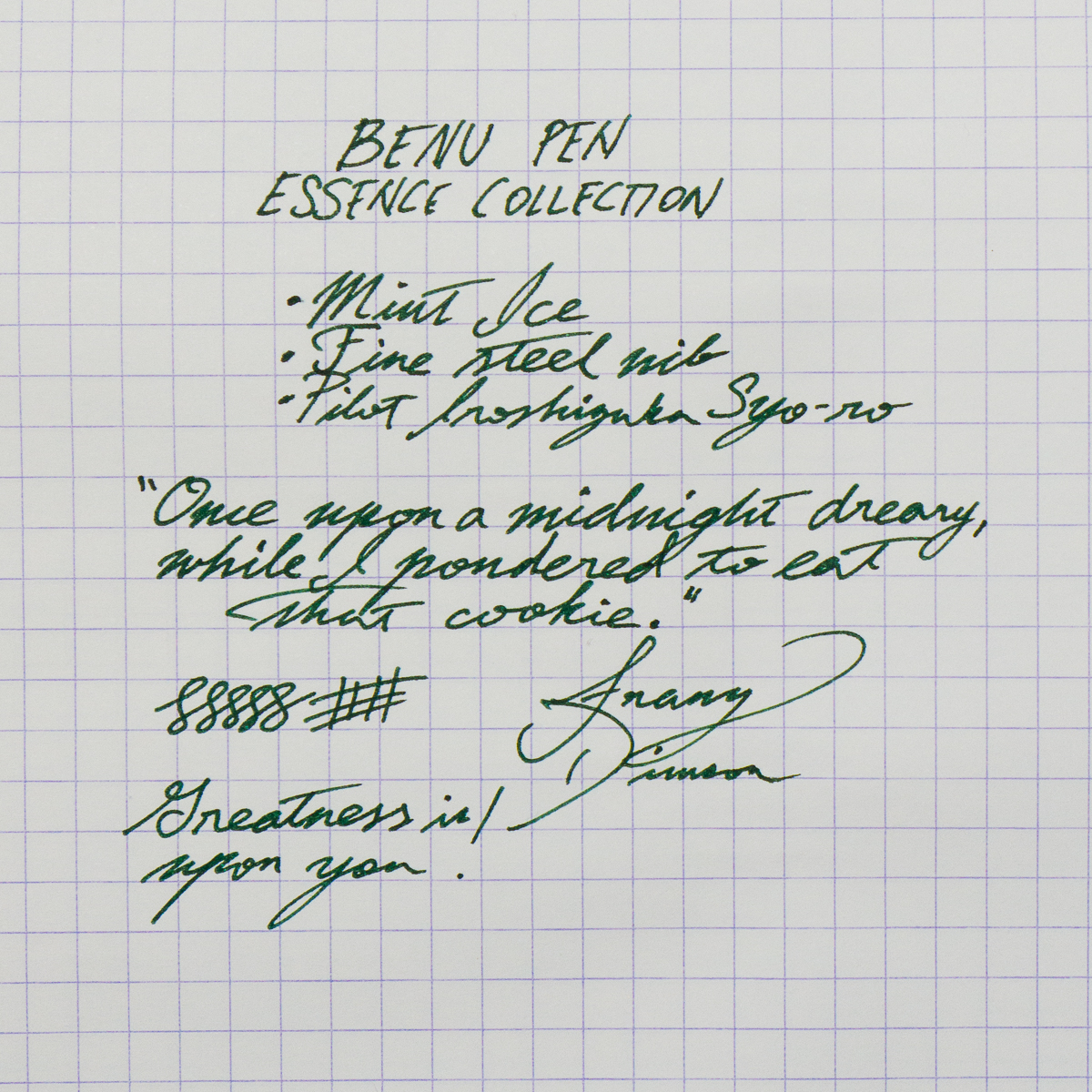
Franz: The Benu’s fine nib wrote well out of the box and I enjoyed using it for my daily writing. It was pretty smooth and with Pilot Iroshizuku Syo-ro, the flow was moderate to generous.
Contrary to Pam’s thoughts, I feel that the current nib complements the shape of the pen and tapers with the section. I placed a #6 Schmidt nib beside the Essence and it became somewhat too small. However, I do wish that Benu could stamp their name/logo onto their nibs. I know it’s an aesthetic thing but I always prefer the nib branding to match my pen.
Franz’s writing sample on a 80 gsm Rhodia grid paper
Write It Up
Katherine: I found the pen comfortable in hand for long periods of time — the section is a smidge small for me, but still perfectly usable. I had no issues with this pen for either journaling or writing quick notes.
Pam: The section and the step are right at the “sweet” spot of the tender bit between thumb and pointer finger. The step wasn’t particularly sharp, but it wasn’t comfortable if I tightened my grip like I inevitably do during a long writing session. The pen was balanced closer to the nib end and comfortable for a longer writing session. I appreciate the added girth of the pen, so it might be pretty comfortable for someone with larger hands (if it wasn’t for the length.)
Franz: The length of the Essence was quite comfortable for me even unposted. I feel that the balance is better when the cap is posted so I wrote with this pen posted for a while. The cap is definitely secure and the grooves on the back of the pen helps it so. When the cap was not aligned to the grooves, it still posted but it wasn’t as stable.
EDC-ness
Katherine: It’s a small-ish pen that fits easily in a pocket. Additionally the clip felt strong and I didn’t hesitate to clip it to my skirt pocket for the day. My one hesitation is that it’s so glittery that I didn’t think customers might take me seriously if I used it in a meeting… but that’s true of a lot of pens, even my beloved raden and maki-e pens. So, coworkers’ raised eyebrows aside, I’d give this a thumbs up as an EDC.
Pam: Due to this pen being a loaner pen, I didn’t have it in my lab coat pocket. And like Katherine, looking young with a blingy pen only adds to an image akin to Doogie Howser sans medical degree.
The clip was strong and was snug within my pen case.
Franz: The Essence was a great pen to use on the daily. I used it at work and the clip secured the pen in my shirt pocket. I appreciate that I don’t need to post the cap to be use it comfortably for a longer period.
Final Grip-ping Impressions
Katherine: To buy or not to buy? In the end it comes down to the aesthetic. Like the Benu Chameleon we reviewed a few months ago, it’s a solid pen, it all comes down to aesthetics, if you love it, you won’t be disappointed.
Pam: The pen is a serviceable pen for those who appreciate the aesthetic. My reception of the pen is lukewarm, but I see those who appreciate the over the top decor of the pen to enjoy this writing instrument.
Franz: The Benu pen company create pens that stand out from others. The acrylic designs catch your attention and then their different pen shapes will intrigue you. The Essence collection is probably one of the more conservatively shaped pens in their lineup and is great to use.
In the beginning, I was apprehensive when I saw the taper of the Essence’s section. I was worried that it may be too small for my larger hand, but I ended up really liking the pen. The pen has a good medium to large size to it that I appreciate very much.
Once again, thanks to the Vanness Incorporated team especially to Lisa Vanness for lending us this Benu pen. We really appreciate your support!
Pen Comparisons
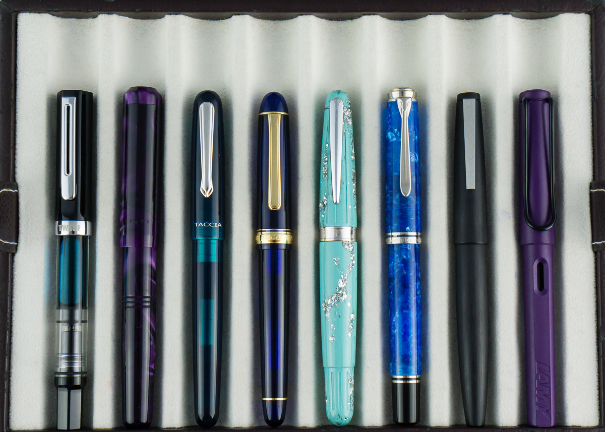
Closed pens from left to right: TWSBI Eco, Franklin-Christoph Model 31, Taccia Spectrum, Platinum 3776, *Benu Essence*, Pelikan M805, Lamy 2000, and Lamy Safari
Posted pens from left to right: TWSBI Eco, Franklin-Christoph Model 31, Taccia Spectrum, Platinum 3776, *Benu Essence*, Pelikan M805, Lamy 2000, and Lamy Safari
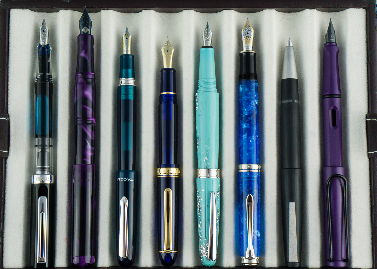
Unposted pens from left to right: TWSBI Eco, Franklin-Christoph Model 31, Taccia Spectrum, Platinum 3776, *Benu Essence*, Pelikan M805, Lamy 2000, and Lamy Safari
Hello pen friends and folk! Franz here, and I’m writing a quick recap to highlight two great things that happened at the 2018 San Francisco Pen Show this past weekend of August 24 thru 26. That would be the Pay-It-Forward Project Table, and the Pen Dash Mixer hosted by Lisa Vanness.
There were lots of events that happened at the show that I will definitely include in my lengthier annual SF Pen Show Report. But I really wanted to highlight these two before my pen show report comes out in the next couple of weeks.
Before anything else, I would like to thank the San Francisco Pen Show organizers for allowing the Pay-It-Forward table, as well as the Pen Dash Mixer to happen at the show this year. And also for continuing to have a bigger, and “funner” pen show each year!
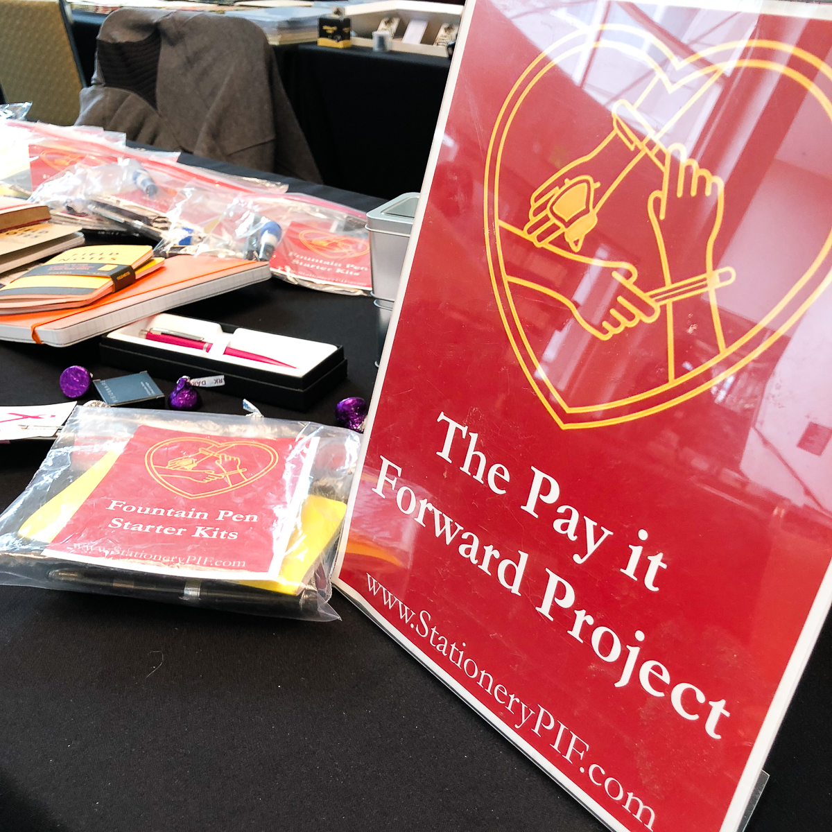
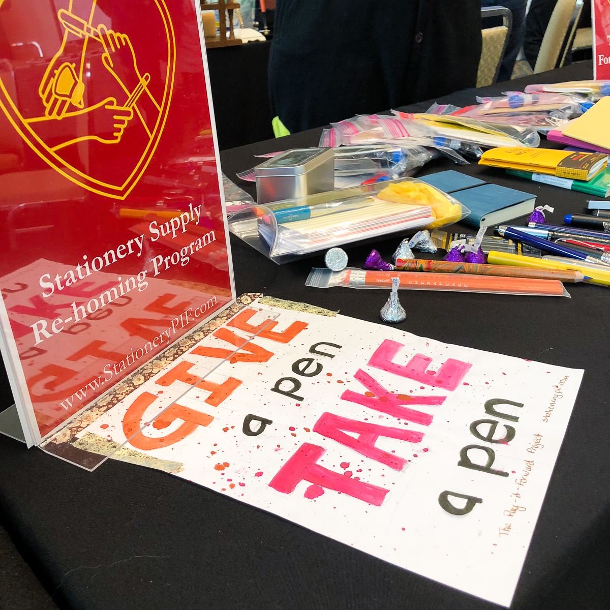
Pay-It-Forward Project
This was the second year that the Pay-It-Forward (PIF) table made an appearance at the SF Pen Show. Even if we were not able to do a blog post, or even a social media post asking for physical and monetary donations, a LOT of generous people have donated to the table this year. Actually, some friends who weren’t even at the show and some out-of-state messaged me for a shipping address and sent oodles and oodles of pens, ink samples, and other stationery items. To all of you who have donated, you know who you are. A VERY BIG THANK YOU from myself, the Pay-It-Forward Project team, and the San Francisco Pen Show!!!
We are happy to report that we have given out 100 PIF Starter Kits (pen, ink sample, and paper) to beginners. And more than 60 donated pens were given away via the Give a Pen, Take a Pen initiative. It is definitely heartwarming to see smiles of excited newbies when they realize that they can choose a pen for free and learn from our volunteers. Makes it all worth the effort to Pay It Forward.
Now I’d be remiss if I did not mention this. The PIF table was staffed by a number of volunteers this year and I would like to give a shout-out of thanks to all that helped out this year. Thank you Sarah M., Carrie H., Andy D., Pam T., Tommy S., and Jim K.! If I missed anyone else who volunteered, please accept my sincere apologies. And last but not the least, a big thank you Kimberly L. for being my co-host of the PIF table this year. She did a lot of things to help prep for the PIF table at this show! And the PIF photos are by Kimberly as well.
If you want to find out more information, or donate either items or funds, please check out www.stationerypif.com for details. You can also check the schedule for the next pen show a PIF table might appear! Thank you for making this community of ours a fun and caring one!
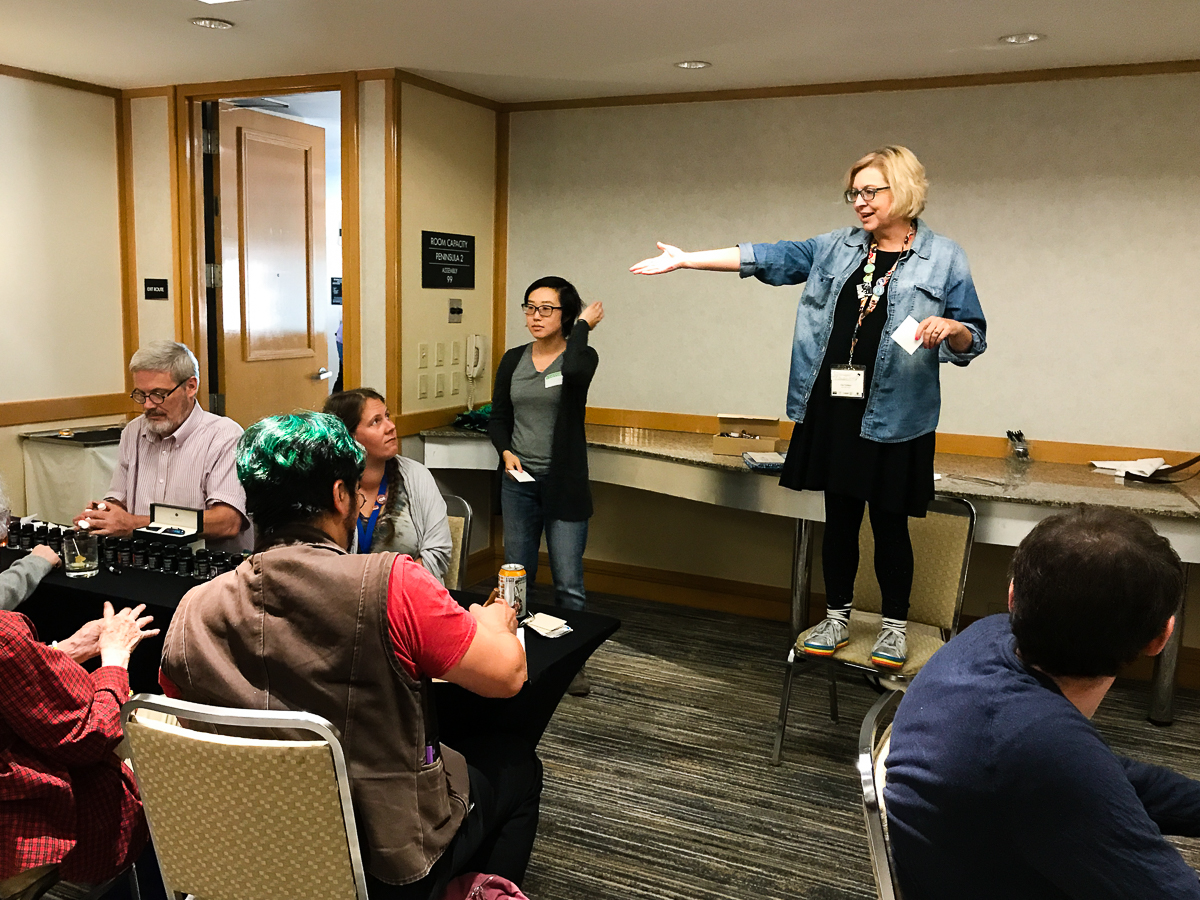
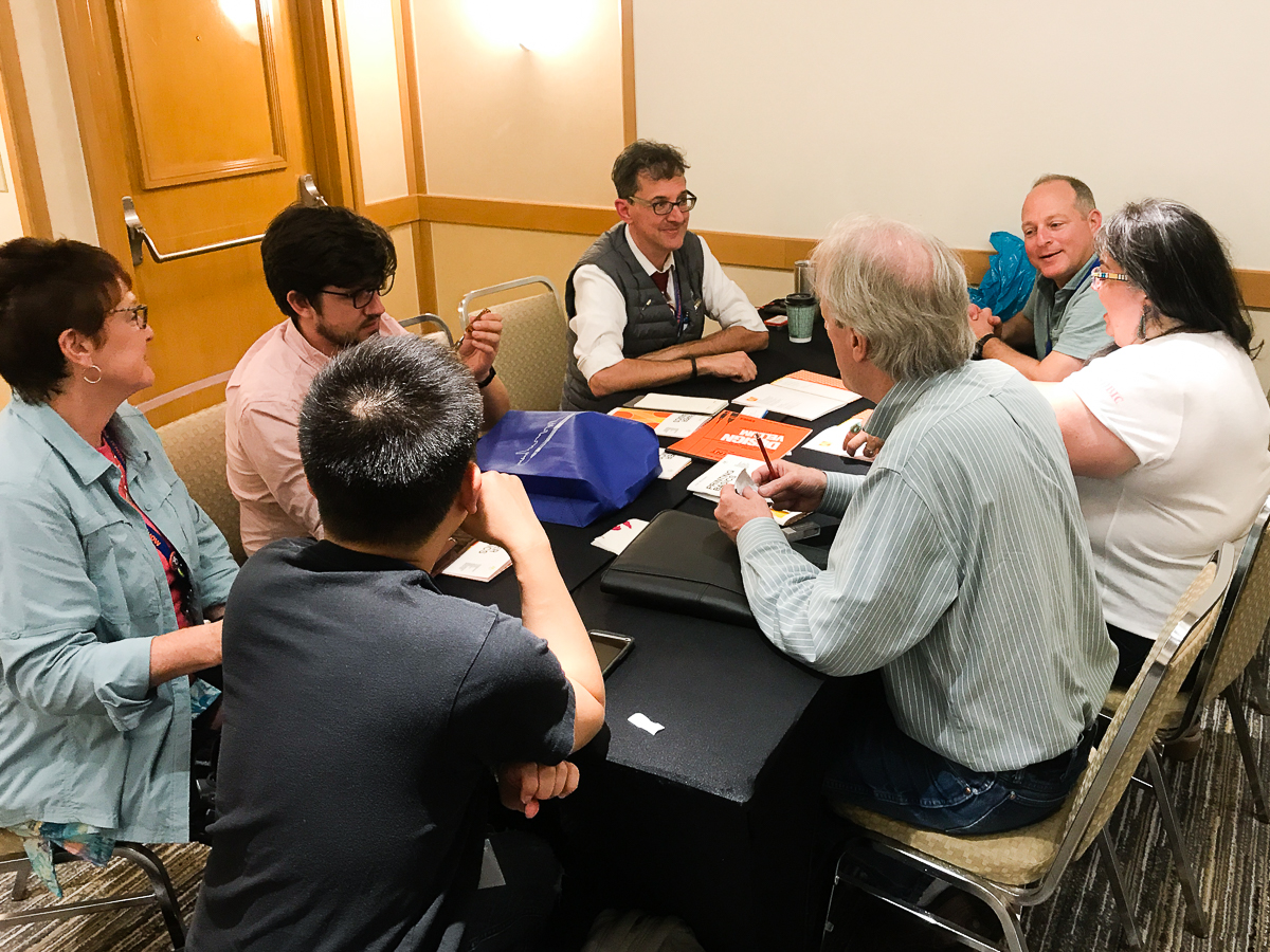
Pen Dash Mixer
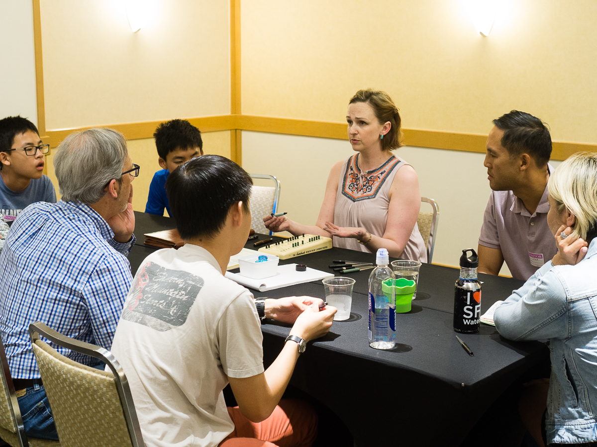
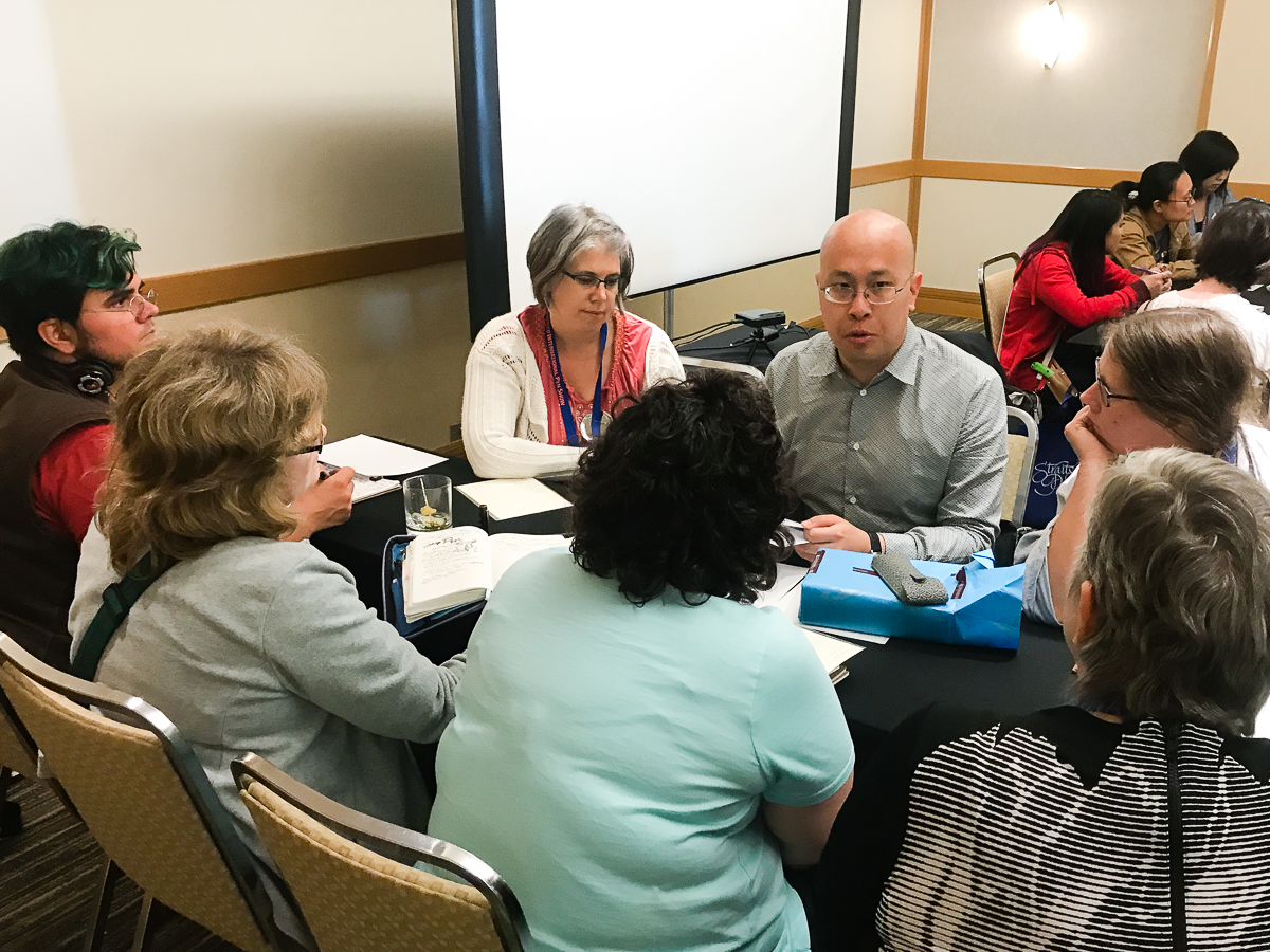
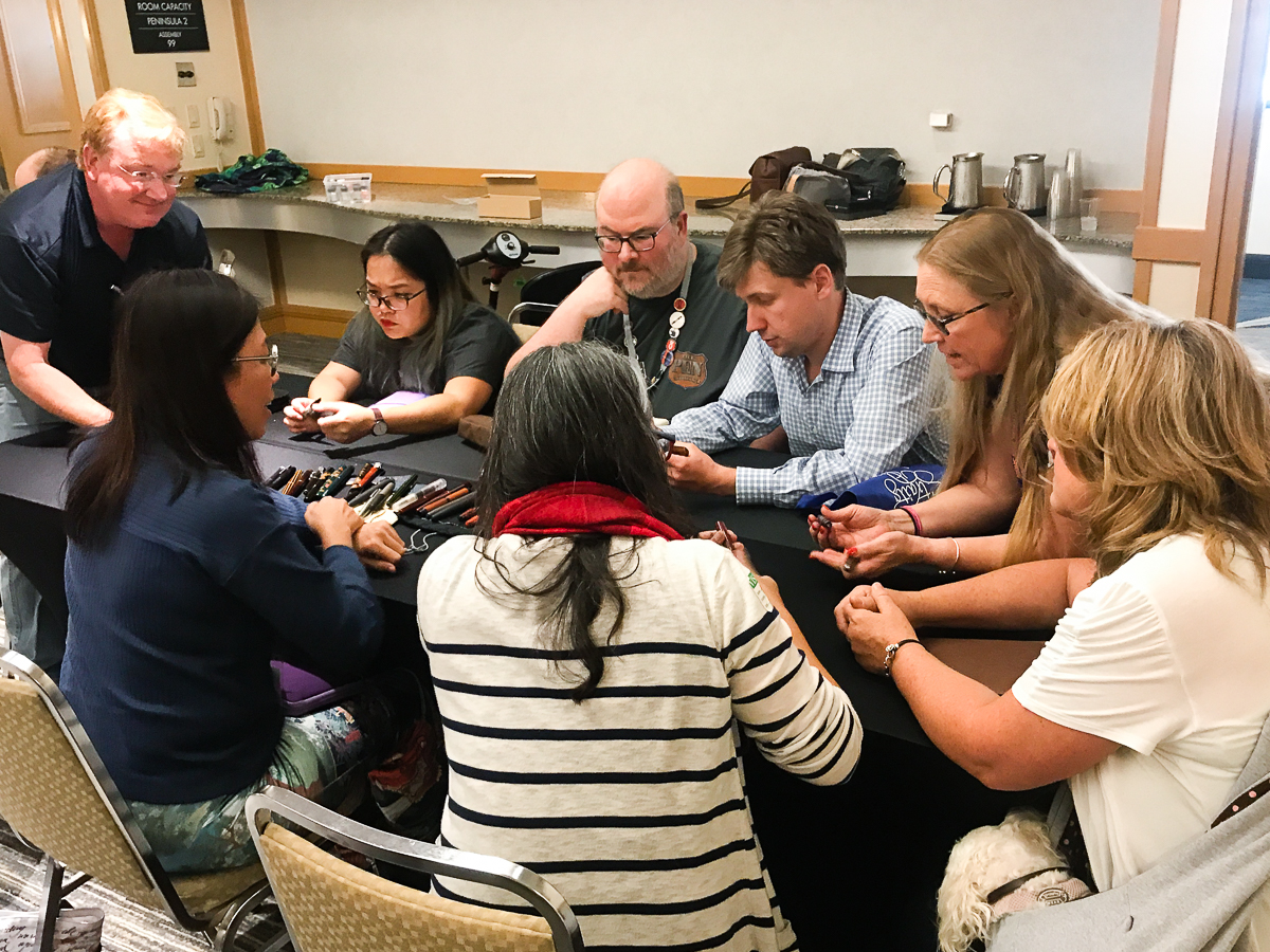
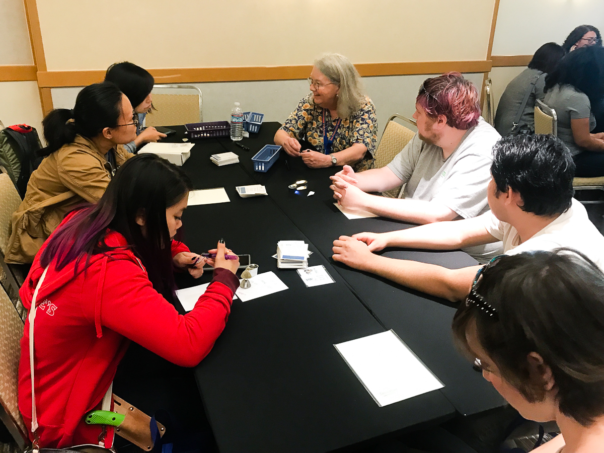
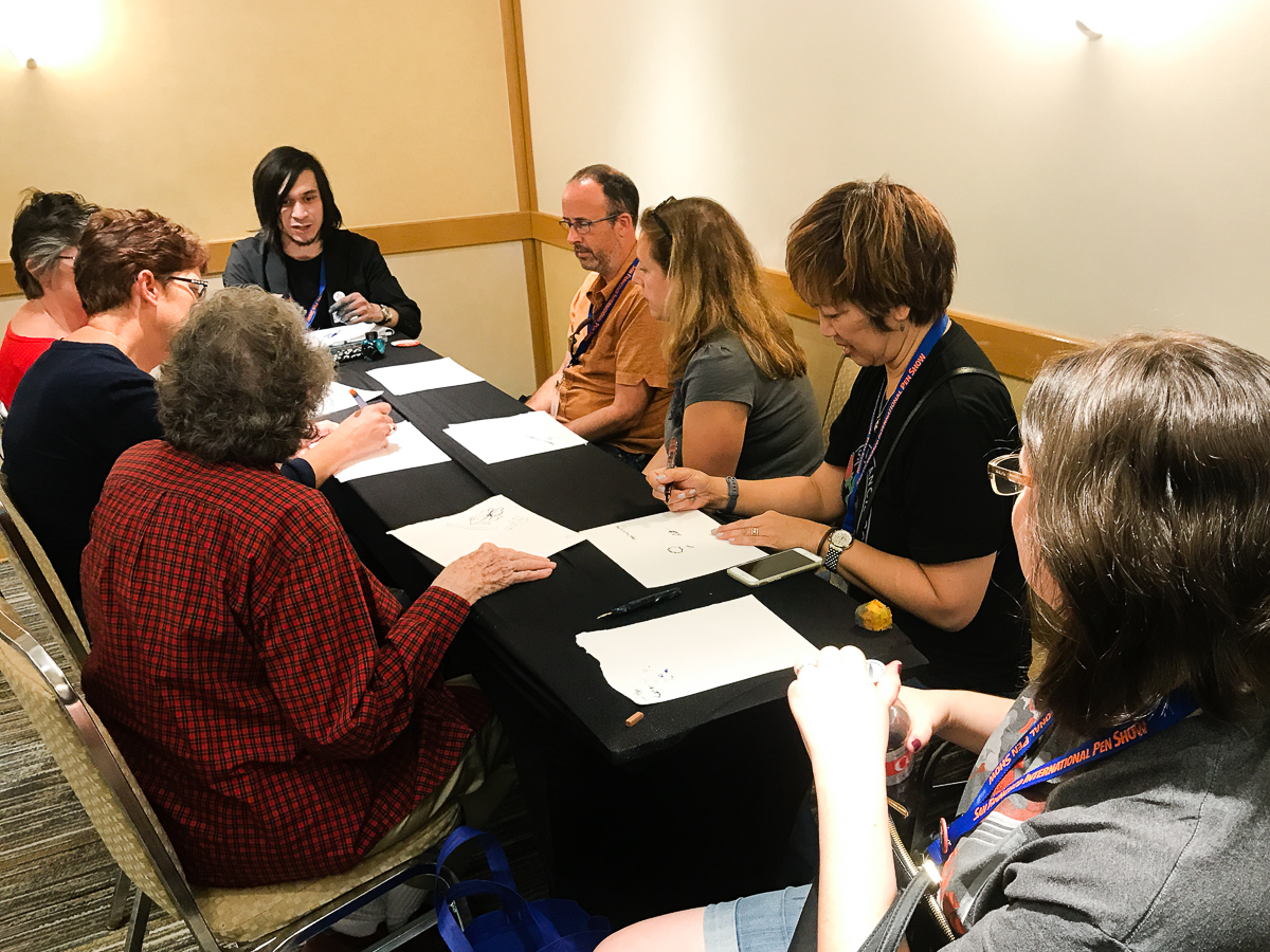
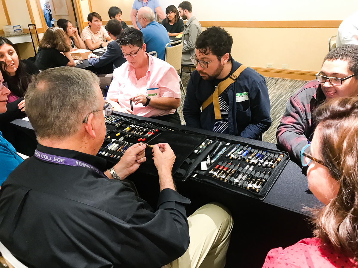
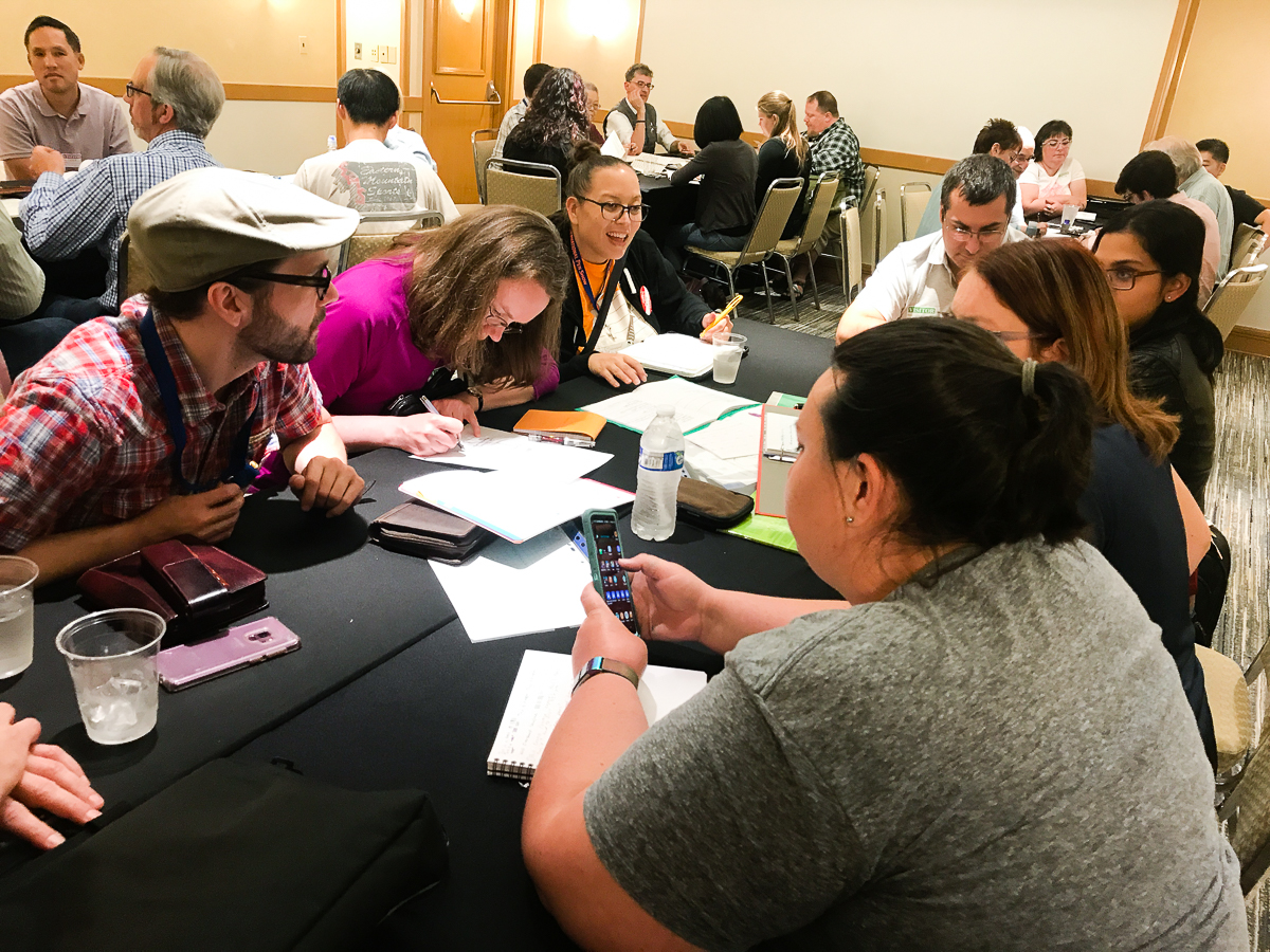
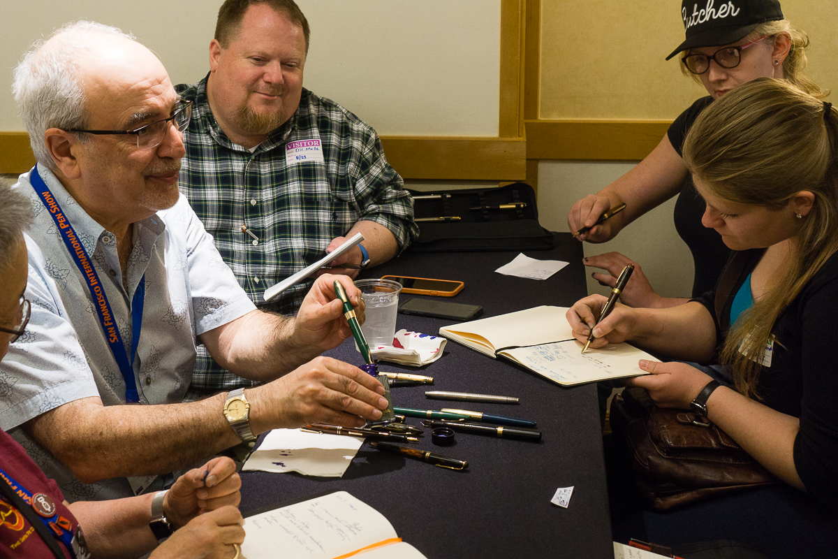
Last year’s SF Pen Show was the first time Lisa Vanness and company tried to have the Pen Dash and ever since then, they hosted it at different pen shows. This year, we had to make sure that this event continued at The Fun Pen Show. So the Pen Dash happened on Saturday at 5:30pm and it was a great success!
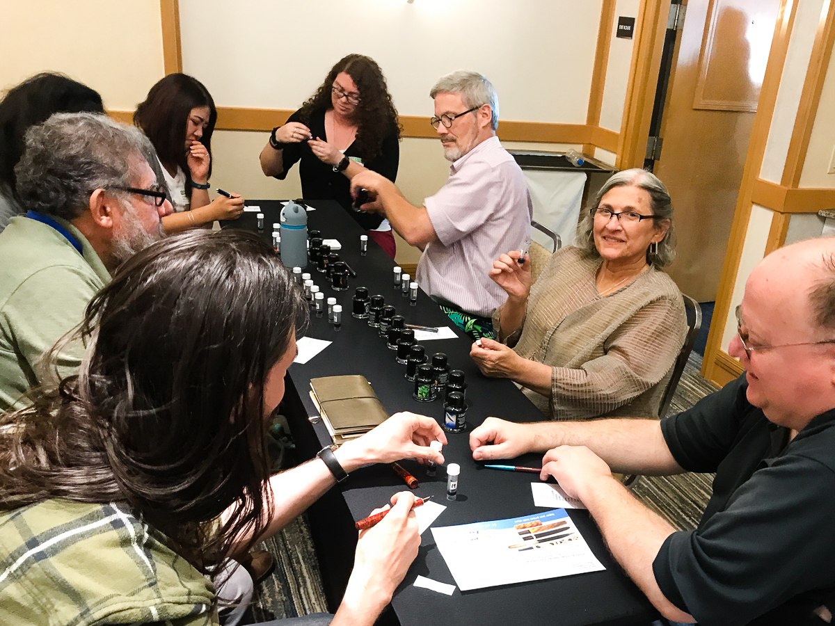
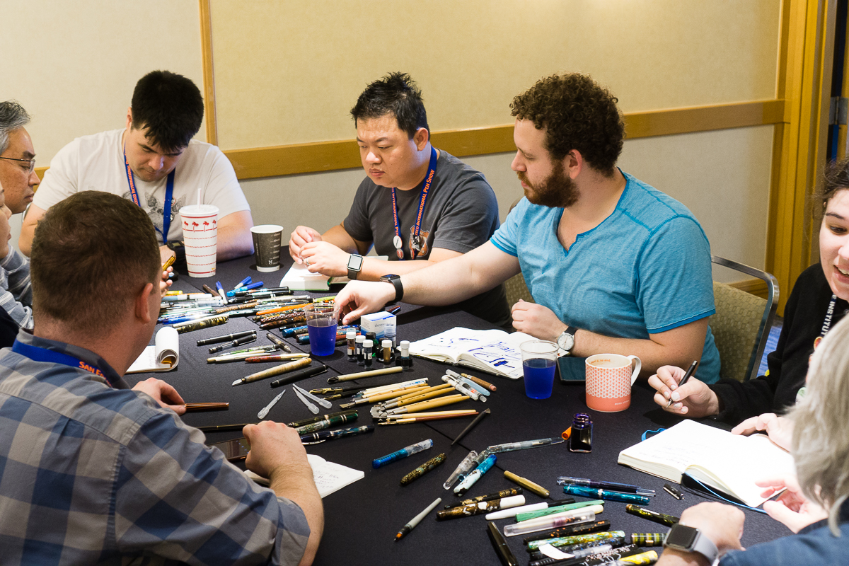
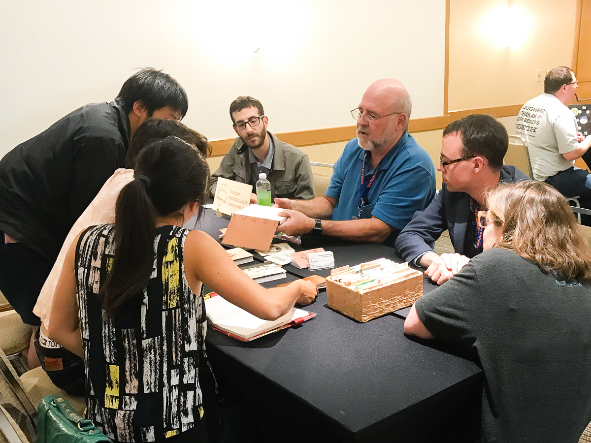
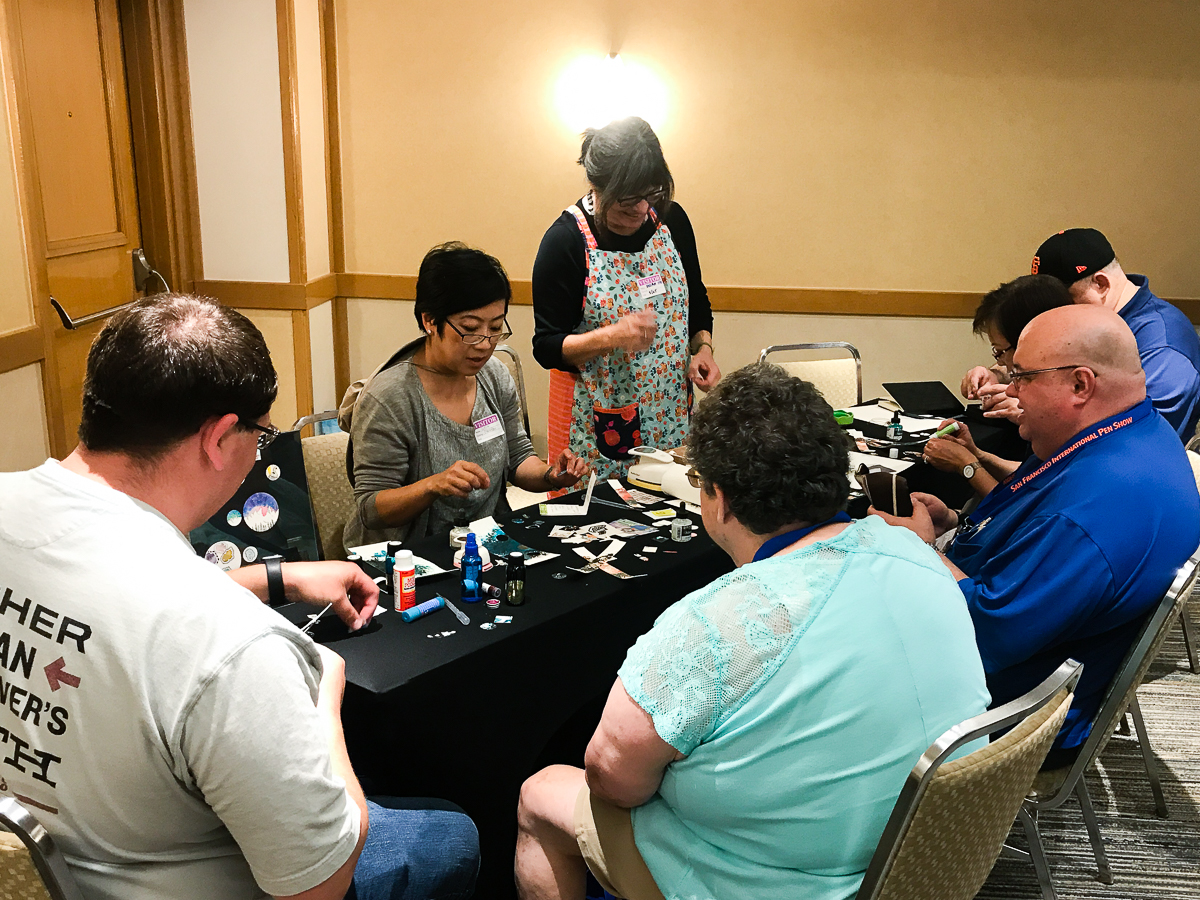
Wait, what is a Pen Dash you may ask! In a nutshell, it’s an effort to create a way for people in the community to interact with each other. But more importantly, to learn from selected table leaders or as I called them, Subject Matter Experts (SMEs). The participants will stay at the table and listen to the SMEs talk about their topic and then after a certain amount of time, the participants then change tables. So it’s kind of Speed Dating except that there is no anxiety and lots of learning.
We had 13 tables separated between 3 rooms and each table had a SME to talk about a certain topic. Topics ranged from vintage and modern pens, pen customization, Japanese urushi pens, paper types, bookbinding, nib styles, creating art pieces, etc. In a span of 10-15 minutes, the SMEs will talk about their topics and answer any questions. After each time frame, the participants switched to another table to learn from another SME. The participants stayed in their respective groups within the room so each person had an equal opportunity to learn from a leader.
At the Pen Dash, we had a little over 100 participants at different ages and different levels of involvement in the stationery community. At the end of the mixer, Lisa took a chair and gave closing remarks in each room and some prizes were given away! Here’s a quick video showing some prize winners!
On behalf of Lisa Vanness and myself, Franz Dimson, we would like to thank Ana Reinert, Pam Tien, Claire Rice, and other Pen Posse volunteers for helping to make this Pen Dash a success!
And we are giving a huge shout-out of appreciation to all the table leaders/SMEs who volunteered their time, knowledge, and effort:
It’s that time of the year again — major pen show hangover for the HOTP crew, the San Francisco Pen Show has ended and we sit around wondering why our wallets are so light and why our coworkers aren’t excited by our new pens…
In an effort to stave off some of the post-pen show despair, Katherine has compiled pictures of some of the fluffy friends who graced us with their presence last weekend. The hotel and show are dog friendly, and there were several this year!
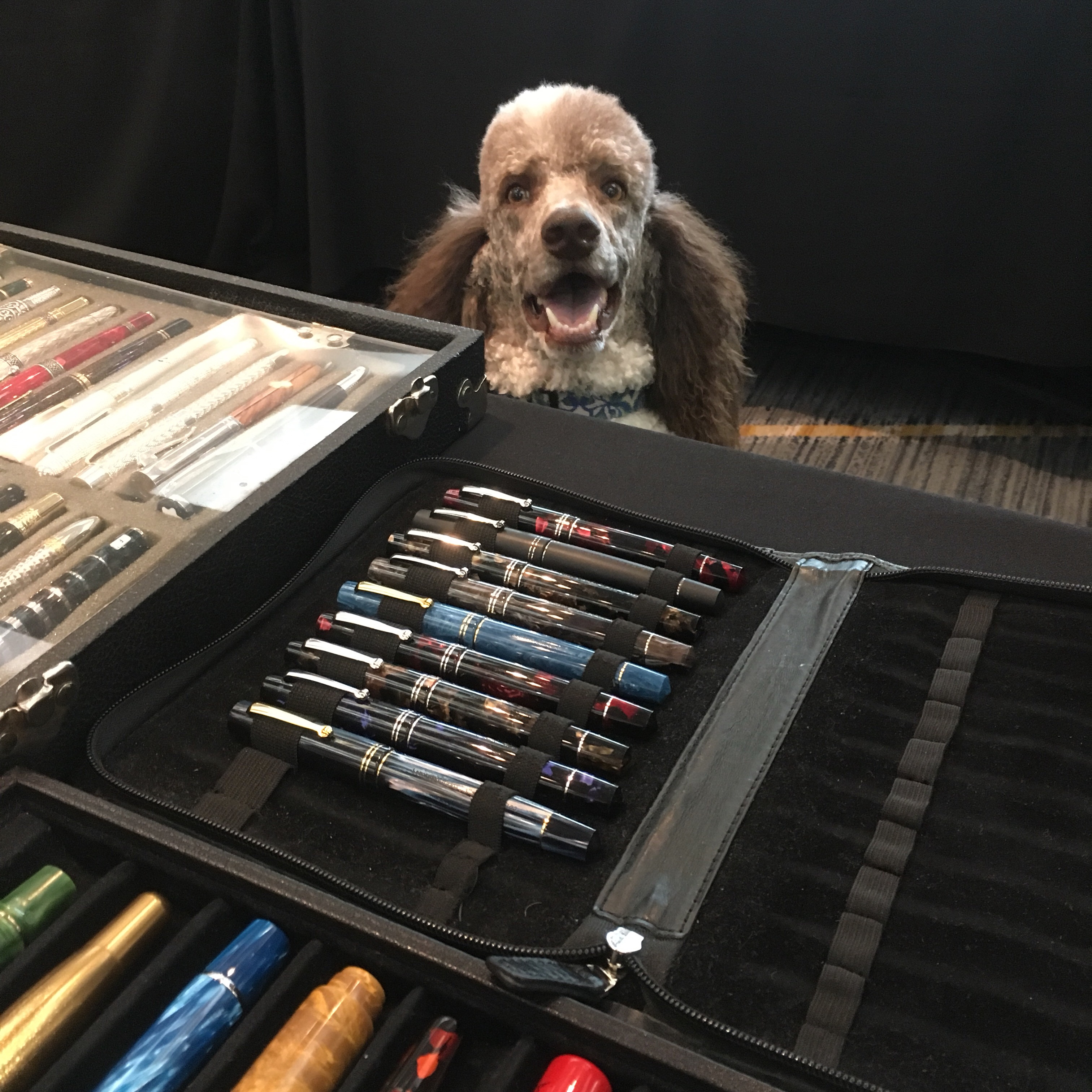
This is Oliver, shopping at Sarj’s table.
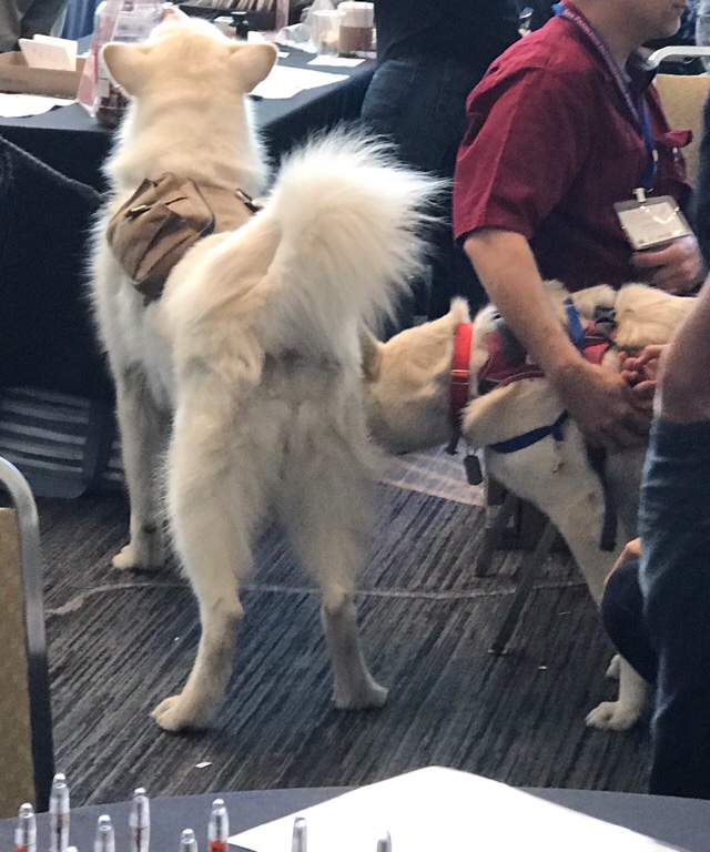
Odin (right) making friends with a mystery dog that is similarly fluffy.
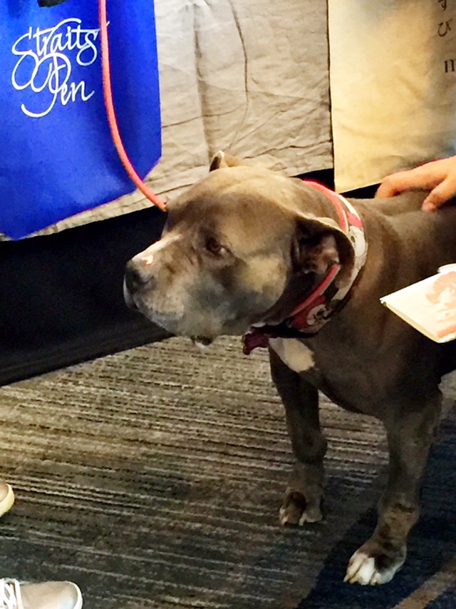
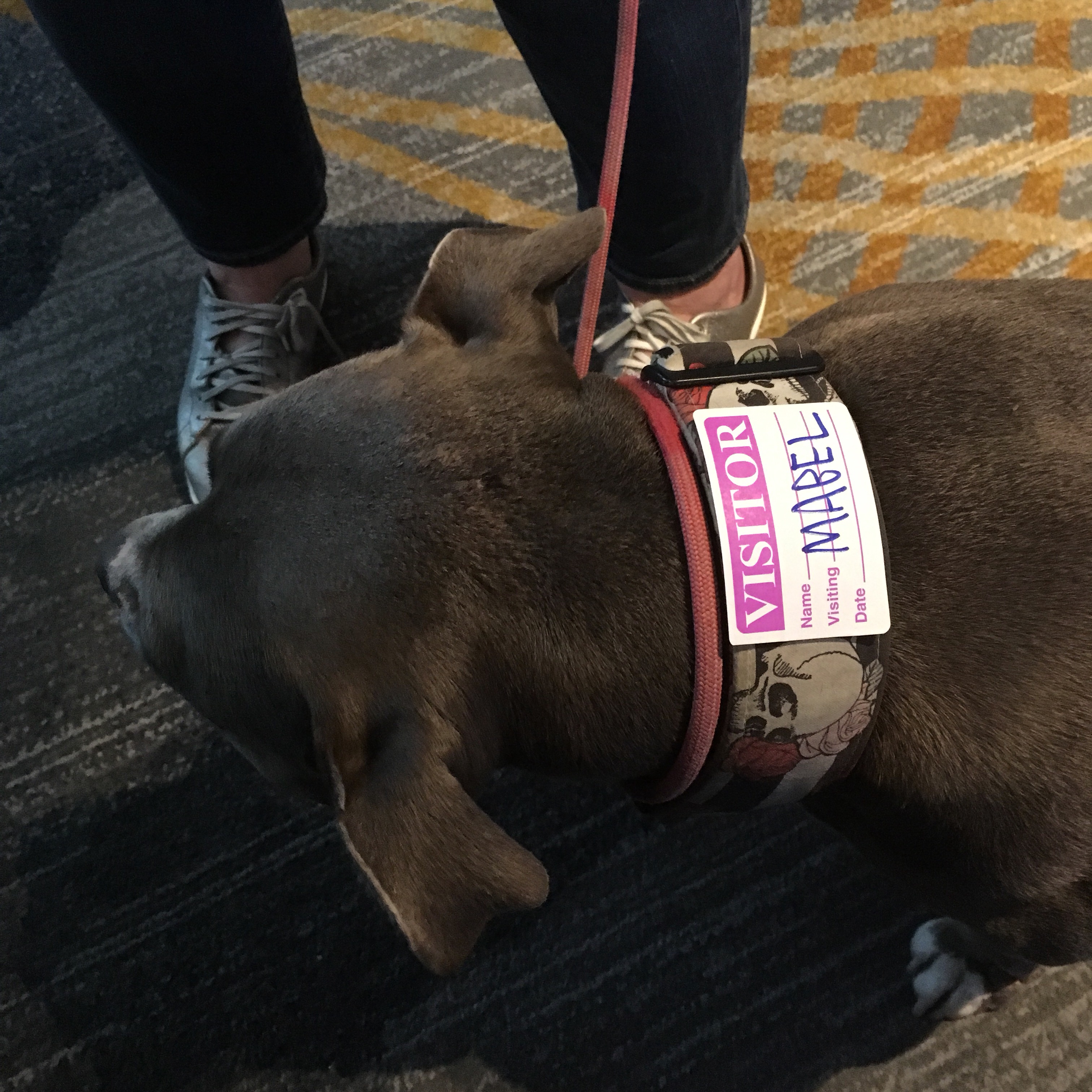
And Mabel, finishing up some shopping at Straits Pen
Mabel even got a name tag!
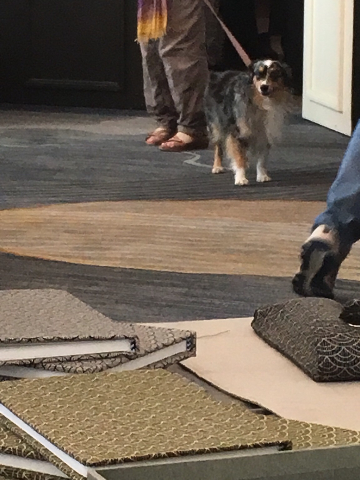
This dog had a friend, but I only got one in the photo. As seen over the Musubi table.
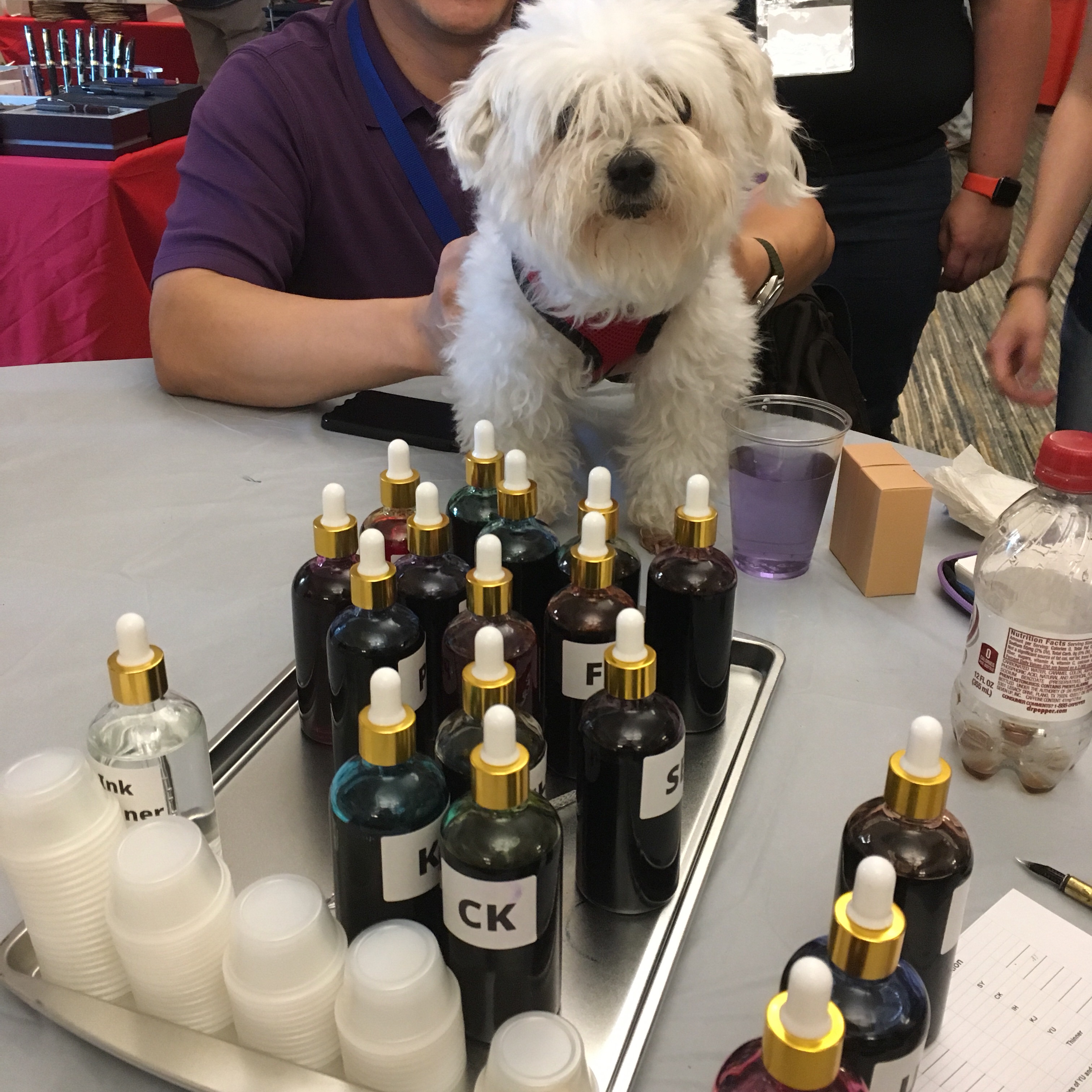
And Moogle, mixing up some bespoke ink (it’ll go great on his white fur!)
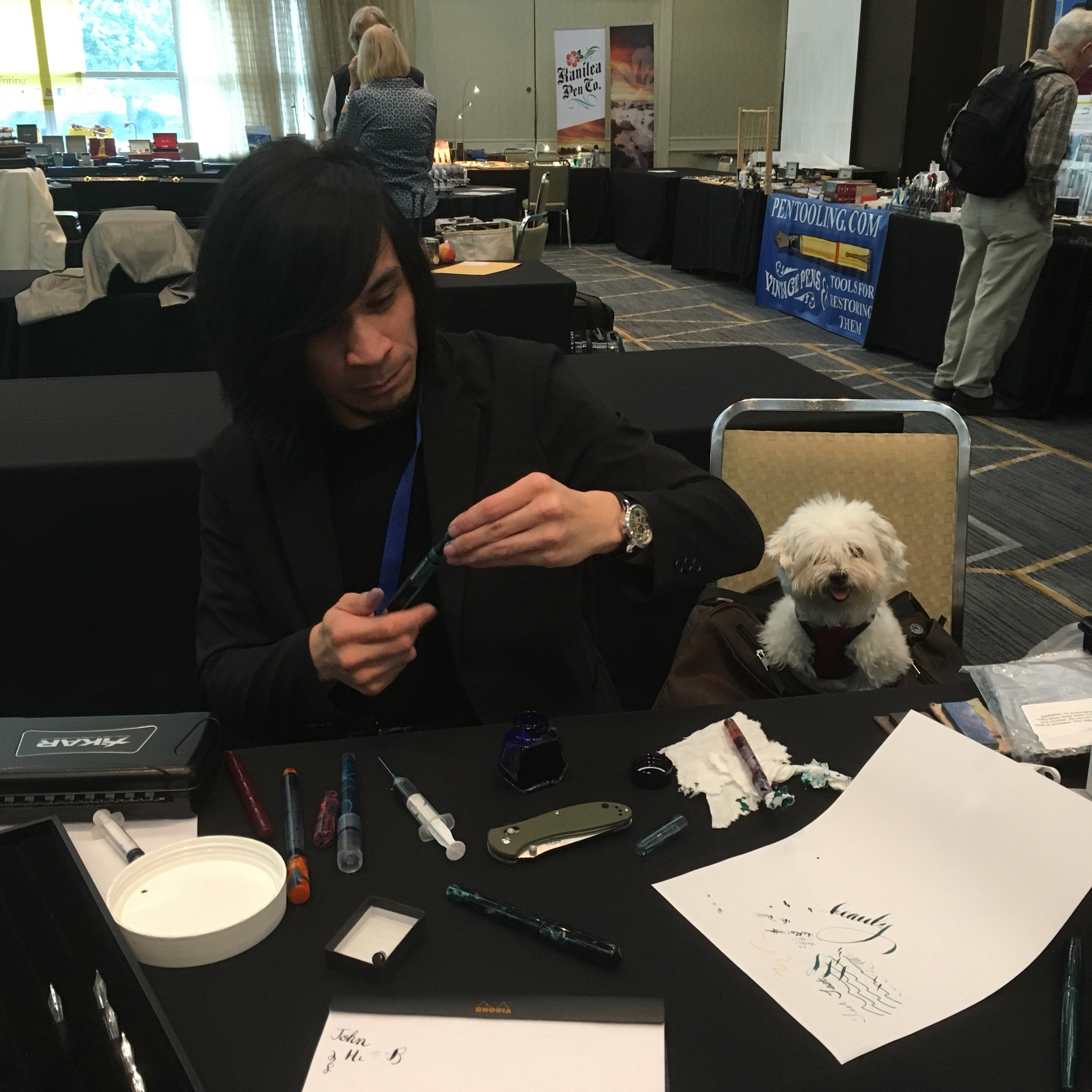
Ralph needed some help… and Moogle was there for him!
Did you make any fluffy friends at the SF Show this year? If you have any photos of your pup at the SF show and would like them added — let us know in the comments!