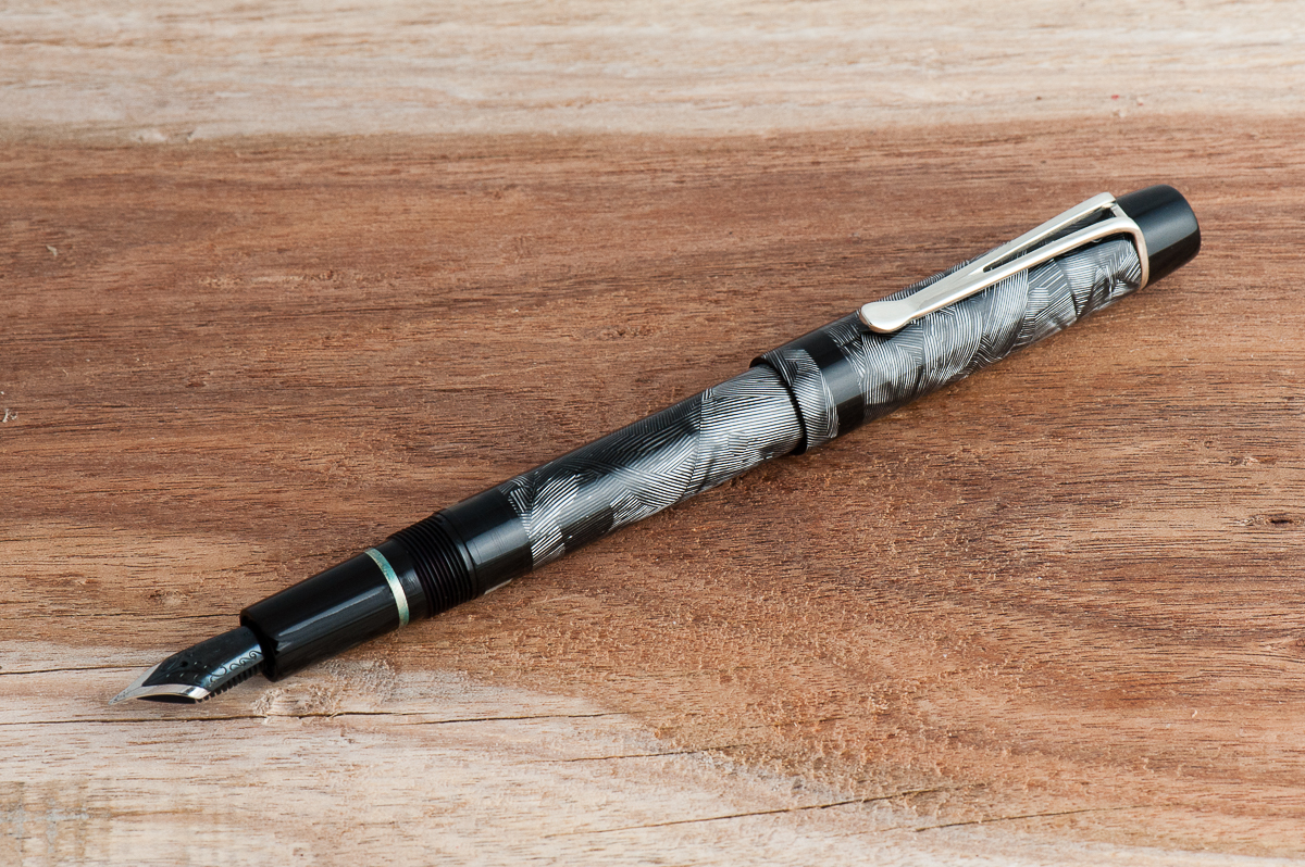
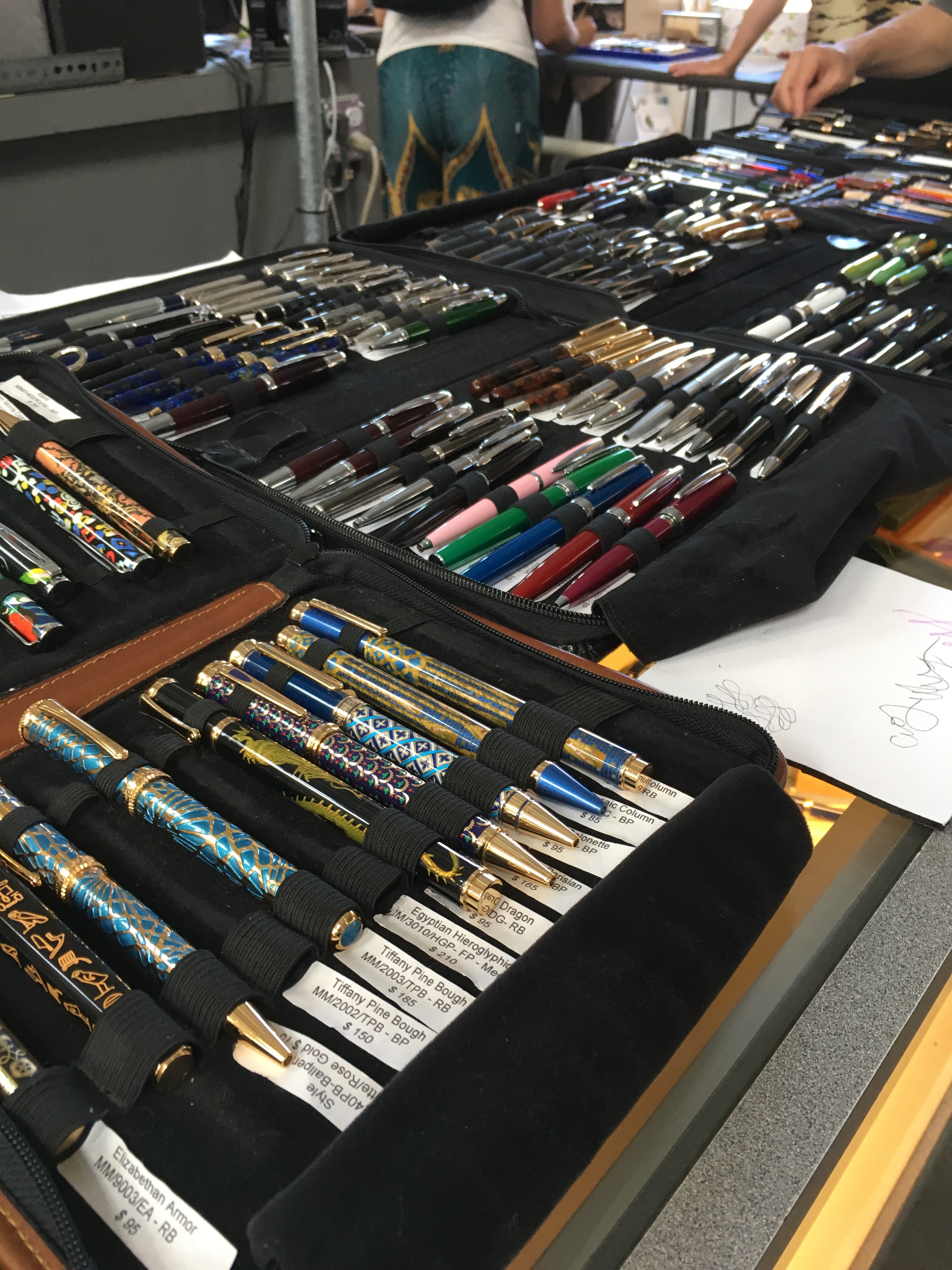
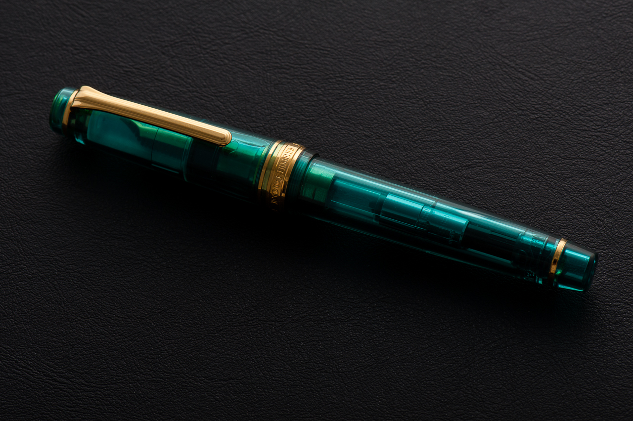
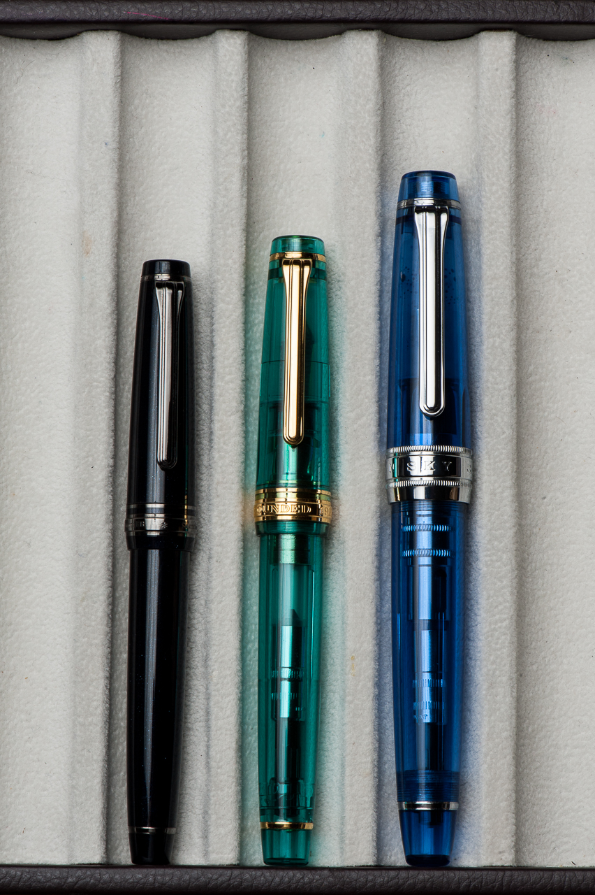
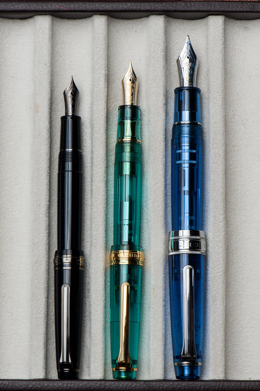
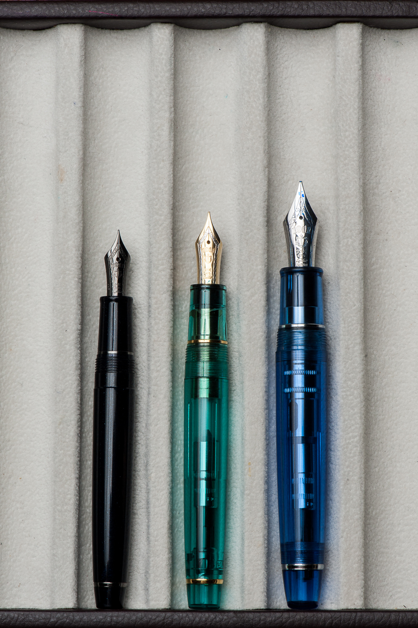
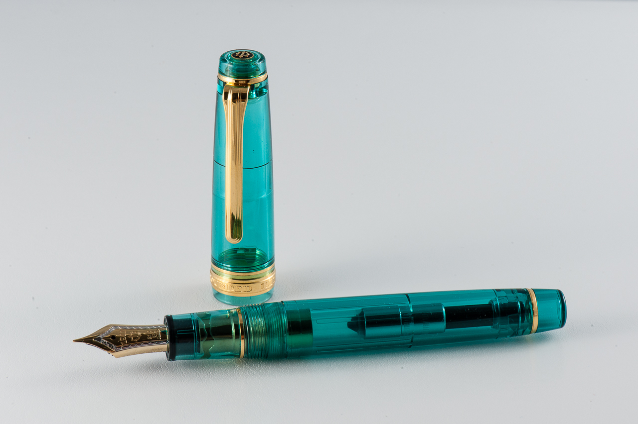
This is a review of working with custom pen maker John Albert, of Romulus Pens. Since he doesn’t have pre-defined ‘models’, we thought it would make more sense to review more general aspects of his pens instead of diving deep on a specific pen. (Also check out his Instagram here)
Hand Over That Pen, please!
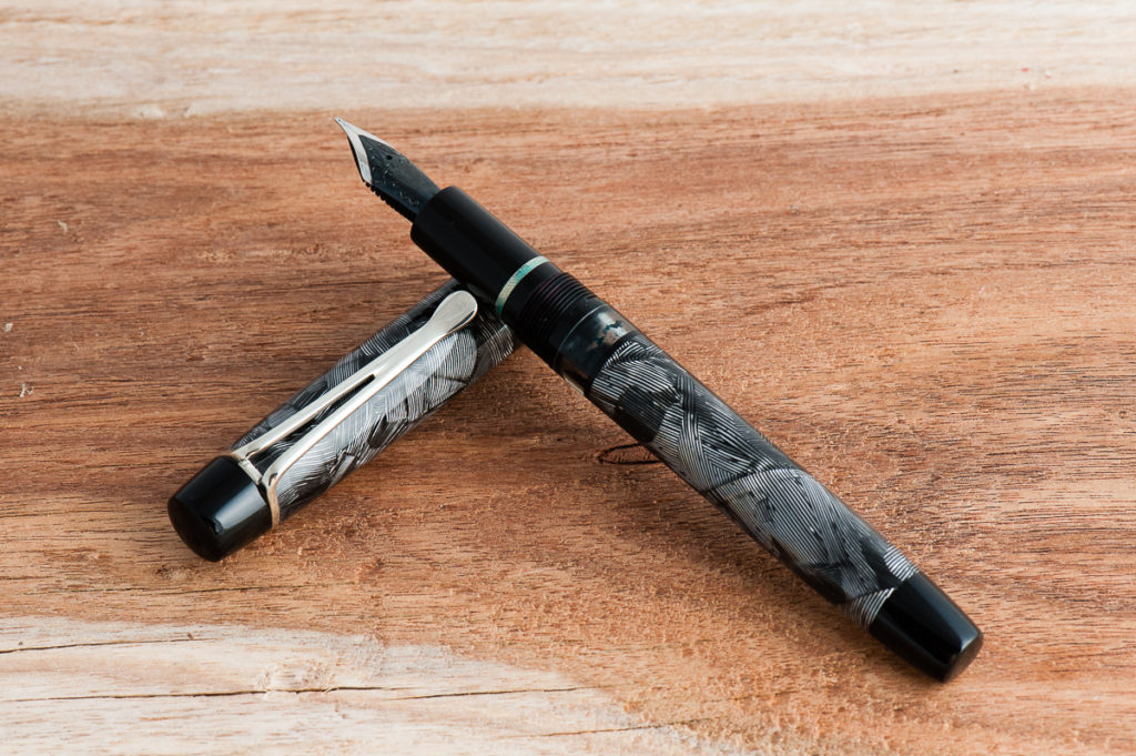
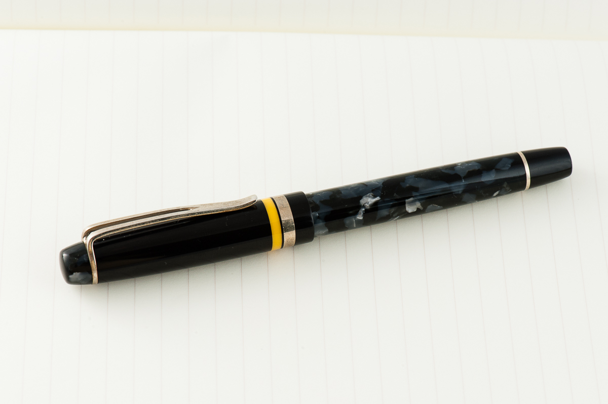
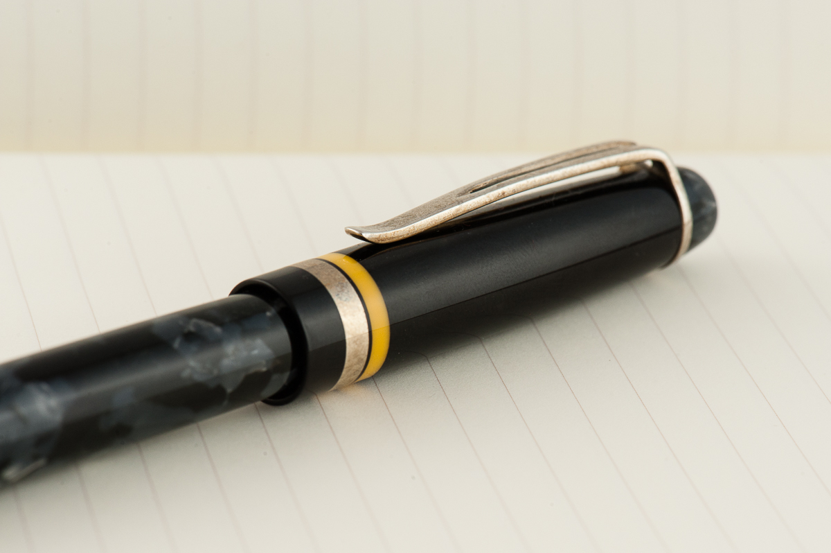
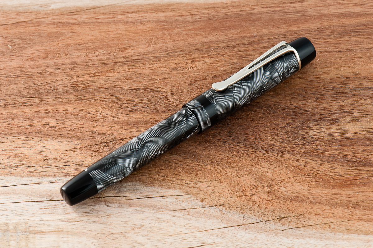
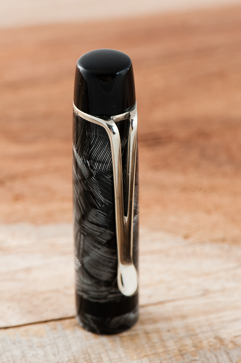
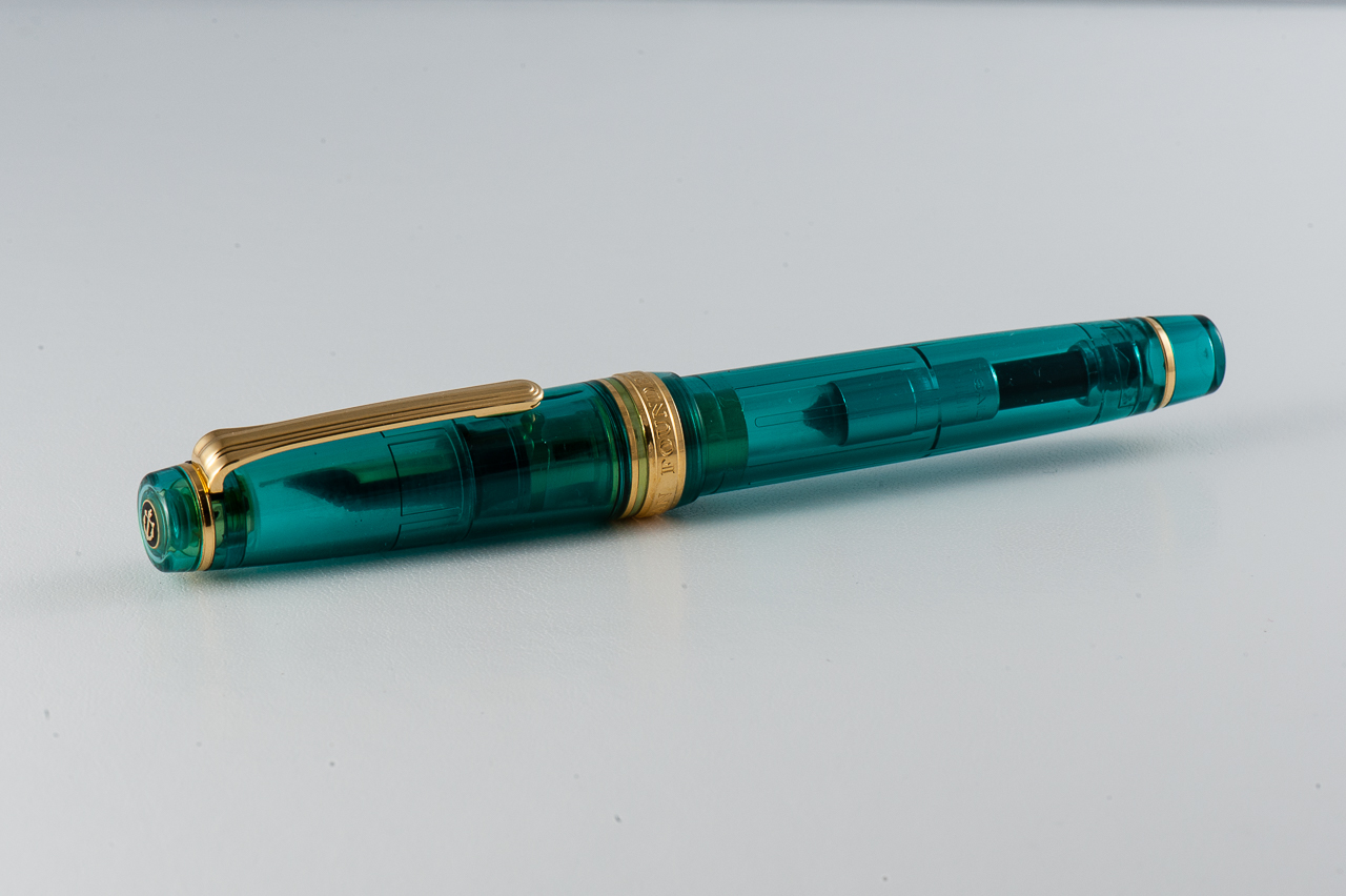
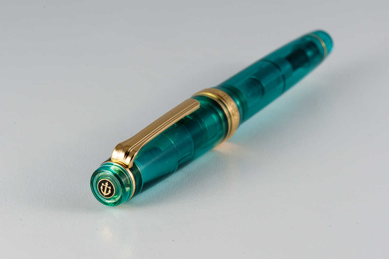
Katherine: To me, this is where John shines. He went to art school and it shows. His pens are classically inspired, but, if you choose, he’ll work with you to incorporate personal and modern touches (sometimes with gentle steering to save you from clashing asks or bad design choices). But, he’s also willing to experiment and try new things. My second pen from him, a purple “nonagon” was at least partially caused by my grousing about being unable to find a Nakaya Decapod Mini and my love for facets — and what a beautiful experiment that has turned out to be! Experiment or not, he takes an immense amount of pride in his work and everything is always immaculately finished — metal bands are tight and smooth, everything is buffed and threads are never tight.
Pam: John has the eye of an artist and the patience of a saint. I haven’t had any experience in designing a pen with all the options available. Particularly since John will work with alot of different materials including hard woods, acrylic (and many more) and with the number of design elements in a pen from the cap, barrel, finials, and clip the possibilities are endless. I started telling John what I wanted in a pen with only one material in mind as the working inspiration. With my initially obscenely long emails of wants, wishes and “I don’t know what to do with this aspect of the pen” and alot of John’s patience and help as a vacillated between all the different possibilities, the “Sherlock” (my name for the pen, not his) was born.
John is great to work with and really does have some great input to fine tune your design to a particular feel or look.
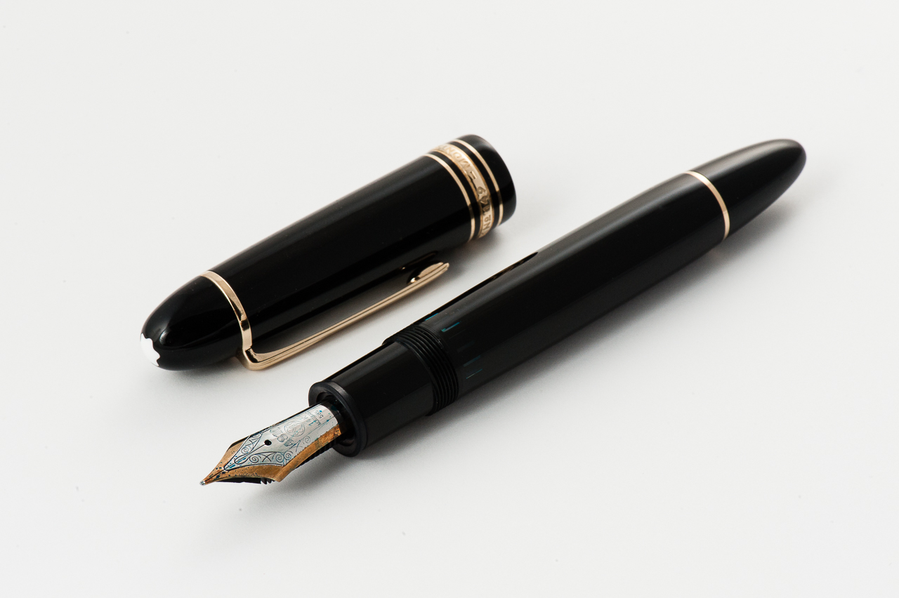
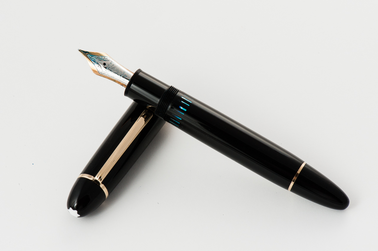
The Business End
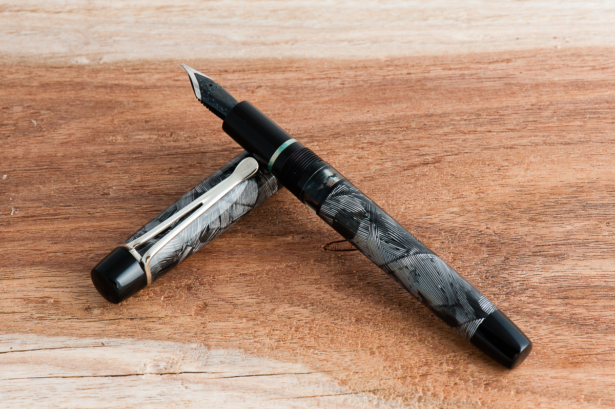
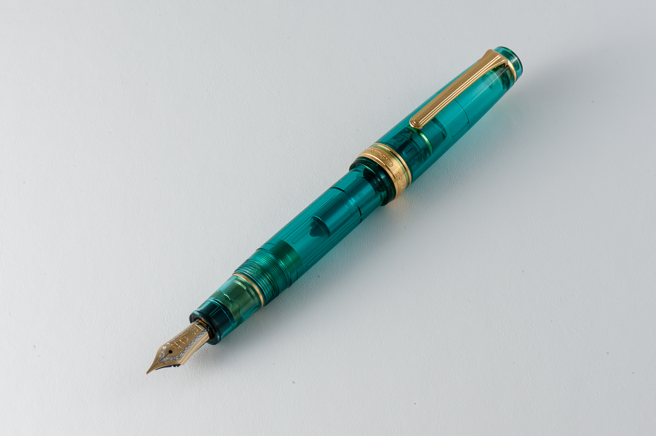
John typically uses Jowo nib units, but can work with other nibs if supplied by the customer. He doesn’t do any grinds or adjustments.
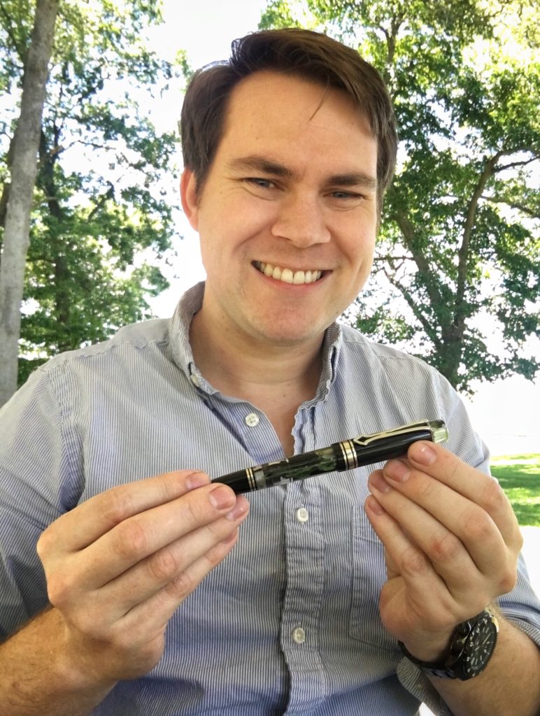
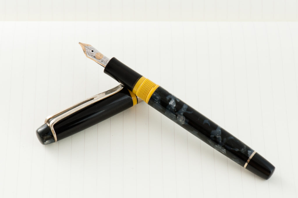
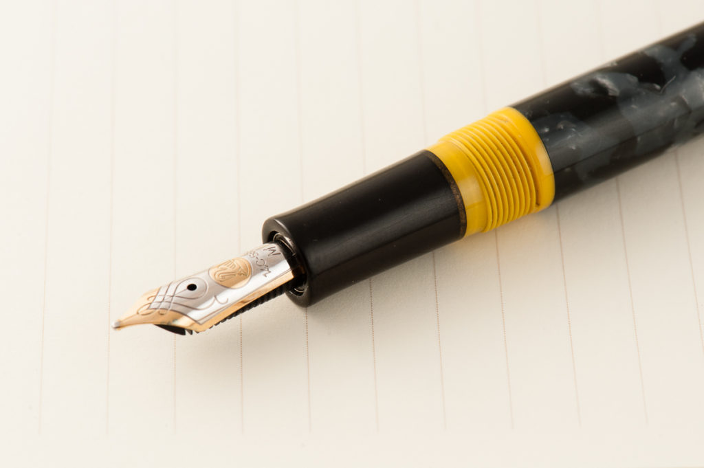
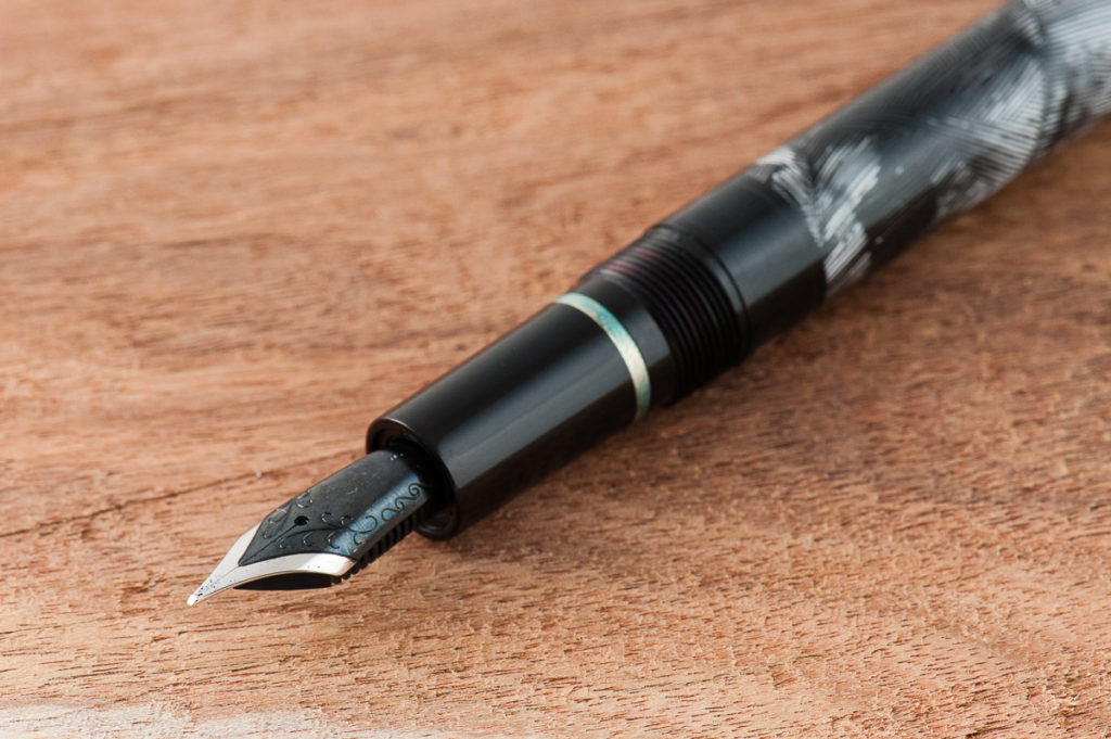
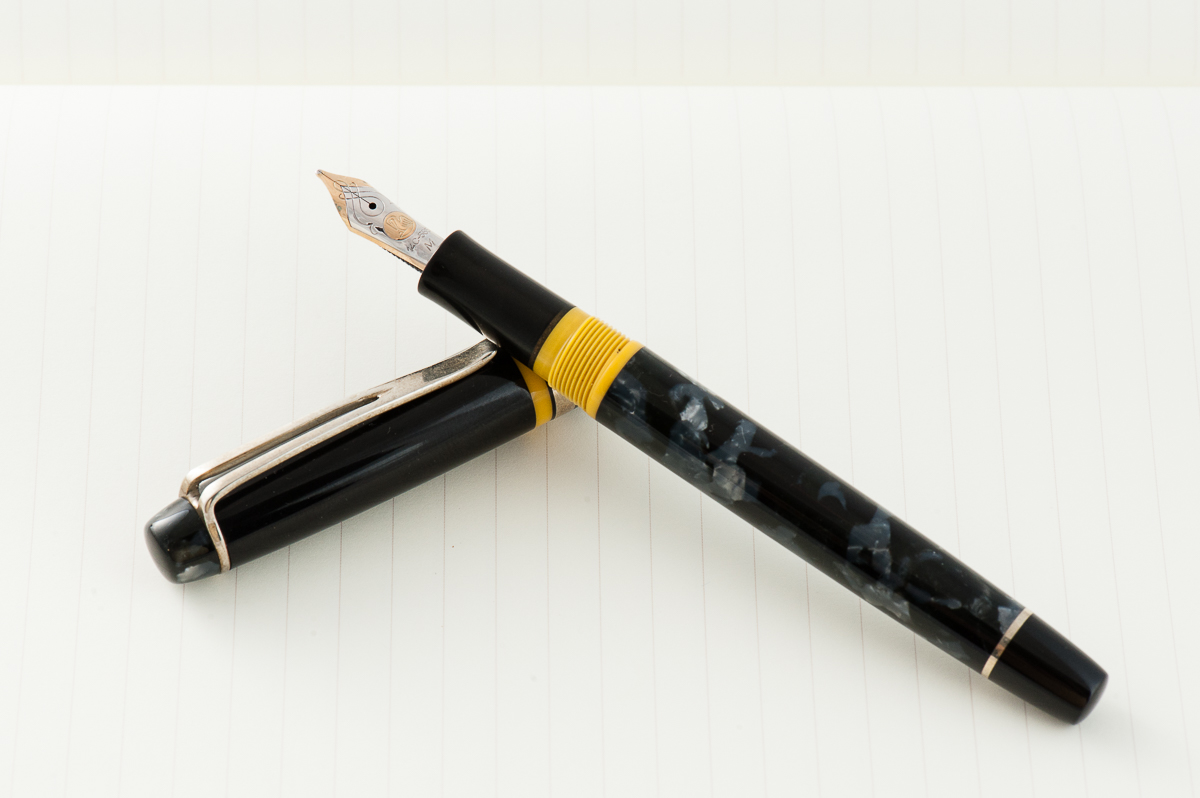
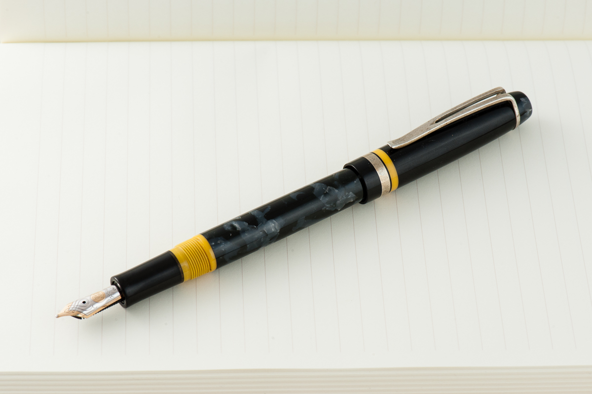
Katherine: While I like Jowo nibs, I don’t love the idea of having a bunch of Jowo-holders. As a result, the first pen I commissioned from John (the grey and yellow one) fits Pelikan m400/600 nibs. I chose to go with an eyedropper, not a piston filler, and it’s written fantastically with little leaking! More recently, John has been building pens around all sorts of nib units, including ones that are entirely friction fit. I don’t own one of these pens (so far) but am excited to do so once I find an appropriate nib.
A Pelikan M600 nib on Katherine’s first Romulus Pen
Pam: I was fine with a Jowo nib for my first pen, particularly with the awesome black/rhodium finish. John was able to get me 2 nib units for my pen, one with a 0.4 cursive italic and one in EF, to suit whatever writing mood I might be in. I really enjoy both nibs and they write as expected. John is branching out to other nib units and I look forward to having all kinds of custom pens that hold some pretty amazing nibs. One day John! One day!
A two tone black oxide #6 steel nib for Pam’s first pen from Romulus Pens
Final Grip-ping Impressions
A Pen Maker’s Goal: A customer to own enough pens to have Wolverine claws with… ;-P
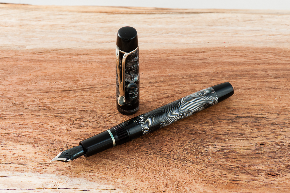
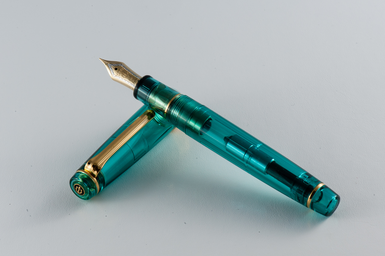
Katherine: I love all three of the Romulus pens I have — a grey celluloid with yellow accents, the first/prototype “nonagon”, in clear acrylic, and the second “nonagon” in a grape stripe resin. All three are immaculately finished, well balanced and well designed. I look forward to working with John on many more custom pens, I already have quite a few ideas queued up…
Pam: John has great workmanship and the “Sherlock” is flawless. The pen is so well polished that the barrel and the finials are seamless to the touch. I joke with John that we can either have a custom pen subscription for me where I just send him money in regular increments until enough money accumulates for me to get another pen by him, or establish a punch card system with the number of ideas I have and get excited about. I don’t keep the ideas to myself mind you, John gets the blitzes of communication when inspiration strikes and he takes it all in stride with great feedback. Did I mention he’s a saint? He also makes all my pen dreams come true.
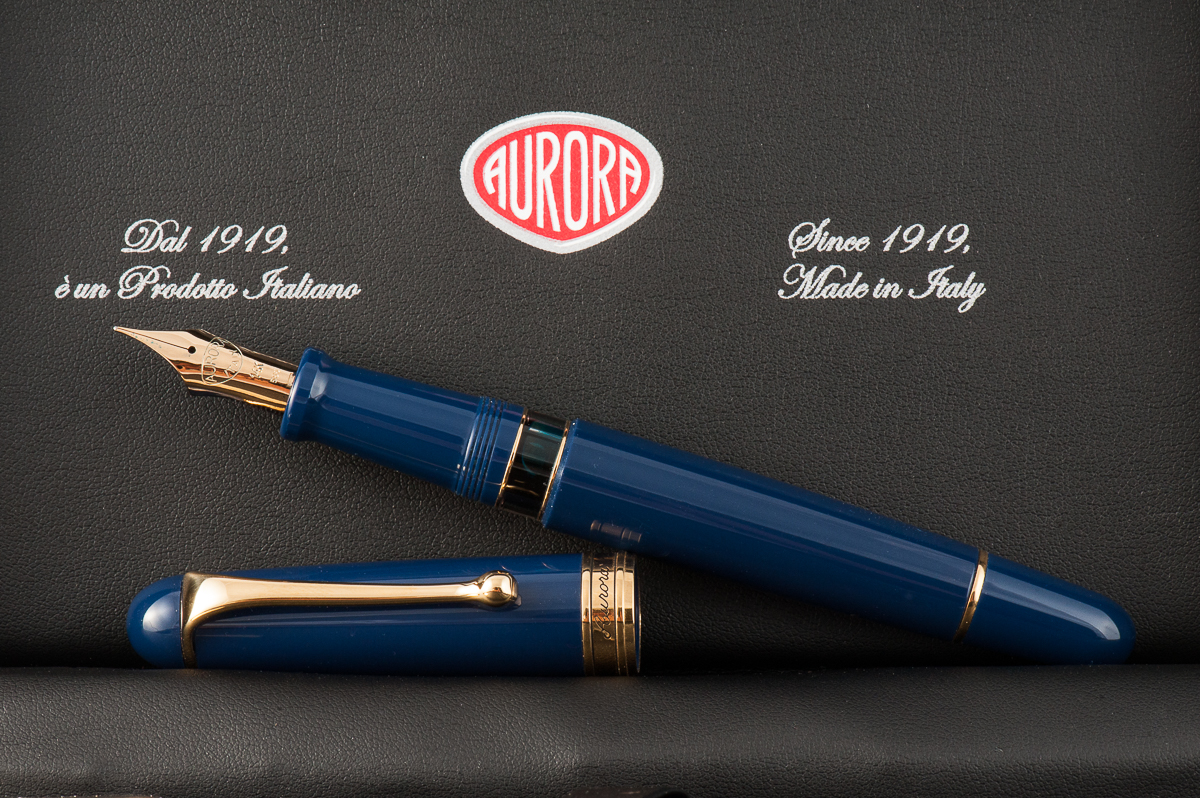
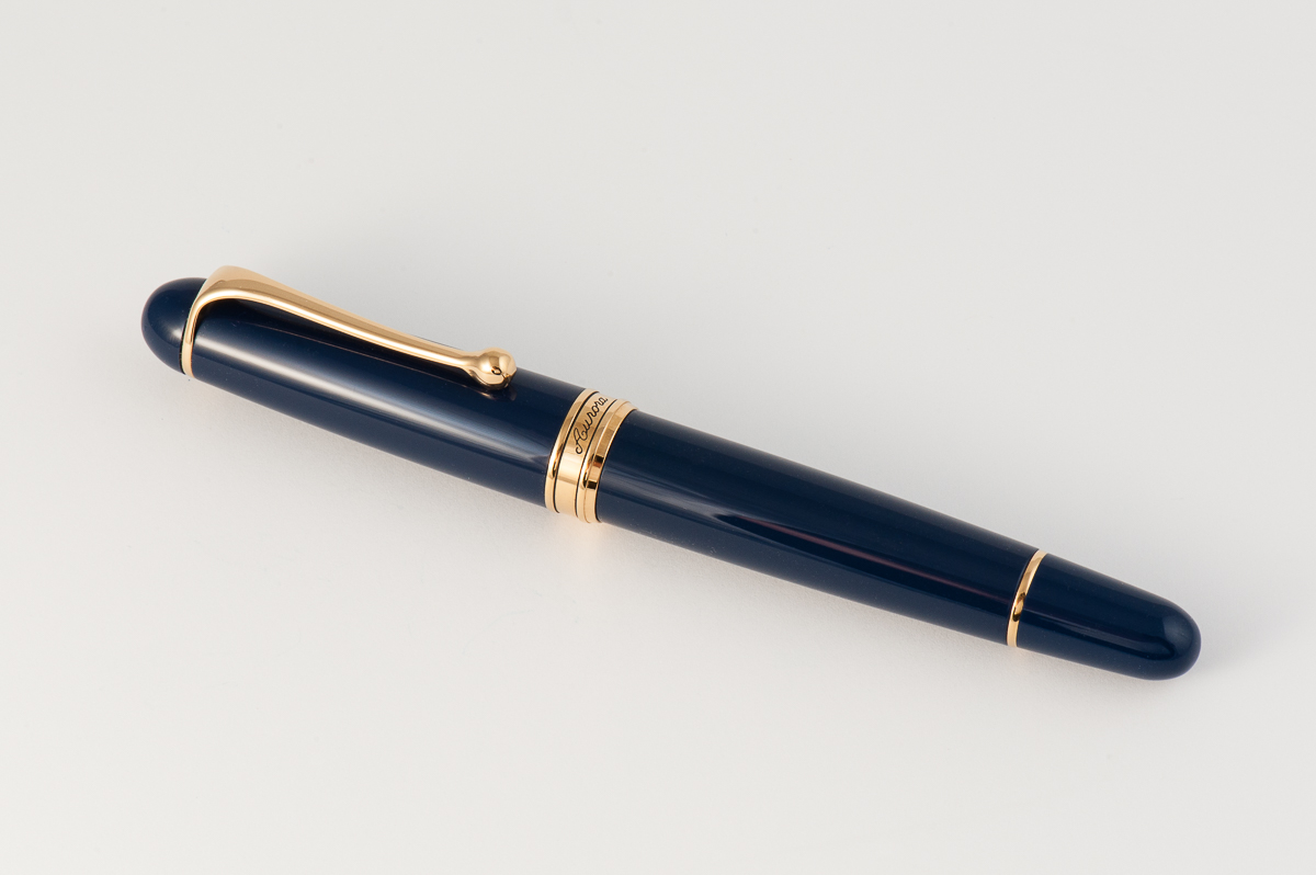
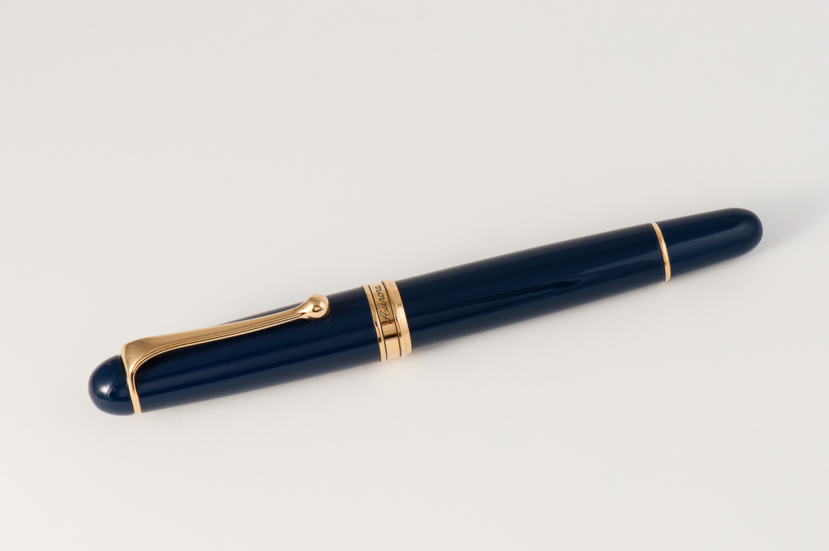
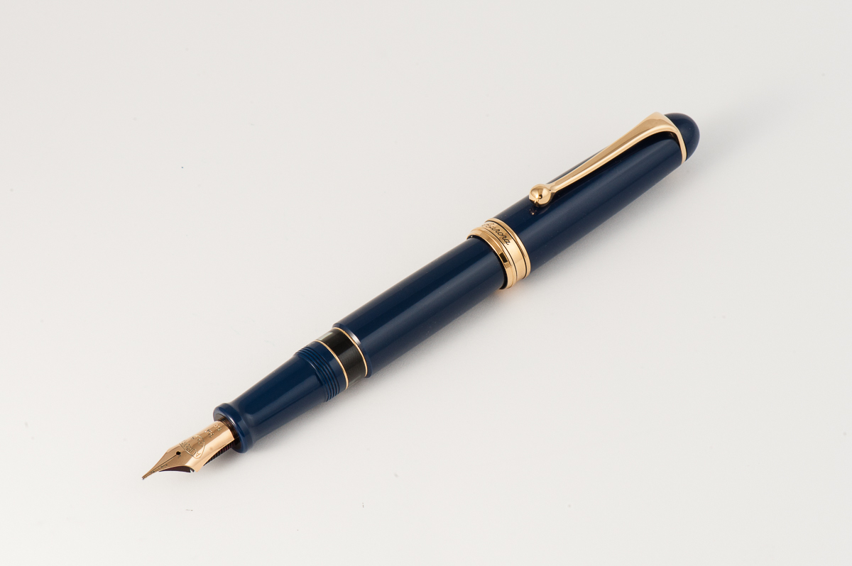
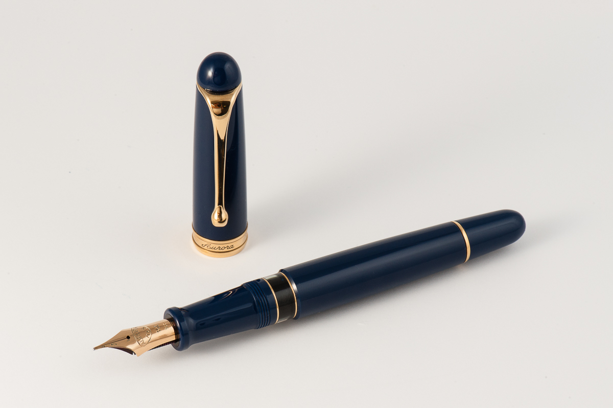
Katherine: I prefer the aesthetic of the square-ended Optima. I thought this was a pretty boring (or perhaps classic?) looking pen, but in a quite unique shade of grey-purple-ish blue.
Pamela: The Aurora Flex 88 has a beautiful blue gray material that is somewhat complimented by the yellow gold hardware. I am curious if a rhodium trim would be a better compliment since the material has a pretty cool tone to it. Shapewise, the pen is a simple cigar shape that does little to convey how special this pen is given all the hype to the “modern flex” pen. The clip is a unique fluid design that doesn’t appeal to me, but does have a clean aesthetic to it. My favorite part of the pen is the ink window. Always a plus for me.
Franz: The Aurora 88 is a visually pleasing pen with a design that makes it timeless. Now this may mean boring for some people …cough… Katherine… cough… ;-P, but the rounded ends look elegant to me. The elongated and tapered barrel makes it a comfortable pen in my hand either posted or unposted.
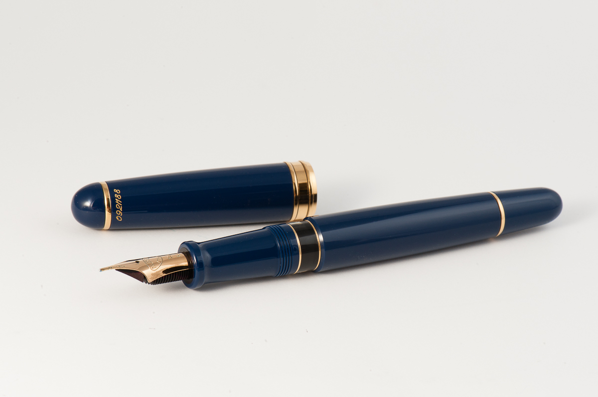
Going back to the pen being timeless, the Aurora 88 design has been in existence since 1947. Albeit, the original 88 design was a bit thinner, had a slip cap, and a hooded nib. Unfortunately, I do not have any photos of a vintage Aurora 88 but an image search for “vintage Aurora 88” will display adequate photos of it. In the 1980’s however, the Aurora 88’s design was altered into what it is right now which is a thicker pen, twist cap, a full size nib, and incorporated with their hidden reservoir system.
Note: This pen history information was taken from Andreas Lambrou’s “Fountain Pens of the World” book.
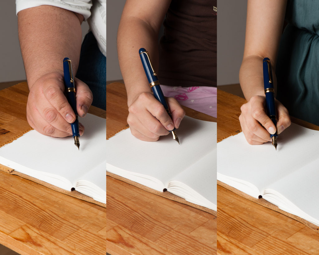
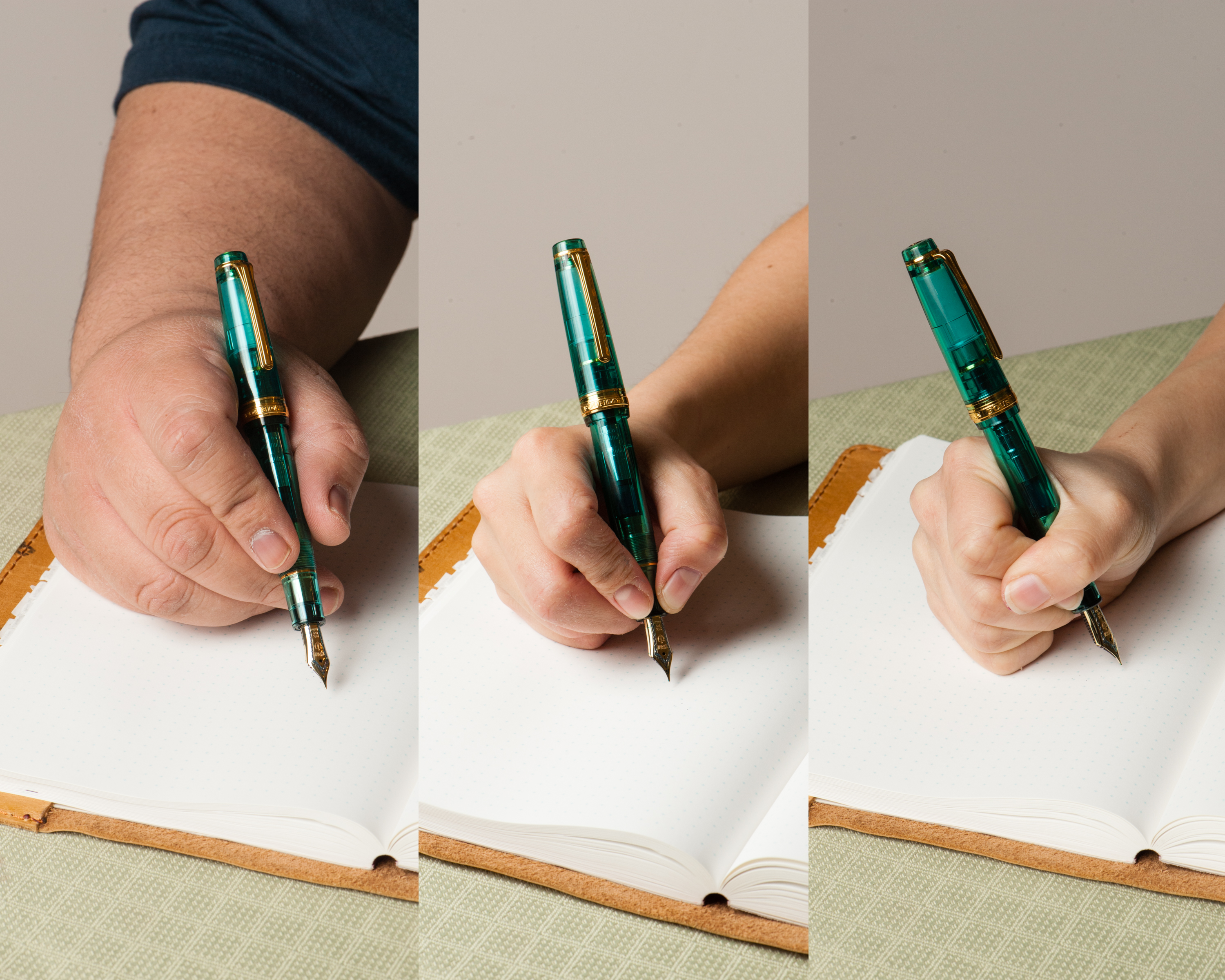
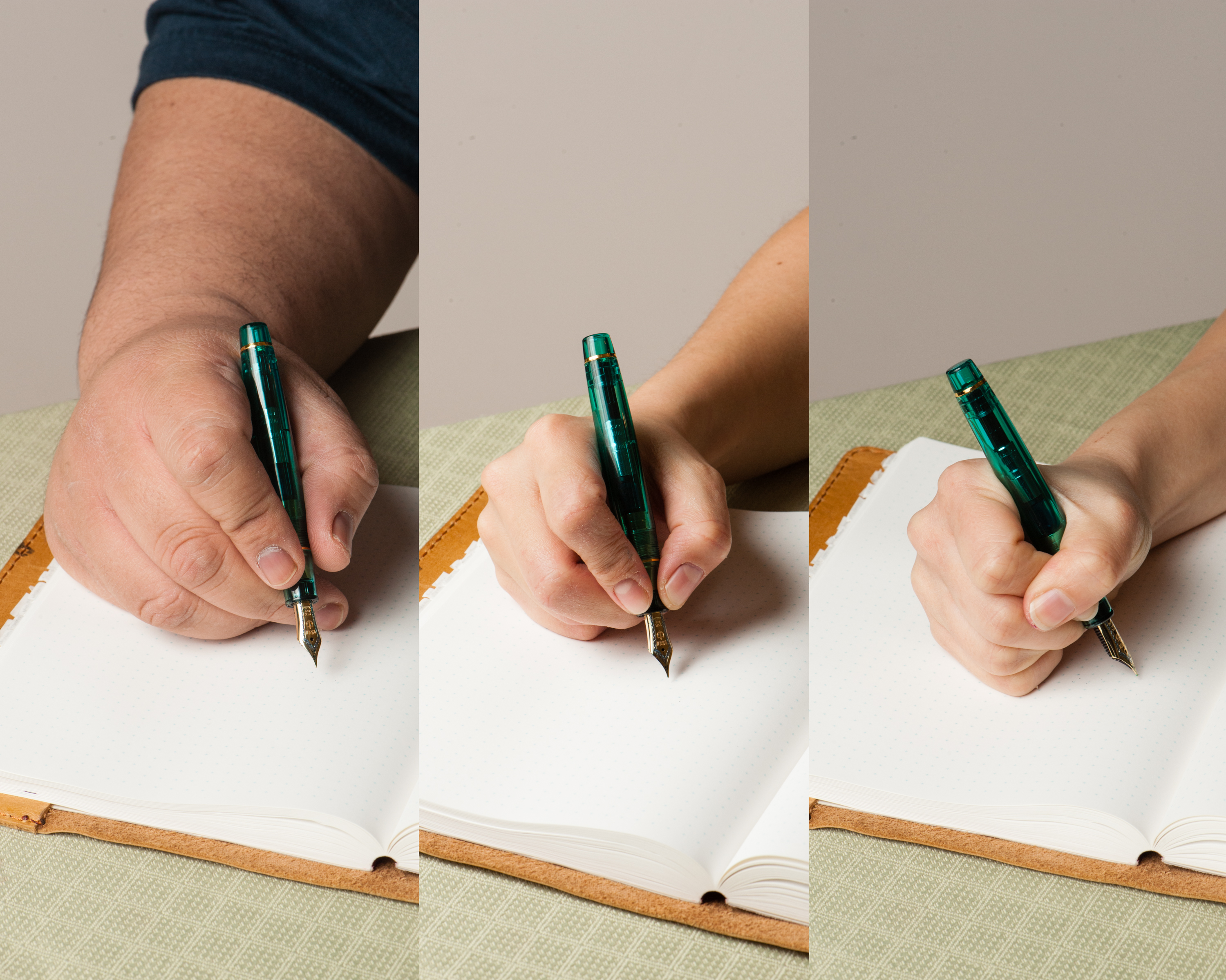
In the Hand: Aurora 88 (posted) — from left to right: Franz, Katherine, and PamIn the Hand: Aurora 88 (unposted) — from left to right: Franz, Katherine, and Pam
The Business End
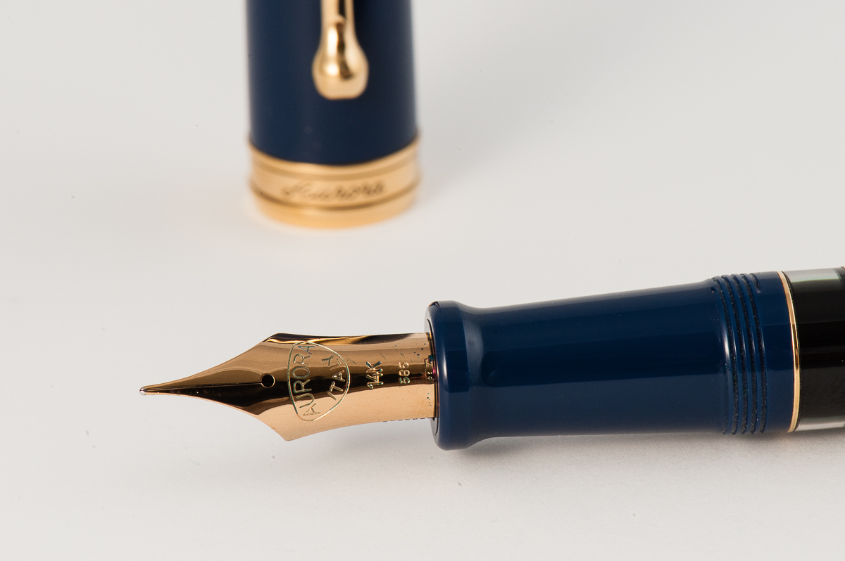
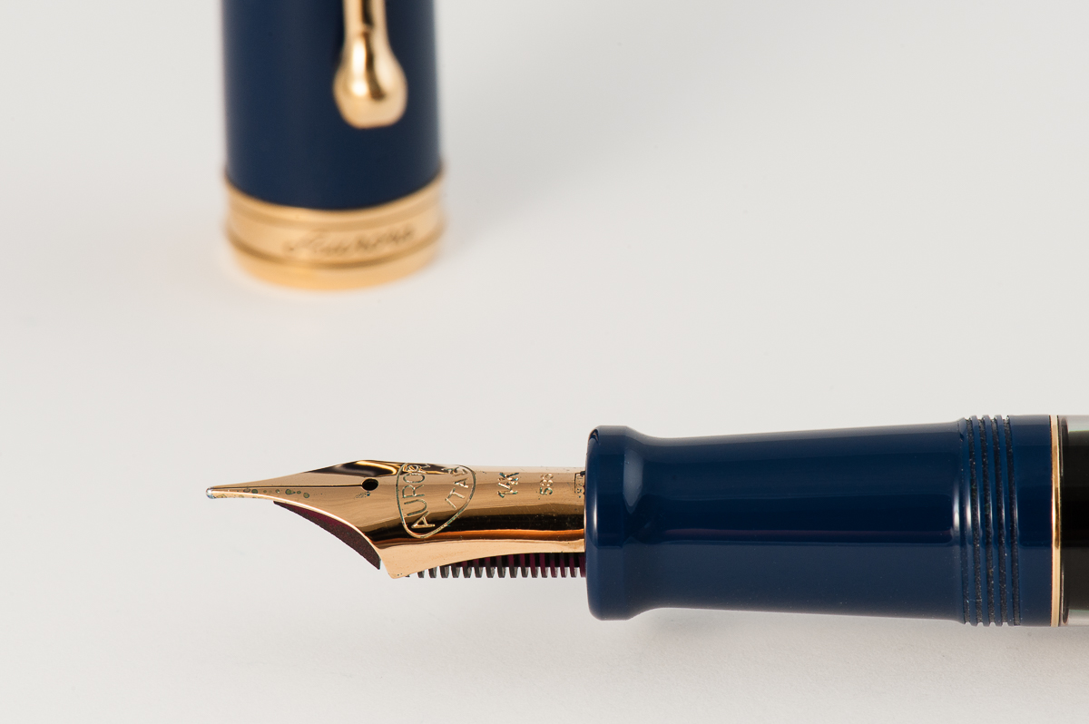
Katherine: I was excited to try Aurora’s much talked about flex nib… but ultimately, I was disappointed. It’s a perfectly usable, and even enjoyable and interesting to use… but, to me, it didn’t live up to the hype. My Pilot 742 FA is significantly softer and offers me much more line variation, while being a fraction of the price. But, if you like the look of the pen, and like soft nibs, this is great — just not what I’d call “flex”.
Pamela: The is a unique shape which provides it the structure needed for this modern flex. Since this pen was on loan from a friend at the SF Pen Posse, I didn’t feel comfortable pushing the limits of this pen. That said, the “flex” is more of a middle ground; it is not as soft as a vintage flex, but softer than the Platinum soft fine nib.
Franz: I really like the shape of Aurora’s nibs especially this fine flex one. The tines are quite longer and cool looking. As for the flex nib and echoing my colleagues above, I feel that it really isn’t a match towards vintage flex nibs. There definitely is line variation but not what you would expect when it is called a flexible nib. I did experience some railroading but as long as I took it slow, it didn’t reoccur anymore.
Overall, Aurora’s nibs are great and I’ve had pleasant experiences with them from writing with other people’s pens. I personally own a factory italic nib that writes quite juicy and sharp. Without any pressure on this fine flex nib, it wrote very smoothly with a fine line.
Write It Up
Katherine: The Aurora 88 is comfortable and enjoyable to write with for long periods. It’s quite light, which I find comfortable and usable for long durations.
Pamela: The 88 is has a very light material, almost too light for me. However, the girth of the pen is very comfortable to use as it cruises over the pages. For this particular nib, I held the pen in a tripod grip. (Yes, even in the tripod, I still grip the pen too tight…). The length of the pen is pretty comfortable both posted and unposted. The material is light enough that posting the pen doesn’t add too much weight or unbalance the pen.
Franz: I enjoyed my journal time with the Aurora 88. I wrote comfortably with the cap posted for about ten minutes, and then unposted for another ten. I do prefer the cap posted on the pen for the extra length but I did not experience any fatigue even when the pen was unposted. Now that’s a rare thing and it’s one of the biggest selling points of the 88 for me.
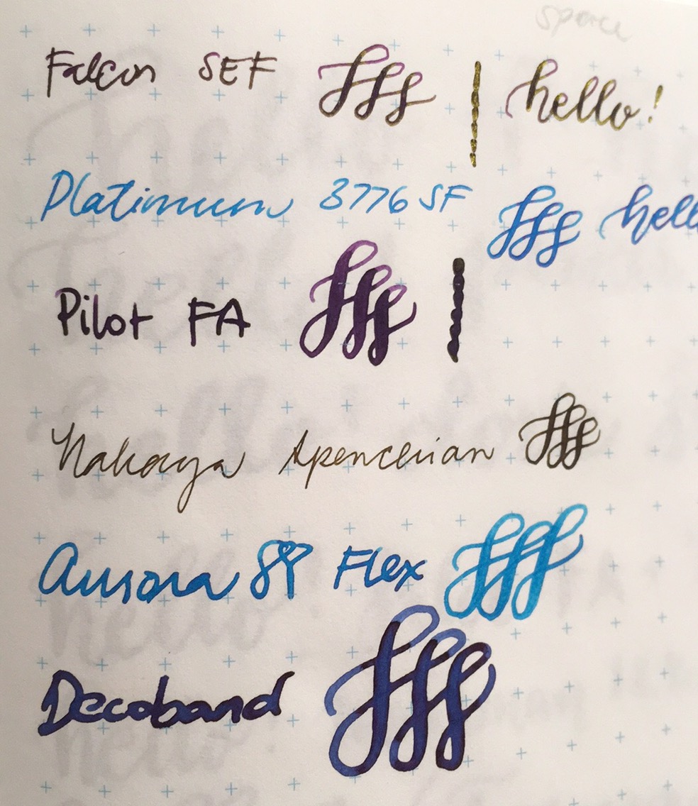
Katherine’s comparison of modern flex nibs (on Tomoe River)
Franz’ writing sample on Rhodia Dot Pad
EDC-ness (Every Day Carry)
Katherine: This was a loan from a friend in the San Francisco Pen Posse — so no EDC-ing for me. But, it has all the makings of being a great EDC pen: A solid and strong clip for pockets (though probably not thick denim), and it uncaps quickly, but not too quickly (one and a quarter turns).
Pamela: Since this pen is on loan, I didn’t trial this pen on the road at work. Instead, the pen is a good size for a daily carry with a strong clip for suit pockets. I wouldn’t recommend throwing this pen into a pair of jeans as the material will probably get pretty scratched up. With the relatively unsubstantial weight, it may also be forgotten in a deep pocket somewhere.
Franz: I used the Aurora 88 at my workplace for a good two days and it was a splendid pen for my work setting. The quick deploy of one and a quarter turns made it convenient for me, as well as the fine width of the nib. As I signed my name, I applied a little bit of pressure and the slight flex gave my signature a bit of flair that I enjoyed very much.
The Aurora 88 has a piston-filler system that carries a good amount of ink and is perfect for an everyday use pen. You can see the ink level quite clearly via the ink window. When you’re running out of ink, fully extend the piston towards the section to activate the hidden reservoir to be able to write a little bit longer. That is a pretty neat feature.
The Aurora 88’s ink window is quite clear.
Final Grip-ping Impressions
Katherine: I have no complaints about this pen, other than the marketing and expectations set by the “flex” label. I’d call this “soft”. That aside, it’s a smooth, comfortable nib that is capable of some line variation (more than a Platinum 3776 SF, but less than a Pilot 742), in a solid and classic body. But, as with many pens in the $500+ category… whether or not it’s worth that price tag is a pretty subjective mater. To me, it’s not, but there aren’t many options for nibs like this, and if you don’t like black Pilots, this is the most line variation I’ve seen from a modern pen.
Pamela: I am torn in my final recommendation for this pen. On one hand, the pen and nib is a modern feat in trying to emulate the infamous vintage flex. On the other hand, there are still vintage flex nibs and pens out there for a substantially smaller price tag. I applaud Aurora for adding more flex and softness to the modern nib options and for those individuals who have the funds and the willingness to support such an endeavor, I would highly recommend this pen to them. For those who lack the funds but still want to try a flex pen, I would recommend taking the time to research vintage pens and flex nibs, and finding a good deal via the Pen Addict slack, reddit or your local pen show.
Franz: It’s interesting how the two ladies above and myself have about the same sentiments on the Aurora 88. The pen itself is very nice to write with and my larger hand was not even a bit uncomfortable/fatigued. If you like the shape of this pen like I do, you may currently acquire one below the $500 price point with the round nibs (Extra Fine, Fine, Medium, and Broad). Now if you want the Fine Flex nib option, you’ll be paying a premium since the flex nib is only available in their limited edition releases. I mean, that’s quite a chunk of money knowing that you can obtain a decent vintage flexible nib for a lot less money. But then of course, the limited edition colors are quite nice as well. The blue finish of this Aurora 88 is very enticing to a blue pen lover like me.
As for my final thoughts on the Aurora 88, I like it. A LOT. This is definitely on my list of pens to one day own and add to my growing Italian pen collection.
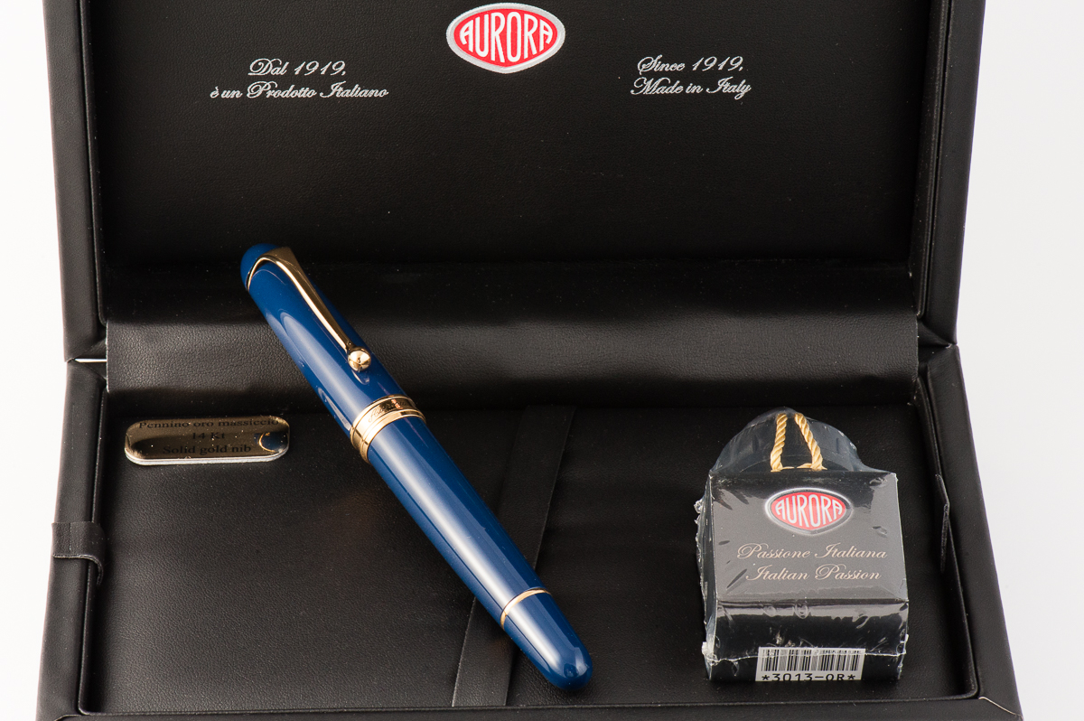
Thank you Michael for lending us your Aurora 88 Flex pen. You’ve been very generous my friend. See you at the Pen Posse meetups soon!
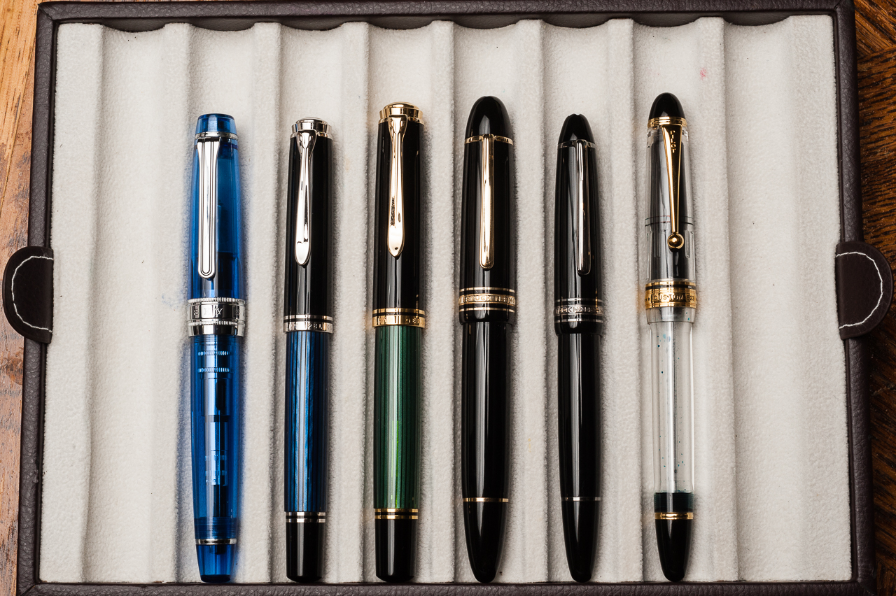
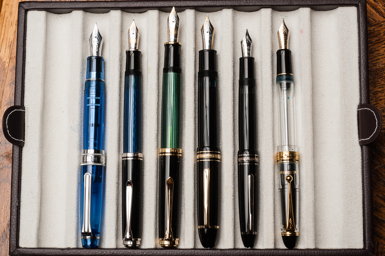
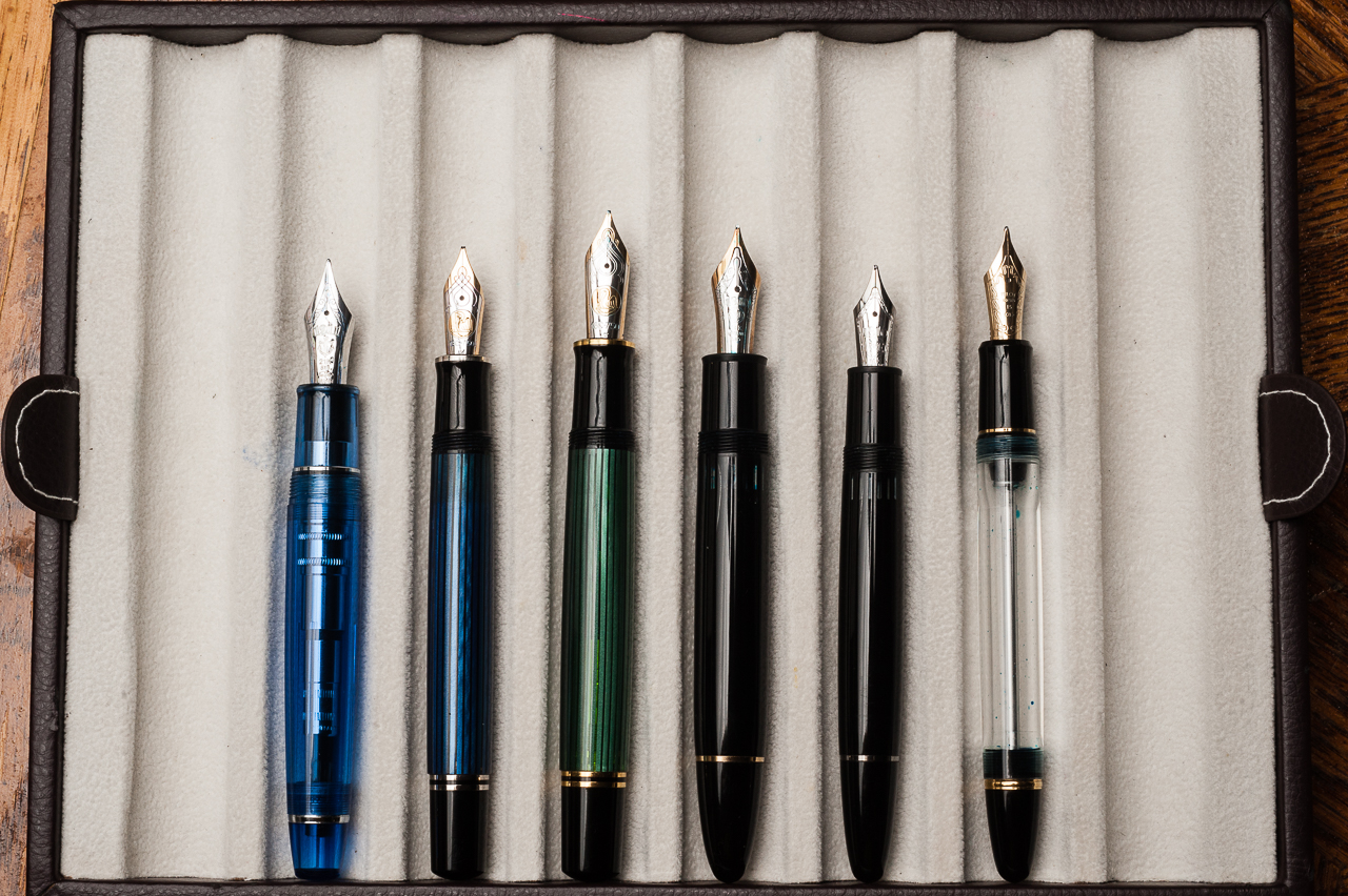
Pen Comparisons
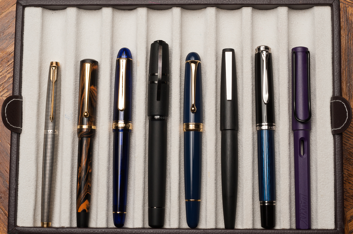
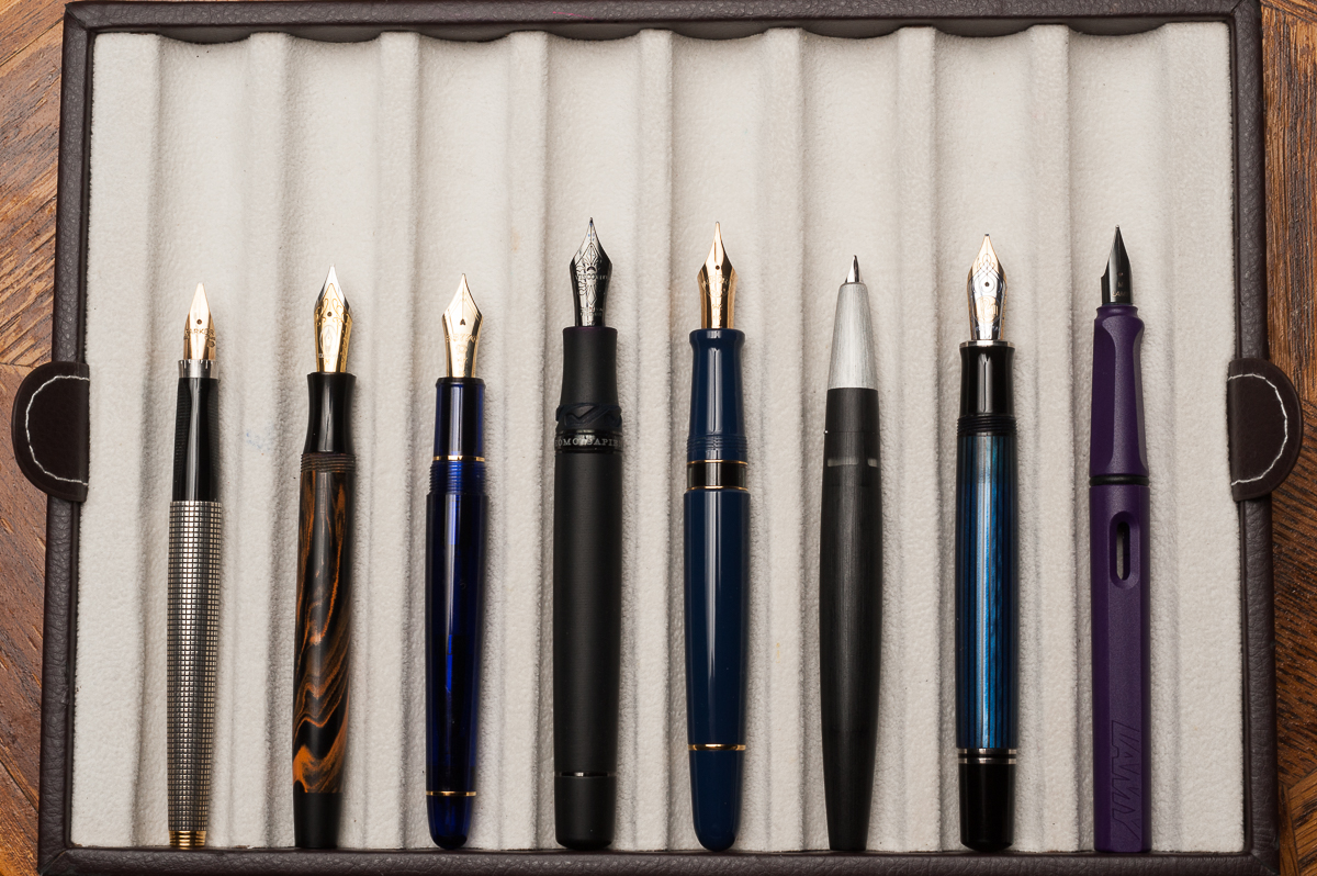
Closed pens from left to right: Parker 75, Edison Beaumont, Platinum 3776, Visconti Homosapiens, *Aurora 88*, Lamy 2000, Pelikan M805, and Lamy SafariPosted pens from left to right: Parker 75, Edison Beaumont, Platinum 3776, Visconti Homosapiens, *Aurora 88*, Lamy 2000, Pelikan M805, and Lamy SafariUnposted pens from left to right: Parker 75, Edison Beaumont, Platinum 3776, Visconti Homosapiens, *Aurora 88*, Lamy 2000, Pelikan M805, and Lamy Safari
This post features Moogle as a guest poster. He’s been silently present (or under the table) for so many of our photo shoots, so we gave him his own post!
Every year (or maybe twice a year?) Flax in Oakland hosts a pen fair!
This year, I embarked on a journey across town to take a look at some pens and attend my first pen fair! (My human hasn’t figured out if the SF Pen Show is dog friendly.)
It was the small gathering at the front of the store, with about 5-6 tables of pens, and some shelves of ink and paper. The rows and rows of pens were pawsitively overwhelming! (And all at 20% off MSRP)
Several brands were represented, and while it’s nice to see pens in person, if you spend a lot of time online, the selection (and 20% off MSRP) aren’t terribly exciting or novel. But, Flax is dog friendly, so there were also other dogs to bark at. (I’m a jerk like that)
Taccia and Sailor were also there, with a table off to the side. Sailor had a couple interesting pens available — a maki-e pen, a clear KOP and a Pro Gear with a sabi togi grind, but unfortunately the last of those wasn’t inked. Taccia (photo above) had a selection of gorgeous and unique urushi pens that I hadn’t seen anywhere online, which were mighty tempting — but I doggedly stuck to my budget.
Overall, the best part were the people! Pam gave me a hug and Franz gave me many pets.
Update 05/15/2017 : We are adding the information that the Turquoise Sailor Pro Gear pictured above was a 2016 limited edition pen release via the Japanese shop, Wancher. Pam purchased this online via the global marketplace, Rakuten. And the Kingfisher finish that Claire is holding below is another Japanese limited edition Sailor Pro Gear. These limited edition finishes are currently unavailable via US retailers. We apologize for not establishing this bit of information. Our main focus for our pen reviews is to show how different pen sizes feel on different hand sizes and we hope that we continue reflecting this point.
Hand Over That Pen, please!
Katherine: I love the look of the Pro Gears — the clean lines and squared-off cap just look really classic, but aren’t boring. The one pictured above is Pam’s, and I think the translucent material is gorgeous, and the gold trim, while louder, really makes the green look more rich. I own a Pro Gear in the Keio Atman “Kingfisher” limited edition colors… That’s another upside, no matter what kinds of colors you liked, there’s a Pro Gear out there for you! (It might just not be cheap…)
Pam: In a previous review, I made terrible analogies comparing my love for the Sailor Pro Gear’s smaller sister, the Progear Slim to the ardent love that Darcy had for Elizabeth Bennett of Pride and Prejudice fame. Just like last time, my love for a Sailor is of literary proportions. I was originally attracted to the Progear Slims as they are only slightly smaller than the Progear, but at a significantly lower price. That being said, you don’t always get to choose what limited edition you love and must have so my collection expanded to the Progears as well. Let’s just say I felt remiss for missing out on such a wonderful pen for so long. The relationship status I I have with my wallet on the other hand is “complicated.”
Claire: Hang with me here, I can wax poetic about the Sailor Pro Gear all day long. This is by far my favorite pen available on the market. I currently own three Pro Gears and one Realo. I love the way this pen looks, the flat finials pull the pen together in the best possible way. The size and weight is perfect for my hand. If I had to choose one pen to write with for the rest of my life, a Pro Gear would be that pen. I love how many colors are available, especially if you’re willing to do the leg work on Japanese exclusives.
Franz: A turquoise-y disposition! (Yep… that will now be a term and a hashtag, thank you very much!) For the past six months I have come to appreciate Sailor pens more and that’s due to both Katherine and Pam. Largely, Pam is to blame though for she has set out to collect some special/limited edition Pro Gear Slim and Classic pens available. And what’s not to like? It’s a pen that Sailor designed almost 15 years ago so the aesthetic works.
The Professional Gear has been on my “list” of pens to own for the longest time. Just like the three ladies above, the flat ends definitely appeal to my taste. The gold trim blends well with the color of the pen and gives it a warm feel.
In the Hand: Sailor Pro Gear (posted) — from left to right: Franz, Katherine, and PamIn the Hand: Sailor Pro Gear (unposted) — from left to right: Franz, Katherine, and PamIn the Hand: Sailor Pro Gear (Kingfisher version) — Claire
The Business End
Katherine: The MF is fun to write with — fine enough for daily use but just wide enough to see the character of one’s ink. My Pro Gear (which I’ve written with more) has a H-F nib, which is extremely fine, but also wet. It’s a magical combination of wet and fine, which leaves me with saturated but very fine lines. Additionally, despite being labeled a “hard” fine, it has some bounce to it. I wouldn’t recommend it, but I can get line variation out of mine. And, at the risk of sounding overly enthusiastic, I also love the feedback on this nib. It’s a nice pencil-y feeling that isn’t too smooth, it’s got character!
Pam: I have had some variability in my experience with the Sailor 21k MF nibs. I have seen some that are more on the fine and harder end of the spectrum while some are broader and slightly wetter. Given that the MF nib is broader than the F or EF, the nib is wonderfully smooth and really shows off the ink qualities like shading or sheen really well. Surprisingly, I didn’t consider grinding the MF down, probably because I paired this turquoise demonstrator Progear with Robert Oster’s Fire and Ice; be still my heart, the sheen!
Claire: The 21k hard fine Sailor nib is my favorite. I love how hard the nib is; though it isn’t too hard. It’s hard to quantify what makes this a Goldilocks nib in my opinion. I love the pencil like feedback that these 21k nibs give so consistently. All three of my fine nibs have given me the same lovely out of the box performance. The only qualm I have with this pen is the converter isn’t the best. Sailor converters don’t hold very much ink and are notorious for having issues. Typically when I get a new Sailor converter I open it up and put silicone grease on the threads and piston. That so far has saved me from running into any of the issues I’ve heard others to have.
Franz: In my experience, Sailor nibs are well tuned out of the box. And this H-MF is no exception at all. I enjoyed writing with this nib for hours. (I have held it hostage from Pam for a while now) And like Katherine, I found the feedback to be pleasant like writing with a pencil.
Sailor Pro Gear 21-karat H-MF (Hard, Medium-Fine) nib
Write It Up
Katherine: This pen surprised me with how small it is for the not “slim” version. And it’s a wonderful size for my small hands. Both this and the Pro Gear Slim are comfortable for me to use for extended periods of time, but I do prefer this to its smaller sibling (Which is unfortunate for my wallet. And there are slightly fewer limited/store editions available in the Pro Gear). This pen isn’t too narrow, it’s well balanced and the nibs are a delight to write with — I regularly toy with the idea of collecting on in each nib size, but haven’t quite convinced myself not to stick to my pen limit.
Pam: As all pen addicts know, the smallest differences can make all the differences turning a good pen to a great pen. Fortunately, going between the Progear Slim and the Progear isn’t such a large difference that it’s an issue. In my hand, the Progear is a bit longer, equally well balanced and slightly girthier than the Slim. The extra girth is great for longer writing sessions in my opinion. Even in more petite hands, the Progear is comfortable and well balanced, capped or uncapped. Honestly, if the Slim is comfortable for you, the Progear would be equally comfortable. If the Slim is slightly uncomfortable for you, the Progear will be just right. All I can say is, beware of picking up a Progear, you won’t want to put it down.
Claire: I can write with a Pro Gear all day long without running into any hand fatigue. Many times when I’m taking notes for school I’m switching between Pro Gears so I can have a variation in ink color. The way the section tapers fits my hand perfectly. The section on the Pro Gear is really what makes the pen. The more I write, the more I want to find more to write. I really can’t write enough about how much I enjoy writing with this pen.
Franz: The Pro Gear is slightly bigger in girth and length compared to the Pro Gear Slim. Because it is larger, it’s more comfortable to journal with. And I wrote blissfully for a good ten minutes. I even got to finish a letter for a friend with it. But once I unposted the cap, it became a bit tiresome even after only five minutes of writing. So definitely for my large paws, I gotta have it posted for longer writing sessions.
EDC-ness
Katherine: This is a great EDC pen — not terribly expensive, not too small, not too big, fantastic nib, durable plastic body, what’s not to like? The clip is solid too! Plus, because the converter is mediocre… even if everything goes wrong, you’ll never get lots of ink on your clothes! (Honestly, because the F I have is so fine, I get plenty of writing out of one converter, so capacity isn’t an issue for me EDC-ing this pen, as long as I remember to check my ink level regularly)
Pam: I have at least one Progear or Progear Slim in my rotation at all times. The nibs can’t be beat and the finer nibs (EF in 14k or F in 21k) performs admirably on cheap office paper for work. The clips are secure without being overly tight and the pens do tolerate being in white coat pocket easily and well. Additionally, depending on what colorway you choose, the pen can be subtle, professional and classic looking or bold, loud and modern. For those in the office setting, this pen can be like a tie, the pop of color or a small, subtle way to show off some personality.
Claire: If I had a job where a fountain pen would be useful in day to day work, this would be the pen I would bring with me every single day. The Pro Gear is often the first pen I reach for when taking notes for class. When I graduate and move to a desk job, you can bet this will be one of the pens I carry with me on a day to day basis. At home, this is almost always the first and only pen I reach for for my evening journaling.
Franz: I once again echo the three ladies above and agree that the Pro Gear is a nice pen to use on a daily basis for my workplace. The pen was clipped securely onto my dress shirt and was always ready to write. You do need to rotate the cap twice to deploy the pen but I just accepted this since it gives me happiness to use the pen. With signing my name multiple times at work, I didn’t feel the need to post the cap and the medium-fine nib was perfect for the copy paper used in the office.
Final Grip-ping Impressions
Katherine: I really like this pen. It comes in so many colors and I’ve been very tempted to collect quite a few. But, alas, my pen limit has prevented me from doing that and instead I only own one Pro Gear, but it’s a solid pen and I love writing with it. It’s a very comfortable pen and a very solid one. I would highly recommend it to anyone who’s thinking of purchasing — and it’s fun (and frustrating…) to hunt down crazy colors and limited editions to find the perfect one (or ten).
Pam: My love for Sailor Progear or Progear Slim has been effusive to say the least. However, once you pick up one of these pens, you will understand. The pen is well made, the nib is beautifully crafted, the shape is elegant and the color ways can be unique. (Speaking of nibs, Sailor makes some amazing specialty nibs like the zoom nib.) Like the Lamy 2000, everyone should at least try this pen, and I would surmise that it’s pretty inevitable that you will own one. Additionally, if it’s a limited edition Progear, I am sure one of us would be happy to “insure” the purchase…
Claire: The size of this pen is perfect, it’s just long enough to fit perfectly in my hand. The balance is exactly what I look for in a pen. The tapered section allows the pen to be comfortable to write with without adding additional weight to the pen. I only have one gripe with this pen: the converter. While I haven’t run into any of the glaring issues I’ve heard of with this converter, I really wish it could hold more ink.
Franz: Sailor has done right with the Professional Gear design. Proportions are great and the build quality is awesome. And just in case you still aren’t sure what my thoughts are, this pen is awesome. It is perfect for me posted, and “okay” unposted. I seem to have always hesitated to buy this pen due to its size in my hand. But after spending some time with Pam’s Pro Gear, I may just get one myself when I find a finish that attracts me.
In closing, every serious pen user should pick up and write with a Sailor Professional Gear. You never know, this pen may just appeal to you and change your mind as it did mine.
Pen Comparisons
Closed pens from left to right: Parker 75, Franklin-Christoph Model 20, Platinum 3776, Pilot Vanishing Point, *Sailor Professional Gear*, Lamy 2000, Pelikan M805, and Lamy SafariPosted pens from left to right: Parker 75, Franklin-Christoph Model 20, Platinum 3776, Pilot Vanishing Point, *Sailor Professional Gear*, Lamy 2000, Pelikan M805, and Lamy SafariUnposted pens from left to right: Parker 75, Franklin-Christoph Model 20, Platinum 3776, Pilot Vanishing Point, *Sailor Professional Gear*, Lamy 2000, Pelikan M805, and Lamy Safari
Sailor Professional Gear Comparisons (Left to right: Pro Gear Slim, Pro Gear Classic, and Pro Gear King of Pen)
Pen Photos (click to enlarge)
Sailor Pro Gear Classic 21-karat H-MF (Hard, Medium-Fine) nib
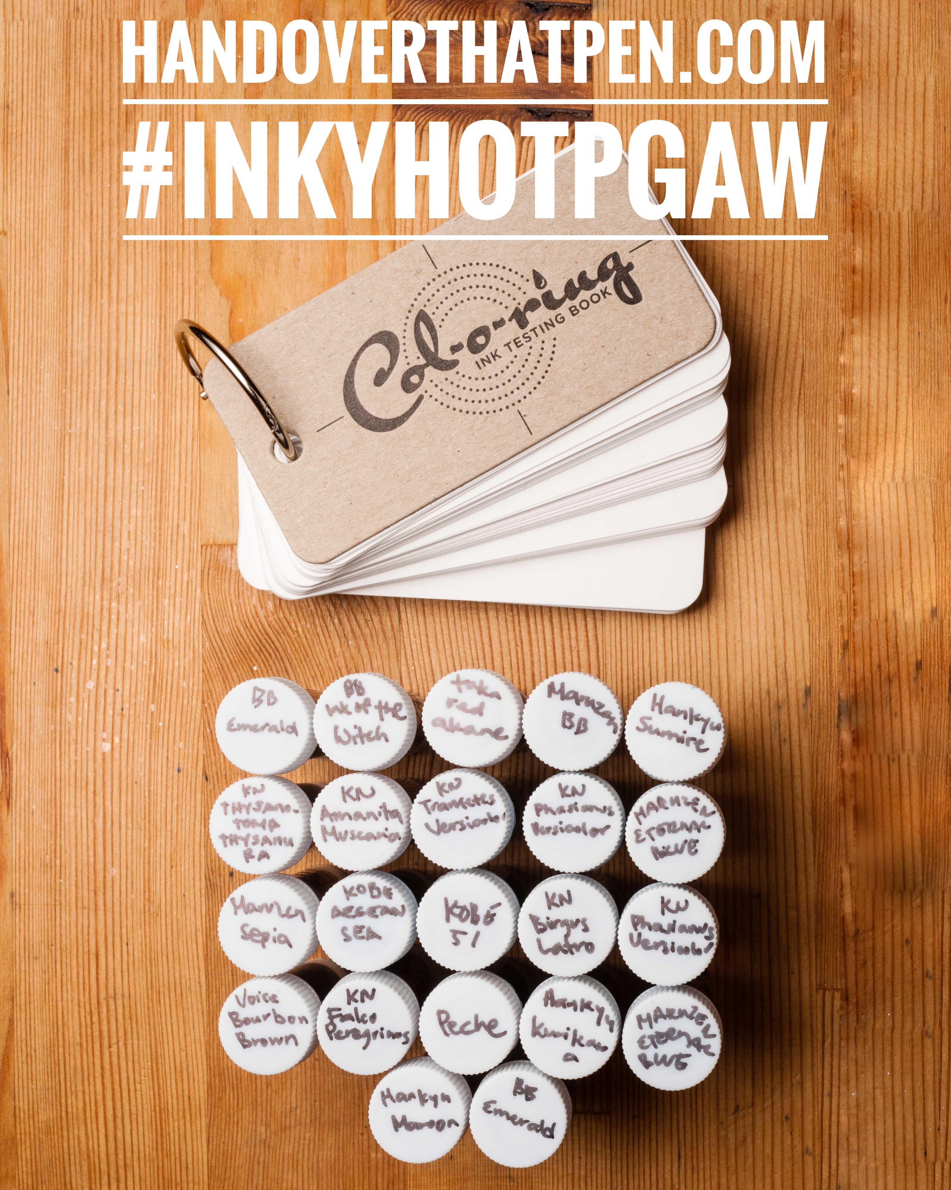
Many of you followed Katherine on her adventures through Japan, including many store exclusive inks. In the meantime, The Well Appointed Desk‘s Col-O-Ring ink testing book debuted! So we’re giving away a great bundle to try out and test some less common Sailor inks — 21 (We have BB Emerald in the picture twice, sorry) 4ml samples of uncommon Sailor inks + 1 Col-O-Ring ink testing book!
To Enter:
Follow us on instagram, @handoverthatpen & regram our giveaway image or post a picture of your favorite fountain pen and ink with the hashtag #inkyHOTPgaw (Please make sure your account is public so we can find it! And no giveaway accounts.)
Comment on this blog entry with your favorite fountain pen and ink (not necessarily a pairing)
The giveaway is open from now, 05/07/2017 until 05/15/2017 11:59pm Pacific time. One entry per person please.
The giveaway is open internationally, but we aren’t responsible for any taxes, customs fees or duties that may be applied, and will be shipping without tracking due to cost.
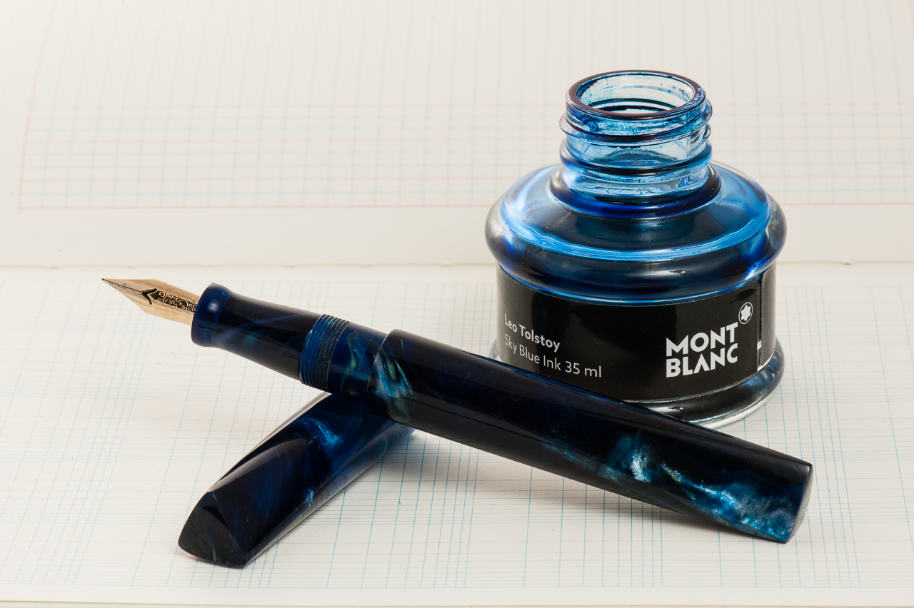
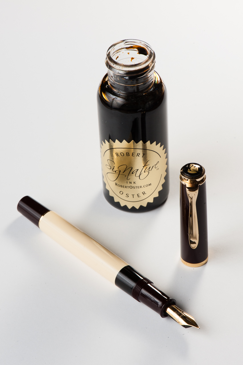
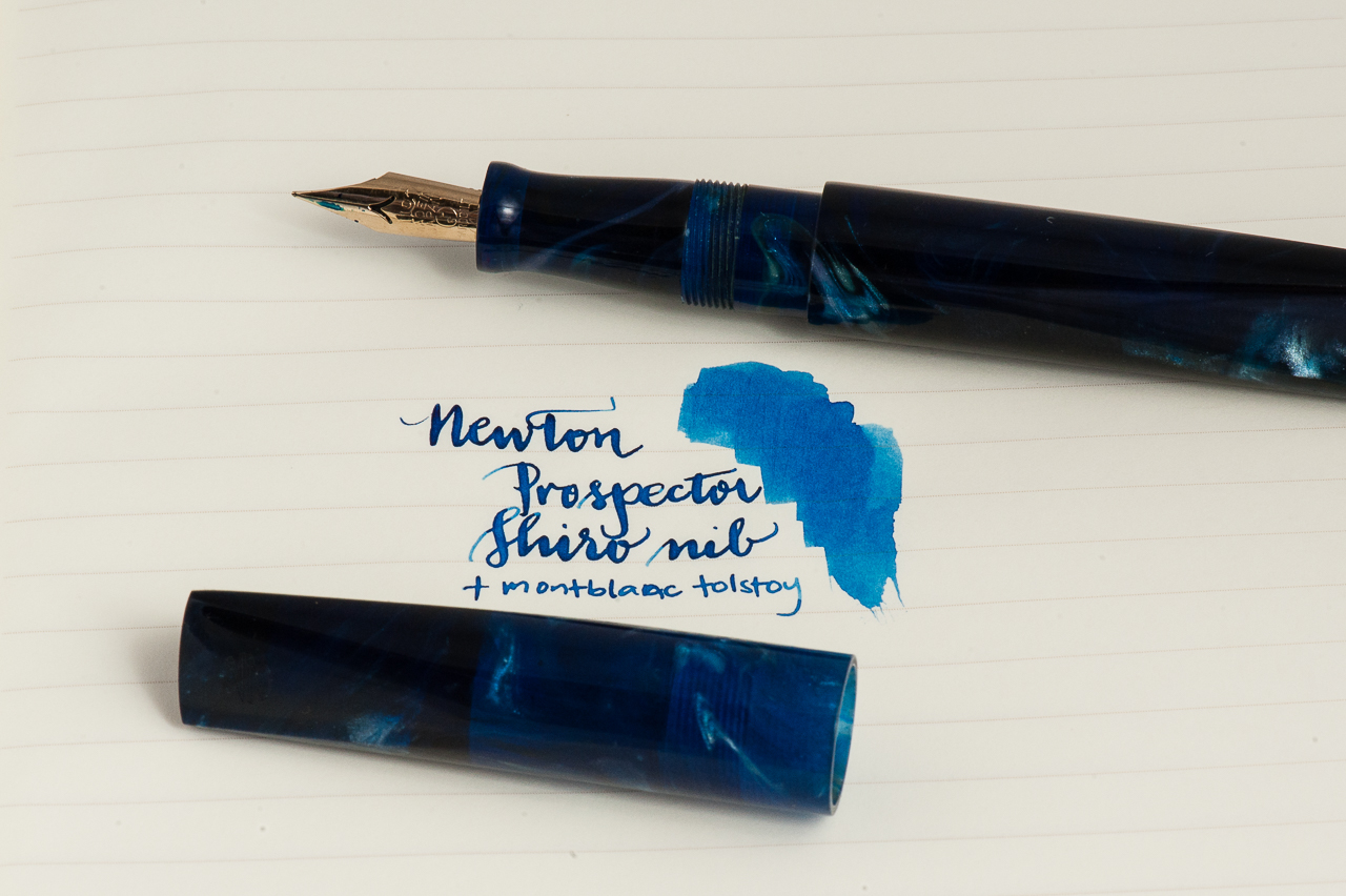
Katherine: It’s still March as I write this — I’m picking a little early since I’ll be out of town for a lot of April. But, even though it’s March, I have no doubt I’ll keep this pen inked through April. 🙂 My pairing for the month is my new Newton Pens Prospector and Montblanc Tolstoy. I chose BSea’s Galaxy Trek resin, which reminds me of the deep ocean. It’s a dark, almost black, blue in many areas with swirls of lighter blue and even white and an occasional brown. I had to pair it with a blue ink, and I chose Tolstoy. There could be lots of reasons for this pairing… blue and blue, reminders of my childhood (swimming off islands in the Philippines and wondering what lurked in the dark waters… and my numerous failed attempts at reading War and peace as a 13 year old), but really it’s just because that’s the blue ink I had on hand when I ripped open the Prospector’s box a few days ago. I only had the presence of mind to record an unboxing video because my boyfriend, Shamiq, suggested it. Then I grabbed the bottle of ink on my desk, filled the pen and proceeded to oooh and aaah over the pen and the shiro nib. And, because I can see into the future, I’m sure I’ll still be ooohing and aaahing over this pen in a couple weeks.
Pam: Spring is in the air! The air is still crisp and a breeze is still about. We still get the occasional rain this season, which just makes me want to curl up with a *mug* of coffee and a good book. In lieu of that possibility, I chose Pelikan M200 Cafè Créme to be paired with Robert Oster Caffè Crema! This particular pen has a wonderful architect nib done by Dan Smith of the Nib Smith fame. It shows off the subtle shades of this pen quite well and keeping a crisp line.
I considered this combination for more of an autumn month, but my love for coffee, Robert Oster inks and Pelikan flocks is year round.
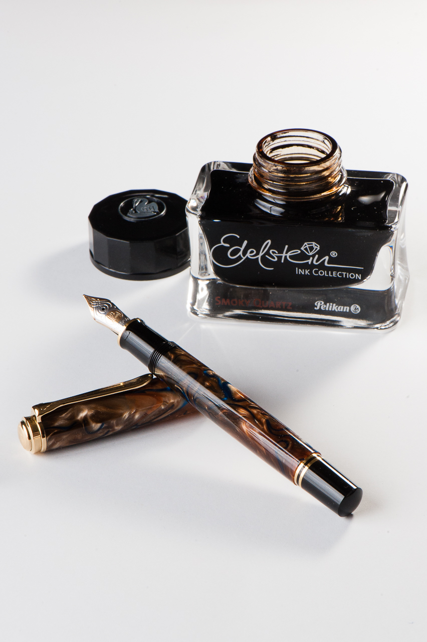
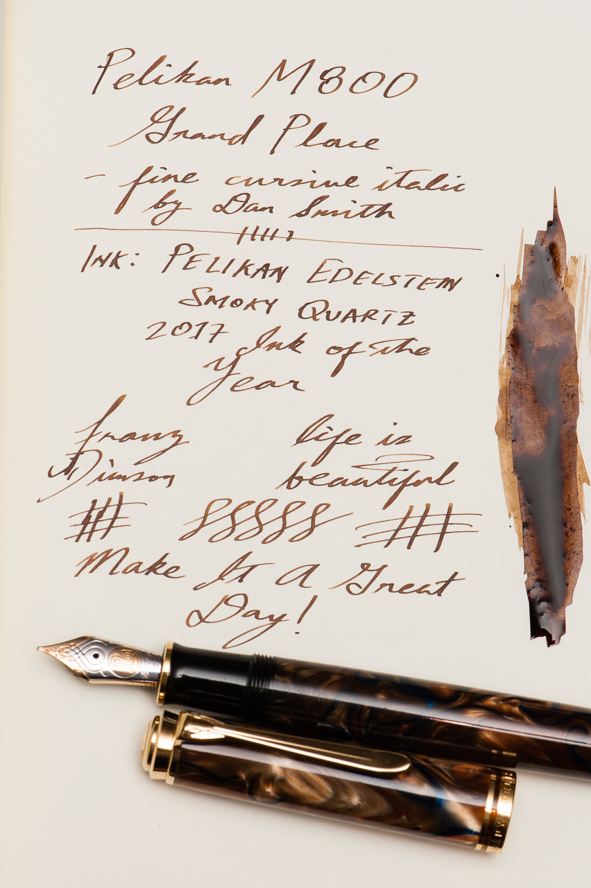
Franz: April’s pairing for me is the Pelikan M800 Grand Place Special Edition release, and the newly released Pelikan Edelstein Smoky Quartz which is their Ink of the Year for 2017.
Now I’ve got quite a few.. ahem.. a lot of inked up pens especially after March’s 6 Pen Challenge so this month’s pairing is a true winner at the moment. The ink is definitely a very nice brown which matches the creamy swirls of the pen. The nib of the M800 is a juicy fine cursive italic nib ground by Dan Smith (The NibSmith), and that generous flow creates spots in my writing wherein the ink pools to an almost black. So far, I’ve got only bought the ne bottle of this ink to test it out but I think a second bottle will be in my inventory sooner than later.
While writing with the M800 Grand Place, I catch myself sometimes just pausing admiring the chatoyant swirls of the pen. It’s almost hypnotic.
Writing Samples (click to enlarge)
Thanks for your time, and keep enjoying your pens. And please tell us what new ink pairings you’ve discovered recently.
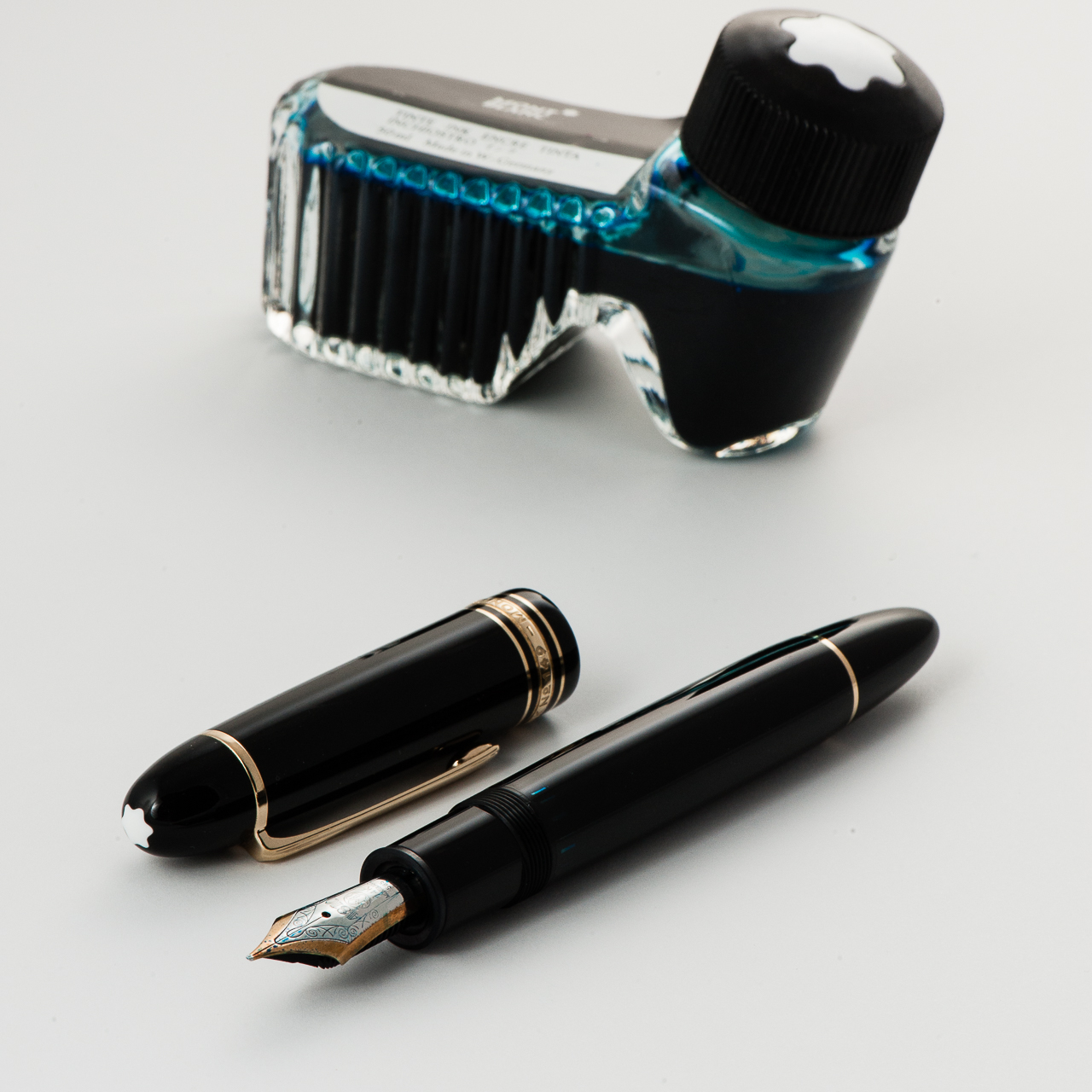
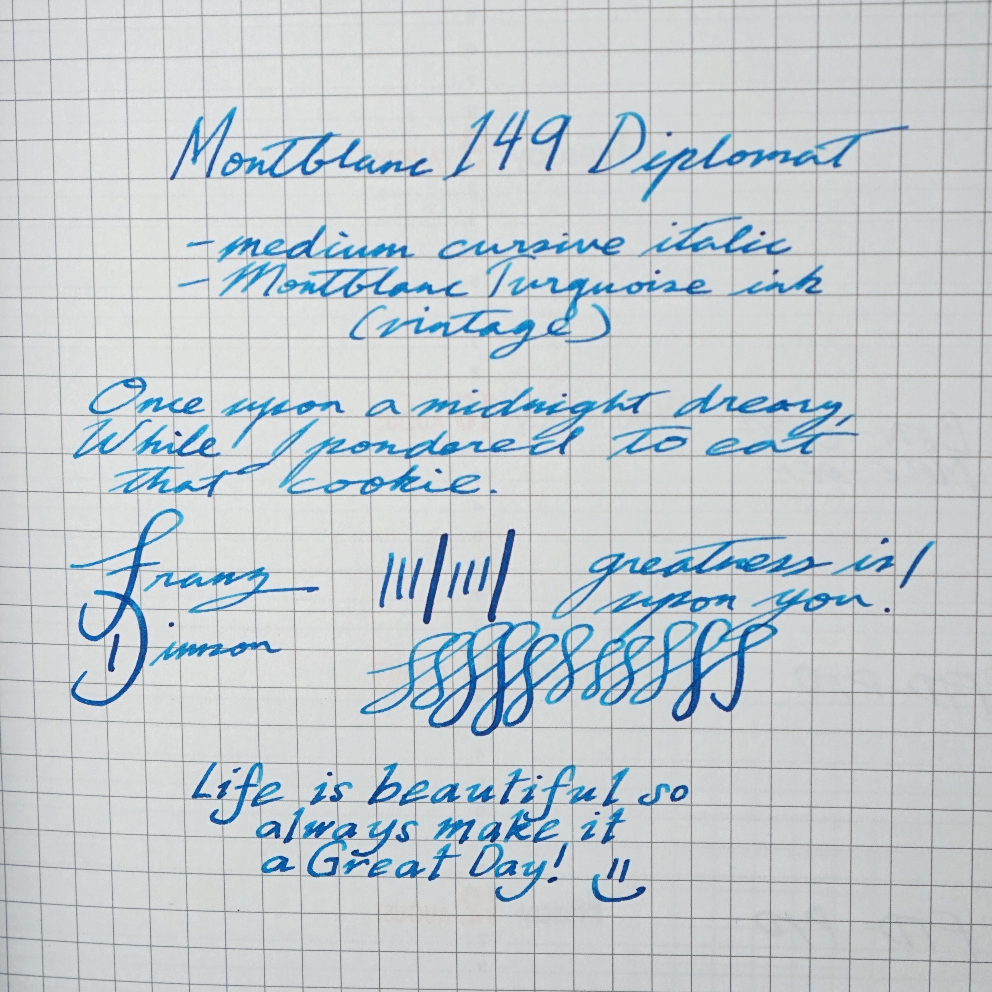
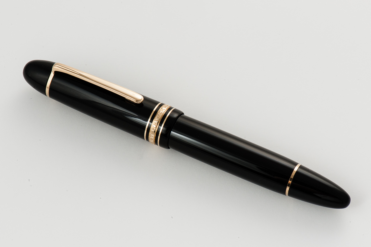
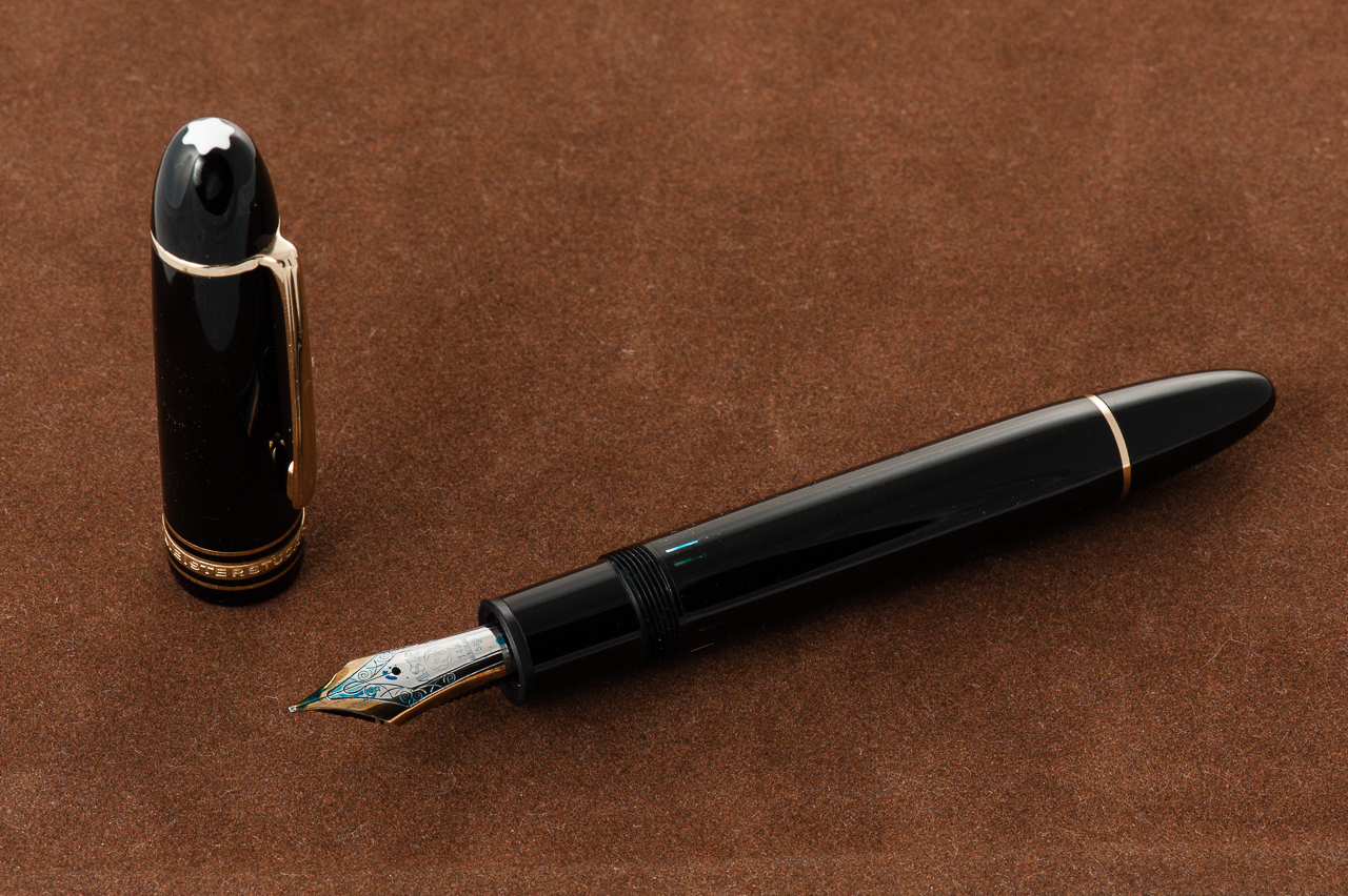
Katherine: The 149, like its little brother the 146, is a very classic style. As I mentioned in our review of the 146, I find the design inoffensive but a little boring.
Pamela: I am not a huge fan of cigar shaped pens. Despite my appreciation of the 146 proportion and finish, I found the 149 to be “too much.” It’s a BIG pen! It’s has a great classic, vintage feel, just not my cup of tea.
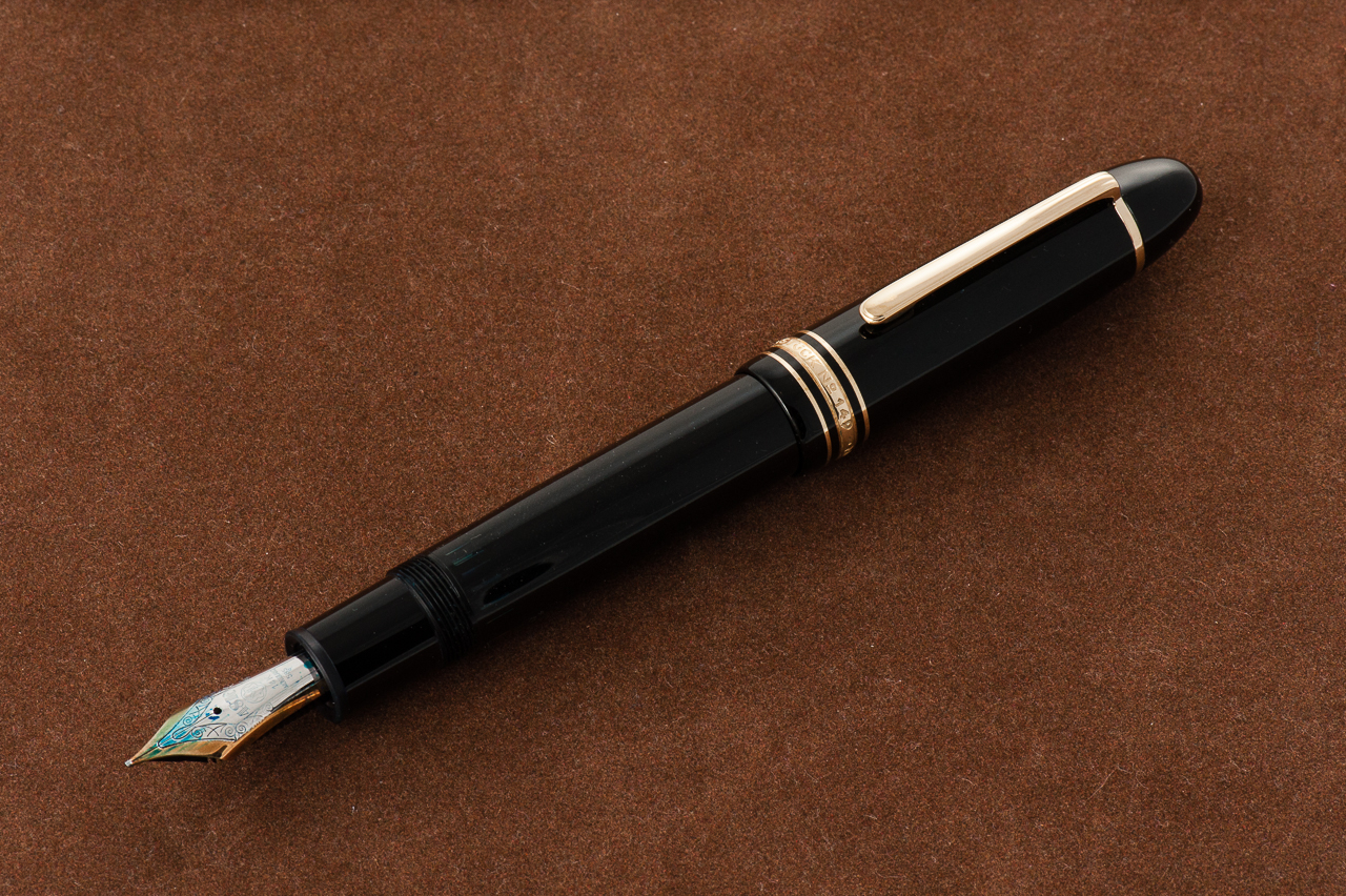
Franz: Oversize pen alert! Here’s a big one. The Montblanc Diplomat 149 is a simple black pen and is quite pleasant to hold. The resin is smooth, and scratch resistant. Its iconic torpedo shape speaks to me. I’ve been aware of this pen ever since I started using fountain pens but I’ve only seen and held one in person two years into the hobby. I had to have it!
Carrying over from our review of the Montblanc 146, the Montblanc Diplomat 149 is part of the Meisterstück line (Masterpiece) and was first introduced in 1952. It is a piston-filled pen which contains a large ink capacity. The number of the pen meant that: 1 – Meisterstück Line, 4 – Piston-filler system, and 9 – nib size.
In the Hand: Montblanc 149 (posted) — from left to right: Franz, Katherine, and PamIn the Hand: Montblanc 149 (unposted) — from left to right: Franz, Katherine, and Pam
The Business End
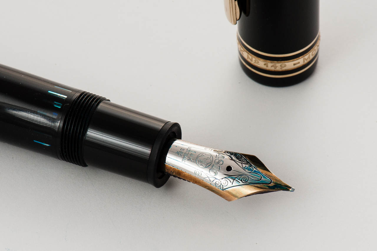
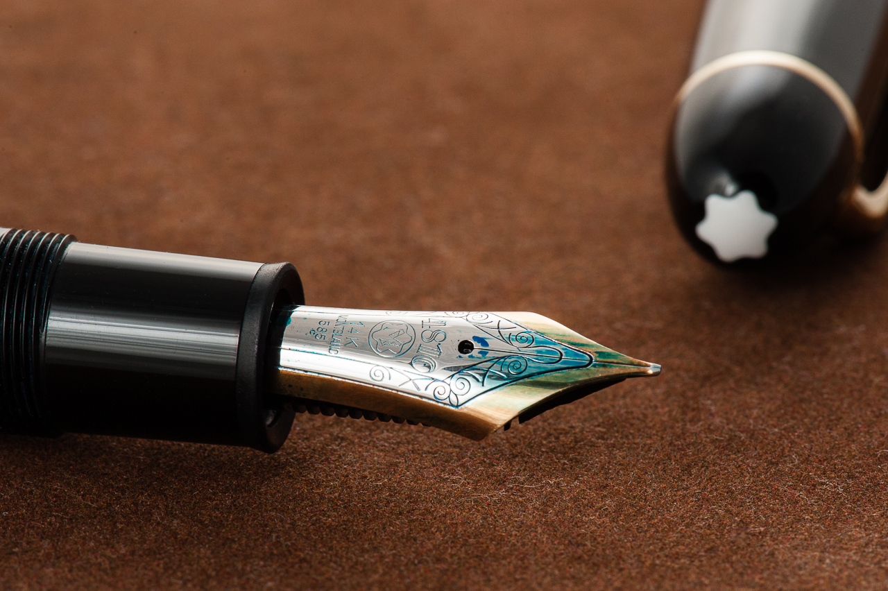
Katherine: The nib on Franz’s specimen, like the other Montblanc nibs I’ve tried, is fantastic. It gets the job done smoothly and flawlessly. The pen is smooth without being glassy, with just enough character not to be boring. I suppose having a grind by Masuyama-san doesn’t hurt either. 🙂
Pamela: Montblanc and Masuyama? Yes please! The nib is a joy to write with and as always, smooth.
Franz: The medium 14K nib of this 149 was a very smooth and juicy when I bought it in January 2015. This was the third Montblanc nib I have written with and so far Montblanc is 3 for 3 in terms of nib quality. I loved the nib’s springiness which gives the writing some character. At the 2015 LA Pen Show, I had Mr. Masuyama turn this nib into a cursive italic and it has been one of my favorite nibs ever since.
Franz’s writing sample on a Rhodia Weekly Planner
Write It Up
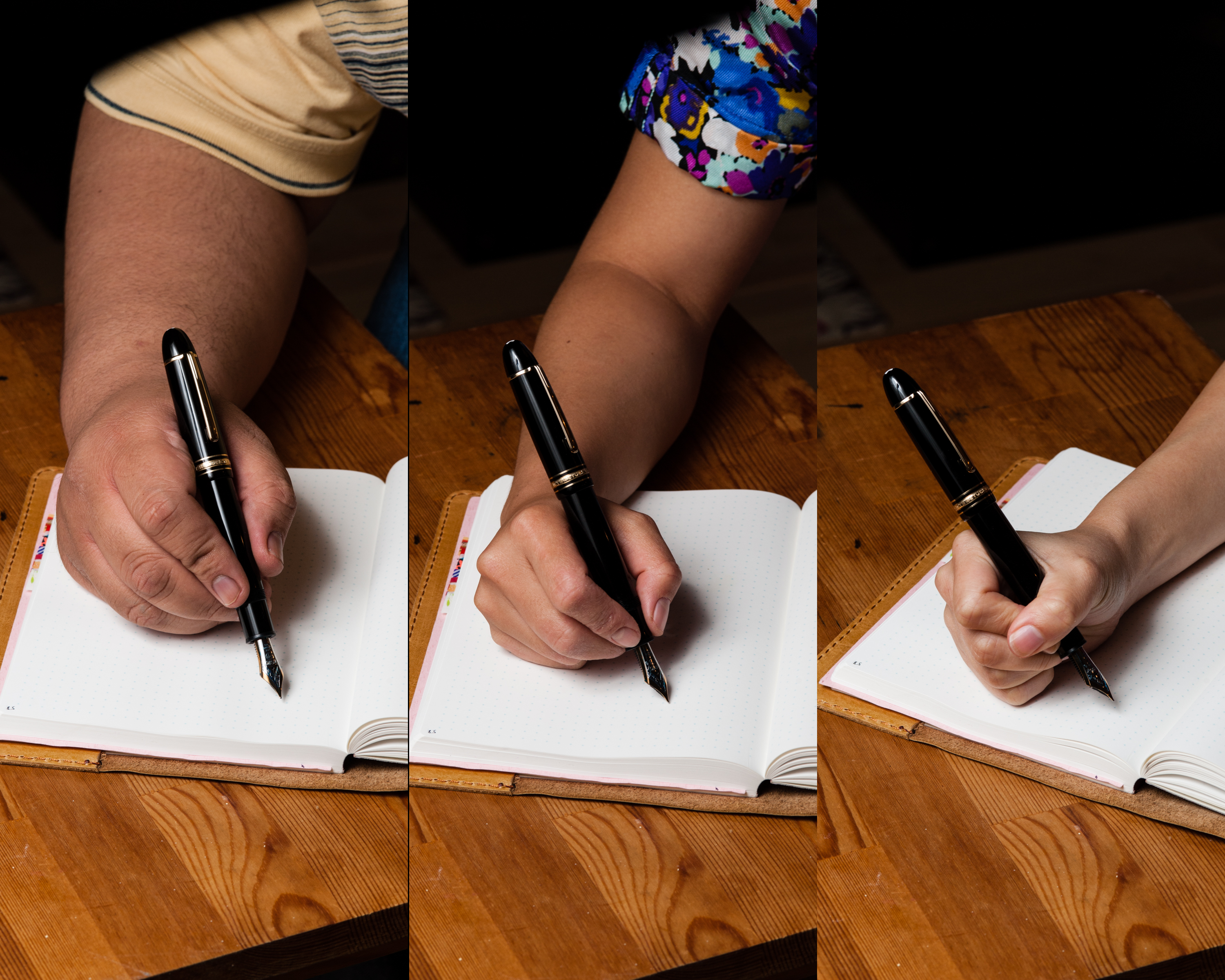
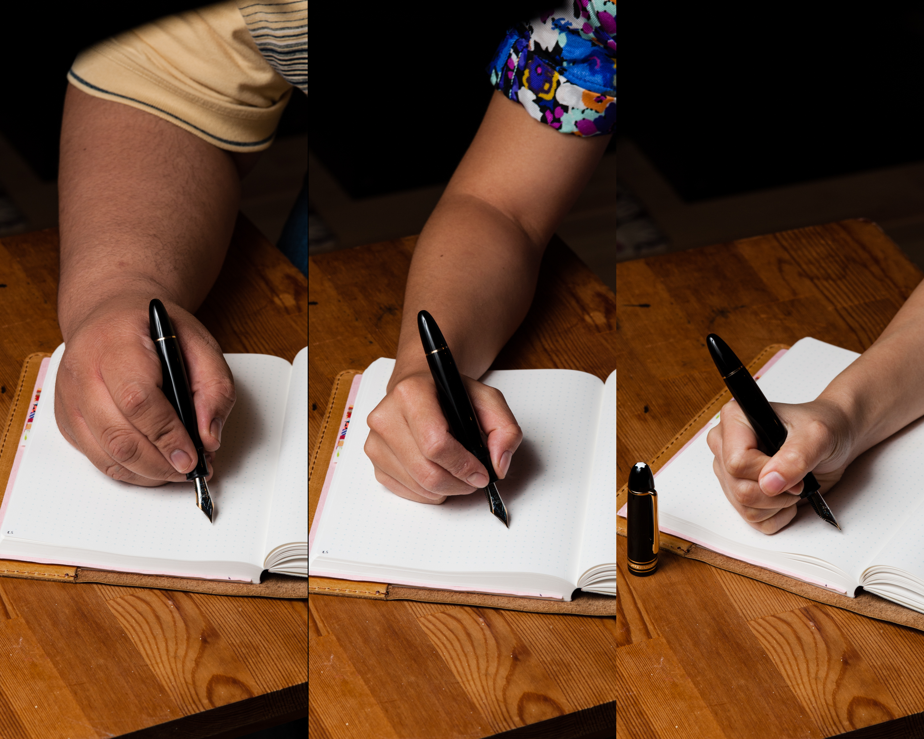
Katherine: While the nib on this pen poses no problems… the size of the pen does. This pen is quite the monster for me. It’s a little too long and a little too girthy to be comfortable. Small hands, huge pen… just ain’t a fit. 146, please!
Pamela: The pen is really unbalanced for me due to my grip and the length of the pen. I felt that my hand fatigued more easily using the larger 149. This pen gave me hand muscle quite the work out.
Franz: During my journaling, the 149 was comfortable for me for the first ten minutes. As I wrote longer with it, my hand felt a bit fatigued. The grip section is about 13 millimeters and it’s one of my wider pens. Lengthwise, I prefer to write with the cap posted but it’s not as secure as I want it to. There was a moment when the cap came loose.
EDC-ness
(Daily use at work/home, at least a day or two)
Katherine: Honestly, I didn’t even try. I borrowed Franz’s pen for a week, but found that it never left my desk. It’s just barely comfortable for me to use, but certainly isn’t a size that I’m comfortable putting in my pocket. Not to mention, it doesn’t fit any of my pen cases. Womp.
Pamela: The pen is not a shy one. It’s also far too large for me to carry around without being stopped for brandishing a weapon. This pen stayed in my backpack as I transported it around, however, it was bit too heavy and large to be an EDC for me.
Franz: I’ve used the 149 in rotation at work for quite a while now, and it’s great for quick notes and perfect for signatures. I appreciate the quick uncapping with just one rotation of the cap, as well as the medium cursive italic nib that writes well on the office copy paper.
Final Grip-ping Impressions
Katherine: This feels like a pretty short review for me. Take everything I loved about the 146… and resize it to be too big for my hands. Sadness. The 146 is a perfect size and weight for me, versus the 149 feels like I’m out to club someone. Maybe some baby seal stationary. (That’s gotta exist, right?)
Pamela: I agree with Katherine that my review of the 149 is shorter than usual. The 149 is a great pen for those who love GREAT (big) pens, enjoys the quality of Montblanc nibs and has the “paws” proportional enough to use larger pens comfortably.
Franz: Talk about iconic! Yep, the Montblanc 149 is one of the most recognizable fountain pens. As evidenced from both ladies above, this pen isn’t for everyone. But one should at least write with it for a period of time and decide for themselves. The 149 fits right at home in my bear paw. Even though it can get tiring for my journaling/letter writing, I love it for quick notes during meetings, and perfect for signatures.
There are quite a few oversize pens comparable to the Montblanc 149. Photos were taken below for comparison. I honestly prefer the size of a Pelikan M805 as it’s almost the same length uncapped, but a little bit thinner and allows me to grip the pen better.
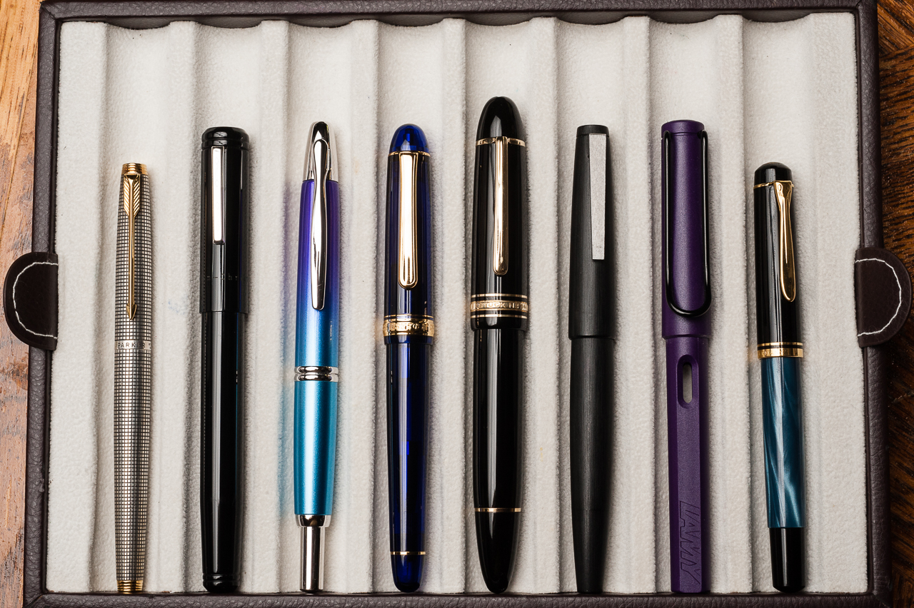
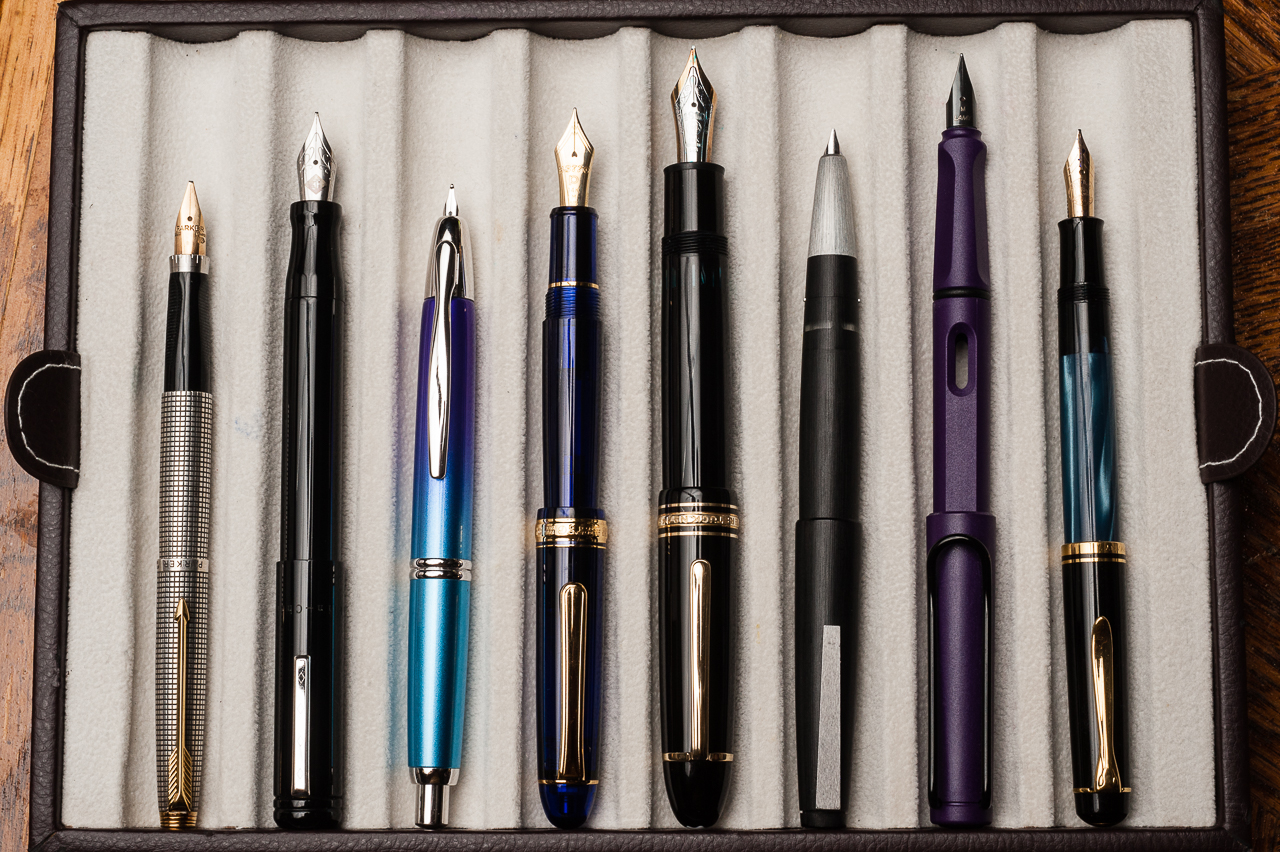
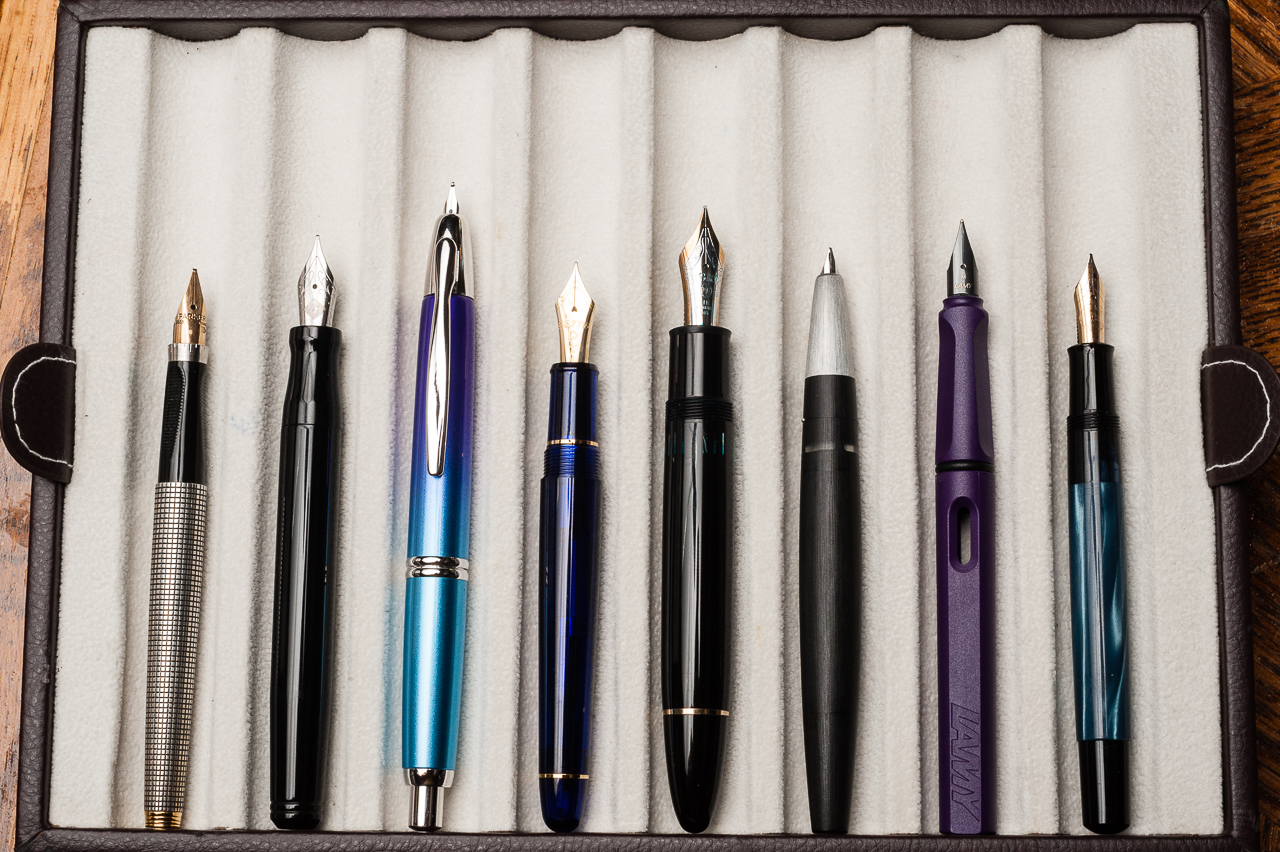
Pen Comparisons
Closed pens from left to right: Parker 75, Franklin-Christoph Model 20, Pilot Vanishing Point, Platinum 3776, *Montblanc 149*, Lamy 2000, Lamy Safari, and Pelikan M200Posted pens from left to right: Parker 75, Franklin-Christoph Model 20, Pilot Vanishing Point, Platinum 3776, *Montblanc 149*, Lamy 2000, Lamy Safari, and Pelikan M200Unposted pens from left to right: Parker 75, Franklin-Christoph Model 20, Pilot Vanishing Point, Platinum 3776, *Montblanc 149*, Lamy 2000, Lamy Safari, and Pelikan M200
Oversize Pen Comparisons
Oversize closed pens from left to right: Sailor King of Pen Pro Gear, Pelikan M805, Pelikan M1000, *Montblanc 149*, Montblanc 146, and Pilot Custom 823Oversize posted pens from left to right: Sailor King of Pen Pro Gear, Pelikan M805, Pelikan M1000, *Montblanc 149*, Montblanc 146, and Pilot Custom 823Oversize unposted pens from left to right: Sailor King of Pen Pro Gear, Pelikan M805, Pelikan M1000, *Montblanc 149*, Montblanc 146, and Pilot Custom 823
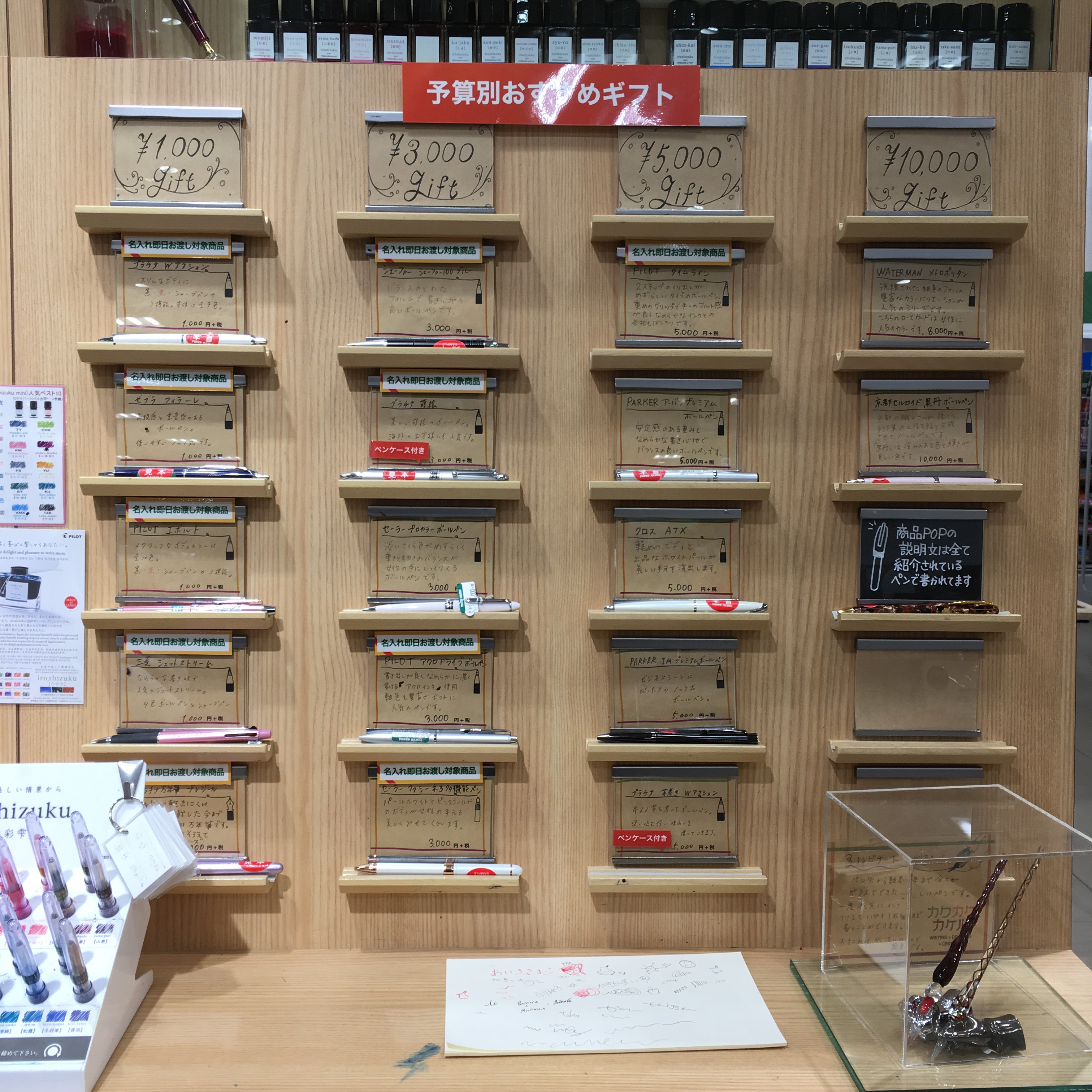
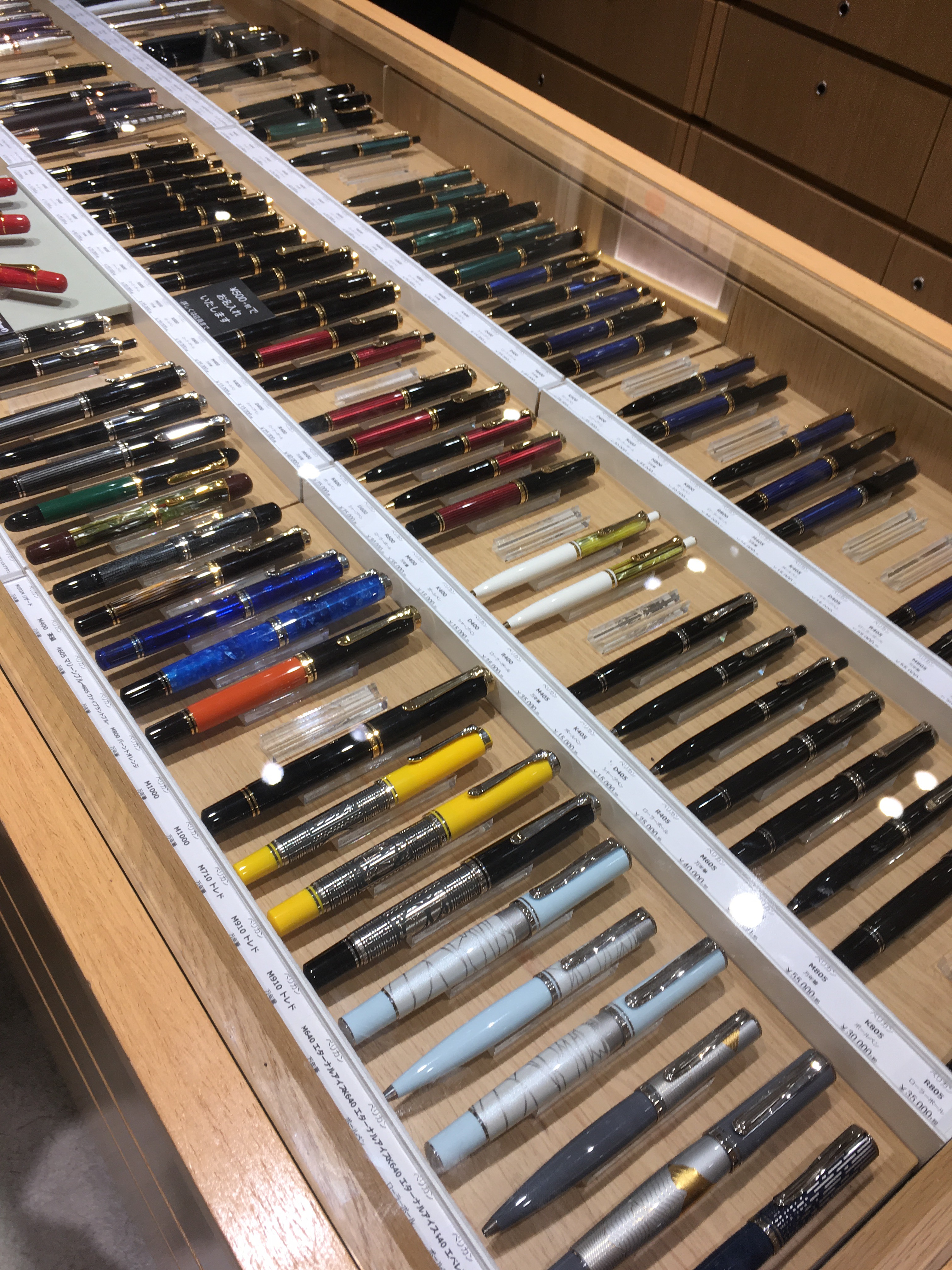
Hello Osaka! This follows my (Katherine’s) posts on pen shopping in Tokyo and Kyoto.
My very first stop was at Daimaru, but I apparently forgot to take pictures, and their pen selection was pretty underwhelming. Instead I bought a bunch of Jinbei-san stationary. And a plush. I do need things to write on!
Next up, Hankyu! This store is in Hanshin-Umeda station (right next to the JR Osaka Station), which makes it easy to access (Hanshin is also in the area, and Nagasawa is within walking distance). I think there’s also a Tokyu Hands nearby.
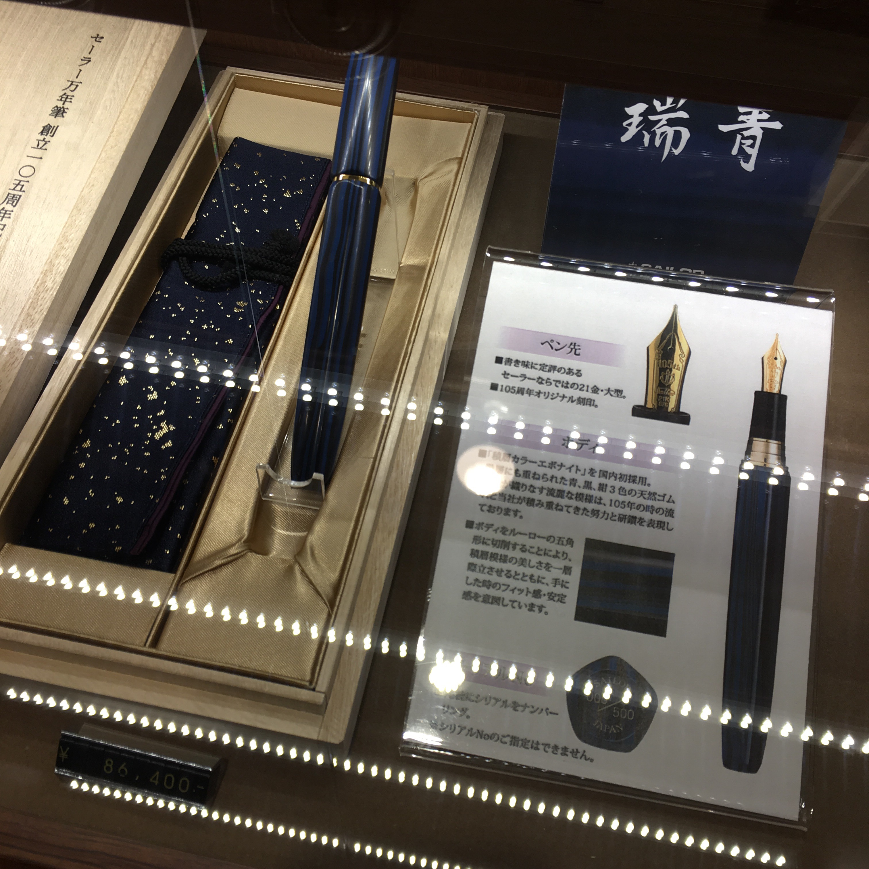
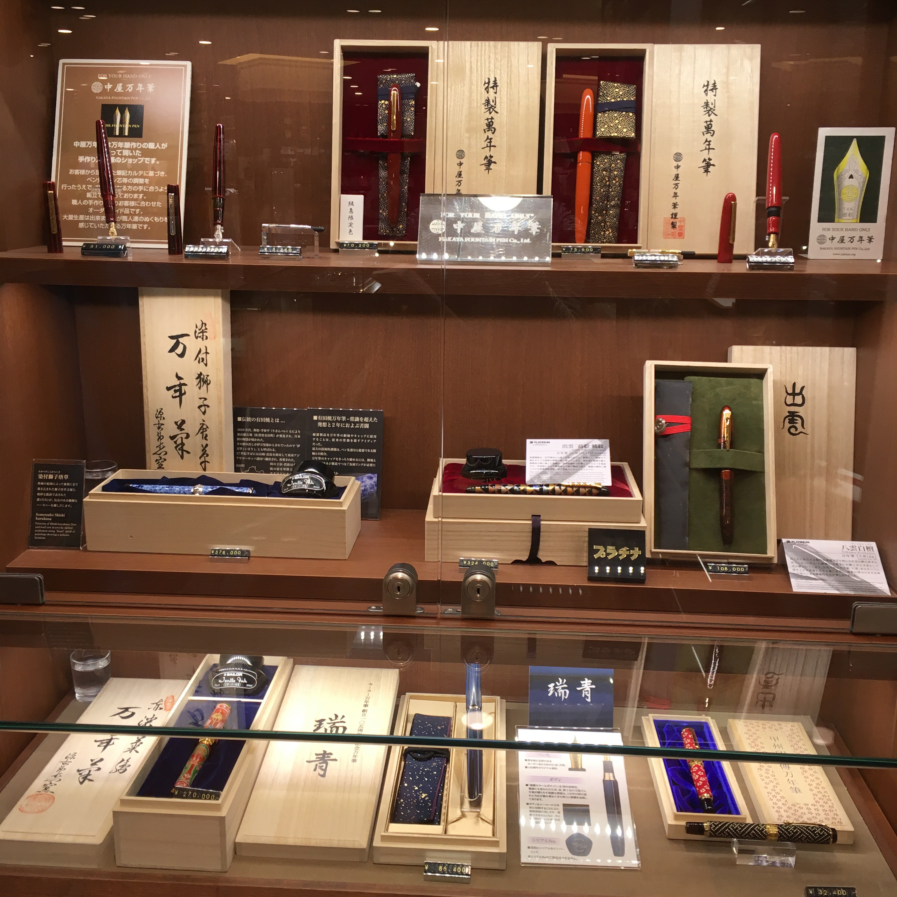
Hankyu stocks a large variety of pens — including some Nakaya and high end Sailor stuff. They still had a Sailor 105th year Zuisei in stock!
And a selection of Nakaya…
And their own store exclusive inks! Swabs and swatches will be coming soon. I got all three. I have great self control. Hah.
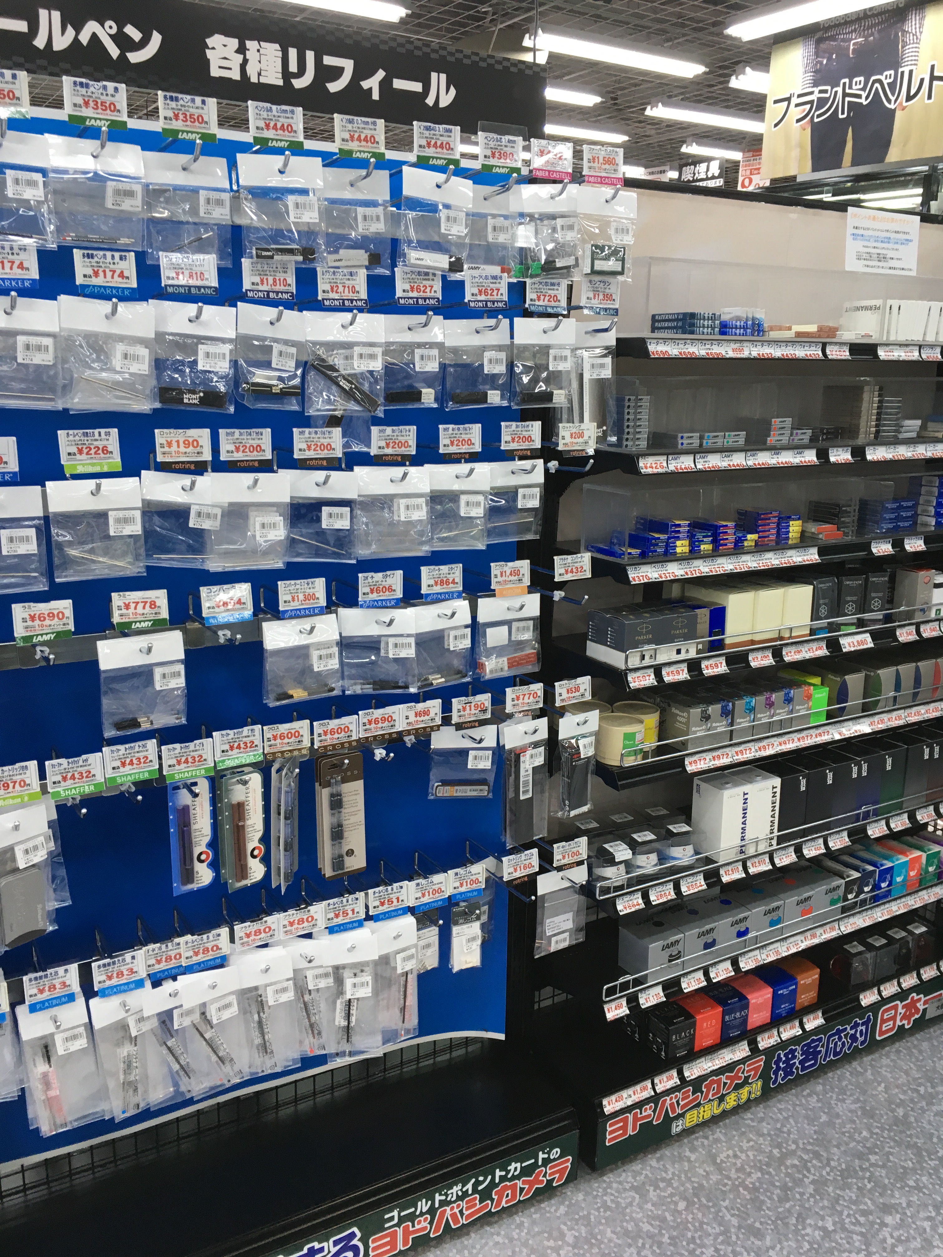
Next up, Yodabashi in Umeda is actually one of those giant multi-level camera/electronics stores, so I was expecting a small display. But surprisingly they have a pretty extensive Platinum display. (As context, we kept going to electronics stores to look for Nintendo Switches)
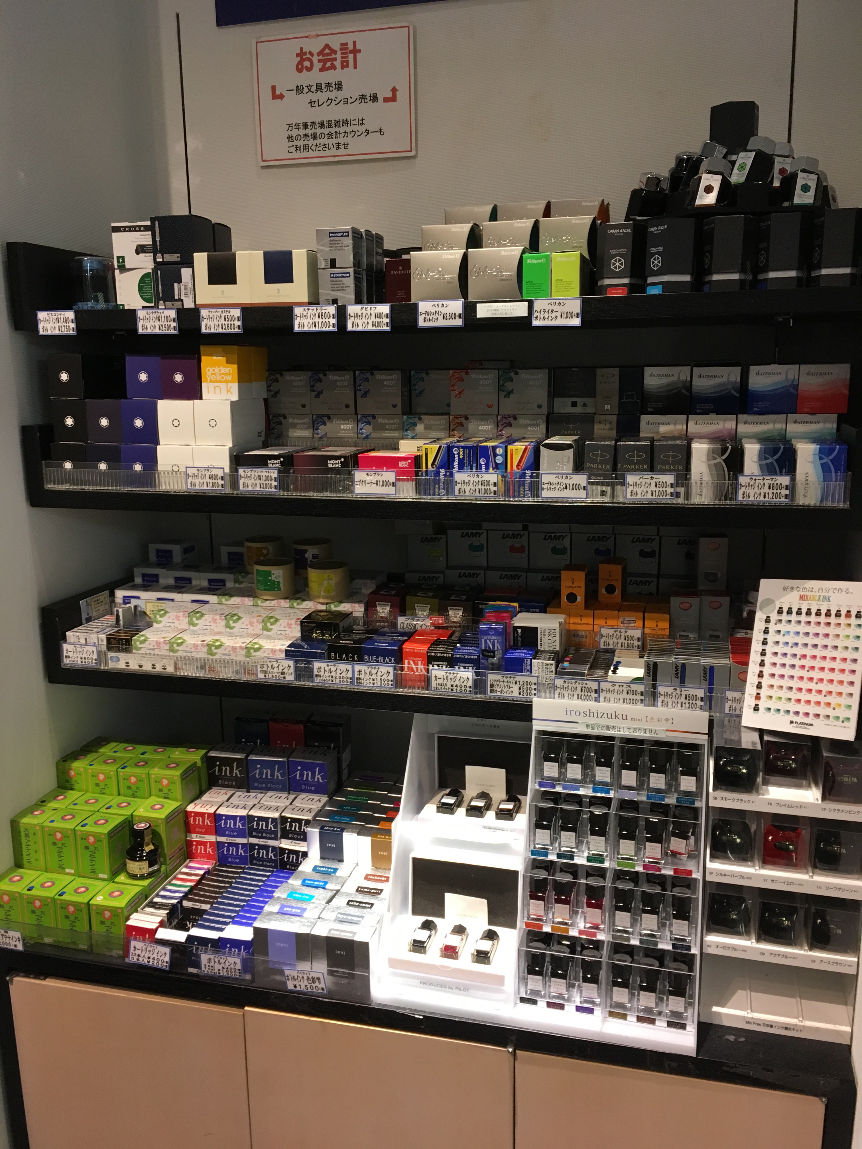
And a selection of converters and inks.
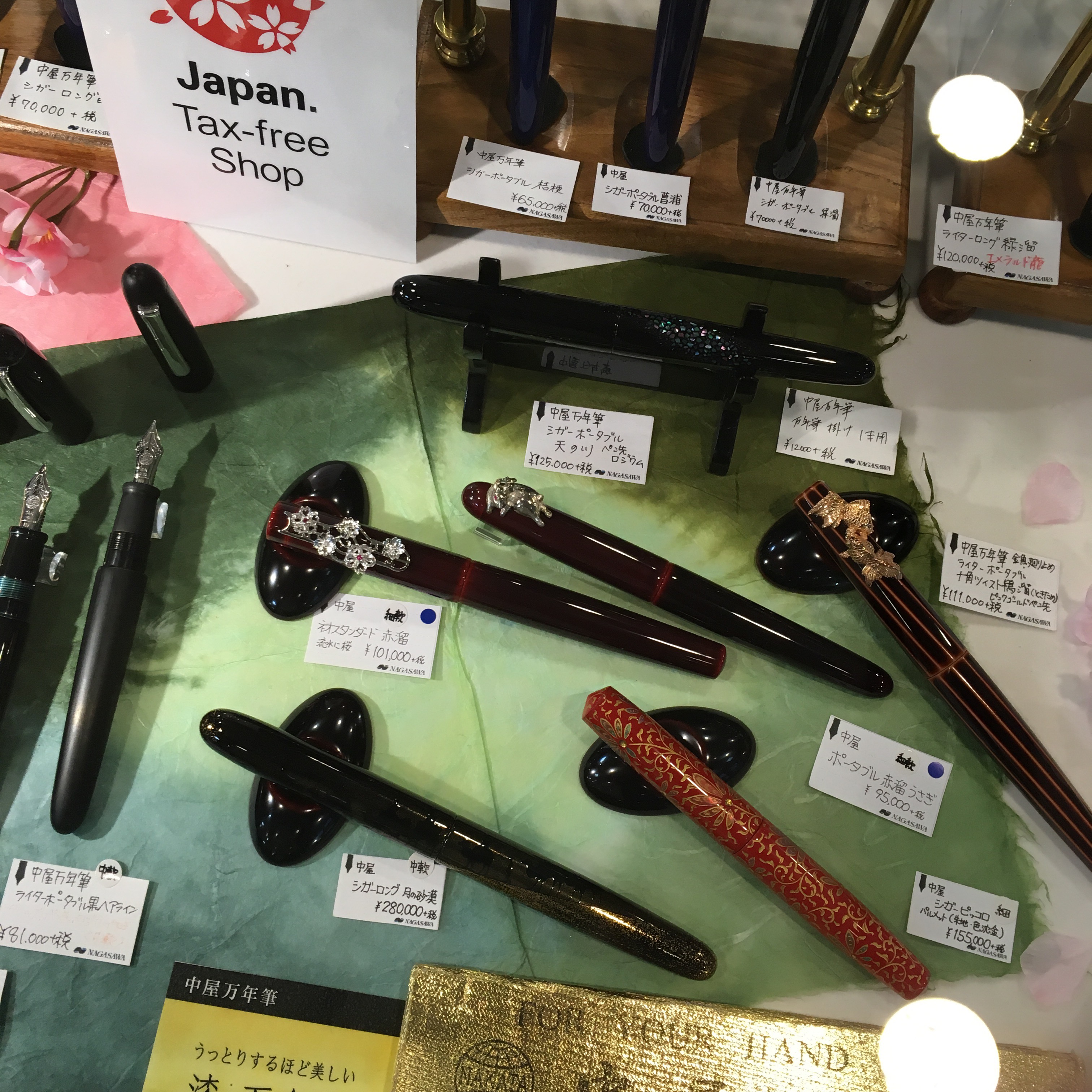
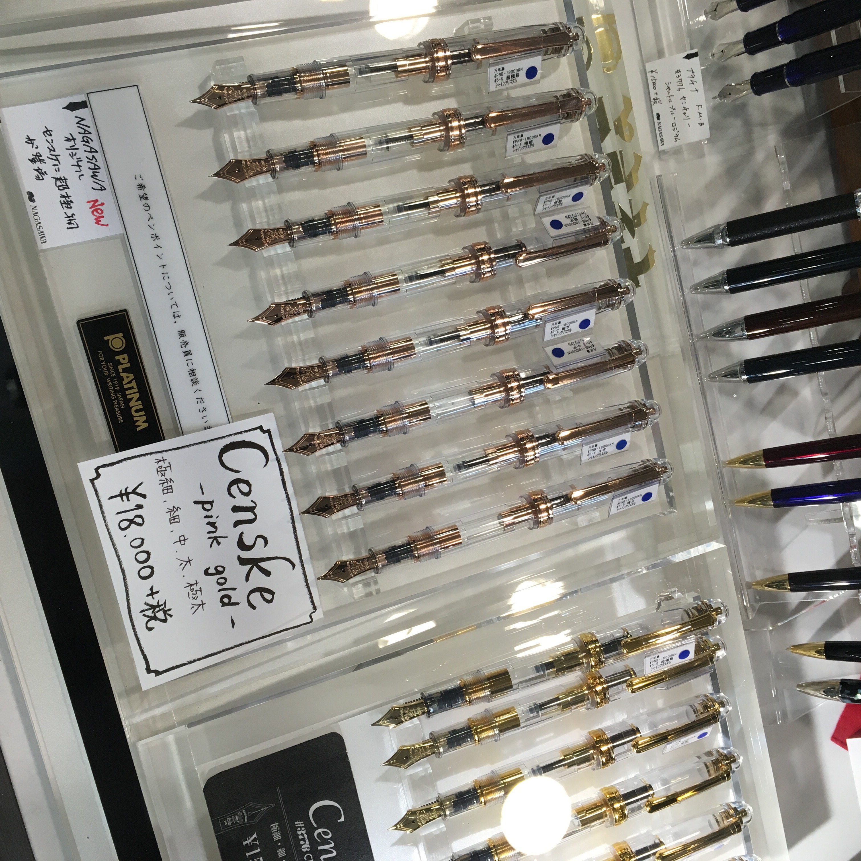
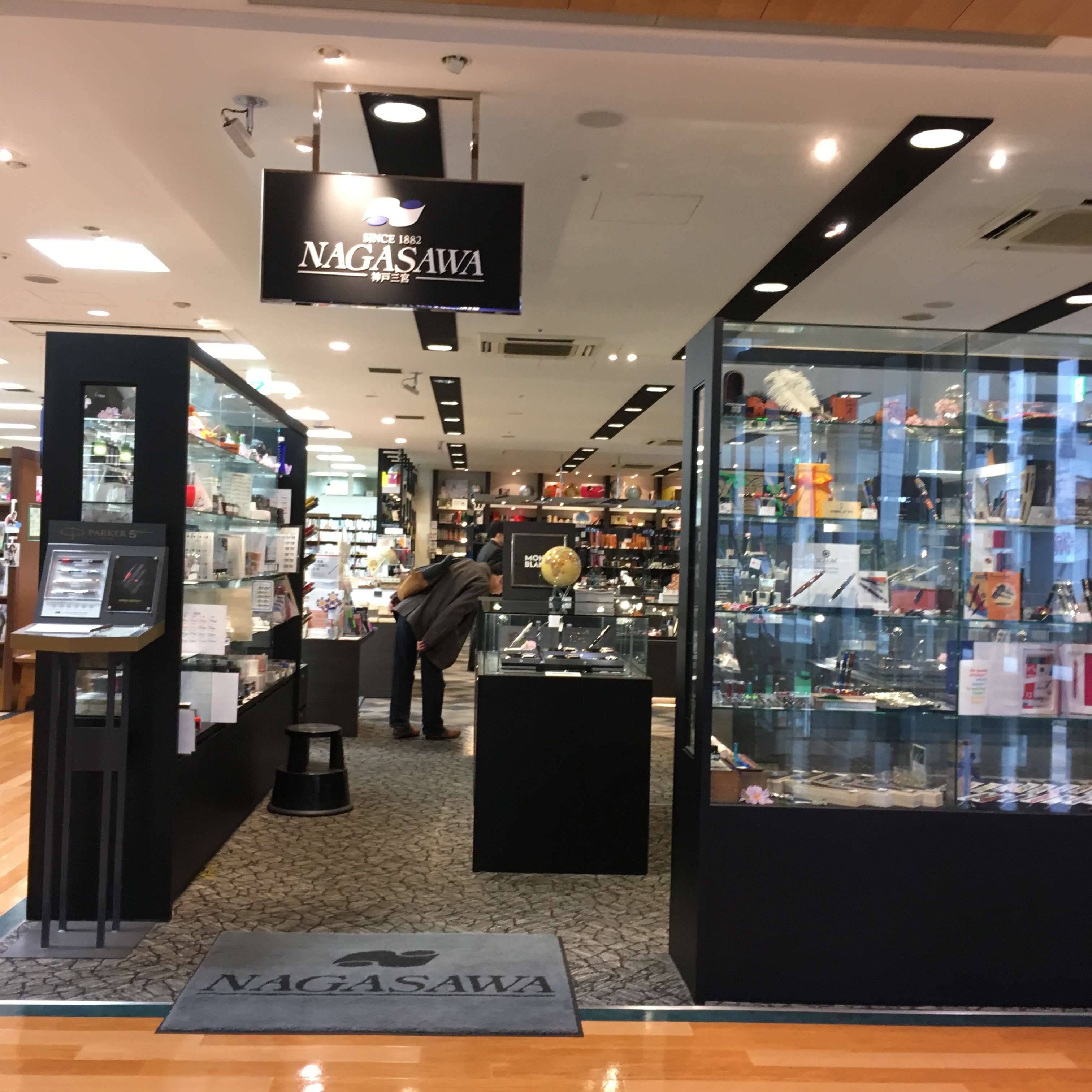
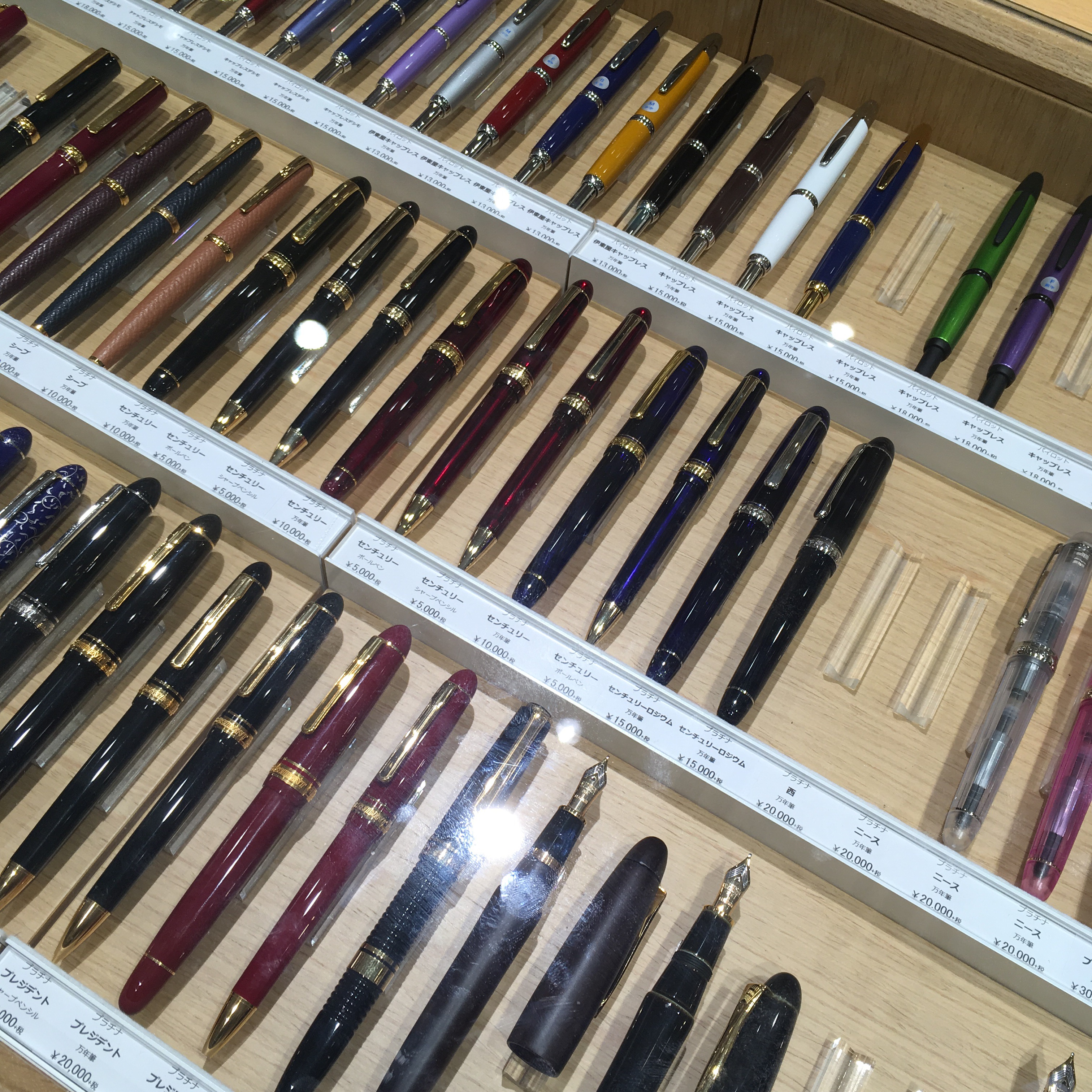
Walking distance from Umeda Station is Nagasawa, which is inside a Maruzen. Nagasawa is by far my favorite store of this trip. And also the only store with interesting Nakaya in stock — they had several with rollstops and non-yellow gold nibs. Amazing! (And bad for my wallet. That toki-tamenuri decapod with the rose gold goldfish stop? It’s mine now.)
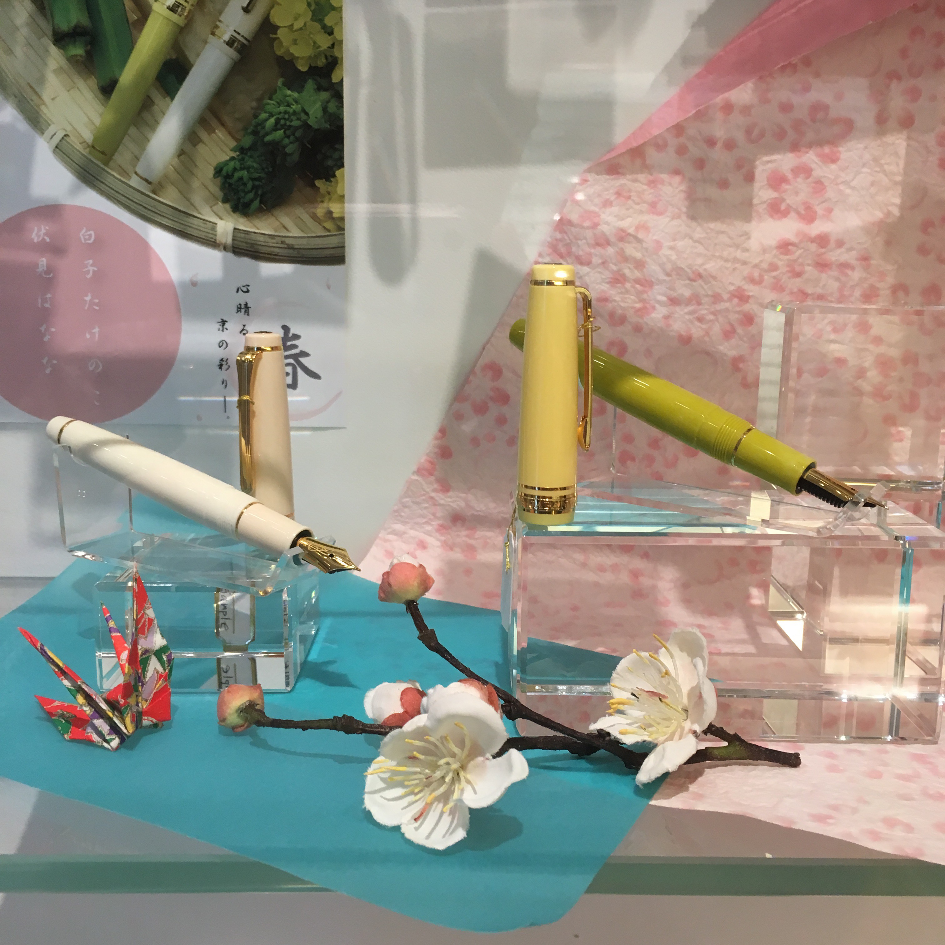
They also carry several limited edition pens — here is the Platinum Censke, in pink and yellow gold: (I was very tempted to get a yellow gold one to put a Nakaya Maki-e converter into!)
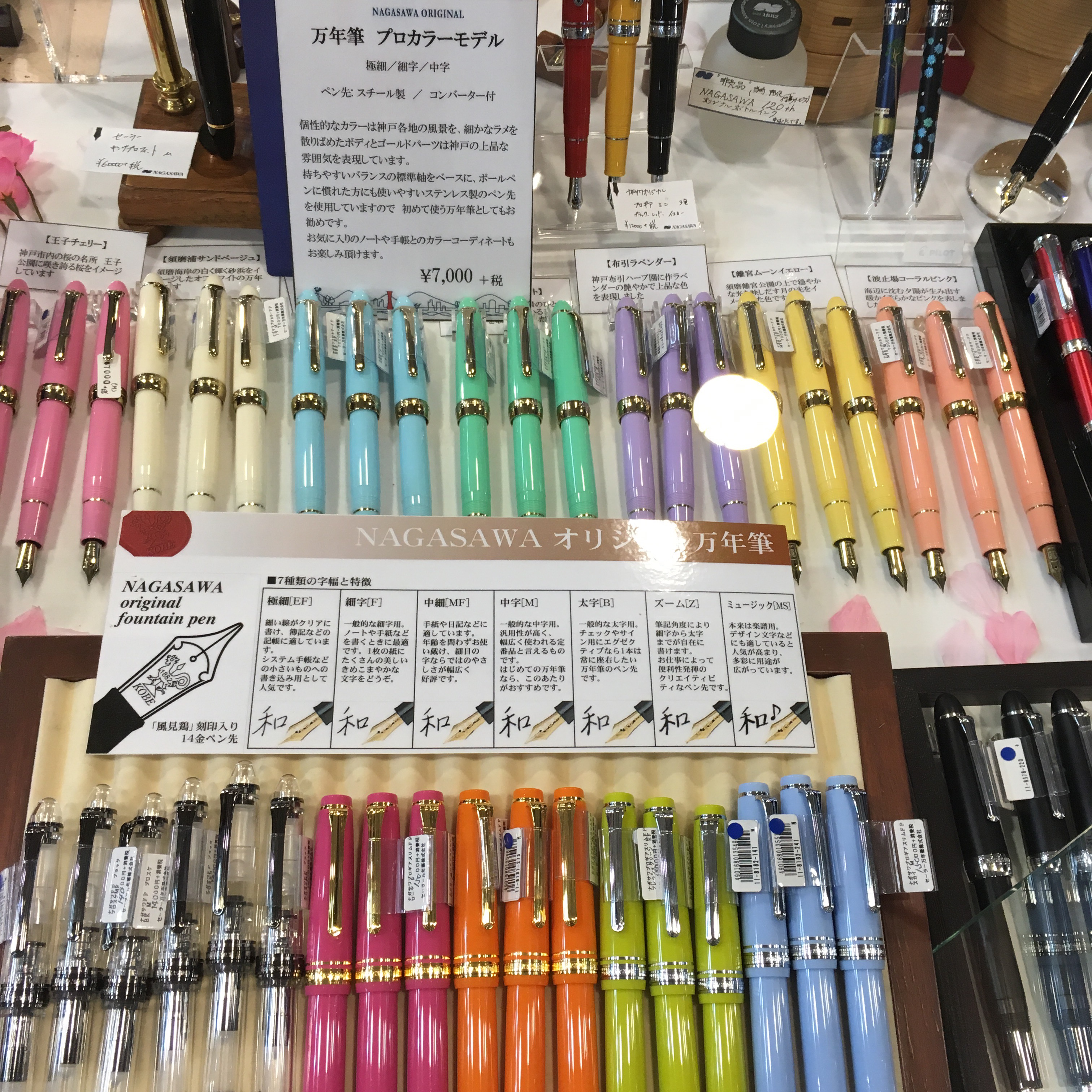
And the store exclusive Sailors in pretty pastel hues:
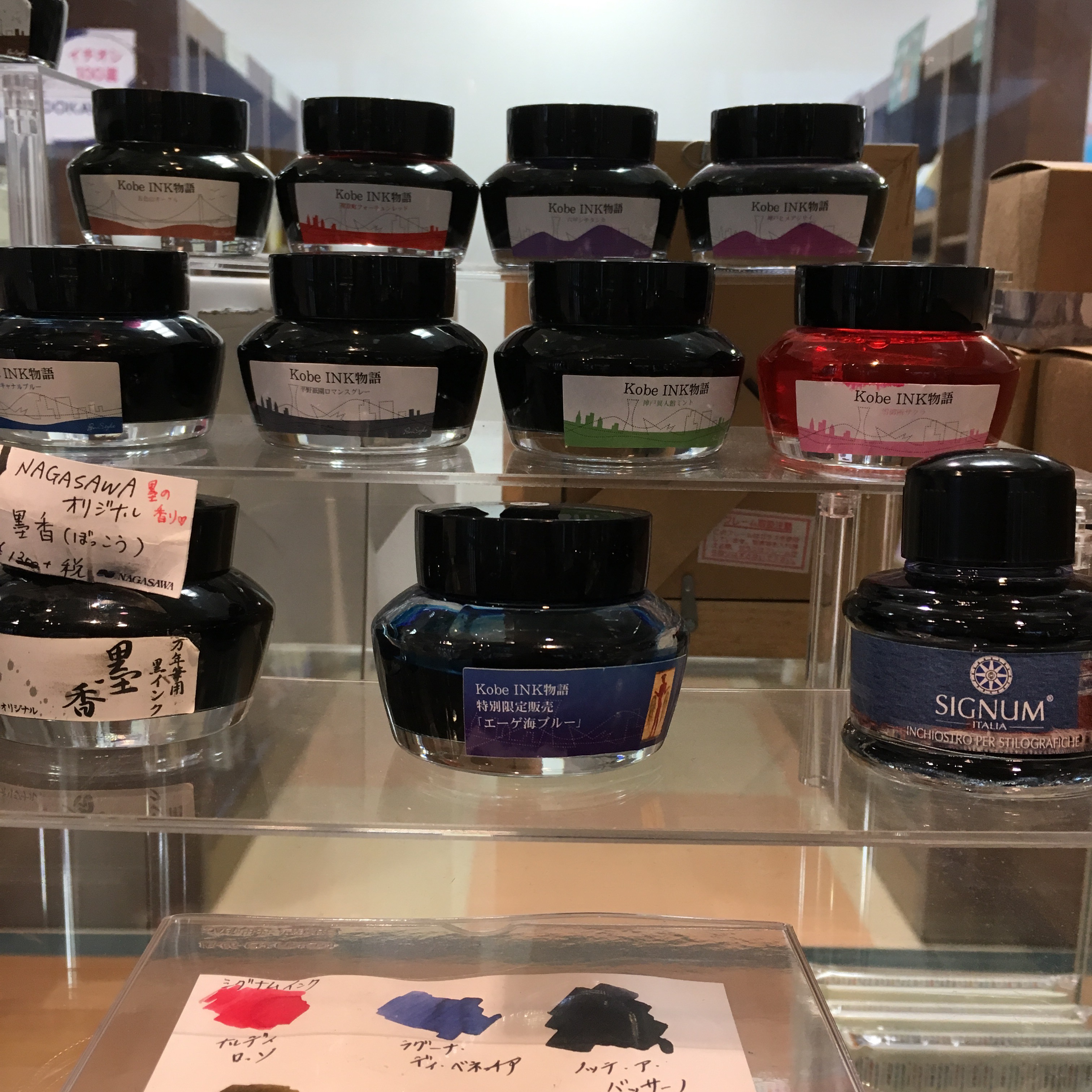
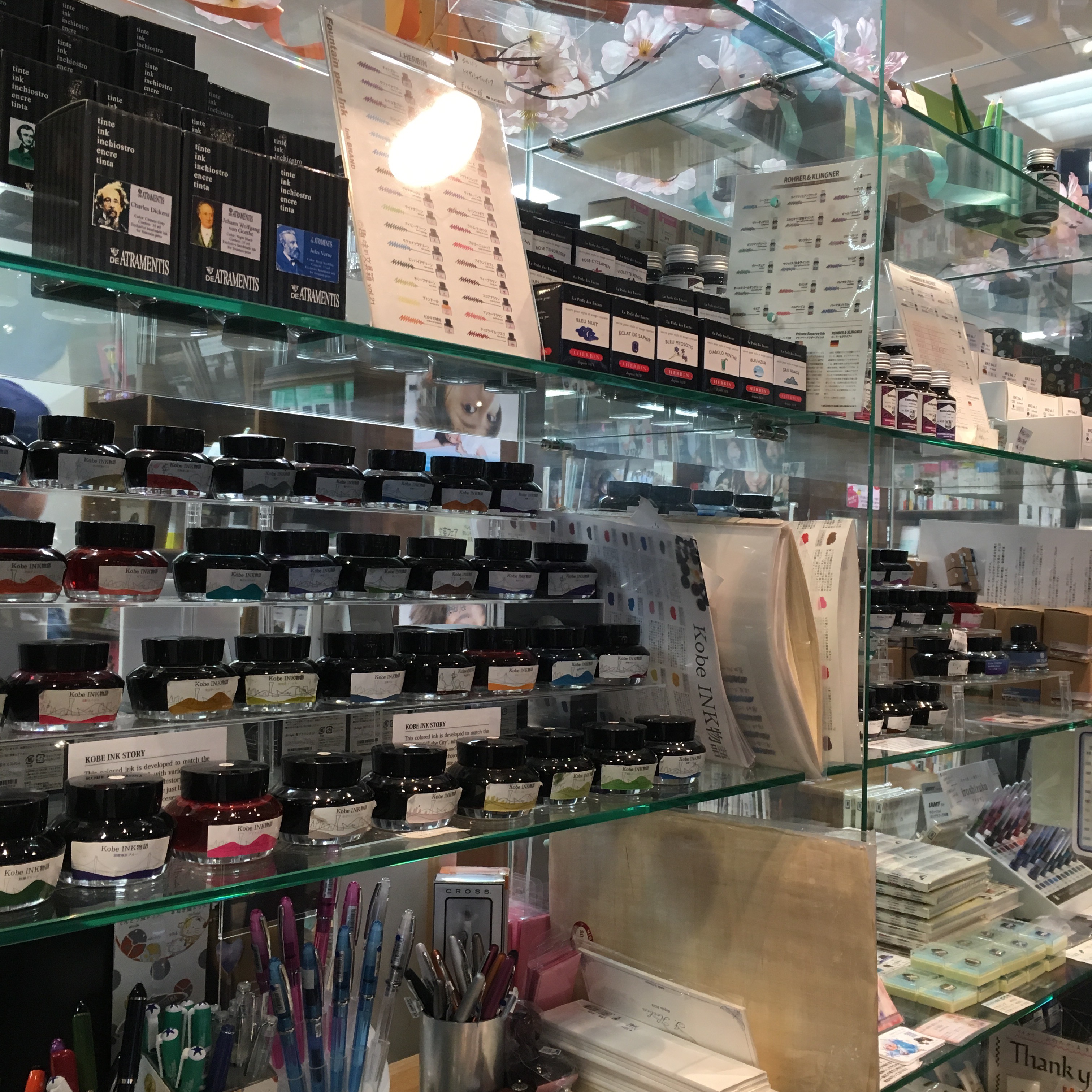
And, of course, their inks!
In addition to their own line of Sailor inks, they also had a great selection of other brands’ inks.
It’s actually a little kiosk thingy inside Maruzen. And they can handle tax free for you as you pay — so no need to shuffle around to another counter.
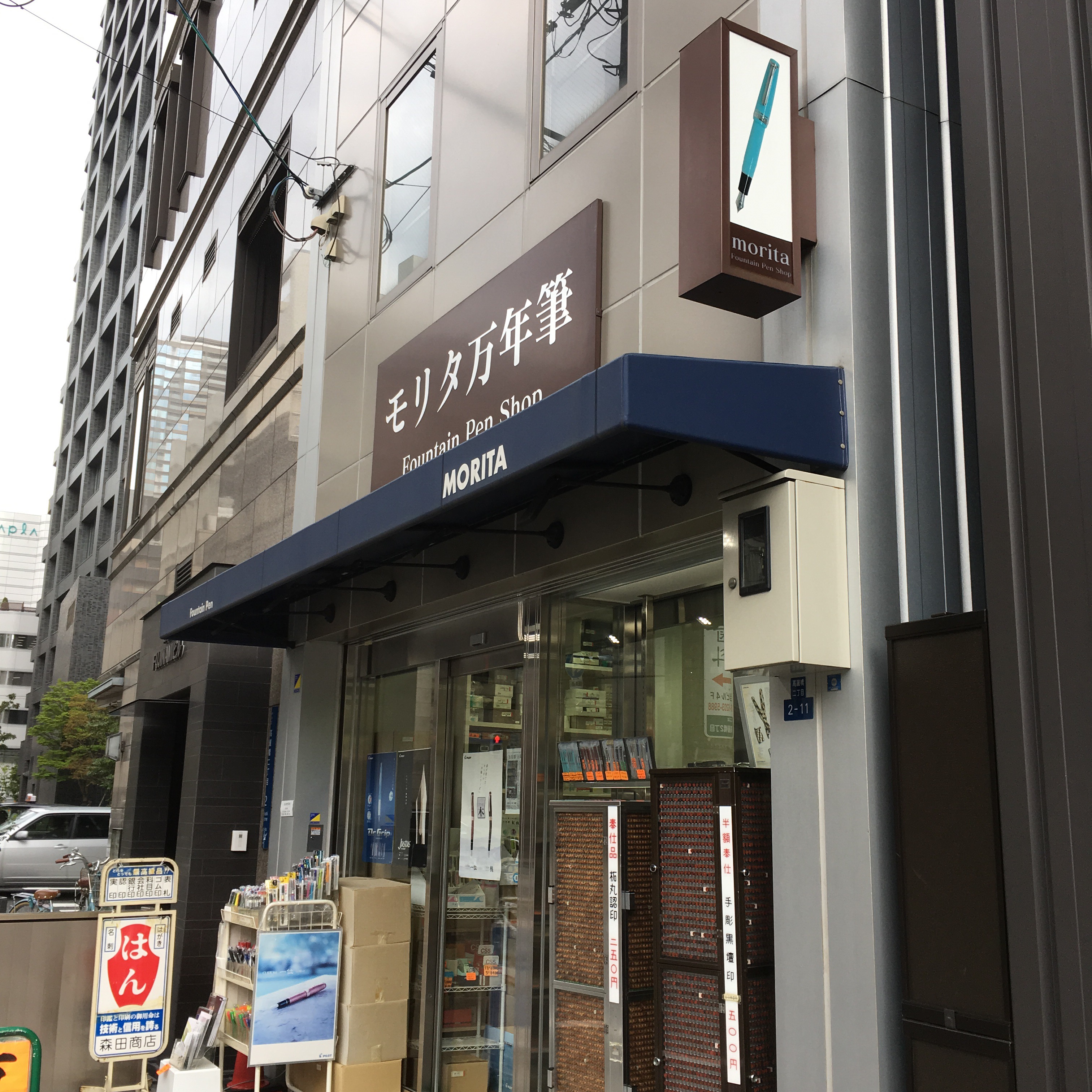
Next was Morita, which was a ten minute walk from the closest subway stop from Hanshin-Umeda:
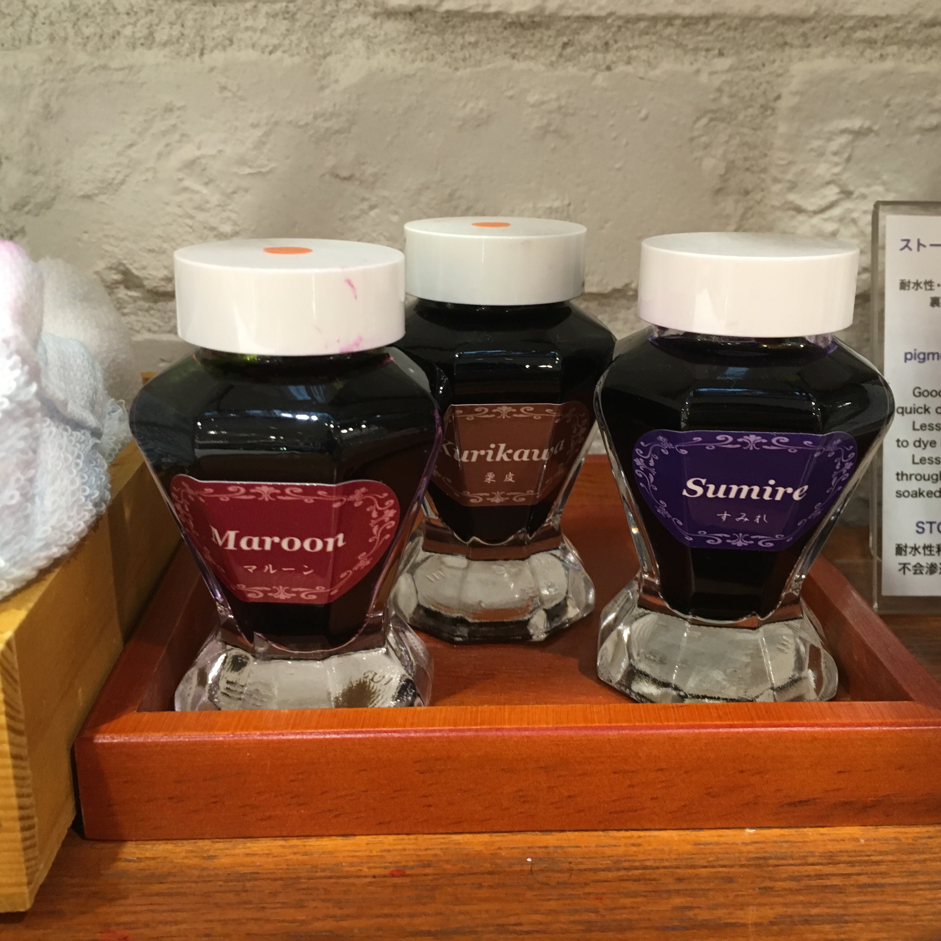
Mr. Morita was super friendly, but was also the pushiest person I met in Japan. He kept offering to show me different things. More funny than annoying though. He also has a line of exclusive Sailors — third row from the top, right and center of the divider — robin’s egg blue! And two exclusive colors of ink, Red Wine and Shade Green — swatches to come!
Also at Hanshin-Umeda station was Hanshin department store. They had a small selection, but I wouldn’t go out of my way and instead spend more time in Hankyu or at Nagasawa.
The Namba Takashimaya has a Maruzen inside it — in the basement and slightly across the subway station. Like the other Maruzens, a decent pen selection and they carry their Athena inks in black, blue, blue black and sepia.
And they had this Duofold on display. I think it looks a little derpy. But wow that’s a lot of money.
I also made it out to Kobe, to eat beef. And we finally found a Nintendo Switch at the Toys R Us in Kobe Harborland. There is a Nagasawa there too, but it’s primarily a stationary store, not a fountain pen store. And they had a no picture policy. So, no pictures.
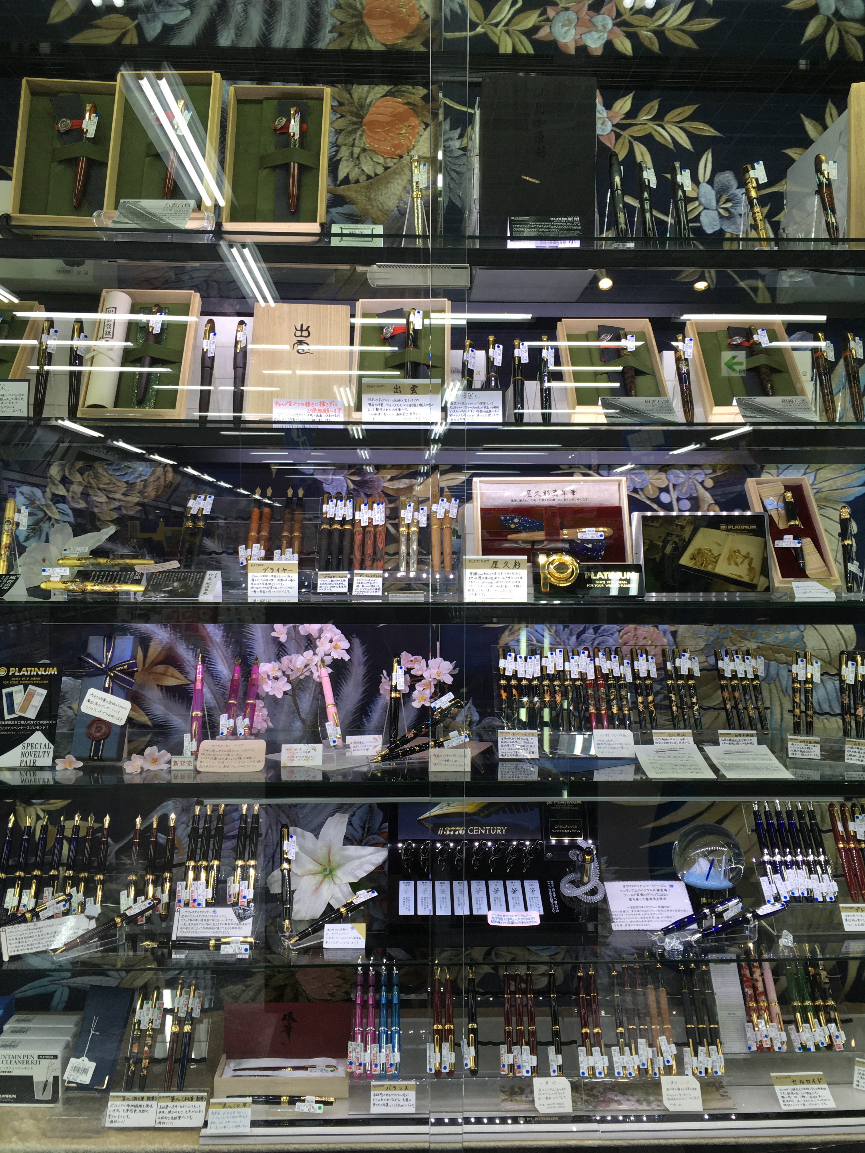
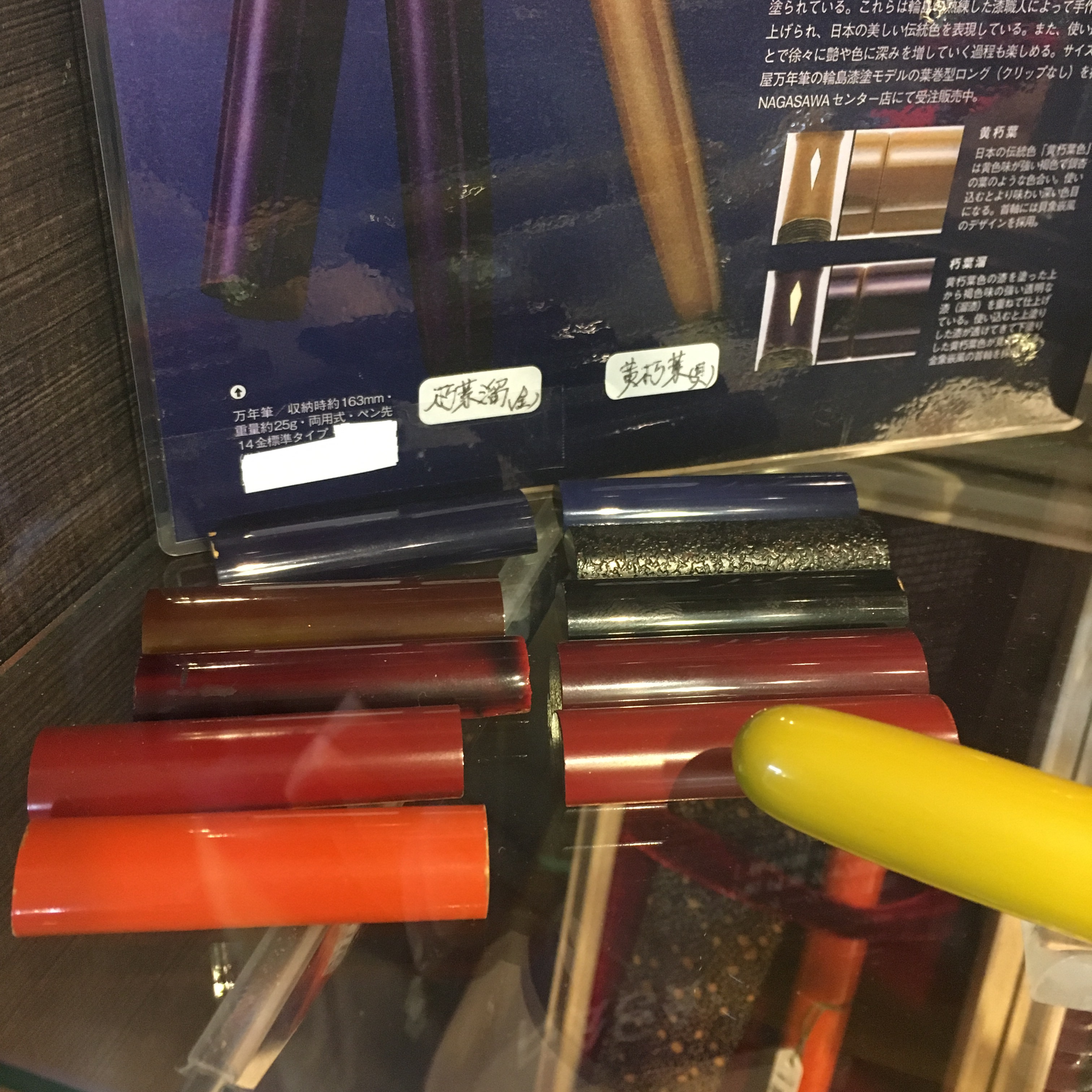
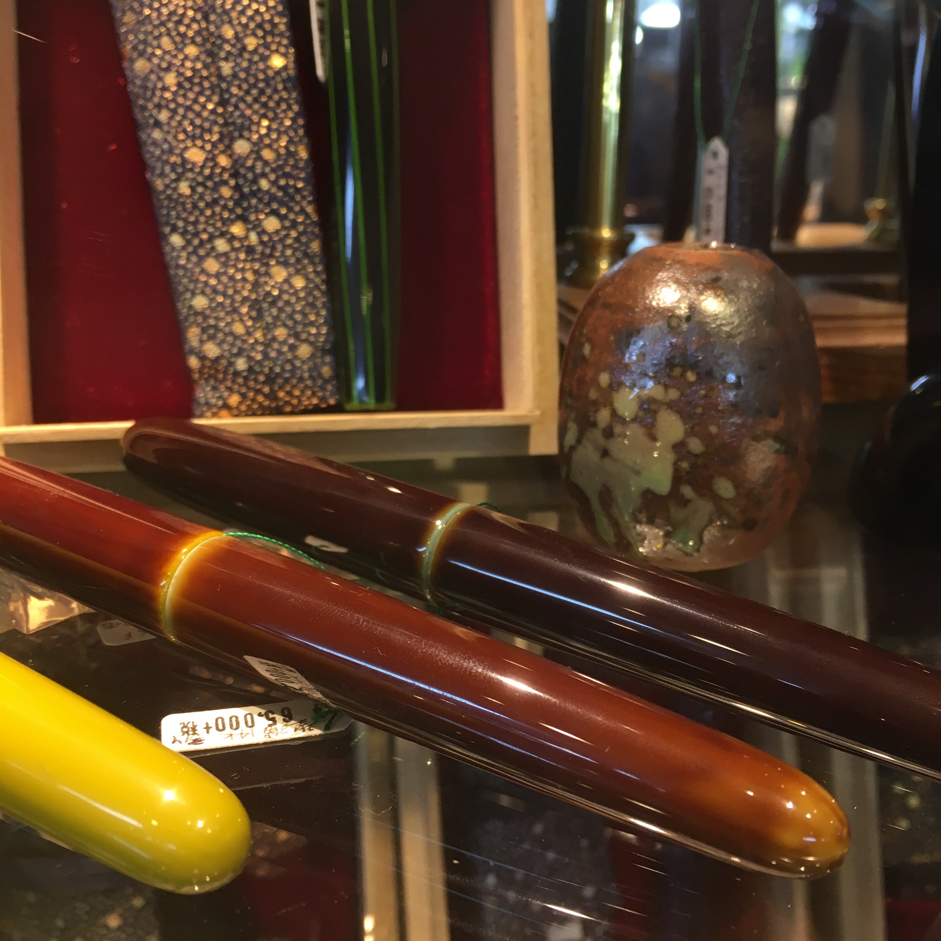
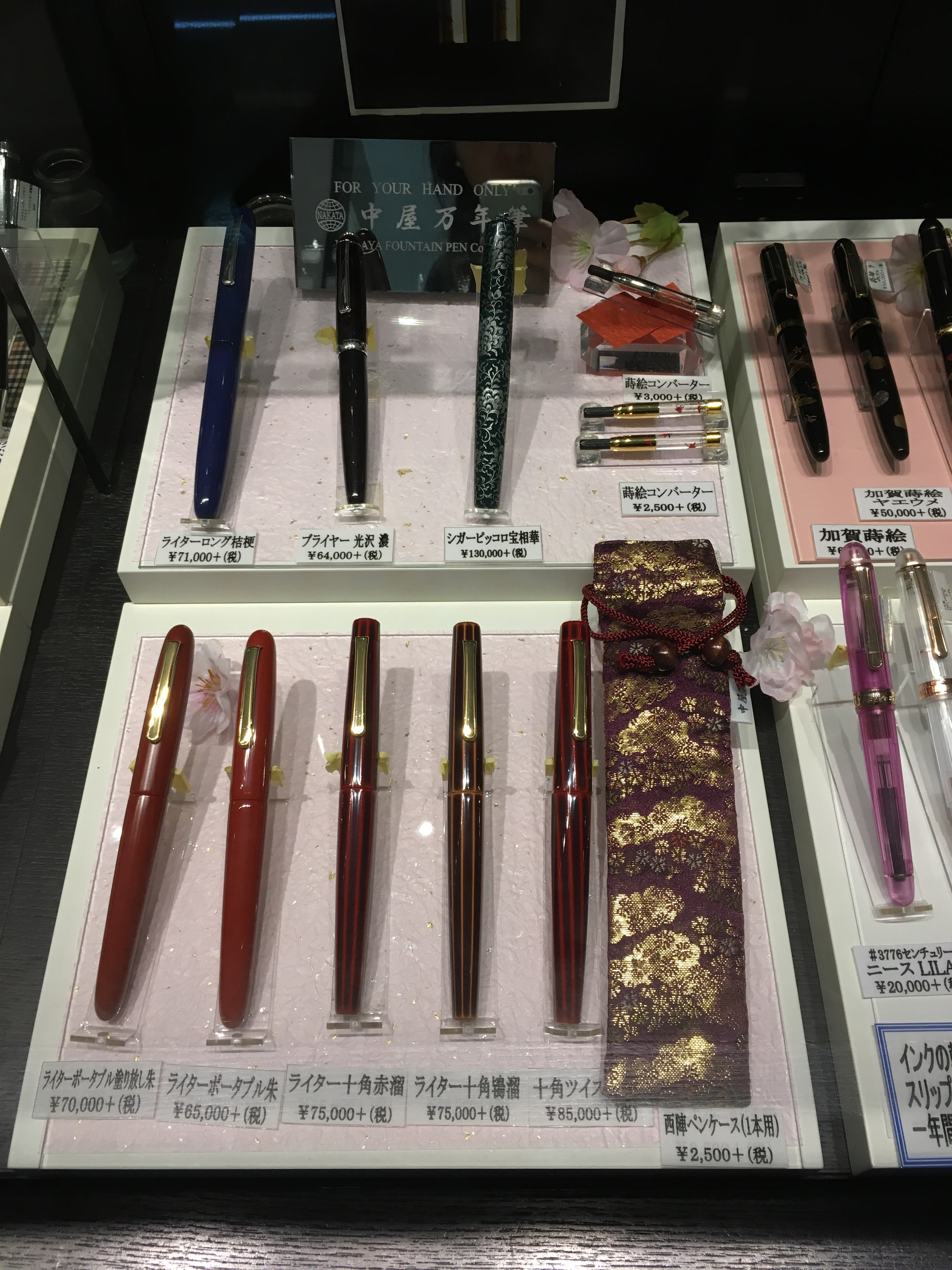
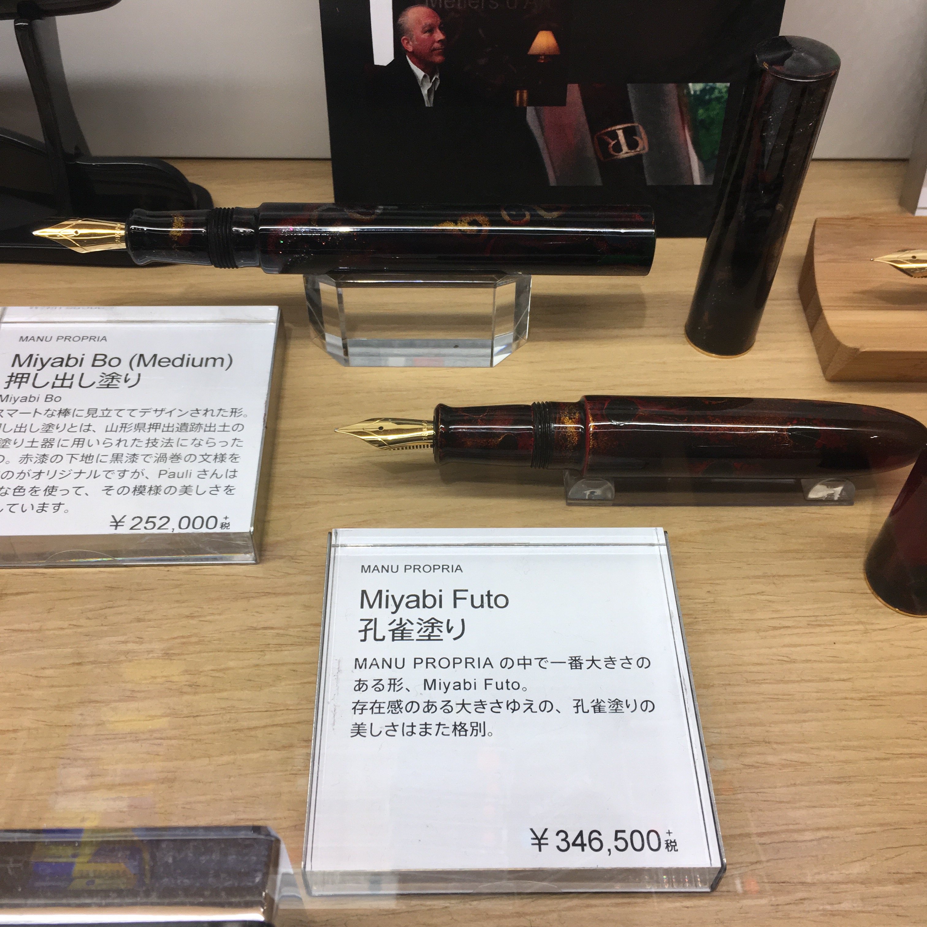
Instead, here are pictures from the Kobe Nagasawa Pen Style Den. It’s on the third floor of a small ish building (and one train stop away from Harborland), once again a kiosk inside a larger store. But, unlike the other Nagasawas, this one carries vintage! (At crazy prices) And two store-exclusive designs of Nakaya Maki-e converters.
And has samples of the different Nakaya finishes to touch and see:
And a good selection of ready to go Nakaya, including one in the now discontinued Shiro-tamenuri. (But not as many pens will roll stops as the Umeda Nagasawa)
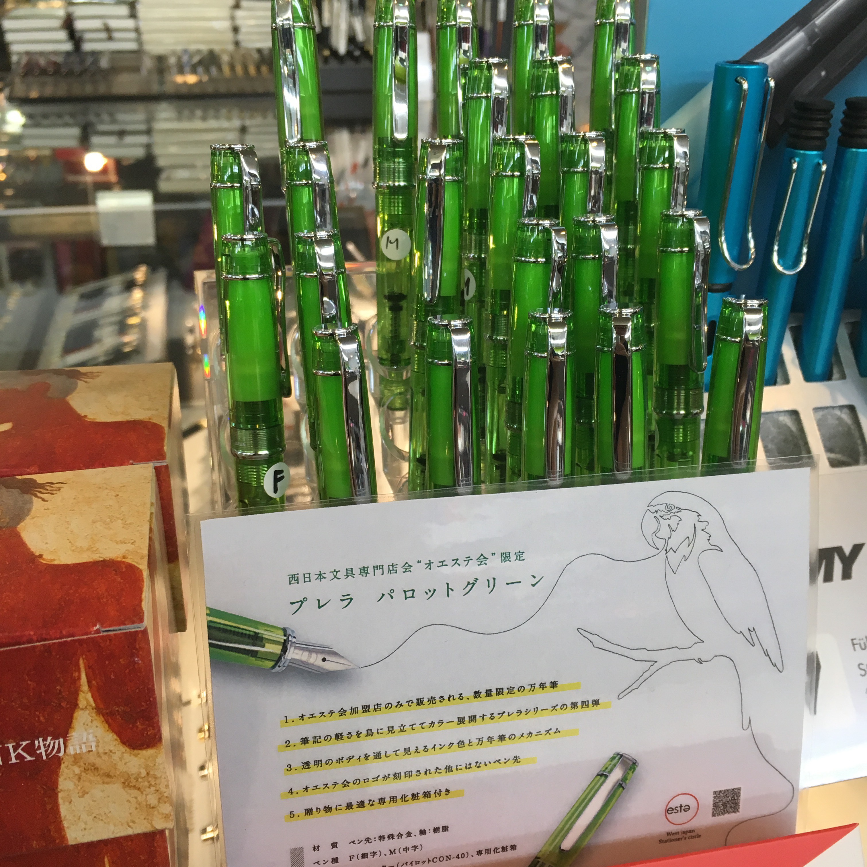
And a case of this year’s Oeste Prera. (Which the other Nagasawa had too, I just forgot to take a picture).
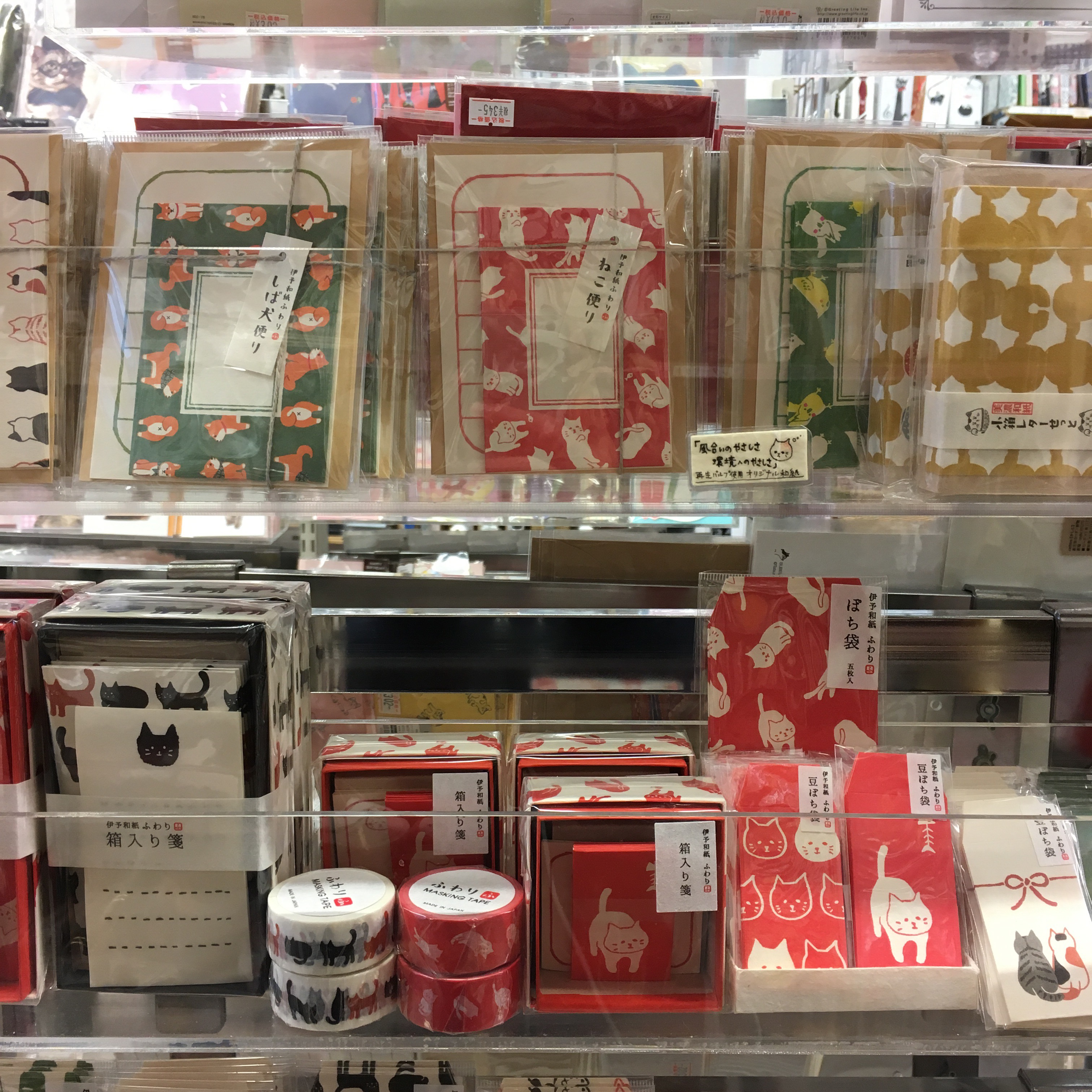
We also stumbled upon this Stationary Store (that’s what Maps calls it, I can’t figure out what it’s called otherwise) that is ENTIRELY CAT THEMED. They do carry a small selection of fountain pens, but also cats everywhere!
And a small selection of pens, both fountain and not:
But omg so much cute cat stuff:
Because I don’t know the name, here’s the address: (It’s also next to the “NMB 48 official shop”, which might be easier to map to)
3-10 Nanbasennichimae
Chūō-ku, Ōsaka-shi, Ōsaka-fu 542-0075
I had been warned that there wasn’t much fountain pen shopping to be done in Osaka — so I was pleasantly surprised. The Nagasawa stores had the largest and most varied selection of Nakayas, as well as their own interesting exclusives.
And Osaka was full of delicious okonomiyaki. But I forgot to upload pictures.
My visit to Kyoto was fairly brief, and I’d done a lot of shopping in Tokyo, so I didn’t go out of my way to hunt down any pens. (I promise Osaka will be more exciting!)
My first stop was Isetan — it’s the giant department store attached to Kyoto Station. Fountain pens are waaaaay up (floor 10, I think) They have a small pen and stationary section, but nothing particularly interesting. There didn’t seem to be any limited edition anything… But if you’re in the area and want to pick up something at Japanese prices, not bad! Also, if you take the escalator all the way up, you’ll stop through several floors of random quirky stuff, like rocks with faces painted on for $15.
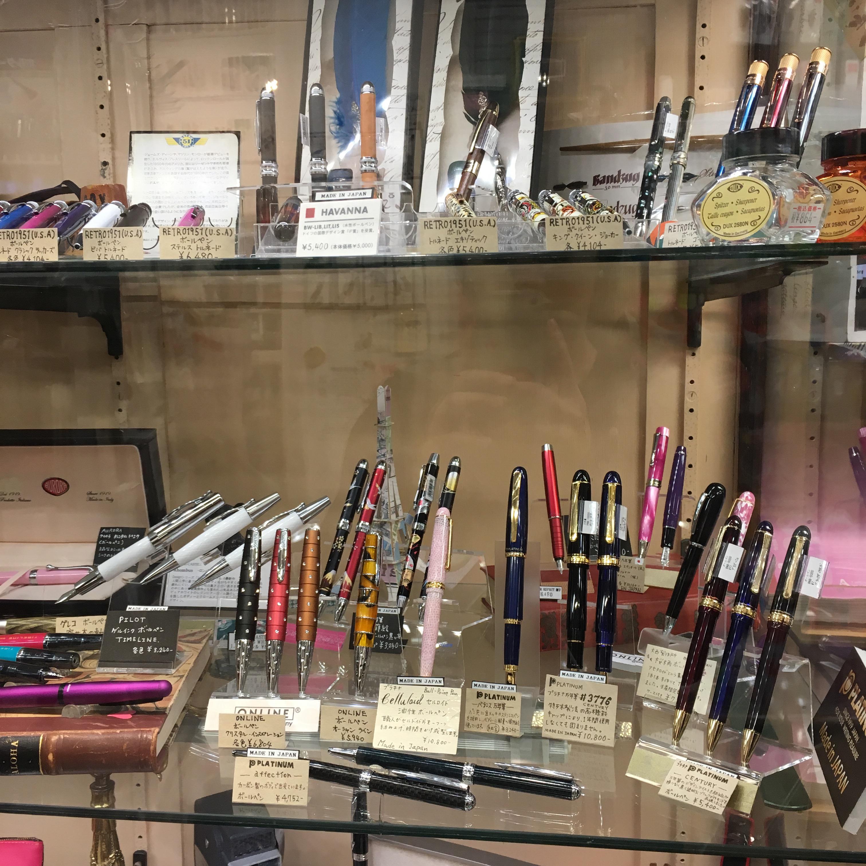
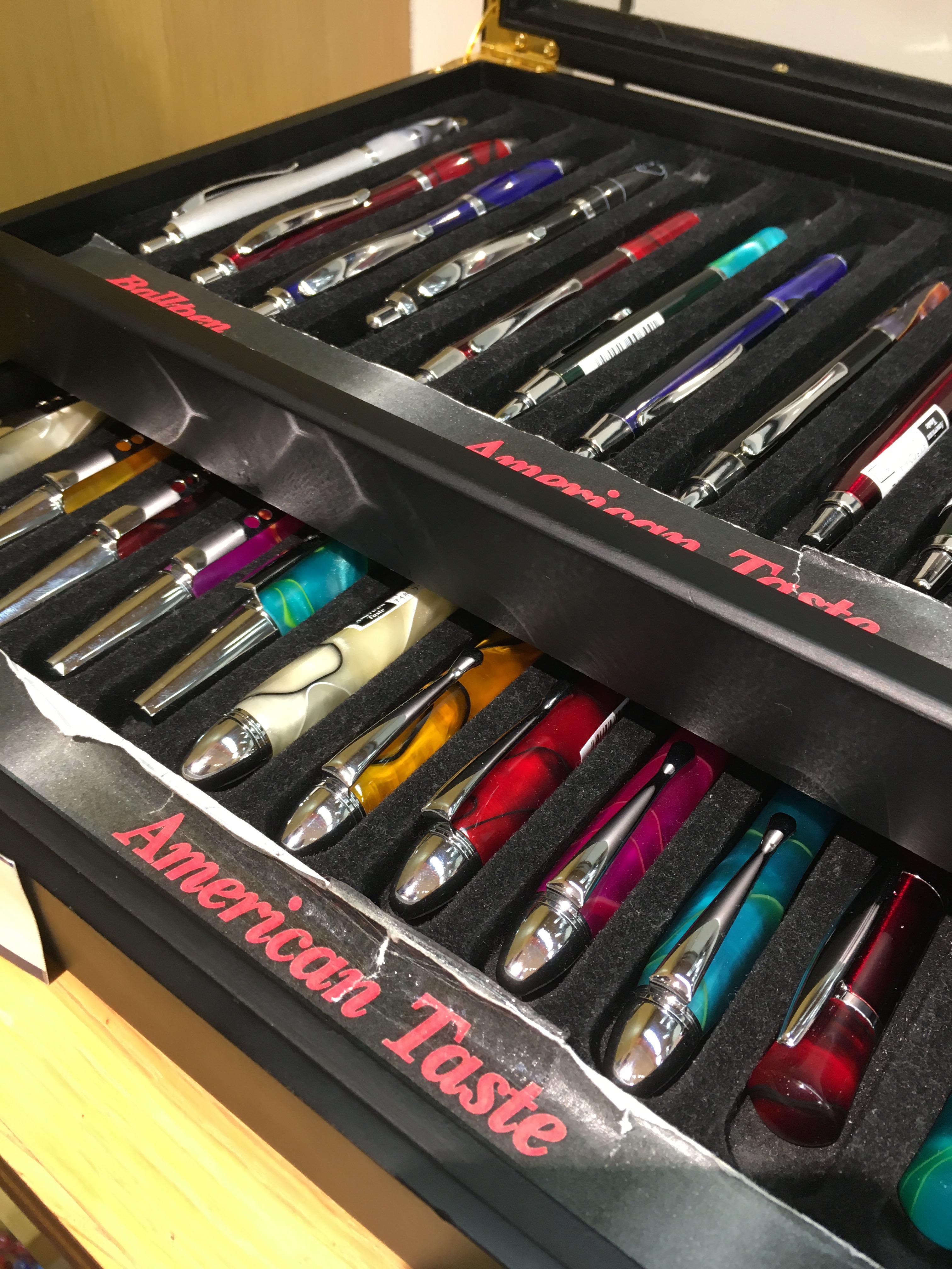
And a tray of “American Taste” pens on a side shelf. Hah.
The other store I made it to in Kyoto was Tokyu Hands. If you’re unfamiliar with Tokyu Hands, it’s not a Kyoto-specific store — they have branches all over Japan, and some in Singapore too! They sell a variety of things from cooking utensils to handbags to… fountain pens! The Kyoto branch is very close to Nishiki Warai, a well known shopping/eating street.
Tokyo Hands stocks a pretty generic selection of inks and pens — including ones at several price points, capping out at about $200. No Nakaya or Namikis here. But they also carry a solid selection of inks, no exclusives, but much more than a couple department stores that have seemed to only stock Pilot blue and black.
In addition to many of the usual subjects, Tokyo Hands also stocks Kyoto Celluloid — I didn’t see this at other branches, but I’ve been told that the Singapore branch also stocks these.
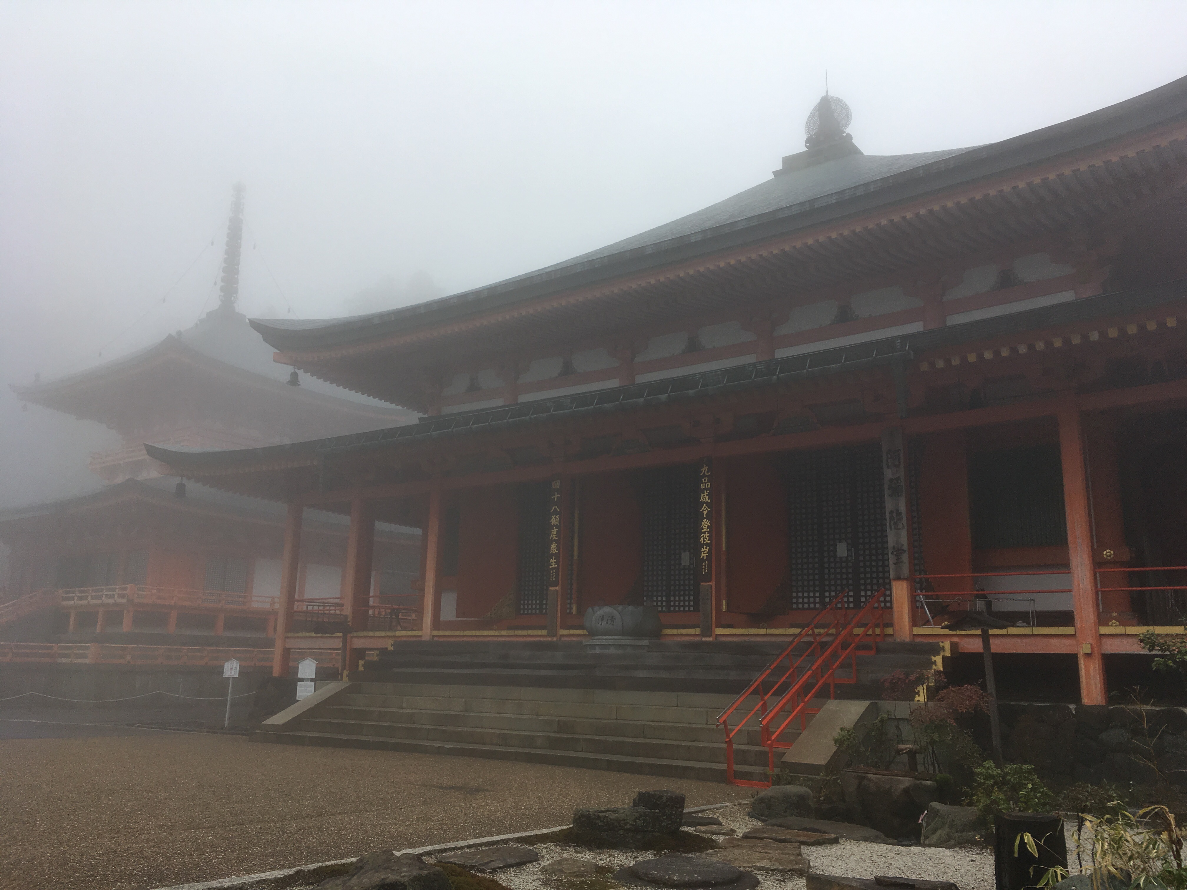
And, because I actually came to Kyoto to see temples, here’s a picture of one of the temples within Enryaku-ji, on Mt. Hiei. Kyoto was amazing, and I think there were a couple more ink places I could have stopped by, but priorities!
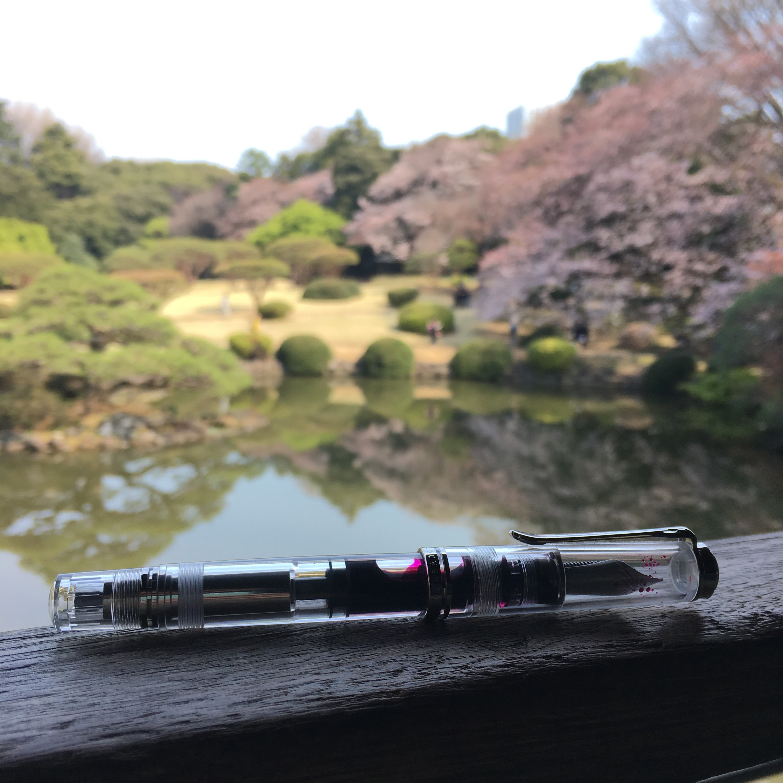
Pelikan M805 demonstrator, Shinjuku Gyoen National Garden
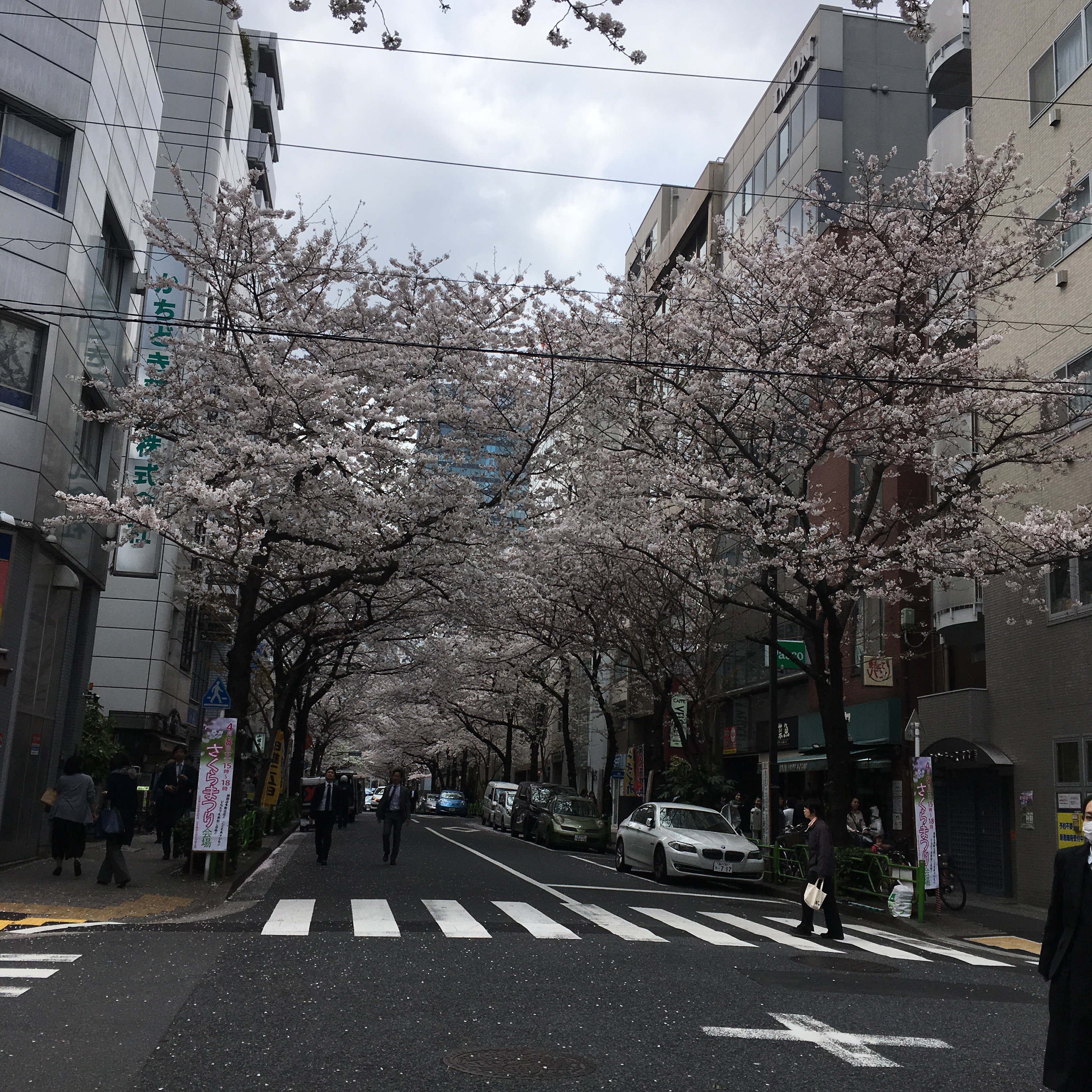
As some of you may know, I, Katherine, am currently in Japan! I spent the last few days in Tokyo, and am now writing this from my Airbnb in Kyoto. I’m here primarily to see the sakura — so look! They’re so pretty! We lucked out and hit Tokyo right as the blossoms hit full bloom, but before it rained.
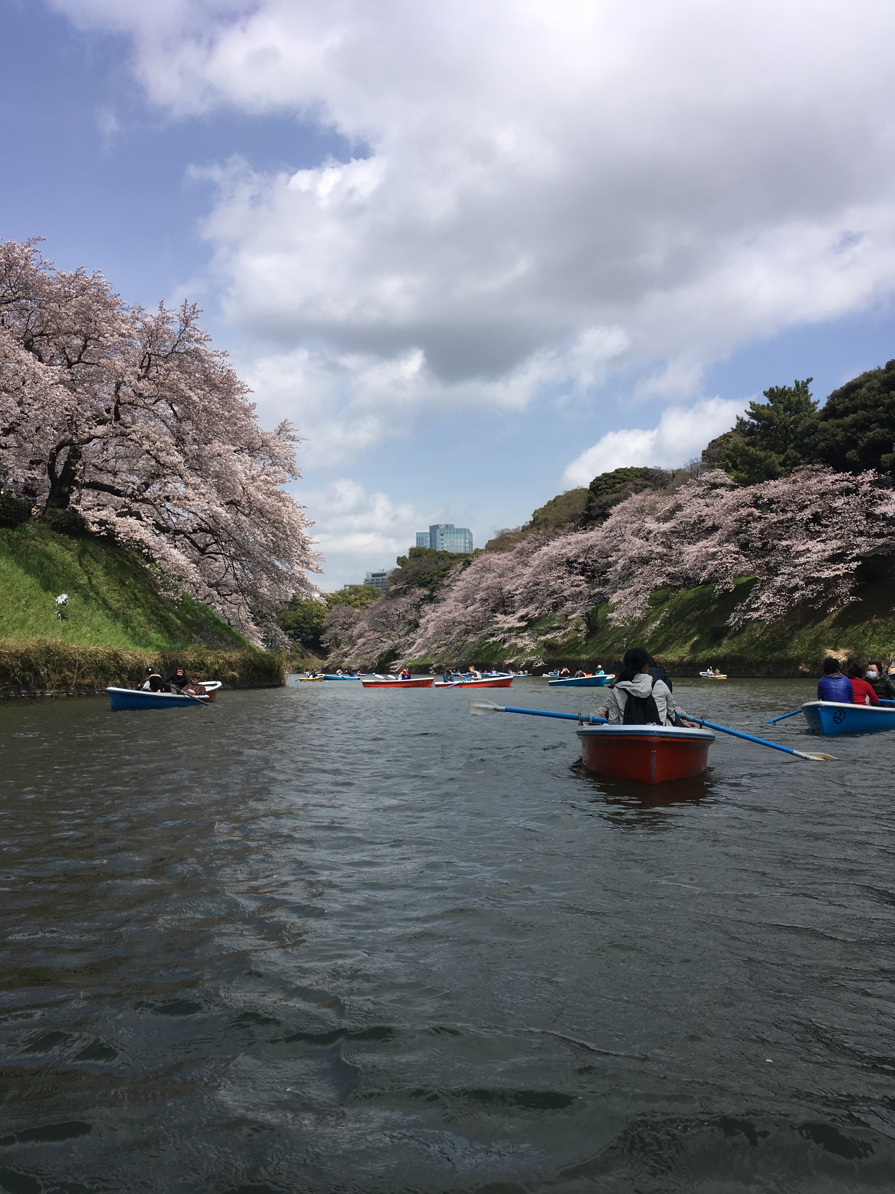
Chidori-ga-fuchi boat ride
But I know you’re here for my notes on fountain pen shopping in Tokyo, so I won’t bore you with any more pictures of sakura. 🙂 As a disclaimer, there are much more complete lists of fountain pen stores in Tokyo. This is by no means an exhaustive list — for that I like this one. This is my first time in Tokyo, so while I certainly hit up some fountain pen stores, I didn’t spent a lot of time pen hunting.
Ameyoko – Bruno (the link above) mentions that there are a couple stores here. I couldn’t find them. Instead I got distracted eating takoyaki, eyeing trays of sashimi and trying to figure out what the other edible offerings were. Fun place, but not terribly easy to navigate.
Maruzen Oazo
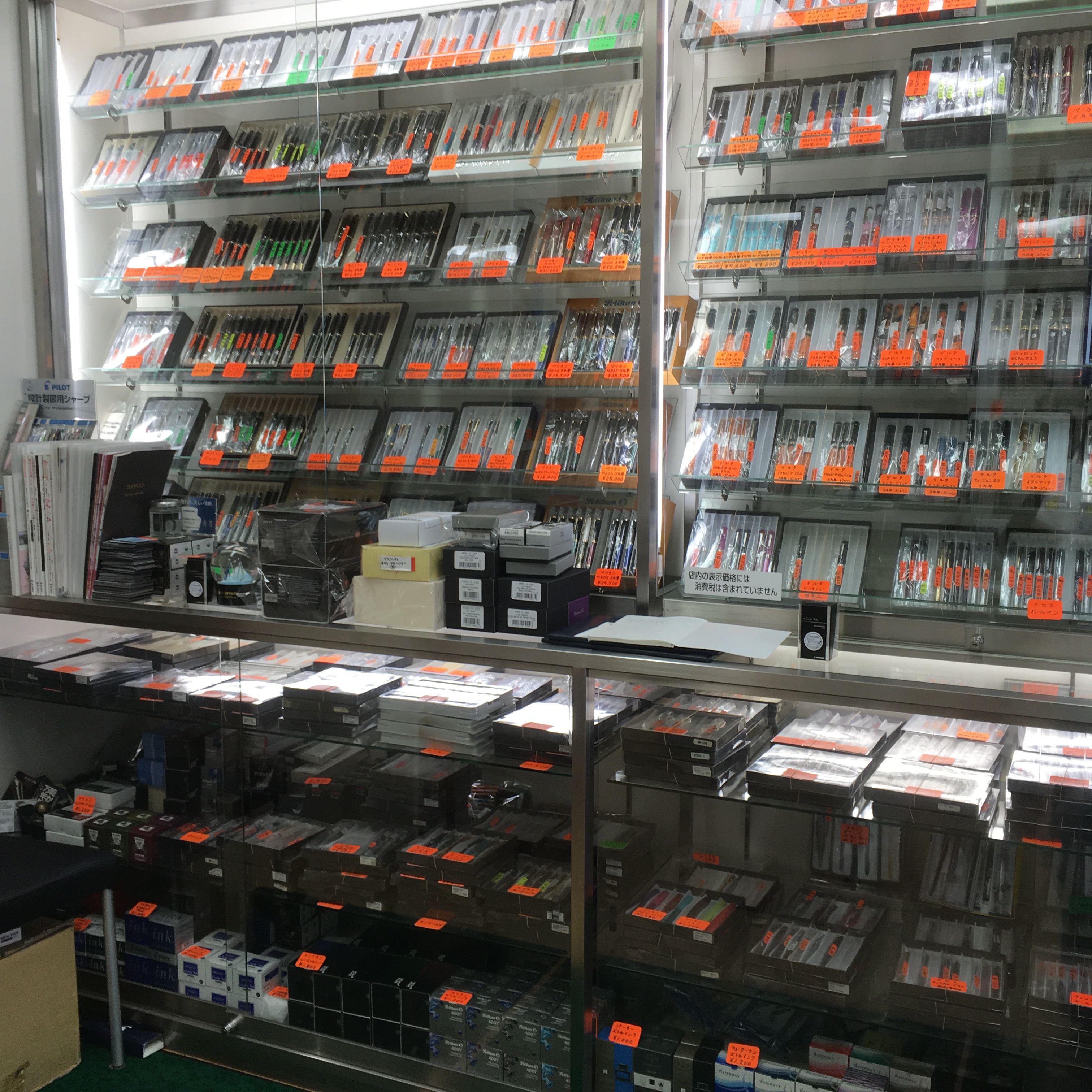
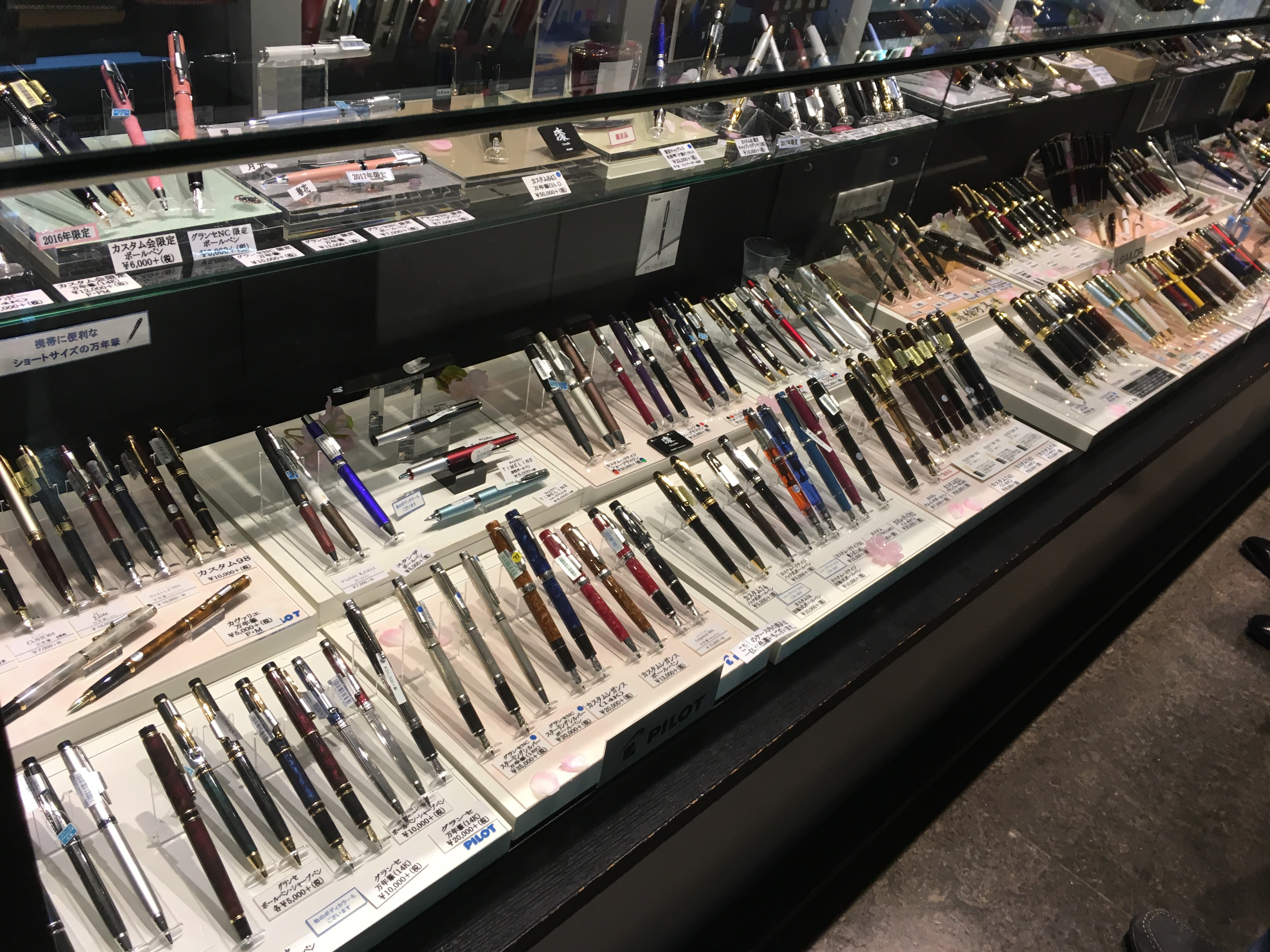
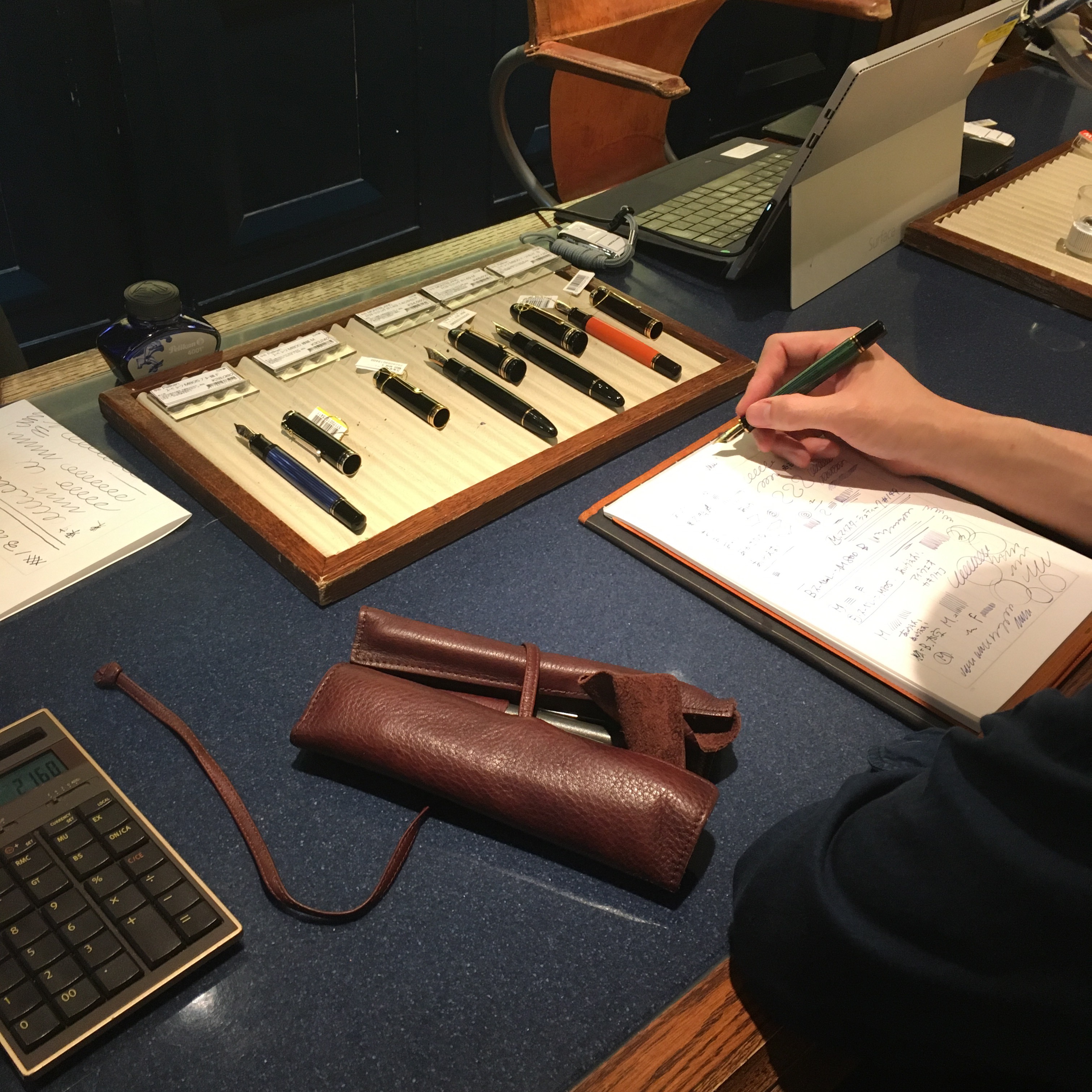
This was my first stop. I was trying to get to Maruzen Nihombashi, walked out of Tokyo station, crossed a street… and looked up to see a MARUZEN sign. The pens are on the top floor (I think? I was pretty tired) and while there’s only one long counter — there’s a lot of good stuff here!
They had all the brands I would expect and a handful I didn’t recognize.
And a small selection of beautiful Nakaya. That green + silver chinkin really caught my eye.
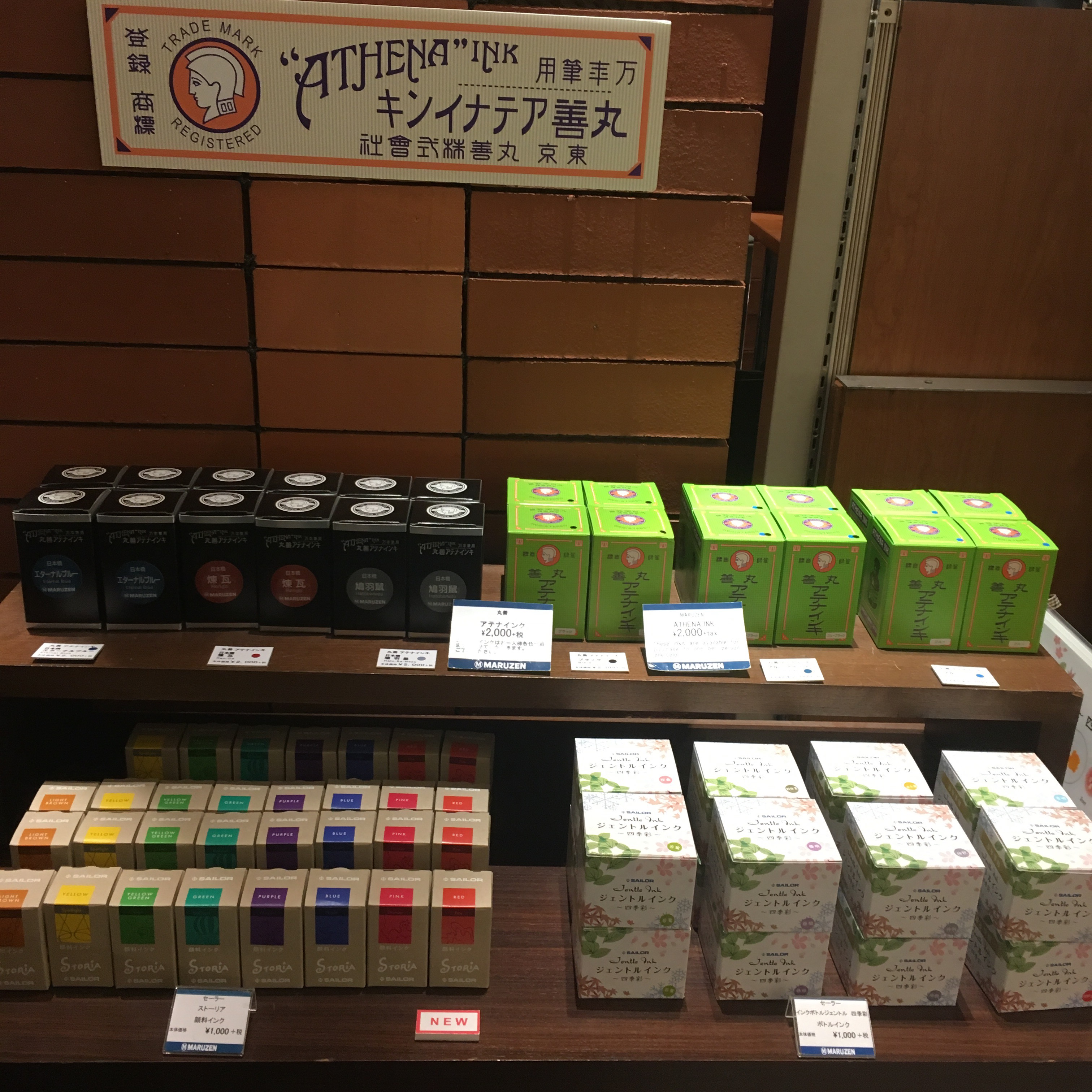
And an ink shelf to the right of the pen counter. The green boxes in the bottom left are their exclusive brand — Maruzen Athena. They had black, blue, blue black and sepia in stock. Each bottle is ¥2000 plus tax (8%).
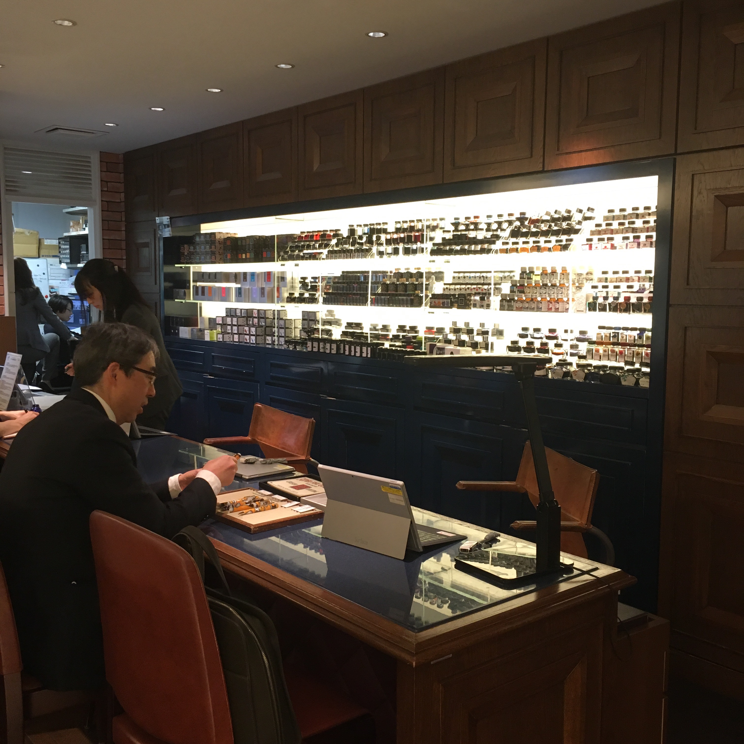
Maruzen Nihombashi
This branch had a slightly larger (I think) selection of pens spread across several counters in the basement. Additionally, the Nihombashi branch has some exclusive inks (and they come in the old style Sailor bottles!) — also ¥2000.
Eurobox Eurobox is a small and somewhat hard to find purveyor of used pens in Ginza. It took me a couple attempts at peering into different buildings to realize that it’s NOT on the ground floor. There is no street facing Eurobox sign. Walk into the door way in this picture (the right one, not the random antiques store next door):
Then go up four flights of stairs… and ta-da!
The owner, Eizo, wasn’t in when I visited, instead it was his son. I’ve emailed Eizo before and he’s always been helpful and speaks pretty good English. His son was also very helpful and nice. He insisted on ducking out of the picture above.
They carry a fantastic selection of vintage pens, primarily American and German. Their prices seem to be fair, but aren’t a bargain. They know what their pens are worth. 🙂 A couple pens caught my eye, but the one I want most still needs restoration, so I’ve been emailing back and forth with Eizo. Fingers crossed everything works out!
Mitsukoshi Ginza
The selection here is tiny — I’d suggest going to the Nihombashi branch instead. I didn’t make it because I ran out of time. The Ginza branch carries a handful of brands, but nothing super interesting or unique compared to other stores. And no ink that I could find.
Itoya Ginza
Itoya really deserves a post of it’s own. It’s a massive stationary/art/neat stuff store that spans two buildings. Fountain pens are in the main building, on the third floor. The annex still has a section where you can build a custom notebook. Neat!
They carry a wide selection of the typical brands you’d expect, but also a handful of less common brands like Manu Propria, Danitrio and Nakaya.
Sorry for the glare-y photos, the store is very well lit and my phone doesn’t know how to deal with that.
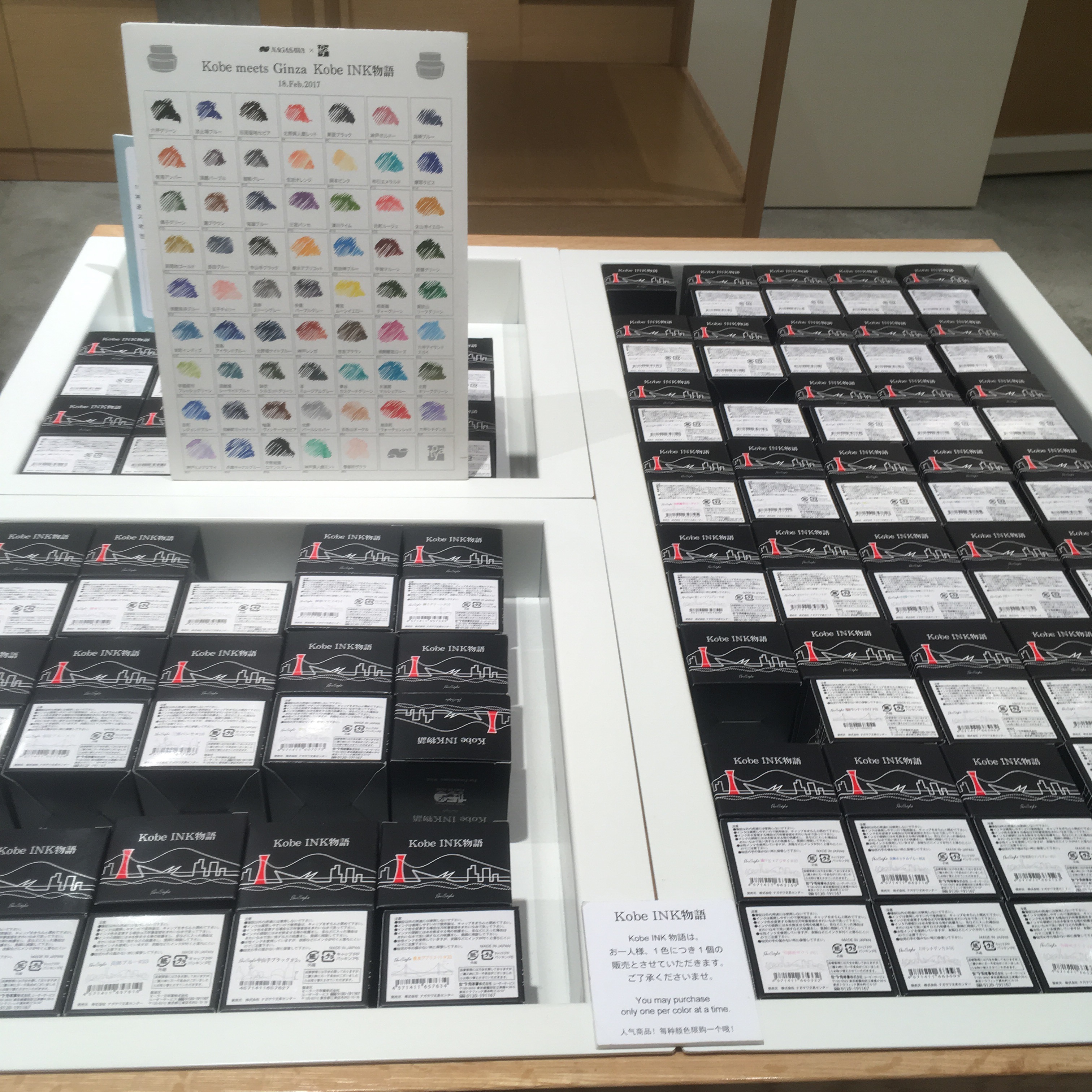
And, they stock Kobe inks! Only one bottle per person per color though. No hoarding. ¥2000 each.
Additionally, if you’re in Japan on a visitor visa and have your passport, you can go to the 6th floor and your 8% tax will be refunded to you. Just don’t be a late evening shopper like me — then you feel bad keeping people at work after store close. (More on that at the bottom of this post)
Kingdom Note
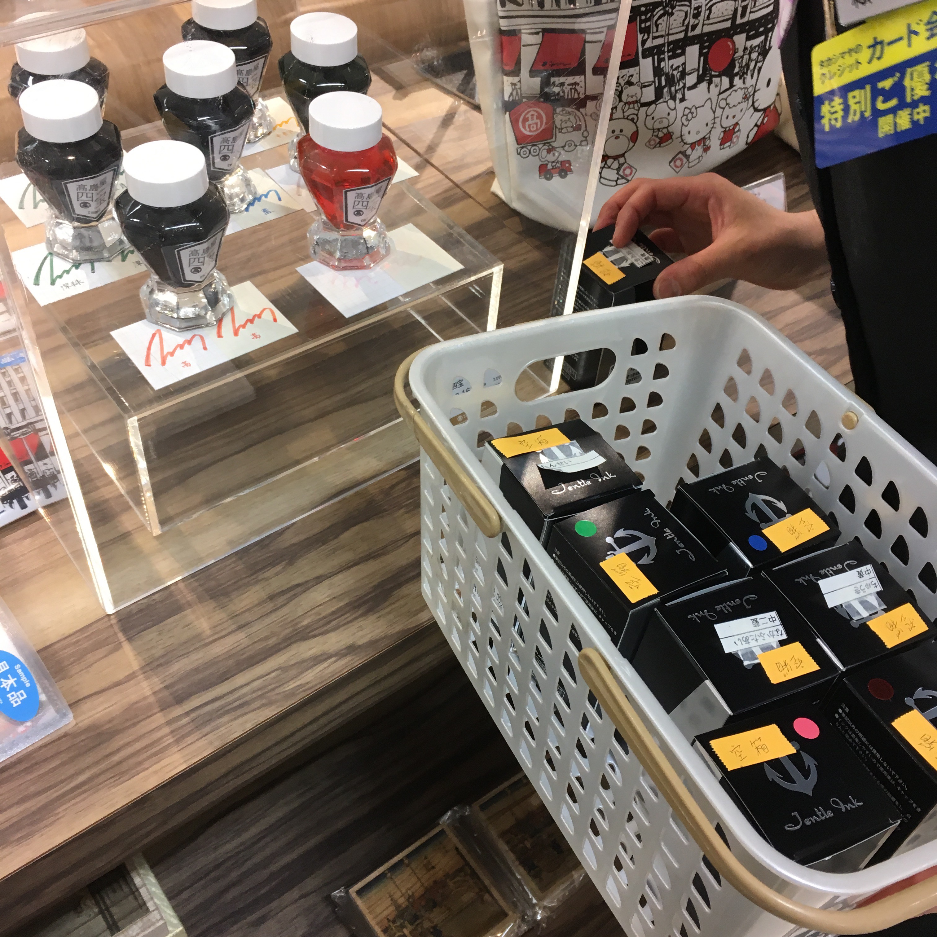
Kingdom Note is primarily famous for their incredible selection of custom inks. But they have quite the selection of pens too. As I was there, they were helping two people pick pens — each pen was lovingly handled and tested.
Here’s the crazy wall of inks behind the counter — the far bottom corner is the home of their custom inks. You can see the little black boxes with white labels. Each is ¥2000 plus 8% tax.
They also still had their current line of vegetable sailor pens on display (though I didn’t check availability) and a handful of other exclusive designs.
Yodobashi Camera (Shinjuku, I think?)
Not worth a trip. But if you’re already hitting up electronics stores while looking for a Nintendo Switch — you should certainly pick up a couple bottles of Iroshizuku at a great price! (¥1620 + 8% tax)
Takashimaya Nihombashi
I know I said no more sakura pictures… but Takashimaya borders a beautiful street, aptly named Sakura-dori. Crazy. Why stand in a crowded park when you can eat delicious karaage (8 blocks down from Takashimaya), take a lovely stroll, then go buy some pens?!
Takashimaya has its own line of store-exclusive inks. I have no idea what availability is like, but they had all of them in stock when I went. My self control is terrible and I got three bottles. Each is ¥2000 + tax. Writing samples to come. Eventually. If you want a tax refund (more on that later), Takashimaya requires you to buy at least ¥5000 of “consumables” — and seals them so you can’t open them in Japan.
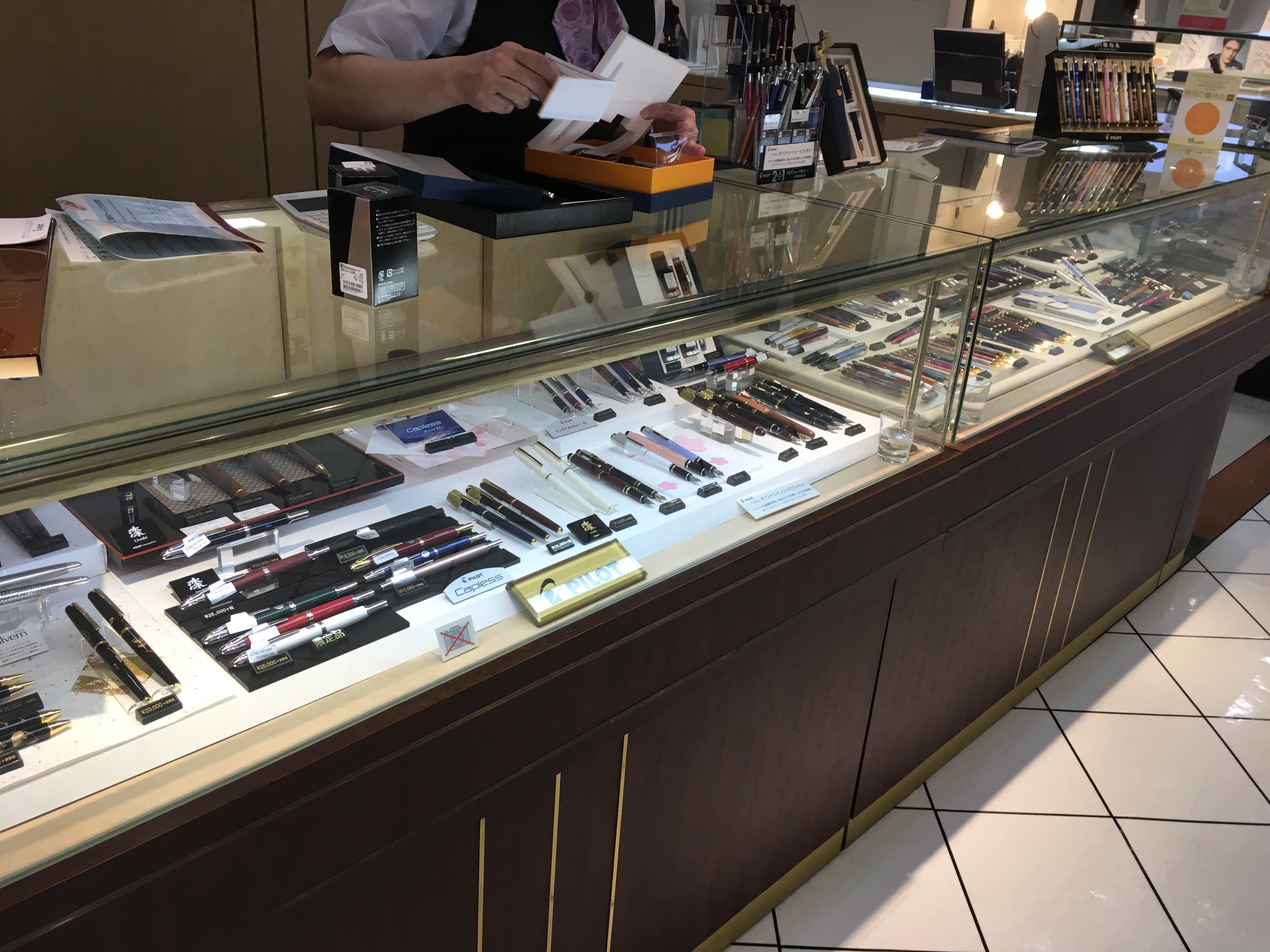
The pen selection is nothing special — but is decent and the staff were very, very nice. They also had a case of Namiki maki-e pens. No Nakayas though.
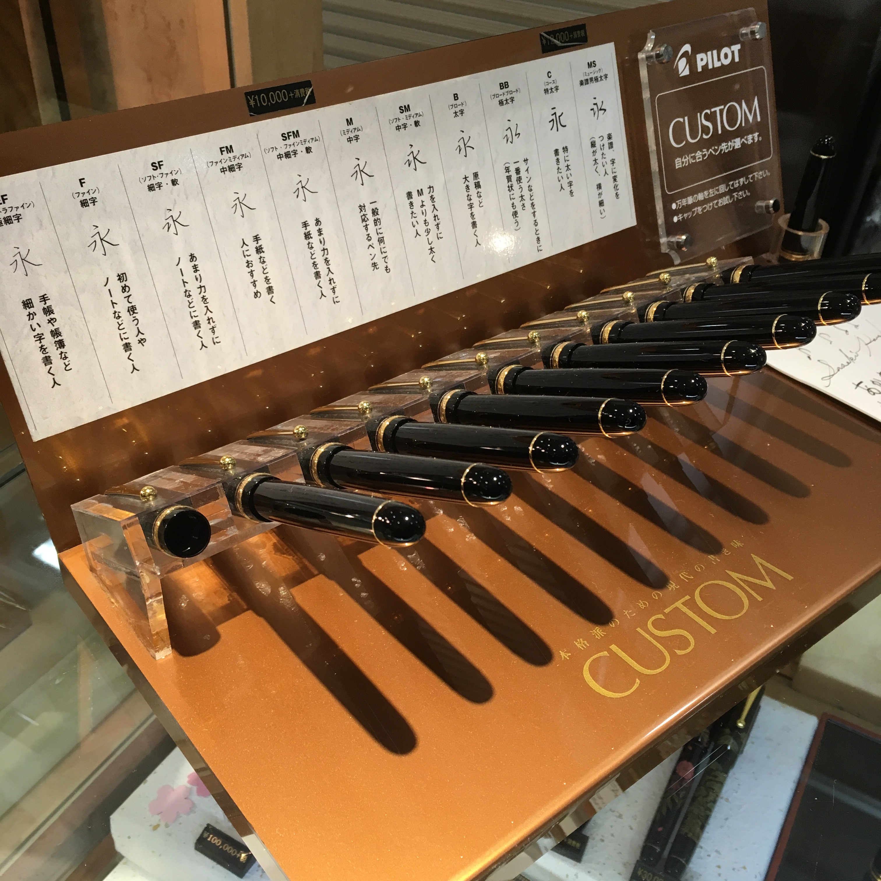
They did have this neat Pilot nib-tester thing! The only other place I saw this was Maruzen Nihombashi. Maybe the others had it and I just didn’t notice.
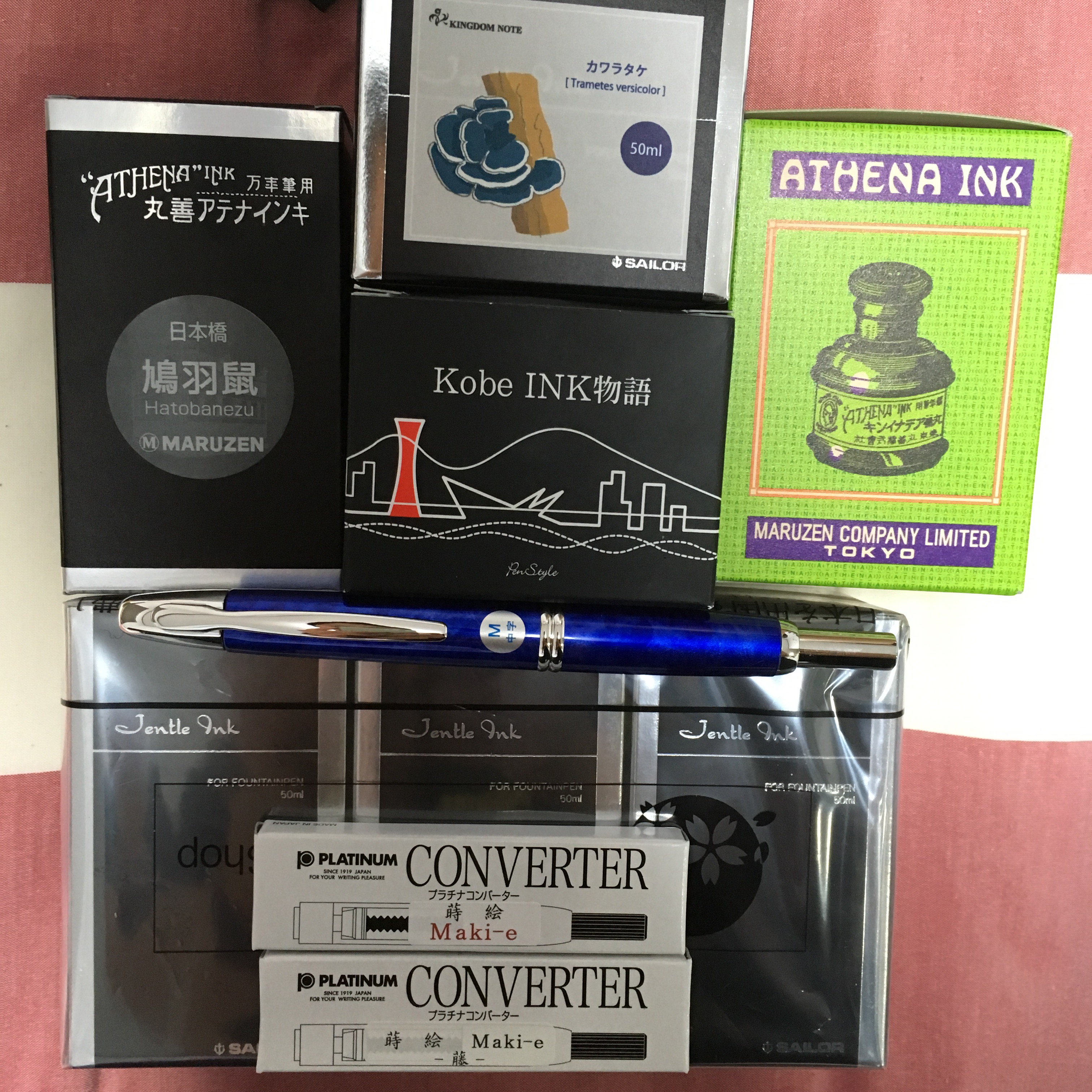
All in all, this is what I bought myself:
Maruzen Athena Hatobanezu ink (Nihombashi only)
Kingdom Note blue shelfy mushroom
Kobe #51 (Itoya)
Maruzen Athena Blue Black (Nihombashi and Oazo both had it)
Three bottles of Takashimaya ink
Pilot Sunset Blue Capless
2 Nakaya Maki-e converters
A note on sales tax:
I mentioned this above, but I wanted to elaborate a little more, since I didn’t know much about the tax refund process when I started shopping. All the stores add on 8% in sales tax. I’m not sure if that’s Japan wide or just Tokyo. As a visitor (foreign passport and a visa that lets you stay less than six months) you can get this tax refunded if your purchase is over ¥5000. Some stores can process it for you in house (Takashimaya, Itoya, probably any of the big department stores) and some can’t, you have to go to a separate tax counter (Maruzen, Kingdom Note) somewhere in the city. But you have to get your refund on the day of your purchase. So plan ahead! Also, you should google the tax refund process yourself — I could be wrong. 🙂