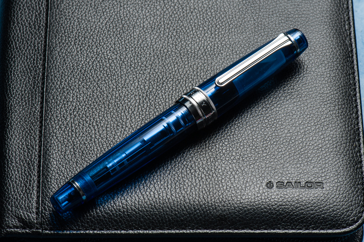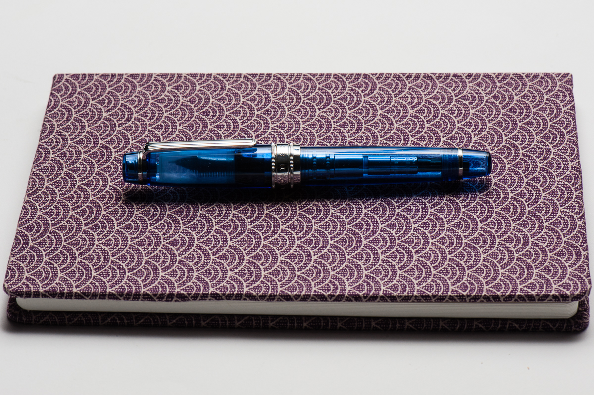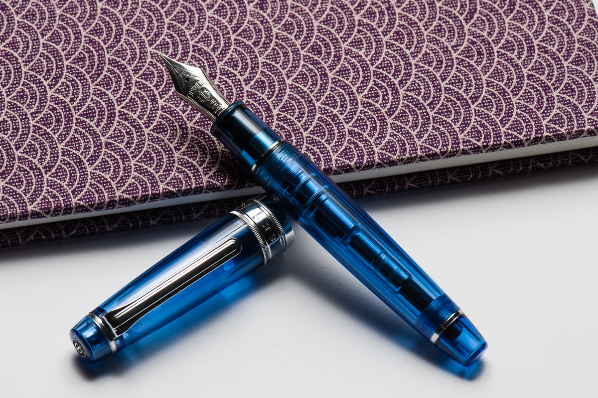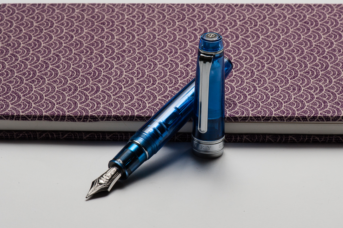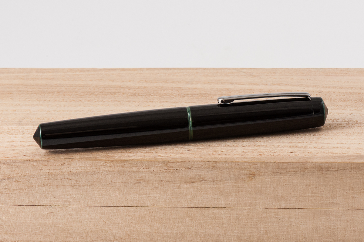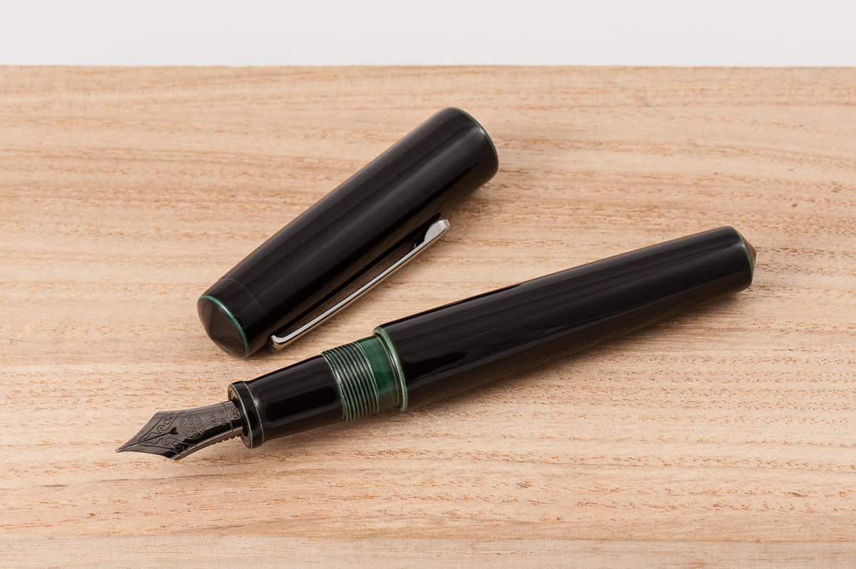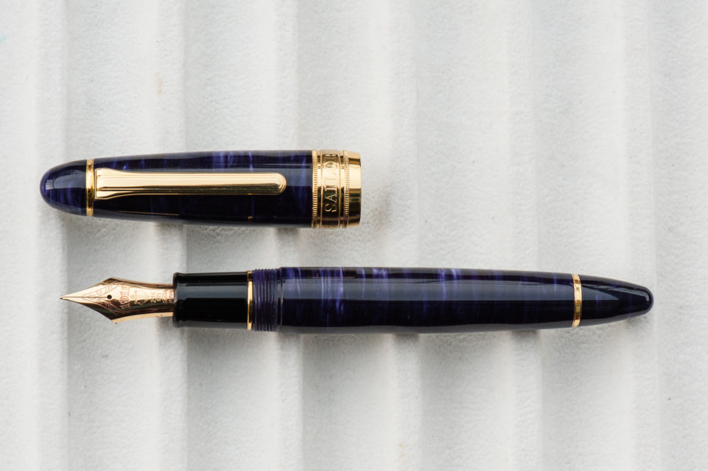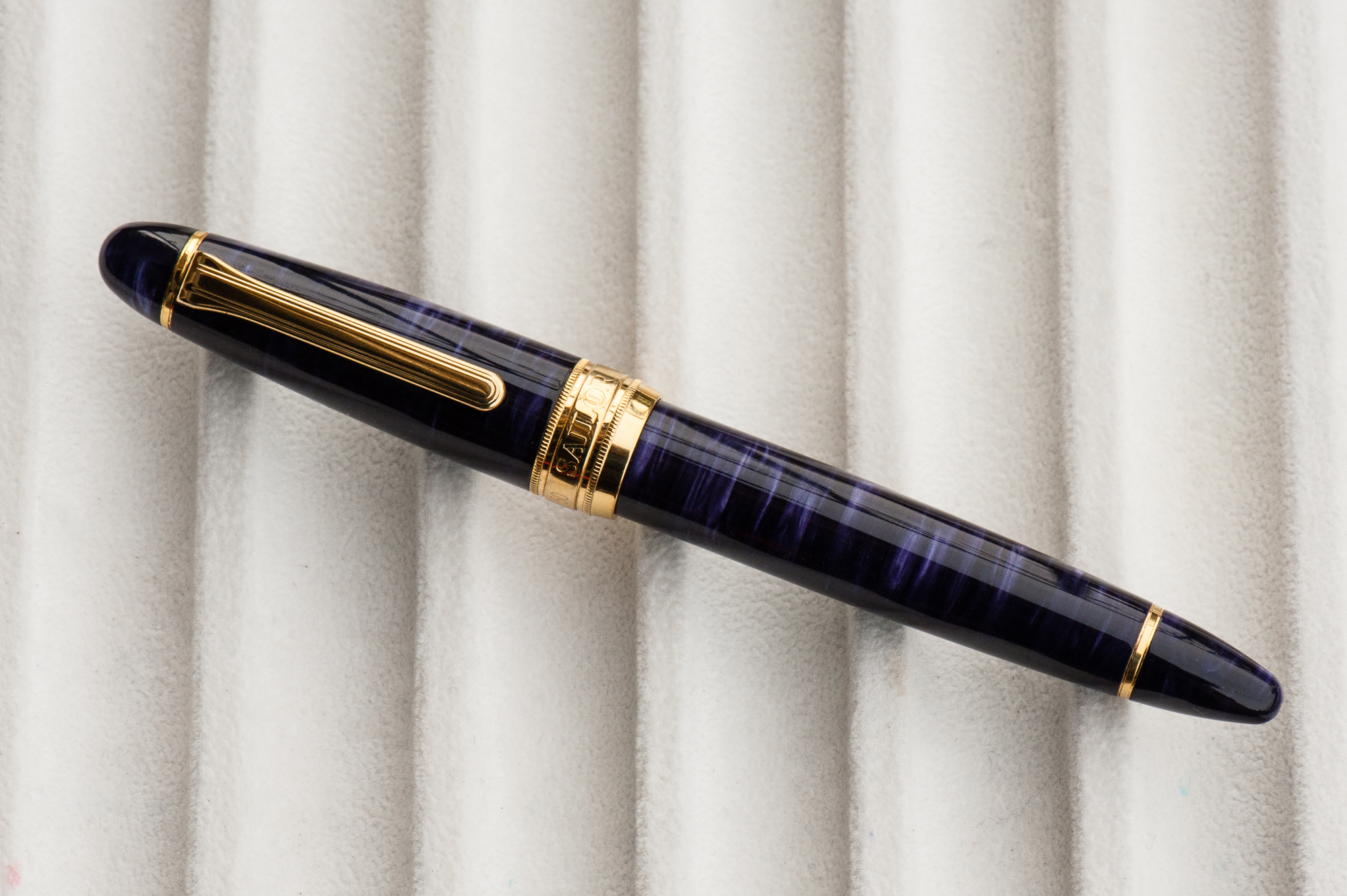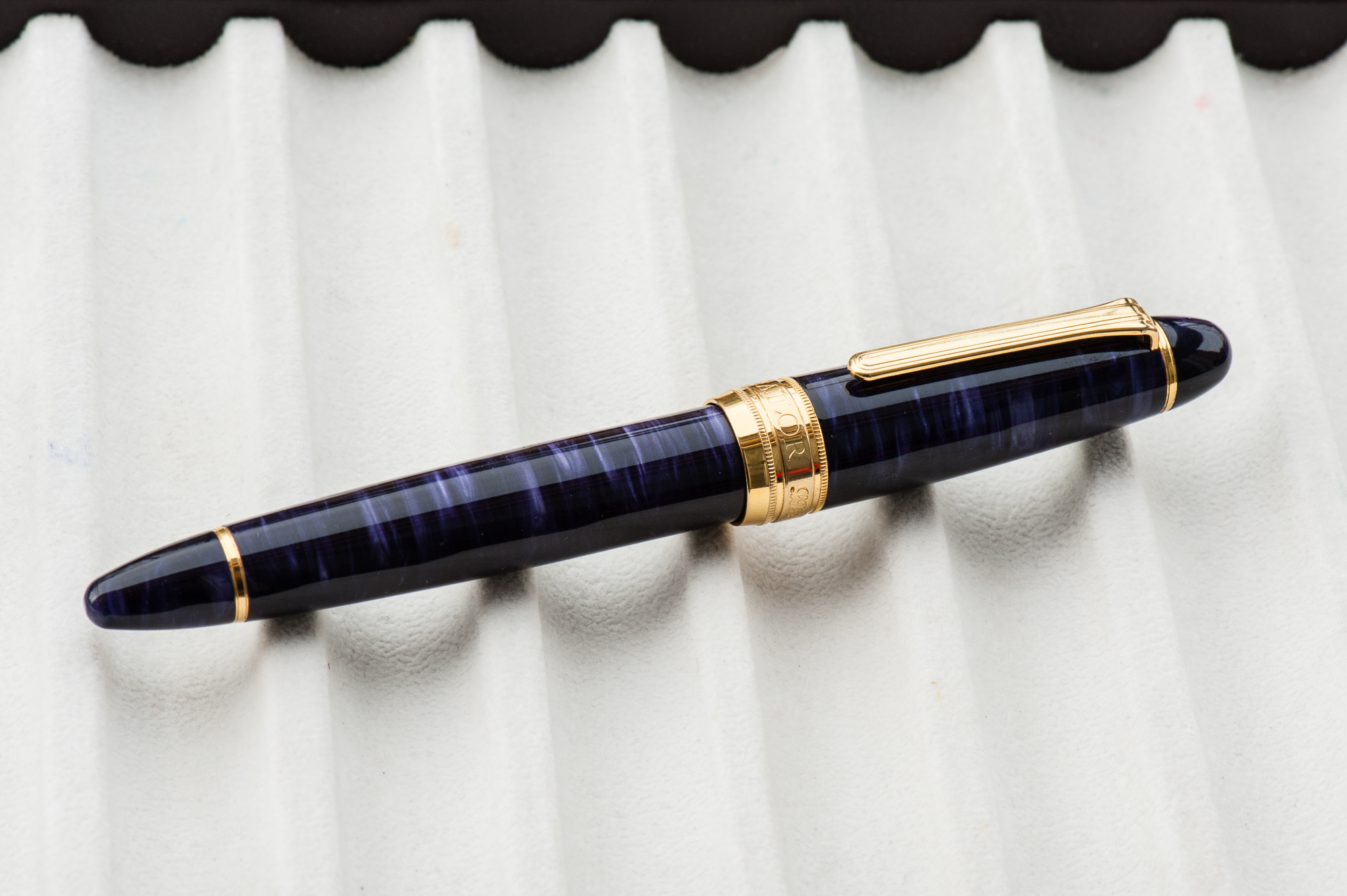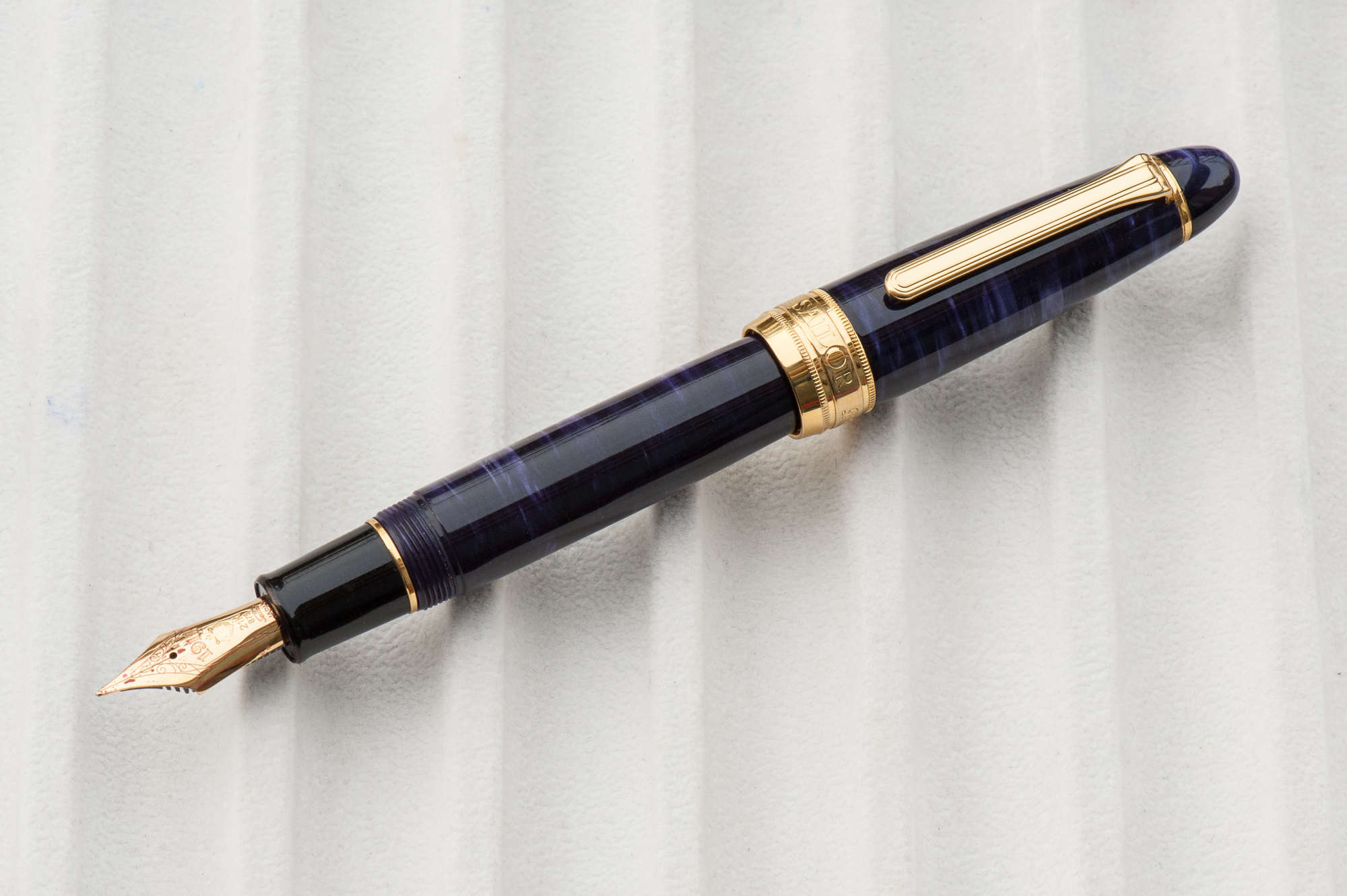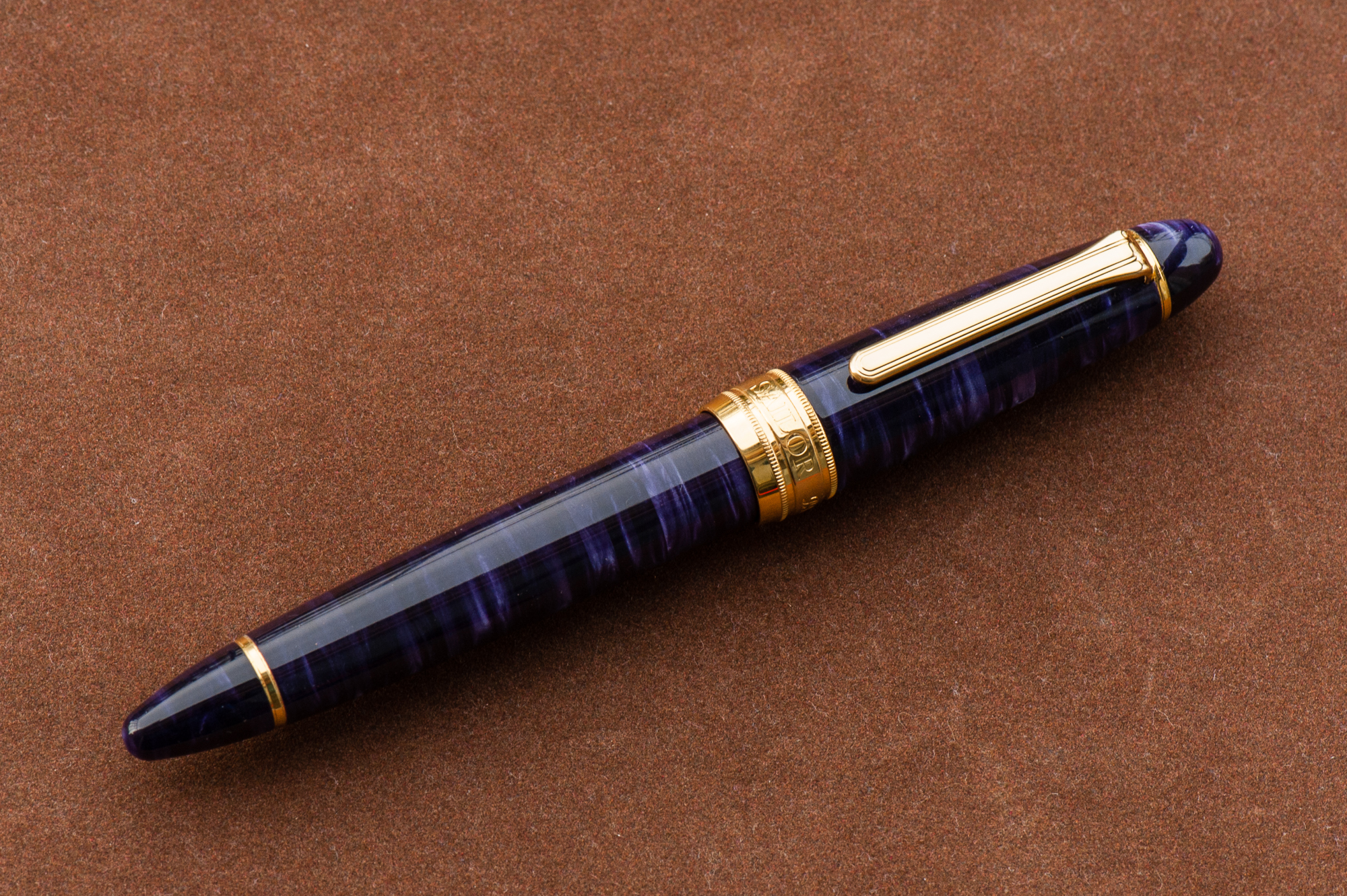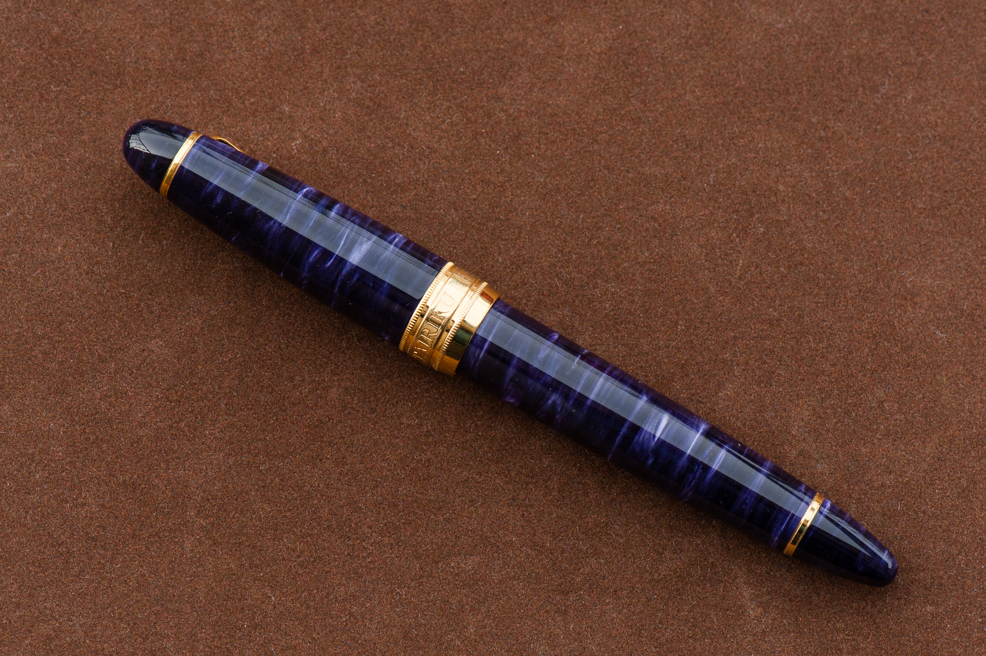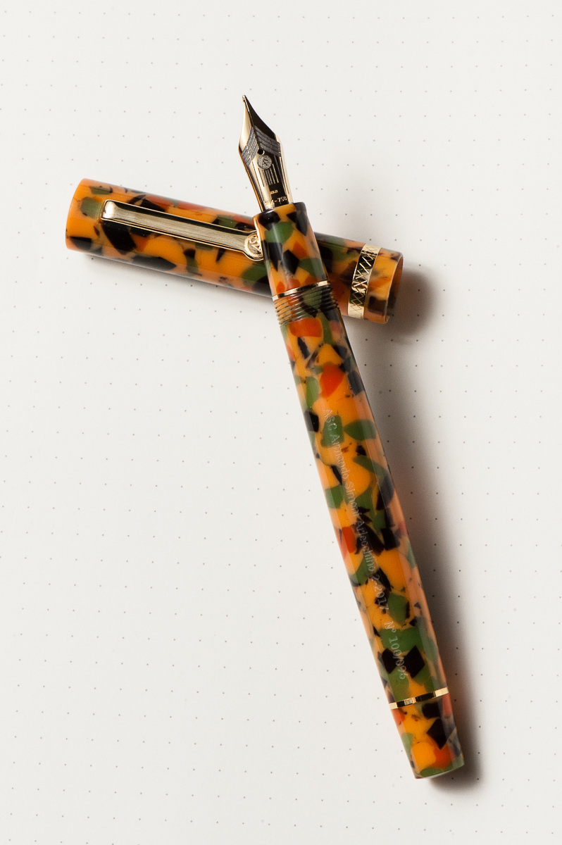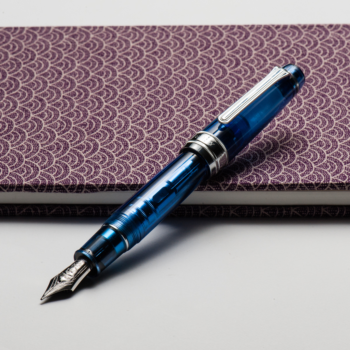
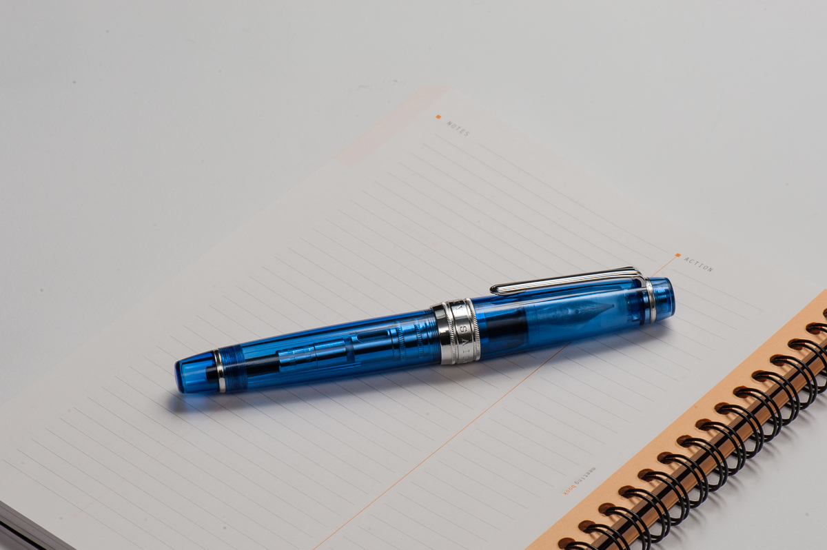
Happy 2018 folks! Thank you for your continued readership and we are looking forward to provide you with more reviews, and other interesting content. And for our first pen review of the year, here’s a blue pen from Sailor.
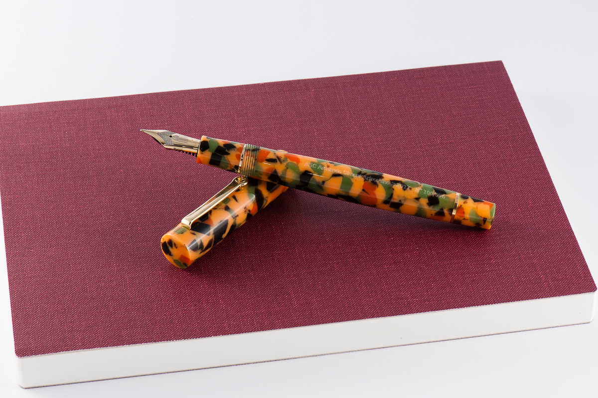
Also, just in case you’re wondering, the notebook the pen is resting on is a Musubi handmade diary just arrived from Singapore. We may review this notebook after some use. We are not affiliated in any way. They were quite popular at the San Francisco Pen Show in 2017 and they’re friendly people as well.
Hand Over That Pen, please!
Katherine: Ahhhhhh. I want a sky. They look so cool. Even the converter showing looks cool!
Pam: I am totally biased given that I own a Sailor Sky in the Progear Slim size. The blue material is the same, however, there are more metal parts to the King of Pen which adds to the weight and hand feel. (More on that later.)
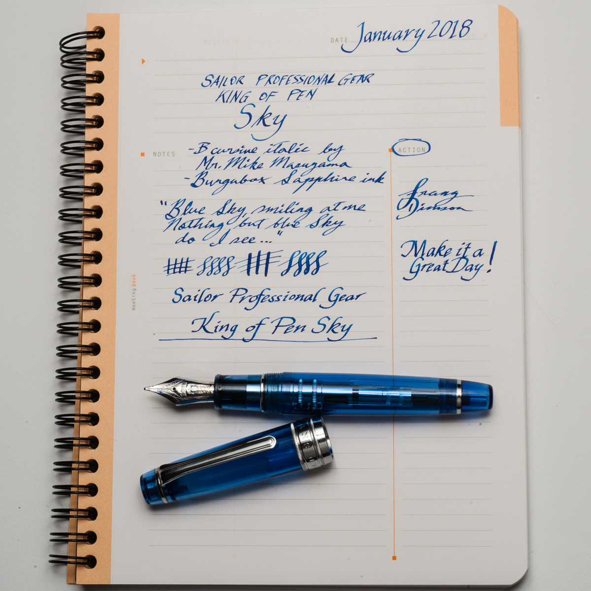
Franz: “Blue Sky smilin’ at me, nothing but blue Sky… do I see…”. Ever had a pen make you just wanna sing? Well, this King of Pen (KoP) Sky did it for me and I got Sinatra’s voice in my head.
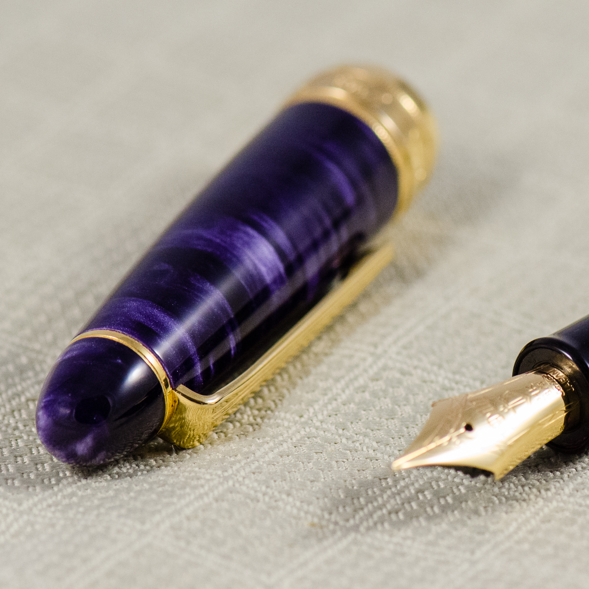
It shouldn’t come as a shock to a lot of people that I just adore the blue finish of the pen and the shape of the Pro Gear is a great aesthetic as well. I’d say that in my hand, the Pro Gear KoP size is in between a Pelikan M800 and Pelikan M1000. A pen of substance if you will.
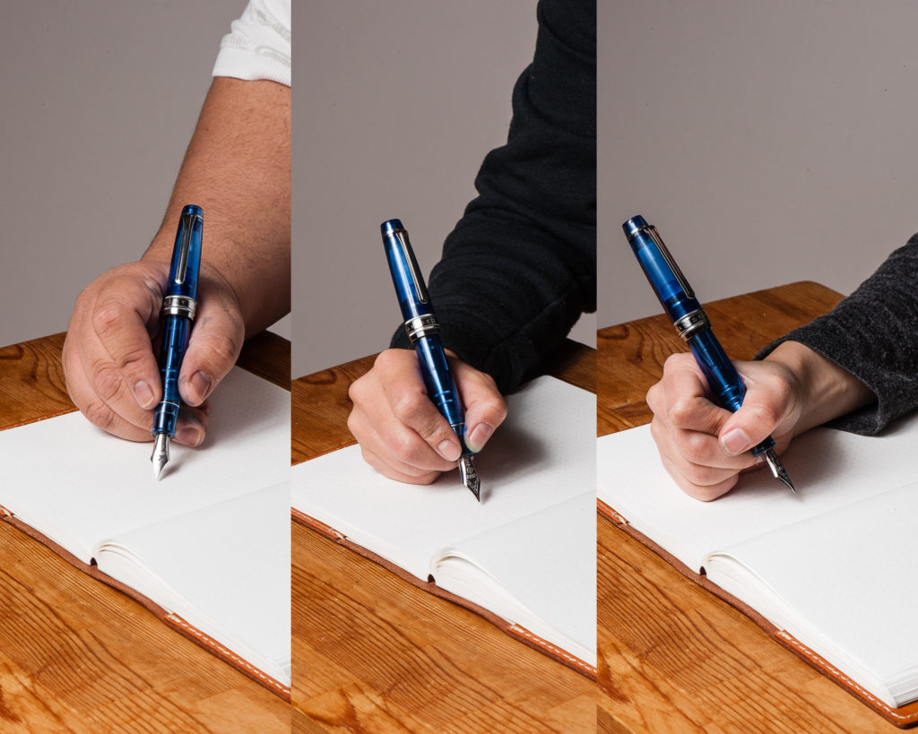
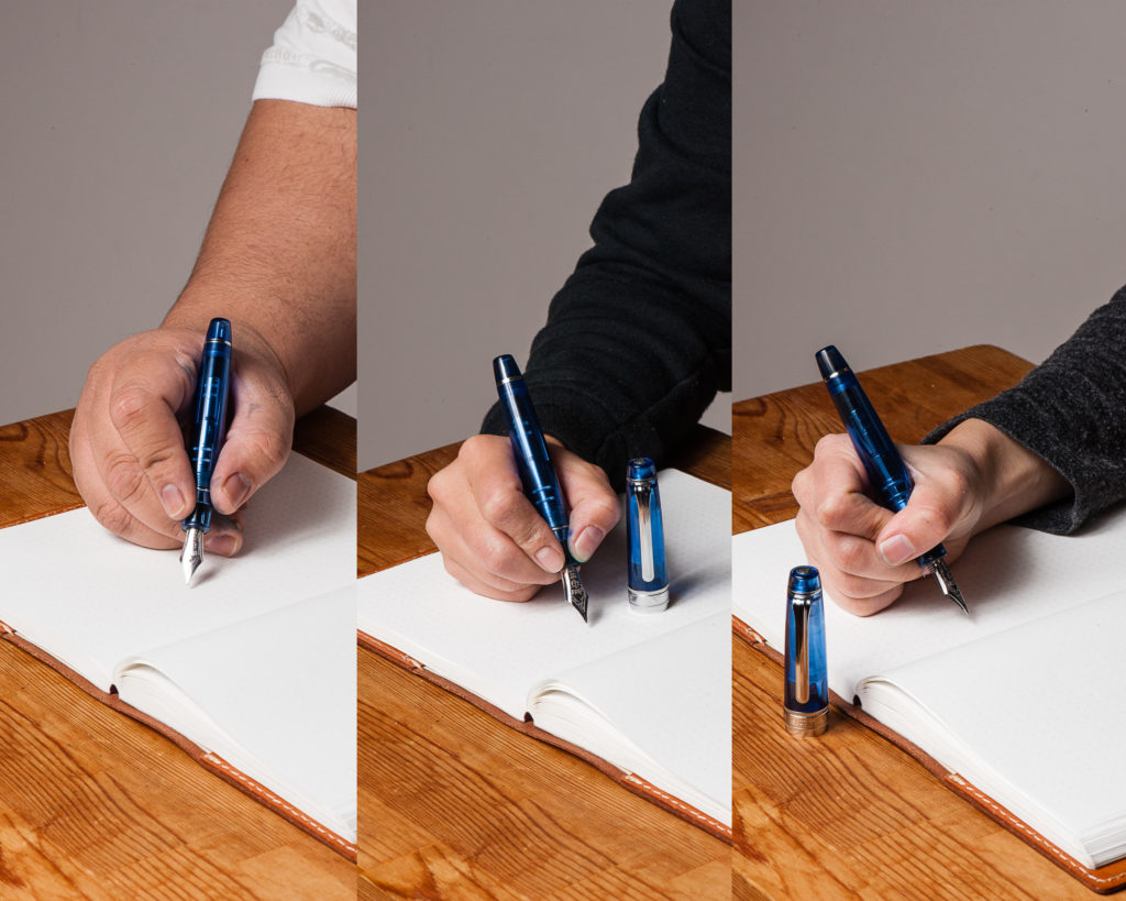
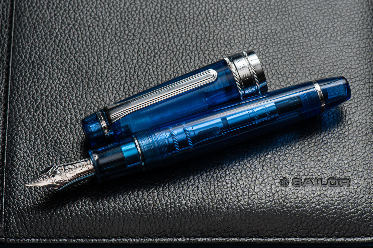
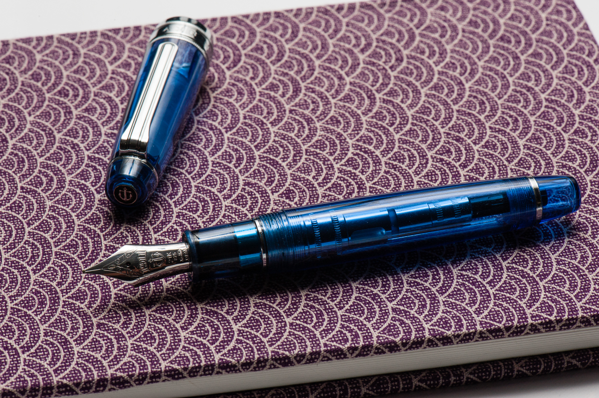
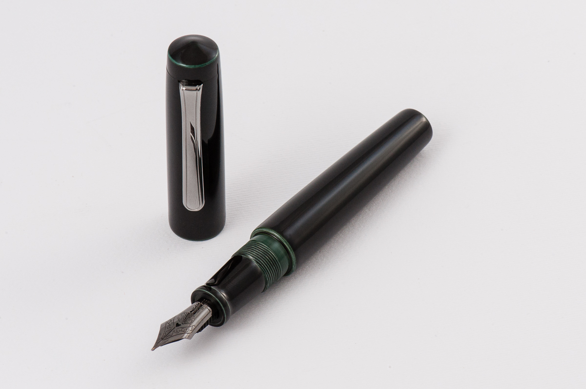
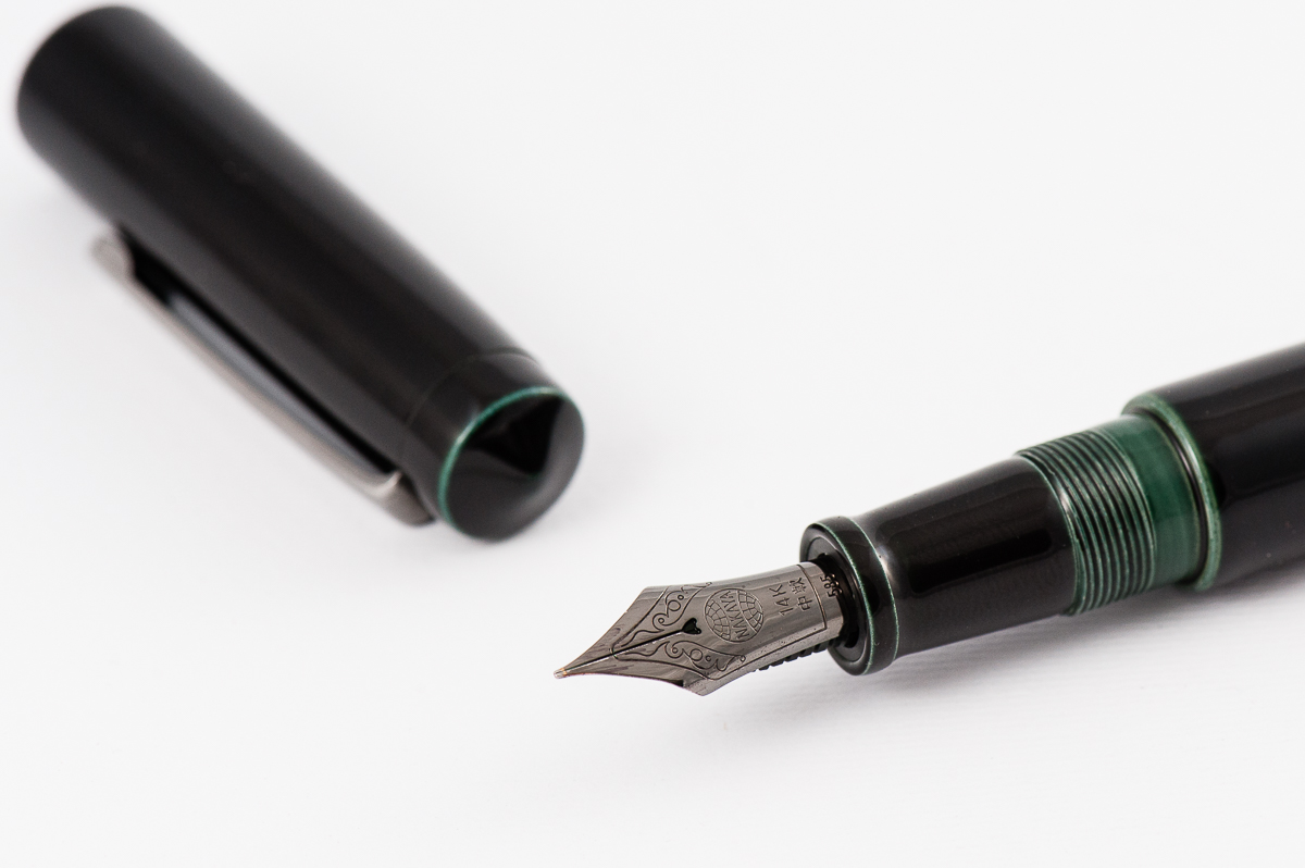
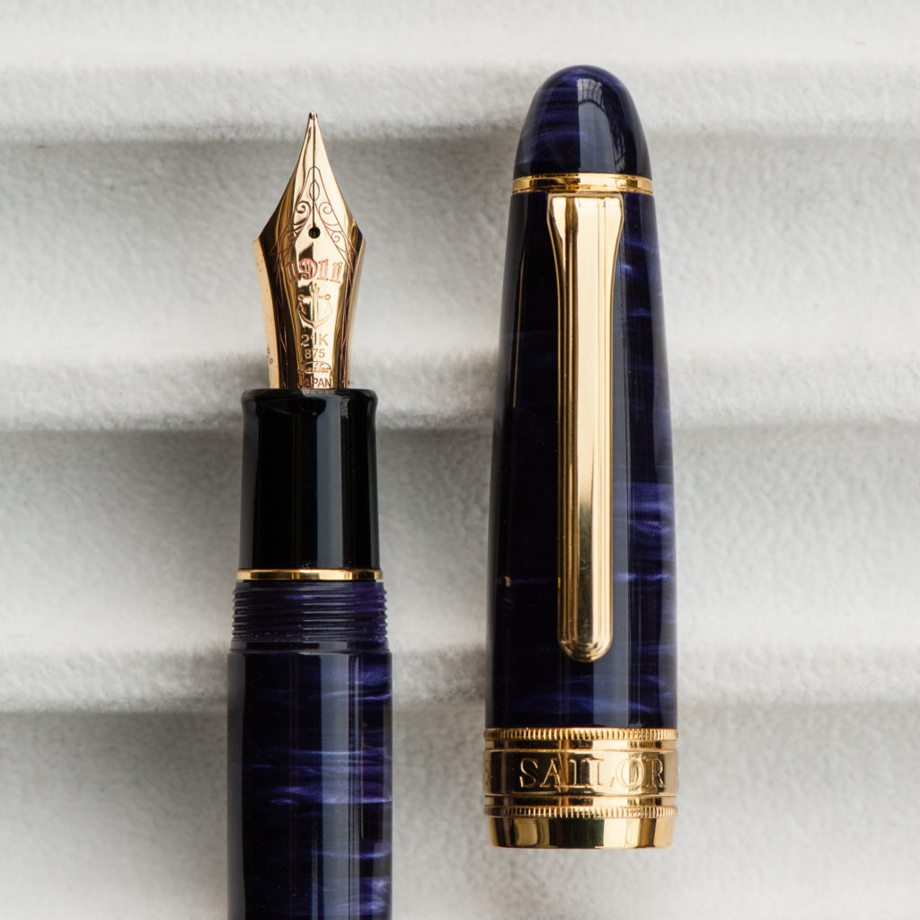
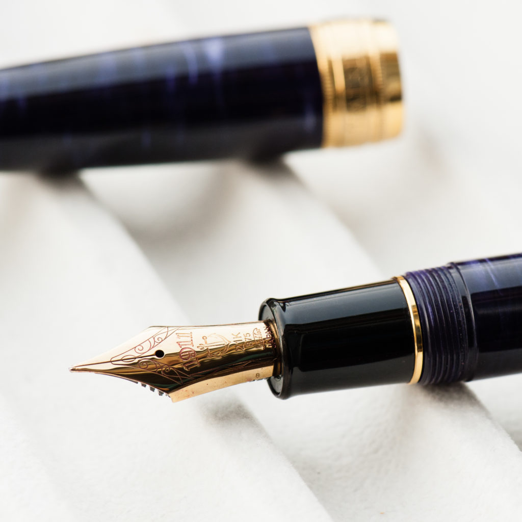
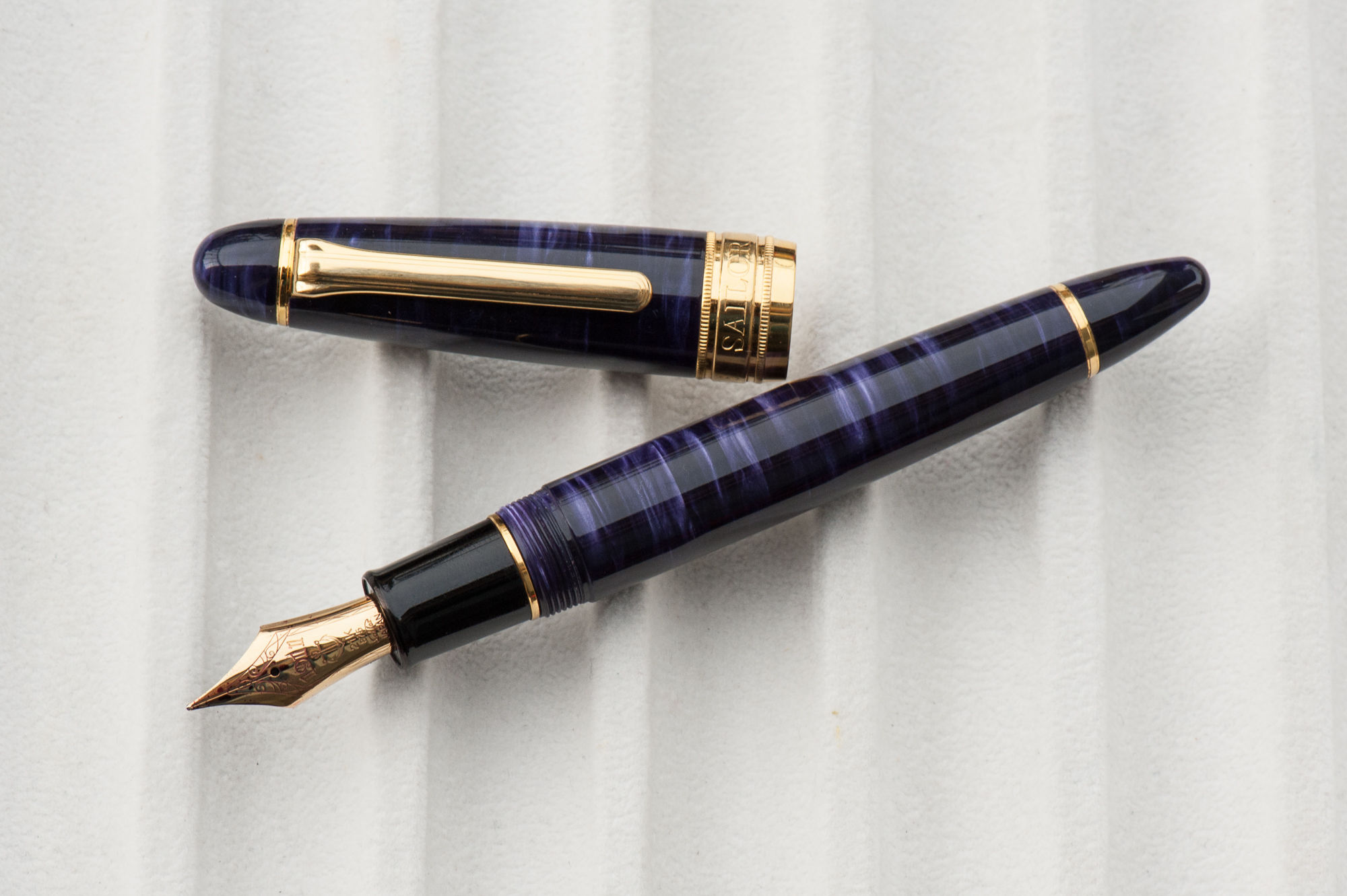
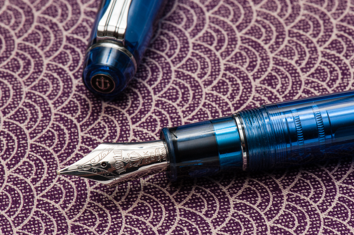
The Business End
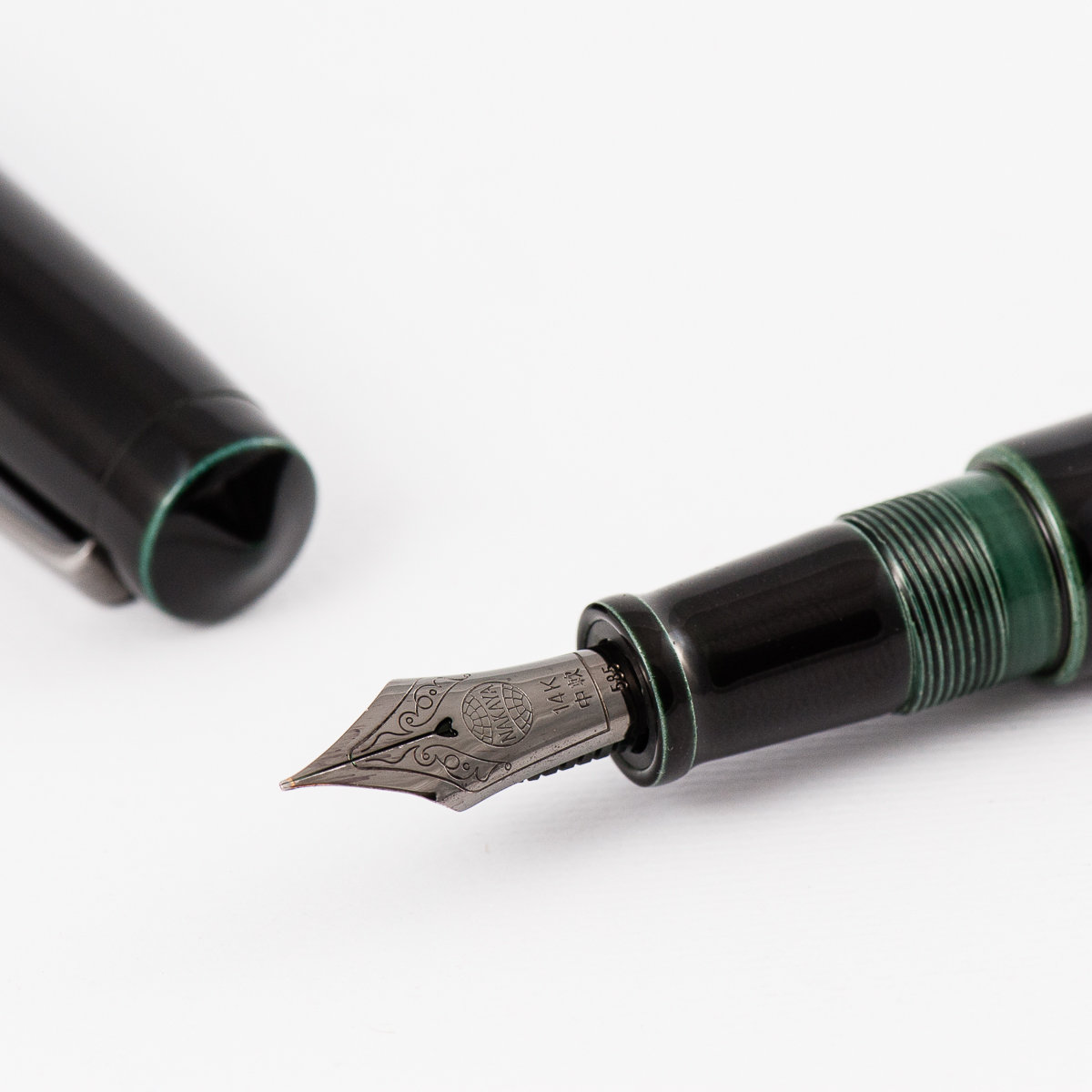
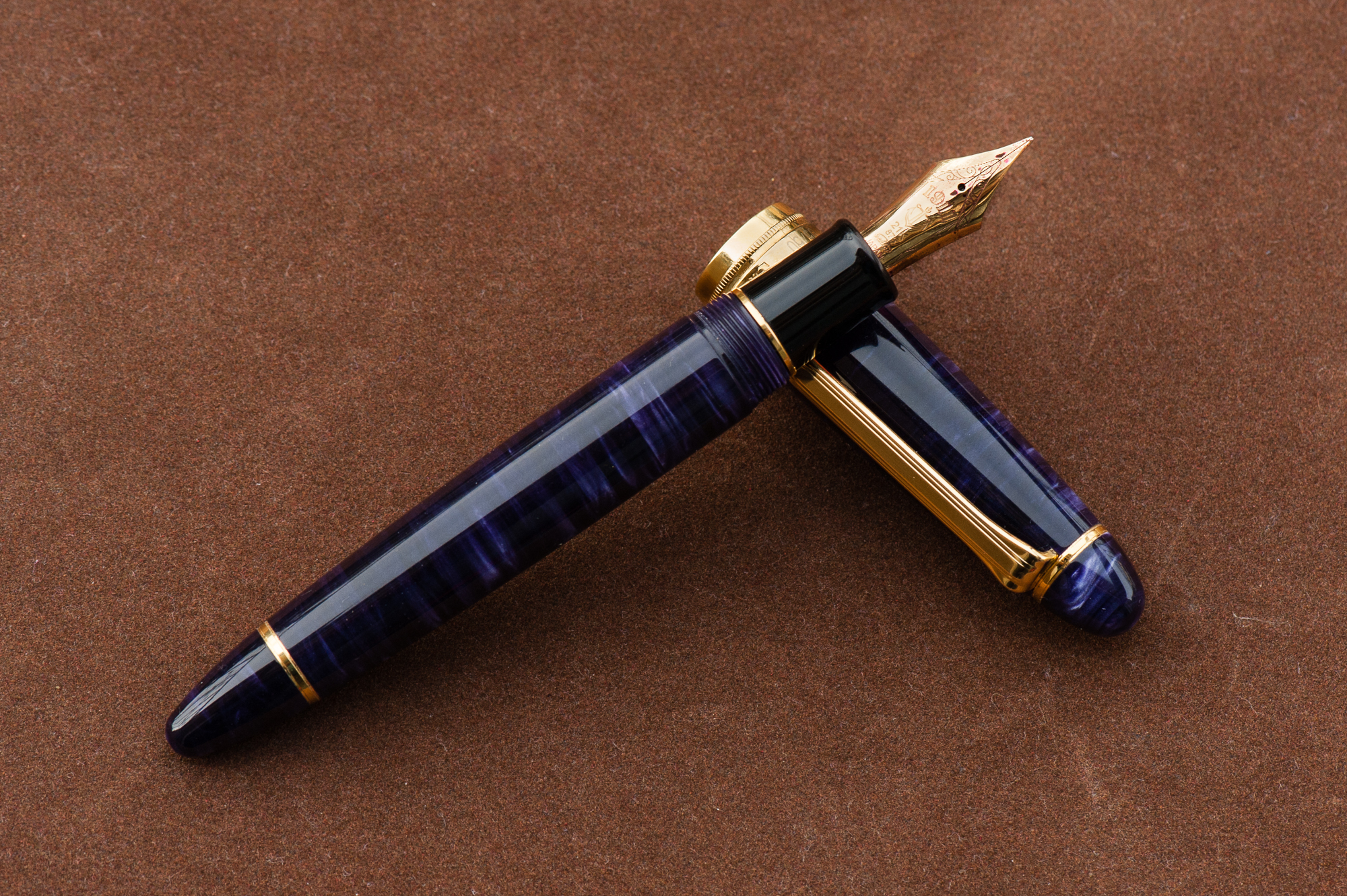
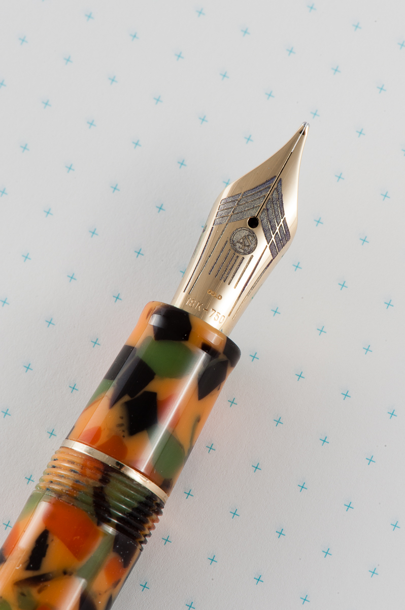
Katherine: Being one of Franz’s, this pen sports a wonderful BCI. The nib is quite large, but a joy to write with. Smooth, juicy without being sloppy and capable of crispy line variation.
Pam: Sailor has one of the most beautiful and consistent nibs on the market. The KOP nib is no exception. The cursive italic was expertly ground and the slight springiness of the nib allows for a great ink flow.
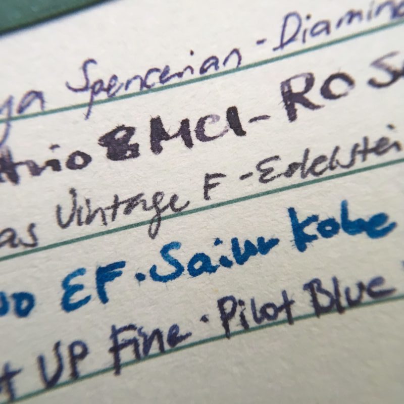
Franz: Mirroring what Pam said, Sailor nibs are well tuned with a hint of feedback out of the box . I’ve purchased a couple Sailor pens in 2017 and it wrote oh so perfectly for me without any adjustment. I got this pen second hand via a well-known auction site for a great price but when I got it, I found that the tines were a bit misaligned and almost too far apart. I inked it up and found that the flow was too much. So what do you do in this situation? You wait for the next pen show and ask Mr. Mike Masuyama to take care of it! Which is what I did and I also asked Masuyamasan to transform the Broad nib into a crisp cursive italic. Been loving the nib ever since.
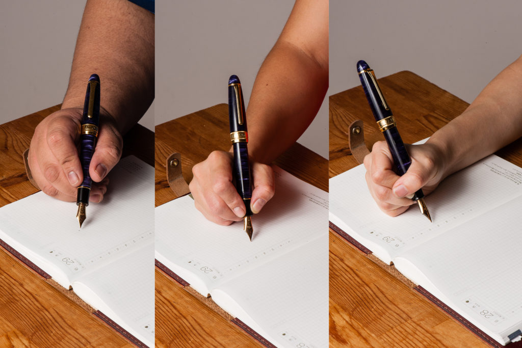
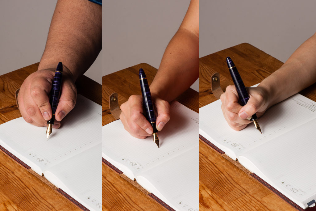
Write It Up
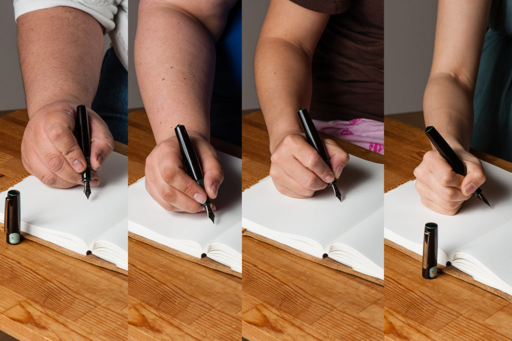
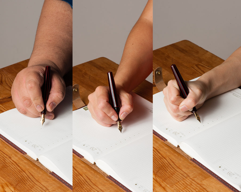
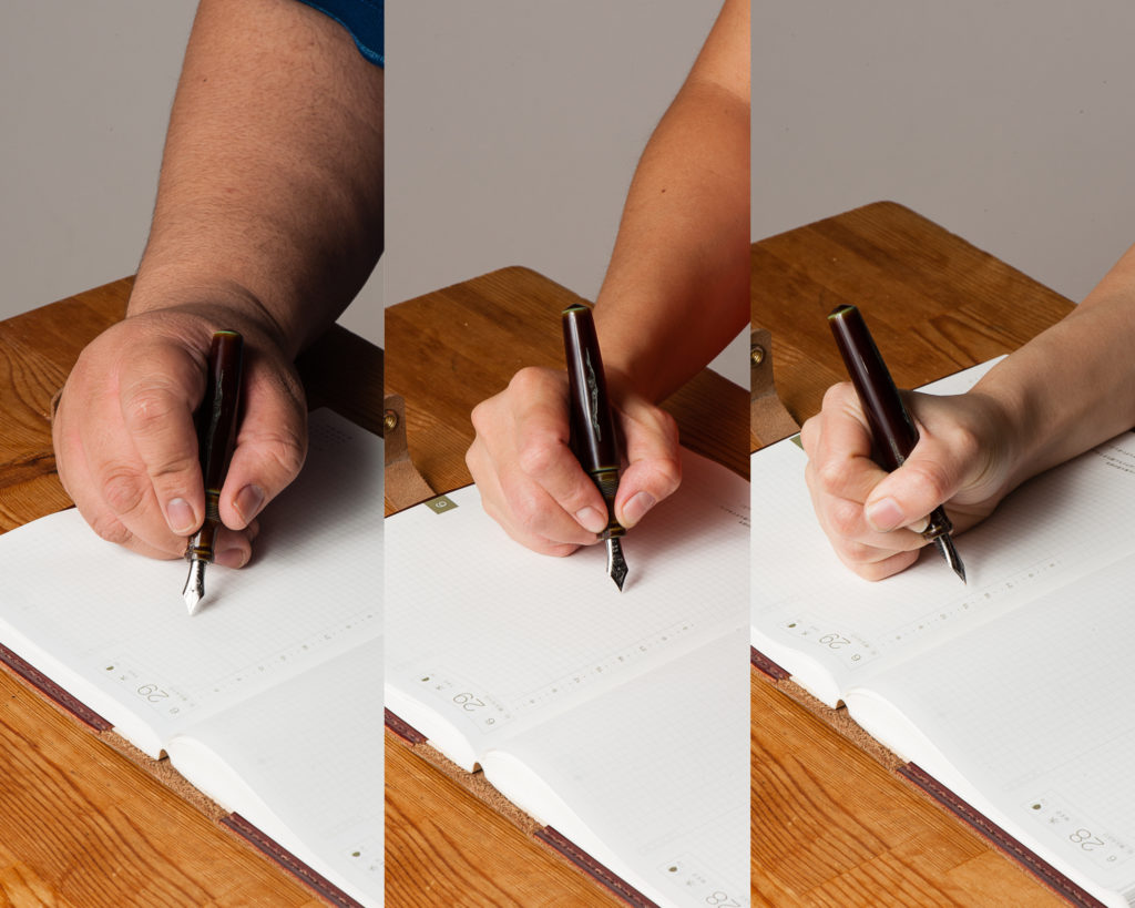
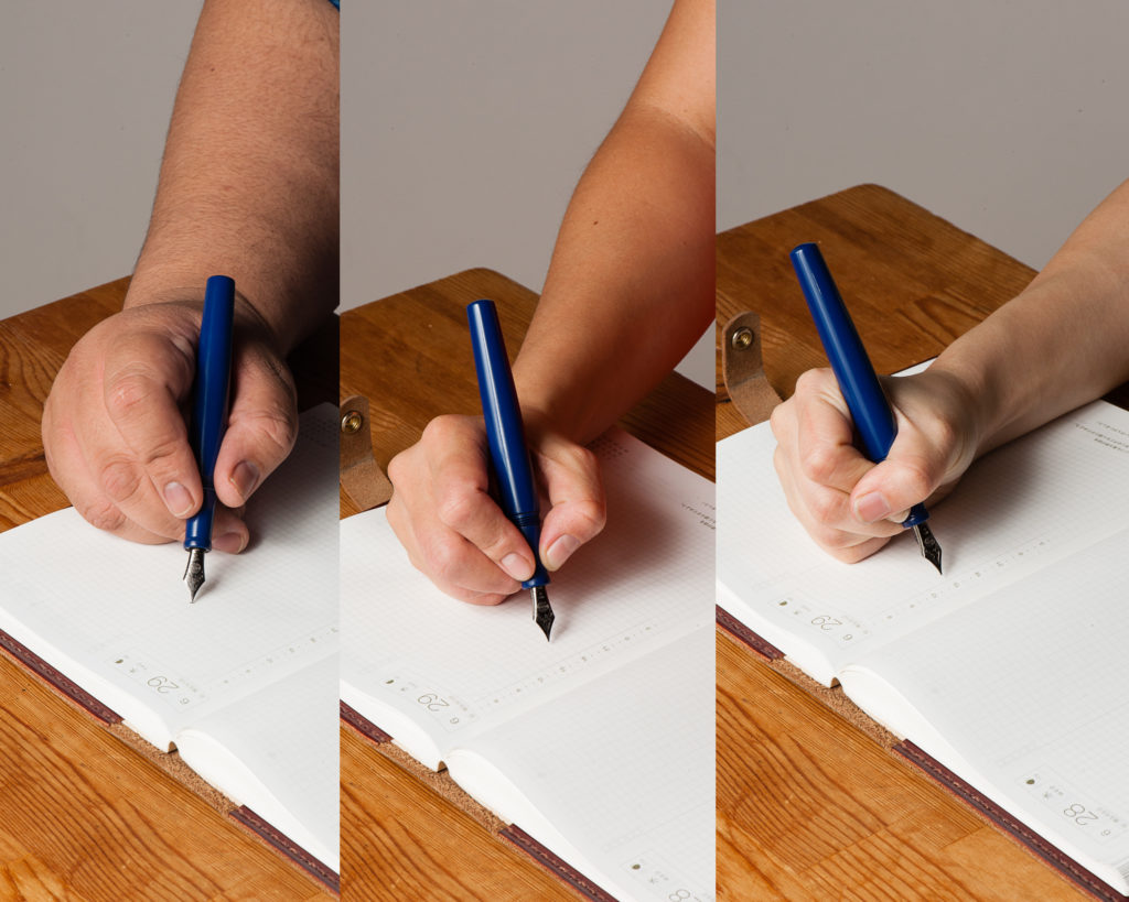
Katherine: The KOP Pro Gear is a little bigger than I’d prefer, but still very comfortable and usable. I had no fatigue using it for extended periods, but do prefer the standard sized Pro Gear overall (better for my wallet, I suppose).
Pam: This size reminds me of the Pelikan M800 where it appears to be intimidating to those with pixie hands but is surprisingly comfortable. I find that the girth of the pen to be comfortable to hold for long periods of time. The weight of the pen doesn’t seem to bother me at all as it’s a well balanced pen when unposted. It does get long and more unwieldy for me when posted.
Franz: As I mentioned in the beginning, the Pro Gear KoP’s size is between the Pelikan M800 and M1000. These are two pens that I’m very happy to write with so this pen definitely fills my hand well. I wrote with the Sky in both posted and unposted modes at 10 minutes each and found that I’m comfortable either way. I lean more towards writing with cap unposted because it’s just a little bit more balanced that way. The cap band does place a bit more weight when posted but it wasn’t top heavy at all.
EDC-ness
Katherine: Works just fine as an EDC. The clip is strong and it takes 2 cap turns to uncap, which isn’t crazy, but feels extra secure.
Pam: This would be a pretty good EDC pen. The only down side is that this beauty maybe a bit too eye catching.
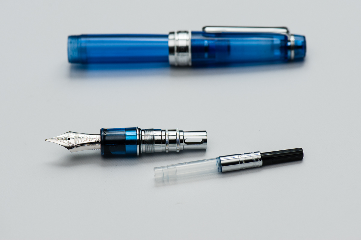
Franz: I use the KoP Sky at my workplace quite regularly and found it very useful as a daily carry pen. The broad cursive italic was just perfect for the copier paper we use as well as on my Rhodia meeting book. The clip like every other Sailor is very secure on my dress shirt pocket and the 2 turns to uncap isn’t too bad at all. It does fill either via cartridge/converter so I found myself refilling the converter after 3-4 days of use.
Final Grip-ping Impressions
Katherine: As mentioned earlier, I prefer the non-KOP Pro Gear more. But, I do love the way the KOP Pro Gear looks — it’s like a chubbier cuter (but larger) version of the Pro Gear! And a solidly awesome pen to boot. Alas, I can’t justify the price point (I can barely justify the price point on most Pro Gears these days…)
Pam: The Sailor KOP is a fantastic pen for those who enjoy the Sailor Progear but want something with a bit more heft and solid feel in hand. It could easily become a daily carry pen or “the” pen that is constantly inked. If there was a KOP in the right color (combination), it would easily make it to my grail pen list. As much as I love the Sailor Progear Slim and Sailor Progear, the KOP is an easy yes for me. Too bad my wallet says no alot more than I do.
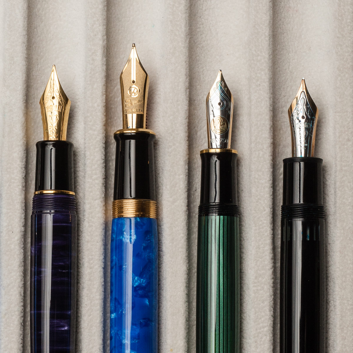
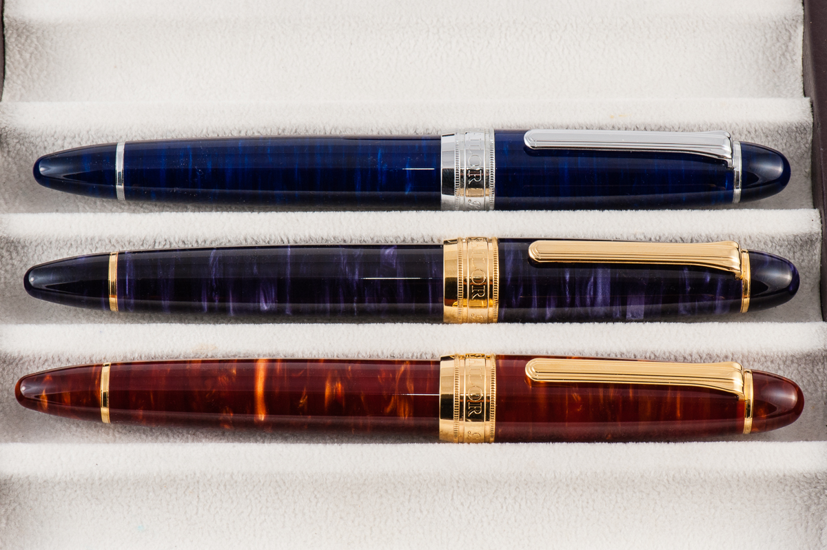
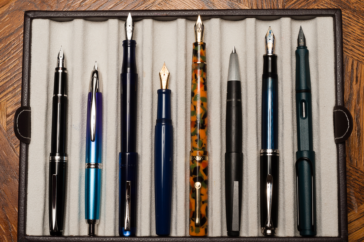
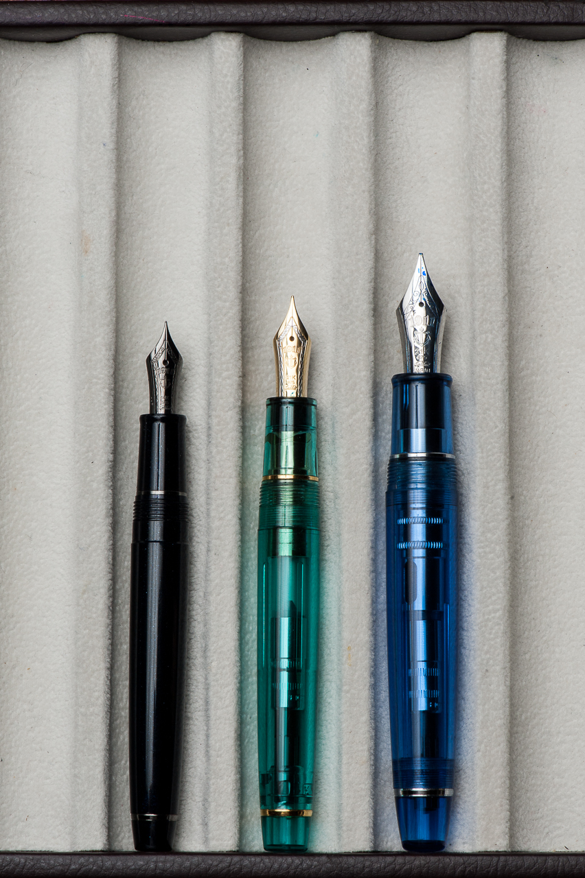
Franz: Four words. Bear paws are happy! The Pro Gear King of Pen is definitely for medium to large sized hands (but Pam who has the smallest hand among the 3 loves it) and I truly prefer this against the Classic size of the Pro Gear pens. In the photos below, the Pro Gear size comparisons dramatically show the big step up in size between the Classic and the King of Pen. Another key difference of a King of Pen is its nib. It is springier than a Classic or Slim size Pro Gear and provides flair to my writing that I appreciate very much.
Because of the price point of the King of Pen, it does dig into your wallet a bit..er..a lot. But it’s all a question of value. I would like to repeat that I won this second hand pen via an auction for a great price and I’m very happy about it. Would I purchase a brand new KoP Sky if this one didn’t come along? **cough** I would **cough**. I’ve wanted one ever since I saw Pam’s Pro Gear Slim Sky.
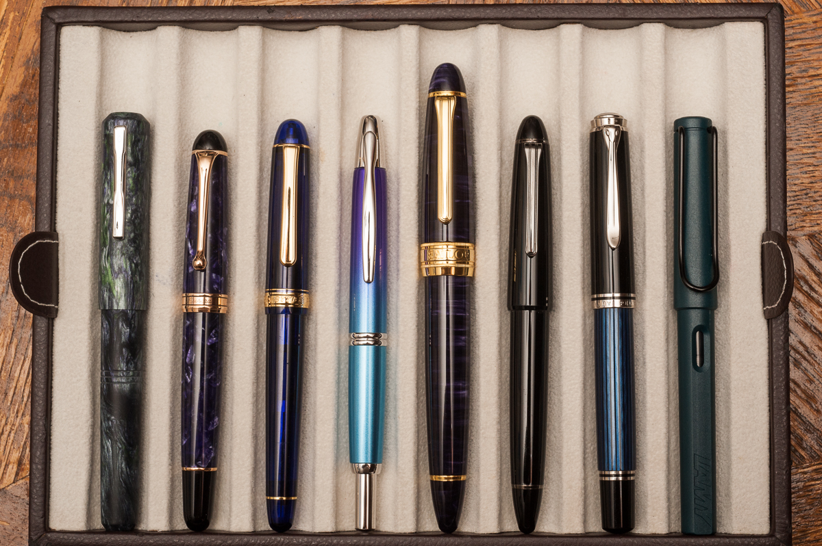
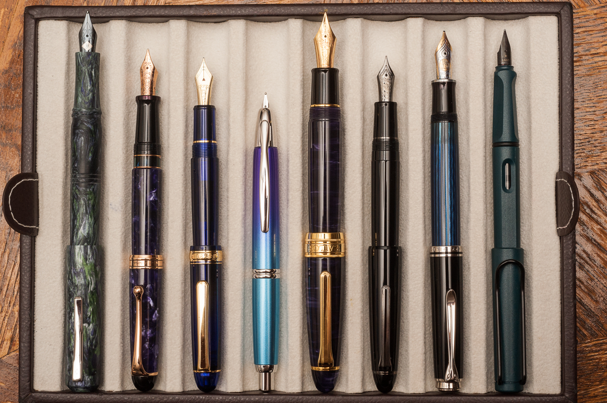
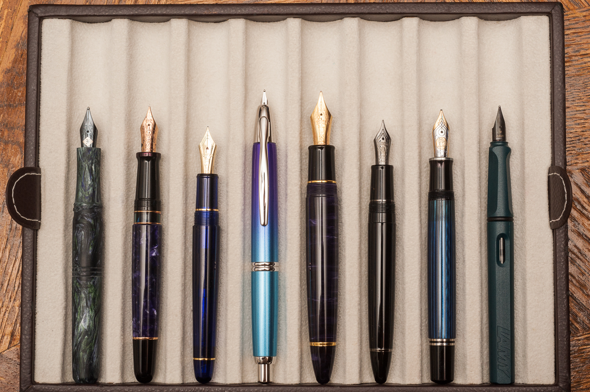
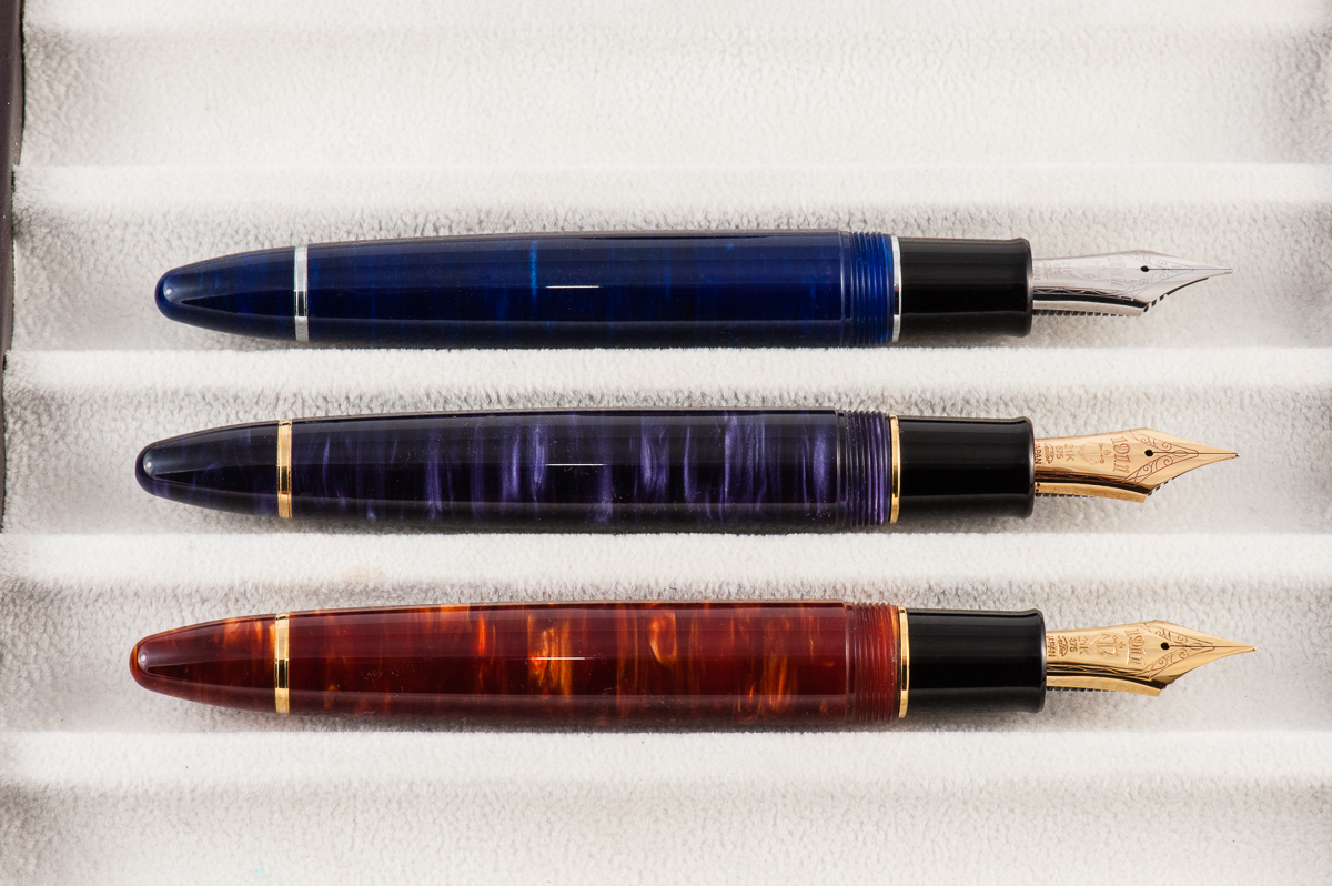
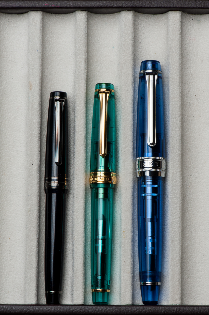
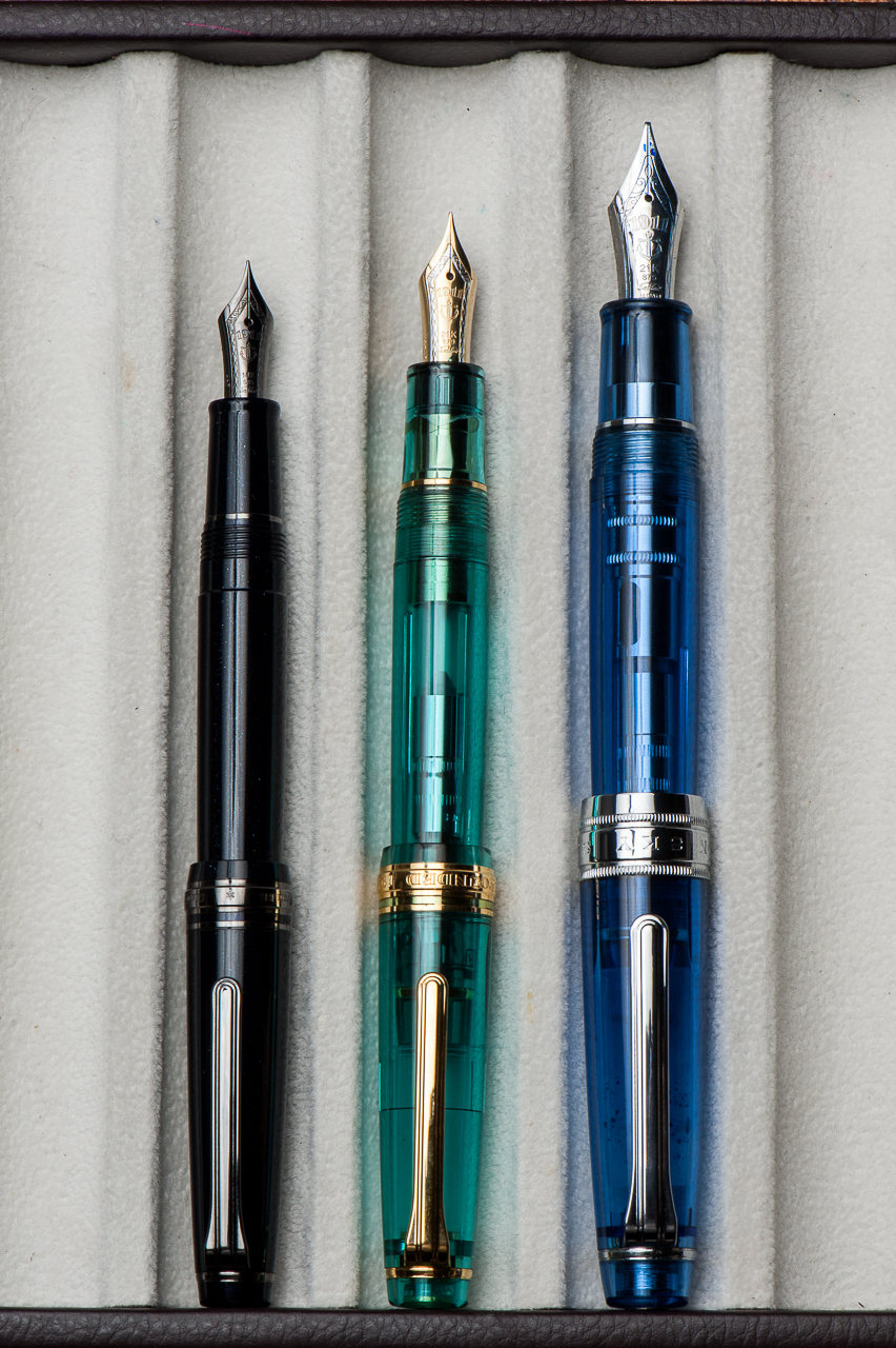
Pen Comparisons
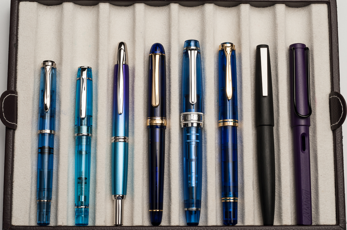
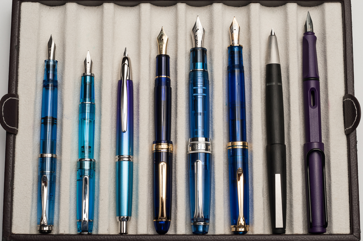
Sailor Professional Gear Comparisons (Left to right: Pro Gear Slim, Pro Gear Classic, and Pro Gear King of Pen)
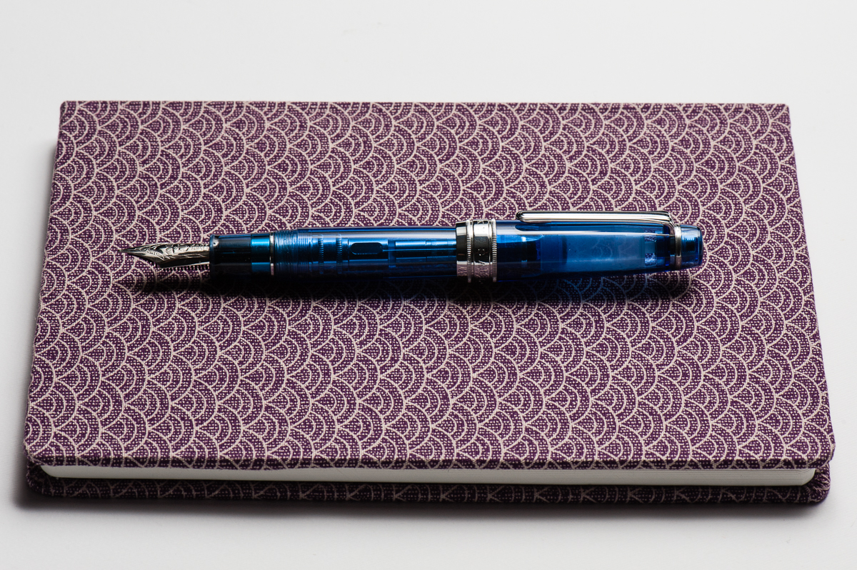
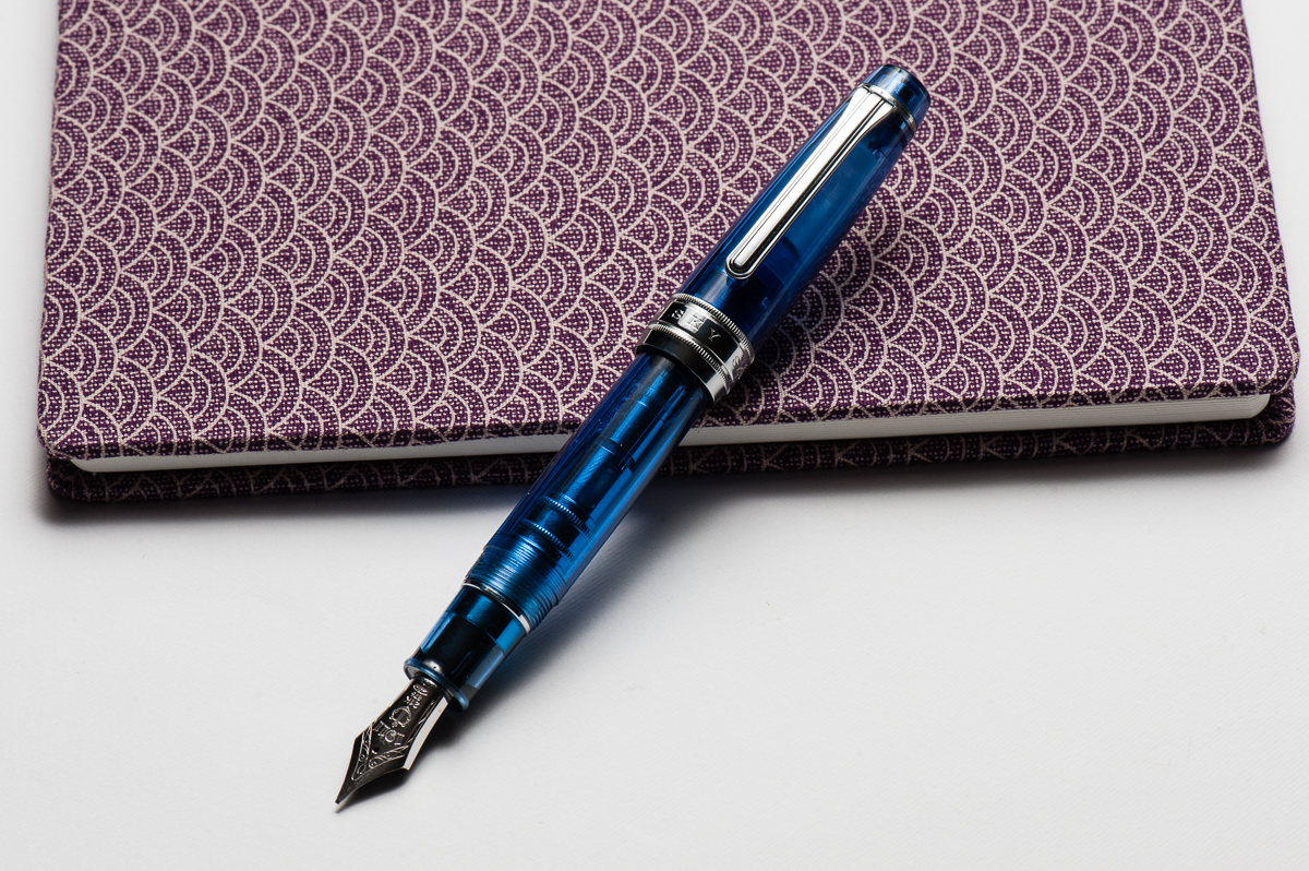
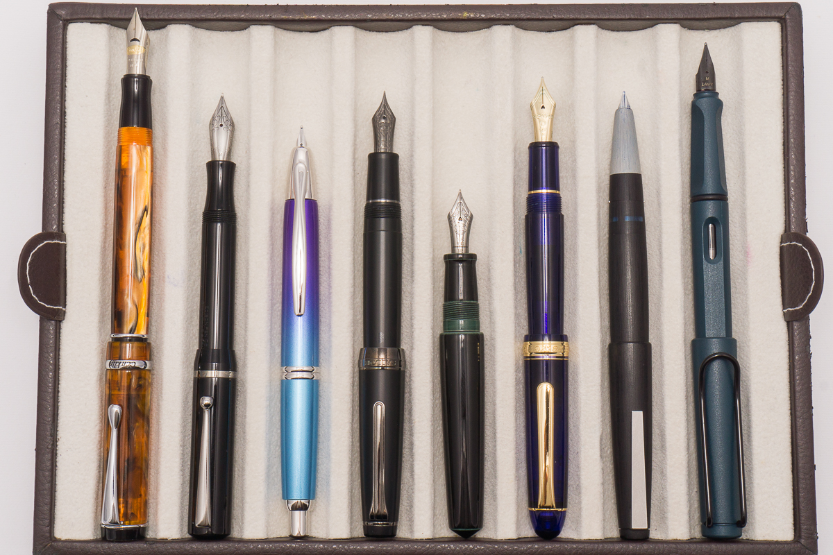
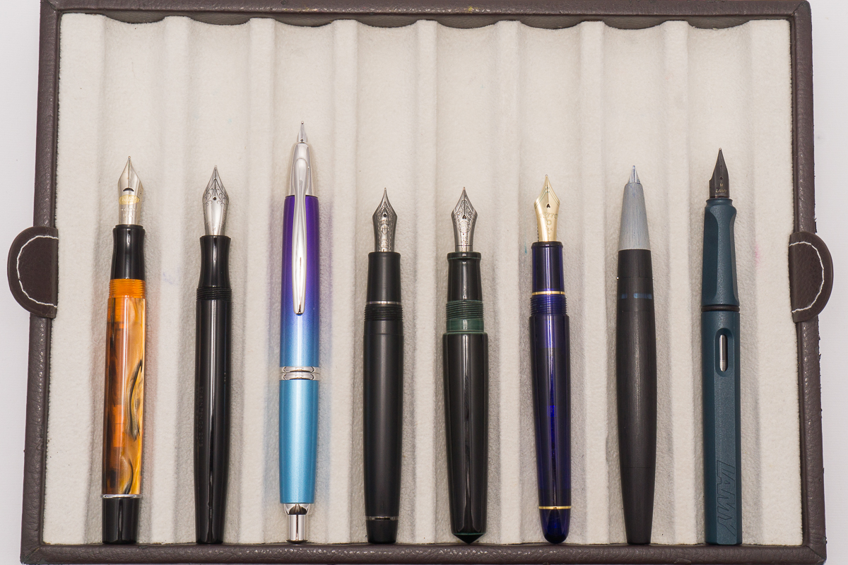
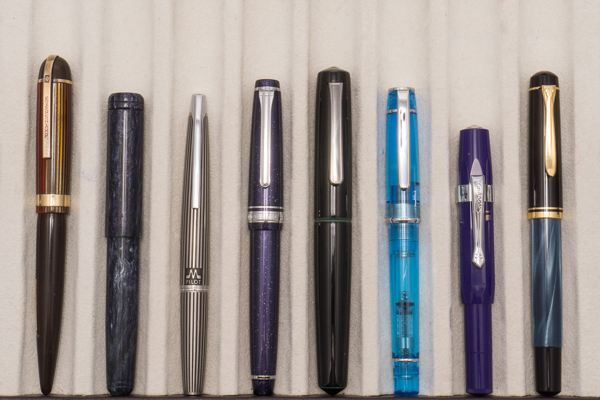
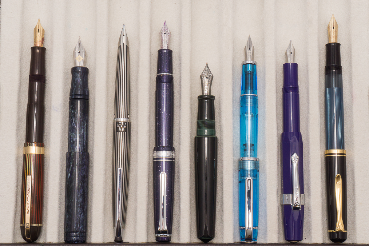
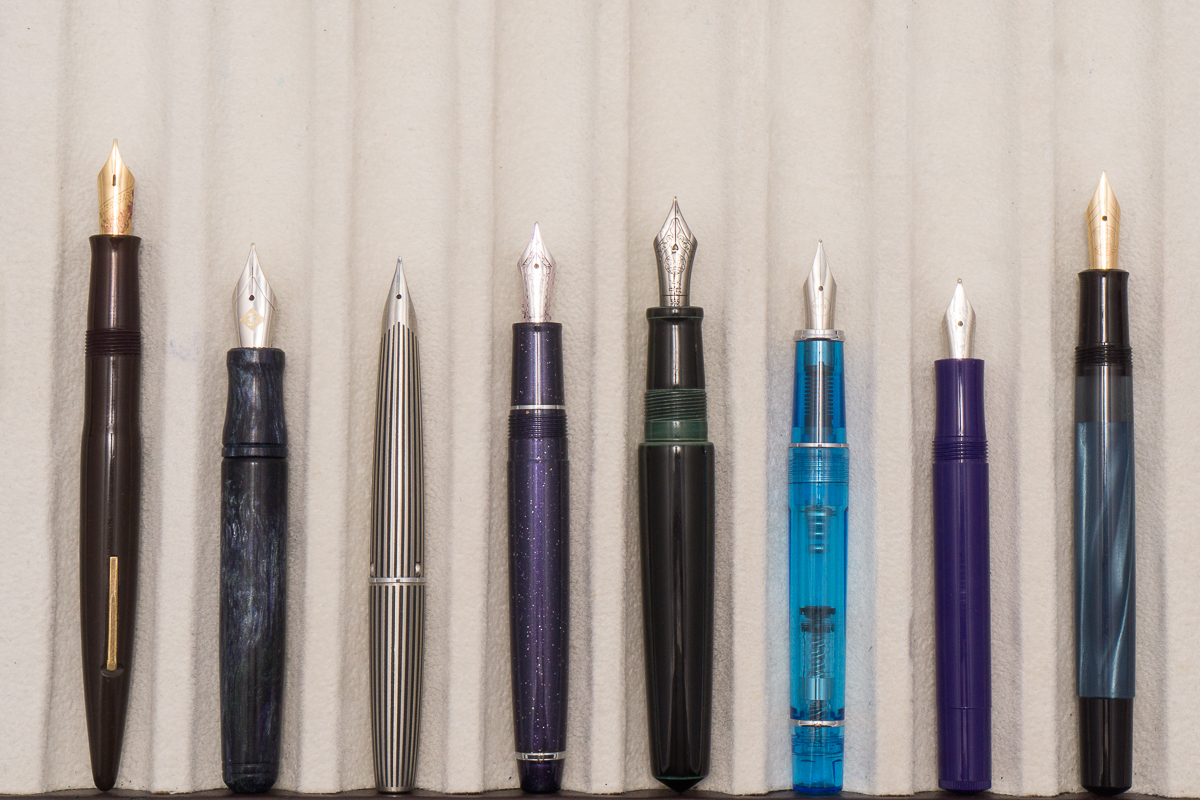
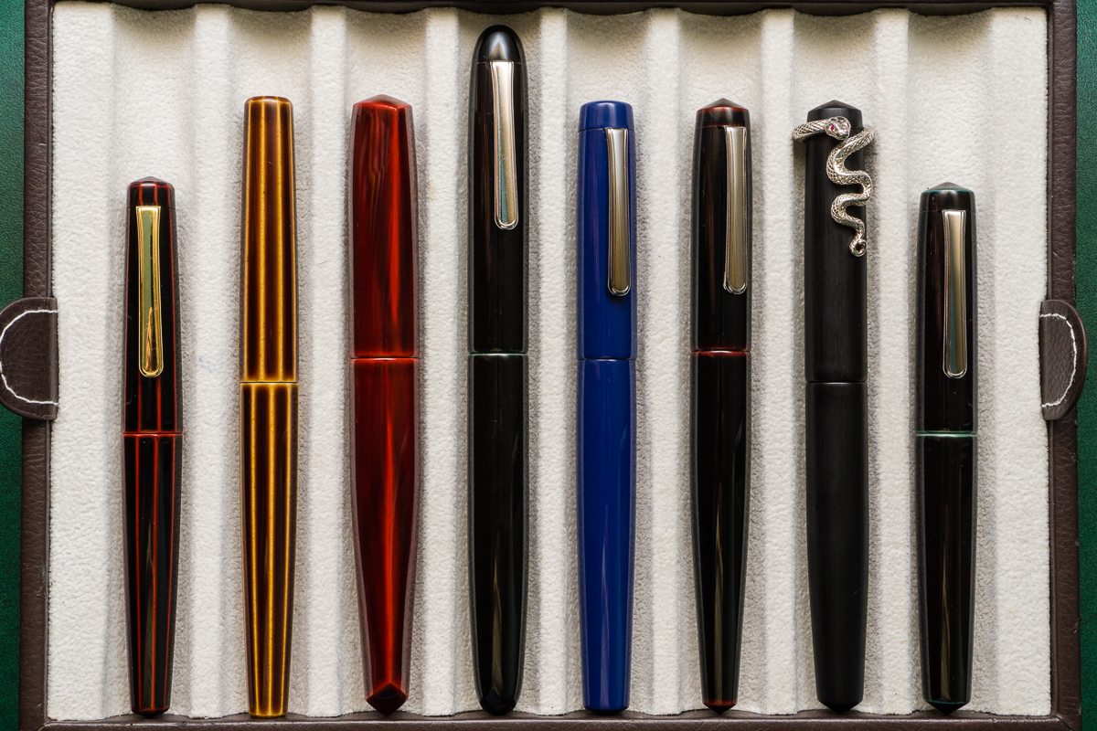
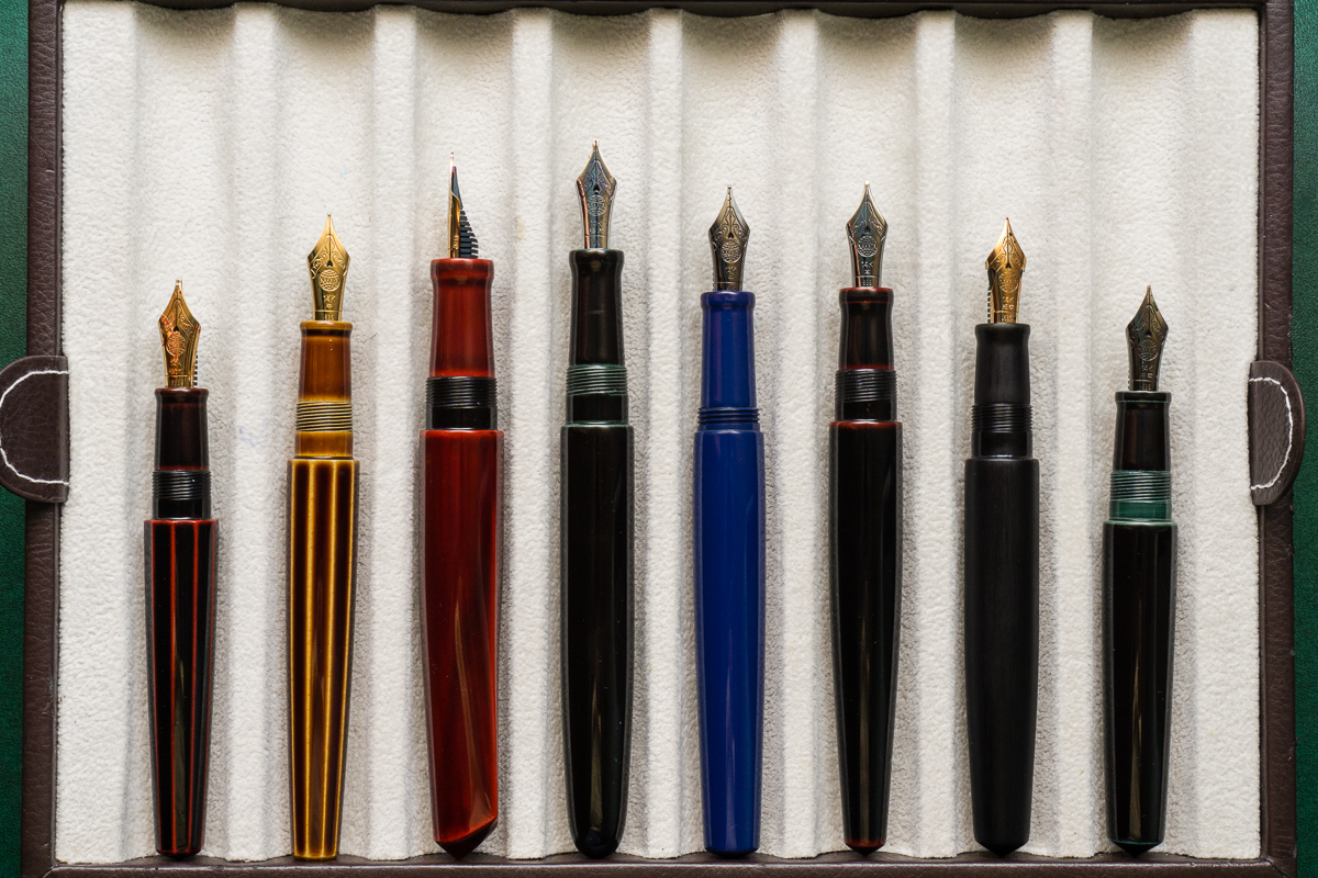
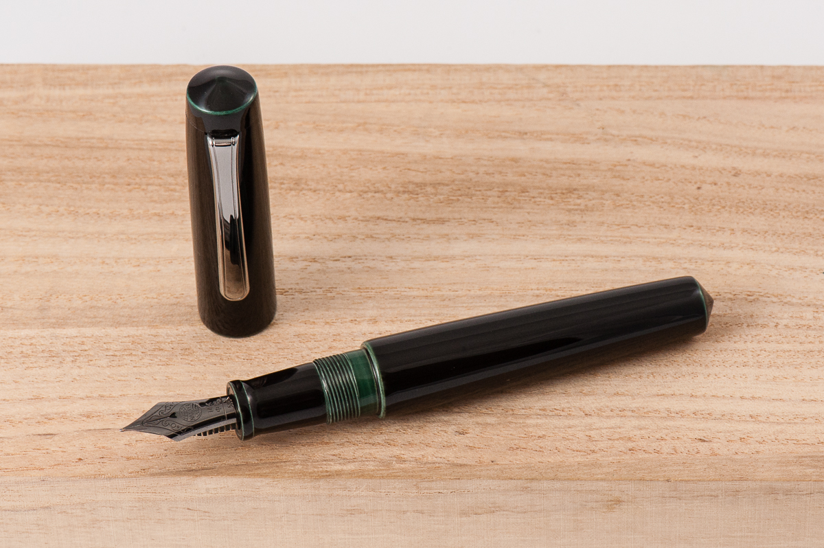
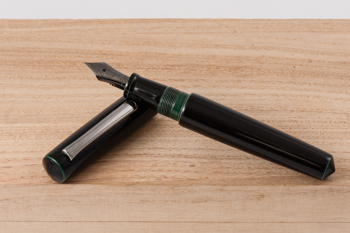
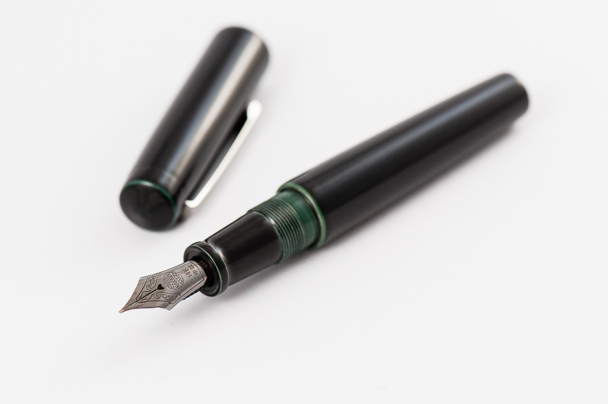
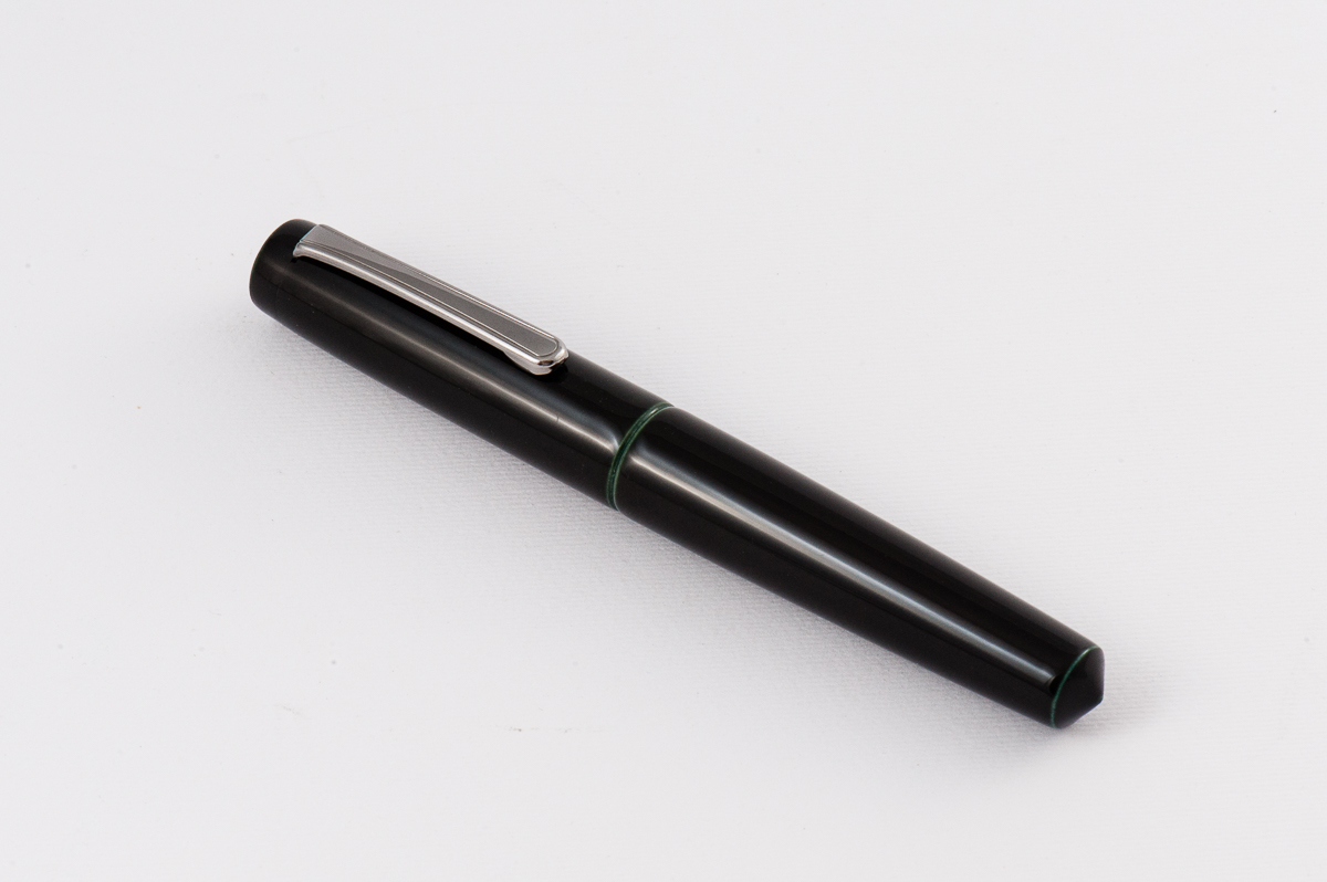
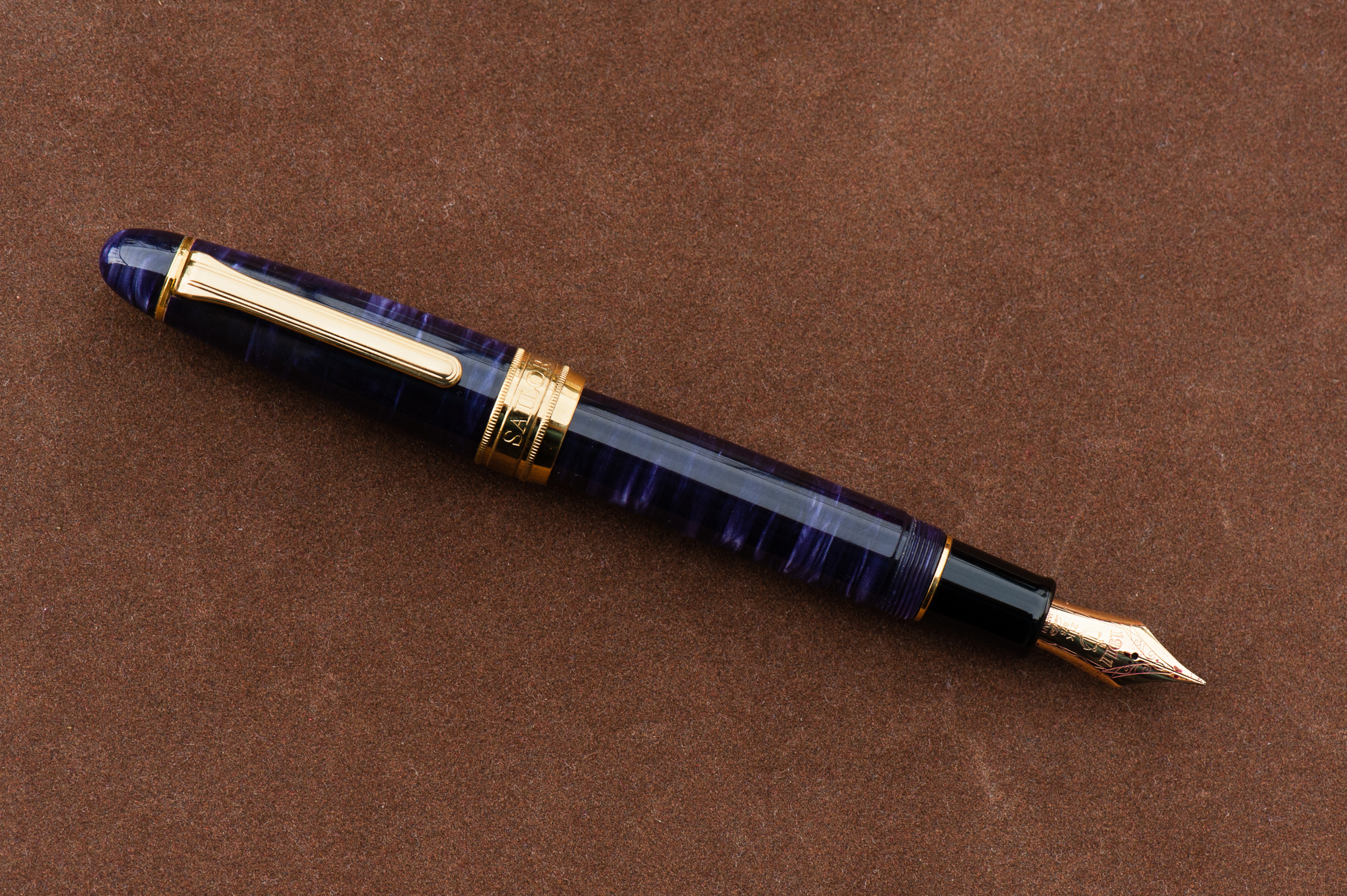
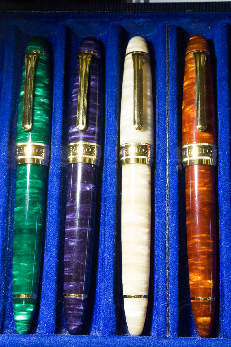
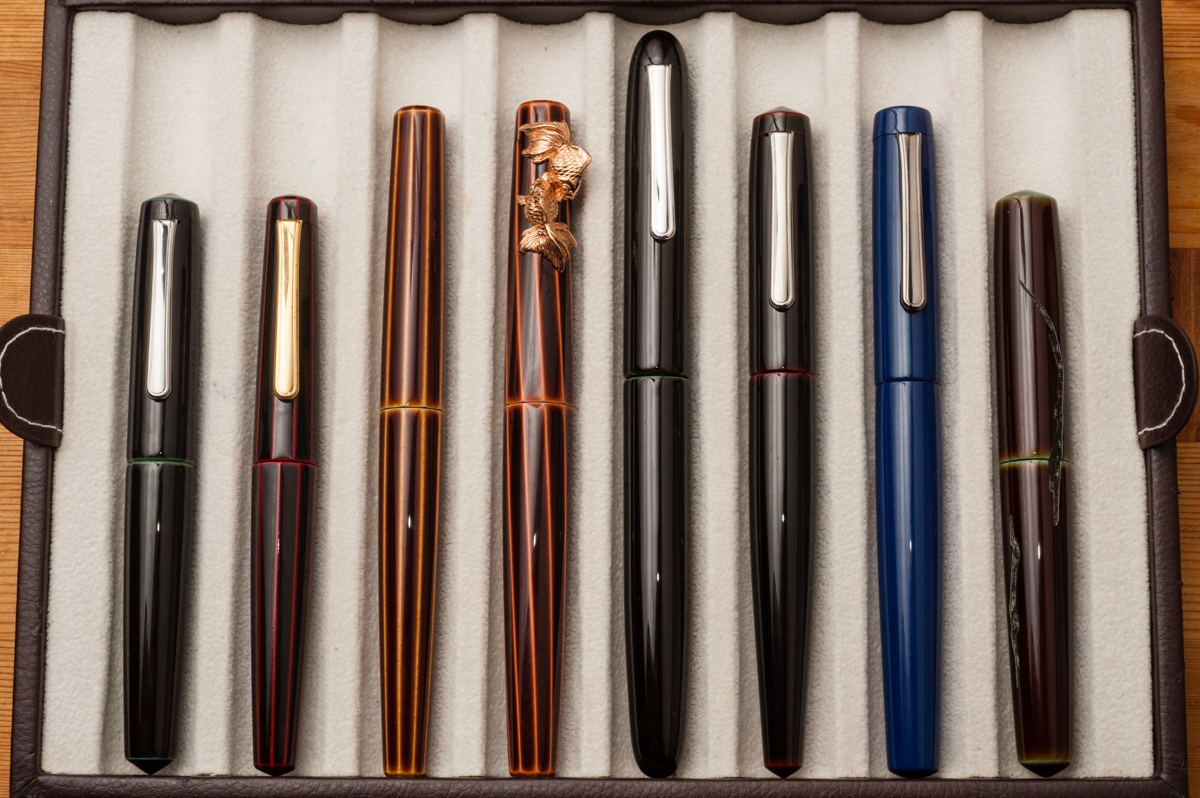
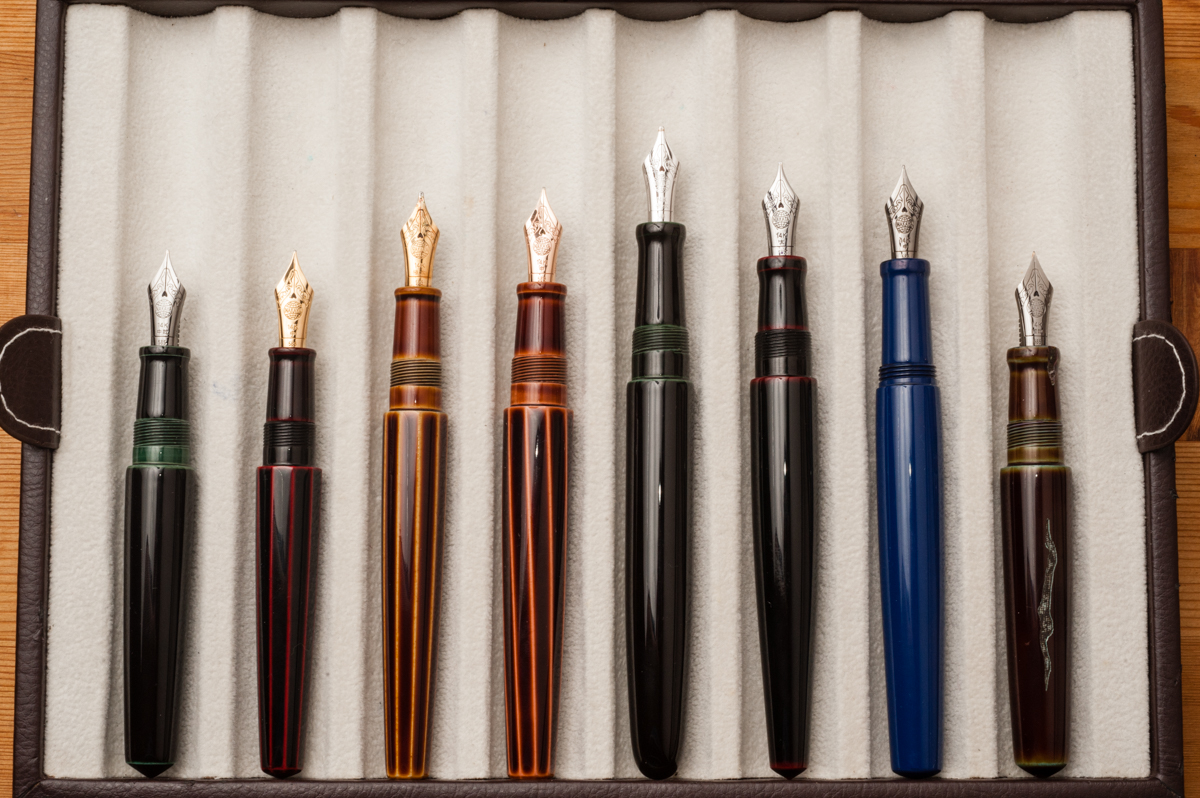
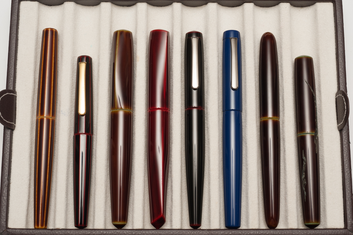
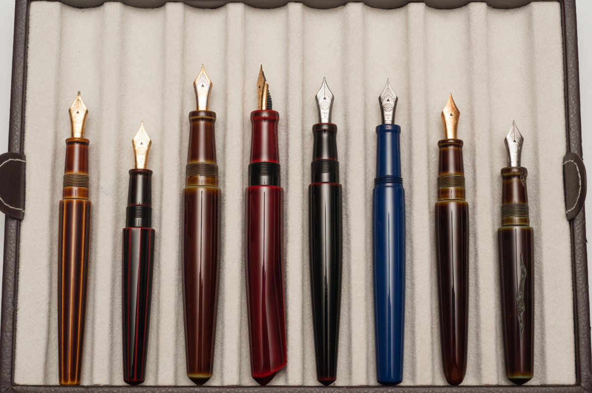
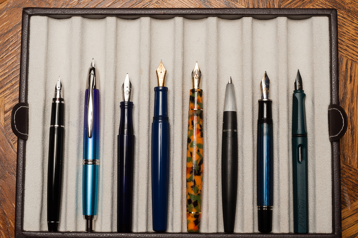
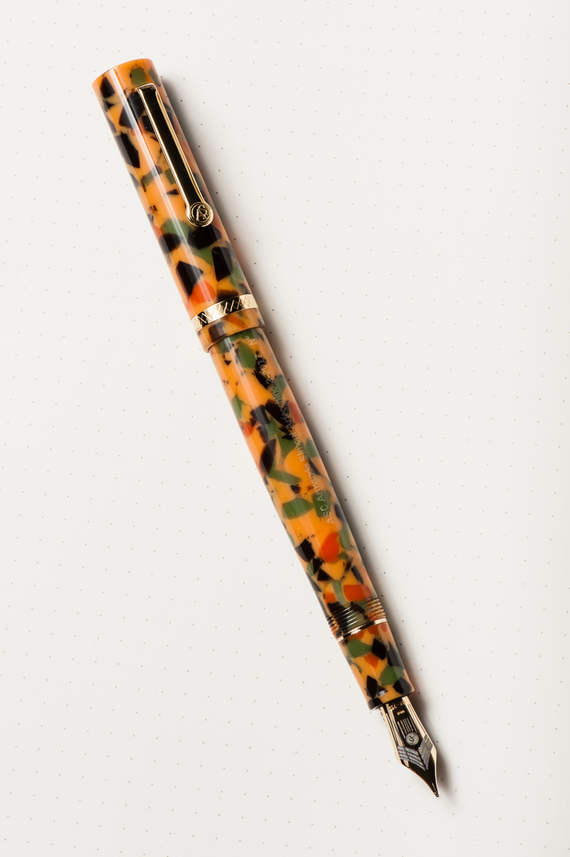
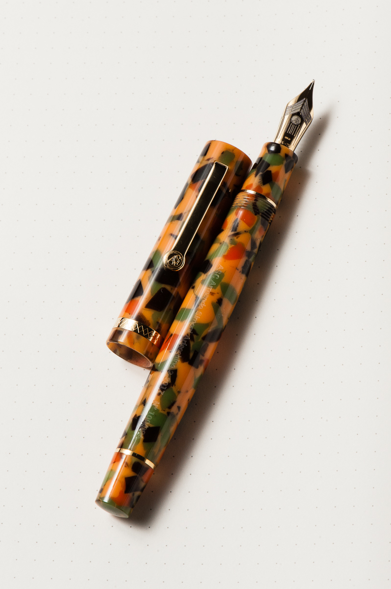
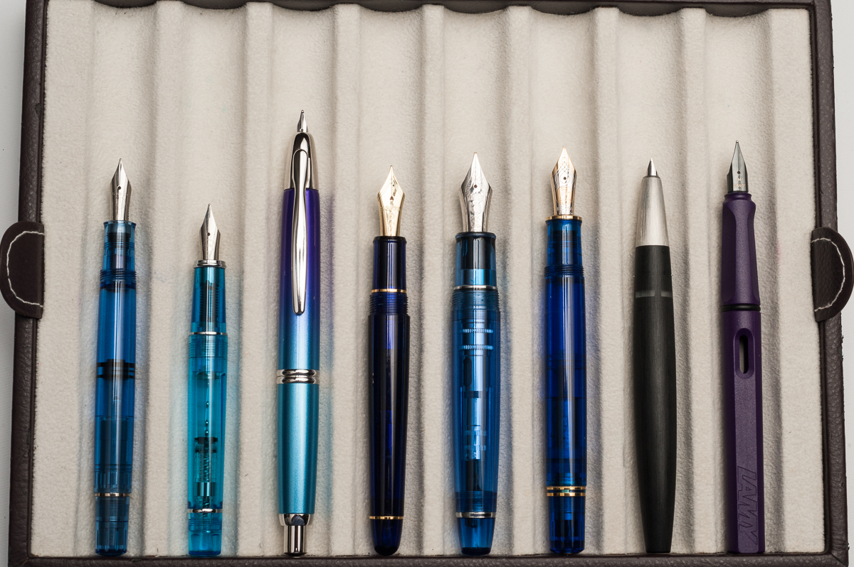
Pen Photos (click to enlarge)