Mini Review: Moleskine Chapters Dotted Journal

It’s Mini Review time! As usual, it’s Katherine writing about another bit of fountain peripheral stuff, this time the Moleskine Chapters notebook. I was gifted one because they’ve dropped to being pretty cheap on Amazon, so I thought I’d give it a whirl. (Also it seems a little inconsiderate to not try something you’re gifted… no matter how bad the reputation of Moleskine paper)

It’s a notebook with six sections plus a set of lists (space for 13) at the very back. Each section has a title spread, and the last section and the lists are perforated. Neat in theory, but I’m not yet sure what I’ll use this for — if you have six things going on in your life, this could be great. For me, I’m not sure.

I know all you really care about is the paper, so here it goes — it’s the typical (I think?) Moleskine paper which is kinda fountain pen tolerant, but not quite friendly. If you prefer drier and narrower nibs, it’s totally fine, with wetter and broader nibs, less so.  What surprised me was that even my rollerball showed through — what are you supposed to use? Pencils? Just the driest fountain pens? (Notice the Perkeo barely shows through)

And, there’s a fair amount of show through… which isn’t great. Moleskine products are so cute, I wish they did better with fountain pens! Alas, they aren’t, but this layout could be perfect for something, I’m just not sure what yet…

2 Comments

May 2018 Pen & Ink Pairing

Katherine: I’m another year older and (supposedly) another year wiser this year… so I’ve chosen to celebrate with a Platinum 3776 Yamanaka, paired with Edelstein Olivine. I’ve loved the texture on the Yamanaka for a while, and was finally lucky enough to pick one up last month. It sat uninked for a couple weeks while I wanted to find it a wonderful partner (pretty uncommon for me, I usually ink things up immediately!). Franz brought over a bottle of Olivine and it seemed like a perfect match. The deep green reminds me of plants, and the textured transparent body of a terrarium — a perfect pairing for the middle of spring.

Here’s to another year of friendship, adventure and pens. (And maybe a few more plants)

Pam: I had struggled to find the perfect ink color for Pelikan’s Ocean Swirl. The teals were either too blue or too green. I originally attempted Organic Studio’s Walden but found the flow of the Ink to be too wet for an already broad EF.

My last attempt with Pilot Iroshizuku Ku-Jaku was a serendipitous hit. The Pelikan nib is wet enough that the ink color shines though and the line width is within the expected range of an EF. Also, like all well behaved inks, it is much faster drying with little concern for smearing in my Midori’s travelers notebook.

I am glad to return to my first inky loves in the last couple of months. Can’t wait to try more of the “oldies but goodies.” Are there any new ink brands that are comparable to the staples like Pilot and Sailor?

Franz: This month, I finally inked up my Franklin-Christoph Model 45 XLV Vanness Exclusive pen. The mint color of this pen really just appeals to me even if I know that it’s a small pen for my hand. But for the past couple of weeks, I’ve used the pen in conjunction with my Starbucks Philippines Weekly Planner and so far it’s a nice complement to it. I’m “trying” to be a bit more organized in scheduling tasks and events and by using this combo, it’s been enjoyable for me.

Since this is a Vanness Exclusive pen, I figured to ink with one of Lisa Vanness’ favorite colors, turquoise. The Sheaffer Skrip Peacock Blue is a nice vintage ink to complement this pen. I know for a fact that there are inks out there that would match the color of the pen however, this is a more personal ink to me for various personal reasons. Let’s just say that this ink is a homage to a couple people. One of those people used to say, “An italic gives you traction…”. And come on, who doesn’t like turquoise ink? Hmm? Hmm? ;-P

Writing Samples

4 Comments

Rome Store Recap

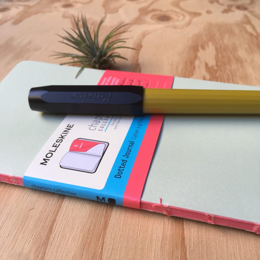
Following up on my Naples Store Recap, here are my photos and notes from my time pen shopping in Rome.

To start with — almost everything (both touristy and pen related) seem to be clustered in the same area. I’m not sure if that’s actually the case, or if the things I could find were biased because I’m searching in English. But, here are the stores I visited —

First up, Stilo Fetti! This store is super close to the Pantheon (about a block away) and very much in the center of the main tourist area.

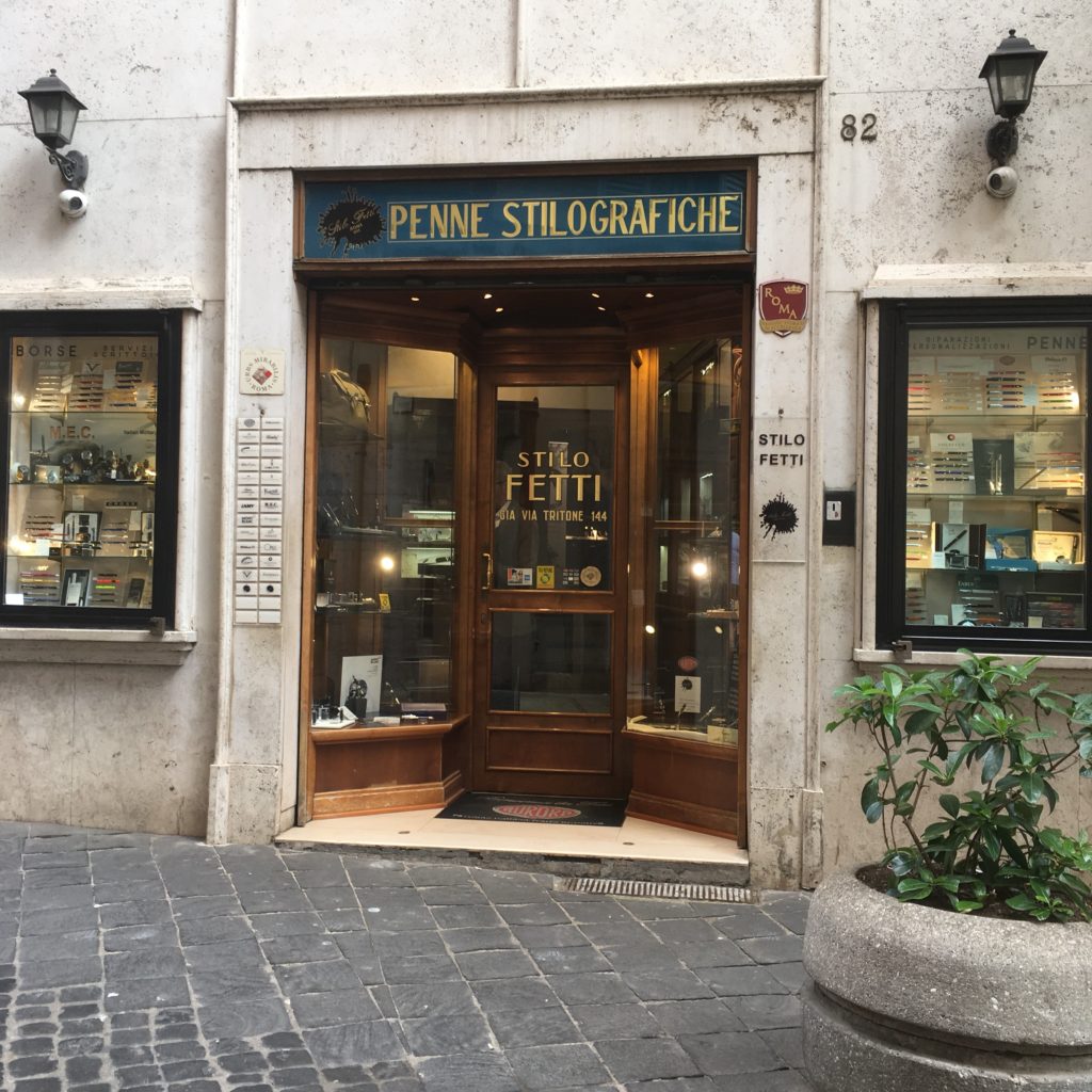
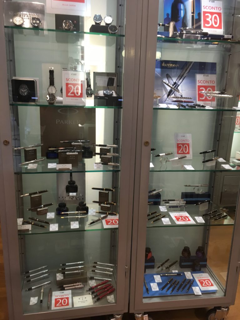
They had quite the selection of pens — including drawers upon drawers that you had to ask to see. A huge selection, but prices were on the higher end of the spectrum for new pens.

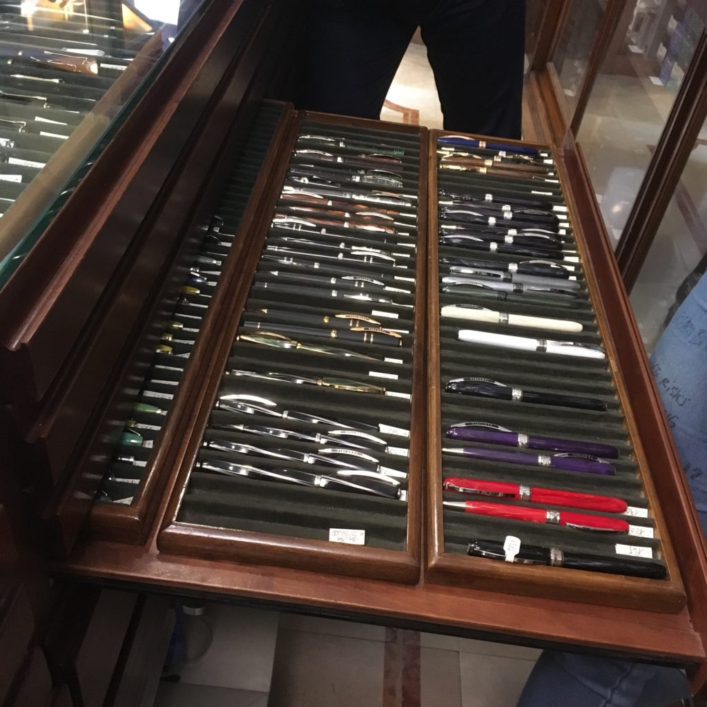
And a small selection of Omas celluloids. The larger ones are all rollerballs, but the smaller ones were fountain pens. They had a handful of new celluloid Omas pens, but none of them came cheap (though I also don’t think the prices were necessarily absurd, Omas celluloid just isn’t cheap these days).

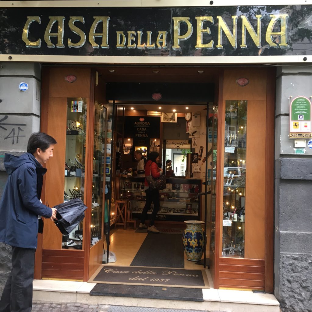
Second, Novelli. This is a pen and pipe store, featuring a smaller selection than Stilo Fetti, but still worth a visit.

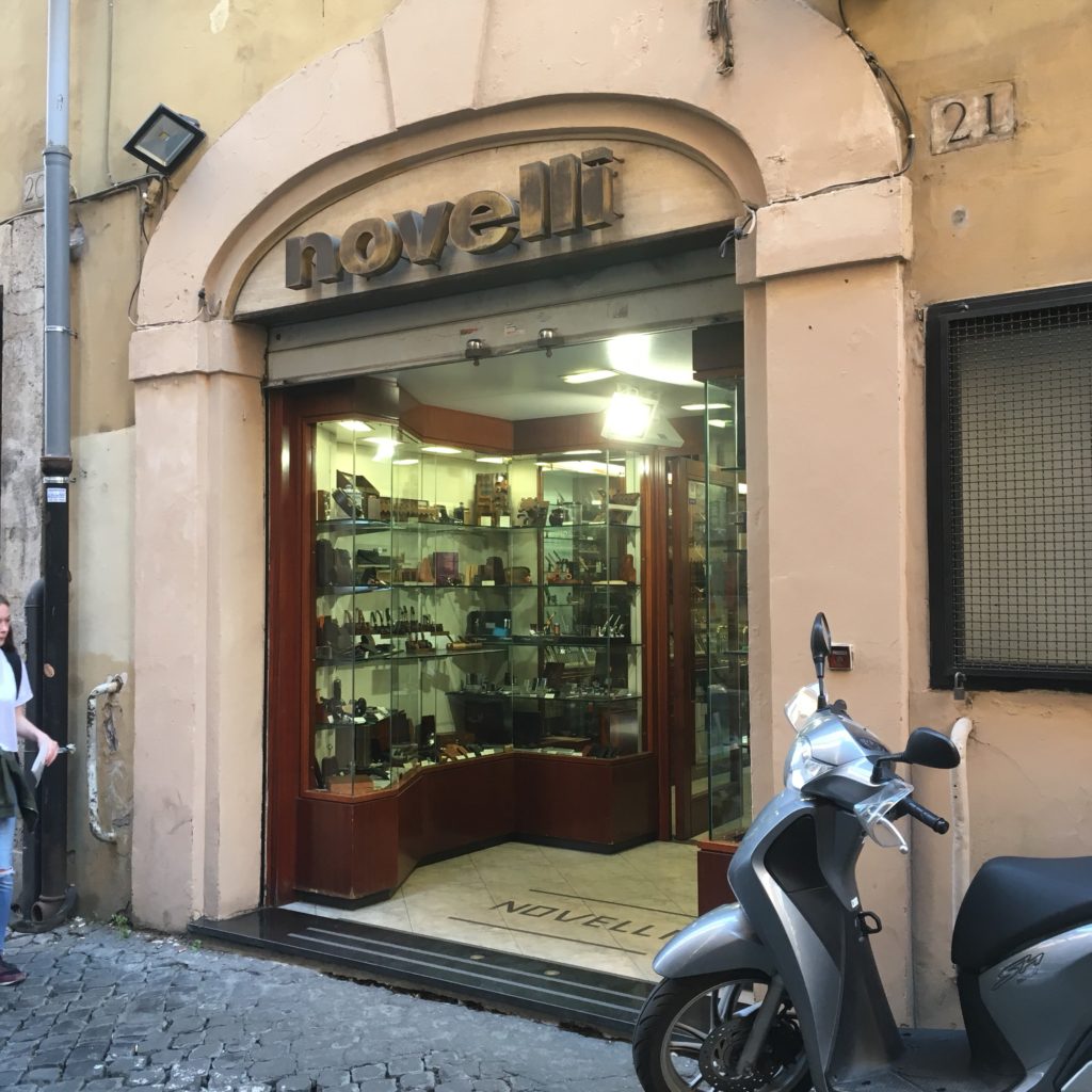
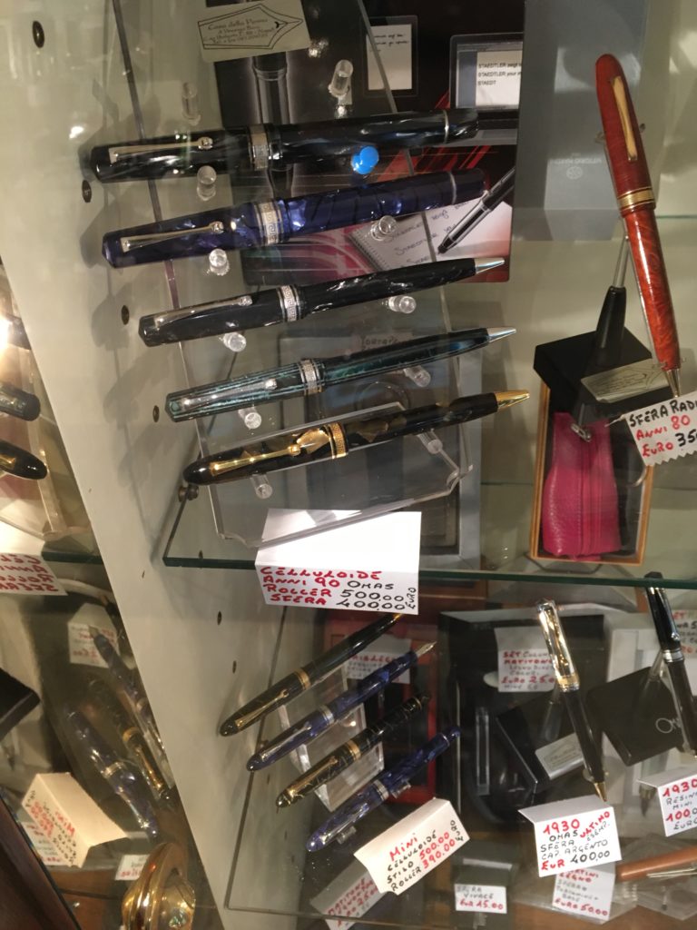
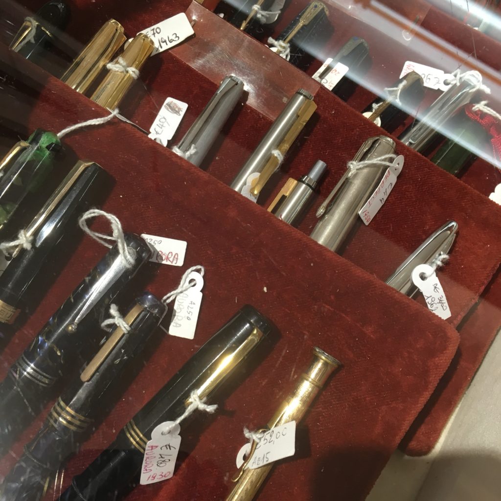
A selection of vintage pens under a glass case — Derek was more than happy to show them to me and answer any questions I had. The third Aurora on the bottom was plenty tempting. Derek also tipped me off on the fact that I could get my tax refund in the city, in cash! Nifty. You end up getting 11% of your purchase price back via the VAT refund (the provider eats the rest of it as profit). All the stores on this list will do a tax refund for purchases over €150 (or maybe 155?).

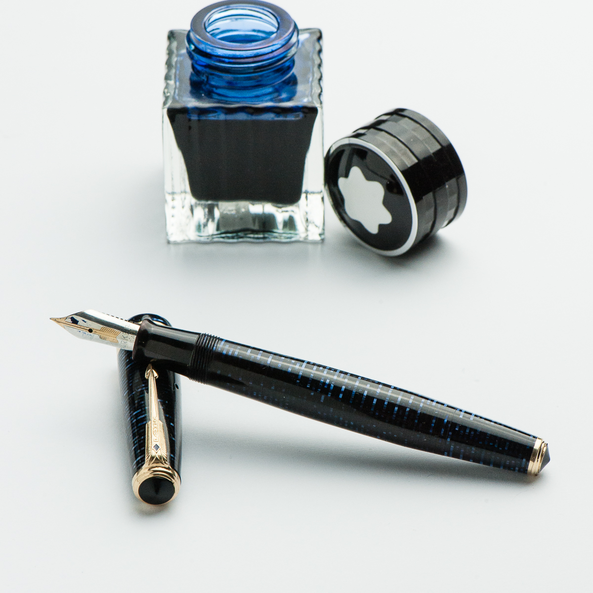
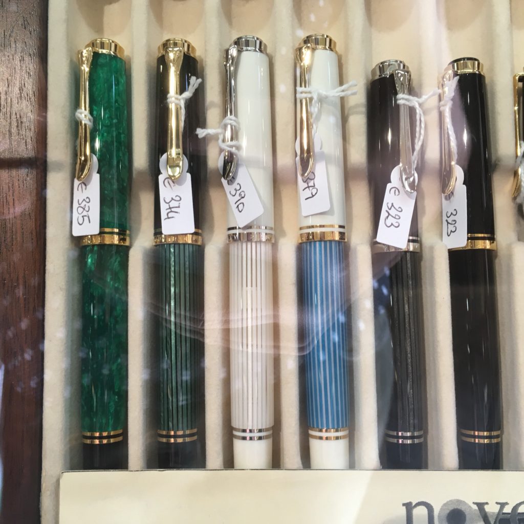
In addition to vintage they also stock quite a few modern pens at reasonable prices. On new pens, the prices seemed a smidge lower than Stilo Fetti (though I didn’t compare extensively across brands). Here’s a selection of M600s and M400s.

Corsani was our third stop — though it’s further out from all the other stores on this list. But if you visit the Vatican (or St Peter’s Basilica) then Corsani is only a short walk away.

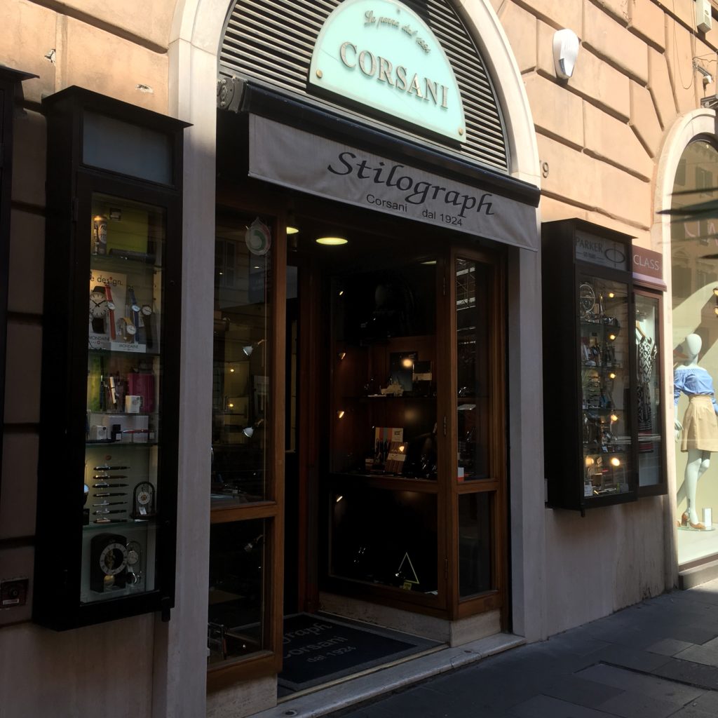
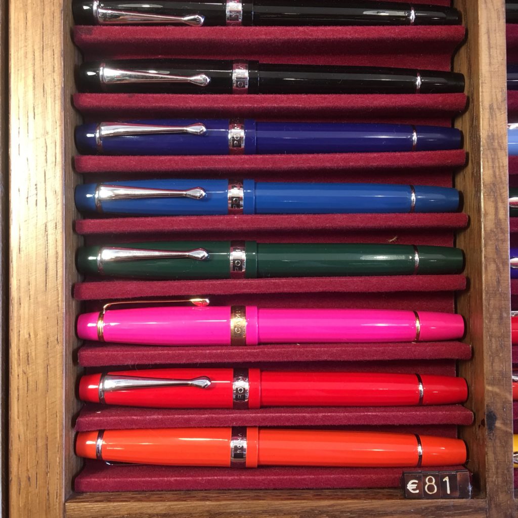
I think Corsani is one of the most famous Roman shops, or at least the one I’d read about most before visiting. It’s also a more modern feeling shop than Stilo Fetti or Novelli and carries a wide range of pens across price points — from cheap to high end.

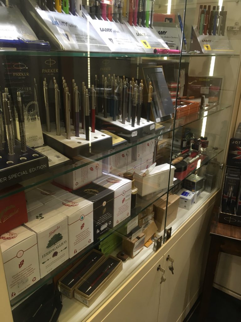
I don’t know much about these, but I saw them in the window and they looked interesting. The staff here were very friendly and happy to test nibs and let you dip pens. My brother ended up buying a Visconti here and they were more than happy to let him pick a nib and (hopefully) avoid the inconsistent QA Visconti is known for.

Fourth, C’Art, which isn’t really a pen store but does sell pens. It was on sale when we visited and the selection wasn’t particularly interesting, but it is there if you’re looking for a pen, any pen. Waterman, Parker, at ST Dupont all had quite a few pens on display.

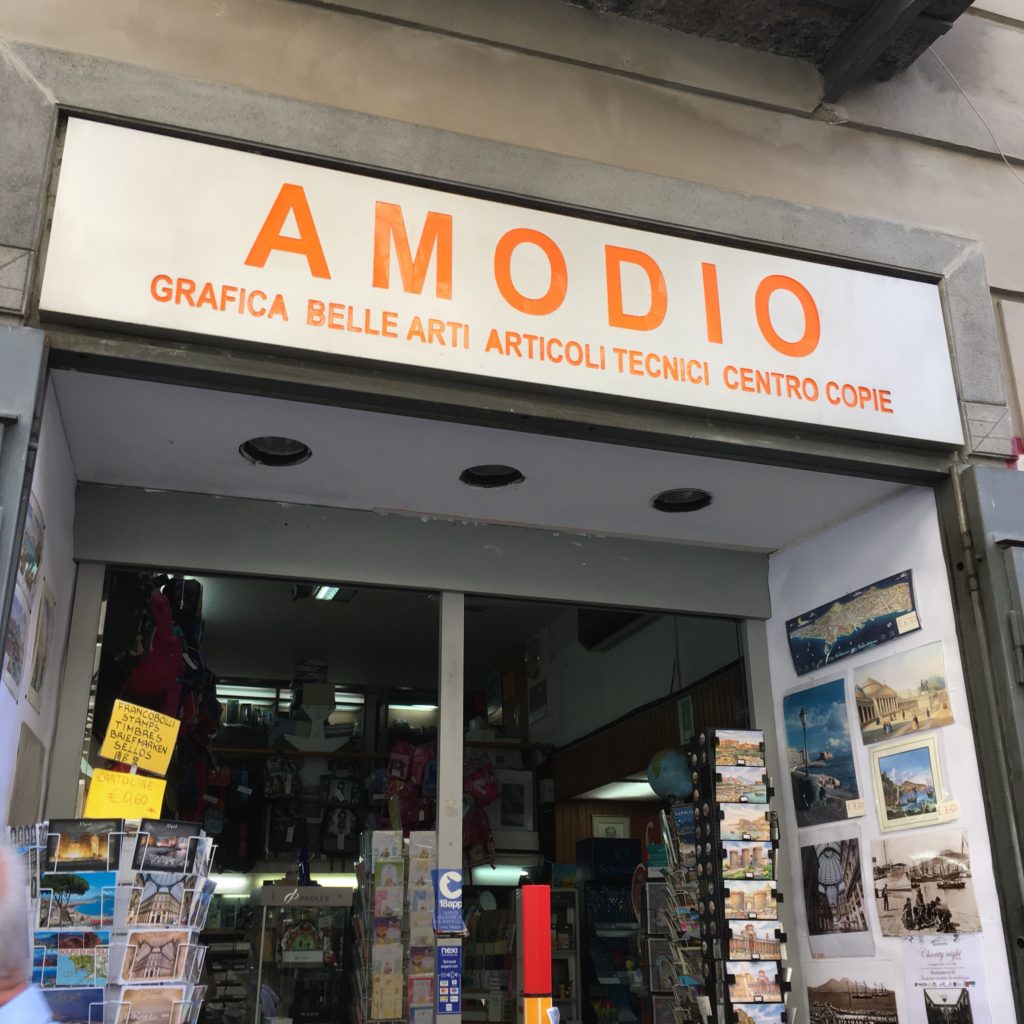
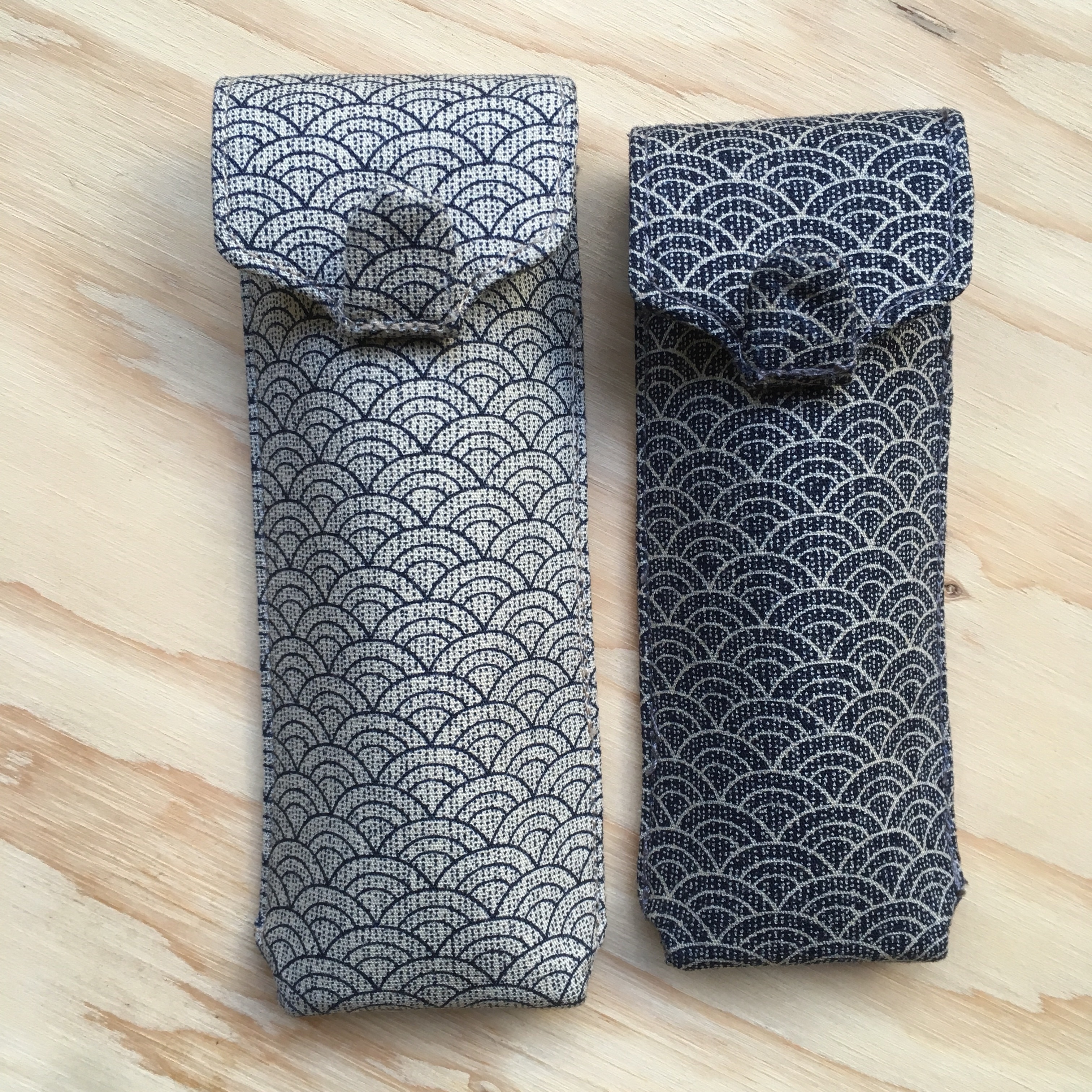
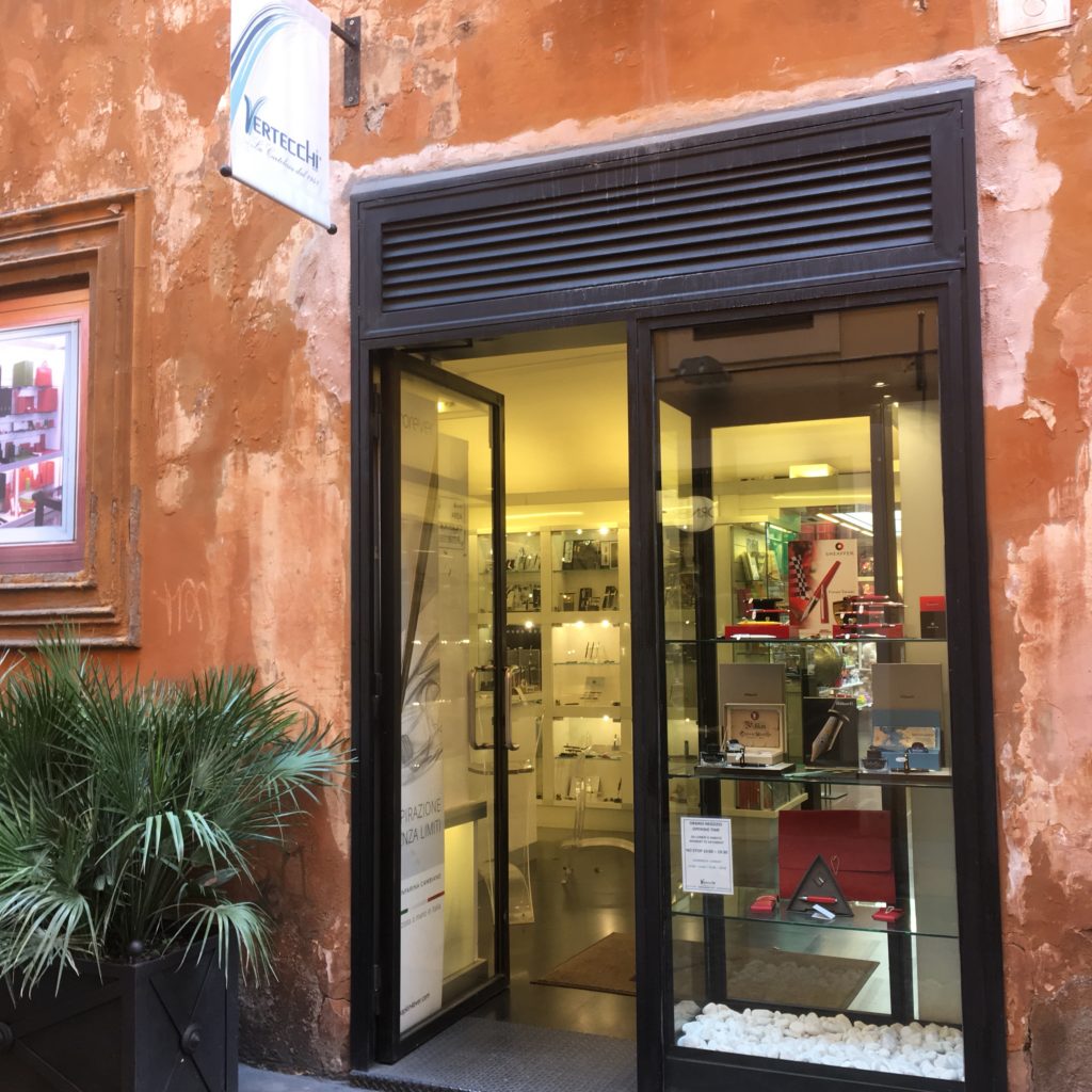
Fifth was Vertecchi. They sell an assortment of school-supply-ish stuff, cute pouches, backpacks, calligraphy supplies, notebooks and have a dedicated room for fountain pens!

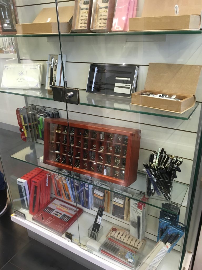
Some of their calligraphy supplies. I was on the lookout for a glass dip pen, but I’ve realized I don’t like the brightly colored swirly ones. They also had glass cases for pens, all the usual suspects, but also Pilot! (though Pilot was pretty expensive). Price wise, higher than Corsani or Novelli, probably on part with Stilo Fetti for the items they both sell. The selection is pretty boring, entirely modern fairly easy to find stuff, but I did almost buy a bunch of cute boxes/pouches/pencil case things.

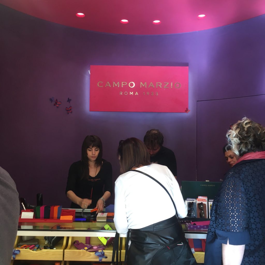
Lastly, Campo Marzio, which is the name of both a street (where one of it’s branches is) and a store is a “fashion accessories” (read: synthetic leather) brand. But, they also carry a bunch of cheap colorful pens.

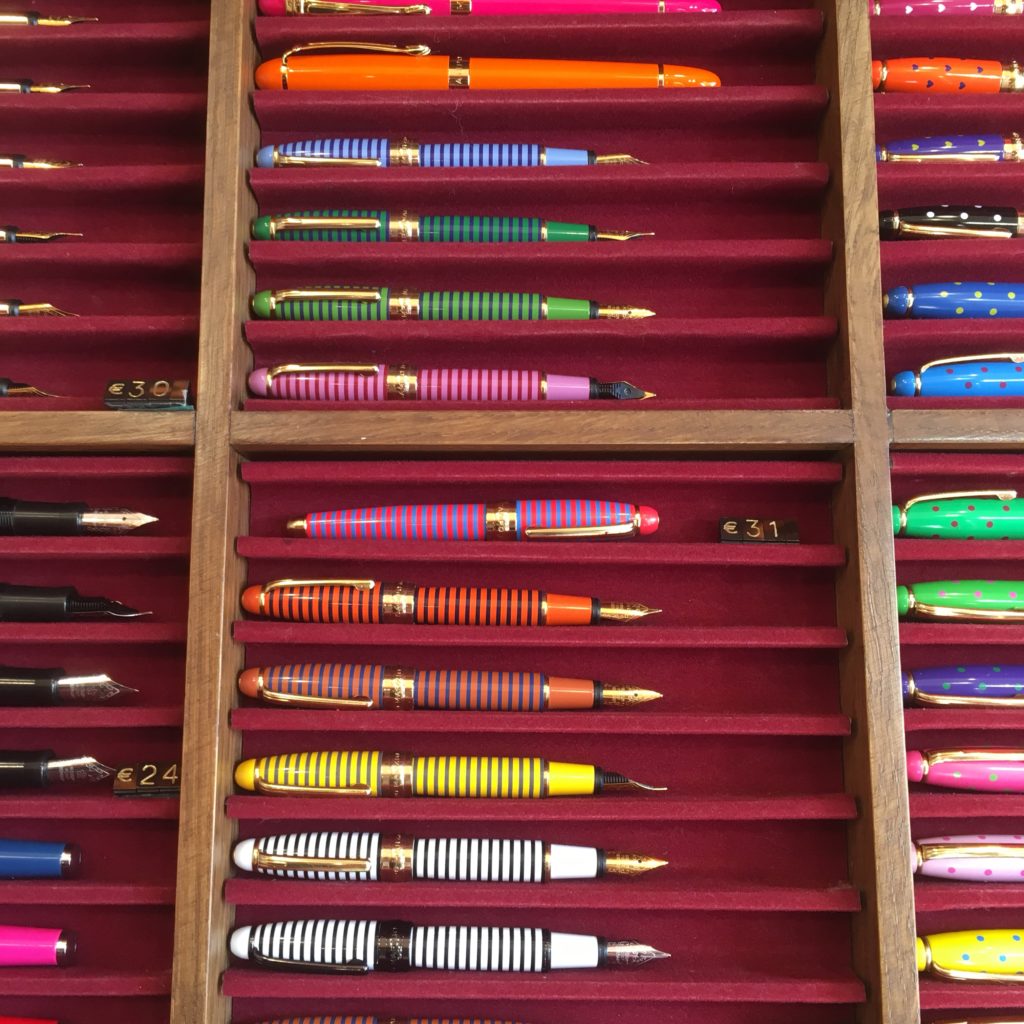
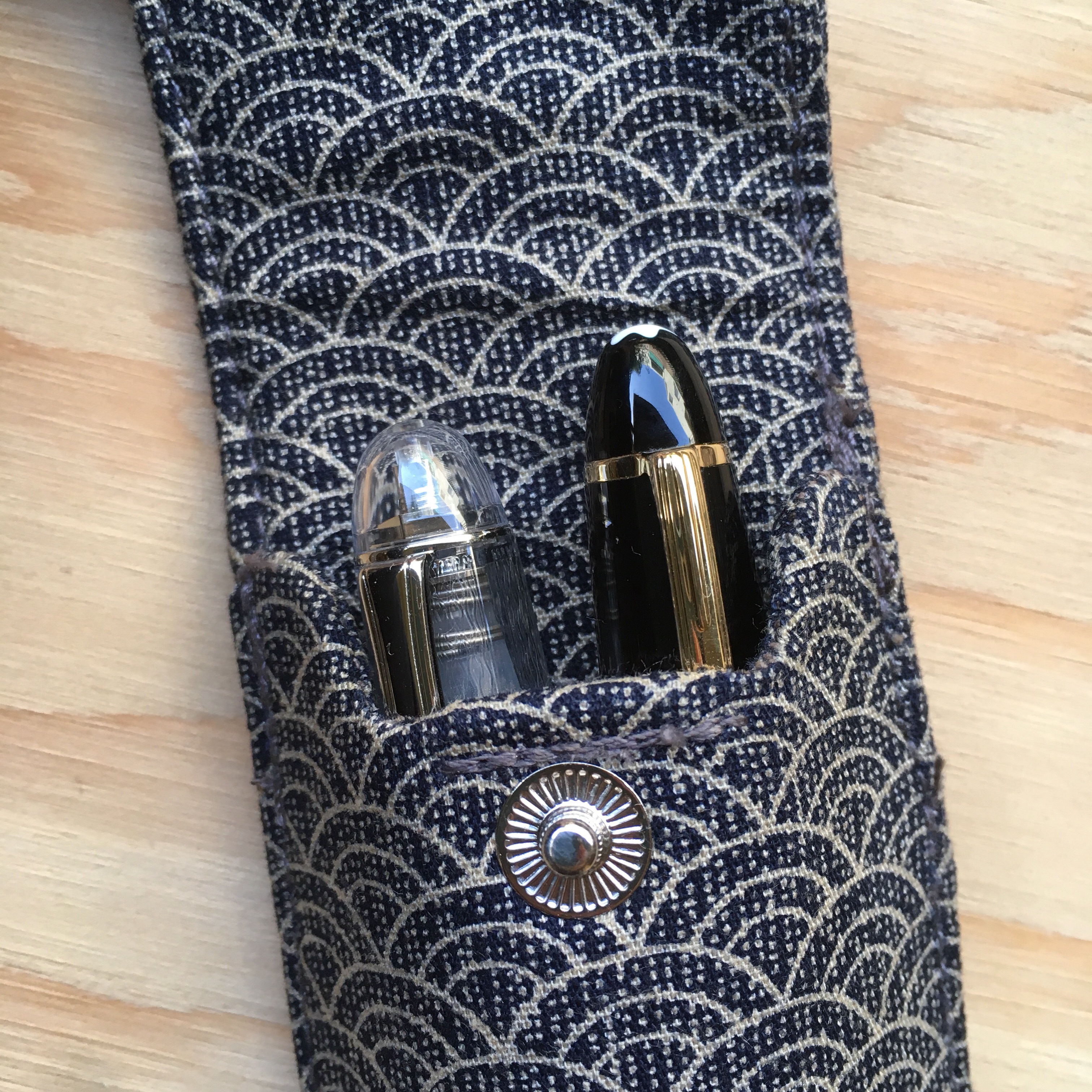
The bulk of their pens are rebranded Chinese pens, but the small striped pens and the faceted pens below were both new to me (though definitely both Chinese made). The pens above are €24 for a fountain pen, €17 for the rollerball. Ignore the price tag. The faceted pens below, I forgot to double check if the price tag was right.

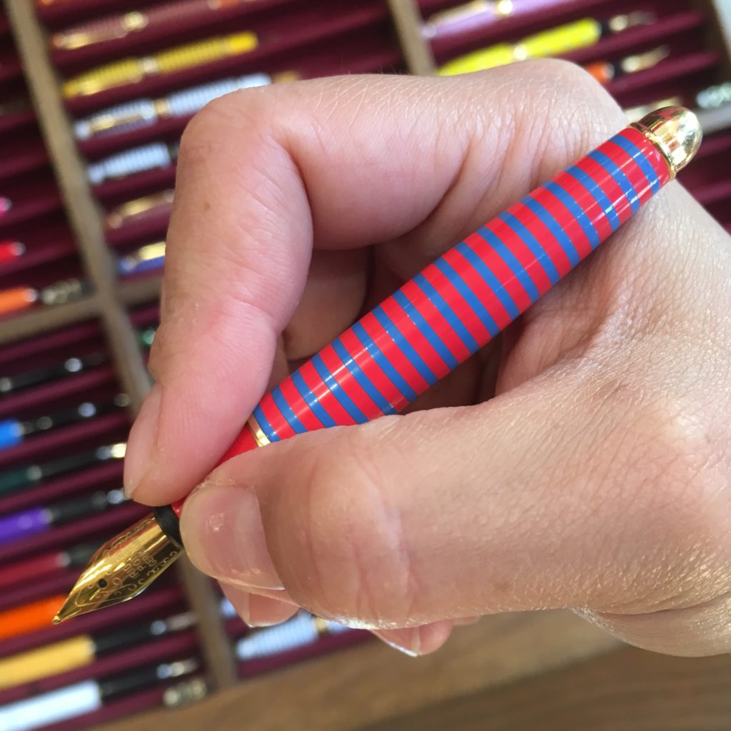
True to the theme of this blog, here’s Katherine’s hand with the small pen unposted. They’re very small!

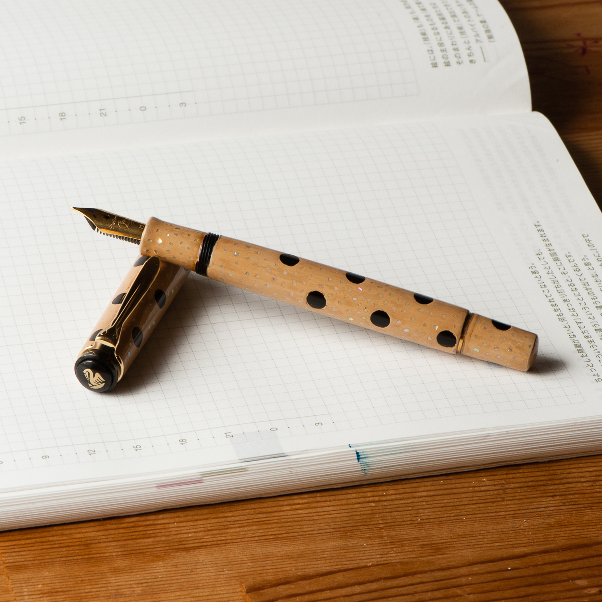
And the last note, the Vatican museum gift shops carry this Delta pen (and a black RB counterpart). The Vatican definitely isn’t a pen store, but I thought I’d note this for those looking for a souvenir pen.

All in all, Rome has quite a few pen stores all within walking distance. Prices here aren’t a steal compared to buying online or in the US (not sure about other locations) even for Italian brands. However, some stores (Corsani!) have brands I don’t typically see, and many of the stores (Fetti, Corsani, Novelli) have quite a selection of pens that you may not find in store — Omas, lots of Delta, vintage, etc. And, because the pens stores are all clumped together, you can eat gelato or other delicious things while walking from one to the next (I had a delicious burrata and anchovy “stuffed pizza” after Corsani, on my way back to Stilo Fetti).

All in all, my Rome (and Italy overall) pen haul was one fountain pen, one rollerball and two bottles of Omas ink. I didn’t call out the store where I bought them because I bought the last two. The only other store where I saw Omas bottles was Novelli, but I think they were part of the display. Corsani had lots of Omas cartridges.

Happy pen shopping!

1 Comment

Naples (and Amalfi Coast) Pen Store Recap

Hi there! It’s that time again, another recap of pen shopping by Katherine. Previous ones include Tokyo, Kyoto and Osaka.

I spent a couple days in Naples and on the Amalfi Coast last week, and had a chance to do a little bit of pen shopping — but not much buying. (A post about Rome, where my wallet bled, will follow)

First stop: Casa Della Penna, really the only store that shows up when you search for pen stores in Naples.

They have a pretty good selection of several brands — mostly mid and higher end ones. Montblanc, Aurora, Omas, Pelikan, pretty standard fare.

They still have Omas in stock — but their prices seem to be pretty standard retail prices, so no deals here. I wouldn’t go out of my way to visit, but if you’re in the area (or live in Naples) it’s a pretty neat store to have near by. Beats anything we have locally in San Francisco!

Second stop: Amodio, I found this one by accident, I was walking around the “old” part of Naples being a tourist (and eating some fried seafood out of a paper cone) and the pens in the window caught my eye —

This is much more of a general office supply store than a pen store, but they do carry a selection of Pelikan, Delta and Lamy pens.

Here’s the lovely M205 in the window display. They also had quite a few other M200-ish Pelikans. I don’t think they carry any pens over €200.

But lots of notebooks and paper! Including quite a few fountain pen friendly brands.

Third stop: stores in Amalfi. There were a couple of these stores in the town of Amalfi (I suspect they exist in other towns along the Amalfi coast, but I didn’t run into them) — stationary stores that sell primarily dip pens and Italian paper. The pen selection isn’t particularly interesting, as they mostly look like cheap souvenirs — though a few had interesting glass dip pens, but those were easily €30-5o.

EDIT on August 24, 2020: Tabula, Amalfi Handmade has requested that we remove pictures of their store. (Well, now I know the name of the store at least!) If you’re heading to this part of the world and are making plans, send Katherine a note on IG and she can send you some pictures. 

But the paper selection was gorgeous! Beautiful patterns, and available in every usage — postcards, notebook, sheets (embossed with the Amatruda logo!), envelopes and cards… etc.

EDIT on August 24, 2020: Second photo here was also removed. 

All in all, it’s always fun to shop for pens, but don’t go out of your way, there’s more to life than buying pens. While in Naples, eat lots of pizza, sfogliatella, cuppo (fried food in a paper cone). And in Amalfi, drink limoncello (or buy some so you can drink it after you spend all your money in Rome…) and enjoy the view!

1 Comment

Mini Review: Atelier Musubi Pen Case

Edit 2 (July 29, 2018): The Musubi divider is here! It’s an easy removable strip in fabric that matches the case and slides in for the length of your pen. No more touching! New pictures to come.

Atelier Musubi is known for their handmade Tomoe River diaries. They recently released these two pen cases in two sizes, a large and a small. I bought a large for myself, and a smaller one for my mom for mother’s day (ssssh — good thing I know she doesn’t read any blogs!).

True to the Musubi description, the small one is a great size for short pens. The long, perfect for longer pens. The long comfortably fits Nakaya Decapods, a Newton Shinobi, an old style Paragon and my Montblanc 146. I’ve only had this for a couple days, so I haven’t tried too many pens!

I haven’t tried too many pens in either case yet, but most of my pens fit in the shorter size, but some, like the Montblanc 146, fit but make the flap slightly harder to close. The 3776 fits perfectly in the short case though!

Overall, I really like the case, it’s very well made and seems very sturdy. My one complaint is that the pens do touch each other in the case (no longer an issue, see my edit at the top of the review). The tab at the top keeps the two pens from touching at the top. In the small size, fatter pens (including Piccolos and the caps of the 3776 and MB 146) they do rub as you slide pens in and out. In the larger case, the above pens don’t rub, but do clatter against each other if you shake the case. I stuffed a small piece of cotton at the bottom of the long case with a bump in the middle, and it seems to hold the pens apart at the bottom too. (They might still rub a little, but at least they don’t clatter against each other when I shake the case)

It’s hard to photograph, but that’s a 3776 and Montblanc 146 in a large case… probably touching. (So use the supplied divider if you care!)

TLDR: Great cases, but not for you if you want a healthy space between all your pens at all times.

Edit: Musubi is rethinking their design to add a separator between pens. Keep an eye out on their social media for updates!

1 Comment

Pen & Ink Pairing: April 2018

Katherine: It’s late in the month and I’m looking back thinking “What have I written with the most this month?” and the winner, hands down, is this funky combination of a Pelikan with a custom urushi finish by Bokumondoh and a Straits Pen custom ink. Honestly, the Pelikan (originally a M200) holds so much ink that I’m getting a little sick of this purple-ish blue. It’s a lovely color… but after staring at it week after week, I’m ready for something new (good thing May is just around the corner!).

Before we hop into my birthday month, here are some quick thoughts on April’s pen and ink —

First, the pen. I sent this M200 to Bokumondoh despite her warnings that this particular finish ends up pretty thick. I love the beige and black polka dots, and the sparkle of the raden. It came back about a month later, and the finish is, as promised, quite thick — but the serendipitous thing is that now I can use my M200 as a slip cap. Game changer! I can still thread the cap if I need to, but the barrel is now thick enough that I use it as a slip cap 90% of the time.

Second, the ink. This is a custom ink that the folks over at Straits Pen cooked up — it’s a wonderful shade of purple-blue that flows well and dries reasonably quickly. I hope to see it in production soon. Perhaps at the SF Pen Show?

Katherine’s Writing Sample


Pam: Thank you Anderson Pens for your ink match up giveaway.  I was a lucky winner of the Pilot Iroshizuku Tsuya-Kusa, a new blue (for me.)  I will admit that I have been lax in my admiration of the Pilot Iroshizuku inks as of late, however I plan on rectifying that.  Starting with pairing this beautiful cornflower blue ink with the Brute Force Design Writer in Sea Glass.  The beautiful and deep blue of Tsuya-kusa is deeper and more nuanced than a turquoise or sky blue.  (That’s right, I said it.  I like it better than Iroshizuku Kon-Peki.)  It’s also a warmer blue with more red tones based on my amateur comparison.

Creator in Chief behind Brute Force Design, Troy, is a wonderful artist in pairing metals and woods in his signature pen designs.  I chose a lighter version of the Writer model due to the beautiful transparency and seafoam green tint of the material. The nib of choice for Brute Force is a Bock nib.  The one I have here is really wet and very well displays the color and depth of Tsuya-kusu to the fullest extent.

Bring on the spring/summer, world!  My inked pens, allergy meds and I are ready for you.

Pam’s Writing Sample


Franz: For the month of April, I thought of inking up my Ryan Krusac Legend L-16 with the limited edition Montlbanc Antoine de Saint-Exupéry ink. I haven’t used the L-16 ever since our review of the pen and I also inked it for two main reasons. First reason is to mark the pen’s first year anniversary with me since I got it at the Atlanta Pen Show in April 2017. Second, the broad cursive italic is very nice to practice my italic calligraphy writing. I’ve been using this pen to write some quotes and post them on instagram. If you’re interested, you may check out #FTDquotes tag on Instagram. =)

As for the MB Saint-Exupéry ink, this was my first time inking a pen with it and the burgundy color is quite rich and has purplish tones. I don’t have many burgundy inks and I find this ink to possess some beautiful shading, and the broad nib brings out the saturation very well. There is no sheen that I can see in the writing which is fine and the flow is very wet. Even if the ink does not match the cocobolo finish of the pen, the ink color complements it well.

What pens and inks have you written with lately this month?

Franz’ Writing Sample


Pen Closeups (click to enlarge)

No Comments

Mini Review: Nakaya Nib Size Comparison

Hello again, it’s me, Katherine, going rogue on one of these mini reviews (complete with unadjusted iPhone photos — sorry). This time I sat down and did writing samples with every Nakaya and Platinum 3776 nib I had on hand.

The method: I chose three inks — Sailor Okuyama, Waterman Serenity Blue and Montblanc Lavender Purple. For each pen and ink combo, I dipped the nib, up to the breather hole, kept it there for ten seconds, then wrote a line and a half in my notebook so the feed wouldn’t be too saturated — then did the writing sample. This is all done in a Hobonichi, with 3.8mm grid.

About the nibs: (from top to bottom, here are some notes)

Nakaya SF + Mottishaw’s Spencerian Grind – very fine, has quite a bit of softness. I think this is fairly close to the stock UEF in line width… But I don’t have one of those, so i can’t do a side by side.

Nakaya Fine – stock nib.

Nakaya Medium – stock nib.

Platinum Medium – stock nib. Overly dry to start, but after adjusting, writes much like the Nakaya stock medium. I’ve had a few Platinum 3776s show up with overly dry nibs out of the box. Nakaya doesn’t have this problem since each is tuned.

Nakaya Medium + Masuyama Formal Italic – A sharp well-defined italic. Great for me because I use very little pressure, but can be scratchy and paper-tearing if the angle doesn’t suit you or you use a lot of pressure.

Nakaya Soft Medium + Mottishaw Cursive Italic – A more forgiving grind than the formal italic, but still not an easy nib — the CI is relatively sharp, but the softness means that it’s extra easy to catch paper edges. This nib works well for my hand, but some people (like Franz) just can’t get it to cooperate. Additionally, it’s tuned on the dry side so you don’t get the forgiveness and slickness of a lubricating ink.

Platinum Broad * – This is very close to a stock Broad, but I’ve ground it down to be a little stubby since I have a hard time writing with round Broads.

Nakaya BB + Mottishaw Stub, taken to .8mm – a nice smooth stub, nice line variation but very easy to write with.

Nakaya BB (also known as C) – stock nib

Nakaya BB (C) – written with upside down

My favorites: My favorite width is the medium — wide enough to show off an ink, narrow enough to suit my small hand writing and doodling. My favorite stock nib is probably a Soft Medium, but I don’t own an unmodified one — time to change that? My favorite nib out of the bunch above is the Soft Medium with the CI grind — I love the way it writes and it demands just enough attention of me to keep me awake. Fun.

There’s not much of a conclusion here — everyone has different nib preferences. Are there any other writing samples or comparisons that would be helpful? Feel free to suggest things! I’m sure Pam and Franz will let me pillage their collections for pens to compare against! 🙂

2 Comments

Mini Review: Midori 10th Anniversary White Grid Notebook

This week my Midori 10th Anniversary notebooks arrived! In particular, I purchased a couple of the White Grid A5 notebooks. MD paper and A5 sides are well known quantities, the interesting about these (since I didn’t get the set) is the white 5mm grid.

The grid is pretty subtle — it’s fairly hard to see without the black backing sheet (comes with the notebook), but becomes more obvious in bright light, or very direct light since it’s lightly glossy (the lines, not the paper). I really like it — I can’t write in a straight line, but this grid is fairly easy to follow and really easy to ignore.

The big gotcha with this notebook is that the lines show through most ink — so in ink blots or wider nibs, you see white lines cutting through your ink. This doesn’t bother me, but I imagine it may bother some.

To conclude this mini review, I really like this notebook, but if the white lines bug you, you may not love it as much as I do (obviously). But, for my writing style — small and uneven, it’s perfect. I just wish I got one of the 10th Anniversary paper notebook covers.

EDIT: Adding this since I think the zoomed in photos above make the lines way more obvious than they are with normal writing.

3 Comments

Pen & Ink Pairing: Feb ’18

Katherine: My pairing for this month is a Danitrio Hakkaku in some sort of red urushi (I’m guessing it’s aka-tamenuri, but I don’t know what Danitrio actually calls it) and Kyo-no-oto (06) Adzuki-iro. Clearly red because Valentines day and Chinese New Years! Not because I got a new ink and put it in a pen that matches…

I’ve had this Hakkaku for a little bit now, but I never found it a perfect ink pairing, but now I have and I’m really enjoying it. The Adzuki-iro is a wonderful dark red without too much orange or purple and it pairs wonderfully with the deep red Hakkaku’s urushi. I’m not Pam, so I don’t think I can declare this a “one true pairing,” but we’ll see if I keep these two together over time. (Maybe I’ll report back next year when red is the thematically appropriate color of the season again…)


Pam:  I am not a fan of Valentines Day, but February does have alot to do with love and a great reminder to appreciate those that you love.  Therefore, it would seem fitting that I show an appreciation for one of my favorite literary figures, Sherlock Holmes.  I obtained the lined vintage celluloid pen from John Albert of Romulus pens and named it Sherlock in the process of designing the pen with him.  The black and gray lines reminded me of the now infamous Belstaff coat that is donned by the most recent reincarnation of Sherlock, Benedict Cumberbatch in the BBC series.  I searched for a while before I found my perfect pairing of ink.  Montblanc Lavender Purple is very reminiscent of the purple scarf Cumberbatch-Sherlock is fond of wearing.  As I told my fellow pen bloggers, I heart Cumberbatch-Sherlock as much as Katherine loves faceted pens. What better time of year to express my love in pen form than this month? Thanks John for such  an amazing pen!


Franz: It’s a blue pen… shocking! =) It has been said before that February is the month of love and well, #iLoveBluePens! So for this month, I chose to ink up and feature this Parker Vacumatic Maxima in Azure Blue Pearl. According to the date code, this Vacumatic was made in the last quarter of 1941. I’ve seriously been getting deeper into the vintage pen realm and loving it. Honestly, any fountain pen lover must own at least one Parker Vacumatic. I’m sure you’ll enjoy the feel of it as well as the coolness of the vacuum pump filler. For about 15 years, Parker produced the Vacumatic in a handful of different sizes for almost every hand size. Having the bear-paw among the 3 of us, the Maxima (the largest) size fits my hand well even with the cap unposted.

Paired with this beautiful blue pen is the limited edition Montblanc Meisterstück Blue Hour/Twilight Blue ink. I love how the pen matches the blue color of the ink when you lay it down on paper and then as it dries, it changes to a blue-green color. I learned about this ink about 3 years ago from reading Azizah’s review on her site: Gourmet Pens-Montblanc Blue Hour.

So a cool blue pen, paired up with a cool blue ink. What else can I ask for? Oh, wait… more blue pens! ;-P

3 Comments

Pen & Ink Pairing: Jan ’18

Katherine: The grey frosty cap reminds me of dirty snow, and the dusty purple ink of cold winter nights… just kidding. I just really like this pairing, and the pen is new to me, so I’m really excited and using it a lot. I first saw this pen over a year and a half ago (on May 12th, 2016 — I don’t remember many dates, but I remember important ones!), in the pen case of a friend (who shall remain nameless), and I fell in love. I tried other pens in the meantime, a black FC 45 IPO (which we reviewed) and a Wonderpens Model 20 in the same “bronze” material… but it wasn’t quite the same. To me the combination of this smokey material and compact form factor (with a sprinkle of nostalgia) is magical. Don’t judge. Anyway, friend decided to buy some fancy urushi pen or something, and offered me this pen… and now it’s MINE.

Patience is bitterbut its fruit is sweet.” – Jean-Jacques Rousseau (Wow, I’m dramatic tonight. Time to go to bed… Waiting wasn’t really that bitter. Just lots of scoping FC tables at shows and on IG.)


Pam: This has been one of the worst winters at work within recent memory for me.  Between medication shortages and the flu vaccine being practically ineffective (twice I have gotten the flu… twice!), it has been an incredibly busy season at the hospital.  Thus, my homage to this season is the Pilot Prera (in white) paired with Pelikan Turquoise.  The Pilot Prera is a workhorse pen for me given that the F nib works wonderfully on office paper.  Pelikan Turquoise a wonderfully vibrant ink that pops off the page of my rather dull reports at work. As people say, it’s the little things in life.  Stay warm, healthy and safe this season everyone.  (Please be patient with your local pharmacies and pharmacists as we troubleshoot the ridiculously long list of medication shortages.)


Franz: The first month of the new year is represented by a vintage Pelikan! Actually, this is my oldest Pelikan pen and it’s a Pelikan 400 in black-striped finish. This was actually one of the last pens I received in 2017 so it’s more of a recent acquisition. Upon my review, this 400 was manufactured around the year 1953 due to the lack of engraving on the cap band and the nib imprint without the Pelikan logo. The black stripes are between green translucent strips that let you see your ink level very subtly and I find it very captivating. It took me almost a year to find this pen at a reasonable price and be in decent condition. And having an oblique medium nib allows me to use it at work and for my journaling as well.

When I received the pen in December 2017, it took me three days to decide what to ink it up with… three days! I’m sure you fountain pen folk will understand. Anyway, I decided to ink it up with Pilot Blue Black which is very familiar to me and usable at work. Since Pilot Blue Black is water resistant, if not waterproof, it’s what I use at my workplace for documents to alternate with Noodler’s Liberty’s Elysium.

It’s almost the end of January and I find myself placing this Pelikan 400 in my pocket on a daily basis and have just reinked it a couple days ago. Even if it’s smaller than what I prefer in pens, I just post the cap and write away. I do alternate it during the day with my Pelikan M805 with a medium cursive italic nib though, but that’s for another pairing post. =)

Franz’ writing sample on Rhodia Meeting Book


What favorite pen and ink combo have you been writing with for the month of January?

3 Comments