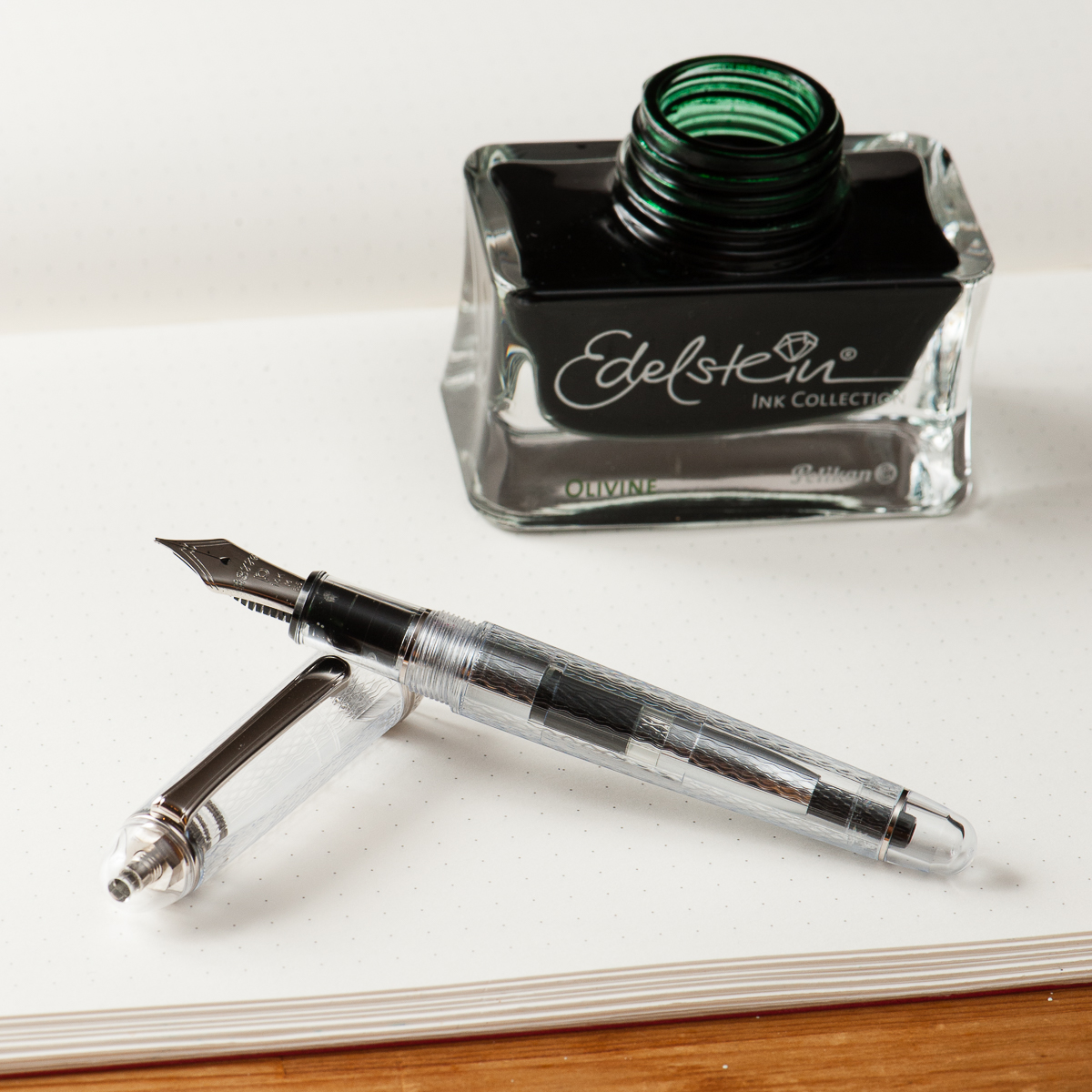
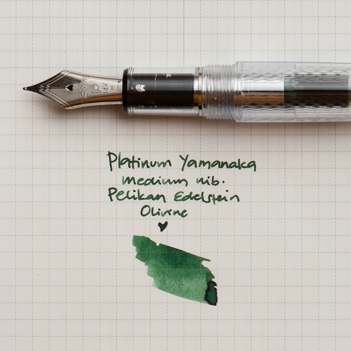
Katherine: I’m another year older and (supposedly) another year wiser this year… so I’ve chosen to celebrate with a Platinum 3776 Yamanaka, paired with Edelstein Olivine. I’ve loved the texture on the Yamanaka for a while, and was finally lucky enough to pick one up last month. It sat uninked for a couple weeks while I wanted to find it a wonderful partner (pretty uncommon for me, I usually ink things up immediately!). Franz brought over a bottle of Olivine and it seemed like a perfect match. The deep green reminds me of plants, and the textured transparent body of a terrarium — a perfect pairing for the middle of spring.
Here’s to another year of friendship, adventure and pens. (And maybe a few more plants)
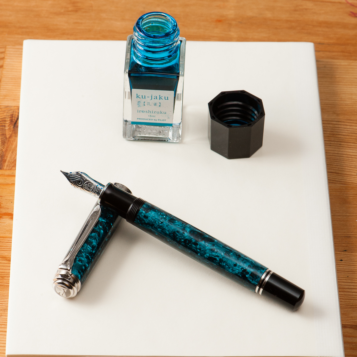
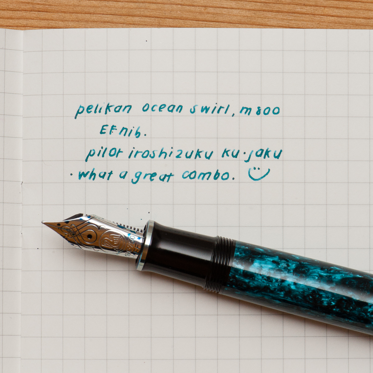
Pam: I had struggled to find the perfect ink color for Pelikan’s Ocean Swirl. The teals were either too blue or too green. I originally attempted Organic Studio’s Walden but found the flow of the Ink to be too wet for an already broad EF.
My last attempt with Pilot Iroshizuku Ku-Jaku was a serendipitous hit. The Pelikan nib is wet enough that the ink color shines though and the line width is within the expected range of an EF. Also, like all well behaved inks, it is much faster drying with little concern for smearing in my Midori’s travelers notebook.
I am glad to return to my first inky loves in the last couple of months. Can’t wait to try more of the “oldies but goodies.” Are there any new ink brands that are comparable to the staples like Pilot and Sailor?
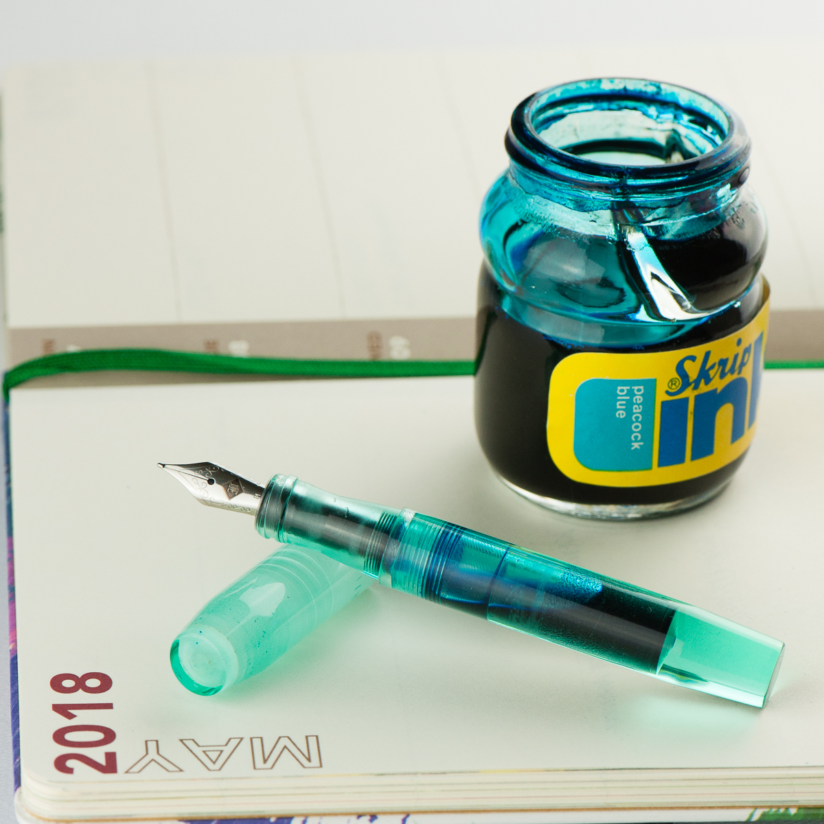
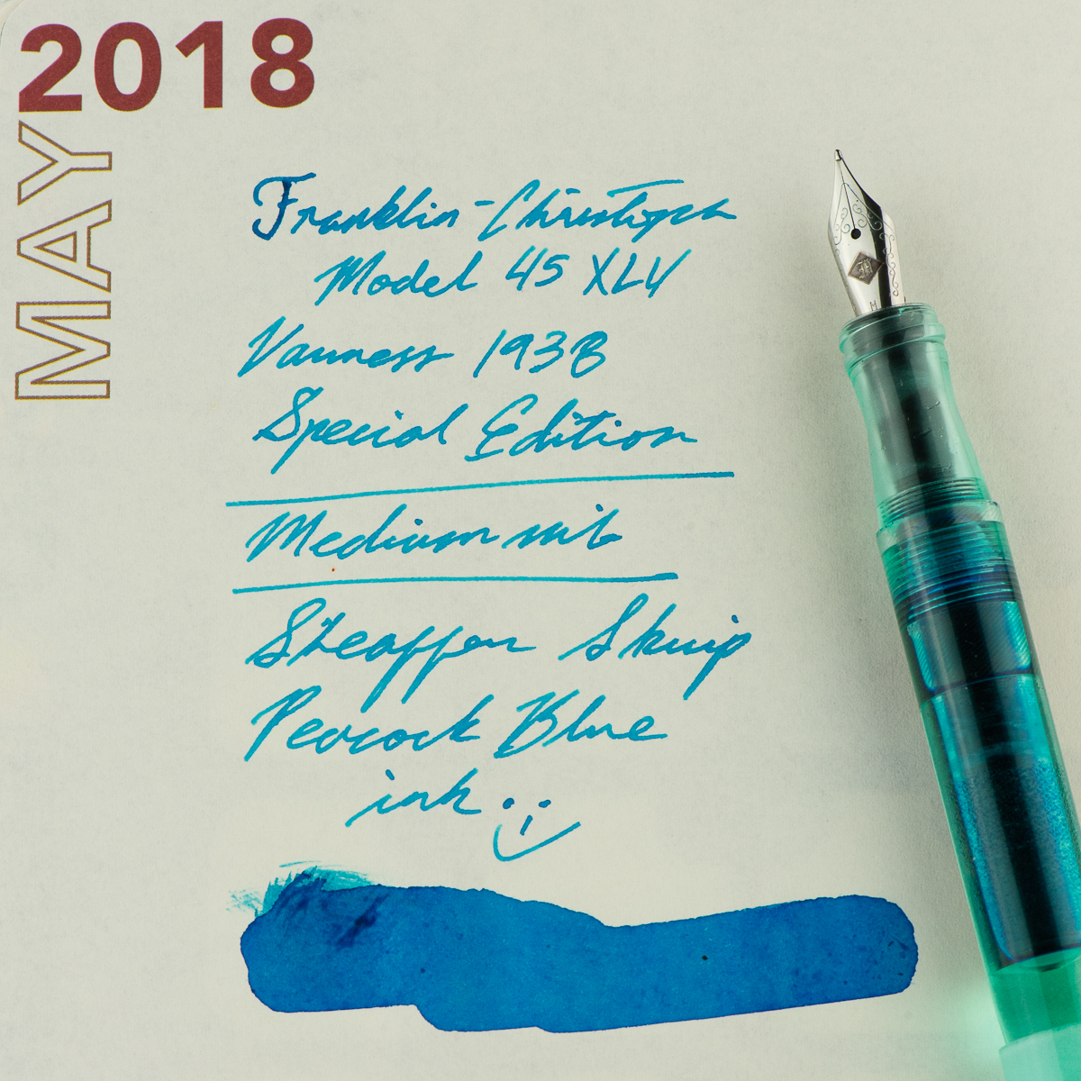
Franz: This month, I finally inked up my Franklin-Christoph Model 45 XLV Vanness Exclusive pen. The mint color of this pen really just appeals to me even if I know that it’s a small pen for my hand. But for the past couple of weeks, I’ve used the pen in conjunction with my Starbucks Philippines Weekly Planner and so far it’s a nice complement to it. I’m “trying” to be a bit more organized in scheduling tasks and events and by using this combo, it’s been enjoyable for me.
Since this is a Vanness Exclusive pen, I figured to ink with one of Lisa Vanness’ favorite colors, turquoise. The Sheaffer Skrip Peacock Blue is a nice vintage ink to complement this pen. I know for a fact that there are inks out there that would match the color of the pen however, this is a more personal ink to me for various personal reasons. Let’s just say that this ink is a homage to a couple people. One of those people used to say, “An italic gives you traction…”. And come on, who doesn’t like turquoise ink? Hmm? Hmm? ;-P
Writing Samples
4 Comments
Love the Peacock Blue💙- and She would be thrilled you remember the Italic lessons😊
Hi there! Great site! So much amazing info — all I want to do is try new inks and pens all day! Quick question: do you know anywhere in the Bay Area that I can get a grind done on a nib? The Google is less than helpful! Thanks much, and again, great job!
Hi Tim! Your best bet is either coming to the SF Show in August or sending a nib out. A couple people at the SF Pen Posse can tune nibs, but no one does grinds.
Loved this post and the pen color pairings!