Hand Over That Pen, please!
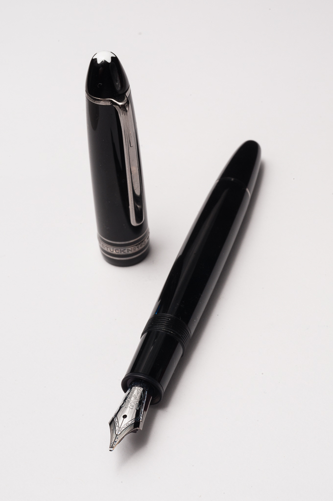
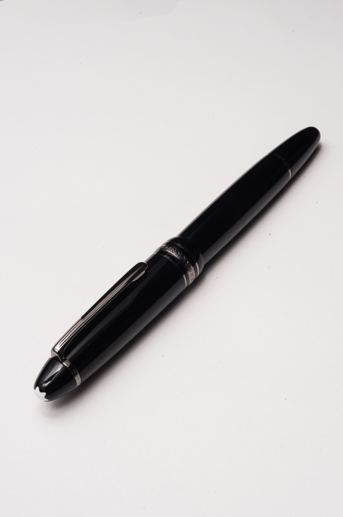
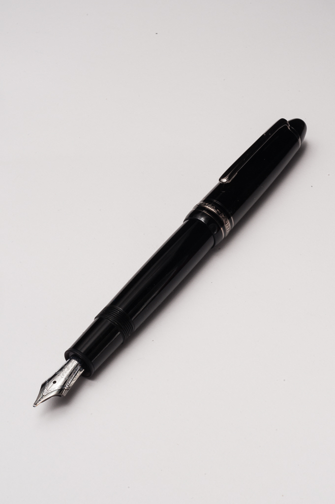
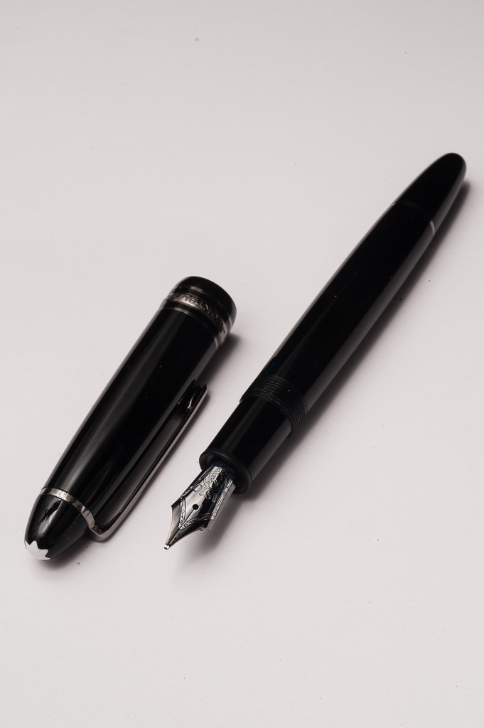
Katherine: The 146 (and its bigger sibling the 149) are the classic black cigar-shaped pen. The shape is boring to some, but timeless and classy to many others. Personally, I find the shape a bit boring, and while many buy the pen for the “prestige” that comes with such a recognizable brand, I found that unappealing. As I’ll discuss in later sections, I loved the innards of the pen, but I much prefer using pens that aren’t as obviously branded, especially at work. All in all though, the “look” of the 146 is inoffensive to me, if I didn’t have a self-imposed 15 pen limit, I’d likely still own one.
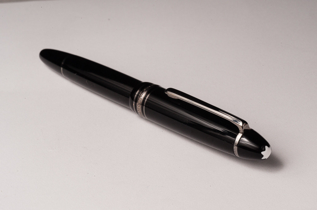
Pam: The 146 is a classic pen with a very classic shape. Typically, I would find the Montblanc 146 with gold trim to be another snoozer or write it off as “another typical pen.” I don’t usually like the cigar shape in a pen, like the Platinum 3776 or the Sailor 1911. That said, Montblanc created a very well proportioned cigar shape pen. It looks streamlined rather than chunky and sleek rather than boring. Maybe it’s the more dramatic taper at the end of the body and cap or it’s the custom ruthenium trim or I enjoyed writing with this pen so much that a “another typical pen” has much more appeal now.
Franz: The LeGrand 146 is such a nice, simple-looking pen. I love the timeless shape of the 146 and that may be the reason why a lot of pens have copied its appearance. The pointed ends are different from the usual pens I own.
So here’s a bit of historical information about this pen. In mid-1948, Montblanc came out with the Masterpiece/Meisterstück 140 Series and the three models introduced were the 142, 144, and the 146. All three were introduced as a piston-filler and until now, the 146 is offered as a piston-filler pen. Over time, the 144 changed to a cartridge/converter filler pen. The Meisterstück 140 Series was a refresh of the Meisterstück 130 Series introduced in the mid 1930’s.
According to Montblanc’s numbering system adopted in the 1930’s, 146 meant that 1 (part of the Meisterstück/Masterpiece line), 4 (piston filler system but it was a 3 in the 130 Series), and 6 (denotes the nib size).
*Please note that this historical information was taken from Mr. Andreas Lambrou’s “Fountain Pens of the World” book. If I have misquoted, or given incorrect information, please let me know. Thanks!
The Business End
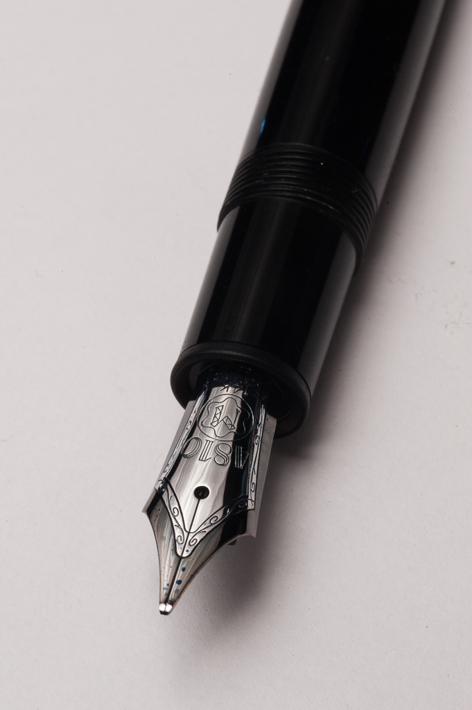
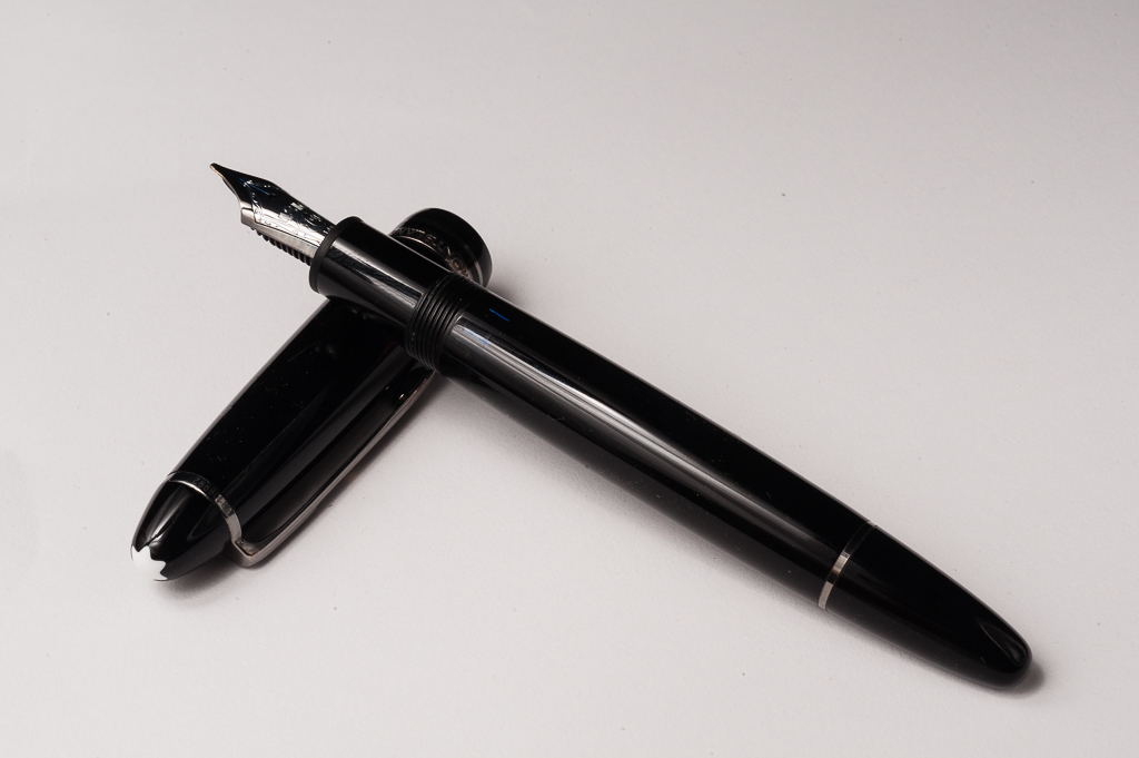
Katherine: I love well-adjusted Montblanc nibs. I’ve used Franz’s (pictured in this review) and love the delightful CI that Dan Smith put on it. But I also, for a few months, owned my own 146 — an early 90s French specimen with an uncommon 18k nib. That was one of the most delightfully smooth (but not glassy) nibs I had ever used. Given my current experiences with MB nibs, I would never hesitate to recommend one to a friend, even out of the box.
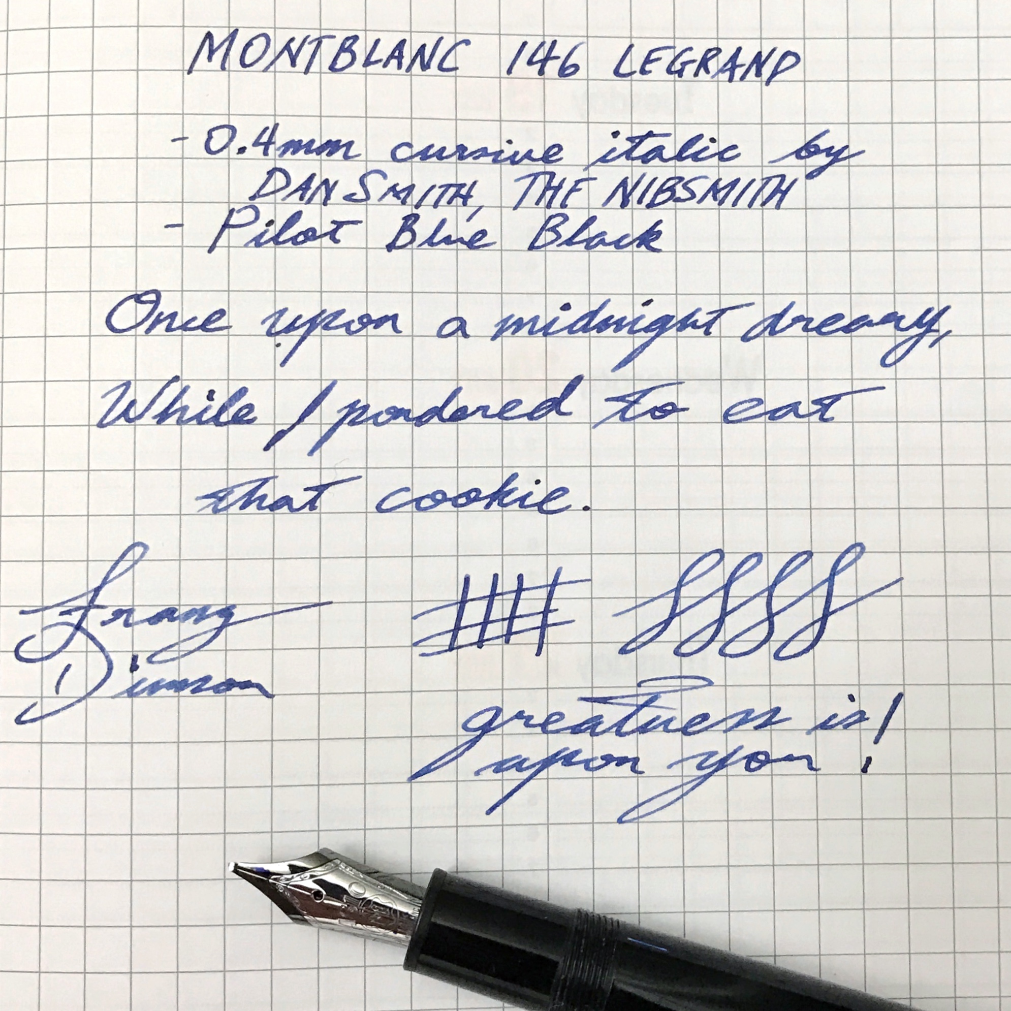
Pam: Montblanc nibs are juicy with some springy-ness to them, based on my time with them at the Montblanc store (which may be longer than I care to admit). I really enjoyed the Montblanc B and BB nibs as they created a stub-like line for me. Therefore, what other “improvement” could you make to a well done nib from Montblanc? Well, someone had the genius idea to send the pen to Dan Smith for a 0.4mm CI grind. I (not so) jokingly told Franz that the 0.4mm is the perfect CI width and I may be forever ruined for all other CI grinds. CI grinds tend to run a bit dry, but this nib is well tuned and provides a consistent, well saturated, beautifully crisp line. Again, ruined… I am, ruined (or forever spoiled.)
Franz: Springy nib… check! Cursive Italic… check! Juicy ink flow… check! Smooth sweet spot… check! Running out of checkboxes here! What can I say? It’s a beautifully tuned nib! Kudos to Dan Smith on this one. As for straight from the factory experience, I have used another 146 nib which was a stock medium and it was a smooth well tuned nib as well. So far, I’ve been pleased with the quality of Montblanc’s nibs.
Write It Up
(20-minute writing experience)
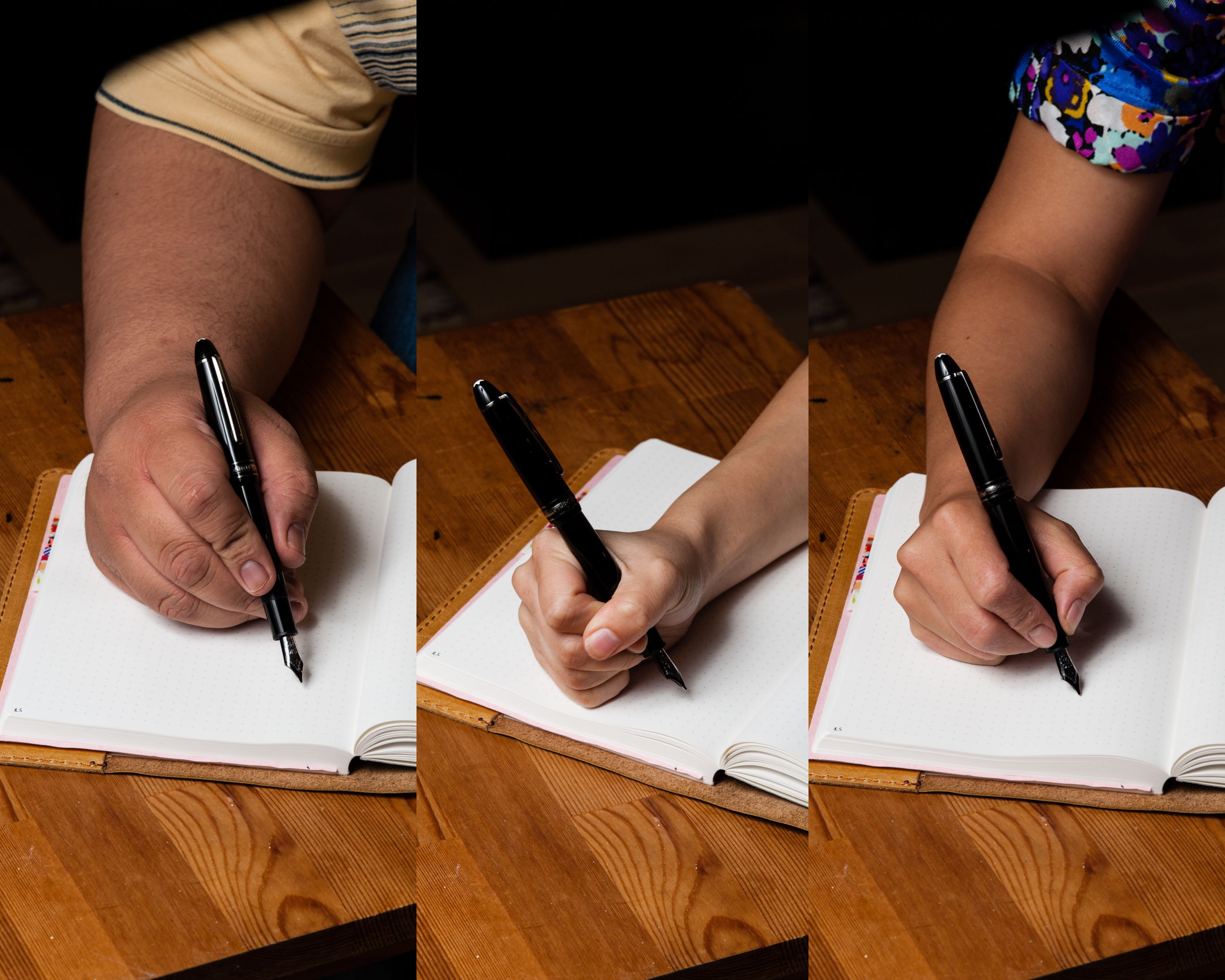
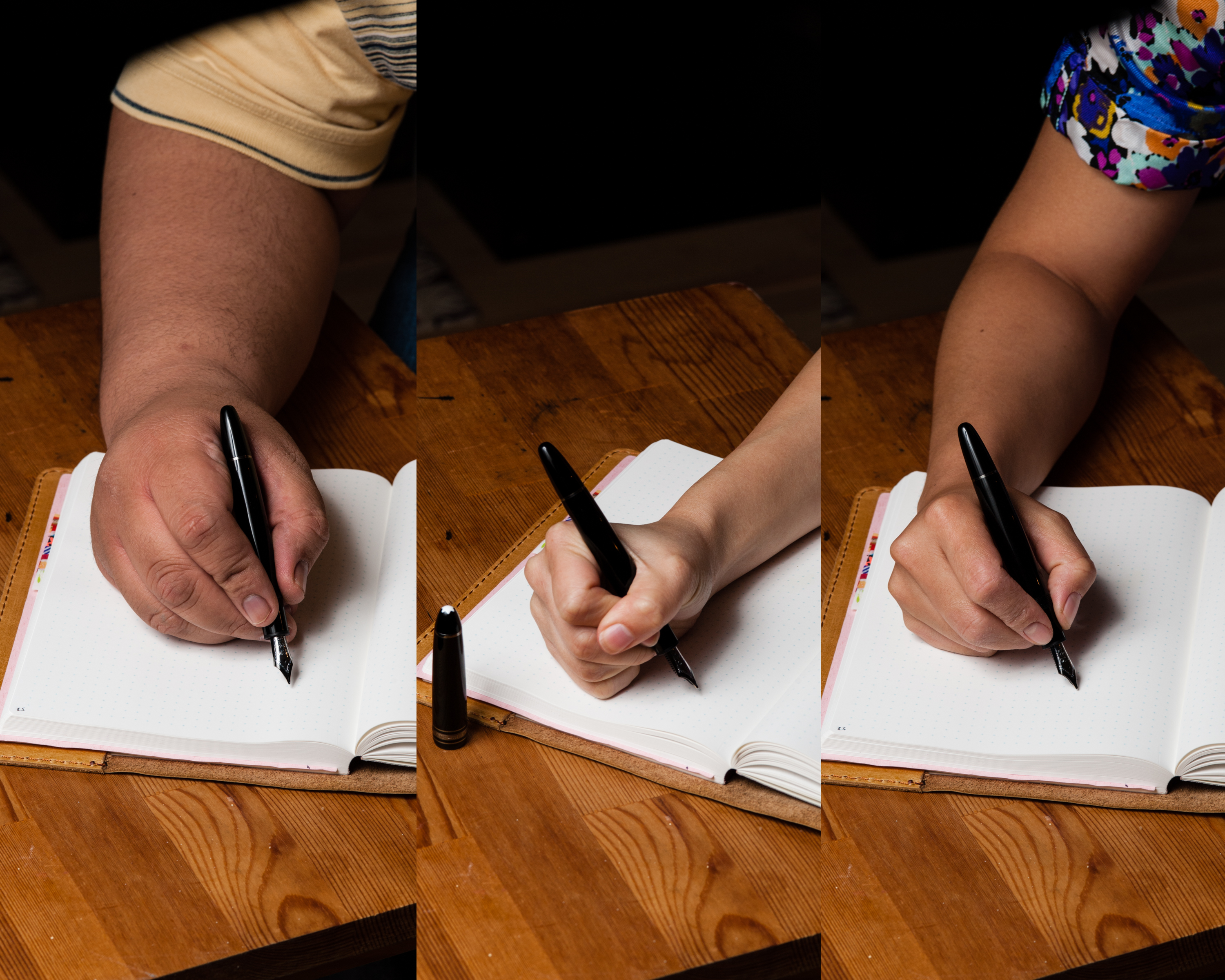
Katherine: The 146 is very comfortable for me — it has a good weight and is comfortable in hand, even when writing for extended periods of time. I prefer it unposted — when posted I find it a bit too top-heavy and my hand gets tired faster.
Pam: I have enjoyed the 146 both posted and unposted in the traditional tripod grip, preferably posted for me. The 146 can be a bit top heavy in my “iron grip.” Given the CI grind, I primarily used this pen in the tripod grip and had no issues with the width of the pen. The girth of the pen at the section is within the usual limits and comfortable to hold for an extended period of time.
Franz: I may have been waxing poetic about this pen but admittedly, the LeGrand 146 size is just a smidge small for my bear paw. Please don’t get me wrong for when the cap is posted, I wrote with it comfortably and I absolutely had no complaints. I loved journaling with it for about 10 minutes but when I unposted the cap, my grip adjusted towards the nib and the pen felt small and unpleasant. I actually felt my hand cramping after writing for five minutes. Please refer to the pen in hand photos above to see how awkwardly small the unposted 146 is in my hand.
So yeah, mixed results on this one for me and just like Pam, I prefer the 146 posted.
EDC-ness
Katherine: This is weird to say since I EDC my Nakayas… but I didn’t like carrying around my 146. While the clip was good, it uncapped decently and was great to write with, I just wasn’t comfortable using a pen that everyone around me identified as “Katherine is using an expensive pen”. Funnily enough, Nakaya and Danitrio are much less recognizable to the layman than my 146 was.
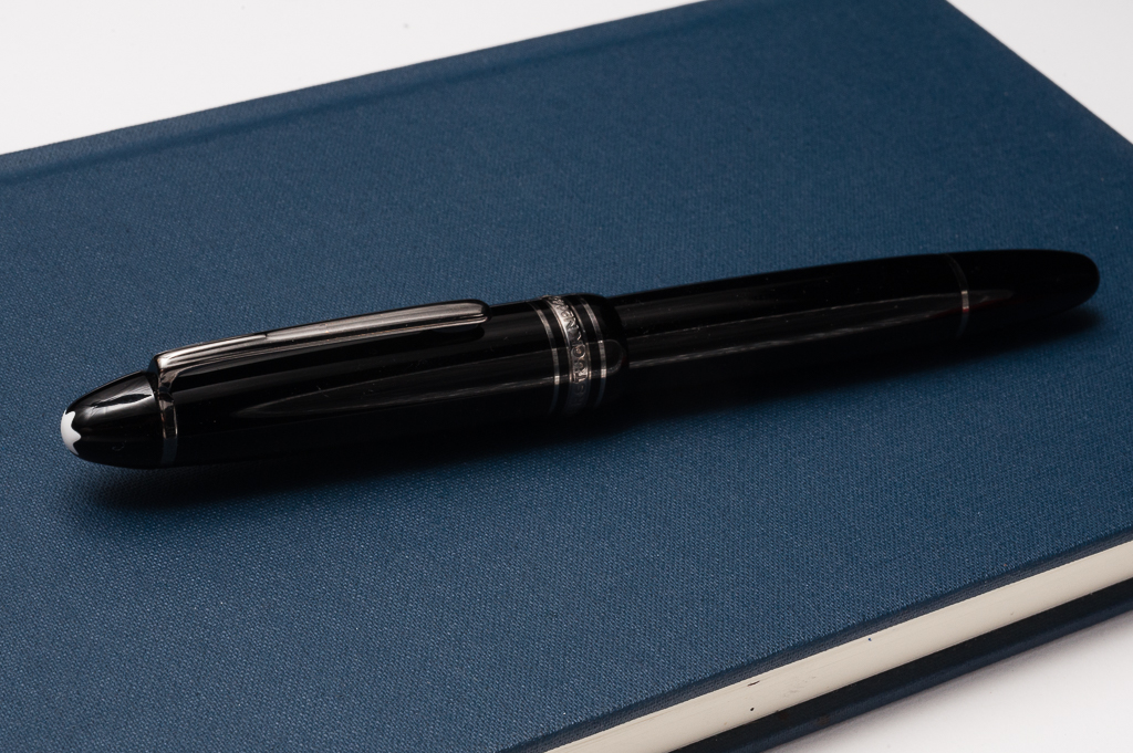
Pam: This pen is a be a great EDC pen as it is a sturdy, well made pen with a secure clip and threaded cap. I didn’t carry this pen around daily as it’s not my pen to damage or lose, but also because would be distracting in my interactions with my colleagues and patients. I am not that comfortable in letting the world know/assume the “cost” of my beloved pen hobby. (Or maybe that’s the SF bay area hipster in me.) Montblanc is such an iconic brand that people will notice this pen very readily. Granted, it’s also a beautiful, classy pen with a very unique ruthenium trim.
Franz: I used the 146 at work and out and about on a weekend and I had no qualms of being able to use this pen as an Everyday Carry pen. The cap unscrews after about 1 and 1/4 turn. Pretty fast deployment there and on the flip-side, the pen never uncapped itself in my pocket. The ink capacity of this piston-filled pen allows one to just keep on writing for a period of time. The subtle ink window above the section threads definitely helped me figure out if I’d need to refill the pen or not. I didn’t really care about the “perceived prestige” that the white star on the cap instills or what other people would think because well, I just don’t. Haha! =) As long as it’s a functional pen with a look that appeals to me, I’ll keep on using it.
Final Grip-ping Impressions
Katherine: Overall, I really love writing with 146s — they’re comfortable, balanced and have great nibs. But I found that I was uncomfortable with the obvious and easily recognizable branding. The moment my boss said, “Oh! You’re using a Montblanc!” the idea of keeping a Montblanc around for normal use went out the window.
Pam: After spending time with the 146, I can see why this pen is such a popular flagship pen. It’s a great size pen that suits many hands, has a classic (albeit “boring”) aesthetic from a historical and iconic brand that backs up it’s name with great nibs and performance. This pen has taught me and made me question a lot about my own pen preferences in terms of shape, nibs and writing style.
I would recommend this pen to anyone looking for a solid performing pen and isn’t wary of being seen with such a recognizable (and expensive) pen. Not all settings are optimized for that. It would be a “must have pen” if it was not so cost prohibitive to have, therefore, it would make a great grail pen to fill the “quintessential classic” slot in any collection. So if you are like me and this a grail pen, I recommend the 146 as a “must try for yourself” pen.
Franz: The LeGrand 146 design is almost 70 years old and as I said in the beginning of this review, it is timeless. This is a nice pen to have in one’s collection quite frankly. If you are able to, please try to write with a 146 and see if it is a good pen for your hand. The nibs are great and it just writes. I really like it when the cap is posted as I detailed above. The only “con” I would say about this pen is that it’s quite pricey when brand new. However, a thorough search in the secondary market may provide one with a reasonable and more affordable price for the pen.
Just a little background on this specific pen. I saw this exact 146 in early 2015 on Dan Smith’s Instagram feed, @TheNibsmith (@fpgeeks back then). He said that he just finished grinding the 0.4mm cursive italic on it and wished he owned the pen. I dug up info from Dan and the original owner of this pen to find out how he got a ruthenium trim. I planned to send a pen to that person who did the custom ruthenium trim but I never got around to doing it. Fast forward to April 2016, I found this pen offered for sale and I pretty much jumped on it. Needless to say, I love this specific 146 not only for its writing capabilities but its history as well.
Pen Comparisons
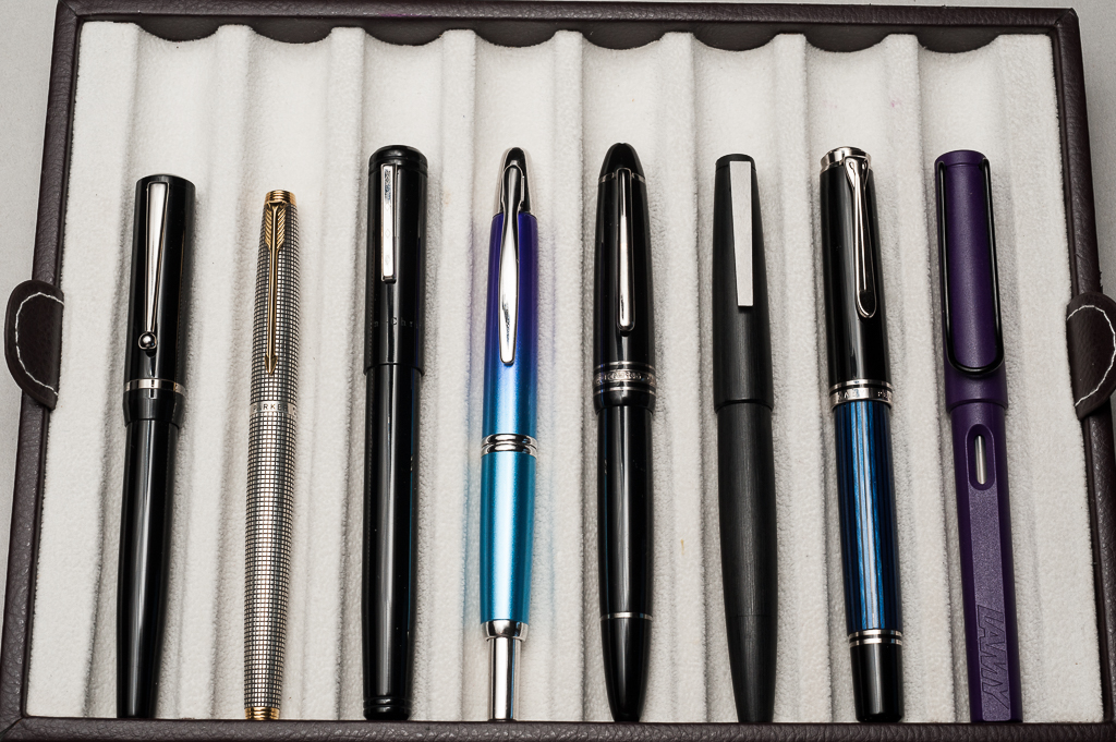
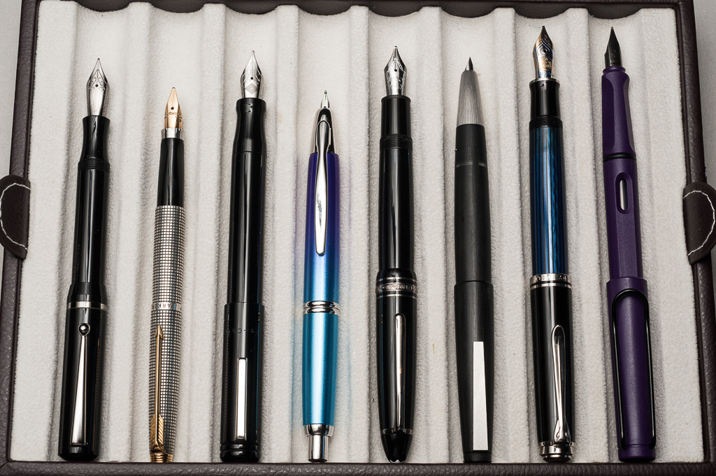
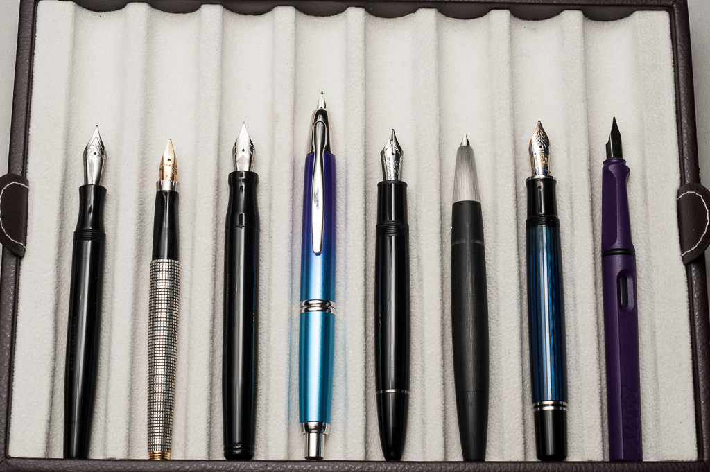
Pen Photos (click to enlarge)

19 Comments
Thanks, great article.
Wow! I just discovered your blog. It’s fantastic, and I can’t wait for more content.
Thanks very much Jason! =) Will try our best to not disappoint. Will subscribe to your blog as well.
What finish is that? I’ve never seen it before.
Very nice review! I love reading them, and the three different perspectives really stand out!
Hi Ben! Its actually a regular Meisterstück 146 with Gold trim. But it was customized to be ruthenium trim.
I have been using a 0.7 cursive italic and a 1.0 stub that both are a lot more interesting on the paper than that pen seems to be. That 0.4 cursive italic doesn’t seem to have much variation or jazz going on, and it seems to the eye to be a nib larger than 0.4. Is that what this particular nib smith does with his 0.4, or am I missing something.
Hi Charles! I love my .4 CIs, but I tend to write very small. For larger writing the line variation isn’t nearly as obvious. Who ground your nibs?
These were two pens that I bought from Indy-Pen-Dance, and it may have been Linda who did the nib. I think she learned from Richard Binder.
Now I want to dig out my 146. But it’s the March 6-Pen Challenge, and I don’t want to take any of my other pens out! Oh maybe I will… one of the three Nakaya Piccolos, hahaha.
Do you know how to date the 146? What is the code and where is it located? (I know. “Let me Google that for you.” But where is the community in that?!)
I found an fpn thread that answers my question. My 146 dates from 1993/4 to 2000, which makes sense, because I bought it in the mid-90s.
You know how you can figure out the month and year of Parkers? Do you know if that kind of detail is available on Montblancs? I tried a Google search on my pen’s serial number, but nothing specific to that came up.
Oh now I’m curious as to what decade my 146 is. Thanks Lisa!
As for the specific month and year, I’m really not sure. Maybe Loren would know. I’ll ask him next time I see him.
Hi, Franz! Because of this post, I did take out my 146 and inked it (temporarily! It’s a special dispensation to suspend the March 6-Pen Challenge to partially fill a pen to check the nib.) – and now I’m wondering if I should send it to Dan Nibsmith. But I’ve been thinking that, on and off, for a couple of years now. This pen and one or two others.
For nibzardry. Ouch, that stretch (nib + wizardry) hurts. But looks almost Polish. Haha.
I have a 146 in Burgandy with a two tone M nib and gold trim… I think it’s just right and beautiful… I bought it on trip to Dubai in 1986 or 87… Same experience with my boss when I took it to office… I think he wasn’t too happy … Ah well… This was the most expensive pen I had then … Till I went right and proper into the rabbit hole… I think that the MB brand positioning has made it instantly recognisable and a target for strange looks etc… It’s a lovely writer, wet and great in the hand… It gets into rotation as much as any pen does… After so long a bit of polish is needed to on the body… I’d love to convert it into a CI… I live too far away from any nibmeister .. But I’m very happy with it as it is… Another lovely review … Great stuff!
i came across this site while looking for reports about sf pen show. i’m looking for a nice step up pen and am thinking about the mb 146 or the pelikan m800. is it true there are alot of mb pens for sale at pen show? what are the used price for a nice gently used 146. and which do you guys prefer, 146 or m800?
I’d suggest trying both in person! I personally prefer the m800, because it’s less blingy — but both are very comfortable pens for me!
I’ve just bought a brand new MS 146 with a EF nib. I really enjoyed reading your post. Quite detailed I dare say 🙂
Very nice review. I plan on acquiring one of these pens this coming week. It’s NOS and I’m getting a great deal on it. I would like information on the Ruthenium trim; that really looks sharp.
Hi Ron! The ruthenium trim was done by a guy from the Netherlands. If you’re interested, I can send you an email of his contact info. Not sure if he’s still doing it though.