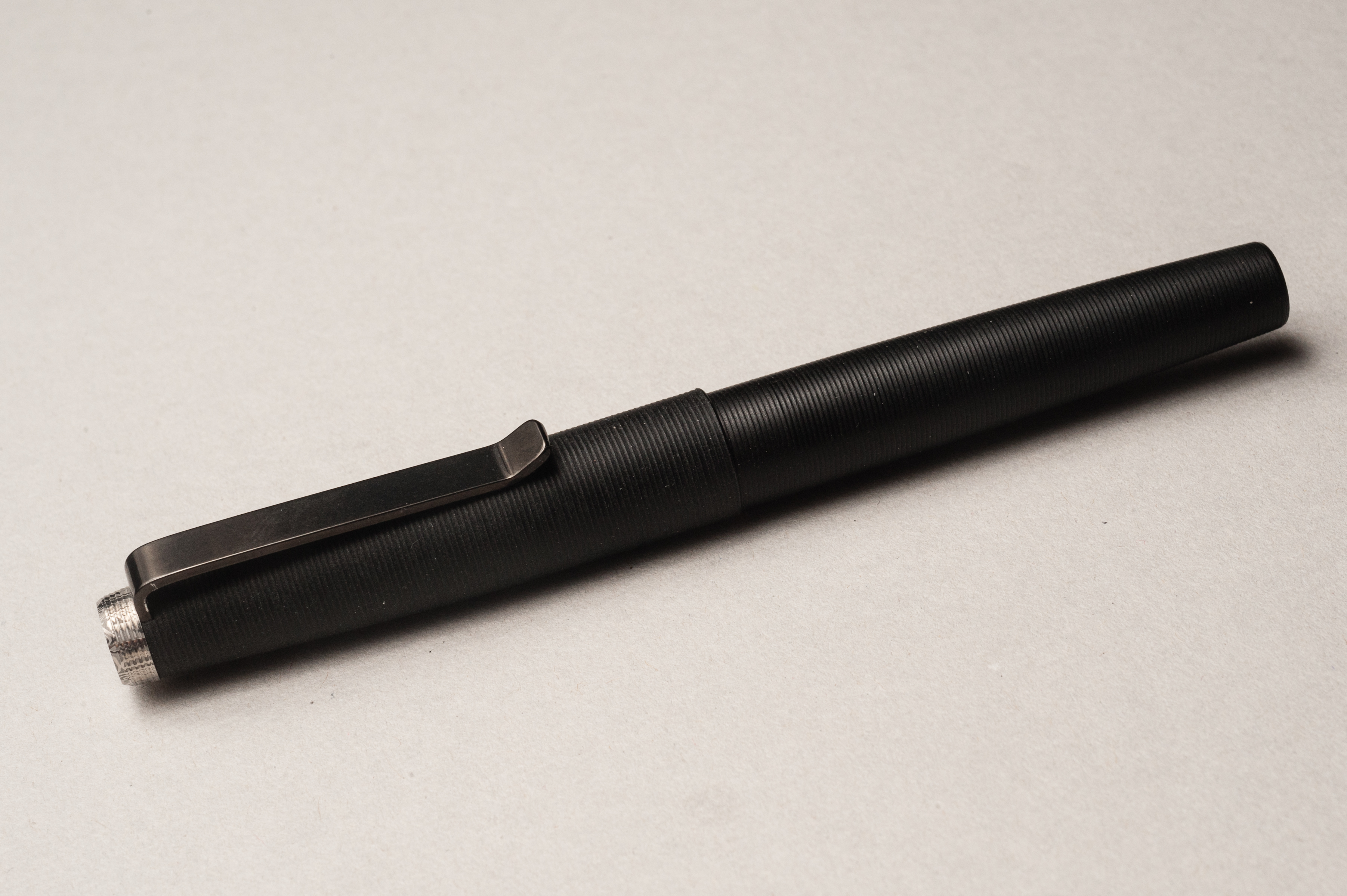
Hand Over That Pen, please!
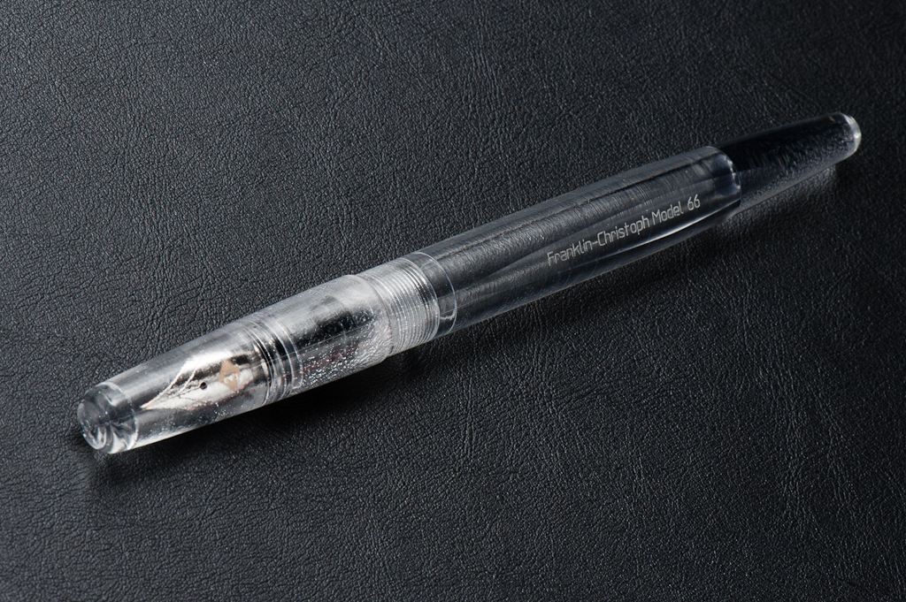
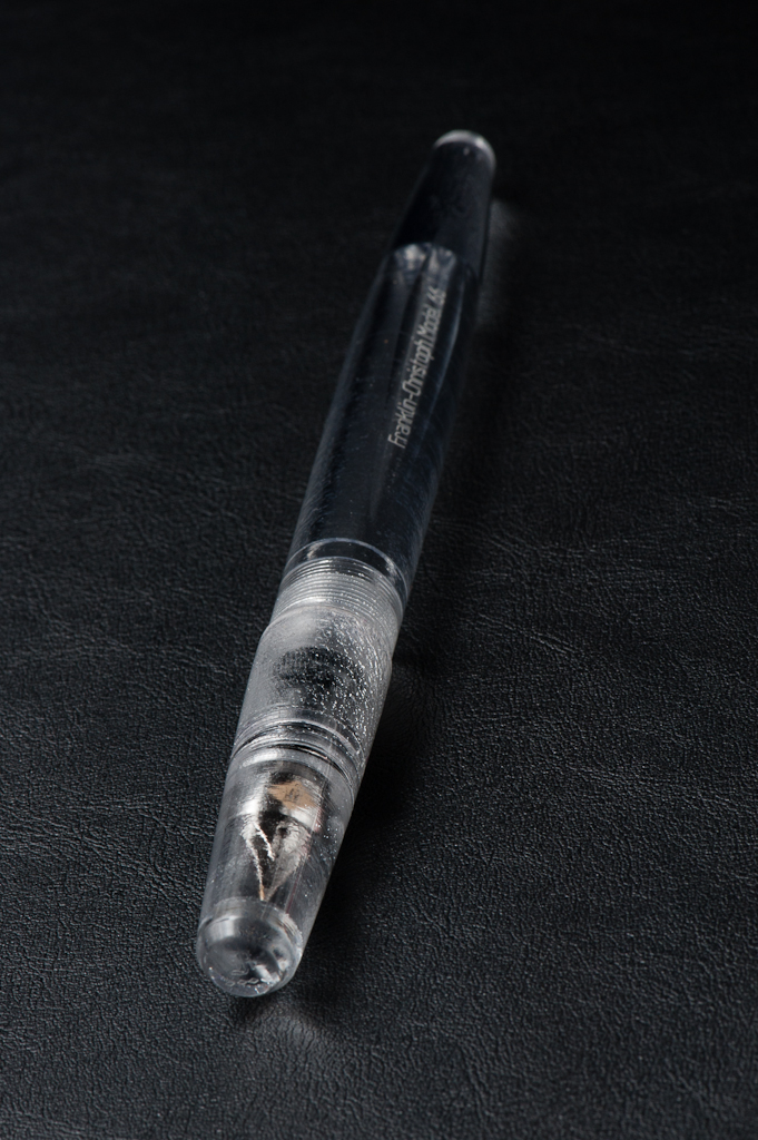
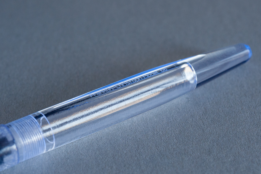
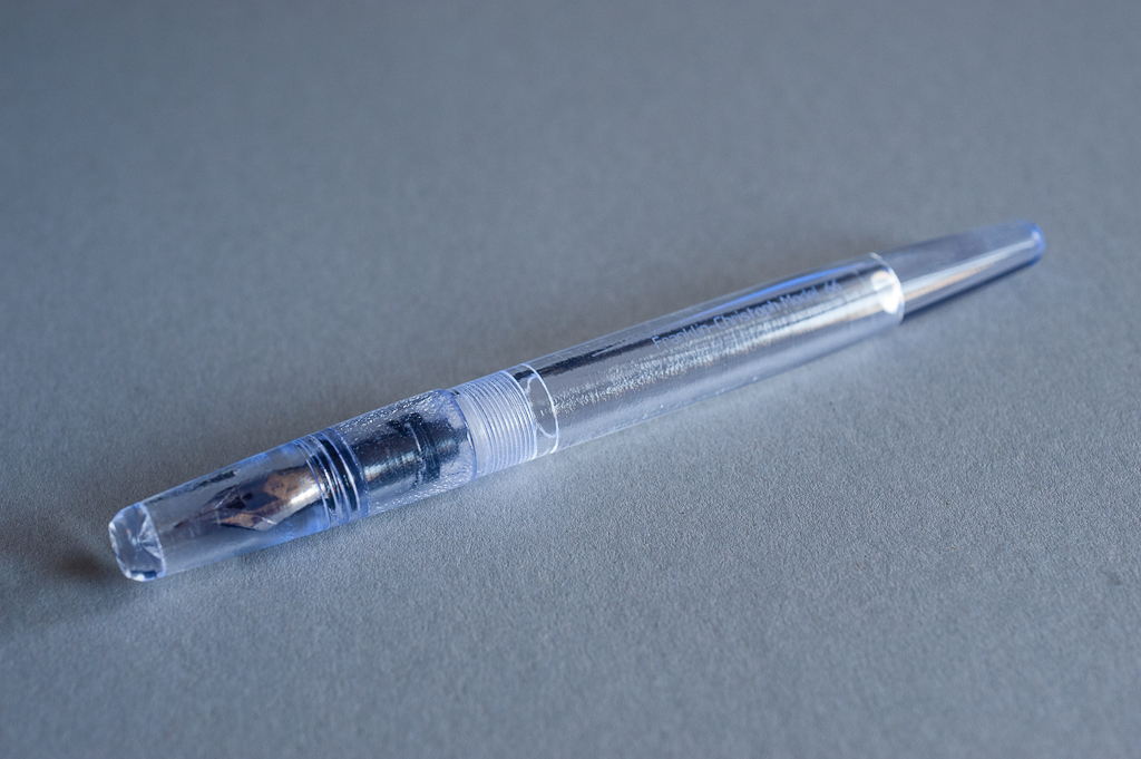
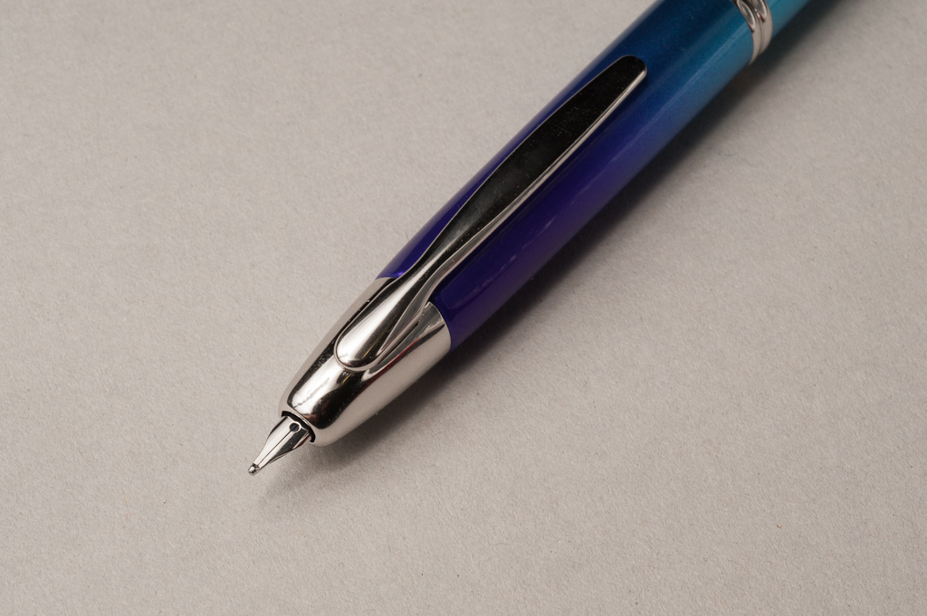
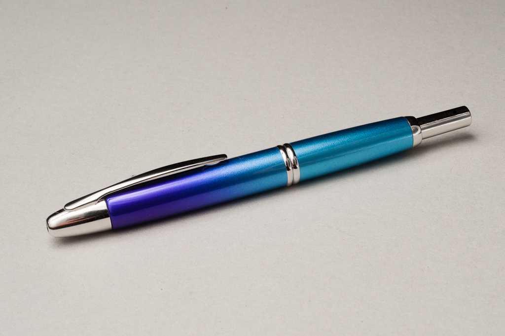
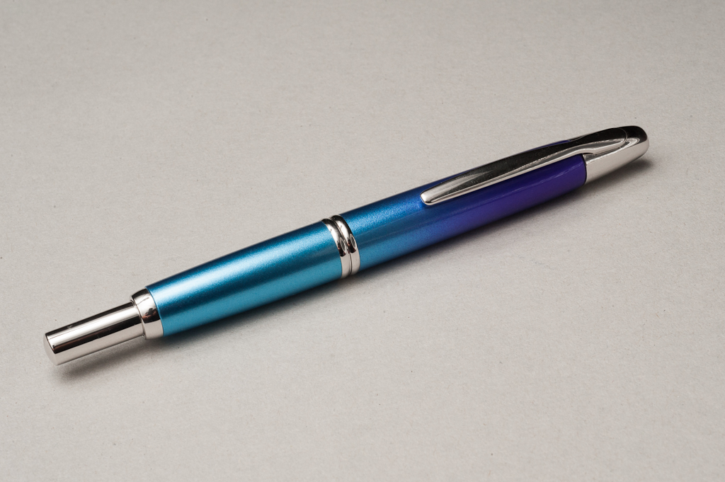
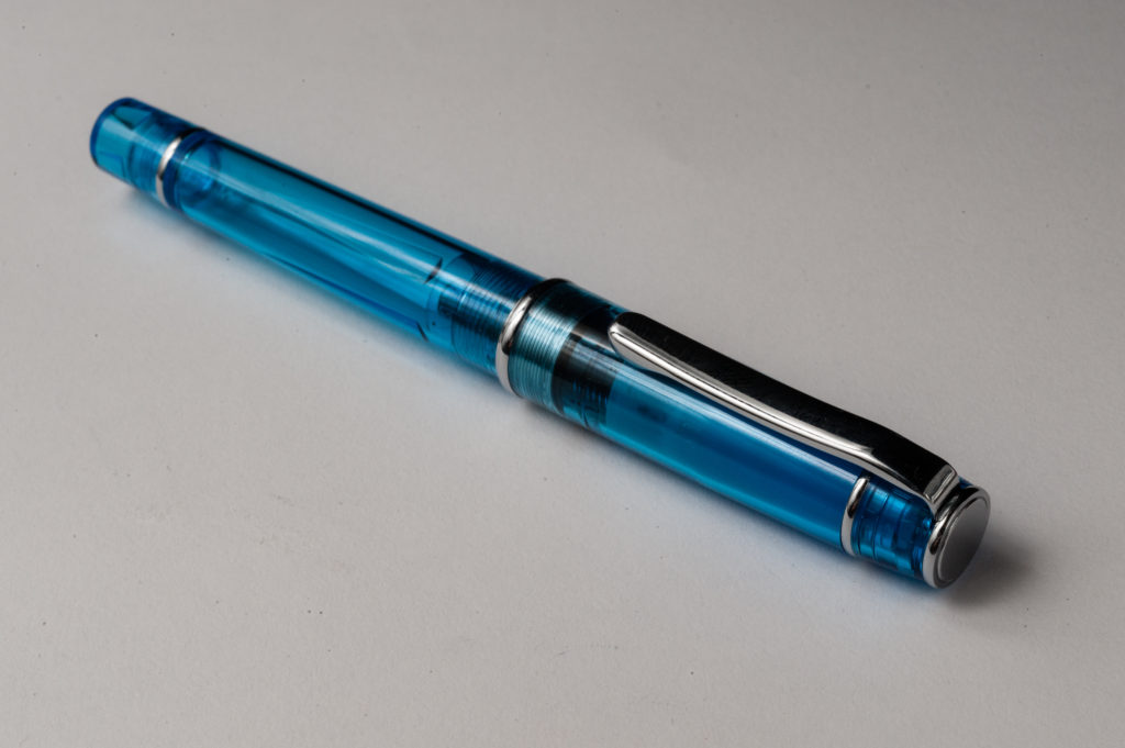
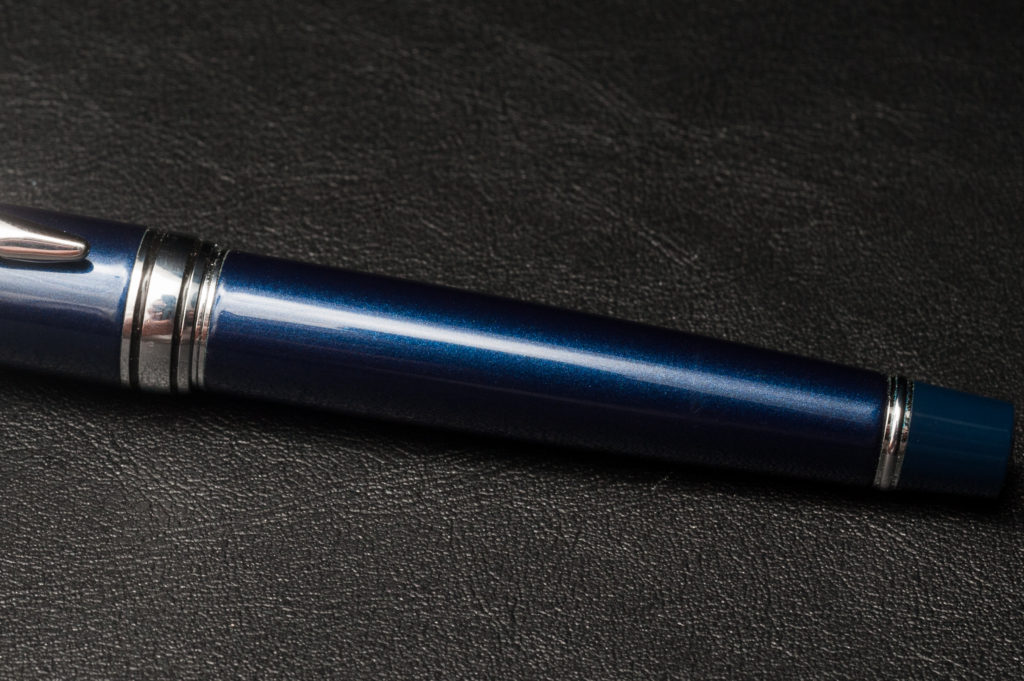
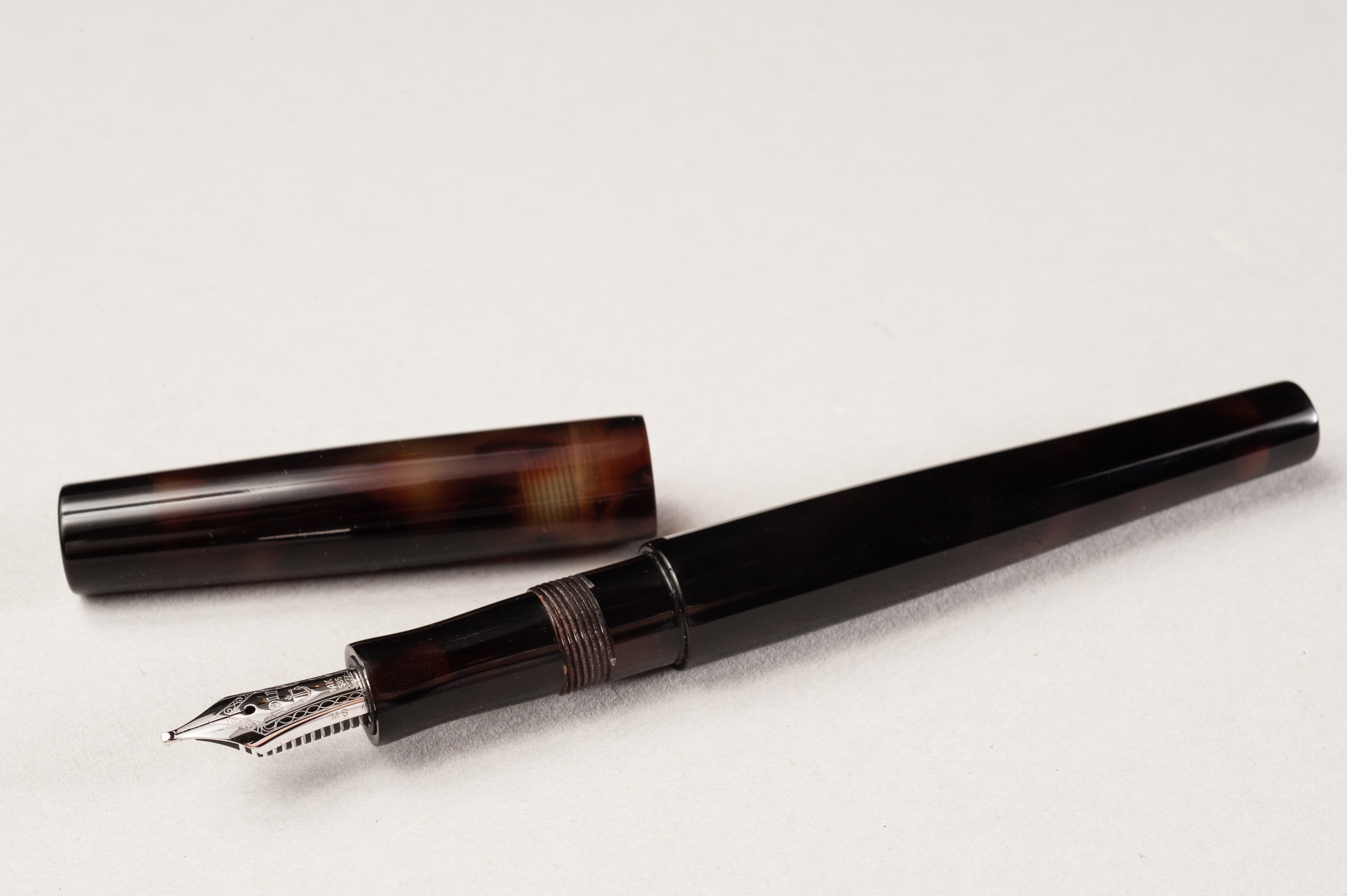
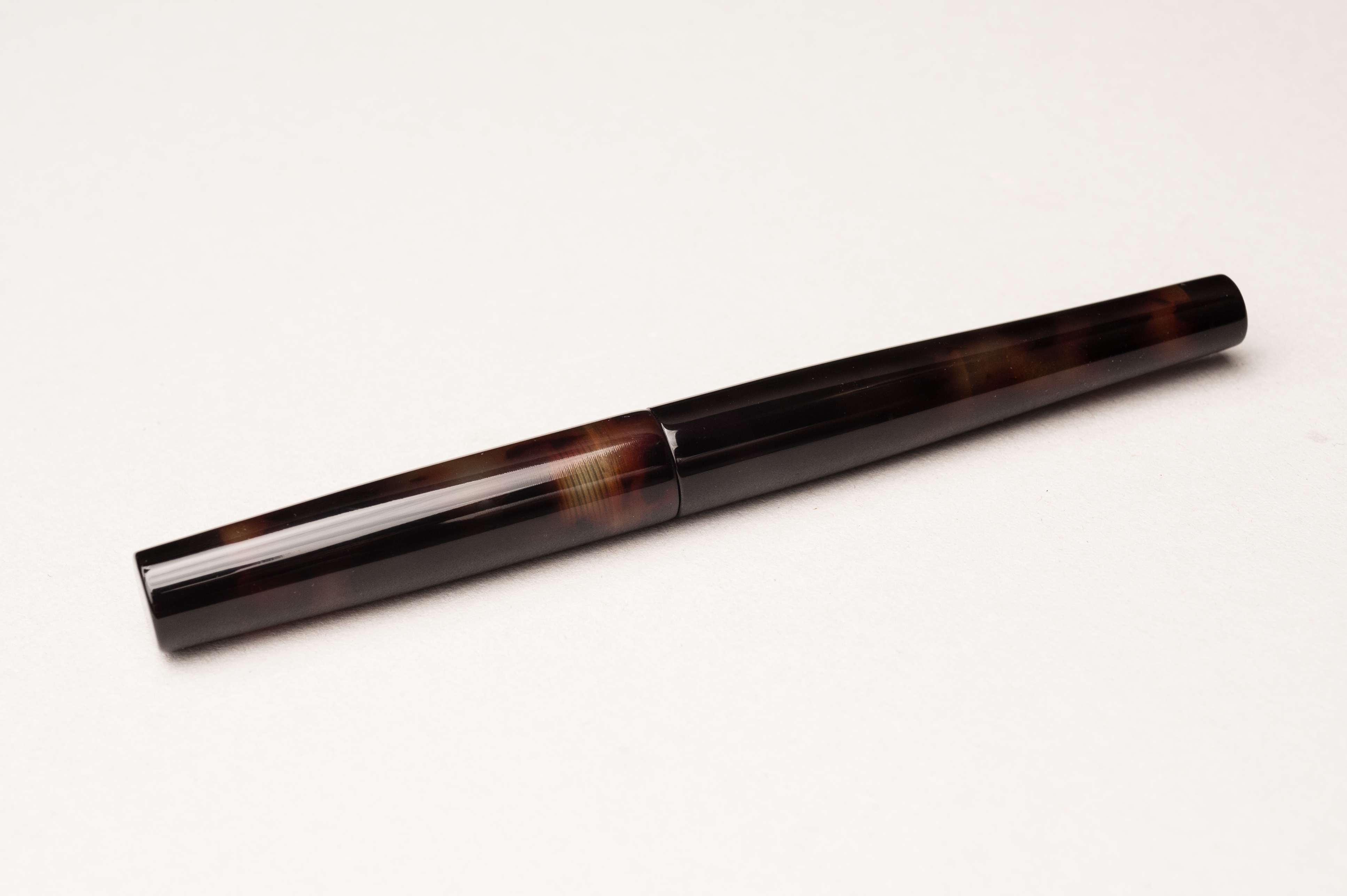
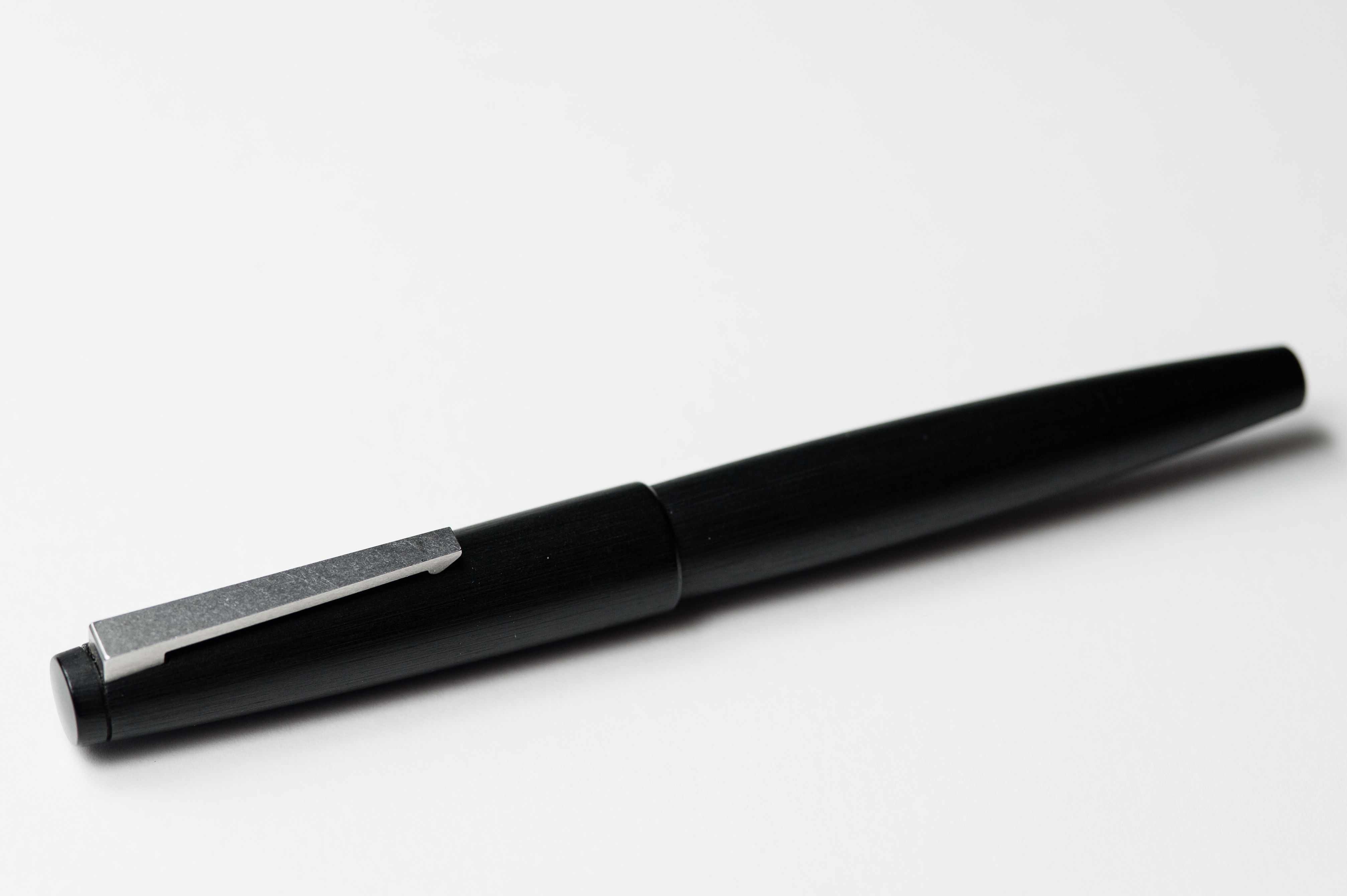
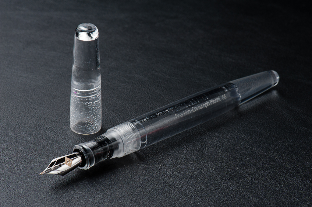
Katherine: This pen looks SO cool. Franz has the Italian Ice version (a special edition-ish material F-C makes some pens in) with a 14k gold Medium Masuyama CI. To me there are two elements to this pen — the Italian ice material and the shape. Realistically, both are pretty darned cool looking to me. I love the rounded shape of the 66 and the flat side means I don’t have to worry about it rolling away. I also love the Italian Ice material, the purple hues are subtle but give the material complexity. I think this is an unpopular opinion — but I like the Italian Ice more then I like the Antique Glass. Yep, I said it.
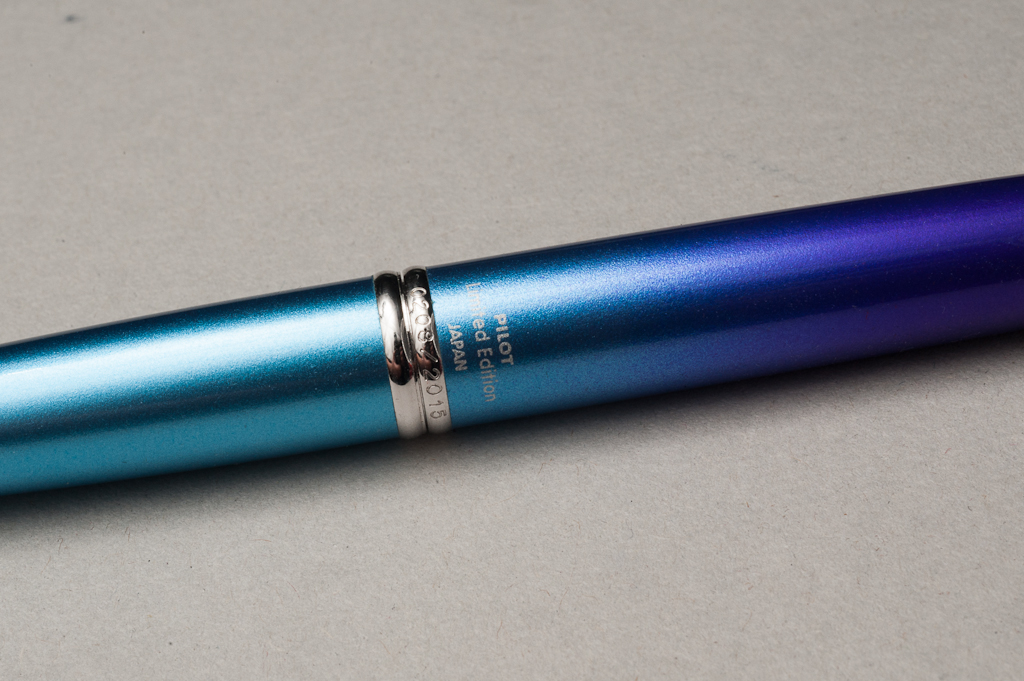
Pam: Franklin-Christoph knows how to tease! This material is pretty unique as its mysteries are revealed with some sunlight. The clear to purple tint is like a wonderful little insider secret to those fortunate enough to have seen the pen in the sun. The Original Ice, Italian Ice or Antique glass material greatly compliments the shape and aesthetics of the model 66. The Original and Italian Ice reminds me of a frosty glass and icicles for the upcoming winter season, respectively. The Antique Glass reminds me of the glass apothecary/pharmacy bottles of yore, filled with ingredients and medicines. All three materials would really show off the beauty of sloshing ink if filled as an eye dropper. The Model 66 is almost seamless when capped and post-able when it’s not, aka, practically perfect! The flat surface lends unique design and provides the added bonus of an un-rolling feature. I really appreciate the subtlety that F-C employs in branding their pens. The etching is light and unobtrusive to the eye or touch, but in the right angle, easily found. Honestly, with materials and design like this pen, F-C doesn’t need much overt advertisement.
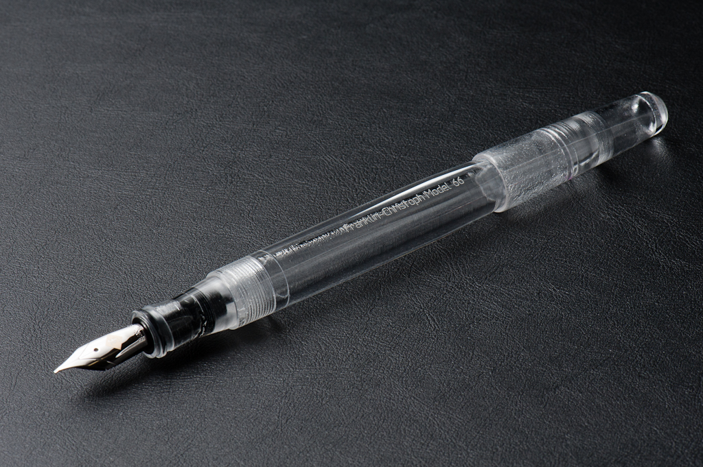
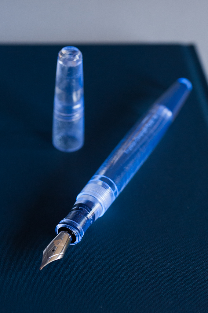
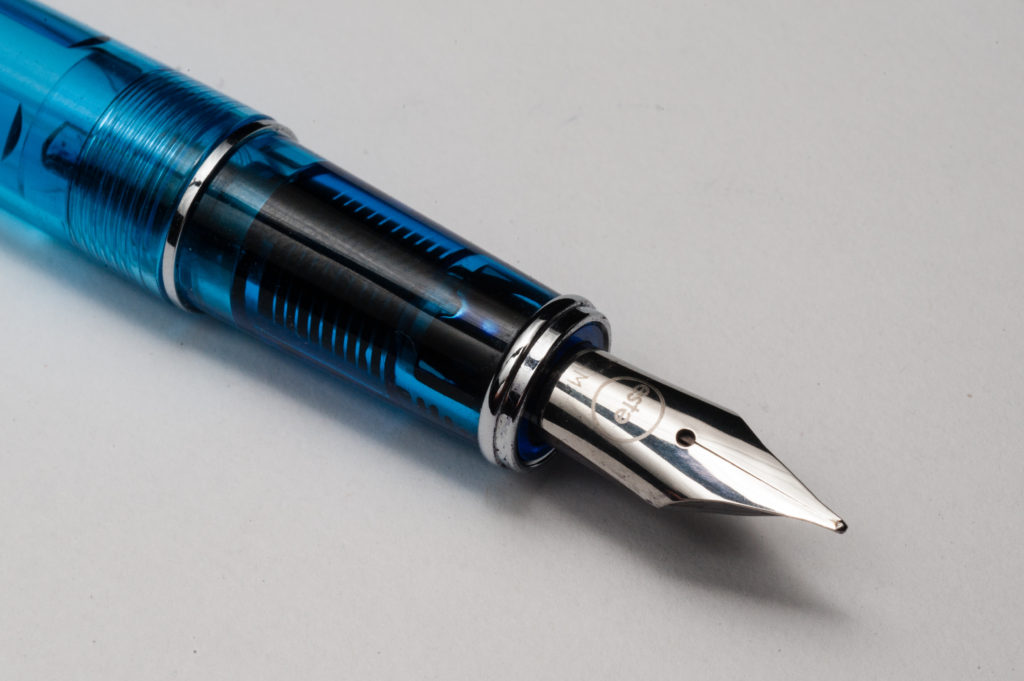
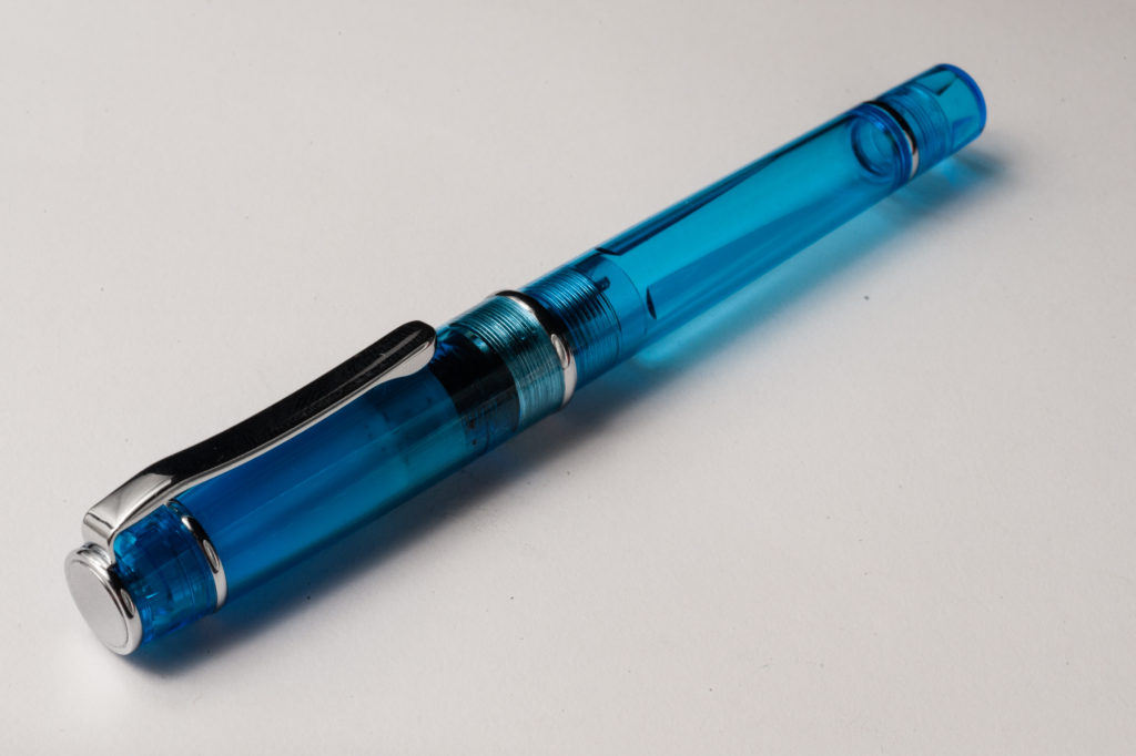
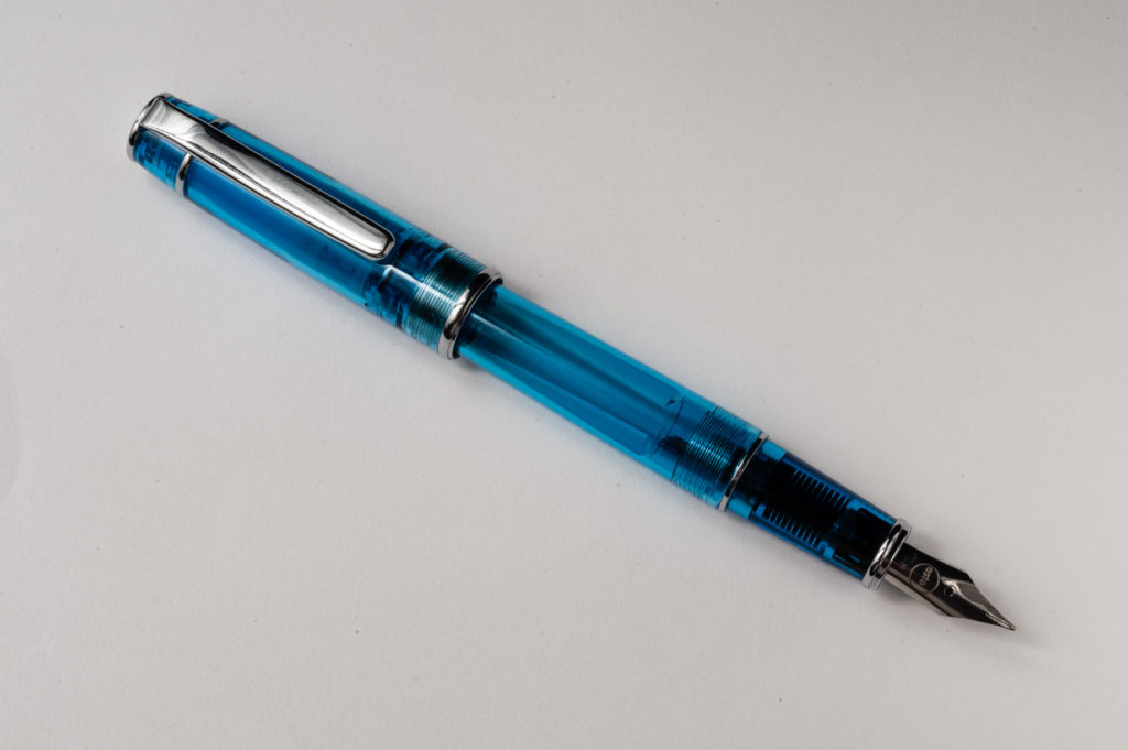
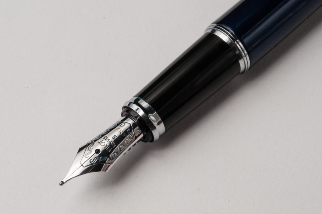
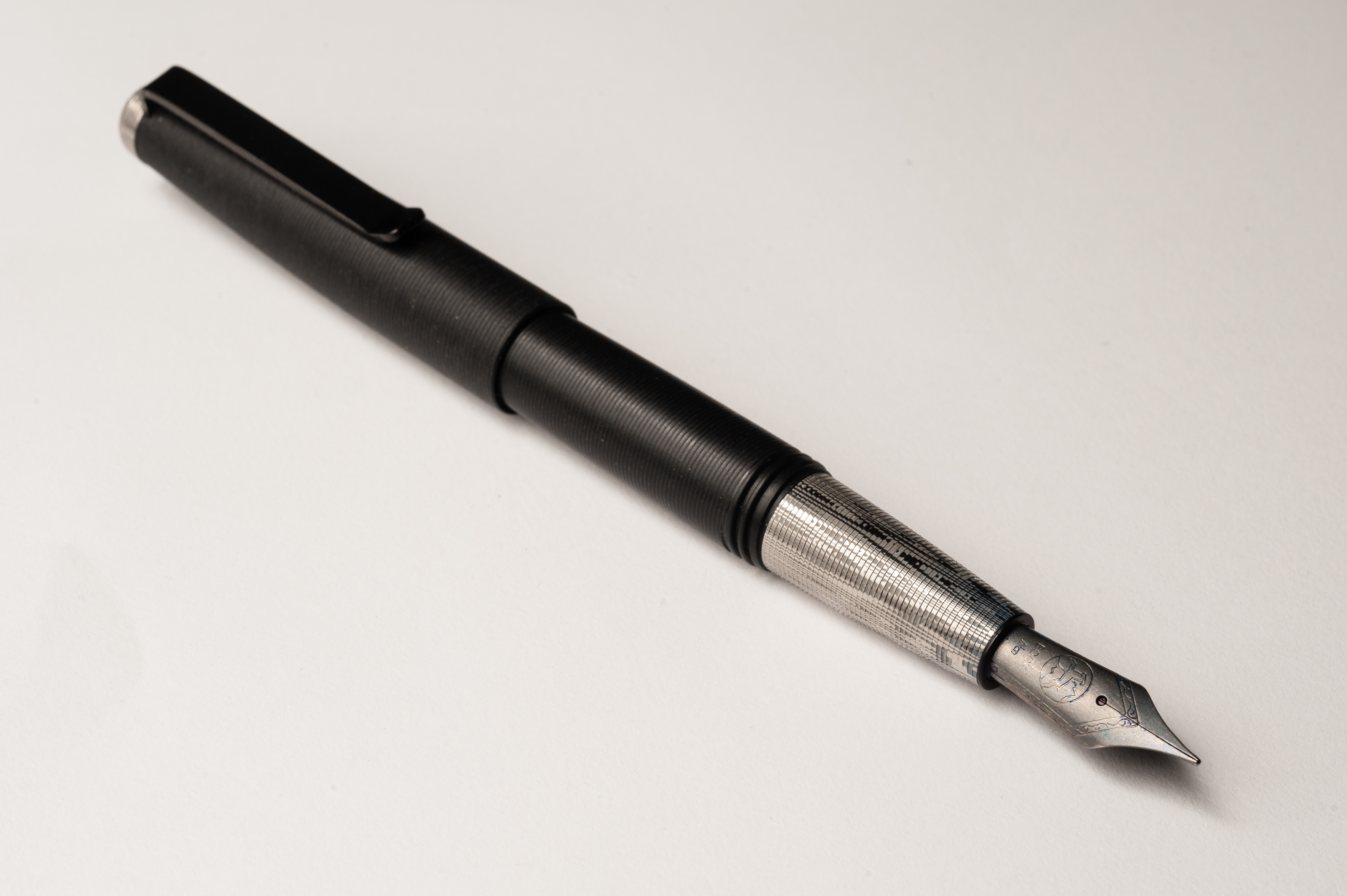
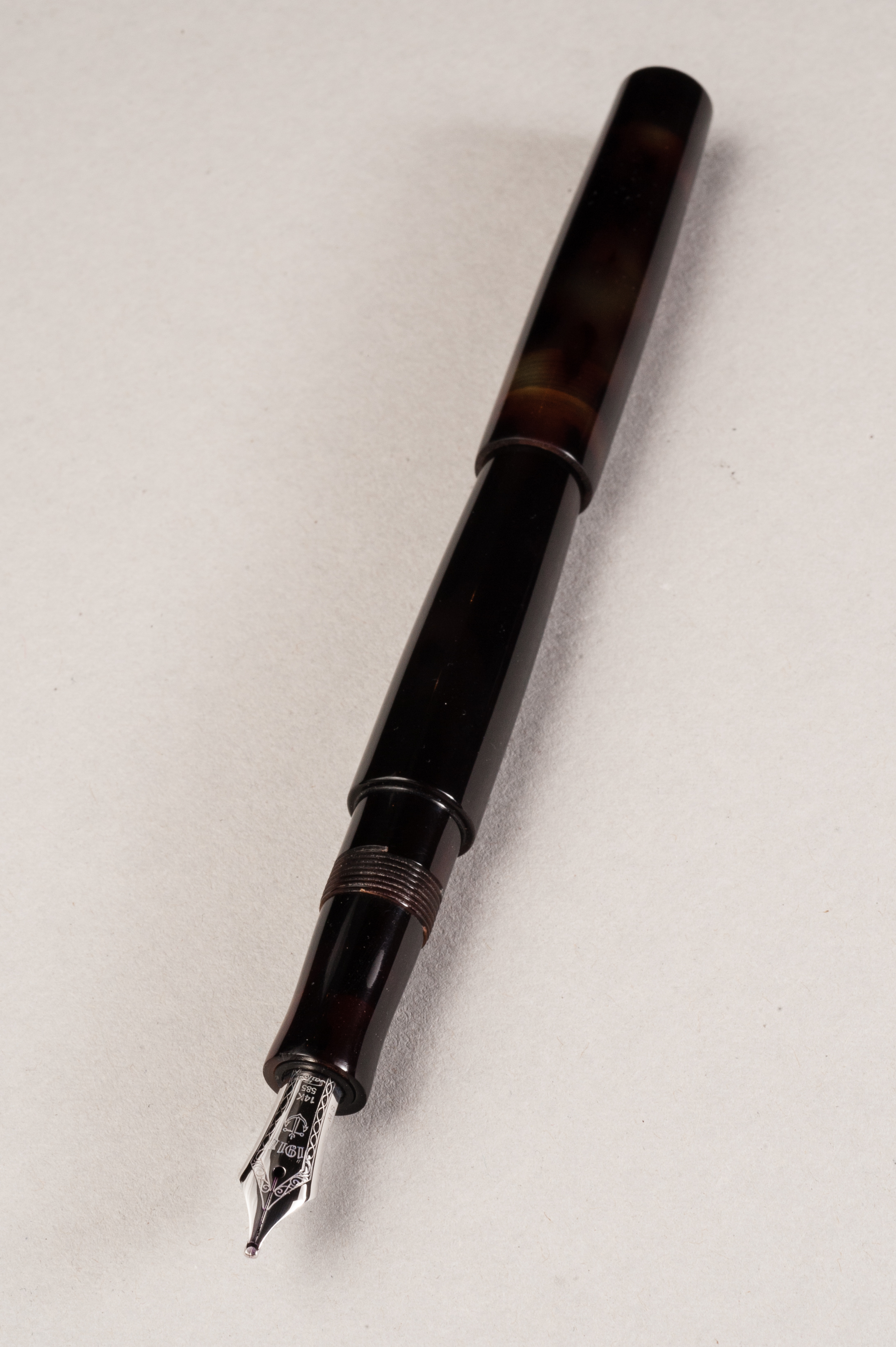
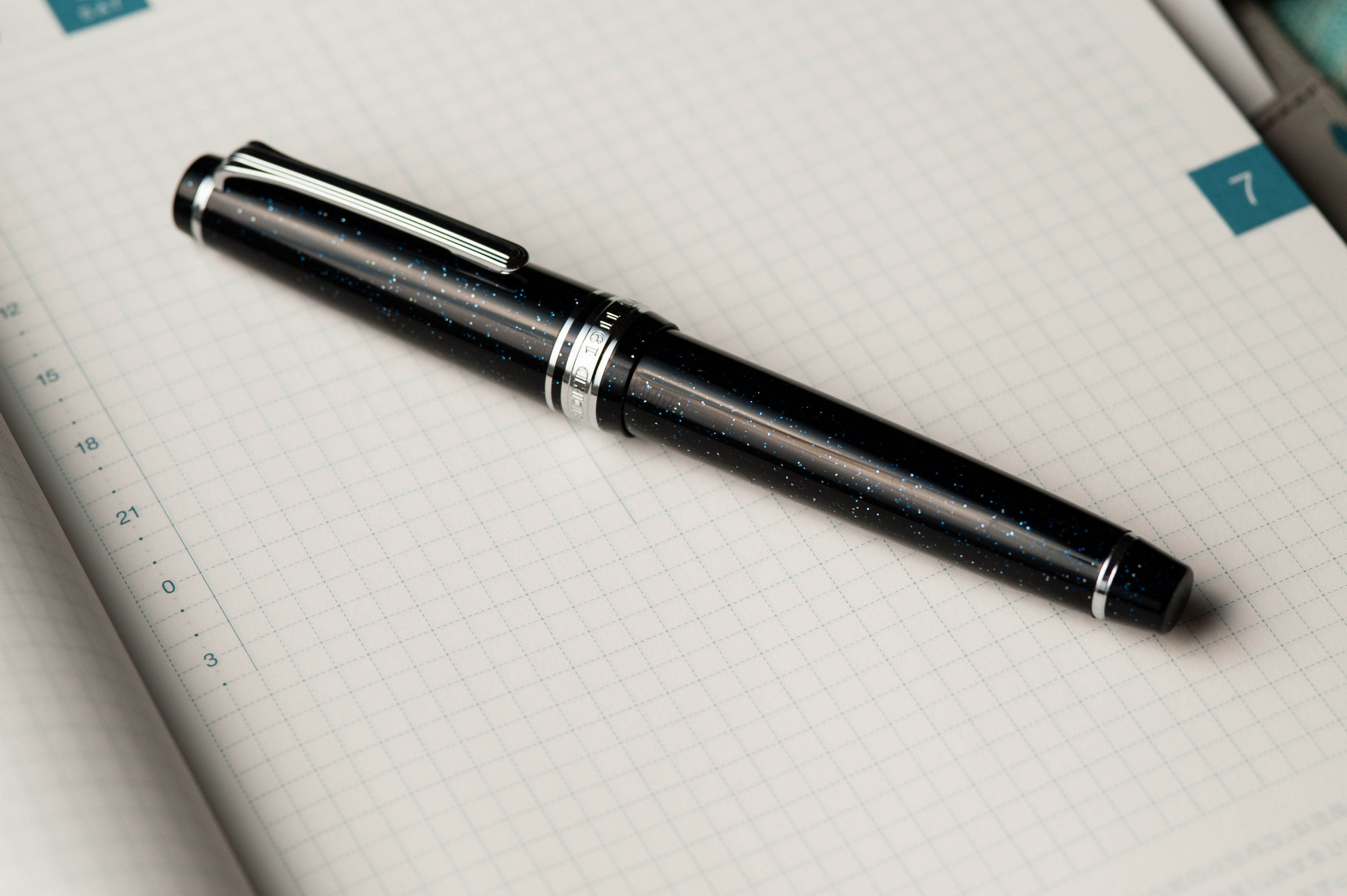
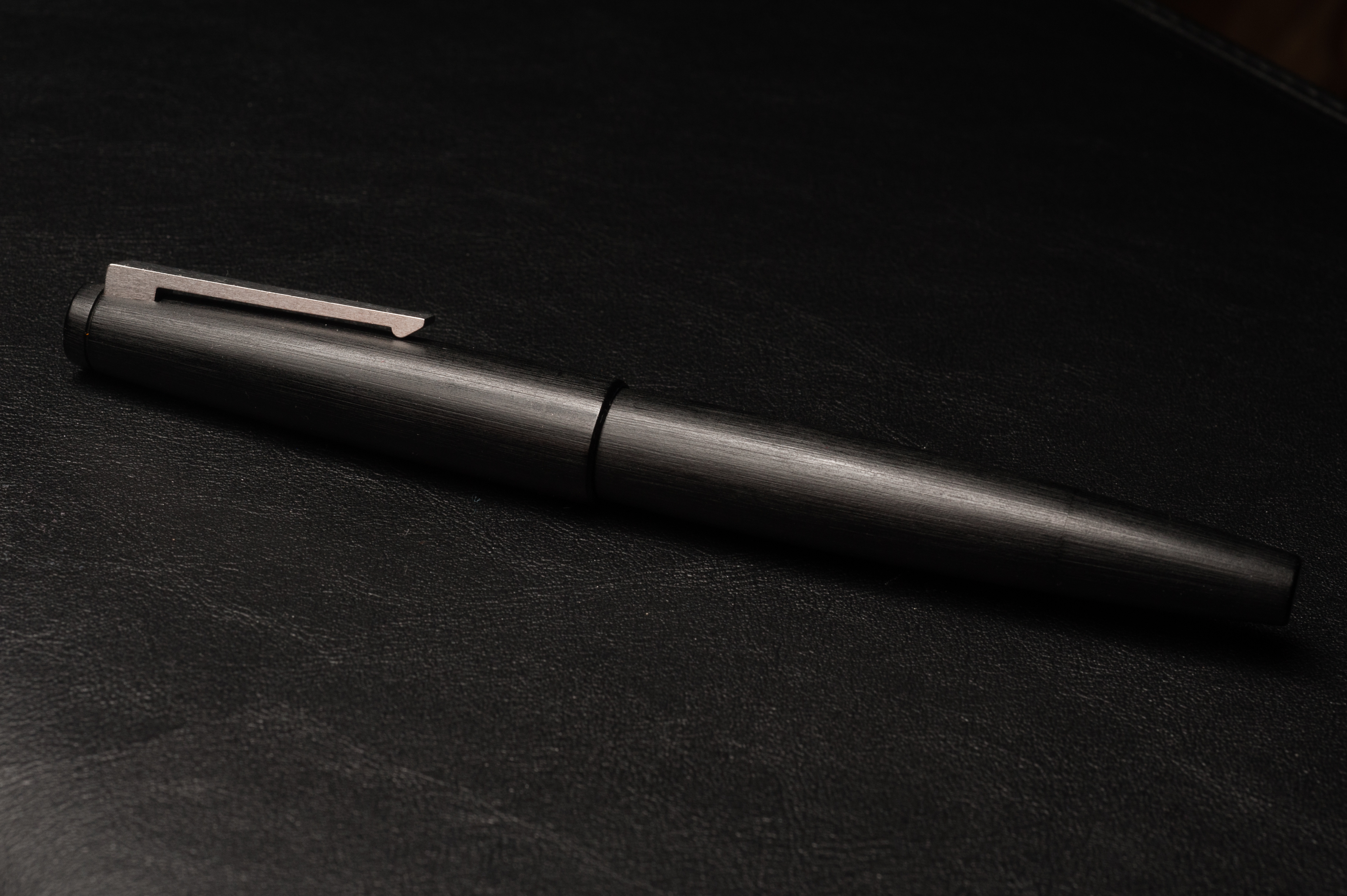
Franz: The Franklin-Christoph Model 66 Stabilis has been a pen that I’ve always been intrigued with ever since I held them at pen shows. They use the Model 66 to allow their customers to test their available multiple nib choices. I got this Italian Ice Model 66 at the 2016 LA Pen Show and it fills my large hands very well. Under even indoor lighting, the pen really just looks like a clear material (as pictured above). But if the pen is under diffused semi-directional daylight, it has a very interesting purple tint to it. It is quite difficult to photograph the correct color of the tint and unfortunately my photos below are more blueish than what you see in person.
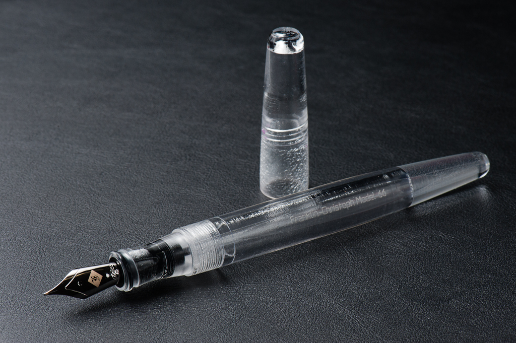
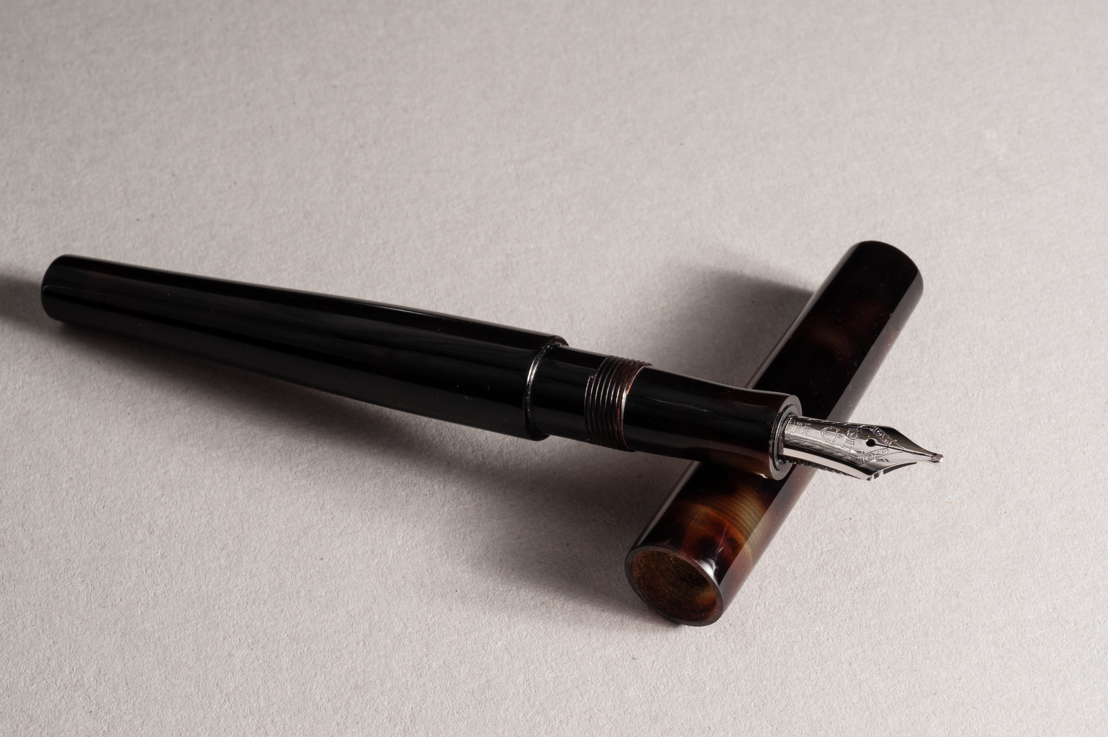
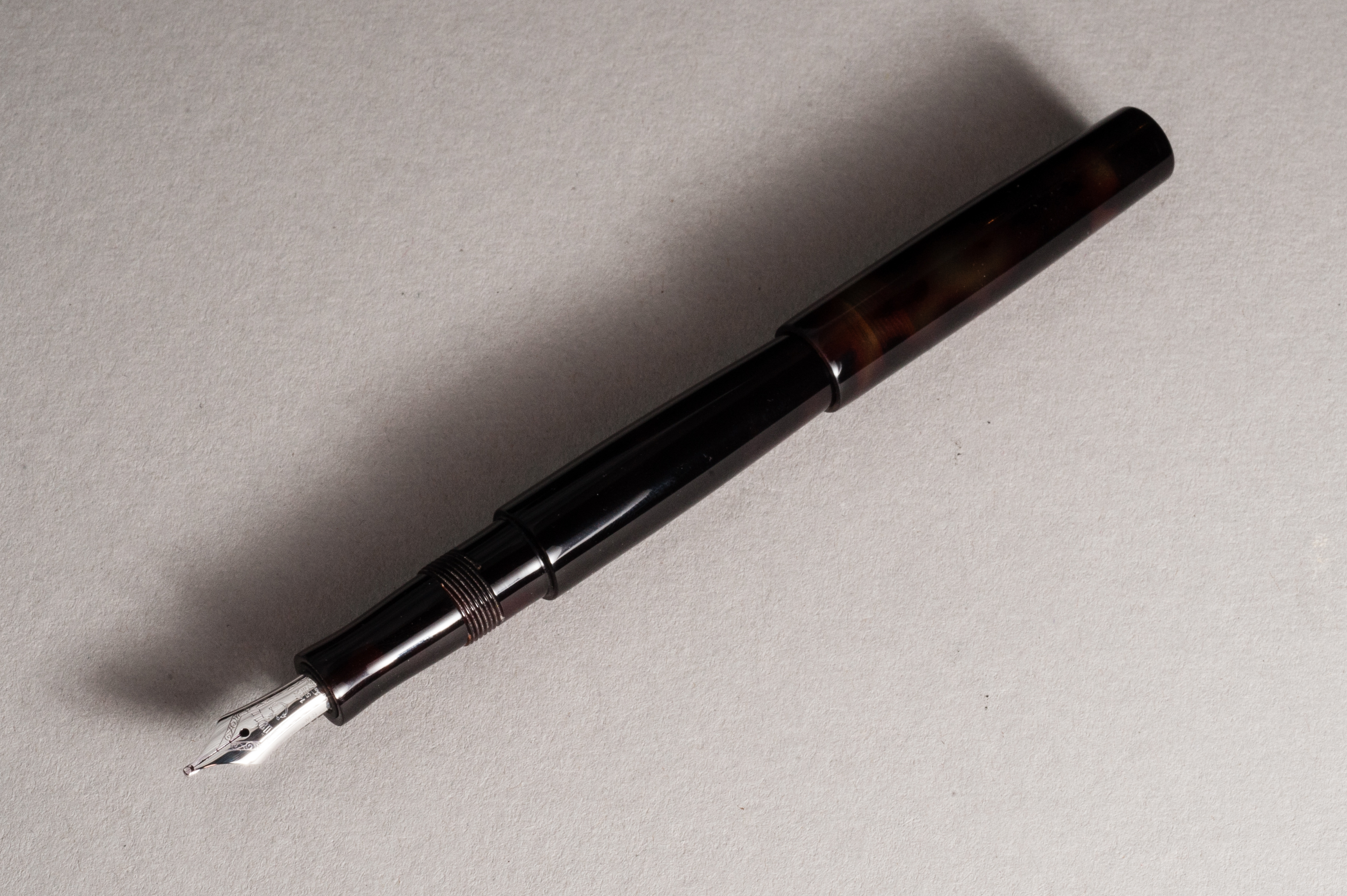
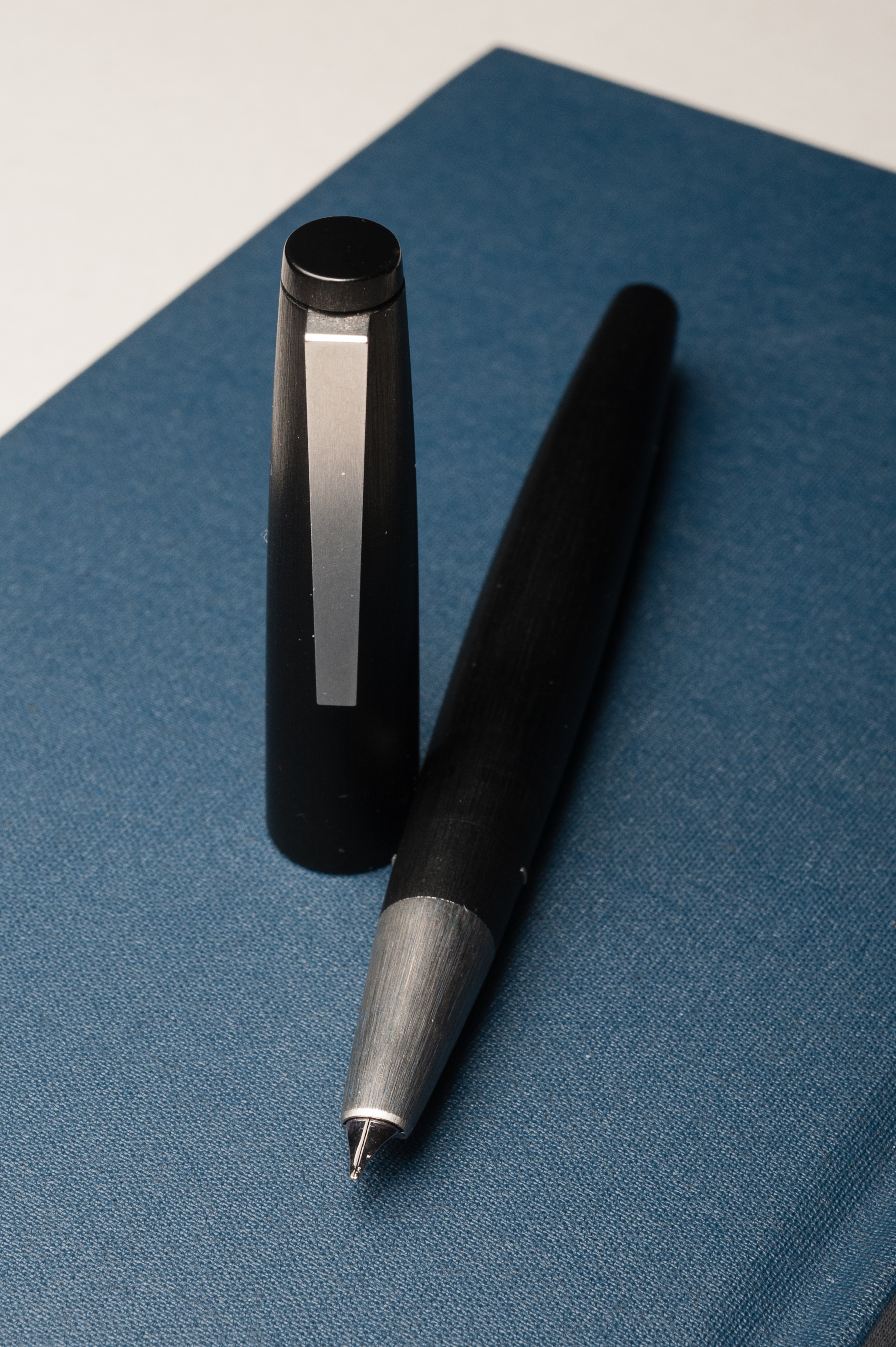
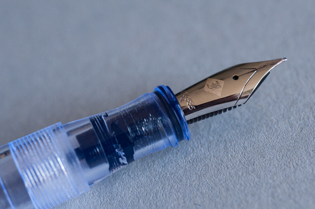
The F-C Model 66 may be inked up using a standard international ink cartridge, or converter. But if you detach the converter, it can also be used as an eyedropper filled pen. Just make sure to use a little bit of 100% silicone grease on the section-barrel threads, and the threads of the nib unit to prevent any leakage.
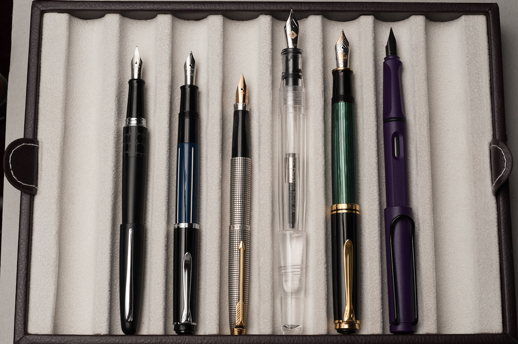
The Business End
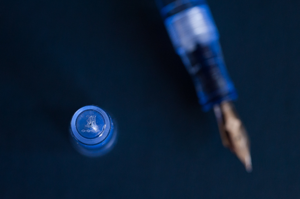
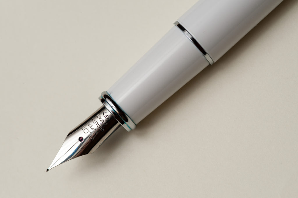
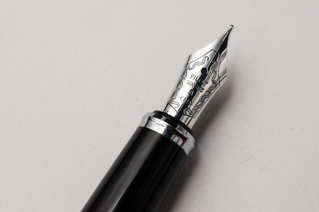
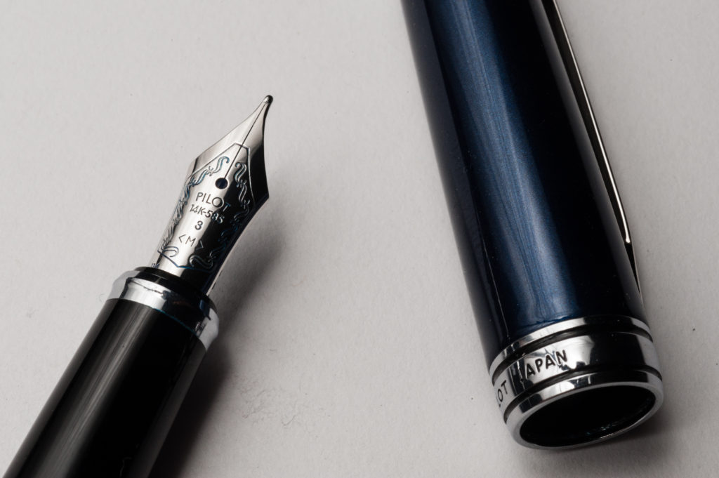
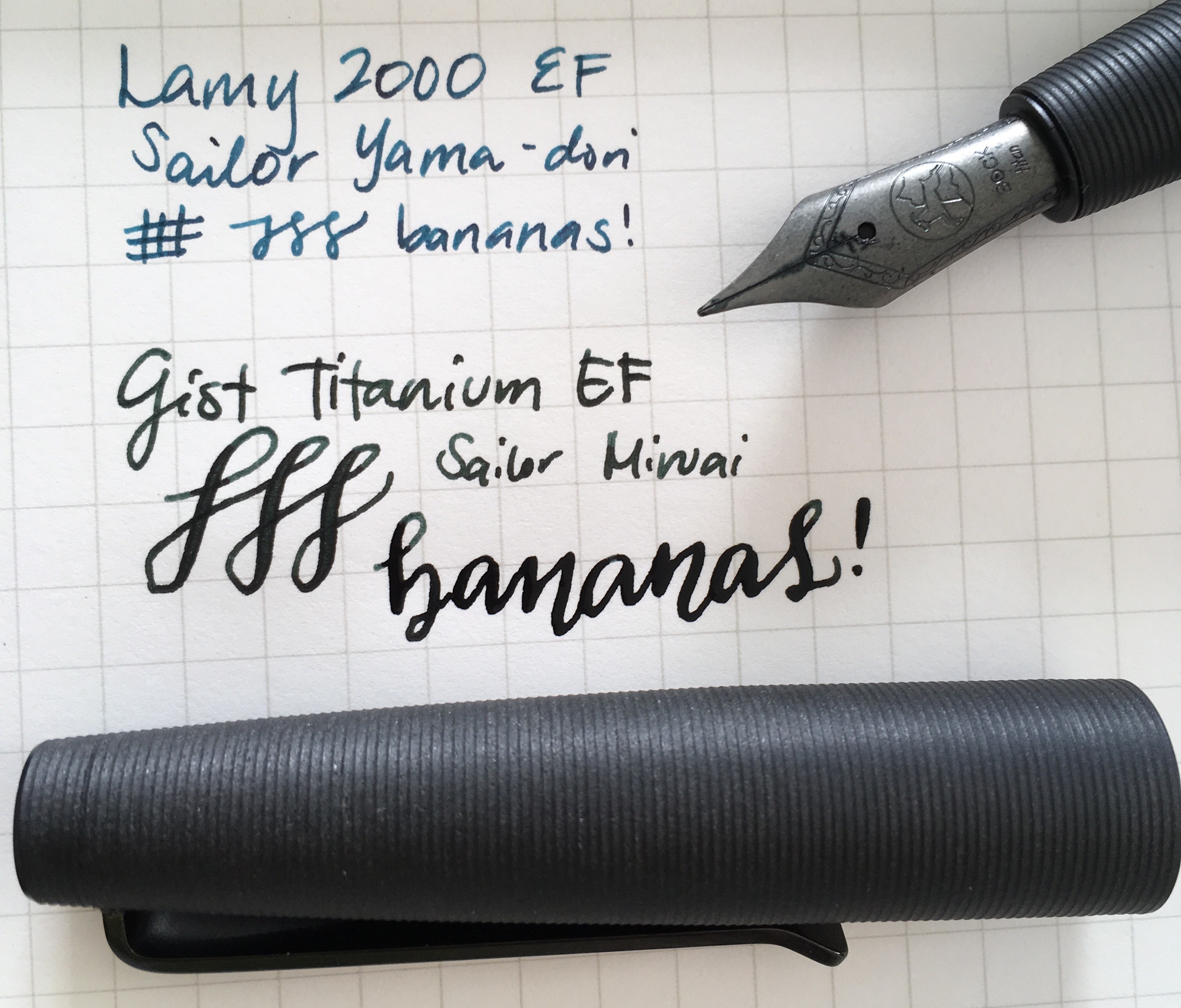
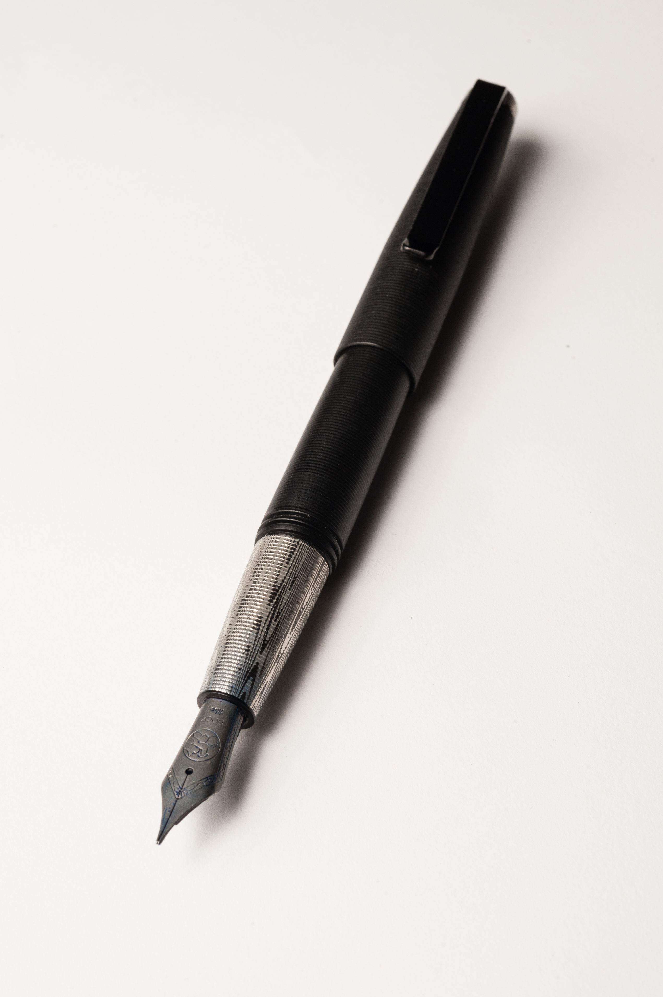
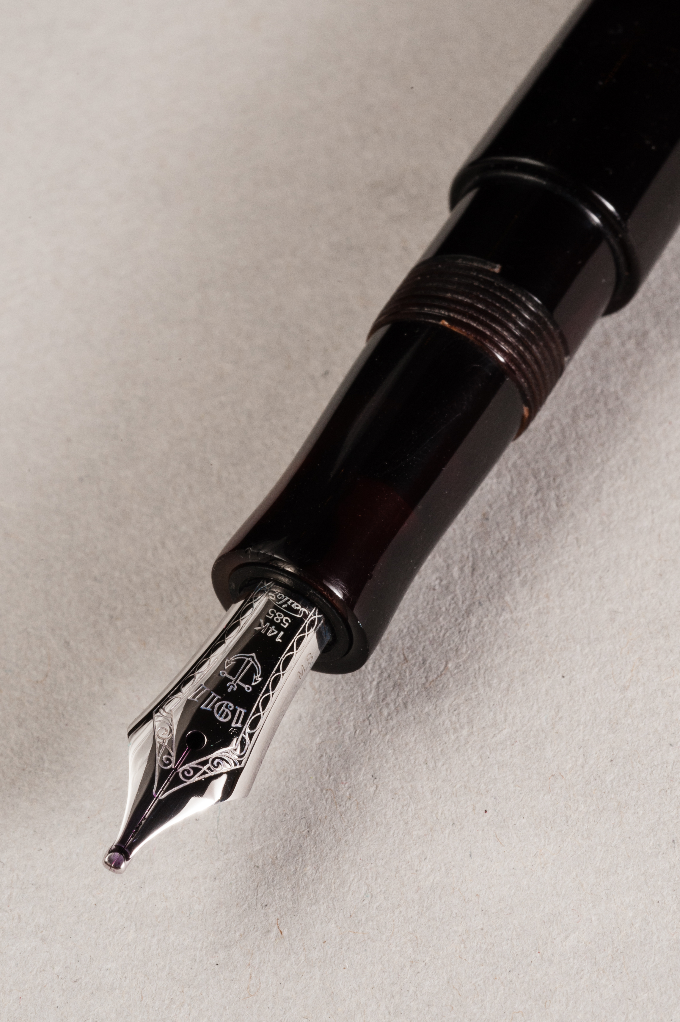
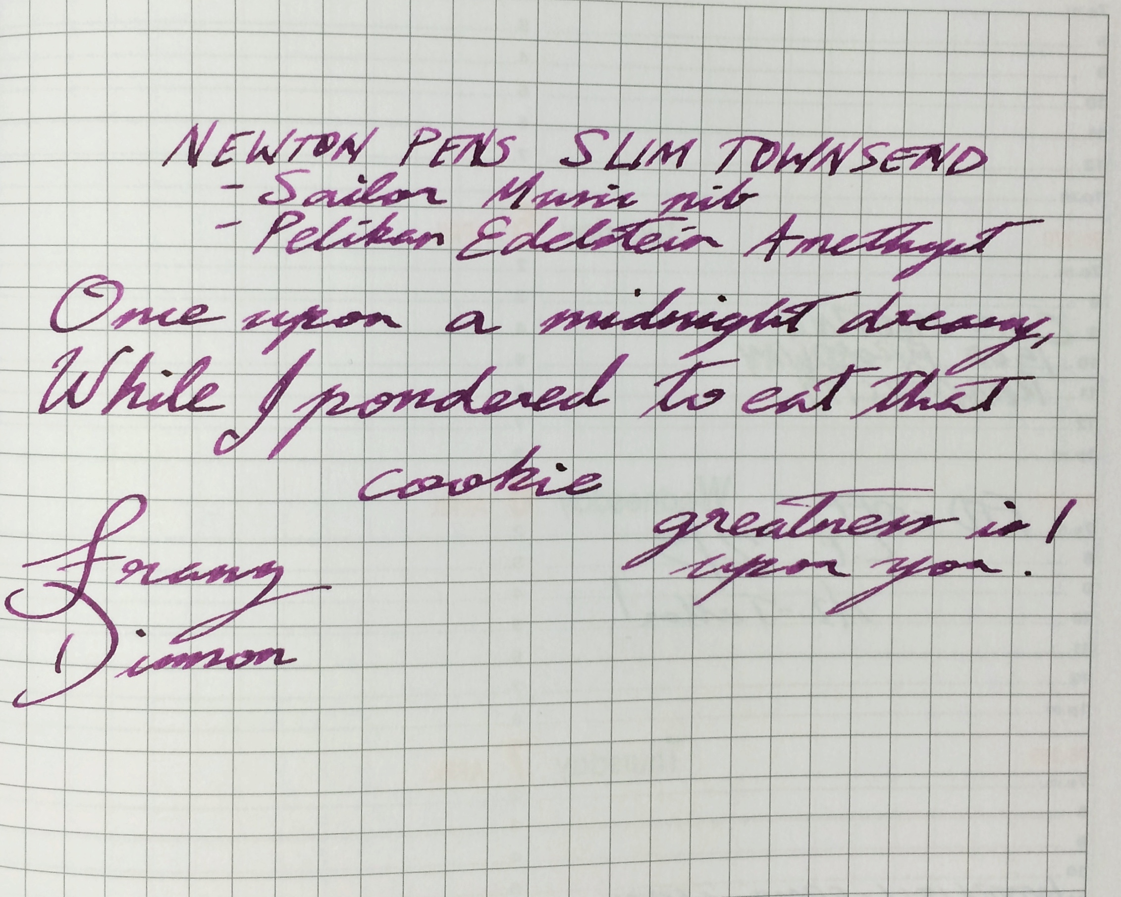
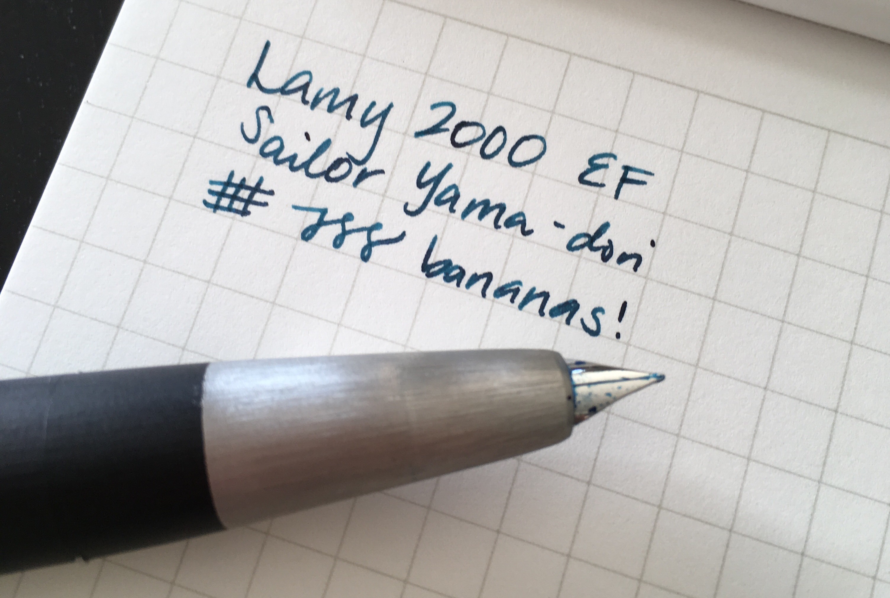
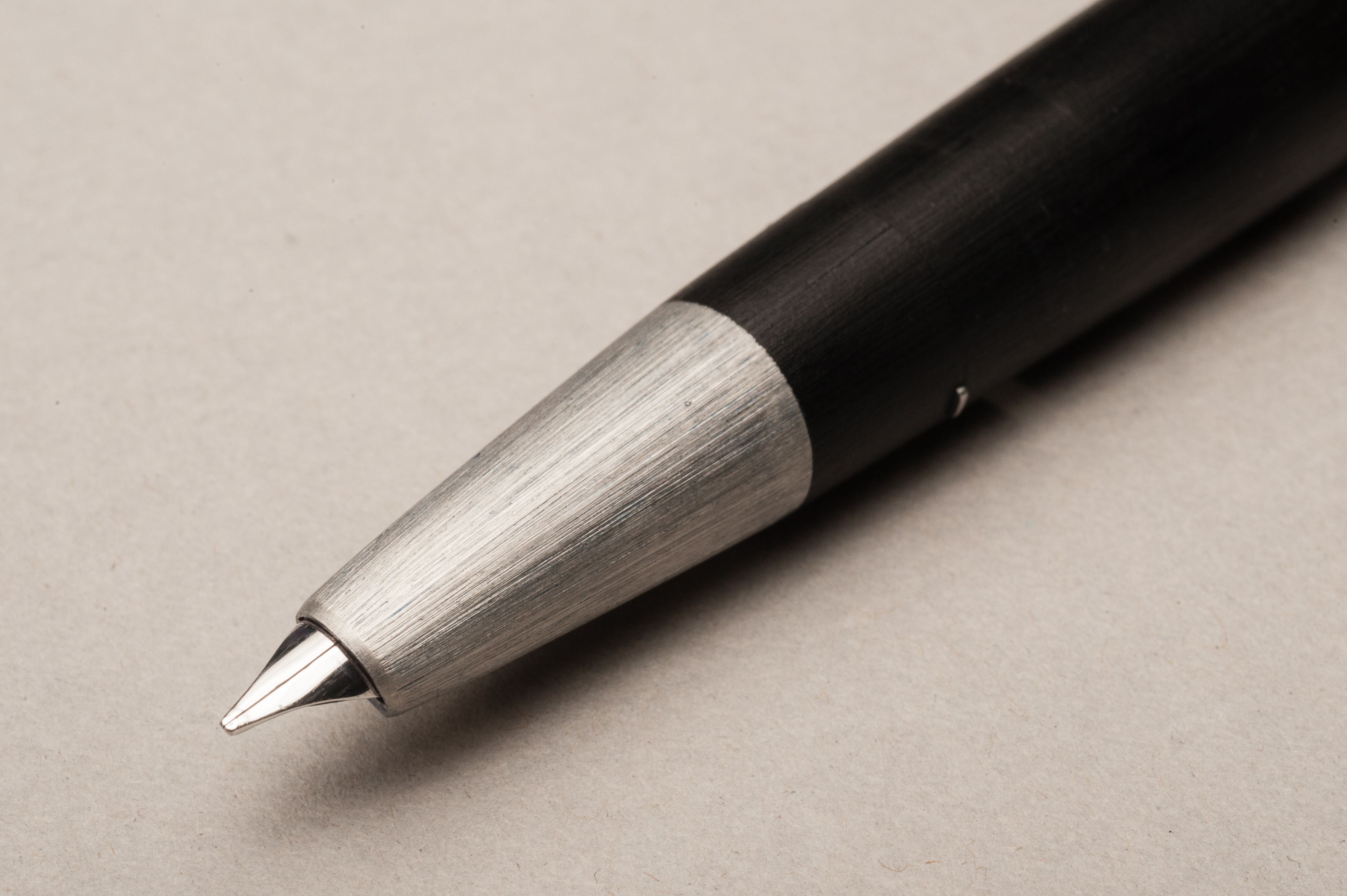
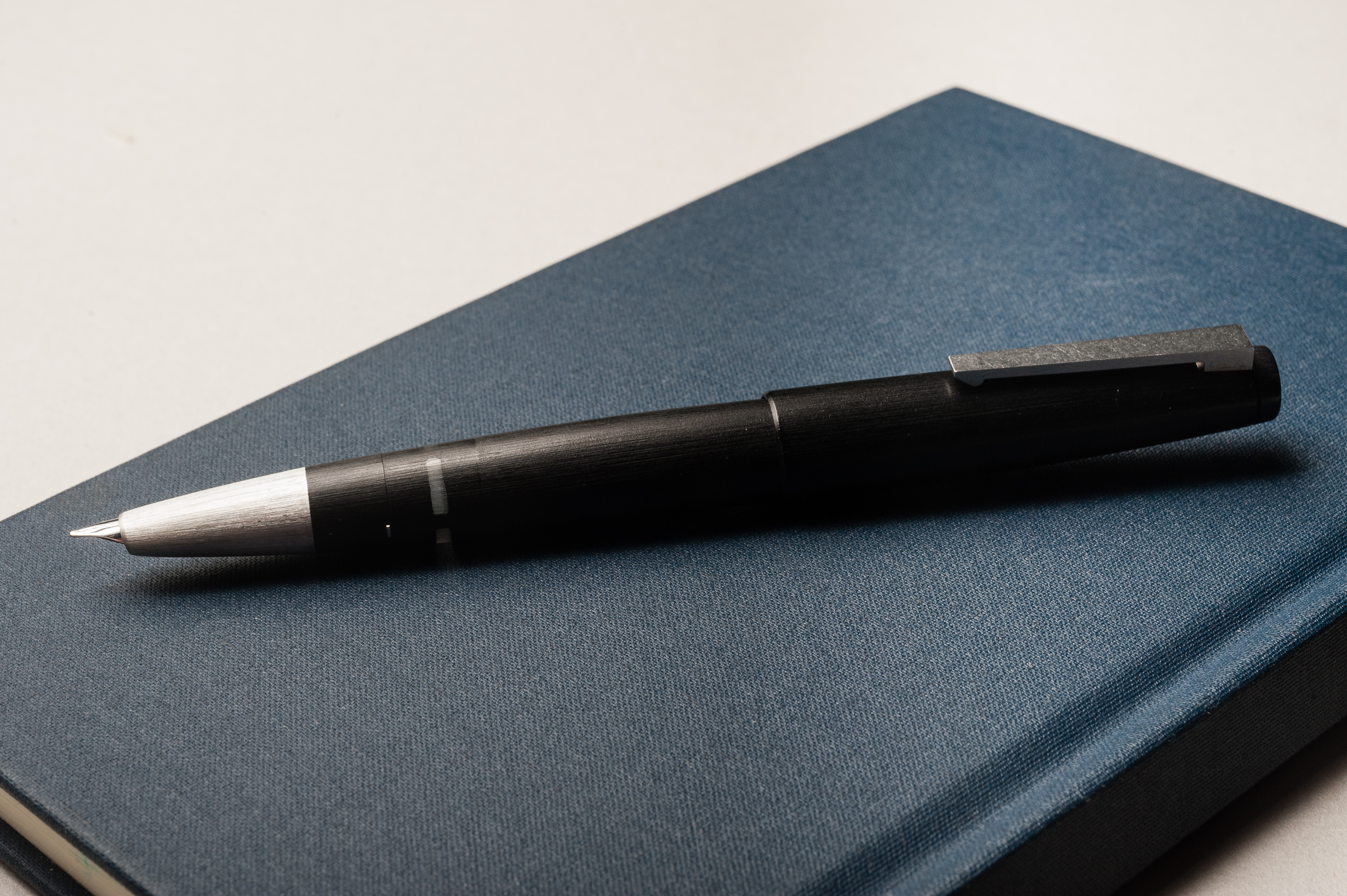
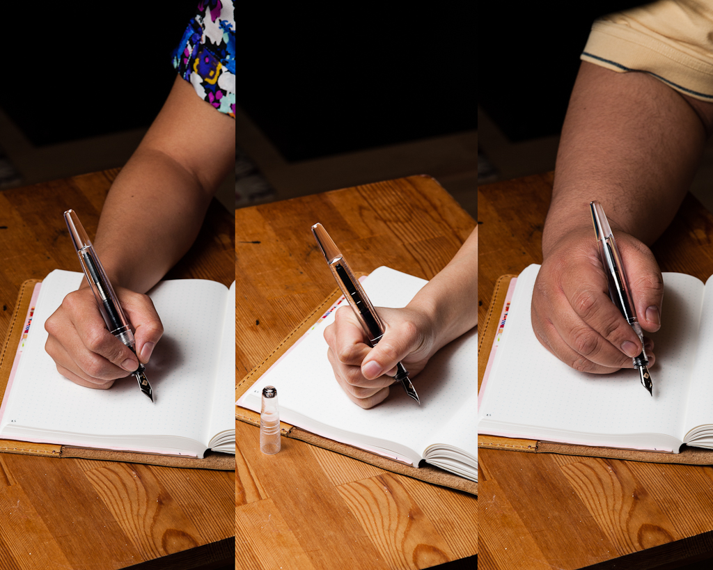
Katherine: The Model 66 takes #6 nibs — so it’s interchangeable with many nibs from F-C. This particular nib was a surprisingly fine, but still crisp medium CI by Mike Masuyama. It’s smooth, has a little bit of spring and was overall a delight to use. I think this particular nib is finer than most Medium CIs, since I have a hard time writing with most MCIs, but had no problems with this one. The only thing worth noting is that while I do enjoy the slight spring of the 14k nib more than the steel, it’s not worth the price difference to me. All my F-Cs have and have had (a couple have been rehomed) steel nibs.
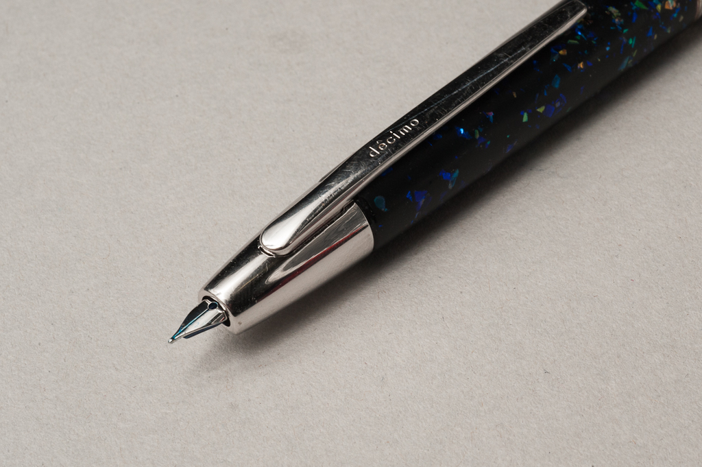
Pam: The medium cursive italic nib was wonderfully crisp and provided a well defined, crisp line. It’s a joy to write with and really shines with the Franklin-Christoph Tenebris Purpuratum, a dark and well saturated black/purple ink. This is one of the most pleasant CI nibs I have written with. This is just a great lesson that you should have your nib tuned by Jim Rouse whenever you have the chance.
Franz: I asked Jim of Franklin-Christoph for a 14k medium cursive italic nib because their 14k is a little bit springier than the 18k. As Katherine mentioned, this medium CI is finer than the usual ones they have. Because I have a very light touch, I enjoyed the line width and variation this nib laid down. As long as I have it aligned to the sweet spot, it’s a smooth writer.
Write It Up
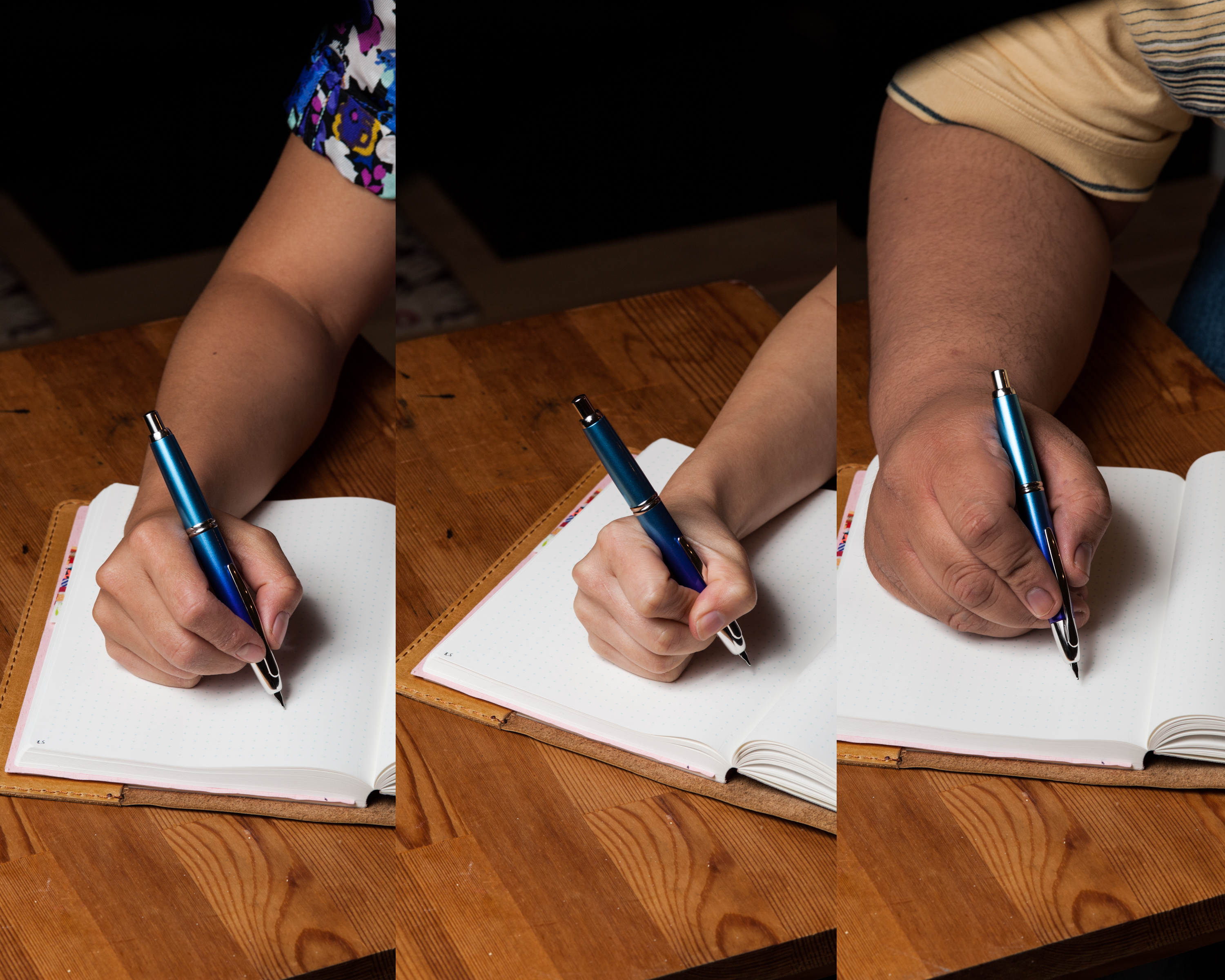
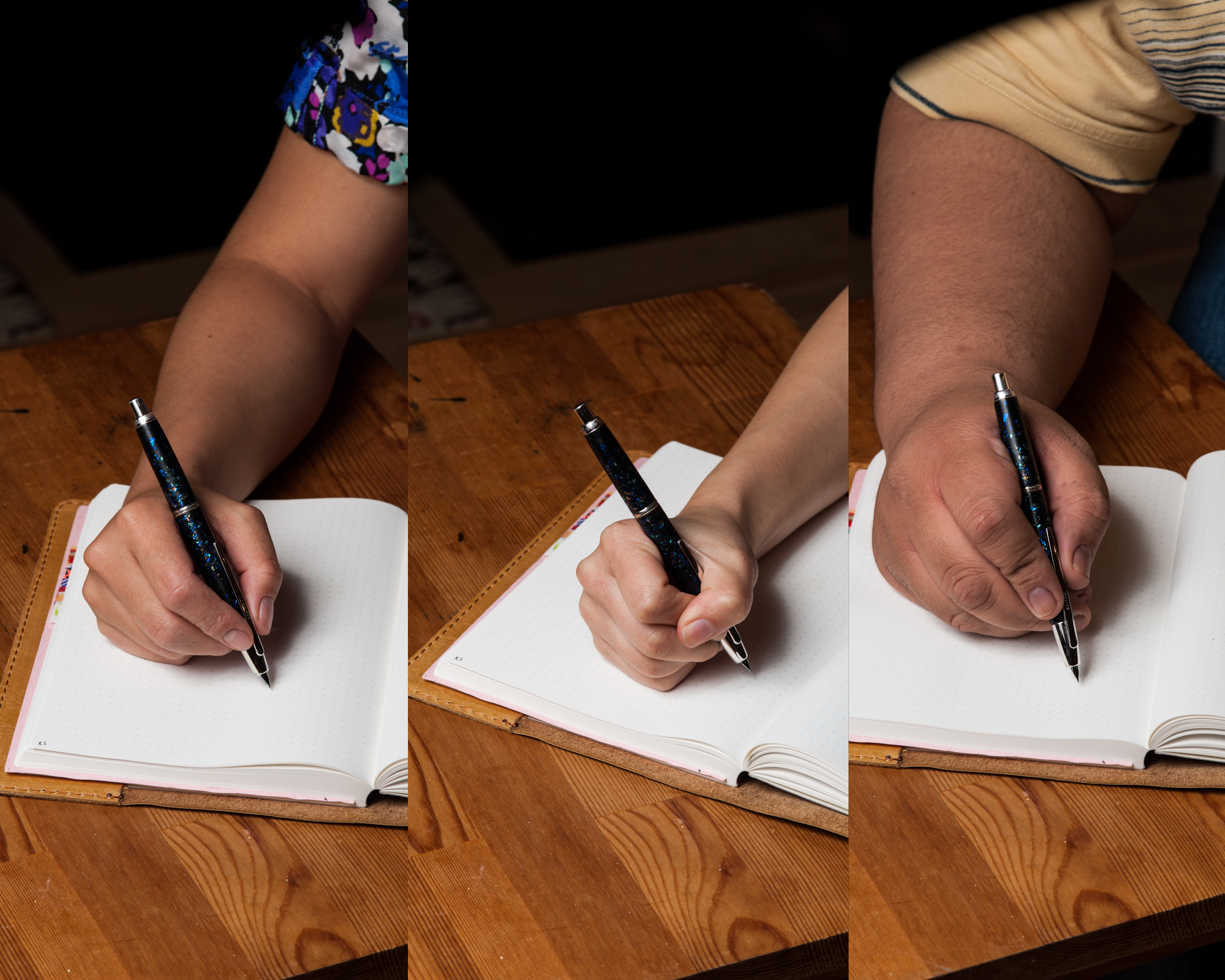
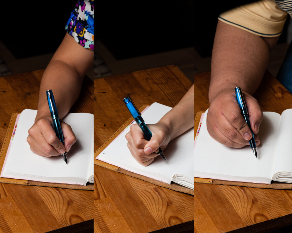
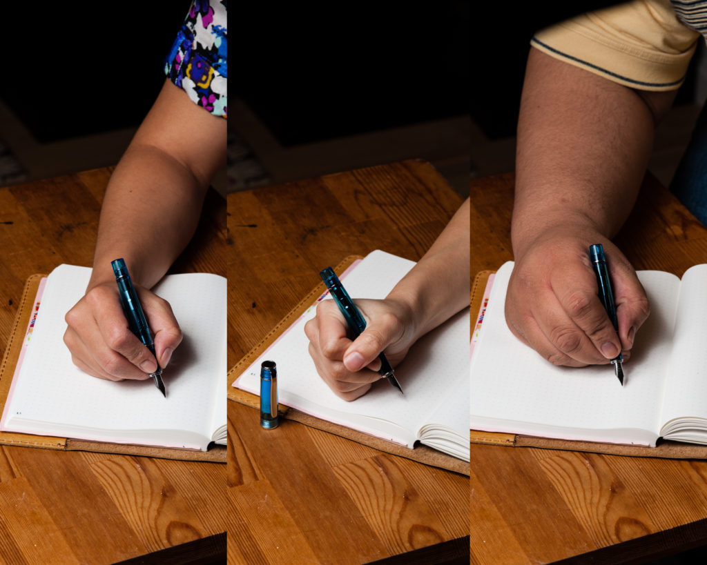
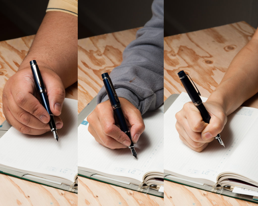
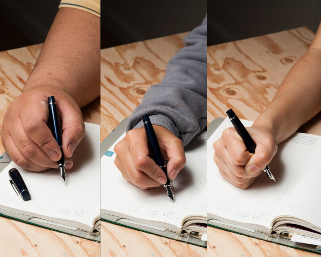
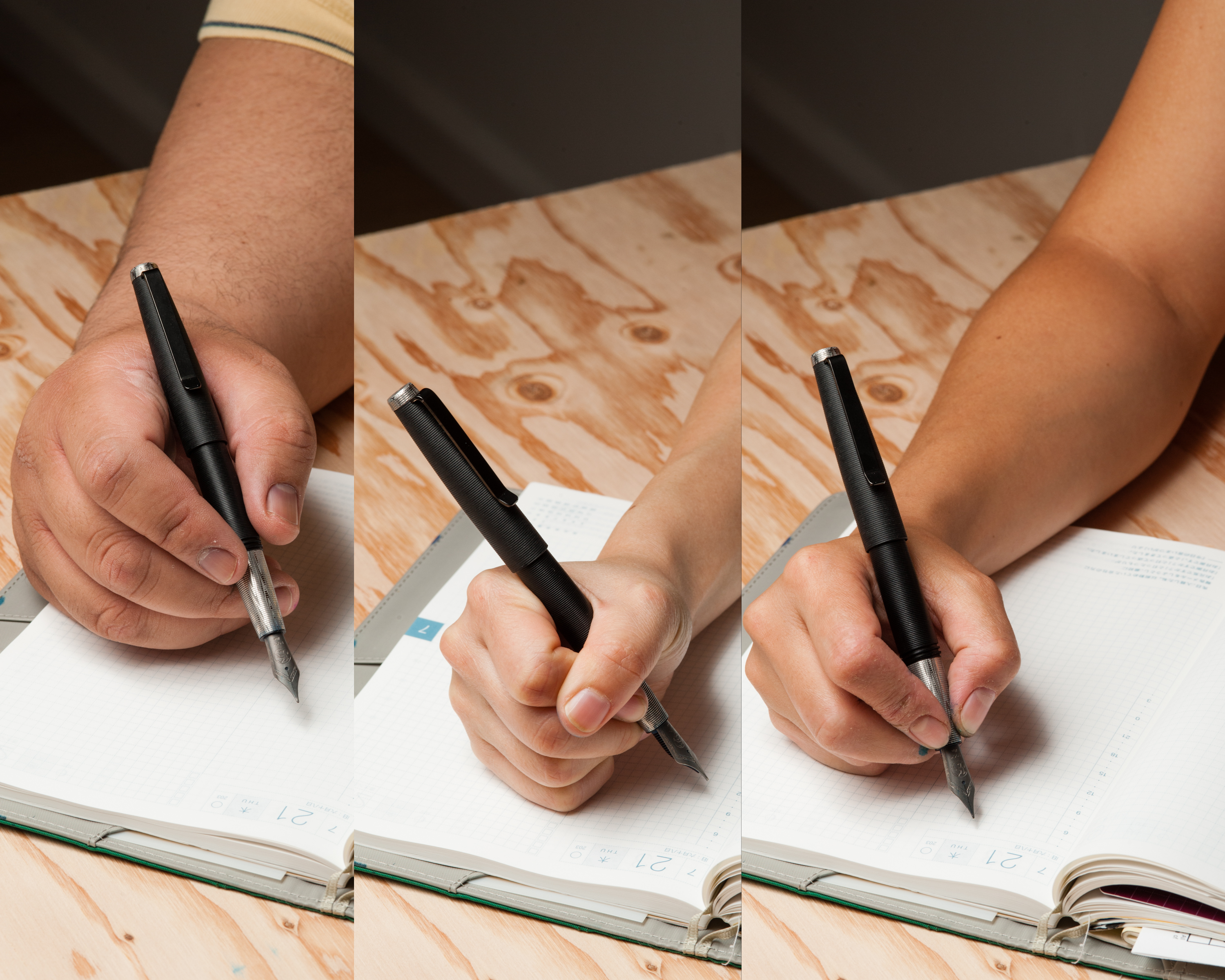
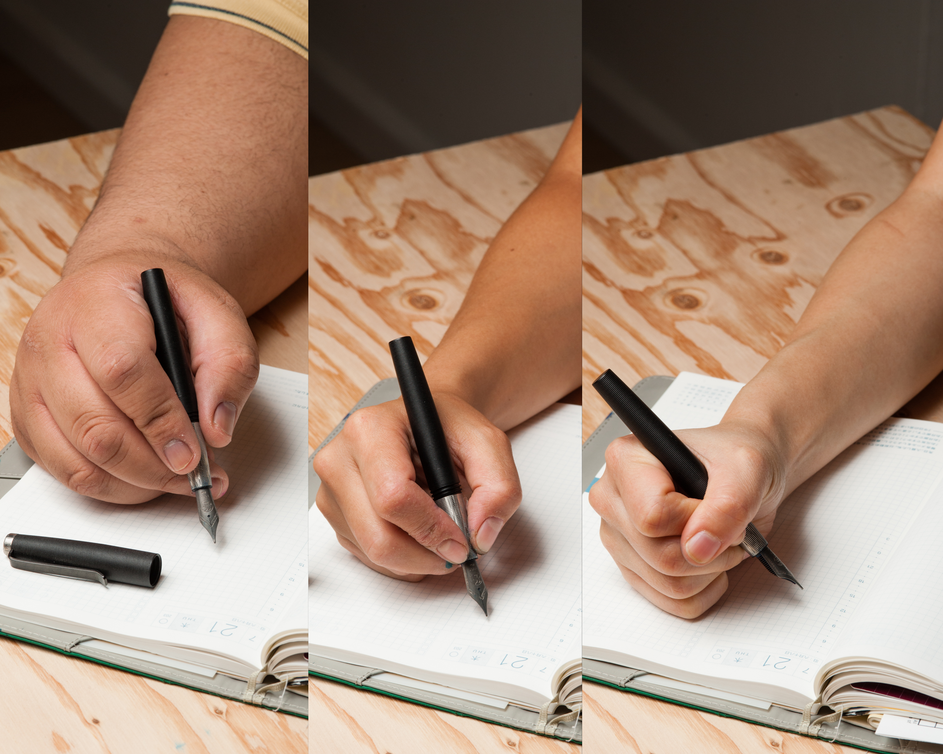
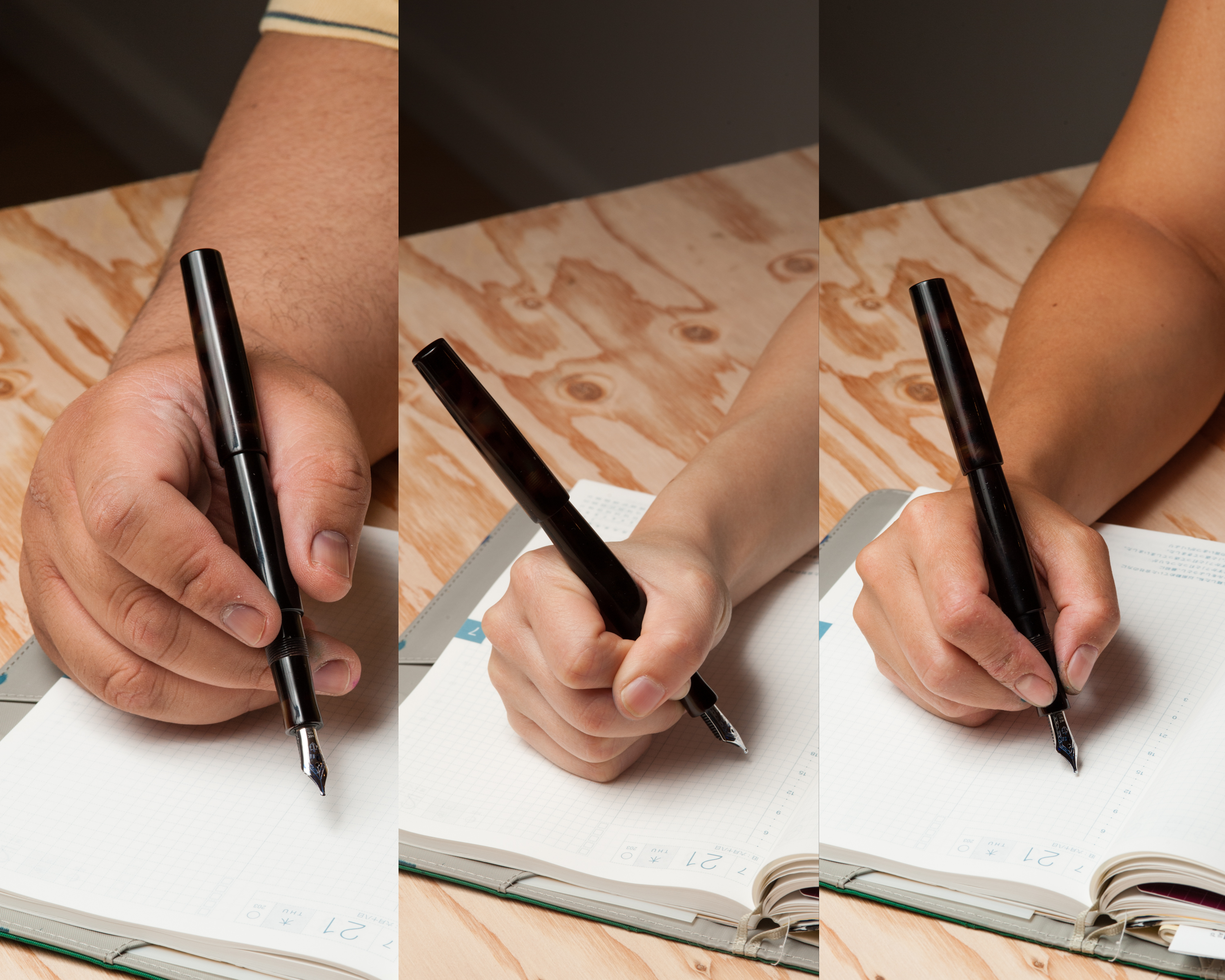
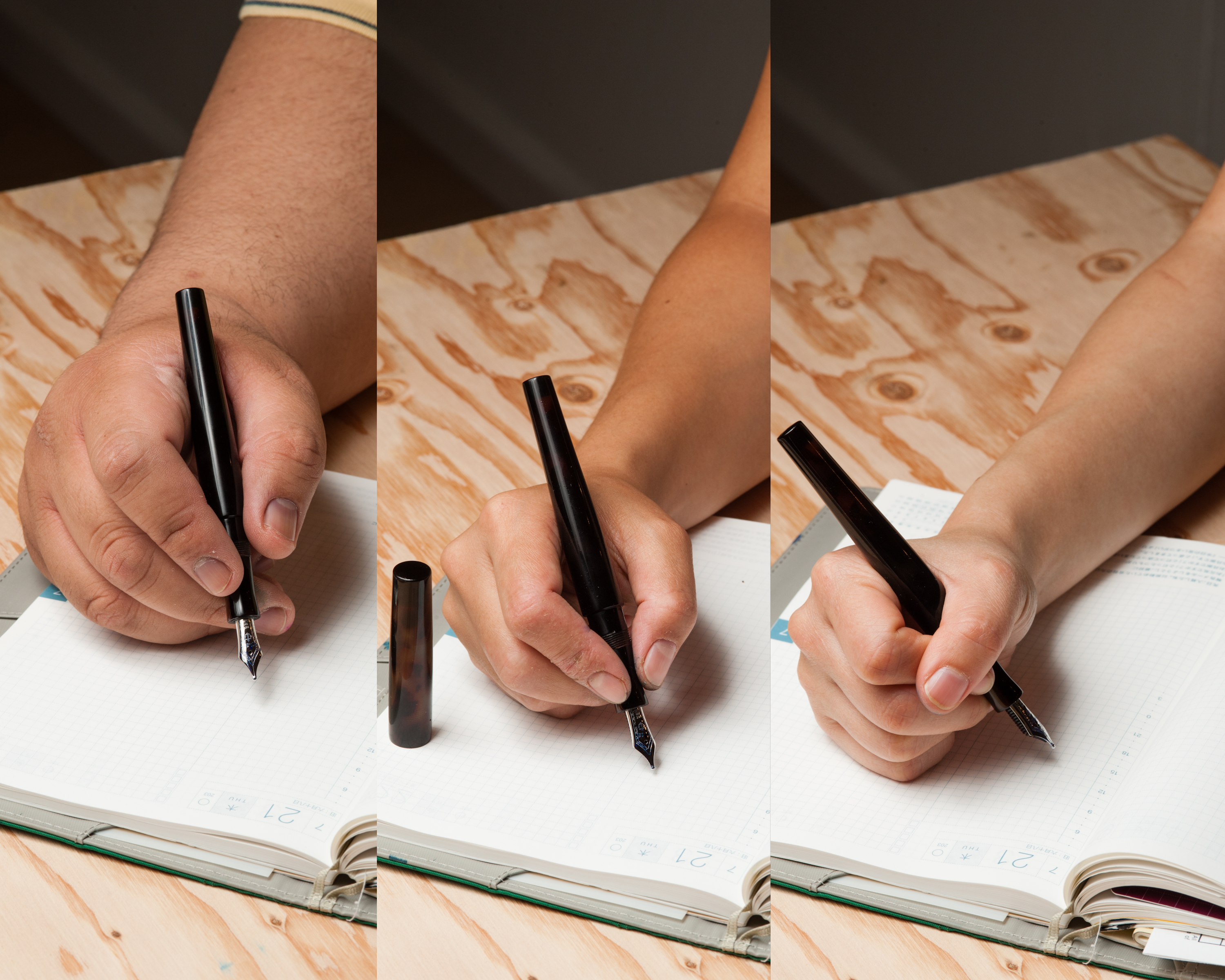
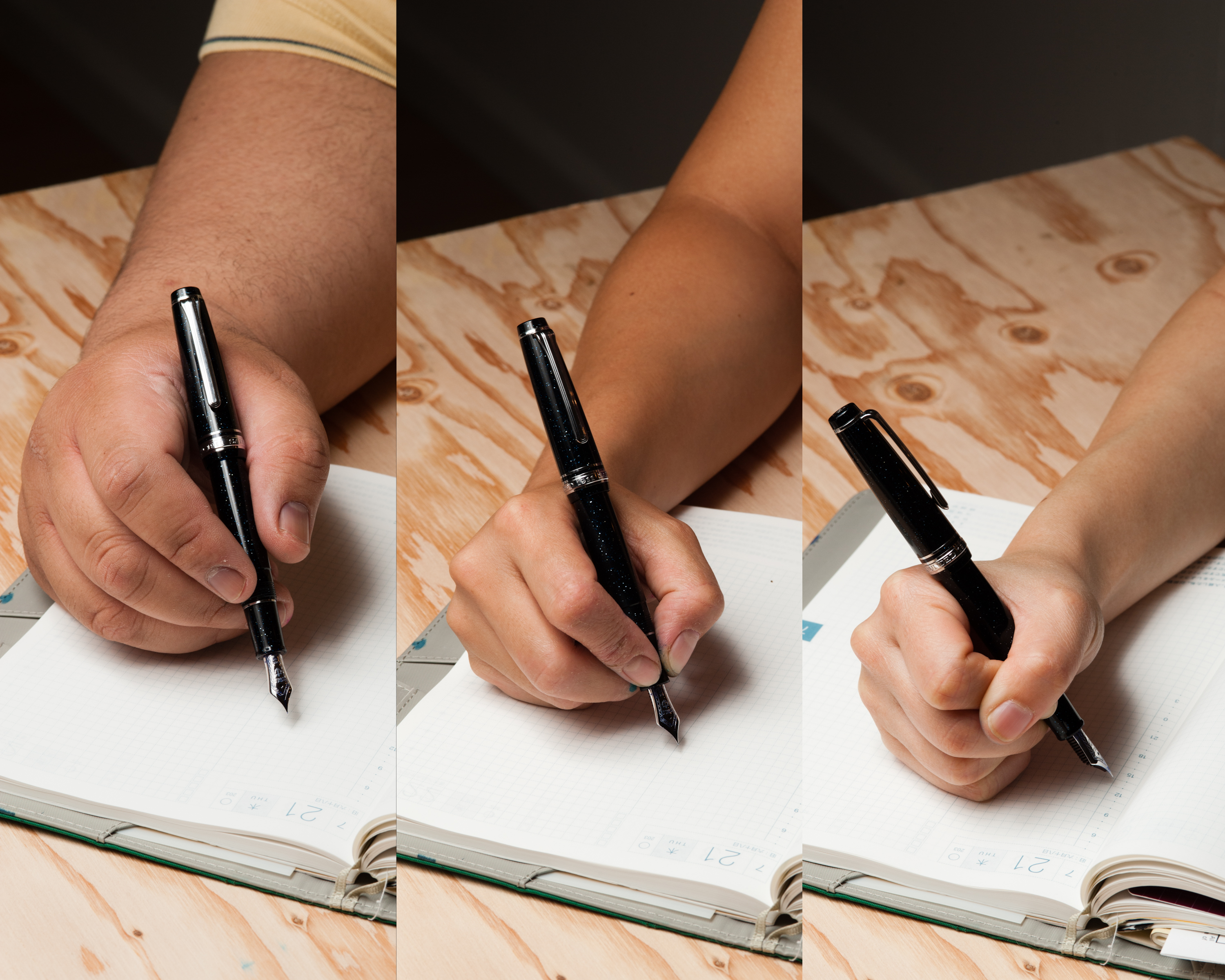
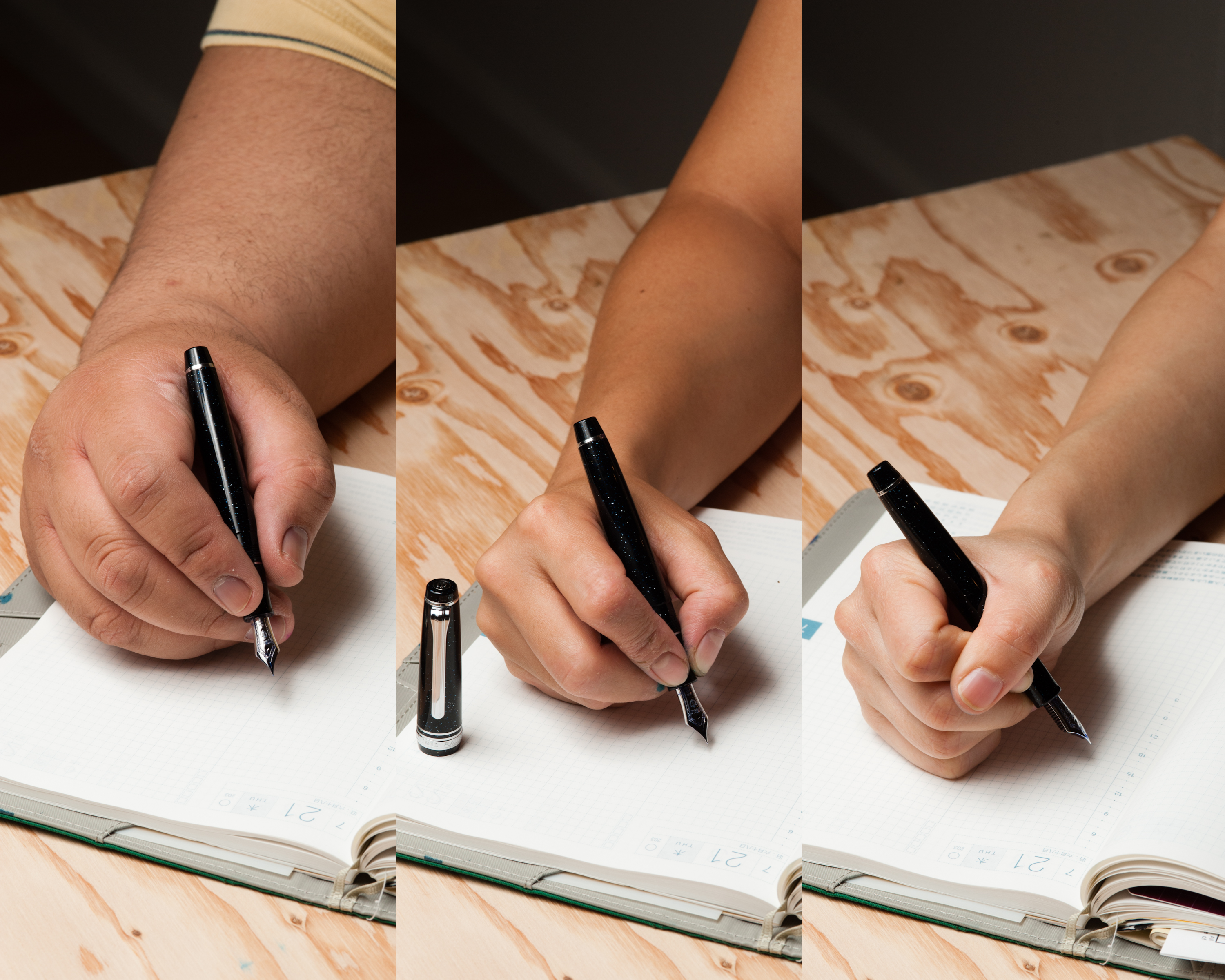
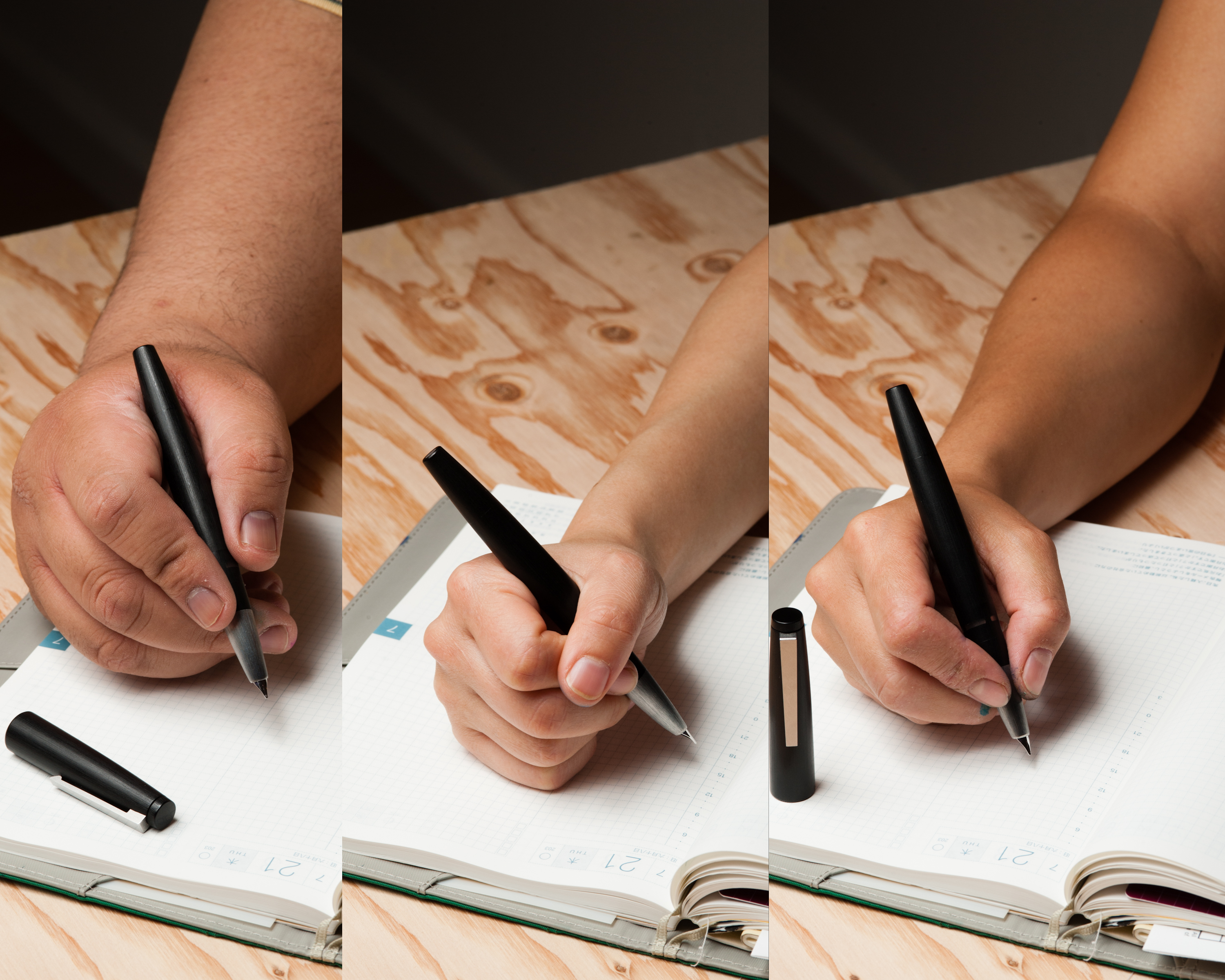
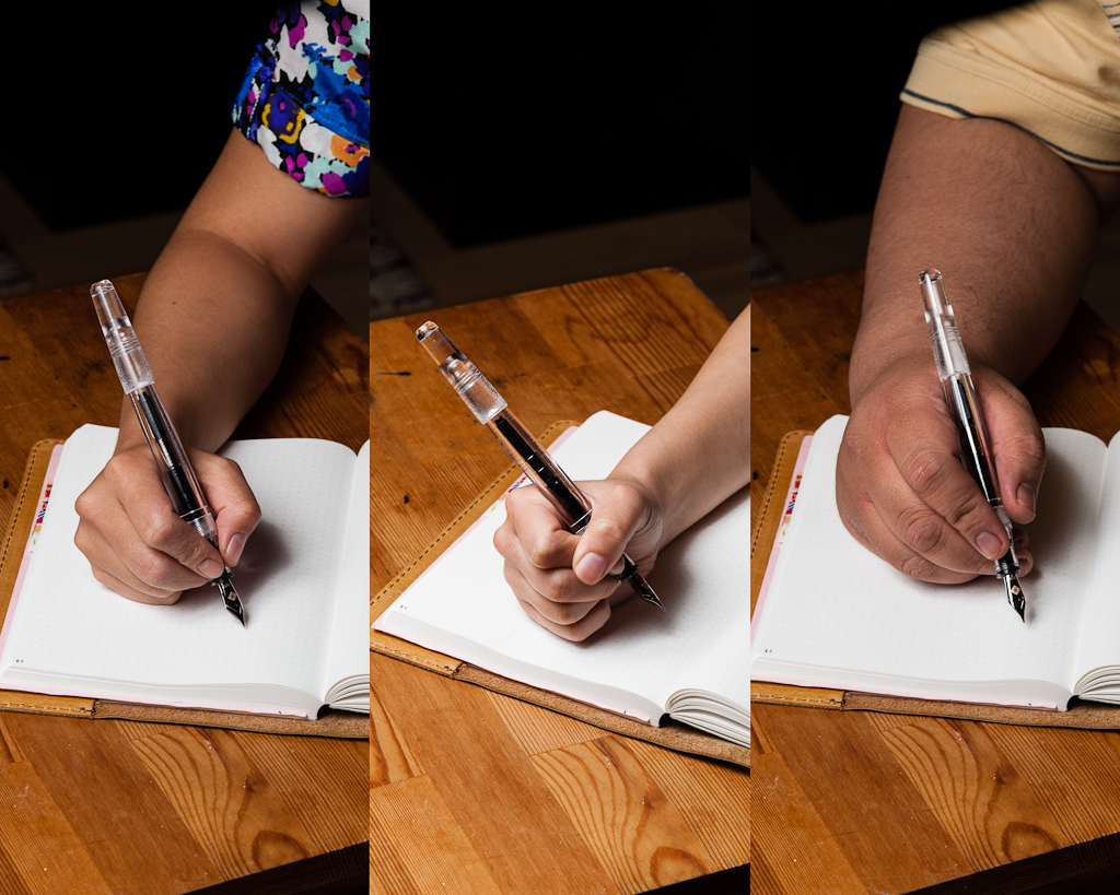
Katherine: Can I skip writing and just ogle this pen? No. Dang it. The Model 66 is comfortable for me — but a touch long. I personally think it looks a little ridiculous in my hand. And, if I post the pen… it feels like I’m writing with a a slightly too-long pen with a weight at the end. This pen is usable, but when writing, I prefer shorter pens. (The p66 is PERFECT for me. But that’s for another review…)
Pam: Tiny hands handle pens alike! I, too, found the Model 66 to be slightly too long, even unposted. The length was more tolerable in the traditional tripod grip. When the pen was posted, it felt unbalanced and top heavy, especially with my “iron fist” grip; it felt like the cap would fall off in this particular grip. This is a great pen for those with hands/paws of the normal to larger persuasion or for those with smaller hands who don’t mind the added length. For the tripod grip with the CI nib, I actually prefer the length of the FC model 45 or shorter pocket models. However, the girth of the model 66 was pretty comfortable in any grip/fist formation.
Franz: I wrote with this pen unposted as I found its length very well balanced and posting the cap seemed unnecessary. The cap when posted seems wobbly at first and if I try to secure it, I have visions that the cap lip might crack. Don’t worry, I think it’s durable enough and it’s probably just me.
Anyway, I wrote in my journal for a good 20 minutes and my hand was quite comfortable using it. I grip the pen on the barrel right above where it meets the section. I found this very enjoyable and my thoughts just flowed as I journalled and also wrote the lyrics of a Bossa nova song.
EDC-ness
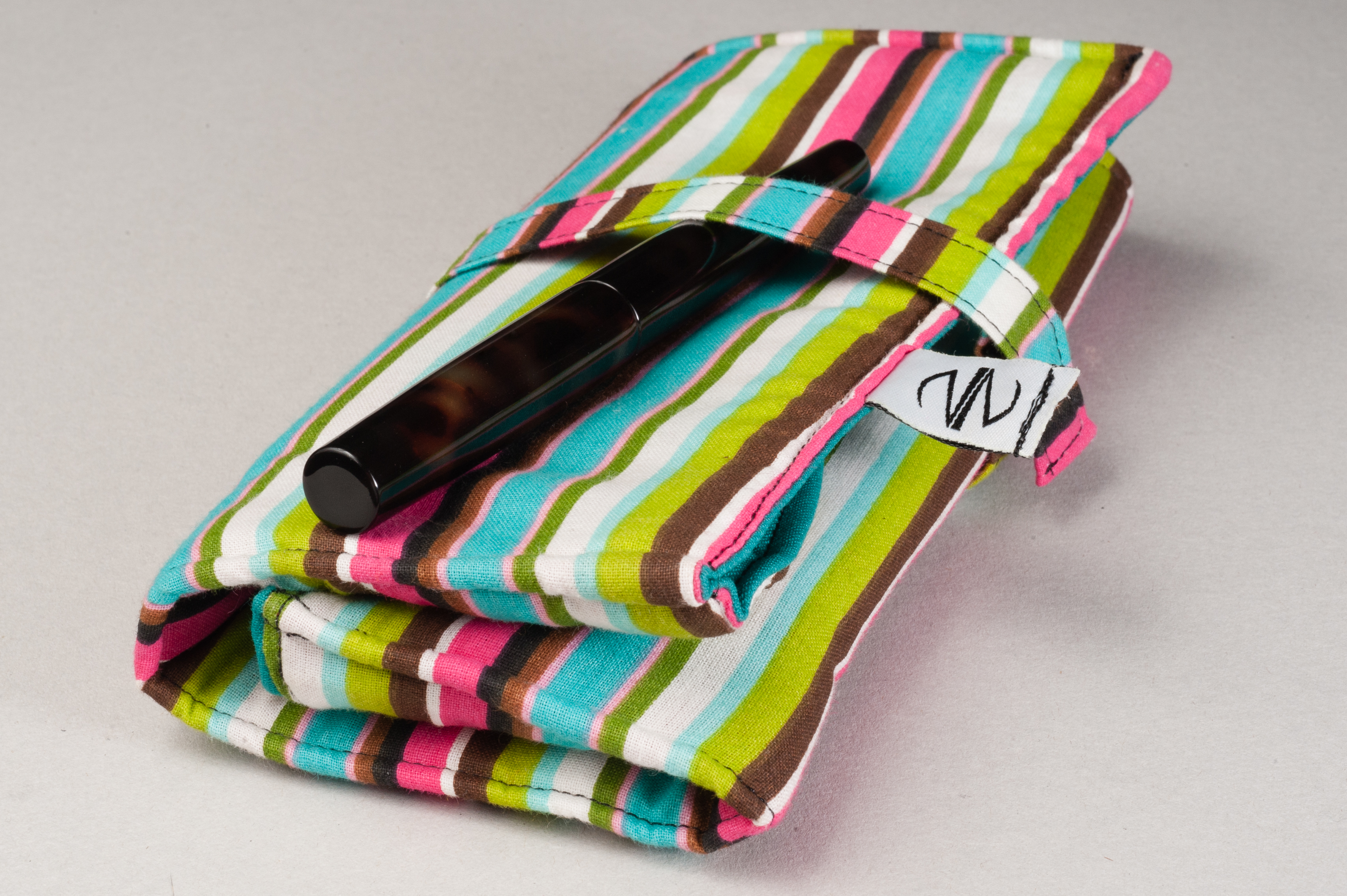
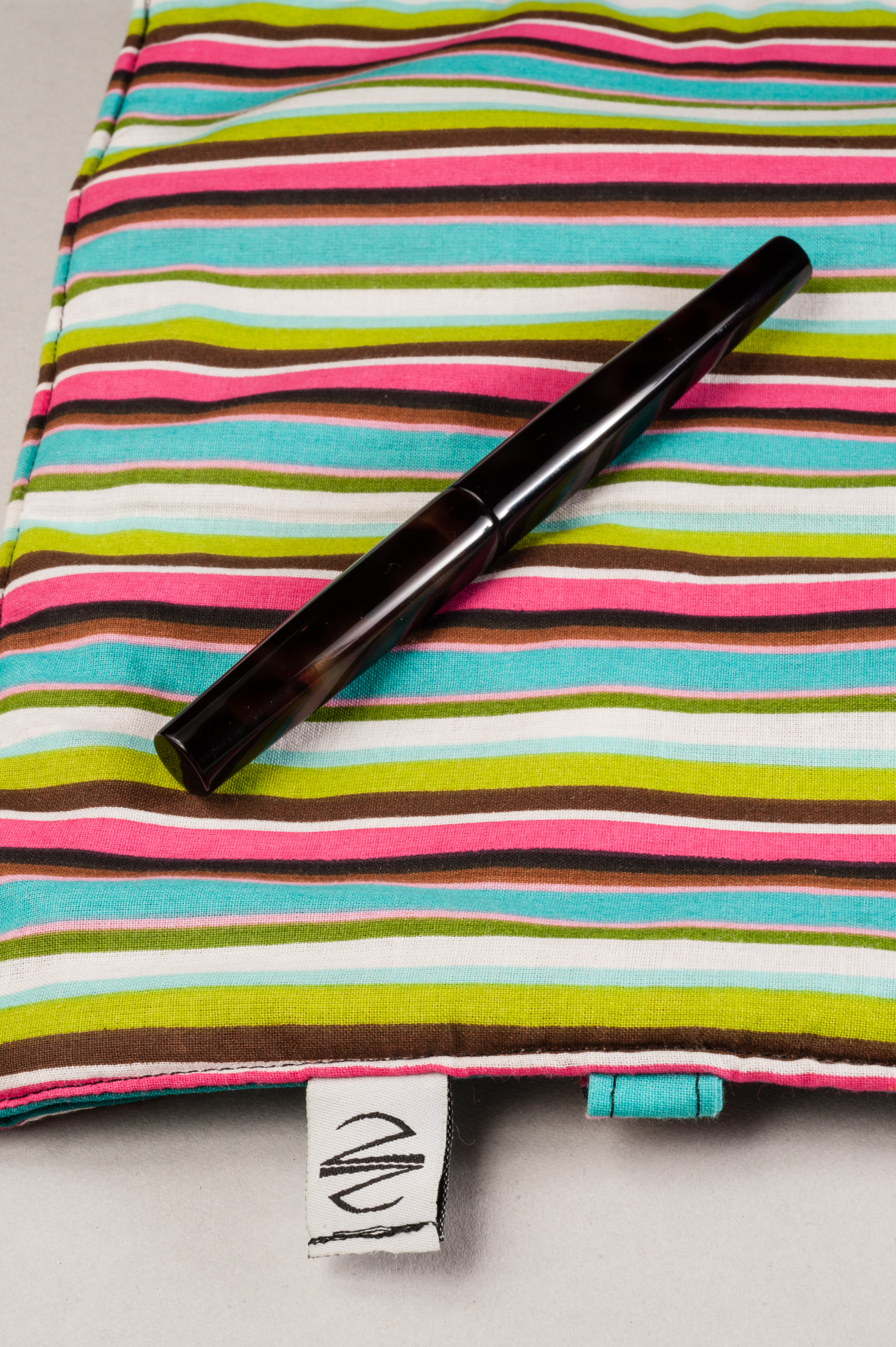
Katherine: Franklin-Christoph calls this a desk pen, and a desk pen it should be. It’s a fairly long clip-less pen with a cap that can roll away (even if the body doesn’t)… Not my favorite combination on strange meeting tables.
Pam: I enjoy the pen for the specific setting of sitting-at-my-desk-with-a-hot-cup-of-tea/coffee-to-journal/memory keep. Due to the lack of a clip and somewhat wobbly cap, I wouldn’t feel comfortable throwing this into my white coat. Knowing me, I would scratch up the material if I accidentally threw it in with my keys or crack the beautiful material from throwing it around too much or lose the cap…
Franz: Yes. The Model 66 is a desk pen for sure but I still gave it a go and used it at work while not at my desk. I placed the pen in my jacket’s inner pocket to make it discrete. The length definitely made the pen stick out the pocket but it also allowed me to quickly grab it when I needed it. The cap unscrews with just half a turn and is quick to deploy. Half a turn! hehe..
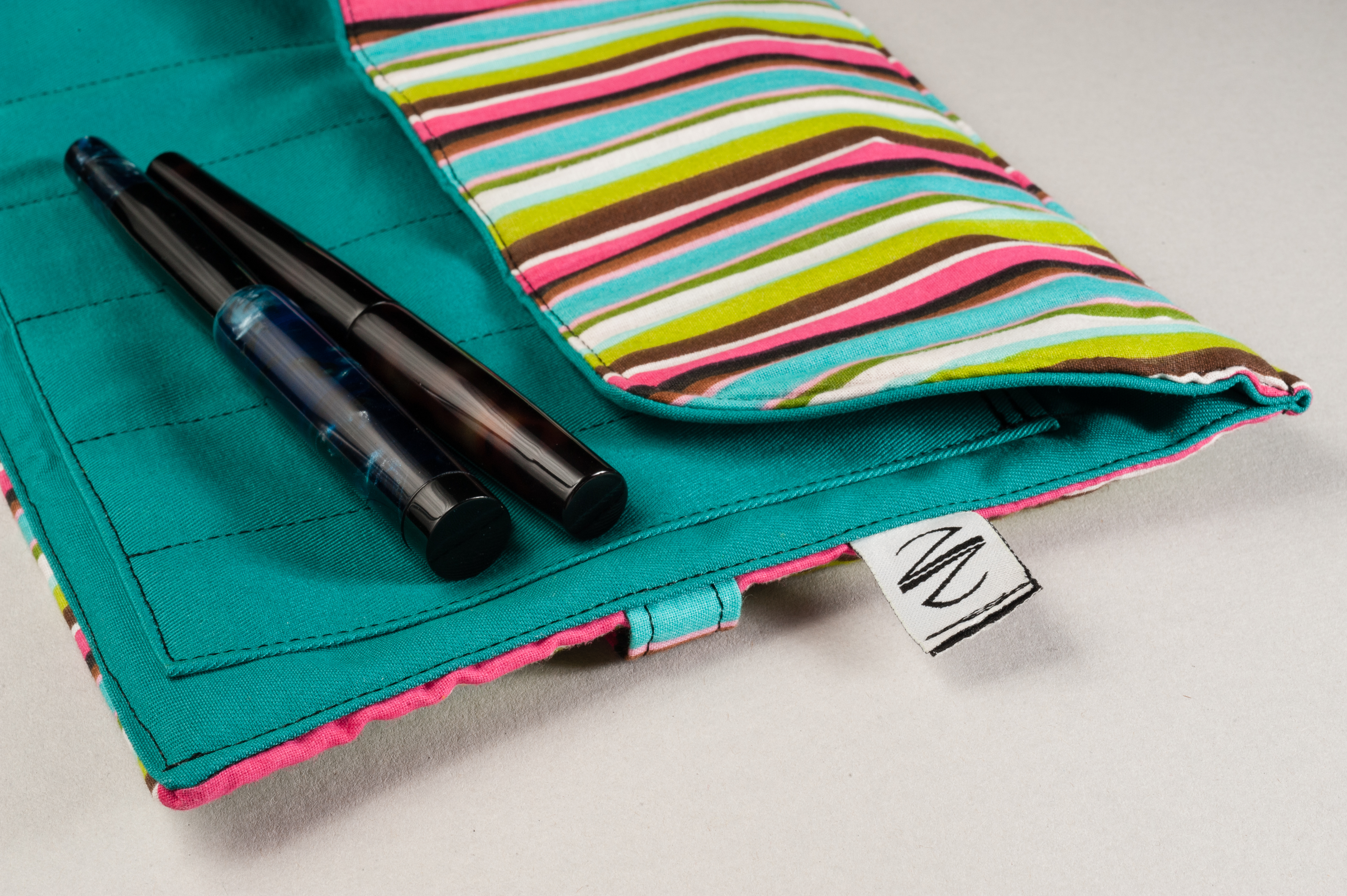
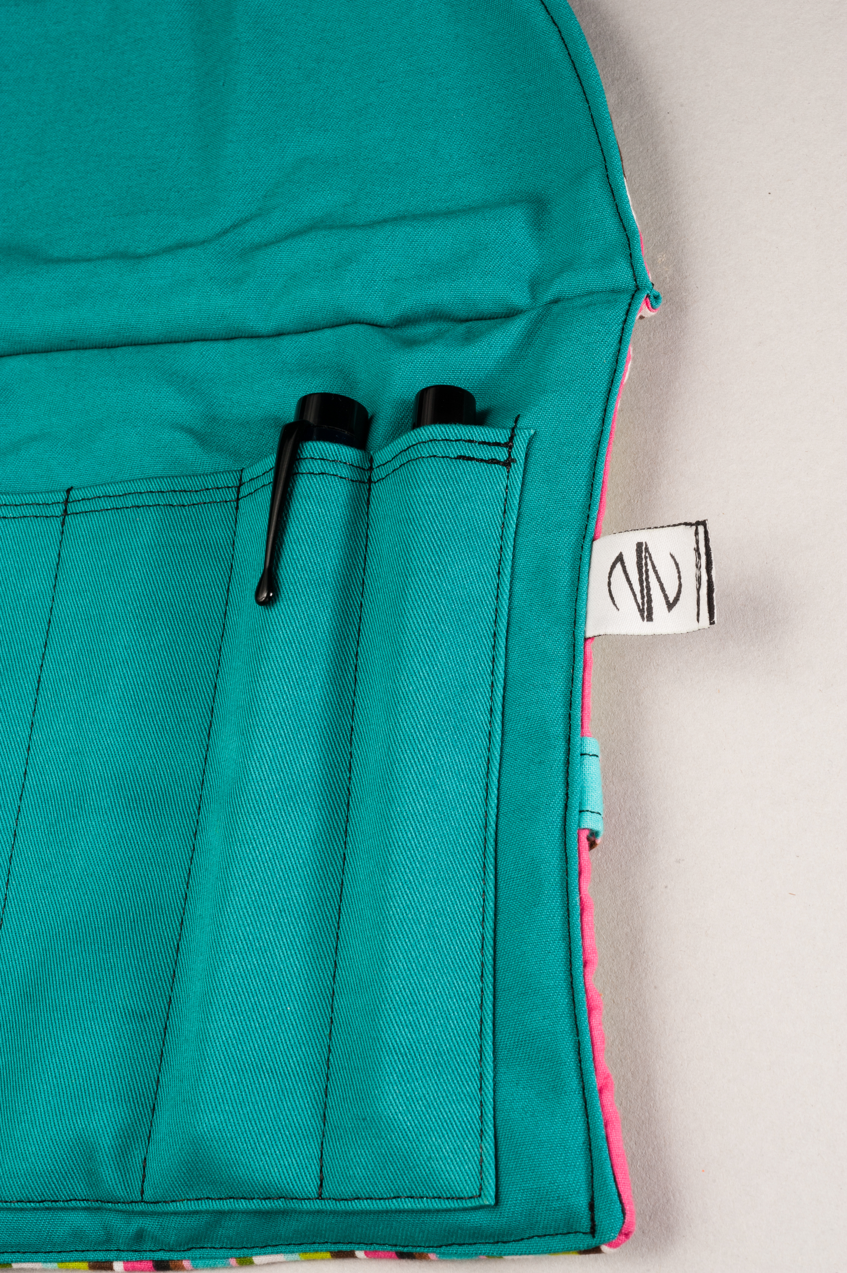
The downside of using this clipless pen as an EDC pen is it’s more prone to roll away and fall if you set it down. And in that one day of using it at work, it almost fell once (yipes!). Also, because of it’s length, the pen sticks out of my shirt pocket unsecured which makes it prone to falling out while I’m moving around. As long as I transport the pen in a case to my office desk and use it there, it’s a great pen to use at work.
Final Grip-ping Impressions
Katherine: Ultimately, this pen isn’t for me. I love the way it looks, but found the length a tad unwieldy both for long writing sessions and as a work pen. I much prefer the size of the Pocket 66, which is very similar, but much shorter. The nib on this pen, as with every F-C nib I’ve tried, is superb. In the end… would I like to own this pen? Yes! It’s gorgeous. Would I use it? Probably not (so… I don’t own it).
Pam: The Model 66 was probably the first design from Franklin-Christoph that caught my attention. The Original Ice was the first material by Franklin-Christoph that had me stalking their website like a hyena on the Serengeti. Of course F-C has been teasing great material for the last 2 years and the Italian Ice is not exception. All in all, this is a great pen that is not only functional, but absolutely beautiful and unique in both design and material.
As this pen and the Ice materials by F-C remind me of the winter season, I find myself wanting to add the pocket 66 to my wishlist for Santa (aka boyfriend) rather than the full model 66. The pocket 66 is more my size. (Actually, almost all of the Franklin-Christoph’s pocket models are more my size…) One of the largest draws for me is also the material, in which I prefer the Original Ice. Hint hint “Santa…”
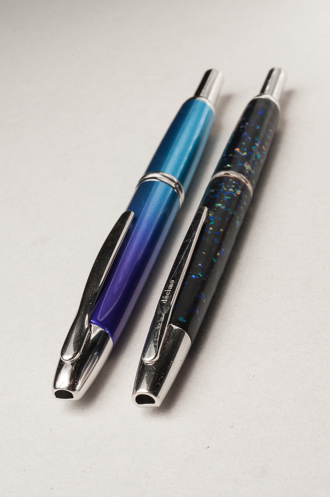
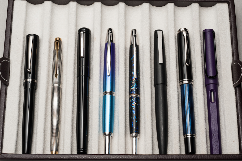
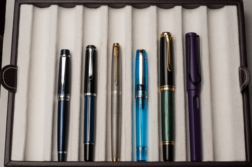
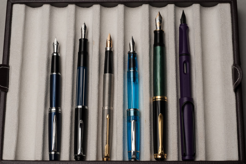
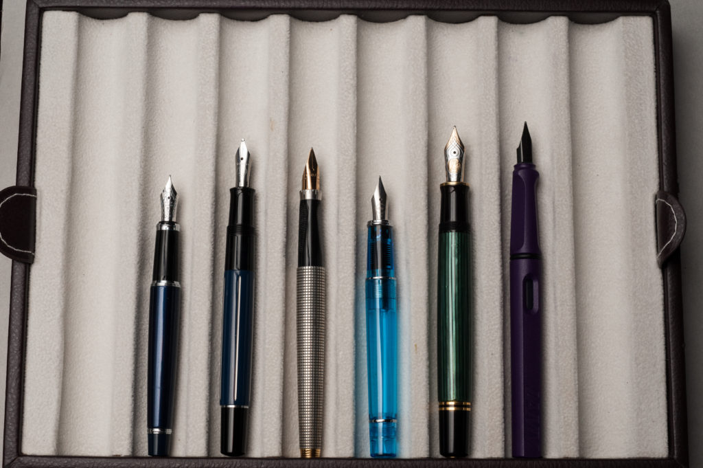
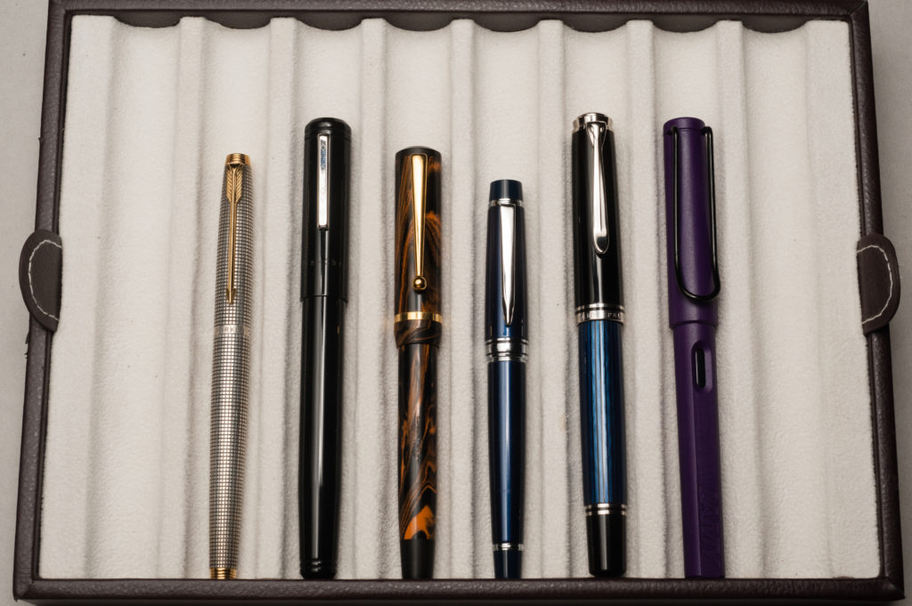
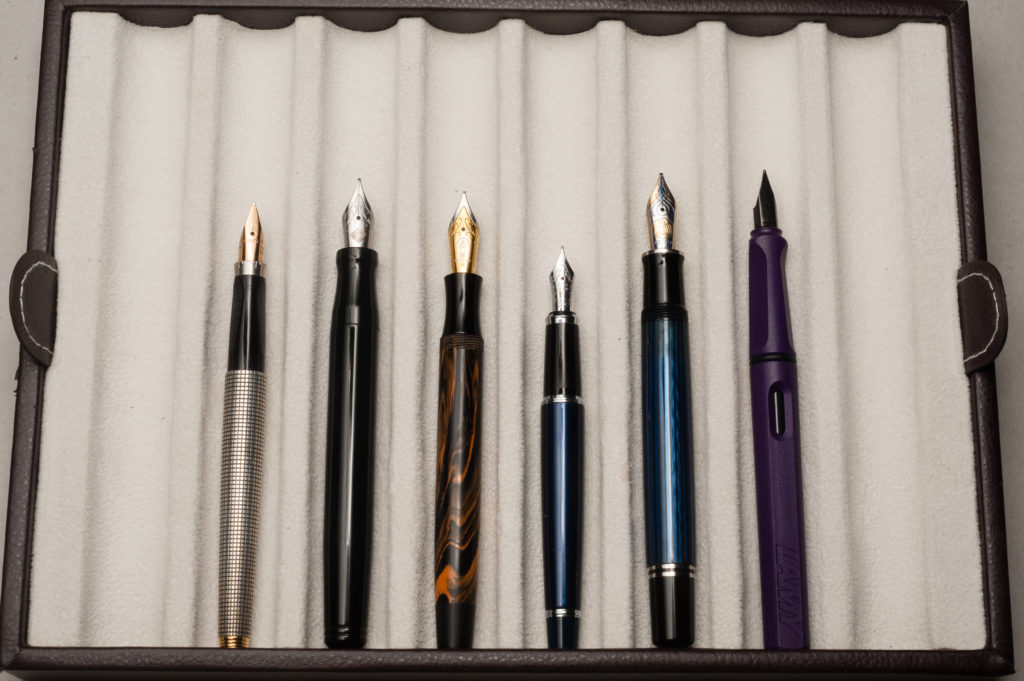
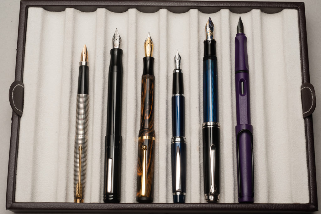
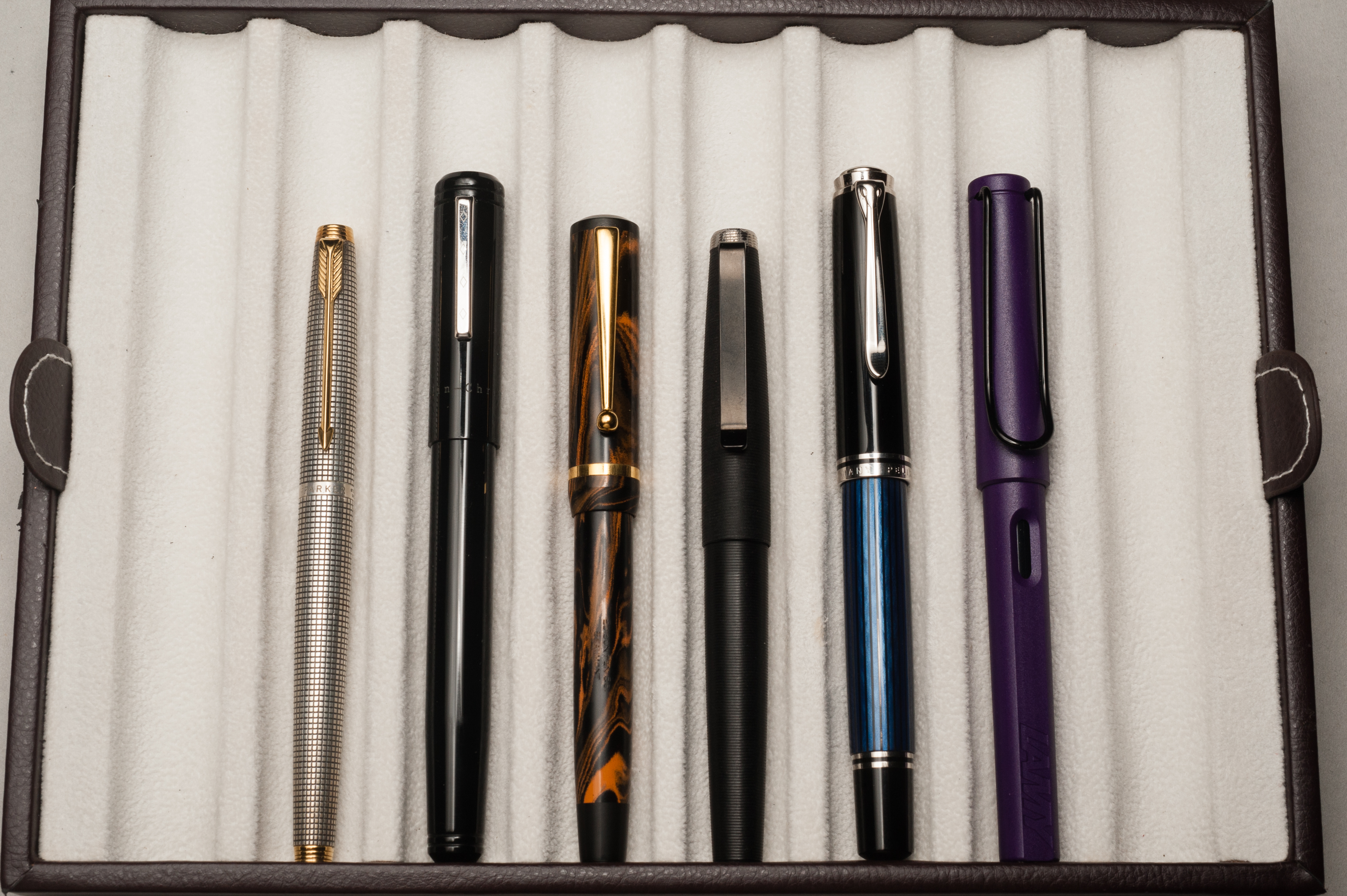
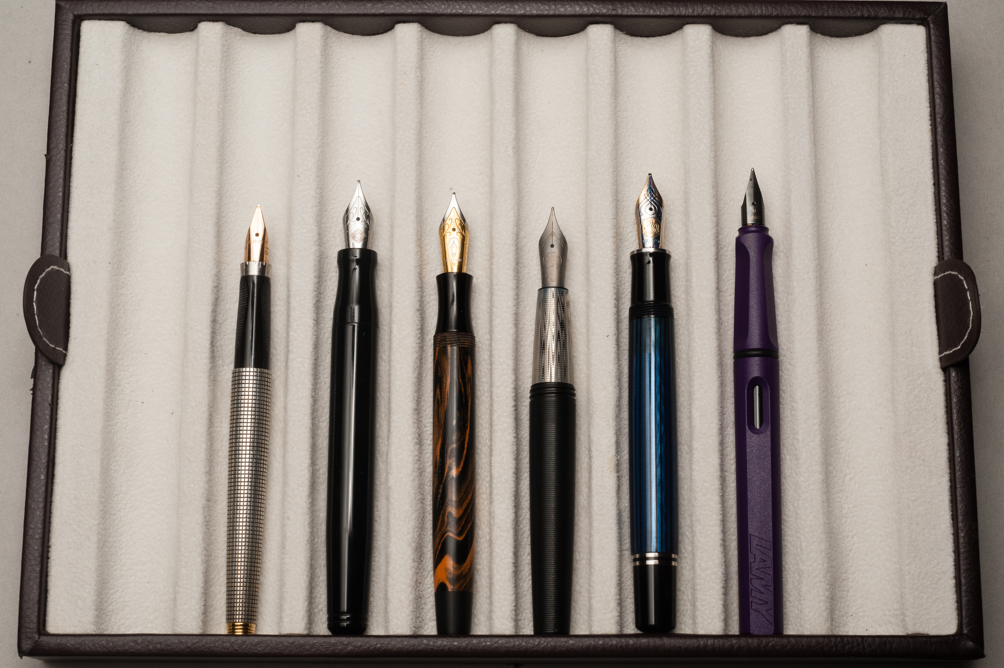
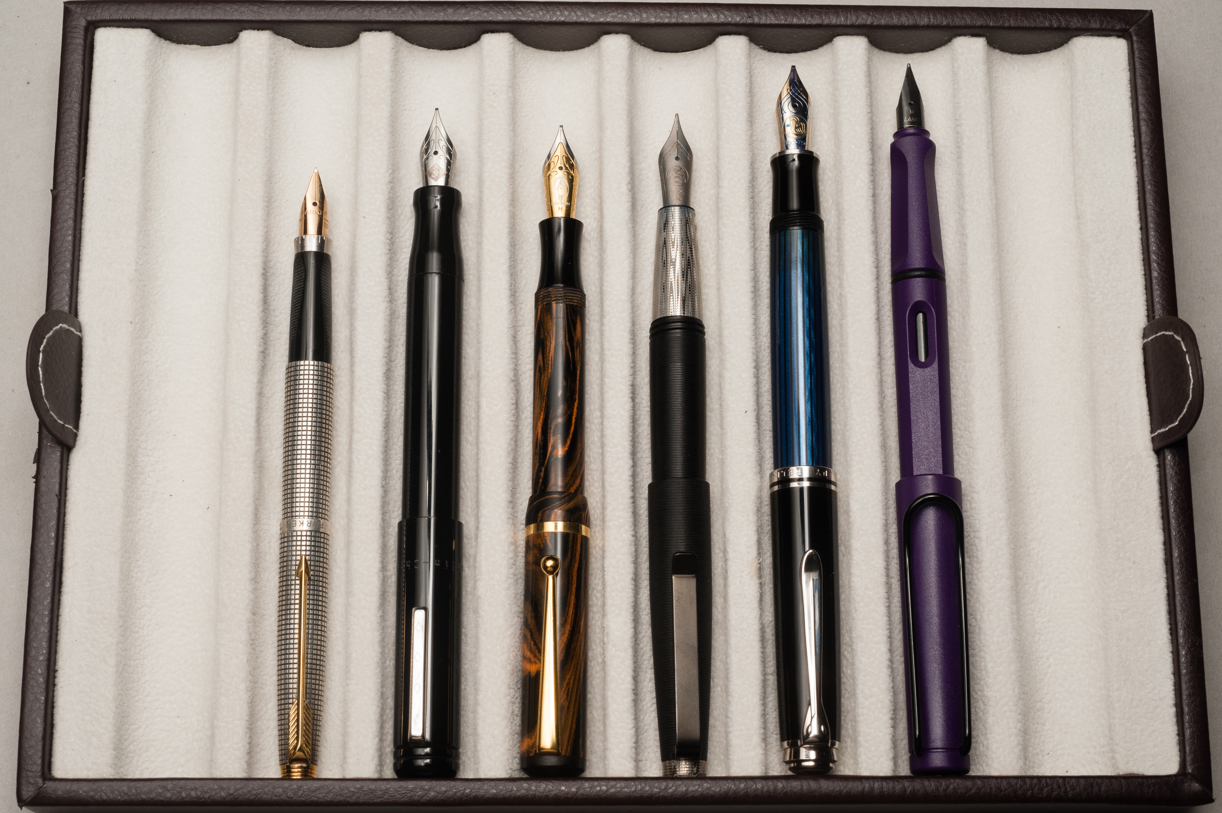
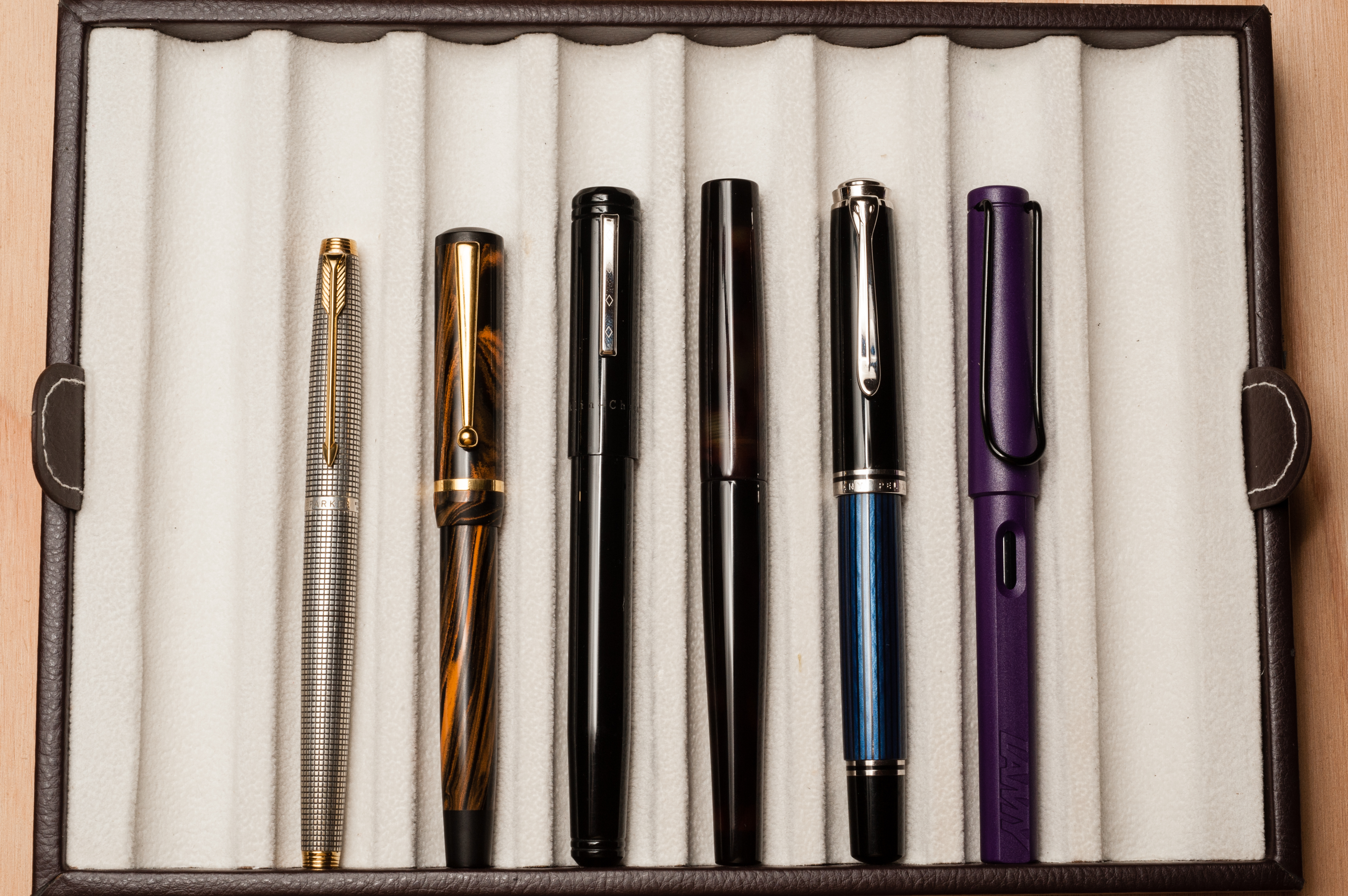
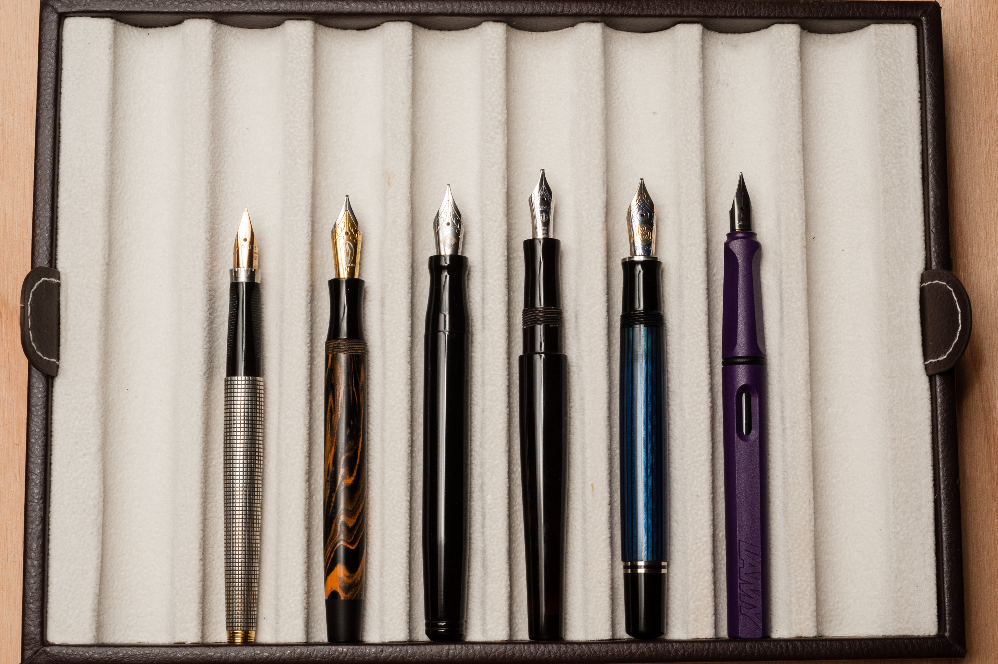
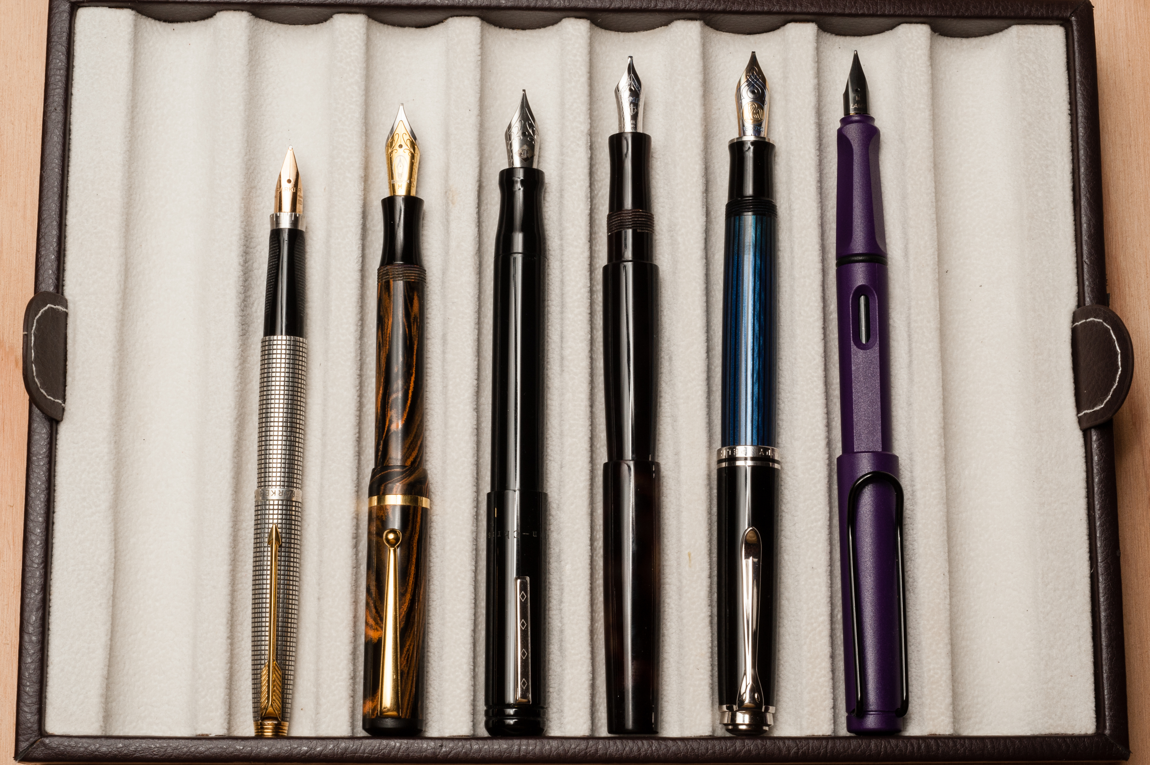
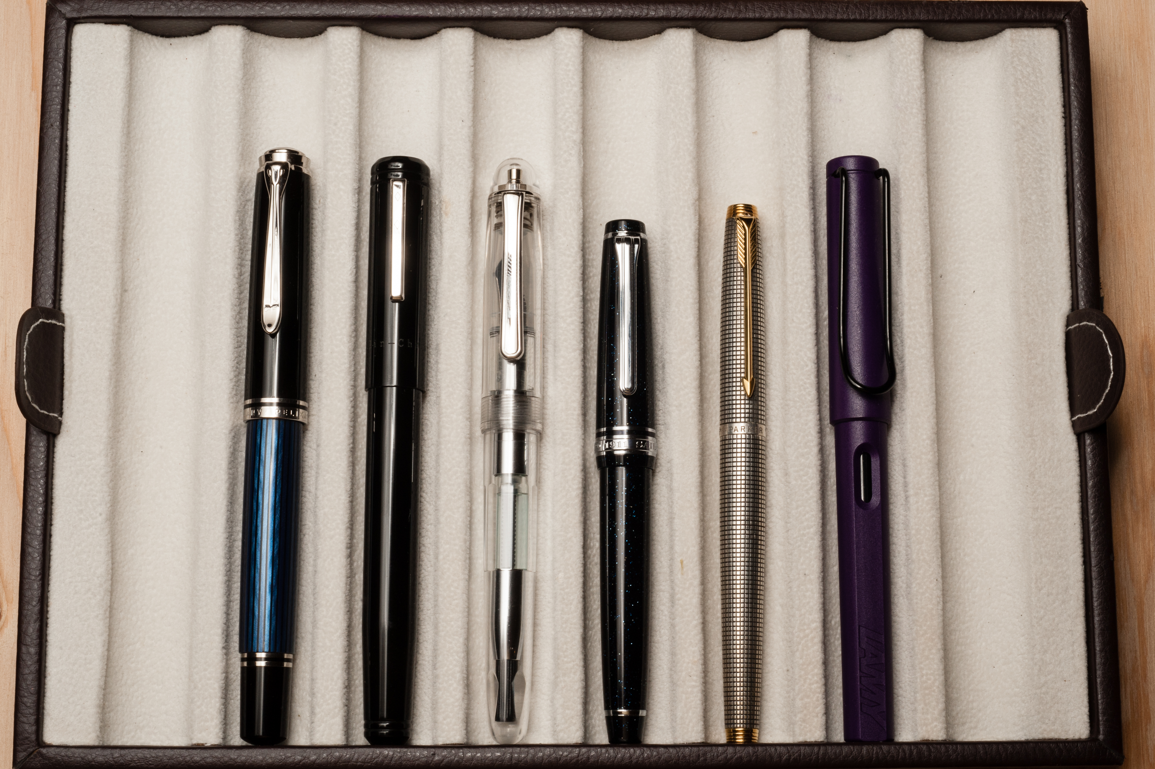
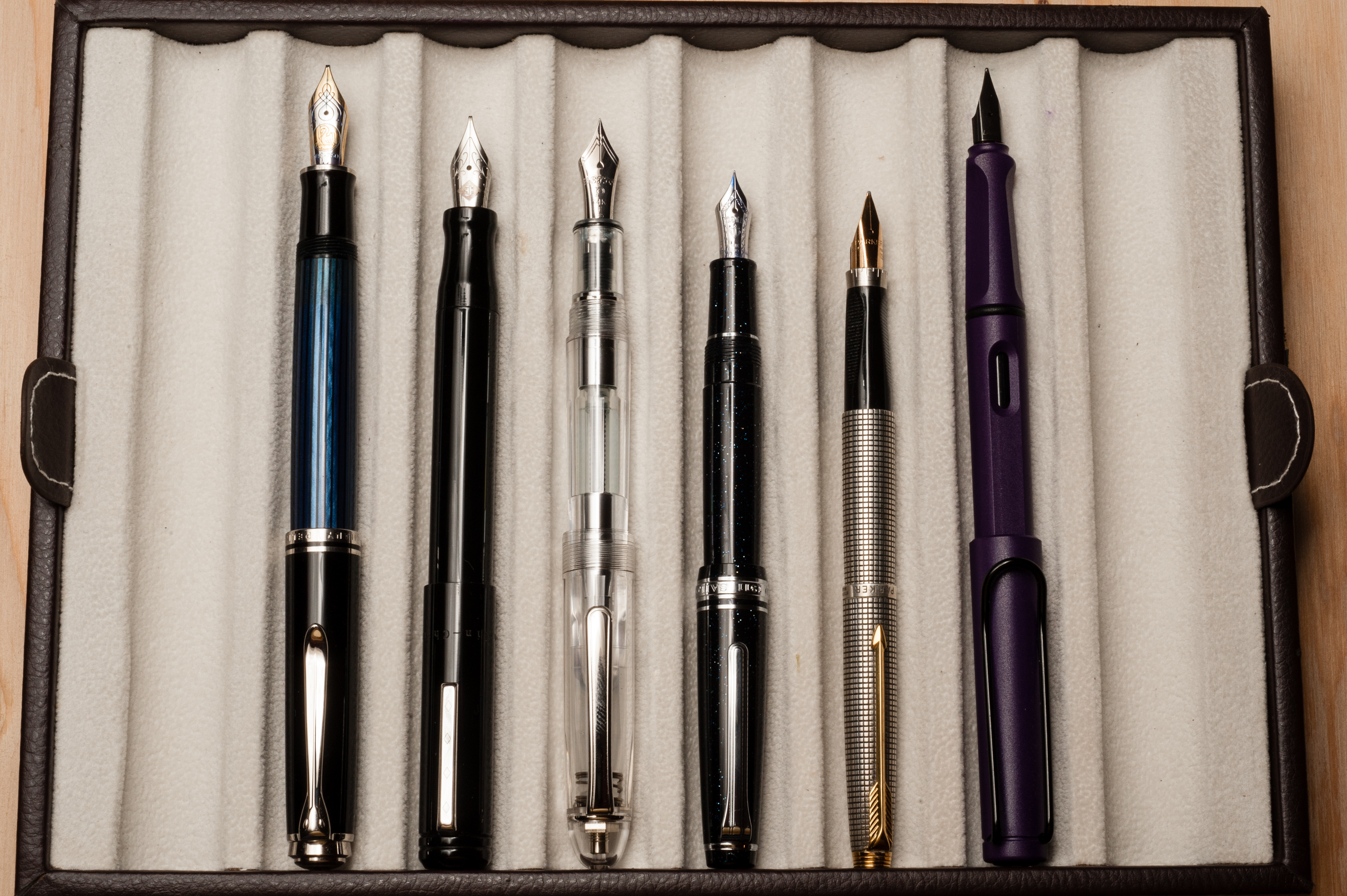
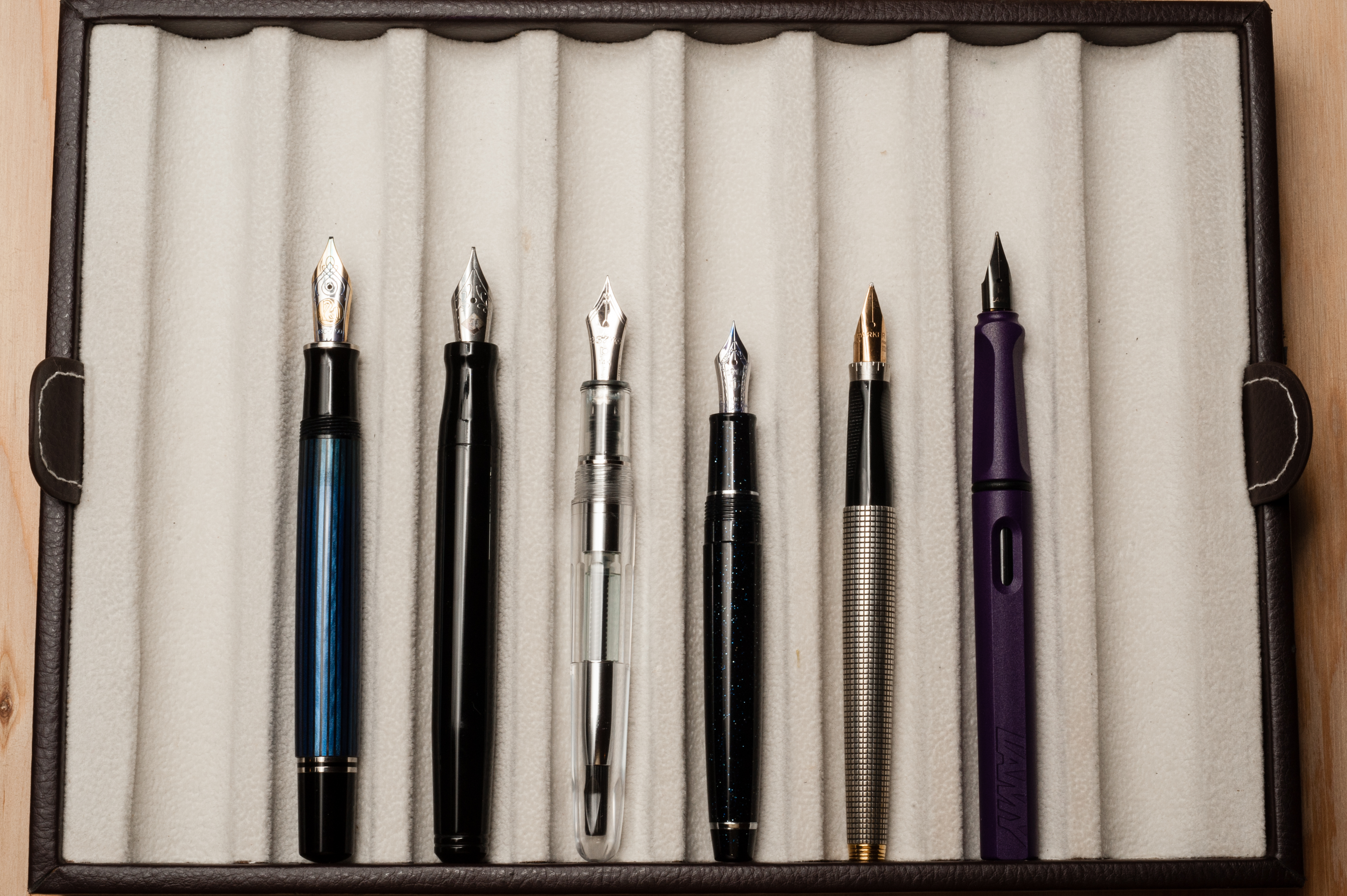
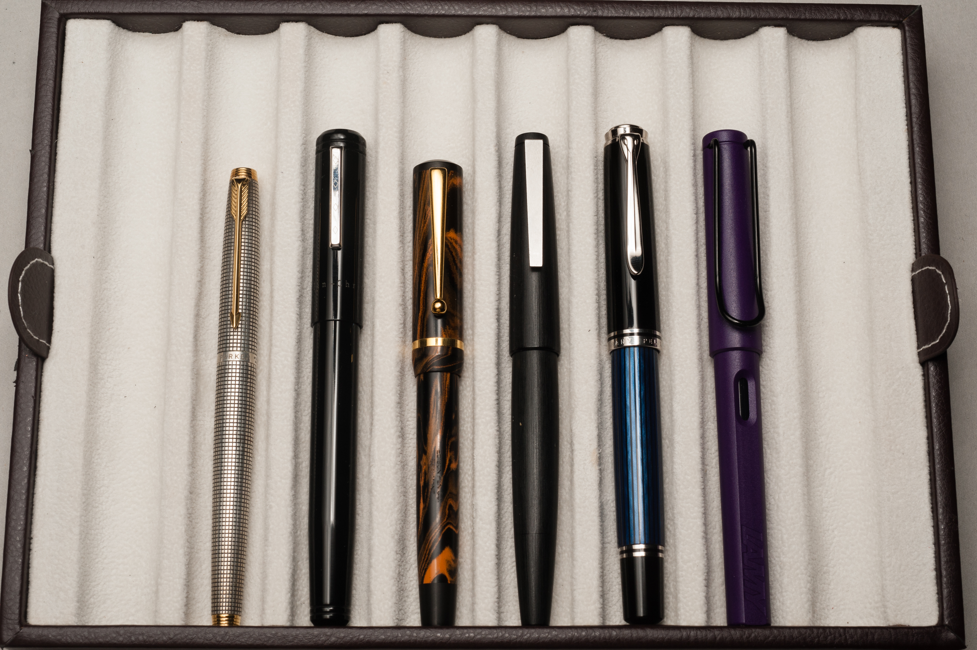
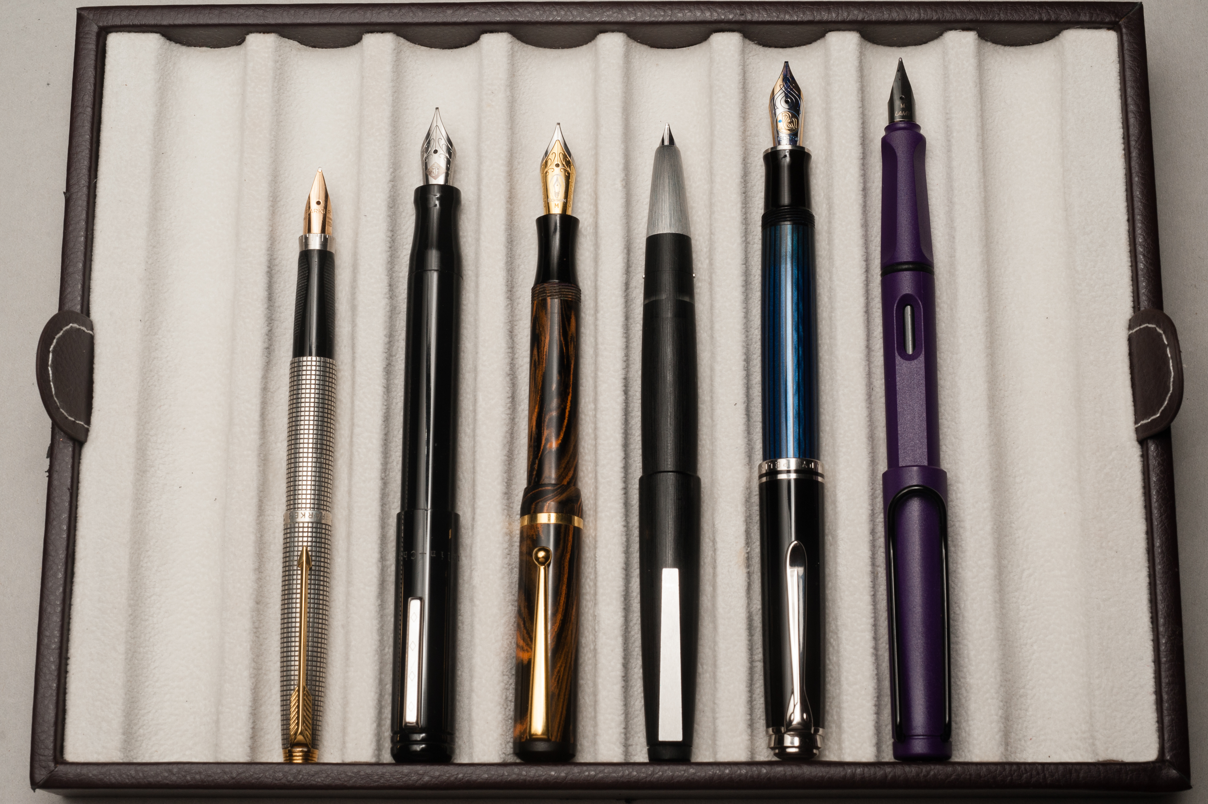
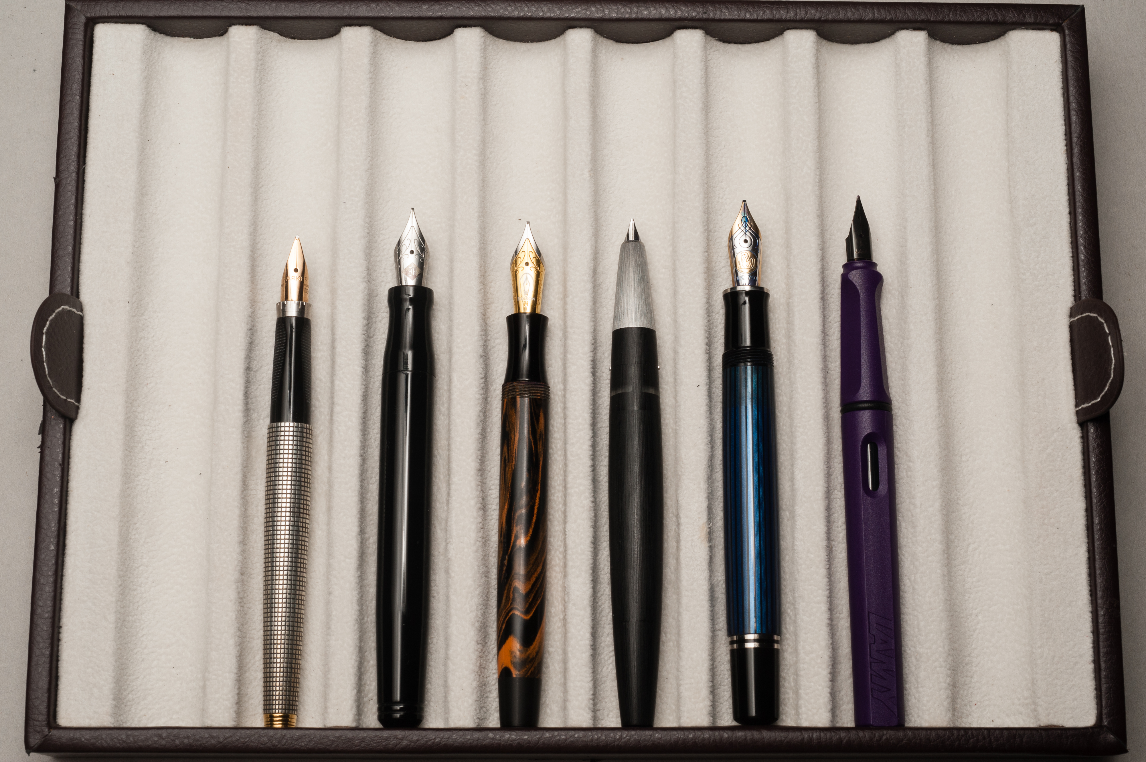
Franz: As seen in the pen comparison photos, the Franklin-Christoph Model 66 Stabilis is quite a long pen with substantial girth as well. If you like larger pens, this may be for you. For small, and medium hands, try it out first for you might feel the same way as my colleagues do and opt for the pocket sized one. As for the Italian Ice finish I love it and I’m happy I got it.
I will most probably end up designating this pen for work and leave it on my desk each day. This way I’ll always have a fountain pen at work. Thanks for reading our review of this pen!
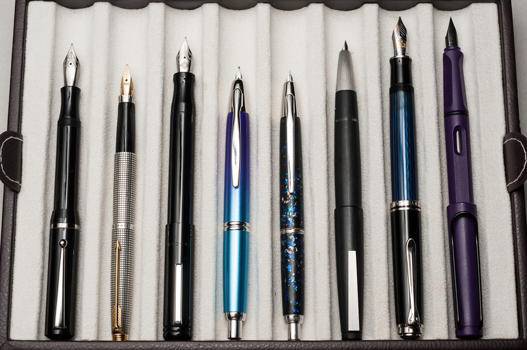
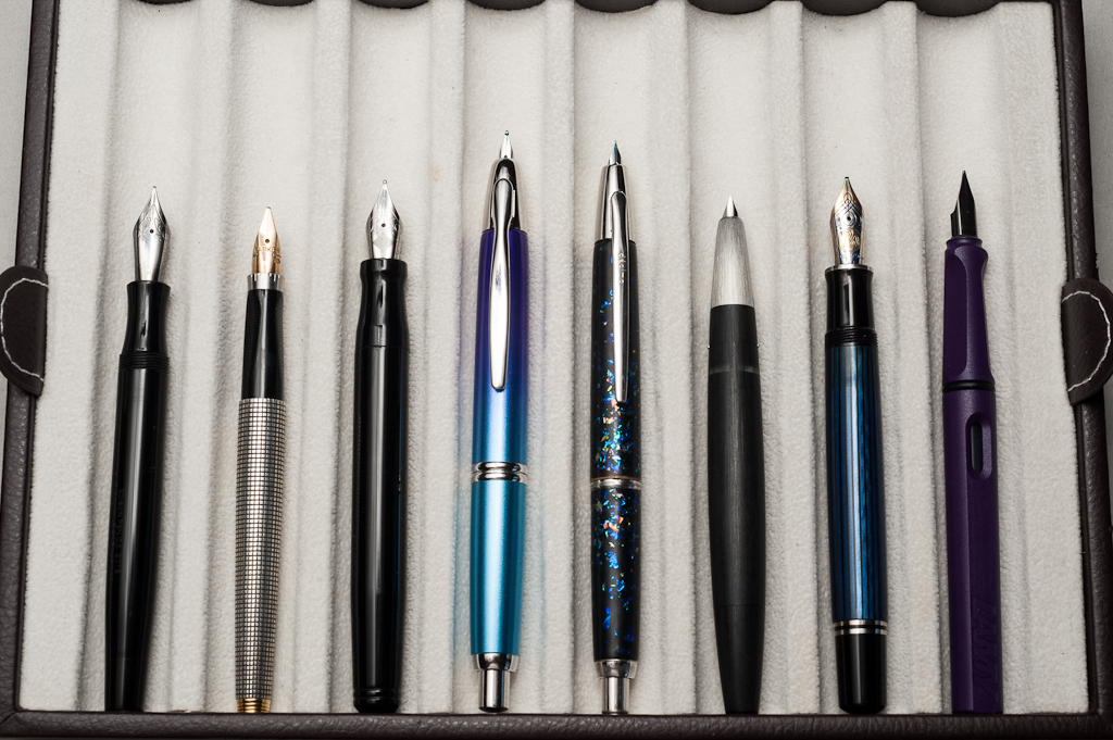
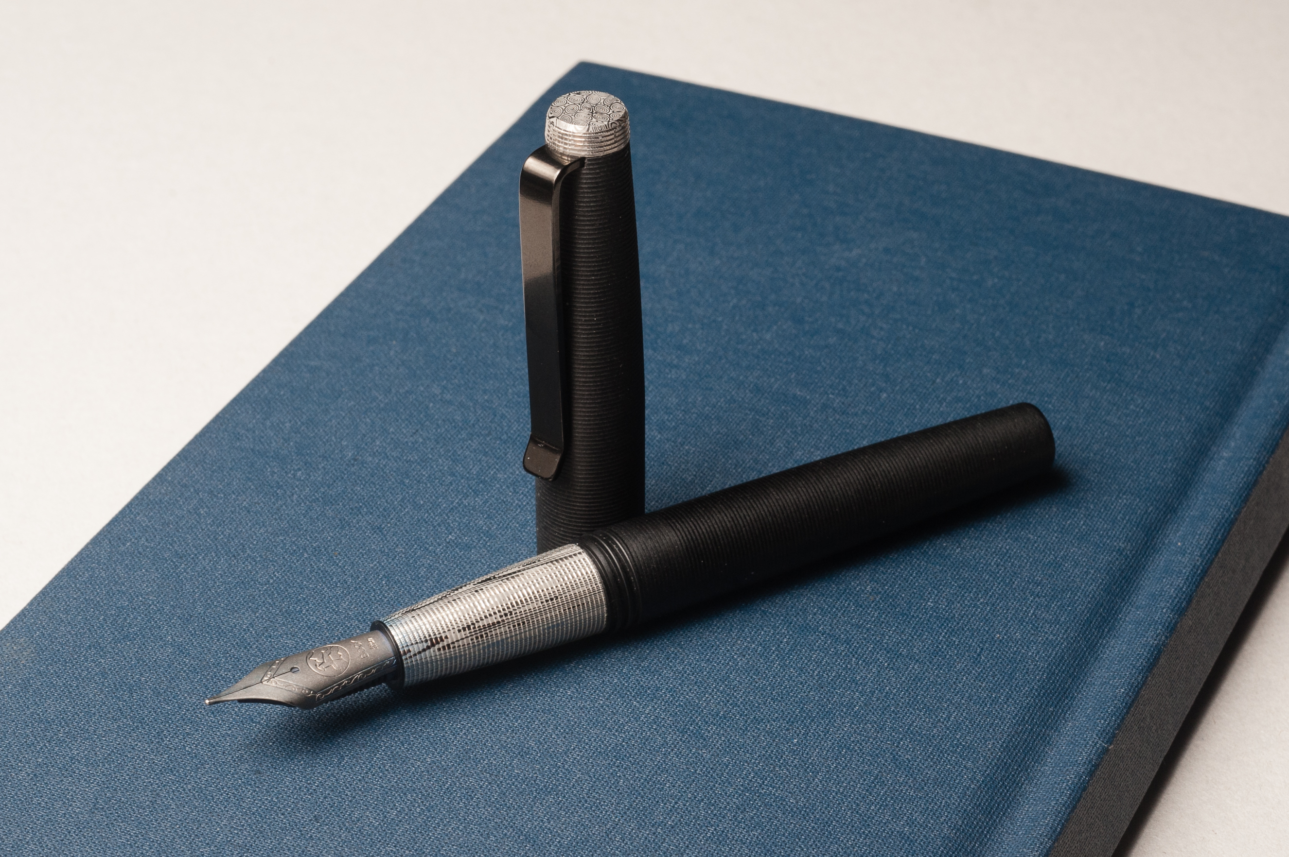
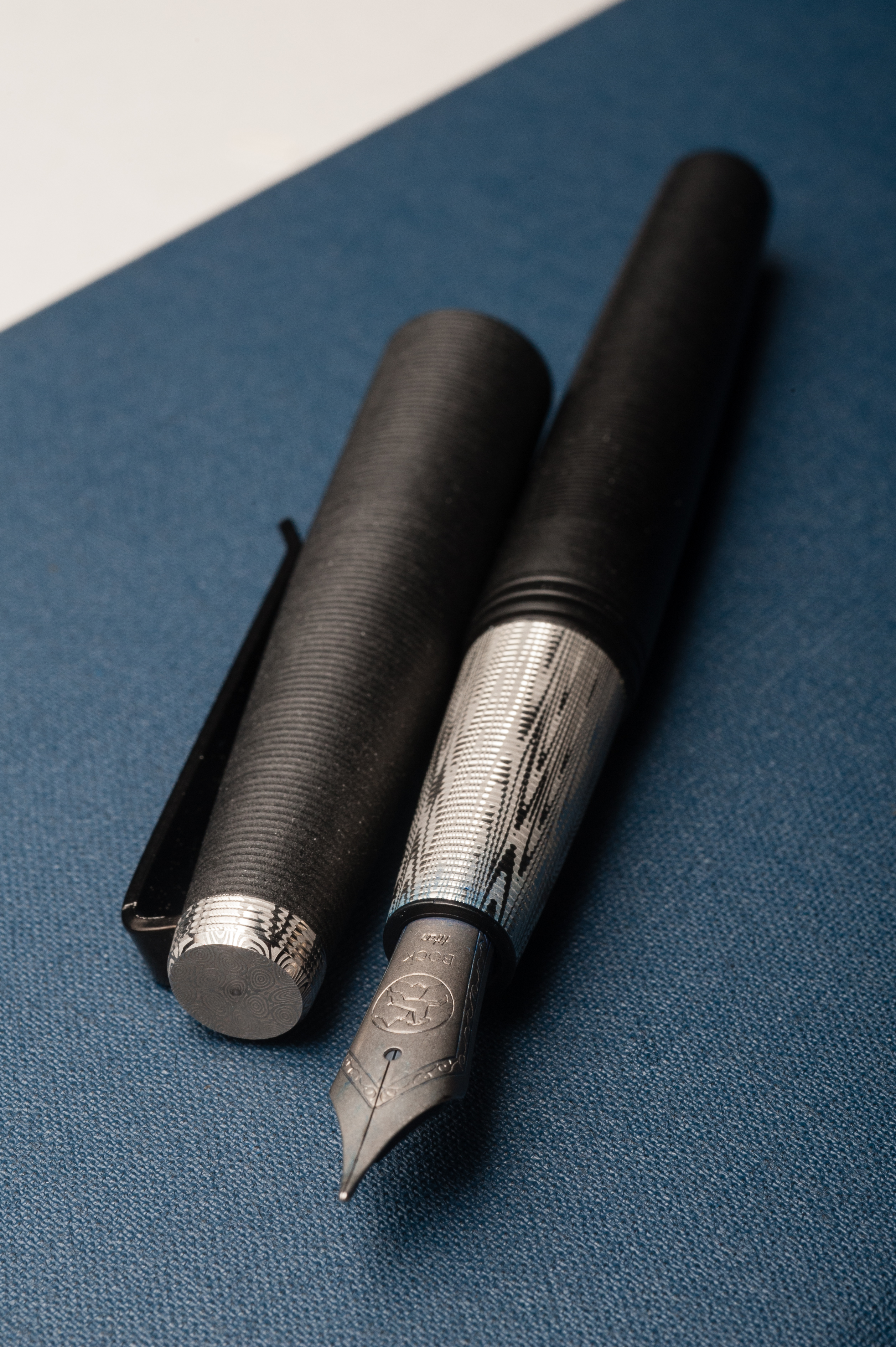
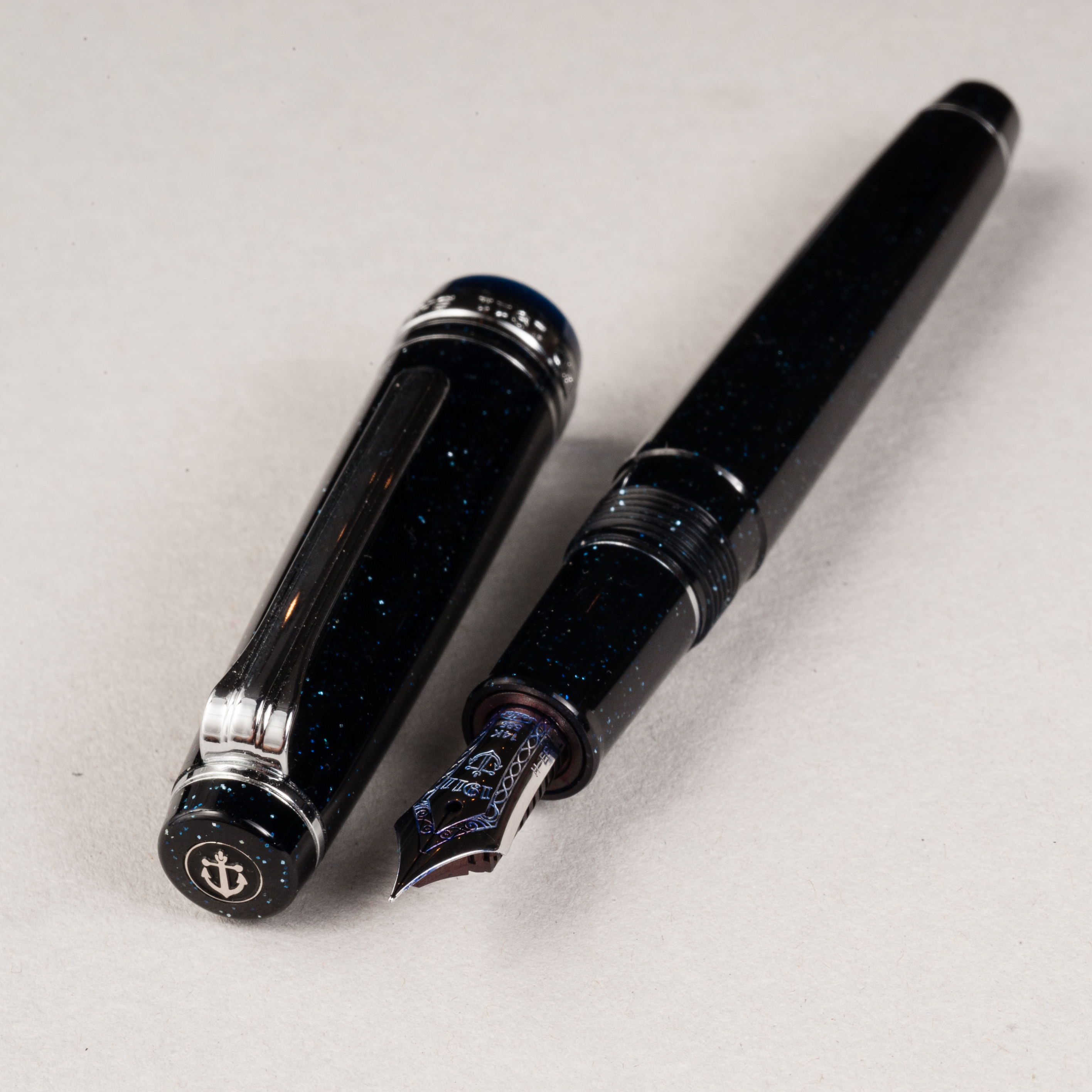
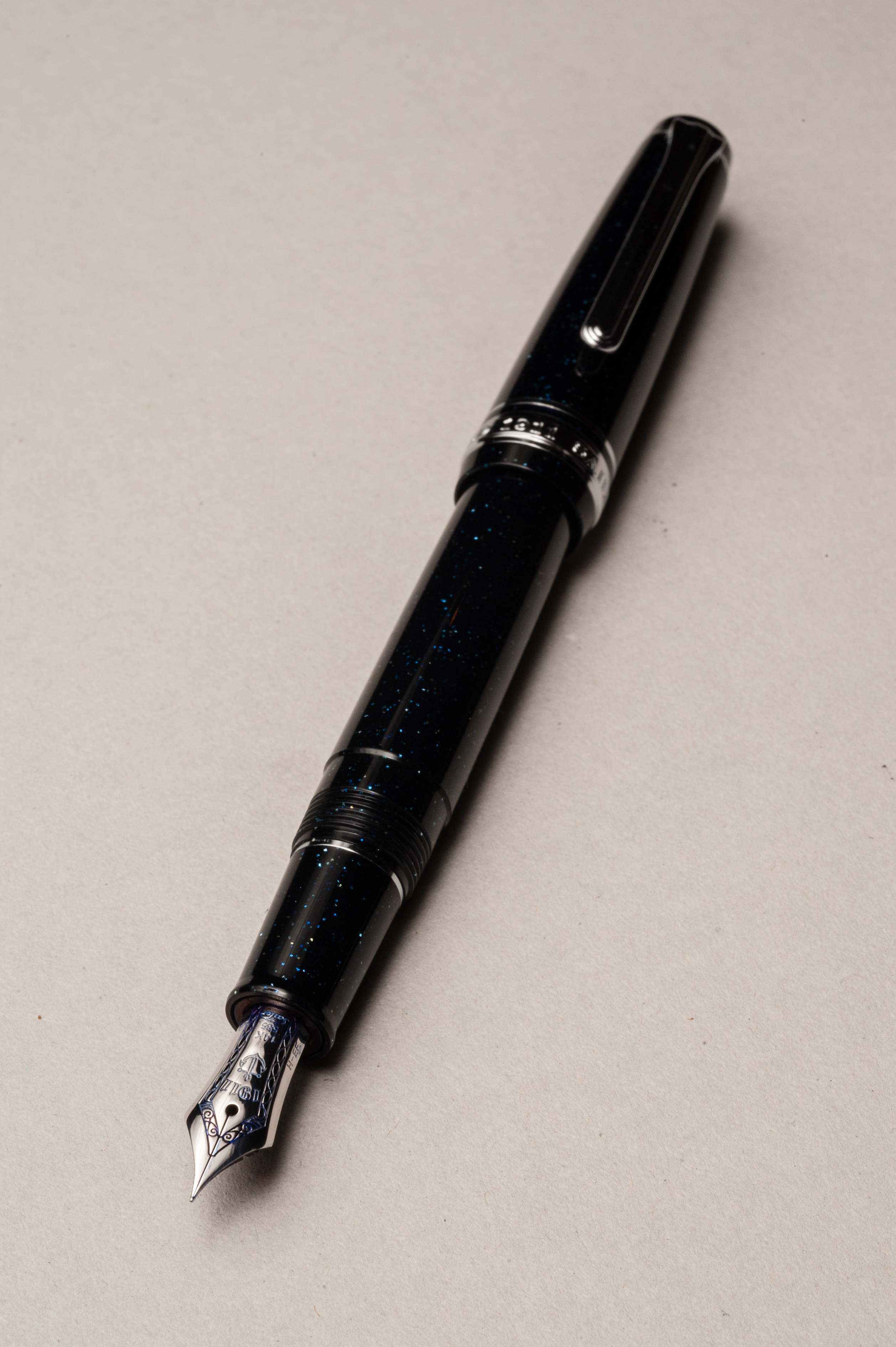
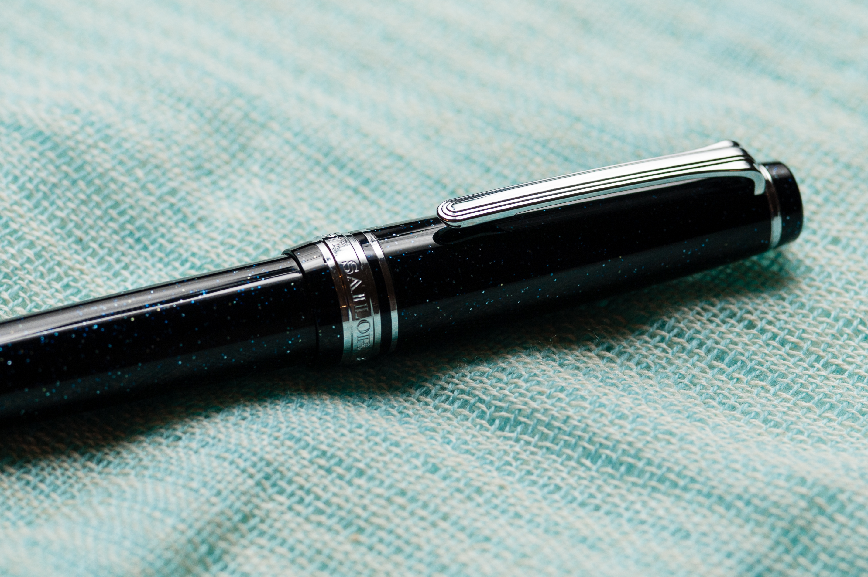
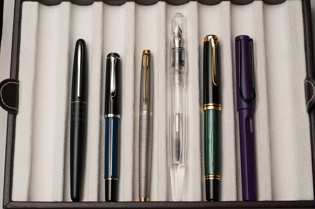
Pen Comparisons

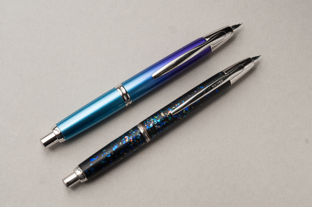
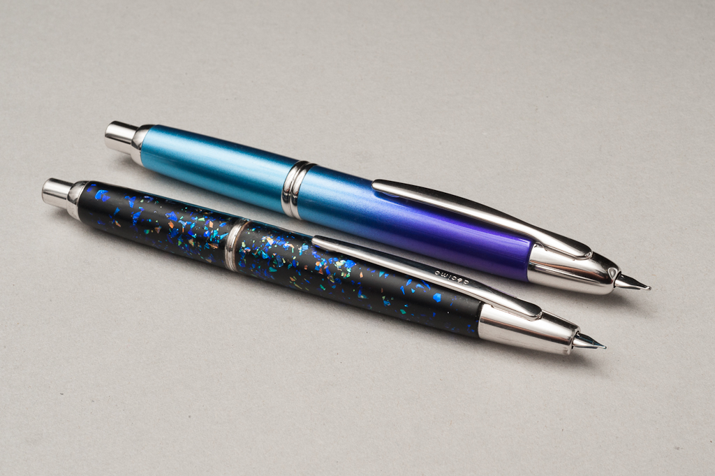
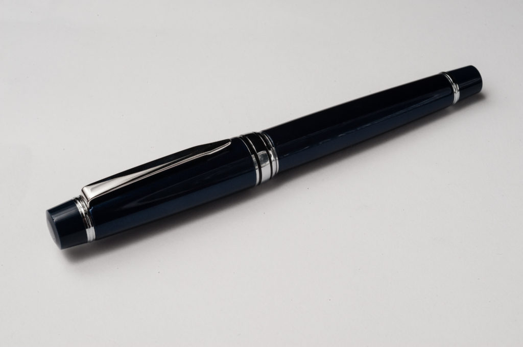
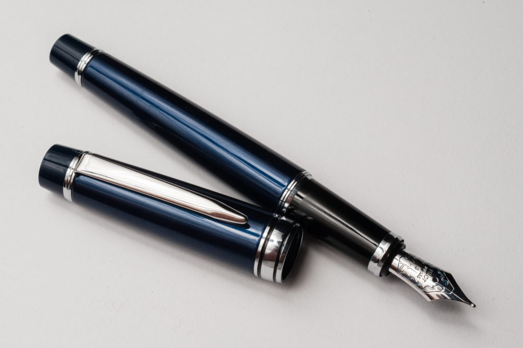
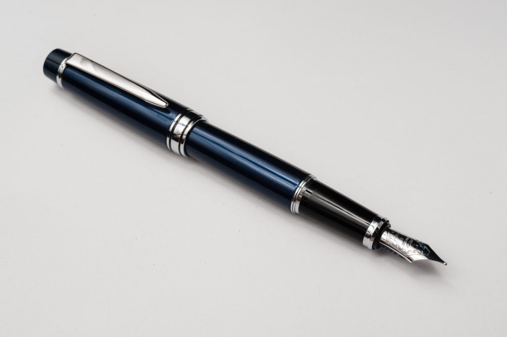
Pen Photos (click to enlarge)