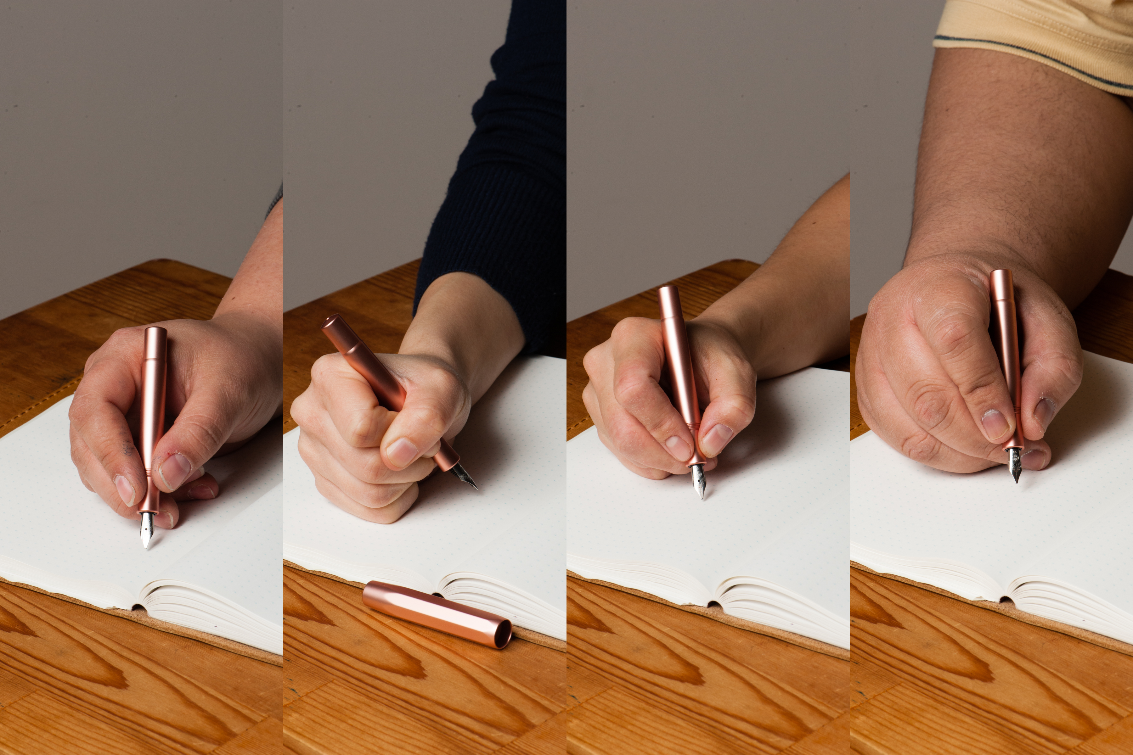
This is our first post with a guest! Claire, a friend of ours from the SF Pen Posse. She has more “average” sized hands than the extremes that the three of us represent. Also, she makes and sells pen wraps on Etsy. Check them out! (Review to come!)
Hand Over That Pen, please!
Pam: My first Kaweco was a Skyline in the minty green color. I had no hesitations to the size of the pen, and the color was spot on! The Kaweco has a very unique design going from a cute and sturdy pocket pen to a “regular” length pen with a post of the cap. Given the portability, durability and assortment of colorways, I can see why the Kaweco is so highly recommended and appreciated by so many in the pen community.
Katherine: I love small pens and faceted pens… so the Kaweco Sport is right down my alley. I also love bright colors… so it’s taken quite a bit of self-control to not collect a rainbow of these. Grumble pen limit grumble. Anyway, I really enjoy the design of this pen — a little quirky, but not too weird. Unique and functional! And if you prefer clips, you can add a clip — they come in both silver and gold.
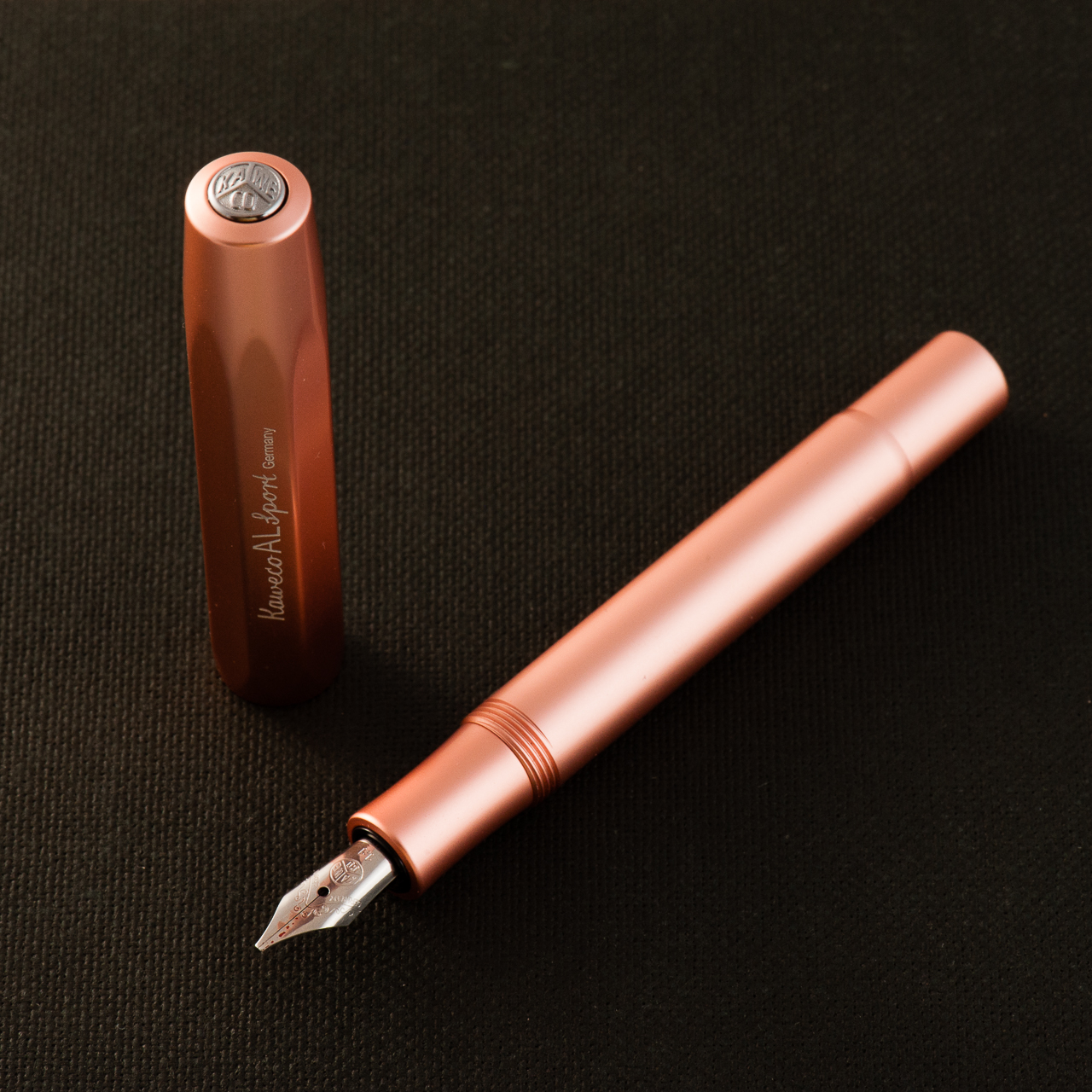
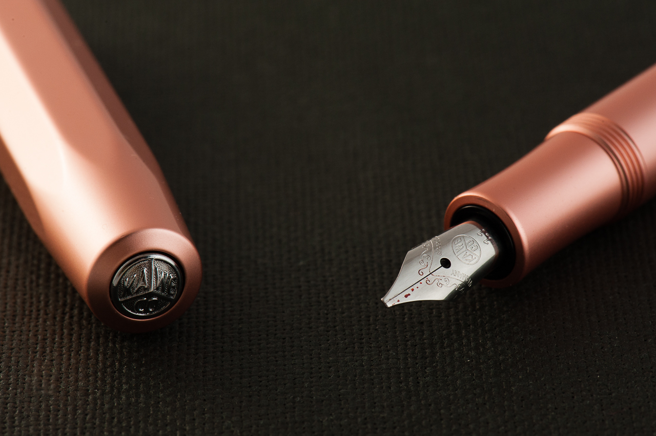
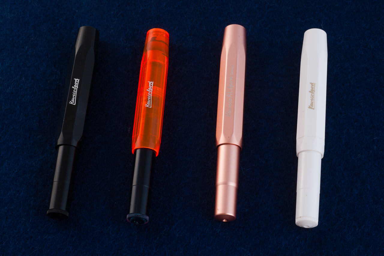
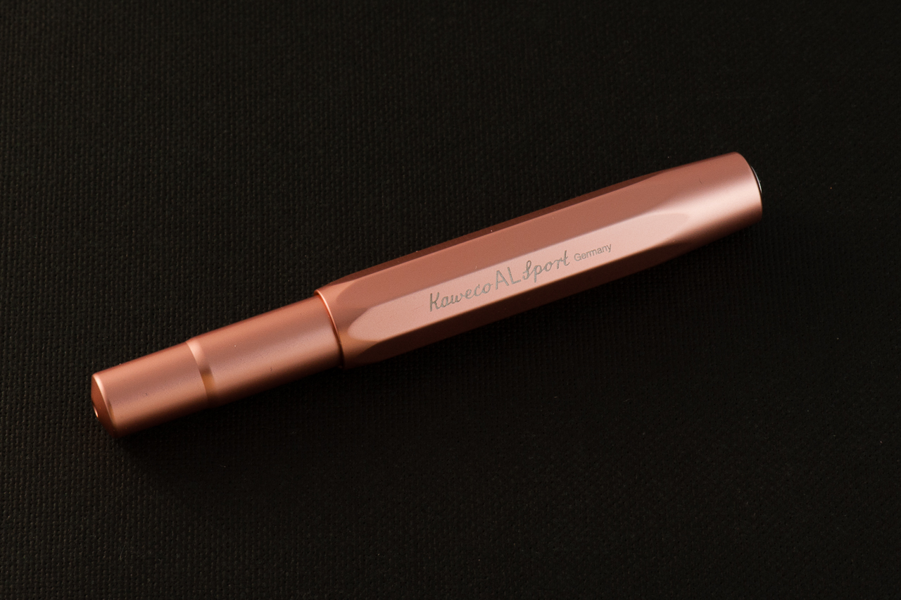
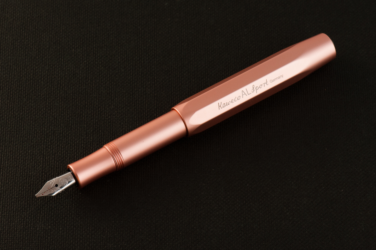
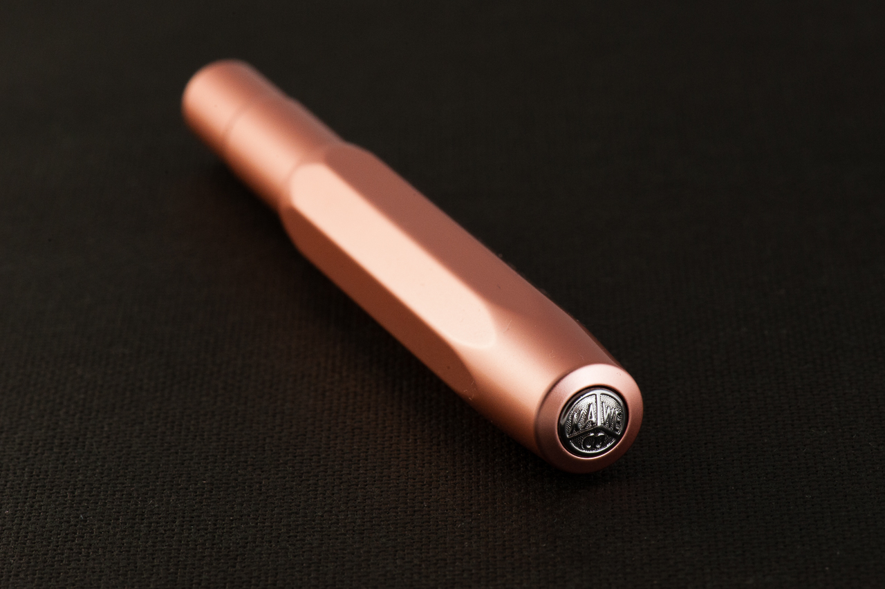
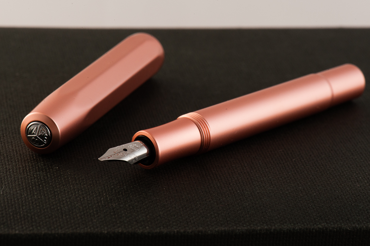
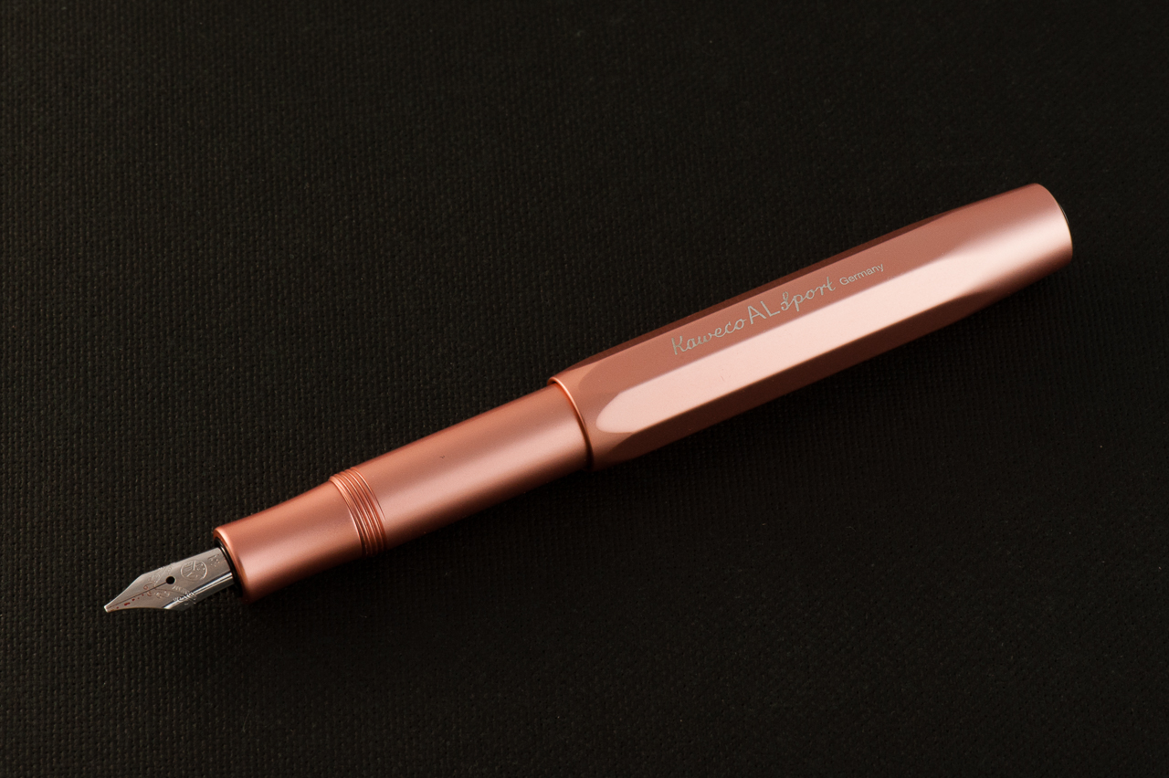
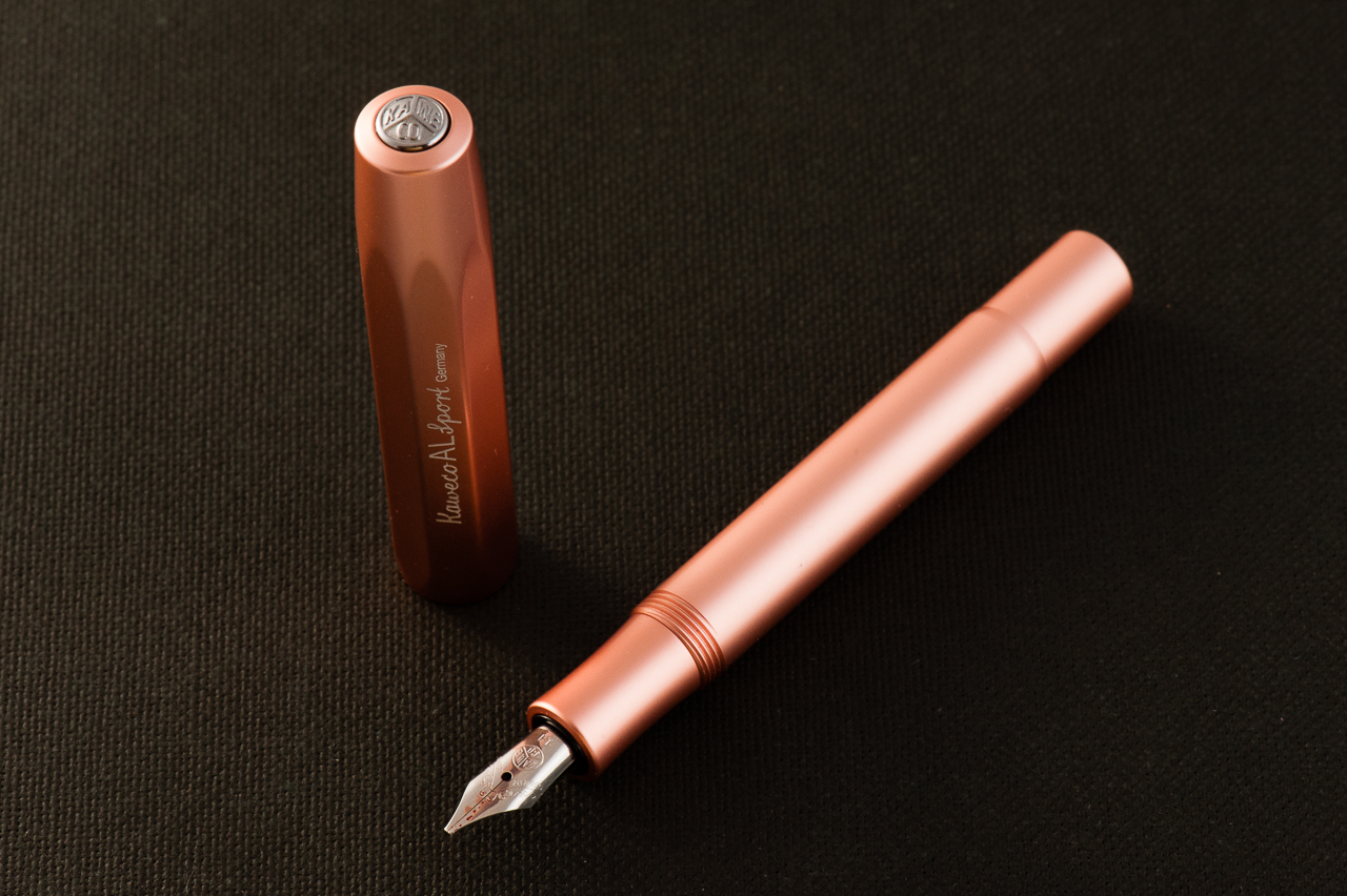
I own a white Sport (which will soon be doused in urushi) and a Rose Gold AL (pictured below). The Rose Gold was a special edition to Eslite, a chain of bookstores in Hong Kong, Macau and Taiwan. To my knowledge, it’s sold out but may show up used here and there.
Claire: This is a pen I avoided purchasing for a while simply because I thought the facets of the cap make the cylindrical-ness of the barrel stick out in an awkwardly. That being said, now that I’ve owned one for a few months the overall aesthetic of the pen has grown on me. This is a sturdy little pen has stood up to everything I’ve thrown at it. I purchased an orange Ice Sport in November and have enjoyed having a decent pen to throw in my pocket. My mum gave me an AC Sport late last year since I wouldn’t shut up about the pen after seeing it on the Pen Addict’s Instagram #blamebrad.
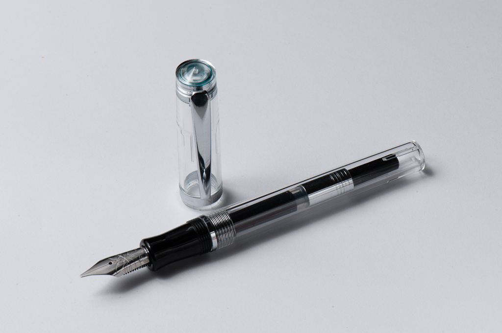
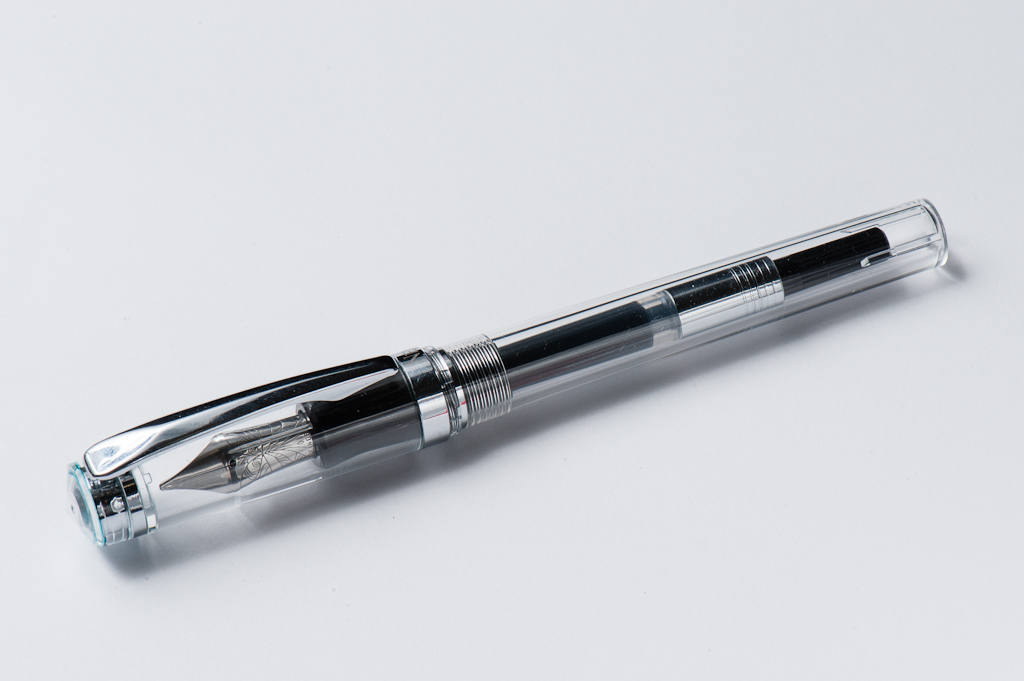
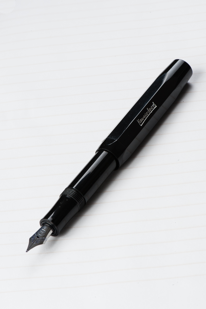
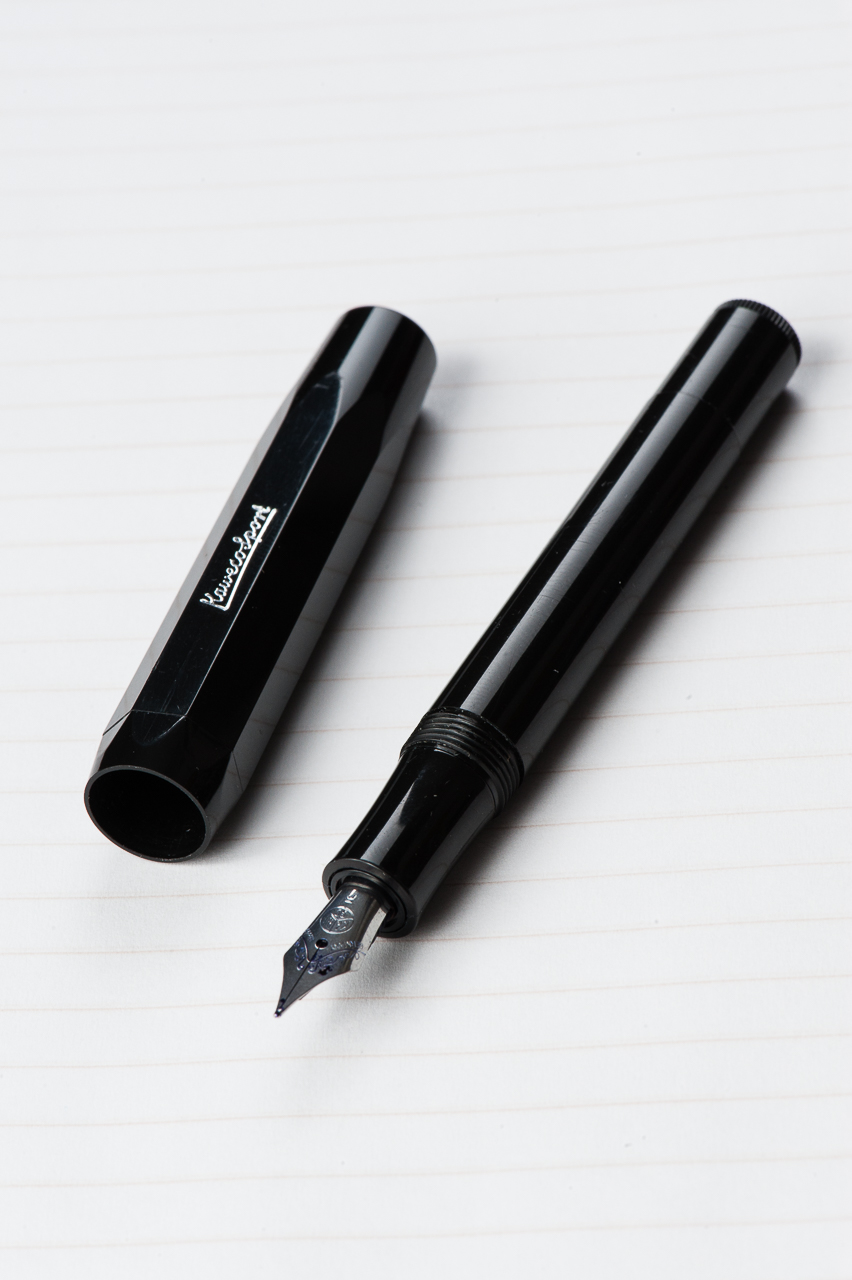
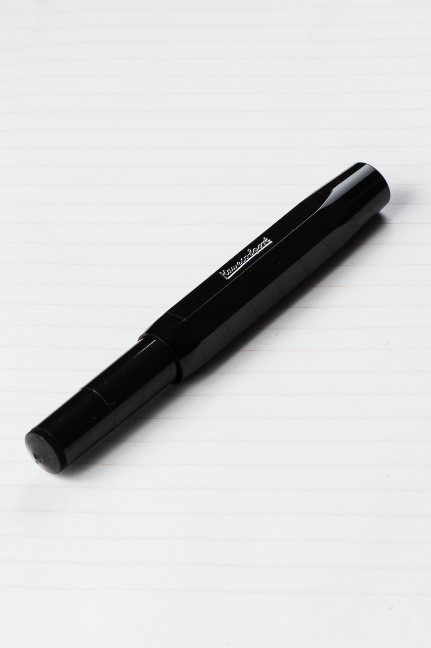
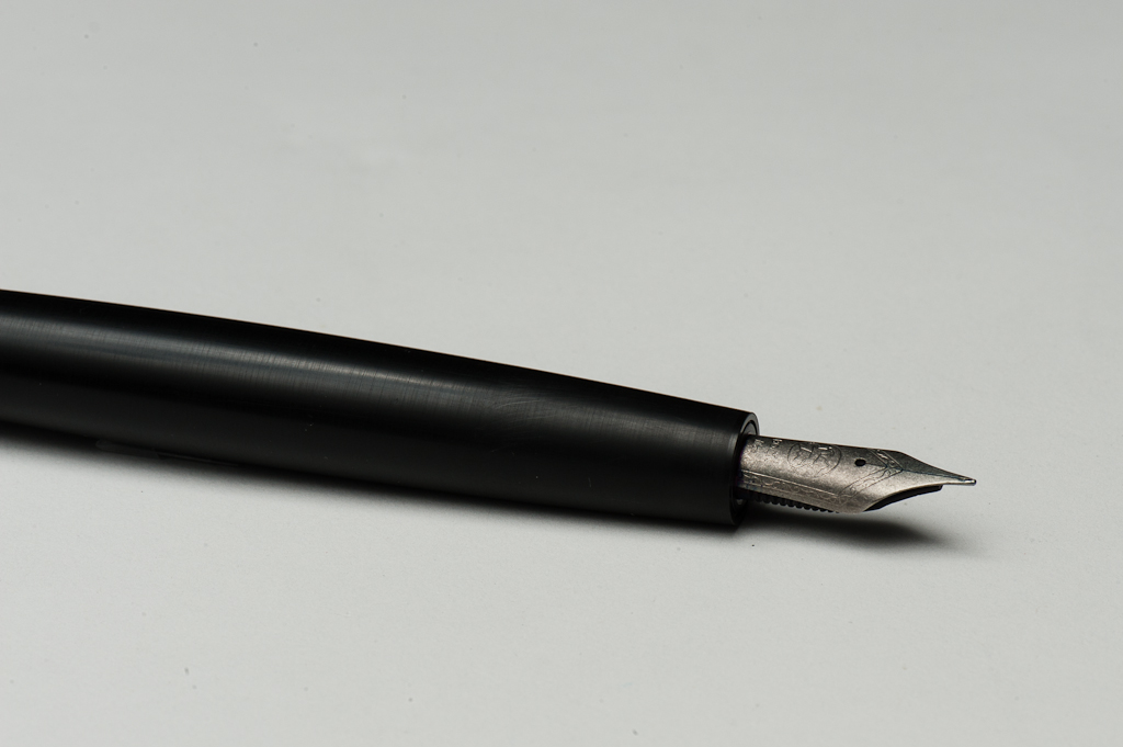
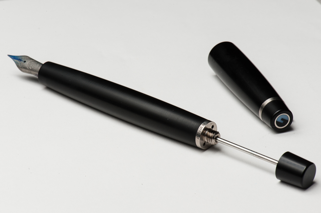
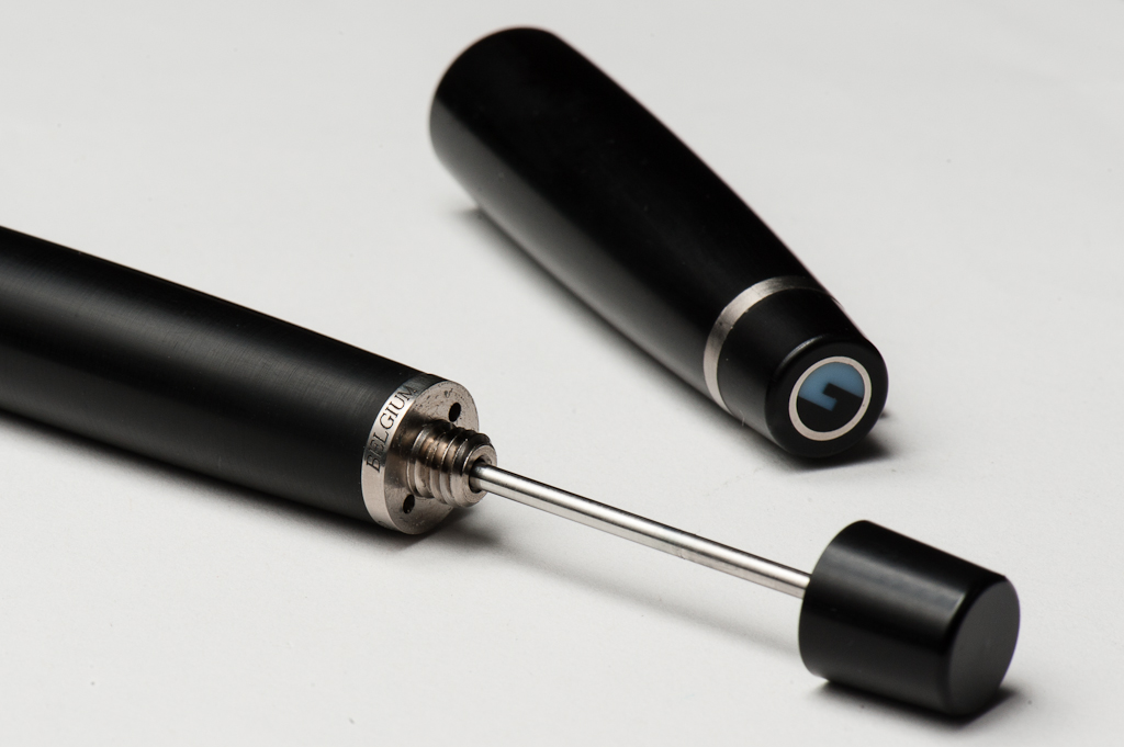
Franz: Hello Kaweco! =) What else can I really say about the appearance of the Kaweco Sport that the ladies above have not mentioned? It really is a pocket pen with such a distinctive and unique design. Before we reviewed the Sport, I never knew how many different styles this pen has available in the market. The two models we are featuring/reviewing here are the AL Sport (aluminum body), and the Skyline Sport (acrylic body/silver trim). There are 5 more styles that this pen can be purchased as: Classic Sport (acrylic body/gold plated trim), ICE Sport (acrylic transparent body), AC Sport (aluminum body with carbon inlays), AL Stonewashed (aluminum body with weathered effect), and Brass Sport (brass body).
The Sport Series was introduced by Kaweco in the year 1911 as a short, safety pocket pen. In the beginning, the pen was called Safety Pen 616 for Sportsmen. They eventually changed it to the Sport-Series. Kaweco updated the pen’s filling system into a piston-filler pen in the 1930s, and then to a cartridge-filler in the 1970s as we know how it is filled today. Of course, you can fill the pen like they did in 1911 and choose to eye-dropper the pen as well. Just be careful when you unscrew the pen. Eyedropper-filled isn’t my preferred method for getting ink into my pens though.
Kaweco Sport history source: www.kaweco-pen.com
The Business End
Pam: Disclaimer, the EF of my Kaweco was too broad for my taste. Given that, it was still a good nib for daily use. I used the pen on cheap office paper and it performed admirably. I didn’t find the nib to be too dry, given my choice of paper at work. The nib writes more true to size on Tomoe River paper, unsurprisingly. I very much enjoy it when I am in the mood for a “bolder” EF line to show off the ink color in my hobonichi. This German EF nib does require me to change the size of my handwriting, ever so slightly, to accommodate the “bolder” line, which results ins a “bubblier” handwriting for me.
I was really surprised how much I enjoyed the 1.1 stub. It’s probably my favorite of all the Kaweco nibs that I have tried. Its a great nib that has the right amount of ink flow so that the line remains relatively crisp and shows off a decent amount of shading in the ink color. If I had to choose between an EF or the 1.1 stub, I would choose the 1.1 stub. My ongoing taste change in nib sizes is very likely due to Franz-fluence (Franz’s influence for those who are pun adverse.)
Katherine: I’ve owned a handful of Kaweco Sport nibs and had a decent out of the box experience with all of them. My Fine and BB ran a bit dry, and my 1.1 “Calligraphy” nib wasn’t too wet, but all in all, they’ve all been very usable. However, I think I’ve been lucky — I have seen quite a few reports of Kawecos with baby’s bottom. None of them will win awards for being my (or, I suspect, anyone’s) favorite nib, but they get the job done and write without fuss.
Claire: Out of the box, the nib on my fine Kaweco AC Sport was great. The extra fine on the Ice Sport required a quick tine alignment; which I don’t mind on a sub $30 pen. Both nibs have been utilitarian; being a tad on the dry side, better for paper of questionable quality. I am thoroughly enjoying the 1.1 stub I’m borrowing from Katherine (I might forget to return it the next time I see her). Typically, fine and extra fine nibs are the way to my heart, so I’m surprised to enjoy the 1.1 so much.
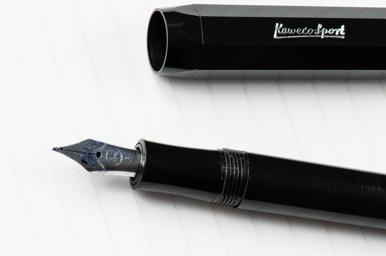
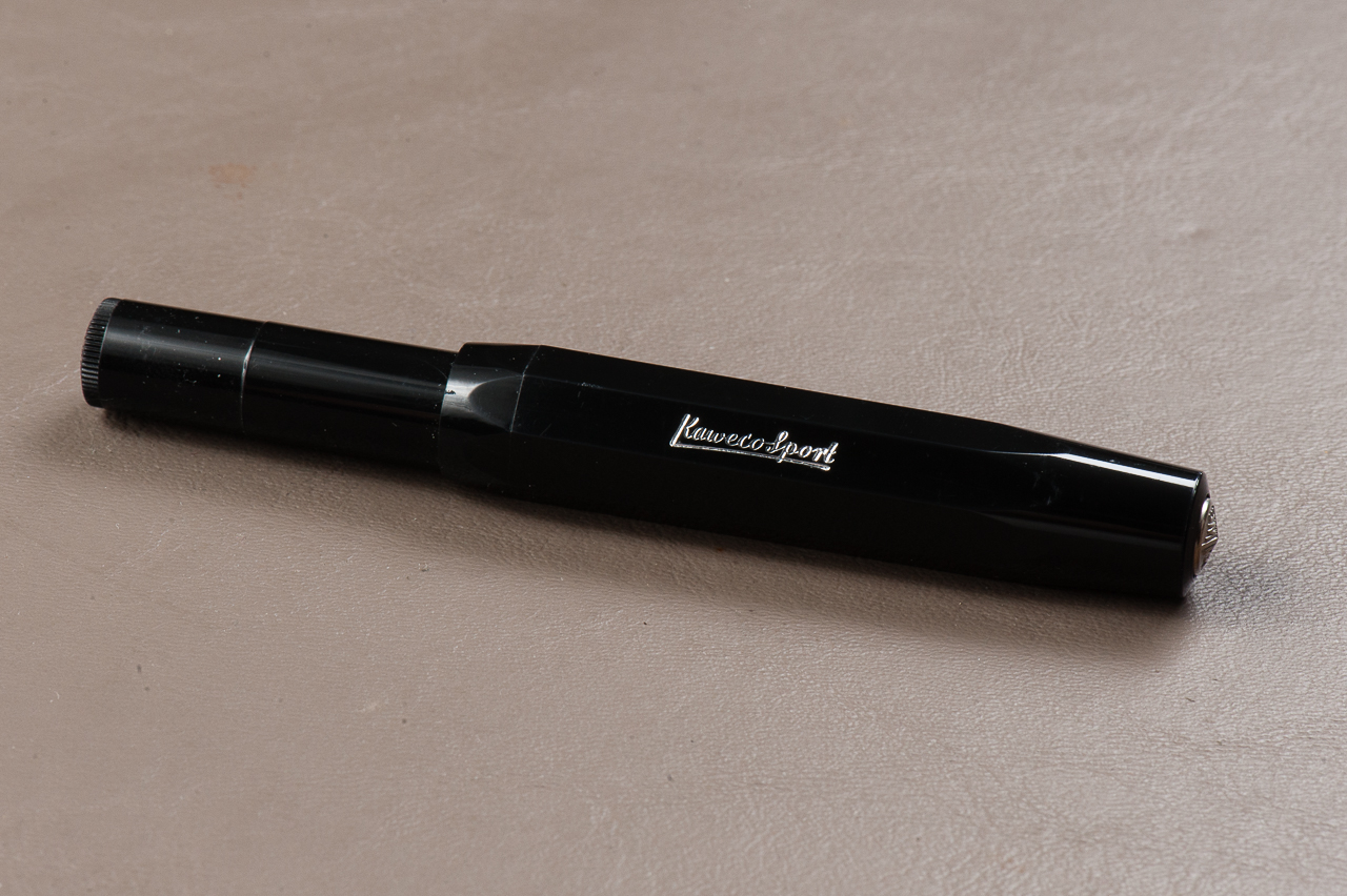
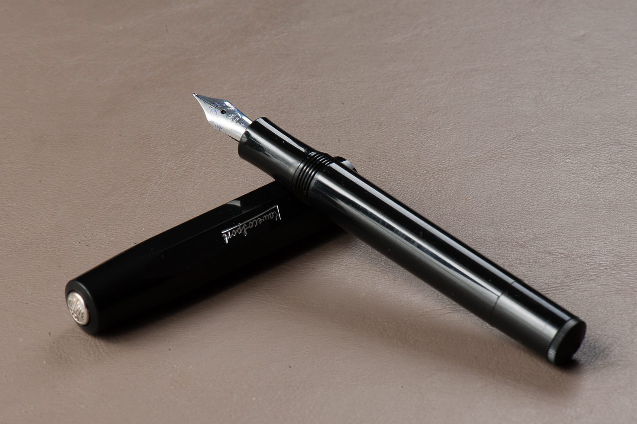
Franz: To echo the sentiments above, Kaweco’s nibs write out of the box. A friend gifted me the black Skyline Sport below and it has a fine nib that just wrote smoothly after I placed the cartridge into the pen. Granted, the nib isn’t as wet as I want it to be but it isn’t scratchy and it wrote nicely. I also got to use Katherine’s 1.1mm nib on her AL Sport and it was also a pleasant experience. Yay for Kaweco! Their business end means business.
Write It Up
Pam: I prefer to write with the Kaweco Skyline posted given how light it is. I much prefer the weight of the Kaweco AL over the Sport. I find the plastic body to be too light and unpleasant to hold for prolonged periods of time. I find myself gripping the pen harder because it feels so unsubstantial. (No, the plastic body did not crack under my iron grip.)
The Kaweco AL is comfortable with or without the cab and relatively well balanced for me either way. The weight is more comfortable and “sits” in my grip well. The Kaweco AL is wonderful when paired with the 1.1 stub nib aka Katherine’s Kaweco, which I had a really hard time giving back.
Katherine: This pen makes it obvious how much smaller my hands are. I can and do use my Kawecos unposted, both my plastic Sport (which was my only work pen for about six months) and my AL. I prefer the plastic Sport when posted though — it gives the pen a little more heft and makes it more comfortable to hold. But, my tiny hands prefer the Sport AL unposted — it feels more balanced to me. All in all, both are very usable for me, both posted and unposted. I don’t own a Sport in Brass, but I’ve tried one and found that it was usable, but heavy and my hand felt the fatigue (especially if it was posted and top heavy) after a bit of writing — usable, but I wouldn’t buy one.
Claire: For quick notes, I don’t feel the need to post the pen. That changes if I’m going to write more than a few sentences (which is the majority of my writing), then I feel the need to post the it to avoid hand fatigue. I prefer the weight and balance of the AL Sport over the Ice Sport. Though, after eyedroppering the Ice Sport is a more comfortable weight. Even posted, this is not a pen I can write for a long time without noticing some discomfort. But as a pocket pen, it isn’t intended for hours upon hours of writing at one time.
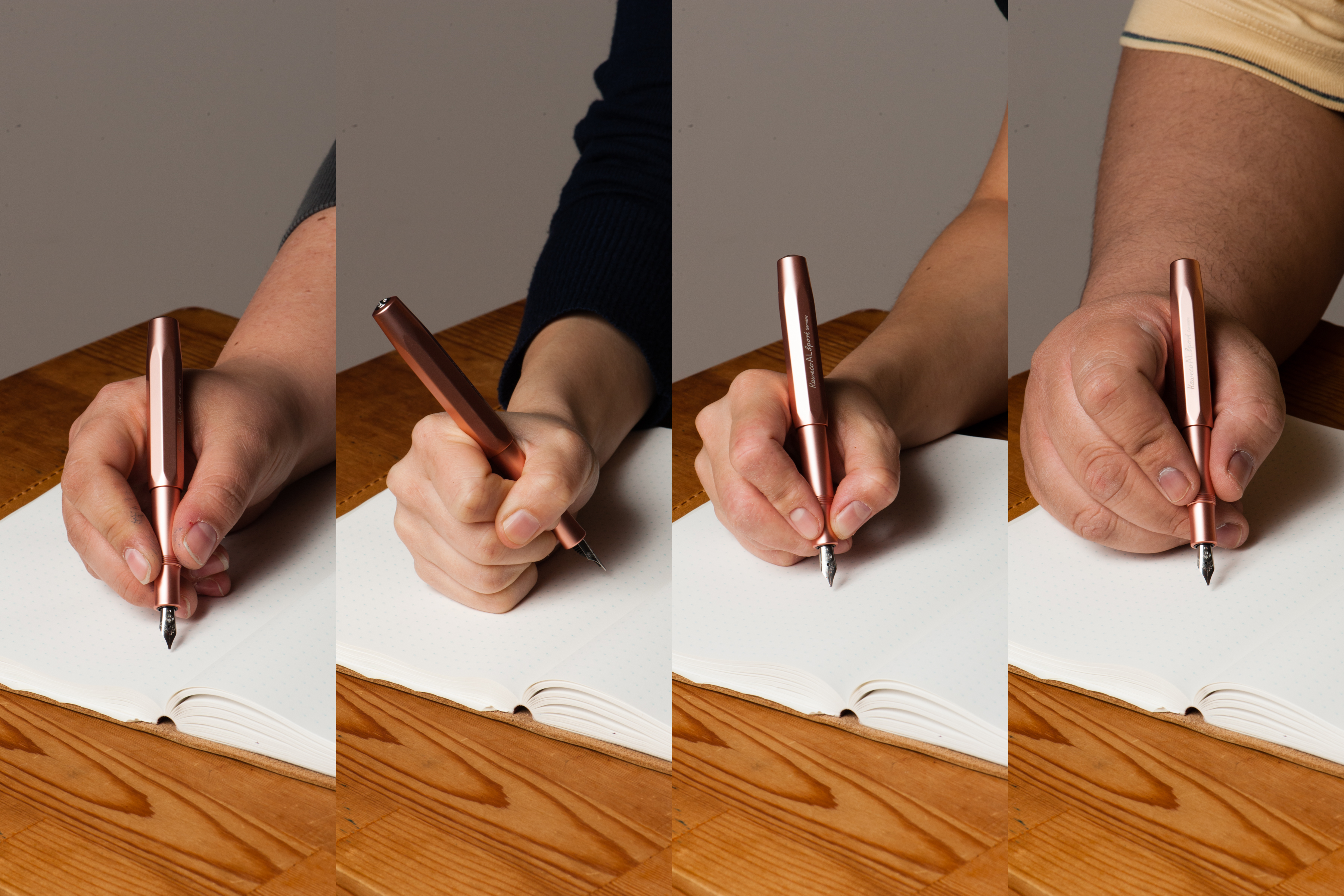
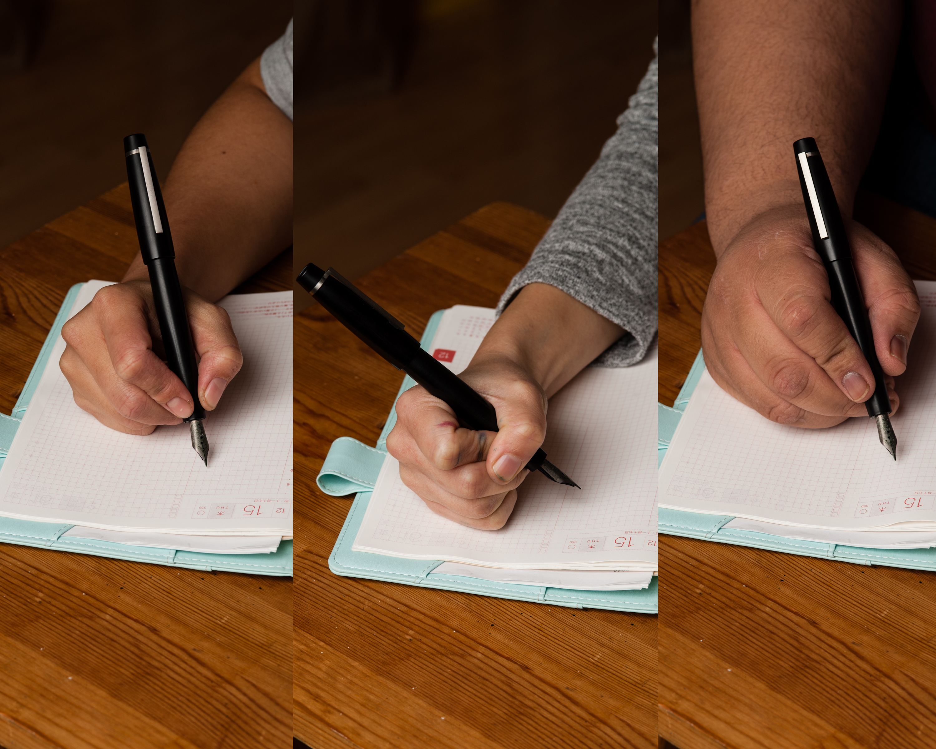
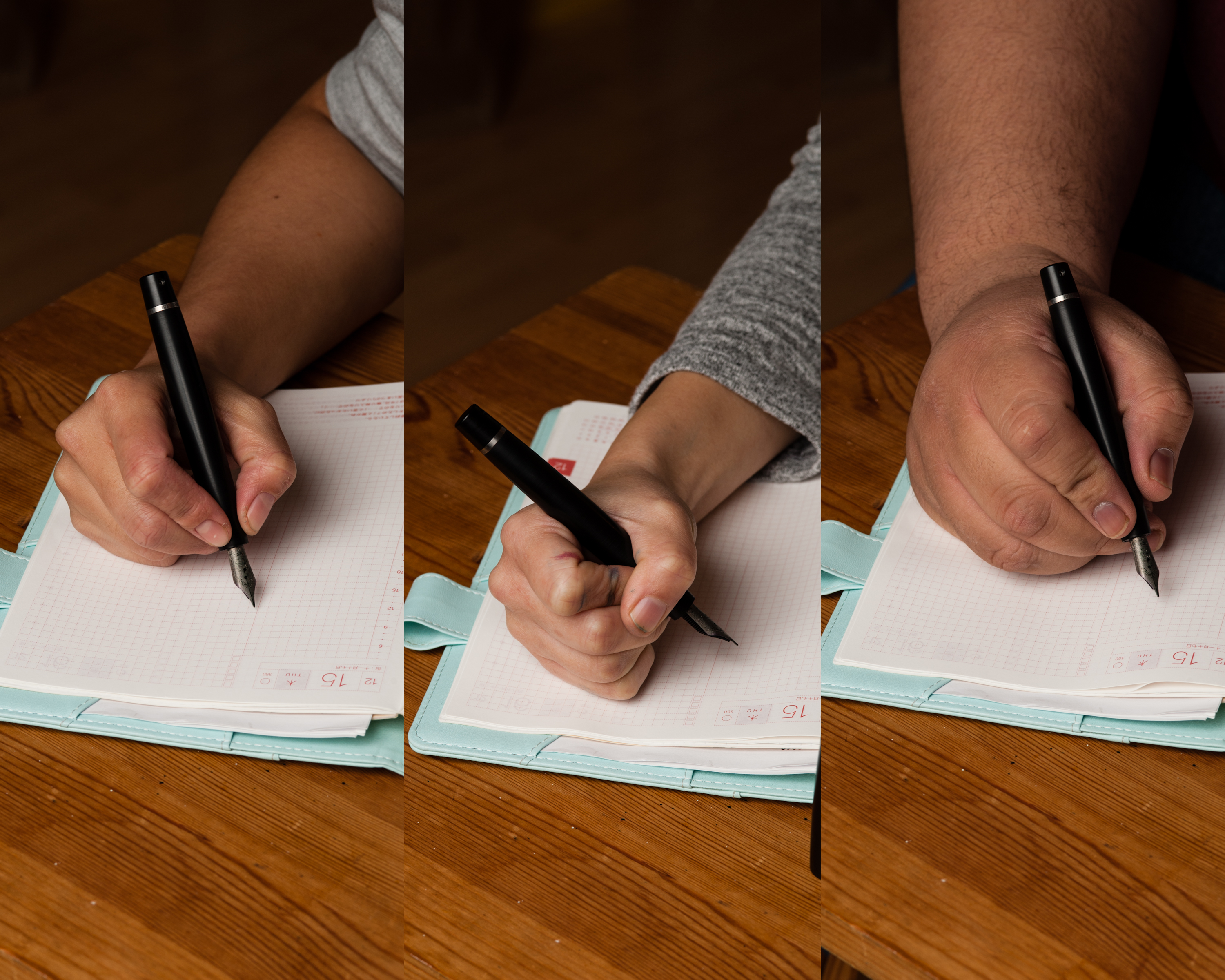
Franz: May I just skip this part? Kidding, kidding! Okay, so I took both the AL, and the Skyline Sport on a test drive. I wrote with both of them posted for about 10 minutes each. Please understand that this Sport is a little too short unposted for my bear paw to write more than 5 words so I just kept the cap posted as I wrote on my journal. Because of the narrow 9.4mm section, my hand cramped up and I noticed my hand gripping the pen tighter than usual. The Skyline Sport is a very light pen and I didn’t enjoy writing with it. The AL Sport however, has a nice weight to it and my hand was a little bit more comfortable. The length of the Sport when posted was fairly comfortable for me.
EDC-ness
Pam: The Kaweco is a great pocket pen, especially the Kaweco Sport, for it’s petite/cute size and lightweightedness. It’s also a great way for me to lose this pen into my many pockets or not notice it before throwing my pants into the laundry. I didn’t try to EDC carry Katherine’s AL, but I would be really interested in purchasing one, and I am pretty sure I will be less likely to lose it or toss it with my dirty laundry.
Katherine: The plastic Sport was my EDC for a few months before I jumped off the deep end and started exploring vintage pens. I had a mint green, Fine nib Sport that I stuck in my pocket, threw in my backpack and generally manhandled. It did great. I ended up gifting it to a friend I was living with for a week (Hi Tatsie! Thanks for letting me stay with you in Singapore!) but I eventually picked up another one, used, to be a project pen (hello urushi, meet my faceted friend). I’ve used my Rose Gold AL on and off as an EDC, and it’s held up similarly — durable, very little (if any) leaking into the cap (perhaps because the nibs are dryish to start with?) and easy to write with quickly. However, I’m a little worried about damaging the finish, so I don’t carry it as often (it was a gift from a cousin).
Claire: The Ice Sport lived in my pocket for several months. About a month ago, I accidentally ran it through the washing machine. No ink leaked out of the pen (no stains on my clothing phew!) and the pen was no worse for the wear. Some ink snuck behind the cap insert, but that’s to be expected. I carried this pen at work quite frequently, though in my line of work a ballpoint or a permanent marker is more suitable. I have since put a different nib on the pen and don’t carry it as lackadaisically.
Franz: Even though I do not use my Skyline Sport for my journaling, or letter-writing needs, it practically lives in my bag ready to be written with. For me, this pen can be used as like a backup when you need to fill out a quick note. In the spirit of the Hand Over That Pen review process, I made it a point to use this pen at my workplace for a day. Let’s just say that it didn’t really impress me as an everyday carry pen. This is mainly because for my larger hands, I need to unscrew and post the cap each time I have to write notes or sign my name. Even though the cap only needs one and a quarter turn to uncap, it was still a bit inconvenient for me. The fine nib performed well as I wrote on the copier paper from our office.
Final Grip-ping Impressions
Pam: I would highly recommend the Kaweco Sport for those who enjoy a small/portable pen and a reliable German nib. For those who enjoy the durability and heft of the aluminium, the Kaweco is a good, solid upgrade. The Sport is a great starter pen, but for fans of the Kaweco Sport, the AL is an obvious choice to have to try out. You won’t regret it.
Katherine: If you like small pens (and I mean small), the Kaweco Sport is fantastic. For the money, I think the plastic Sport is a great pen — durable, neat looking and a solid writer. The AL isn’t a bad pen at all, but at it’s price point, unless you really like the way it looks, it does seem a bit expensive for what it is. Price aside though, I prefer the AL. The pen feels more substantial, nib units are unscrewable (instead of friction fit in the plastic Sport) and the finish can show wear and tear — and I’m a sucker for pens that tell a story.
Claire: The section of this pen is just a little bit narrow for my taste. As such this is never going to be the pen I reach for to take notes in class. Narrow sections are especially uncomfortable for me thanks to an old fracture in one of my fingers so your mileage may vary. That being said, this is a pen I thoroughly enjoy; another one may be heading my way as soon as the stainless steel version becomes available.
Franz: I’m gonna go with what Claire said above and echo that the Kaweco Sport is a little too small for my use. If you have big hands, this may not be a pen for a daily user but try one out when you can. It is a cool pen to have in the bag/collection and they’ve got very nice finishes of this pen in the different styles I mentioned in the beginning of this review. I actually want to get the AL Sport Night Edition just because it’s all decked out stealthily with a nice carbon black nib too. But that’s the pen collector in me who wants to have all the stealth pens. Haha!
Cheers!
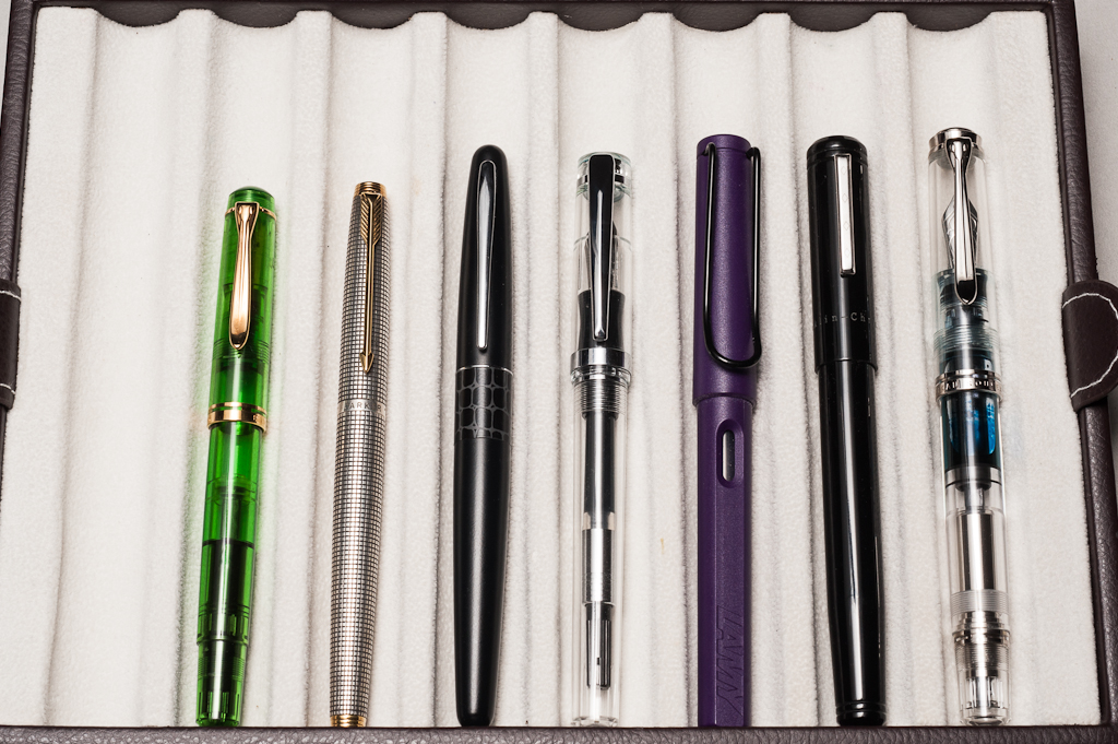
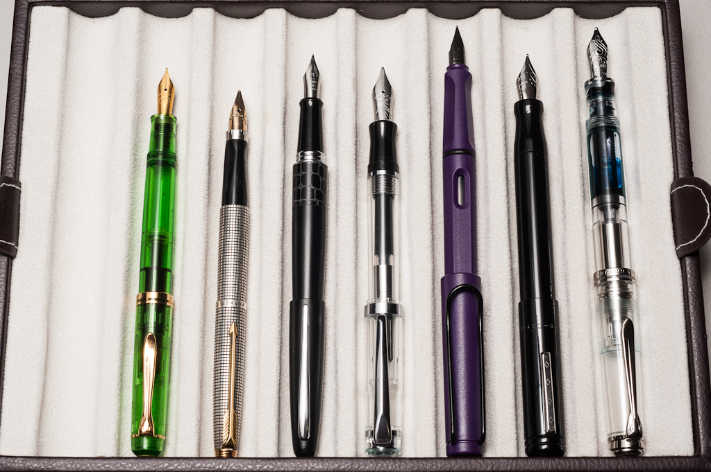
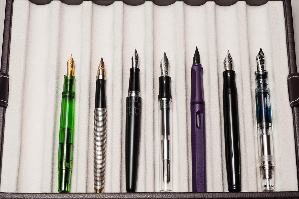
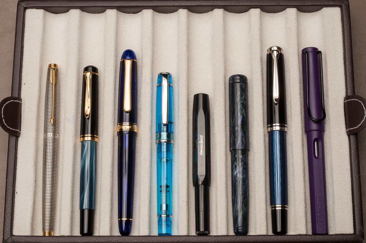
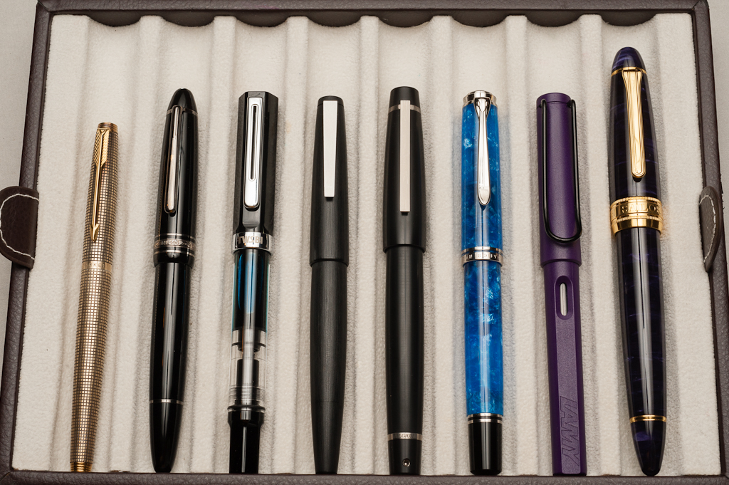
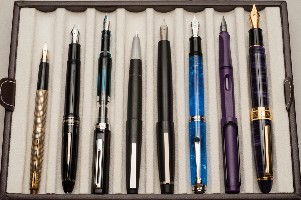
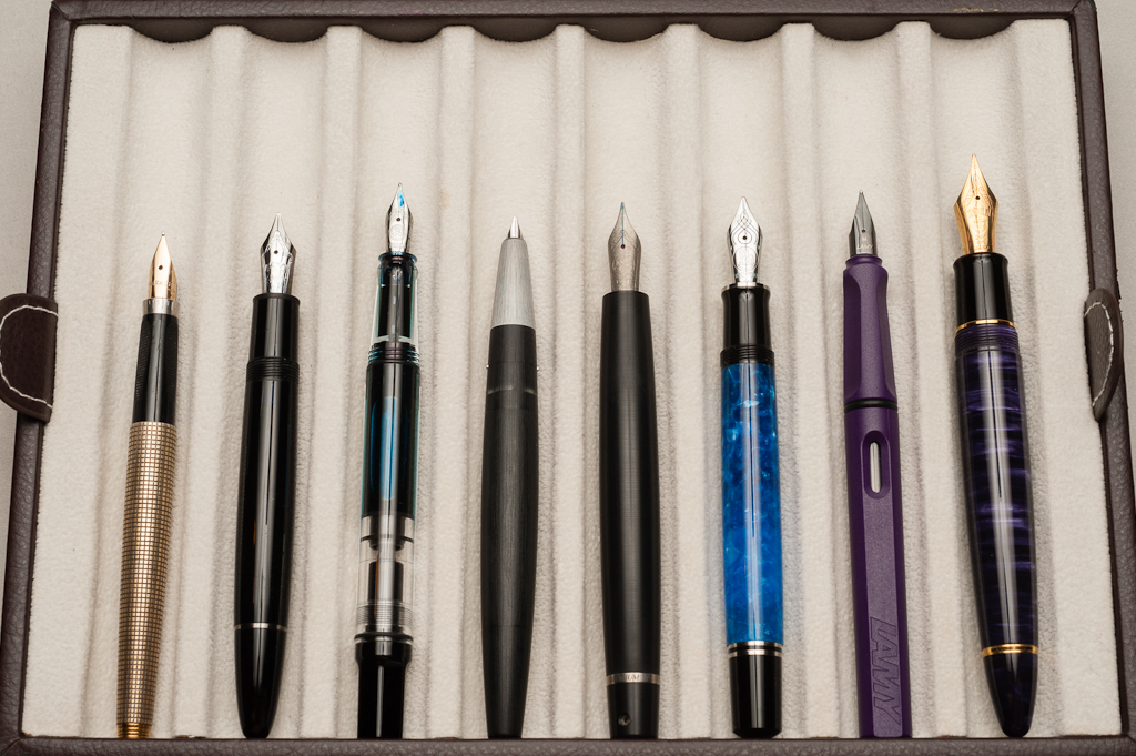
Pen Comparisons
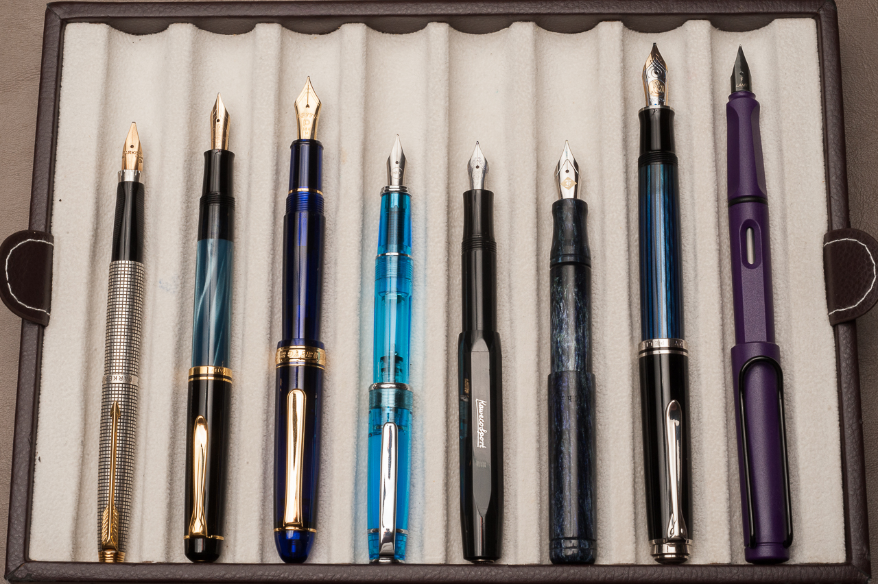
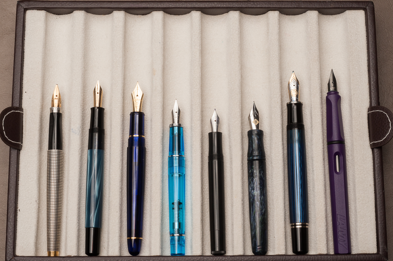
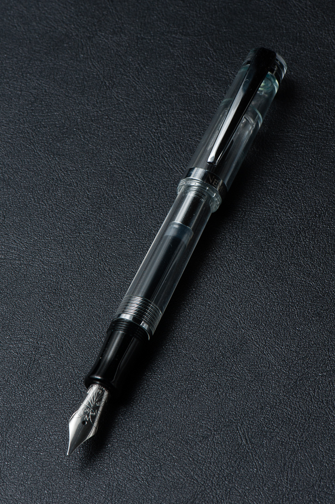
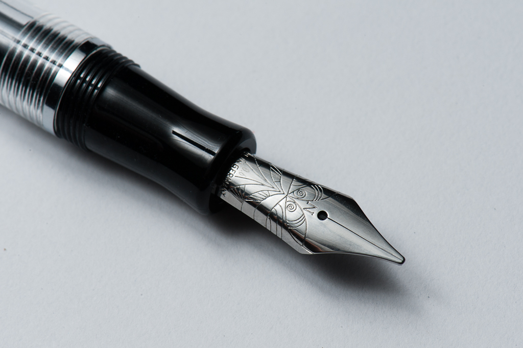
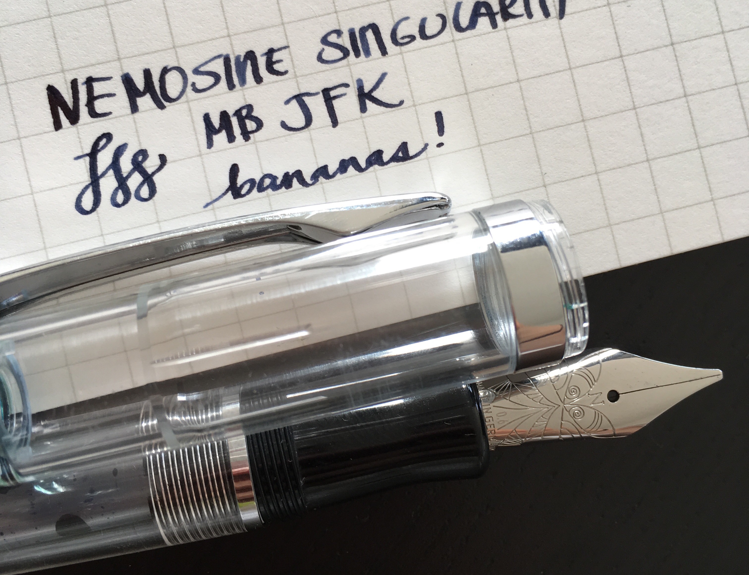
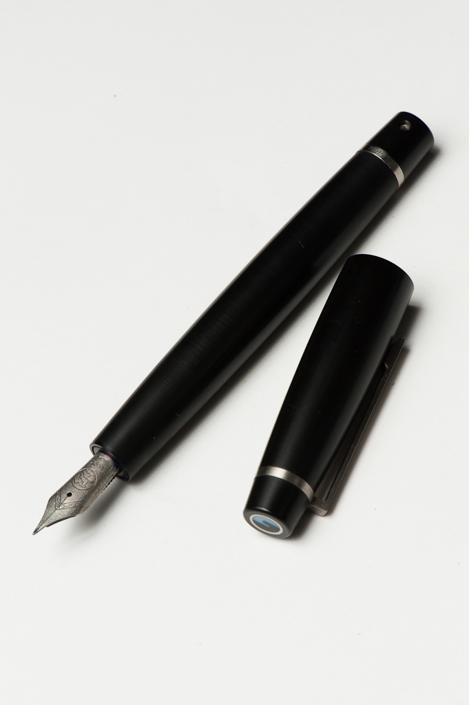
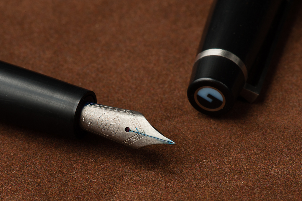
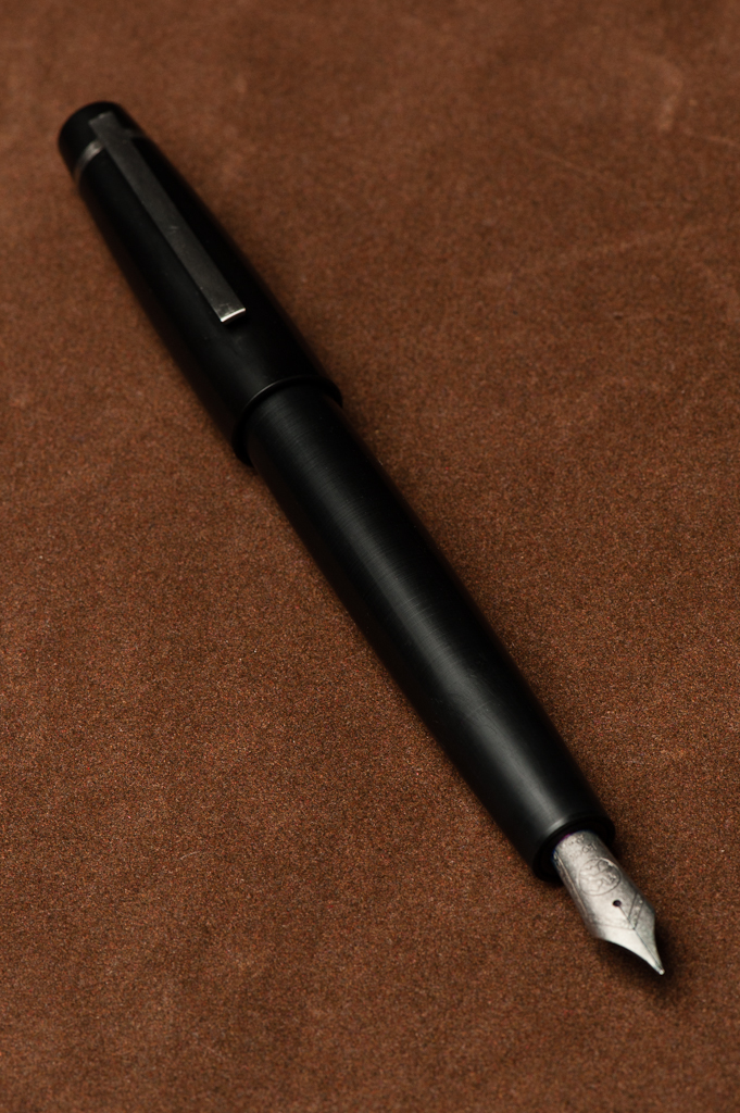
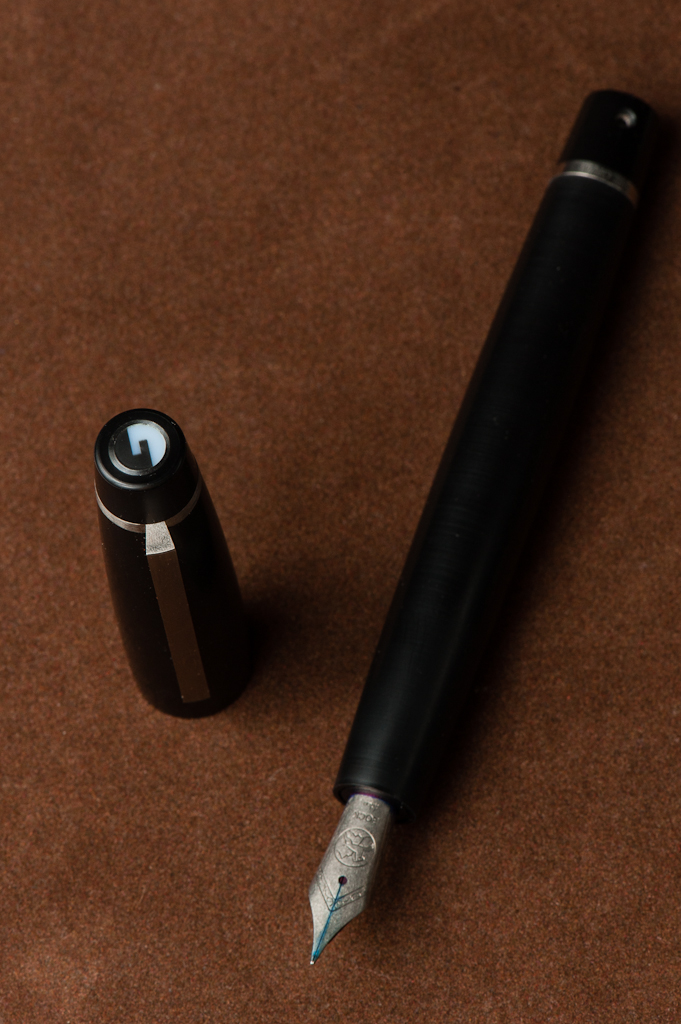
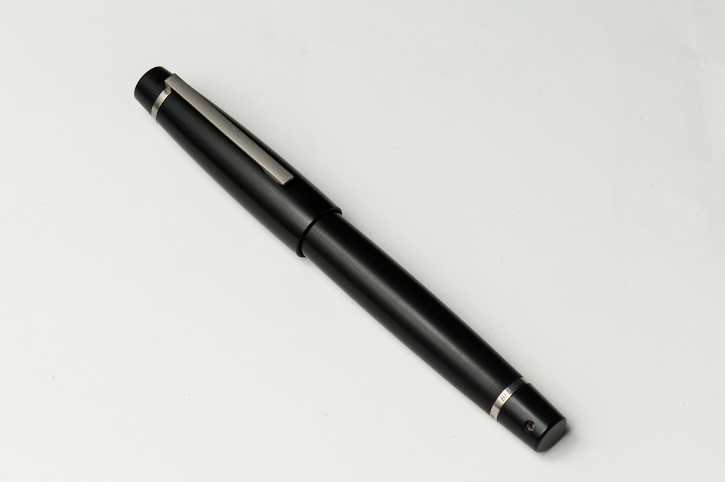
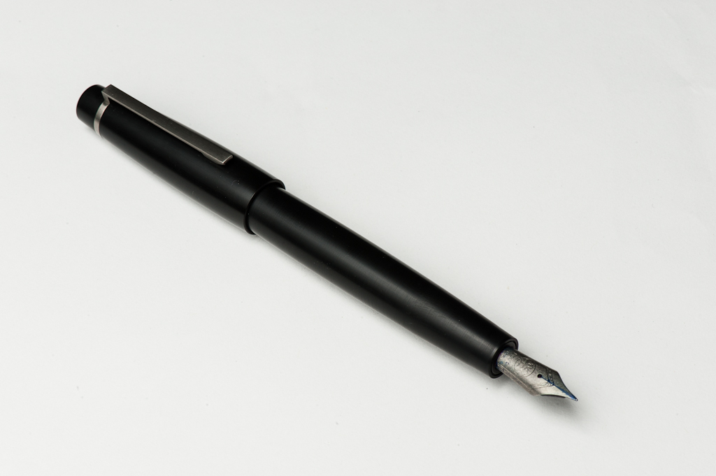
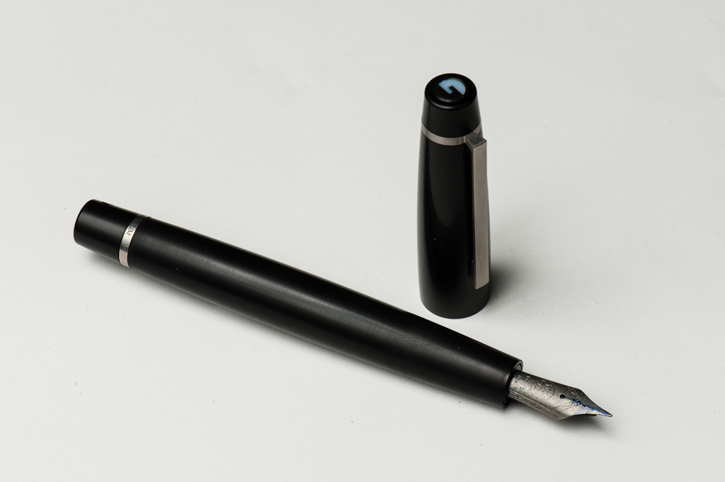
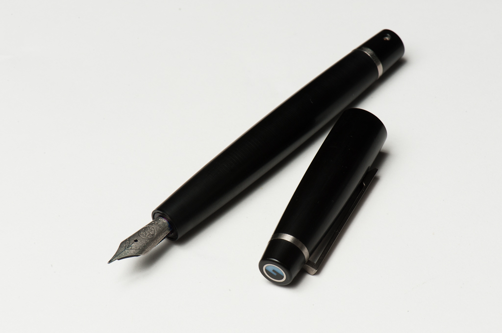
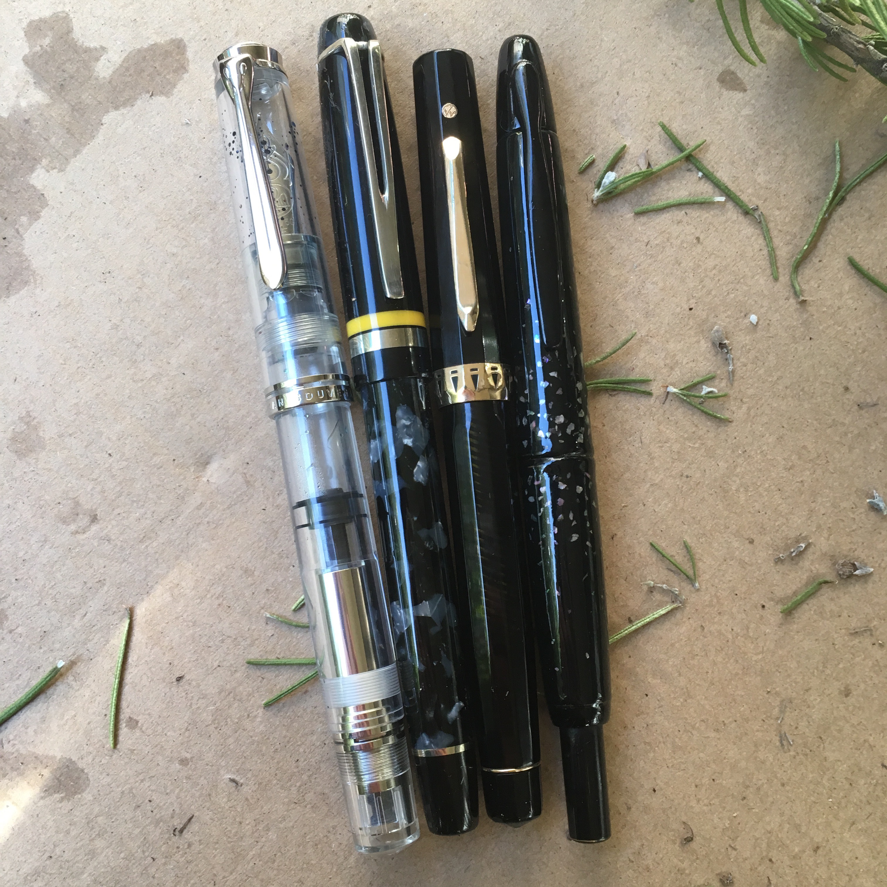
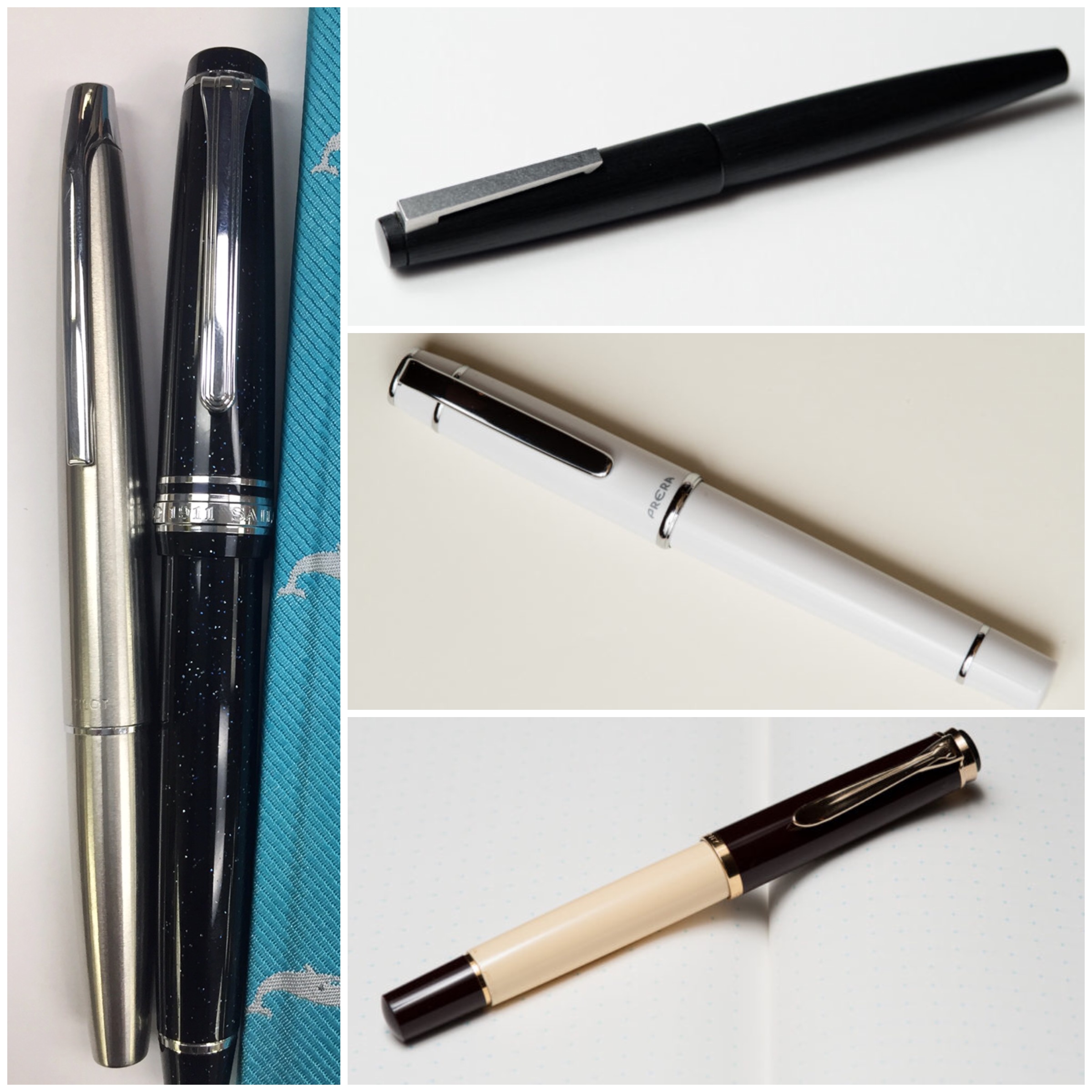
Pen Photos (click to enlarge)
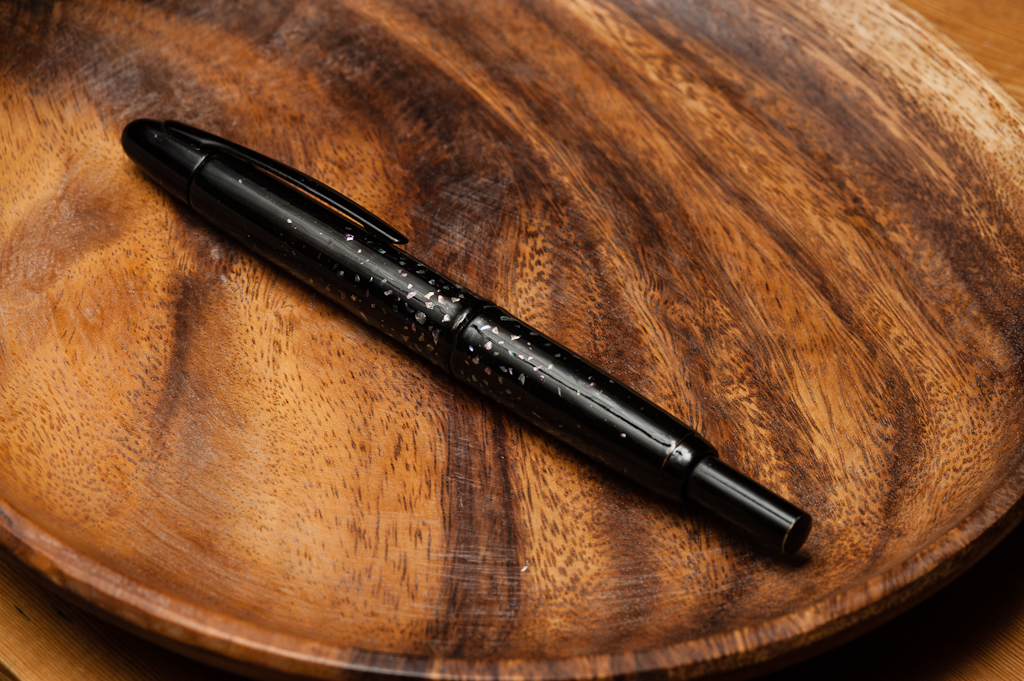
 (bottom left is abalone shell, top right is glitter nail polish)
 (some of the dust from my abalone shell as I flaked it with a dremel… then you get to pick through it with tweezers for the bigger pieces)