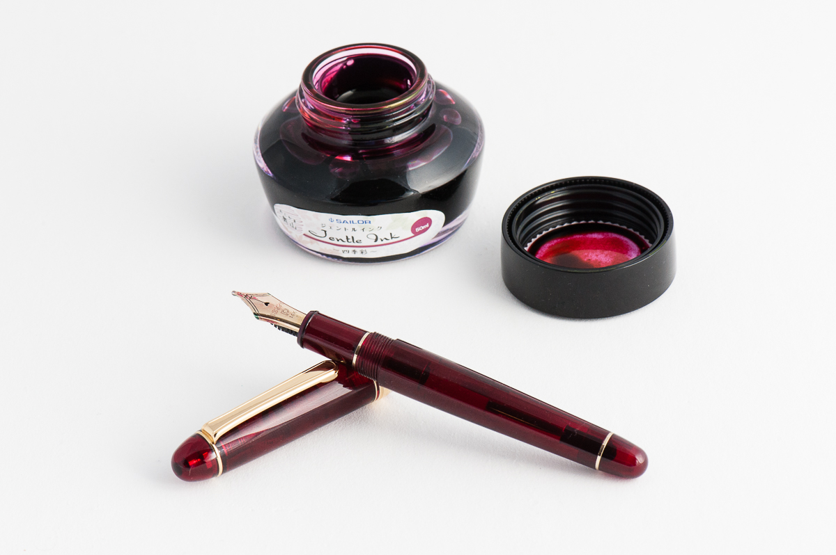
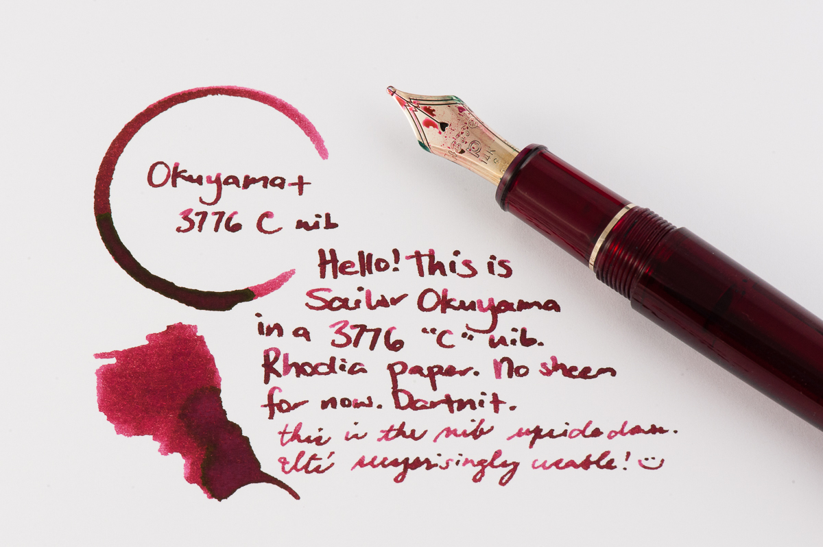
Katherine: This month my pairing is a Platinum 3776 in the red “Bourgogne” color, with Sailor Okuyama. I picked up the 3776 (I previously rated it one of my top pens) because of the C nib. C stands for “coarse” and is Platinum’s BB nib. It’s quite broad, but, out of the box, not a gusher — which I like. Additionally it writes smoothly when upside down, so I can use it at work too! Overall I’m really enjoying the sheen of Okuyama, laid down by a nib that gets the sheen going, but isn’t gratuitous.
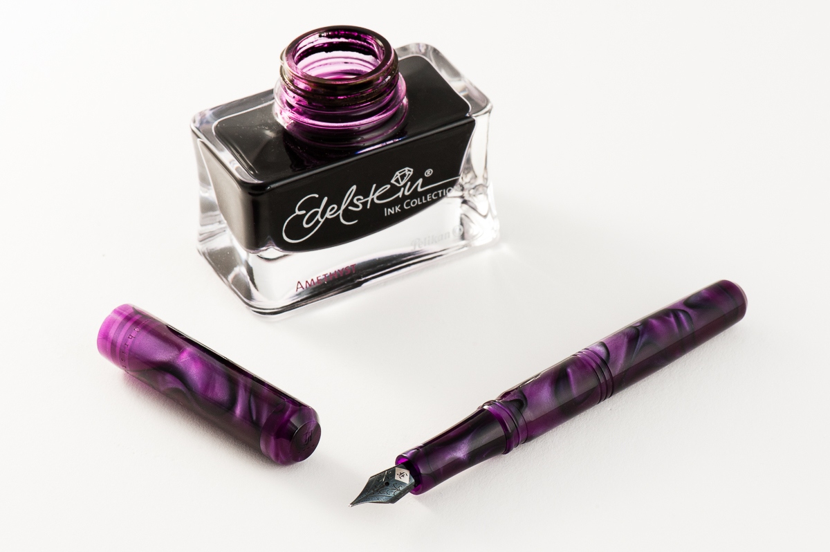
Franz: A co-worker of mine once said that Purple is the color of royalty, and madness. I totally agree! So for the month of June, my royal pen and ink pairing is the Franklin-Christoph Model 31 Omnis in Purpurae finish, and the Pelikan Edelstein Amethyst special edition ink. The deep purple and black swirls of the “Purpurae” madly matches the dark purple of the Amethyst ink. The acrylic has chatoyance that just can’t be captured on camera that well especially on the lighter swirls of the pen.
A quick aside, I got the Model 31 at the 2017 LA Pen Show and it was (at that time) the initial color prototype. Scott Franklin of Franklin-Christoph commented that this was the first purple 31 out there. I initially called the color “Purple Soul” but Franklin-Christoph recently introduced it as a regular part of their Model 31 line up as “Purpurae”. The Amethyst ink was Pelikan’s 2015 special edition Ink of the Year and has become my top favorite purple ink due to it being a darker color, and its sheen when ink pools in the writing.
Will this pen and ink pairing become an OTP (One True Pairing) for me? We shall see!
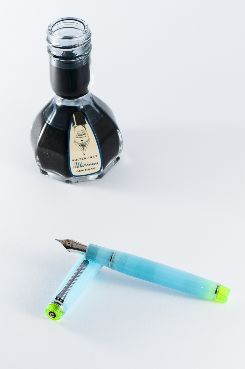
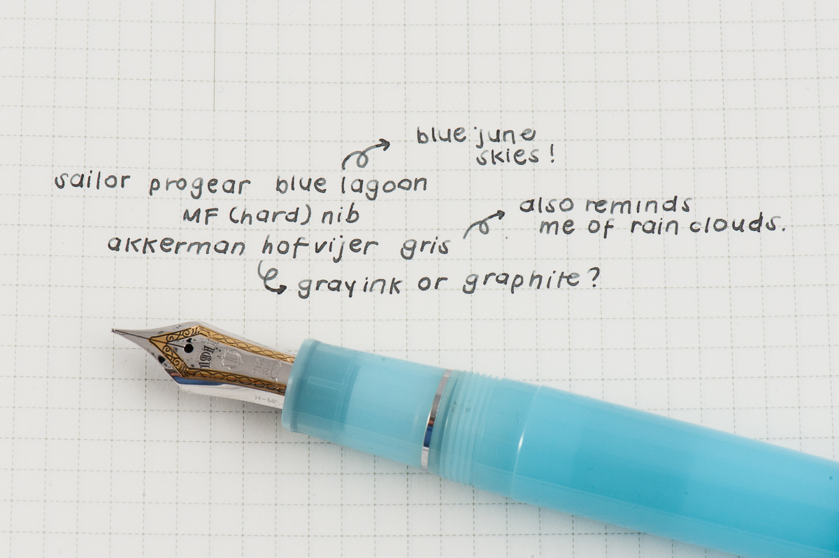
Pam: Summer is in full swing but I still miss the rainy season so this pen is a reflection of having the best of both worlds. My choice for the June pairing is Sailor Pro Gear Blue Lagoon with Akkerman Hofvijver Gris (#29) ink. This is probably one of my favorite OTP/pen and ink pairings since I started collecting pen.
The Sailor progear has a really unique and whimsical color pairing with the neon green and soft blue. The gentle blue with such a vibrant hue reminds me of the “Unicorn Barf” colorway with the blue and bright pink. I have been trying to get the term “Unicorn Snot” for this blue and green combination to stick…but alas. The Sailor nib is perfectly wet enough to show off the wonderful gray ink, as usual.
Akkerman #29 is my first ink from Akkerman and I couldn’t be happier with this ink. It’s practically my “gateway” gray, getting me more interested and more inclined to try out more gray inks. I had thought that gray inks would be only dilute and dull blacks. I am so glad to be have been mistaken! Originally obtained via ink sample from Vanness Pens, I quickly tried to obtain a full bottle of this wonderful gray. The gray reminds me alot of pencil graphite and I really enjoy the shading available in this ink. Not to mention, the bottle of Akkerman ink is always a treat in itself!
Writing Samples (click to enlarge)
1 Comment
Really love the Sailor Pro Gear Blue Lagoon! How did you manage to lay your hands on one? It has been frustratingly difficult for me to even find any information on it at all.