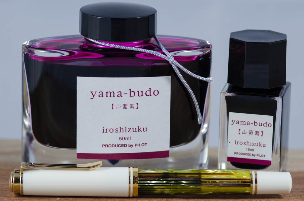
Pam: Have you ever bought a pen because you were so blinded by it’s beauty? Well, the Pelikan White Tortoise (with EF nib) was that pen for me. When I indulged in my “pen binge of 2016” (Thanks Franz!) I had bought the pen at a great deal but was very lost on it’s place in my collection when I received it. (I didn’t expect to get more than one grail pen within a year, I thought I had more time to consider these things!!) Most unfortunate was that despite the beauty of the pen, I couldn’t find a pen that compelled me to want to write with it.
I found Rohrer Klingner Alt-Goldrun to be underwhelming in the EF nib despite it matching to the beautiful Pelikan binde. I didn’t find a brown ink that I liked enough to keep using in this pen. I didn’t think a blue ink would “compliment” the White Tortie very well. After almost year of testing pen and ink combinations and long hiatuses of not using the pen, I considered “shelving” the Tortie. (Couldn’t bring myself to sell the pen either. It’s pen purgatory!)
Instagram and fellow pen lovers to the rescue!!! It was Heidi from Four Fifty Two (I think) who inked up Yama-budo in her White Tortie. I finally took the plunge and copied the genius combination! What a pairing!
I find the wetter EF nib to be great with Yama-budo since it provides more ink to the page and thus a more saturated color. (My first foray with this color was in a super DRY nib that led me to believe that this ink was more pink than crimson.) The color itself is beautiful and most importantly, readable. The color is dark enough for great readability, but is not your usual blue or black, or even purple. The color is so unique and the gold sheen really clinched this ink for me.
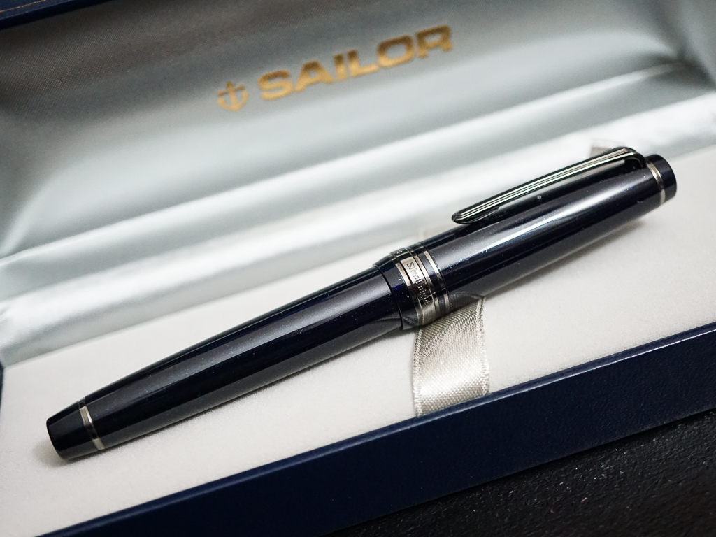
Katherine: My pairing for Feb has been my Sailor Sapporo Bung Box Silent Night & KWZ Twilight. Limited editions galore. My Silent Night has a wonderful wet Zoom nib in it — perfect for showing off the varied shades of KWZ Twilight. Additionally, the pen and ink pair thematically to me — the bright to dark teals of KWZ Twilight fade into the dark blue, almost black of the Silent Night. If only KWZ Twilight glittered in its darkest spots. Actually, if I had one wish for this ink, it would be that I had more than a sample. Hence, only the pen is pictured above.
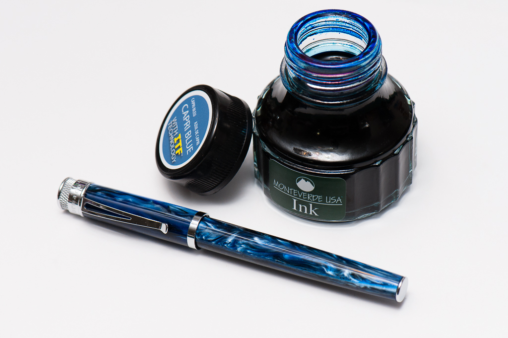
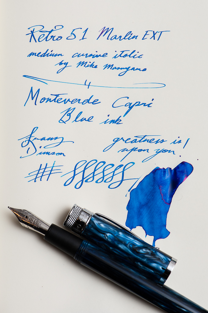
Franz: My pen and ink pairing for the month of February are both new to me within the month. It is the Retro 51 Marlin EXT fountain pen, and the Monteverde Capri Blue ink. I have wanted the Marlin pen since last year and when I heard it was being discontinued, I “had” to have it. On the Vanness Pens site (www.vanness1938.com), I found their last one so I purchased it right away as my “birthday” pen. Once I got it, I immediately inked it up with the Monteverde Capri Blue. This was the first pen I’ve inked with the Capri Blue and I’m very happy how it matches the swirls in the barrel of the Marlin. The ink’s color is also usable for my workplace so it’s a pairing I can use both for the home and office.
Now to top this pairing off, I had Mr. Mike Masuyama (www.mikeitwork.com) transform the medium nib into his cursive italic grind at the recently held LA Pen Show. Writing sample in the photo below. So the Marlin has become one of my top favorite pens. The Marlin will be a mainstay in my lineup for the 6 Pen Challenge that I will be participating in the whole month of March.
What are your recent pen and ink pairings?
5 Comments
Love this blog–so much fun and so helpful to have three different–and three very articulate and lively–points of view. I also like the photos very much! Keep up the good work
Hi there! Thank you for your kind words! =)
As this very moment, I’m using my pilot Metropolitan with Lamy green.
not the best green one TBH.
Very cool! What color is your Metro?
The ink and pen pairings are great to read and I find that I haven’t really spent that much time on matching the ink colour and the pen… I sort of like to rotate the inks and the pens … My standard inks are Noodlers Heart of Darkness or other Black inks such as Take Sumi, Sailor Black, Noodlers Dark Matter Pilot Blue Black. So at any time two pens will have these… Then it’s just my mood at the time for the other pens and ink choices… I tend to prefer inks that shade or have a sheen … Darker inks seem to work better… But I do try and use a wide range of colours in the edc set … I wonder what the next set of pairings will be… This is really interesting as one gets a better look at an ink … Thanks again 👍💙✒️