This is a new series of posts for us. Each month we’ll pick a pen an ink pairing and share why we love it. What are your favorite pairings? And please give us feedback — we love comments!
Pam: I tend to make pen and ink “one true pairings,” as in, once a pen and ink are well paired, they are almost permanently paired for me. My first OTP was the Lamy 2000, EF nib with Sailor Yama-dori. The Lamy 2000 didn’t sing, and arguably, a disappointment due to my original ink choice. I thought the nib was too wide, too wet, and created a “weird” line. However, once I put in Sailor Yama-dori, thie “too wet” was just right to show off the beautiful red sheen on the perfectly teal ink. The “too wide” and “weird line” became a semi-architect because I could actually see the difference between my vertical and horizontal strokes. I haven’t inked up the Lamy 2000 with any other ink since its second inking.
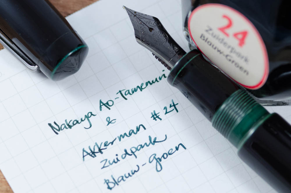
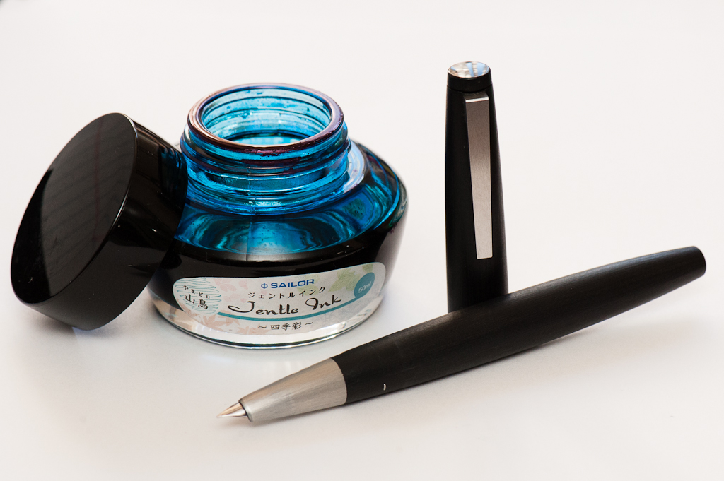
Katherine: If you follow me on Instagram, you’ll know that I got my first Nakaya (unboxing video here). Nibs.com had ONE ao-tamenuri (blue-green) Piccolo left, and I couldn’t resist. When the pen arrived I waffled over what ink to ink it with — something I knew I loved, or a totally new ink? I went with Akkerman #24 Zuiderpark Blauw-Groen, which I suspected would match the blue-green accents on the pen — and I was right! The ink flows well, but is on the dry side and matches the pen perfectly. After reveling in my perfect match, I found out that Franz (who I got my sample of Akkerman #24 from) bought the ink to match his Ao-Tamenuri pen… great minds think alike!
Franz: I’m excited about this post because I know that most pen folk are particular about the inks they use on their pens. I mean, that’s one of the biggest appeal of using fountain pens. It’s the ability of being able to choose your preferred ink, your own nib size/grind, and the perfect size of the pen for your hand. We’re not even tackling paper choices yet. That may be for another kind of blog post. Haha!
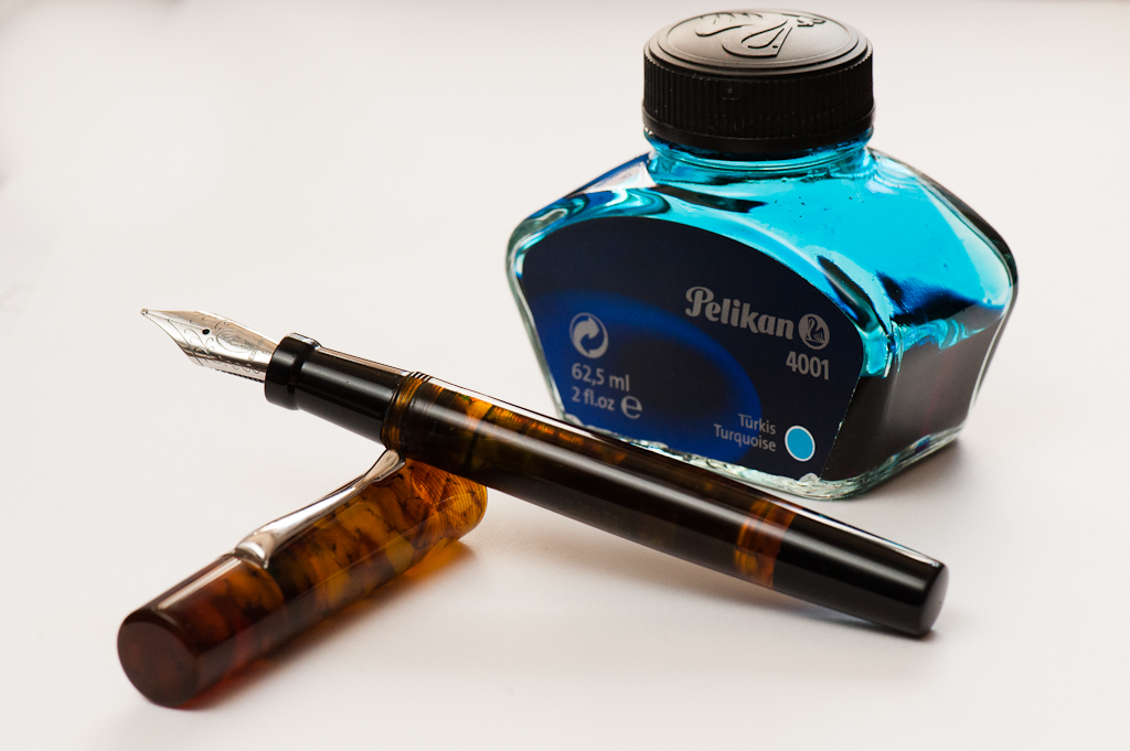
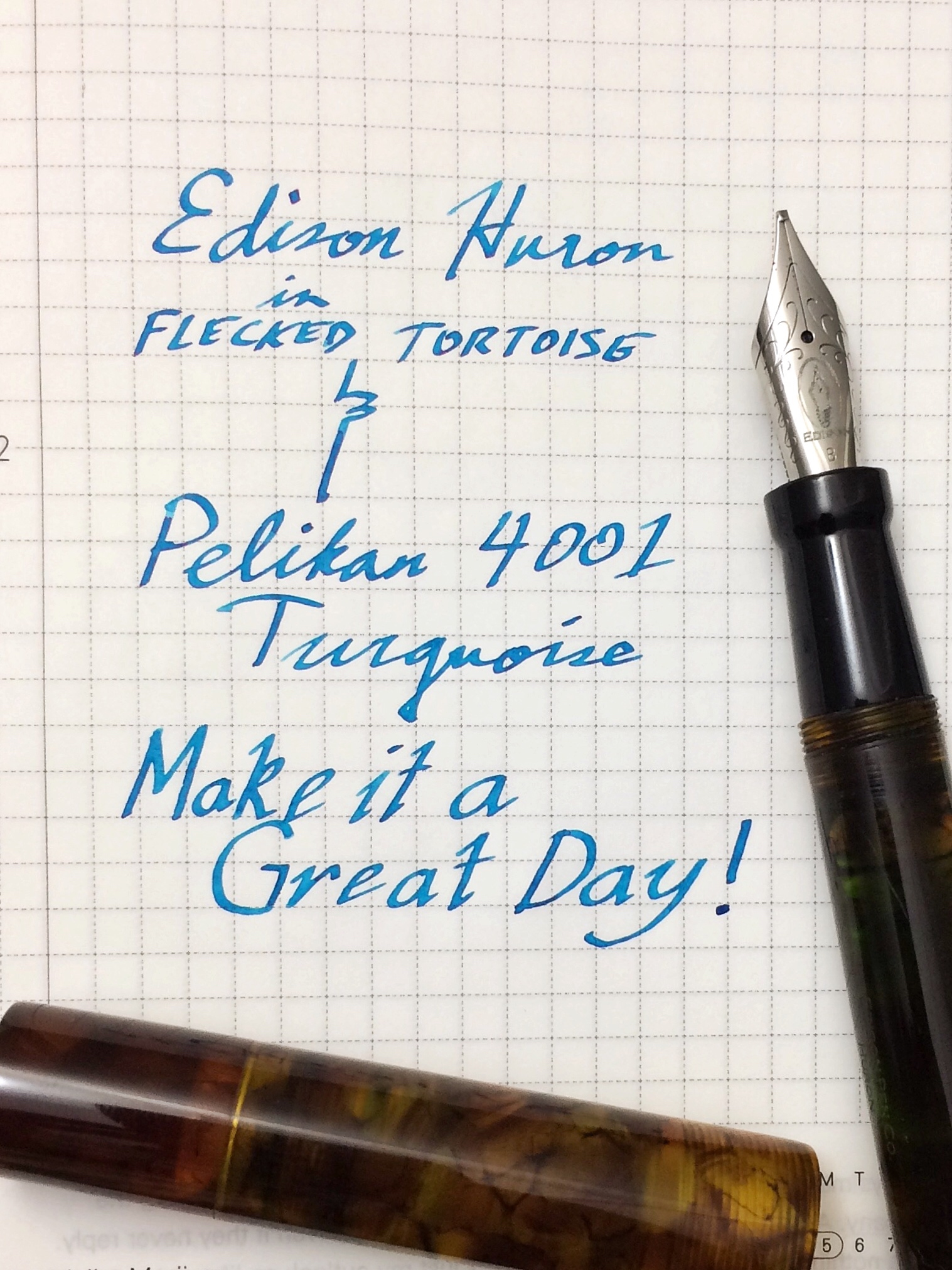
So for this month of January, I’d like to feature my pairing of my custom Edison Huron in Flecked Tortoise and the Pelikan 4001 Turquoise. The Pelikan Turquoise has become one of my top 5 favorite inks for the past years and I’ve become accustomed to its properties. The color of this ink is a nice complement to the rich brown tortoiseshell acrylic. The Huron sports a broad cursive italic customized by Mr. Brian Gray and the width of the line shows off the ink’s color and sometimes its sheen. Following Pam’s strategy, this may be my O.T.P. for this pen.
Here’s a writing sample.
Don’t forget to let us know what your favorite pairings are! Thank you!
3 Comments
Diamine Steel Blue looks fantastic in my white TWSBI Eco. But the Pelikan 4001 Turquoise looks great as well. I should pick up a bottle soon!
I gotta try Diamine Steel Blue for sure!
I love Papier Plume Pecan in my M200 Cafe Creme. The medium nib writes very wet after some adjusting I did, and it really brings out some beautiful shading (which is ironic seeing as how I feel the ink really falls flat in finer/drier nibs.) Cafe Creme is one of my favorite special editions as well.