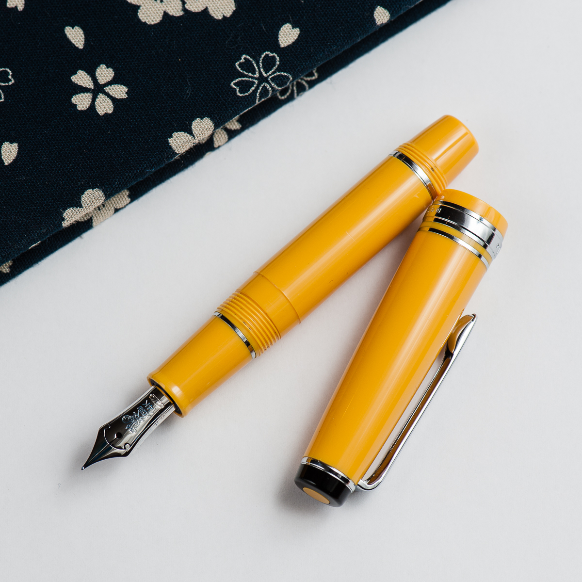
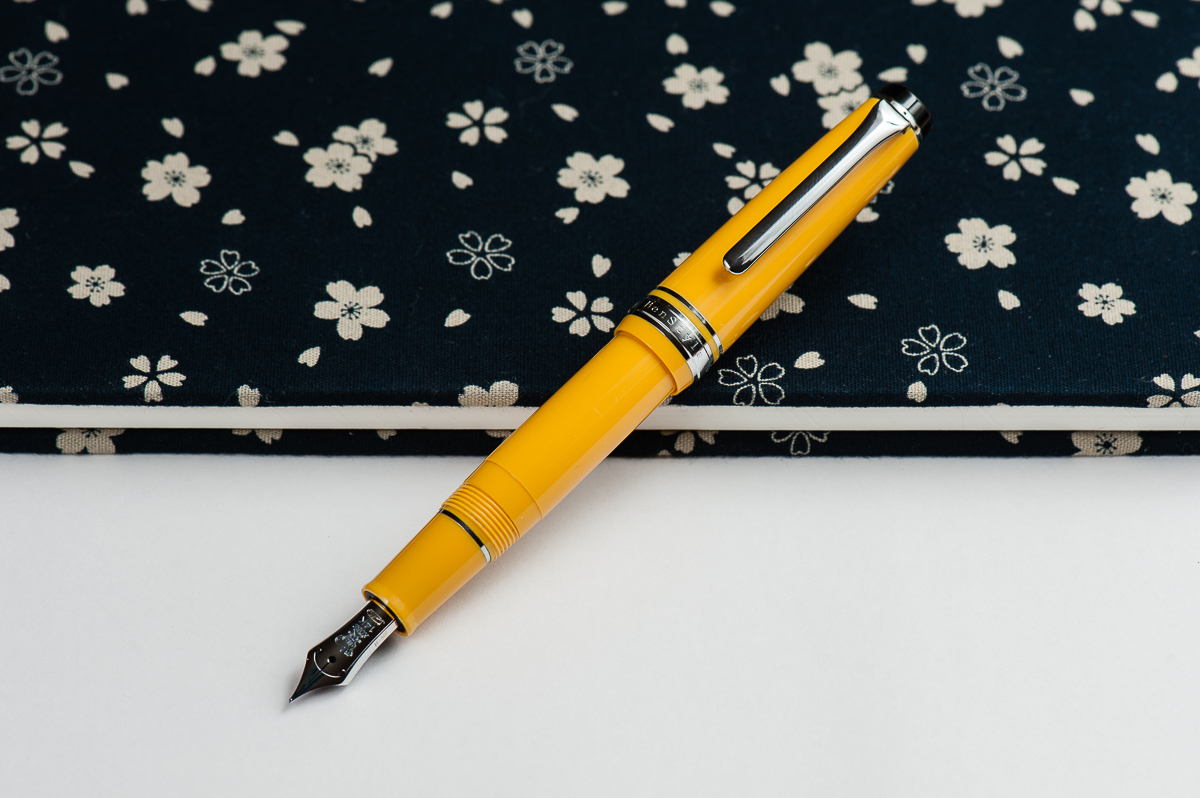
Katherine: This pen is adorable. But it does bug me a little that the end of the barrel isn’t black (I’m picky, I know). But oh, it is so cute. (Contrary to what Pam says, they’re still available on Rakuten)
Pam: CHIBI BUMBLEBEE SAILOR for the win!!! It’s a petite Progear that is small enough that the pen gets posted by screwing on the end of the pen. Sailor pocket pen are three words that send my heart swooning; great things come in small packages. Unfortunately, these are not being made anymore. They are available on the secondary market.
Franz: The Sailor Pro Gear Mini is so tiny and charming especially in this yellow finish! Pam calls it bumblebee and I can see that too but in my mind, I refer to it as a banana pen. I don’t know… it’s just something about that black cap finial that makes me think of one of my favorite fruits.
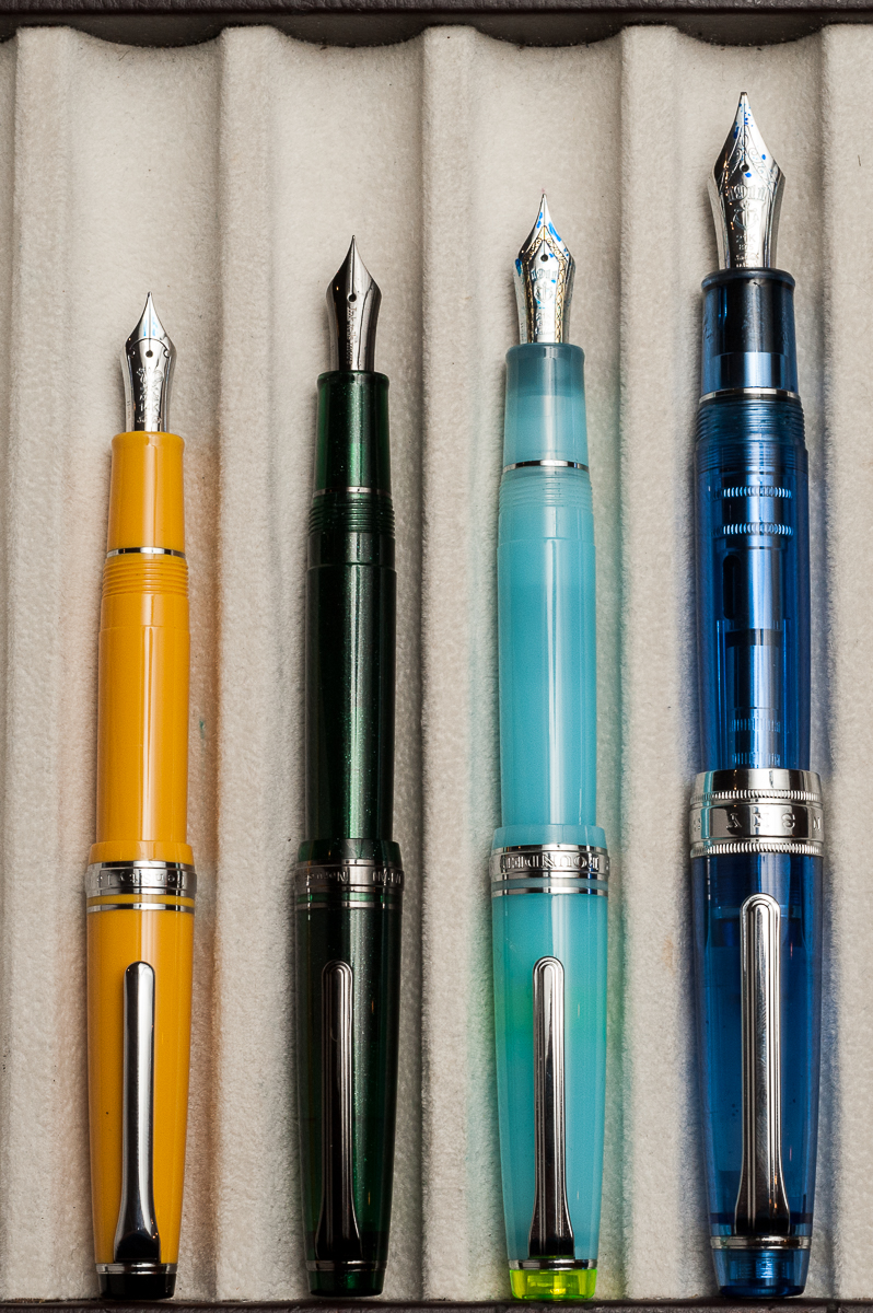
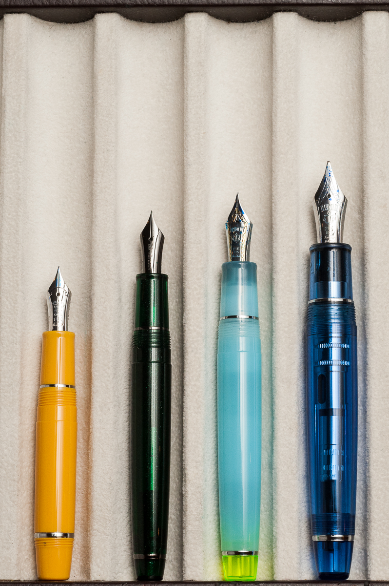
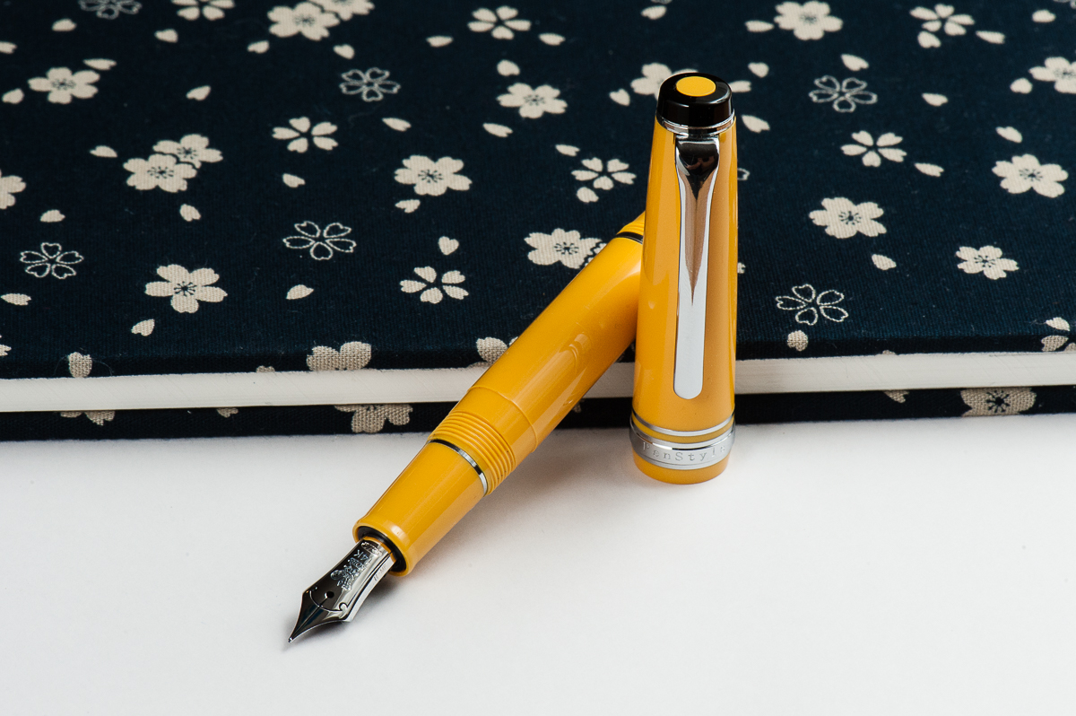
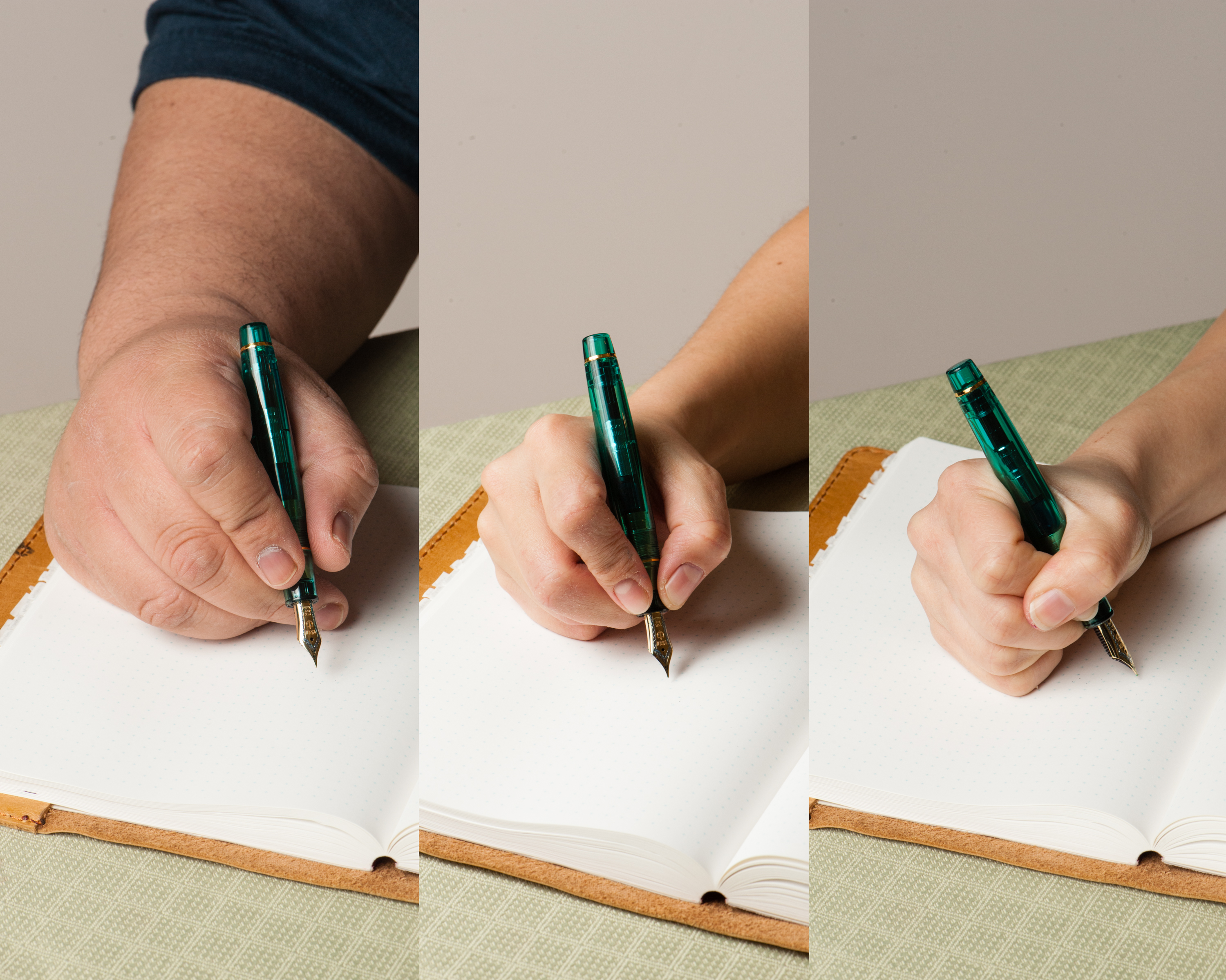
In the Hand: Sailor Pro Gear Mini (posted) – from left to right: Franz, Katherine, and PamIn the Hand: Sailor Pro Gear Mini (unposted) – from left to right: Franz, Katherine, and Pam
The Business End
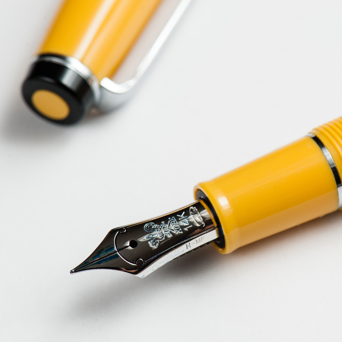
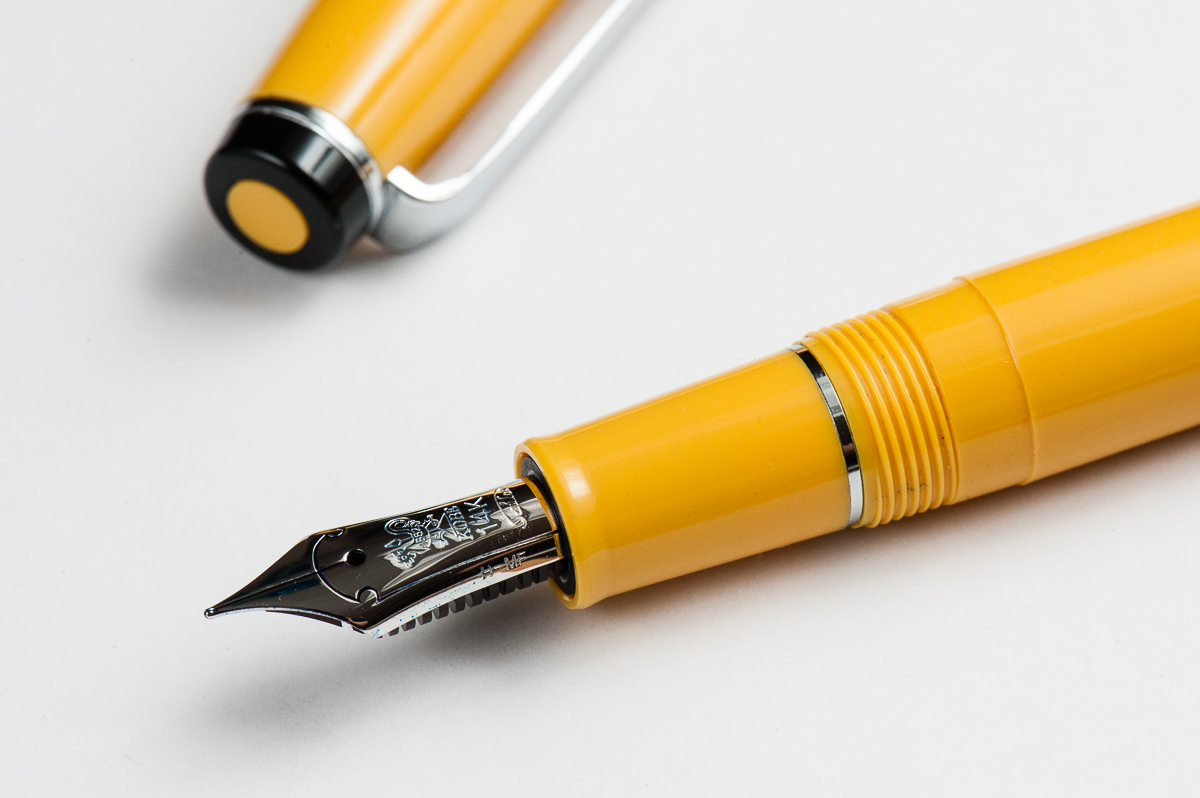
Katherine: It’s the the same Sailor MF 14k as a Pro Gear Slim (it’s really just a Pro Gear Slim with a shorter barrel, after all) — and unsurprisingly, I really enjoyed it. It’s broad enough that I can see the color of the ink, but fine enough that I can stick to my usual tiny hand writing.
Pam: It’s a Sailor MF (medium-fine) nib. It’s in the great sweet spot of a slightly wetter/broader line that isn’t too wet. I would recommend putting in an ink that you want to show off. Perhaps an ink with some sheen. I don’t find as much feedback with this Sailor nib, which makes sense given that the MF nib is a bit broader.
Franz: The Mini’s medium-fine nib is very nice to write with. Just like most Sailor nibs I’ve tried, it was very smooth. The M-F line width is actually a good one for me as I find Sailor’s fine nibs just “a little” too thin of a line for me. The design on this nib is different from any other Sailor pen because this was a pen commissioned and sold by the Nagasawa Kobe stores in Japan.
Write It Up
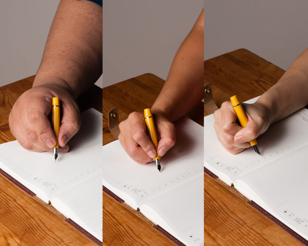
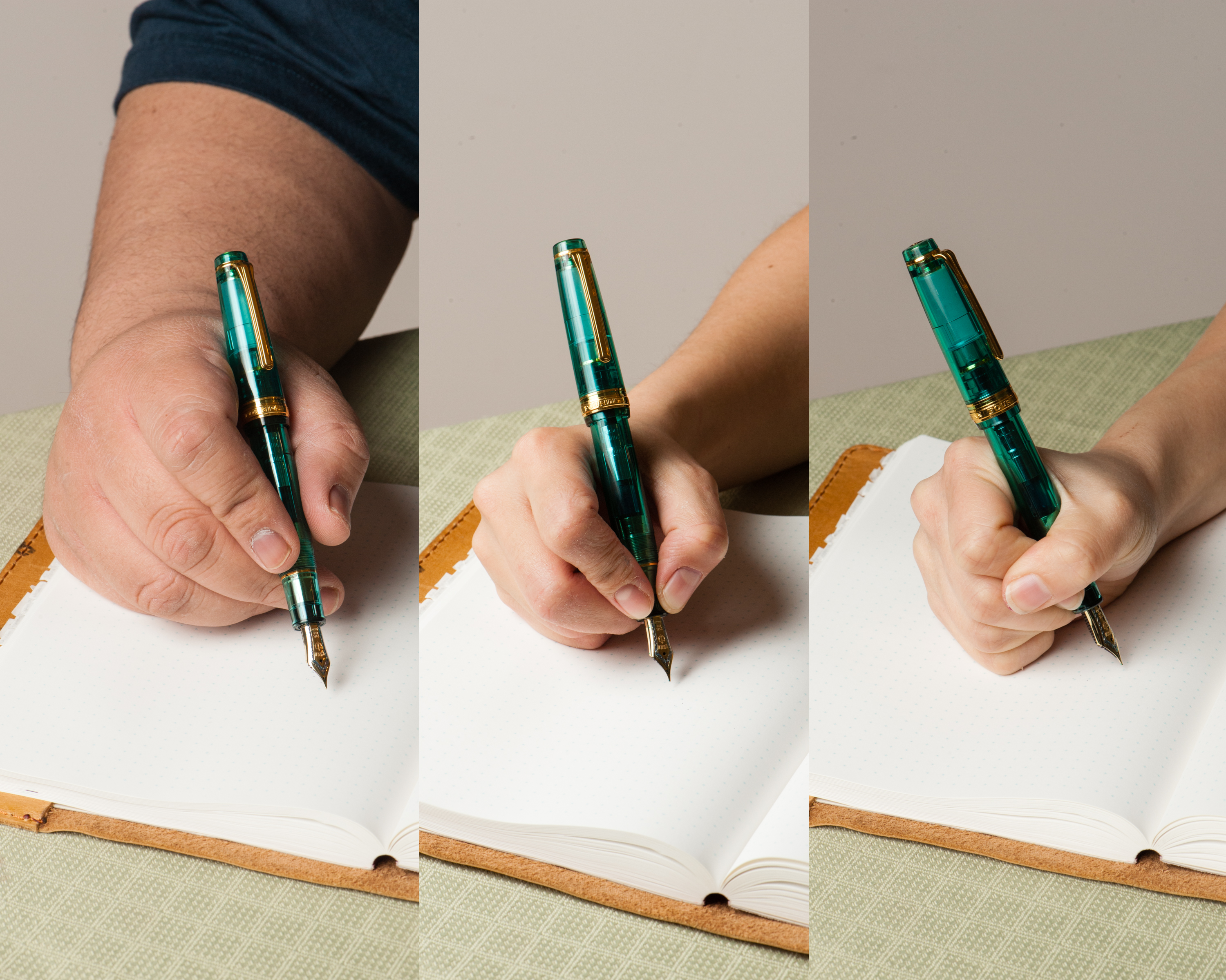
Katherine: I found this pen usable, but slightly short when unposted. It’s one of the few pens that I prefer posted to unposted. Like the Kaweco Sport, when unposted, this pen makes my hand a bit tired after a while because it’s just barely long enough to fit in my hand and I have to be careful about how I position my hand. Posted though, it’s fantastic — like a slightly longer Pro Gear Slim!
Pam: The size of the pen posted is similar to the Sailor Progear Slim. The width of the pen is exactly that of the Sailor Progear Slim actually. They section and body are swappable amongst the Sailor Progear Slim and Mini. Other than the length, if you find the width of the Sailor Progear Slim comfortable, this pen won’t be a problem for you.
Franz: I wrote in my journal with the Mini only in the posted mode because it was quite difficult to write with the cap unposted. I found that the posted length made it a little more comfortable for me. The girth of the section was quite thin for me so I end up gripping the pen on the threads. They weren’t too sharp and I barely noticed them.
EDC-ness
Katherine: It’s great for quick notes and pocket use. It’s tiny, brightly colored (and hard to lose…) and seems plenty durable, not that I threw it against a wall or anything.
Pam: I kept this pen with my Hobonichi A6 notebook cover and it kept up with my adventures in my bag. It’s really portable. It’s not the best for quick notes given that you have to screw the cap onto the body to post, However, if you have particularly petite hands and don’t need to post it, a which quick twist of 1.5 rotations, will get you writing pretty quick.
Franz: Ahh… every day carry. It is definitely a pen that fits in your pockets. The M-F nib is actually very appropriate for use on cheap copier papers as the line is thin and the ink spread is minimal. But I don’t think I can recommend this pen for large handed writers because after 2 or 3 words, it’s hard to write with the pen unposted. This is due to the pen falling into the crook of my hand and is uncomfortable. I’d need to post the cap and screw it onto the barrel which takes quite a bit of time if you are constantly needing to cap and uncap for quick usage. It takes almost 2 turns to uncap the pen and then another turn or two for posting the cap. Small hands? No problem as you can see from the two ladies’ experience.
Final Grip-ping Impressions
Katherine: This pen is really cute — but between this and the Pro Gear Slim, I’d prefer the latter. It’s just a little more flexible and accommodating for my hand. But if short pens are your thing — this is definitely a great fit.
Pam: It’s a chibi Sailor for chibi hands. It’s a solid Sailor pen, albeit small. If you are into challenging yourself on how small of a pen you can comfortably write with (like Franz), this is a great pen to borrow from smaller hand friends. If you are looking for a great pocket pen and don’t mind the extra work posting, you will be rewarded with this Sailor.
Franz: I really like the Pro Gear Mini a lot, and want one for myself. But to be honest, this is more because of me just hoarding wanting the pen in my collection. As a journal, or letter writing pen, I’d use this pen again.
The Mini is a pen more suited for people with a small, or medium hand size. This is coming from a guy who uses his King of Pen Pro Gear a lot in the workplace and for daily use. As well as a guy who constantly annoys pen friends by singing, “I like big pens and I cannot lie…!”.
But one, including myself, cannot deny that the Sailor Pro Gear Mini is an adorable pen to behold. #ChibiPen
Pen Comparisons
Closed pens from left to right: Pelikan M400, Platinum 3776, Pilot Prera, Franklin-Christoph Model 45, *Sailor Professional Gear Sapporo/Mini*, TWSBI Eco, Pelikan M805, Lamy SafariPosted pens from left to right: Pelikan M400, Platinum 3776, Pilot Prera, Franklin-Christoph Model 45, *Sailor Professional Gear Sapporo/Mini*, TWSBI Eco, Pelikan M805, Lamy SafariUnposted pens from left to right: Pelikan M400, Platinum 3776, Pilot Prera, Franklin-Christoph Model 45, *Sailor Professional Gear Sapporo/Mini*, TWSBI Eco, Pelikan M805, Lamy Safari
Sailor Professional Gear Comparisons (Left to right: Pro Gear Sapporo/Mini, Pro Gear Slim, Pro Gear Classic, and Pro Gear King of Pen)
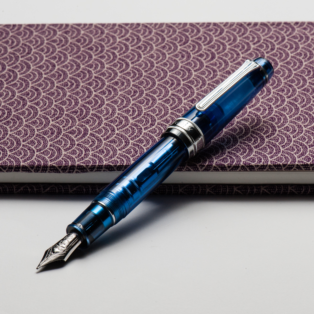
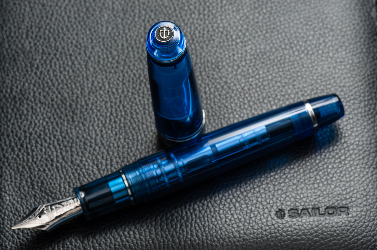
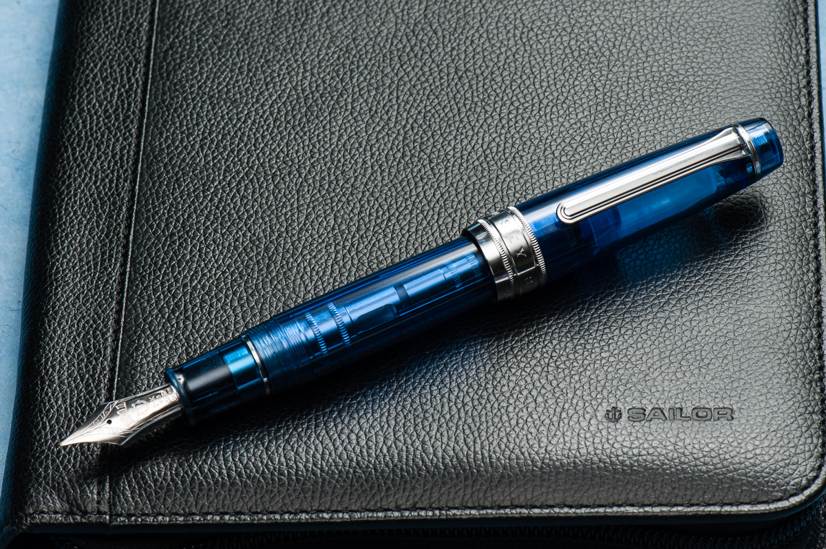
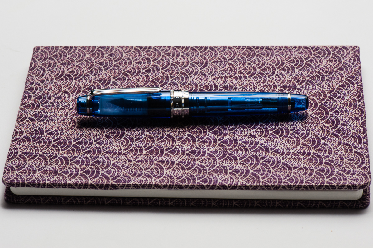
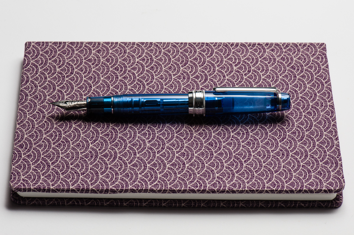
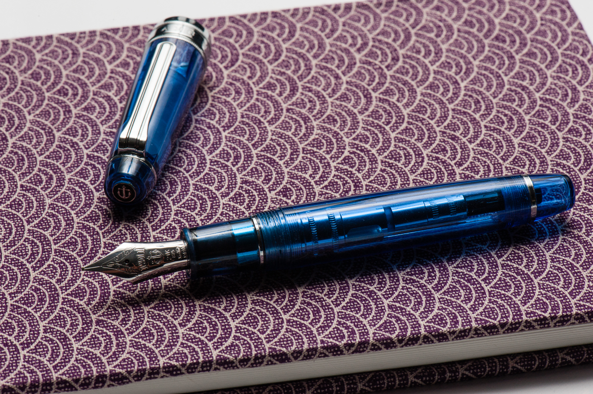
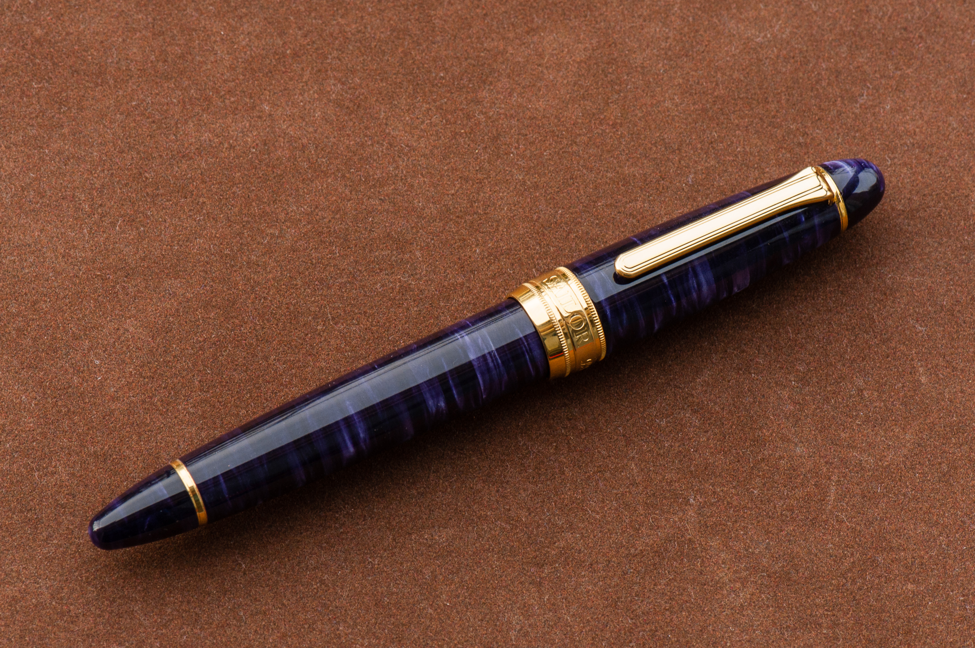
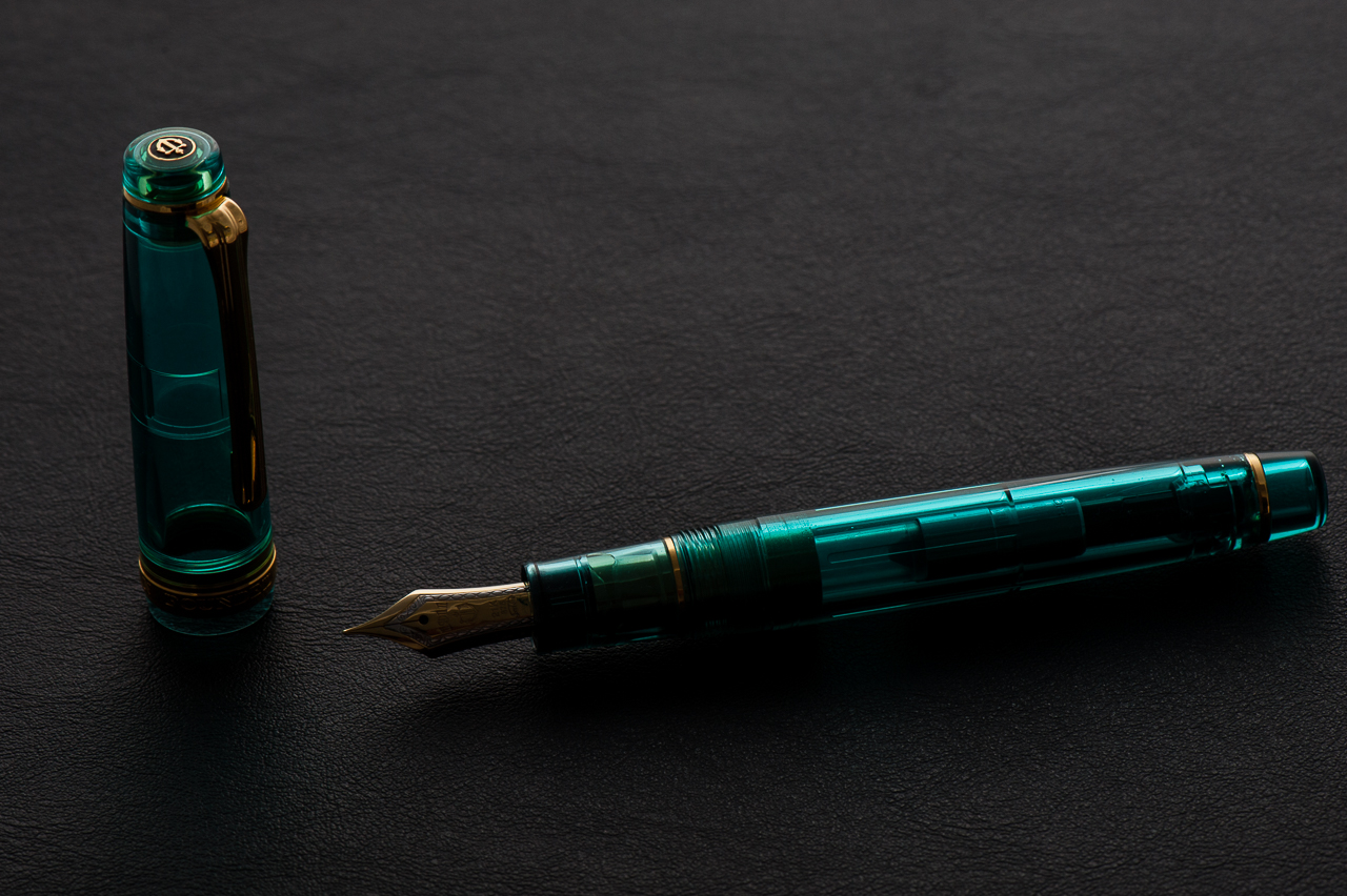
Happy 2018 folks! Thank you for your continued readership and we are looking forward to provide you with more reviews, and other interesting content. And for our first pen review of the year, here’s a blue pen from Sailor.
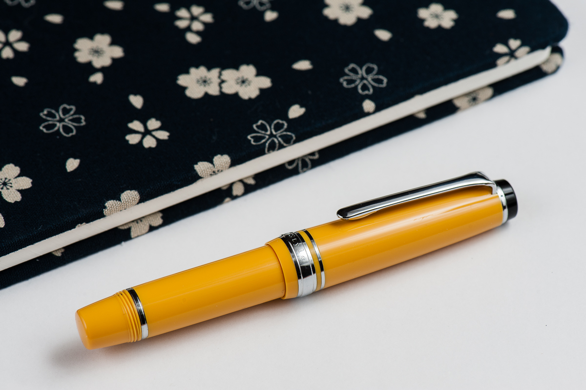
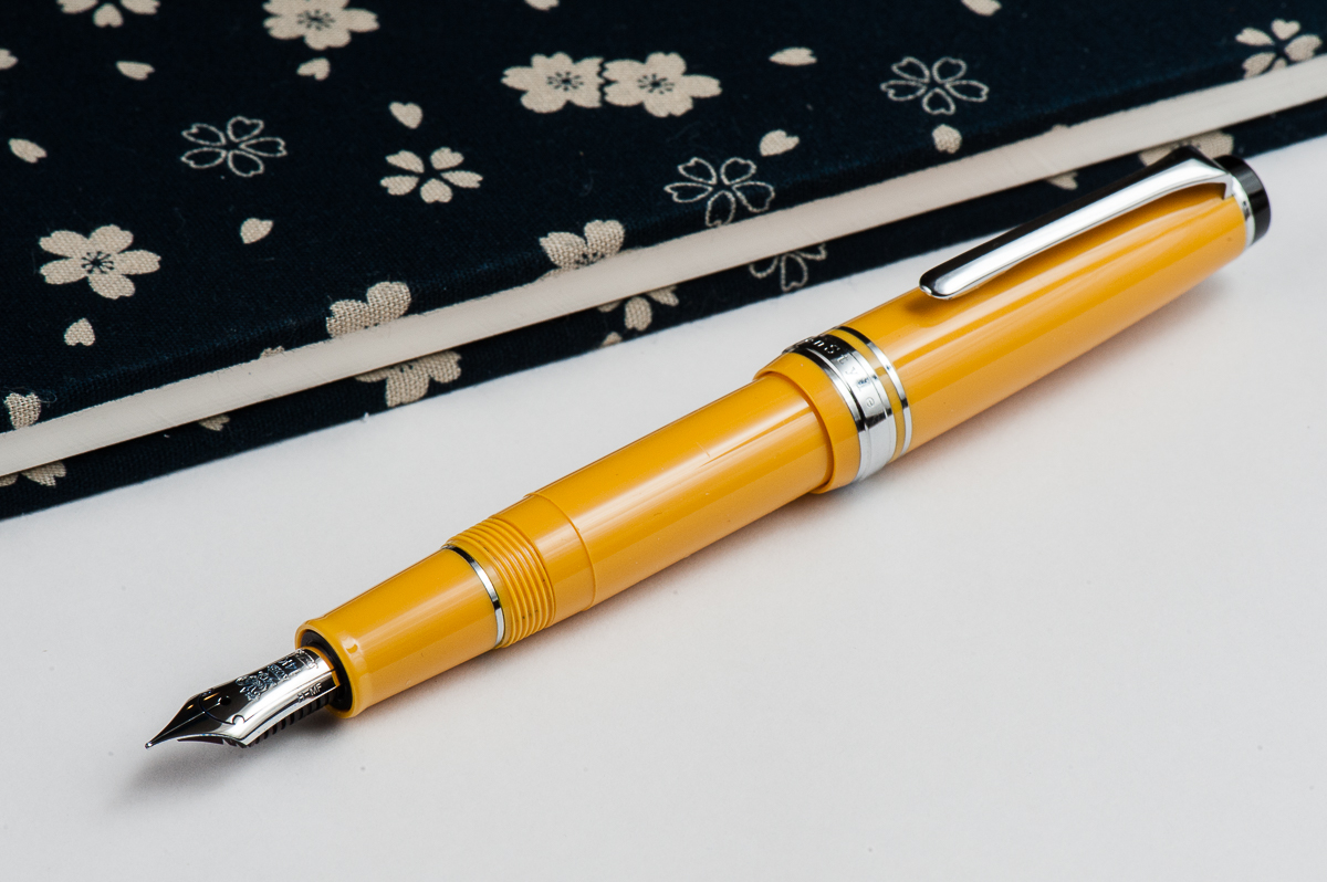
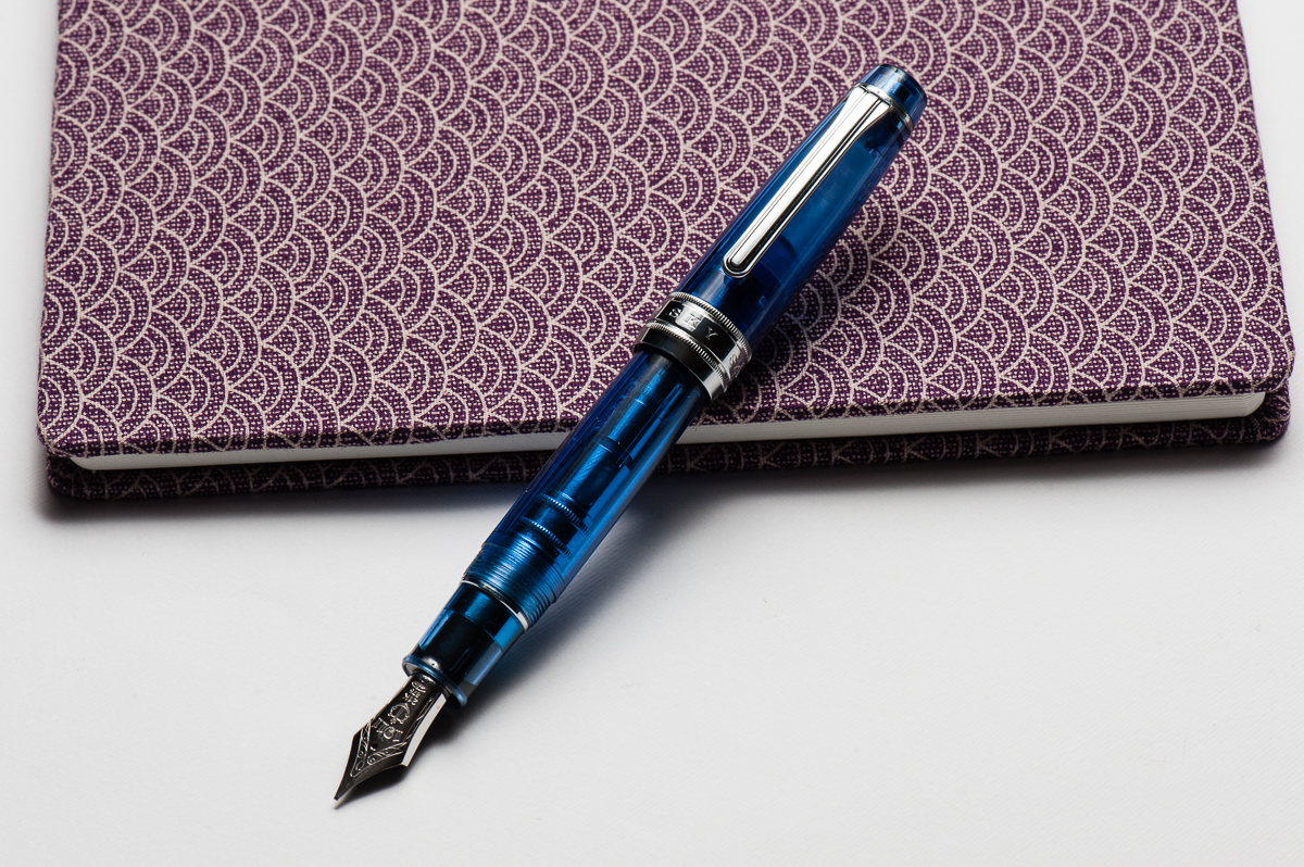
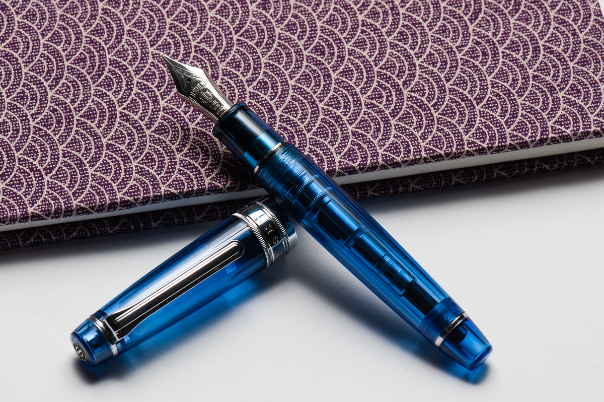
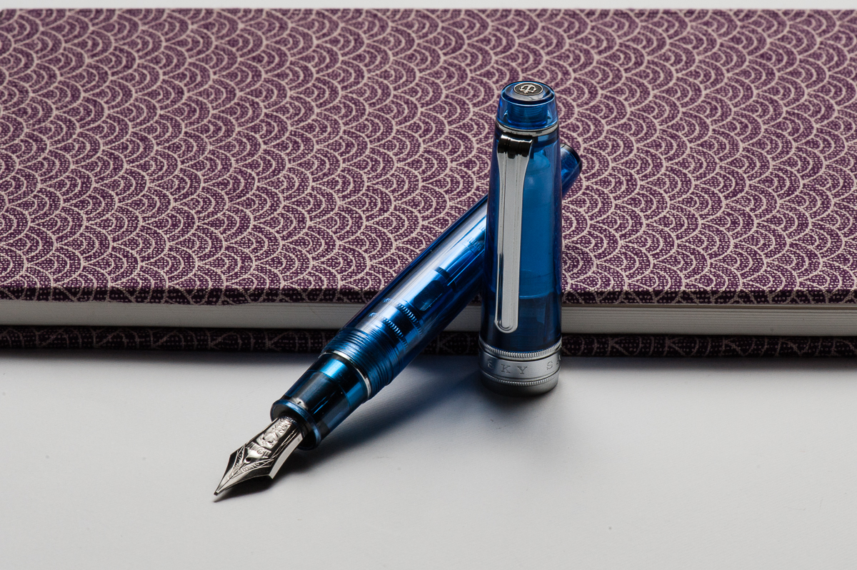
Also, just in case you’re wondering, the notebook the pen is resting on is a Musubi handmade diary just arrived from Singapore. We may review this notebook after some use. We are not affiliated in any way. They were quite popular at the San Francisco Pen Show in 2017 and they’re friendly people as well.
Hand Over That Pen, please!
Katherine: Ahhhhhh. I want a sky. They look so cool. Even the converter showing looks cool!
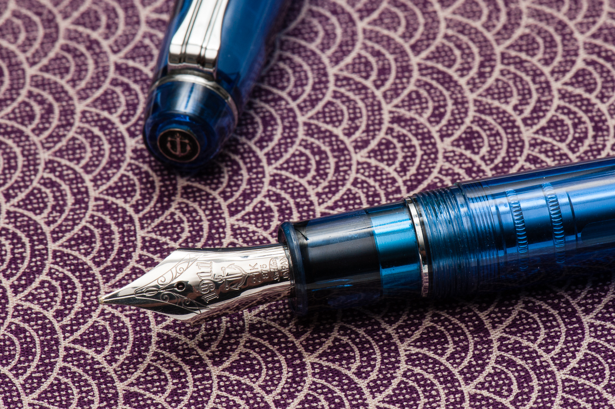
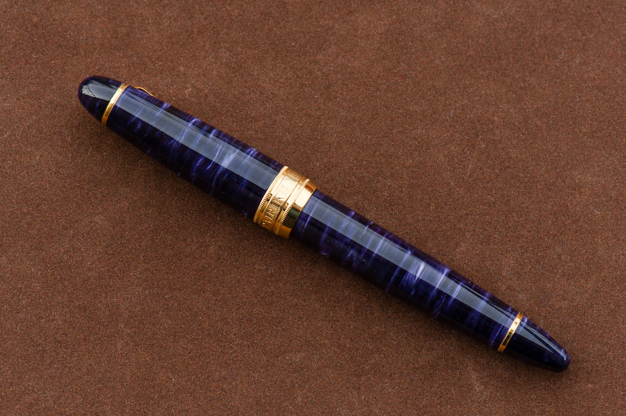
Pam: I am totally biased given that I own a Sailor Sky in the Progear Slim size. The blue material is the same, however, there are more metal parts to the King of Pen which adds to the weight and hand feel. (More on that later.)
Franz: “Blue Sky smilin’ at me, nothing but blue Sky… do I see…”. Ever had a pen make you just wanna sing? Well, this King of Pen (KoP) Sky did it for me and I got Sinatra’s voice in my head.
It shouldn’t come as a shock to a lot of people that I just adore the blue finish of the pen and the shape of the Pro Gear is a great aesthetic as well. I’d say that in my hand, the Pro Gear KoP size is in between a Pelikan M800 and Pelikan M1000. A pen of substance if you will.
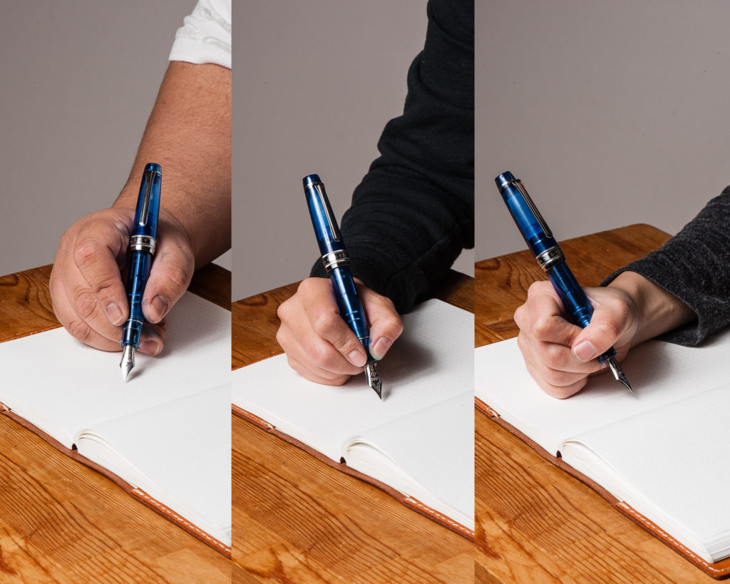
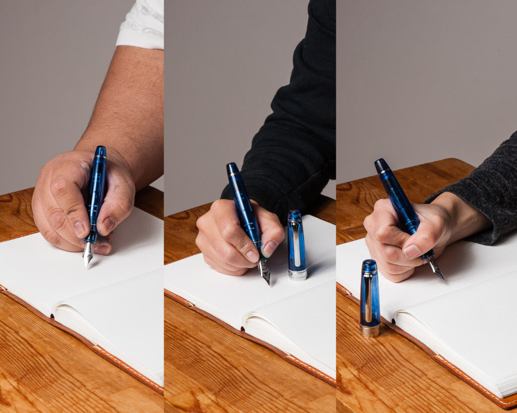
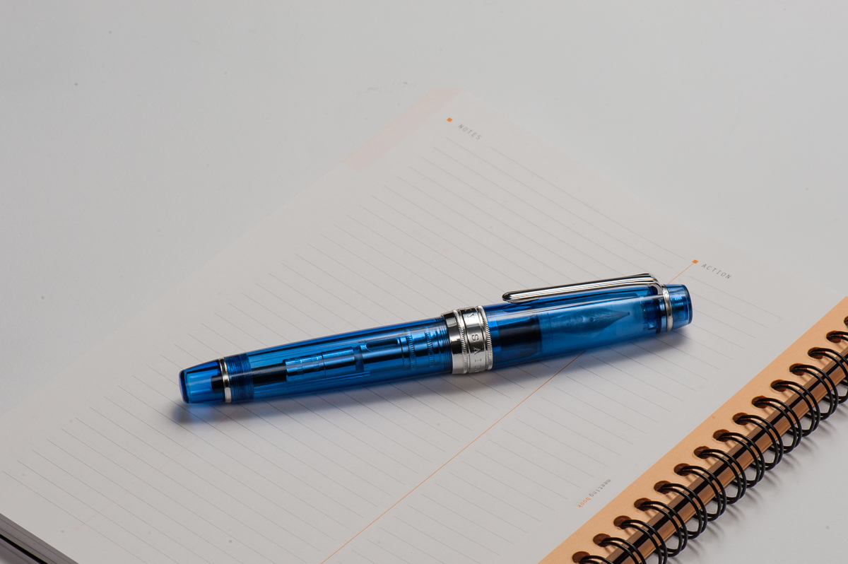
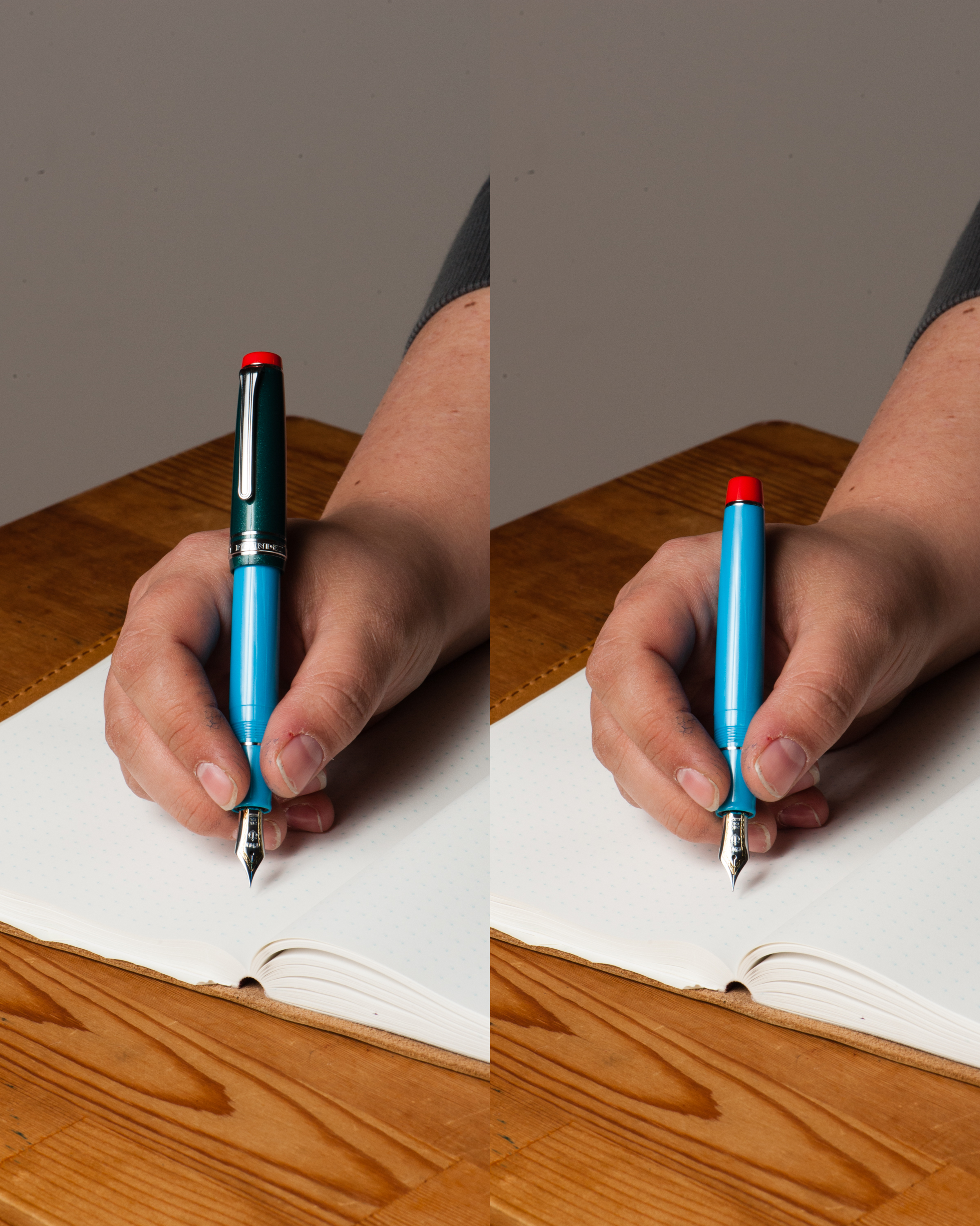
In the Hand: Sailor Pro Gear King of Pen (posted) – from left to right: Franz, Katherine, and PamIn the Hand: Sailor Pro Gear King of Pen (unposted) – from left to right: Franz, Katherine, and Pam
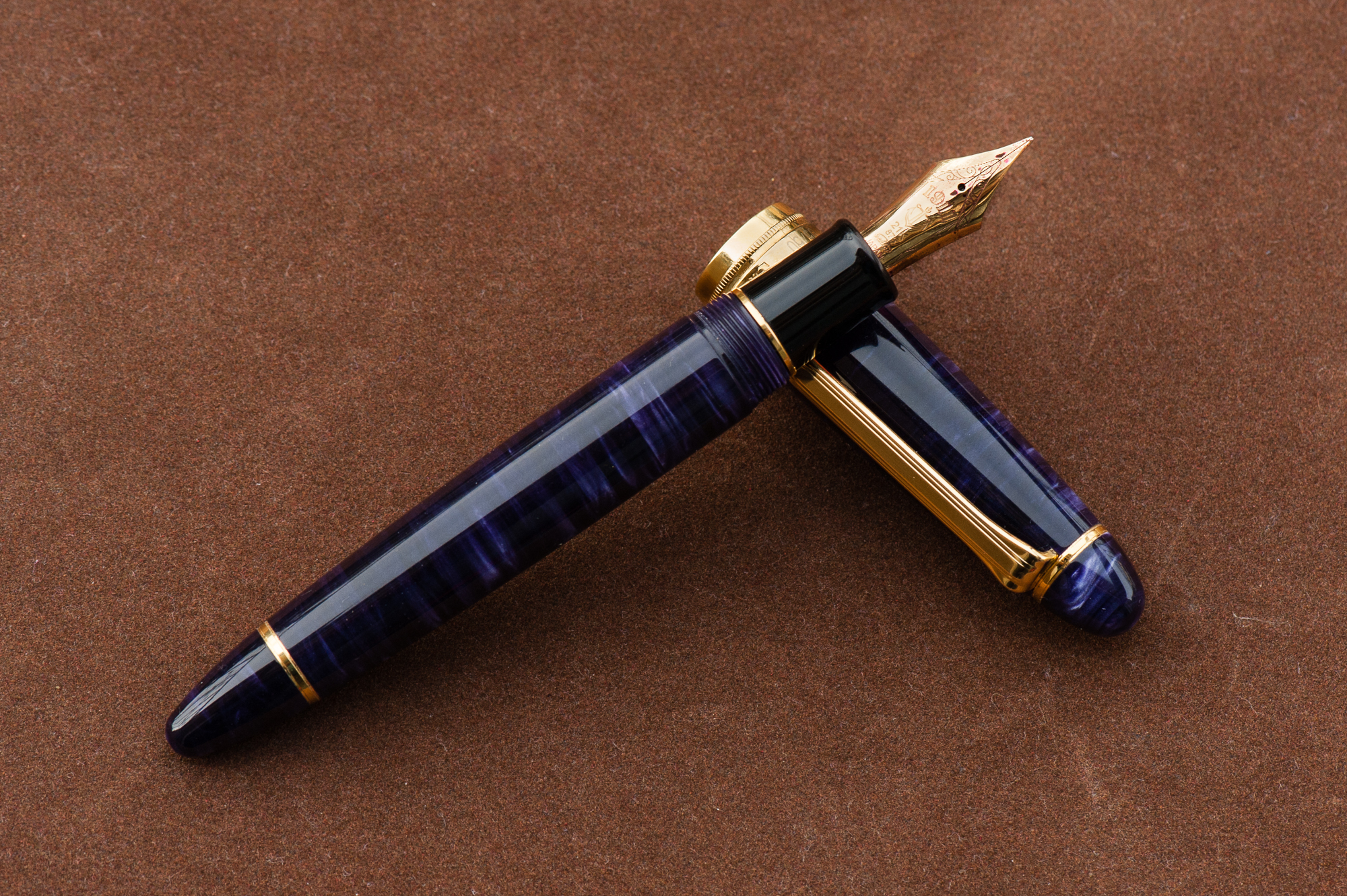
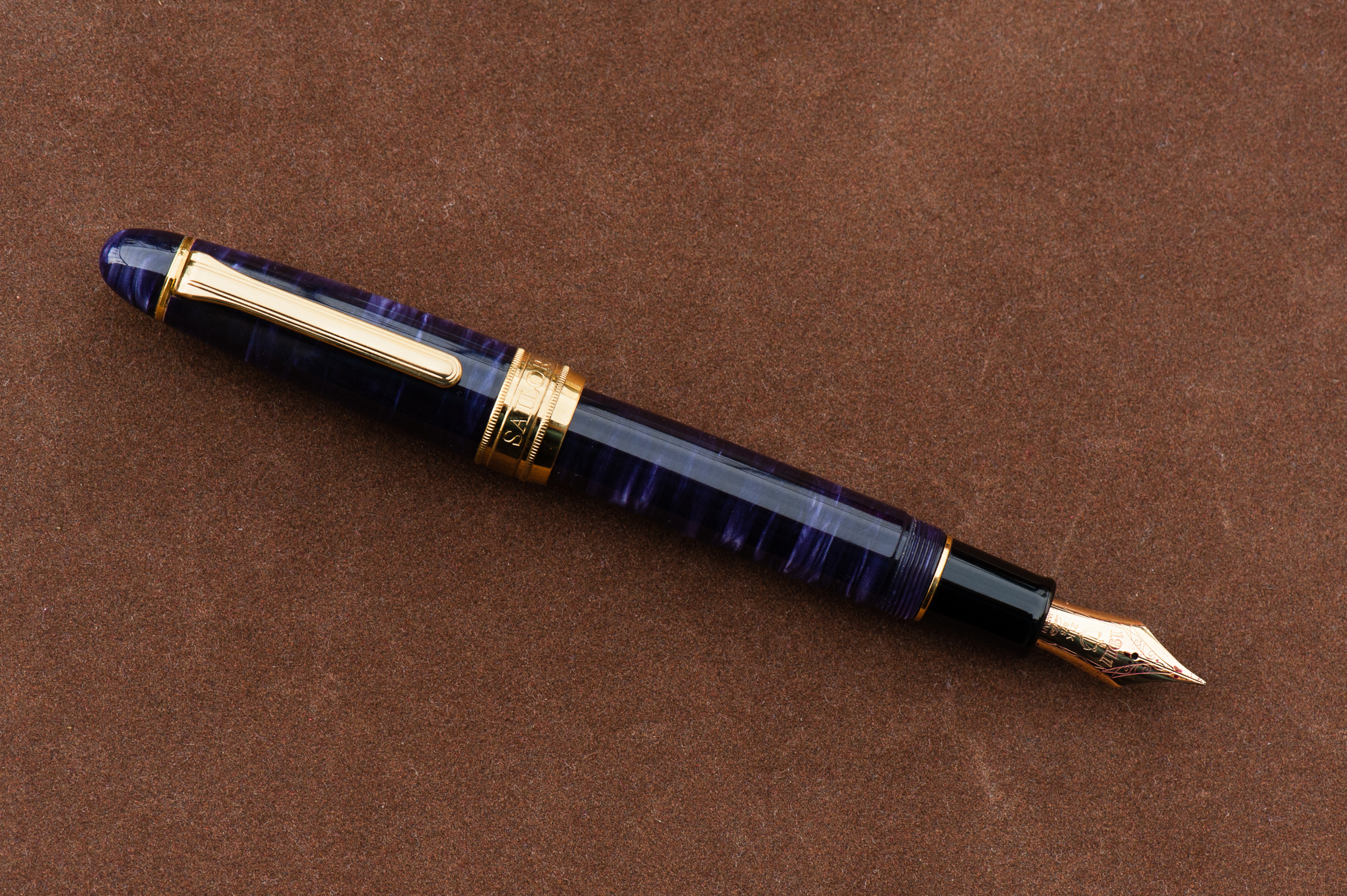
The Business End
Katherine: Being one of Franz’s, this pen sports a wonderful BCI. The nib is quite large, but a joy to write with. Smooth, juicy without being sloppy and capable of crispy line variation.
Pam: Sailor has one of the most beautiful and consistent nibs on the market. The KOP nib is no exception. The cursive italic was expertly ground and the slight springiness of the nib allows for a great ink flow.
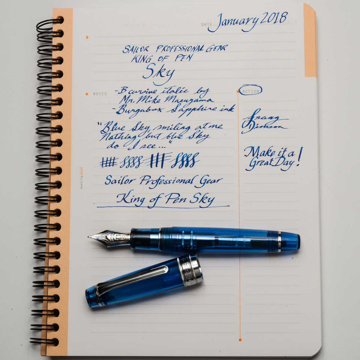
Franz: Mirroring what Pam said, Sailor nibs are well tuned with a hint of feedback out of the box . I’ve purchased a couple Sailor pens in 2017 and it wrote oh so perfectly for me without any adjustment. I got this pen second hand via a well-known auction site for a great price but when I got it, I found that the tines were a bit misaligned and almost too far apart. I inked it up and found that the flow was too much. So what do you do in this situation? You wait for the next pen show and ask Mr. Mike Masuyama to take care of it! Which is what I did and I also asked Masuyamasan to transform the Broad nib into a crisp cursive italic. Been loving the nib ever since.
Franz’ writing sample on a Rhodia 6.5 x 8.25 Meeting Book
Write It Up
Katherine: The KOP Pro Gear is a little bigger than I’d prefer, but still very comfortable and usable. I had no fatigue using it for extended periods, but do prefer the standard sized Pro Gear overall (better for my wallet, I suppose).
Pam: This size reminds me of the Pelikan M800 where it appears to be intimidating to those with pixie hands but is surprisingly comfortable. I find that the girth of the pen to be comfortable to hold for long periods of time. The weight of the pen doesn’t seem to bother me at all as it’s a well balanced pen when unposted. It does get long and more unwieldy for me when posted.
Franz: As I mentioned in the beginning, the Pro Gear KoP’s size is between the Pelikan M800 and M1000. These are two pens that I’m very happy to write with so this pen definitely fills my hand well. I wrote with the Sky in both posted and unposted modes at 10 minutes each and found that I’m comfortable either way. I lean more towards writing with cap unposted because it’s just a little bit more balanced that way. The cap band does place a bit more weight when posted but it wasn’t top heavy at all.
EDC-ness
Katherine: Works just fine as an EDC. The clip is strong and it takes 2 cap turns to uncap, which isn’t crazy, but feels extra secure.
Pam: This would be a pretty good EDC pen. The only down side is that this beauty maybe a bit too eye catching.
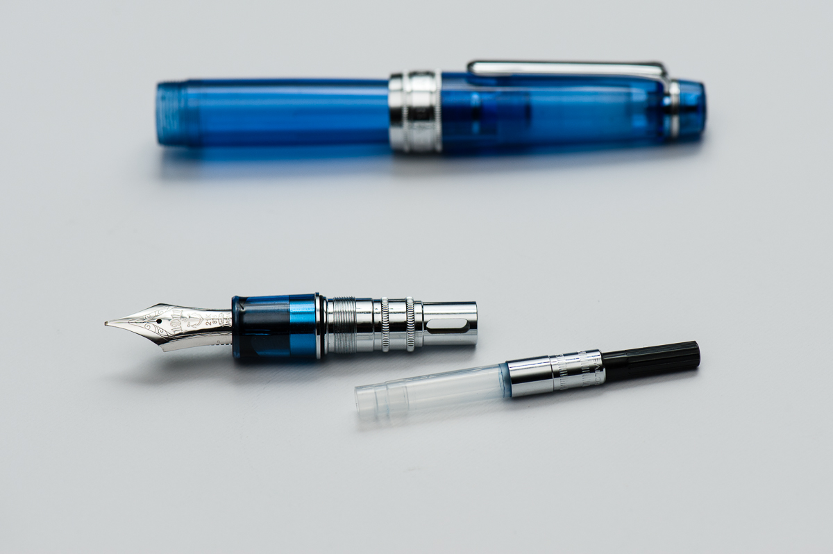
Franz: I use the KoP Sky at my workplace quite regularly and found it very useful as a daily carry pen. The broad cursive italic was just perfect for the copier paper we use as well as on my Rhodia meeting book. The clip like every other Sailor is very secure on my dress shirt pocket and the 2 turns to uncap isn’t too bad at all. It does fill either via cartridge/converter so I found myself refilling the converter after 3-4 days of use.
Final Grip-ping Impressions
Katherine: As mentioned earlier, I prefer the non-KOP Pro Gear more. But, I do love the way the KOP Pro Gear looks — it’s like a chubbier cuter (but larger) version of the Pro Gear! And a solidly awesome pen to boot. Alas, I can’t justify the price point (I can barely justify the price point on most Pro Gears these days…)
Pam: The Sailor KOP is a fantastic pen for those who enjoy the Sailor Progear but want something with a bit more heft and solid feel in hand. It could easily become a daily carry pen or “the” pen that is constantly inked. If there was a KOP in the right color (combination), it would easily make it to my grail pen list. As much as I love the Sailor Progear Slim and Sailor Progear, the KOP is an easy yes for me. Too bad my wallet says no alot more than I do.
Franz: Four words. Bear paws are happy! The Pro Gear King of Pen is definitely for medium to large sized hands (but Pam who has the smallest hand among the 3 loves it) and I truly prefer this against the Classic size of the Pro Gear pens. In the photos below, the Pro Gear size comparisons dramatically show the big step up in size between the Classic and the King of Pen. Another key difference of a King of Pen is its nib. It is springier than a Classic or Slim size Pro Gear and provides flair to my writing that I appreciate very much.
Because of the price point of the King of Pen, it does dig into your wallet a bit..er..a lot. But it’s all a question of value. I would like to repeat that I won this second hand pen via an auction for a great price and I’m very happy about it. Would I purchase a brand new KoP Sky if this one didn’t come along? **cough** I would **cough**. I’ve wanted one ever since I saw Pam’s Pro Gear Slim Sky.
Pen Comparisons
Closed pens from left to right: Pelikan M205, Pilot Prera, Pilot Vanishing Point, Platinum 3776, *Sailor Professional Gear King of Pen*, Pelikan M800, Lamy 2000. Lamy SafariPosted pens from left to right: Pelikan M205, Pilot Prera, Pilot Vanishing Point, Platinum 3776, *Sailor Professional Gear King of Pen*, Pelikan M800, Lamy 2000. Lamy SafariUnposted pens from left to right: Pelikan M205, Pilot Prera, Pilot Vanishing Point, Platinum 3776, *Sailor Professional Gear King of Pen*, Pelikan M800, Lamy 2000. Lamy Safari
Sailor Professional Gear Comparisons (Left to right: Pro Gear Slim, Pro Gear Classic, and Pro Gear King of Pen)
Katherine: We’d agreed on a prompt of top five acquisitions, I think. But I’m rebelling. 2017 was the year of the Nakaya for me — I went from zero to six, so let’s talk about that.
To start, some insight into my head — I place a lot of value in things that aren’t mass produced and are made by masters of a craft (see also my love for fine dining). Second, I’m willing to pay much more for things I can’t make/do myself (see my love for absurd molecular gastronomy, much less for anything I could conceivably cook at home). Third, I’m pretty busy with work, but I’m obsessive and I tend to be willing to try to do a lot of things (see the hours I’ve spent in the kitchen making my own sous vide egg foams).
Given those things, and my love of pens, I think Nakaya are a natural fit for me. I won’t lie, I’ve dabbled with my own finishes and urushi lacquer, and it’s still something I want to learn more about. Until then, Nakaya is a delightful mix of beautiful forms*, masterful craftsmanship and daily indulgence, all bundled together in a utilitarian writing instrument.
And, because the adventure doesn’t have to end — Nakaya I still want: another Mini Decapod (vaguely considering letting one go? let me know!), a pen in ishime suzu (black and silver) and a Decapod Twist in midori-tamenuri (a mini deca in midori-tamenuri would be amazing… but my odds are so low).
* I have a soft spot for pens with gently conical ends, and a (excuse my language) massive hard on for faceted pens.
Pam: 2017 was a year of acquiring and within that process refining what my writing preferences are. It has been the most adventurous and sentimental year yet for me with 2 pen shows and great pen friends. The five pens I chose is a reflection of my experiences in 2017 as well as the direction that my pen use and “collection” is headed in 2018.
No surprise to the Sailor ProGear Blue Lagoon. It’s by far my favorite Sailor (don’t tell the Progear Slims) for it’s color combination and performance. It has solidified my love for the Sailor Progear and Progear Slims. With all the special limited editions that Sailor keeps coming out with, like the Purple Cosmos, all I can say is that Sailor is going to be keeping my wallet pretty slim. The Pelikan m800 Ocean Swirl was a very pleasant surprise by my pen-spirators (Katherine, Franz and Roz) that included my non-fountain-pen-bestie getting me a very extravagant gift for my 31st birthday. I am a very lucky girl. After having an m800 of my own I am wondering why I was so hesitant to try the m800 size before this year. It’s a great size for pretty much any hand size and so well balanced!
I am actually surprised by the remaining 3 pens on my list given that I never thought of myself as a vintage girl. However, vintage pens have an affinity for small hands as the form factor of the pens are naturally slim and compact. It’s a great match. I am enamored by “short long” pens which are pocket pens that cap into a “normal” size pen. There aren’t that many short long pens with Japanese fine nibs on the modern market; only the Pilot Elite comes to mind. This “gap” is actually well fulfilled by the vintage pens. All three of the Japanese firms (Sailor, Pilot and Platinum) made short-longs/pocket pens back in the day, going as far as to mimic each other’s designs. The black stripe Myu by Pilot and this unique Platinum black and silver pen really opened my eyes to treasures of the vintage world. What I love about the vintage pen world is that everyone has a “niche” in terms of what they get excited about and what they collect. With the influence of a fellow pen friend, Andrew, I may have slipped down this rabbit hole and I can’t wait to see where it will lead in 2018.
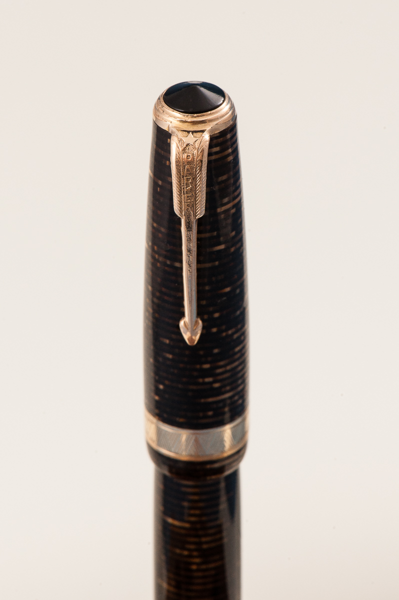
Lastly but certainly the greatest of surprises for me is the Parker 51. I don’t typically talk about Parkers and why haven’t I? The nib on this Parker is FANTASTIC, the smooth body and width of the pen is super comfortable for my handwriting, and it’s vintage?! This pen broke me of the idea that vintage pens were “stuffy.” How do you revive a “stuffy” pen? Put a bright ink in it. Inspired by Franz’s post of “black pens want pink ink” on Instagram and following that advice, I found great joy and a wonderful writing experience with this pen.
All I can say is that 2017 was eye-opening. I think 2018 is going to be a year of continual refinement and potentially slowing down the rate of acquiring. Some people have a word of the year and if I had to choose one for my pen use/collection, it would be “intentional” and being more cognizant of my own pen habits and use case (at least until the next Sailor Progear limited edition or vintage pocket pen comes my way).
Franz: Wow! 2017 is almost over and HELLO 2018!
I’ve enjoyed this hobby very much especially because of all the great people I meet along the way. Lots of highlights and events that passed this year. Here’s just a few I’d like to share.
In February, I went to the LA Pen Show and it was all about fun, and food! I mean, pens are great and all but you’ve gotta enjoy some great food too. That restaurant in Korea town with the awesome iced tea was a highlight. Tin Roof Bistro dinner was a success too. Got to spend some time with my sister as well.
In April, went to the Atlanta Pen Show for the very first time. I got to meet up with a family friend who has been into fountain pens long before myself and showed him around for his first pen show. Got to see the live Pen Addict podcast. Late night food at the Waffle House… yum.
In August, got to attend the SF Pen Show and once again assist with their classes and seminars. That show is just phenomenal. Got to host the Pay-It-Forward table with my Mom and a few other Pen Posse friends.
In September, Pelikan Hubs was held, and it was great listening to Mr. Rick Propas provide a history if my favorite pen brand.
All year round, Pen Posse meetups happen with the Food sub-committee meetups as well. The pen posse is a great group of people and happy to be part of it!
Also, I’m very thankful that this Hand Over That Pen blog continues to be. My friendship with Katherine and Pam is just… extraordinary.
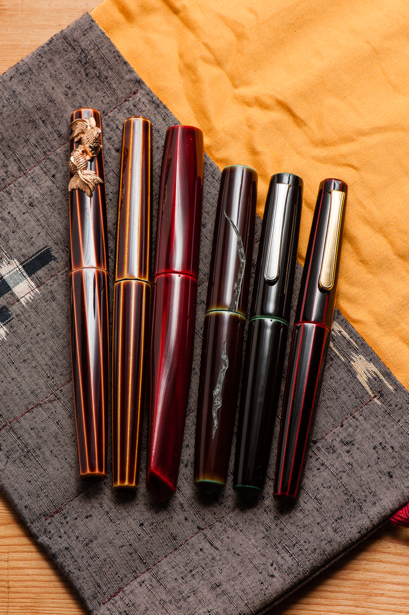
Here’s my top 5 pens for 2017 in accordance to being inked up and mostly used during the year.
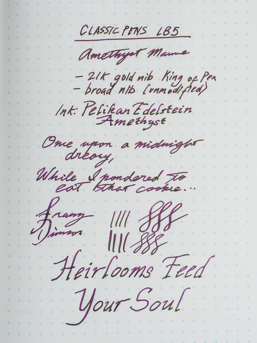
Classic Pens LB5, Tairiku (continent) in Amethyst Mauve, Broad nib. This pen was part of my top 5 last year as well. It just shows that I love writing with this pen. The 21-karat Sailor King of Pen nib is very nice especially on Tomoe River paper. The length of the pen is perfect for my hand. It still has Pelikan Edelstein Amethyst ink in it.
Nakaya Neo Standard, Kikyo, Medium nib. This is a new pen for me in 2017 that I got from the secondary market. Just like the LB5, the length of the pen is perfect for me. The dark blue is understated and it’s a pen I’ve been using a lot at work. The ruthenium clip and nib made it an even more subtle and beautiful pen for me. Thanks to J. of Classic Fountain Pens! The medium nib is perfect for either the cheap copier paper or Tomoe River paper that I use a lot. The Neo Standard is paired with Pilot Blue Black ink as it matches the dark blue finish.
Pelikan M1000, Green Striated, Fine cursive italic nib. I’ve had this pen since 2016 but I only had the nib turned into a cursive italic by Mr. Dan Smith at the 2017 LA Pen Show. Since then, the M1000 has not been un-inked and I’ve used it almost every day. The nib is springy and wet just like it should. I am a self-confessed Pelikan Addict and this flagship pen is perfect! It has been paired with my top favorite ink, Pelikan 4001 Turquoise.
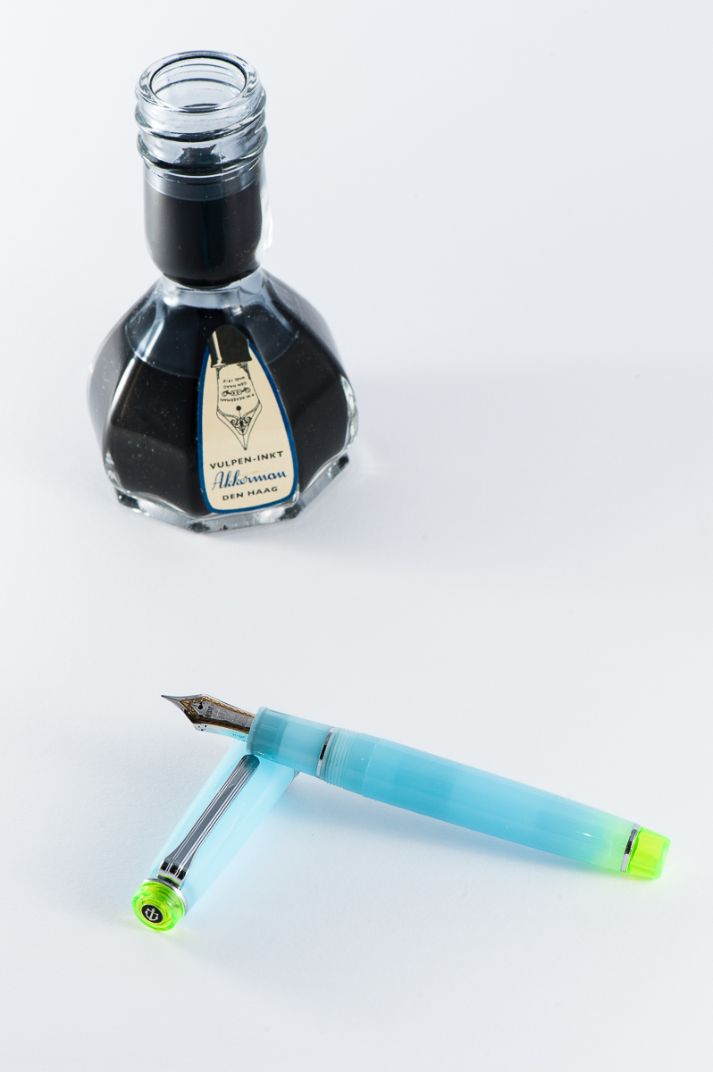
Parker Vacumatic Maxima, Golden Brown, Medium nib. I have such a love for the Parker Vacumatic pens and I always have at least one Vacumatic inked up. The stacked coin design is so beautiful with these Vacumatic pens. I was looking for a Vacumatic Maxima during the 2017 SF Pen Show but couldn’t find one with a great price, and nib preference. But at a Pen Posse right after the show, I was presented this pen for a great price and it has a medium flexy nib. It also sports a Star clip which was a transitional clip in 1939 before Parker chose the Blue Diamond clip. The Maxima is one of the “bigger” pens in its time and I find it comfortable to write with even unposted. Posted, the length makes it perfect, but I avoid doing so because the cap lip might crack. I love using this at work and every time I use it, it places a smile on my face. It has been inked up with Akkerman 05 Shocking Blue ever since.
Wahl-Eversharp Personal Point Gold Seal, Lazulitic Blue, Medium nib. Ok, Parker pens seems to always get my attention but Wahl-Eversharp pens do so occasionally as well. I’ve been on the lookout for larger sized W-E pens but haven’t really seen much that is within the budget. I saw this W-E pen in person in early 2016 and did not act on it and thought that it was sold. Fast forward to July 2017, I found this pen again and I immediately sold a pen to buy it. That’s how much I wanted it. No regrets at all and has been in use since bought! The blue material of this Personal Point is just stunning especially for a blue pen lover like yours truly. Just like the Vacumatic Maxima, it has a flexy medium nib which writes oh so smoothly. Currently inked with Pilot Blue Black.
Happy New Year to you all and may 2018 bring you more blessings and happiness!
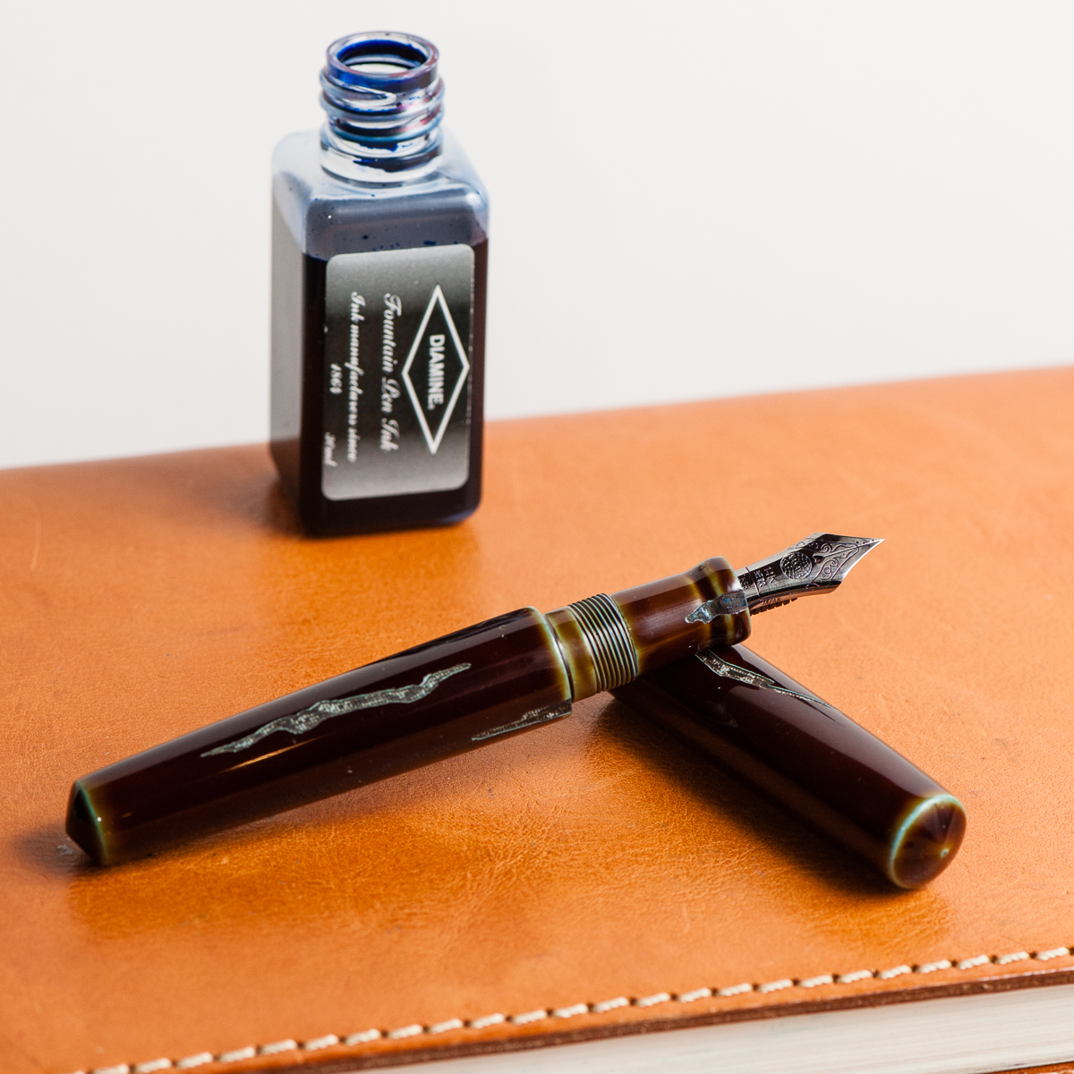
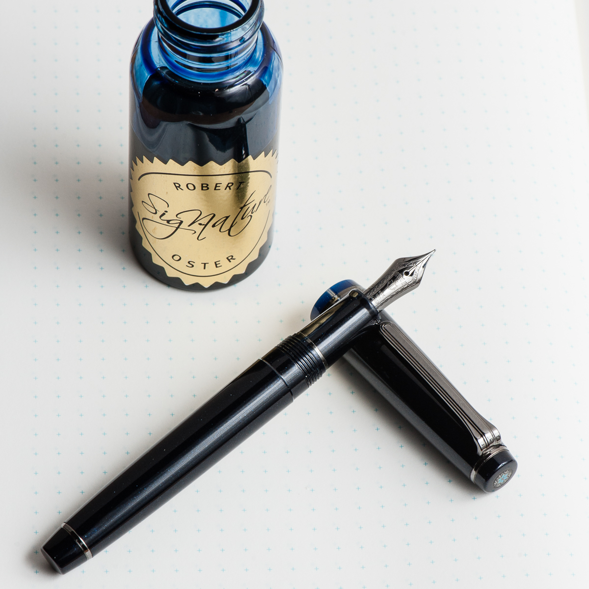
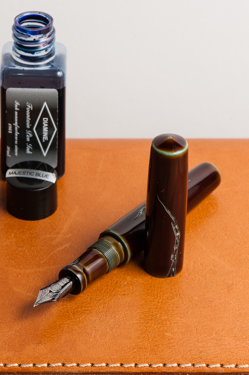
Katherine: December has been a crazy month of trying to not drown. The year is wrapping up at work and I feel so behind on everything, and slightly sick. In light of that, I decided on an EDC that is both practical but also brings me so much happiness every time I pull it out to use it. Diamine Majestic Blue for work-friendly writing, paired with a Nakaya Piccolo in Heki-Tamenuri Negoro and a Mottishaw Spencerian nib for lots of joy. To tell the truth, I barely flex the nib, but I do enjoy the bounce it has and how fine it is — I can cram lots of to-dos in my Hobonichi weeks. 😐
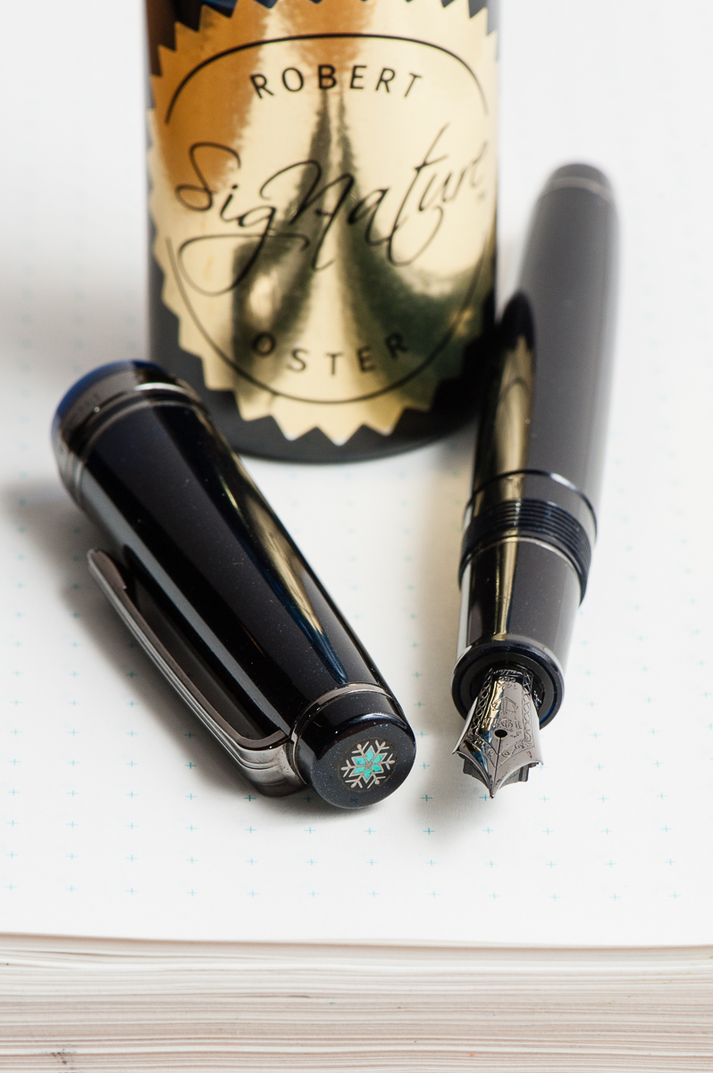
Pam: December is a month that I look forward to the most due to the holiday season. One of my favorite pens that was an ode to this magical time of year is Bungbox’s Silent Night, a limited edition made available last year, 2016. I don’t have an affinity to blue black inks such as Silent Night or Bungbox 4B. Blue grays, however, like Pilot Iroshizuku Tsuki-yo, is one of my favorite inks of all time. Therefore, it would only seem fair to try Robert Oster Blue Night in the Silent Night. Blue Night reminds me of Tsuki-yo, but has more shading, at least in this pen with an Japanese F nib. I do wonder if the shading properties would differ in a wetter nib. Given that I have only inked it for less than 24 hours, I will report an update on Blue Night to determine if it’s a keeper.
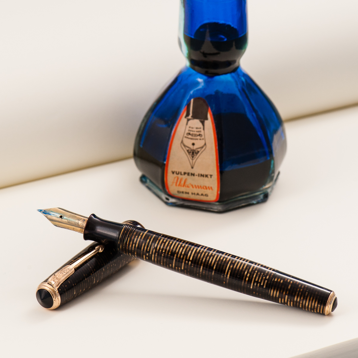
Franz: For the month of December, I chose a vintage pen. But it ain’t just any vintage pen, it’s my Parker Vacumatic Senior Maxima in a Golden Brown finish. I recently got the pen this year and it’s in such great condition for a pen made in 1939. I always adore that stacked coin design of the Vacumatic celluloids. Something special about this pen is that it has a Star clip. This was a transitional clip in models made in 1938 thru 1939 before Parker came up with the Blue Diamond in 1939 as well. The size of the Maxima fits my hand very well.
I chose Akkerman #05 Shocking Blue as my ink because the blue ink complements the beautiful brown celluloid finish of the pen. Plus it’s an ink that I’m comfortable using in my vintage pens.
Happy holidays to you all! And keep enjoying your pens and ink!
While we absolutely believe that every day is fountain pen day, the first Friday of November is quite special because we get to celebrate our favorite writing instrument throughout the world in unison. This is also a day or a weekend wherein different deals and discounts are offered by our favorite retailers. Check out the Sponsors tab of the FPD website for more info on these deals.
More importantly, Fountain Pen Day is also a great time to share the joys of writing with a fountain pen to family, and friends!
To celebrate, we the trio, are running a giveaway with three prizes for three lucky winners:
A limited edition green demonstrator Oeste Prera fountain pen
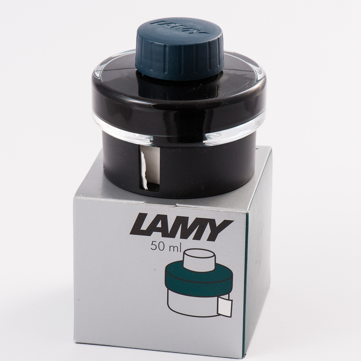
A bottle of the 2017 limited edition Lamy Petrol ink
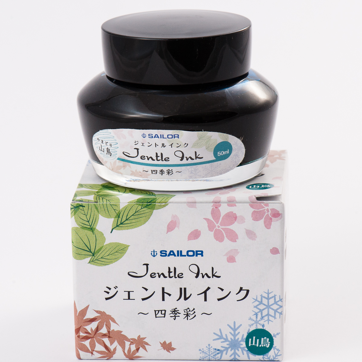
A bottle of one of our favorite inks — Sailor Jentle Yama-dori
To Enter:
Follow us on instagram, @handoverthatpen & regram our giveaway image or post a picture of your favorite fountain pen and ink with the hashtag #hotp2017FPDGAW (Please make sure your account is public so we can find it! And no giveaway accounts.) or —
Comment on this blog entry with your favorite fountain pen and ink (not necessarily a pairing)
The giveaway is open from now, 11/03/2017 until 11/10/2017 11:59pm Pacific time. One entry per person please.
The giveaway is open internationally, but we aren’t responsible for any taxes, customs fees or duties that may be applied, and will be shipping without tracking due to cost.
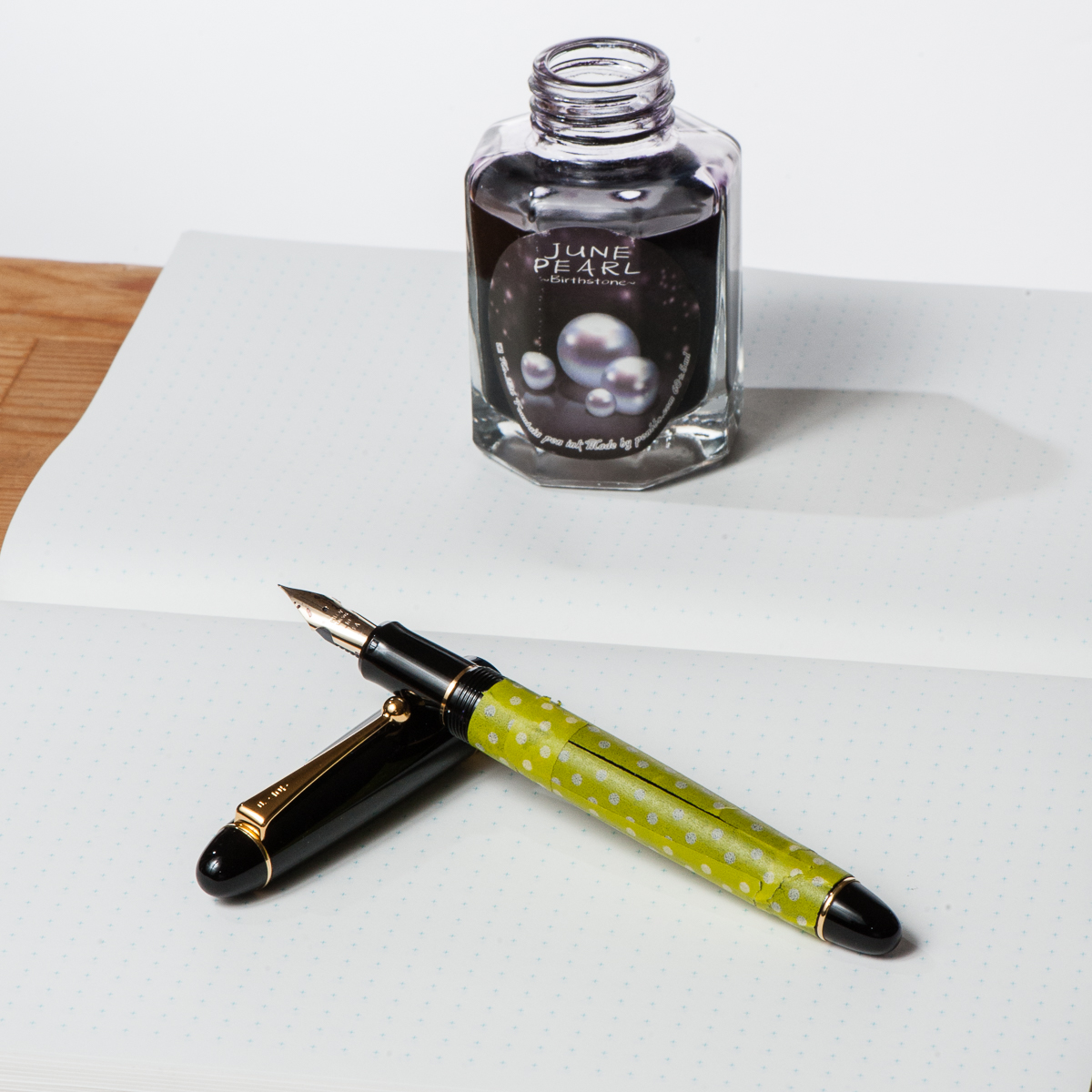
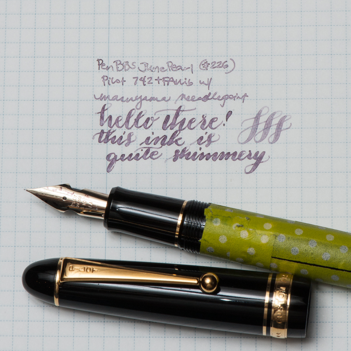
Katherine: My pairing for the month isn’t thematic in any way, just a pen and ink combo I was (and am) excited to use — Pen BBS June Pearl (picked up from Straits Pens at the SF Show a few months ago) paired with a Pilot 742 FA sporting a Masuyama Needlepoint grind. Ignore the washi, I was trying to decide how something looked… and now it’s just there.
I love the pairing of the pale shimmer ink with the soft flexy nib of the 742. Written in a fine line, June Pearl is pretty light, but in the FA I get swirls of shimmer and more readable text. All in all, I really enjoy writing with the 742 and the FA nib, I’m just (unfortunately) not a big fan of the body.
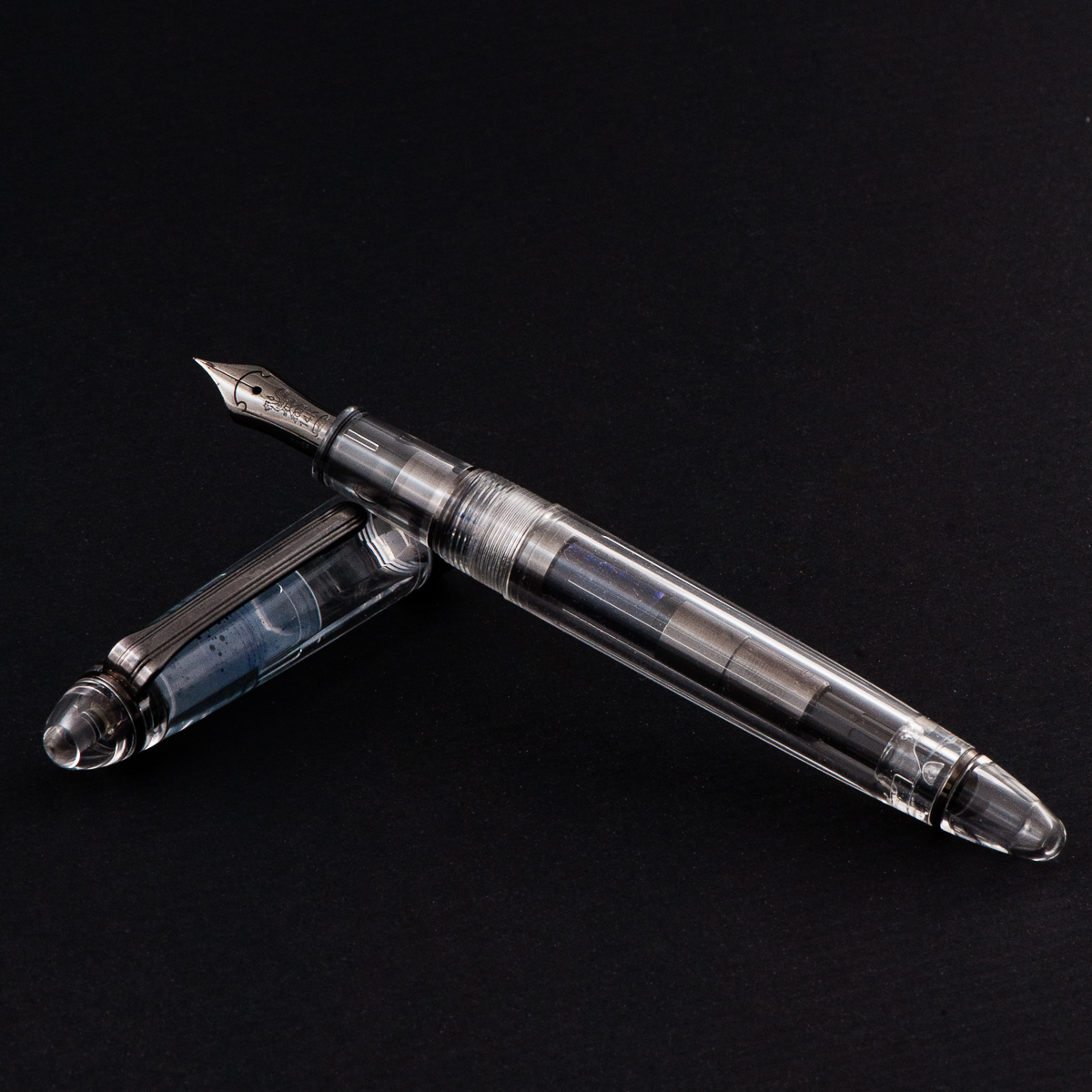
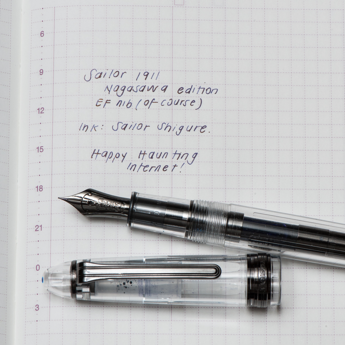
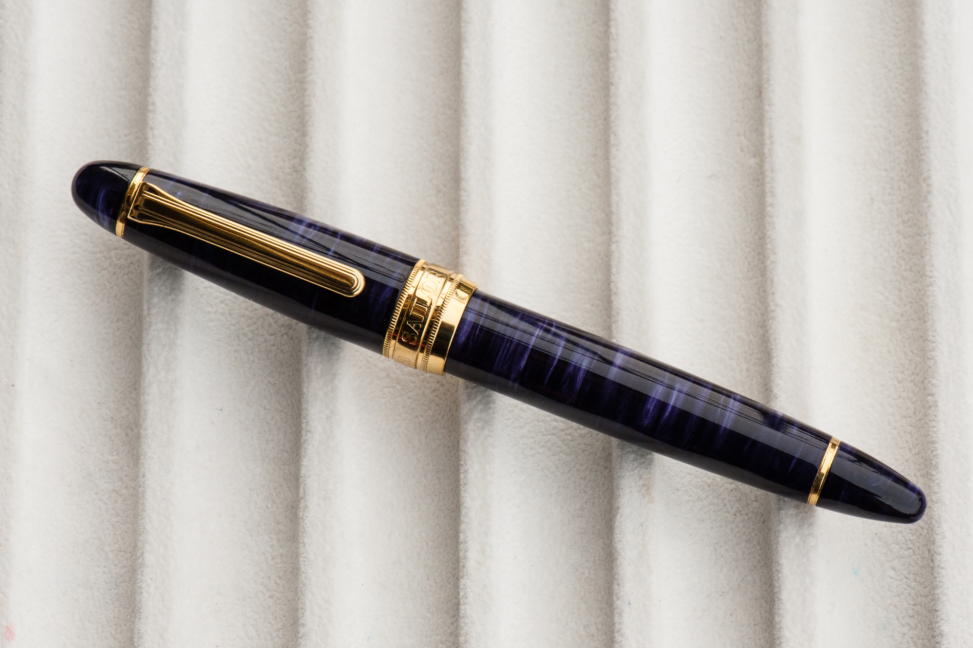
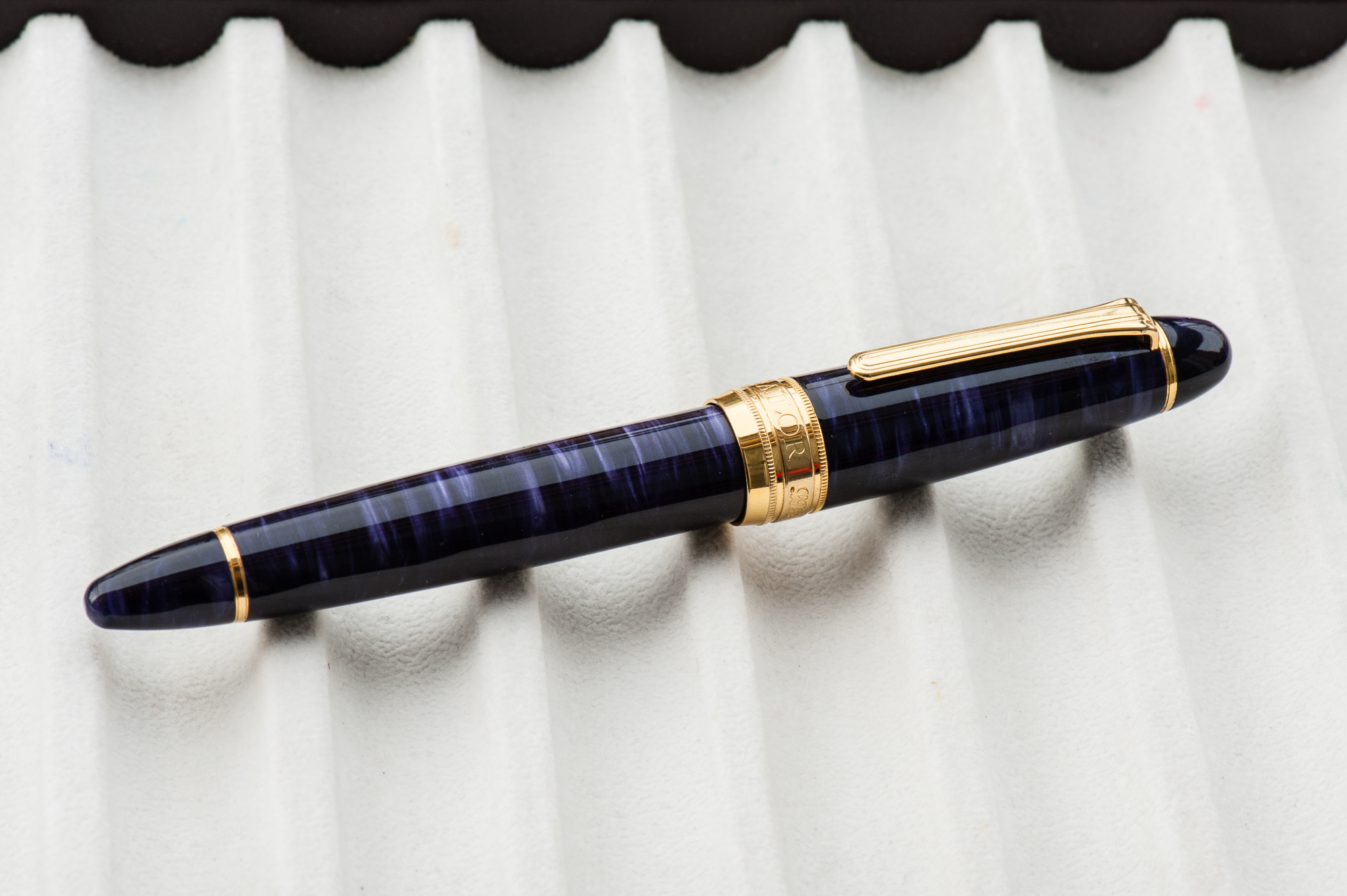
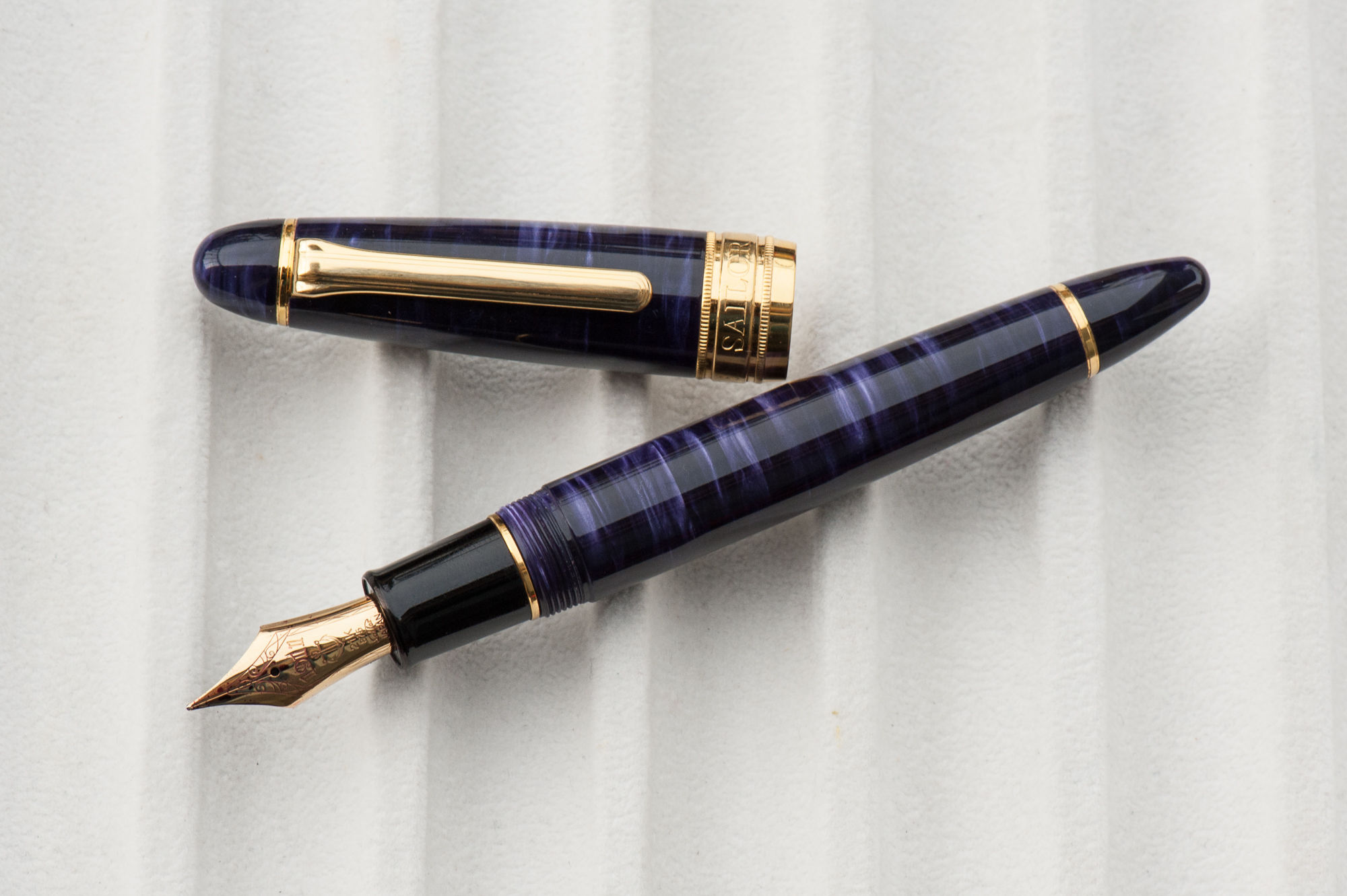
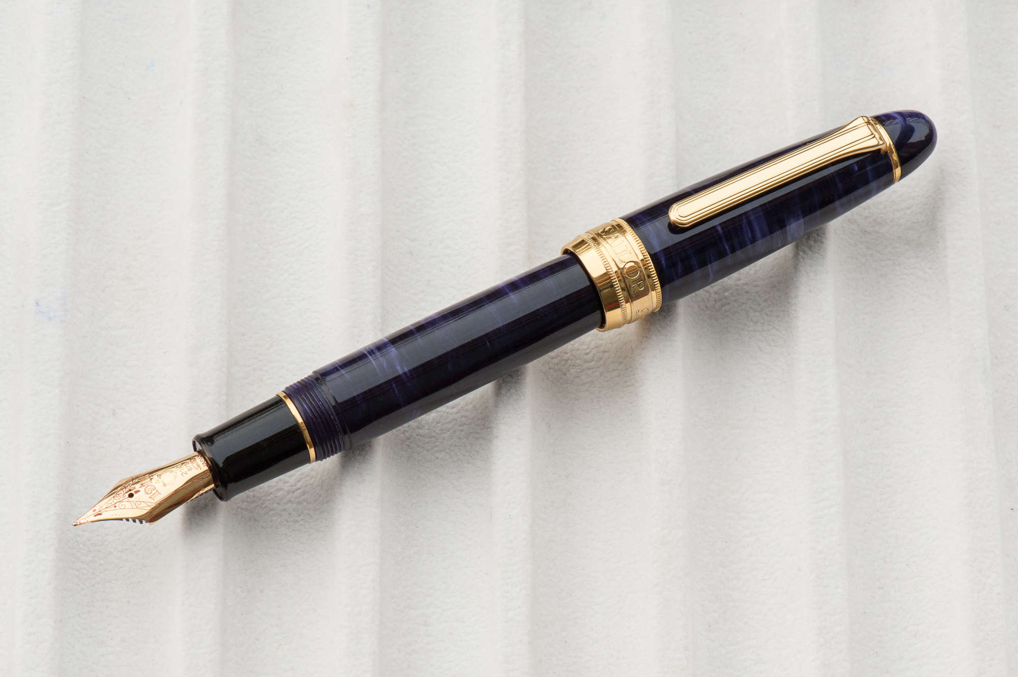
Pam: For October, the month of Halloween, it would seem most appropriate to bring out the Sailor 1911, Nagasawa edition; a demonstrator with the ruthenium trim. Even the converter has the ruthenium trim! It is one my favorite colorways: monochromatic. Honestly, I was not a fan of the 1911, but this particular finish was so unique (at the time) that acquiring it from Claire was instantaneous. (Thank you Claire!!)
I wanted a dark ink to complement the “darkness” of the 1911, but not a black ink. The only ink that came to mind for me was Sailor Shigure. The dark and deep purple is a wonderful complement to the rhuthenium trim. It’s also one of the few inks that I adore that doesn’t have an obvious sheen to it. That only adds to the mysterious and haunting vibe of the ink when paired with this pen during the Halloween season.
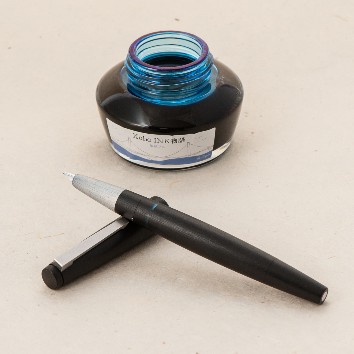
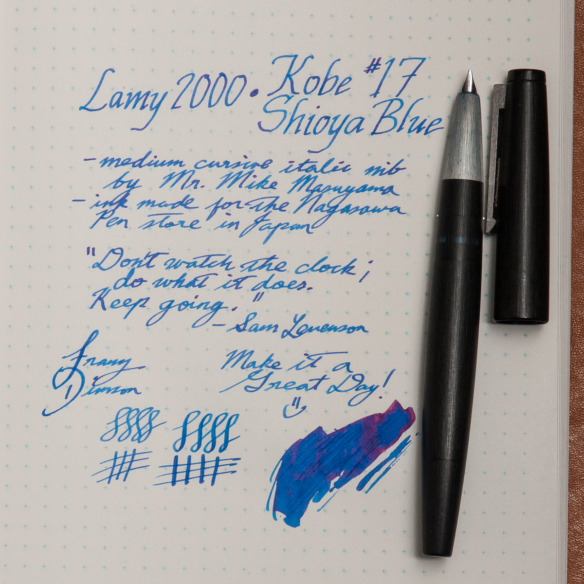
Franz: This month, my pairing is more of a discovery and rediscovery of sorts. First, the pen. I haven’t written with my Lamy 2000 for almost a year and I’ve definitely missed it. The 2000 is easily one of my favorite black pens of all time. And now for the ink, I recently bought a bottle of Kobe’s #17 Shioya Blue without trying a sample but I figured it could be a suitable ink for work.
So a pen and nib I know very well, and a new ink. As expected, the Kobe ink flowed very well with the cursive italic nib. Actually, the italic nib showed the shading properties of this ink very nicely. I’m so glad I did this pairing and since I wrote with the 2000 a lot, the ink level is now below 50% . I’ll most likely top off the ink in a week or so. Thank you for reading our inky thoughts here.
Wishing you a Happy Halloween! And please comment what pen and ink combo are you are currently using.
Writing Samples (click to enlarge)
Katherine’s Pilot Custom 742 and Pen BBS June Pearl on Nanami Seven Seas Crossfield Tomoe River paperPams Sailor 1911S with Sailor Shigure ink on Hobonichi paperFranz’s Lamy 2000 and Kobe #17 Shioya Blue on Nanami Seven Seas Crossfield Tomoe River paper
HOTP Editorial: Please note that the Classic Pens LB5 were limited edition releases from 2012 and since then has been unavailable for sale from their authorized retailers. The LB5 pen can occasionally be found for sale in the secondary market, or at a pen show. Granted that because this is a limited edition pen, this may only happen a few times and far in between.
This review, and our pen blog is primarily focused on providing a point-of-view (or is it a grip-of-view?) from different hand sizes as well as compare the LB5’s size against other more common pens. Thank you for reading our thoughts and reviews!
Hand Over That Pen, please!
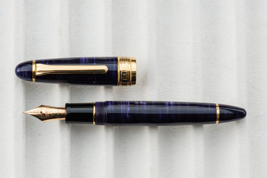
Katherine: This is a very sizable pen made out of a very unique and interesting material. The something or another fancy acrylic has a lot of depth, in a way that is totally unique from celluloid or other acrylics. I really like how this pen looks — I just wish it were smaller.
Pam: Holy nightstick Batman! That’s how big this pen is (at least to me). It’s one of the most notable features of the pen. The second thing that I noticed of this massive beauty is the material. The material has a lot of surface area to show off it’s depth and iridescence. Pictures can’t do this pen justice. One of my favorite materials of the LB 5 is the purple. The overall aesthetic of the pen is very much a classic shape with the traditional gold trim. However, maybe it’s the size or the material, but I wouldn’t consider the aesthetic of the pen to be “vintage” looking.
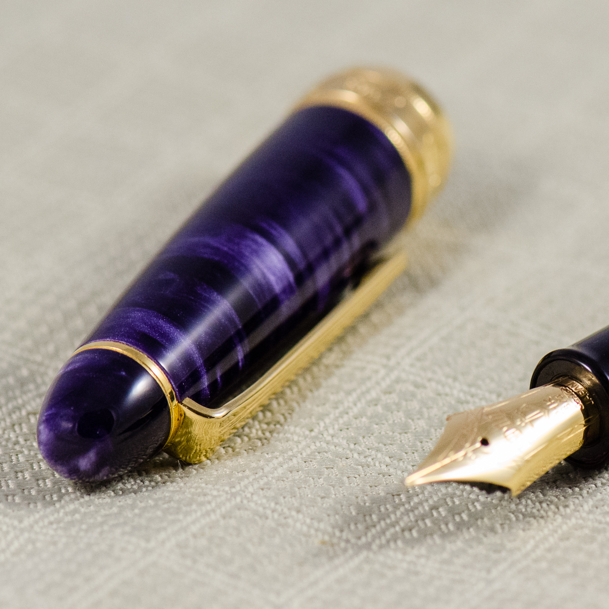
Franz: CHATOYANCE! Pardon my French. An over-sized pen with a beautiful acrylic material? Please tell me more!
The Classic Pens LB5 is an impressive pen to behold. Their unique material lures you in and the Sailor King of Pen nib performance keeps you coming back for more. As the blog photographer for HOTP, I tried my very best to show the beauty of the LB5’s material but nothing beats seeing it in person.
In the Hand: Classic Pens LB5 (posted) – from left to right: Franz, Katherine, and PamIn the Hand: Classic Pens LB5 (unposted) – from left to right: Franz, Katherine, and Pam
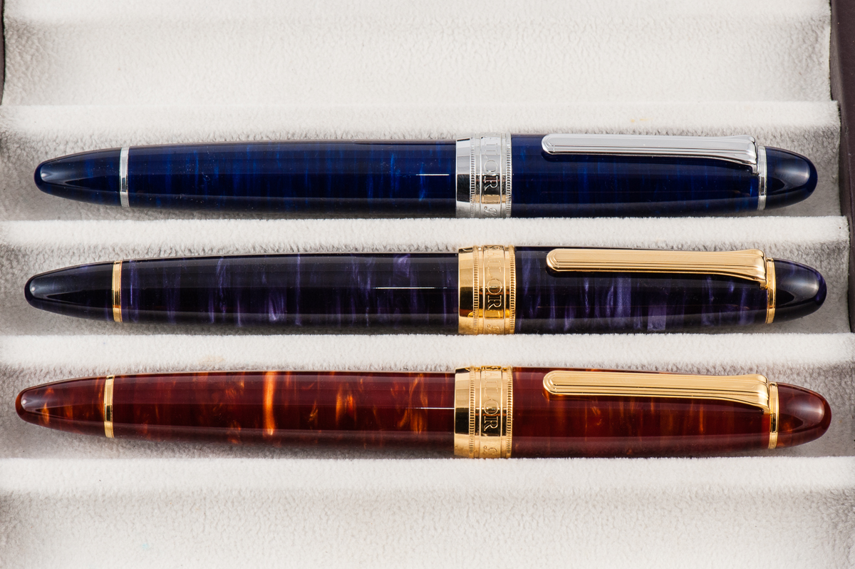
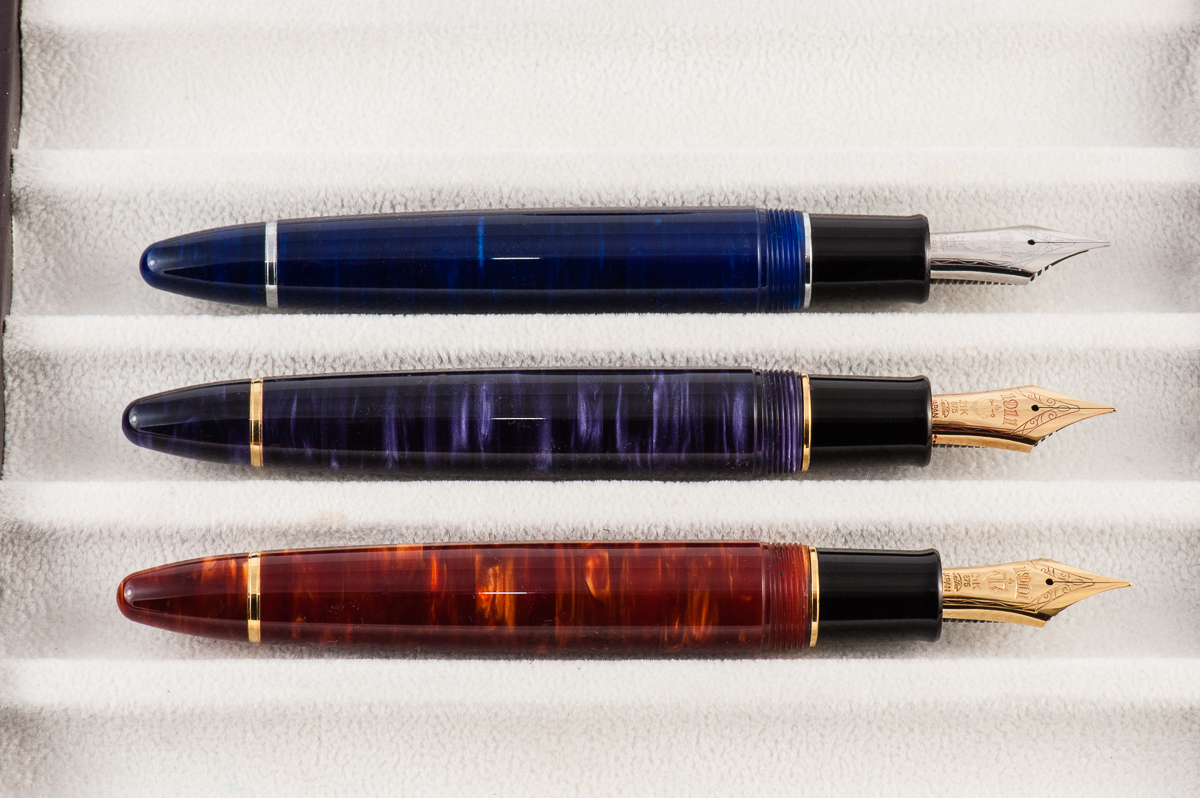
Background Info: Classic Pens was established in 1987 and has been known for collaborating with other pen brands, and artists to introduce stunning limited edition art pens. The pen in review is part of the LB Collection wherein LB is an acronym for Lambrou and Brown. Andreas Lambrou and Keith Brown are the two founders of Classic Pens. The LB5 series was introduced in 2012 and 2013 to commemorate the company’s 25th year anniversary and was aptly named, Classic Pens LB5 25th Anniversary Shizen (Nature) Pens.
The unique acrylic was made by two companies. First, Sintetica from Italy cast the sheets of pearlized acrylic and then Carville from the United Kingdom used an exclusive diffusion bonding technique to bond multiple sheets together and made the material more stable. The acrylic was then sent to Sailor Pen Japan to each be turned into a King Profit (King of Pen) pen. A difference to be noted is that the LB5 was made 5mm longer than the King Profit pen. And the pen was fitted with a 21-karat King Profit nib. The nib sizes offered were either a medium, or broad. There were a few Nagahara Cross Point nibs available at a premium price.
The LB5 was manufactured in six different colors: Tensui (raindrops) in Space Blue, Kaen (violent flames) in Flame Red, Midorigi (new green trees) in Forest Green, Tairiku (continent) in Marble White, Kouseki (metal ore) in Diamond Brown, and Tairiku (continent) in Amethyst Mauve which is the pen we are reviewing. This limited edition was issued only with 50 pens in each color. with a listed price of $1,600 in 2013. Important to note that in recent years, Classic Pens changed their name into Lambrou Pens.
close up of the cap’s acrylic
The Business End
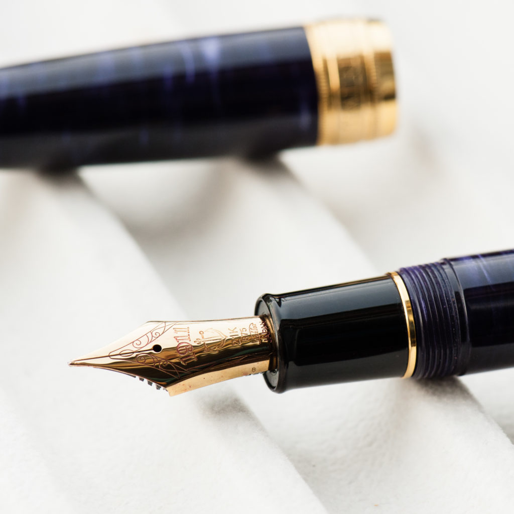
Katherine: I’ve tried LB5s with both an unmodified Medium and a Broad Cursive Italic, both were lovely. The first time I tried it, I was surprised by how soft and bouncy the nib was. I loved writing with it, though it is a monster of a nib. I tend to hold my pens pretty far forward, and the size of this nib means I hold it at the very lip sometimes. Not a problem, but an observation.
Pam: This nib is a Sailor nib, so it’s perfect. Actually, it’s not the typical size of the Sailor nibs that we know and adore so well. Like the pen, it’s bigger! With the extra size and material of the nib, comes with more bounce. Perhaps, it’s my natural bias to love all things Sailor but I really enjoyed the “oversized” nib with the “oversized” pen. (Oversized is in quotes because I know it’s the perfect size for bear paws.) Oddly enough, I felt that this nib was proportional to the pen and performed extremely well. It was a smoother nib than I expected and I didn’t feel the pencil-like feedback that Sailor nibs are known for.
Franz: The LB5 is made by Sailor so naturally, the nib used was their King of Pen line. As Pam mentioned, the size of the KoP nib was balanced against the larger size of the LB5.
Most Sailor nibs write perfectly out-of-the-box and this was no exception. The unmodified broad nib wrote smoothly and had a bit of bounce to it. The 21-karat KoP nibs are not meant to be used for flex writing but its springiness provided a little flair to my writing. As shown in the second photo below, the LB5 section is comparable to other over-sized pens and was comfortable for my grip.
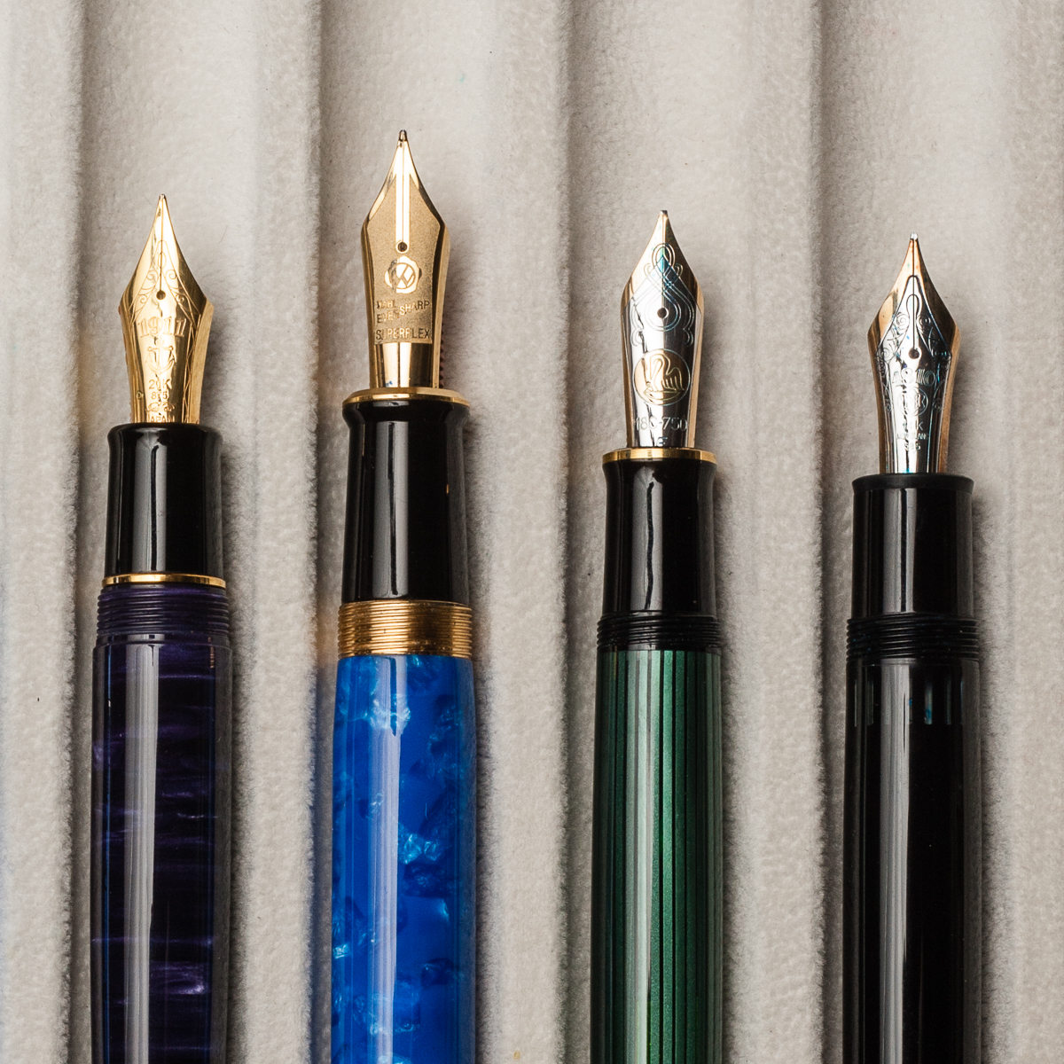
Sailor King of Pen Broad NibOver-sized nibs from left to right: Classic Pens LB5, Wahl-Eversharp Decoband, Pelikan M1000, and Montblanc 149Franz’ writing sample on a Nanami Crossfield Journal
Write It Up
Katherine: This pen is a littttle too large for me. It’s usable, but if I grip it tightly, my hand ends up pretty tired. If I grip it loosely though, it’s great! A fun nib in a pen that’s beautiful. Unfortunately, though, I tend to be a not-loose gripper by default, so I don’t think this pen will ever be a favorite for journaling.
Pam: The pen is easier to write with the tripod grip. My “iron fist” grip had the larger pen feel unbalanced. The tripod grip being a “secondary grip” for me did tire out my hand, however the width of the pen was still very comfortable in either grip. The threads were not sharp so I wasn’t so worried about my “iron fist” grip getting too uncomfortable. If only my hands were larger, this pen would be much more comfortable. This pen would be great for the “normal” or medium hand size. (Just not pixie hands.)
Franz: The bear paw… I mean, my hand wrote with the LB5 effortlessly in both posted or unposted modes. As mentioned earlier, the LB5 is 5mm longer than the “standard” Sailor King of Pen. This is because Classic Pens requested Sailor to lengthen the barrel to make the pen more comfortable to write with when unposted. I truly appreciate the extra length of the barrel and was sufficient for my larger hands. I do post the cap sometimes when i feel that I’d like the pen to be a little heavier and it was still a pleasant journaling session.
EDC-ness
Katherine: This pen is too large for me to EDC comfortably. I tend to stick my pens in notebooks sandwiches, or occasionally in my jacket pockets… and this is just too big. It’s like having a hot dog in your pocket. But, if you have larger pockets than I do, it seems up to the task. Solidly made, and takes about 2.25 twists to uncap, so solid but not too tedious.
Pam: This pen is a bit too large for my pockets, whitecoat or jeans. I would also not recommend being rough with this pen given that the material is so beautiful and may be scratched by keys. This beast will need a home in a case.
Franz: Is the LB5 a good pen for Every Day Carry use? Well, it could be. As detailed by the two ladies above, it is a larger pen to bring along. When I used this pen at work, I had to make sure that the dress shirt I was wearing had a deep breast pocket and even then, it still stuck out semi-securely. I am able to conceal and secure the LB5 when I constantly wear a suit jacket at work though. Now for carrying cases, it barely fit in my Nock Co. Sinclair case that I use on the daily. It does fit nicely inside my Franklin-Christoph Penvelope Six case and is quite secure in my bag. The broad nib is a little too wet for the cheap paper used at work but I believe a medium nib would be perfect.
Just like most Sailor pens, it is a cartridge/converter filled pen so when I used this pen on the daily, I found that I needed to refill every three days or so. An advantage of the c/c filler is it makes the pen light weight instead of having a filling mechanism installed which potentially makes a pen heavier.
Final Grip-ping Impressions
Katherine: I can see why this pen is a grail for many, but the size just means it doesn’t work for me. I wish pen makers wouldn’t only make their flagships massive… It’s gorgeous, has a fantastic nib and has a really unique material. But, I prefer smaller pens. :/ Womp.
Pam: I love the nib of this pen. Unfortunately, this pen wouldn’t be balanced to have a small pen with a large nib. I would highly recommend this pen to those who have the fortune of having a “normal” hand size and can find one of these pens looking for a new home. The way I see, if both criteria are met, the stars have aligned and you are meant to have this pen. ;p (Wallet protests aside.)
Franz: As we have noted in the beginning of this review, the Classic Pens LB5 has long been sold out. If you are interested in the pen’s unique diffusion bonded acrylic, Andy Lambrou currently has another edition of limited edition pens in these acrylics. The Lambrou Pens LB6 Virtues is slowly being issued in seven different colors. This edition however is more limited since they are releasing only 10 pens in each color.
My final thoughts on the LB5? I am channeling the thoughts of the people who had reviewed the LB5 before (Dan Smith, SBRE Brown, Matt Armstrong, etc.) when I say that, I love this pen! The Classic Pens LB5 has been a part of my Top 5 pens ever since I brought it home from the pen show. Why? Is it because: it’s a limited edition? the material? the pen size? the aesthetic? the value? the connection I have with the pen maker? I can’t specifically answer why but I feel that it’s the whole package that the LB5 delivers.
Pen Comparisons
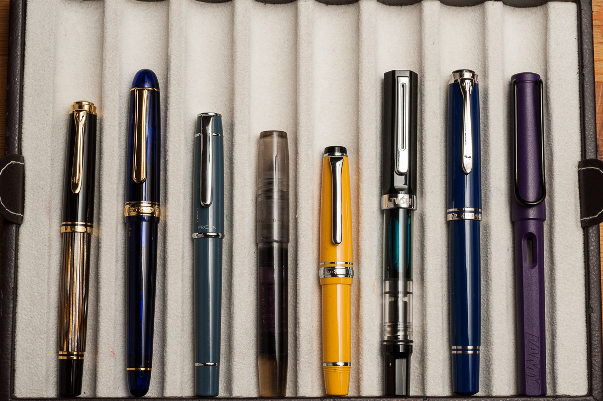
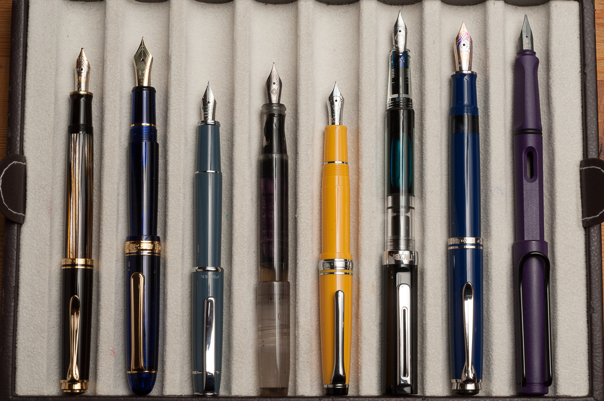
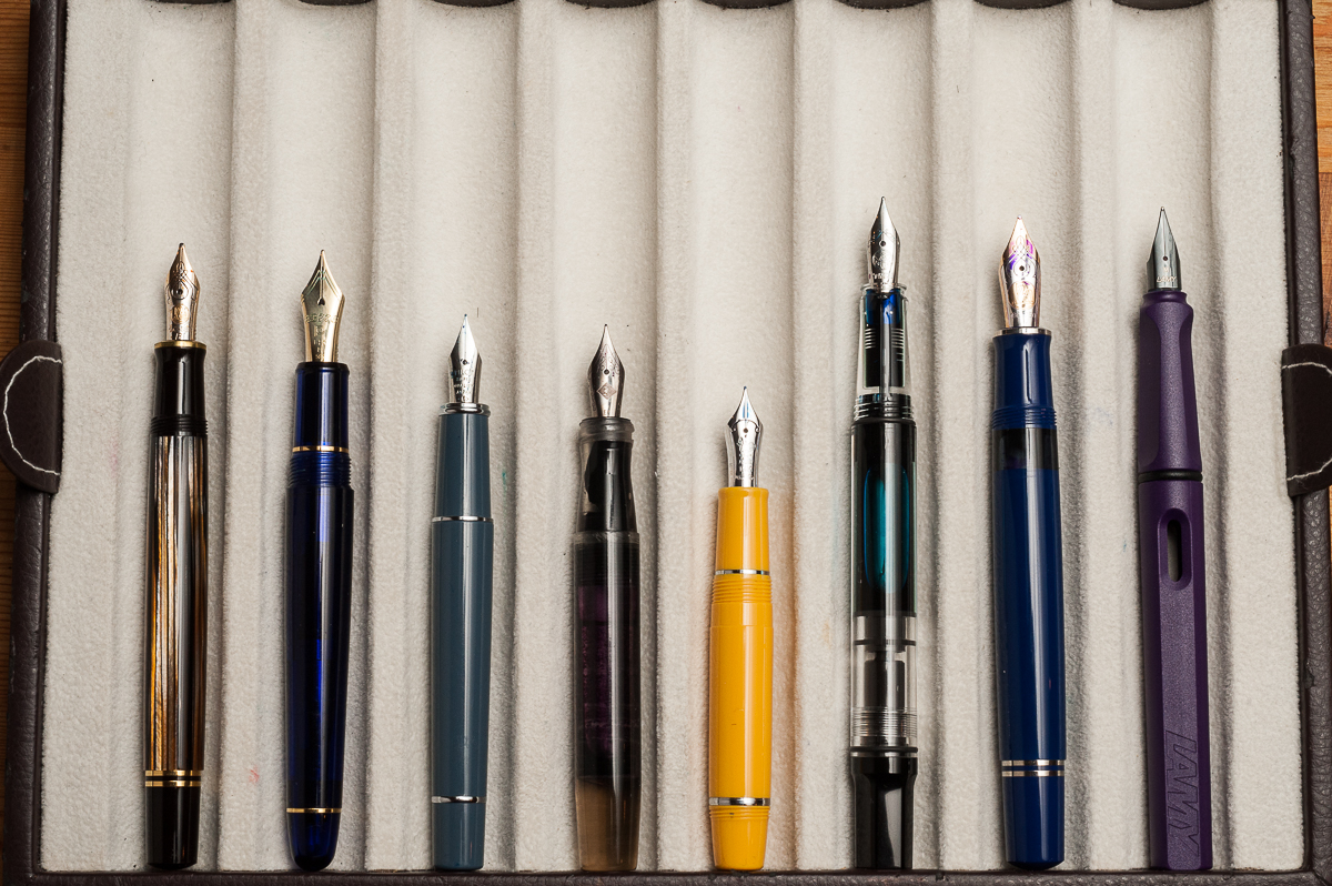
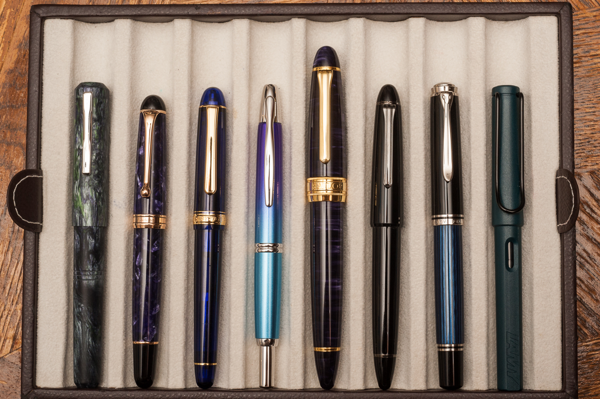
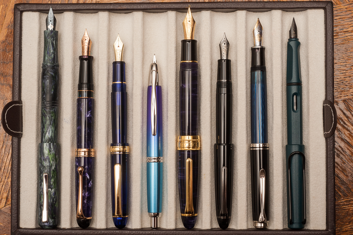
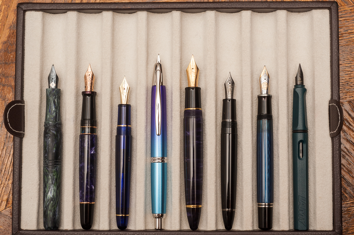
Closed pens from left to right: Franklin-Christoph Model 31, Aurora 88, Pilot Vanishing Point, *Classic Pens LB5*, Sailor 1911 Large, Pelikan M805, and Lamy SafariPosted pens from left to right: Franklin-Christoph Model 31, Aurora 88, Pilot Vanishing Point, *Classic Pens LB5*, Sailor 1911 Large, Pelikan M805, and Lamy SafariUnposted pens from left to right: Franklin-Christoph Model 31, Aurora 88, Pilot Vanishing Point, *Classic Pens LB5*, Sailor 1911 Large, Pelikan M805, and Lamy Safari
Pen Photos (click to enlarge)
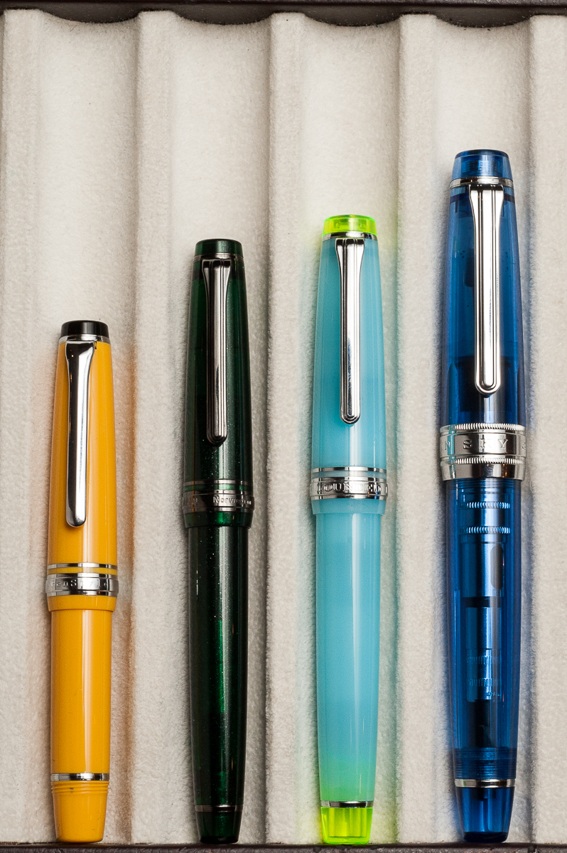
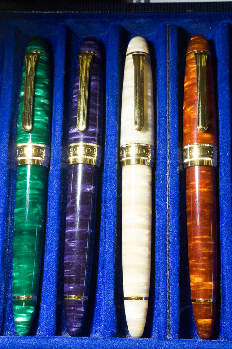
Closed pens from top to bottom: Tensui (raindrops) in Space Blue, Tairiku (continent) in Amethyst Mauve, Kouseki (metal ore) in Diamond BrownUnposted pens from top to bottom: Tensui (raindrops) in Space Blue, Tairiku (continent) in Amethyst Mauve, Kouseki (metal ore) in Diamond BrownClosed pens from left to right: Closed pens from top to bottom: Midorigi (new green trees) in Forest Green, Tairiku (continent) in Amethyst Mauve, Tairiku (continent) in Marble White, Kouseki (metal ore) in Diamond Brown
Our apologies dear friends. We skipped our August pen and ink pairing post for we all have been swamped for the past couple of months. We did not want to skip September as well no matter how late it may be. Thank you for reading and your kind words!
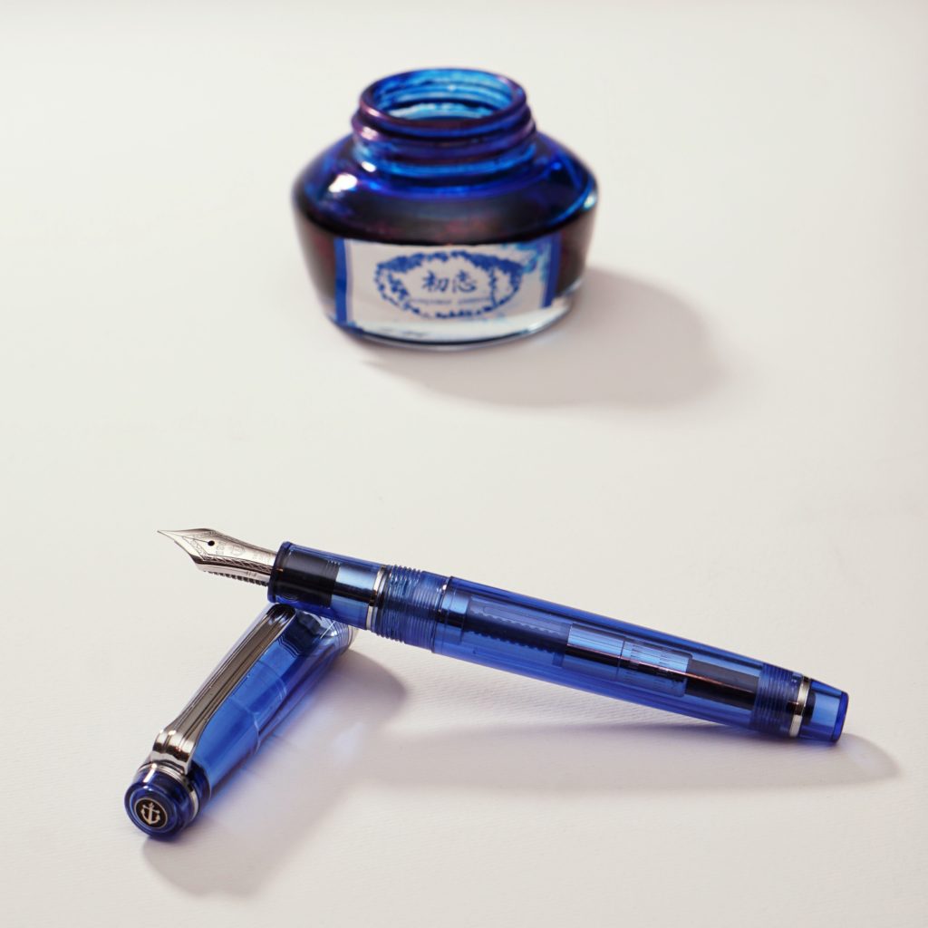
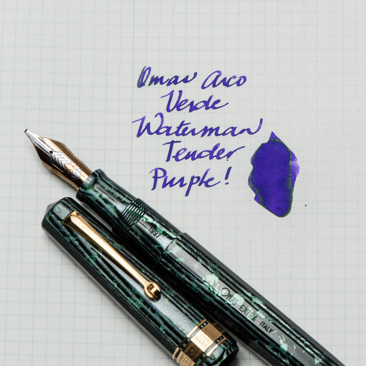
Katherine: This pen was the star of my SF Pen Show 2017 Haul — an “old size” Omas Paragon in Arco Verde. It has a smooth, relatively wet (but not puddle-y!) B CI. The nib is marked BB, but I think it was narrowed a little bit, but is realistically somewhere between a B and a BB, it’s wider than my other Omas B by a hair. I paired it with Waterman Tender Purple for both contrast and how easy to clean it is. The pairing has been very fun for me — a smooth broad CI putting down vivid stokes of purple, with a hint of sheen in the wetter spots. This might end up as a “one true pairing” for me, since I suspect this will be an annoying to clean pen. 🙂
Pam: As a great fan of alliteration, it would only seem appropriate that September would herald in the Sailor Sky with Sapphire ink. The Sailor Sky was my second Sailor Pro Gear Slim. The rest is how we should say, his-ssstory. This pairing is also one my first first “ink will match the pen” type of pairings. (I am working on being more adventurous!) It’s one of my most sustaining pairings!
Sailor Sky is a special edition color, although I don’t think it’s limited. It’s a special edition like the 4 Seasons. (I think.) The barrel color reminds me of a summer sky. I originally paired this pen with Bungbox Omaezaki Sea. However, what really stuck was Bungbox First Love Sapphire, an ink that Franz has introduced me to. To say the least, it was love at first write. I absolutely love the sheen on this ink! It’s a very distinct blue ink with a red sheen that comes through beautifully with the F nib of the Sailor Sky. Some people have compared it to Akkerman’s Shocking Blue. More than anything, I highly recommend trying First Love Sapphire, you might fall for it too.
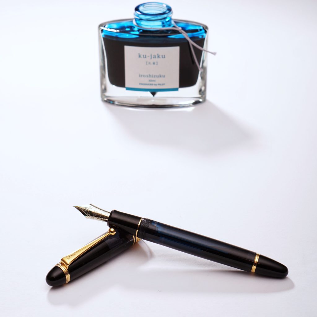
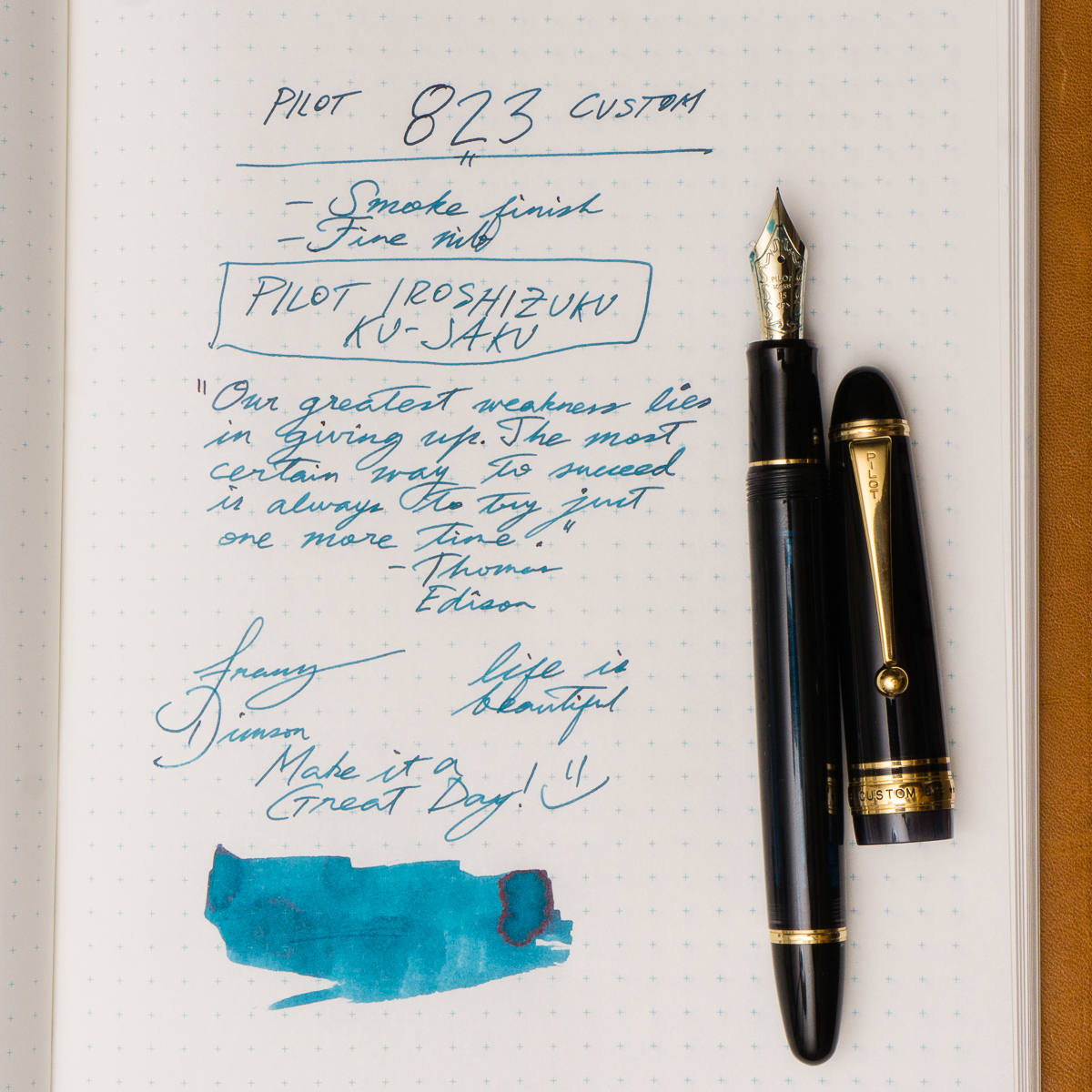
Franz: So for the month of September, my pairing is the Pilot Custom 823 in Smoke or Black Transparent finish and Pilot Iroshizuku Ku-Jaku ink. Ku-Jaku/Peacock is a deep turquoise blue and is such a nice ink color for both work and personal use. The 823 is the first pen I’ve ever inked up with Ku-Jaku. Even though the nib on the 823 is a stock fine, I still appreciate the color it lays down on paper especially on Tomoe River paper in my Nanami Cross Field journal.
The Smoke finish definitely conceals the ink color inside the barrel but you can definitely see the ink level as you write. During meetings in a professional setting, this pen doesn’t call attention to itself but I still enjoy the subtlety of its transparency and places a smile on my face. Now on to trying to remember what that meeting was about.
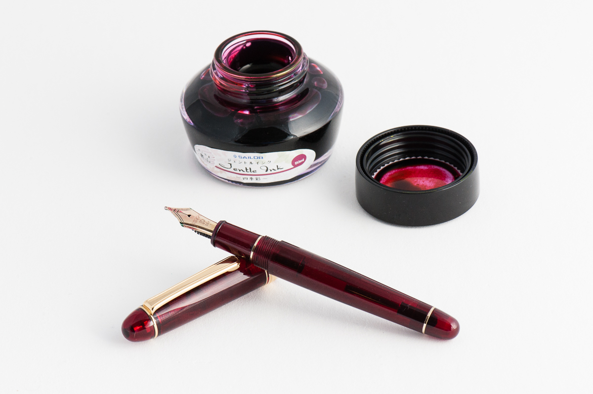
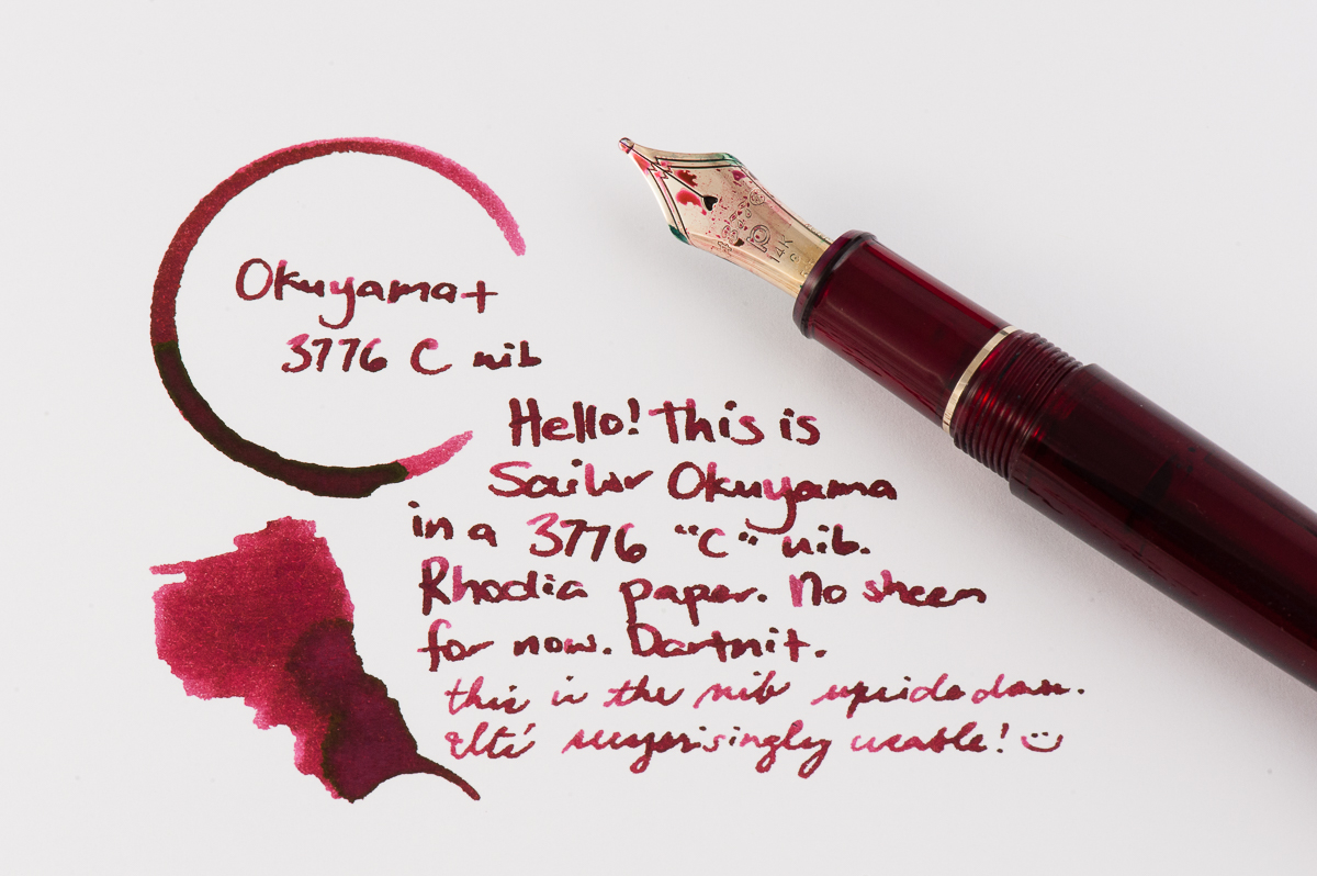
Katherine: This month my pairing is a Platinum 3776 in the red “Bourgogne” color, with Sailor Okuyama. I picked up the 3776 (I previously rated it one of my top pens) because of the C nib. C stands for “coarse” and is Platinum’s BB nib. It’s quite broad, but, out of the box, not a gusher — which I like. Additionally it writes smoothly when upside down, so I can use it at work too! Overall I’m really enjoying the sheen of Okuyama, laid down by a nib that gets the sheen going, but isn’t gratuitous.
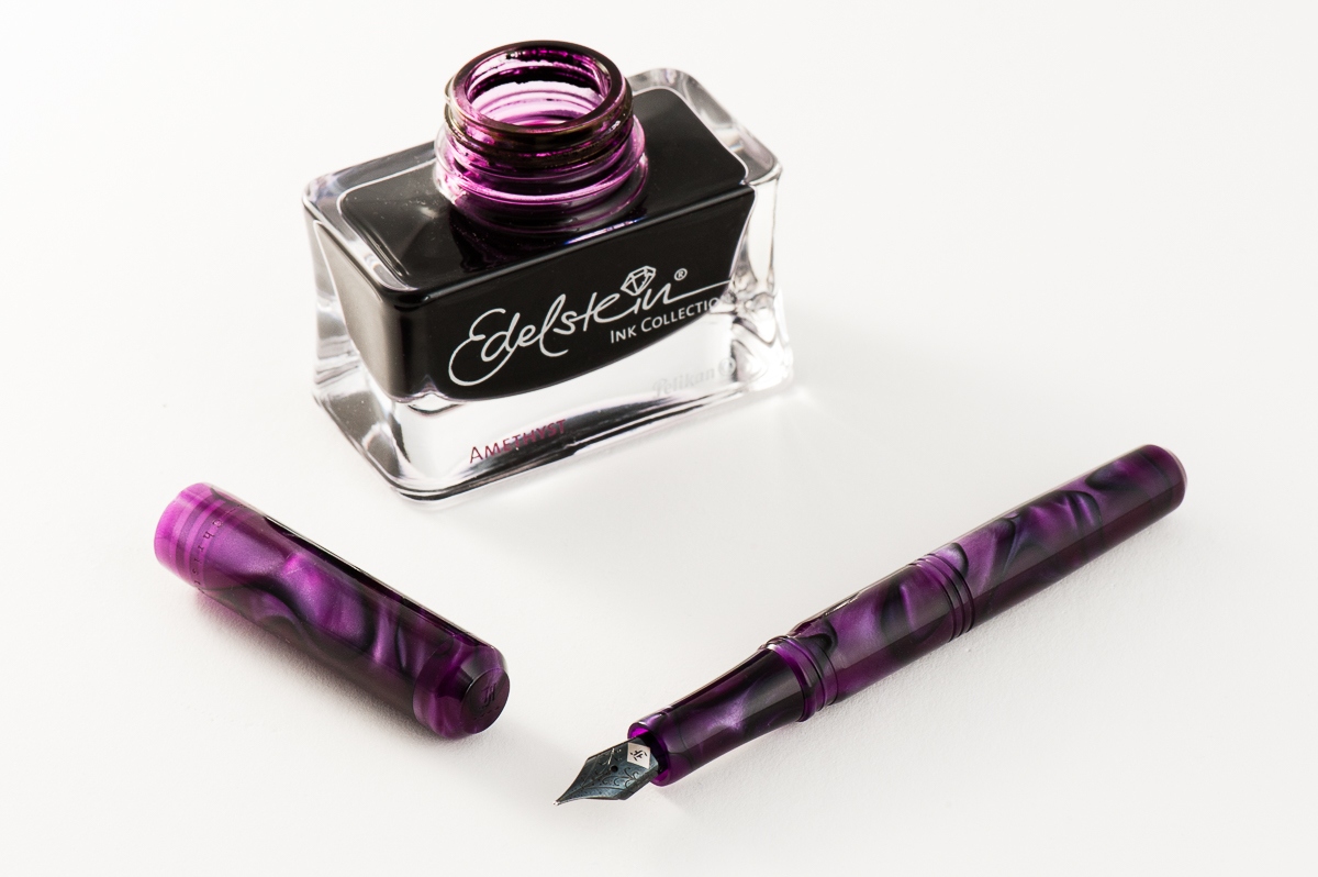
Franz: A co-worker of mine once said that Purple is the color of royalty, and madness. I totally agree! So for the month of June, my royal pen and ink pairing is the Franklin-Christoph Model 31 Omnis in Purpurae finish, and the Pelikan Edelstein Amethyst special edition ink. The deep purple and black swirls of the “Purpurae” madly matches the dark purple of the Amethyst ink. The acrylic has chatoyance that just can’t be captured on camera that well especially on the lighter swirls of the pen.
A quick aside, I got the Model 31 at the 2017 LA Pen Show and it was (at that time) the initial color prototype. Scott Franklin of Franklin-Christoph commented that this was the first purple 31 out there. I initially called the color “Purple Soul” but Franklin-Christoph recently introduced it as a regular part of their Model 31 line up as “Purpurae”. The Amethyst ink was Pelikan’s 2015 special edition Ink of the Year and has become my top favorite purple ink due to it being a darker color, and its sheen when ink pools in the writing.
Will this pen and ink pairing become an OTP (One True Pairing) for me? We shall see!
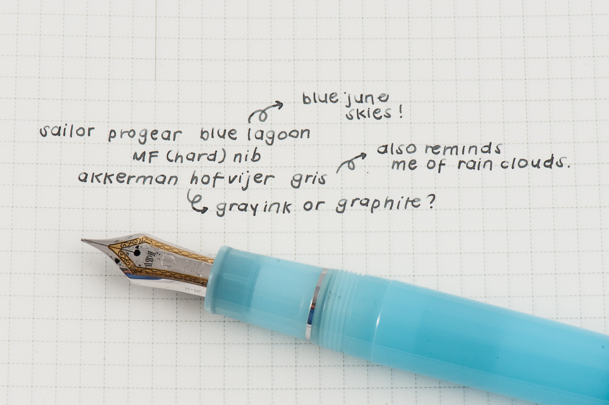
Pam: Summer is in full swing but I still miss the rainy season so this pen is a reflection of having the best of both worlds. My choice for the June pairing is Sailor Pro Gear Blue Lagoon with Akkerman Hofvijver Gris (#29) ink. This is probably one of my favorite OTP/pen and ink pairings since I started collecting pen.
The Sailor progear has a really unique and whimsical color pairing with the neon green and soft blue. The gentle blue with such a vibrant hue reminds me of the “Unicorn Barf” colorway with the blue and bright pink. I have been trying to get the term “Unicorn Snot” for this blue and green combination to stick…but alas. The Sailor nib is perfectly wet enough to show off the wonderful gray ink, as usual.
Akkerman #29 is my first ink from Akkerman and I couldn’t be happier with this ink. It’s practically my “gateway” gray, getting me more interested and more inclined to try out more gray inks. I had thought that gray inks would be only dilute and dull blacks. I am so glad to be have been mistaken! Originally obtained via ink sample from Vanness Pens, I quickly tried to obtain a full bottle of this wonderful gray. The gray reminds me alot of pencil graphite and I really enjoy the shading available in this ink. Not to mention, the bottle of Akkerman ink is always a treat in itself!
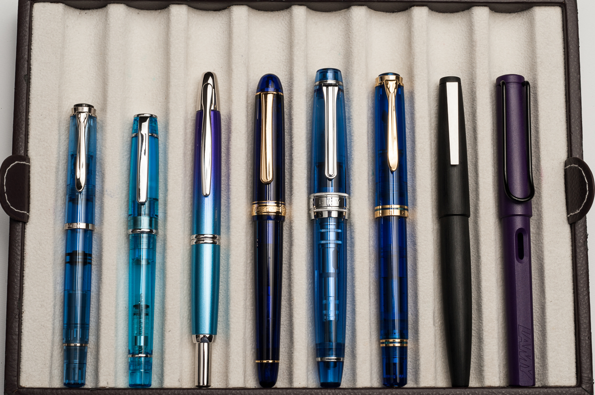
Update 05/15/2017 : We are adding the information that the Turquoise Sailor Pro Gear pictured above was a 2016 limited edition pen release via the Japanese shop, Wancher. Pam purchased this online via the global marketplace, Rakuten. And the Kingfisher finish that Claire is holding below is another Japanese limited edition Sailor Pro Gear. These limited edition finishes are currently unavailable via US retailers. We apologize for not establishing this bit of information. Our main focus for our pen reviews is to show how different pen sizes feel on different hand sizes and we hope that we continue reflecting this point.
Hand Over That Pen, please!
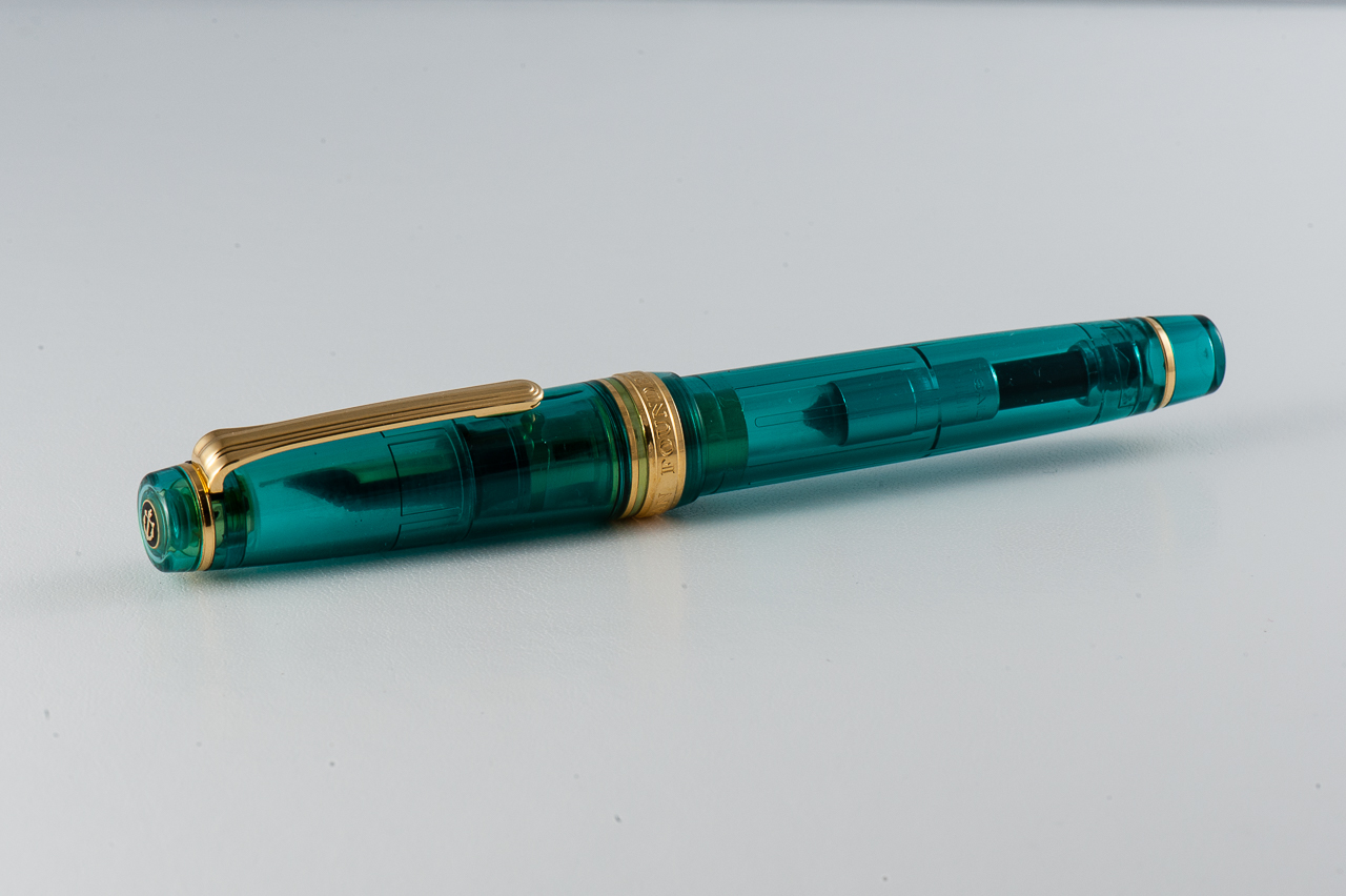
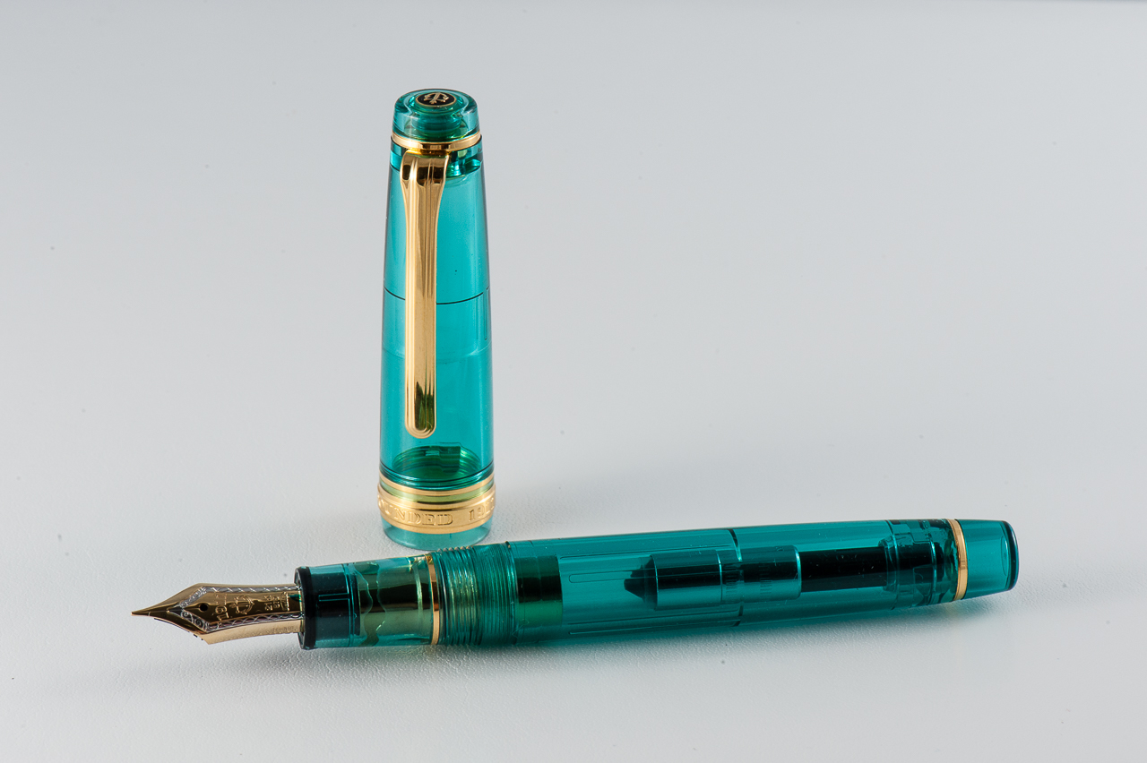
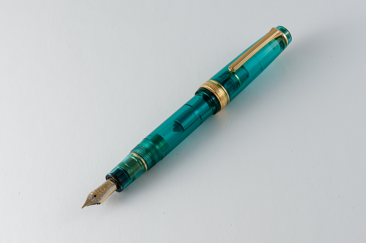
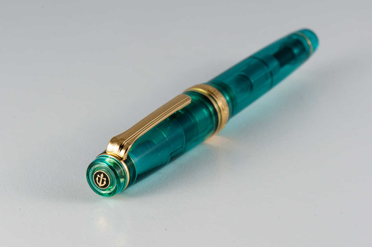
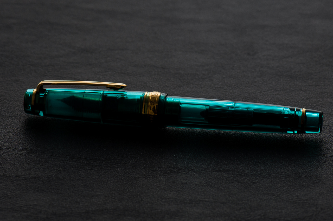
Katherine: I love the look of the Pro Gears — the clean lines and squared-off cap just look really classic, but aren’t boring. The one pictured above is Pam’s, and I think the translucent material is gorgeous, and the gold trim, while louder, really makes the green look more rich. I own a Pro Gear in the Keio Atman “Kingfisher” limited edition colors… That’s another upside, no matter what kinds of colors you liked, there’s a Pro Gear out there for you! (It might just not be cheap…)
Pam: In a previous review, I made terrible analogies comparing my love for the Sailor Pro Gear’s smaller sister, the Progear Slim to the ardent love that Darcy had for Elizabeth Bennett of Pride and Prejudice fame. Just like last time, my love for a Sailor is of literary proportions. I was originally attracted to the Progear Slims as they are only slightly smaller than the Progear, but at a significantly lower price. That being said, you don’t always get to choose what limited edition you love and must have so my collection expanded to the Progears as well. Let’s just say I felt remiss for missing out on such a wonderful pen for so long. The relationship status I I have with my wallet on the other hand is “complicated.”
Claire: Hang with me here, I can wax poetic about the Sailor Pro Gear all day long. This is by far my favorite pen available on the market. I currently own three Pro Gears and one Realo. I love the way this pen looks, the flat finials pull the pen together in the best possible way. The size and weight is perfect for my hand. If I had to choose one pen to write with for the rest of my life, a Pro Gear would be that pen. I love how many colors are available, especially if you’re willing to do the leg work on Japanese exclusives.
Franz: A turquoise-y disposition! (Yep… that will now be a term and a hashtag, thank you very much!) For the past six months I have come to appreciate Sailor pens more and that’s due to both Katherine and Pam. Largely, Pam is to blame though for she has set out to collect some special/limited edition Pro Gear Slim and Classic pens available. And what’s not to like? It’s a pen that Sailor designed almost 15 years ago so the aesthetic works.
The Professional Gear has been on my “list” of pens to own for the longest time. Just like the three ladies above, the flat ends definitely appeal to my taste. The gold trim blends well with the color of the pen and gives it a warm feel.
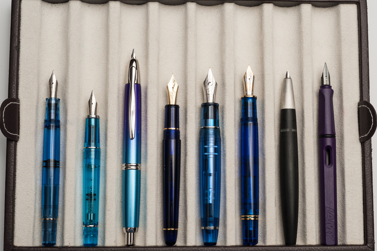
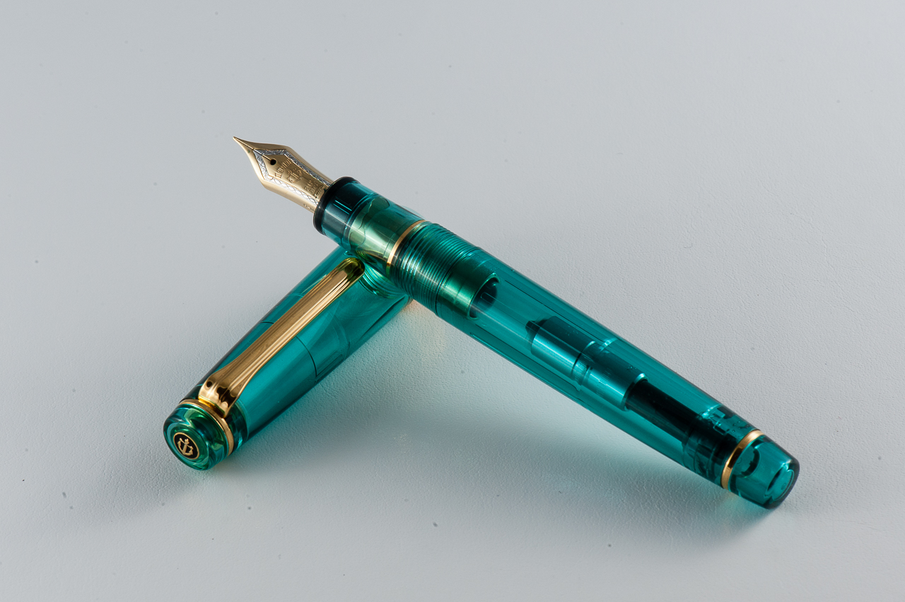
In the Hand: Sailor Pro Gear (posted) — from left to right: Franz, Katherine, and PamIn the Hand: Sailor Pro Gear (unposted) — from left to right: Franz, Katherine, and PamIn the Hand: Sailor Pro Gear (Kingfisher version) — Claire
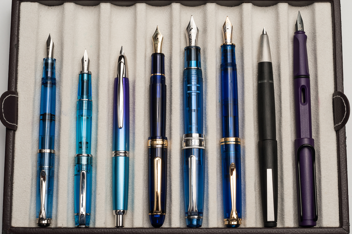
The Business End
Katherine: The MF is fun to write with — fine enough for daily use but just wide enough to see the character of one’s ink. My Pro Gear (which I’ve written with more) has a H-F nib, which is extremely fine, but also wet. It’s a magical combination of wet and fine, which leaves me with saturated but very fine lines. Additionally, despite being labeled a “hard” fine, it has some bounce to it. I wouldn’t recommend it, but I can get line variation out of mine. And, at the risk of sounding overly enthusiastic, I also love the feedback on this nib. It’s a nice pencil-y feeling that isn’t too smooth, it’s got character!
Pam: I have had some variability in my experience with the Sailor 21k MF nibs. I have seen some that are more on the fine and harder end of the spectrum while some are broader and slightly wetter. Given that the MF nib is broader than the F or EF, the nib is wonderfully smooth and really shows off the ink qualities like shading or sheen really well. Surprisingly, I didn’t consider grinding the MF down, probably because I paired this turquoise demonstrator Progear with Robert Oster’s Fire and Ice; be still my heart, the sheen!
Claire: The 21k hard fine Sailor nib is my favorite. I love how hard the nib is; though it isn’t too hard. It’s hard to quantify what makes this a Goldilocks nib in my opinion. I love the pencil like feedback that these 21k nibs give so consistently. All three of my fine nibs have given me the same lovely out of the box performance. The only qualm I have with this pen is the converter isn’t the best. Sailor converters don’t hold very much ink and are notorious for having issues. Typically when I get a new Sailor converter I open it up and put silicone grease on the threads and piston. That so far has saved me from running into any of the issues I’ve heard others to have.
Franz: In my experience, Sailor nibs are well tuned out of the box. And this H-MF is no exception at all. I enjoyed writing with this nib for hours. (I have held it hostage from Pam for a while now) And like Katherine, I found the feedback to be pleasant like writing with a pencil.
Sailor Pro Gear 21-karat H-MF (Hard, Medium-Fine) nib
Write It Up
Katherine: This pen surprised me with how small it is for the not “slim” version. And it’s a wonderful size for my small hands. Both this and the Pro Gear Slim are comfortable for me to use for extended periods of time, but I do prefer this to its smaller sibling (Which is unfortunate for my wallet. And there are slightly fewer limited/store editions available in the Pro Gear). This pen isn’t too narrow, it’s well balanced and the nibs are a delight to write with — I regularly toy with the idea of collecting on in each nib size, but haven’t quite convinced myself not to stick to my pen limit.
Pam: As all pen addicts know, the smallest differences can make all the differences turning a good pen to a great pen. Fortunately, going between the Progear Slim and the Progear isn’t such a large difference that it’s an issue. In my hand, the Progear is a bit longer, equally well balanced and slightly girthier than the Slim. The extra girth is great for longer writing sessions in my opinion. Even in more petite hands, the Progear is comfortable and well balanced, capped or uncapped. Honestly, if the Slim is comfortable for you, the Progear would be equally comfortable. If the Slim is slightly uncomfortable for you, the Progear will be just right. All I can say is, beware of picking up a Progear, you won’t want to put it down.
Claire: I can write with a Pro Gear all day long without running into any hand fatigue. Many times when I’m taking notes for school I’m switching between Pro Gears so I can have a variation in ink color. The way the section tapers fits my hand perfectly. The section on the Pro Gear is really what makes the pen. The more I write, the more I want to find more to write. I really can’t write enough about how much I enjoy writing with this pen.
Franz: The Pro Gear is slightly bigger in girth and length compared to the Pro Gear Slim. Because it is larger, it’s more comfortable to journal with. And I wrote blissfully for a good ten minutes. I even got to finish a letter for a friend with it. But once I unposted the cap, it became a bit tiresome even after only five minutes of writing. So definitely for my large paws, I gotta have it posted for longer writing sessions.
EDC-ness
Katherine: This is a great EDC pen — not terribly expensive, not too small, not too big, fantastic nib, durable plastic body, what’s not to like? The clip is solid too! Plus, because the converter is mediocre… even if everything goes wrong, you’ll never get lots of ink on your clothes! (Honestly, because the F I have is so fine, I get plenty of writing out of one converter, so capacity isn’t an issue for me EDC-ing this pen, as long as I remember to check my ink level regularly)
Pam: I have at least one Progear or Progear Slim in my rotation at all times. The nibs can’t be beat and the finer nibs (EF in 14k or F in 21k) performs admirably on cheap office paper for work. The clips are secure without being overly tight and the pens do tolerate being in white coat pocket easily and well. Additionally, depending on what colorway you choose, the pen can be subtle, professional and classic looking or bold, loud and modern. For those in the office setting, this pen can be like a tie, the pop of color or a small, subtle way to show off some personality.
Claire: If I had a job where a fountain pen would be useful in day to day work, this would be the pen I would bring with me every single day. The Pro Gear is often the first pen I reach for when taking notes for class. When I graduate and move to a desk job, you can bet this will be one of the pens I carry with me on a day to day basis. At home, this is almost always the first and only pen I reach for for my evening journaling.
Franz: I once again echo the three ladies above and agree that the Pro Gear is a nice pen to use on a daily basis for my workplace. The pen was clipped securely onto my dress shirt and was always ready to write. You do need to rotate the cap twice to deploy the pen but I just accepted this since it gives me happiness to use the pen. With signing my name multiple times at work, I didn’t feel the need to post the cap and the medium-fine nib was perfect for the copy paper used in the office.
Final Grip-ping Impressions
Katherine: I really like this pen. It comes in so many colors and I’ve been very tempted to collect quite a few. But, alas, my pen limit has prevented me from doing that and instead I only own one Pro Gear, but it’s a solid pen and I love writing with it. It’s a very comfortable pen and a very solid one. I would highly recommend it to anyone who’s thinking of purchasing — and it’s fun (and frustrating…) to hunt down crazy colors and limited editions to find the perfect one (or ten).
Pam: My love for Sailor Progear or Progear Slim has been effusive to say the least. However, once you pick up one of these pens, you will understand. The pen is well made, the nib is beautifully crafted, the shape is elegant and the color ways can be unique. (Speaking of nibs, Sailor makes some amazing specialty nibs like the zoom nib.) Like the Lamy 2000, everyone should at least try this pen, and I would surmise that it’s pretty inevitable that you will own one. Additionally, if it’s a limited edition Progear, I am sure one of us would be happy to “insure” the purchase…
Claire: The size of this pen is perfect, it’s just long enough to fit perfectly in my hand. The balance is exactly what I look for in a pen. The tapered section allows the pen to be comfortable to write with without adding additional weight to the pen. I only have one gripe with this pen: the converter. While I haven’t run into any of the glaring issues I’ve heard of with this converter, I really wish it could hold more ink.
Franz: Sailor has done right with the Professional Gear design. Proportions are great and the build quality is awesome. And just in case you still aren’t sure what my thoughts are, this pen is awesome. It is perfect for me posted, and “okay” unposted. I seem to have always hesitated to buy this pen due to its size in my hand. But after spending some time with Pam’s Pro Gear, I may just get one myself when I find a finish that attracts me.
In closing, every serious pen user should pick up and write with a Sailor Professional Gear. You never know, this pen may just appeal to you and change your mind as it did mine.
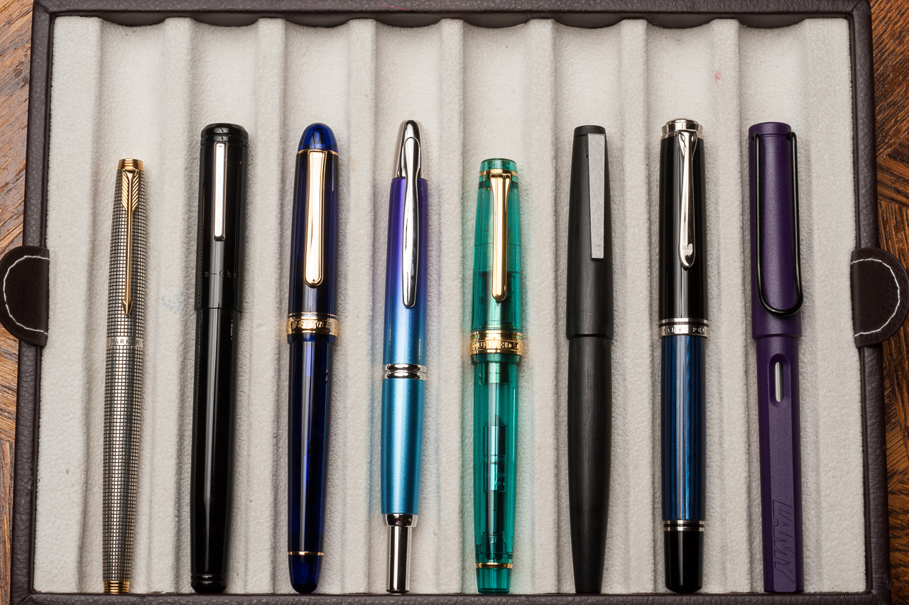
Pen Comparisons
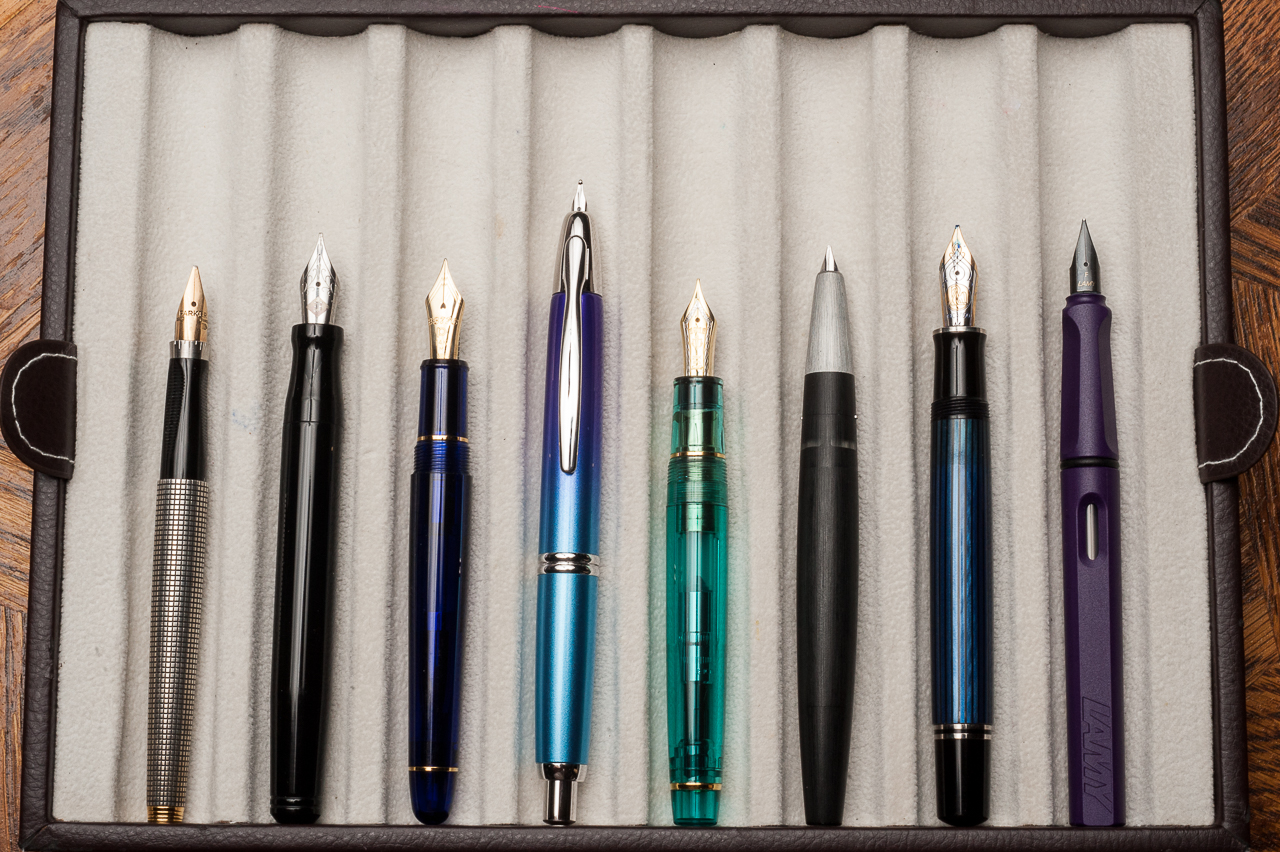
Closed pens from left to right: Parker 75, Franklin-Christoph Model 20, Platinum 3776, Pilot Vanishing Point, *Sailor Professional Gear*, Lamy 2000, Pelikan M805, and Lamy SafariPosted pens from left to right: Parker 75, Franklin-Christoph Model 20, Platinum 3776, Pilot Vanishing Point, *Sailor Professional Gear*, Lamy 2000, Pelikan M805, and Lamy SafariUnposted pens from left to right: Parker 75, Franklin-Christoph Model 20, Platinum 3776, Pilot Vanishing Point, *Sailor Professional Gear*, Lamy 2000, Pelikan M805, and Lamy Safari
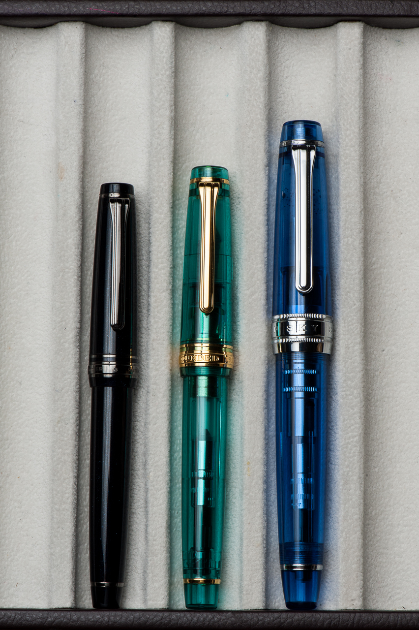
Sailor Professional Gear Comparisons (Left to right: Pro Gear Slim, Pro Gear Classic, and Pro Gear King of Pen)
Pen Photos (click to enlarge)
Sailor Pro Gear Classic 21-karat H-MF (Hard, Medium-Fine) nib