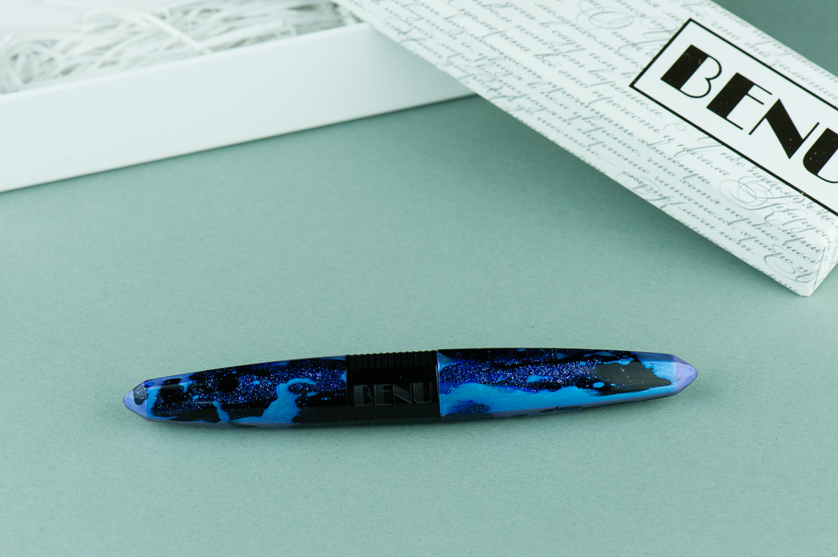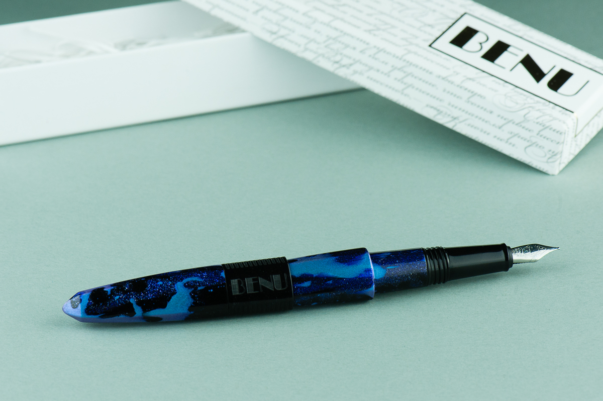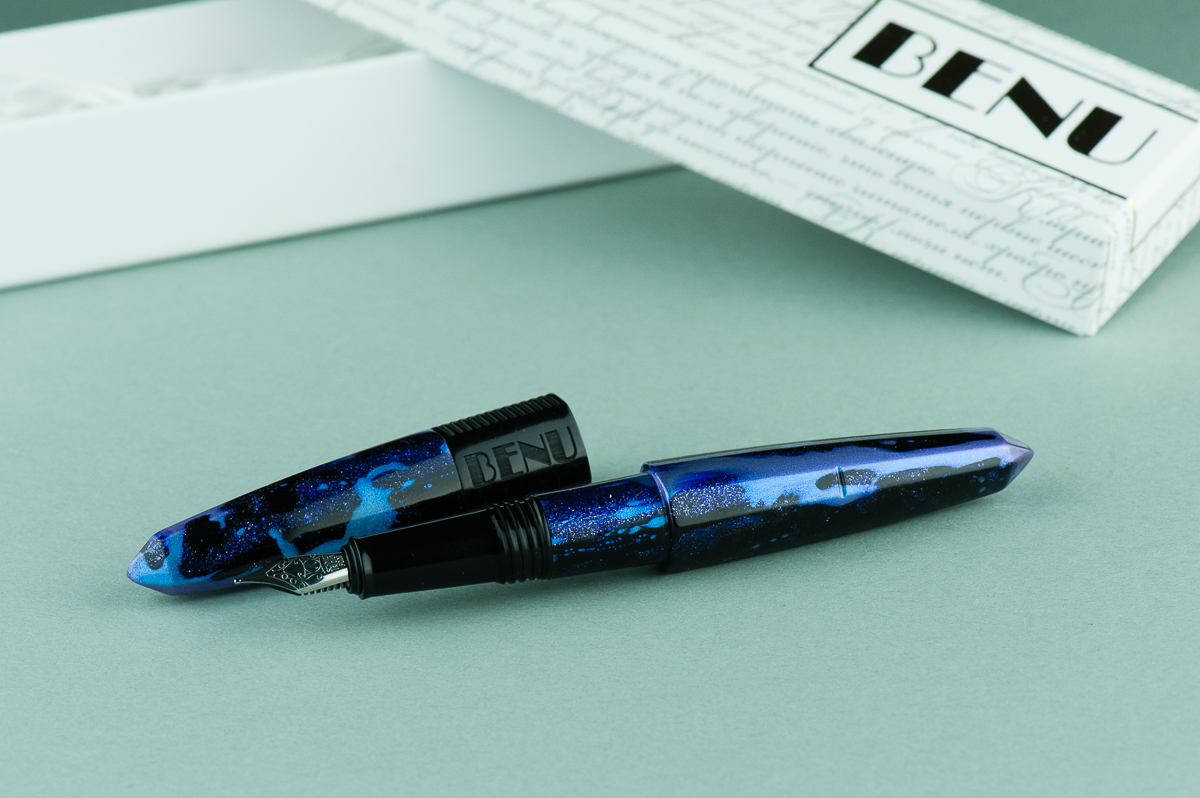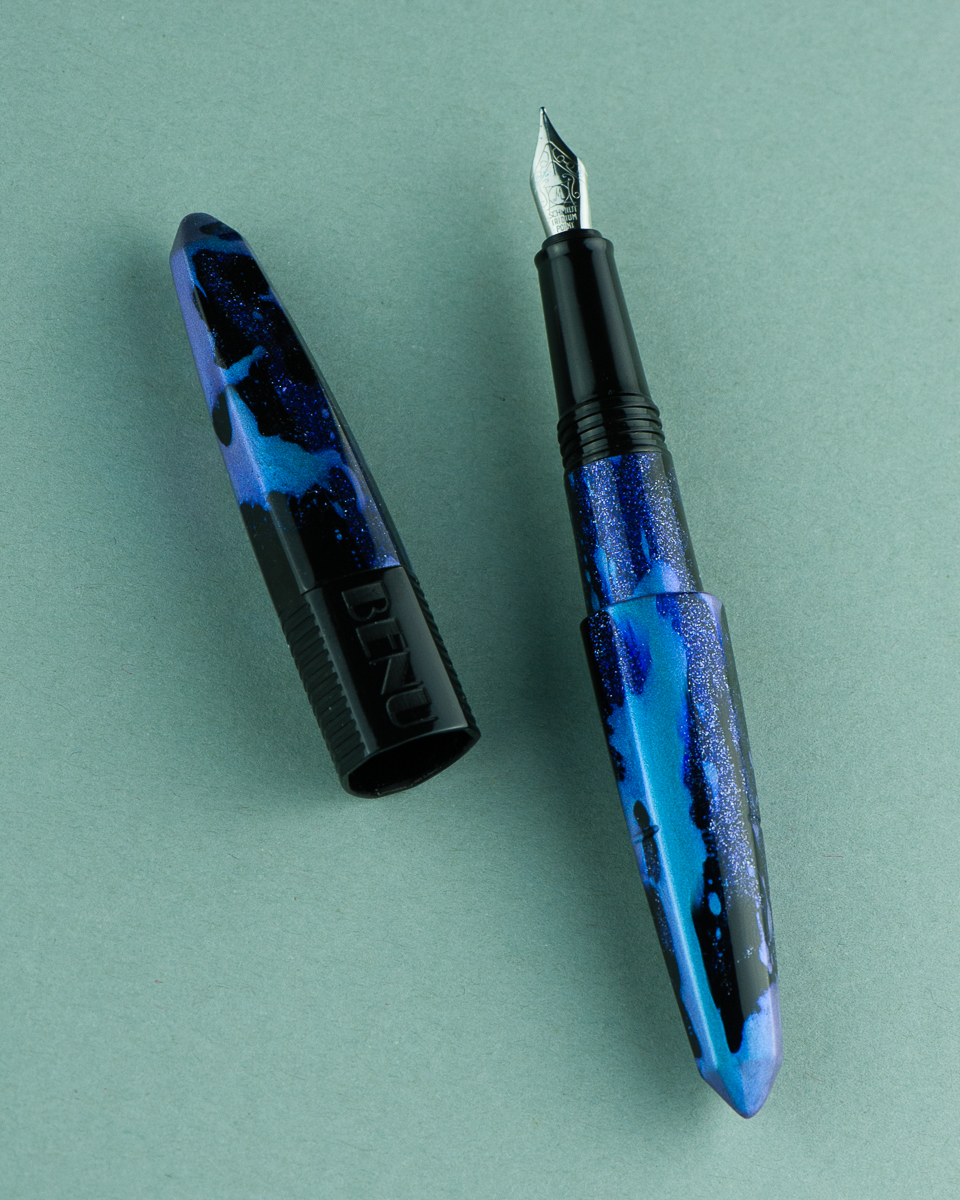
We want to thank Lisa and Mike Vanness of Vanness Incorporated for lending us this Benu Pen Chameleon fountain pen for review. And sorry it has taken a while Lisa! The Vanness family has had a pen shop in Little Rock, Arkansas since 1938 and is celebrating 80 years of being in business. Check their store out if you can. They also travel to pen shows in the United States and one of the shows that we will see them at is the upcoming San Francisco Pen Show in August.
The opinions in this review are always our own and we were not compensated (monetarily or otherwise) for this review.
Hand Over That Pen, please!
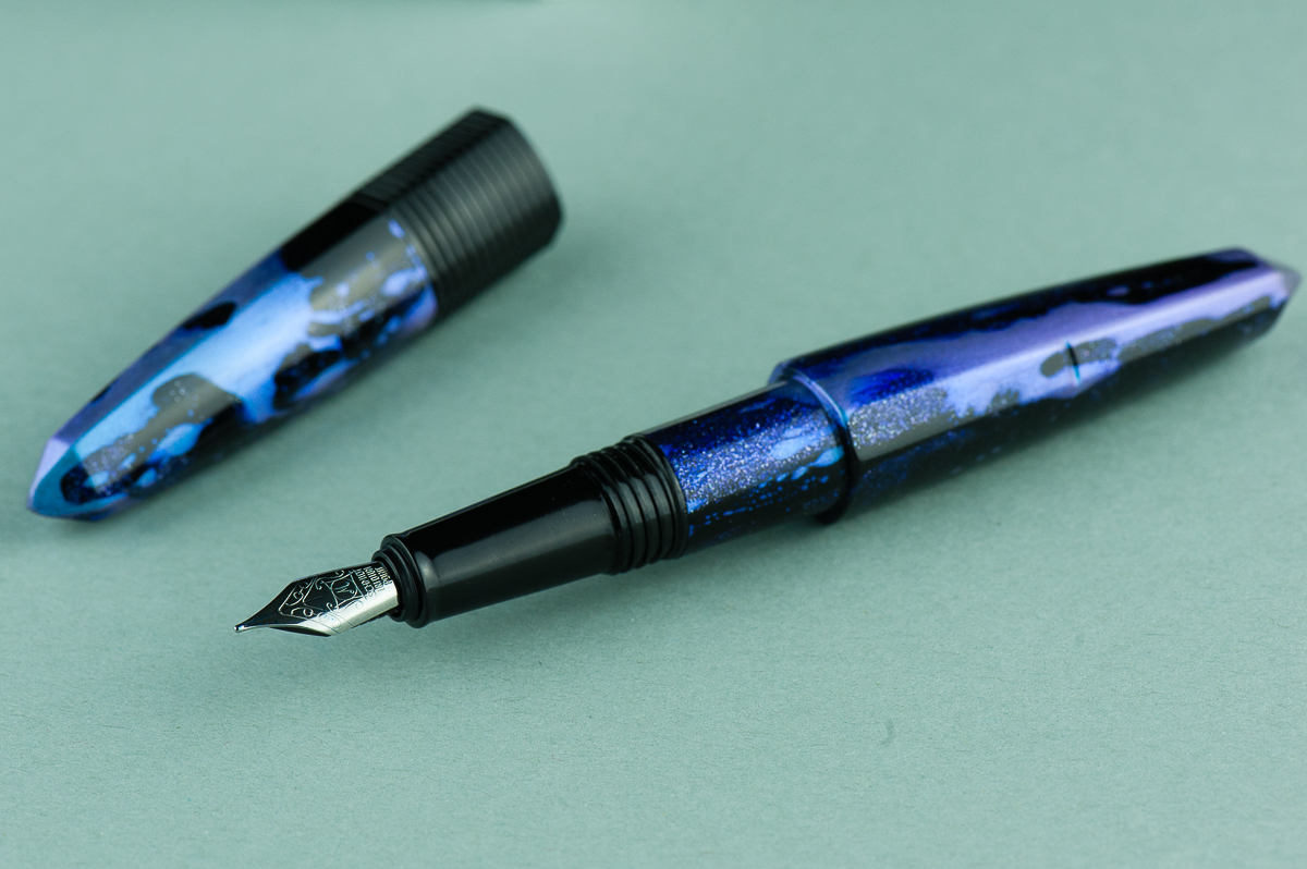
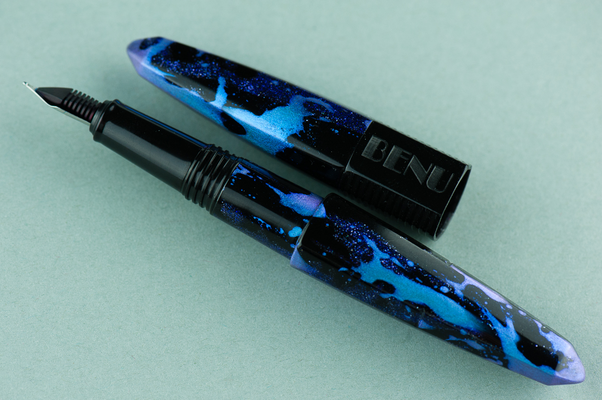
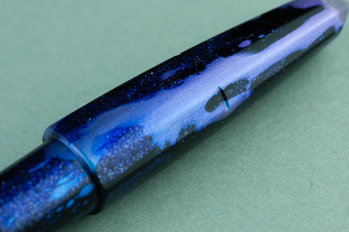
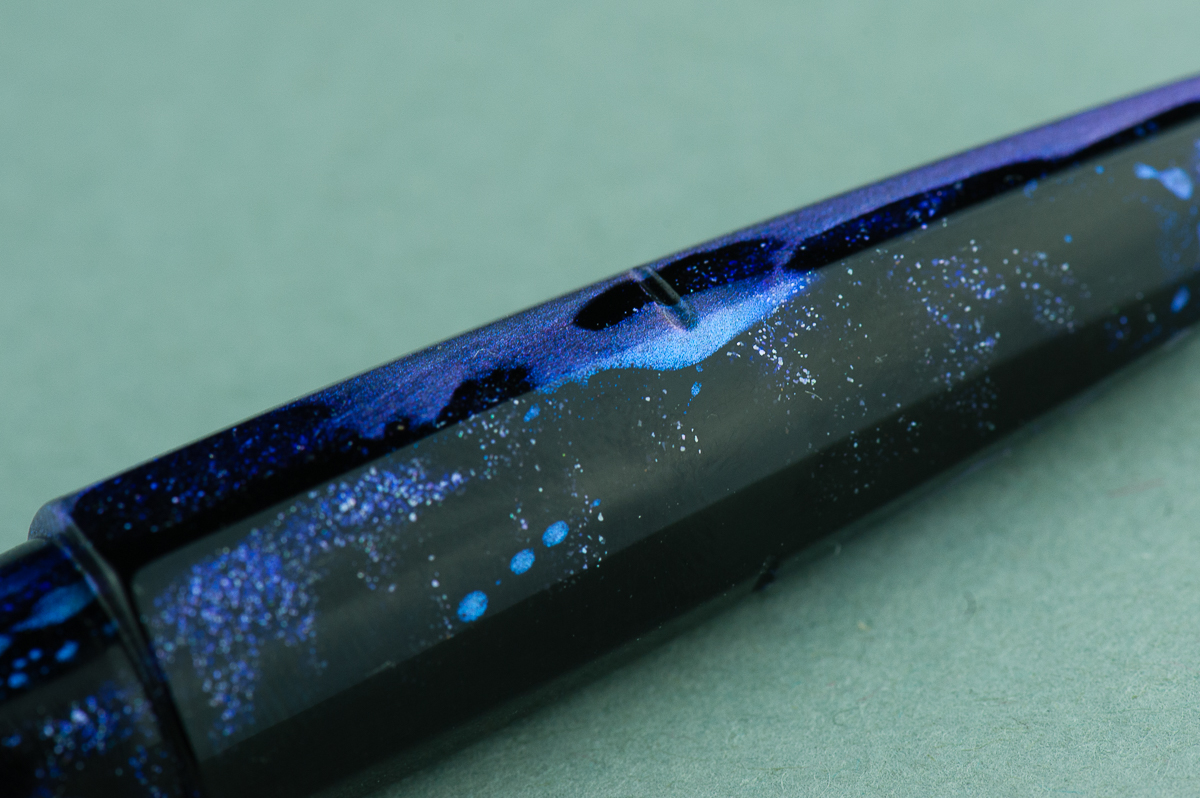
Katherine: This pen is… very purple. The unique shape of many of the Benu pens has intrigued me since I started to see them on Instagram. Many thanks to Vanness for lending us one so I could finally try one! And such a cool purple material too. Off the bat, I suspect the looks of this pen will be very polarizing — you either love it or you don’t. Personally, I like the galaxy-ish purple material and the unique shape. However, I couldn’t get the triangular sides to line up, which bugged me (I could also just be incompetent EDIT: Franz confirmed — I’m incompetent and it lines up for him).
Pam: It’s a very unique pen in terms of aesthetics. The material is “loud” to me but the shape is intriguing. It’s not often that we get to see a triangular shape in the world of fountain pens. I will admit that I am not particularly fond of the material as I find it very distracting and detracts from the cool shape of the pen.
Franz: Yep, this Benu Chameleon pen definitely has a distinctive design. It reminds me of the crystal that Superman used to create his Fortress of Solitude except that it’s blue and purple (blurple) and not a glowing green. Hmm… I hope that wasn’t too geeky of a reference. Hehehe… =P
Details

The Business End
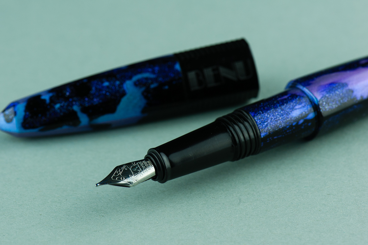
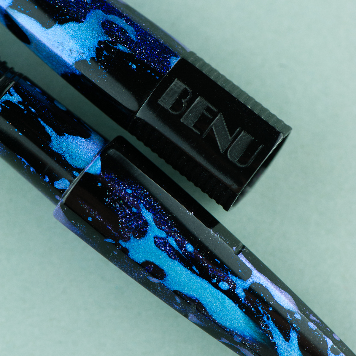
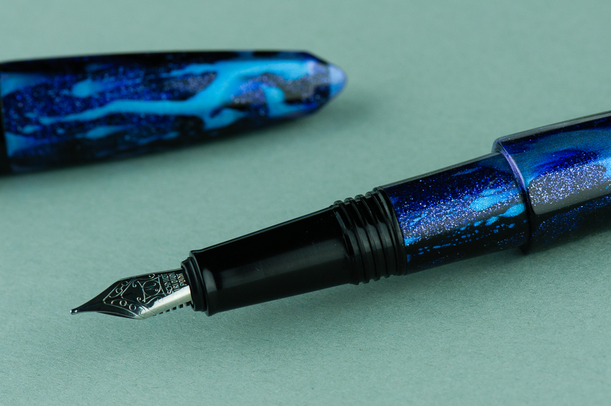
Katherine: It contains a Schmidt nib, which is perfectly usable, but not particularly memorable. It’s on the smaller side though — so I bet you might be able to swap a vintage nib into it (though I didn’t try, so proceed at your own risk!).
Pam: I do find the Schmidt nib to be small relative to the rest of the pen. It’s not ideal for my angle of writing with this particular set up. It puts my hand closer to the paper than I would like it. The Schmidt nib is a reliable nib, writing smoothly and well right out of the box.
Franz: This Chameleon has a medium steel nib and is smooth out of the box. The smaller #5 nib complements the taper of the barrel and section nicely. This nib wrote nicely as it should and I liked it. I believe Benu pens currently have F, M, and B as nib size choices.
As Katherine alluded to, you can “gently” pull out the nib and feed to swap a similarly sized nib. Please remember that any modification you make to any pen may void any warranty there may be.
Write It Up
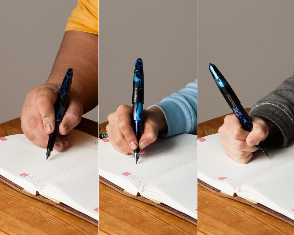
Katherine: When I uncapped it, I was initially worried about the size of the step from section to barrel, but the section is long enough and I hold my pen far enough forward that it wasn’t an issue at all. The section is on the narrower side, and the pen is on the heavier side, which generally isn’t a combination I love. This pen was no different — usable, but not a pen that feels perfect in hand.
Pam: The triangular shape surprisingly doesn’t detract from the comfort during the writing experience, however, the step does for me. It’s not very sharp, but that does depend on how heavily you grip the pen. I was left with some indentations on my hands based on my typical grip. I do think Benu created this pen for those with a traditional grip in mind.
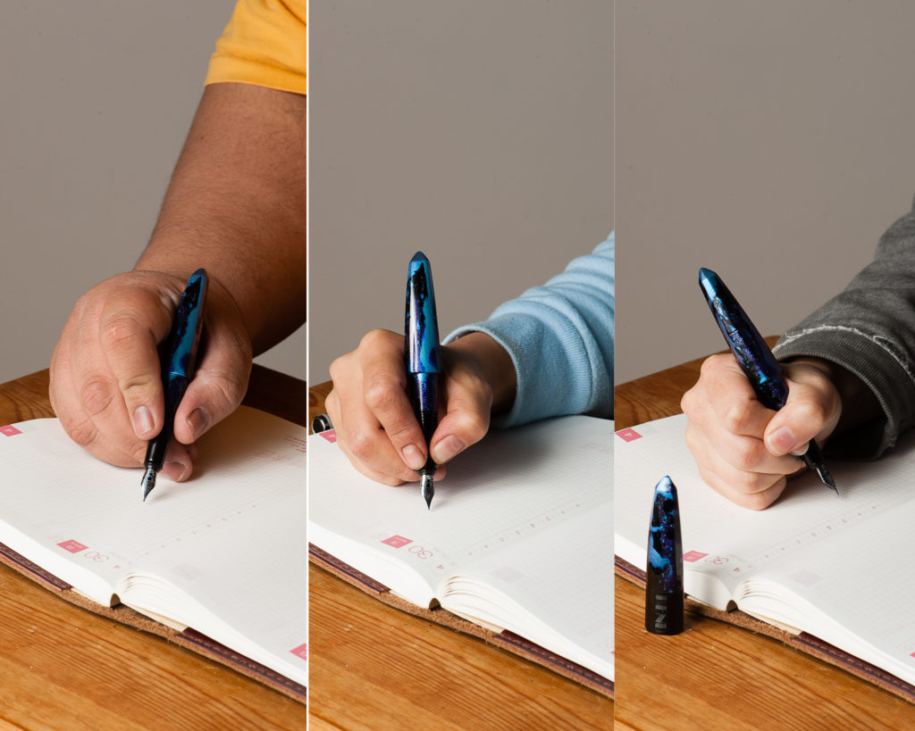
The cap does post rather deeply and the material is light enough that it doesn’t add too significant of a weight to the back end of the pen. Posting the pen may be beneficial for those with the larger hands. I found it did upset my balance, especially since the nib is relatively small and it threw off my typical writing angle slightly.
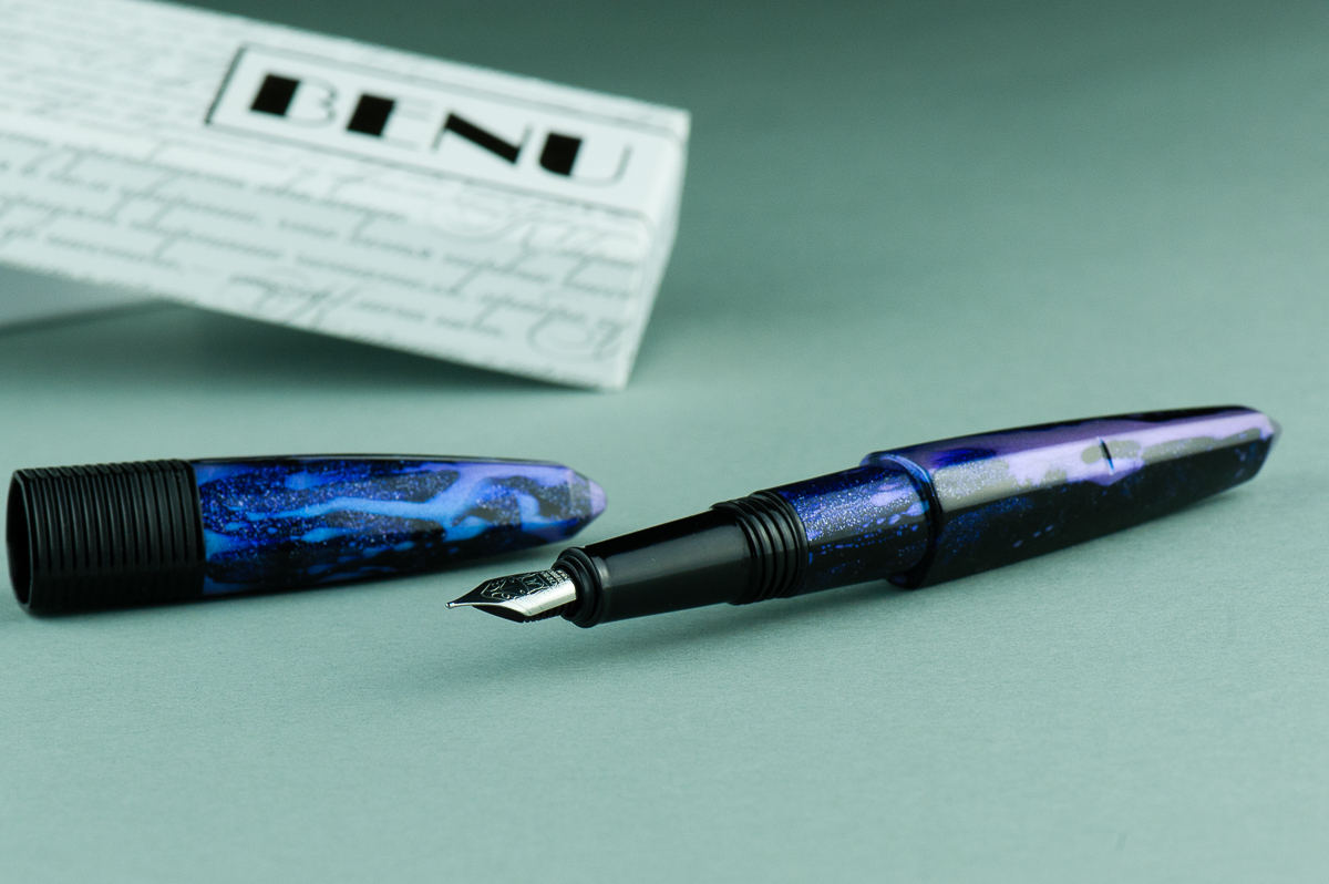
Franz: I comfortably wrote with this pen unposted for a long time and it’s due to the longer than usual section. My grip ends up on the threads and they are not sharp at all. Posted, the Chameleon definitely becomes longer. And I really love the notches on the barrel to keep the cap in place. I surprisingly prefer writing with the Chameleon unposted.

EDC-ness
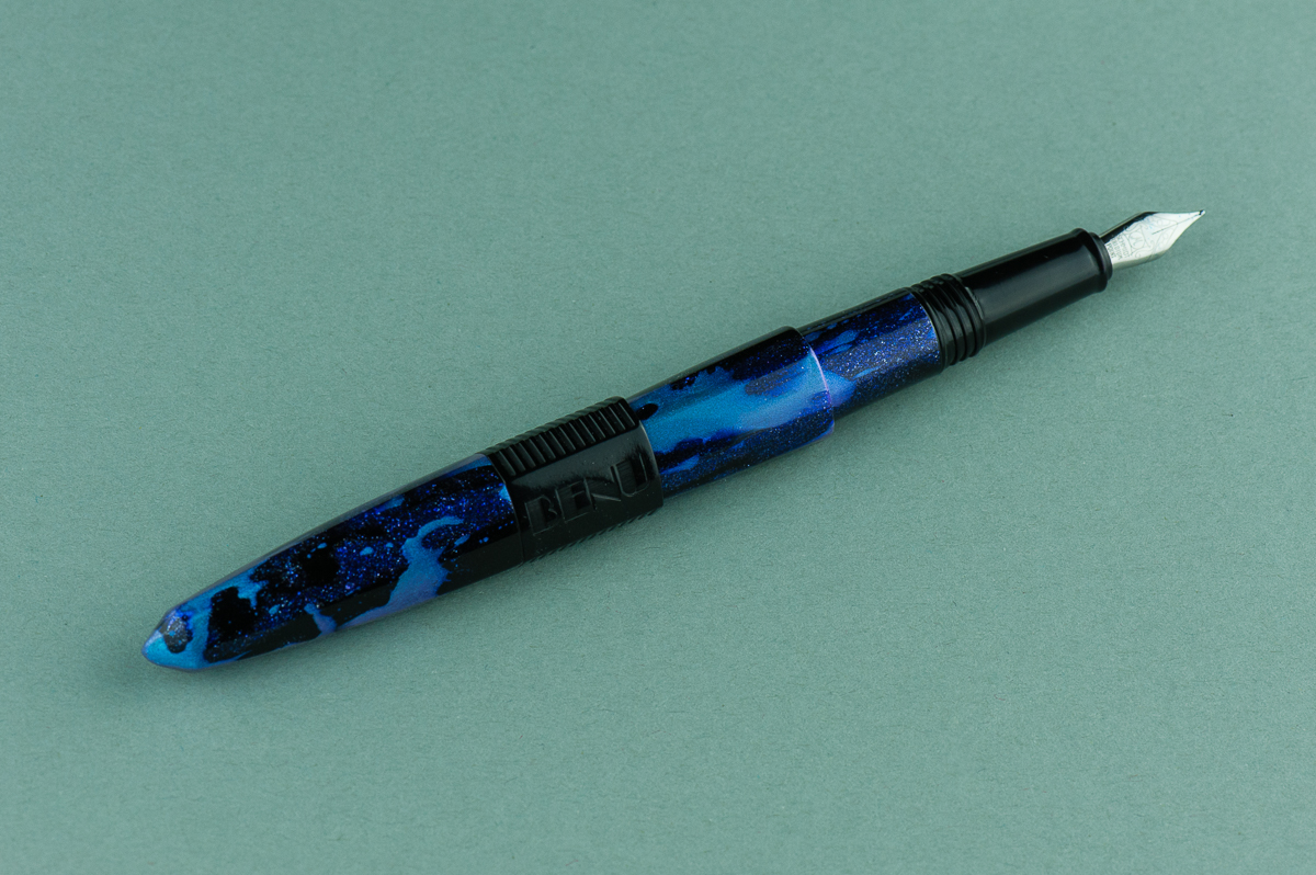
Katherine: Upside: it doesn’t roll. Downside: it doesn’t have a clip. It takes two turns to uncap, but they’re two wonderfully smooth turns.
Pam: The pen did well in my Nock Sinclair case for EDC-ness, however, it wasn’t user friendly for me at work being clipless. On the flip side, it was quick to uncap and the nib performed admirably well on crappy office paper. The cap does post relatively securely for those quick notes. My biggest hesitation with this being my EDC is that the material is also quite loud which made me hesitate bringing it out in the hospital setting.
Franz: In the workplace, I used the Chameleon either on the go stored in my shirt pocket or on my desk. I found that this pen is the sit-down-and-write kind due to the number of cap turns (2 and a quarter), as well as the facets that made sure the pen did not roll away. The medium nib wrote nicely on the copier paper and was all around nice.
This pen is also fun-ny because my coworkers thought I was holding a mascara tube or something. Technically, it applies color to a surface, right? ;-P
Final Grip-ping Impressions
Katherine: The unique shapes and materials are the big draw with this pen. If it’s not your thing, this isn’t the pen for you. But, if you’re like me and you’ve been curious about them for a while, it’s a bit of a relief to find out that while it isn’t the most comfortable and perfect pen for my hand, it’s definitely a usable and reliable writer. My one peeve is that the facets/sides don’t line up.
Pam: Benu is willing to break tradition with unique materials and shapes. This pen is best suited for those with a traditional tripod grip. So if you are looking for a pen with a unique aesthetic and reliable nib, this might be the pen for you. Based on the material and how it works out with my grip, this pen just isn’t for me.
Franz: Hey Katherine!!! The cap and barrel’s facets do line up. You just gotta give it a gentle twist. 😉 Overall, the Chameleon pen is a good size pen and the shape definitely stands out against other pen designs. What also captivates me is the “Charming” finish on this pen. Blue and purple are my two favorite colors and this is a great example of a blurple pen. I do like this pen a lot and if it is up your aesthetical alley, try it out!
Another shout out of appreciation to Lisa and Mike Vanness for the opportunity to review this Benu pen! The Chameleon pen in this finish and others can be found over at their site, www.vanness1938.com.
Pen Comparisons
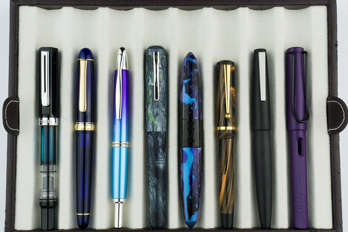
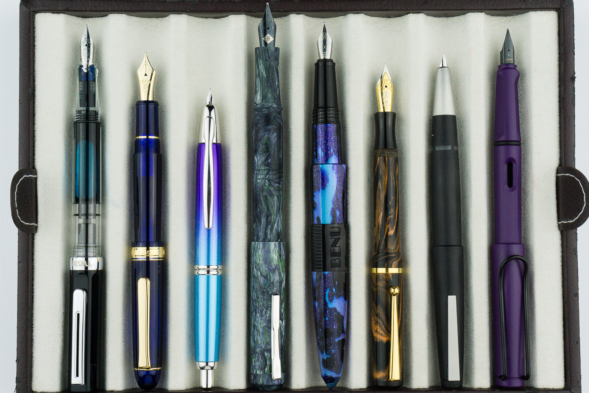
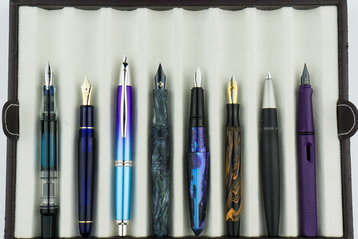
Pen Photos (click to enlarge)
