Shall we say, #LATEPOST? Ha!
Our apologies dear friends. We skipped our August pen and ink pairing post for we all have been swamped for the past couple of months. We did not want to skip September as well no matter how late it may be. Thank you for reading and your kind words!
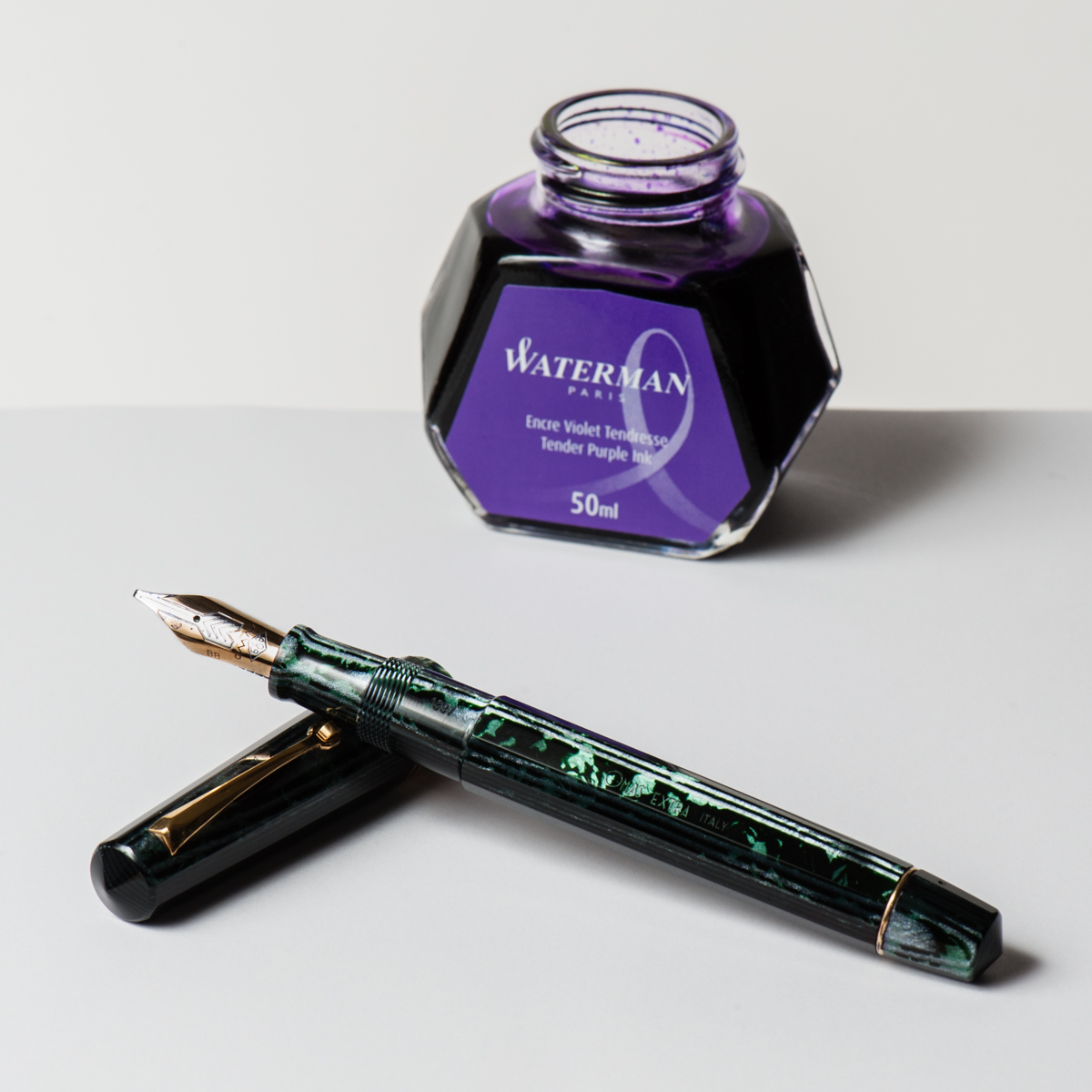
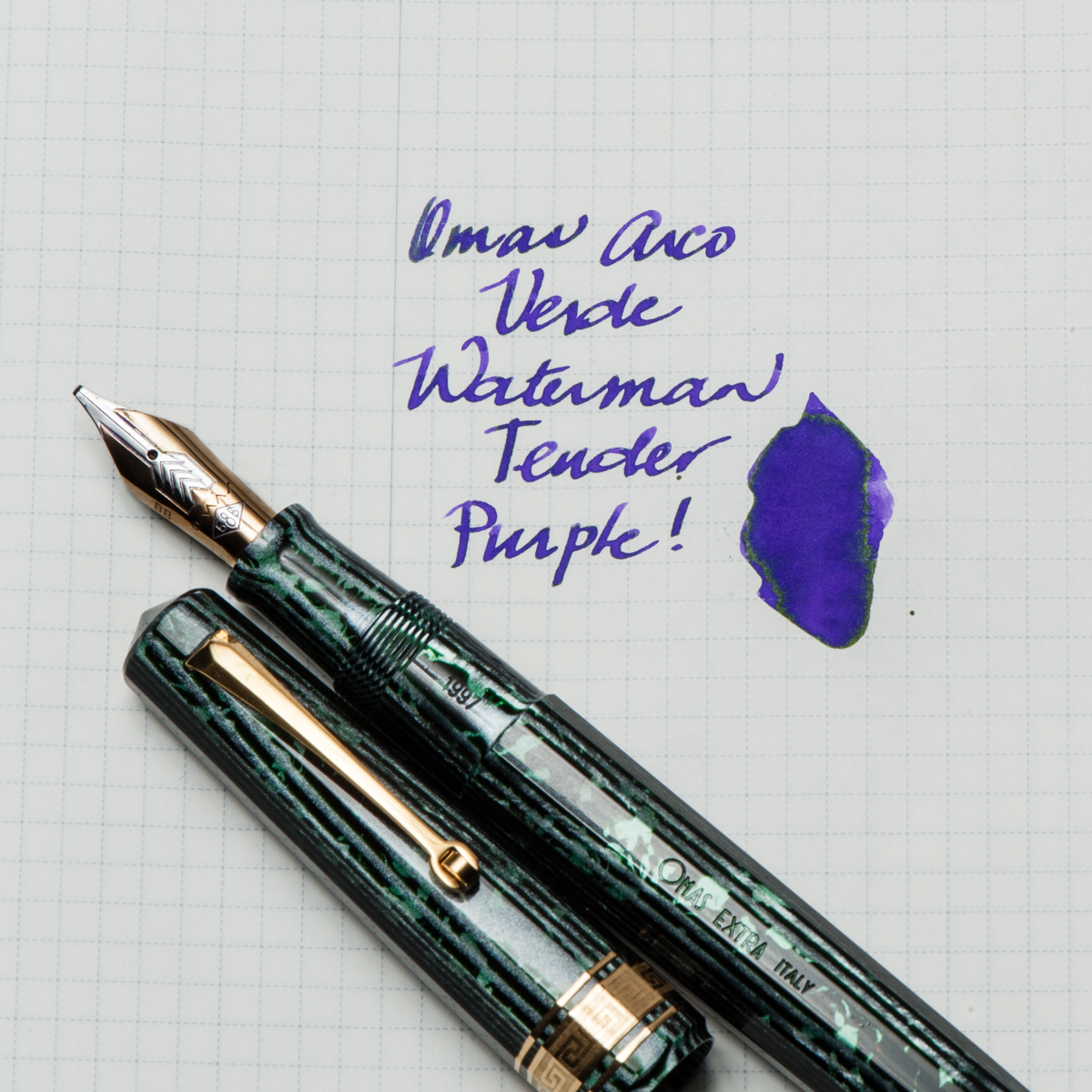
Katherine: This pen was the star of my SF Pen Show 2017 Haul — an “old size” Omas Paragon in Arco Verde. It has a smooth, relatively wet (but not puddle-y!) B CI. The nib is marked BB, but I think it was narrowed a little bit, but is realistically somewhere between a B and a BB, it’s wider than my other Omas B by a hair. I paired it with Waterman Tender Purple for both contrast and how easy to clean it is. The pairing has been very fun for me — a smooth broad CI putting down vivid stokes of purple, with a hint of sheen in the wetter spots. This might end up as a “one true pairing” for me, since I suspect this will be an annoying to clean pen. 🙂
Pam: As a great fan of alliteration, it would only seem appropriate that September would herald in the Sailor Sky with Sapphire ink. The Sailor Sky was my second Sailor Pro Gear Slim. The rest is how we should say, his-ssstory. This pairing is also one my first first “ink will match the pen” type of pairings. (I am working on being more adventurous!) It’s one of my most sustaining pairings!
Sailor Sky is a special edition color, although I don’t think it’s limited. It’s a special edition like the 4 Seasons. (I think.) The barrel color reminds me of a summer sky. I originally paired this pen with Bungbox Omaezaki Sea. However, what really stuck was Bungbox First Love Sapphire, an ink that Franz has introduced me to. To say the least, it was love at first write. I absolutely love the sheen on this ink! It’s a very distinct blue ink with a red sheen that comes through beautifully with the F nib of the Sailor Sky. Some people have compared it to Akkerman’s Shocking Blue. More than anything, I highly recommend trying First Love Sapphire, you might fall for it too.
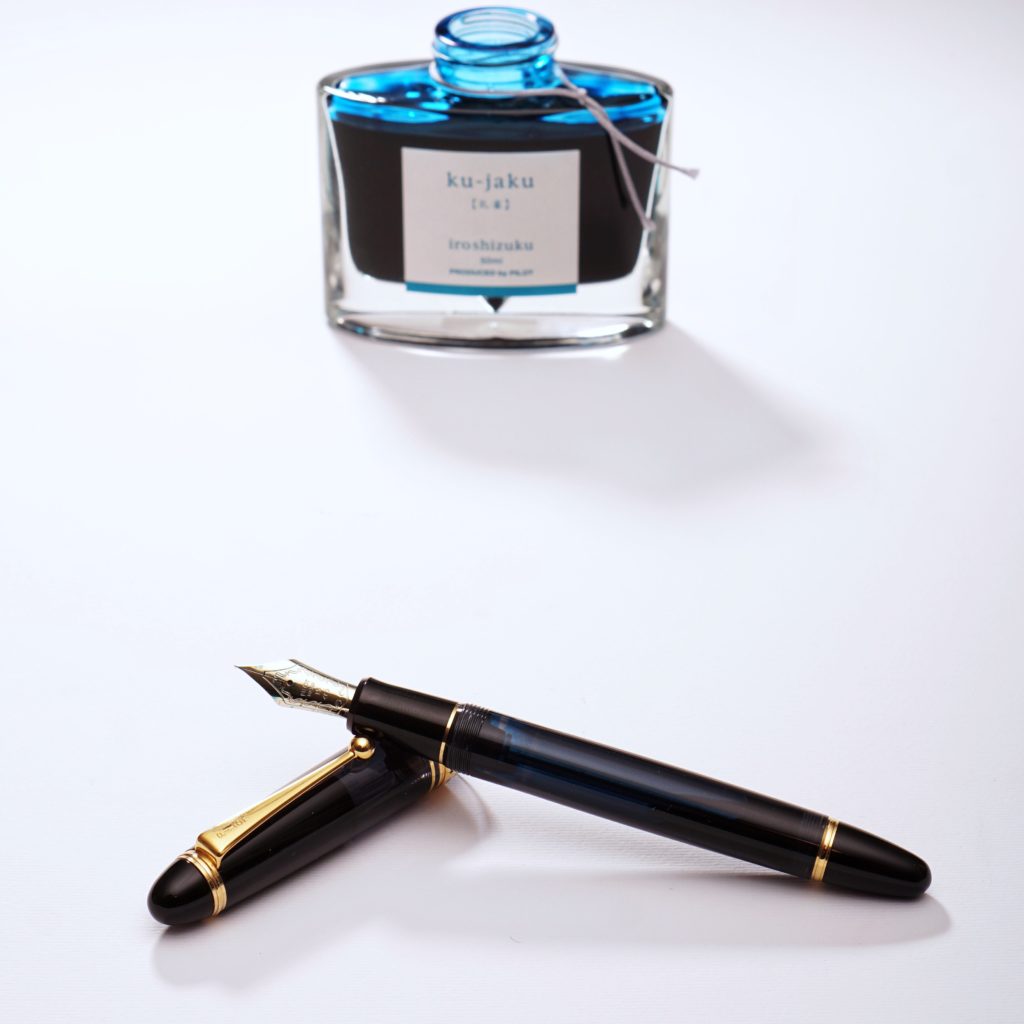
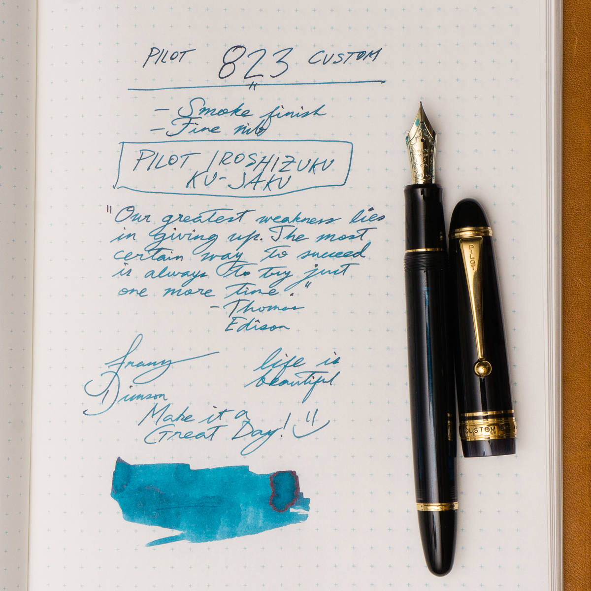
Franz: So for the month of September, my pairing is the Pilot Custom 823 in Smoke or Black Transparent finish and Pilot Iroshizuku Ku-Jaku ink. Ku-Jaku/Peacock is a deep turquoise blue and is such a nice ink color for both work and personal use. The 823 is the first pen I’ve ever inked up with Ku-Jaku. Even though the nib on the 823 is a stock fine, I still appreciate the color it lays down on paper especially on Tomoe River paper in my Nanami Cross Field journal.
The Smoke finish definitely conceals the ink color inside the barrel but you can definitely see the ink level as you write. During meetings in a professional setting, this pen doesn’t call attention to itself but I still enjoy the subtlety of its transparency and places a smile on my face. Now on to trying to remember what that meeting was about.
Writing Samples (click to enlarge)