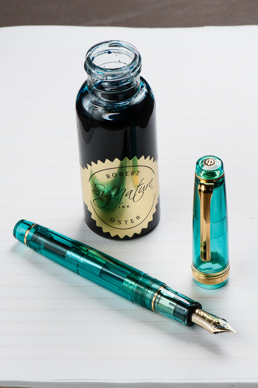
Pam: I can’t take credit for this pairing; it was serendipity, actually. Robert Oster has made a stunning and wonderful ink that has caught the fancy of many pen lovers. In the meantime, I was drooling over the turquoise Sailor from Wancher. They happen to arrive around the same time so ta da! Perfect match!
Robert Oster’s Fire and Ice is a beautiful dark turquoise with a great red sheen and is aptly named. The MF nib of the Sailor pen is a bit wetter and broader than my usual preference, but with this ink, I wouldn’t want it any other way. It’s the perfect nib for ALL THE SHEEN! I am working on enlarging my microscopic penmanship to do justice for such a perfect OTP (one true pairing).
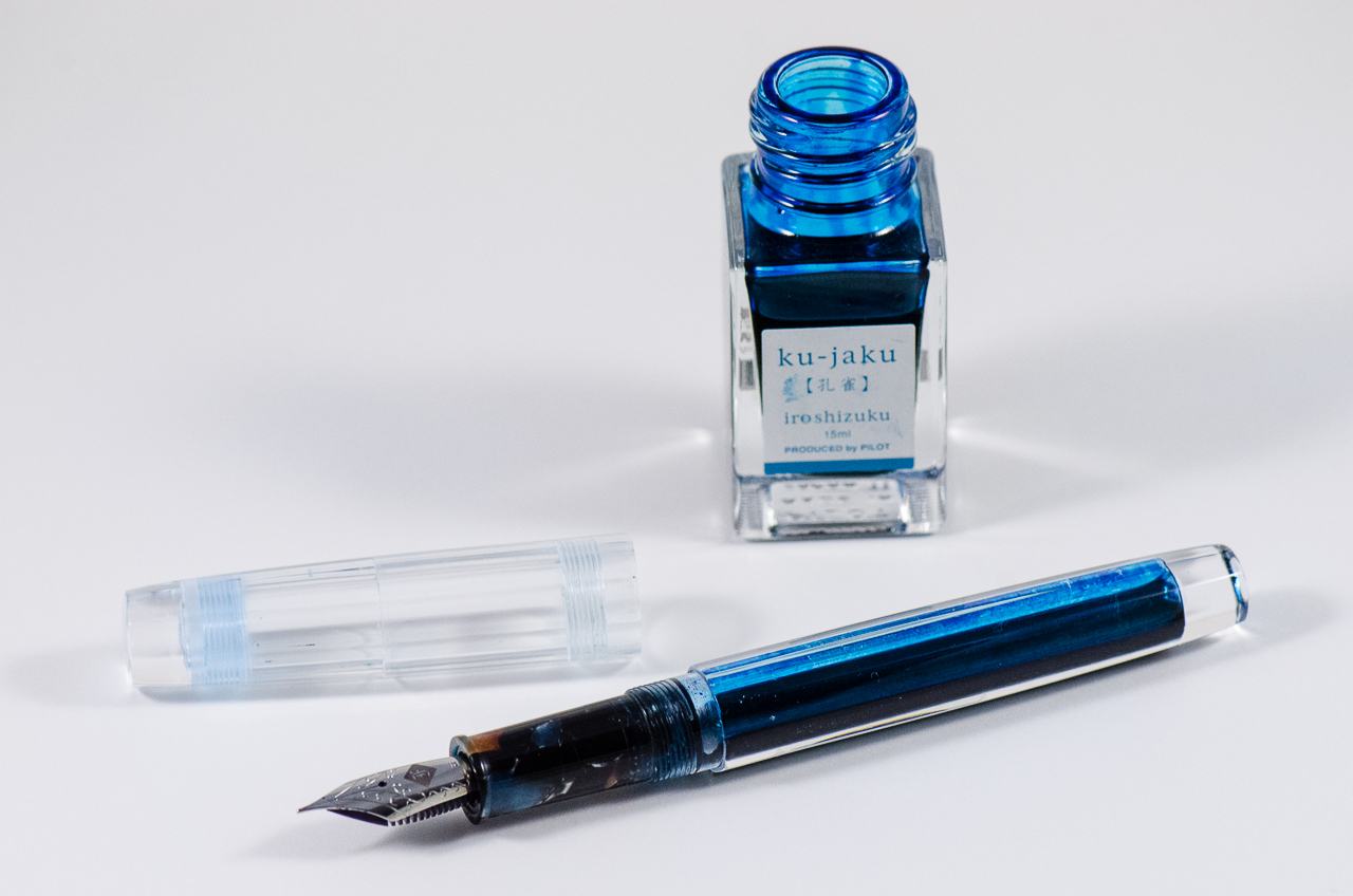
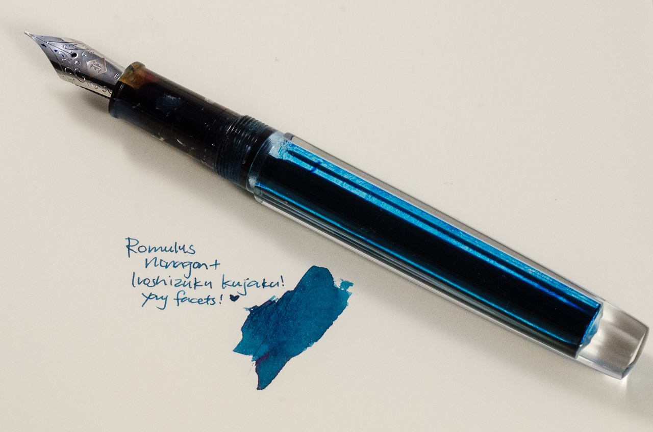
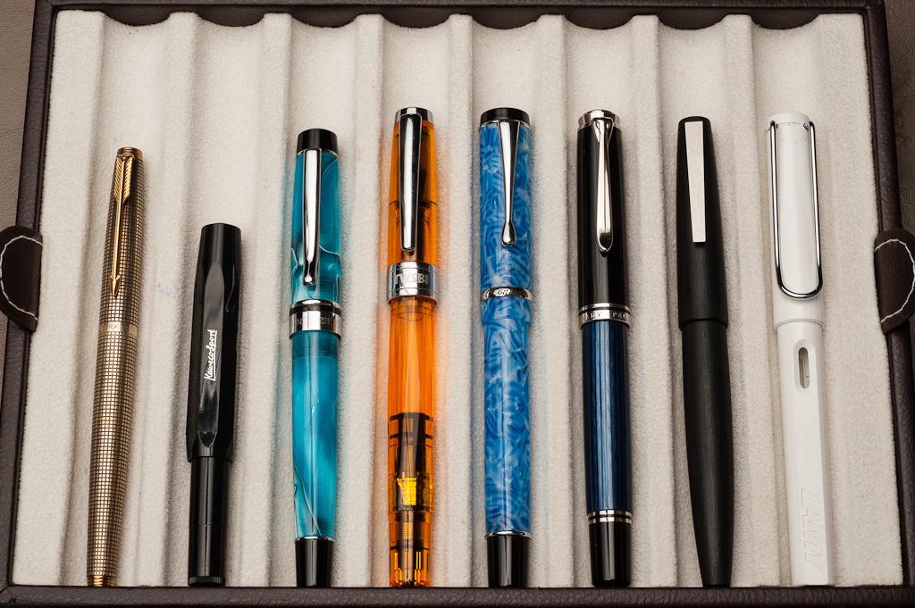
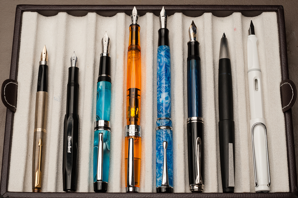
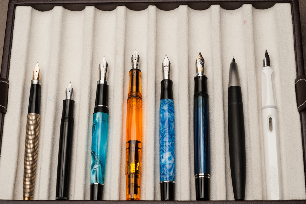
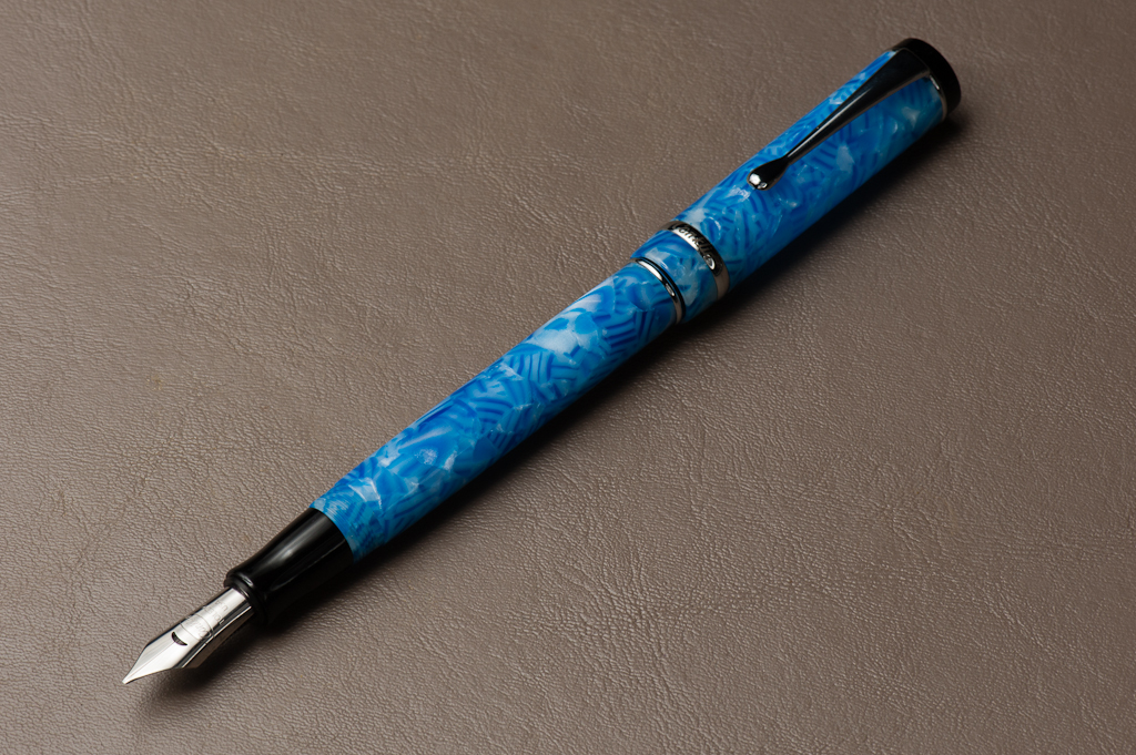
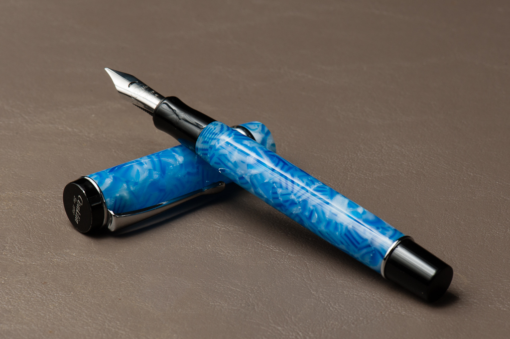
Katherine: I picked this month’s pairing based on what I’ll be using the most — a custom faceted pen by Romulus Pens and Pilot Ku-jaku. John of Romulus pens made this pen as a proof of concept (Possibly because I couldn’t shut up about how much I loved facets while I was hunting for a Nakaya Decapod Mini) and sent it to me to test drive. I have a custom one on order and hope to see it in the next few weeks (hint hint).
When the pen arrived, I was almost afraid to ink it up, the clear body its nine facets were so pretty — they reminded me of a prism. But, a pen is a pen and it’s meant to be used — so I picked Pilot Iroshizuku Ku-jaku. I wanted a bright ink since I’d see it sloshing around, but I also wanted something I’d be able to use at work without getting too many weird looks — so a bright blue it is! I’ve swapped a Franklin-Christoph Masuyama Needlepoint nib into it and it’s a joy to use… but I predict that I’ll be writing with this pen for a long time before I write it dry.
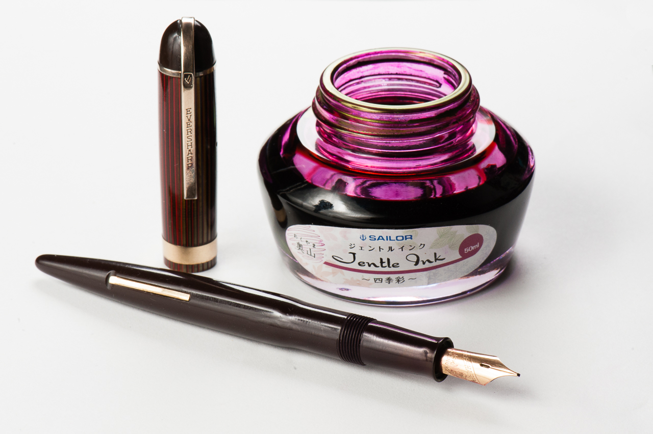
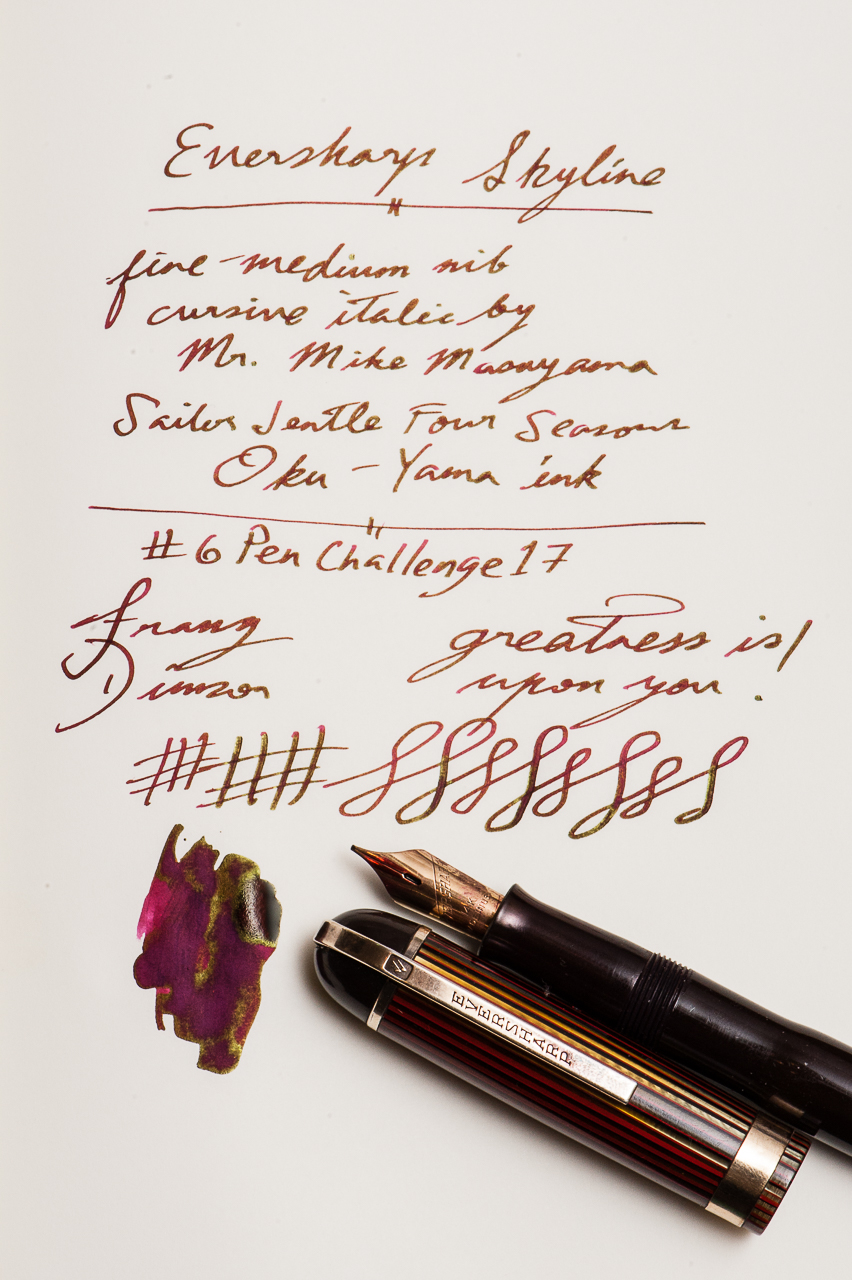
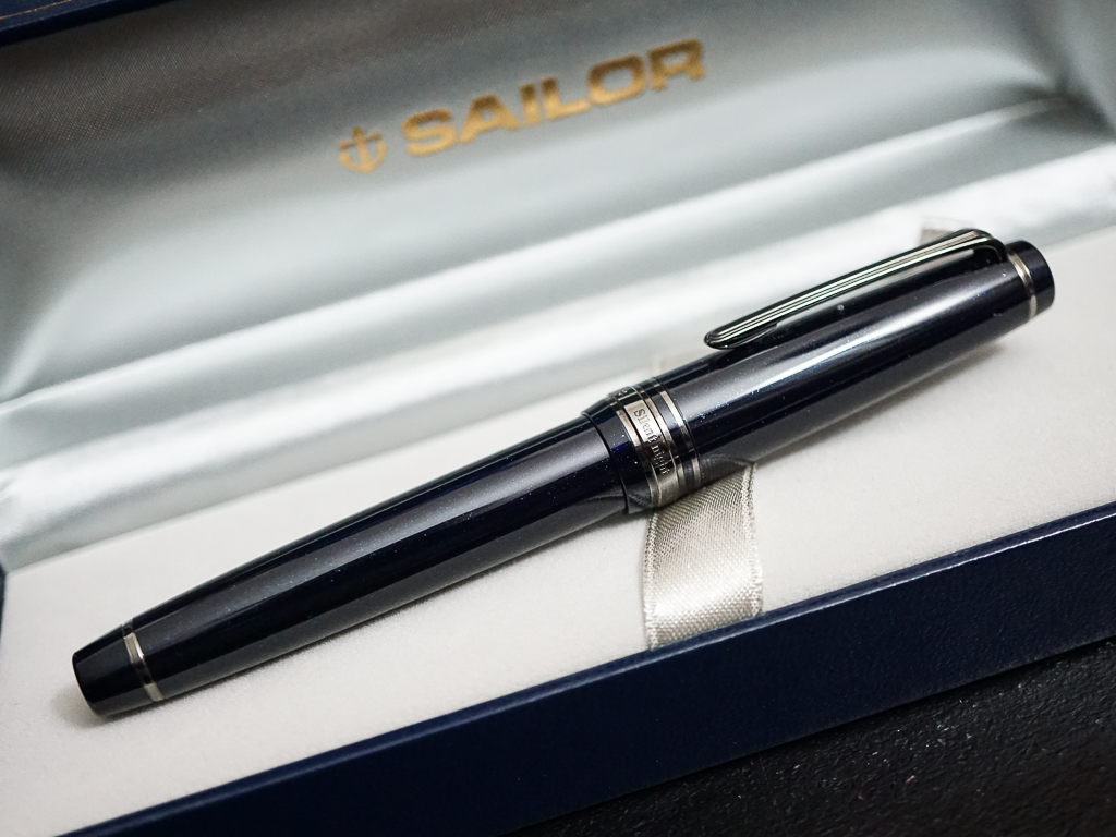
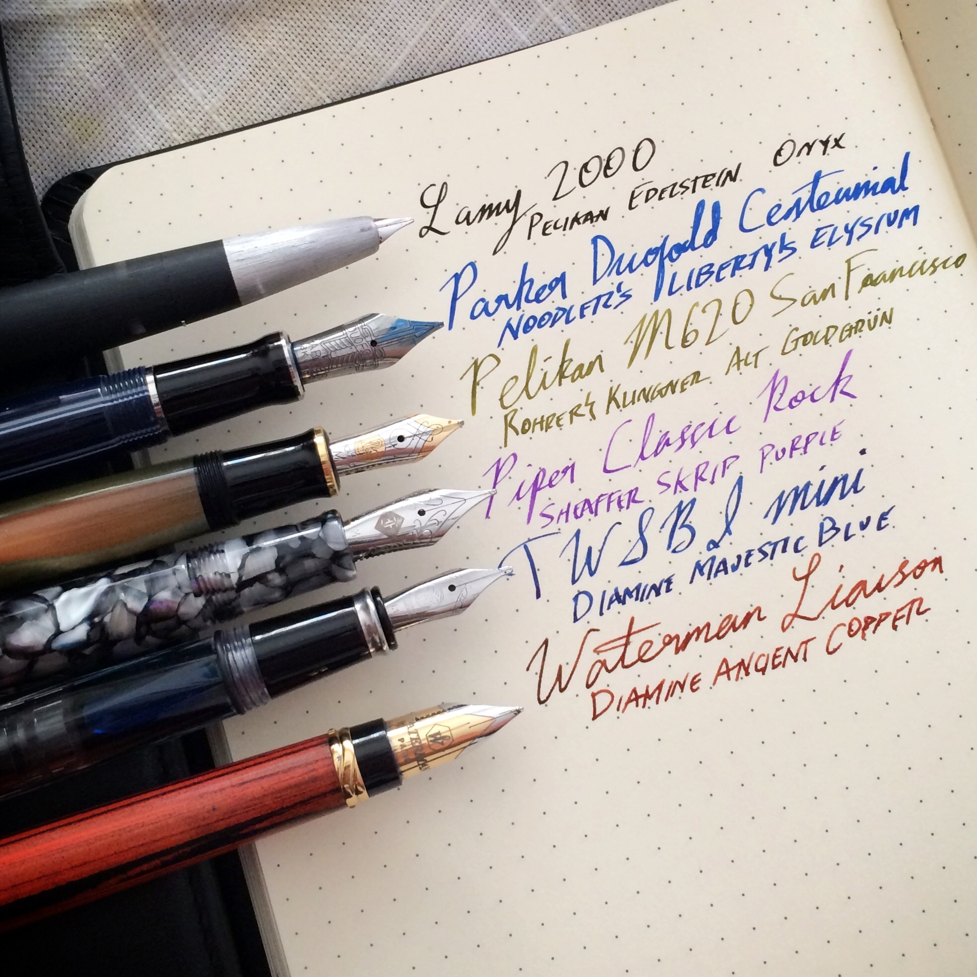
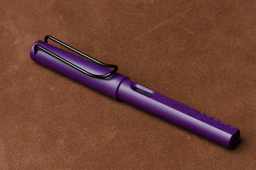
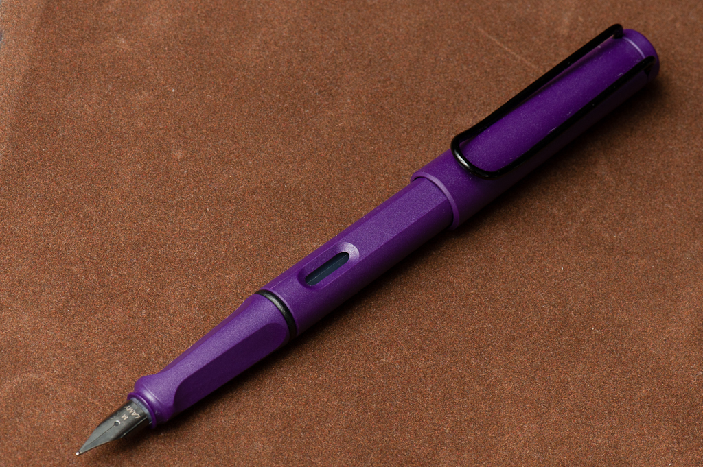
Franz: I have chosen my vintage Eversharp Skyline pen, and the Sailor Four Seasons Oku-Yama ink as my pairing for March. This Skyline is a Standard size and had an unmarked fine-medium gold nib. The Skyline is one of my favorite vintage pen models and they were produced from 1941 until it was discontinued in 1948. I am not sure as to when this pen was exactly made though. This pen is part of my six pens for the ongoing #6PenChallenge17 for March. Here’s a link if you don’t know what I’m talking about https://www.handoverthatpen.com/2017/02/26/6penchallenge/
The Sailor Oku-Yama is such a perfect match for this pen because of the red/burgundy color and the nice gold sheen. This ink echoes the red and gold color of the pen quite nicely. Also at the 2016 SF Pen Show, I had Mr. Mike Masuyama turn the nib into a smooth Cursive Italic so it has been a usual pen in rotation for me. It’s got some nice springiness as well.
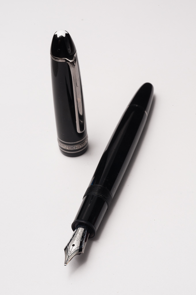
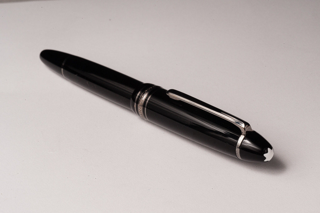
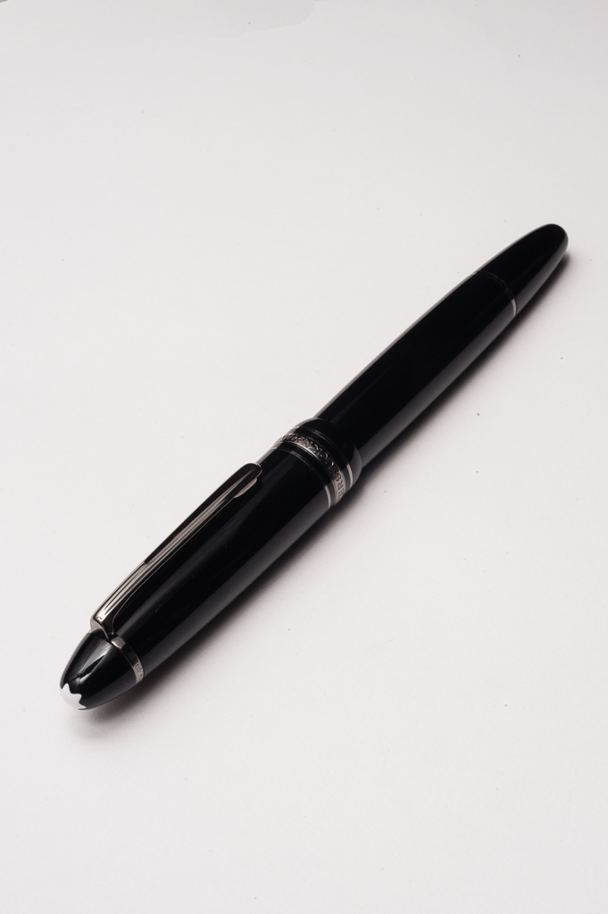
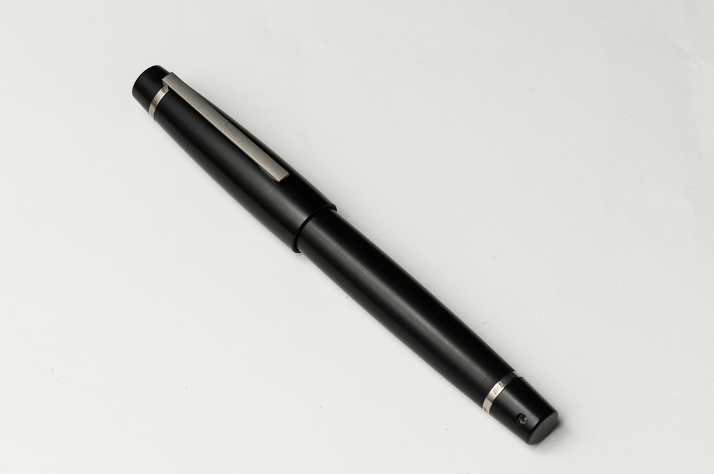
Katherine: The 146 (and its bigger sibling the 149) are the classic black cigar-shaped pen. The shape is boring to some, but timeless and classy to many others. Personally, I find the shape a bit boring, and while many buy the pen for the “prestige” that comes with such a recognizable brand, I found that unappealing. As I’ll discuss in later sections, I loved the innards of the pen, but I much prefer using pens that aren’t as obviously branded, especially at work. All in all though, the “look” of the 146 is inoffensive to me, if I didn’t have a self-imposed 15 pen limit, I’d likely still own one.
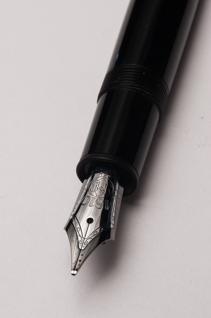
Pam: The 146 is a classic pen with a very classic shape. Typically, I would find the Montblanc 146 with gold trim to be another snoozer or write it off as “another typical pen.” I don’t usually like the cigar shape in a pen, like the Platinum 3776 or the Sailor 1911. That said, Montblanc created a very well proportioned cigar shape pen. It looks streamlined rather than chunky and sleek rather than boring. Maybe it’s the more dramatic taper at the end of the body and cap or it’s the custom ruthenium trim or I enjoyed writing with this pen so much that a “another typical pen” has much more appeal now.
Franz: The LeGrand 146 is such a nice, simple-looking pen. I love the timeless shape of the 146 and that may be the reason why a lot of pens have copied its appearance. The pointed ends are different from the usual pens I own.
So here’s a bit of historical information about this pen. In mid-1948, Montblanc came out with the Masterpiece/Meisterstück 140 Series and the three models introduced were the 142, 144, and the 146. All three were introduced as a piston-filler and until now, the 146 is offered as a piston-filler pen. Over time, the 144 changed to a cartridge/converter filler pen. The Meisterstück 140 Series was a refresh of the Meisterstück 130 Series introduced in the mid 1930’s.
According to Montblanc’s numbering system adopted in the 1930’s, 146 meant that 1 (part of the Meisterstück/Masterpiece line), 4 (piston filler system but it was a 3 in the 130 Series), and 6 (denotes the nib size).
*Please note that this historical information was taken from Mr. Andreas Lambrou’s “Fountain Pens of the World” book. If I have misquoted, or given incorrect information, please let me know. Thanks!
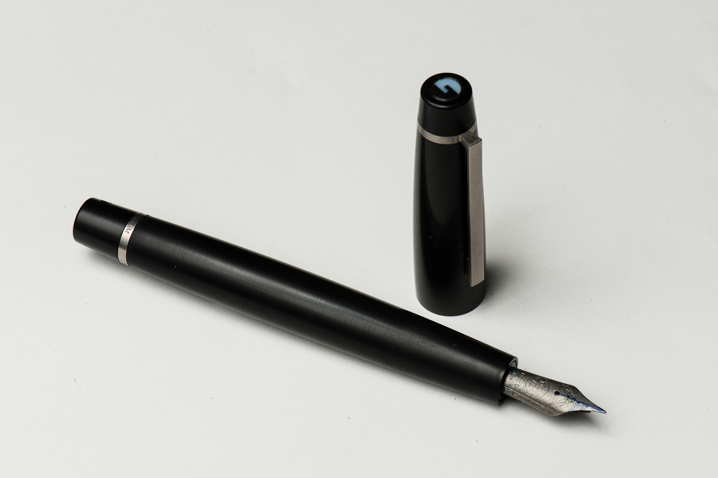
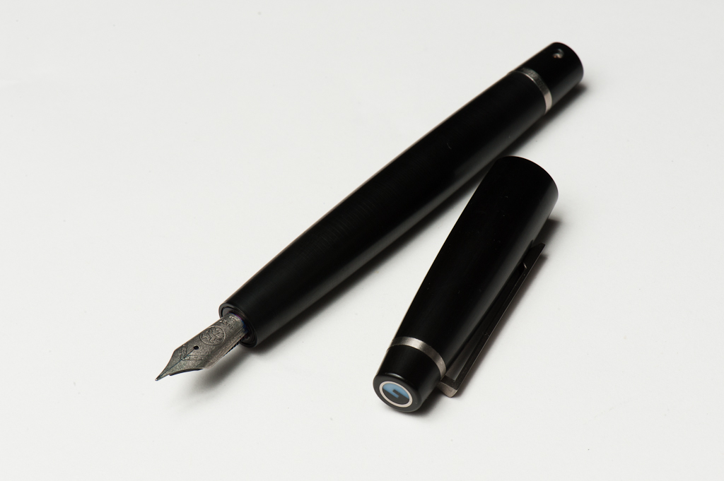
In The Hand: Montblanc LeGrand 146 (posted) – from left to right: Franz, Pam, and KatherineIn The Hand: Montblanc LeGrand 146 (unposted) – from left to right: Franz, Pam, and Katherine
The Business End
Katherine: I love well-adjusted Montblanc nibs. I’ve used Franz’s (pictured in this review) and love the delightful CI that Dan Smith put on it. But I also, for a few months, owned my own 146 — an early 90s French specimen with an uncommon 18k nib. That was one of the most delightfully smooth (but not glassy) nibs I had ever used. Given my current experiences with MB nibs, I would never hesitate to recommend one to a friend, even out of the box.
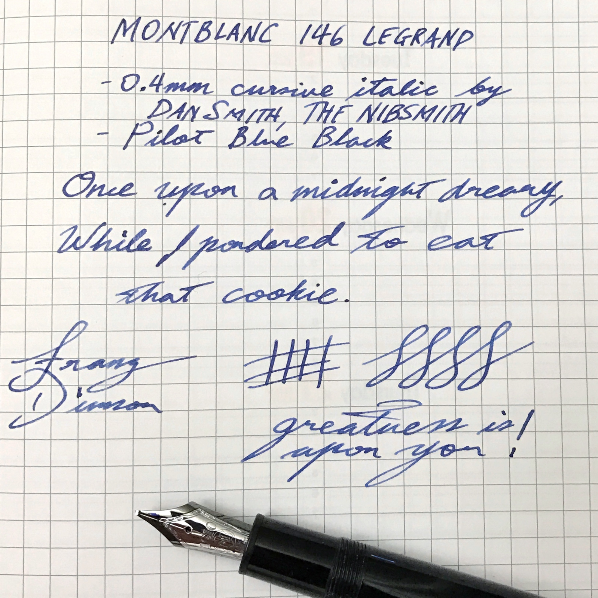
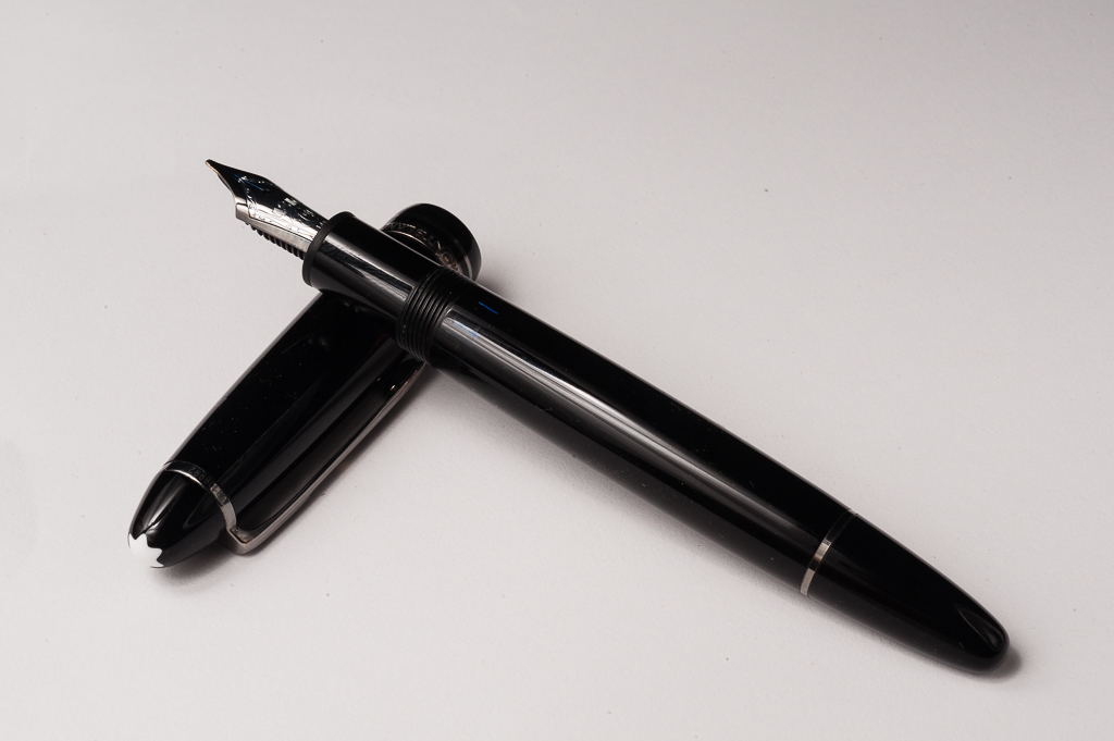
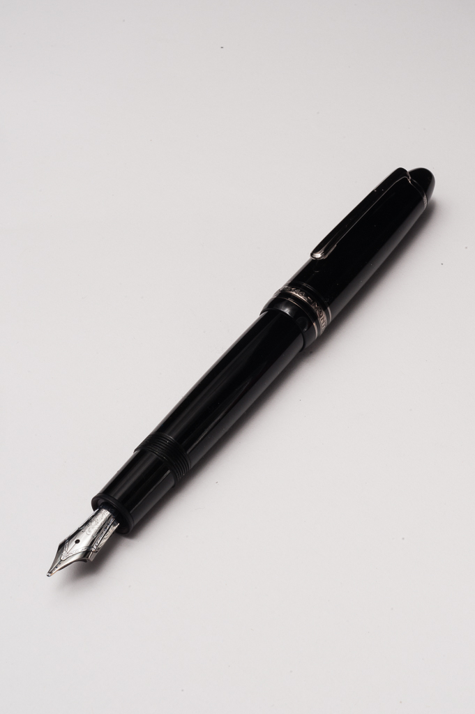
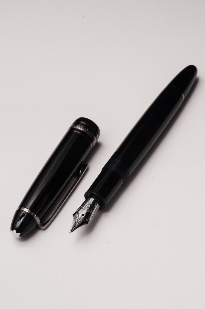
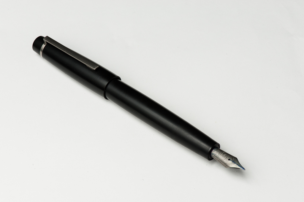
Pam: Montblanc nibs are juicy with some springy-ness to them, based on my time with them at the Montblanc store (which may be longer than I care to admit). I really enjoyed the Montblanc B and BB nibs as they created a stub-like line for me. Therefore, what other “improvement” could you make to a well done nib from Montblanc? Well, someone had the genius idea to send the pen to Dan Smith for a 0.4mm CI grind. I (not so) jokingly told Franz that the 0.4mm is the perfect CI width and I may be forever ruined for all other CI grinds. CI grinds tend to run a bit dry, but this nib is well tuned and provides a consistent, well saturated, beautifully crisp line. Again, ruined… I am, ruined (or forever spoiled.)
Franz: Springy nib… check! Cursive Italic… check! Juicy ink flow… check! Smooth sweet spot… check! Running out of checkboxes here! What can I say? It’s a beautifully tuned nib! Kudos to Dan Smith on this one. As for straight from the factory experience, I have used another 146 nib which was a stock medium and it was a smooth well tuned nib as well. So far, I’ve been pleased with the quality of Montblanc’s nibs.
The 0.4mm cursive italic nib by Mr. Dan “NibSmith” SmithFranz’s writing sample of the Montblanc 146 on a Rhodia Weekly Planner
Write It Up
(20-minute writing experience)
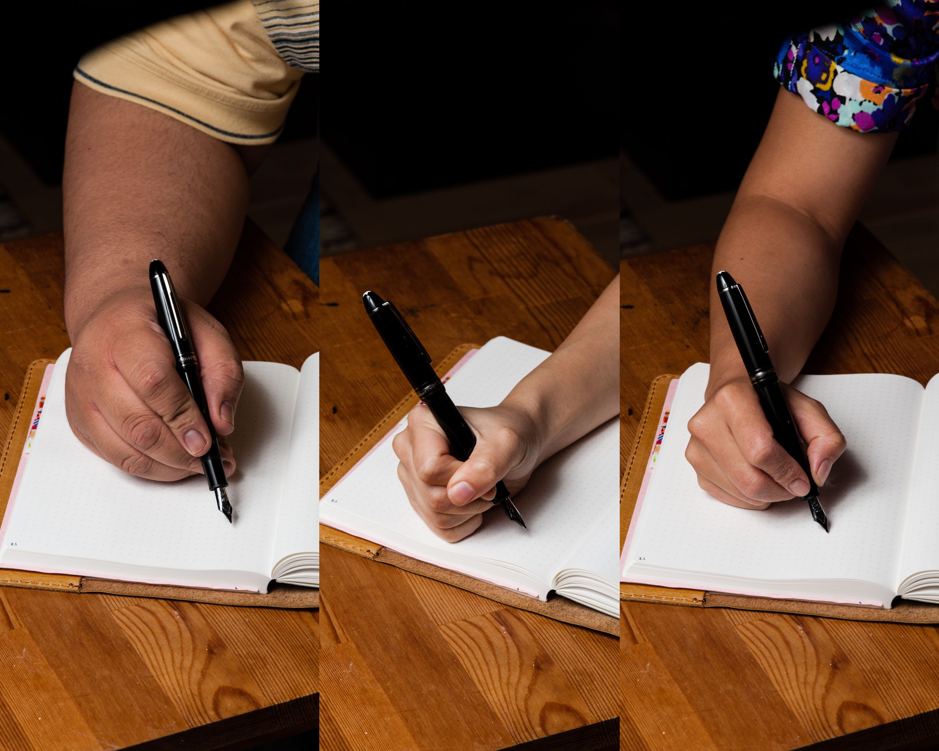
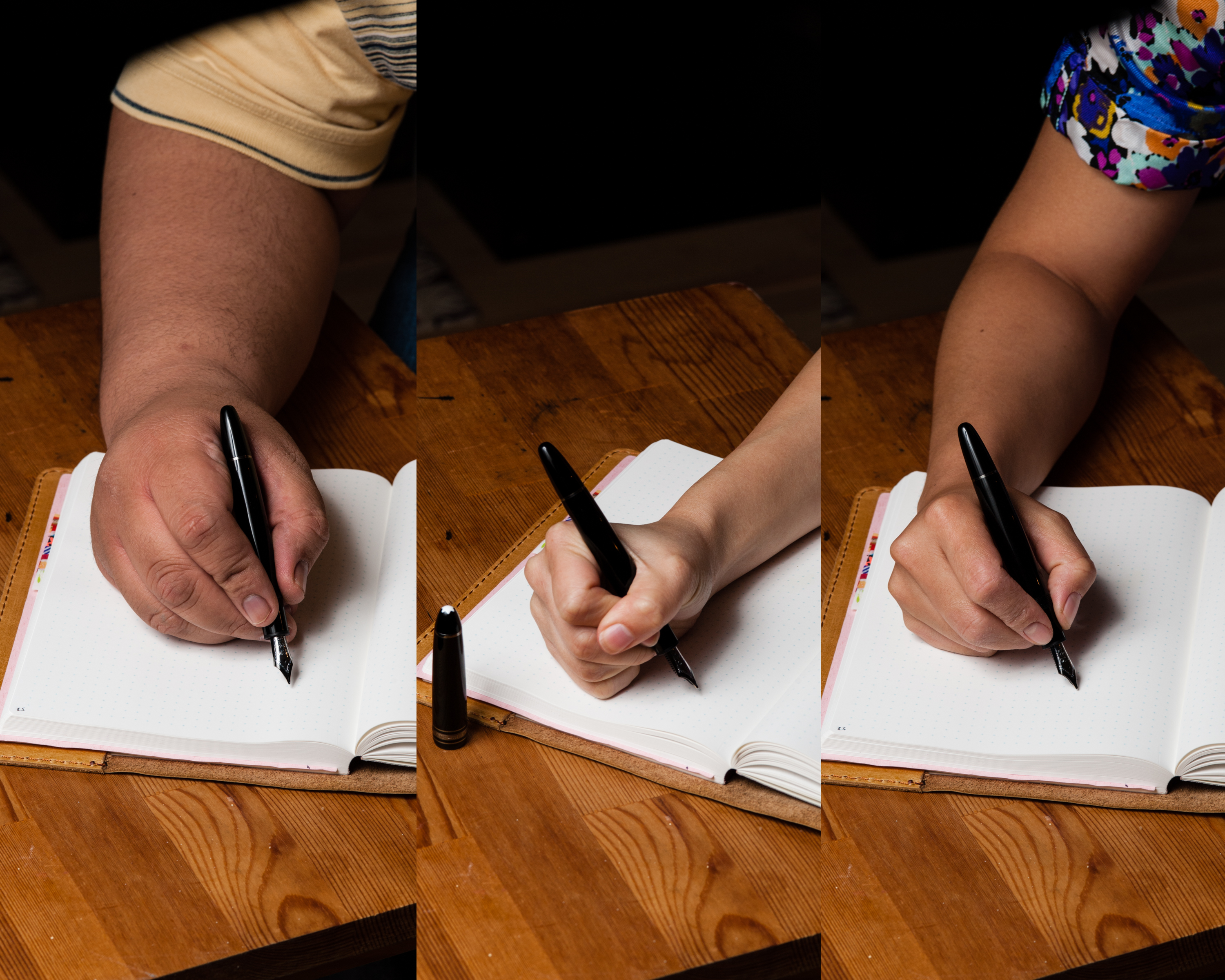
Katherine: The 146 is very comfortable for me — it has a good weight and is comfortable in hand, even when writing for extended periods of time. I prefer it unposted — when posted I find it a bit too top-heavy and my hand gets tired faster.
Pam: I have enjoyed the 146 both posted and unposted in the traditional tripod grip, preferably posted for me. The 146 can be a bit top heavy in my “iron grip.” Given the CI grind, I primarily used this pen in the tripod grip and had no issues with the width of the pen. The girth of the pen at the section is within the usual limits and comfortable to hold for an extended period of time.
Franz: I may have been waxing poetic about this pen but admittedly, the LeGrand 146 size is just a smidge small for my bear paw. Please don’t get me wrong for when the cap is posted, I wrote with it comfortably and I absolutely had no complaints. I loved journaling with it for about 10 minutes but when I unposted the cap, my grip adjusted towards the nib and the pen felt small and unpleasant. I actually felt my hand cramping after writing for five minutes. Please refer to the pen in hand photos above to see how awkwardly small the unposted 146 is in my hand.
So yeah, mixed results on this one for me and just like Pam, I prefer the 146 posted.
EDC-ness
Katherine: This is weird to say since I EDC my Nakayas… but I didn’t like carrying around my 146. While the clip was good, it uncapped decently and was great to write with, I just wasn’t comfortable using a pen that everyone around me identified as “Katherine is using an expensive pen”. Funnily enough, Nakaya and Danitrio are much less recognizable to the layman than my 146 was.
Pam: This pen is a be a great EDC pen as it is a sturdy, well made pen with a secure clip and threaded cap. I didn’t carry this pen around daily as it’s not my pen to damage or lose, but also because would be distracting in my interactions with my colleagues and patients. I am not that comfortable in letting the world know/assume the “cost” of my beloved pen hobby. (Or maybe that’s the SF bay area hipster in me.) Montblanc is such an iconic brand that people will notice this pen very readily. Granted, it’s also a beautiful, classy pen with a very unique ruthenium trim.
Franz: I used the 146 at work and out and about on a weekend and I had no qualms of being able to use this pen as an Everyday Carry pen. The cap unscrews after about 1 and 1/4 turn. Pretty fast deployment there and on the flip-side, the pen never uncapped itself in my pocket. The ink capacity of this piston-filled pen allows one to just keep on writing for a period of time. The subtle ink window above the section threads definitely helped me figure out if I’d need to refill the pen or not. I didn’t really care about the “perceived prestige” that the white star on the cap instills or what other people would think because well, I just don’t. Haha! =) As long as it’s a functional pen with a look that appeals to me, I’ll keep on using it.
Final Grip-ping Impressions
Katherine: Overall, I really love writing with 146s — they’re comfortable, balanced and have great nibs. But I found that I was uncomfortable with the obvious and easily recognizable branding. The moment my boss said, “Oh! You’re using a Montblanc!” the idea of keeping a Montblanc around for normal use went out the window.
Pam: After spending time with the 146, I can see why this pen is such a popular flagship pen. It’s a great size pen that suits many hands, has a classic (albeit “boring”) aesthetic from a historical and iconic brand that backs up it’s name with great nibs and performance. This pen has taught me and made me question a lot about my own pen preferences in terms of shape, nibs and writing style.
I would recommend this pen to anyone looking for a solid performing pen and isn’t wary of being seen with such a recognizable (and expensive) pen. Not all settings are optimized for that. It would be a “must have pen” if it was not so cost prohibitive to have, therefore, it would make a great grail pen to fill the “quintessential classic” slot in any collection. So if you are like me and this a grail pen, I recommend the 146 as a “must try for yourself” pen.
Franz: The LeGrand 146 design is almost 70 years old and as I said in the beginning of this review, it is timeless. This is a nice pen to have in one’s collection quite frankly. If you are able to, please try to write with a 146 and see if it is a good pen for your hand. The nibs are great and it just writes. I really like it when the cap is posted as I detailed above. The only “con” I would say about this pen is that it’s quite pricey when brand new. However, a thorough search in the secondary market may provide one with a reasonable and more affordable price for the pen.
Just a little background on this specific pen. I saw this exact 146 in early 2015 on Dan Smith’s Instagram feed, @TheNibsmith (@fpgeeks back then). He said that he just finished grinding the 0.4mm cursive italic on it and wished he owned the pen. I dug up info from Dan and the original owner of this pen to find out how he got a ruthenium trim. I planned to send a pen to that person who did the custom ruthenium trim but I never got around to doing it. Fast forward to April 2016, I found this pen offered for sale and I pretty much jumped on it. Needless to say, I love this specific 146 not only for its writing capabilities but its history as well.
Pen Comparisons
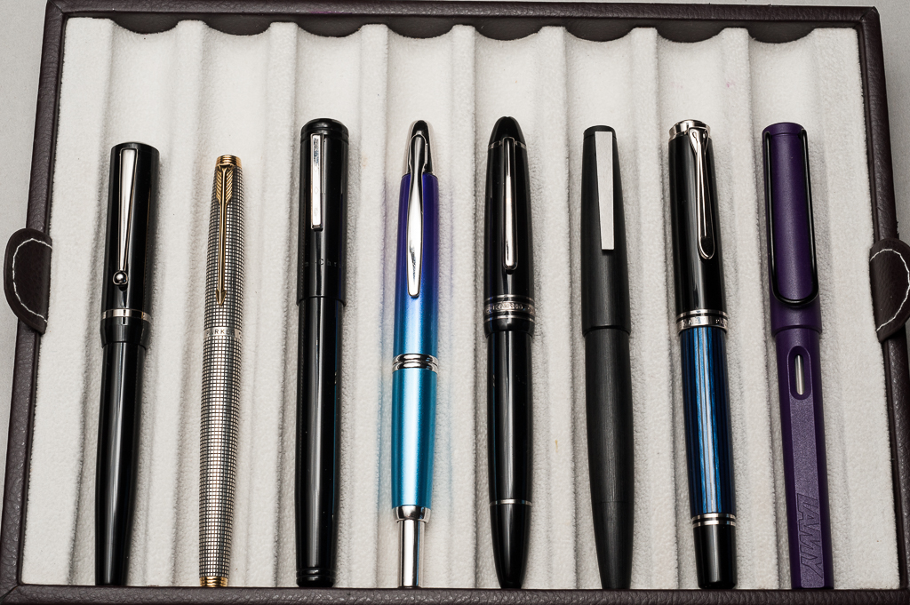
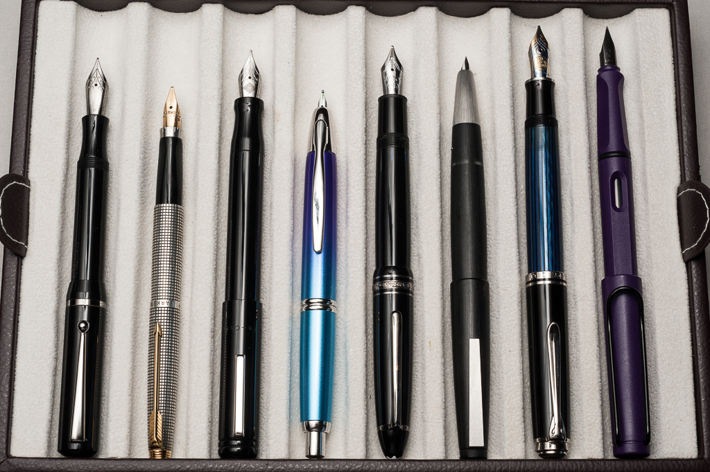
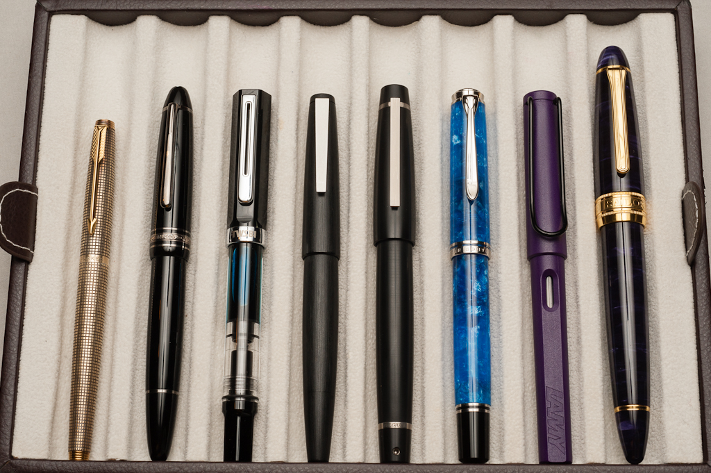
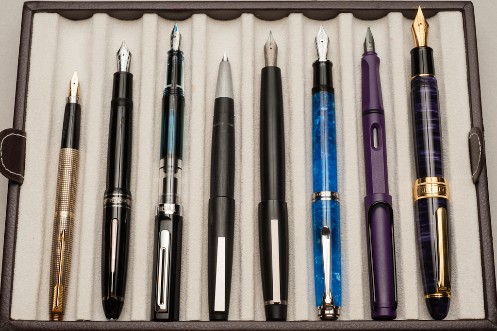
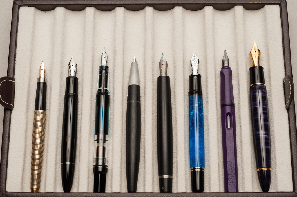
Closed pens from left to right: Edison Beaumont, Parker 75, Franklin-Christoph Model 20, Pilot Vanishing Point, *Montblanc LeGrand 146* , Lamy 2000, Pelikan M805, and Lamy SafariPosted pens from left to right: Edison Beaumont, Parker 75, Franklin-Christoph Model 20, Pilot Vanishing Point, *Montblanc LeGrand 146* , Lamy 2000, Pelikan M805, and Lamy SafariUnposted pens from left to right: Edison Beaumont, Parker 75, Franklin-Christoph Model 20, Pilot Vanishing Point, *Montblanc LeGrand 146* , Lamy 2000, Pelikan M805, and Lamy Safari
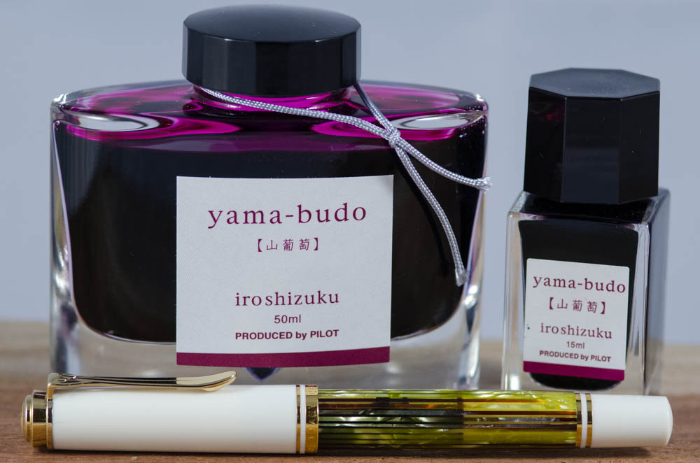
Pam: Have you ever bought a pen because you were so blinded by it’s beauty? Well, the Pelikan White Tortoise (with EF nib) was that pen for me. When I indulged in my “pen binge of 2016” (Thanks Franz!) I had bought the pen at a great deal but was very lost on it’s place in my collection when I received it. (I didn’t expect to get more than one grail pen within a year, I thought I had more time to consider these things!!) Most unfortunate was that despite the beauty of the pen, I couldn’t find a pen that compelled me to want to write with it.
I found Rohrer Klingner Alt-Goldrun to be underwhelming in the EF nib despite it matching to the beautiful Pelikan binde. I didn’t find a brown ink that I liked enough to keep using in this pen. I didn’t think a blue ink would “compliment” the White Tortie very well. After almost year of testing pen and ink combinations and long hiatuses of not using the pen, I considered “shelving” the Tortie. (Couldn’t bring myself to sell the pen either. It’s pen purgatory!)
Instagram and fellow pen lovers to the rescue!!! It was Heidi from Four Fifty Two (I think) who inked up Yama-budo in her White Tortie. I finally took the plunge and copied the genius combination! What a pairing!
I find the wetter EF nib to be great with Yama-budo since it provides more ink to the page and thus a more saturated color. (My first foray with this color was in a super DRY nib that led me to believe that this ink was more pink than crimson.) The color itself is beautiful and most importantly, readable. The color is dark enough for great readability, but is not your usual blue or black, or even purple. The color is so unique and the gold sheen really clinched this ink for me.
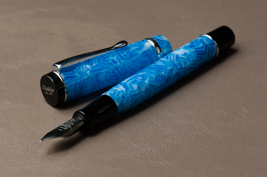
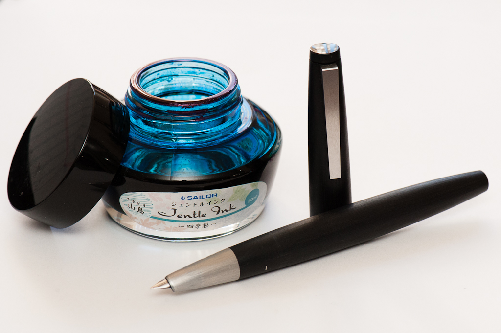
Katherine: My pairing for Feb has been my Sailor Sapporo Bung Box Silent Night & KWZ Twilight. Limited editions galore. My Silent Night has a wonderful wet Zoom nib in it — perfect for showing off the varied shades of KWZ Twilight. Additionally, the pen and ink pair thematically to me — the bright to dark teals of KWZ Twilight fade into the dark blue, almost black of the Silent Night. If only KWZ Twilight glittered in its darkest spots. Actually, if I had one wish for this ink, it would be that I had more than a sample. Hence, only the pen is pictured above.
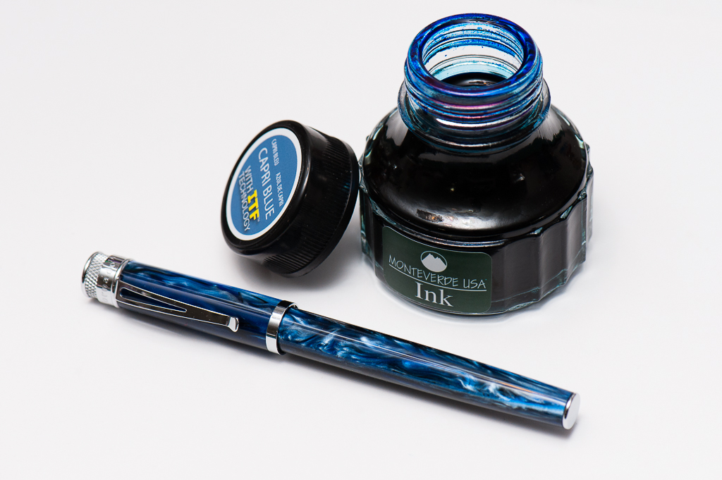
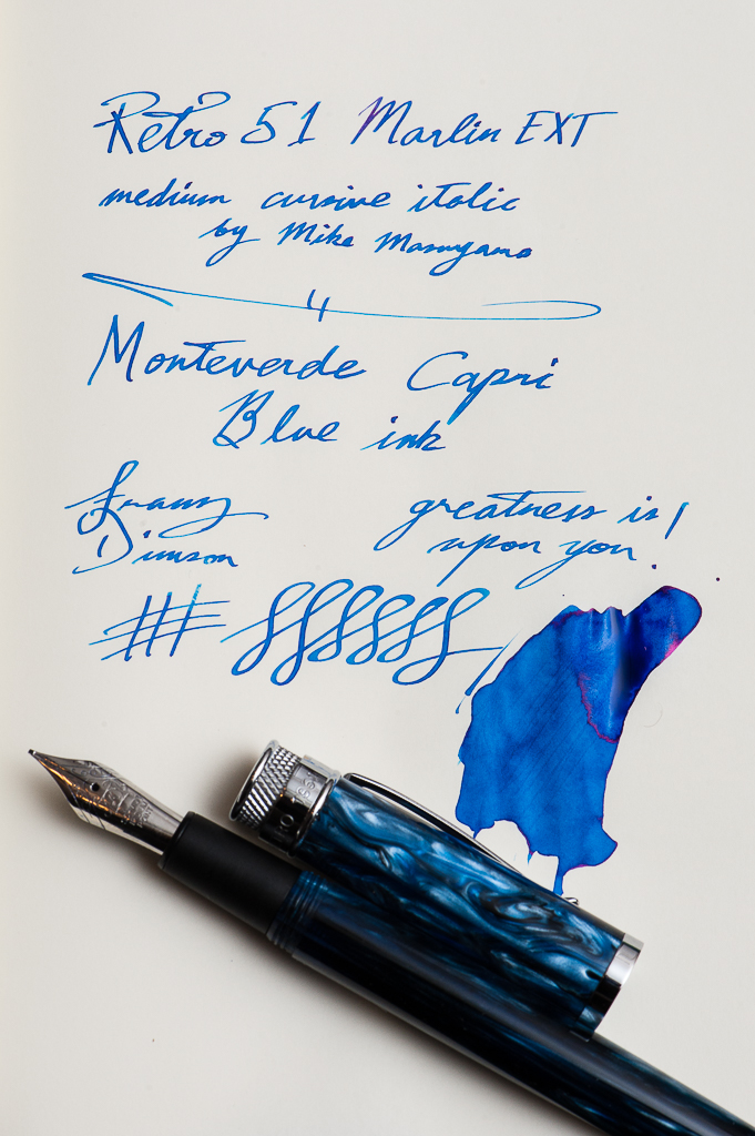
Franz: My pen and ink pairing for the month of February are both new to me within the month. It is the Retro 51 Marlin EXT fountain pen, and the Monteverde Capri Blue ink. I have wanted the Marlin pen since last year and when I heard it was being discontinued, I “had” to have it. On the Vanness Pens site (www.vanness1938.com), I found their last one so I purchased it right away as my “birthday” pen. Once I got it, I immediately inked it up with the Monteverde Capri Blue. This was the first pen I’ve inked with the Capri Blue and I’m very happy how it matches the swirls in the barrel of the Marlin. The ink’s color is also usable for my workplace so it’s a pairing I can use both for the home and office.
Now to top this pairing off, I had Mr. Mike Masuyama (www.mikeitwork.com) transform the medium nib into his cursive italic grind at the recently held LA Pen Show. Writing sample in the photo below. So the Marlin has become one of my top favorite pens. The Marlin will be a mainstay in my lineup for the 6 Pen Challenge that I will be participating in the whole month of March.
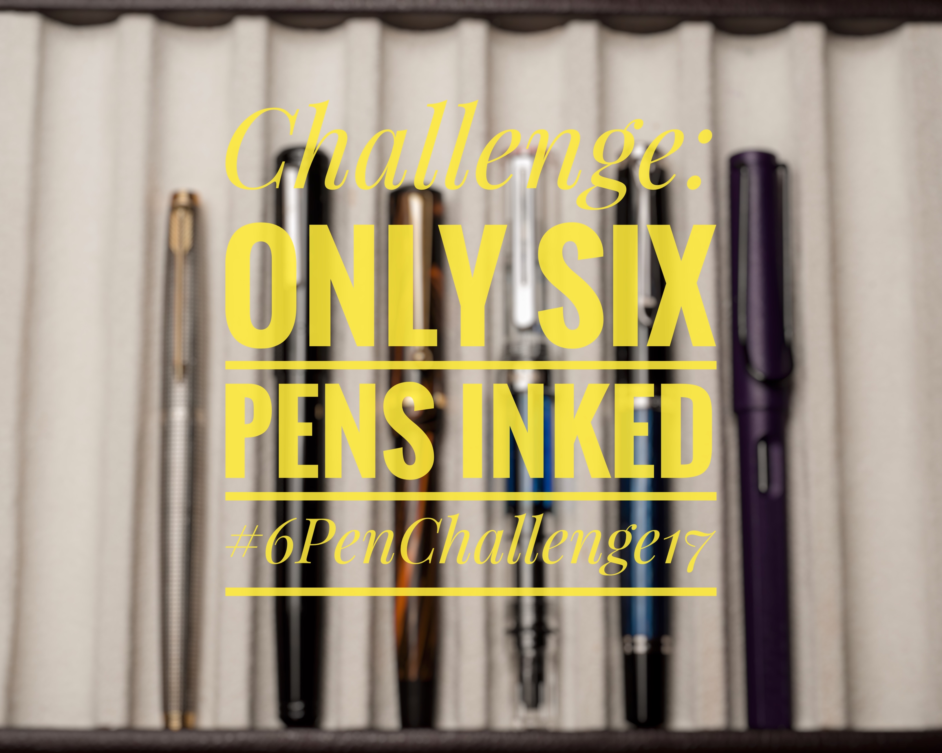
For the last couple years, Kata (@kataish) and Franz (@franzdimson) have run the Six Pen Challenge on Instagram — this year we’re hoping that more people will join us! This will be the first year that the Hand Over That Pen crew will be doing it together!
This year’s Instagram tag is #6PENCHALLENGE17. And the challenge will begin on March 1, 2017. Even if you start late in March, it’s perfectly fine. It’s all about the fun of it. =)
Tag your Instagram/Twitter posts to show that you’re joining in this fun challenge and to show your progress as well.
There’s only one rule in this challenge: Only six pens inked at a time.
Once you’ve written a pen dry, will you be re-inking it? Or choose another pen to ink up and use? That’s totally up to you! It’s a great way to appreciate your pens and have a bit more focus and fun in this pen hobby of ours.
Check out #6PenChallenge on Instagram for past photos/posts. The Six Pen Challenge was first ran on October 2014, then May 2015, and the last one was March 2016.
Will you join us? Which are your six pens and inks? Let us know!
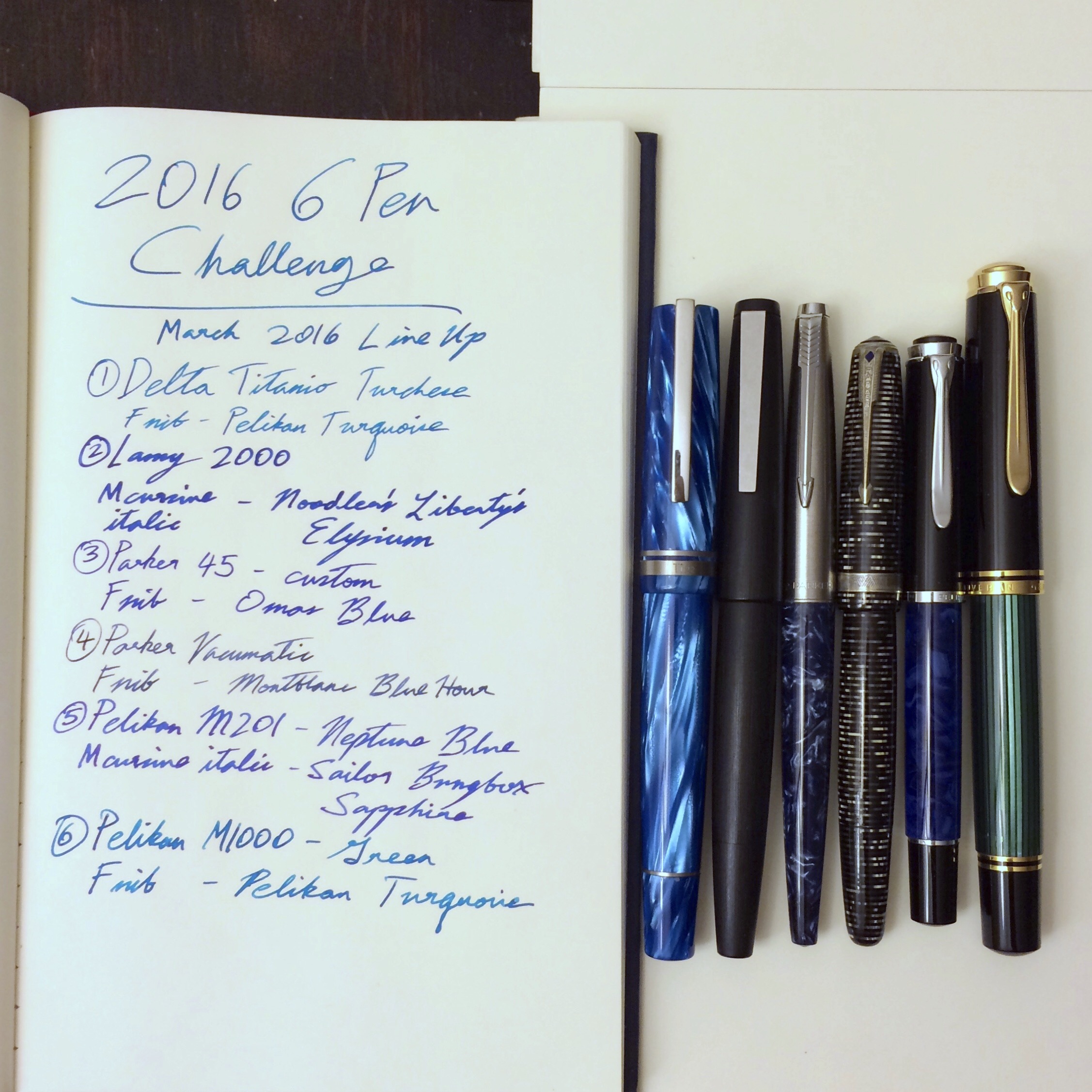
Franz: October 2014 #6PenChallenge line up/progress shotFranz: May 2015 #6PenChallenge line up. Used the same six pens for the whole month of May.Franz: March 2016 #6PenChallenge line up. Used the same six pens for the month of March.
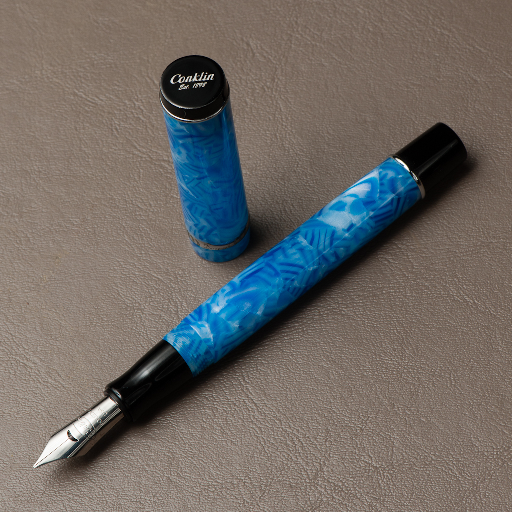
Katherine: I had always assumed this pen was more expensive than it is… When Franz suggested we review it and I finally looked it up, I was surprised! The pen is sizable, well made and was quite comfortable unposted. When posted, it was definitely too long and top heavy for me. I also loved some of the little details — the crescent shaped breather hole is unique and a great touch!
Pam: The Conklin is a sturdy and sizable pen that has a unique style and material. The traditional shape, blue hash/swirl pattern of the acrylic, and the silver/nickel furnishing gives the pen an eclectic feel of both classic vintage and boldly modern. I find the pen to be quite long, even unposted. The pen feels too long and top heavy when posted. I found the overall weight to be surprisingly robust. It wasn’t actually too heavy, just had more “density” than I was expecting. (I hope that makes sense.)
Franz: A Blue pen! =) I like the shape and size of the Conklin Duragraph. It fits my hand nicely and that Ice Blue finish is pretty to look at. The striations reminds me of vintage pens (i.e. Parker Televisor) which is a cool finish. The size of the Duragraph is close to the Pelikan M800 which I regard as a perfect size for my bear paw… er… large hands.
The Duragraph is filled via standard international cartridge or converter. Conklin supplies the pen with 2 cartridges (black, and blue), and a converter already installed. That is great!
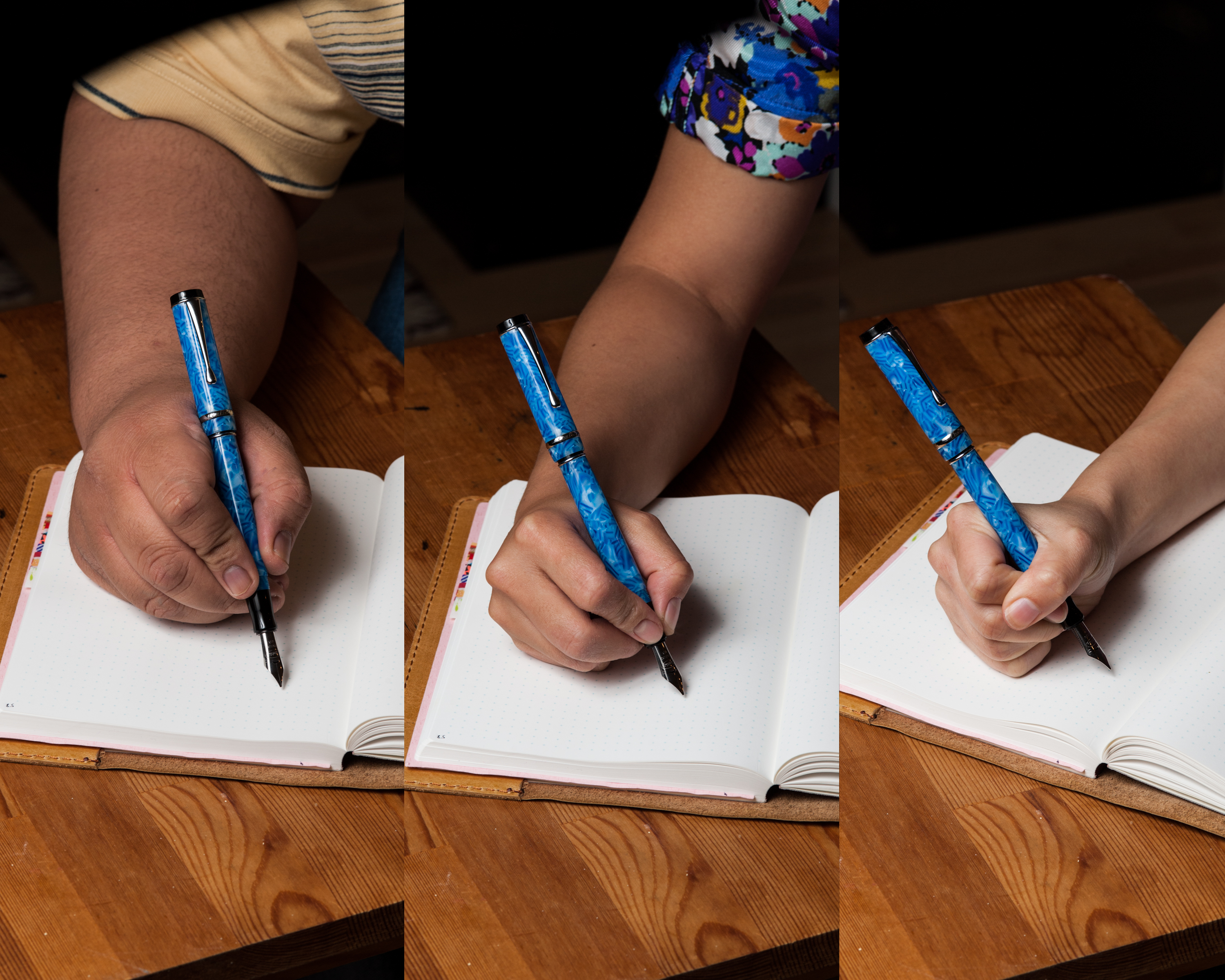
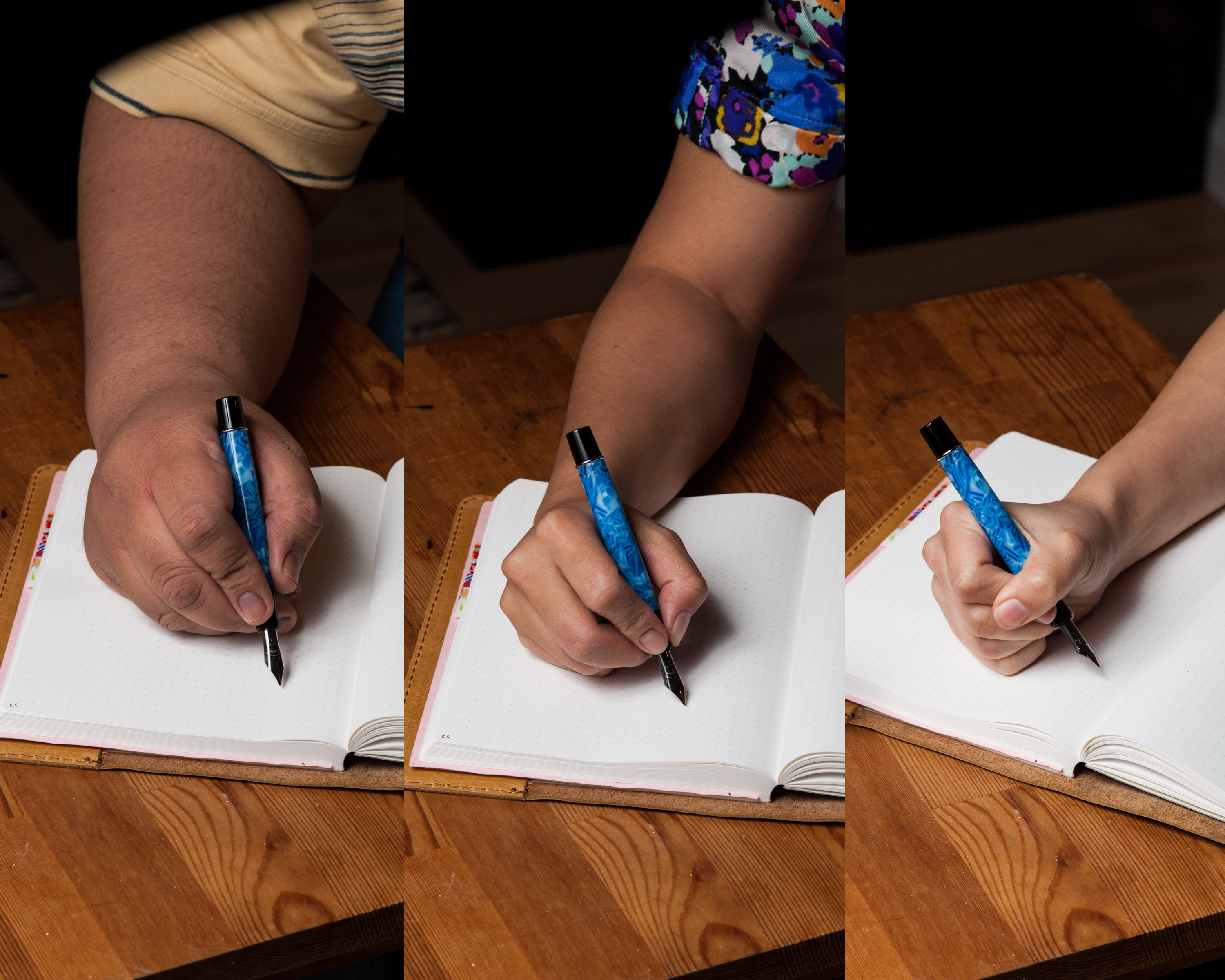
In The Hand: Conklin Duragraph (posted) – from left to right: Franz, Katherine, and PamIn The Hand: Conklin Duragraph (unposted) – from left to right: Franz, Katherine, and Pam
The Business End
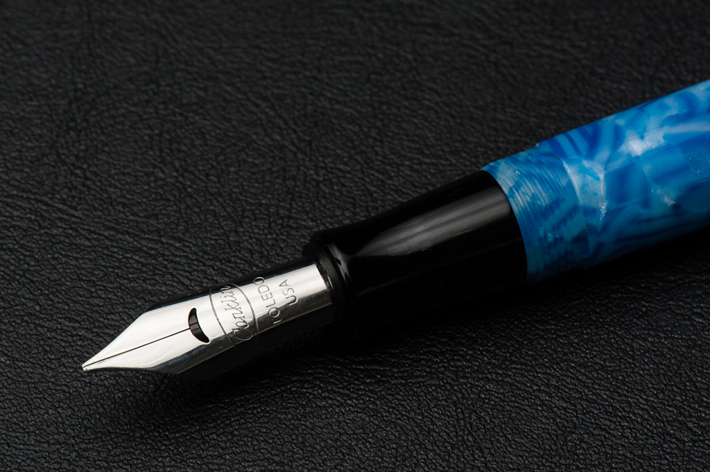
Katherine: The 1.1 stub is super smooth. On smooth paper like Tomoe River it’s almost too smooth for me. But, at the end of the day, it is usable for me, unlike many Lamy nibs which are just too smooth. The stub also produces good line variation while being rounded enough for easy use without fussing about angles.
Pam: I found the stub to be a joy to write with and it glided over quality paper (i.e. Midori and Tomoe River) really well. The stub didn’t require any particular angle or sweet spot. I found the nib to be pretty wet and it would show shading well.
Franz: To echo the ladies above, I loved writing with this nib. This stub nib is quite smooth and offers a bit of line variation that I’m used to with my other cursive italic nibs. Great job Conklin!
Write It Up
Katherine: This pen was comfortable for long writing sessions, as long as I use it unposted. The stub nib kept things fun. I didn’t have any issues withe cramping or discomfort… So win win!
Pam: I usually develop a cramp writing in the traditional tripod however, the width of this “sizable” pen made the writing experience pretty comfortable and the cramping to a minimum. I didn’t have any major issues with the threads and my fingers felt pretty comfortable on the section. I preferred writing with the pen unposted since the cap makes it too top heavy.
Franz: As I wrote with the Duragraph unposted, I enjoyed my journal time. I did not experience any hand cramping or fatigue. Unfortunately, when the cap is posted it becomes unwieldy because the cap doesn’t post deeply. This made it too long and as Pam already said it’s top heavy.
EDC-ness
Katherine: The clip on this pen is super tight — good for clipping to thin notebook covers, not great for thicker things or soft fabric (pockets). It takes a full rotation to unscrew the cap, which is totally reasonable. I wouldn’t hesitate to use this as a grab and go work pen, but it’s certainly not pocket sized. 🙂
Pam: The pen is robust with a tight, sturdy clip and durable material. The acrylic looks like it would age well and take some daily wear. No comments on accidental drops since I was far too paranoid to ruin Franz’s pen. (I didn’t drop it, I promise.) I tend to reach for more snap cap pens at work, just for the ease and convenience. However, at home, this was an easy go to pen for journaling.
Franz: This was a nice pen to use at work because it unscrewed quickly with just one turn. The clip was a bit tight but it clipped onto my shirt pocket quite easily. Now this could just be due to the ink (Montblanc Blue Hour) but I found the nib to feather and bleed on the copier paper used at work. The flow is perfect on Tomoe River, and Rhodia paper though. I wouldn’t hesitate to use this pen with a medium or fine nib on copier paper.
Final Grip-ping Impressions
Katherine: I think this is a great deal for the price. I’ve seen them as low as $40 — and I think it’s great value for the money. The stub was fantastic to write with, and it has the looks of a much more expensive pen (though that’s subjective). If you told me this was a $150 pen, I’d believe you and think that was a little steep… but at $40-50, it’s great. I think this is a very viable alternative to the many of the more popular “entry” to “mid” level pens like TWSBIs.
Pam: The Conklin Duragraph has a unique aesthetic that doesn’t appeal to me personally, however it’s a great “upper entry” level pen for those who enjoy the style. Given how difficult it is to find pens around the $50 price range that has the same quality material, unique styling, and that “criminally smooth” nib, it’s a great deal. If you were looking for a pen like the Lamy Safari, Al-Star, TWSBI 580, Kaweco AL Sport, or Pilot Prera but hesitated because they don’t look “corporate” friendly, consider the Conklin Duragraph!
Franz: Okay, final thoughts? Let me share that this was the second Duragraph that I purchased. =) The first one I got was the amber finish and that looks awesome as well. As of today, it has a MSRP of $65 and as Katherine mentioned, you can purchase this pen at a lower price. I definitely recommend this as a nice writer in one’s collection.
I found great value with the Conklin Duragraph along with beautiful aesthetics. To my knowledge, it is offered in four finishes. I’m not saying I’ll complete the set but you never know. ;-P
Thank you!
Pen Comparisons
Closed pens from left to right: Parker 75, Kaweco Sport, Monteverde Prima, TWSBI 540, *Conklin Duragraph*, Pelikan M805, Lamy 2000, and Lamy SafariPosted pens from left to right: Parker 75, Kaweco Sport, Monteverde Prima, TWSBI 540, *Conklin Duragraph*, Pelikan M805, Lamy 2000, and Lamy SafariUnposted pens from left to right: Parker 75, Kaweco Sport, Monteverde Prima, TWSBI 540, *Conklin Duragraph*, Pelikan M805, Lamy 2000, and Lamy Safari
This is a new series of posts for us. Each month we’ll pick a pen an ink pairing and share why we love it. What are your favorite pairings? And please give us feedback — we love comments!
Sailor Jentle Yama-Dori and the Lamy 2000
Pam: I tend to make pen and ink “one true pairings,” as in, once a pen and ink are well paired, they are almost permanently paired for me. My first OTP was the Lamy 2000, EF nib with Sailor Yama-dori. The Lamy 2000 didn’t sing, and arguably, a disappointment due to my original ink choice. I thought the nib was too wide, too wet, and created a “weird” line. However, once I put in Sailor Yama-dori, thie “too wet” was just right to show off the beautiful red sheen on the perfectly teal ink. The “too wide” and “weird line” became a semi-architect because I could actually see the difference between my vertical and horizontal strokes. I haven’t inked up the Lamy 2000 with any other ink since its second inking.
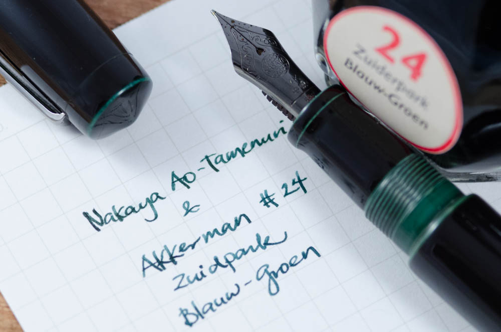
Katherine: If you follow me on Instagram, you’ll know that I got my first Nakaya (unboxing video here). Nibs.com had ONE ao-tamenuri (blue-green) Piccolo left, and I couldn’t resist. When the pen arrived I waffled over what ink to ink it with — something I knew I loved, or a totally new ink? I went with Akkerman #24 Zuiderpark Blauw-Groen, which I suspected would match the blue-green accents on the pen — and I was right! The ink flows well, but is on the dry side and matches the pen perfectly. After reveling in my perfect match, I found out that Franz (who I got my sample of Akkerman #24 from) bought the ink to match his Ao-Tamenuri pen… great minds think alike!
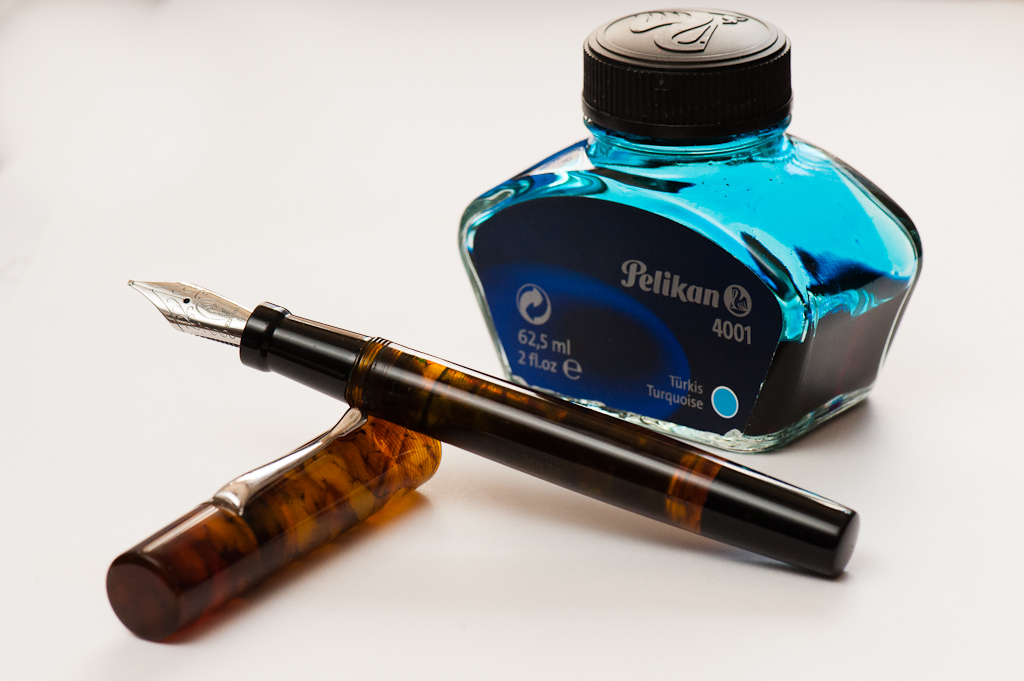
Pelikan 4001 Turquoise and Edison Huron
Franz: I’m excited about this post because I know that most pen folk are particular about the inks they use on their pens. I mean, that’s one of the biggest appeal of using fountain pens. It’s the ability of being able to choose your preferred ink, your own nib size/grind, and the perfect size of the pen for your hand. We’re not even tackling paper choices yet. That may be for another kind of blog post. Haha!
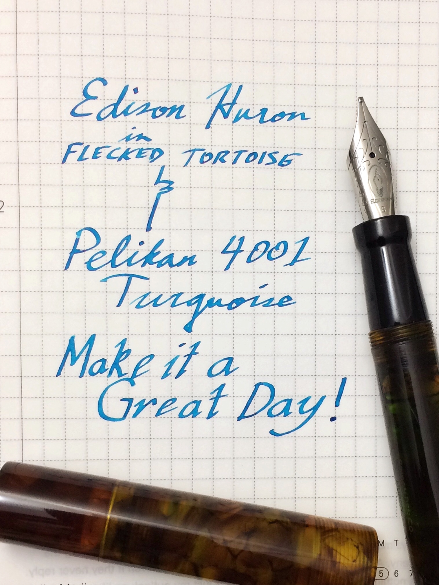
So for this month of January, I’d like to feature my pairing of my custom Edison Huron in Flecked Tortoise and the Pelikan 4001 Turquoise. The Pelikan Turquoise has become one of my top 5 favorite inks for the past years and I’ve become accustomed to its properties. The color of this ink is a nice complement to the rich brown tortoiseshell acrylic. The Huron sports a broad cursive italic customized by Mr. Brian Gray and the width of the line shows off the ink’s color and sometimes its sheen. Following Pam’s strategy, this may be my O.T.P. for this pen.
Here’s a writing sample.
Don’t forget to let us know what your favorite pairings are! Thank you!
Katherine: This Conid is… minimalist. Surprise! It’s a sleek, subtle black pen with a couple of nice touches. It’s beautifully made and very clean to look at. You can see faint horizontal marks on the delrin, I assume a remnant of the machining — I like it, it adds a handmade feel to the pen. Additionally the clip is a solid piece — no seams, how cool is that?
Pam: I can’t help but compare the Conid to my favorite minimalistic pen, the Lamy 2000. The sharp lines of the clip and the shape is very similar. Although, the Conid is longer in hand and wider in girth. The quality of the pen can be felt in hand and has a good heft to it.
Franz: Conid pens have been a brand that I’ve always wanted to try out and write with. Thankfully, Katherine was able to obtain one. The Minimalistica model feels fantastic in the hand because of the Delrin material. And the tidiness of the design is what makes this simple pen pleasing to the eyes.
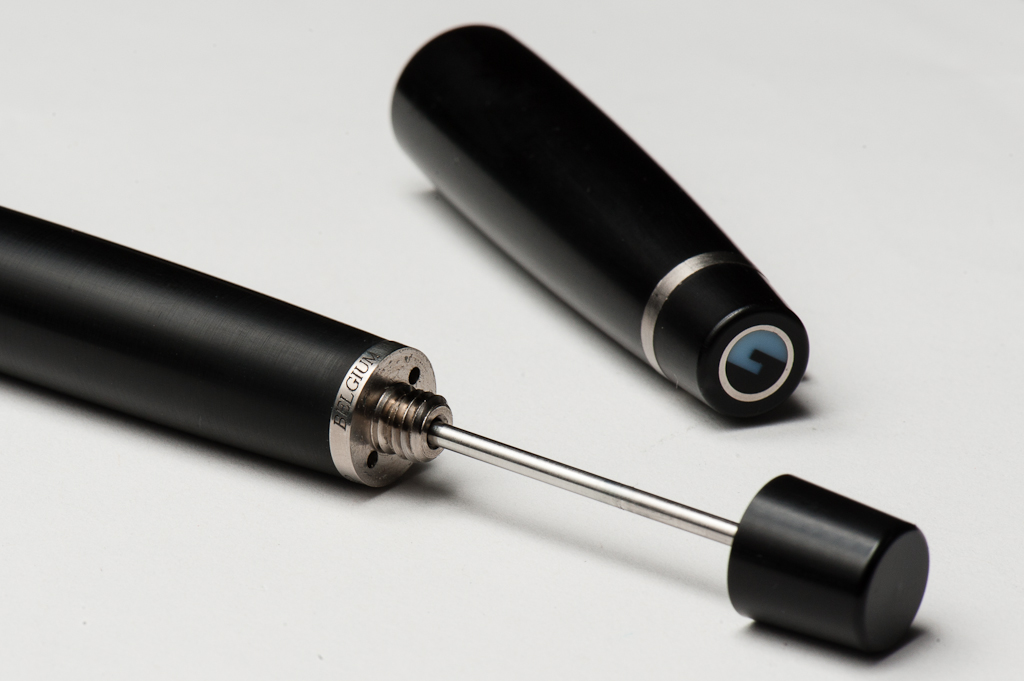
The feature that Conid pens are well known for is their bulkfiller system that utilizes the full barrel as its ink reservoir. According to their website, the Minimalistica can hold up to 2.5ml of ink and that’s some serious ink supply! My Pelikan M805 that I use at work daily have a capacity of about 1.2ml and lasts about a week for me. With the extra fine nib grade of this specific pen, a full inking will probably last me a month!
In the Hand: Conid Minimalistica (posted) — from left to right: Katherine, Pam, and FranzIn the Hand: Conid Minimalistica (unposted) — from left to right: Katherine, Pam, and Franz
The Business End
Katherine: The nib on this particular one is a Bock Titanium EF. It’s a smidge more wet than I’d prefer, but still lots of fun. I like the unique feel that titanium nibs have — an interesting sort of feedback (perhaps vibration is the better term?) that isn’t quite the pencil-like feedback of a Japanese EF, but isn’t the buttery smoothness of many German nibs. In addition to being a nib that feels very much alive as you write with it, the titanium nib is quite soft. The softness isn’t the same as one experiences with a soft gold nib, but the line variation can be similar (though the spring back is quite different). All in all, it’s an interesting nib and I would consider getting a Bock Ti nib in the future!
Pam: I really enjoy the titanium EF nib which surprised me. It felt smoother and more consistent in line than the nib in my Gist (prior to the needlepoint grind). Maybe the line consistency is due to my practice of not bearing down on my pens. (The iron grip is still a work in progress….)
The nib itself was pretty wet, smooth and wonderful on Tomoe River paper in my Hobonichi. I would be happy to consider another pen with the EF titanium nib again.
Franz: I generally prefer medium, and broad nibs but this extra fine titanium nib was a nice experience for me. The ink flow was just right for my light writing pressure and the springiness added a bit of flair to my writing if I press a little more. Additionally, the color of the titanium nib complemented the titanium clip very well.
Bock Titanium nib ground to an extra fineThe Delrin Black tapers nicely towards the Bock nib
Write It Up
Katherine: I hate to say it, but unfortunately, this is where the pen fell apart for me. I found that as I wrote it felt like my fingers were slipping. Initially I thought it was because the section was too wide for me, but after writing a couple pages more, I noticed that the slippery delrin and the smooth section were causing my fingers to slowly slide down the section, and I’d unintentionally wiggle my fingers back up to maintain a comfortable writing angle. Have you ever worn jeans that were just a smiiidge too big and you have to pull them up as you walk around? It’s a lot like that. Except that’s pretty tiring for my fingers.
All in alll, the nib is lots of fun, it’s well suited to long writing sessions due to the monstrous ink capacity, but the smooth section and material just don’t work for me. It’s worth noting that it’s been cold lately, which makes my normally dry skin even drier… so ymmv.
Pam: The width of the pen makes longer writing instances very comfortable, even in the unusual tripod grip (for me). I did find the pen to be too long to post for balance. It is much better unposted. I found the quality of the pen to be very evident in pen. The overall writing experience is great and I had alot of fun. Given the size, though, I prefer the length of the Lamy 2000 or the Gist by Tactile Turn.
Franz: Contrary to Katherine’s writing experience, I had such a fun time writing with the Minimalistica. The Delrin material made the pen just stay within my grip and the girth was just right for my hand. I wrote with the pen unposted for the first ten minutes and it was very comfortable. It was most comfortable for me with the cap posted because my grip went further up and the pen fit snugly between my thumb and index finger. This can be seen in the In The Hand photo above.
The comfortable grip, and the extra fine titanium nib made an enjoyable journaling session that lasted a little over twenty minutes.
EDC-ness
Katherine: I carried this pen at work for a few days. It was great when I was sitting at my desk, the slip cap makes uncapping to take notes very easy. The downside is that the slip cap doesn’t have a clear point at which it’s firmly on — so if I’m running around between conference rooms and meetings, I was worried that I hadn’t capped it securely enough and that I might drop the pen or the cap (I didn’t, but I worried anyway). In using this pen I’ve realized that I prefer snap caps or fast screw-caps for EDCs. Slip caps sound convenient, but I’m often left worrying that I haven’t capped the pen snugly.
Pam: The clip was very sturdy and great for EDC. However, I didn’t feel that the cap was as secure as other slip cap pens. The large ink volume of this pen makes it a great candidate for long business trips, especially if your travel plans include aviation. The extra reservoir with the EF nib almost ensures that you will have enough ink to get through the day if necessary.
Franz: I got to use the Minimalistica at work for two days and it was a great experience. No need to screw off the cap to deploy quickly and the clip was secure in my shirt pocket. I can see myself using this pen as a daily writer especially since the ink capacity beats any piston-filled pen.
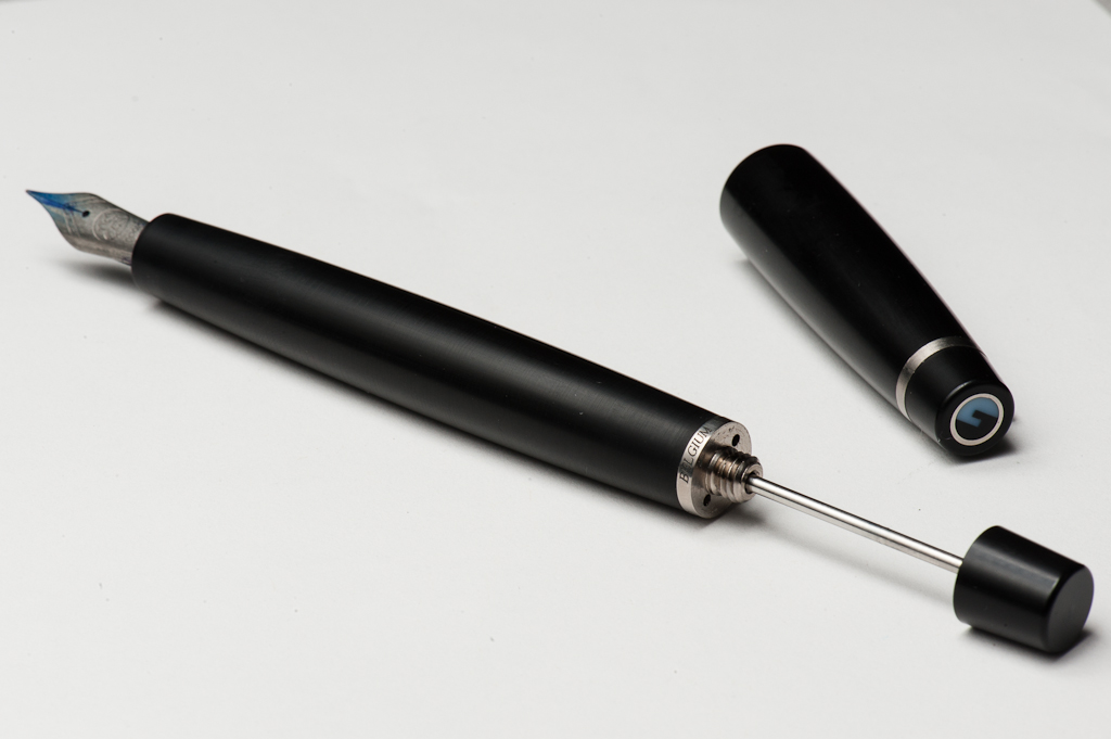
Here are photos of the Minimalistica with the filler rod extended. This mechanism ensures that the barrel gets a full fill after 1 or 2 operations.
Final Grip-ping Impressions
Katherine: I expected to love this pen, but unfortunately I really don’t. I love the way it looks and the filling system is really cool (it took me like five tries to figure out… but once I did, it’s magical), but the slippery section just doesn’t work for me. For science, I tried wrapping a thin strip of washi tape around the section and that small amount of texture made it a much more comfortable writer for me — but at the price point of this pen (over $300, even buying one used) I can’t justify a pen that isn’t comfortable to hold. If this pen was cheaper I might keep it and rough up the section with sandpaper… but I’m not willing to risk that.
Pam: I really enjoyed my experience with the pen, however, I don’t find the pen compelling enough to recommend due to the price. The Conid does have the unique filling mechanism, but I didn’t even try to experiment with it. For the price of the Conid, you could easily get the Lamy 2000 AND a Gist with the Bock EF titanium nib. So unless you are greatly interested or compelled the bulk filler system, I would recommend getting two pens for the price of this one.
Franz: The Conid Minimalistica is a very nice looking pen (as long as you like black pens). My bear paw is definitely impressed by the size and material of it. This is a well made pen and their bulkfiller system sets them apart from other similarly priced pens.
To summarize my experience with the Minimalistica in one sentence, it is a beefed-up version of the Lamy 2000!You can see the similarities and size difference of these two pens below. For a person who loves the feel in the hand of the Lamy 2000, it’s safe to say that I love the Conid pen as well. It was unfortunate that Katherine traded the Minimalistica shortly after the three of us used it. But I consider myself lucky to have tried out the Minimalisitica so much so that it is now on my list of pens to acquire. Thanks Katherine! =)
Pen Comparisons
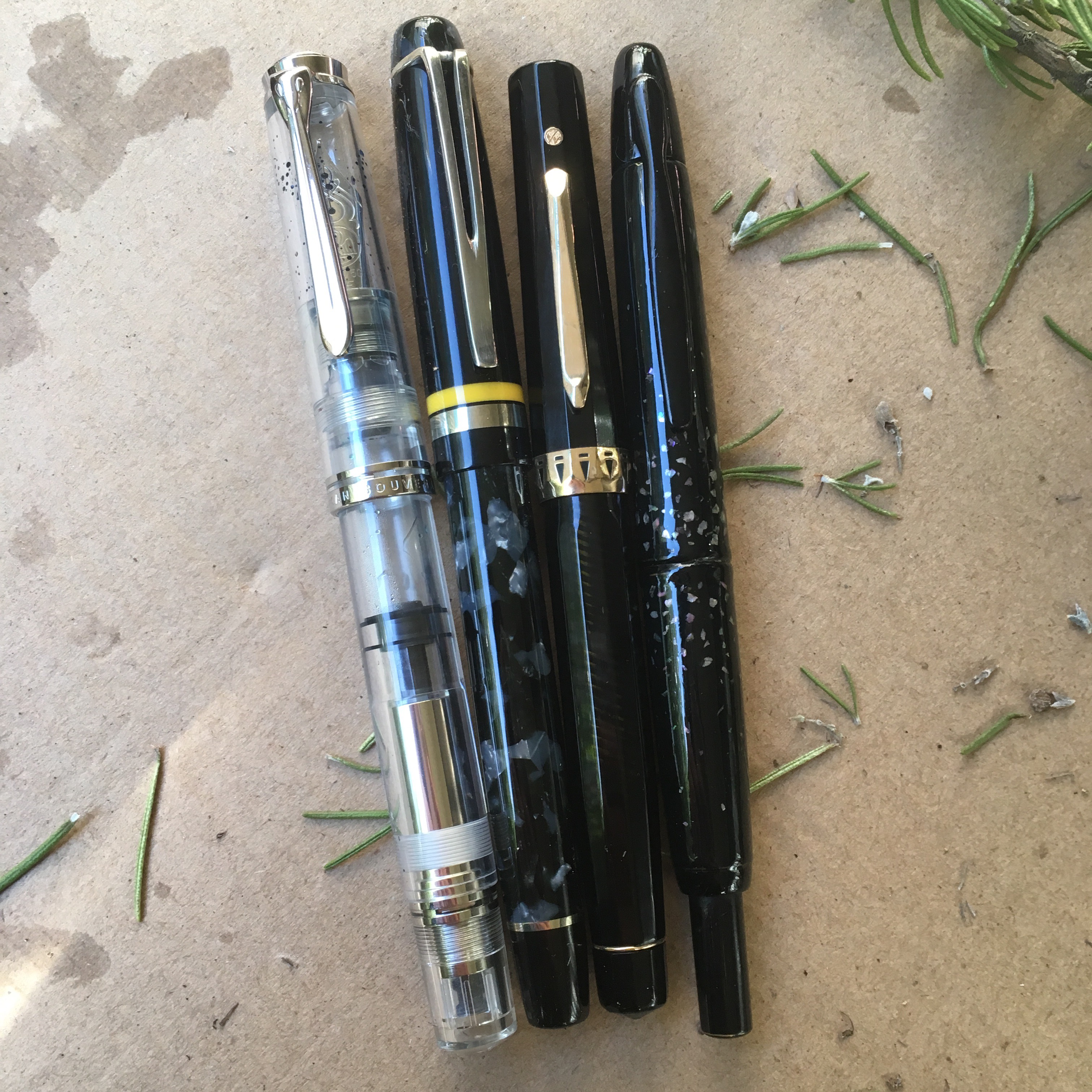
Closed pens from left to right: Parker 75, Montblanc 146, TWSBI Eco, Lamy 2000, *Conid Minimalistica*, Pelikan M805, Lamy Safari, and Classic Pens LB5Posted pens from left to right: Parker 75, Montblanc 146, TWSBI Eco, Lamy 2000, *Conid Minimalistica*, Pelikan M805, Lamy Safari, and Classic Pens LB5Unposted pens from left to right: Parker 75, Montblanc 146, TWSBI Eco, Lamy 2000, *Conid Minimalistica*, Pelikan M805, Lamy Safari, and Classic Pens LB5
2016 was a whirlwind of a year for me with fountain pens. It’s really the first time I’ve expanded beyond just having a pen or two. I started out the year buying quite a few pens in quick succession, then in May, after impulse ordering a Nakaya and buying a Danitrio within the same week, I decided to set a 15 pen limit for myself. (More on that some other day) So, with that in mind — looking back at the last year, here is my top third:
Pelikan M805, EF nib. I had eyed this pen but considered it ridiculously expensive (It’s $700 on nibs.com!) — but Franz, being the fantastic enabler that he is, lent me his to borrow. Over the week that I had it, I discovered that the M800’s size wasn’t too big nor too heavy (worries of the small-handed). Additionally, it’s the only fountain pen my non-hobbyist boyfriend has ever complimented. I picked up one used about a month later and it’s been a love affair ever since. The size is perfect, it’s looks really cool AND it holds a boatload of ink. It also helps that the Pelikan EF is easy for me to use — it’s not too wet, yet still shows sheening and shading with the right inks.
Romulus Pens Custom, M Pelikan M600 nib. This is my first custom pen, and I had a great experience working with John Albert on designing this pen. I got to pick every aspect of the pen — from the yellow accents, to the nib (a delightfully wet, but not firehose-y Pelikan M600 Medium), to the size (a smidge narrower than the M800, but just as long) to the filling capacity (a little larger than an international short, so I can change inks often). The result is a fantastic companion to my M805 — a wider wetter nib for headers and more interesting inks, and a completely different look.
Wahl Doric, #9 Adjustable Broad Stub. Of the four vintage pens I currently own and the dozens that have passed through my hands in the last year, this Doric is the one I have to have. To start with, the nib is amazing and unlike anything else I own, it’s a semi-flex, super smooth broad and wet factory stub. In addition to a very interesting nib, it’s in great shape (no dings, scratches or tarnishing) and is a nifty vac-filler (I’m not a big fan of sacs and levers, so this is a big deal to me!). And, of course, it appeals to me aesthetically — I picked this over an Omas, and haven’t regretted it. I love the faceted design, the subtle striped pattern and the contrast of the gold hardware.
Platinum 3776, Soft Fine. This one is actually a cheat as I no longer own this pen. I owned two 3776s, a Bourgogne and a Sai, and I have since sold both. However, I do love the nibs and am eagerly waiting their more expensive sibling, a Nakaya. The 3776 was the first nib that I tried that really opened my eyes to how different a nib could be without being super flexy or having a crazy grind.
Pilot Vanishing Point. While I’ve found that the VP is a super-solid convenient pen, it hasn’t been a daily carry for me. But, it has been a fantastic base for all sorts of experiments. An easy to remove clip and clearly demarcated barrel makes it an ideal candidate for experimenting with raden and other finishes. And, if things turn out well, it’s not hard to use the pen!
L to R: Pelikan M805, Romulus Pens custom, Eversharp Doric & Pilot Vanishing Point
Pam:
2016 marked the birth of my friendships with Katherine and Franz which led to the creation of this blog which has opened me to the best parts of being part of the pen community. Good people, good ink, good pens and great conversations. Thank you Katherine and Franz for adopting me and being there with great pens and ink through “broad” and “needlepoint” this year.
It also marked the year that I broke any “savings” resolutions I had as I bought pens from my “grail” list, from different eras (modern and vintage), from different brands (Pelikan, Nemosine, Brute Force Designs, Tactile Turn etc.), and had my first custom nib grind completed by Dan Smith!
Sailor Pro Gear Slim, EF nib. The limited edition Galaxy finish from 2015 was a grail pen of mine. The nib is amazingly smooth for an EF and it is a joy to use. It has been inked since I received it. In quick summary, the EF nib on this pen, by Sailor, is a must try. Even for those who don’t enjoy such a fine line, it’s a great nib in how it feels on paper and provides a perfectly saturated line. This nib on Midori or Tomoe River paper is heavenly.
Lamy 2000, EF nib. The Lamy 2000 is my most recommended pen this year. My fellow pen addict physician still raves about this pen. This pen taught me that loving a pen doesn’t mean I need to love it no matter what. When I first received the pen, I didn’t love for work because the line wasn’t what I wanted on the copy paper. However, the more I wrote with it on Midori paper, the more the “mini-architect-like” line variation grew on me. Pairing it with a fantastic ink like Yama-dori doesn’t hurt either. I primarily use it with my B6 sized planner, that has paper similar to Midori paper, on a daily basis. Maybe it’s Franz’s influence on me, but now, the EF nib on copy paper isn’t so bad either.
Pilot Prera, F nib. Of all the “beginner” pens that I have tried, the Prera has been with me the longest. It harkens back to the “good ol’ days” for me. The nib is still wonderful and it still writes well, even on copy paper. I use it regularly for work and in my Hobonichi. For the relatively affordable price and beautiful colors, I am surprised that I don’t have multiples of this pen.
Pelikan M200, B architect grind by Dan Smith. This pen was “adopted” by me from Franz, which provides it with extra sentimental value. The architect grind is probably one of my favorite discoveries this year. Despite seeing multiple writing samples with this nib grind, it wasn’t until I tried it, that I was smitten. Due to how I hold my pen, the architect grind becomes more of a stub or cursive italic. The lines are not as crisp as a cursive italic but the line variation is undeniable. Bonus, no hand cramps and the Pelikan M200 is the perfect size and fit. This pen has it all.
Pilot Myu, F nib. This was the year that I branched out into the vintage realm seeking the Myu. (Thanks Mike Dudek.) Thanks to Katherine, I got my hands on this beauty, that is so unique in design and amazing on paper. Katherine has been introducing me to more vintage pens like Sheaffer and Esterbrook. So we will see what 2017 will bring!
For 2017, I am probably going to be selling some of my pens and refine my collection. It’s a bit hard to sell any pen, but I also enjoy using pens. So pens that don’t “spark joy” when used will (probably) find a happier home (maybe).
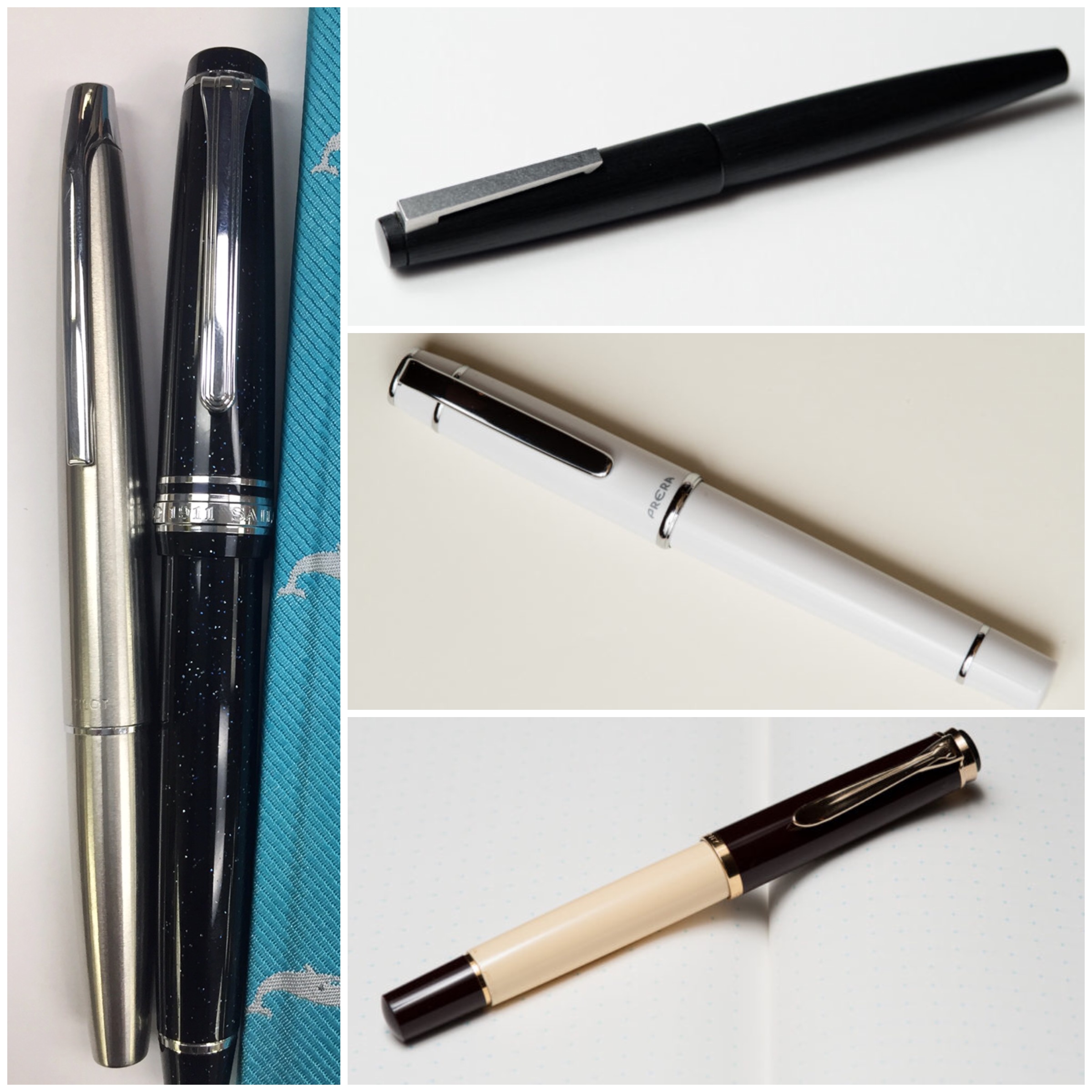
L to R, Top to bottom: Pilot MYU, Sailor Pro Gear Slim, Lamy 2000, Pilot Prera, Pelikan M200
Franz:
Another year has passed and I am still very much into this fountain pen hobby, if not, even deeper. What really makes this hobby more enjoyable are the people I share the fun with. Throughout the year, I’ve been fortunate to spend time and meet with people I’ve only known via the interwebs. And of course, who would’ve thought that I’d be part of a pen blog with Pam and Katherine? This definitely raised it up a notch or two.
Anyway, this post is about our top 5 pens. The way I approached this is I thought of the 5 pens that I’ve always kept inked up and write with for the most of 2016. So, here they are:
Pelikan M805, Blue Striated, M cursive italic. Ah yes, this is the Franz pen. I’ve had this pen since 2013 and it’s what I use at work and for personal writing. At the 2014 SF Pen Show, Mike Masuyama-san (mikeitwork.com) transformed this medium nib into a cursive italic and this has been my nib of all nibs ever since. My signature, and writing looks best with this nib. Aside from the nib, I regard the Pelikan M800/805 model the most perfect pen for my hand. So this nib and the pen body has been a powerhouse of a combo for me. Paired since 2013 with Noodlers Liberty’s Elysium ink.
Classic Pens LB5, Tairiku (continent) in Amethyst Mauve, B nib. I acquired this specific LB5 from Mr. Andy Lambrou (lambroupens.com) at the 2015 LA Pen Show since I fell in love with the material. The broad 21k gold nib is quite springy and gives my writing a little bit of character. The LB5 was made 5mm longer than the Sailor King of Pen and even if the difference is minor in scale, the difference in the hand was quite major. The length and girth of this pen is quite perfect for my hand. Paired with Pelikan Edelstein Amethyst ink. An Amethyst ink for the Amethyst Mauve.
Edison Pen Custom Huron Pump Filler, Flecked Tortoise, B cursive italic. I’ve always had the flecked tortoise material on my mind ever since Goulet Pens offered the limited edition Edison Nouveau Encore in 2012. At the 2016 LA Pen Show, I finally sat down with Mr. Brian Gray of the Edison Pen Co. (edisonpen.com) and discussed my order from his Signature Line and asked him to make the broad nib into a cursive italic. And after 8 long weeks, it arrived! It’s one of my 2016 purchases that I’m very proud of. Paired with Pelikan 4001 Turquoise ink since April 2016.
Parker Vacumatic Maxima, Silver Pearl, M nib. Since I started this hobby, I have always loved Parker Vacumatic pens. The fourth generation Vacumatic in Major size was one of the first vintage pens I acquired but it was a little too small for me. At the 2016 SF Pen Show, I’ve set out and purchased my first Vacumatic Maxima at a reasonable price. It has a medium springy nib and perfect for my hand. I’ve had this pen inked up since August 2016 and I use it at work regularly. Paired with Pilot Blue Black.
TWSBI Eco, Black, M nib. This pen surprisingly became one of my favorite pens within a very short span of time. Ever since I used and reviewed Pam’s TWSBI Eco in August, I’ve had this pen on my mind and just struggled with deciding if I wanted the transparent version, or the black version. I finally decided to get the black version in November and since then, it’s been my daily user pen in tandem with my Pelikan M805 at work. I may, or may not have this nib turned into a cursive italic the next time I see Masuyama-san. Currently paired with Sailor Jentle Yama-Dori ink.
Here’s to more fun with friends and pens in 2017! Happy New Year!!
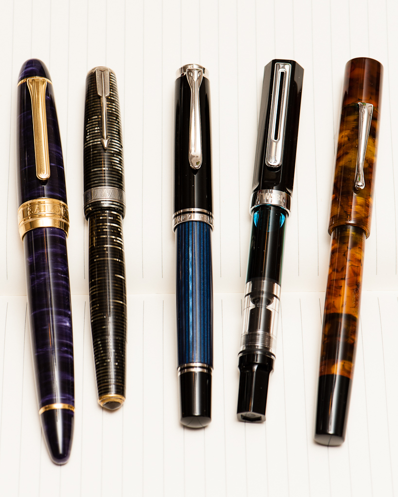
L to R: Classic Pens LB5, Parker Vacumatic, Pelikan M805, TWSBI Eco, Edison Huron
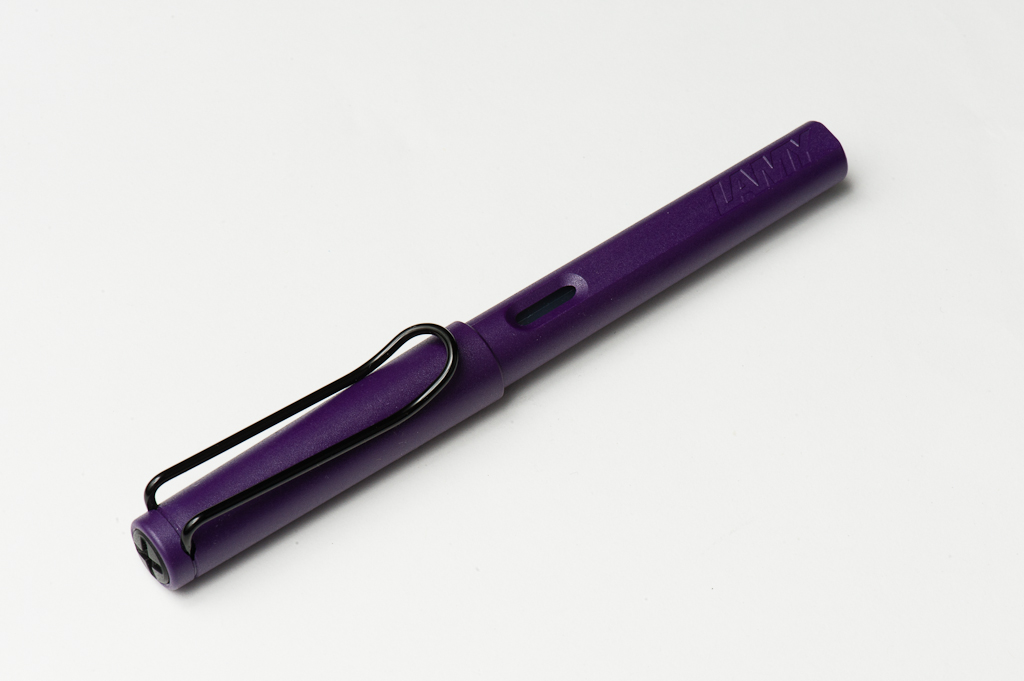
Katherine: The Lamy Safari is a commonly recommended “beginner” pen. I didn’t try one until I had been using fountain pens pretty regularly for over a year — the design was never a “gotta have” for me, and I had always heard the nibs ran broad, which wasn’t what I thought I preferred. When I finally acquired a Safari (won it in a raffle at a local art supply store), I was pleasantly surprised by how well made it seemed, but quickly grew frustrated with the triangular grip. Of the common “beginner” pens, it’s the one I like least — I much prefer the TWSBI Eco and Pilot Metro, but that’s personal preference.
Pam: The Lamy Safari’s unique design makes it a definite standout among all the fountain pens, let alone an introductory pen. I have picked up the Lamy Safari and the Lamy Joy in the past, and they have since found happier homes. However, picking up Katherine’s Lamy Safari brought back some great memories and reasons why I was drawn to that pen in the first place.
The oddly shaped grip didn’t initially bother me, it’s only an issue when I grip too tight and the softer corners of the grip can dig into my fingers and the soft spot between my thumb and pointer finger. The color of the dark lilac with the black trim is quite awesome. In general, I do prefer the shiny chrome trim. The texture of the dark lilac is also quite different given that it has a more matte finish to the “shiny” and slick Safaris. The extra “grippier” texture does add to a good hand feel. I haven’t had the chance to try the AL (aluminum) version of the Safari and I would be curious to see if the feel in hand would be different.
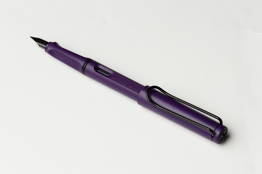
Franz: When I started using fountain pens, I noticed that there is a disparity between pen people about the Lamy Safari through my online research. This was mainly due to the triangular grip that kind of forces one how to grip the pen. But because I liked how the charcoal version of the Safari looks, (and it was on sale on Amazon) I eventually got one when I was six months into the hobby. The grip actually did not bother me and I found that my fingers just rested almost parallel to the pen. This can be seen below in the unposted In the Hand photo.
I’m loving the Dark Lilac color with the black trim and the matte finish lets me hold the pen without my fingers slipping off.
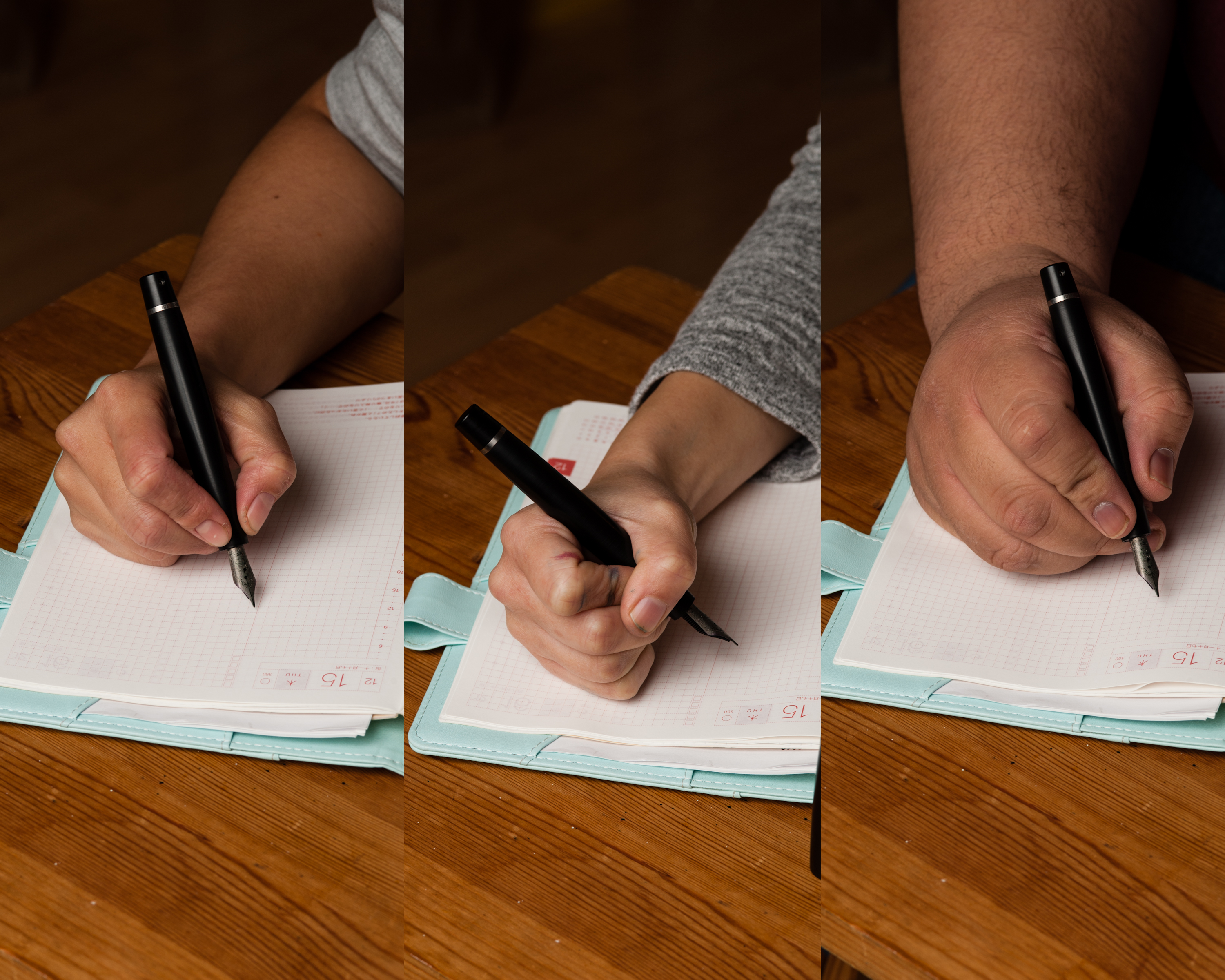
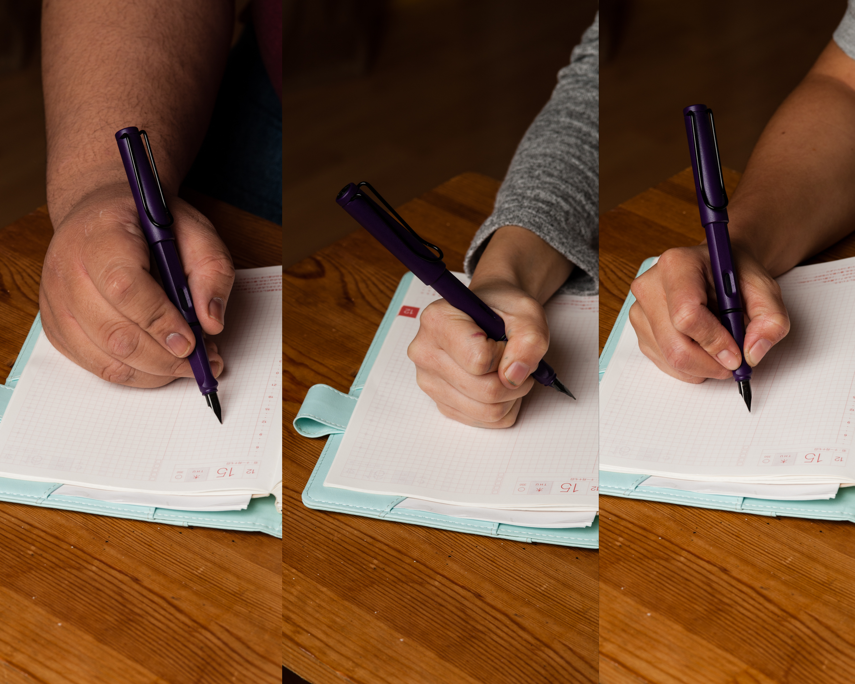
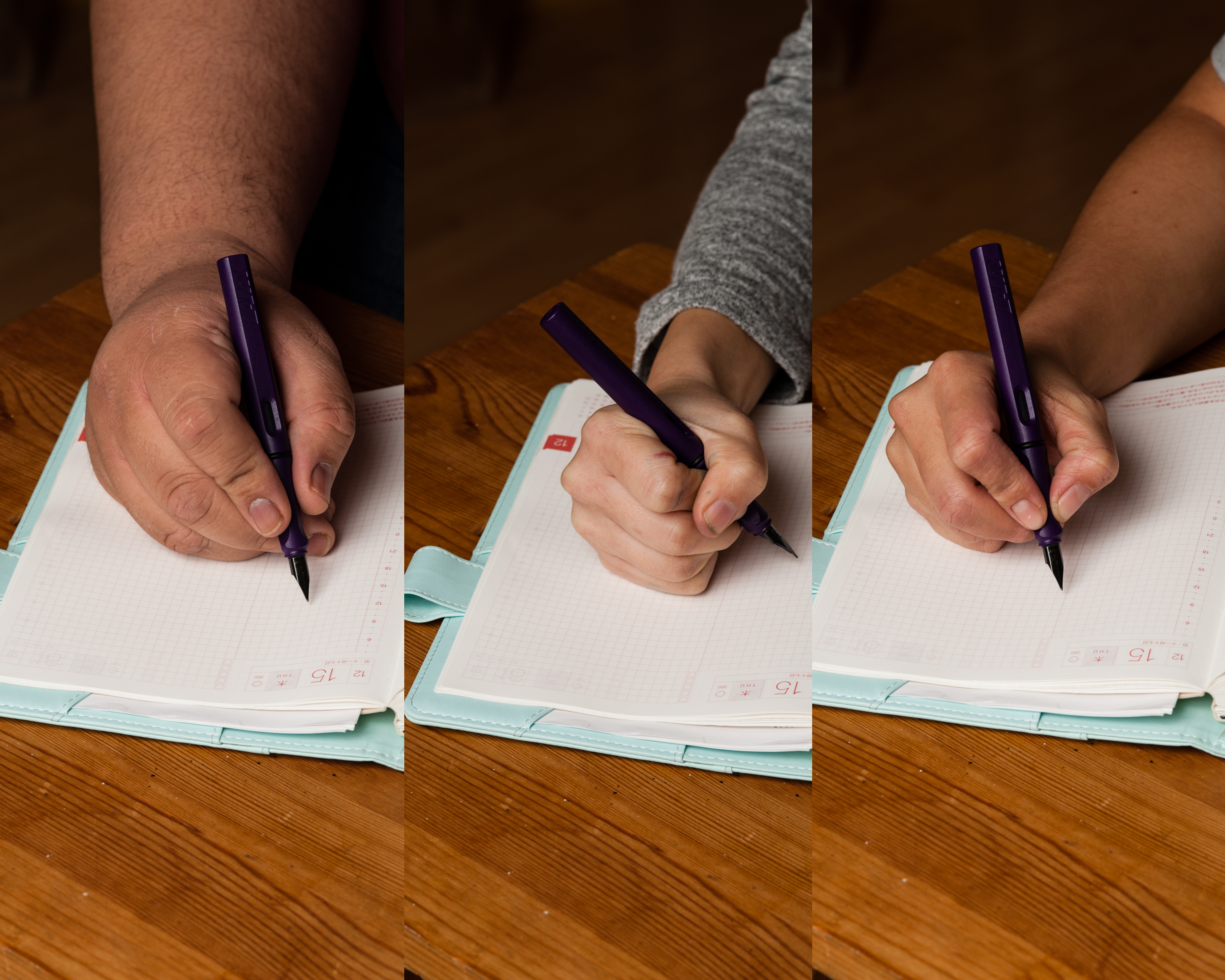
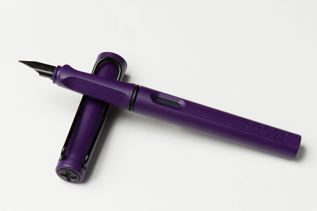
In the Hand: Lamy Safari (posted) — from left to right: Franz, Pam, and KatherineIn the Hand: Lamy Safari (unposted) — from left to right: Franz, Pam, and Katherine
The Business End
Katherine: The Safari nib is smooth and pretty straightforward. I’ve tried a couple now and found that they have been pretty consistent. However, in general, I don’t prefer super-smooth nibs, so I find the Lamy Safari nib a little “too smooth” and would prefer something with a touch more feedback.
Pam: I am reminded and also surprised how much I enjoyed the medium nib on Tomoe River paper/Hobonichi and Midori paper. Maybe it’s Franz’s influence, but the broader line didn’t bother me as much as I thought it would. Instead, I found the nib to be smooth and really easy to use. I enjoy stiffer nibs and I do feel that the Safari’s nibs are quite stiff. The line is always consistent and clean. I have had some experience that the nib can be on the drier side.
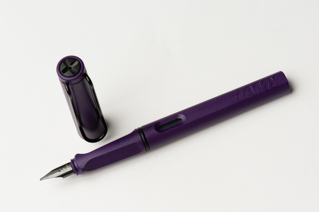
Franz: I love the black nib on this Safari however, it may develop scratches and eventually the coating will peel from use as you can already see some in the photo below.
This was my first medium Safari nib and it was quite smooth with a good flow. My first Safari had a fine nib and the ink flow was a bit dry. For those who don’t know, you can actually buy separate nibs in different sizes for cheap and switch it out ofthe feed. So you can have multiple nib widths with just one pen.
Please note that the Safari is cartridge/converter filled and they include one cartridge when you buy the pen, but they do not include the Z24 converter so that would be an added expense.
Write It Up
Katherine: The Safari is, overall, a comfortable size. The triangle grip was initially a huge turn-off for me, but after forcing myself to use it for a longer writing session I found that it wasn’t nearly as annoying as I thought. I still wouldn’t actively seek out a pen with a grip like this, but it isn’t as unusable as I thought it would be. Instead I found that I wrote very consistently since my angle never changed. Overall I found it usable and comfortable — but, like Franz, I wish it was a little bit heavier.
Pam: I found the Safari to be slightly top heavy when posted, but too light when unposted. Like the Eco, the length was just a tad too long, especially when posted. If the Safari was closer to the size of the Prera, or even the Pelikan M200s/M400s, it probably would have stayed in my collection. The plastic does make the pen really light, which can lead to comfort when writing for an extended period of time. It can also lend to feeling too insubstantial, like the Kaweco Sport. I very much enjoyed my time with the Safari and being reacquainted with the nib on paper. I was also reminded that I didn’t enjoy the body of the pen as much as I do the nib.
Franz: The length of the Safari is adequate for my hand in either posted, or unposted modes. The width of the grip section felt nice especially since I hold it higher. I really just wish the pen was a little heavier though. For 20 minutes, I wrote with the cap posted to give a little bit more weight. It was an enjoyable journaling moment.
EDC-ness
Katherine: The Lamy shines on this front — the snap cap makes it easy to grab and go, and the triangular grip helps you get yourself into the right position for writing quickly. If I needed to keep a fountain pen at my desk for quick notes or for people to borrow, the Lamy Safari would be a strong contender.
Pam: Snap cap and durability of the plastic makes the Safari a great work pen. The design is also really interesting and sure to spark a few conversations among your pen-curious co-workers. The medium nib is dry enough to work relatively well on copy paper with minimal bleeding or feathering.
Franz: The Lamy Safari is actually a great pen to use on a daily basis for its plastic ruggedness makes it easy to just bring along even without a case. The slip cap definitely made it a quick deploy pen and the medium nib was good for the copy paper at work as well. The Dark Lilac color also was admired by a customer of mine and had me talk a little about fountain pens. Yeah!
Final Grip-ping Impressions
Katherine: The Lamy Safari just isn’t my cup of tea. The triangular grip and lightness add up to a pen that I don’t actively dislike, but am not excited to use. Overall, I think of it as a very bland pen — it works, but doesn’t bring me joy.
Pam: I would recommend the Lamy Safari to those who enjoy the TWSBI Eco for the size and want to enjoy the versatility of swapping out nibs. The design is unique, the pen is relatively affordable, and a great introduction to Lamy as a brand and to fountain pens as a whole. My only quibble, which is a personal preference was in the size and weight. Those nibs though… definitely worth a try in any Lamy pen that will accommodate them.
Franz: Pam has listed some great reasons as to why the Lamy Safari has been recommended to fountain pen beginners, and doing these pen reviews made me appreciate this pen for what it is. The Safari is a pen that is a gateway for new users and is also great for experienced pen folk.
I like this pen a lot but it just seems a little light for me. It’s really the only negative thing for me. Granted, since I own three Safari versions at the present time, it’s not a very big negative for me. Haha!
Thank you for reading and your time.
Pen Comparisons
Closed pens from left to right: Parker 75, Pilot Vanishing Point, Pelikan M205, Lamy 2000, *Lamy Safari*, TWSBI Eco, Conklin Duragraph, and Pelikan M805Posted pens from left to right: Parker 75, Pilot Vanishing Point, Pelikan M205, Lamy 2000, *Lamy Safari*, TWSBI Eco, Conklin Duragraph, and Pelikan M805Unposted pens from left to right: Parker 75, Pilot Vanishing Point, Pelikan M205, Lamy 2000, *Lamy Safari*, TWSBI Eco, Conklin Duragraph, and Pelikan M805
If you had $500 and you can buy three pens, what pens would those be?
And, to clarify, this should be MSRP/fair prices for the pens — not 50-cent flea market Montblanc finds. (Katherine has only managed to do this twice…)
Katherine:
I’ll be honest — I didn’t listen to the podcast, but when Pam first asked me, my immediate question was “MSRP, or how much I paid for the pen used?” But, I guess to be fair, we’re going with fair prices, not crazy deals. 🙂 My three would be my Doric (I paid $275 for it at a pen show, so I assume that’s fair? :P), a Pilot Vanishing Point with a fine nib ($90ish off eBay) and a vintage Pelikan 400 with a fine nib, ideally a soft one (~$120 in green most likely, since I’ve never seen a Tortie one below $140 ish, but I have purchased two greens and a black for $120 or under).
If I was only allowed modern pens… A Pelikan M805 in extra fine (EF) nib (~$350 from the UK), a Pilot Vanishing Point also with an EF nib (~$90ish), a Kaweco Sport with a broad nib ($25), and, if it’s allowed, a 1.1 calligraphy nib for the Kaweco ($12).
Pam:
I loved the idea of the $500 game because it really highlighted to me what pens I would recommend to a budding pen lover who is on a relatively limited budget. Or the better question for me was what would be the three pens I would want to buy and use regularly if I only had $500 to spend on pens for the foreseeable future. (This is a possible future since my “new year’s resolution” for 2017 is to “Save more and eff up less.”) I don’t see the “savings” part standing for very long when I am surrounded by such amazing pen friends, writing instruments, ink and stationery.
My choices are the Lamy 2000 in an EF nib (~$160 via Goulet Pens), a Sailor Pro Gear Slim, transparent model with rhodium trim, in EF nib (~$160 via Anderson’s Pens) and Brute Force Design’s Pequeño in Amber Tortoise acrylic with a fine or medium nib so that Katherine can experiment grinding the nib (~$145 from Brute Force Designs aka Troy Clark).
Leftover money would be for ink from Vanness. My choices for ink would be: Bungbox Omaezaki Sea, Sailor Yama-dori, Pilot Tsuki-yo.
Franz:
This is sooo easy! Pelikan M805 Blue-Black with a medium cursive italic by Mr. Mike Masuyama… BOOM!! hahaha… I know, I know, that’s against the rule of the game. ;-P
Okay, it definitely was a difficult task but I think it became a learning experience and taught me what I would want other than Pelikan pens. So the first pen would be an Edison Huron from the Signature Line of the Edison Pen Co. ($250), and I will ask him to do a cursive italic grind on a broad nib ($40). Next would be the Franklin-Christoph Model 03 Anderson Pens Special Edition with a medium nib ($165). That blue marble acrylic is just something else! And the last pen would be a black TWSBI Eco with a fine nib (~$30 from Goulet Pens). And I still have $15 for a nice bottle of Noodler’s Liberty’s Elysium, or Sailor Yama-Dori.
What would you choose for the $500 game? Better yet, what are you getting for the pen lover in your life?