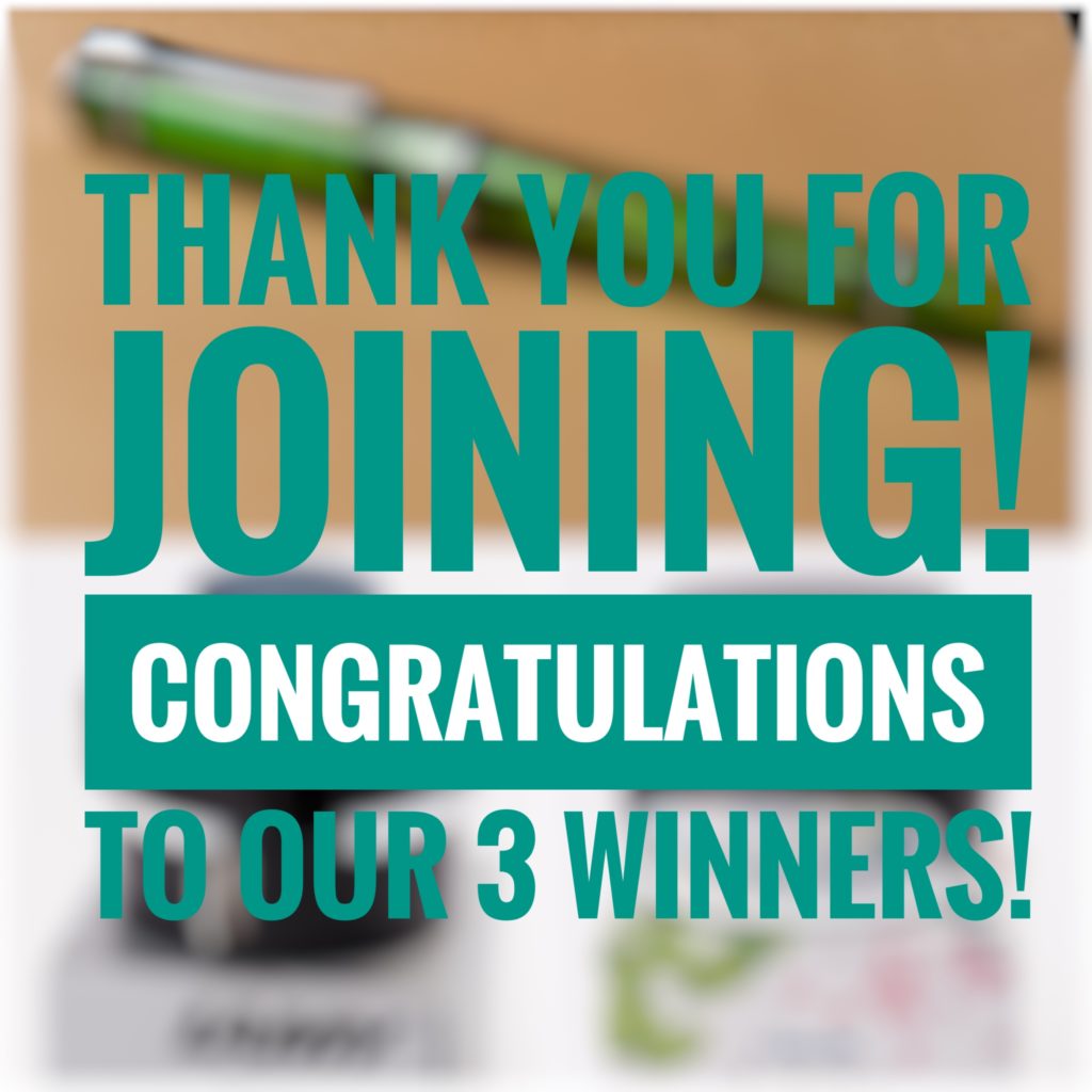
Woohoo! Congratulations to our 3 winners of the FPD Giveaway we held on November 3, 2017. The giveaway was open for anyone to join either via commenting on the blog post, or via Instagram.
We had 184 entries and 3 were randomly chosen between the three of us. Thank you all very much for joining in and being a part of the awesome community!
And the winners are:
Oeste Prera in Green Demonstrator – @theclarkm via Instagram
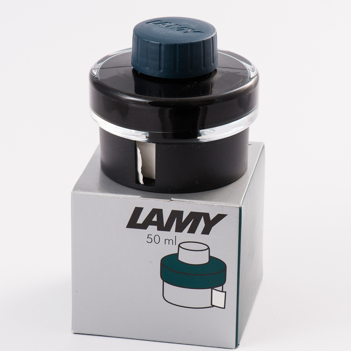
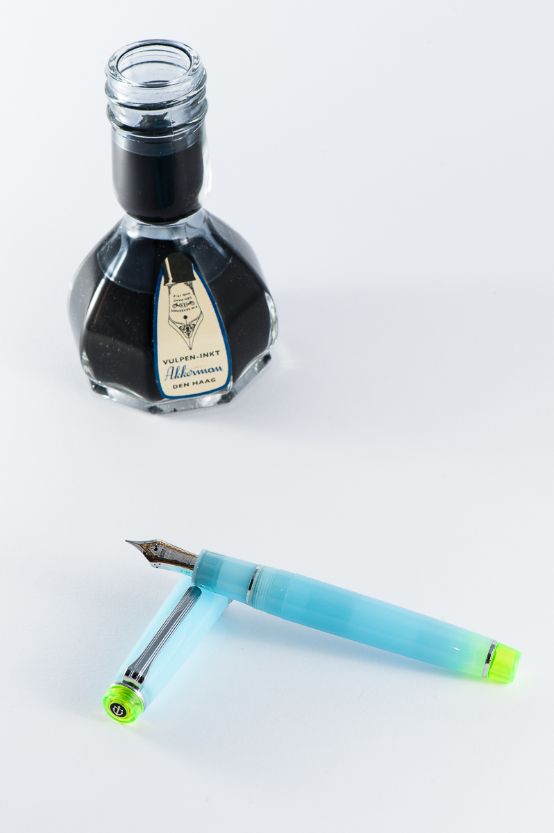
Lamy Petrol ink bottle – @inkydipper via Instagram
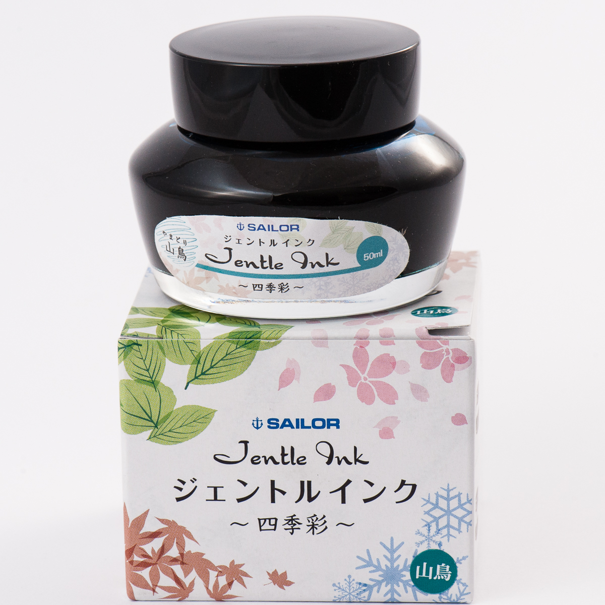
Sailor Yama-dori ink bottle – @inkdabbler via Instagram
Congratulations again! Always have fun with your pens and inks! Until the next giveaway.
While we absolutely believe that every day is fountain pen day, the first Friday of November is quite special because we get to celebrate our favorite writing instrument throughout the world in unison. This is also a day or a weekend wherein different deals and discounts are offered by our favorite retailers. Check out the Sponsors tab of the FPD website for more info on these deals.
More importantly, Fountain Pen Day is also a great time to share the joys of writing with a fountain pen to family, and friends!
To celebrate, we the trio, are running a giveaway with three prizes for three lucky winners:
A limited edition green demonstrator Oeste Prera fountain pen
A bottle of the 2017 limited edition Lamy Petrol ink
A bottle of one of our favorite inks — Sailor Jentle Yama-dori
To Enter:
Follow us on instagram, @handoverthatpen & regram our giveaway image or post a picture of your favorite fountain pen and ink with the hashtag #hotp2017FPDGAW (Please make sure your account is public so we can find it! And no giveaway accounts.) or —
Comment on this blog entry with your favorite fountain pen and ink (not necessarily a pairing)
The giveaway is open from now, 11/03/2017 until 11/10/2017 11:59pm Pacific time. One entry per person please.
The giveaway is open internationally, but we aren’t responsible for any taxes, customs fees or duties that may be applied, and will be shipping without tracking due to cost.
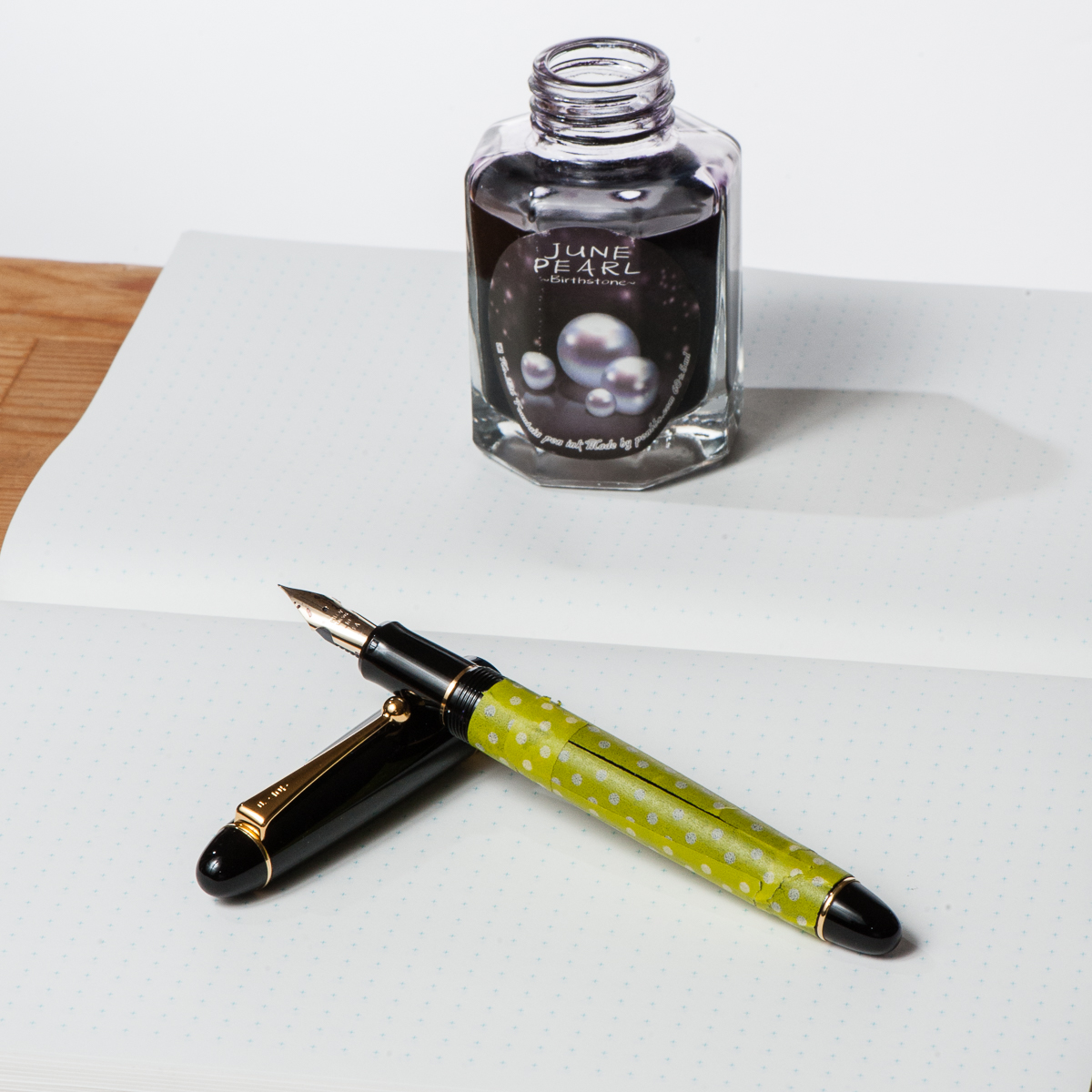
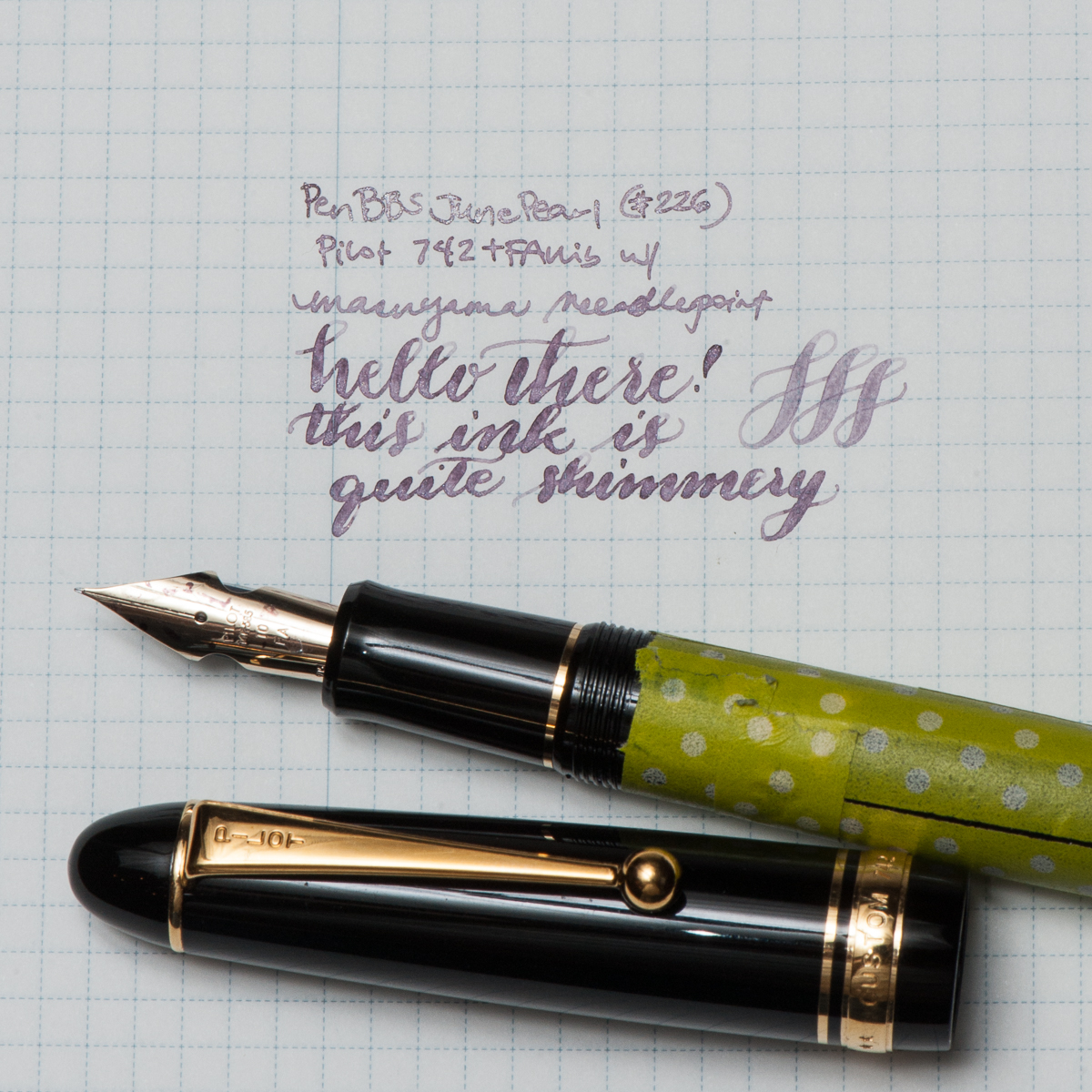
Katherine: My pairing for the month isn’t thematic in any way, just a pen and ink combo I was (and am) excited to use — Pen BBS June Pearl (picked up from Straits Pens at the SF Show a few months ago) paired with a Pilot 742 FA sporting a Masuyama Needlepoint grind. Ignore the washi, I was trying to decide how something looked… and now it’s just there.
I love the pairing of the pale shimmer ink with the soft flexy nib of the 742. Written in a fine line, June Pearl is pretty light, but in the FA I get swirls of shimmer and more readable text. All in all, I really enjoy writing with the 742 and the FA nib, I’m just (unfortunately) not a big fan of the body.
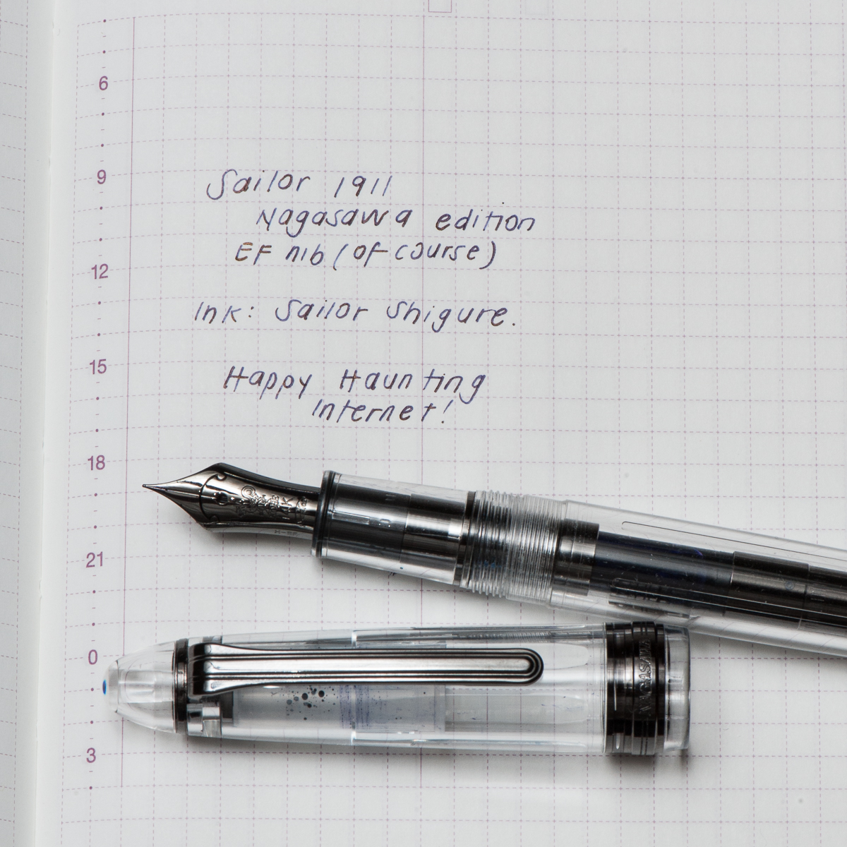
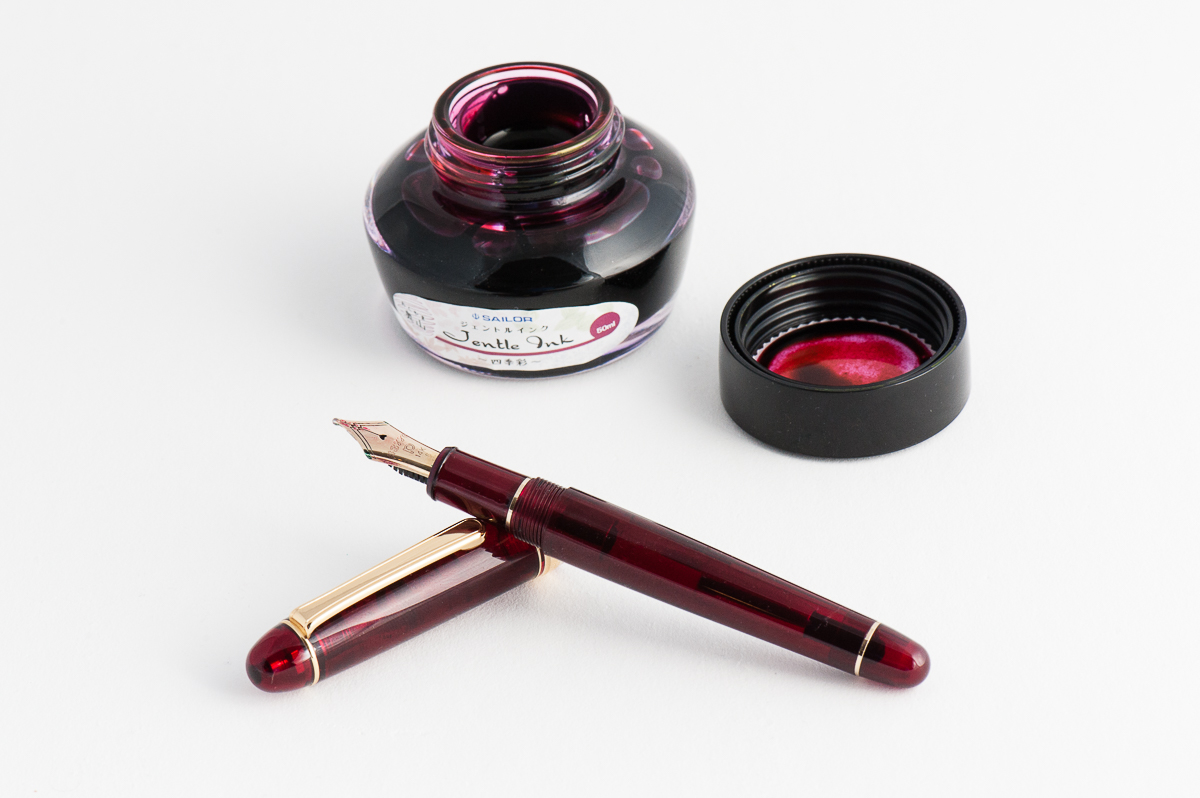
Pam: For October, the month of Halloween, it would seem most appropriate to bring out the Sailor 1911, Nagasawa edition; a demonstrator with the ruthenium trim. Even the converter has the ruthenium trim! It is one my favorite colorways: monochromatic. Honestly, I was not a fan of the 1911, but this particular finish was so unique (at the time) that acquiring it from Claire was instantaneous. (Thank you Claire!!)
I wanted a dark ink to complement the “darkness” of the 1911, but not a black ink. The only ink that came to mind for me was Sailor Shigure. The dark and deep purple is a wonderful complement to the rhuthenium trim. It’s also one of the few inks that I adore that doesn’t have an obvious sheen to it. That only adds to the mysterious and haunting vibe of the ink when paired with this pen during the Halloween season.
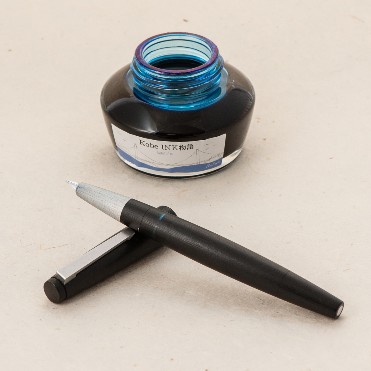
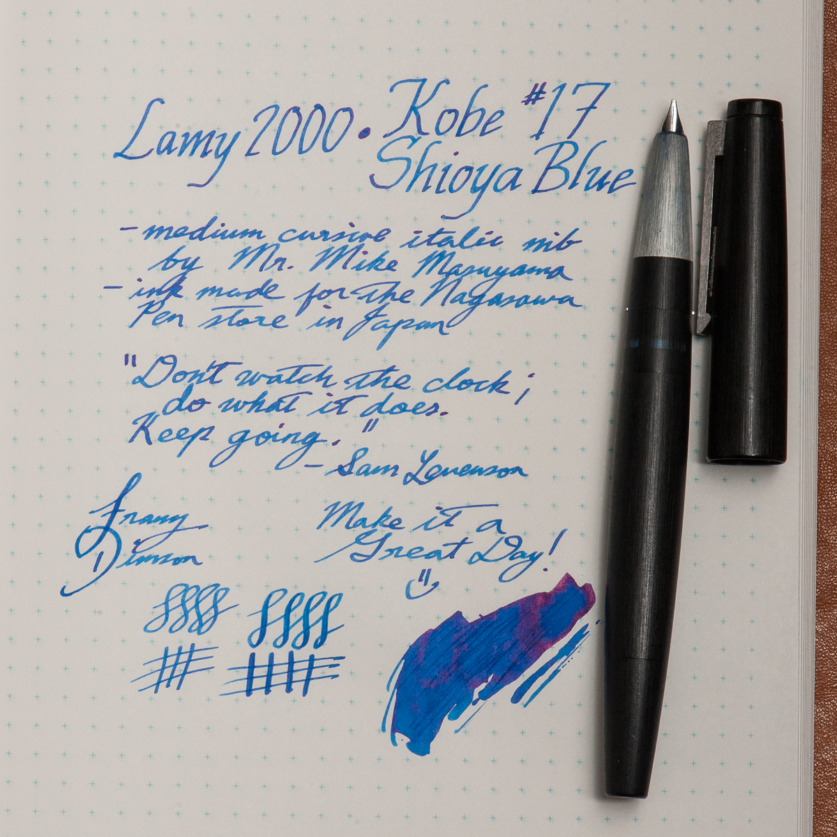
Franz: This month, my pairing is more of a discovery and rediscovery of sorts. First, the pen. I haven’t written with my Lamy 2000 for almost a year and I’ve definitely missed it. The 2000 is easily one of my favorite black pens of all time. And now for the ink, I recently bought a bottle of Kobe’s #17 Shioya Blue without trying a sample but I figured it could be a suitable ink for work.
So a pen and nib I know very well, and a new ink. As expected, the Kobe ink flowed very well with the cursive italic nib. Actually, the italic nib showed the shading properties of this ink very nicely. I’m so glad I did this pairing and since I wrote with the 2000 a lot, the ink level is now below 50% . I’ll most likely top off the ink in a week or so. Thank you for reading our inky thoughts here.
Wishing you a Happy Halloween! And please comment what pen and ink combo are you are currently using.
Writing Samples (click to enlarge)
Katherine’s Pilot Custom 742 and Pen BBS June Pearl on Nanami Seven Seas Crossfield Tomoe River paperPams Sailor 1911S with Sailor Shigure ink on Hobonichi paperFranz’s Lamy 2000 and Kobe #17 Shioya Blue on Nanami Seven Seas Crossfield Tomoe River paper
Our apologies dear friends. We skipped our August pen and ink pairing post for we all have been swamped for the past couple of months. We did not want to skip September as well no matter how late it may be. Thank you for reading and your kind words!
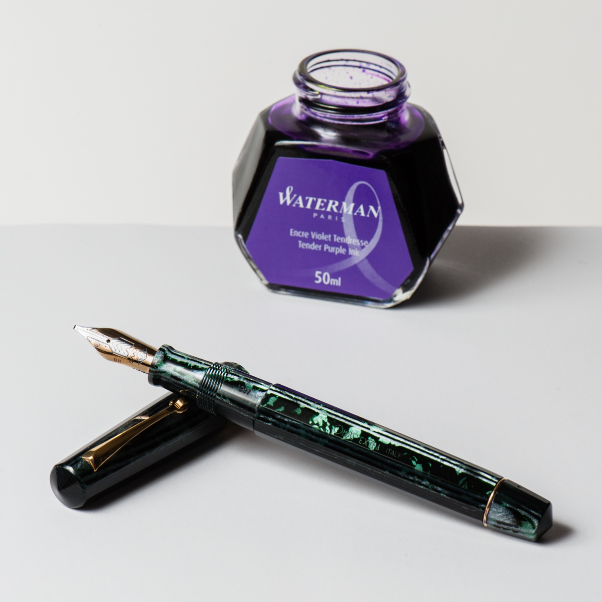
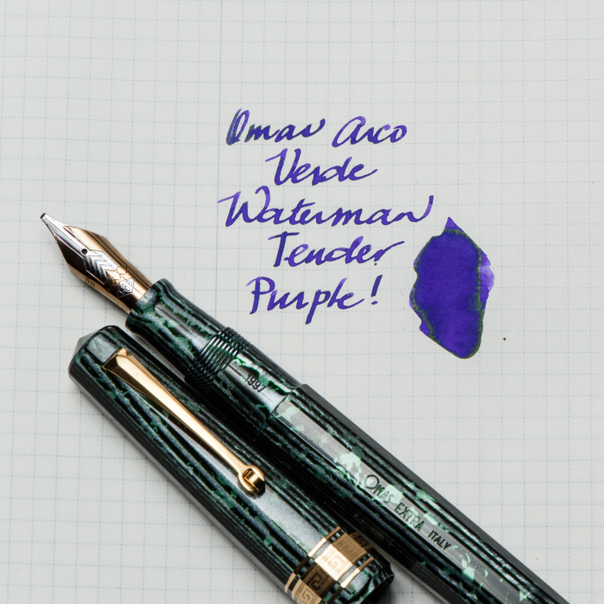
Katherine: This pen was the star of my SF Pen Show 2017 Haul — an “old size” Omas Paragon in Arco Verde. It has a smooth, relatively wet (but not puddle-y!) B CI. The nib is marked BB, but I think it was narrowed a little bit, but is realistically somewhere between a B and a BB, it’s wider than my other Omas B by a hair. I paired it with Waterman Tender Purple for both contrast and how easy to clean it is. The pairing has been very fun for me — a smooth broad CI putting down vivid stokes of purple, with a hint of sheen in the wetter spots. This might end up as a “one true pairing” for me, since I suspect this will be an annoying to clean pen. 🙂
Pam: As a great fan of alliteration, it would only seem appropriate that September would herald in the Sailor Sky with Sapphire ink. The Sailor Sky was my second Sailor Pro Gear Slim. The rest is how we should say, his-ssstory. This pairing is also one my first first “ink will match the pen” type of pairings. (I am working on being more adventurous!) It’s one of my most sustaining pairings!
Sailor Sky is a special edition color, although I don’t think it’s limited. It’s a special edition like the 4 Seasons. (I think.) The barrel color reminds me of a summer sky. I originally paired this pen with Bungbox Omaezaki Sea. However, what really stuck was Bungbox First Love Sapphire, an ink that Franz has introduced me to. To say the least, it was love at first write. I absolutely love the sheen on this ink! It’s a very distinct blue ink with a red sheen that comes through beautifully with the F nib of the Sailor Sky. Some people have compared it to Akkerman’s Shocking Blue. More than anything, I highly recommend trying First Love Sapphire, you might fall for it too.
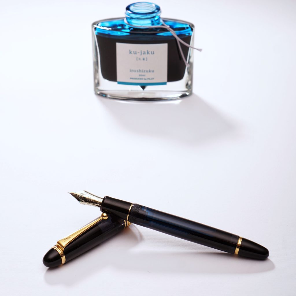
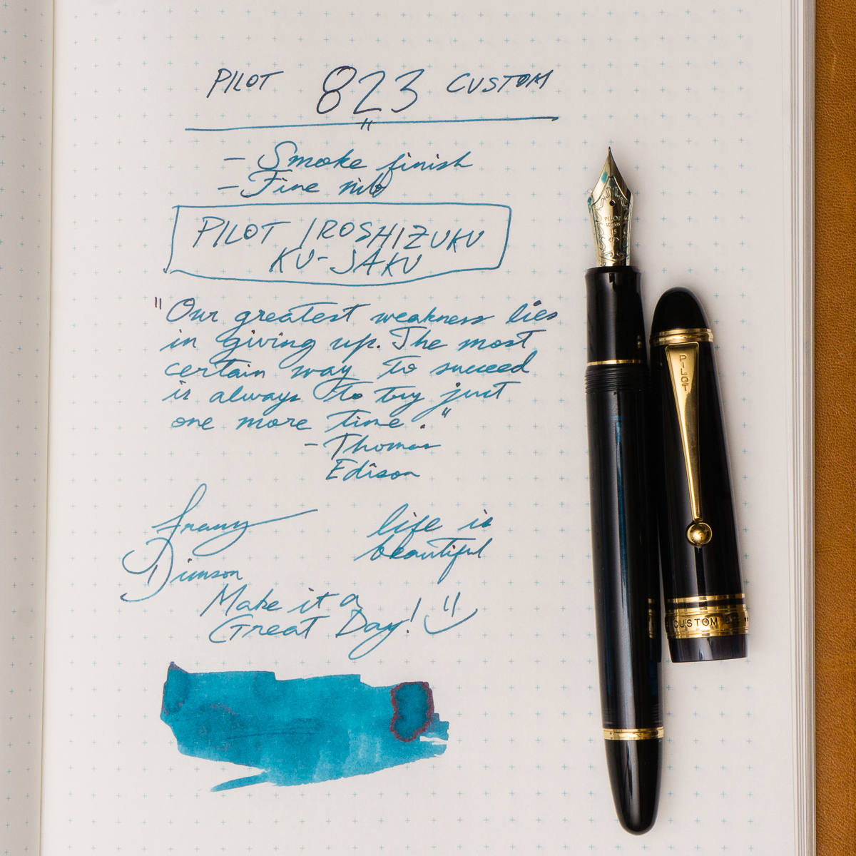
Franz: So for the month of September, my pairing is the Pilot Custom 823 in Smoke or Black Transparent finish and Pilot Iroshizuku Ku-Jaku ink. Ku-Jaku/Peacock is a deep turquoise blue and is such a nice ink color for both work and personal use. The 823 is the first pen I’ve ever inked up with Ku-Jaku. Even though the nib on the 823 is a stock fine, I still appreciate the color it lays down on paper especially on Tomoe River paper in my Nanami Cross Field journal.
The Smoke finish definitely conceals the ink color inside the barrel but you can definitely see the ink level as you write. During meetings in a professional setting, this pen doesn’t call attention to itself but I still enjoy the subtlety of its transparency and places a smile on my face. Now on to trying to remember what that meeting was about.
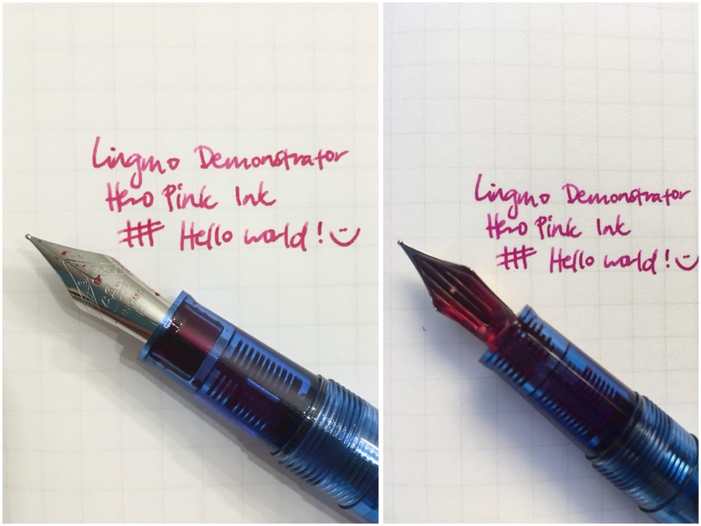
Katherine: As many of you know, I’ve been “upgrading” my collection at a pretty rapid clip over the last year. The SF Show quickly approaches and about a year ago, my most expensive pen was a Danitrio… but other than that, I’d never spent more than $120 on a pen. That’s changed quite a bit, so this month I thought I’d revisit the cheaper side of the hobby — I inked up a Lingmo blue demonstrator with some Hero Pink ink (the entire set of ten colors was $30!). It’s a slim pen, but I love the pairing of a bright ink on the clear feed of the Lingmo! A bright and sunny combo for the summer!
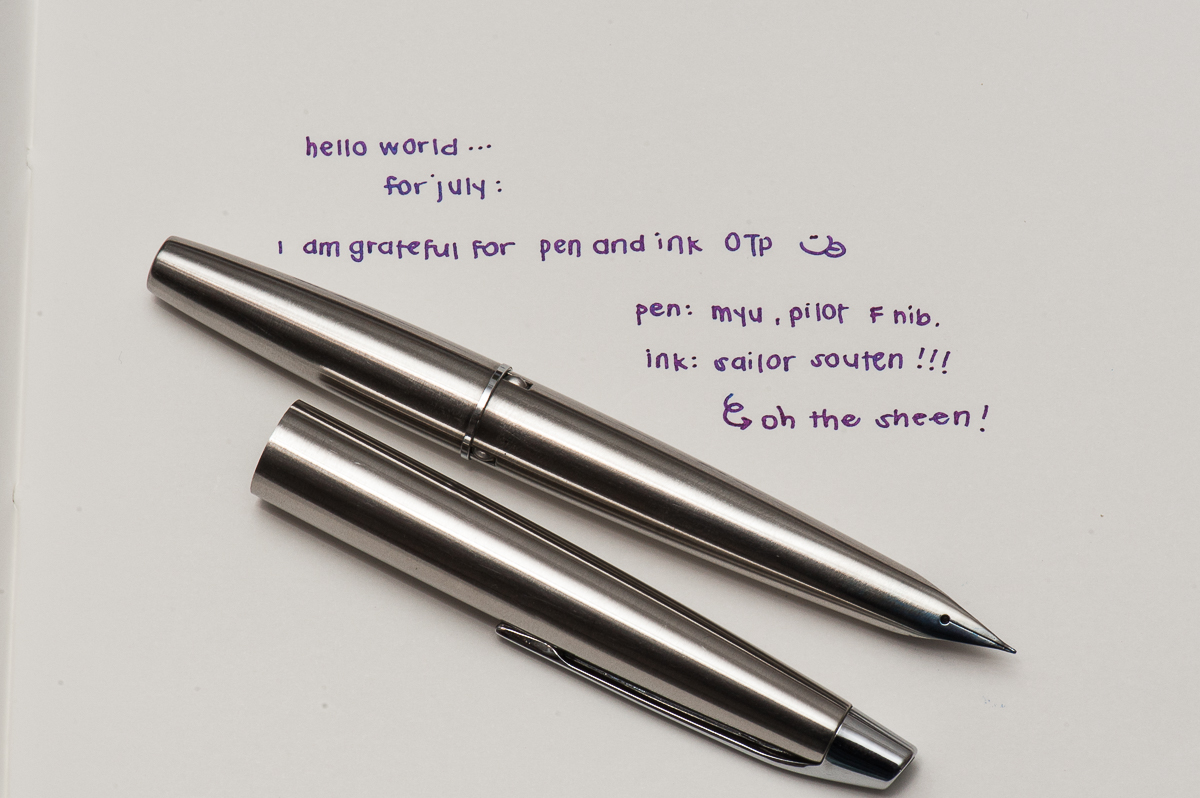
Pam: July is the peak of the summer months here in California. My inky homage to the cloudless (and hot) days and swimming pools during this time of year is Sailor Souten! I was lucky enough to get my hands on a Pilot MYU with a Fine nib. (Thank you Andrew!) The feed has a chip on it that creates a wetter ink flow. (It writes more of a Medium Fine to me.) With the extra flow of the pen, and the unique design, I had a hard time finding an ink and pen combination that I loved…until I tried Sailor Souten. Sailor Souten is reminiscent (if not identical) to Sailor Sky High. The bright color and sheen really comes through with the extra wetness with this Pilot MYU. The bright color of the ink is a great compliment to the minimalistic design and color of the MYU. It’s like the unexpected bright pocket square to a gray suit. Or maybe this is a pen-ink version of the mullet: The pen looks like it means business, but the ink is a party.
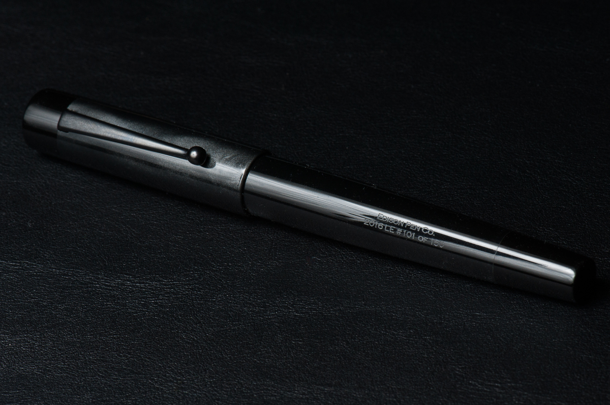
Franz: Aww man! July has been a busy month for me and I’m “grateful” that I have my pen friends and my pens to keep me going. #hotpGratefulInJuly! It took me a while to decide which pen and ink pairing I’d be highlighting for July for I have a “few” pens inked up. I’ve decided to feature my 2016 Limited Edition Stealth Glenmont from the Edison Pen Co. I acquired number 101 of 150 last October of 2016 and I was lucky because this pen was sold out less than 12 hours when it was announced by Brian Gray. Being that this is a black pen, the ink options are unlimited and I initially inked it up last year with a blue-black ink.
This month, I was reminded of what my friend Gerald (@mycoffeepot) once said. “Stealth pens crave pink ink”, April 2013. (And by the way, he does pen reviews on YouTube) So, I got myself a bottle of Pilot Iroshizuku Tsutsuji and satisfied my stealth pen’s craving. With the broad cursive italic nib customized by Dan “The Nibsmith” Smith, the juicy ink flow brings out Tsutsuji’s gorgeous color. And that sheen! =) I’ve been happily journaling with this pen and it’s almost time to refill the converter.
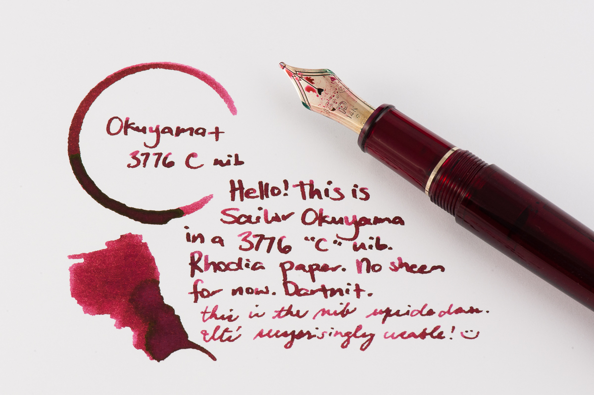
Katherine: This month my pairing is a Platinum 3776 in the red “Bourgogne” color, with Sailor Okuyama. I picked up the 3776 (I previously rated it one of my top pens) because of the C nib. C stands for “coarse” and is Platinum’s BB nib. It’s quite broad, but, out of the box, not a gusher — which I like. Additionally it writes smoothly when upside down, so I can use it at work too! Overall I’m really enjoying the sheen of Okuyama, laid down by a nib that gets the sheen going, but isn’t gratuitous.
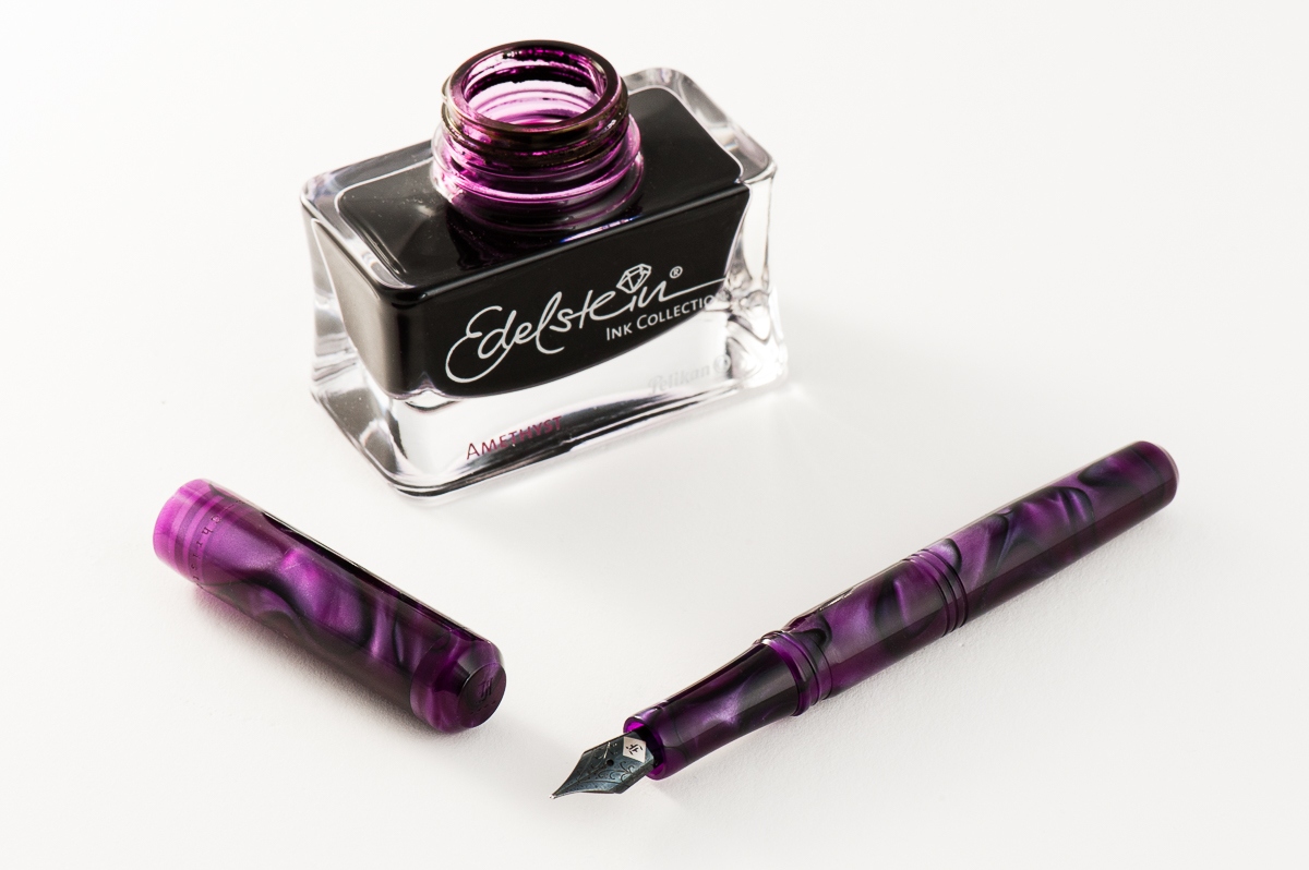
Franz: A co-worker of mine once said that Purple is the color of royalty, and madness. I totally agree! So for the month of June, my royal pen and ink pairing is the Franklin-Christoph Model 31 Omnis in Purpurae finish, and the Pelikan Edelstein Amethyst special edition ink. The deep purple and black swirls of the “Purpurae” madly matches the dark purple of the Amethyst ink. The acrylic has chatoyance that just can’t be captured on camera that well especially on the lighter swirls of the pen.
A quick aside, I got the Model 31 at the 2017 LA Pen Show and it was (at that time) the initial color prototype. Scott Franklin of Franklin-Christoph commented that this was the first purple 31 out there. I initially called the color “Purple Soul” but Franklin-Christoph recently introduced it as a regular part of their Model 31 line up as “Purpurae”. The Amethyst ink was Pelikan’s 2015 special edition Ink of the Year and has become my top favorite purple ink due to it being a darker color, and its sheen when ink pools in the writing.
Will this pen and ink pairing become an OTP (One True Pairing) for me? We shall see!
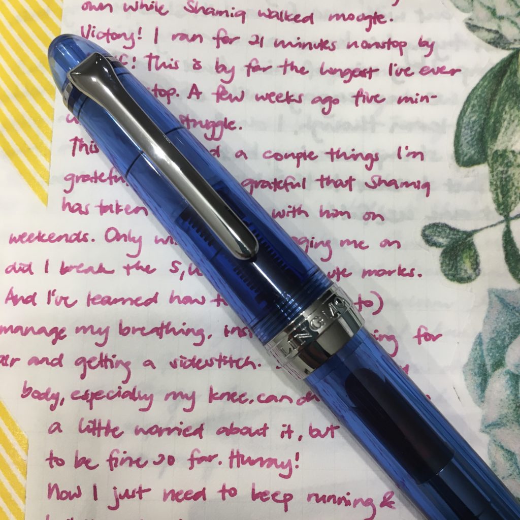
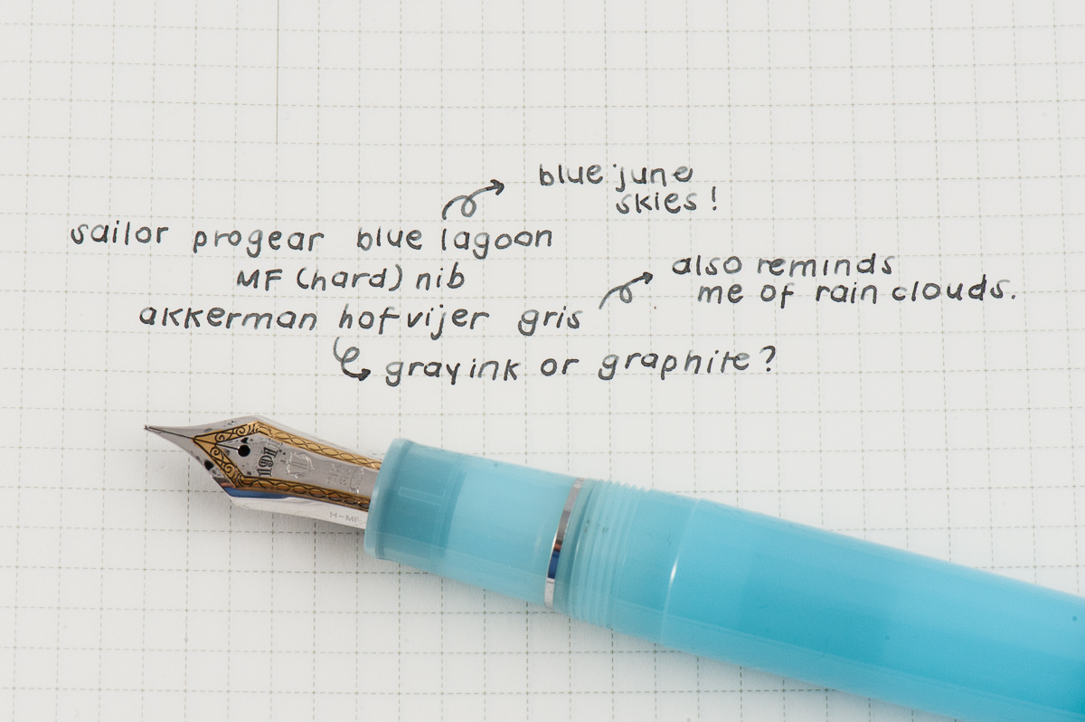
Pam: Summer is in full swing but I still miss the rainy season so this pen is a reflection of having the best of both worlds. My choice for the June pairing is Sailor Pro Gear Blue Lagoon with Akkerman Hofvijver Gris (#29) ink. This is probably one of my favorite OTP/pen and ink pairings since I started collecting pen.
The Sailor progear has a really unique and whimsical color pairing with the neon green and soft blue. The gentle blue with such a vibrant hue reminds me of the “Unicorn Barf” colorway with the blue and bright pink. I have been trying to get the term “Unicorn Snot” for this blue and green combination to stick…but alas. The Sailor nib is perfectly wet enough to show off the wonderful gray ink, as usual.
Akkerman #29 is my first ink from Akkerman and I couldn’t be happier with this ink. It’s practically my “gateway” gray, getting me more interested and more inclined to try out more gray inks. I had thought that gray inks would be only dilute and dull blacks. I am so glad to be have been mistaken! Originally obtained via ink sample from Vanness Pens, I quickly tried to obtain a full bottle of this wonderful gray. The gray reminds me alot of pencil graphite and I really enjoy the shading available in this ink. Not to mention, the bottle of Akkerman ink is always a treat in itself!
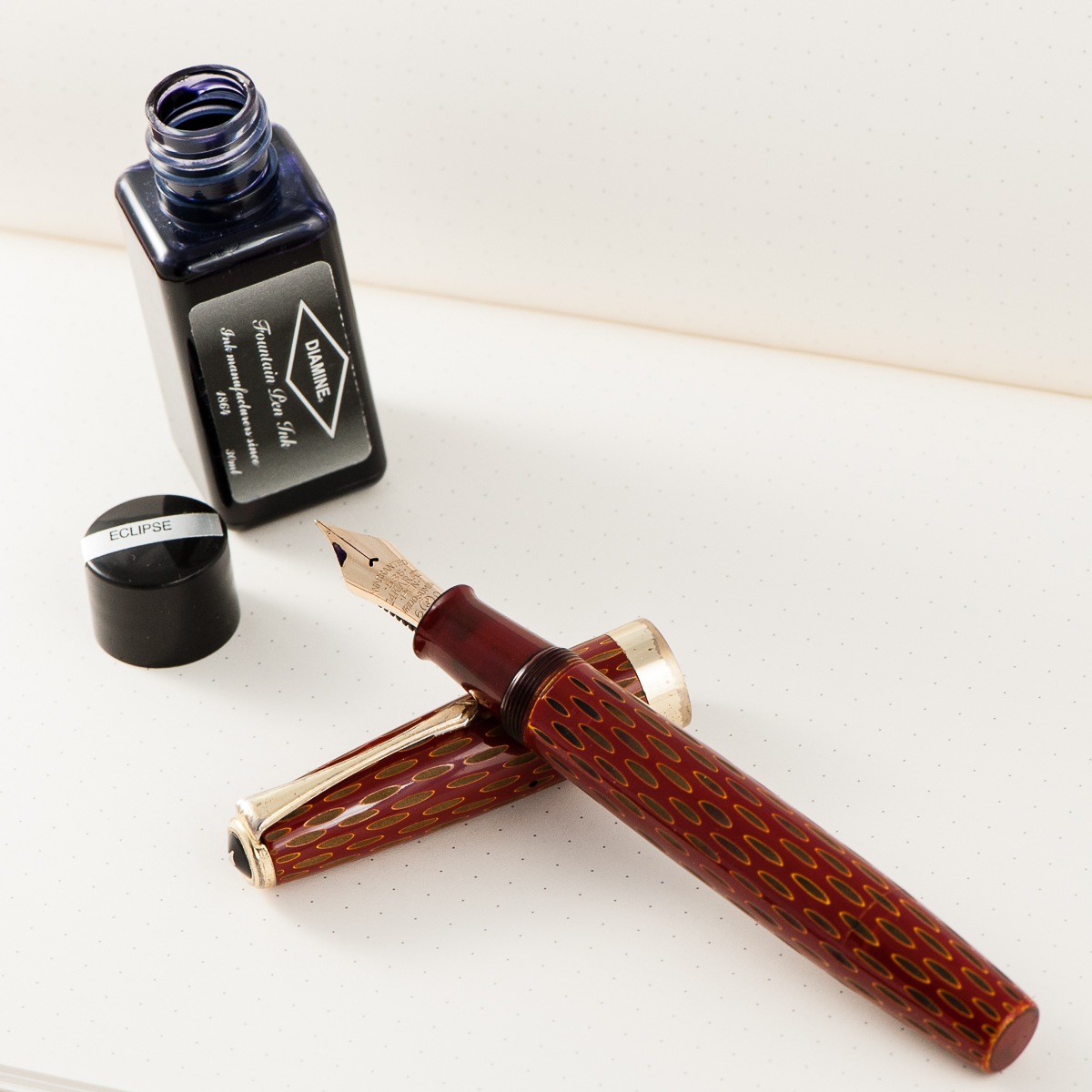
Katherine: My pairing for the month is, once again just based on usage — a Ban-ei Kamakura-bori vintage urushi pen + Diamine Eclipse. I bought this pen while I was in Japan last month, but it only arrived a couple weeks ago since Eurobox had to complete the restoration. I paired it with Diamine Eclipse because the pen holds a whopping 3ml of ink — and I really like Eclipse and haven’t used in a while. I predict I’ll be using it for weeks to come. I really like Eclipse since it’s a dark, dark purple ink that’s very work friendly, but has some hidden character. The pen, on the other hand is full of fantastic detail… but doesn’t really match the Eclipse. Oh well. 😛
Pam: The skies are clearing up and the hotter spring nights are great for seeing the stars. So my ink and pen pairing for May is the Sailor Pro Gear Slim in the Galaxy finish with Private Reserve Electric DC Blue.
The dark blue ink has an incredible red sheen that reminds me of the night sky and the depths of space. The sheen shows up even with the EF nib on the Pro Gear Slim, granted, the nib has a great balance of fine line and wetness. In my not so discerning opinion, the sheen rivals that of the famous Robert Oster inks like Fire and Ice.
Some people have reservations about Private Reserve or Noodlers inks potentially causing damage to a pen. I can only attest for the Electric DC Blue, but I have not had any issue with this ink in my beloved Galaxy.
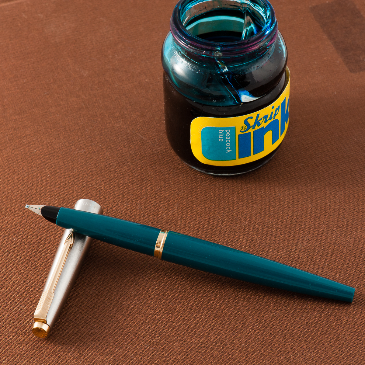
Franz: My pairing for May is a personal (read as emotional) one and please be advised that this will have a different feel from my usual write-up. I inked up my Teal Parker 45 with Sheaffer Skrip Peacock Blue ink. I believe the pen matches this turquoise ink quite nicely. It’s also a great vintage ink for a nice vintage-y pen.
I chose to ink the Parker 45 as a homage to the Queen of ink, Susan Wirth. She recently passed away unexpectedly this month. I acquired this pen from Susie’s table at the 2016 LA Pen Show and it has an italic nib. If I’m not mistaken, the Parker 45 is one of her favorite pens as well. She’s also a great advocate of writing with Italic nibs.
Susie was the first person who taught me about writing with an italic nib. I can still hear her distinct voice in my head as she says, “An italic gives you traction in your writing. Without it, it’s like a car that goes all over the road.”. I met Susie at the 2012 SF Pen Show and I immediately learned a lot from her. At the time, I did not know that she went to every US pen show and that she had been attending shows since mid-1980’s. But as I continued to attend the LA and SF Pen Shows annually, I’ve learned how much of a big part of the community she is. At the 2016 LA pen show, I brought my mom along and when she met Susie, she got the Susan Wirth Experience. This resulted with my Mom buying her first flexible nib fountain pen. So just like me, my Mom learned a lot from Susie at her first pen show.
Susie is already missed in the pen community but I know that she will live on in our hearts and in our writing. Thank you for everything Susie!
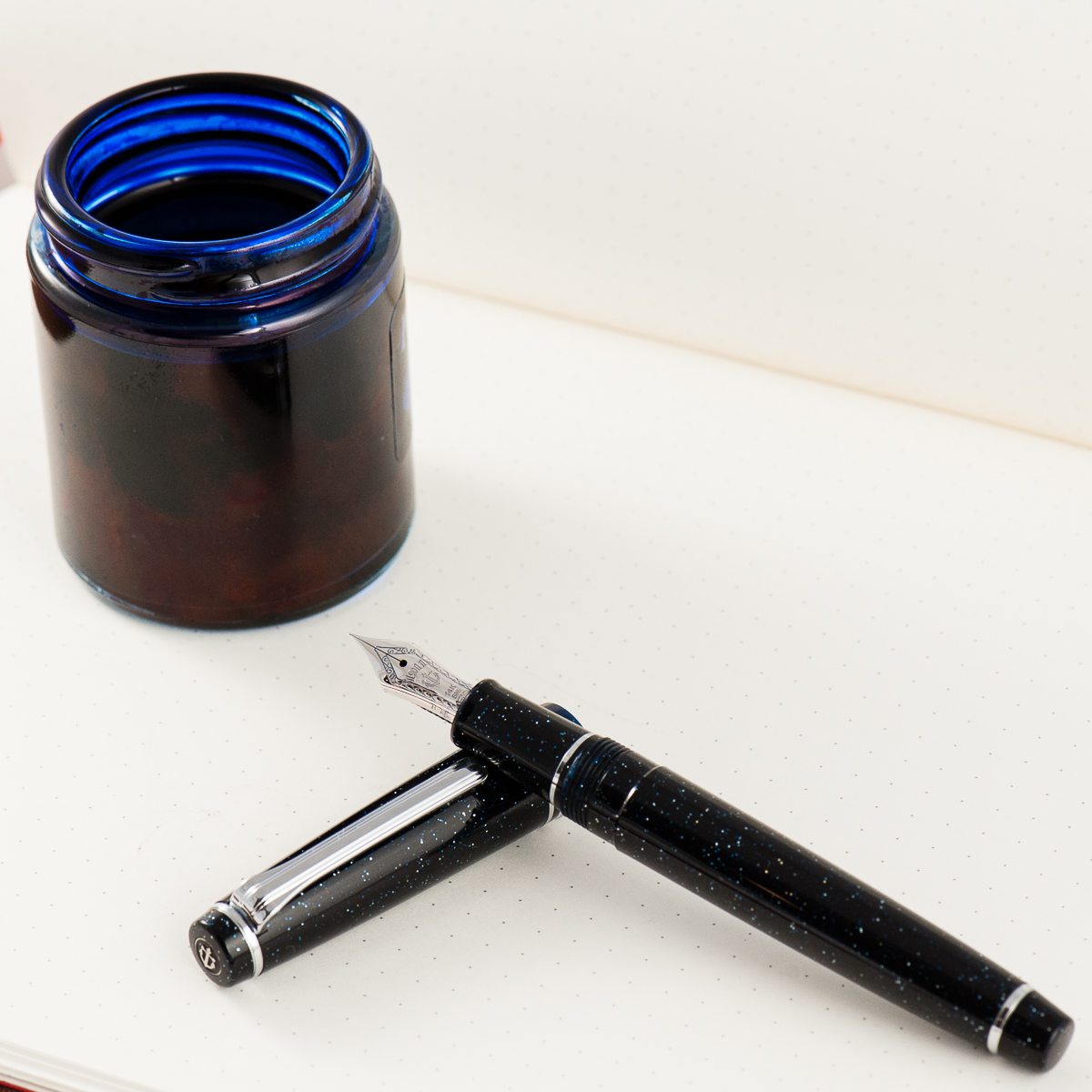
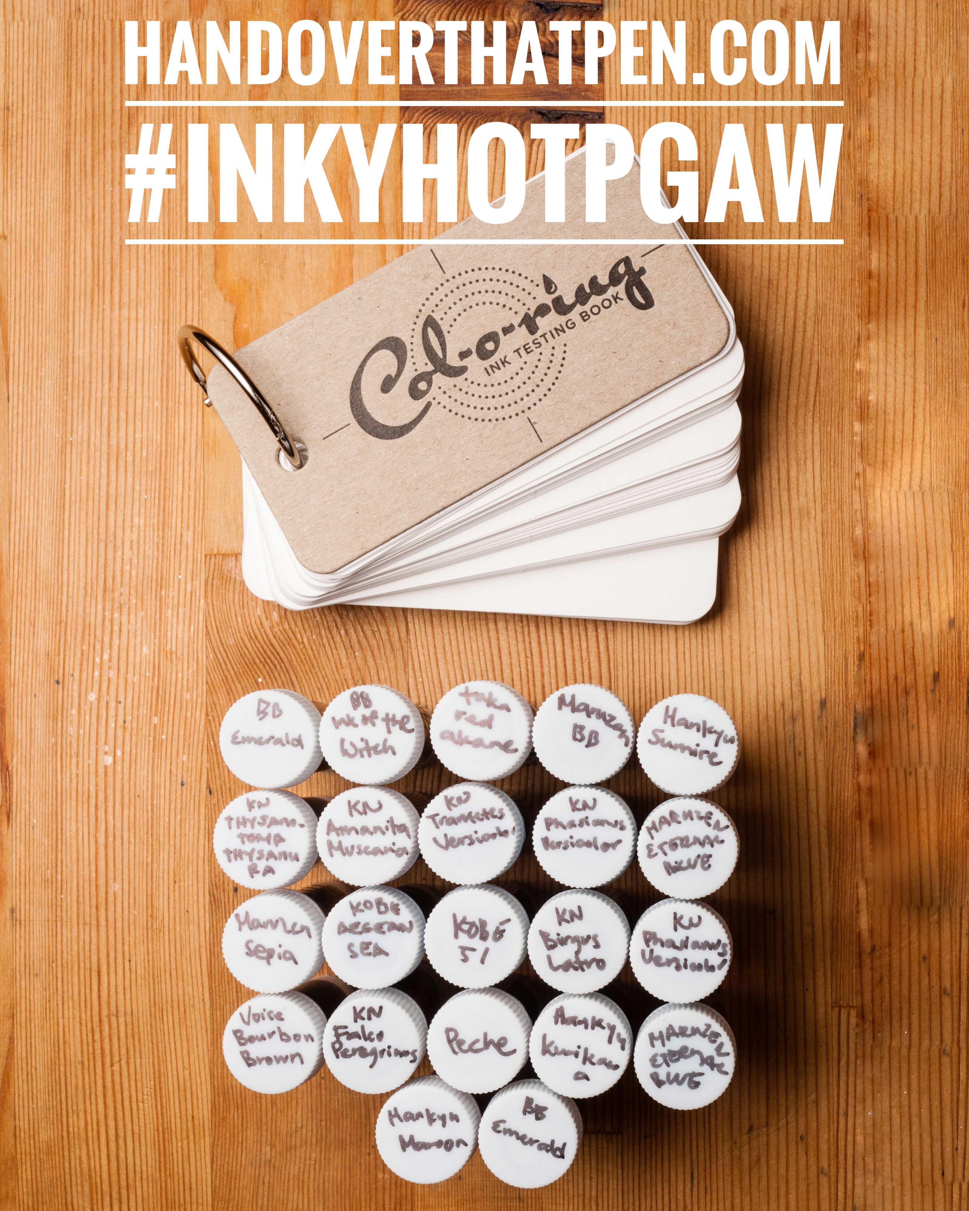
Many of you followed Katherine on her adventures through Japan, including many store exclusive inks. In the meantime, The Well Appointed Desk‘s Col-O-Ring ink testing book debuted! So we’re giving away a great bundle to try out and test some less common Sailor inks — 21 (We have BB Emerald in the picture twice, sorry) 4ml samples of uncommon Sailor inks + 1 Col-O-Ring ink testing book!
To Enter:
Follow us on instagram, @handoverthatpen & regram our giveaway image or post a picture of your favorite fountain pen and ink with the hashtag #inkyHOTPgaw (Please make sure your account is public so we can find it! And no giveaway accounts.)
Comment on this blog entry with your favorite fountain pen and ink (not necessarily a pairing)
The giveaway is open from now, 05/07/2017 until 05/15/2017 11:59pm Pacific time. One entry per person please.
The giveaway is open internationally, but we aren’t responsible for any taxes, customs fees or duties that may be applied, and will be shipping without tracking due to cost.
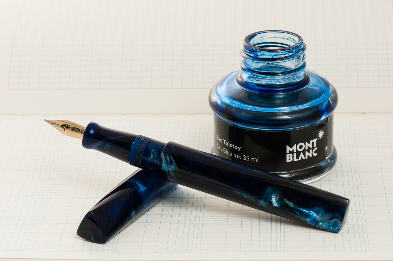
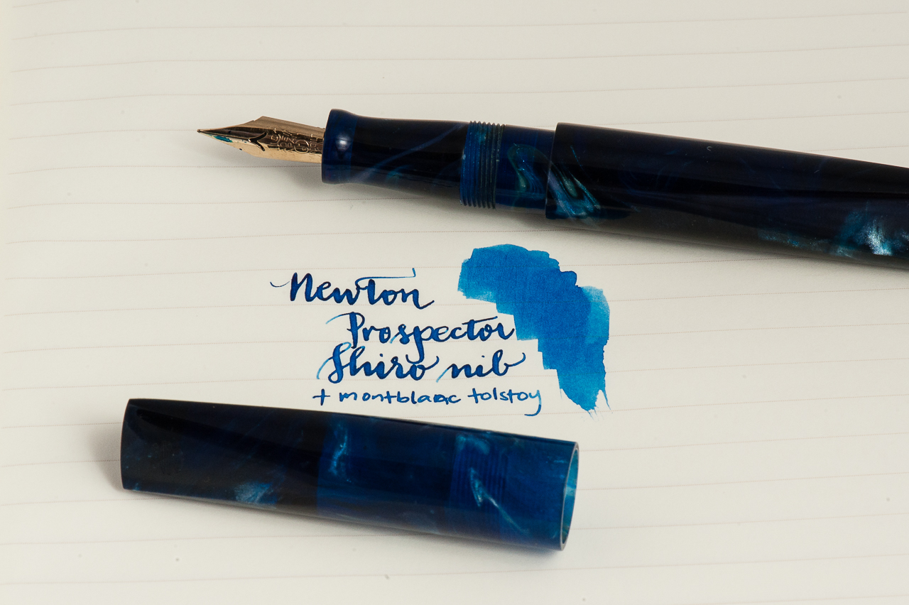
Katherine: It’s still March as I write this — I’m picking a little early since I’ll be out of town for a lot of April. But, even though it’s March, I have no doubt I’ll keep this pen inked through April. 🙂 My pairing for the month is my new Newton Pens Prospector and Montblanc Tolstoy. I chose BSea’s Galaxy Trek resin, which reminds me of the deep ocean. It’s a dark, almost black, blue in many areas with swirls of lighter blue and even white and an occasional brown. I had to pair it with a blue ink, and I chose Tolstoy. There could be lots of reasons for this pairing… blue and blue, reminders of my childhood (swimming off islands in the Philippines and wondering what lurked in the dark waters… and my numerous failed attempts at reading War and peace as a 13 year old), but really it’s just because that’s the blue ink I had on hand when I ripped open the Prospector’s box a few days ago. I only had the presence of mind to record an unboxing video because my boyfriend, Shamiq, suggested it. Then I grabbed the bottle of ink on my desk, filled the pen and proceeded to oooh and aaah over the pen and the shiro nib. And, because I can see into the future, I’m sure I’ll still be ooohing and aaahing over this pen in a couple weeks.
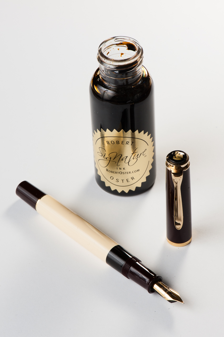
Pam: Spring is in the air! The air is still crisp and a breeze is still about. We still get the occasional rain this season, which just makes me want to curl up with a *mug* of coffee and a good book. In lieu of that possibility, I chose Pelikan M200 Cafè Créme to be paired with Robert Oster Caffè Crema! This particular pen has a wonderful architect nib done by Dan Smith of the Nib Smith fame. It shows off the subtle shades of this pen quite well and keeping a crisp line.
I considered this combination for more of an autumn month, but my love for coffee, Robert Oster inks and Pelikan flocks is year round.
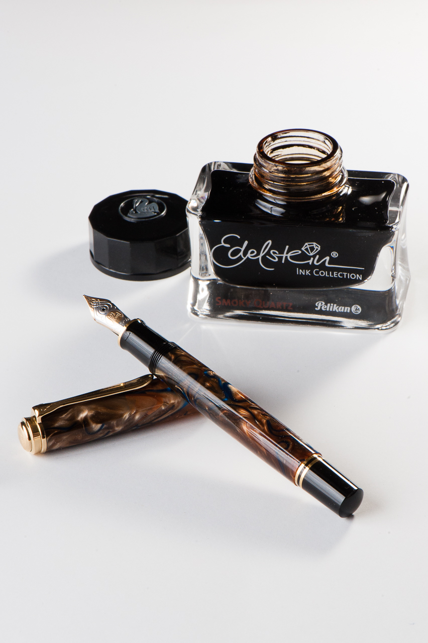
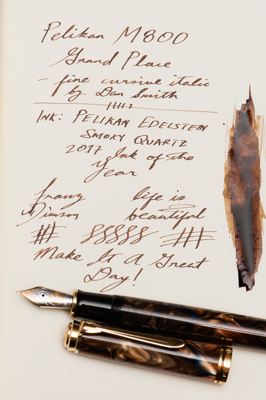
Franz: April’s pairing for me is the Pelikan M800 Grand Place Special Edition release, and the newly released Pelikan Edelstein Smoky Quartz which is their Ink of the Year for 2017.
Now I’ve got quite a few.. ahem.. a lot of inked up pens especially after March’s 6 Pen Challenge so this month’s pairing is a true winner at the moment. The ink is definitely a very nice brown which matches the creamy swirls of the pen. The nib of the M800 is a juicy fine cursive italic nib ground by Dan Smith (The NibSmith), and that generous flow creates spots in my writing wherein the ink pools to an almost black. So far, I’ve got only bought the ne bottle of this ink to test it out but I think a second bottle will be in my inventory sooner than later.
While writing with the M800 Grand Place, I catch myself sometimes just pausing admiring the chatoyant swirls of the pen. It’s almost hypnotic.
Writing Samples (click to enlarge)
Thanks for your time, and keep enjoying your pens. And please tell us what new ink pairings you’ve discovered recently.
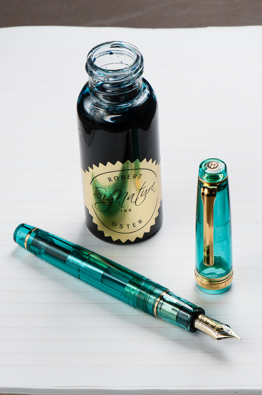
Pam: I can’t take credit for this pairing; it was serendipity, actually. Robert Oster has made a stunning and wonderful ink that has caught the fancy of many pen lovers. In the meantime, I was drooling over the turquoise Sailor from Wancher. They happen to arrive around the same time so ta da! Perfect match!
Robert Oster’s Fire and Ice is a beautiful dark turquoise with a great red sheen and is aptly named. The MF nib of the Sailor pen is a bit wetter and broader than my usual preference, but with this ink, I wouldn’t want it any other way. It’s the perfect nib for ALL THE SHEEN! I am working on enlarging my microscopic penmanship to do justice for such a perfect OTP (one true pairing).
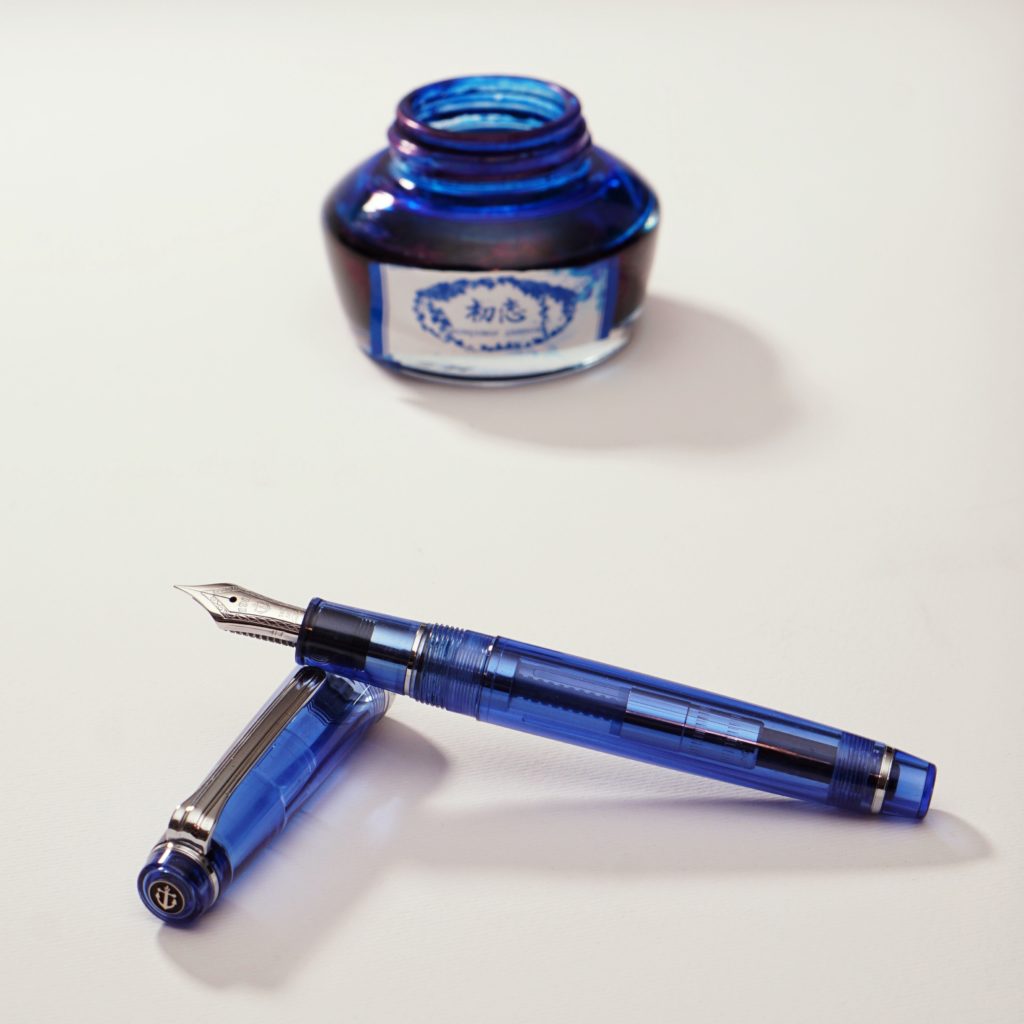
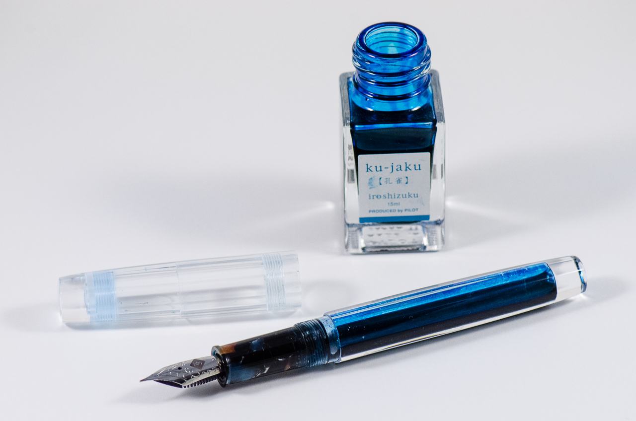
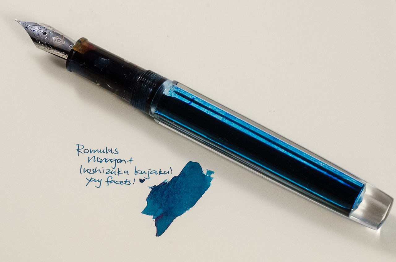
Katherine: I picked this month’s pairing based on what I’ll be using the most — a custom faceted pen by Romulus Pens and Pilot Ku-jaku. John of Romulus pens made this pen as a proof of concept (Possibly because I couldn’t shut up about how much I loved facets while I was hunting for a Nakaya Decapod Mini) and sent it to me to test drive. I have a custom one on order and hope to see it in the next few weeks (hint hint).
When the pen arrived, I was almost afraid to ink it up, the clear body its nine facets were so pretty — they reminded me of a prism. But, a pen is a pen and it’s meant to be used — so I picked Pilot Iroshizuku Ku-jaku. I wanted a bright ink since I’d see it sloshing around, but I also wanted something I’d be able to use at work without getting too many weird looks — so a bright blue it is! I’ve swapped a Franklin-Christoph Masuyama Needlepoint nib into it and it’s a joy to use… but I predict that I’ll be writing with this pen for a long time before I write it dry.
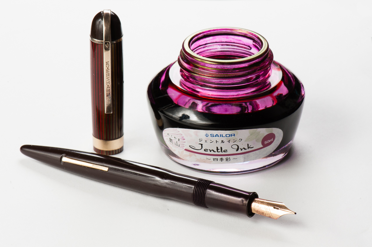
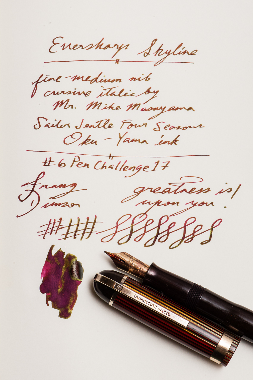
Franz: I have chosen my vintage Eversharp Skyline pen, and the Sailor Four Seasons Oku-Yama ink as my pairing for March. This Skyline is a Standard size and had an unmarked fine-medium gold nib. The Skyline is one of my favorite vintage pen models and they were produced from 1941 until it was discontinued in 1948. I am not sure as to when this pen was exactly made though. This pen is part of my six pens for the ongoing #6PenChallenge17 for March. Here’s a link if you don’t know what I’m talking about https://www.handoverthatpen.com/2017/02/26/6penchallenge/
The Sailor Oku-Yama is such a perfect match for this pen because of the red/burgundy color and the nice gold sheen. This ink echoes the red and gold color of the pen quite nicely. Also at the 2016 SF Pen Show, I had Mr. Mike Masuyama turn the nib into a smooth Cursive Italic so it has been a usual pen in rotation for me. It’s got some nice springiness as well.