Hand Over That Pen, please!
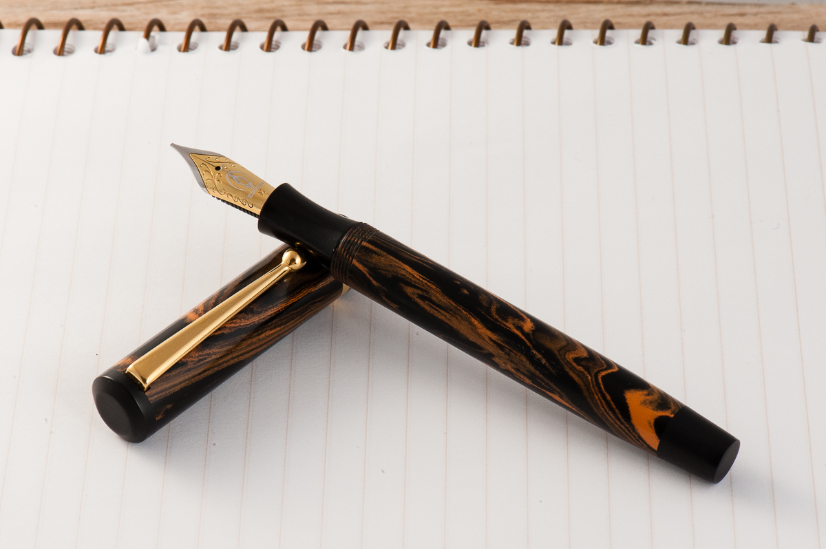
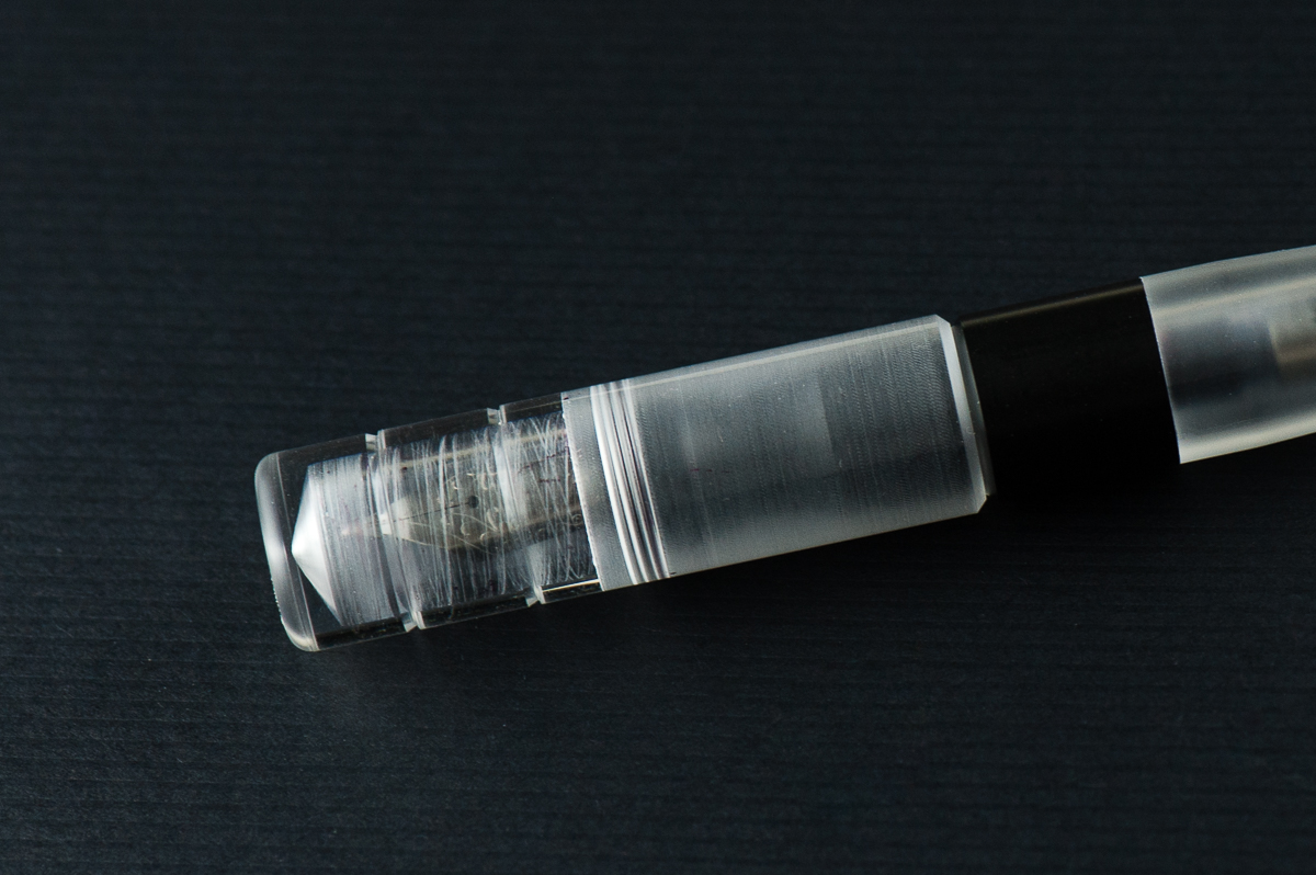
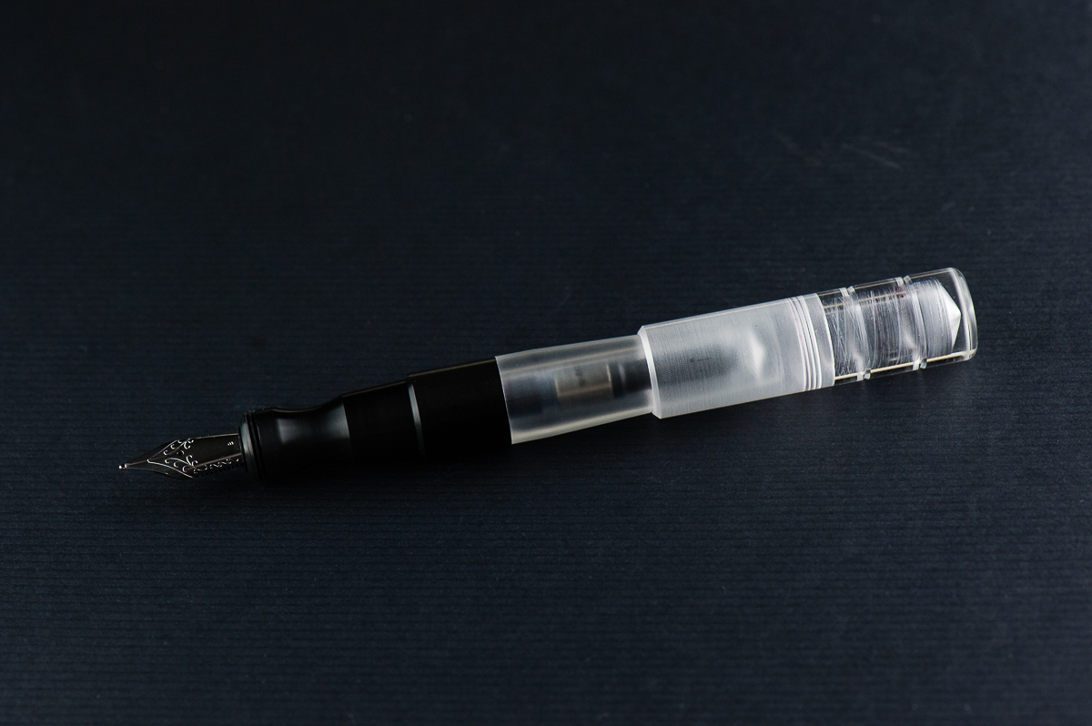
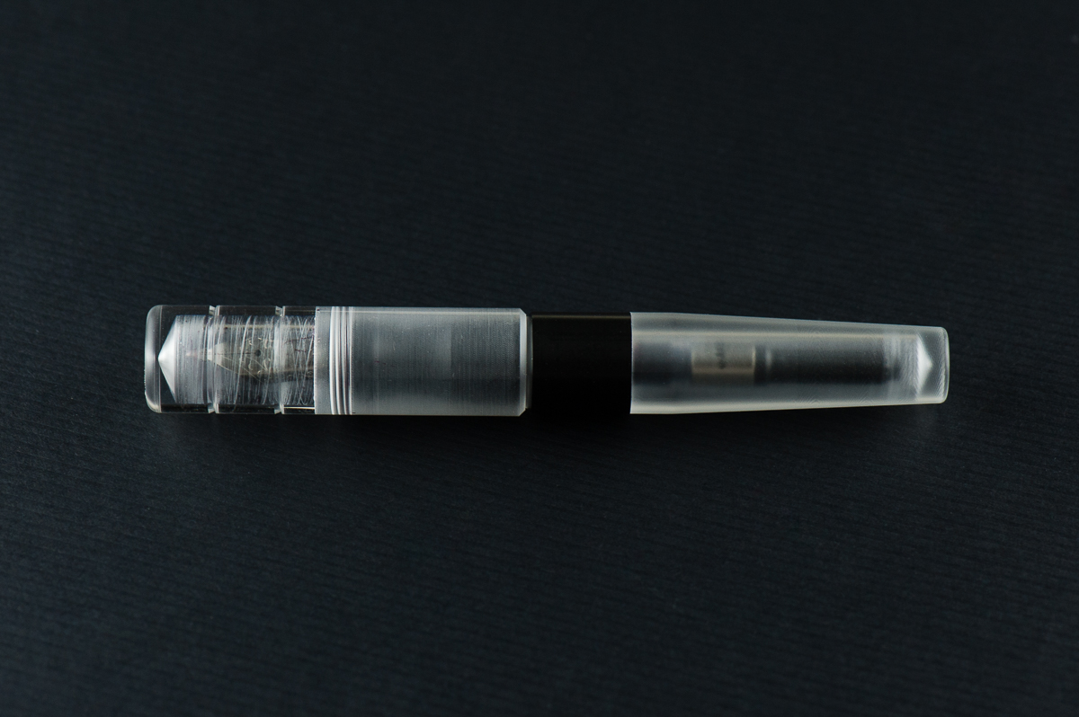
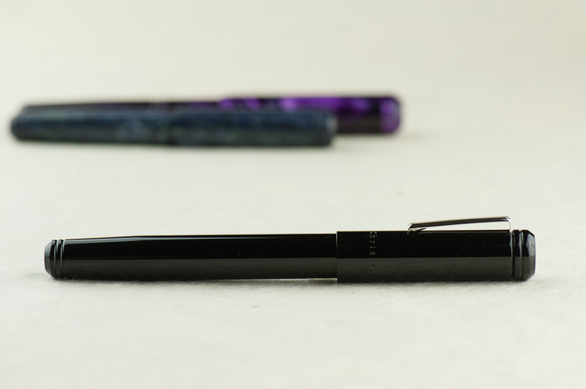
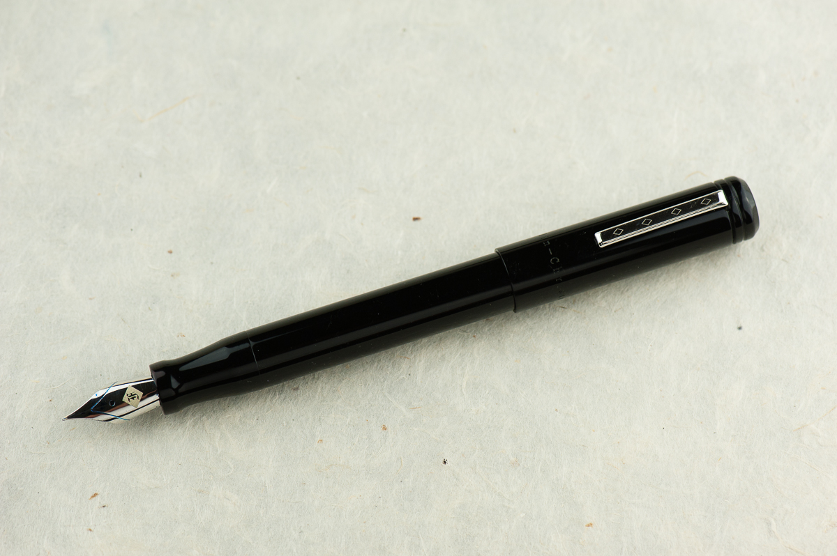
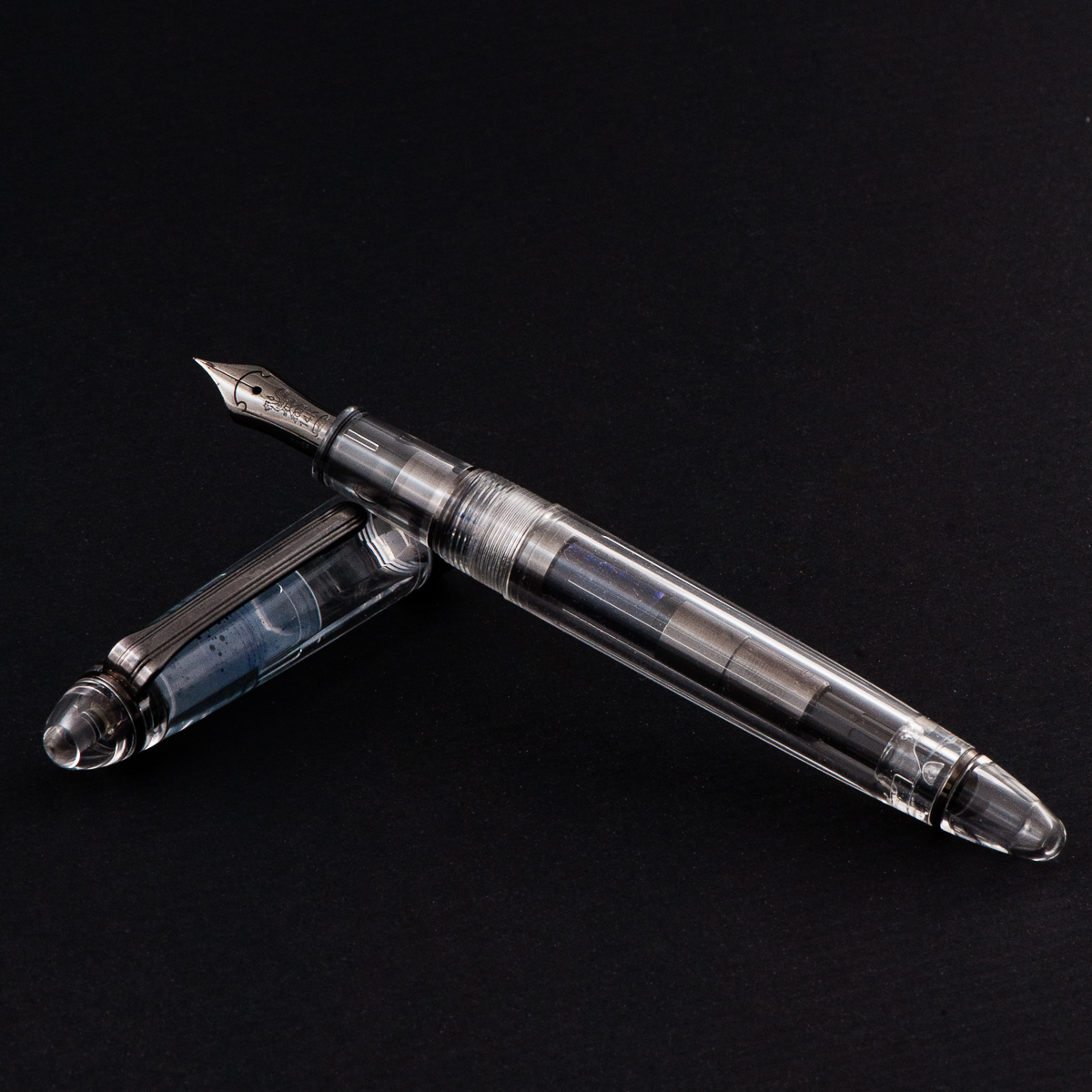
Katherine: I love short and chubby pens — so the Kasama Una is right down my alley. I also love demonstrators, despite not owning too many, so that’s another check mark. When Kasama first started selling the Unas, I was a little disappointed that they had delrin sections, instead of being entirely translucent, but now that I’ve spent some time with it, it’s grown on me a lot!
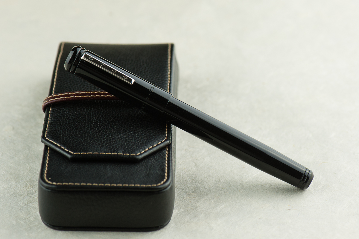
Pam: I am so glad that Franz and Katherine are my gateways to the awesome pen and stationary community in the Phillipines. The Kasama Una is a very modern pen with the translucent and black material. The acrylic feels good to the hand, and the section is Delrin which feels fantastic. It feels warmer than the acrylic in my opinion. The shape of the pen seems disproportional to me at first glance, however, after picking it up, it makes a lot of sense. The cap adds to the oversized nature of the pen, however, the pen body itself is proportional in your hand.
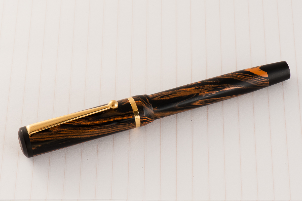
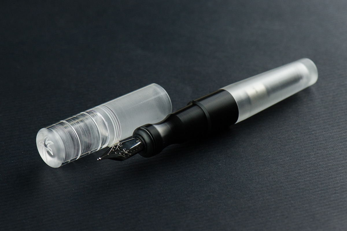
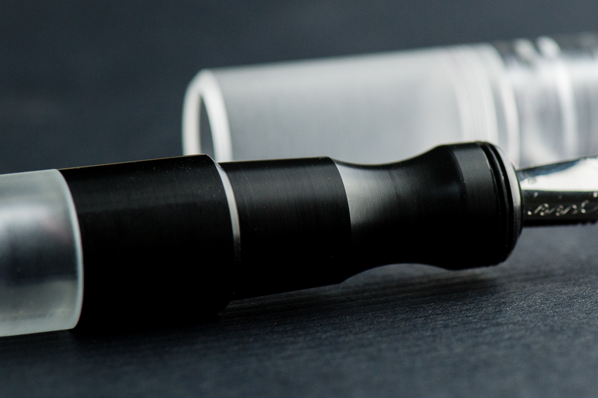
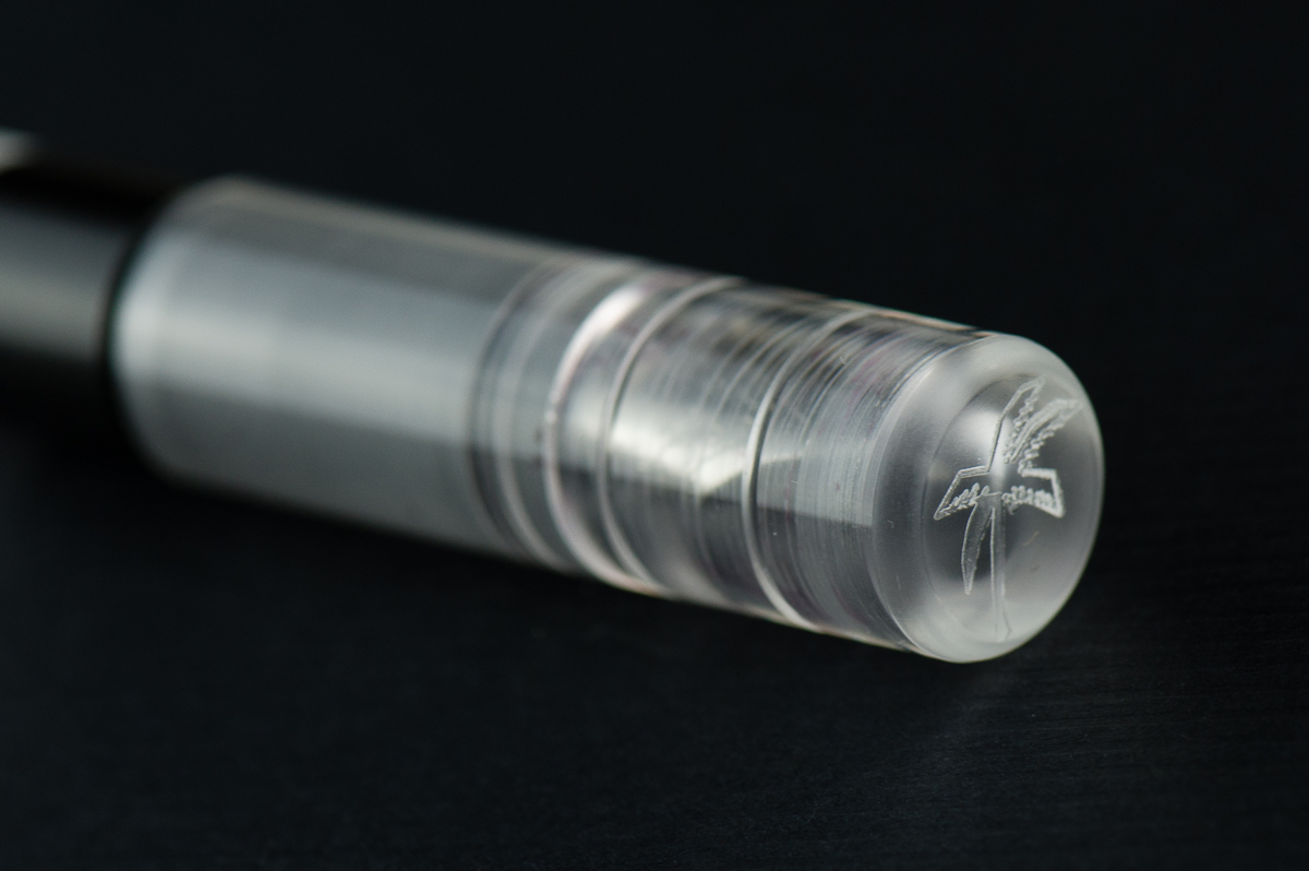
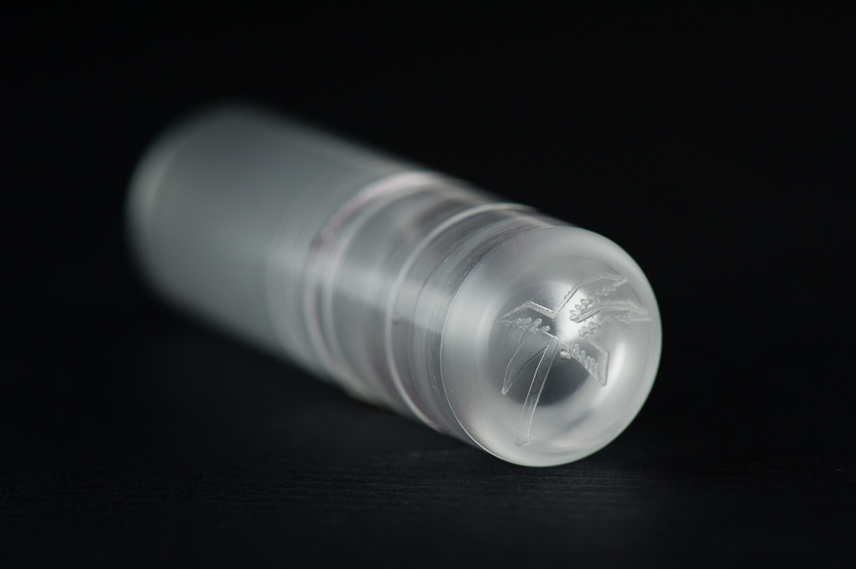
Franz: One of the things I love about this pen hobby is being able to check out cool things either in terms of design or materials. And this Kasama Una fountain pen definitely piques my interest in both of those aspects. Honestly, what drew my attention to this pen is its section. It’s oddly shaped, weirdly ergonomic, and that delrin material is prrretty cool! Actually, it seems that the Kasama folks created the pen around the features of the section (see their post on Instagram).
As Pam mentioned, Kasama is a new pen company from the Philippines and they create these Una pens in the Philippines as well. Kasama is a Filipino/Tagalog word that can mean a multitude of things depending on its usage and context. Some of which are: companion, fellow, friend, being included, or being in one’s company, etc. Una in tagalog means first which is befitting since this is Kasama’s first fountain pen.
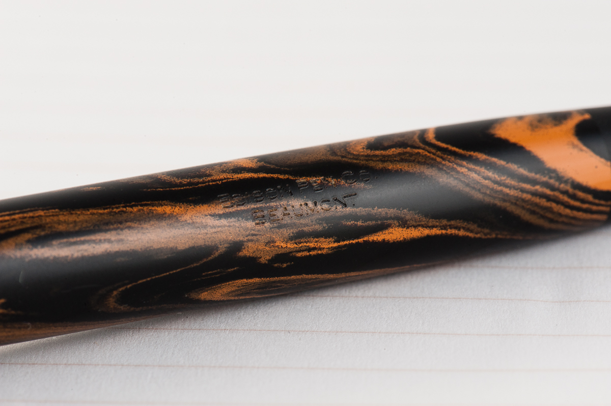
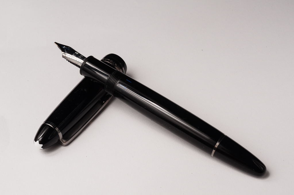
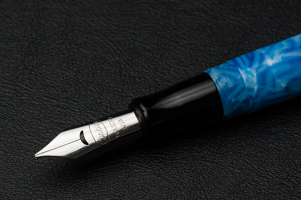
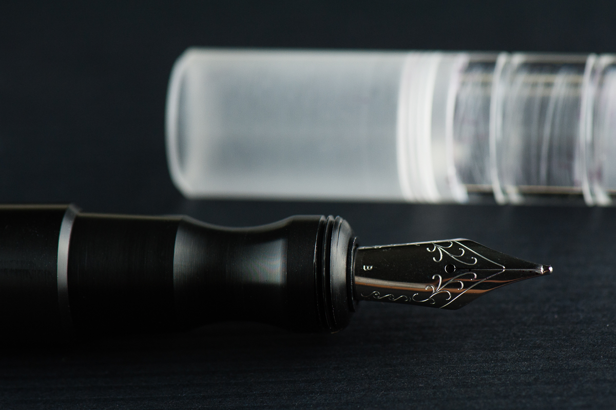
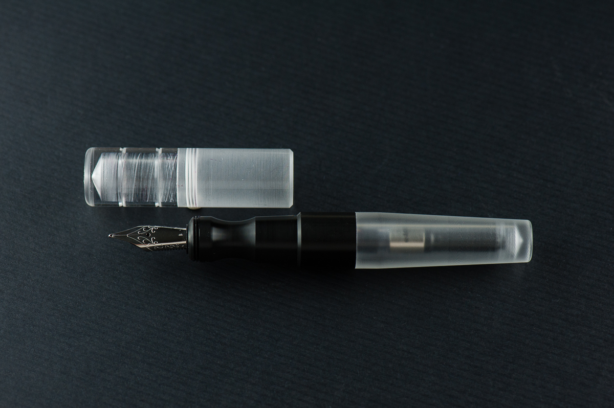
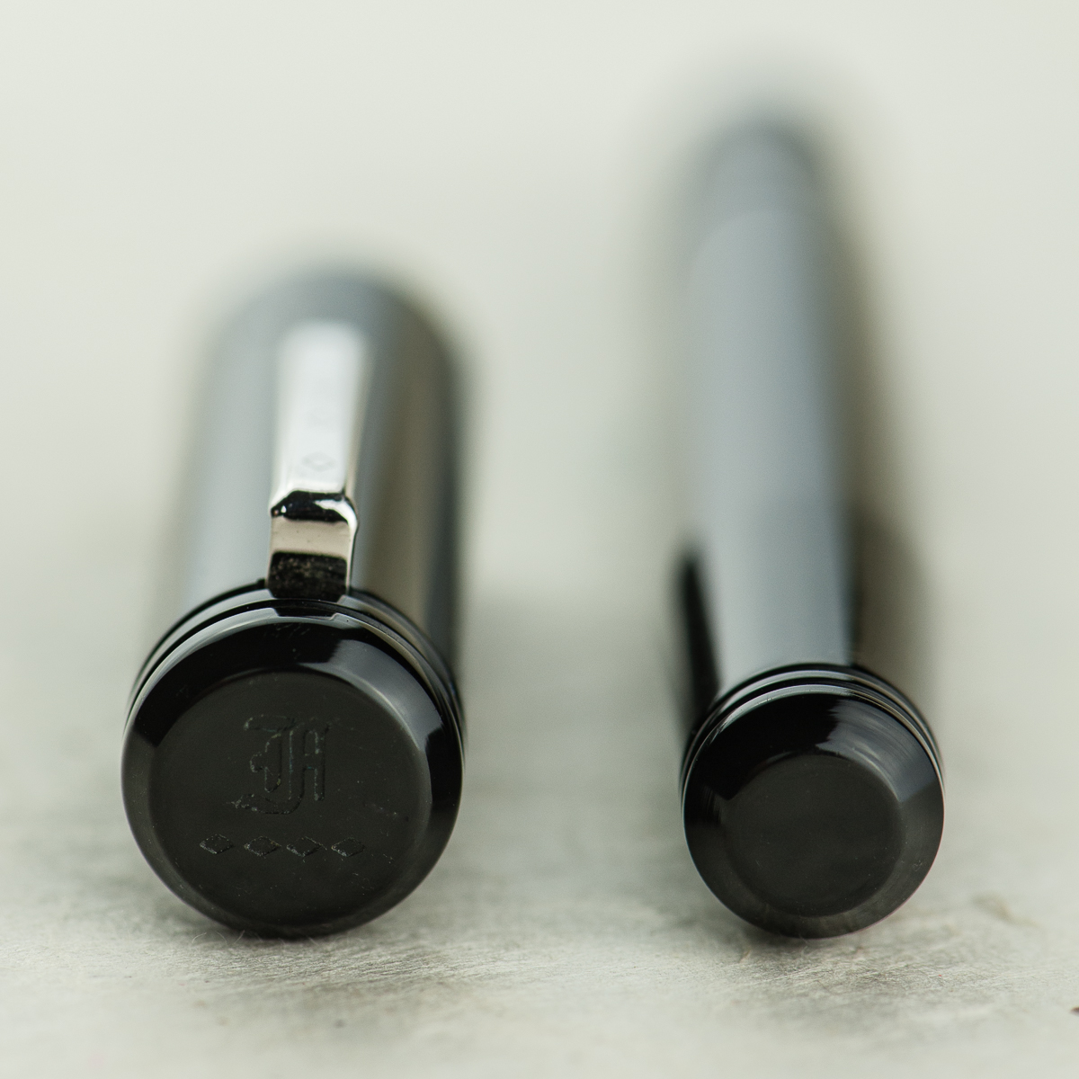
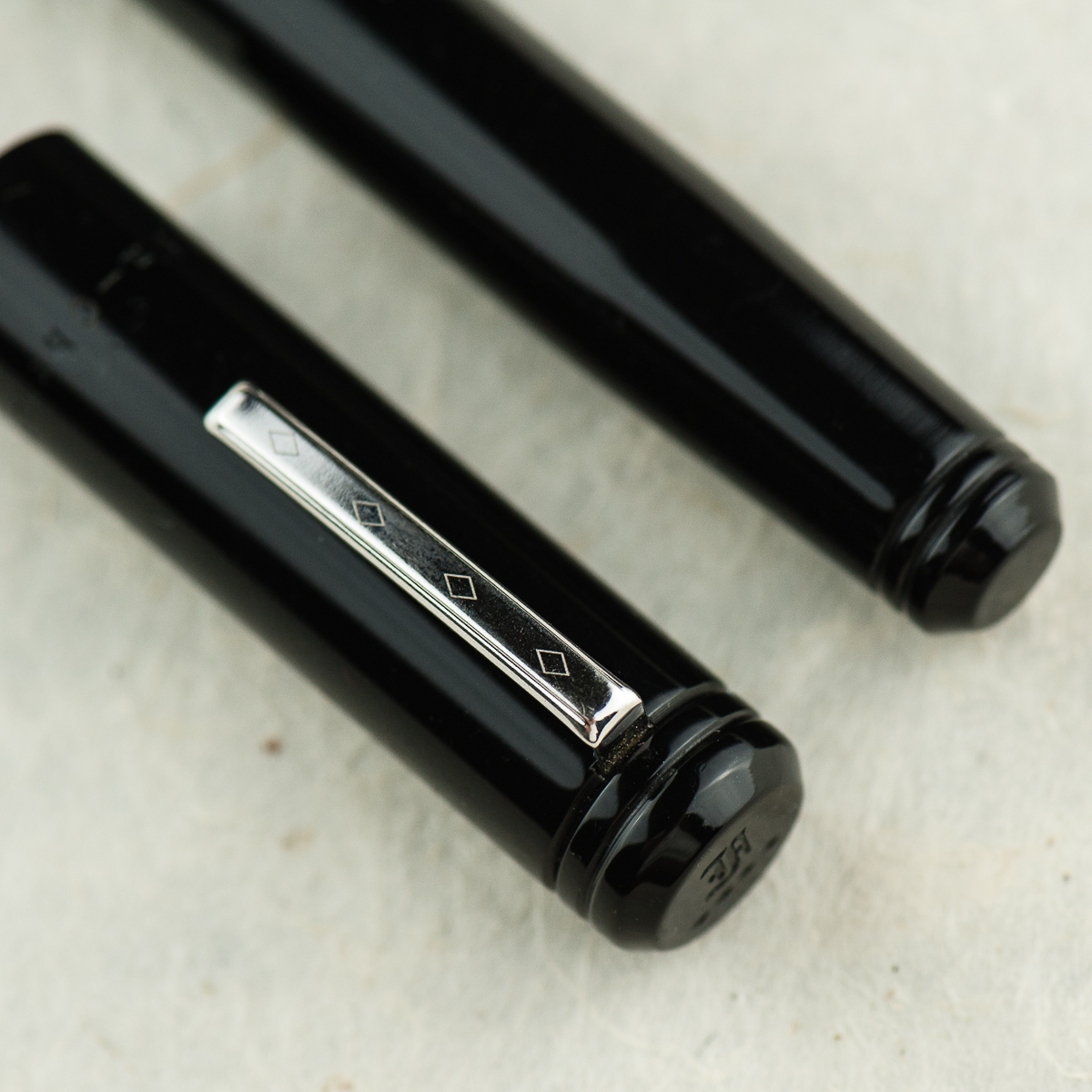
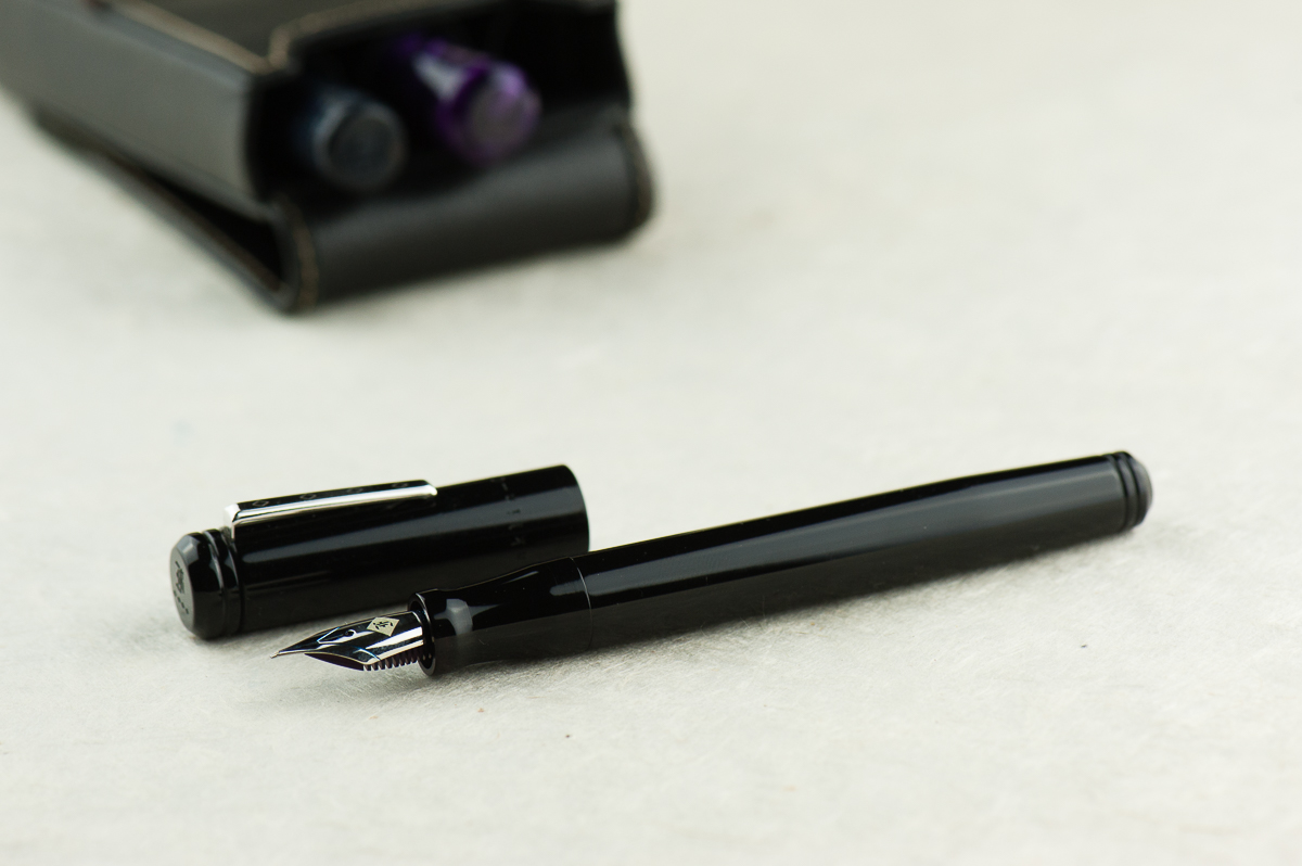
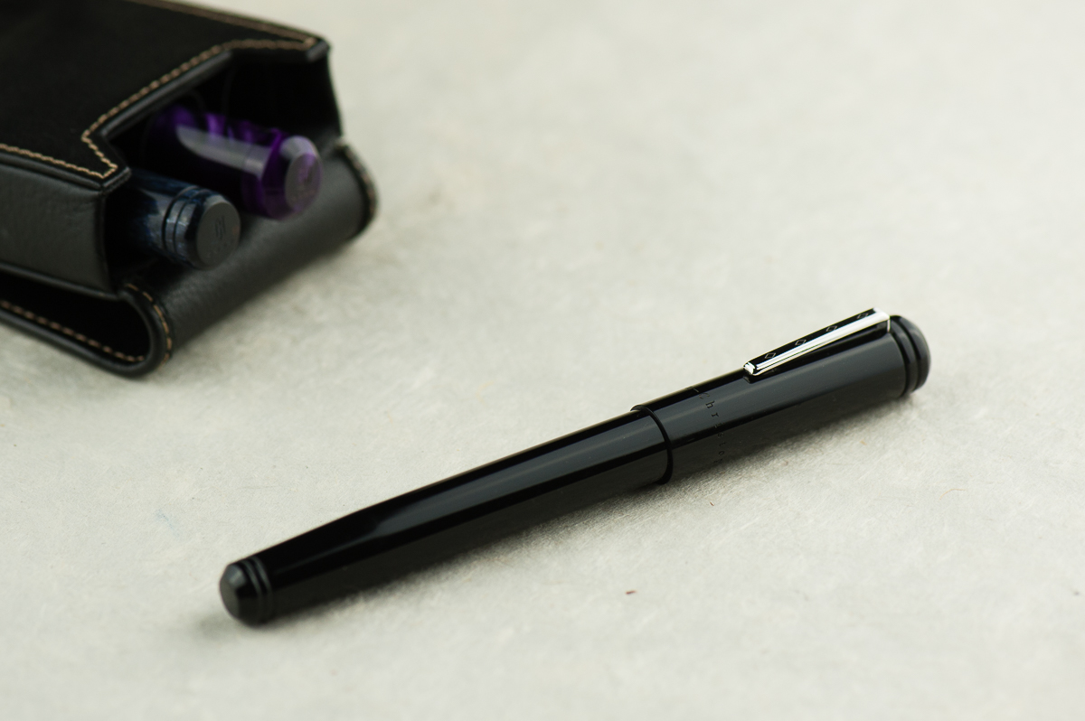
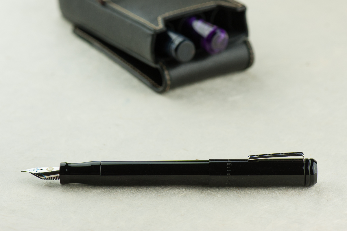
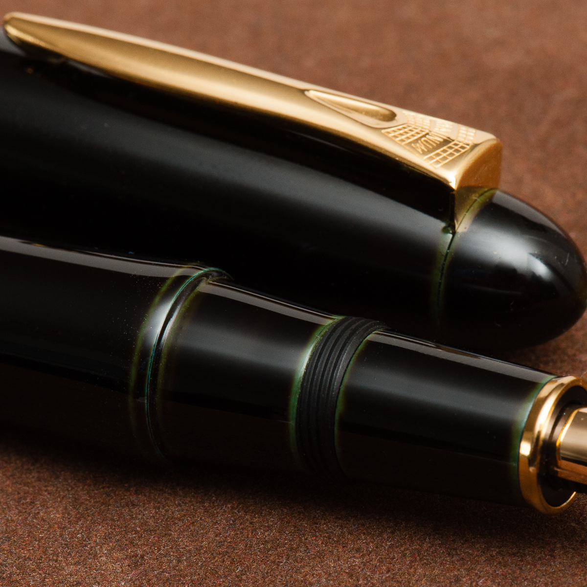
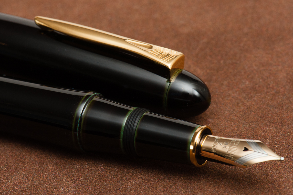
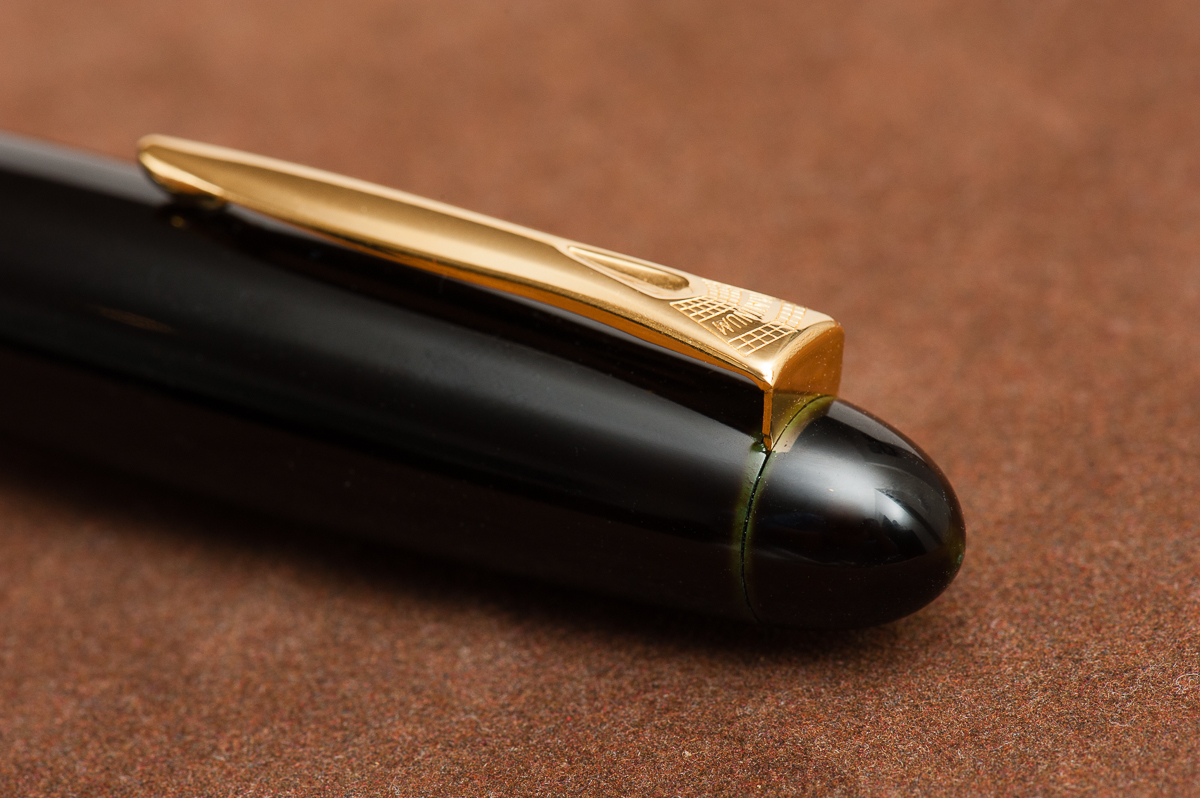
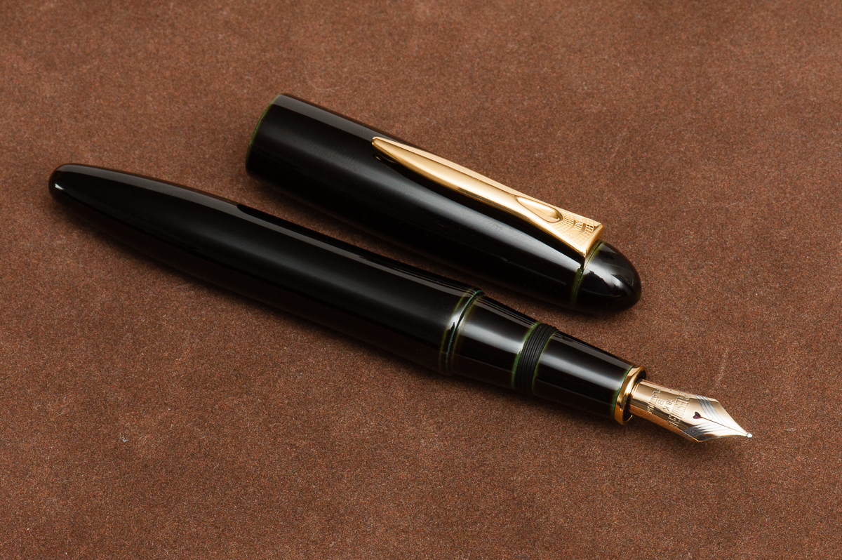
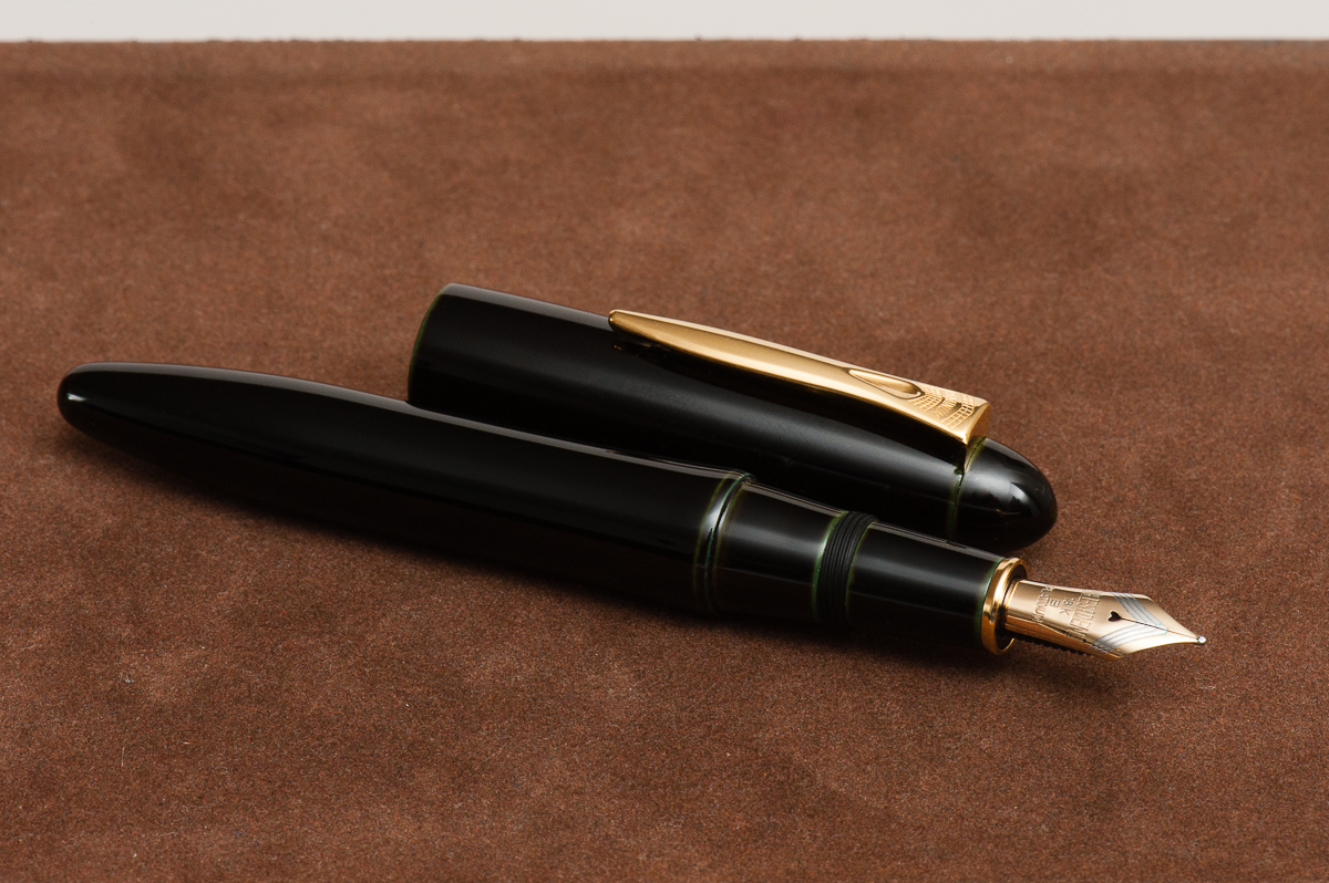
Detail Shots

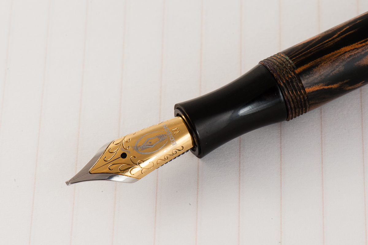
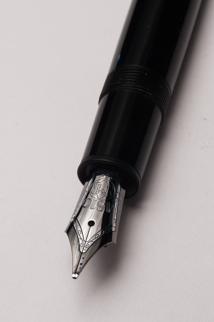
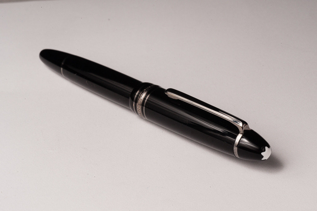
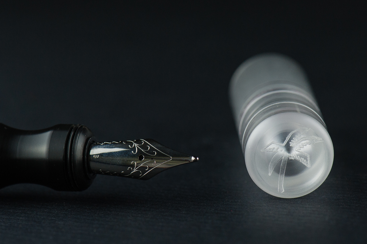
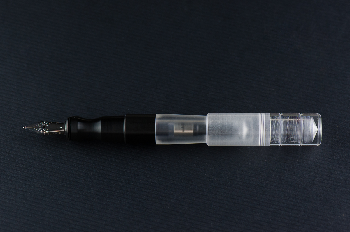
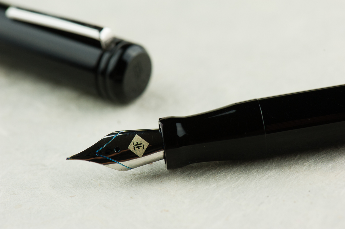
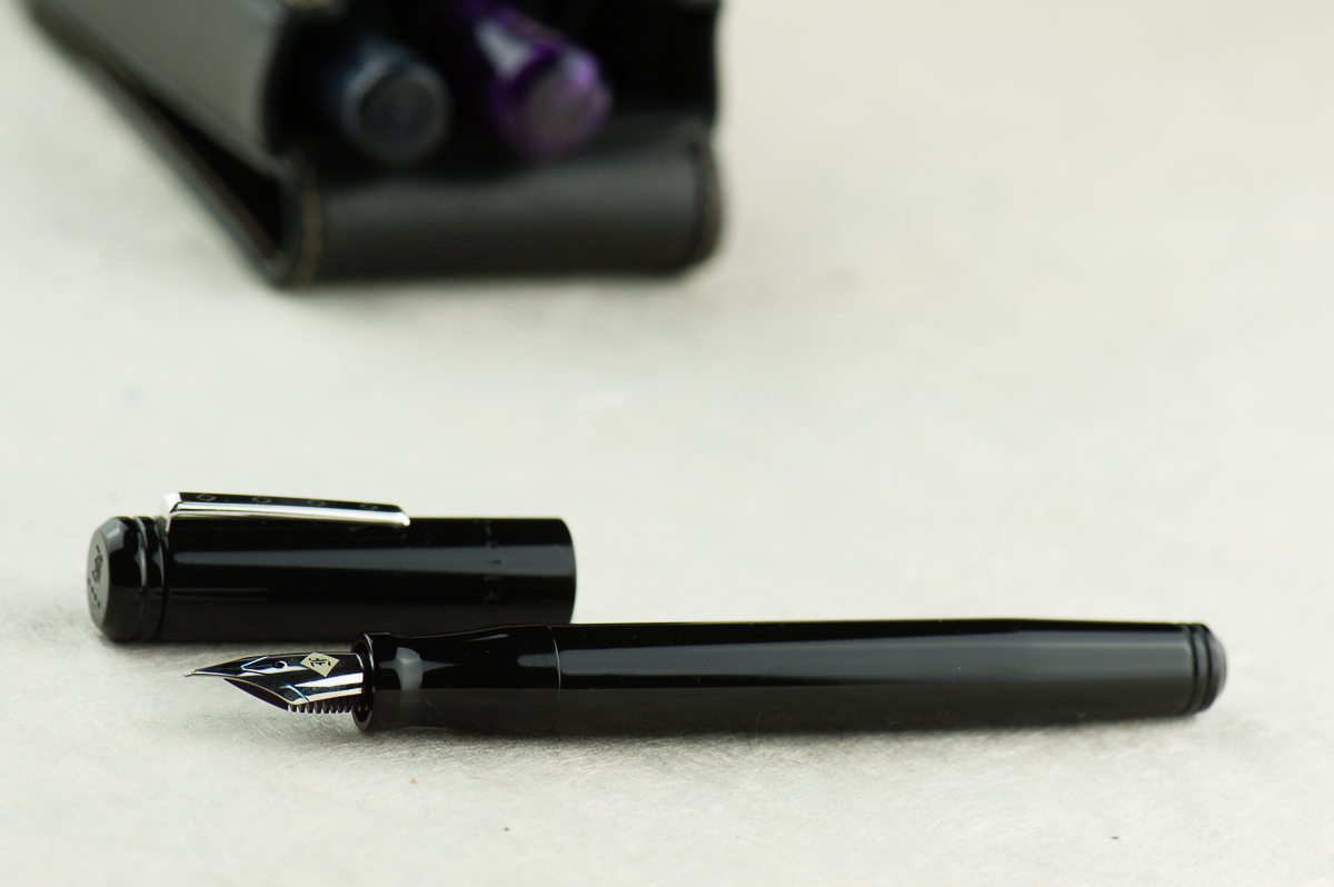
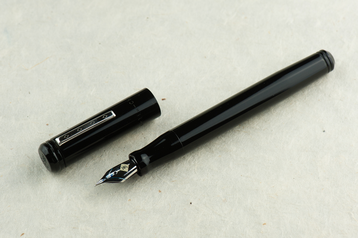
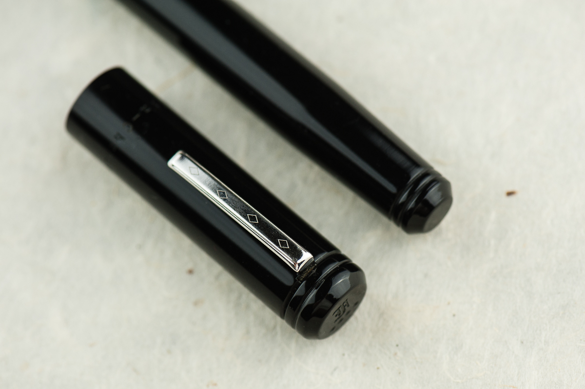
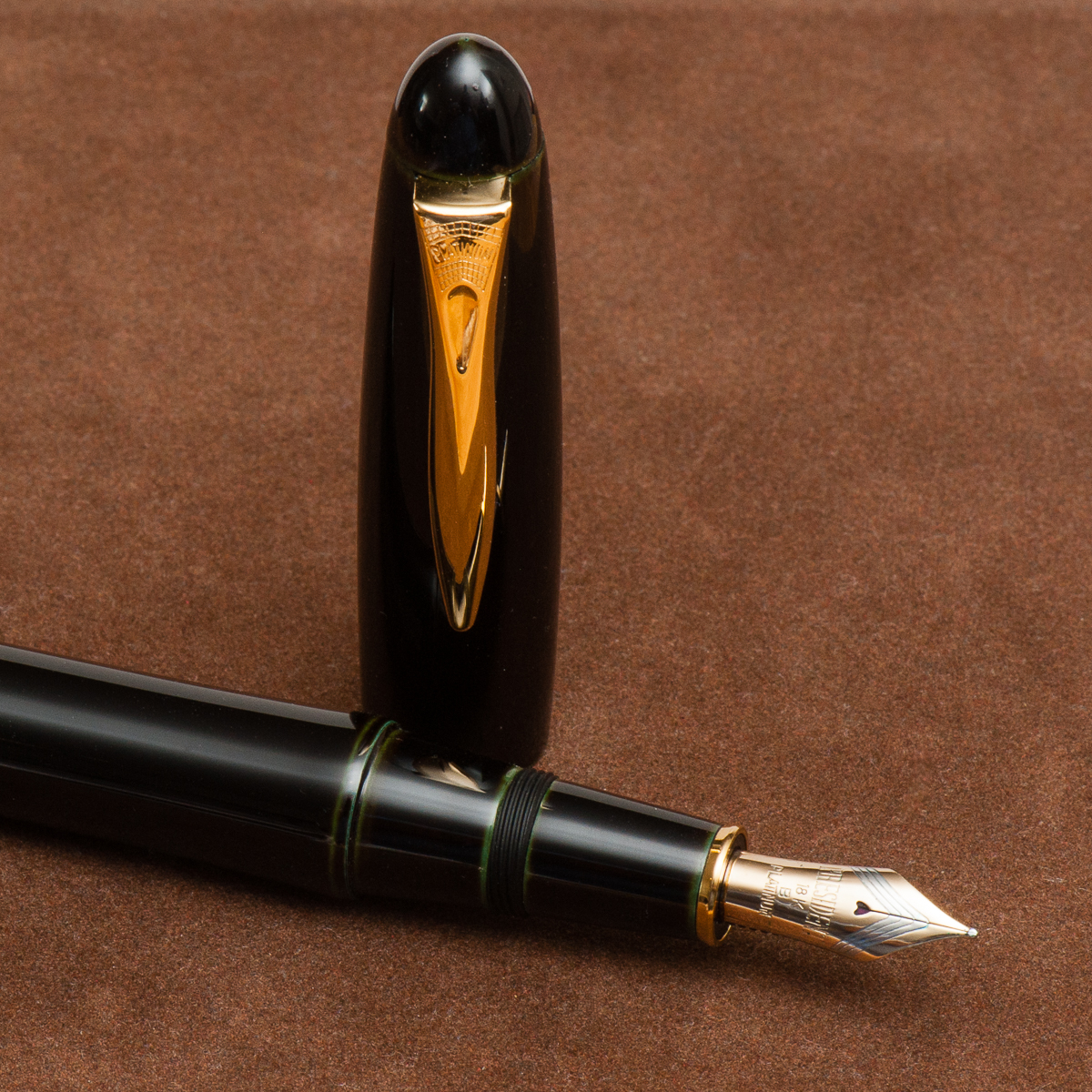
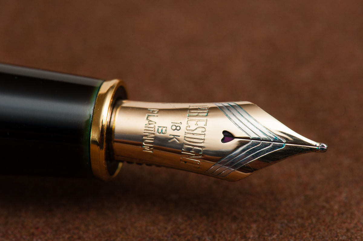
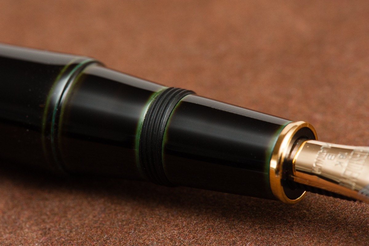
The Business End
Katherine: It’s a Jowo broad that’s super smooth (I’m not sure if they did any tuning work, but I know they do grinds on some nibs). Not my favorite width, but Jowo threads are standard, so I’m excited to swap it out after this review is done.
Pam: The nib is a stock Jowo broad nib that is glass smooth. It performed well and provided a well saturated line. Not much variation from the standard quality of the Jowo nibs in terms of stiffness or performance. This nib is just smoother than usual so I am not sure if it was tuned or not.
Franz: Perfectly tuned broad and juicy nib. And I love me some broad nibs! =) And yep, being a Jowo nib you can swap it with other similarly sized ones.
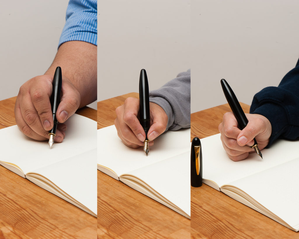
Write It Up
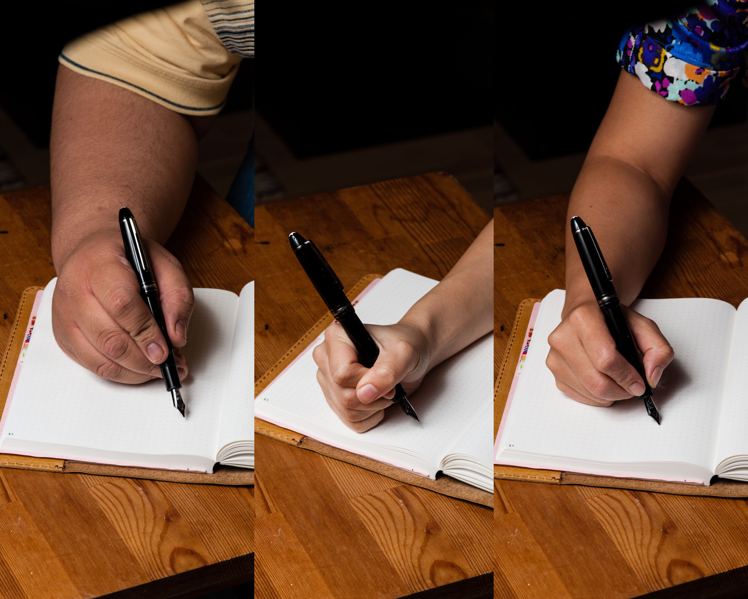
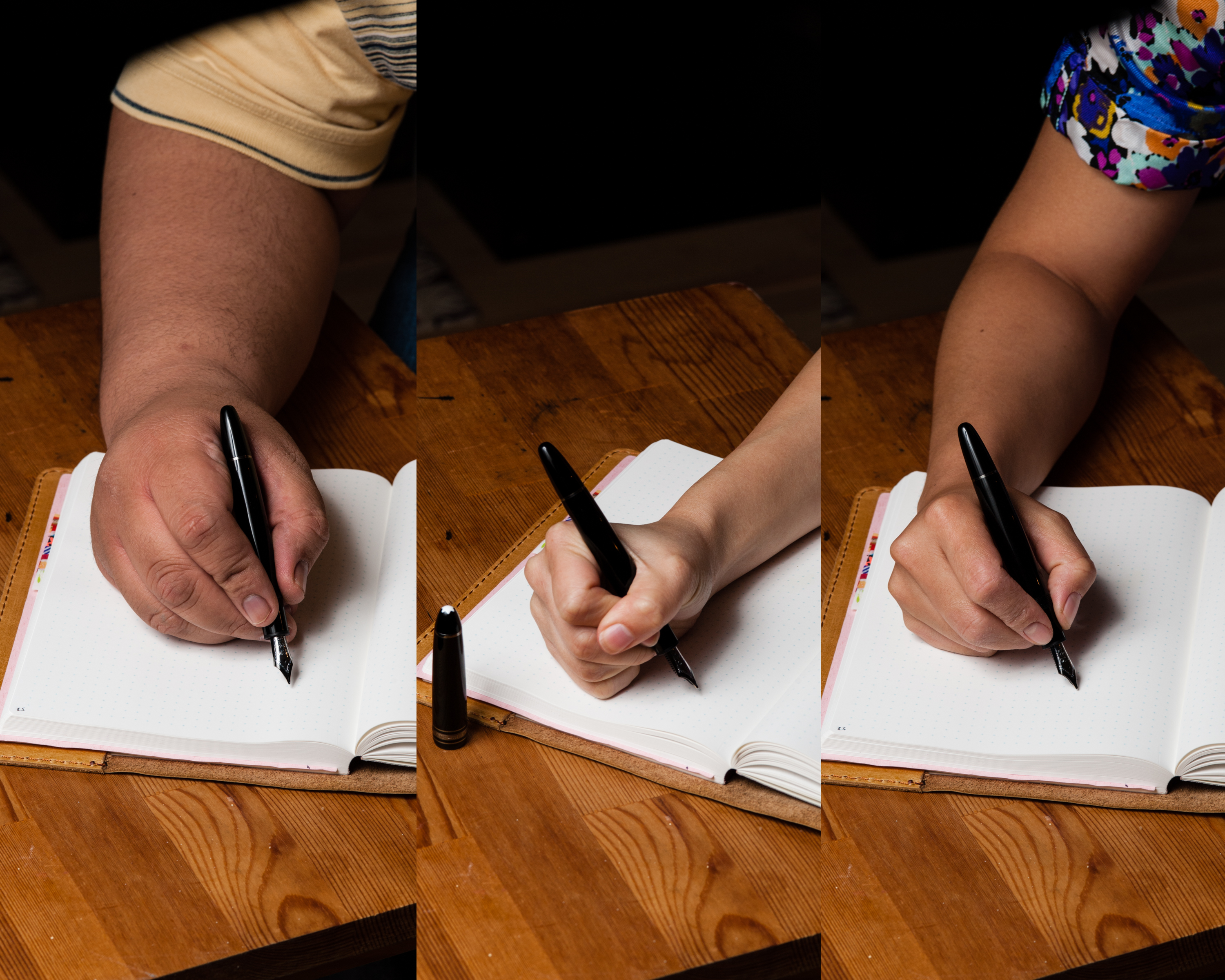
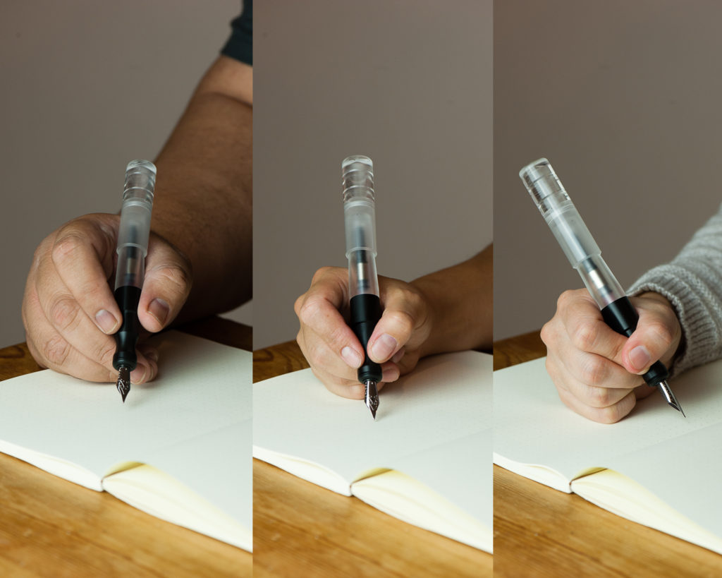
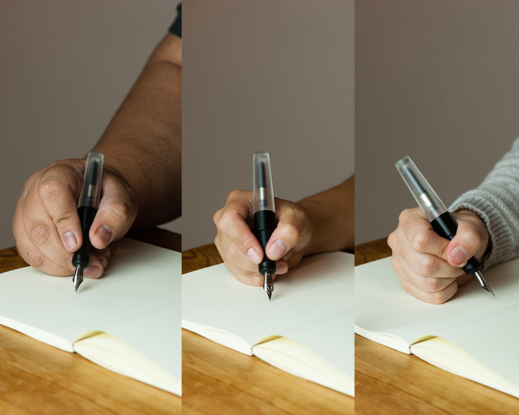
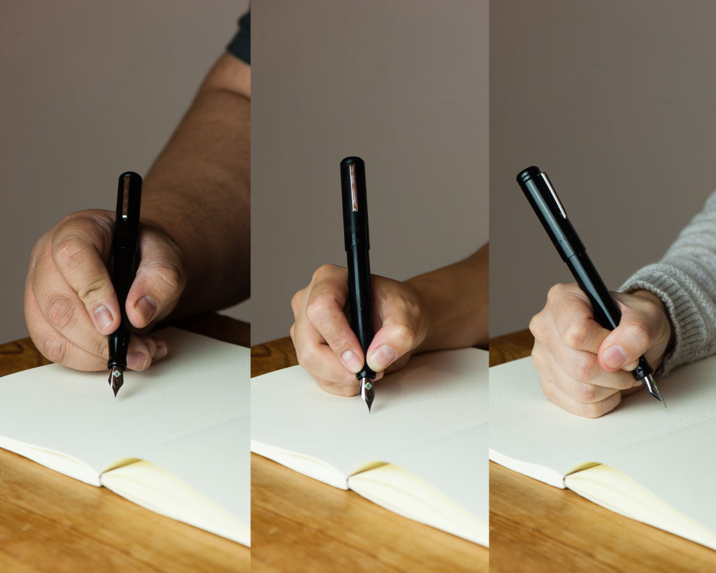
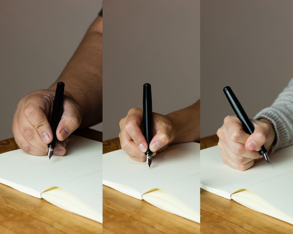
Katherine: I suspect the Kasama Una’s shape will be pretty polarizing. It has a very deep waist where you hold the pen, so this either works for you or it doesn’t. Personally, it works great for me and is very comfortable, but I’m not surprised it doesn’t work for Pam. It does force me to hold my pen at a reasonable distance from the nib though, versus my natural tendency to hold pens further forward.
Pam: I had a really hard time wrapping my hands around this pen, literally. The Kasama Una has a cap that encapsulates the section as well. It leads to the step being higher up on a pen than most pens. The step is very smooth so it doesn’t bite into the flesh between thumb and pointer finger, but it is noticeable and can be annoying. The section has a pretty deep groove that is super comfortable for the tripod grip but gets wonky for me in my tiger fist grip. Adding to the comfort of the tripod grip is the extra width to the pen.
Franz: Writing with the Una is quite enjoyable since it is on the larger side of the pen scale. What won me over is how comfortable the pen’s section is even if my grip lands on the pinched area. Either when the cap was posted or not, I wrote effortlessly for a long period of time.
A thing to note, the cap posts deeply however sometimes if it’s not secure it becomes lopsided or may even come off while writing. This could be user error in my part because I also didn’t want to use force since it wasn’t my pen.
EDC-ness
Katherine: Totally EDC-able, though I don’t remember offhand how many rotations it takes to get the cap off — I think two? Ish? Either way, it’s an easy to carry pen that has a rugged aesthetic that suggests durability. One of the later editions of this pen was made from ultem, a super durable plastic — I have one on the way, drop test here we come!
Pam: This pen won’t be lost in your pocket, clip or no clip. There wasn’t a drop test but the acrylic body does appear to be of high quality. Scratches may be more evident on the material and finish. It only takes about 2 turns to uncap the pen so it’s a great pen for pick notes if you can spare two hands. My only gripe is that the body section can also unscrew as you attempt to unscrew the cap depending on the force applied. It’s because the threads for the body and the cap are cut in the same direction. It doesn’t happen often and surely something that can be improved upon in later iterations of this pen.
Franz: First (Una ;-P) to answer the number of turns, it took one and 3 quarter turns to cap or uncap the Una. Not bad for a daily use pen! This pen stayed in my shirt pocket fairly secured even without a clip. And because it is a larger pen, I didn’t have to fish it out to use it. Of course with the cheap copier paper and the broad nib, I definitely didn’t use it very often at work. But if fitted with a finer nib, this pen will be great to use.
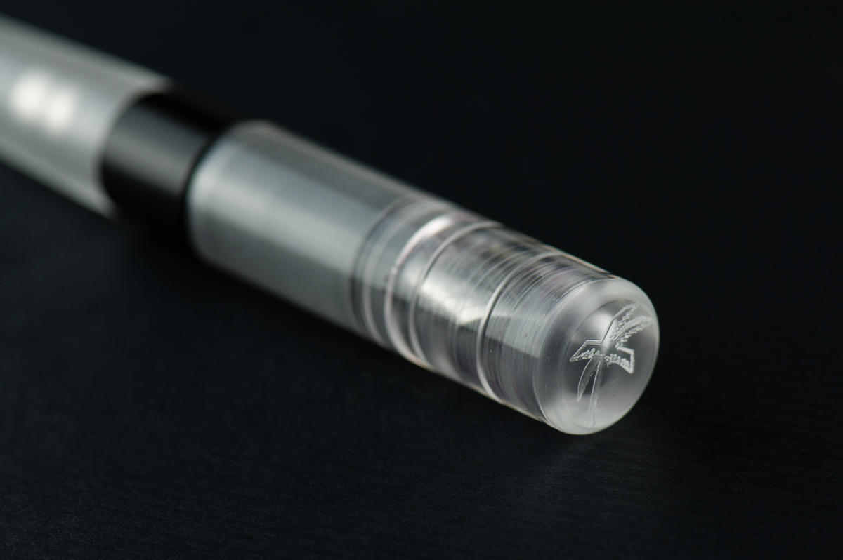
A feature I’d like to highlight is the Delrin section’s fine machined lines. It’s smooth to the touch but you can feel a hint of texture. =)
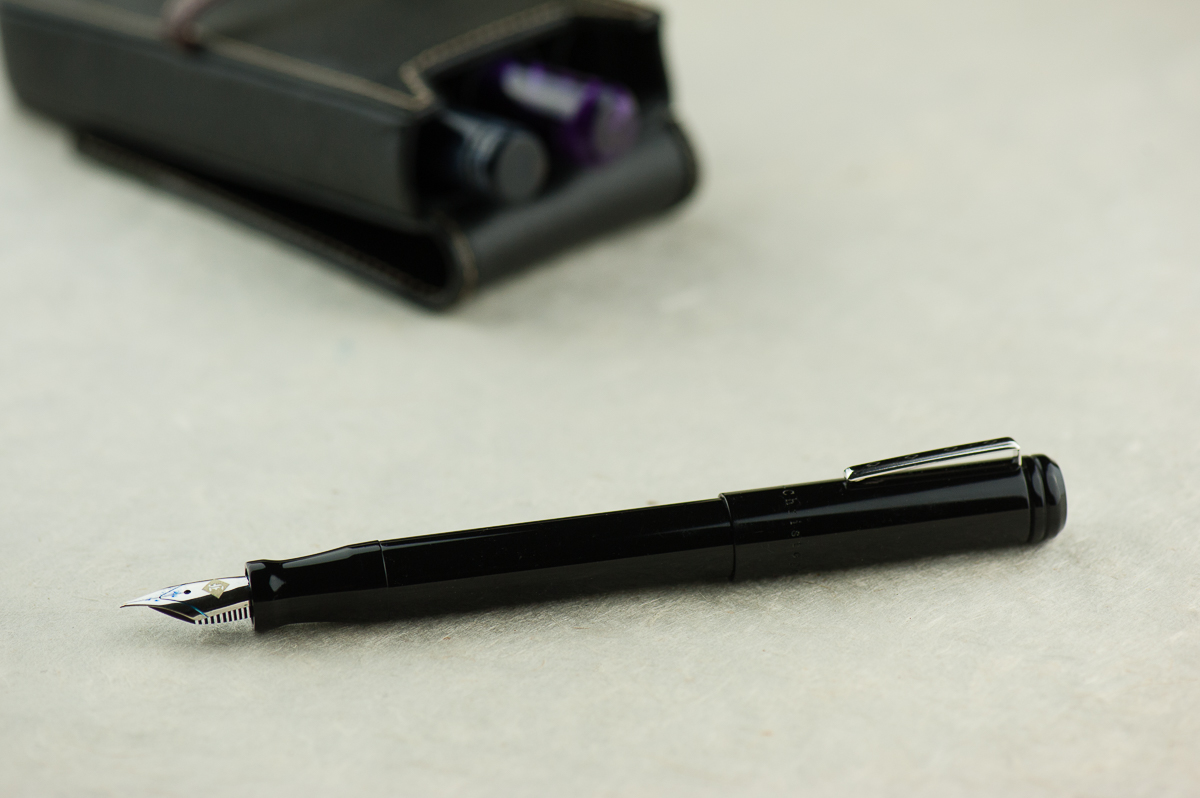
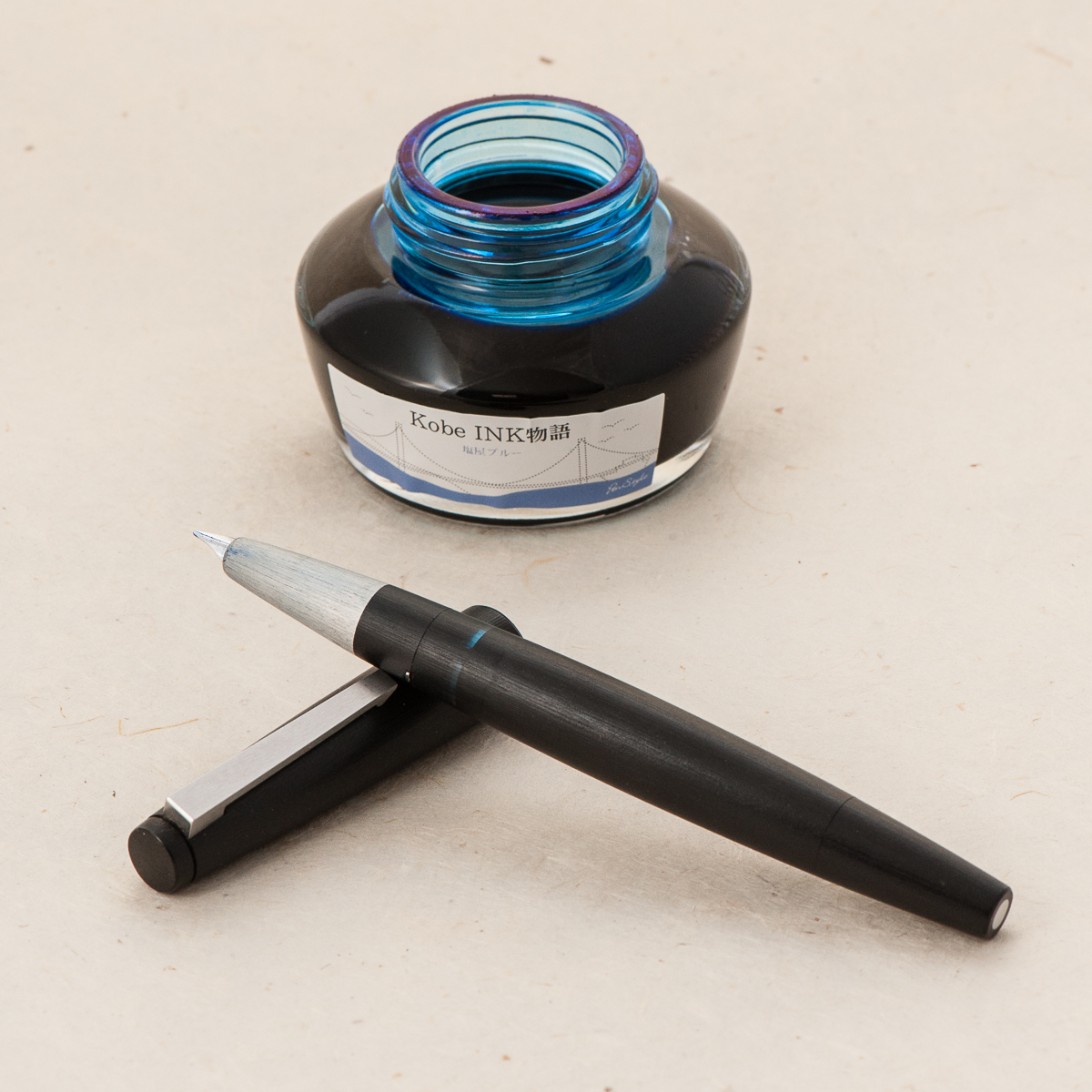
The Una is a cartridge/converter filler and they include a standard international converter with it. I imagine that you can eyedropper this one as well but since it was Katherine’s pen, I didn’t attempt to do so.
Final Grip-ping Impressions
Katherine: I’m excited to see more makers in the pen scene, and especially excited to see that Kasama went for a more unique design, not another standard-ish girth stick or rounded stick CNC pen. The pen itself is well made (though there was a sharp point on the end of the barrel, I sanded it down, but that would have been easy to do in shop) and solidly made. My only real gripe with this pen is that the section<>barrel and section<>cap threads turn in the same direction — so if you don’t tighten the section<>barrel well, unscrewing the cap can unscrew the barrel instead. This hasn’t been an issue for me, but it’s a small design change that could go a long way.
Pam: This is a solid pen and well worth a try, especially for those who prefer a wider pen. It has the potential to be made with a variety of acrylics and delrin and very comfortable for longer writing session. Other than the section, which is a deal breaker for the pixie fist grip that I have, I would recommend this pen. Good thing Katherine has one I can play with occasionally!
Franz: To sum up, I really love the Una fountain pen. I’d largely attribute that to the design: interestingly shaped Delrin section, machined lines on the cap, translucent cap that shows the nib underneath, and a couple more things.
Katherine and Pam pointed out probably the biggest issue with this pen though. The Una’s thread design can be a little frustrating if you’re in a rush to write but then you find that you unscrewed the barrel instead. Annoying? Sure. But I’d be getting one anyway. Because… penvy (pen envy). Darn you Katherine for making me spend money!
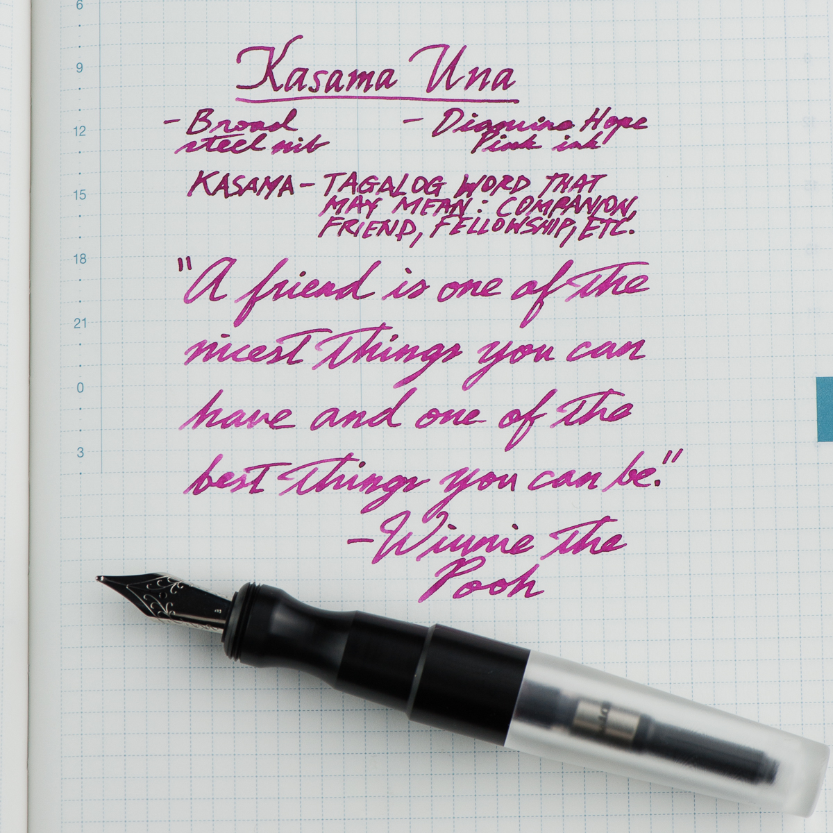
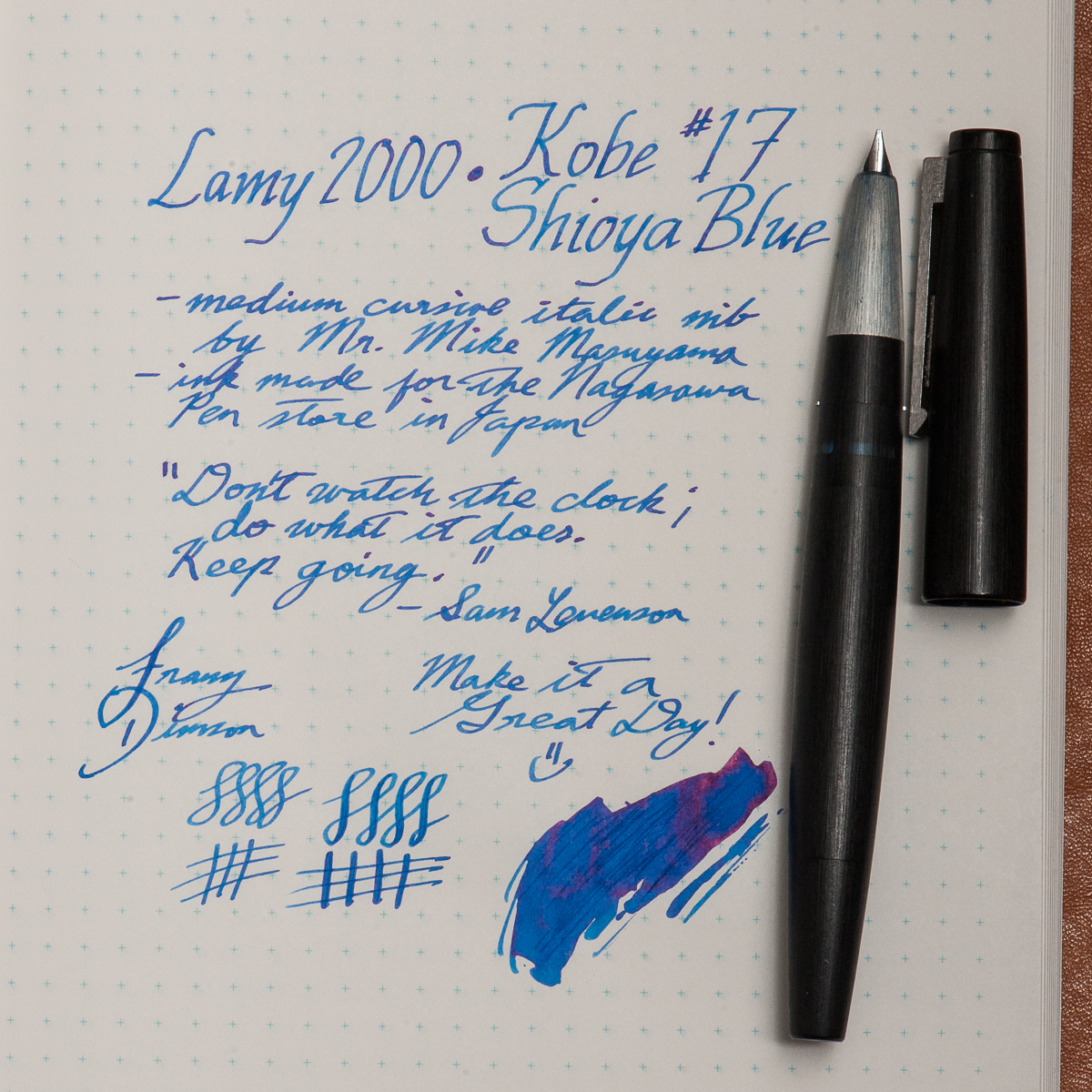
My chosen quote from the writing sample above fits my gratitude of being friends with Katherine and Pam in this fun little project we call HOTP. They are my “kasama” in this blog. Thanks ladies! And thank you all for your readership. =)
“A friend is one of the nicest things you can have and one of the best things you can be.” — Winnie The Pooh
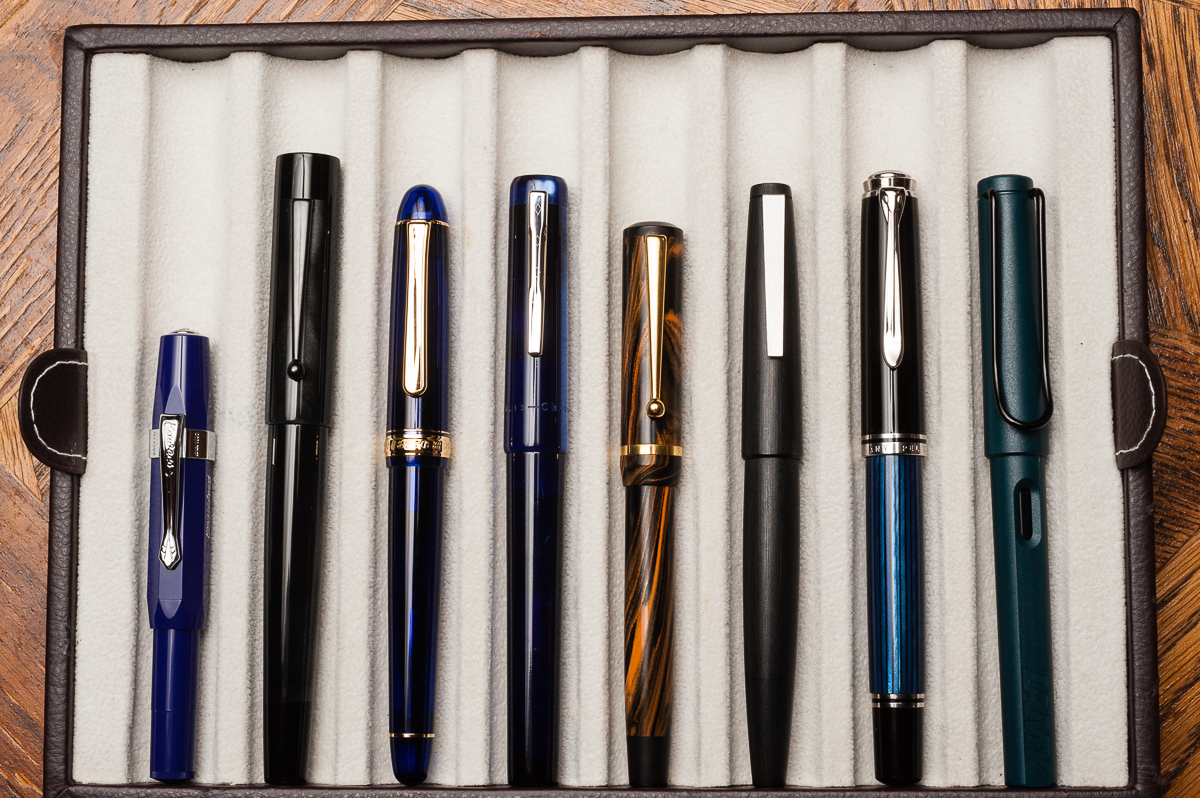
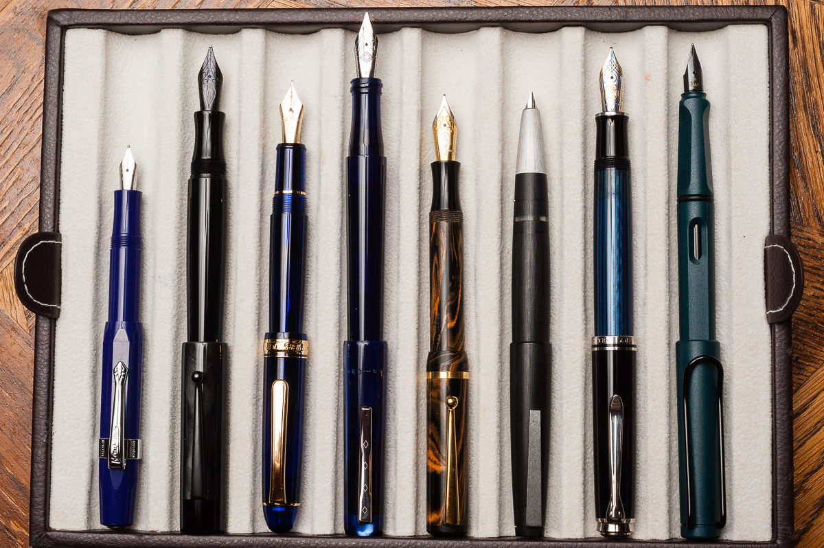
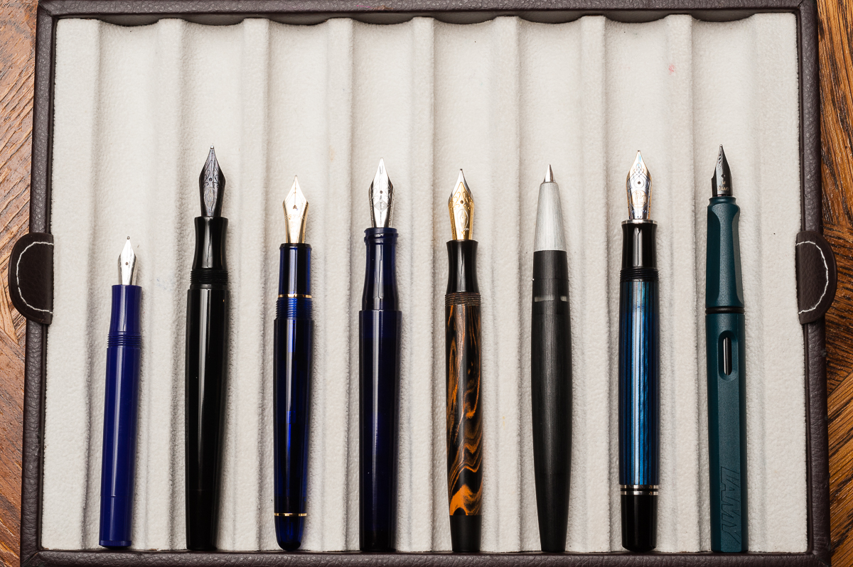
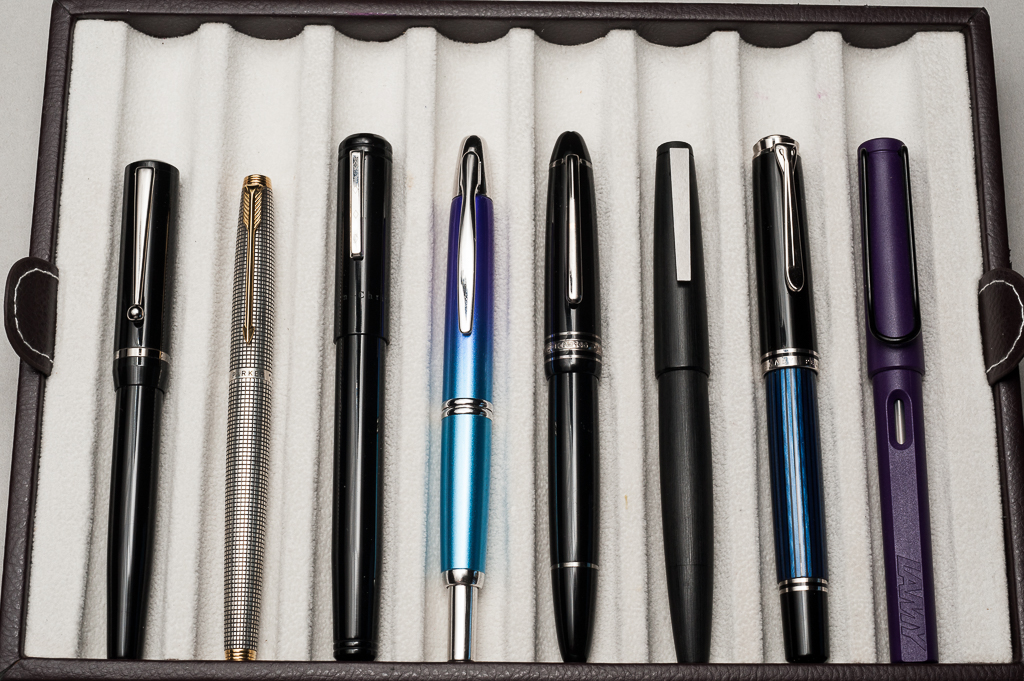
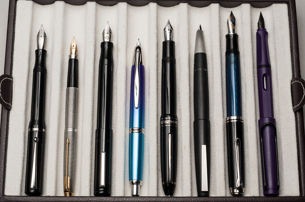
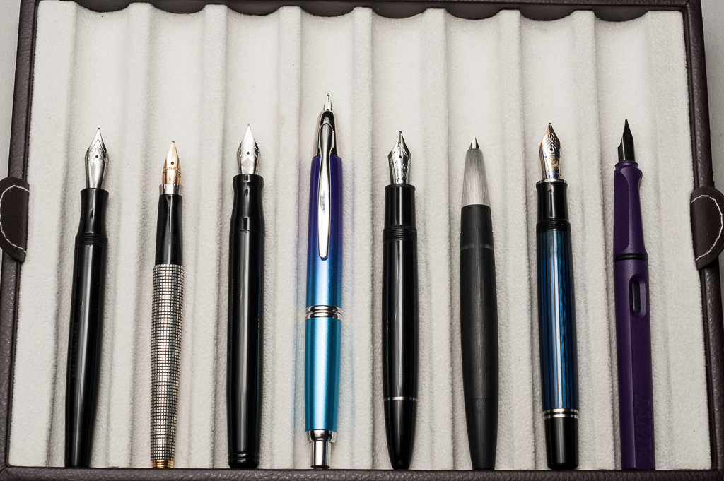
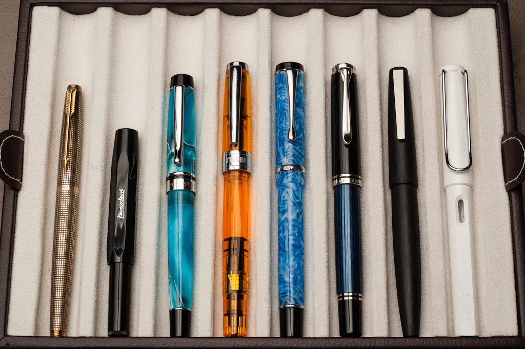
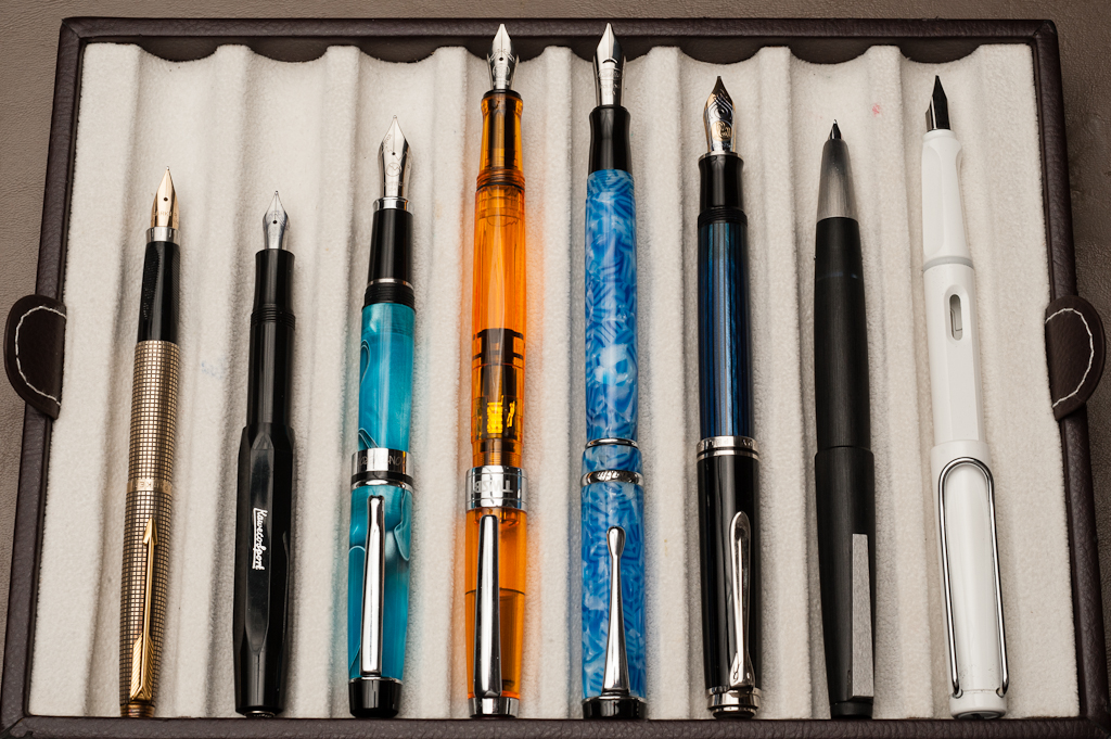
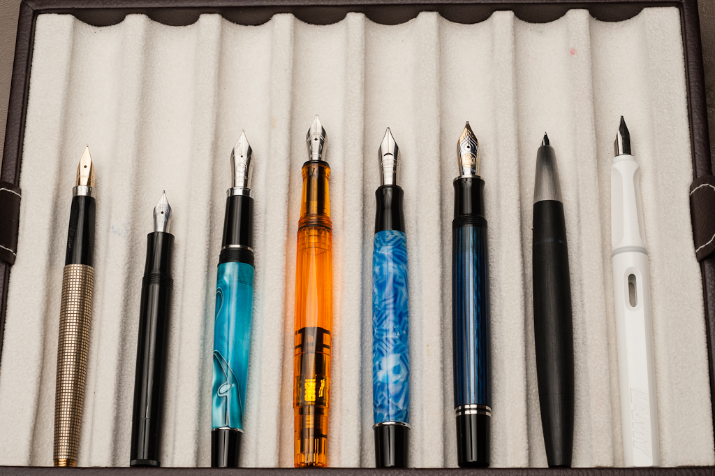
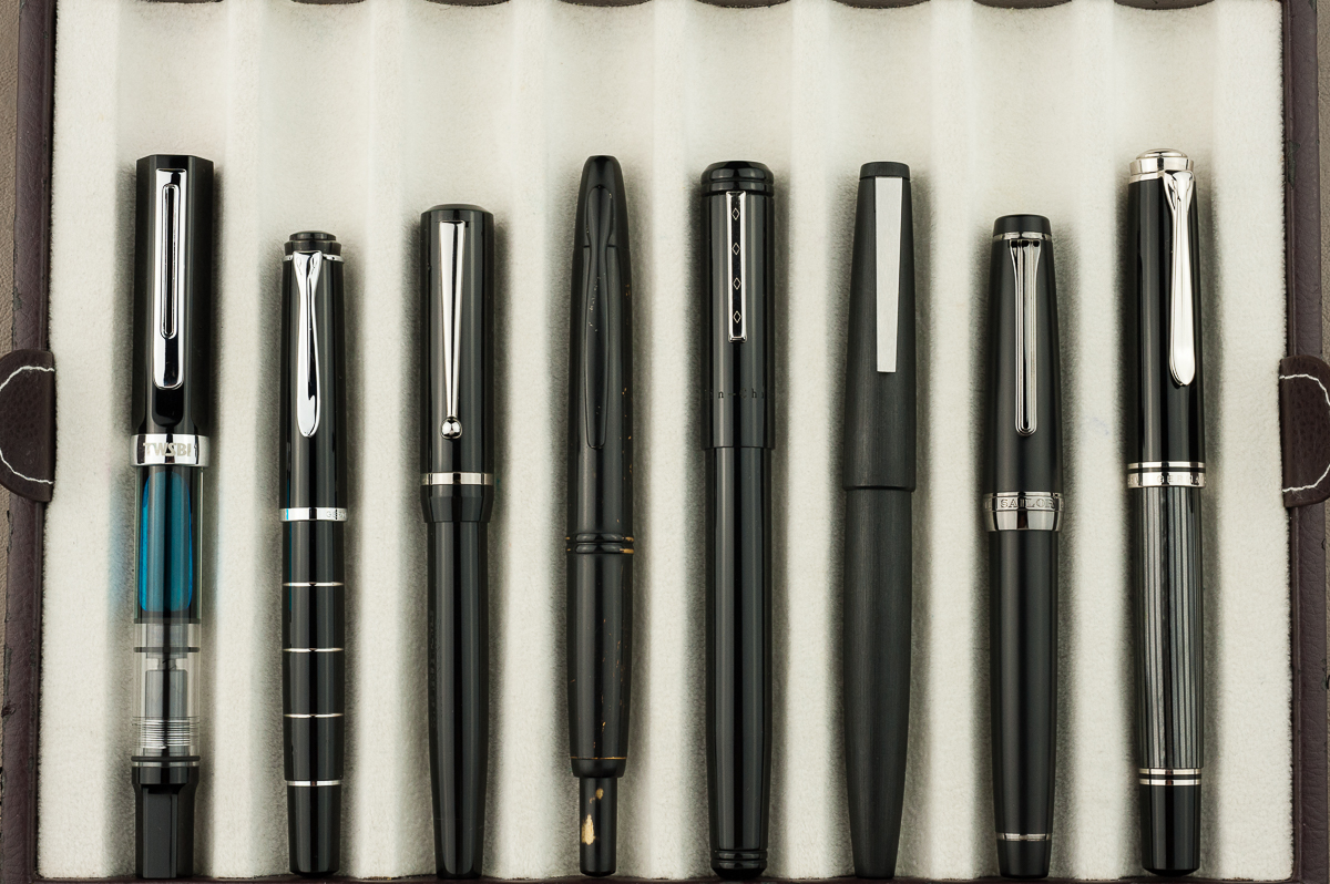
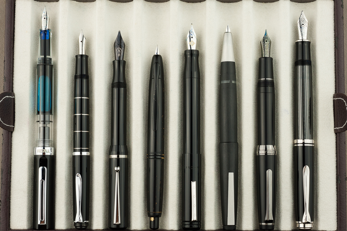
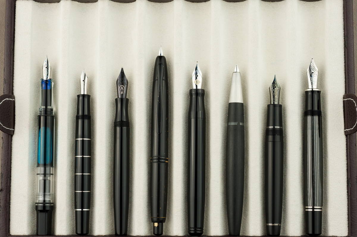
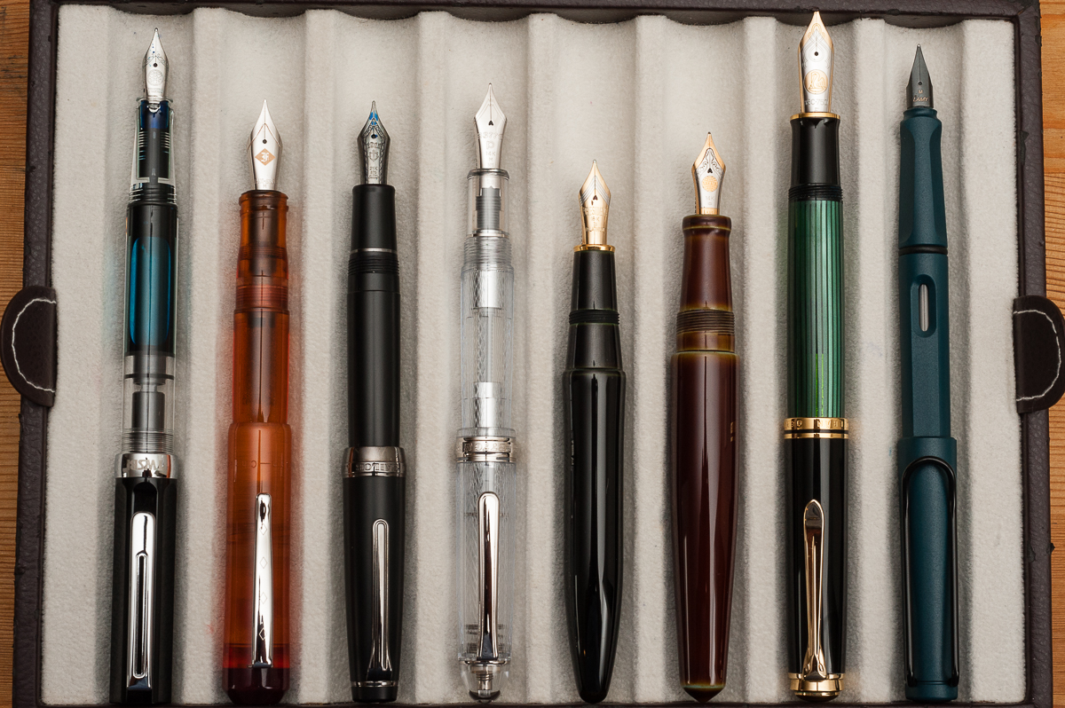
Pen Comparisons
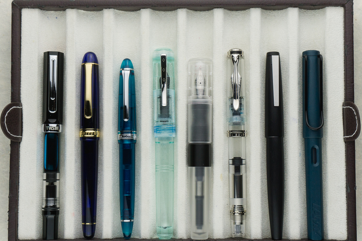
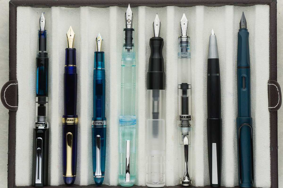
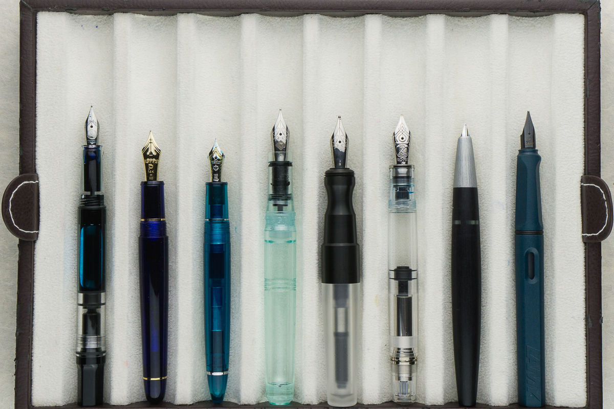
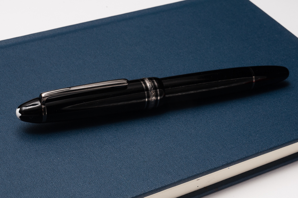
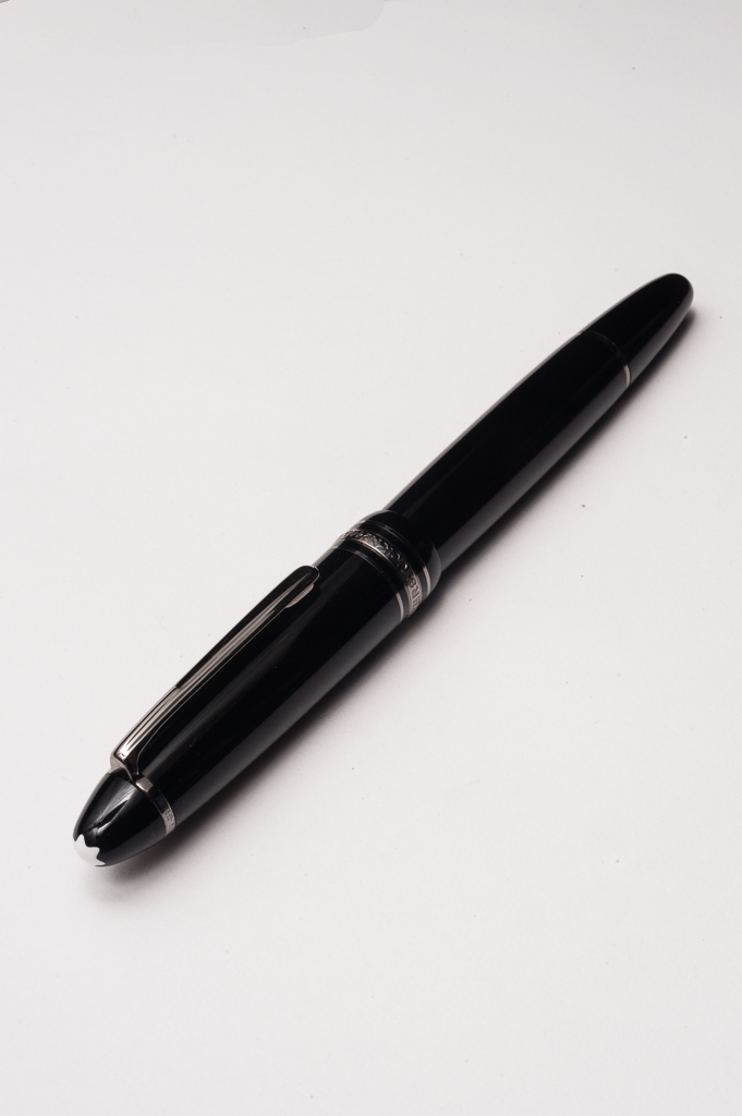
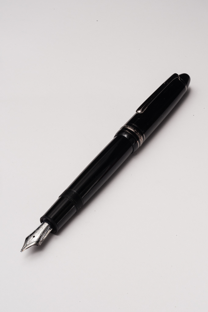
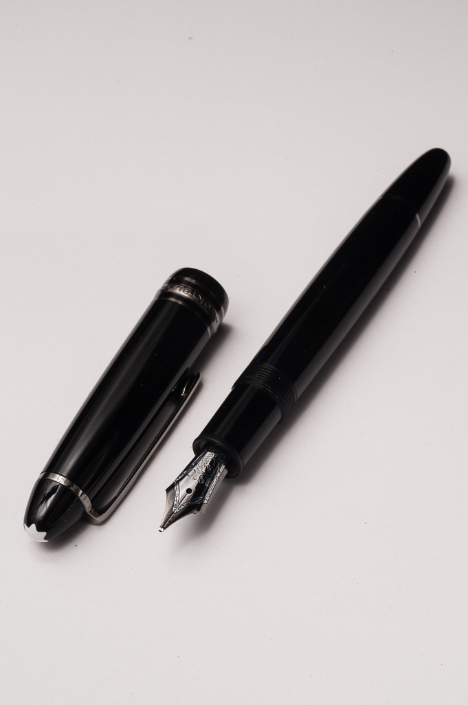
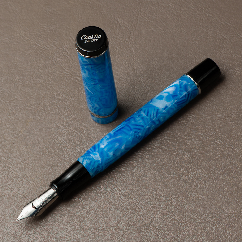
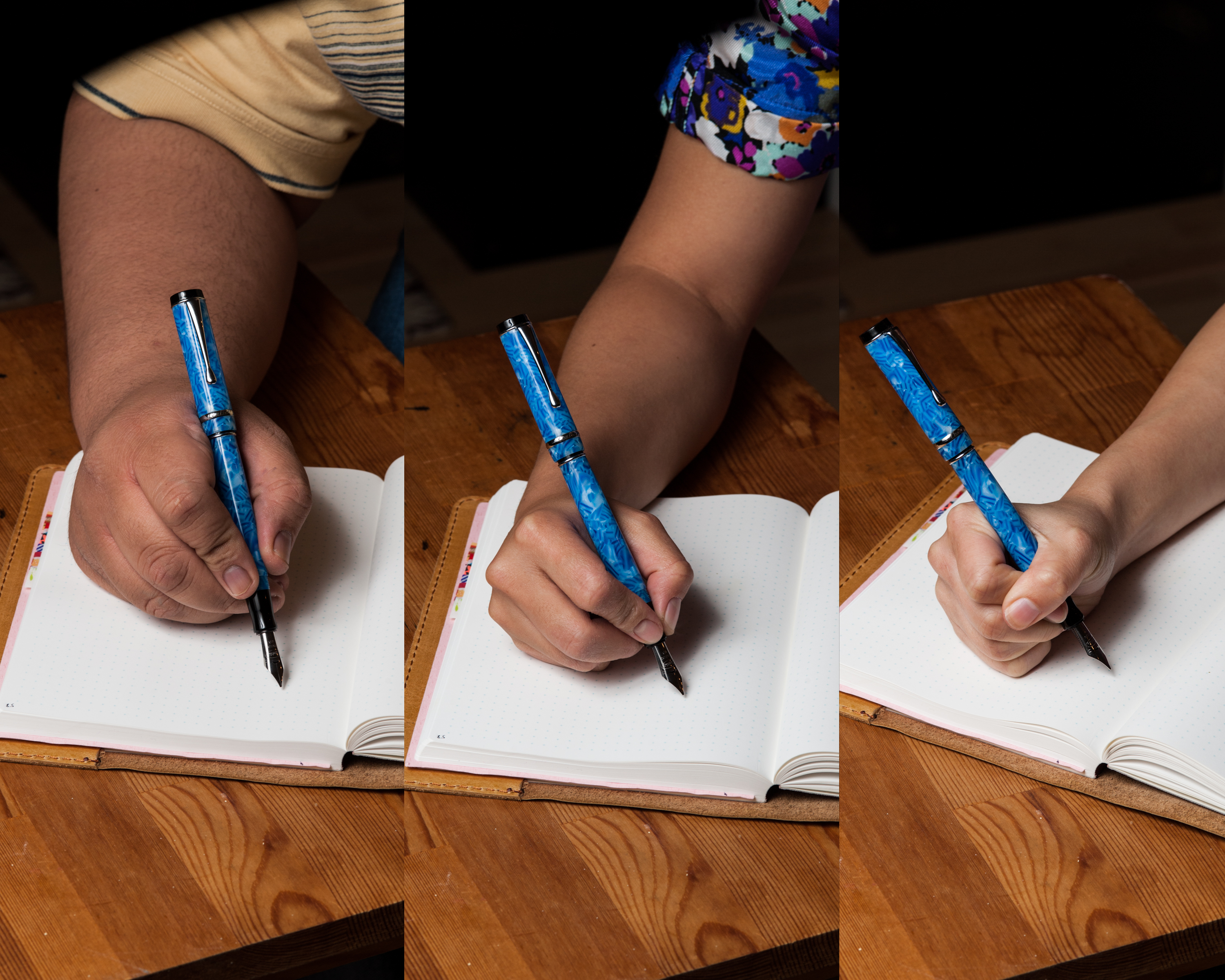
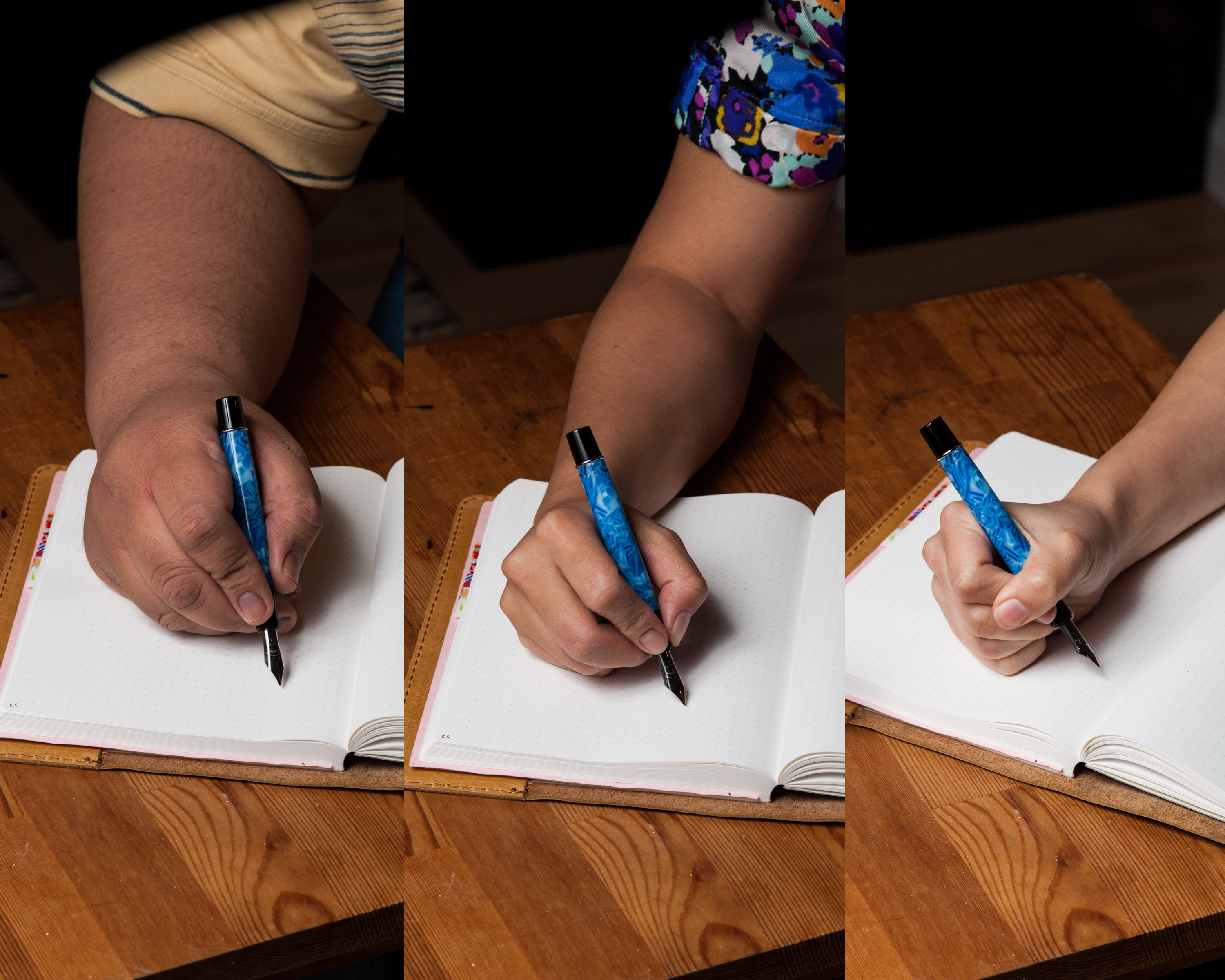
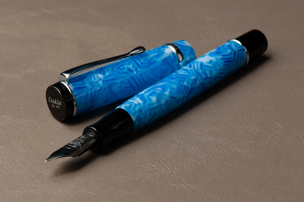
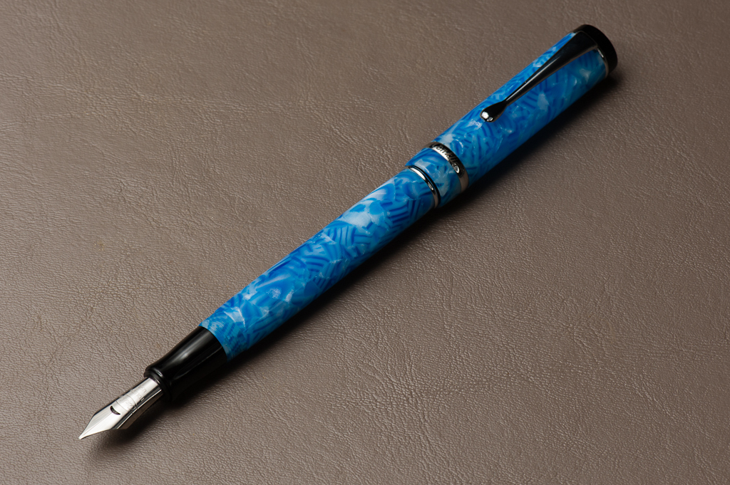
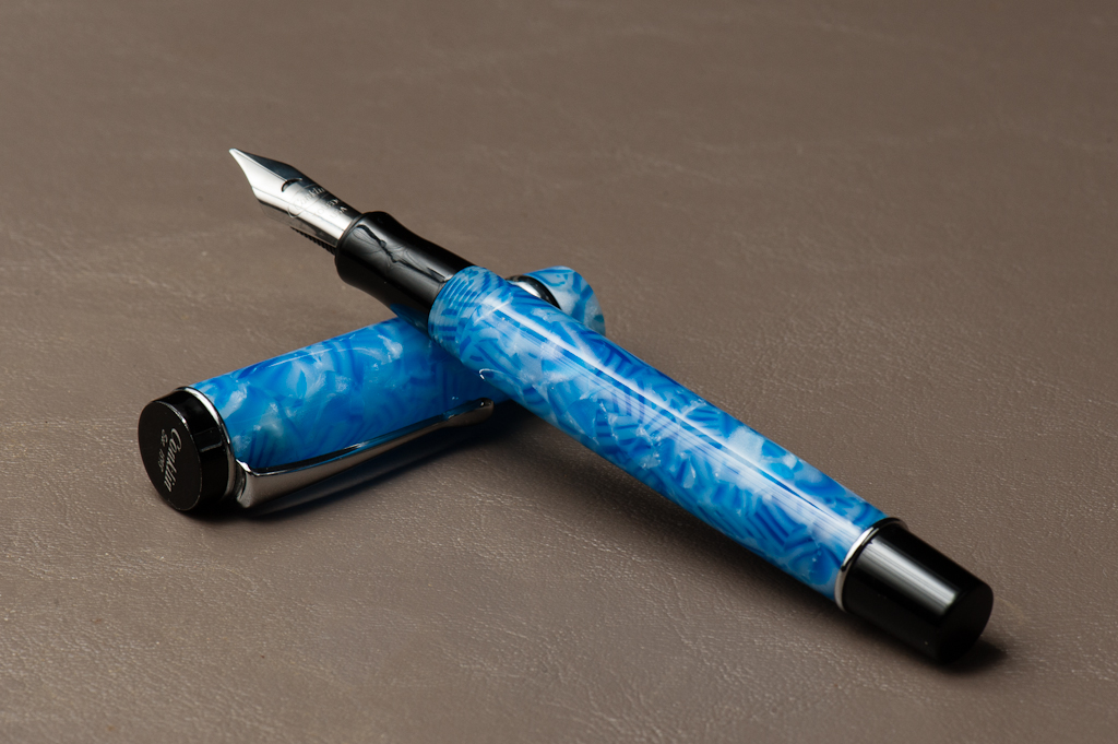
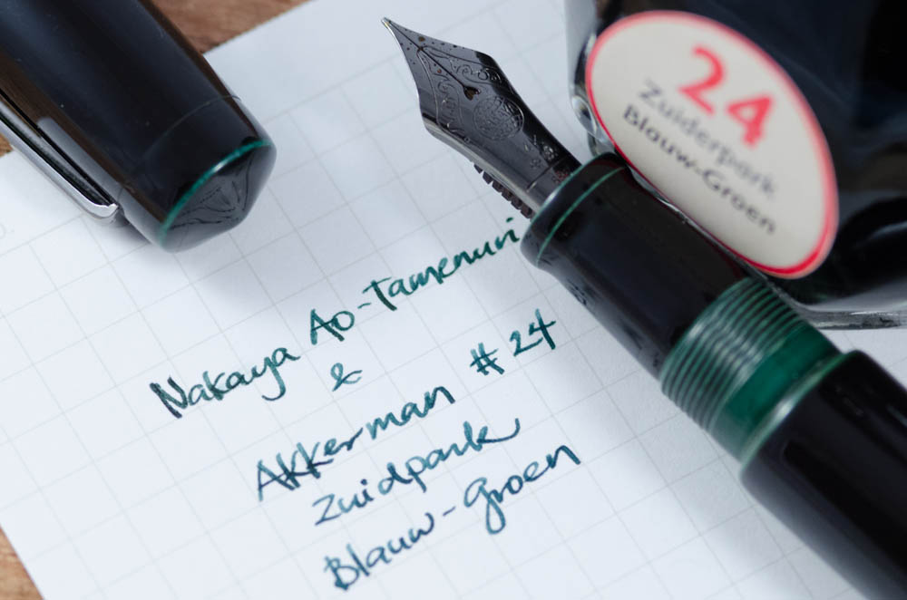
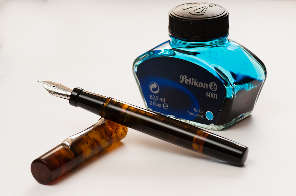
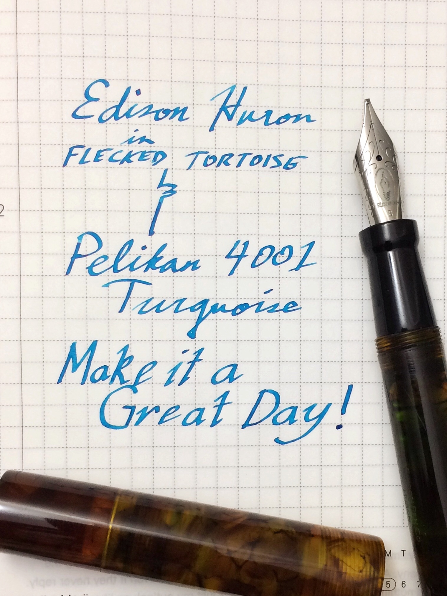
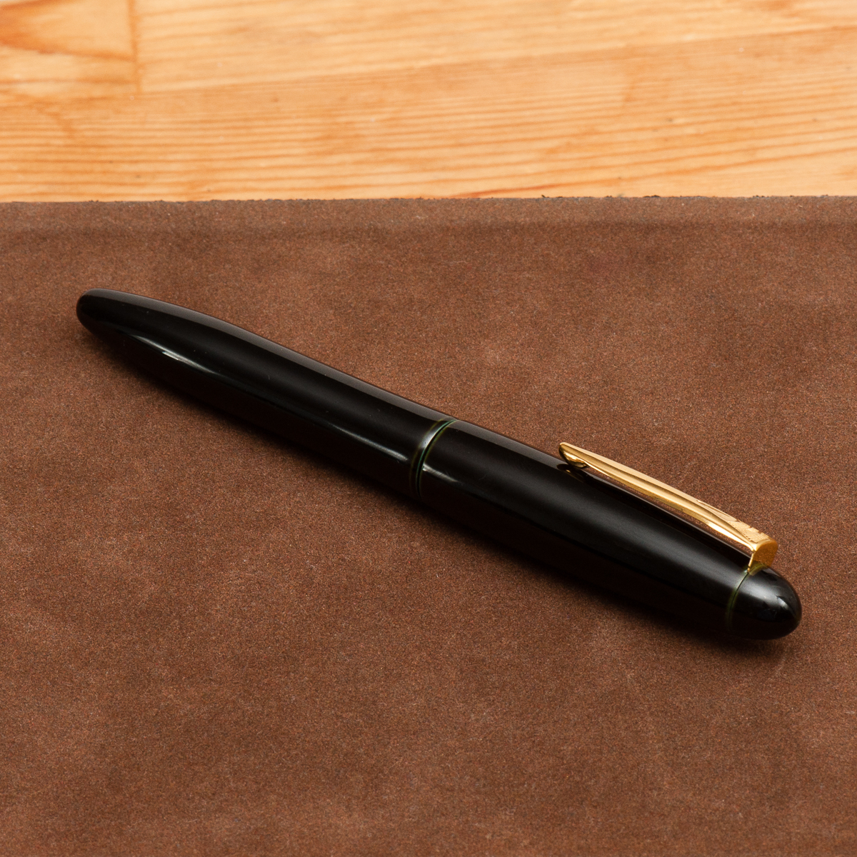
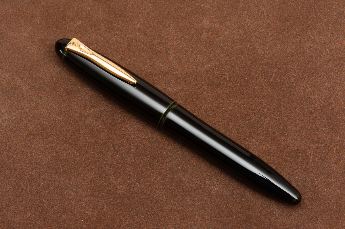
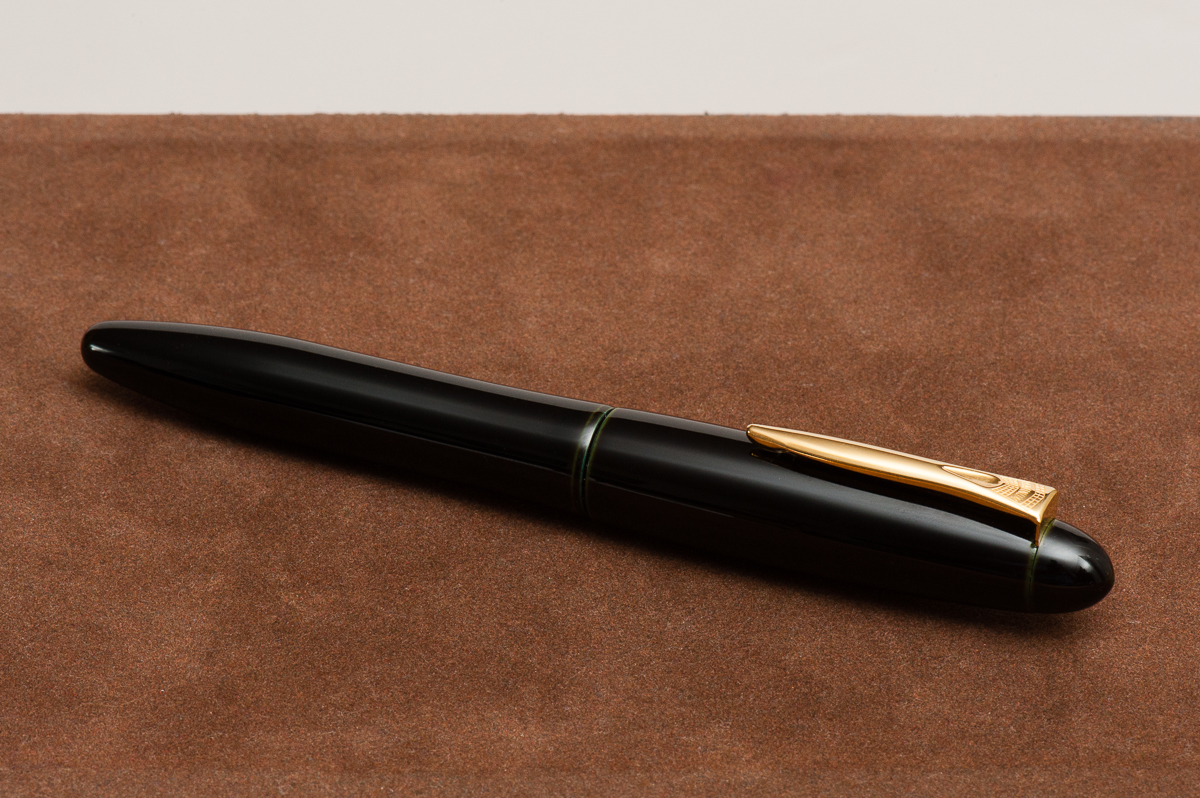
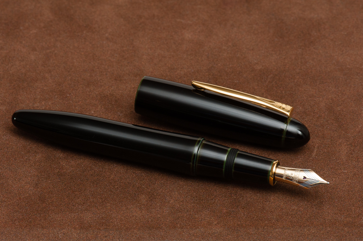
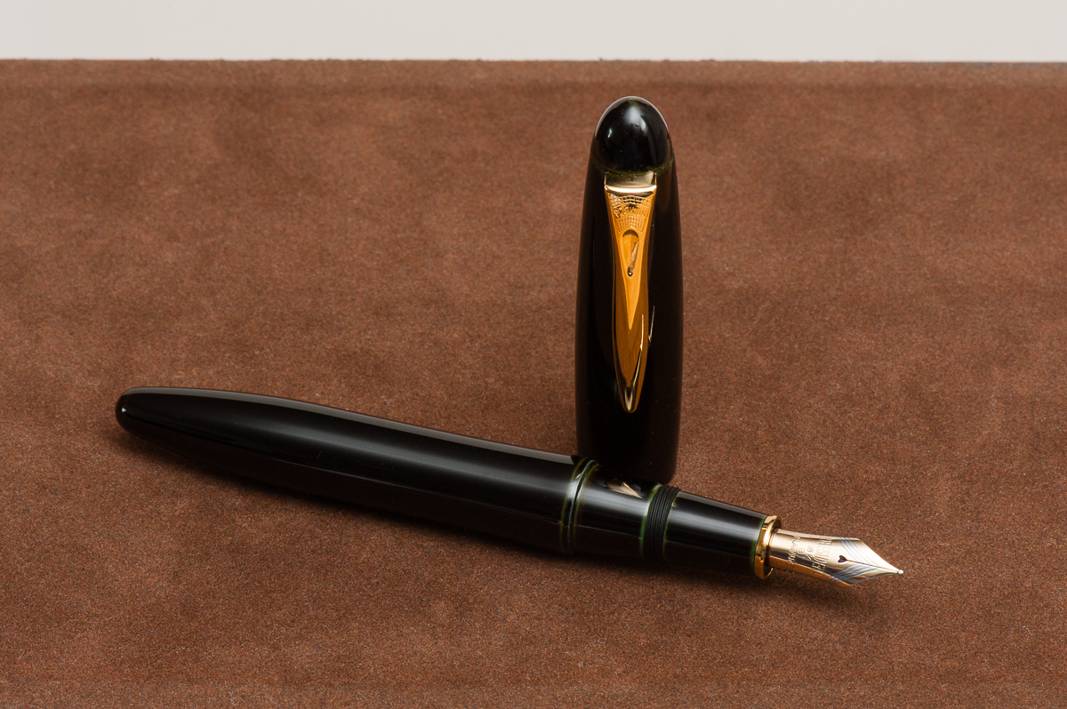
Pen Photos (click to enlarge)


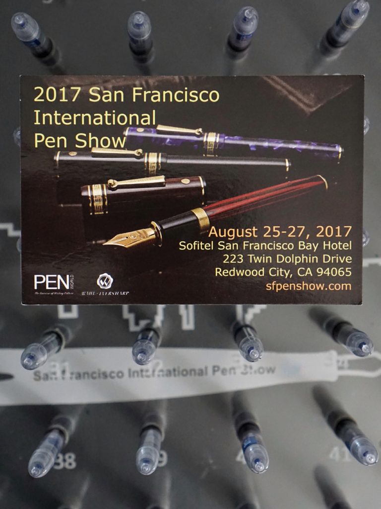
 This year, we will have the Hand Over That Pen table to host the Pay-It-Forward initiative.